
#cryptoeducation
cryptoeducation
3.5M views
19,725 Discussing
Hot
Latest

·
--
🚨 Most Beginners Make This Crypto Mistake…
They look at the price and immediately think:
📈 “It’s going up — I should buy!”
📉 “It’s falling — I should sell!”
But price is only ONE part of the picture.
Before making any decision, look at:
🔹 Market Cap
🔹 Trading Volume
🔹 Market Sentiment
🔹 Bitcoin’s overall movement
The more you understand, the less you have to rely on random hype.
🧠 Don’t just follow the market. Learn how it works.
What’s the first crypto concept you learned? 👇
#crypto #bitcoin #BTC #cryptoeducation #BinanceSquare
🚨 Most Beginners Make This Crypto Mistake…
They look at the price and immediately think:
📈 “It’s going up — I should buy!”
📉 “It’s falling — I should sell!”
But price is only ONE part of the picture.
Before making any decision, look at:
🔹 Market Cap
🔹 Trading Volume
🔹 Market Sentiment
🔹 Bitcoin’s overall movement
The more you understand, the less you have to rely on random hype.
🧠 Don’t just follow the market. Learn how it works.
What’s the first crypto concept you learned? 👇
#crypto #bitcoin #BTC #cryptoeducation #BinanceSquare
They look at the price and immediately think:
📈 “It’s going up — I should buy!”
📉 “It’s falling — I should sell!”
But price is only ONE part of the picture.
Before making any decision, look at:
🔹 Market Cap
🔹 Trading Volume
🔹 Market Sentiment
🔹 Bitcoin’s overall movement
The more you understand, the less you have to rely on random hype.
🧠 Don’t just follow the market. Learn how it works.
What’s the first crypto concept you learned? 👇
#crypto #bitcoin #BTC #cryptoeducation #BinanceSquare
70

·
--
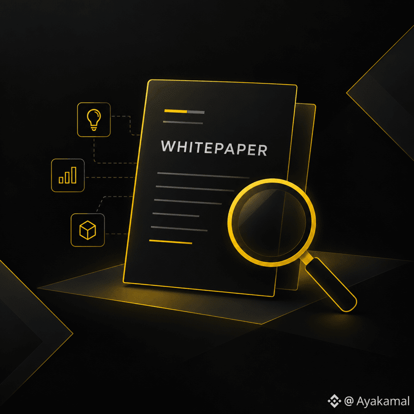
📄 Before You Research a Crypto Project, Read Its Whitepaper
You don’t need to be a developer to read a crypto whitepaper.
You just need to know what to look for.
A whitepaper is a document that explains a project’s goals, technology, tokenomics, and roadmap.
Here are a few things to check 👇
🔎 1. What Problem Is It Solving?
Start with the basics:
What problem does the project want to solve?
And more importantly:
What solution is it proposing?
If the idea isn’t clear, that’s worth investigating further.
🪙 2. Understand the Token
Look for information about:
* What the token is used for
* Its supply
* Distribution
* Incentive mechanisms
This can help you understand the token’s role within the project.
🗺️ 3. Check the Roadmap
What does the project say it plans to build?
And what has actually been delivered?
Comparing the roadmap with real development progress can give you additional context.
⚠️ One important thing
A whitepaper is a starting point, not proof that a project is legitimate or successful.
Whitepapers are not standardized, and they can contain vague promises, marketing language, or incomplete technical details.
Always combine the whitepaper with other research.
📚 Learn more with Binance Academy.
Educational content only, not financial advice. DYOR.
#Binance #crypto
#CryptoEducation
📄 Before You Research a Crypto Project, Read Its Whitepaper
You don’t need to be a developer to read a crypto whitepaper.
You just need to know what to look for.
A whitepaper is a document that explains a project’s goals, technology, tokenomics, and roadmap.
Here are a few things to check 👇
🔎 1. What Problem Is It Solving?
Start with the basics:
What problem does the project want to solve?
And more importantly:
What solution is it proposing?
If the idea isn’t clear, that’s worth investigating further.
🪙 2. Understand the Token
Look for information about:
* What the token is used for
* Its supply
* Distribution
* Incentive mechanisms
This can help you understand the token’s role within the project.
🗺️ 3. Check the Roadmap
What does the project say it plans to build?
And what has actually been delivered?
Comparing the roadmap with real development progress can give you additional context.
⚠️ One important thing
A whitepaper is a starting point, not proof that a project is legitimate or successful.
Whitepapers are not standardized, and they can contain vague promises, marketing language, or incomplete technical details.
Always combine the whitepaper with other research.
📚 Learn more with Binance Academy.
Educational content only, not financial advice. DYOR.
#Binance #crypto
#CryptoEducation
You don’t need to be a developer to read a crypto whitepaper.
You just need to know what to look for.
A whitepaper is a document that explains a project’s goals, technology, tokenomics, and roadmap.
Here are a few things to check 👇
🔎 1. What Problem Is It Solving?
Start with the basics:
What problem does the project want to solve?
And more importantly:
What solution is it proposing?
If the idea isn’t clear, that’s worth investigating further.
🪙 2. Understand the Token
Look for information about:
* What the token is used for
* Its supply
* Distribution
* Incentive mechanisms
This can help you understand the token’s role within the project.
🗺️ 3. Check the Roadmap
What does the project say it plans to build?
And what has actually been delivered?
Comparing the roadmap with real development progress can give you additional context.
⚠️ One important thing
A whitepaper is a starting point, not proof that a project is legitimate or successful.
Whitepapers are not standardized, and they can contain vague promises, marketing language, or incomplete technical details.
Always combine the whitepaper with other research.
📚 Learn more with Binance Academy.
Educational content only, not financial advice. DYOR.
#Binance #crypto
#CryptoEducation
2
74
Stop Holding Idle Crypto: A Beginner’s Guide to Binance Simple EarnLeaving your $USDT, BTC, orBNB sitting idle in your Spot Wallet yields 0%. If you aren't actively executing trades today, leaving those funds untouched means missing out on passive daily yields.
Here is a straightforward breakdown of Binance Simple Earn and how to choose between Flexible and Locked products:
1. Flexible Products (Maximum Liquidity)
How it works: Deposit your crypto and earn rewards calculated continuously.
* Withdrawals: Instant. Redeem back to your Spot Wallet at any time if you see a trade setup or need liquidity.
* Best for: Active trading capital, emergency funds, or stablecoins waiting for buying opportunities.
2. Locked Products (Higher Yields)
How it works: Commit your assets for fixed durations (e.g., 30, 60, or 90 days) in exchange for a higher fixed APR.
* Withdrawals: Bound to the agreed duration. You can request an early redemption, but doing so forfeits accrued interest rewards.
* Best for: Long-term holdings ($BNB, $ETH,$SOL) that you intend to hold through market cycles regardless.
---
💡 Pro-Tip: Auto-Subscribe
Enable Auto-Subscribe in your Earn settings. This automatically reinvests your daily payout rewards back into Simple Earn, compounding your interest without requiring daily manual actions.
💬 Quick Question: Are you keeping your idle funds in Flexible or Locked Earn right now? Let’s share strategies in the comments! 👇
Disclaimer: Not financial advice. Always do your own research (DYOR) before locking assets.
$USDT $BNB $BTC
#BinanceEarn #CryptoEducation
Stop Holding Idle Crypto: A Beginner’s Guide to Binance Simple Earn
Leaving your $USDT, BTC, orBNB sitting idle in your Spot Wallet yields 0%. If you aren't actively executing trades today, leaving those funds untouched means missing out on passive daily yields.
Here is a straightforward breakdown of Binance Simple Earn and how to choose between Flexible and Locked products:
1. Flexible Products (Maximum Liquidity)
How it works: Deposit your crypto and earn rewards calculated continuously.
* Withdrawals: Instant. Redeem back to your Spot Wallet at any time if you see a trade setup or need liquidity.
* Best for: Active trading capital, emergency funds, or stablecoins waiting for buying opportunities.
2. Locked Products (Higher Yields)
How it works: Commit your assets for fixed durations (e.g., 30, 60, or 90 days) in exchange for a higher fixed APR.
* Withdrawals: Bound to the agreed duration. You can request an early redemption, but doing so forfeits accrued interest rewards.
* Best for: Long-term holdings ($BNB , $ETH,$SOL) that you intend to hold through market cycles regardless.
---
💡 Pro-Tip: Auto-Subscribe
Enable Auto-Subscribe in your Earn settings. This automatically reinvests your daily payout rewards back into Simple Earn, compounding your interest without requiring daily manual actions.
💬 Quick Question: Are you keeping your idle funds in Flexible or Locked Earn right now? Let’s share strategies in the comments! 👇
Disclaimer: Not financial advice. Always do your own research (DYOR) before locking assets.
$USDT $BNB $BTC
#BinanceEarn #CryptoEducation
Here is a straightforward breakdown of Binance Simple Earn and how to choose between Flexible and Locked products:
1. Flexible Products (Maximum Liquidity)
How it works: Deposit your crypto and earn rewards calculated continuously.
* Withdrawals: Instant. Redeem back to your Spot Wallet at any time if you see a trade setup or need liquidity.
* Best for: Active trading capital, emergency funds, or stablecoins waiting for buying opportunities.
2. Locked Products (Higher Yields)
How it works: Commit your assets for fixed durations (e.g., 30, 60, or 90 days) in exchange for a higher fixed APR.
* Withdrawals: Bound to the agreed duration. You can request an early redemption, but doing so forfeits accrued interest rewards.
* Best for: Long-term holdings ($BNB , $ETH,$SOL) that you intend to hold through market cycles regardless.
---
💡 Pro-Tip: Auto-Subscribe
Enable Auto-Subscribe in your Earn settings. This automatically reinvests your daily payout rewards back into Simple Earn, compounding your interest without requiring daily manual actions.
💬 Quick Question: Are you keeping your idle funds in Flexible or Locked Earn right now? Let’s share strategies in the comments! 👇
Disclaimer: Not financial advice. Always do your own research (DYOR) before locking assets.
$USDT $BNB $BTC
#BinanceEarn #CryptoEducation
1
143
·
--
Ever wondered what a single candle on a crypto chart is actually telling you?
If you’ve already learned how to look at a crypto chart, the next step is understanding candlesticks.
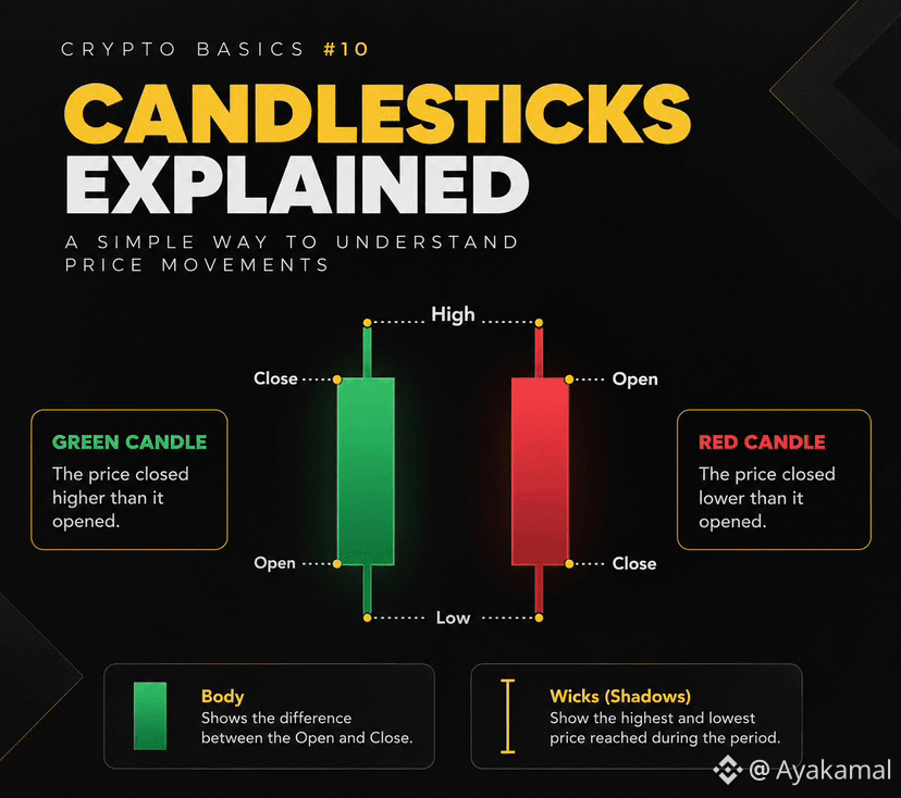
A candlestick shows how an asset’s price moved during a specific period — and every candle is built from four key prices.
🔹 The 4 prices behind every candle
Open — the first recorded price during the period.
High — the highest price reached.
Low — the lowest price reached.
Close — the last recorded price.
Together, these are called OHLC data.
🕯️ Body vs. Wicks
The body shows the difference between the Open and Close.
The thin lines extending above and below the body are called wicks or shadows. They show the High and Low reached during that period.
🟢 Green vs. 🔴 Red
In most charting platforms:
🟢 Green candle → Close is higher than Open.
🔴 Red candle → Close is lower than Open.
The colors can be customized on some platforms, but the underlying logic stays the same.
⏱️ And what does one candle represent?
That depends on the timeframe you choose.
A candle can represent a short period such as a minute, or a much longer period such as a day.
So the same asset can look very different depending on the timeframe you’re viewing.
The simple way to remember it:
Open → High → Low → Close
Once you understand these four points, you have the basic language needed to start reading candlestick charts.
And remember: candlesticks show what happened during a period. They don’t guarantee what happens next.
📚 Keep learning with Binance Academy.
Educational content only, not financial advice. DYOR.
#Binance #CryptoEducation
Ever wondered what a single candle on a crypto chart is actually telling you?
If you’ve already learned how to look at a crypto chart, the next step is understanding candlesticks.
A candlestick shows how an asset’s price moved during a specific period — and every candle is built from four key prices.
🔹 The 4 prices behind every candle
Open — the first recorded price during the period.
High — the highest price reached.
Low — the lowest price reached.
Close — the last recorded price.
Together, these are called OHLC data.
🕯️ Body vs. Wicks
The body shows the difference between the Open and Close.
The thin lines extending above and below the body are called wicks or shadows. They show the High and Low reached during that period.
🟢 Green vs. 🔴 Red
In most charting platforms:
🟢 Green candle → Close is higher than Open.
🔴 Red candle → Close is lower than Open.
The colors can be customized on some platforms, but the underlying logic stays the same.
⏱️ And what does one candle represent?
That depends on the timeframe you choose.
A candle can represent a short period such as a minute, or a much longer period such as a day.
So the same asset can look very different depending on the timeframe you’re viewing.
The simple way to remember it:
Open → High → Low → Close
Once you understand these four points, you have the basic language needed to start reading candlestick charts.
And remember: candlesticks show what happened during a period. They don’t guarantee what happens next.
📚 Keep learning with Binance Academy.
Educational content only, not financial advice. DYOR.
#Binance #CryptoEducation
If you’ve already learned how to look at a crypto chart, the next step is understanding candlesticks.
A candlestick shows how an asset’s price moved during a specific period — and every candle is built from four key prices.
🔹 The 4 prices behind every candle
Open — the first recorded price during the period.
High — the highest price reached.
Low — the lowest price reached.
Close — the last recorded price.
Together, these are called OHLC data.
🕯️ Body vs. Wicks
The body shows the difference between the Open and Close.
The thin lines extending above and below the body are called wicks or shadows. They show the High and Low reached during that period.
🟢 Green vs. 🔴 Red
In most charting platforms:
🟢 Green candle → Close is higher than Open.
🔴 Red candle → Close is lower than Open.
The colors can be customized on some platforms, but the underlying logic stays the same.
⏱️ And what does one candle represent?
That depends on the timeframe you choose.
A candle can represent a short period such as a minute, or a much longer period such as a day.
So the same asset can look very different depending on the timeframe you’re viewing.
The simple way to remember it:
Open → High → Low → Close
Once you understand these four points, you have the basic language needed to start reading candlestick charts.
And remember: candlesticks show what happened during a period. They don’t guarantee what happens next.
📚 Keep learning with Binance Academy.
Educational content only, not financial advice. DYOR.
#Binance #CryptoEducation
2
82

·
--
📚 Crypto Education — Candlesticks
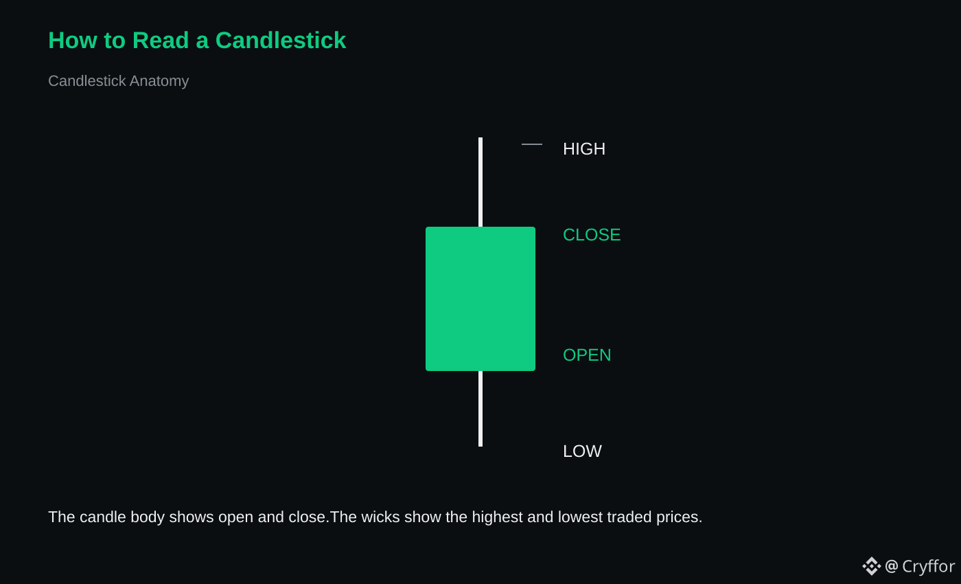
🟢 Bullish candle: buyers controlled the period.
🔴 Bearish candle: sellers controlled the period.
📍 The wick shows where price traded but failed to hold.
📊 Candles become more useful with:
🔎 Support/resistance
📈 Trend
⚡ Volume
👀 Higher-timeframe structure
🤔 Which candle pattern do you watch most?
#CryptoEducation #Binance #Candlesticks #Trading
📚 Crypto Education — Candlesticks
🟢 Bullish candle: buyers controlled the period.
🔴 Bearish candle: sellers controlled the period.
📍 The wick shows where price traded but failed to hold.
📊 Candles become more useful with:
🔎 Support/resistance
📈 Trend
⚡ Volume
👀 Higher-timeframe structure
🤔 Which candle pattern do you watch most?
#CryptoEducation #Binance #Candlesticks #Trading
🟢 Bullish candle: buyers controlled the period.
🔴 Bearish candle: sellers controlled the period.
📍 The wick shows where price traded but failed to hold.
📊 Candles become more useful with:
🔎 Support/resistance
📈 Trend
⚡ Volume
👀 Higher-timeframe structure
🤔 Which candle pattern do you watch most?
#CryptoEducation #Binance #Candlesticks #Trading
9
Article
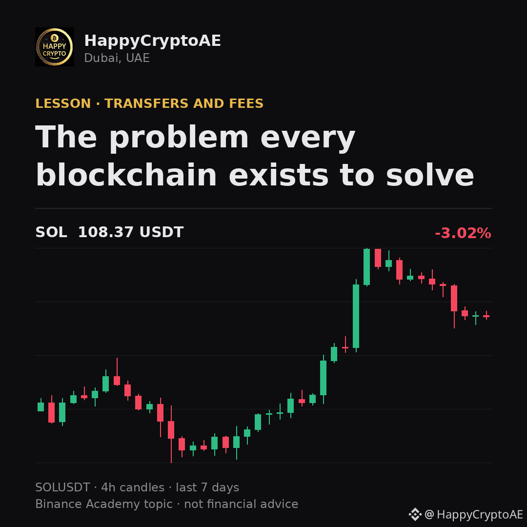
The problem every blockchain exists to solveDigital data copies perfectly, which means digital money faces one hard question: what stops the same unit being spent twice? Before blockchains, the answer was always a central party keeping the single authoritative record.
A blockchain answers it without that party. Transactions are ordered by consensus, and once one spends a unit, any later attempt to spend the same unit is rejected by everyone. This is what all the machinery is for - the blocks, the confirmations, the fees. Not complexity for its own sake, but the cost of settling that one question with nobody in charge.
Binance Academy covers this in more depth: https://www.binance.com/en/academy/glossary/double-spending
Trading crypto from Dubai since 2019.
$BTC $ETH $SOL
#Crypto #CryptoEducation #Binance
The problem every blockchain exists to solve
Digital data copies perfectly, which means digital money faces one hard question: what stops the same unit being spent twice? Before blockchains, the answer was always a central party keeping the single authoritative record.
A blockchain answers it without that party. Transactions are ordered by consensus, and once one spends a unit, any later attempt to spend the same unit is rejected by everyone. This is what all the machinery is for - the blocks, the confirmations, the fees. Not complexity for its own sake, but the cost of settling that one question with nobody in charge.
Binance Academy covers this in more depth: https://www.binance.com/en/academy/glossary/double-spending
Trading crypto from Dubai since 2019.
$BTC $ETH $SOL
#Crypto #CryptoEducation #Binance
A blockchain answers it without that party. Transactions are ordered by consensus, and once one spends a unit, any later attempt to spend the same unit is rejected by everyone. This is what all the machinery is for - the blocks, the confirmations, the fees. Not complexity for its own sake, but the cost of settling that one question with nobody in charge.
Binance Academy covers this in more depth: https://www.binance.com/en/academy/glossary/double-spending
Trading crypto from Dubai since 2019.
$BTC $ETH $SOL
#Crypto #CryptoEducation #Binance
49

·
--
Binance Academy: build knowledge before taking risk.
Crypto moves fast. The strongest edge is not chasing every candle—it is understanding the technology, market mechanics and security risks behind the asset.
Binance Academy is a free learning platform covering:
• Blockchain fundamentals: blocks, consensus, wallets and transactions
• Bitcoin and UTXO mechanics
• Trading concepts: spot, futures, leverage and risk management
• DeFi, staking, liquidity pools and smart contracts
• On-chain analysis and blockchain data
• Web3, NFTs, DAOs and the metaverse
• Security, scams, phishing and account protection
• Regulation, compliance and responsible participation
A practical learning path:
1. Start with blockchain and wallet basics.
2. Learn how transactions and fees work.
3. Study market structure before using leverage.
4. Practise reading on-chain data with a block explorer.
5. Secure your account with 2FA, an anti-phishing code and withdrawal-address whitelisting.
6. Test your knowledge through Binance Academy quizzes and courses.
The goal is not to predict every move. The goal is to make better questions, verify claims and manage risk with discipline.
Education does not guarantee profit—but lack of education can make avoidable mistakes more expensive.
Explore Binance Academy: academy.binance.com
Educational content only. Not financial advice.
#BinanceAcademy #CryptoEducation #Web3 #BinanceAngels
Binance Academy: build knowledge before taking risk.
Crypto moves fast. The strongest edge is not chasing every candle—it is understanding the technology, market mechanics and security risks behind the asset.
Binance Academy is a free learning platform covering:
• Blockchain fundamentals: blocks, consensus, wallets and transactions
• Bitcoin and UTXO mechanics
• Trading concepts: spot, futures, leverage and risk management
• DeFi, staking, liquidity pools and smart contracts
• On-chain analysis and blockchain data
• Web3, NFTs, DAOs and the metaverse
• Security, scams, phishing and account protection
• Regulation, compliance and responsible participation
A practical learning path:
1. Start with blockchain and wallet basics.
2. Learn how transactions and fees work.
3. Study market structure before using leverage.
4. Practise reading on-chain data with a block explorer.
5. Secure your account with 2FA, an anti-phishing code and withdrawal-address whitelisting.
6. Test your knowledge through Binance Academy quizzes and courses.
The goal is not to predict every move. The goal is to make better questions, verify claims and manage risk with discipline.
Education does not guarantee profit—but lack of education can make avoidable mistakes more expensive.
Explore Binance Academy: academy.binance.com
Educational content only. Not financial advice.
#BinanceAcademy #CryptoEducation #Web3 #BinanceAngels
Crypto moves fast. The strongest edge is not chasing every candle—it is understanding the technology, market mechanics and security risks behind the asset.
Binance Academy is a free learning platform covering:
• Blockchain fundamentals: blocks, consensus, wallets and transactions
• Bitcoin and UTXO mechanics
• Trading concepts: spot, futures, leverage and risk management
• DeFi, staking, liquidity pools and smart contracts
• On-chain analysis and blockchain data
• Web3, NFTs, DAOs and the metaverse
• Security, scams, phishing and account protection
• Regulation, compliance and responsible participation
A practical learning path:
1. Start with blockchain and wallet basics.
2. Learn how transactions and fees work.
3. Study market structure before using leverage.
4. Practise reading on-chain data with a block explorer.
5. Secure your account with 2FA, an anti-phishing code and withdrawal-address whitelisting.
6. Test your knowledge through Binance Academy quizzes and courses.
The goal is not to predict every move. The goal is to make better questions, verify claims and manage risk with discipline.
Education does not guarantee profit—but lack of education can make avoidable mistakes more expensive.
Explore Binance Academy: academy.binance.com
Educational content only. Not financial advice.
#BinanceAcademy #CryptoEducation #Web3 #BinanceAngels
53
1. “Learn crypto today, build your financial knowledge for tomorrow. 📚🚀”
2. “Crypto rewards patience, knowledge, and discipline—not hype. 💡”
3. “Stay curious. Keep learning. Let your crypto journey grow. 🌱₿”
4. “The best investment is understanding what you’re investing in. 🧠💰”
5. “Blockchain is more than crypto—it’s a new way to build trust online. 🔗”
6. “Don’t chase every candle. Learn the market, understand the risk. 📊”
7. “Small lessons today can lead to smarter decisions tomorrow. 🚀”
8. “Crypto never sleeps, so keep learning and stay informed. 🌐”
9. “Knowledge first, trades second. 🧠📈”
10. “In crypto, patience can be as valuable as capital. 💎"
“Crypto isn’t just about price movements. It’s about learning technology, understanding markets, managing risk, and staying curious. Keep learning. 🚀 #Binance #Crypto #Blockchain”
“Every market cycle teaches something new. Instead of only watching the price, take time to understand why the market moves. 📊🧠 #CryptoEducation #Binance”
1. “Learn crypto today, build your financial knowledge for tomorrow. 📚🚀”
2. “Crypto rewards patience, knowledge, and discipline—not hype. 💡”
3. “Stay curious. Keep learning. Let your crypto journey grow. 🌱₿”
4. “The best investment is understanding what you’re investing in. 🧠💰”
5. “Blockchain is more than crypto—it’s a new way to build trust online. 🔗”
6. “Don’t chase every candle. Learn the market, understand the risk. 📊”
7. “Small lessons today can lead to smarter decisions tomorrow. 🚀”
8. “Crypto never sleeps, so keep learning and stay informed. 🌐”
9. “Knowledge first, trades second. 🧠📈”
10. “In crypto, patience can be as valuable as capital. 💎"
“Crypto isn’t just about price movements. It’s about learning technology, understanding markets, managing risk, and staying curious. Keep learning. 🚀 #Binance #Crypto #Blockchain”
“Every market cycle teaches something new. Instead of only watching the price, take time to understand why the market moves. 📊🧠 #CryptoEducation #Binance”
2. “Crypto rewards patience, knowledge, and discipline—not hype. 💡”
3. “Stay curious. Keep learning. Let your crypto journey grow. 🌱₿”
4. “The best investment is understanding what you’re investing in. 🧠💰”
5. “Blockchain is more than crypto—it’s a new way to build trust online. 🔗”
6. “Don’t chase every candle. Learn the market, understand the risk. 📊”
7. “Small lessons today can lead to smarter decisions tomorrow. 🚀”
8. “Crypto never sleeps, so keep learning and stay informed. 🌐”
9. “Knowledge first, trades second. 🧠📈”
10. “In crypto, patience can be as valuable as capital. 💎"
“Crypto isn’t just about price movements. It’s about learning technology, understanding markets, managing risk, and staying curious. Keep learning. 🚀 #Binance #Crypto #Blockchain”
“Every market cycle teaches something new. Instead of only watching the price, take time to understand why the market moves. 📊🧠 #CryptoEducation #Binance”
70

Your crypto’s security depends on more than its price—it depends on who controls the private keys.
When assets remain on a centralized exchange, the platform typically manages custody and transactions on your behalf. This can be convenient, but it also means you rely on the exchange’s security, systems, and withdrawal processes.
With self-custody, you control the wallet and private keys directly. That removes dependence on an intermediary, but it also makes you responsible for backups, device security, and recovery phrases. A lost or exposed seed phrase can permanently compromise the wallet.
The practical lesson: understand the custody model before using any crypto service. Enable strong account security, verify wallet addresses carefully, and never share a recovery phrase—even with someone claiming to offer support.
#CryptoEducation #Blockchain #Web3
Your crypto’s security depends on more than its price—it depends on who controls the private keys.
When assets remain on a centralized exchange, the platform typically manages custody and transactions on your behalf. This can be convenient, but it also means you rely on the exchange’s security, systems, and withdrawal processes.
With self-custody, you control the wallet and private keys directly. That removes dependence on an intermediary, but it also makes you responsible for backups, device security, and recovery phrases. A lost or exposed seed phrase can permanently compromise the wallet.
The practical lesson: understand the custody model before using any crypto service. Enable strong account security, verify wallet addresses carefully, and never share a recovery phrase—even with someone claiming to offer support.
#CryptoEducation #Blockchain #Web3
When assets remain on a centralized exchange, the platform typically manages custody and transactions on your behalf. This can be convenient, but it also means you rely on the exchange’s security, systems, and withdrawal processes.
With self-custody, you control the wallet and private keys directly. That removes dependence on an intermediary, but it also makes you responsible for backups, device security, and recovery phrases. A lost or exposed seed phrase can permanently compromise the wallet.
The practical lesson: understand the custody model before using any crypto service. Enable strong account security, verify wallet addresses carefully, and never share a recovery phrase—even with someone claiming to offer support.
#CryptoEducation #Blockchain #Web3
55
A low-fee transaction isn’t always the best transaction—understanding Ethereum gas can save you from costly mistakes.
“Gas” measures the computational work required to process an Ethereum transaction. The total fee generally includes:
• Base fee: Set by the network and burned
• Priority fee (tip): Paid to the validator
• Gas used: The amount of computation your transaction requires
During periods of congestion, the base fee can rise because users compete for limited block space. A simple transfer usually uses less gas than a token swap, NFT mint, or smart-contract interaction.
Before confirming a transaction, check the network, total fee, and whether you are using the correct contract. Remember that a failed transaction may still consume gas because validators performed the requested computation.
Ethereum layer-2 networks can reduce costs by processing activity off the main chain, but users should still verify bridge and contract risks.
What’s the most confusing part of gas fees for you?
#Ethereum #CryptoEducation $ETH
A low-fee transaction isn’t always the best transaction—understanding Ethereum gas can save you from costly mistakes.
“Gas” measures the computational work required to process an Ethereum transaction. The total fee generally includes:
• Base fee: Set by the network and burned
• Priority fee (tip): Paid to the validator
• Gas used: The amount of computation your transaction requires
During periods of congestion, the base fee can rise because users compete for limited block space. A simple transfer usually uses less gas than a token swap, NFT mint, or smart-contract interaction.
Before confirming a transaction, check the network, total fee, and whether you are using the correct contract. Remember that a failed transaction may still consume gas because validators performed the requested computation.
Ethereum layer-2 networks can reduce costs by processing activity off the main chain, but users should still verify bridge and contract risks.
What’s the most confusing part of gas fees for you?
#Ethereum #CryptoEducation $ETH
“Gas” measures the computational work required to process an Ethereum transaction. The total fee generally includes:
• Base fee: Set by the network and burned
• Priority fee (tip): Paid to the validator
• Gas used: The amount of computation your transaction requires
During periods of congestion, the base fee can rise because users compete for limited block space. A simple transfer usually uses less gas than a token swap, NFT mint, or smart-contract interaction.
Before confirming a transaction, check the network, total fee, and whether you are using the correct contract. Remember that a failed transaction may still consume gas because validators performed the requested computation.
Ethereum layer-2 networks can reduce costs by processing activity off the main chain, but users should still verify bridge and contract risks.
What’s the most confusing part of gas fees for you?
#Ethereum #CryptoEducation $ETH
77
Article
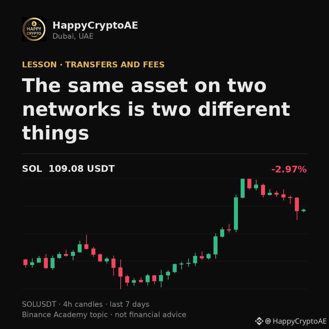
The same asset on two networks is two different thingsA widely used token often exists on several networks at once. The name is identical, the balance is quoted the same way, and the two versions are not interchangeable.
Sending one network's version to an address expecting another's is the classic way funds disappear. The transfer often succeeds - it simply lands somewhere nothing is watching. This is why every deposit screen asks for the network separately from the address, and why that dropdown deserves the same attention as the address itself. Recovery, when possible at all, is slow, manual, and never guaranteed.
Binance Academy covers this in more depth: https://www.binance.com/en/academy/glossary/cross-chain
Trading crypto from Dubai since 2019.
$USDT $ETH $SOL
#Crypto #CryptoEducation #Binance
The same asset on two networks is two different things
A widely used token often exists on several networks at once. The name is identical, the balance is quoted the same way, and the two versions are not interchangeable.
Sending one network's version to an address expecting another's is the classic way funds disappear. The transfer often succeeds - it simply lands somewhere nothing is watching. This is why every deposit screen asks for the network separately from the address, and why that dropdown deserves the same attention as the address itself. Recovery, when possible at all, is slow, manual, and never guaranteed.
Binance Academy covers this in more depth: https://www.binance.com/en/academy/glossary/cross-chain
Trading crypto from Dubai since 2019.
$USDT $ETH $SOL
#Crypto #CryptoEducation #Binance
Sending one network's version to an address expecting another's is the classic way funds disappear. The transfer often succeeds - it simply lands somewhere nothing is watching. This is why every deposit screen asks for the network separately from the address, and why that dropdown deserves the same attention as the address itself. Recovery, when possible at all, is slow, manual, and never guaranteed.
Binance Academy covers this in more depth: https://www.binance.com/en/academy/glossary/cross-chain
Trading crypto from Dubai since 2019.
$USDT $ETH $SOL
#Crypto #CryptoEducation #Binance
73

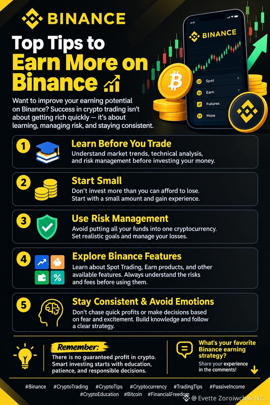
🚀 Top Tips to Earn More on Binance 💰📈
Want to improve your earning potential on Binance? Success in crypto trading isn't about getting rich quickly—it's about learning, managing risk, and staying consistent.
Here are 5 practical tips to grow your crypto journey:
✅ 1. Learn Before You Trade 📚 Understand market trends, technical analysis, and risk management before investing your money.
✅ 2. Start Small 💵 Don't invest more than you can afford to lose. Start with a small amount and gain experience.
✅ 3. Use Risk Management 🛡️ Avoid putting all your funds into one cryptocurrency. Set realistic goals and manage your losses.
✅ 4. Explore Binance Features 🔍 Learn about Spot Trading, Earn products, and other available features. Always understand the risks and fees before using them.
✅ 5. Stay Consistent & Avoid Emotions 🧠 Don't chase quick profits or make decisions based on fear and excitement. Build knowledge and follow a clear strategy.
🔥 Remember: There is no guaranteed profit in crypto. Smart investing starts with education, patience, and responsible decisions.
💬 What's your favorite Binance earning strategy? Share your experience in the comments! 👇
#Binance #CryptoTrading #CryptoTips #Cryptocurrency #TradingTips #PassiveIncome #CryptoEducation #Bitcoin #FinancialFreedom
🚀 Top Tips to Earn More on Binance 💰📈
Want to improve your earning potential on Binance? Success in crypto trading isn't about getting rich quickly—it's about learning, managing risk, and staying consistent.
Here are 5 practical tips to grow your crypto journey:
✅ 1. Learn Before You Trade 📚 Understand market trends, technical analysis, and risk management before investing your money.
✅ 2. Start Small 💵 Don't invest more than you can afford to lose. Start with a small amount and gain experience.
✅ 3. Use Risk Management 🛡️ Avoid putting all your funds into one cryptocurrency. Set realistic goals and manage your losses.
✅ 4. Explore Binance Features 🔍 Learn about Spot Trading, Earn products, and other available features. Always understand the risks and fees before using them.
✅ 5. Stay Consistent & Avoid Emotions 🧠 Don't chase quick profits or make decisions based on fear and excitement. Build knowledge and follow a clear strategy.
🔥 Remember: There is no guaranteed profit in crypto. Smart investing starts with education, patience, and responsible decisions.
💬 What's your favorite Binance earning strategy? Share your experience in the comments! 👇
#Binance #CryptoTrading #CryptoTips #Cryptocurrency #TradingTips #PassiveIncome #CryptoEducation #Bitcoin #FinancialFreedom
Want to improve your earning potential on Binance? Success in crypto trading isn't about getting rich quickly—it's about learning, managing risk, and staying consistent.
Here are 5 practical tips to grow your crypto journey:
✅ 1. Learn Before You Trade 📚 Understand market trends, technical analysis, and risk management before investing your money.
✅ 2. Start Small 💵 Don't invest more than you can afford to lose. Start with a small amount and gain experience.
✅ 3. Use Risk Management 🛡️ Avoid putting all your funds into one cryptocurrency. Set realistic goals and manage your losses.
✅ 4. Explore Binance Features 🔍 Learn about Spot Trading, Earn products, and other available features. Always understand the risks and fees before using them.
✅ 5. Stay Consistent & Avoid Emotions 🧠 Don't chase quick profits or make decisions based on fear and excitement. Build knowledge and follow a clear strategy.
🔥 Remember: There is no guaranteed profit in crypto. Smart investing starts with education, patience, and responsible decisions.
💬 What's your favorite Binance earning strategy? Share your experience in the comments! 👇
#Binance #CryptoTrading #CryptoTips #Cryptocurrency #TradingTips #PassiveIncome #CryptoEducation #Bitcoin #FinancialFreedom
102

·
--
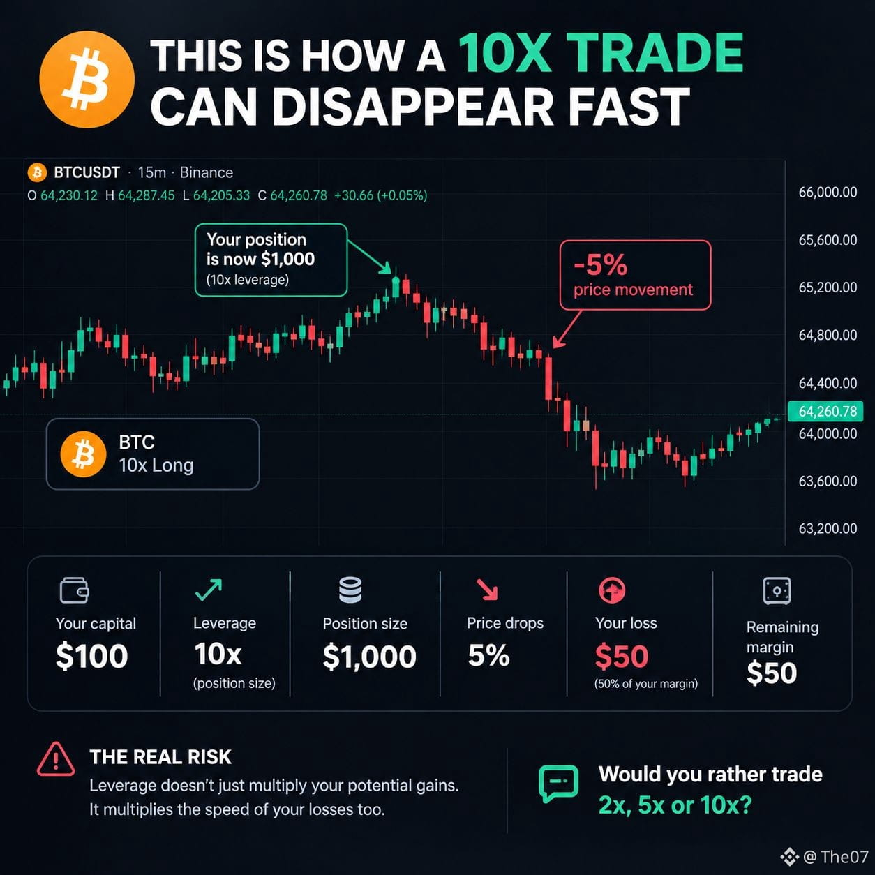
🚨 THIS IS HOW A 10X TRADE CAN DISAPPEAR FAST
You have $100.
You open a 10x long position.
Your position is now $1,000.
Then the coin drops just 5%.
Your loss:
$50
You just lost 50% of your original margin.
And if the price keeps moving against you, liquidation gets closer.
That’s the part many beginners underestimate:
Leverage doesn’t just multiply potential gains.
It multiplies the speed of your losses too.
Would you rather trade 2x, 5x or 10x? 👇
#cryptoeducation #trading #Leverage #crypto #bitcoin $BTC
{spot}(BTCUSDT)
🚨 THIS IS HOW A 10X TRADE CAN DISAPPEAR FAST
You have $100.
You open a 10x long position.
Your position is now $1,000.
Then the coin drops just 5%.
Your loss:
$50
You just lost 50% of your original margin.
And if the price keeps moving against you, liquidation gets closer.
That’s the part many beginners underestimate:
Leverage doesn’t just multiply potential gains.
It multiplies the speed of your losses too.
Would you rather trade 2x, 5x or 10x? 👇
#cryptoeducation #trading #Leverage #crypto #bitcoin $BTC
You have $100.
You open a 10x long position.
Your position is now $1,000.
Then the coin drops just 5%.
Your loss:
$50
You just lost 50% of your original margin.
And if the price keeps moving against you, liquidation gets closer.
That’s the part many beginners underestimate:
Leverage doesn’t just multiply potential gains.
It multiplies the speed of your losses too.
Would you rather trade 2x, 5x or 10x? 👇
#cryptoeducation #trading #Leverage #crypto #bitcoin $BTC
45
·
--
🚨 WHY DO 90% OF TRADERS LOSE MONEY IN $BTC & CRYPTO? 📉
Ever wonder why the market dumps or pumps the exact second after you open a trade or set your stop loss? 🤔
You aren't just unlucky. Whales and market makers track retail liquidity. They know exactly where emotional traders place their stops! 🛑
Here is how you stop falling into their traps:
1️⃣ Stop emotional trading (FOMO & Panic selling).
2️⃣ Never risk more than you can afford to lose on a single $BTC position.
3️⃣ Always have a clear plan before entering the market. 💎
Master your mind, and you master your portfolio!
👇 Be honest: Have you ever had your stop loss hunted right before the market reversed? Let me know in the comments!
❤️ Hit the Like button and Follow for more daily crypto insights!
#BinanceSquare #cryptotrading #tradingpsychology #BTC #CryptoEducation
🚨 WHY DO 90% OF TRADERS LOSE MONEY IN $BTC & CRYPTO? 📉
Ever wonder why the market dumps or pumps the exact second after you open a trade or set your stop loss? 🤔
You aren't just unlucky. Whales and market makers track retail liquidity. They know exactly where emotional traders place their stops! 🛑
Here is how you stop falling into their traps:
1️⃣ Stop emotional trading (FOMO & Panic selling).
2️⃣ Never risk more than you can afford to lose on a single $BTC position.
3️⃣ Always have a clear plan before entering the market. 💎
Master your mind, and you master your portfolio!
👇 Be honest: Have you ever had your stop loss hunted right before the market reversed? Let me know in the comments!
❤️ Hit the Like button and Follow for more daily crypto insights!
#BinanceSquare #cryptotrading #tradingpsychology #BTC #CryptoEducation
Ever wonder why the market dumps or pumps the exact second after you open a trade or set your stop loss? 🤔
You aren't just unlucky. Whales and market makers track retail liquidity. They know exactly where emotional traders place their stops! 🛑
Here is how you stop falling into their traps:
1️⃣ Stop emotional trading (FOMO & Panic selling).
2️⃣ Never risk more than you can afford to lose on a single $BTC position.
3️⃣ Always have a clear plan before entering the market. 💎
Master your mind, and you master your portfolio!
👇 Be honest: Have you ever had your stop loss hunted right before the market reversed? Let me know in the comments!
❤️ Hit the Like button and Follow for more daily crypto insights!
#BinanceSquare #cryptotrading #tradingpsychology #BTC #CryptoEducation
1
30
·
--
🚨 CRITICAL SECURITY ALERT: How to protect your crypto from scammers! 🛡️🔐
In the crypto world, YOU are your own bank. That means security is your #1 priority!
Here are 3 golden rules to keep your funds safe:
1️⃣ Never share your Seed Phrase or Private Keys with anyone—not even "support"! 🛑
2️⃣ Always double-check website URLs before connecting your wallet (Beware of phishing links). 🌐
3️⃣ Enable 2FA (Google Authenticator) on all your exchange accounts right now. 📲
A moment of carelessness can cost you your entire portfolio. Stay safe, stay smart! 💎
👇 What’s the scariest scam attempt you've ever faced? Let me know in the comments!
❤️ Hit the Like button and Follow for more vital security tips!
#BinanceSquare #CryptoSecurity #StaySafe #cryptoeducation #Web3
🚨 CRITICAL SECURITY ALERT: How to protect your crypto from scammers! 🛡️🔐
In the crypto world, YOU are your own bank. That means security is your #1 priority!
Here are 3 golden rules to keep your funds safe:
1️⃣ Never share your Seed Phrase or Private Keys with anyone—not even "support"! 🛑
2️⃣ Always double-check website URLs before connecting your wallet (Beware of phishing links). 🌐
3️⃣ Enable 2FA (Google Authenticator) on all your exchange accounts right now. 📲
A moment of carelessness can cost you your entire portfolio. Stay safe, stay smart! 💎
👇 What’s the scariest scam attempt you've ever faced? Let me know in the comments!
❤️ Hit the Like button and Follow for more vital security tips!
#BinanceSquare #CryptoSecurity #StaySafe #cryptoeducation #Web3
In the crypto world, YOU are your own bank. That means security is your #1 priority!
Here are 3 golden rules to keep your funds safe:
1️⃣ Never share your Seed Phrase or Private Keys with anyone—not even "support"! 🛑
2️⃣ Always double-check website URLs before connecting your wallet (Beware of phishing links). 🌐
3️⃣ Enable 2FA (Google Authenticator) on all your exchange accounts right now. 📲
A moment of carelessness can cost you your entire portfolio. Stay safe, stay smart! 💎
👇 What’s the scariest scam attempt you've ever faced? Let me know in the comments!
❤️ Hit the Like button and Follow for more vital security tips!
#BinanceSquare #CryptoSecurity #StaySafe #cryptoeducation #Web3
1
32
·
--
🧠 THE PSYCHOLOGY OF CRYPTO: Why 95% of People Fail in This Market! 📉📈
Crypto trading isn't just about complex charts or technical indicators. 80% of success in this market is pure Mindset and Emotion Control. 🛑
Have you ever:
1️⃣ Sold your coin in a panic, only for it to pump right after? 🤦♂️
2️⃣ Bought the absolute top because of pure FOMO (Fear Of Missing Out)? 🚀
The market is designed to reward the patient and punish the emotional. If you let fear and greed control your trades, the whales will always take your money.
How to fix this?
* Always have a clear entry and exit plan before clicking buy.
* Stop staring at the 1-minute chart every 5 minutes!
Master your mind, and you master your portfolio. 💎
👇 Be honest: Have you ever panic-sold a coin at a loss? Let me know in the comments!
❤️ If this hits home, hit the Like button and Follow for more crypto insights!
#BinanceSquare #Cryptomindset #tradingpsychology #HODL #CryptoEducation
🧠 THE PSYCHOLOGY OF CRYPTO: Why 95% of People Fail in This Market! 📉📈
Crypto trading isn't just about complex charts or technical indicators. 80% of success in this market is pure Mindset and Emotion Control. 🛑
Have you ever:
1️⃣ Sold your coin in a panic, only for it to pump right after? 🤦♂️
2️⃣ Bought the absolute top because of pure FOMO (Fear Of Missing Out)? 🚀
The market is designed to reward the patient and punish the emotional. If you let fear and greed control your trades, the whales will always take your money.
How to fix this?
* Always have a clear entry and exit plan before clicking buy.
* Stop staring at the 1-minute chart every 5 minutes!
Master your mind, and you master your portfolio. 💎
👇 Be honest: Have you ever panic-sold a coin at a loss? Let me know in the comments!
❤️ If this hits home, hit the Like button and Follow for more crypto insights!
#BinanceSquare #Cryptomindset #tradingpsychology #HODL #CryptoEducation
Crypto trading isn't just about complex charts or technical indicators. 80% of success in this market is pure Mindset and Emotion Control. 🛑
Have you ever:
1️⃣ Sold your coin in a panic, only for it to pump right after? 🤦♂️
2️⃣ Bought the absolute top because of pure FOMO (Fear Of Missing Out)? 🚀
The market is designed to reward the patient and punish the emotional. If you let fear and greed control your trades, the whales will always take your money.
How to fix this?
* Always have a clear entry and exit plan before clicking buy.
* Stop staring at the 1-minute chart every 5 minutes!
Master your mind, and you master your portfolio. 💎
👇 Be honest: Have you ever panic-sold a coin at a loss? Let me know in the comments!
❤️ If this hits home, hit the Like button and Follow for more crypto insights!
#BinanceSquare #Cryptomindset #tradingpsychology #HODL #CryptoEducation
1
45
·
--
Binance Pre-IPO: bringing private-market exposure closer to crypto users.
Binance’s Pre-IPO offering introduces a new way to explore companies before a traditional public listing. But the first rule is simple: understand exactly what you are buying.
Two concepts are important:
• Pre-IPO Perpetual Contracts: Binance Futures products designed to track an expected private-company valuation before an IPO. They are USDT-margined derivatives—not company shares. Traders do not receive ownership, voting rights or dividends.
• On-chain Pre-IPO assets: Binance Web3 Wallet can help users discover selected tokenised private-market exposure through supported third-party infrastructure. Availability, structure and rights depend on the issuer and jurisdiction.
What traders must check:
1. Is the product a perpetual contract, tokenised exposure or a direct share?
2. How is the reference price calculated before the IPO?
3. What happens if the IPO is delayed, repriced or cancelled?
4. What are the funding, leverage, liquidity and liquidation rules?
5. Is the product available in your region?
6. What rights—and what risks—does the token actually represent?
A Pre-IPO product can improve price discovery and broaden access. It does not remove valuation uncertainty, counterparty risk, regulatory risk or market volatility.
Read the contract specifications and issuer terms before trading. Exposure is not ownership.
Educational content only. Not financial advice.
#Binance #PreIPO #CryptoEducation #BinanceAngels
Binance Pre-IPO: bringing private-market exposure closer to crypto users.
Binance’s Pre-IPO offering introduces a new way to explore companies before a traditional public listing. But the first rule is simple: understand exactly what you are buying.
Two concepts are important:
• Pre-IPO Perpetual Contracts: Binance Futures products designed to track an expected private-company valuation before an IPO. They are USDT-margined derivatives—not company shares. Traders do not receive ownership, voting rights or dividends.
• On-chain Pre-IPO assets: Binance Web3 Wallet can help users discover selected tokenised private-market exposure through supported third-party infrastructure. Availability, structure and rights depend on the issuer and jurisdiction.
What traders must check:
1. Is the product a perpetual contract, tokenised exposure or a direct share?
2. How is the reference price calculated before the IPO?
3. What happens if the IPO is delayed, repriced or cancelled?
4. What are the funding, leverage, liquidity and liquidation rules?
5. Is the product available in your region?
6. What rights—and what risks—does the token actually represent?
A Pre-IPO product can improve price discovery and broaden access. It does not remove valuation uncertainty, counterparty risk, regulatory risk or market volatility.
Read the contract specifications and issuer terms before trading. Exposure is not ownership.
Educational content only. Not financial advice.
#Binance #PreIPO #CryptoEducation #BinanceAngels
Binance’s Pre-IPO offering introduces a new way to explore companies before a traditional public listing. But the first rule is simple: understand exactly what you are buying.
Two concepts are important:
• Pre-IPO Perpetual Contracts: Binance Futures products designed to track an expected private-company valuation before an IPO. They are USDT-margined derivatives—not company shares. Traders do not receive ownership, voting rights or dividends.
• On-chain Pre-IPO assets: Binance Web3 Wallet can help users discover selected tokenised private-market exposure through supported third-party infrastructure. Availability, structure and rights depend on the issuer and jurisdiction.
What traders must check:
1. Is the product a perpetual contract, tokenised exposure or a direct share?
2. How is the reference price calculated before the IPO?
3. What happens if the IPO is delayed, repriced or cancelled?
4. What are the funding, leverage, liquidity and liquidation rules?
5. Is the product available in your region?
6. What rights—and what risks—does the token actually represent?
A Pre-IPO product can improve price discovery and broaden access. It does not remove valuation uncertainty, counterparty risk, regulatory risk or market volatility.
Read the contract specifications and issuer terms before trading. Exposure is not ownership.
Educational content only. Not financial advice.
#Binance #PreIPO #CryptoEducation #BinanceAngels
36

·
--
🚀 **A Simple Crypto Tip for Beginners**
If you are new to crypto, don’t rush into buying coins just because they are trending.
Before entering any trade, always check:
🔹 The project and its purpose
🔹 Trading volume and liquidity
🔹 Recent market news
🔹 Your risk level
Crypto markets can move quickly, so always do your own research and never invest more than you can afford to lose.
📌 Follow for simple crypto insights and market updates.
#Crypto #Binance #bitcoin #BTC #Ethereum #ETH #CryptoEducation
🚀 **A Simple Crypto Tip for Beginners**
If you are new to crypto, don’t rush into buying coins just because they are trending.
Before entering any trade, always check:
🔹 The project and its purpose
🔹 Trading volume and liquidity
🔹 Recent market news
🔹 Your risk level
Crypto markets can move quickly, so always do your own research and never invest more than you can afford to lose.
📌 Follow for simple crypto insights and market updates.
#Crypto #Binance #bitcoin #BTC #Ethereum #ETH #CryptoEducation
If you are new to crypto, don’t rush into buying coins just because they are trending.
Before entering any trade, always check:
🔹 The project and its purpose
🔹 Trading volume and liquidity
🔹 Recent market news
🔹 Your risk level
Crypto markets can move quickly, so always do your own research and never invest more than you can afford to lose.
📌 Follow for simple crypto insights and market updates.
#Crypto #Binance #bitcoin #BTC #Ethereum #ETH #CryptoEducation
45
Article
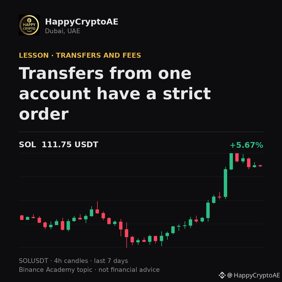
Transfers from one account have a strict orderOn some networks each account numbers its own transactions in sequence. The network processes them in that order and will not skip one.
This produces a confusing symptom worth recognising. If an earlier transaction is stuck, everything you send afterwards waits behind it - not because those later transfers have a problem, but because they cannot be processed out of order. The fix is to resolve the blocked one rather than to keep resending. Knowing this turns "all my transfers are frozen" into "one transfer is frozen", which is a very different problem.
Binance Academy covers this in more depth: https://www.binance.com/en/academy/glossary/nonce
Trading crypto from Dubai since 2019.
$ETH $BNB $SOL
#Crypto #CryptoEducation #Binance
Transfers from one account have a strict order
On some networks each account numbers its own transactions in sequence. The network processes them in that order and will not skip one.
This produces a confusing symptom worth recognising. If an earlier transaction is stuck, everything you send afterwards waits behind it - not because those later transfers have a problem, but because they cannot be processed out of order. The fix is to resolve the blocked one rather than to keep resending. Knowing this turns "all my transfers are frozen" into "one transfer is frozen", which is a very different problem.
Binance Academy covers this in more depth: https://www.binance.com/en/academy/glossary/nonce
Trading crypto from Dubai since 2019.
$ETH $BNB $SOL
#Crypto #CryptoEducation #Binance
This produces a confusing symptom worth recognising. If an earlier transaction is stuck, everything you send afterwards waits behind it - not because those later transfers have a problem, but because they cannot be processed out of order. The fix is to resolve the blocked one rather than to keep resending. Knowing this turns "all my transfers are frozen" into "one transfer is frozen", which is a very different problem.
Binance Academy covers this in more depth: https://www.binance.com/en/academy/glossary/nonce
Trading crypto from Dubai since 2019.
$ETH $BNB $SOL
#Crypto #CryptoEducation #Binance
95
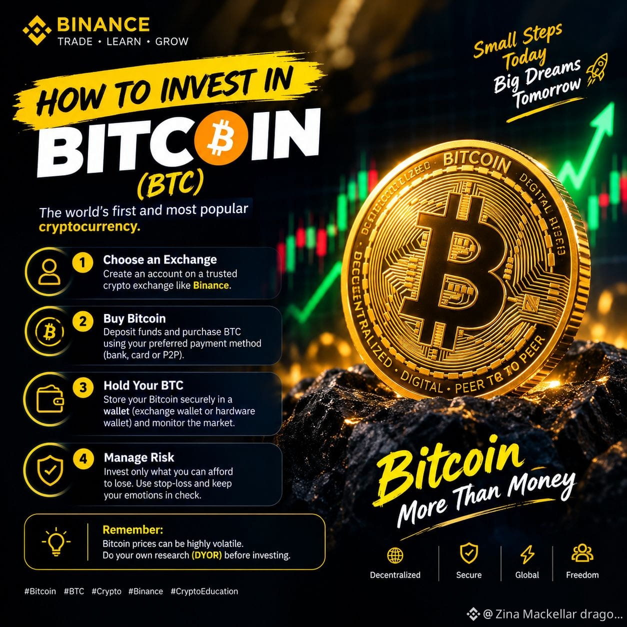
🚀 How to Invest in Bitcoin (BTC)?
Bitcoin is a popular cryptocurrency that you can buy and hold as a long-term investment.
🔹 1. Choose an Exchange: Create an account on a trusted crypto exchange.
🔹 2. Buy Bitcoin: Purchase BTC using your available funds.
🔹 3. Hold Your BTC: Store your Bitcoin securely and monitor the market.
🔹 4. Manage Risk: Invest only what you can afford to lose.
💡 Remember: Bitcoin prices can be highly volatile. Do your own research (DYOR) before investing.
#Bitcoin #BTC #Crypto #Binance #CryptoEducation
Binanc
🚀 How to Invest in Bitcoin (BTC)?
Bitcoin is a popular cryptocurrency that you can buy and hold as a long-term investment.
🔹 1. Choose an Exchange: Create an account on a trusted crypto exchange.
🔹 2. Buy Bitcoin: Purchase BTC using your available funds.
🔹 3. Hold Your BTC: Store your Bitcoin securely and monitor the market.
🔹 4. Manage Risk: Invest only what you can afford to lose.
💡 Remember: Bitcoin prices can be highly volatile. Do your own research (DYOR) before investing.
#Bitcoin #BTC #Crypto #Binance #CryptoEducation
Binanc
Bitcoin is a popular cryptocurrency that you can buy and hold as a long-term investment.
🔹 1. Choose an Exchange: Create an account on a trusted crypto exchange.
🔹 2. Buy Bitcoin: Purchase BTC using your available funds.
🔹 3. Hold Your BTC: Store your Bitcoin securely and monitor the market.
🔹 4. Manage Risk: Invest only what you can afford to lose.
💡 Remember: Bitcoin prices can be highly volatile. Do your own research (DYOR) before investing.
#Bitcoin #BTC #Crypto #Binance #CryptoEducation
Binanc
50
Log in to explore more content
Join global crypto users on Binance Square
⚡️ Get latest and useful information about crypto.
💬 Trusted by the world’s largest crypto exchange.
👍 Discover real insights from verified creators.
Email / Phone number
Trending Topics
1
#SaylorHintsStrategyBitcoinBuy
2.2M views
12,255 Discussing
2
#BOJRaisesRatesTo31YearHigh
234,981 views
3,183 Discussing
3
#BuffettStepsDownAsBerkshireChairman
113,158 views
1,699 Discussing
4
#XRPExchangeReservesHitSevenYearLow
123,960 views
1,476 Discussing
5
#HKCompletesFirstHKDStablecoinUseCase
147,839 views
1,857 Discussing
6
#VietnamPlansFirstCryptoLicensesIn2026
92,561 views
1,262 Discussing
7
#BTCBreaks80K
522,215 views
5,690 Discussing
8
#BitcoinMarketCapTopsTesla
127,241 views
1,411 Discussing
9
#SOLJumpsAbout10%
128,116 views
1,272 Discussing
10
#EthereumReclaims$2600
11,589 views
140 Discussing