
musyuha_HORNET
32 投稿

musyuha_HORNET
報告
ユーザーをブロック
3 フォロー
29 フォロワー
53 いいね
投稿
すべて
引用
翻訳参照
RSI вище 70 часто називають «перекупленістю», а нижче 30 — «перепроданістю». Проблема починається, коли ці орієнтири перетворюють на автоматичні команди.
Сильний тренд може довго утримувати RSI на високих значеннях. Слабкий бізнес може залишатися «перепроданим» і продовжувати падати.
Для bStock я використовував би RSI лише як запитання до графіка:
— рух прискорився чи сповільнився?
— його підтверджує обсяг?
— є фундаментальна новина?
— де рівень, після якого сценарій неправильний?
Індикатор вимірює швидкість і масштаб недавнього руху. Він не знає справедливої вартості компанії й не бачить майбутнього.
Найкорисніший сигнал від RSI — не «купи» або «продай», а «перевір контекст».
RSI вище 70 часто називають «перекупленістю», а нижче 30 — «перепроданістю». Проблема починається, коли ці орієнтири перетворюють на автоматичні команди.
Сильний тренд може довго утримувати RSI на високих значеннях. Слабкий бізнес може залишатися «перепроданим» і продовжувати падати.
Для bStock я використовував би RSI лише як запитання до графіка:
— рух прискорився чи сповільнився?
— його підтверджує обсяг?
— є фундаментальна новина?
— де рівень, після якого сценарій неправильний?
Індикатор вимірює швидкість і масштаб недавнього руху. Він не знає справедливої вартості компанії й не бачить майбутнього.
Найкорисніший сигнал від RSI — не «купи» або «продай», а «перевір контекст».
Сильний тренд може довго утримувати RSI на високих значеннях. Слабкий бізнес може залишатися «перепроданим» і продовжувати падати.
Для bStock я використовував би RSI лише як запитання до графіка:
— рух прискорився чи сповільнився?
— його підтверджує обсяг?
— є фундаментальна новина?
— де рівень, після якого сценарій неправильний?
Індикатор вимірює швидкість і масштаб недавнього руху. Він не знає справедливої вартості компанії й не бачить майбутнього.
Найкорисніший сигнал від RSI — не «купи» або «продай», а «перевір контекст».
95
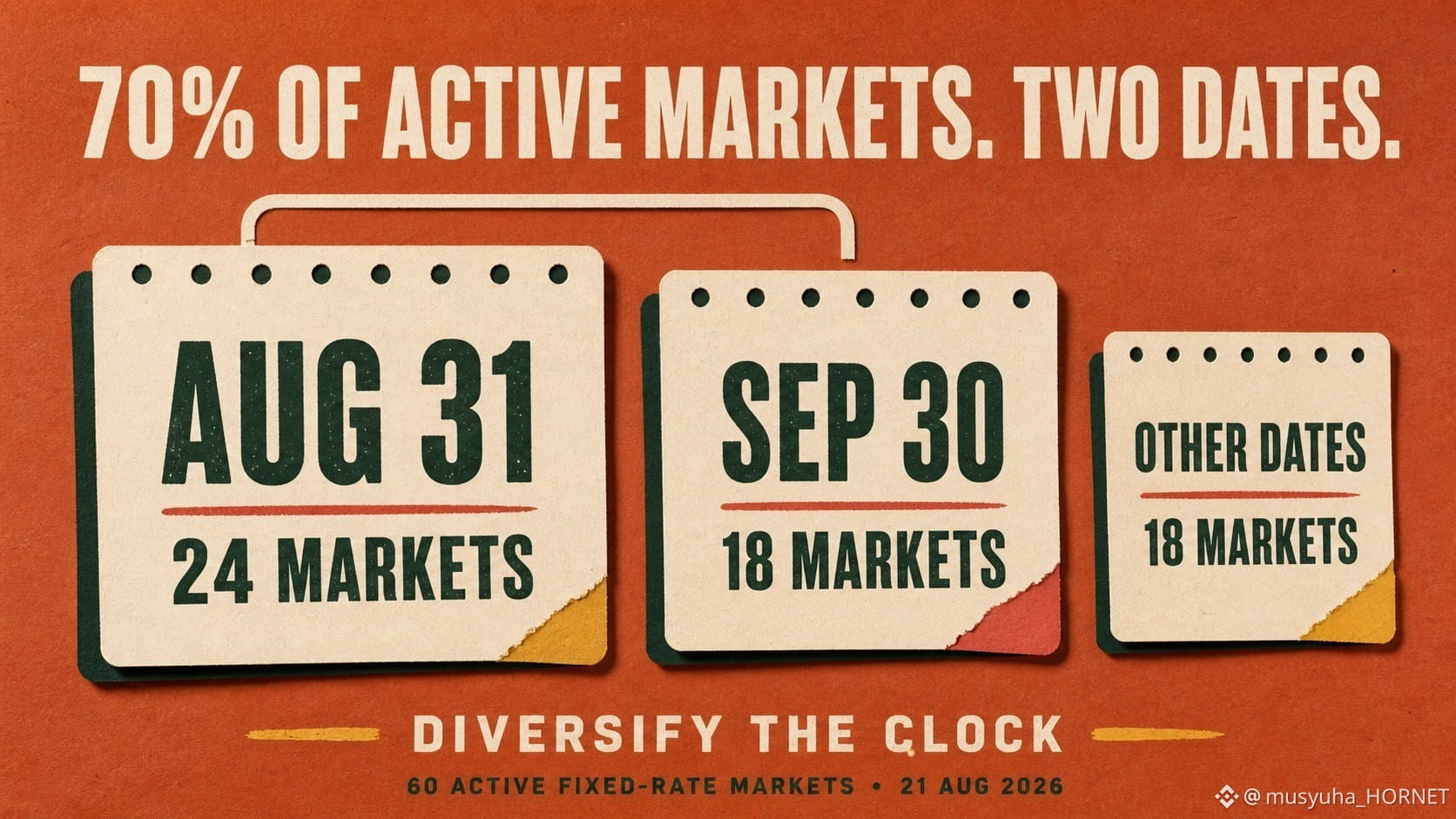
TermMaxのアクティブな固定金利市場の70%は、たった2つの満期日に集中していました。
私は、APRの行を1つずつ比較する代わりに、TermMaxの公開APIにあるアクティブなAlpha以外の固定金利市場をすべて満期日ごとに集計しました。
スナップショット: 2026年8月21日 07:48 UTC
• 8月31日: 24市場
• 9月30日: 18市場
• 8月30日: 6市場
• その他すべての日付: 11日付にまたがる12市場
つまり、60市場のうち42市場—70%—がたった2日付に満期を迎えます。8月30日を含めると80%が3日付に集中します。
しかし、キャパシティマップは別の様相を示していました。
8月31日と9月30日に満期を迎える42市場では、公開されている借入キャパシティの合計がおよそ499万ドルでした。
10月16日に満期を迎えるたった2市場では、およそ669万ドルでした。
市場数が多いことは、必ずしもキャパシティが多いことを意味しません。
これは重要です。というのも、満期は借り手にとっての返済期限であり、貸し手にとっての償還点だからです。ポートフォリオには多くの個別市場を含めつつ、これらのイベントを同じ日付に集中させることがあります。
これは市場ストレスの予測ではありません。カレンダー上の集中度をその時点で測定したものです。
私のチェックリスト:
1. エクスポージャーを資産ごとだけでなく、満期ごとにまとめる。
2. 市場数と見えるキャパシティを比較する。
3. 返済日と償還日の集中を特定する。
4. 実行前にライブクォートを再確認する。
私のルール: 担保だけでなく、時間も分散する。
公開APIのスナップショットです。見えるキャパシティは変動する可能性があり、1つのレートでフルサイズの執行を保証するものではありません。
確認したソース: TermMaxの公開市場API、および公式のMarket and Range Orderドキュメント。
@termmax #TermMax
TermMaxのアクティブな固定金利市場の70%は、たった2つの満期日に集中していました。
私は、APRの行を1つずつ比較する代わりに、TermMaxの公開APIにあるアクティブなAlpha以外の固定金利市場をすべて満期日ごとに集計しました。
スナップショット: 2026年8月21日 07:48 UTC
• 8月31日: 24市場
• 9月30日: 18市場
• 8月30日: 6市場
• その他すべての日付: 11日付にまたがる12市場
つまり、60市場のうち42市場—70%—がたった2日付に満期を迎えます。8月30日を含めると80%が3日付に集中します。
しかし、キャパシティマップは別の様相を示していました。
8月31日と9月30日に満期を迎える42市場では、公開されている借入キャパシティの合計がおよそ499万ドルでした。
10月16日に満期を迎えるたった2市場では、およそ669万ドルでした。
市場数が多いことは、必ずしもキャパシティが多いことを意味しません。
これは重要です。というのも、満期は借り手にとっての返済期限であり、貸し手にとっての償還点だからです。ポートフォリオには多くの個別市場を含めつつ、これらのイベントを同じ日付に集中させることがあります。
これは市場ストレスの予測ではありません。カレンダー上の集中度をその時点で測定したものです。
私のチェックリスト:
1. エクスポージャーを資産ごとだけでなく、満期ごとにまとめる。
2. 市場数と見えるキャパシティを比較する。
3. 返済日と償還日の集中を特定する。
4. 実行前にライブクォートを再確認する。
私のルール: 担保だけでなく、時間も分散する。
公開APIのスナップショットです。見えるキャパシティは変動する可能性があり、1つのレートでフルサイズの執行を保証するものではありません。
確認したソース: TermMaxの公開市場API、および公式のMarket and Range Orderドキュメント。
@TermMax #TermMax
私は、APRの行を1つずつ比較する代わりに、TermMaxの公開APIにあるアクティブなAlpha以外の固定金利市場をすべて満期日ごとに集計しました。
スナップショット: 2026年8月21日 07:48 UTC
• 8月31日: 24市場
• 9月30日: 18市場
• 8月30日: 6市場
• その他すべての日付: 11日付にまたがる12市場
つまり、60市場のうち42市場—70%—がたった2日付に満期を迎えます。8月30日を含めると80%が3日付に集中します。
しかし、キャパシティマップは別の様相を示していました。
8月31日と9月30日に満期を迎える42市場では、公開されている借入キャパシティの合計がおよそ499万ドルでした。
10月16日に満期を迎えるたった2市場では、およそ669万ドルでした。
市場数が多いことは、必ずしもキャパシティが多いことを意味しません。
これは重要です。というのも、満期は借り手にとっての返済期限であり、貸し手にとっての償還点だからです。ポートフォリオには多くの個別市場を含めつつ、これらのイベントを同じ日付に集中させることがあります。
これは市場ストレスの予測ではありません。カレンダー上の集中度をその時点で測定したものです。
私のチェックリスト:
1. エクスポージャーを資産ごとだけでなく、満期ごとにまとめる。
2. 市場数と見えるキャパシティを比較する。
3. 返済日と償還日の集中を特定する。
4. 実行前にライブクォートを再確認する。
私のルール: 担保だけでなく、時間も分散する。
公開APIのスナップショットです。見えるキャパシティは変動する可能性があり、1つのレートでフルサイズの執行を保証するものではありません。
確認したソース: TermMaxの公開市場API、および公式のMarket and Range Orderドキュメント。
@TermMax #TermMax
82
翻訳参照
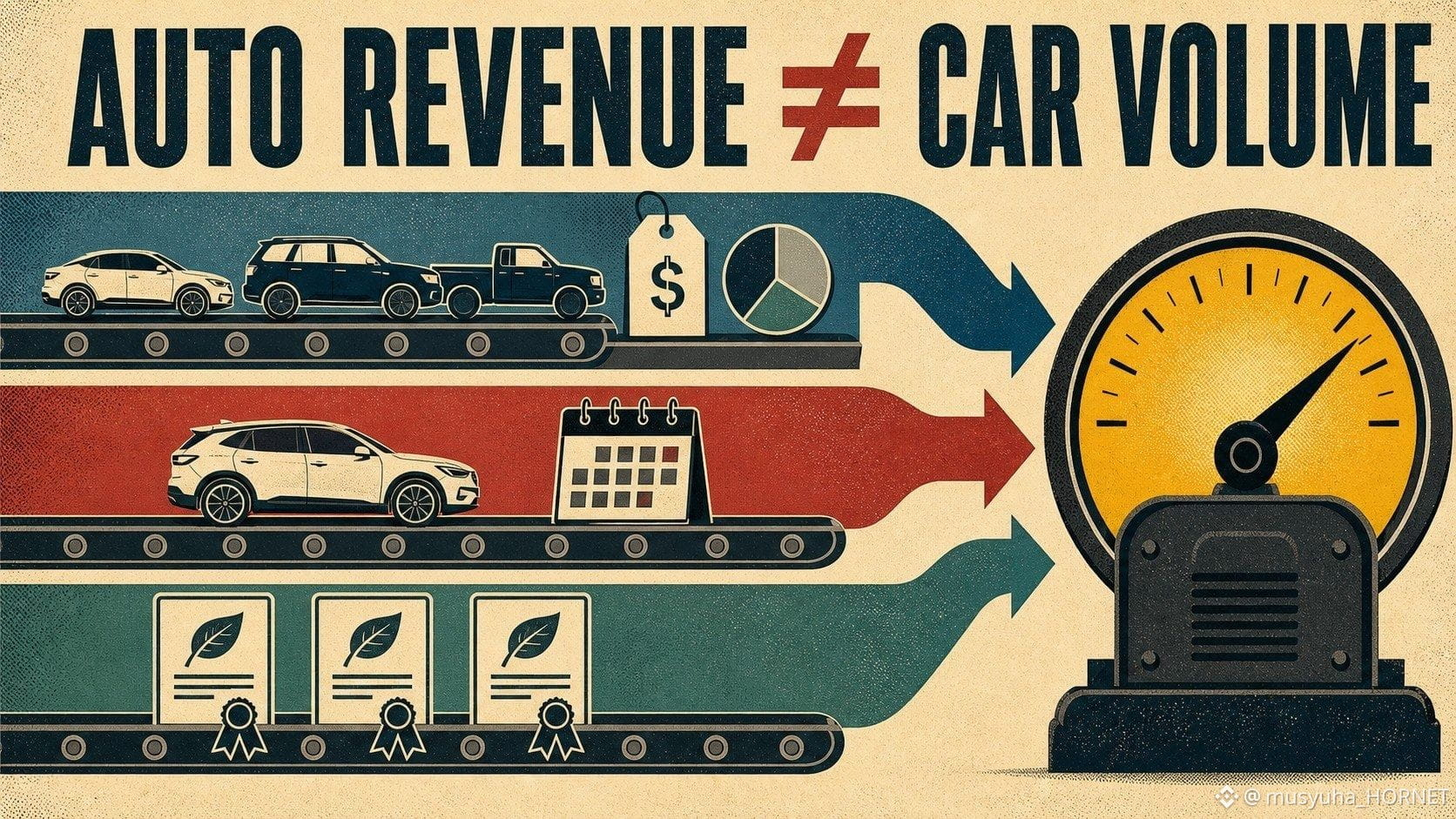
A change in automotive revenue does not always describe a change in vehicle volume.
Tesla’s automotive segment includes more than vehicle sales. It also contains automotive leasing and revenue from tradable regulatory credits. Those credits are sold to other regulated entities and can move with regulation, compliance demand and contract timing—not with Tesla deliveries alone.
So my $TSLAB bridge is:
vehicle deliveries × price and mix
+ automotive leasing
+ regulatory credits
= total automotive revenue
If total automotive revenue improves, I first ask which line created the change. Credit revenue can support reported results without requiring an additional car to be delivered. Conversely, deliveries can rise while price reductions or mix limit vehicle-sales revenue.
My checklist is simple:
1. deliveries;
2. automotive revenue excluding regulatory credits;
3. regulatory-credit revenue;
4. leasing contribution;
5. average-price and model-mix commentary.
This does not make credit revenue less real. It makes its driver different. A clean thesis should separate regulatory economics from customer vehicle economics.
Source checked: Tesla 2025 Form 10-K.
@BinanceCIS #bStocksCIS
A change in automotive revenue does not always describe a change in vehicle volume.
Tesla’s automotive segment includes more than vehicle sales. It also contains automotive leasing and revenue from tradable regulatory credits. Those credits are sold to other regulated entities and can move with regulation, compliance demand and contract timing—not with Tesla deliveries alone.
So my $TSLAB bridge is:
vehicle deliveries × price and mix
+ automotive leasing
+ regulatory credits
= total automotive revenue
If total automotive revenue improves, I first ask which line created the change. Credit revenue can support reported results without requiring an additional car to be delivered. Conversely, deliveries can rise while price reductions or mix limit vehicle-sales revenue.
My checklist is simple:
1. deliveries;
2. automotive revenue excluding regulatory credits;
3. regulatory-credit revenue;
4. leasing contribution;
5. average-price and model-mix commentary.
This does not make credit revenue less real. It makes its driver different. A clean thesis should separate regulatory economics from customer vehicle economics.
Source checked: Tesla 2025 Form 10-K.
@BinanceCIS #bStocksCIS
Tesla’s automotive segment includes more than vehicle sales. It also contains automotive leasing and revenue from tradable regulatory credits. Those credits are sold to other regulated entities and can move with regulation, compliance demand and contract timing—not with Tesla deliveries alone.
So my $TSLAB bridge is:
vehicle deliveries × price and mix
+ automotive leasing
+ regulatory credits
= total automotive revenue
If total automotive revenue improves, I first ask which line created the change. Credit revenue can support reported results without requiring an additional car to be delivered. Conversely, deliveries can rise while price reductions or mix limit vehicle-sales revenue.
My checklist is simple:
1. deliveries;
2. automotive revenue excluding regulatory credits;
3. regulatory-credit revenue;
4. leasing contribution;
5. average-price and model-mix commentary.
This does not make credit revenue less real. It makes its driver different. A clean thesis should separate regulatory economics from customer vehicle economics.
Source checked: Tesla 2025 Form 10-K.
@BinanceCIS #bStocksCIS
2
2
69
翻訳参照
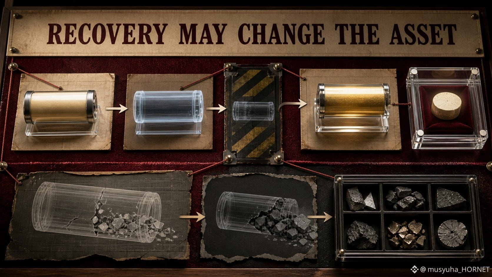
Receiving collateral is not the same as receiving the debt asset you originally expected.
TermMax describes a physical-delivery mechanism for cases where liquidation does not fully recover the debt token. FT holders can receive a proportional share of delivered collateral rather than being left only with an unrecovered claim.
That mechanism can improve recovery, but it changes the asset-level risk.
A lender who expected USDC may finish with part of the collateral instead. The value then depends on the collateral price, liquidity and the cost of converting it. For a vault, delivered collateral can also affect withdrawal timing if there is not enough idle liquidity.
I would therefore audit a fixed-rate position in two layers:
1. Payment layer: face value and maturity.
2. Recovery layer: collateral type, LLTV, oracle, liquidation liquidity and delivery rules.
The deeper lesson is that “fixed” describes the contractual rate, not the exact asset composition under every stress scenario.
Sources checked: TermMax Docs — Protocol FAQ; Risks.
@termmax #TermMax
Receiving collateral is not the same as receiving the debt asset you originally expected.
TermMax describes a physical-delivery mechanism for cases where liquidation does not fully recover the debt token. FT holders can receive a proportional share of delivered collateral rather than being left only with an unrecovered claim.
That mechanism can improve recovery, but it changes the asset-level risk.
A lender who expected USDC may finish with part of the collateral instead. The value then depends on the collateral price, liquidity and the cost of converting it. For a vault, delivered collateral can also affect withdrawal timing if there is not enough idle liquidity.
I would therefore audit a fixed-rate position in two layers:
1. Payment layer: face value and maturity.
2. Recovery layer: collateral type, LLTV, oracle, liquidation liquidity and delivery rules.
The deeper lesson is that “fixed” describes the contractual rate, not the exact asset composition under every stress scenario.
Sources checked: TermMax Docs — Protocol FAQ; Risks.
@TermMax #TermMax
TermMax describes a physical-delivery mechanism for cases where liquidation does not fully recover the debt token. FT holders can receive a proportional share of delivered collateral rather than being left only with an unrecovered claim.
That mechanism can improve recovery, but it changes the asset-level risk.
A lender who expected USDC may finish with part of the collateral instead. The value then depends on the collateral price, liquidity and the cost of converting it. For a vault, delivered collateral can also affect withdrawal timing if there is not enough idle liquidity.
I would therefore audit a fixed-rate position in two layers:
1. Payment layer: face value and maturity.
2. Recovery layer: collateral type, LLTV, oracle, liquidation liquidity and delivery rules.
The deeper lesson is that “fixed” describes the contractual rate, not the exact asset composition under every stress scenario.
Sources checked: TermMax Docs — Protocol FAQ; Risks.
@TermMax #TermMax
80
翻訳参照
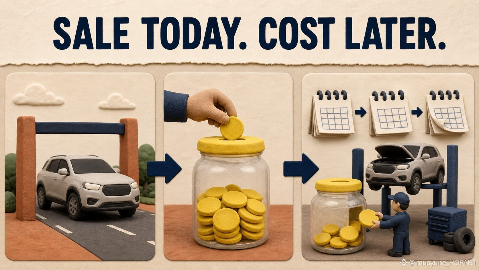
A vehicle sale can create revenue today and an estimated cost that may be paid years later.
At delivery, a manufacturer records a warranty reserve based on expected future repairs. Actual claims later reduce that reserve. Changes in claim frequency, repair cost, product reliability or coverage can require additional adjustments.
Tesla states that its warranties can range from one to twenty-five years depending on the product and component. That makes the estimate especially interesting for $TSLAB: automotive, battery, energy-storage and solar products do not share one identical claim pattern.
The roll-forward I want is:
opening reserve + new accruals + estimate changes − claims paid = closing reserve
Then I compare it with deliveries, product mix and the age of the installed base.
A rising reserve is not automatically evidence of worse quality; it can rise because more products were sold. A falling reserve is not automatically reassuring; the mix or assumptions may have changed.
The useful signal comes from reserve growth relative to activity and from management’s explanation of assumption changes.
Source checked: Tesla 2025 Form 10-K.
@BinanceCIS #bStocksCIS
A vehicle sale can create revenue today and an estimated cost that may be paid years later.
At delivery, a manufacturer records a warranty reserve based on expected future repairs. Actual claims later reduce that reserve. Changes in claim frequency, repair cost, product reliability or coverage can require additional adjustments.
Tesla states that its warranties can range from one to twenty-five years depending on the product and component. That makes the estimate especially interesting for $TSLAB: automotive, battery, energy-storage and solar products do not share one identical claim pattern.
The roll-forward I want is:
opening reserve + new accruals + estimate changes − claims paid = closing reserve
Then I compare it with deliveries, product mix and the age of the installed base.
A rising reserve is not automatically evidence of worse quality; it can rise because more products were sold. A falling reserve is not automatically reassuring; the mix or assumptions may have changed.
The useful signal comes from reserve growth relative to activity and from management’s explanation of assumption changes.
Source checked: Tesla 2025 Form 10-K.
@BinanceCIS #bStocksCIS
At delivery, a manufacturer records a warranty reserve based on expected future repairs. Actual claims later reduce that reserve. Changes in claim frequency, repair cost, product reliability or coverage can require additional adjustments.
Tesla states that its warranties can range from one to twenty-five years depending on the product and component. That makes the estimate especially interesting for $TSLAB: automotive, battery, energy-storage and solar products do not share one identical claim pattern.
The roll-forward I want is:
opening reserve + new accruals + estimate changes − claims paid = closing reserve
Then I compare it with deliveries, product mix and the age of the installed base.
A rising reserve is not automatically evidence of worse quality; it can rise because more products were sold. A falling reserve is not automatically reassuring; the mix or assumptions may have changed.
The useful signal comes from reserve growth relative to activity and from management’s explanation of assumption changes.
Source checked: Tesla 2025 Form 10-K.
@BinanceCIS #bStocksCIS
70
翻訳参照
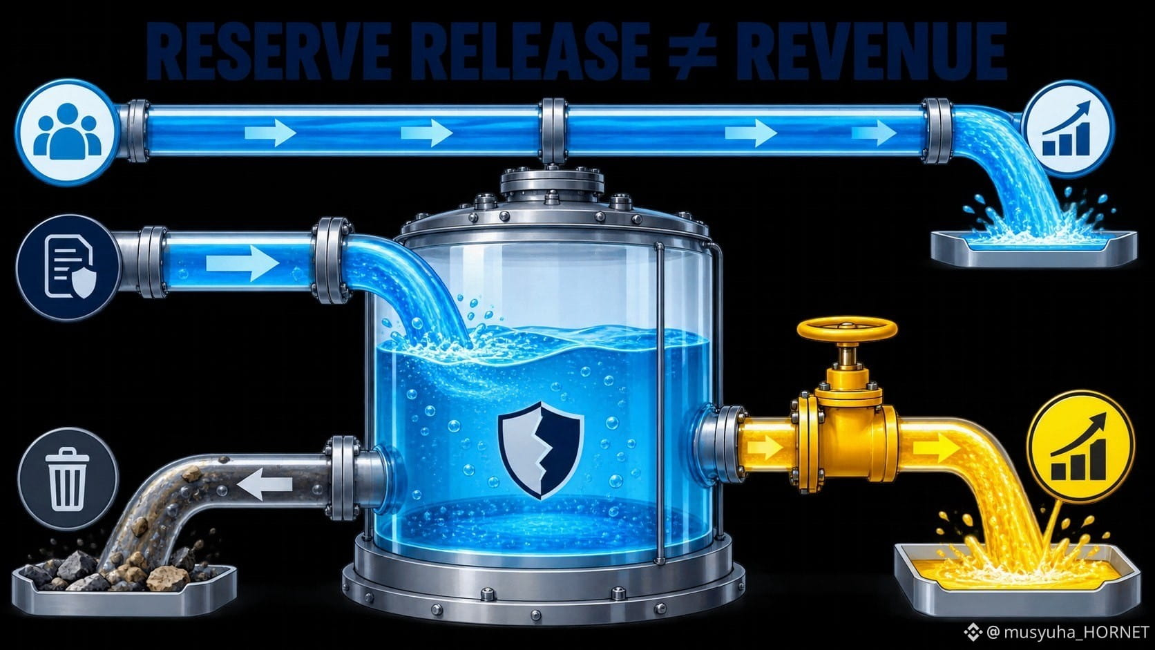
A bank can report a credit provision benefit without earning new customer revenue.
The allowance for credit losses is an estimate of expected losses. The provision adjusts that allowance through the income statement. Net charge-offs use the allowance when specific losses are recognized. If expected losses fall—or a portfolio is sold or reclassified—part of a previous reserve can be released, creating a benefit.
For $GSB, the useful roll-forward is:
opening allowance + provision − net charge-offs ± portfolio changes = closing allowance
This is why a negative provision can lift earnings while loan revenue is unchanged. It may reflect genuinely better credit expectations, but it can also come from a portfolio transaction or a change in assumptions.
My five checks are:
1. loan balances and mix;
2. allowance coverage;
3. provision expense or benefit;
4. charge-offs and recoveries;
5. portfolio sales, transfers or model changes.
The release is not fake. It reverses an estimate that affected prior earnings. But it should not be confused with recurring operating revenue.
@BinanceCIS #bStocksCIS
A bank can report a credit provision benefit without earning new customer revenue.
The allowance for credit losses is an estimate of expected losses. The provision adjusts that allowance through the income statement. Net charge-offs use the allowance when specific losses are recognized. If expected losses fall—or a portfolio is sold or reclassified—part of a previous reserve can be released, creating a benefit.
For $GSB, the useful roll-forward is:
opening allowance + provision − net charge-offs ± portfolio changes = closing allowance
This is why a negative provision can lift earnings while loan revenue is unchanged. It may reflect genuinely better credit expectations, but it can also come from a portfolio transaction or a change in assumptions.
My five checks are:
1. loan balances and mix;
2. allowance coverage;
3. provision expense or benefit;
4. charge-offs and recoveries;
5. portfolio sales, transfers or model changes.
The release is not fake. It reverses an estimate that affected prior earnings. But it should not be confused with recurring operating revenue.
@BinanceCIS #bStocksCIS
The allowance for credit losses is an estimate of expected losses. The provision adjusts that allowance through the income statement. Net charge-offs use the allowance when specific losses are recognized. If expected losses fall—or a portfolio is sold or reclassified—part of a previous reserve can be released, creating a benefit.
For $GSB, the useful roll-forward is:
opening allowance + provision − net charge-offs ± portfolio changes = closing allowance
This is why a negative provision can lift earnings while loan revenue is unchanged. It may reflect genuinely better credit expectations, but it can also come from a portfolio transaction or a change in assumptions.
My five checks are:
1. loan balances and mix;
2. allowance coverage;
3. provision expense or benefit;
4. charge-offs and recoveries;
5. portfolio sales, transfers or model changes.
The release is not fake. It reverses an estimate that affected prior earnings. But it should not be confused with recurring operating revenue.
@BinanceCIS #bStocksCIS
1
1
90
翻訳参照
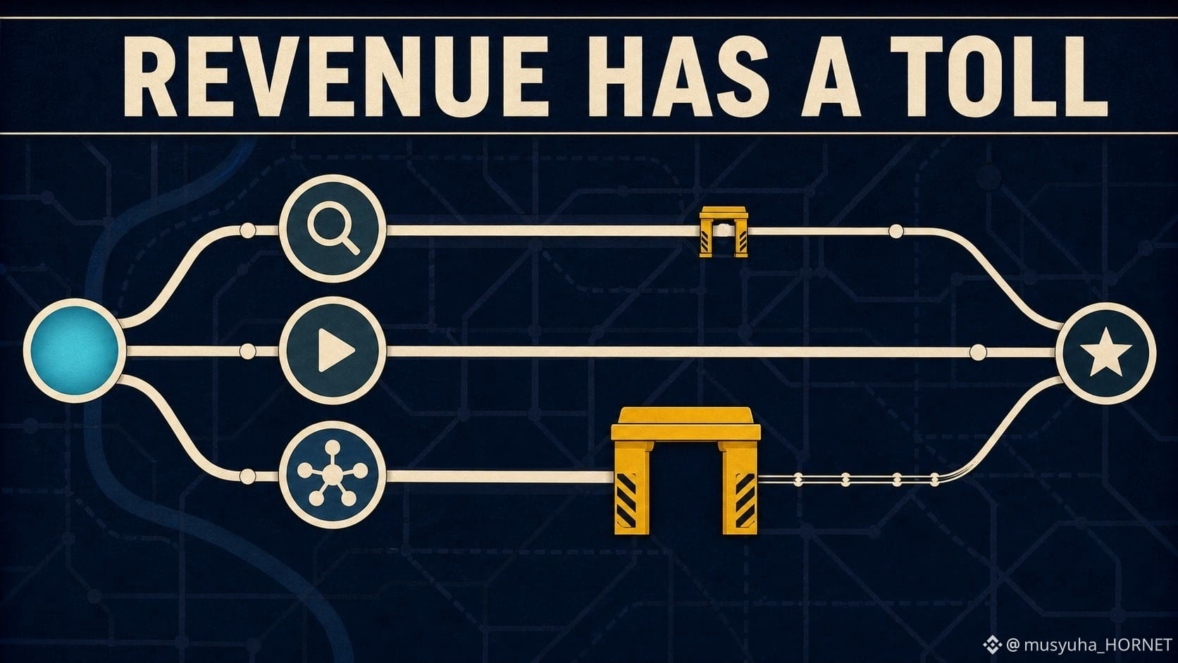
Two advertising dollars can produce different retained economics.
For $GOOGLB, the missing bridge is traffic acquisition costs, or TAC. Alphabet pays distribution partners and Google Network partners under revenue-sharing arrangements. The company notes that the TAC rate on Network advertising revenue is significantly higher than the rate on Search & other revenue.
So the useful map is not simply “more ad revenue = more profit.” It is:
advertiser spend → reported ad revenue → TAC → infrastructure, content and operating costs → contribution
This makes mix important. Growth coming through owned-and-operated search can have a different cost path from growth that relies more heavily on partner properties. Neither route is automatically better; they solve different distribution problems.
When I read Alphabet’s advertising results, I separate:
1. Search & other revenue;
2. YouTube advertising;
3. Google Network revenue;
4. TAC in dollars and as a share of related revenue.
The headline is the gross inflow. The distribution toll explains how much of that inflow stays inside the system before other costs.
@BinanceCIS #bStocksCIS
Two advertising dollars can produce different retained economics.
For $GOOGLB, the missing bridge is traffic acquisition costs, or TAC. Alphabet pays distribution partners and Google Network partners under revenue-sharing arrangements. The company notes that the TAC rate on Network advertising revenue is significantly higher than the rate on Search & other revenue.
So the useful map is not simply “more ad revenue = more profit.” It is:
advertiser spend → reported ad revenue → TAC → infrastructure, content and operating costs → contribution
This makes mix important. Growth coming through owned-and-operated search can have a different cost path from growth that relies more heavily on partner properties. Neither route is automatically better; they solve different distribution problems.
When I read Alphabet’s advertising results, I separate:
1. Search & other revenue;
2. YouTube advertising;
3. Google Network revenue;
4. TAC in dollars and as a share of related revenue.
The headline is the gross inflow. The distribution toll explains how much of that inflow stays inside the system before other costs.
@BinanceCIS #bStocksCIS
For $GOOGLB, the missing bridge is traffic acquisition costs, or TAC. Alphabet pays distribution partners and Google Network partners under revenue-sharing arrangements. The company notes that the TAC rate on Network advertising revenue is significantly higher than the rate on Search & other revenue.
So the useful map is not simply “more ad revenue = more profit.” It is:
advertiser spend → reported ad revenue → TAC → infrastructure, content and operating costs → contribution
This makes mix important. Growth coming through owned-and-operated search can have a different cost path from growth that relies more heavily on partner properties. Neither route is automatically better; they solve different distribution problems.
When I read Alphabet’s advertising results, I separate:
1. Search & other revenue;
2. YouTube advertising;
3. Google Network revenue;
4. TAC in dollars and as a share of related revenue.
The headline is the gross inflow. The distribution toll explains how much of that inflow stays inside the system before other costs.
@BinanceCIS #bStocksCIS
3
3
86
翻訳参照
A payment platform can process more money and still keep less economics from each dollar.
For $PYPLB, Total Payment Volume is a flow metric, not revenue and not profit. A simplified bridge is:
TPV → transaction revenue → transaction costs and losses → transaction margin dollars
The route matters. Branded checkout, peer-to-peer activity and large enterprise processing do not necessarily carry the same pricing or cost structure. Product mix and foreign exchange can make transaction revenue grow at a different rate from TPV. Protection programs, funding costs and transaction-loss rates then affect what remains.
That is why “TPV up” is not a complete thesis. I would check four lines together:
1. TPV growth;
2. transaction revenue growth;
3. transaction margin dollars;
4. transaction and credit loss rates.
I would not reduce the analysis to one take-rate number either. A lower rate can reflect weak pricing—or a deliberate shift toward very large, lower-yield volume. The mix tells us which explanation is more plausible.
Sources checked: PayPal 2025 Form 10-K and annual report.
@BinanceCIS #bStocksCIS
A payment platform can process more money and still keep less economics from each dollar.
For $PYPLB, Total Payment Volume is a flow metric, not revenue and not profit. A simplified bridge is:
TPV → transaction revenue → transaction costs and losses → transaction margin dollars
The route matters. Branded checkout, peer-to-peer activity and large enterprise processing do not necessarily carry the same pricing or cost structure. Product mix and foreign exchange can make transaction revenue grow at a different rate from TPV. Protection programs, funding costs and transaction-loss rates then affect what remains.
That is why “TPV up” is not a complete thesis. I would check four lines together:
1. TPV growth;
2. transaction revenue growth;
3. transaction margin dollars;
4. transaction and credit loss rates.
I would not reduce the analysis to one take-rate number either. A lower rate can reflect weak pricing—or a deliberate shift toward very large, lower-yield volume. The mix tells us which explanation is more plausible.
Sources checked: PayPal 2025 Form 10-K and annual report.
@BinanceCIS #bStocksCIS
For $PYPLB, Total Payment Volume is a flow metric, not revenue and not profit. A simplified bridge is:
TPV → transaction revenue → transaction costs and losses → transaction margin dollars
The route matters. Branded checkout, peer-to-peer activity and large enterprise processing do not necessarily carry the same pricing or cost structure. Product mix and foreign exchange can make transaction revenue grow at a different rate from TPV. Protection programs, funding costs and transaction-loss rates then affect what remains.
That is why “TPV up” is not a complete thesis. I would check four lines together:
1. TPV growth;
2. transaction revenue growth;
3. transaction margin dollars;
4. transaction and credit loss rates.
I would not reduce the analysis to one take-rate number either. A lower rate can reflect weak pricing—or a deliberate shift toward very large, lower-yield volume. The mix tells us which explanation is more plausible.
Sources checked: PayPal 2025 Form 10-K and annual report.
@BinanceCIS #bStocksCIS

75
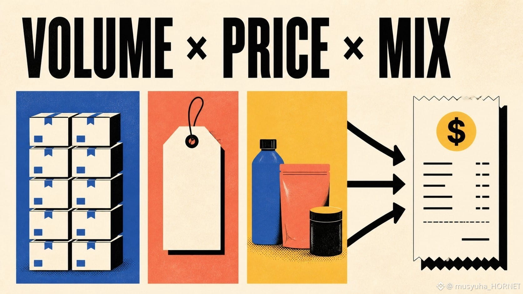
"“収益は伸びた”は、まだ3つの問いを隠している答えです。
使える一次モデルは次のとおりです:
収益 ≈ 販売数量 × 価格 × ミックス
$TSLABでは、自動車の収益は納車台数、平均販売価格、そしてモデル・市場・リースのミックスによって動き得ます。$AAPLBでは、会社が事業全体について単一の簡単なユニット数を公表していない場合でも、製品カテゴリー間のミックスやサービスが売上高のトップラインを組み替えることができます。為替は4つ目の換算効果も加え得ます。
だからこそ、同じ収益成長率でも、描く運営の物語はまったく異なり得ます。より多くの台数をより低い価格で売ることは規模拡大に役立つ一方で、利益率を圧迫します。横ばいの数量でも、ミックスが良ければ、より広範な需要がなくても収益と利益率が押し上げられることがあります。為替の追い風は、現地通貨ベースの需要を変えずに、報告ベースの成長を改善させることもあります。
私の4つのチェックは、(1)数量の代理指標、(2)価格またはミックスに関するコメント、(3)為替効果、(4)粗利益率の確認、です。
開示が不完全なときに、厳密な数式を無理に当てはめることが目的ではありません。収益の行を1つの不可分なシグナルとして扱うのをやめることが目的です。
@BinanceCIS #bStocksCIS
"“収益は伸びた”は、まだ3つの問いを隠している答えです。
使える一次モデルは次のとおりです:
収益 ≈ 販売数量 × 価格 × ミックス
$TSLABでは、自動車の収益は納車台数、平均販売価格、そしてモデル・市場・リースのミックスによって動き得ます。$AAPLBでは、会社が事業全体について単一の簡単なユニット数を公表していない場合でも、製品カテゴリー間のミックスやサービスが売上高のトップラインを組み替えることができます。為替は4つ目の換算効果も加え得ます。
だからこそ、同じ収益成長率でも、描く運営の物語はまったく異なり得ます。より多くの台数をより低い価格で売ることは規模拡大に役立つ一方で、利益率を圧迫します。横ばいの数量でも、ミックスが良ければ、より広範な需要がなくても収益と利益率が押し上げられることがあります。為替の追い風は、現地通貨ベースの需要を変えずに、報告ベースの成長を改善させることもあります。
私の4つのチェックは、(1)数量の代理指標、(2)価格またはミックスに関するコメント、(3)為替効果、(4)粗利益率の確認、です。
開示が不完全なときに、厳密な数式を無理に当てはめることが目的ではありません。収益の行を1つの不可分なシグナルとして扱うのをやめることが目的です。
@BinanceCIS #bStocksCIS
使える一次モデルは次のとおりです:
収益 ≈ 販売数量 × 価格 × ミックス
$TSLABでは、自動車の収益は納車台数、平均販売価格、そしてモデル・市場・リースのミックスによって動き得ます。$AAPLBでは、会社が事業全体について単一の簡単なユニット数を公表していない場合でも、製品カテゴリー間のミックスやサービスが売上高のトップラインを組み替えることができます。為替は4つ目の換算効果も加え得ます。
だからこそ、同じ収益成長率でも、描く運営の物語はまったく異なり得ます。より多くの台数をより低い価格で売ることは規模拡大に役立つ一方で、利益率を圧迫します。横ばいの数量でも、ミックスが良ければ、より広範な需要がなくても収益と利益率が押し上げられることがあります。為替の追い風は、現地通貨ベースの需要を変えずに、報告ベースの成長を改善させることもあります。
私の4つのチェックは、(1)数量の代理指標、(2)価格またはミックスに関するコメント、(3)為替効果、(4)粗利益率の確認、です。
開示が不完全なときに、厳密な数式を無理に当てはめることが目的ではありません。収益の行を1つの不可分なシグナルとして扱うのをやめることが目的です。
@BinanceCIS #bStocksCIS
1
106
翻訳参照
A bStock post becomes stronger when every claim has the right type of source.
My evidence ladder has three steps:
1. Binance product source — confirms the pair, product mechanics and eligibility context.
2. Company filing — explains what the underlying business actually sells and how it reports revenue.
3. Current market evidence — a real Binance pair screenshot, order-book view or trading widget captured at the stated time.
Each source answers a different question.
Binance cannot replace the company’s annual report for business fundamentals. A company filing cannot confirm that a regional Binance pair is currently available. A screenshot cannot explain either one without context.
For my next bStocks post, I would not start with the conclusion. I would first collect one item from every level of the ladder.
Three documents are usually enough to turn a generic opinion into a verifiable educational post.
What is missing most often: product source, company source or timestamped market proof?
@BinanceCIS #bStocksCIS
A bStock post becomes stronger when every claim has the right type of source.
My evidence ladder has three steps:
1. Binance product source — confirms the pair, product mechanics and eligibility context.
2. Company filing — explains what the underlying business actually sells and how it reports revenue.
3. Current market evidence — a real Binance pair screenshot, order-book view or trading widget captured at the stated time.
Each source answers a different question.
Binance cannot replace the company’s annual report for business fundamentals. A company filing cannot confirm that a regional Binance pair is currently available. A screenshot cannot explain either one without context.
For my next bStocks post, I would not start with the conclusion. I would first collect one item from every level of the ladder.
Three documents are usually enough to turn a generic opinion into a verifiable educational post.
What is missing most often: product source, company source or timestamped market proof?
@BinanceCIS #bStocksCIS
My evidence ladder has three steps:
1. Binance product source — confirms the pair, product mechanics and eligibility context.
2. Company filing — explains what the underlying business actually sells and how it reports revenue.
3. Current market evidence — a real Binance pair screenshot, order-book view or trading widget captured at the stated time.
Each source answers a different question.
Binance cannot replace the company’s annual report for business fundamentals. A company filing cannot confirm that a regional Binance pair is currently available. A screenshot cannot explain either one without context.
For my next bStocks post, I would not start with the conclusion. I would first collect one item from every level of the ladder.
Three documents are usually enough to turn a generic opinion into a verifiable educational post.
What is missing most often: product source, company source or timestamped market proof?
@BinanceCIS #bStocksCIS

2
3
65
翻訳参照
A price alert tells me that something moved. An event map helps me ask why.
For bStocks, I would build alerts around the business driver:
$AMATB → semiconductor-capex updates and customer spending.
$METAB → advertising demand, engagement and investment spending.
$GSB → deal activity, underwriting, trading flows and asset management.
$CRCLB → USDC circulation, reserve returns and distribution economics.
Four tickers, four different evidence calendars.
The mistake is using the same checklist for every company because all four trade in the same Binance interface.
My workflow:
1. Write the driver.
2. Name the primary source.
3. Add the next reporting date.
4. Only then set the price alert.
This turns a watchlist from a collection of symbols into a research system.
The interface is shared. The evidence schedule is not.
@BinanceCIS #bStocksCIS
A price alert tells me that something moved. An event map helps me ask why.
For bStocks, I would build alerts around the business driver:
$AMATB → semiconductor-capex updates and customer spending.
$METAB → advertising demand, engagement and investment spending.
$GSB → deal activity, underwriting, trading flows and asset management.
$CRCLB → USDC circulation, reserve returns and distribution economics.
Four tickers, four different evidence calendars.
The mistake is using the same checklist for every company because all four trade in the same Binance interface.
My workflow:
1. Write the driver.
2. Name the primary source.
3. Add the next reporting date.
4. Only then set the price alert.
This turns a watchlist from a collection of symbols into a research system.
The interface is shared. The evidence schedule is not.
@BinanceCIS #bStocksCIS
For bStocks, I would build alerts around the business driver:
$AMATB → semiconductor-capex updates and customer spending.
$METAB → advertising demand, engagement and investment spending.
$GSB → deal activity, underwriting, trading flows and asset management.
$CRCLB → USDC circulation, reserve returns and distribution economics.
Four tickers, four different evidence calendars.
The mistake is using the same checklist for every company because all four trade in the same Binance interface.
My workflow:
1. Write the driver.
2. Name the primary source.
3. Add the next reporting date.
4. Only then set the price alert.
This turns a watchlist from a collection of symbols into a research system.
The interface is shared. The evidence schedule is not.
@BinanceCIS #bStocksCIS

1
3
103
ウォッチリスト上の8つのbStocksは、自動的に8つの独立したアイデアを生み出すわけではありません。
私はまず経済ドライバーでウォッチリストを並べ替え、その後にセクターで並べ替えます。
例:
AIインフラ:$NVDAB, $AMATB, $MUB, $DELLB.
デジタル広告:$METAB, $GOOGLB.
暗号資産の動きとステーブルコイン:$COINB, $CRCLB.
広範な指数へのエクスポージャー:$SPYB, $QQQB.
カテゴリは重複し得ます。NVIDIAはすでに、指数ETFの両方の中に入っている可能性があります。Alphabetは広告とクラウドを組み合わせています。CoinbaseとCircleはUSDCを通じてつながっています。
まさにここがポイントです。マップはティッカー数の裏に隠さず、共通のドライバーを明らかにすべきなのです。
私のルールは、ポジションごとに1文です:
「このbStockは___のためにここにあります。」
2つの答えが同一の場合は、重複が意図されたものかどうかを確認します。
分散とは、ポートフォリオの行数のことではありません。真に異なるリスクの“種類と規模”のことです。
ペアの入手可能性は、2026年8月6日のBinanceの公開スポットデータで確認しました。
@BinanceCIS #bStocksCIS
ウォッチリスト上の8つのbStocksは、自動的に8つの独立したアイデアを生み出すわけではありません。
私はまず経済ドライバーでウォッチリストを並べ替え、その後にセクターで並べ替えます。
例:
AIインフラ:$NVDAB, $AMATB, $MUB, $DELLB.
デジタル広告:$METAB, $GOOGLB.
暗号資産の動きとステーブルコイン:$COINB, $CRCLB.
広範な指数へのエクスポージャー:$SPYB, $QQQB.
カテゴリは重複し得ます。NVIDIAはすでに、指数ETFの両方の中に入っている可能性があります。Alphabetは広告とクラウドを組み合わせています。CoinbaseとCircleはUSDCを通じてつながっています。
まさにここがポイントです。マップはティッカー数の裏に隠さず、共通のドライバーを明らかにすべきなのです。
私のルールは、ポジションごとに1文です:
「このbStockは___のためにここにあります。」
2つの答えが同一の場合は、重複が意図されたものかどうかを確認します。
分散とは、ポートフォリオの行数のことではありません。真に異なるリスクの“種類と規模”のことです。
ペアの入手可能性は、2026年8月6日のBinanceの公開スポットデータで確認しました。
@BinanceCIS #bStocksCIS
私はまず経済ドライバーでウォッチリストを並べ替え、その後にセクターで並べ替えます。
例:
AIインフラ:$NVDAB, $AMATB, $MUB, $DELLB.
デジタル広告:$METAB, $GOOGLB.
暗号資産の動きとステーブルコイン:$COINB, $CRCLB.
広範な指数へのエクスポージャー:$SPYB, $QQQB.
カテゴリは重複し得ます。NVIDIAはすでに、指数ETFの両方の中に入っている可能性があります。Alphabetは広告とクラウドを組み合わせています。CoinbaseとCircleはUSDCを通じてつながっています。
まさにここがポイントです。マップはティッカー数の裏に隠さず、共通のドライバーを明らかにすべきなのです。
私のルールは、ポジションごとに1文です:
「このbStockは___のためにここにあります。」
2つの答えが同一の場合は、重複が意図されたものかどうかを確認します。
分散とは、ポートフォリオの行数のことではありません。真に異なるリスクの“種類と規模”のことです。
ペアの入手可能性は、2026年8月6日のBinanceの公開スポットデータで確認しました。
@BinanceCIS #bStocksCIS

1
1
125
翻訳参照
“Rates down” is a macro headline. It is not a complete company thesis.
Consider four different transmission paths:
$CRCLB: reserve income depends in part on the returns earned on assets backing Circle’s stablecoins, alongside circulation and distribution costs.
$GSB: rates interact with financing, client activity, asset values and capital-markets conditions.
$PYPLB: the path runs through consumers, merchants, funding economics and transaction behavior.
$MSTRB: rates can affect financing conditions, but the company’s Bitcoin treasury and capital structure add separate drivers.
The same central-bank decision can therefore reach each bStock through a different channel and with competing effects.
My macro checklist is:
headline → transmission channel → company revenue/cost line → counter-effect.
If I cannot fill all four boxes, I do not yet have a company-specific thesis.
Macro news starts the analysis. It should not finish it.
@BinanceCIS #bStocksCIS
“Rates down” is a macro headline. It is not a complete company thesis.
Consider four different transmission paths:
$CRCLB: reserve income depends in part on the returns earned on assets backing Circle’s stablecoins, alongside circulation and distribution costs.
$GSB: rates interact with financing, client activity, asset values and capital-markets conditions.
$PYPLB: the path runs through consumers, merchants, funding economics and transaction behavior.
$MSTRB: rates can affect financing conditions, but the company’s Bitcoin treasury and capital structure add separate drivers.
The same central-bank decision can therefore reach each bStock through a different channel and with competing effects.
My macro checklist is:
headline → transmission channel → company revenue/cost line → counter-effect.
If I cannot fill all four boxes, I do not yet have a company-specific thesis.
Macro news starts the analysis. It should not finish it.
@BinanceCIS #bStocksCIS
Consider four different transmission paths:
$CRCLB: reserve income depends in part on the returns earned on assets backing Circle’s stablecoins, alongside circulation and distribution costs.
$GSB: rates interact with financing, client activity, asset values and capital-markets conditions.
$PYPLB: the path runs through consumers, merchants, funding economics and transaction behavior.
$MSTRB: rates can affect financing conditions, but the company’s Bitcoin treasury and capital structure add separate drivers.
The same central-bank decision can therefore reach each bStock through a different channel and with competing effects.
My macro checklist is:
headline → transmission channel → company revenue/cost line → counter-effect.
If I cannot fill all four boxes, I do not yet have a company-specific thesis.
Macro news starts the analysis. It should not finish it.
@BinanceCIS #bStocksCIS

2
2
167
翻訳参照
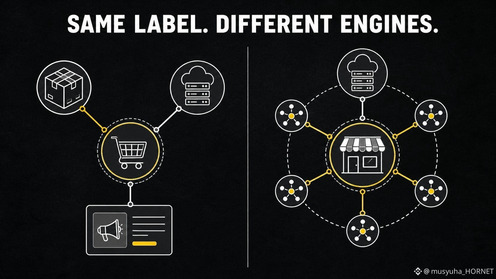
Putting $AMZNB and $BABAB in one “e-commerce” box removes most of the useful information.
Amazon reports North America, International and AWS, with advertising also an important disclosed activity. Alibaba describes e-commerce and AI + Cloud as its two core engines.
The overlap is real: both connect merchants, consumers and digital infrastructure. The transmission paths are different.
A simple comparison should ask:
1. Which geography sets the demand signal?
2. How much of the story comes from commerce versus cloud?
3. Is the key risk consumer spending, merchant activity, regulation, infrastructure investment—or several at once?
This matters because the same headline, such as “online sales are growing,” can be too shallow to explain either company.
My rule: classify the revenue engine before classifying the sector.
Two e-commerce bStocks can diversify geography, but they can still share exposure to consumer demand and digital-ad competition.
@BinanceCIS #bStocksCIS
Putting $AMZNB and $BABAB in one “e-commerce” box removes most of the useful information.
Amazon reports North America, International and AWS, with advertising also an important disclosed activity. Alibaba describes e-commerce and AI + Cloud as its two core engines.
The overlap is real: both connect merchants, consumers and digital infrastructure. The transmission paths are different.
A simple comparison should ask:
1. Which geography sets the demand signal?
2. How much of the story comes from commerce versus cloud?
3. Is the key risk consumer spending, merchant activity, regulation, infrastructure investment—or several at once?
This matters because the same headline, such as “online sales are growing,” can be too shallow to explain either company.
My rule: classify the revenue engine before classifying the sector.
Two e-commerce bStocks can diversify geography, but they can still share exposure to consumer demand and digital-ad competition.
@BinanceCIS #bStocksCIS
Amazon reports North America, International and AWS, with advertising also an important disclosed activity. Alibaba describes e-commerce and AI + Cloud as its two core engines.
The overlap is real: both connect merchants, consumers and digital infrastructure. The transmission paths are different.
A simple comparison should ask:
1. Which geography sets the demand signal?
2. How much of the story comes from commerce versus cloud?
3. Is the key risk consumer spending, merchant activity, regulation, infrastructure investment—or several at once?
This matters because the same headline, such as “online sales are growing,” can be too shallow to explain either company.
My rule: classify the revenue engine before classifying the sector.
Two e-commerce bStocks can diversify geography, but they can still share exposure to consumer demand and digital-ad competition.
@BinanceCIS #bStocksCIS
1
3
84
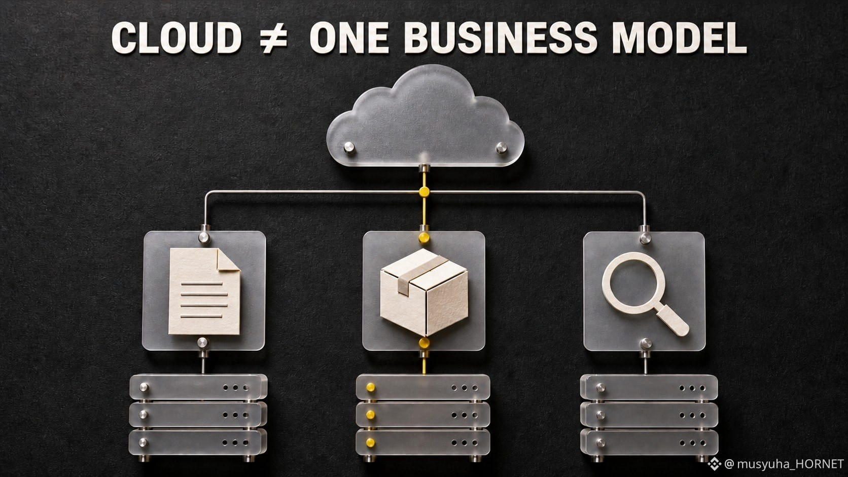
「クラウドへのエクスポージャー」は、非常に異なる3つの企業構造を隠してしまうことがあります。
$MSFTB は、エンタープライズ向け生産性ソフト、クラウド基盤、個人向けコンピューティングを組み合わせた事業に接続しています。
$AMZNB は、AWSに加えて、はるかに大きなコマース・エコシステムと広告を組み合わせています。
$GOOGLB は、Google Cloud と、検索、YouTube、その他のサービスとの結びつきが依然として強い事業を組み合わせています。
同じクラウド成長の見出しが、したがって、別々の入口を通って3つの損益計算書に入ってきます。
私の比較グリッドは、行は3つだけです。
• クラウドのプロダクトは何か?
• ほかにどの「エンジン」が企業の物語を支配しているか?
• どの顧客の予算が最も重要か:エンタープライズIT、消費者向けコマース、広告?
これにより、よくあるウォッチリストの誤りを防ぎます。つまり、「クラウドに関連する3つの bStocks は、同じエクスポージャーの3つのバージョンだ」と決めつけてしまうことです。
クラウド・セグメントは似ているかもしれません。しかし、親会社の分母は同じではありません。
どの組み合わせを分析したいですか:ソフト+クラウド、コマース+クラウド、それとも広告+クラウド?
確認した出所:Microsoft のFY2025レポート、Amazon のFY2025結果、Alphabetの投資家向け資料。
@BinanceCIS #bStocksCIS
「クラウドへのエクスポージャー」は、非常に異なる3つの企業構造を隠してしまうことがあります。
$MSFTB は、エンタープライズ向け生産性ソフト、クラウド基盤、個人向けコンピューティングを組み合わせた事業に接続しています。
$AMZNB は、AWSに加えて、はるかに大きなコマース・エコシステムと広告を組み合わせています。
$GOOGLB は、Google Cloud と、検索、YouTube、その他のサービスとの結びつきが依然として強い事業を組み合わせています。
同じクラウド成長の見出しが、したがって、別々の入口を通って3つの損益計算書に入ってきます。
私の比較グリッドは、行は3つだけです。
• クラウドのプロダクトは何か?
• ほかにどの「エンジン」が企業の物語を支配しているか?
• どの顧客の予算が最も重要か:エンタープライズIT、消費者向けコマース、広告?
これにより、よくあるウォッチリストの誤りを防ぎます。つまり、「クラウドに関連する3つの bStocks は、同じエクスポージャーの3つのバージョンだ」と決めつけてしまうことです。
クラウド・セグメントは似ているかもしれません。しかし、親会社の分母は同じではありません。
どの組み合わせを分析したいですか:ソフト+クラウド、コマース+クラウド、それとも広告+クラウド?
確認した出所:Microsoft のFY2025レポート、Amazon のFY2025結果、Alphabetの投資家向け資料。
@BinanceCIS #bStocksCIS
$MSFTB は、エンタープライズ向け生産性ソフト、クラウド基盤、個人向けコンピューティングを組み合わせた事業に接続しています。
$AMZNB は、AWSに加えて、はるかに大きなコマース・エコシステムと広告を組み合わせています。
$GOOGLB は、Google Cloud と、検索、YouTube、その他のサービスとの結びつきが依然として強い事業を組み合わせています。
同じクラウド成長の見出しが、したがって、別々の入口を通って3つの損益計算書に入ってきます。
私の比較グリッドは、行は3つだけです。
• クラウドのプロダクトは何か?
• ほかにどの「エンジン」が企業の物語を支配しているか?
• どの顧客の予算が最も重要か:エンタープライズIT、消費者向けコマース、広告?
これにより、よくあるウォッチリストの誤りを防ぎます。つまり、「クラウドに関連する3つの bStocks は、同じエクスポージャーの3つのバージョンだ」と決めつけてしまうことです。
クラウド・セグメントは似ているかもしれません。しかし、親会社の分母は同じではありません。
どの組み合わせを分析したいですか:ソフト+クラウド、コマース+クラウド、それとも広告+クラウド?
確認した出所:Microsoft のFY2025レポート、Amazon のFY2025結果、Alphabetの投資家向け資料。
@BinanceCIS #bStocksCIS
2
105
翻訳参照
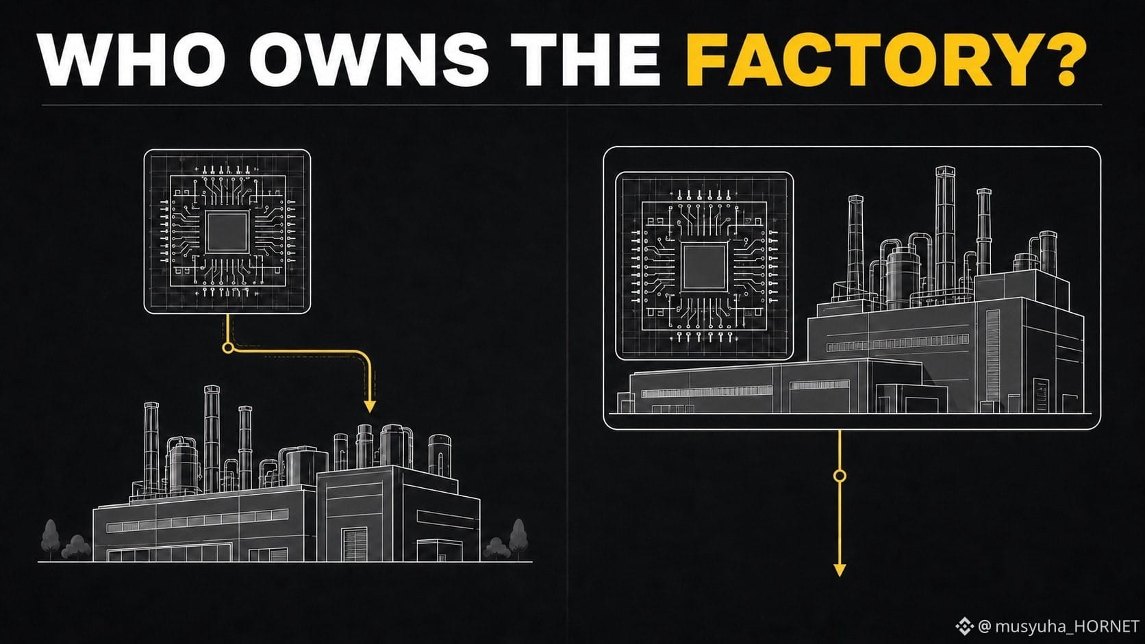
Two semiconductor tickers can react to the same chip headline for very different reasons.
AMD describes itself as a fabless semiconductor company. Its model focuses on designing products while relying on external manufacturers for production.
Intel reports both Intel Products and Intel Foundry. That means its story includes product demand, but also the economics and execution of manufacturing capacity.
For $AMDB and $INTCB, I would separate the questions:
• Is demand for the chips improving?
• Who carries the factory investment?
• Is manufacturing execution a customer relationship, an internal cost, or both?
This is why “semiconductor exposure” is too broad to be an analysis. One model can be more sensitive to product mix and external supply partners; the other can also be affected by factory utilization, process execution and foundry customers.
Same sector. Different capital architecture.
Before comparing the two charts, compare who owns the manufacturing problem.
@BinanceCIS #bStocksCIS
Two semiconductor tickers can react to the same chip headline for very different reasons.
AMD describes itself as a fabless semiconductor company. Its model focuses on designing products while relying on external manufacturers for production.
Intel reports both Intel Products and Intel Foundry. That means its story includes product demand, but also the economics and execution of manufacturing capacity.
For $AMDB and $INTCB, I would separate the questions:
• Is demand for the chips improving?
• Who carries the factory investment?
• Is manufacturing execution a customer relationship, an internal cost, or both?
This is why “semiconductor exposure” is too broad to be an analysis. One model can be more sensitive to product mix and external supply partners; the other can also be affected by factory utilization, process execution and foundry customers.
Same sector. Different capital architecture.
Before comparing the two charts, compare who owns the manufacturing problem.
@BinanceCIS #bStocksCIS
AMD describes itself as a fabless semiconductor company. Its model focuses on designing products while relying on external manufacturers for production.
Intel reports both Intel Products and Intel Foundry. That means its story includes product demand, but also the economics and execution of manufacturing capacity.
For $AMDB and $INTCB, I would separate the questions:
• Is demand for the chips improving?
• Who carries the factory investment?
• Is manufacturing execution a customer relationship, an internal cost, or both?
This is why “semiconductor exposure” is too broad to be an analysis. One model can be more sensitive to product mix and external supply partners; the other can also be affected by factory utilization, process execution and foundry customers.
Same sector. Different capital architecture.
Before comparing the two charts, compare who owns the manufacturing problem.
@BinanceCIS #bStocksCIS
1
2
80
·
--
ブリッシュ
本人確認中
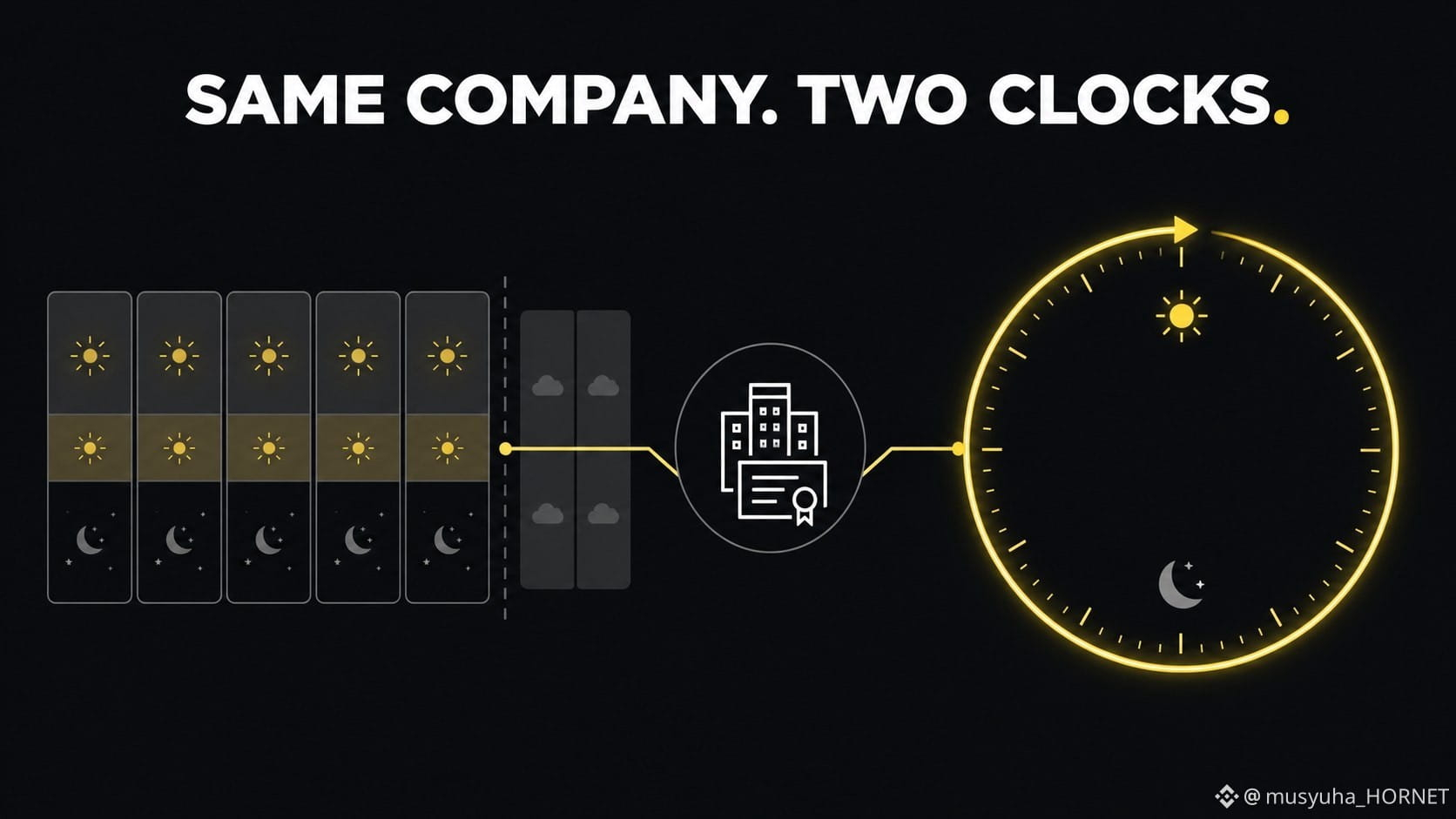
同じ会社が、Binanceの中で2つの異なる“取引スケジュール(クロック)”にまたがって取引できるようになりました。
Binanceでの株式の直接取引は、米国市場のセッション(レギュラー、延長、そしてオーバーナイト)に従います。一般に週5日、休日と週末を除けば、ほぼ1日24時間の取引が可能です。BinanceのSpotにあるbStocksは、24/7の取引を想定して設計されています。
両方の画面で、同じ会社に紐づくエクスポージャーが表示されていると、その違いは見落としやすいです。
土曜日には、bStockがアクティブなクリプトの注文帳(オーダーブック)を持っていても、直接株式の取引会場はセッション間の時間帯に入っている可能性があります。米国の市場休日には、片方の経路だけが稼働していて、もう一方が利用できない場合があります。基となる会場が再開すれば、新しい情報を素早く再評価(リプリス)できます。
私のルール:2つの価格を比較する前に、それぞれの“クロック(取引スケジュール)”を比べます。
同じ会社だからといって、同じ市場カレンダー、同じ流動性、同じ執行経路とは限りません。
@BinanceCIS #bStocksCIS
同じ会社が、Binanceの中で2つの異なる“取引スケジュール(クロック)”にまたがって取引できるようになりました。
Binanceでの株式の直接取引は、米国市場のセッション(レギュラー、延長、そしてオーバーナイト)に従います。一般に週5日、休日と週末を除けば、ほぼ1日24時間の取引が可能です。BinanceのSpotにあるbStocksは、24/7の取引を想定して設計されています。
両方の画面で、同じ会社に紐づくエクスポージャーが表示されていると、その違いは見落としやすいです。
土曜日には、bStockがアクティブなクリプトの注文帳(オーダーブック)を持っていても、直接株式の取引会場はセッション間の時間帯に入っている可能性があります。米国の市場休日には、片方の経路だけが稼働していて、もう一方が利用できない場合があります。基となる会場が再開すれば、新しい情報を素早く再評価(リプリス)できます。
私のルール:2つの価格を比較する前に、それぞれの“クロック(取引スケジュール)”を比べます。
同じ会社だからといって、同じ市場カレンダー、同じ流動性、同じ執行経路とは限りません。
@BinanceCIS #bStocksCIS
Binanceでの株式の直接取引は、米国市場のセッション(レギュラー、延長、そしてオーバーナイト)に従います。一般に週5日、休日と週末を除けば、ほぼ1日24時間の取引が可能です。BinanceのSpotにあるbStocksは、24/7の取引を想定して設計されています。
両方の画面で、同じ会社に紐づくエクスポージャーが表示されていると、その違いは見落としやすいです。
土曜日には、bStockがアクティブなクリプトの注文帳(オーダーブック)を持っていても、直接株式の取引会場はセッション間の時間帯に入っている可能性があります。米国の市場休日には、片方の経路だけが稼働していて、もう一方が利用できない場合があります。基となる会場が再開すれば、新しい情報を素早く再評価(リプリス)できます。
私のルール:2つの価格を比較する前に、それぞれの“クロック(取引スケジュール)”を比べます。
同じ会社だからといって、同じ市場カレンダー、同じ流動性、同じ執行経路とは限りません。
@BinanceCIS #bStocksCIS
4
88
ほとんどのトレーダーは「エントリー」を考えて計画します。
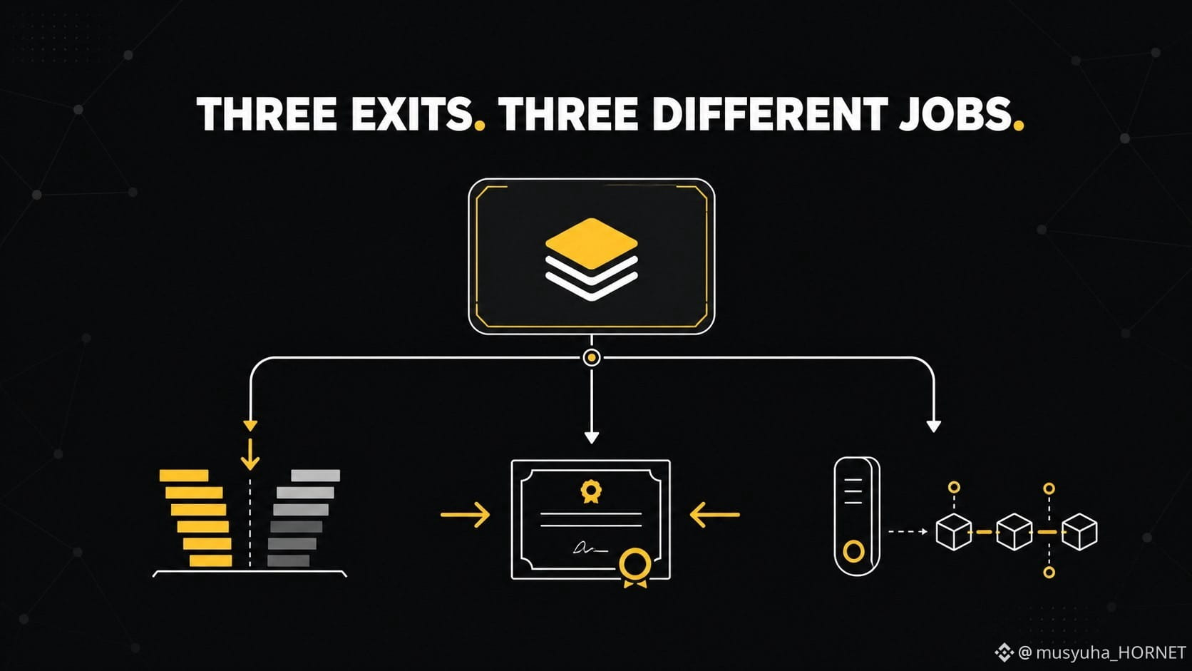
bStocksでは、まず「出口(エグジット)」を先に整理します。なぜなら、「出口」はまったく異なる3種類の行動を意味し得るからです。
Binance SpotでbStockを売却します。これは、利用可能な注文板価格でエクスポージャーをクローズするため、スプレッドや流動性が重要になります。
それを、対応する直接株(ダイレクト株)へ再度変換します。対象ユーザーの場合、Binanceはこれを「手数料なしの1:1変換」と説明していますが、メンテナンスやコーポレートアクションの処理中は利用可能性が一時的に停止することがあります。
bStockを、BNB Smart Chain上の互換ウォレットへ引き出します。これは保有の管理主体(カストディ)が変わるだけで、ポジションを売却するわけではありません。ネットワーク手数料、送金の制御、ならびに利用資格の制限は引き続き適用されます。
1つのポジション、3つのルート:価格による出口/ラッパーによる出口/カストディによる出口。
私の実務的なルールはシンプルです。ボタンを選ぶ前に、実際に必要としている結果はどれかを決めること。見た目が一番安そうなルートが、必ずしも正しい課題を解決するルートとは限りません。
@BinanceCIS #bStocksCIS
ほとんどのトレーダーは「エントリー」を考えて計画します。
bStocksでは、まず「出口(エグジット)」を先に整理します。なぜなら、「出口」はまったく異なる3種類の行動を意味し得るからです。
Binance SpotでbStockを売却します。これは、利用可能な注文板価格でエクスポージャーをクローズするため、スプレッドや流動性が重要になります。
それを、対応する直接株(ダイレクト株)へ再度変換します。対象ユーザーの場合、Binanceはこれを「手数料なしの1:1変換」と説明していますが、メンテナンスやコーポレートアクションの処理中は利用可能性が一時的に停止することがあります。
bStockを、BNB Smart Chain上の互換ウォレットへ引き出します。これは保有の管理主体(カストディ)が変わるだけで、ポジションを売却するわけではありません。ネットワーク手数料、送金の制御、ならびに利用資格の制限は引き続き適用されます。
1つのポジション、3つのルート:価格による出口/ラッパーによる出口/カストディによる出口。
私の実務的なルールはシンプルです。ボタンを選ぶ前に、実際に必要としている結果はどれかを決めること。見た目が一番安そうなルートが、必ずしも正しい課題を解決するルートとは限りません。
@BinanceCIS #bStocksCIS
bStocksでは、まず「出口(エグジット)」を先に整理します。なぜなら、「出口」はまったく異なる3種類の行動を意味し得るからです。
Binance SpotでbStockを売却します。これは、利用可能な注文板価格でエクスポージャーをクローズするため、スプレッドや流動性が重要になります。
それを、対応する直接株(ダイレクト株)へ再度変換します。対象ユーザーの場合、Binanceはこれを「手数料なしの1:1変換」と説明していますが、メンテナンスやコーポレートアクションの処理中は利用可能性が一時的に停止することがあります。
bStockを、BNB Smart Chain上の互換ウォレットへ引き出します。これは保有の管理主体(カストディ)が変わるだけで、ポジションを売却するわけではありません。ネットワーク手数料、送金の制御、ならびに利用資格の制限は引き続き適用されます。
1つのポジション、3つのルート:価格による出口/ラッパーによる出口/カストディによる出口。
私の実務的なルールはシンプルです。ボタンを選ぶ前に、実際に必要としている結果はどれかを決めること。見た目が一番安そうなルートが、必ずしも正しい課題を解決するルートとは限りません。
@BinanceCIS #bStocksCIS
3
77

記事
翻訳参照
Чому $ROBO не впаде як 90% монет?Сьогодні, коли компанії шалено кидаються купувати оперативну пам'ять для AI, токен $ROBO O має перспективу на ріст.
Чесно, він зачепив мене не “шумом”, а ідеєю. @FabricFND робить ставку на те, що скоро AI-агенти й роботи будуть не просто помічниками, а виконавцями задач: доставляти, шукати дані, керувати сервісами, домовлятися між собою. І тоді їм потрібні базові речі, як у людей: хто ти (DID/ідентичність), чим платиш (гаманець) і за якими правилами працюєш (координація/governance).
Ось і вся магія — проста логіка, але великий потенціал. Не дивно, що після руху ціни ROBO тримається біля ~0.05: ринок ніби “пробує на смак” цей наратив і чекає апдейти. Я теж слідкую 👀 #robo
Чому $ROBO не впаде як 90% монет?
Сьогодні, коли компанії шалено кидаються купувати оперативну пам'ять для AI, токен $ROBO O має перспективу на ріст.
Чесно, він зачепив мене не “шумом”, а ідеєю. @Fabric Foundation робить ставку на те, що скоро AI-агенти й роботи будуть не просто помічниками, а виконавцями задач: доставляти, шукати дані, керувати сервісами, домовлятися між собою. І тоді їм потрібні базові речі, як у людей: хто ти (DID/ідентичність), чим платиш (гаманець) і за якими правилами працюєш (координація/governance).
Ось і вся магія — проста логіка, але великий потенціал. Не дивно, що після руху ціни ROBO тримається біля ~0.05: ринок ніби “пробує на смак” цей наратив і чекає апдейти. Я теж слідкую 👀 #robo
Чесно, він зачепив мене не “шумом”, а ідеєю. @Fabric Foundation робить ставку на те, що скоро AI-агенти й роботи будуть не просто помічниками, а виконавцями задач: доставляти, шукати дані, керувати сервісами, домовлятися між собою. І тоді їм потрібні базові речі, як у людей: хто ти (DID/ідентичність), чим платиш (гаманець) і за якими правилами працюєш (координація/governance).
Ось і вся магія — проста логіка, але великий потенціал. Не дивно, що після руху ціни ROBO тримається біля ~0.05: ринок ніби “пробує на смак” цей наратив і чекає апдейти. Я теж слідкую 👀 #robo
2
58
ログインして、さらにコンテンツを読む
厳選トピックで世界の暗号資産トレーダーの仲間入り
⚡️ 暗号資産に関する最新かつ有益な情報が見つかります。
💬 世界最大の暗号資産取引所から信頼されています。
👍 認証を受けたクリエイターから、有益なインサイトを得られます。
メール / 電話番号
トレンドトピック
AIStocksWhatNext
閲覧回数 995,358
6,997人が討論中
注目ハッシュタグキャンペーンでトラフィック報酬を「シェア&ウィン」しよう
✨トピック:AI株が上昇し続ける中、ほかにどんな投資チャンスが残っている?
👉参加方法:
ハッシュタグ #AIStocksWhatNext を付けて短い投稿または記事を公開する
強気か弱気かを共有し、AI株の保有または取引を投稿してください—取引ウィジェットを使うと資格を得やすくなる可能性があります。
データやチャートを共有し、AI生成画像を避けることで、投稿をさらに強化できます。
✍️以下の切り口を参考にコンテンツを作成してください:
- Nvidiaは来年のチップ販売が倍増すると述べ、主要なAI企業は記録的な売上を更新し続けています。これを支える計算コストはそれだけでも驚異的です。本当にAI需要は伸びているのか? そして、それはどれくらい続くのでしょうか?AI株は全体的に上昇中。これは本物のブレイクアウトなのか、それとも短期的な戻りなのか?
- 産業のリーダーたちはAI開発のペースを落とすよう求めています。一方でトランプは「AIフォース」を構築する計画で、AIが将来的に米国のGDPの25%を占める可能性があると主張しています。あなたはどちら側ですか? AI株に対する州レベルの後押しは長期的な勝利になりますか?
- あなたはAI株を買っていますか? 取引/保有を、取引シェアリングウィジェットで共有してください。
⏰キャンペーン期間:
- 2026-09-22 7:00 - 2026-09-24 4:00(UTC)
🎁報酬:
- 上記のガイドラインを満たし、100語を超える適格投稿は審査され、ランダムなトラフィックブースト(500〜3,000ビュー)が付与される場合があります。投稿が選ばれた場合は、フィード担当者から通知が届きます。
- Binance Square Officialに記事が掲載されるチャンス
投稿のアイデアが必要ですか? トピックページ #AIStocksWhatNext または Square Guide on How to Post for Better Reach をご覧ください。
Binance Square Official
·いいね:609件
·閲覧回数 1.8M
BitcoinRejectedAt$87,300Twice
閲覧回数 0
0人が討論中
BCHJumps28%OnCMEFuturesListing
閲覧回数 22,085
650人が討論中