

#jup
jup
10.4M vues
10,886 mentions
Populaire
Récents


·
--
$JUP looks primed to keep climbing, with bulls firmly in control of the trend.
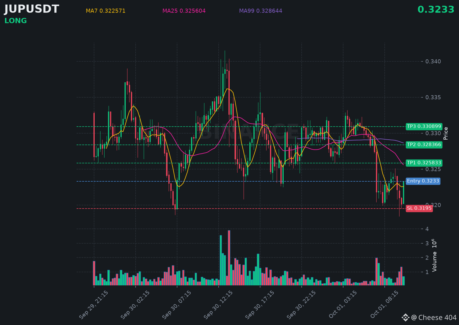
📍 @ 0.3233 | Volume: 0.23M USD
RSI 45 | EMA20: 0.324073 USD
📈 Trade Plan:
📈 Entry: 0.32254 – 0.32406
🛑 Stop Loss: 0.3195
🎯 TP1: 0.325833
🎯 TP2: 0.328366
🎯 TP3: 0.330899
Waiting for a retest, then riding the uptrend.
👉 $JUP 👈 Catch it
#JUP
$JUP looks primed to keep climbing, with bulls firmly in control of the trend.
📍 @ 0.3233 | Volume: 0.23M USD
RSI 45 | EMA20: 0.324073 USD
📈 Trade Plan:
📈 Entry: 0.32254 – 0.32406
🛑 Stop Loss: 0.3195
🎯 TP1: 0.325833
🎯 TP2: 0.328366
🎯 TP3: 0.330899
Waiting for a retest, then riding the uptrend.
👉 $JUP 👈 Catch it
#JUP
📍 @ 0.3233 | Volume: 0.23M USD
RSI 45 | EMA20: 0.324073 USD
📈 Trade Plan:
📈 Entry: 0.32254 – 0.32406
🛑 Stop Loss: 0.3195
🎯 TP1: 0.325833
🎯 TP2: 0.328366
🎯 TP3: 0.330899
Waiting for a retest, then riding the uptrend.
👉 $JUP 👈 Catch it
#JUP
432

⚠️ WHALE MANIPULATION or CLEAN BREAKOUT? The Dual-Trigger Strategy!
Market makers are trapping retail traders at key levels across $ENA , $RAY , and $JUP . To stay ahead of the liquidity sweeps, we combine Whale Psychology with Precision Execution Levels:
---
🧠 TYPE A: WHALE LIQUIDITY PSYCHOLOGY
• Whales push prices toward obvious high resistance levels to induce FOMO buying before shaking out late long positions.
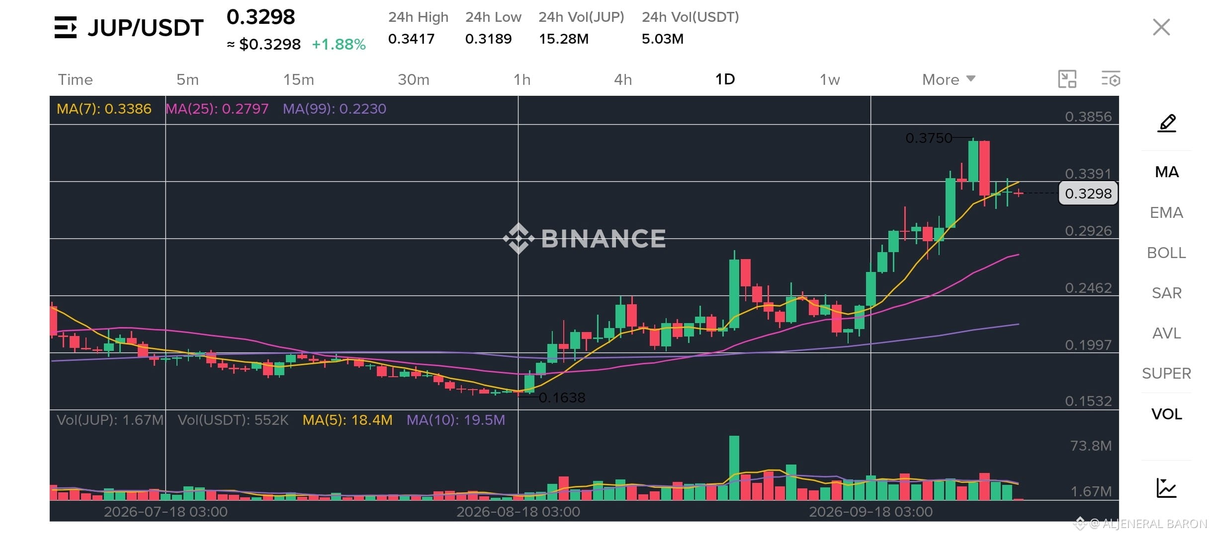
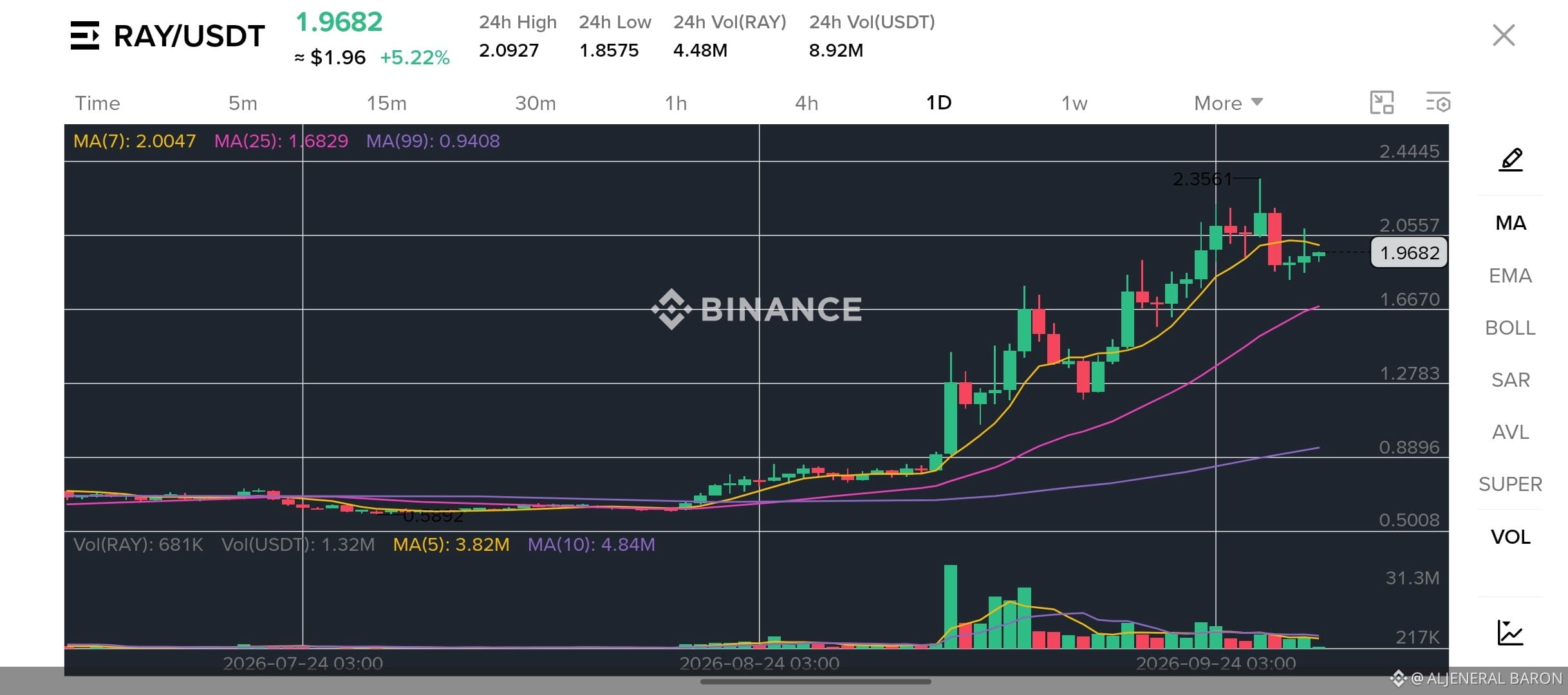
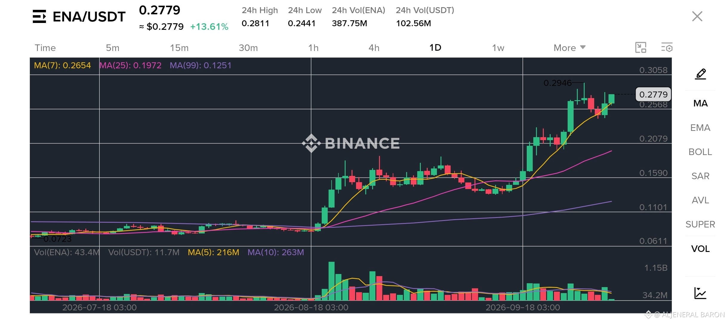
• Look for fakeouts near previous highs ($ENA: $0.2946, $RAY: $2.0920, $JUP: $0.3417) where retail stop-losses and liquidation pools reside.
---
⚔️ TYPE B: PRECISION SURGICAL EXECUTION
🔥 1. ENA (Ethena)
• Current Price: $0.2779 (+13.61%)
• The Trap Zone: Chasing above $0.2850 without daily candle confirmation.
• Buy Trigger (Retest): $0.2650 – $0.2700 | Target: $0.3050 | Invalidation (SL): $0.2440
⚡ 2. RAY (Raydium)
• Current Price: $1.9682 (+5.22%)
• The Trap Zone: Buying directly into the $2.05 – $2.09 overhead supply wall.
• Buy Trigger (Retest): $1.8800 – $1.9500 | Target: $2.3500 | Invalidation (SL): $1.6800
🪐 3. JUP (Jupiter)
• Current Price: $0.3298 (+1.88%)
• The Trap Zone: Shorting while price consolidates directly above the MA7 ($0.3386).
• Buy Trigger (Retest): $0.3180 – $0.3280 | Target: $0.3750 | Invalidation (SL): $0.2790
---
🎯 COMMUNITY HYBRID POLL:
Which side of the trade are you taking today?
1️⃣ Riding the Whale Breakout Momentum 🚀
2️⃣ Waiting for the Trap Sweeps at Retest Zones 🎯
3️⃣ Sitting on Cash / Neutral 🧘♂️
Drop 1, 2, or 3 below! 👇
#ENA #Ray #JUP #cryptotrading #BinanceSquare
⚠️ WHALE MANIPULATION or CLEAN BREAKOUT? The Dual-Trigger Strategy!
Market makers are trapping retail traders at key levels across $ENA , $RAY , and $JUP . To stay ahead of the liquidity sweeps, we combine Whale Psychology with Precision Execution Levels:
---
🧠 TYPE A: WHALE LIQUIDITY PSYCHOLOGY
• Whales push prices toward obvious high resistance levels to induce FOMO buying before shaking out late long positions.
• Look for fakeouts near previous highs ($ENA : $0.2946, $RAY : $2.0920, $JUP : $0.3417) where retail stop-losses and liquidation pools reside.
---
⚔️ TYPE B: PRECISION SURGICAL EXECUTION
🔥 1. ENA (Ethena)
• Current Price: $0.2779 (+13.61%)
• The Trap Zone: Chasing above $0.2850 without daily candle confirmation.
• Buy Trigger (Retest): $0.2650 – $0.2700 | Target: $0.3050 | Invalidation (SL): $0.2440
⚡ 2. RAY (Raydium)
• Current Price: $1.9682 (+5.22%)
• The Trap Zone: Buying directly into the $2.05 – $2.09 overhead supply wall.
• Buy Trigger (Retest): $1.8800 – $1.9500 | Target: $2.3500 | Invalidation (SL): $1.6800
🪐 3. JUP (Jupiter)
• Current Price: $0.3298 (+1.88%)
• The Trap Zone: Shorting while price consolidates directly above the MA7 ($0.3386).
• Buy Trigger (Retest): $0.3180 – $0.3280 | Target: $0.3750 | Invalidation (SL): $0.2790
---
🎯 COMMUNITY HYBRID POLL:
Which side of the trade are you taking today?
1️⃣ Riding the Whale Breakout Momentum 🚀
2️⃣ Waiting for the Trap Sweeps at Retest Zones 🎯
3️⃣ Sitting on Cash / Neutral 🧘♂️
Drop 1, 2, or 3 below! 👇
#ENA #Ray #JUP #cryptotrading #BinanceSquare
Market makers are trapping retail traders at key levels across $ENA , $RAY , and $JUP . To stay ahead of the liquidity sweeps, we combine Whale Psychology with Precision Execution Levels:
---
🧠 TYPE A: WHALE LIQUIDITY PSYCHOLOGY
• Whales push prices toward obvious high resistance levels to induce FOMO buying before shaking out late long positions.
• Look for fakeouts near previous highs ($ENA : $0.2946, $RAY : $2.0920, $JUP : $0.3417) where retail stop-losses and liquidation pools reside.
---
⚔️ TYPE B: PRECISION SURGICAL EXECUTION
🔥 1. ENA (Ethena)
• Current Price: $0.2779 (+13.61%)
• The Trap Zone: Chasing above $0.2850 without daily candle confirmation.
• Buy Trigger (Retest): $0.2650 – $0.2700 | Target: $0.3050 | Invalidation (SL): $0.2440
⚡ 2. RAY (Raydium)
• Current Price: $1.9682 (+5.22%)
• The Trap Zone: Buying directly into the $2.05 – $2.09 overhead supply wall.
• Buy Trigger (Retest): $1.8800 – $1.9500 | Target: $2.3500 | Invalidation (SL): $1.6800
🪐 3. JUP (Jupiter)
• Current Price: $0.3298 (+1.88%)
• The Trap Zone: Shorting while price consolidates directly above the MA7 ($0.3386).
• Buy Trigger (Retest): $0.3180 – $0.3280 | Target: $0.3750 | Invalidation (SL): $0.2790
---
🎯 COMMUNITY HYBRID POLL:
Which side of the trade are you taking today?
1️⃣ Riding the Whale Breakout Momentum 🚀
2️⃣ Waiting for the Trap Sweeps at Retest Zones 🎯
3️⃣ Sitting on Cash / Neutral 🧘♂️
Drop 1, 2, or 3 below! 👇
#ENA #Ray #JUP #cryptotrading #BinanceSquare
1
1
503

🔥 $JUP Squeezing Below Resistance — Breakout Move Loading?
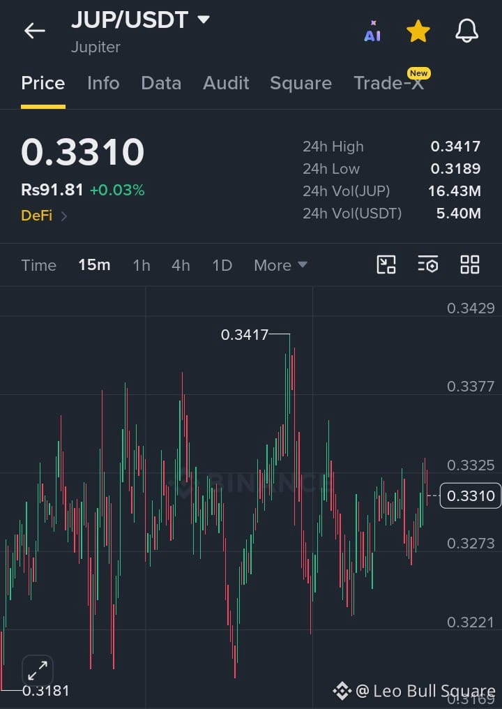
$JUP /USDT is trading near $0.3310 (+0.03%) on the 15M chart after recovering from the $0.3189 24H low, with buyers repeatedly defending the $0.3273–$0.3221 support zone. Price is now pressing against $0.3325 resistance; a strong candle close above this level with rising volume could trigger momentum toward $0.3377 and the $0.3417 24H high. Trade idea: Entry $0.3300–$0.3325, TP1 $0.3375, TP2 $0.3415, Stop Loss below $0.3265. With 16.43M JUP / $5.40M USDT in 24H volume, the key signal is a breakout + retest confirmation—failure to hold $0.3273 could expose the deeper $0.3221 support.
#JUP
{spot}(JUPUSDT)
🔥 $JUP Squeezing Below Resistance — Breakout Move Loading?
$JUP /USDT is trading near $0.3310 (+0.03%) on the 15M chart after recovering from the $0.3189 24H low, with buyers repeatedly defending the $0.3273–$0.3221 support zone. Price is now pressing against $0.3325 resistance; a strong candle close above this level with rising volume could trigger momentum toward $0.3377 and the $0.3417 24H high. Trade idea: Entry $0.3300–$0.3325, TP1 $0.3375, TP2 $0.3415, Stop Loss below $0.3265. With 16.43M JUP / $5.40M USDT in 24H volume, the key signal is a breakout + retest confirmation—failure to hold $0.3273 could expose the deeper $0.3221 support.
#JUP
$JUP /USDT is trading near $0.3310 (+0.03%) on the 15M chart after recovering from the $0.3189 24H low, with buyers repeatedly defending the $0.3273–$0.3221 support zone. Price is now pressing against $0.3325 resistance; a strong candle close above this level with rising volume could trigger momentum toward $0.3377 and the $0.3417 24H high. Trade idea: Entry $0.3300–$0.3325, TP1 $0.3375, TP2 $0.3415, Stop Loss below $0.3265. With 16.43M JUP / $5.40M USDT in 24H volume, the key signal is a breakout + retest confirmation—failure to hold $0.3273 could expose the deeper $0.3221 support.
#JUP
1
90

Web3 Infrastructure Before Acceleration
$ENS | $LDO | $JUP
ENS, LDO, and JUP remain important infrastructure and ecosystem-focused assets. ENS supports Ethereum naming infrastructure, LDO remains closely tied to Ethereum staking, while JUP represents a major Solana ecosystem protocol.
Their individual structures remain worth monitoring as liquidity rotates.
Key Takeaway: Strong ecosystems can provide the foundation for renewed momentum.
#ENS #LDO #JUP #Web3 #MarketStructure
{future}(ENSUSDT)
{future}(LDOUSDT)
{future}(JUPUSDT)
Web3 Infrastructure Before Acceleration
$ENS | $LDO | $JUP
ENS, LDO, and JUP remain important infrastructure and ecosystem-focused assets. ENS supports Ethereum naming infrastructure, LDO remains closely tied to Ethereum staking, while JUP represents a major Solana ecosystem protocol.
Their individual structures remain worth monitoring as liquidity rotates.
Key Takeaway: Strong ecosystems can provide the foundation for renewed momentum.
#ENS #LDO #JUP #Web3 #MarketStructure
$ENS | $LDO | $JUP
ENS, LDO, and JUP remain important infrastructure and ecosystem-focused assets. ENS supports Ethereum naming infrastructure, LDO remains closely tied to Ethereum staking, while JUP represents a major Solana ecosystem protocol.
Their individual structures remain worth monitoring as liquidity rotates.
Key Takeaway: Strong ecosystems can provide the foundation for renewed momentum.
#ENS #LDO #JUP #Web3 #MarketStructure
1
204

·
--
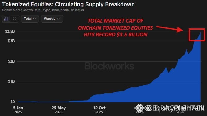
🚨 $JUP LEADS ONCHAIN EQUITY REVOLUTION AS TOKENIZED STOCKS SURGE TO RECORD $3.5B! 💥
Institutional capital is quietly accelerating onchain equity integration following the regulatory sandbox framework. 📊 Tokenized stock market cap just breached $3.5B, delivering a staggering 860% year-over-year expansion as real-world assets capture structural liquidity.
$JUP is capturing the bulk of this volume migration, recording a 104% surge in monthly trading activity. 🔍 As traditional financial rails merge with decentralized order books, early institutional positioning is creating a massive structural shift across the sector.
💬 Is this regulatory green light the ultimate catalyst for traditional assets migrating completely onchain? 👇
⚠️ Not financial advice. Always manage your risk. 🛡️
🏷️ #JUP #Tokenization #RWA #DeFi #Crypto
🦈 🏦
🚨 $JUP LEADS ONCHAIN EQUITY REVOLUTION AS TOKENIZED STOCKS SURGE TO RECORD $3.5B! 💥
Institutional capital is quietly accelerating onchain equity integration following the regulatory sandbox framework. 📊 Tokenized stock market cap just breached $3.5B, delivering a staggering 860% year-over-year expansion as real-world assets capture structural liquidity.
$JUP is capturing the bulk of this volume migration, recording a 104% surge in monthly trading activity. 🔍 As traditional financial rails merge with decentralized order books, early institutional positioning is creating a massive structural shift across the sector.
💬 Is this regulatory green light the ultimate catalyst for traditional assets migrating completely onchain? 👇
⚠️ Not financial advice. Always manage your risk. 🛡️
🏷️ #JUP #Tokenization #RWA #DeFi #Crypto
🦈 🏦
Institutional capital is quietly accelerating onchain equity integration following the regulatory sandbox framework. 📊 Tokenized stock market cap just breached $3.5B, delivering a staggering 860% year-over-year expansion as real-world assets capture structural liquidity.
$JUP is capturing the bulk of this volume migration, recording a 104% surge in monthly trading activity. 🔍 As traditional financial rails merge with decentralized order books, early institutional positioning is creating a massive structural shift across the sector.
💬 Is this regulatory green light the ultimate catalyst for traditional assets migrating completely onchain? 👇
⚠️ Not financial advice. Always manage your risk. 🛡️
🏷️ #JUP #Tokenization #RWA #DeFi #Crypto
🦈 🏦
45

·
--
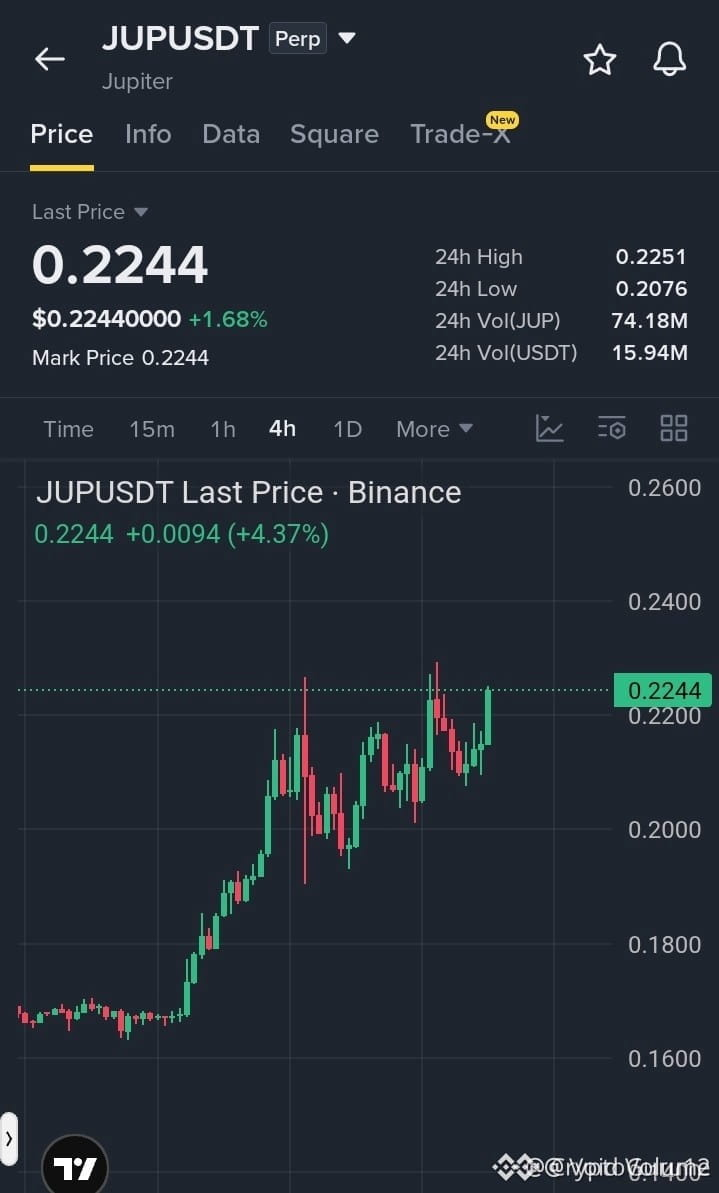
⚡ $JUP TESTING KEY RESISTANCE AT 0.225 AS BULLISH STRUCTURE EXPANDS 📈
Entry: 0.218 - 0.224 ⚡
Target: 0.230 - 0.248 🚀
Stop Loss: 0.210 ⚠️
Smart money continues to defend higher lows on the 4H timeframe following the structural breakout from the 0.17 demand level. 📊 Price is currently probing institutional liquidity within the 0.224 to 0.225 resistance threshold, building energy for potential expansion.
📌 An immediate reclaim of 0.225 clears the path toward upper liquidity pools up to 0.248, while invalidation sits sharply defined below 0.210. 💡 Market structure favors buyers as long as order flow respects this key support zone. 🤔 Are you anticipating an immediate breakout or waiting for a low-tf retest before positioning? 👇
⚠️ Not financial advice. Always manage your risk. 🛡️
🏷️ #JUP #Crypto #MarketStructure #Trading #Breakout
🎯 🦈
⚡ $JUP TESTING KEY RESISTANCE AT 0.225 AS BULLISH STRUCTURE EXPANDS 📈
Entry: 0.218 - 0.224 ⚡
Target: 0.230 - 0.248 🚀
Stop Loss: 0.210 ⚠️
Smart money continues to defend higher lows on the 4H timeframe following the structural breakout from the 0.17 demand level. 📊 Price is currently probing institutional liquidity within the 0.224 to 0.225 resistance threshold, building energy for potential expansion.
📌 An immediate reclaim of 0.225 clears the path toward upper liquidity pools up to 0.248, while invalidation sits sharply defined below 0.210. 💡 Market structure favors buyers as long as order flow respects this key support zone. 🤔 Are you anticipating an immediate breakout or waiting for a low-tf retest before positioning? 👇
⚠️ Not financial advice. Always manage your risk. 🛡️
🏷️ #JUP #Crypto #MarketStructure #Trading #Breakout
🎯 🦈
Entry: 0.218 - 0.224 ⚡
Target: 0.230 - 0.248 🚀
Stop Loss: 0.210 ⚠️
Smart money continues to defend higher lows on the 4H timeframe following the structural breakout from the 0.17 demand level. 📊 Price is currently probing institutional liquidity within the 0.224 to 0.225 resistance threshold, building energy for potential expansion.
📌 An immediate reclaim of 0.225 clears the path toward upper liquidity pools up to 0.248, while invalidation sits sharply defined below 0.210. 💡 Market structure favors buyers as long as order flow respects this key support zone. 🤔 Are you anticipating an immediate breakout or waiting for a low-tf retest before positioning? 👇
⚠️ Not financial advice. Always manage your risk. 🛡️
🏷️ #JUP #Crypto #MarketStructure #Trading #Breakout
🎯 🦈
14

·
--
🚨 JUP IS EXPANDING BEYOND SWAPS
Jupiter is turning into something much bigger than a Solana swap aggregator.
The latest expansion adds SOL, BTC and ETH perpetual markets, while Jupiter has also previewed a new stocks section.
And the activity is already significant.
Jupiter’s aggregator processed roughly $23B in spot-swap volume across about 109M swaps between August 29 and September 27.
That means the story is shifting from simple token swaps toward a broader onchain trading platform.
Perps. Spot. Stocks.
Jupiter is trying to put more of the trading stack in one place.
🚨 JUP UPDATE: Jupiter is expanding its trading ecosystem fast. Click the $JUP setup below 🫵🏻 to review the market structure and watch the next reaction.
$JUP
{future}(JUPUSDT)
.
.
#JUP #Jupiter #Write2Earn
🚨 JUP IS EXPANDING BEYOND SWAPS
Jupiter is turning into something much bigger than a Solana swap aggregator.
The latest expansion adds SOL, BTC and ETH perpetual markets, while Jupiter has also previewed a new stocks section.
And the activity is already significant.
Jupiter’s aggregator processed roughly $23B in spot-swap volume across about 109M swaps between August 29 and September 27.
That means the story is shifting from simple token swaps toward a broader onchain trading platform.
Perps. Spot. Stocks.
Jupiter is trying to put more of the trading stack in one place.
🚨 JUP UPDATE: Jupiter is expanding its trading ecosystem fast. Click the $JUP setup below 🫵🏻 to review the market structure and watch the next reaction.
$JUP
.
.
#JUP #Jupiter #Write2Earn
Jupiter is turning into something much bigger than a Solana swap aggregator.
The latest expansion adds SOL, BTC and ETH perpetual markets, while Jupiter has also previewed a new stocks section.
And the activity is already significant.
Jupiter’s aggregator processed roughly $23B in spot-swap volume across about 109M swaps between August 29 and September 27.
That means the story is shifting from simple token swaps toward a broader onchain trading platform.
Perps. Spot. Stocks.
Jupiter is trying to put more of the trading stack in one place.
🚨 JUP UPDATE: Jupiter is expanding its trading ecosystem fast. Click the $JUP setup below 🫵🏻 to review the market structure and watch the next reaction.
$JUP
.
.
#JUP #Jupiter #Write2Earn

541

·
--
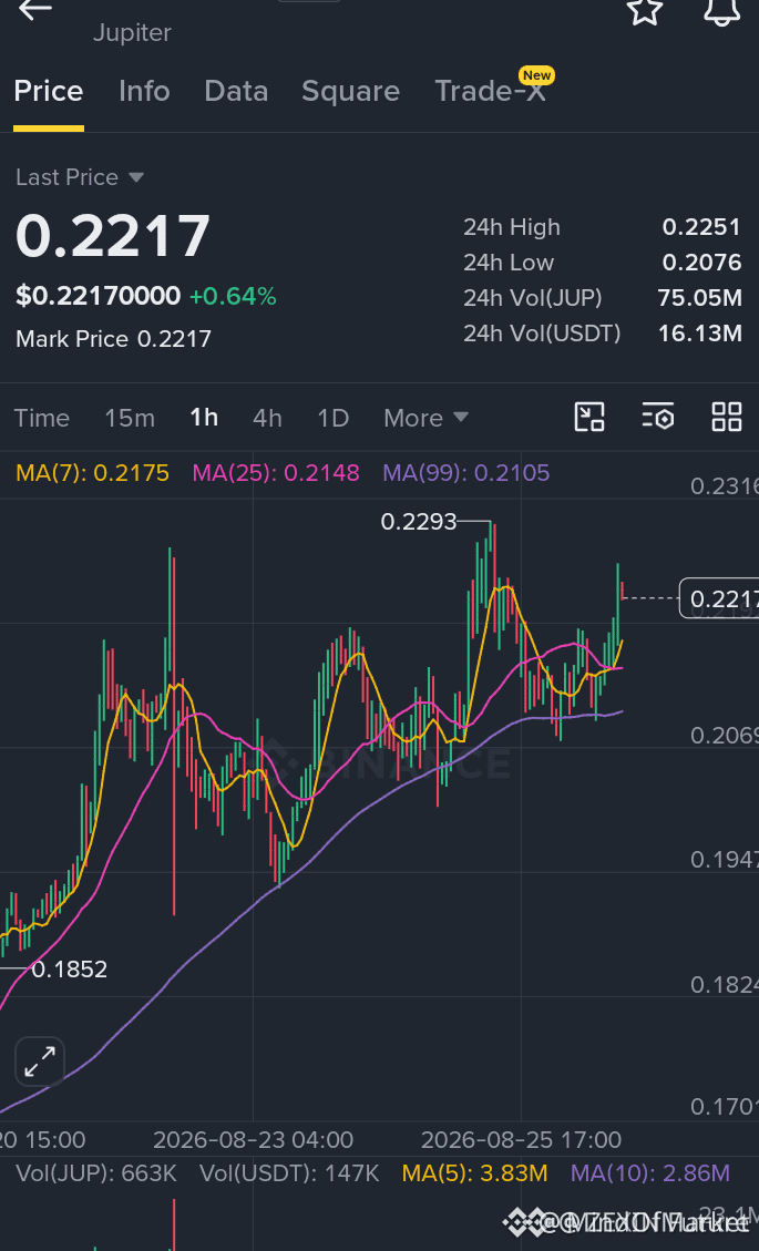
🦈 $JUP TESTING SUPPLY ZONE AS BULLISH STRUCTURE EXPANDS TOWARD BREAKOUT TRIGGER! ⚡
Entry: 0.218 - 0.224 ⚡
Target: 0.230 - 0.248 🚀
Stop Loss: 0.210 ⚠️
The 4H market structure on $JUP remains impeccably bullish, maintaining aggressive higher lows following the impulse from the 0.17 liquidity origin. 📊 Institutional order flow continues to defend the 0.210 demand shelf, efficiently absorbing sell-side pressure beneath the key pivot. 🔍
With price compression tightening directly into the 0.224 supply zone, a decisive sweep above 0.225 unlocks liquidity for rapid expansion toward higher targets. 📌 Accumulation inside this range provides a clean risk profile prior to full structural continuation. 💬 Are you positioning early within the accumulation range or waiting for a confirmed breakout above 0.225? 👇
⚠️ Not financial advice. Always manage your risk. 🛡️
🏷️ #JUP #CryptoAnalysis #Breakout #OrderFlow #Trading
🎯 🦈
🦈 $JUP TESTING SUPPLY ZONE AS BULLISH STRUCTURE EXPANDS TOWARD BREAKOUT TRIGGER! ⚡
Entry: 0.218 - 0.224 ⚡
Target: 0.230 - 0.248 🚀
Stop Loss: 0.210 ⚠️
The 4H market structure on $JUP remains impeccably bullish, maintaining aggressive higher lows following the impulse from the 0.17 liquidity origin. 📊 Institutional order flow continues to defend the 0.210 demand shelf, efficiently absorbing sell-side pressure beneath the key pivot. 🔍
With price compression tightening directly into the 0.224 supply zone, a decisive sweep above 0.225 unlocks liquidity for rapid expansion toward higher targets. 📌 Accumulation inside this range provides a clean risk profile prior to full structural continuation. 💬 Are you positioning early within the accumulation range or waiting for a confirmed breakout above 0.225? 👇
⚠️ Not financial advice. Always manage your risk. 🛡️
🏷️ #JUP #CryptoAnalysis #Breakout #OrderFlow #Trading
🎯 🦈
Entry: 0.218 - 0.224 ⚡
Target: 0.230 - 0.248 🚀
Stop Loss: 0.210 ⚠️
The 4H market structure on $JUP remains impeccably bullish, maintaining aggressive higher lows following the impulse from the 0.17 liquidity origin. 📊 Institutional order flow continues to defend the 0.210 demand shelf, efficiently absorbing sell-side pressure beneath the key pivot. 🔍
With price compression tightening directly into the 0.224 supply zone, a decisive sweep above 0.225 unlocks liquidity for rapid expansion toward higher targets. 📌 Accumulation inside this range provides a clean risk profile prior to full structural continuation. 💬 Are you positioning early within the accumulation range or waiting for a confirmed breakout above 0.225? 👇
⚠️ Not financial advice. Always manage your risk. 🛡️
🏷️ #JUP #CryptoAnalysis #Breakout #OrderFlow #Trading
🎯 🦈
16

·
--
$JUP
{spot}(JUPUSDT)
🔻 $JUP SHORT SETUP 🔴
🔥 Sellers are taking control — here is the setup. ⚡
Trade Plan
Entry: 0.3338
Stop Loss: 0.3388
TP1: 0.3259
TP2: 0.3204
TP3: 0.3138
Trigger:
Immediate entry at current levels.
Risk Note:
Trading cryptocurrencies, particularly with leverage on perpetual futures, involves substantial risk and is not suitable for all investors. Ensure you understand the risks involved, manage your capital diligently, and only commit funds you can afford to lose. Past performance is not indicative of future results.
#JUP #Crypto #ShortTrade #SwingTrading
$JUP
🔻 $JUP SHORT SETUP 🔴
🔥 Sellers are taking control — here is the setup. ⚡
Trade Plan
Entry: 0.3338
Stop Loss: 0.3388
TP1: 0.3259
TP2: 0.3204
TP3: 0.3138
Trigger:
Immediate entry at current levels.
Risk Note:
Trading cryptocurrencies, particularly with leverage on perpetual futures, involves substantial risk and is not suitable for all investors. Ensure you understand the risks involved, manage your capital diligently, and only commit funds you can afford to lose. Past performance is not indicative of future results.
#JUP #Crypto #ShortTrade #SwingTrading
🔻 $JUP SHORT SETUP 🔴
🔥 Sellers are taking control — here is the setup. ⚡
Trade Plan
Entry: 0.3338
Stop Loss: 0.3388
TP1: 0.3259
TP2: 0.3204
TP3: 0.3138
Trigger:
Immediate entry at current levels.
Risk Note:
Trading cryptocurrencies, particularly with leverage on perpetual futures, involves substantial risk and is not suitable for all investors. Ensure you understand the risks involved, manage your capital diligently, and only commit funds you can afford to lose. Past performance is not indicative of future results.
#JUP #Crypto #ShortTrade #SwingTrading
9

·
--
Haussier
$JUP Jupiter remains an important part of the Solana DeFi ecosystem, making JUP an interesting token for traders watching Solana activity. Today, $JUP
{spot}(JUPUSDT)
should be analyzed together with SOL and the wider altcoin market. If Solana remains strong, ecosystem tokens can attract additional attention. However, strong ecosystem narratives do not guarantee immediate price increases. Traders should watch whether JUP holds support and whether volume increases during breakouts. Avoid buying after a sudden spike without confirmation. If price rejects resistance, patience may be better than chasing. Position sizing is important because ecosystem tokens can become volatile during fast market rotations. Plan the risk before entering, not after the trade starts moving. #JUP
$JUP Jupiter remains an important part of the Solana DeFi ecosystem, making JUP an interesting token for traders watching Solana activity. Today, $JUP
should be analyzed together with SOL and the wider altcoin market. If Solana remains strong, ecosystem tokens can attract additional attention. However, strong ecosystem narratives do not guarantee immediate price increases. Traders should watch whether JUP holds support and whether volume increases during breakouts. Avoid buying after a sudden spike without confirmation. If price rejects resistance, patience may be better than chasing. Position sizing is important because ecosystem tokens can become volatile during fast market rotations. Plan the risk before entering, not after the trade starts moving. #JUP
should be analyzed together with SOL and the wider altcoin market. If Solana remains strong, ecosystem tokens can attract additional attention. However, strong ecosystem narratives do not guarantee immediate price increases. Traders should watch whether JUP holds support and whether volume increases during breakouts. Avoid buying after a sudden spike without confirmation. If price rejects resistance, patience may be better than chasing. Position sizing is important because ecosystem tokens can become volatile during fast market rotations. Plan the risk before entering, not after the trade starts moving. #JUP
14
·
--
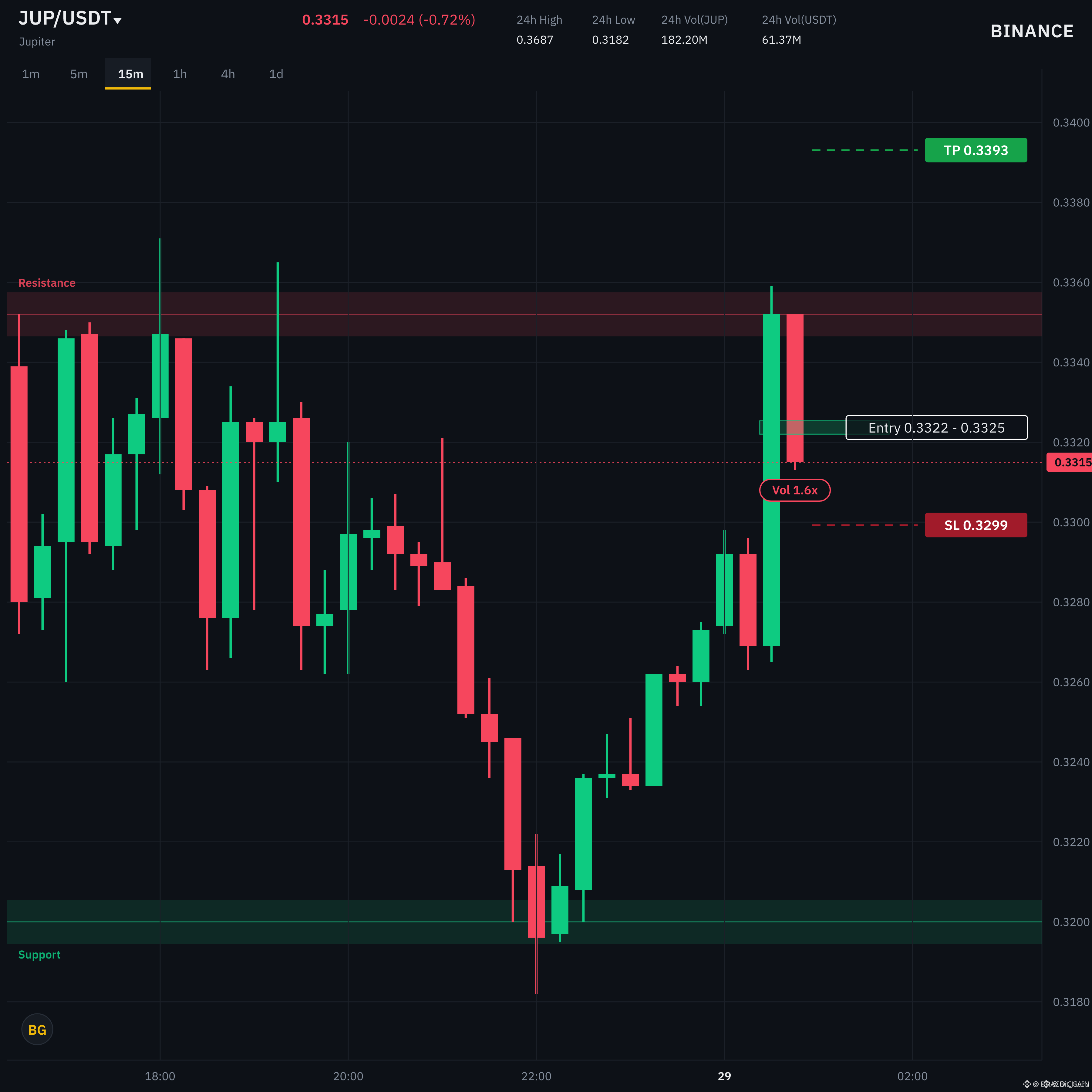
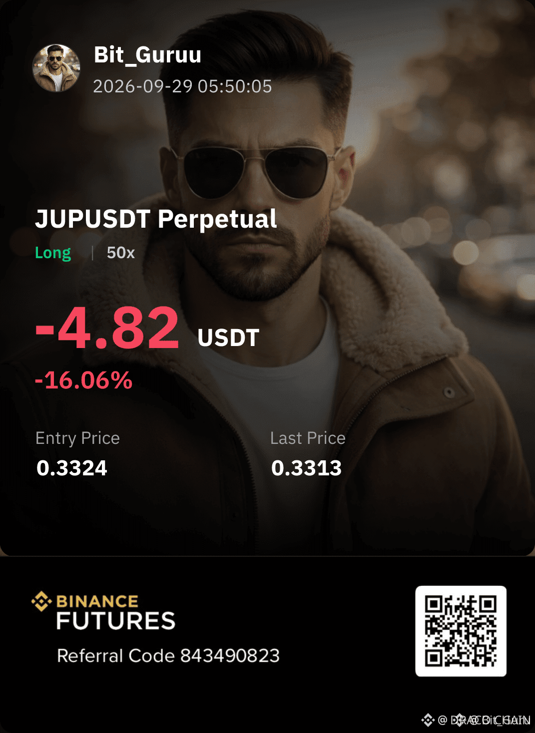
🦈 $JUP PREPARES FOR EXPANSION AS LIQUIDITY SWEEP SEALS BULLISH DEMAND ZONE! ⚡
Entry: 0.33220 - 0.33253 🟢
Target: 0.33514 - 0.33931 🚀
Stop Loss: 0.32993 ⚠️
📊 Price action on $JUP has executed a precise sweep of sell-side liquidity, stabilizing directly within a key institutional demand block. Smart money absorption is evident at these structural discount levels.
💡 The path of least resistance points toward an aggressive fair value gap fill extending toward 0.33931. 🔍 Defining structural risk strictly below 0.32993 ensures an asymmetrical setup aligned with order flow momentum.
💬 Are you positioning inside this demand block or waiting for momentum confirmation above local high? 👇
⚠️ Not financial advice. Always manage your risk. 🛡️
🏷️ #JUP #SmartMoney #LongSetup #Crypto #Trading
🎯 💎
🦈 $JUP PREPARES FOR EXPANSION AS LIQUIDITY SWEEP SEALS BULLISH DEMAND ZONE! ⚡
Entry: 0.33220 - 0.33253 🟢
Target: 0.33514 - 0.33931 🚀
Stop Loss: 0.32993 ⚠️
📊 Price action on $JUP has executed a precise sweep of sell-side liquidity, stabilizing directly within a key institutional demand block. Smart money absorption is evident at these structural discount levels.
💡 The path of least resistance points toward an aggressive fair value gap fill extending toward 0.33931. 🔍 Defining structural risk strictly below 0.32993 ensures an asymmetrical setup aligned with order flow momentum.
💬 Are you positioning inside this demand block or waiting for momentum confirmation above local high? 👇
⚠️ Not financial advice. Always manage your risk. 🛡️
🏷️ #JUP #SmartMoney #LongSetup #Crypto #Trading
🎯 💎
Entry: 0.33220 - 0.33253 🟢
Target: 0.33514 - 0.33931 🚀
Stop Loss: 0.32993 ⚠️
📊 Price action on $JUP has executed a precise sweep of sell-side liquidity, stabilizing directly within a key institutional demand block. Smart money absorption is evident at these structural discount levels.
💡 The path of least resistance points toward an aggressive fair value gap fill extending toward 0.33931. 🔍 Defining structural risk strictly below 0.32993 ensures an asymmetrical setup aligned with order flow momentum.
💬 Are you positioning inside this demand block or waiting for momentum confirmation above local high? 👇
⚠️ Not financial advice. Always manage your risk. 🛡️
🏷️ #JUP #SmartMoney #LongSetup #Crypto #Trading
🎯 💎
19

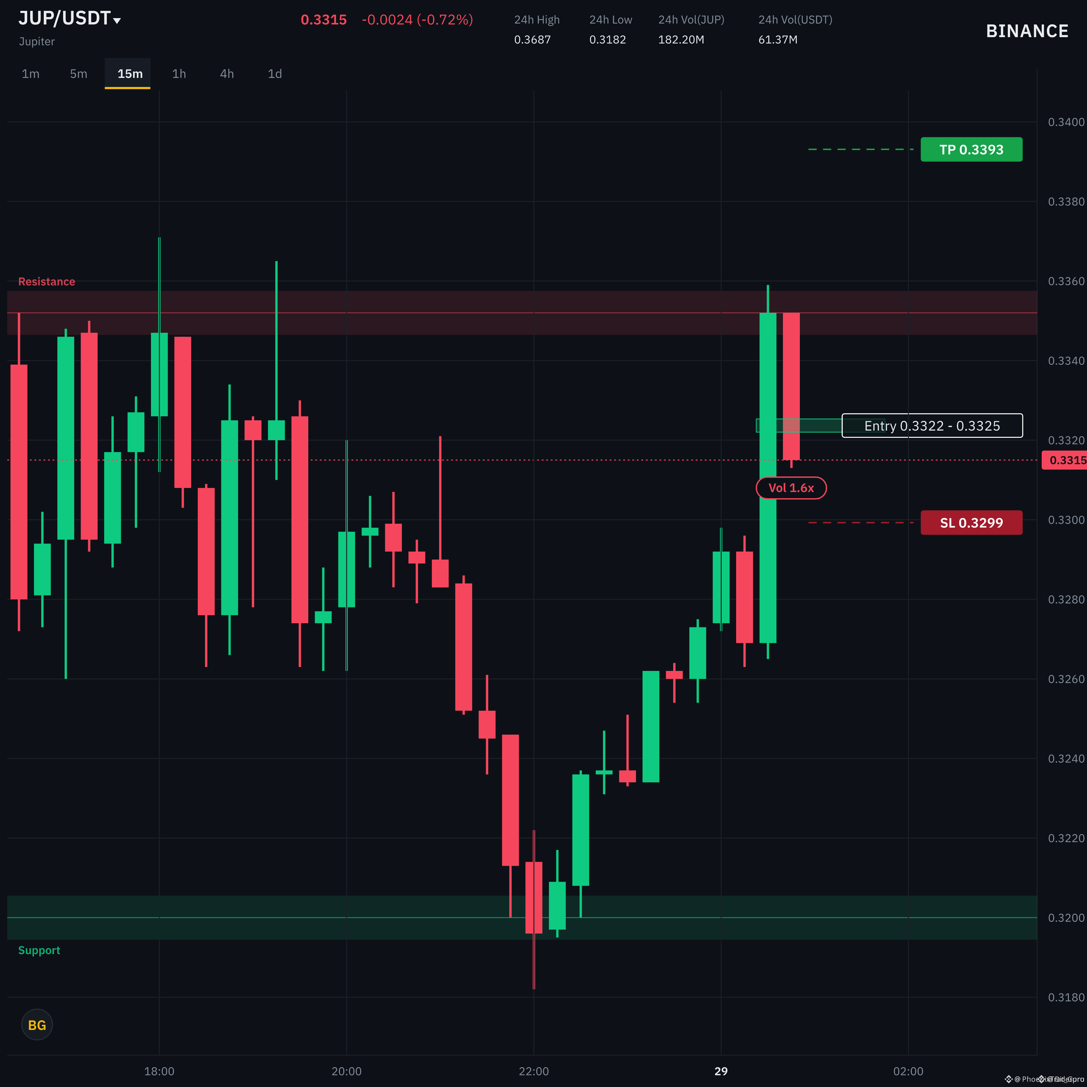
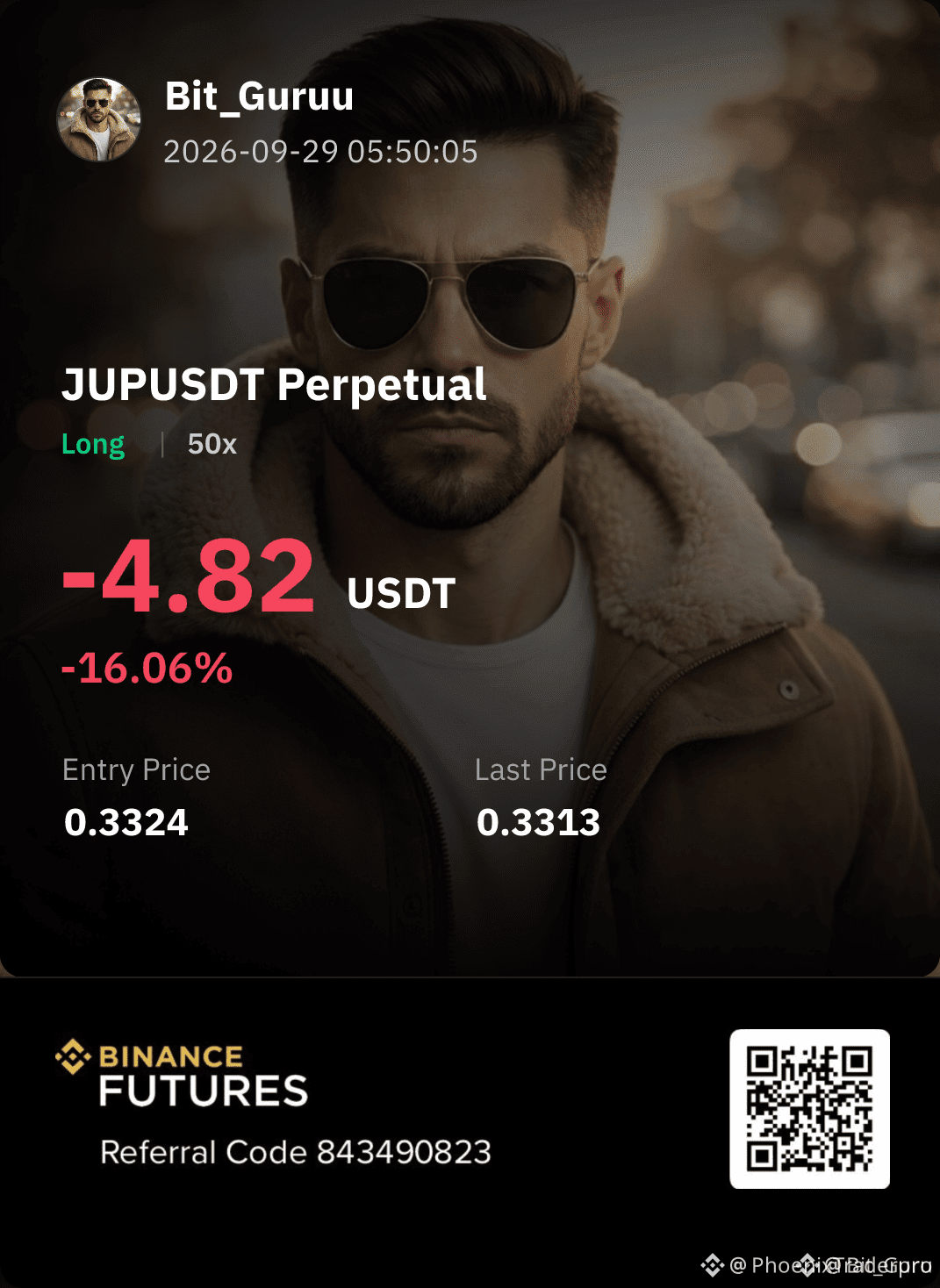
🚨 $JUP COILING FOR IGNITION AS BUYERS COMPRESS SELLER LIQUIDITY AT SUPPORT! 💥
Entry: 0.33220 - 0.33253 ⚡
Target: 0.33514 - 0.33931 🚀
Stop Loss: 0.32993 ⚠️
📌 Buyers are aggressively defending this narrow consolidation shelf, absorbing every attempt by sellers to push price lower. 📊 Order flow indicates real-time accumulation while momentum indicators signal a primed coil ready to burst past resistance.
💡 A clean breakout above immediate order blocks opens a direct run toward our final expansion targets. 💬 Are you front-running this momentum push or waiting for a confirmed reclaim? 👇
⚠️ Not financial advice. Always manage your risk. 🛡️
🏷️ #JUP #LongSetup #Altcoins #Trading
⚡ 🎯
🚨 $JUP COILING FOR IGNITION AS BUYERS COMPRESS SELLER LIQUIDITY AT SUPPORT! 💥
Entry: 0.33220 - 0.33253 ⚡
Target: 0.33514 - 0.33931 🚀
Stop Loss: 0.32993 ⚠️
📌 Buyers are aggressively defending this narrow consolidation shelf, absorbing every attempt by sellers to push price lower. 📊 Order flow indicates real-time accumulation while momentum indicators signal a primed coil ready to burst past resistance.
💡 A clean breakout above immediate order blocks opens a direct run toward our final expansion targets. 💬 Are you front-running this momentum push or waiting for a confirmed reclaim? 👇
⚠️ Not financial advice. Always manage your risk. 🛡️
🏷️ #JUP #LongSetup #Altcoins #Trading
⚡ 🎯
Entry: 0.33220 - 0.33253 ⚡
Target: 0.33514 - 0.33931 🚀
Stop Loss: 0.32993 ⚠️
📌 Buyers are aggressively defending this narrow consolidation shelf, absorbing every attempt by sellers to push price lower. 📊 Order flow indicates real-time accumulation while momentum indicators signal a primed coil ready to burst past resistance.
💡 A clean breakout above immediate order blocks opens a direct run toward our final expansion targets. 💬 Are you front-running this momentum push or waiting for a confirmed reclaim? 👇
⚠️ Not financial advice. Always manage your risk. 🛡️
🏷️ #JUP #LongSetup #Altcoins #Trading
⚡ 🎯
22

·
--
Vérifié
🚨 JUP JUST EXPANDED ITS TRADING ECOSYSTEM
Jupiter is adding more than just another token pair.
Its Perps platform recently launched six new markets: JUP, HYPE, ZEC, SPCX, SKHYNIX and SNDK.
The important part?
These new markets use Jupiter’s GUM order-book trading engine, expanding the platform beyond its existing liquidity-pool model.
And JUP itself is now part of that expansion.
This matters because Jupiter continues pushing deeper into on-chain trading infrastructure rather than staying only as a Solana swap aggregator.
More markets.
More trading infrastructure.
More reasons for traders to watch what Jupiter builds next.
Don’t chase the headline. Watch how the market reacts.
🚨 JUP UPDATE: Jupiter just expanded its Perps ecosystem with new markets. Click the $JUP setup below 🫵🏻 to review the structure and watch the next reaction.
$JUP
{future}(JUPUSDT)
.
.
.
#JUP #jupiter #Write2Earn
🚨 JUP JUST EXPANDED ITS TRADING ECOSYSTEM
Jupiter is adding more than just another token pair.
Its Perps platform recently launched six new markets: JUP, HYPE, ZEC, SPCX, SKHYNIX and SNDK.
The important part?
These new markets use Jupiter’s GUM order-book trading engine, expanding the platform beyond its existing liquidity-pool model.
And JUP itself is now part of that expansion.
This matters because Jupiter continues pushing deeper into on-chain trading infrastructure rather than staying only as a Solana swap aggregator.
More markets.
More trading infrastructure.
More reasons for traders to watch what Jupiter builds next.
Don’t chase the headline. Watch how the market reacts.
🚨 JUP UPDATE: Jupiter just expanded its Perps ecosystem with new markets. Click the $JUP setup below 🫵🏻 to review the structure and watch the next reaction.
$JUP
.
.
.
#JUP #jupiter #Write2Earn
Jupiter is adding more than just another token pair.
Its Perps platform recently launched six new markets: JUP, HYPE, ZEC, SPCX, SKHYNIX and SNDK.
The important part?
These new markets use Jupiter’s GUM order-book trading engine, expanding the platform beyond its existing liquidity-pool model.
And JUP itself is now part of that expansion.
This matters because Jupiter continues pushing deeper into on-chain trading infrastructure rather than staying only as a Solana swap aggregator.
More markets.
More trading infrastructure.
More reasons for traders to watch what Jupiter builds next.
Don’t chase the headline. Watch how the market reacts.
🚨 JUP UPDATE: Jupiter just expanded its Perps ecosystem with new markets. Click the $JUP setup below 🫵🏻 to review the structure and watch the next reaction.
$JUP
.
.
.
#JUP #jupiter #Write2Earn

888

·
--
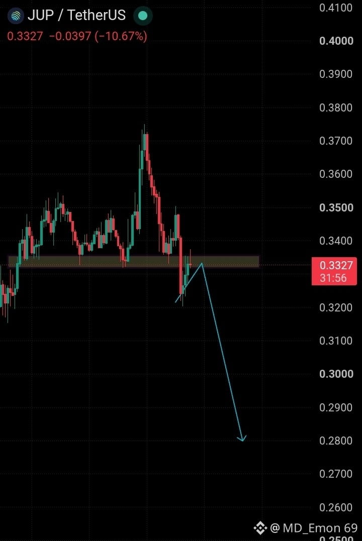
📉 JUP/USDT — Bearish Setup
$JUP
{spot}(JUPUSDT)
Price is retesting the 0.332–0.337 resistance zone.
🔴 If a strong bearish/red candle closes from this area, it could confirm downside continuation.
🎯 Potential Targets: 0.320 → 0.300 → 0.280
⚠️ Wait for candle confirmation before taking any trade.
Bearish bias below the resistance zone.
Not financial advice — trade with proper risk management.
#JUP #JUPUSDT #crypto #cryptotrading #BinanceSquare
📉 JUP/USDT — Bearish Setup
$JUP
Price is retesting the 0.332–0.337 resistance zone.
🔴 If a strong bearish/red candle closes from this area, it could confirm downside continuation.
🎯 Potential Targets: 0.320 → 0.300 → 0.280
⚠️ Wait for candle confirmation before taking any trade.
Bearish bias below the resistance zone.
Not financial advice — trade with proper risk management.
#JUP #JUPUSDT #crypto #cryptotrading #BinanceSquare
$JUP
Price is retesting the 0.332–0.337 resistance zone.
🔴 If a strong bearish/red candle closes from this area, it could confirm downside continuation.
🎯 Potential Targets: 0.320 → 0.300 → 0.280
⚠️ Wait for candle confirmation before taking any trade.
Bearish bias below the resistance zone.
Not financial advice — trade with proper risk management.
#JUP #JUPUSDT #crypto #cryptotrading #BinanceSquare
User-2a666:
A shit
3
306

·
--
🚀💸 Prime Trade Setup $JUP 🚀💸
{spot}(JUPUSDT)
$JUP has successfully printed a macro bottom structure and established an unbreakable foundation directly above a historical demand zone. The risk-to-reward ratio here is heavily skewed in favor of buyers, making it an elite swing trade.
* 🔹 Entry Zone: $JUP 0.3463 – 0.3340
* 🎯 Target 1: 0.4200
* 🎯 Target 2: 0.5100
* 🛑 Stop Loss: 0.3150
📊 Trade Rationale:
* Heavy structural defense on major daily timeframes.
* Relative Strength Index (RSI) showing hidden bullish divergence.
* Clean sky with zero immediate overhead resistance.
#JUP #BinanceExplorers #TradingSignals #cryptotrading #cryptosignals
🚀💸 Prime Trade Setup $JUP 🚀💸
$JUP has successfully printed a macro bottom structure and established an unbreakable foundation directly above a historical demand zone. The risk-to-reward ratio here is heavily skewed in favor of buyers, making it an elite swing trade.
* 🔹 Entry Zone: $JUP 0.3463 – 0.3340
* 🎯 Target 1: 0.4200
* 🎯 Target 2: 0.5100
* 🛑 Stop Loss: 0.3150
📊 Trade Rationale:
* Heavy structural defense on major daily timeframes.
* Relative Strength Index (RSI) showing hidden bullish divergence.
* Clean sky with zero immediate overhead resistance.
#JUP #BinanceExplorers #TradingSignals #cryptotrading #cryptosignals
$JUP has successfully printed a macro bottom structure and established an unbreakable foundation directly above a historical demand zone. The risk-to-reward ratio here is heavily skewed in favor of buyers, making it an elite swing trade.
* 🔹 Entry Zone: $JUP 0.3463 – 0.3340
* 🎯 Target 1: 0.4200
* 🎯 Target 2: 0.5100
* 🛑 Stop Loss: 0.3150
📊 Trade Rationale:
* Heavy structural defense on major daily timeframes.
* Relative Strength Index (RSI) showing hidden bullish divergence.
* Clean sky with zero immediate overhead resistance.
#JUP #BinanceExplorers #TradingSignals #cryptotrading #cryptosignals

13

·
--
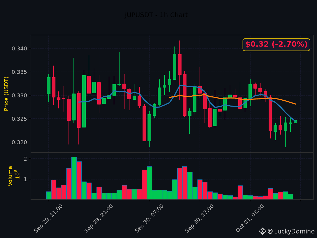
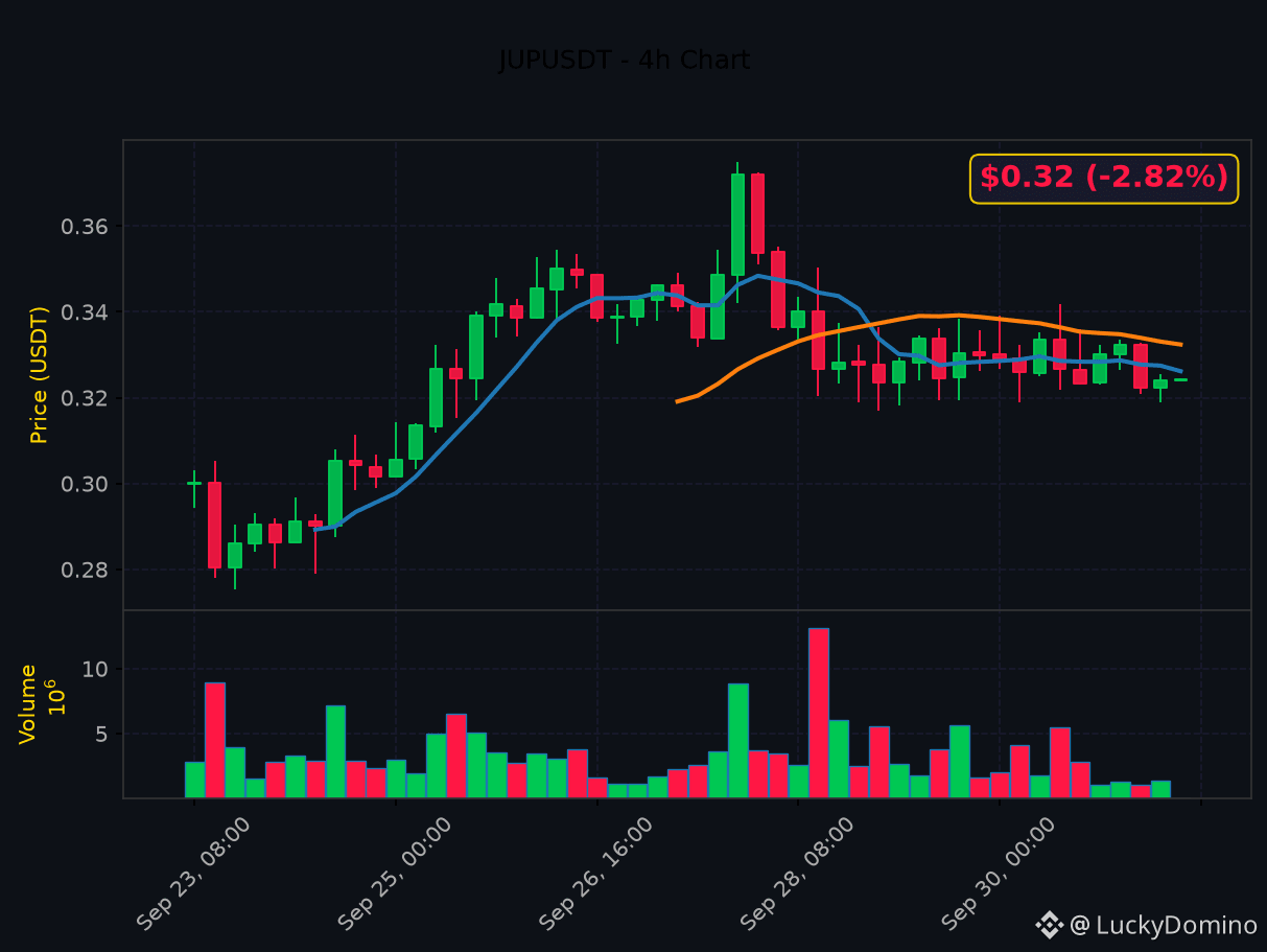
⚡ JUP tại ngã rẽ. Mức này quyết định bước tiếp theo.
📊 $JUP — Phân tích kỹ thuật chi tiết
💹 Hành động giá:
• Entry: $0.32 (-2.70% 24h)
• Hỗ trợ: $0.32 | Kháng cự: $0.34
• Pivot: $0.33
📈 Động lượng:
• RSI(14) tại 39.1 — Động lượng yếu. Bên bán kiểm soát.
• Histogram MACD âm sâu — giai đoạn phân phối.
🔗 Cấu trúc MA:
• EMA20: $0.33 | EMA50: $0.33
• Cấu trúc giảm: Giá < EMA20 < EMA50. Mỗi nhịp tăng là dịp bán.
🎯 Thiết lập giao dịch:
• Thiên hướng: SHORT
• Mục tiêu 1: $0.34 | Mục tiêu 2: $0.35
• Cắt lỗ: $0.31
• R:R = 1:1.4
🔥 LONG hay SHORT? Comment bên dưới 👇
$JUP $SOL
#JUP #PhanTichKyThuat #CryptoTrading #PriceAction
⚡ JUP tại ngã rẽ. Mức này quyết định bước tiếp theo.
📊 $JUP — Phân tích kỹ thuật chi tiết
💹 Hành động giá:
• Entry: $0.32 (-2.70% 24h)
• Hỗ trợ: $0.32 | Kháng cự: $0.34
• Pivot: $0.33
📈 Động lượng:
• RSI(14) tại 39.1 — Động lượng yếu. Bên bán kiểm soát.
• Histogram MACD âm sâu — giai đoạn phân phối.
🔗 Cấu trúc MA:
• EMA20: $0.33 | EMA50: $0.33
• Cấu trúc giảm: Giá < EMA20 < EMA50. Mỗi nhịp tăng là dịp bán.
🎯 Thiết lập giao dịch:
• Thiên hướng: SHORT
• Mục tiêu 1: $0.34 | Mục tiêu 2: $0.35
• Cắt lỗ: $0.31
• R:R = 1:1.4
🔥 LONG hay SHORT? Comment bên dưới 👇
$JUP $SOL
#JUP #PhanTichKyThuat #CryptoTrading #PriceAction
📊 $JUP — Phân tích kỹ thuật chi tiết
💹 Hành động giá:
• Entry: $0.32 (-2.70% 24h)
• Hỗ trợ: $0.32 | Kháng cự: $0.34
• Pivot: $0.33
📈 Động lượng:
• RSI(14) tại 39.1 — Động lượng yếu. Bên bán kiểm soát.
• Histogram MACD âm sâu — giai đoạn phân phối.
🔗 Cấu trúc MA:
• EMA20: $0.33 | EMA50: $0.33
• Cấu trúc giảm: Giá < EMA20 < EMA50. Mỗi nhịp tăng là dịp bán.
🎯 Thiết lập giao dịch:
• Thiên hướng: SHORT
• Mục tiêu 1: $0.34 | Mục tiêu 2: $0.35
• Cắt lỗ: $0.31
• R:R = 1:1.4
🔥 LONG hay SHORT? Comment bên dưới 👇
$JUP $SOL
#JUP #PhanTichKyThuat #CryptoTrading #PriceAction
·
--
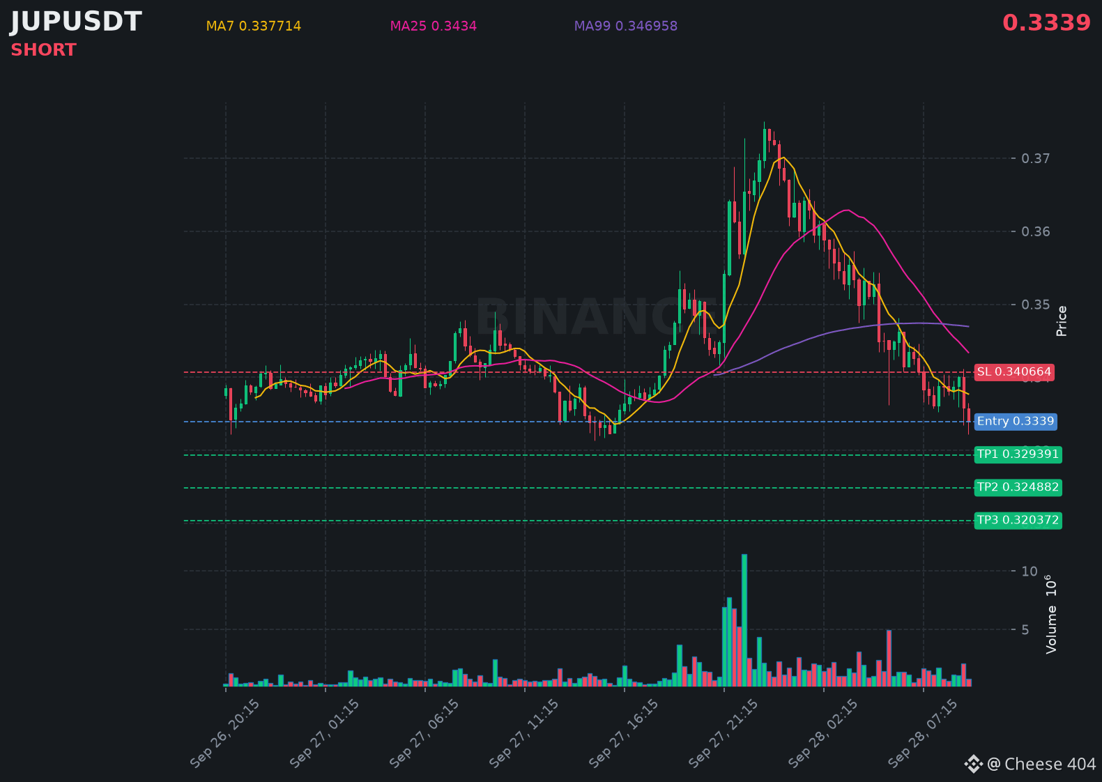
$JUP is struggling below resistance, hinting at another leg down in the coming hours.
📍 @ 0.3339 | Volume: 0.26M USD
RSI 31 | EMA20: 0.341499 USD
📈 Trade Plan:
📈 Entry: 0.332547 – 0.335253
🛑 Stop Loss: 0.340664
🎯 TP1: 0.329391
🎯 TP2: 0.324882
🎯 TP3: 0.320372
Waiting for confirmation, then riding the downtrend.
👉 $JUP 👈 Catch it
#JUP
$JUP is struggling below resistance, hinting at another leg down in the coming hours.
📍 @ 0.3339 | Volume: 0.26M USD
RSI 31 | EMA20: 0.341499 USD
📈 Trade Plan:
📈 Entry: 0.332547 – 0.335253
🛑 Stop Loss: 0.340664
🎯 TP1: 0.329391
🎯 TP2: 0.324882
🎯 TP3: 0.320372
Waiting for confirmation, then riding the downtrend.
👉 $JUP 👈 Catch it
#JUP
📍 @ 0.3339 | Volume: 0.26M USD
RSI 31 | EMA20: 0.341499 USD
📈 Trade Plan:
📈 Entry: 0.332547 – 0.335253
🛑 Stop Loss: 0.340664
🎯 TP1: 0.329391
🎯 TP2: 0.324882
🎯 TP3: 0.320372
Waiting for confirmation, then riding the downtrend.
👉 $JUP 👈 Catch it
#JUP
135

·
--
Haussier
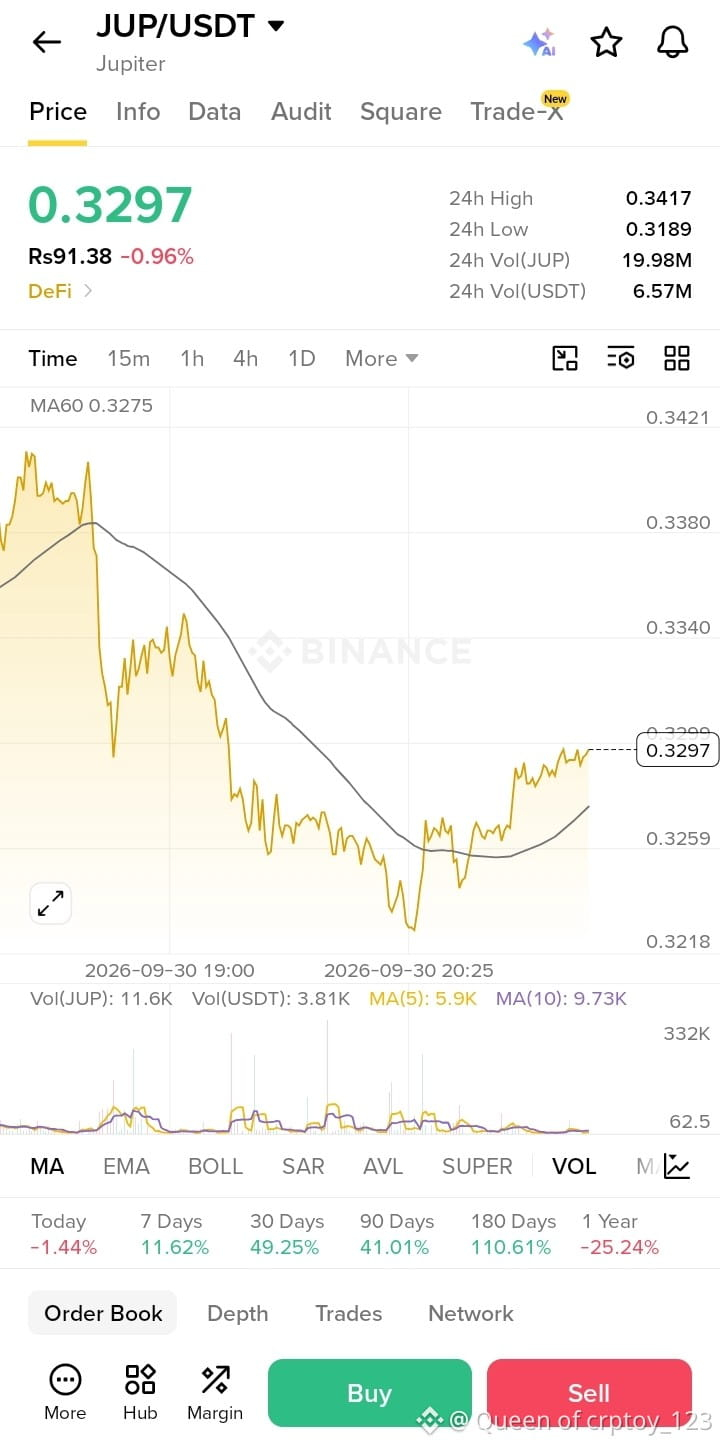
🚀 فرصة ارتداد صعودي على عملة $JUP
{future}(JUPUSDT)
! 📈
نرى تعافياً قوياً وارتداداً من مستوى الدعم المحلي، مع عودة الزخم لصالح المشترين. إليك خطة التداول السريعة لاستغلال هذه الحركة:
🟢 سعر الدخول: 0.3270 - 0.3295 دولار
🎯 الهدف الأول (TP1): 0.3350 دولار
🎯 الهدف الثاني (TP2): 0.3410 دولار
🎯 الهدف الثالث (TP3): 0.3500 دولار
🔴 وقف الخسارة (SL): 0.3210 دولار
💡 السبب: ارتد السعر بنجاح من منطقة الدعم 0.3218 مع زخم إيجابي واستعادة المتوسطات المتحركة قصيرة الأجل. ترقب اختراق المقاومة لتسريع المكاسب!
#كريبتو #تداول #عملات_رقمية #JUP
🚀 فرصة ارتداد صعودي على عملة $JUP
! 📈
نرى تعافياً قوياً وارتداداً من مستوى الدعم المحلي، مع عودة الزخم لصالح المشترين. إليك خطة التداول السريعة لاستغلال هذه الحركة:
🟢 سعر الدخول: 0.3270 - 0.3295 دولار
🎯 الهدف الأول (TP1): 0.3350 دولار
🎯 الهدف الثاني (TP2): 0.3410 دولار
🎯 الهدف الثالث (TP3): 0.3500 دولار
🔴 وقف الخسارة (SL): 0.3210 دولار
💡 السبب: ارتد السعر بنجاح من منطقة الدعم 0.3218 مع زخم إيجابي واستعادة المتوسطات المتحركة قصيرة الأجل. ترقب اختراق المقاومة لتسريع المكاسب!
#كريبتو #تداول #عملات_رقمية #JUP
! 📈
نرى تعافياً قوياً وارتداداً من مستوى الدعم المحلي، مع عودة الزخم لصالح المشترين. إليك خطة التداول السريعة لاستغلال هذه الحركة:
🟢 سعر الدخول: 0.3270 - 0.3295 دولار
🎯 الهدف الأول (TP1): 0.3350 دولار
🎯 الهدف الثاني (TP2): 0.3410 دولار
🎯 الهدف الثالث (TP3): 0.3500 دولار
🔴 وقف الخسارة (SL): 0.3210 دولار
💡 السبب: ارتد السعر بنجاح من منطقة الدعم 0.3218 مع زخم إيجابي واستعادة المتوسطات المتحركة قصيرة الأجل. ترقب اختراق المقاومة لتسريع المكاسب!
#كريبتو #تداول #عملات_رقمية #JUP
1

·
--
Article
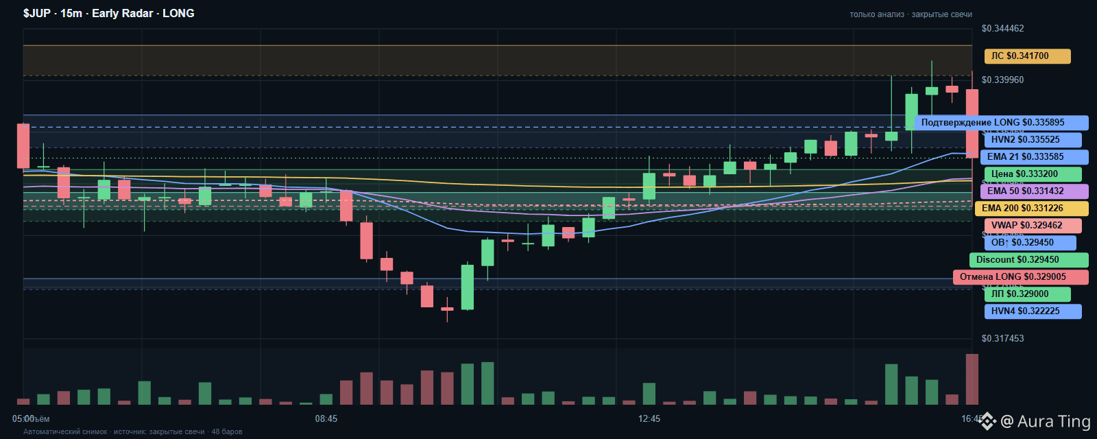
JUP · Early Radar⚡ Достигнута цель сценария LONG.
закрытие 0.3388 / уровень 0.3359 · объём 4.59× / ориентир 1.25×
🧩 LONG ниже прежнего входа за $JUP (JUP/USDT) · ⏱️ 15m · контекст; триггер 5m
⚠️ НОВЫЙ LONG-ВХОД НЕ АКТУАЛЕН: две последние закрытые 5m-свечи находятся ниже $0.3359; последнее закрытие $0.3332. Бумажный сценарий остаётся в журнале до стопа $0.329; для нового входа нужны новый пробой и ретест.
📊 Снимок Binance Spot:
💰 Цена: $0.3332 · ⏱️ 1ч: -0.81% · 📅 24ч: +1.09%.
💧 Объём за час $556,535 · 🔁 Сделок 8,756.
📊 Активность M5: объём $128,511 · сделок 1 148 · Score активности 85/100
📚 Стакан ±1% · глубина: $157,577 · ↔️ спред: 0.03%.
🔎 Проверка данных: подтверждены.
📈 LONG контекст: цена выше EMA50 и VWAP (15м)
📊 Техническая карта · ⏱️ 15m · контекст; триггер 5m.
🧭 Контекст: покупка пока не подтверждена — ждём согласования свечей, объёма и уровня; это не сигнал на продажу. ❗
✅ Данные сверены.
📈 Индикаторы:
〽️ EMA 21: $0.3336
〽️ EMA 50: $0.3314
〽️ EMA 200: $0.3312
⚖️ VWAP: $0.3295
🌡️ RSI 14: 50.9
🎯 Уровни:
🧱 Старшие ТФ: Старшие уровни 1D/4H/1H по swing high/low.
🔵 Подтверждение · закрепление выше: $0.3359
🔴 Сопротивление · верхняя зона: $0.3357
🟢 Поддержка · нижняя зона: $0.3292
🛑 Отмена сценария · ниже поддержки: $0.329
🏁 Следующая старшая зона: $0.3386
🗓️ Старший фильтр 1D: бычья структура · поддерживает LONG-контекст · крупные swing-уровни: поддержка $0.2754 · сопротивление $0.375. D1 задаёт контекст, но не отменяет 15m-зону и 5m-триггер.
🟩 Зоны:
🟩 HVN4: $0.3218–$0.3227
🟩 локальная поддержка: $0.3277–$0.3322
🟩 HVN2: $0.3341–$0.337
🧭 Пилотная Fibonacci-модель LONG · 15m: пробой структуры коррекции подтверждён.
📐 Импульс вверх: $0.3225 → $0.3334 · пробой структуры; тело 1.70× медианы · объём 2.78× медианы.
↩️ Коррекция: 7 контртрендовые свечи · глубина 40.4% · зона 38,2–61,8% ($0.3267–$0.3292).
✅ Подтверждение структуры: закрытие 15m выше $0.3325.
🛑 Отмена пилотного сценария: закрытие 15m ниже $0.3248 (78,6% импульса).
🧪 Это отдельная наблюдательная модель: она пока не меняет фильтры автопубликации; вероятность не рассчитана.
🧭 Цена закрепилась ниже прежнего входа $0.3359. Новый LONG-вход сейчас не подтверждён; бумажный сценарий отслеживается до стопа $0.329.
🎯 Нового LONG-входа сейчас нет; для него нужны новый пробой и новый удержанный ретест.
🚨 Уровень отмены прежнего входа сохранён только для истории.
🧭 Состояние: прежний бумажный сценарий отслеживается, но текущая цена не является новой точкой входа.
⚠️ Сценарий BLOCKED: контекст свечей, объёма и уровня не согласован; медвежий тренд; тренд рынка направлен против LONG-сценария. Причины риска раскрыты выше; публикация не означает одобрения сценария системой.
🏁 Цель бумажного сценария: $0.3386.
📎 График будет прикреплён к этому посту.
🙂 Самостоятельно проверяйте уровни, ликвидность и риск.
⚠️ Это исследовательское наблюдение, а не рекомендация купить или продать. Проверьте график, контракт и собственный риск.
#JUP #CryptoAnalysis #Earlyradar_onchain #RiskManagement #Binance_Square
JUP · Early Radar
⚡ Достигнута цель сценария LONG.
закрытие 0.3388 / уровень 0.3359 · объём 4.59× / ориентир 1.25×
🧩 LONG ниже прежнего входа за $JUP (JUP/USDT) · ⏱️ 15m · контекст; триггер 5m
⚠️ НОВЫЙ LONG-ВХОД НЕ АКТУАЛЕН: две последние закрытые 5m-свечи находятся ниже $0.3359; последнее закрытие $0.3332. Бумажный сценарий остаётся в журнале до стопа $0.329; для нового входа нужны новый пробой и ретест.
📊 Снимок Binance Spot:
💰 Цена: $0.3332 · ⏱️ 1ч: -0.81% · 📅 24ч: +1.09%.
💧 Объём за час $556,535 · 🔁 Сделок 8,756.
📊 Активность M5: объём $128,511 · сделок 1 148 · Score активности 85/100
📚 Стакан ±1% · глубина: $157,577 · ↔️ спред: 0.03%.
🔎 Проверка данных: подтверждены.
📈 LONG контекст: цена выше EMA50 и VWAP (15м)
📊 Техническая карта · ⏱️ 15m · контекст; триггер 5m.
🧭 Контекст: покупка пока не подтверждена — ждём согласования свечей, объёма и уровня; это не сигнал на продажу. ❗
✅ Данные сверены.
📈 Индикаторы:
〽️ EMA 21: $0.3336
〽️ EMA 50: $0.3314
〽️ EMA 200: $0.3312
⚖️ VWAP: $0.3295
🌡️ RSI 14: 50.9
🎯 Уровни:
🧱 Старшие ТФ: Старшие уровни 1D/4H/1H по swing high/low.
🔵 Подтверждение · закрепление выше: $0.3359
🔴 Сопротивление · верхняя зона: $0.3357
🟢 Поддержка · нижняя зона: $0.3292
🛑 Отмена сценария · ниже поддержки: $0.329
🏁 Следующая старшая зона: $0.3386
🗓️ Старший фильтр 1D: бычья структура · поддерживает LONG-контекст · крупные swing-уровни: поддержка $0.2754 · сопротивление $0.375. D1 задаёт контекст, но не отменяет 15m-зону и 5m-триггер.
🟩 Зоны:
🟩 HVN4: $0.3218–$0.3227
🟩 локальная поддержка: $0.3277–$0.3322
🟩 HVN2: $0.3341–$0.337
🧭 Пилотная Fibonacci-модель LONG · 15m: пробой структуры коррекции подтверждён.
📐 Импульс вверх: $0.3225 → $0.3334 · пробой структуры; тело 1.70× медианы · объём 2.78× медианы.
↩️ Коррекция: 7 контртрендовые свечи · глубина 40.4% · зона 38,2–61,8% ($0.3267–$0.3292).
✅ Подтверждение структуры: закрытие 15m выше $0.3325.
🛑 Отмена пилотного сценария: закрытие 15m ниже $0.3248 (78,6% импульса).
🧪 Это отдельная наблюдательная модель: она пока не меняет фильтры автопубликации; вероятность не рассчитана.
🧭 Цена закрепилась ниже прежнего входа $0.3359. Новый LONG-вход сейчас не подтверждён; бумажный сценарий отслеживается до стопа $0.329.
🎯 Нового LONG-входа сейчас нет; для него нужны новый пробой и новый удержанный ретест.
🚨 Уровень отмены прежнего входа сохранён только для истории.
🧭 Состояние: прежний бумажный сценарий отслеживается, но текущая цена не является новой точкой входа.
⚠️ Сценарий BLOCKED: контекст свечей, объёма и уровня не согласован; медвежий тренд; тренд рынка направлен против LONG-сценария. Причины риска раскрыты выше; публикация не означает одобрения сценария системой.
🏁 Цель бумажного сценария: $0.3386.
📎 График будет прикреплён к этому посту.
🙂 Самостоятельно проверяйте уровни, ликвидность и риск.
⚠️ Это исследовательское наблюдение, а не рекомендация купить или продать. Проверьте график, контракт и собственный риск.
#JUP #CryptoAnalysis #Earlyradar_onchain #RiskManagement #Binance_Square
закрытие 0.3388 / уровень 0.3359 · объём 4.59× / ориентир 1.25×
🧩 LONG ниже прежнего входа за $JUP (JUP/USDT) · ⏱️ 15m · контекст; триггер 5m
⚠️ НОВЫЙ LONG-ВХОД НЕ АКТУАЛЕН: две последние закрытые 5m-свечи находятся ниже $0.3359; последнее закрытие $0.3332. Бумажный сценарий остаётся в журнале до стопа $0.329; для нового входа нужны новый пробой и ретест.
📊 Снимок Binance Spot:
💰 Цена: $0.3332 · ⏱️ 1ч: -0.81% · 📅 24ч: +1.09%.
💧 Объём за час $556,535 · 🔁 Сделок 8,756.
📊 Активность M5: объём $128,511 · сделок 1 148 · Score активности 85/100
📚 Стакан ±1% · глубина: $157,577 · ↔️ спред: 0.03%.
🔎 Проверка данных: подтверждены.
📈 LONG контекст: цена выше EMA50 и VWAP (15м)
📊 Техническая карта · ⏱️ 15m · контекст; триггер 5m.
🧭 Контекст: покупка пока не подтверждена — ждём согласования свечей, объёма и уровня; это не сигнал на продажу. ❗
✅ Данные сверены.
📈 Индикаторы:
〽️ EMA 21: $0.3336
〽️ EMA 50: $0.3314
〽️ EMA 200: $0.3312
⚖️ VWAP: $0.3295
🌡️ RSI 14: 50.9
🎯 Уровни:
🧱 Старшие ТФ: Старшие уровни 1D/4H/1H по swing high/low.
🔵 Подтверждение · закрепление выше: $0.3359
🔴 Сопротивление · верхняя зона: $0.3357
🟢 Поддержка · нижняя зона: $0.3292
🛑 Отмена сценария · ниже поддержки: $0.329
🏁 Следующая старшая зона: $0.3386
🗓️ Старший фильтр 1D: бычья структура · поддерживает LONG-контекст · крупные swing-уровни: поддержка $0.2754 · сопротивление $0.375. D1 задаёт контекст, но не отменяет 15m-зону и 5m-триггер.
🟩 Зоны:
🟩 HVN4: $0.3218–$0.3227
🟩 локальная поддержка: $0.3277–$0.3322
🟩 HVN2: $0.3341–$0.337
🧭 Пилотная Fibonacci-модель LONG · 15m: пробой структуры коррекции подтверждён.
📐 Импульс вверх: $0.3225 → $0.3334 · пробой структуры; тело 1.70× медианы · объём 2.78× медианы.
↩️ Коррекция: 7 контртрендовые свечи · глубина 40.4% · зона 38,2–61,8% ($0.3267–$0.3292).
✅ Подтверждение структуры: закрытие 15m выше $0.3325.
🛑 Отмена пилотного сценария: закрытие 15m ниже $0.3248 (78,6% импульса).
🧪 Это отдельная наблюдательная модель: она пока не меняет фильтры автопубликации; вероятность не рассчитана.
🧭 Цена закрепилась ниже прежнего входа $0.3359. Новый LONG-вход сейчас не подтверждён; бумажный сценарий отслеживается до стопа $0.329.
🎯 Нового LONG-входа сейчас нет; для него нужны новый пробой и новый удержанный ретест.
🚨 Уровень отмены прежнего входа сохранён только для истории.
🧭 Состояние: прежний бумажный сценарий отслеживается, но текущая цена не является новой точкой входа.
⚠️ Сценарий BLOCKED: контекст свечей, объёма и уровня не согласован; медвежий тренд; тренд рынка направлен против LONG-сценария. Причины риска раскрыты выше; публикация не означает одобрения сценария системой.
🏁 Цель бумажного сценария: $0.3386.
📎 График будет прикреплён к этому посту.
🙂 Самостоятельно проверяйте уровни, ликвидность и риск.
⚠️ Это исследовательское наблюдение, а не рекомендация купить или продать. Проверьте график, контракт и собственный риск.
#JUP #CryptoAnalysis #Earlyradar_onchain #RiskManagement #Binance_Square
1
Connectez-vous pour découvrir plus de contenu
Rejoignez la communauté mondiale des adeptes de cryptomonnaies sur Binance Square
⚡️ Suviez les dernières informations importantes sur les cryptomonnaies.
💬 Jugé digne de confiance par la plus grande plateforme d’échange de cryptomonnaies au monde.
👍 Découvrez les connaissances que partagent les créateurs vérifiés.
Adresse e-mail/Nº de téléphone
Sujets d’actualité
1
#EtherGains70.9%InQ3
11,971 vues
259 mentions
2
#TreasuryLetsStatesFileStablecoinCertificationsEarly
0 vues
0 mentions
3
#US10YearYieldNears5.3%
48,882 vues
474 mentions
4
#DollarIndexHitsHighestSinceMay2025
2,257 vues
147 mentions
5
#USWeeklyJoblessClaimsFallTo197000
6,495 vues
187 mentions
6
#BitcoinETFsTake$6.34BillionInQ3
3,317 vues
45 mentions
7
#KoreaProposesTokenizingStocksAndBonds
35,152 vues
554 mentions
8
#MetaMaskExitsLidoValidatorsAfterSecurityIncident
115,849 vues
1,294 mentions
9
#MicronBeatsEarningsLiftsGuidance
63,646 vues
951 mentions
10
#CFTCSubmitsTwoEventContractRulesToWhiteHouse
43,676 vues
739 mentions