
#uiuxdesign
uiuxdesign
742 views
7 Discussing
Hot
Latest

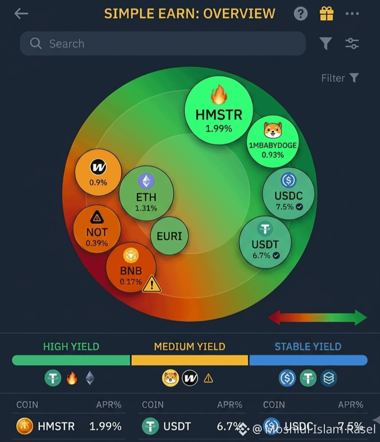
I was looking at the Binance Simple Earn section recently and realized how tedious it is to scroll through rows of text just to compare yields. So, I decided to redesign the interface into a purely visual dashboard.
The concept is simple: instead of reading numbers, you just look at the colors and shapes to understand your profits.
I designed a circular heatmap where the green areas indicate higher profitability, while the red and orange areas show lower returns or underperforming assets. The coins are represented as bubbles, and their size and placement correspond directly to their APR.
At the bottom, I added a straightforward bar graph that breaks your portfolio down into high, medium, and stable yields. The entire goal of this design is to let you understand exactly how your assets are performing at a single glance, without needing to read or process any text.
I would love to hear your thoughts on this concept. Do you prefer the traditional list format, or does a visual approach like this make more sense for tracking your crypto investments?
#Binance #UIUXDesign #cryptotradingpro #Web3 #ProductDesign
I was looking at the Binance Simple Earn section recently and realized how tedious it is to scroll through rows of text just to compare yields. So, I decided to redesign the interface into a purely visual dashboard.
The concept is simple: instead of reading numbers, you just look at the colors and shapes to understand your profits.
I designed a circular heatmap where the green areas indicate higher profitability, while the red and orange areas show lower returns or underperforming assets. The coins are represented as bubbles, and their size and placement correspond directly to their APR.
At the bottom, I added a straightforward bar graph that breaks your portfolio down into high, medium, and stable yields. The entire goal of this design is to let you understand exactly how your assets are performing at a single glance, without needing to read or process any text.
I would love to hear your thoughts on this concept. Do you prefer the traditional list format, or does a visual approach like this make more sense for tracking your crypto investments?
#Binance #UIUXDesign #cryptotradingpro #Web3 #ProductDesign
The concept is simple: instead of reading numbers, you just look at the colors and shapes to understand your profits.
I designed a circular heatmap where the green areas indicate higher profitability, while the red and orange areas show lower returns or underperforming assets. The coins are represented as bubbles, and their size and placement correspond directly to their APR.
At the bottom, I added a straightforward bar graph that breaks your portfolio down into high, medium, and stable yields. The entire goal of this design is to let you understand exactly how your assets are performing at a single glance, without needing to read or process any text.
I would love to hear your thoughts on this concept. Do you prefer the traditional list format, or does a visual approach like this make more sense for tracking your crypto investments?
#Binance #UIUXDesign #cryptotradingpro #Web3 #ProductDesign
171
Log in to explore more content
Join global crypto users on Binance Square
⚡️ Get latest and useful information about crypto.
💬 Trusted by the world’s largest crypto exchange.
👍 Discover real insights from verified creators.
Email / Phone number
Trending Topics
1
#BitcoinHoldsAbove$77000
6,035 views
161 Discussing
2
#FedHikeOddsRiseTo89%
38,122 views
725 Discussing
3
#BitcoinCrosses$78000
8,885 views
192 Discussing
4
#RLUSDSupplyHitsRecord$2.442B
1,585 views
31 Discussing
5
#AvalancheIntegratesIntoUAEPassDigitalVault
45,795 views
797 Discussing
6
#UKSeeksViewsOnTokenizingGold
33,607 views
577 Discussing
7
#AnthropicCEOCallsForAISlowdown
204,855 views
3,092 Discussing
8
#RevolutDataLeakReportedlyPostedAttackersThreatenDailyReleases
3,826 views
80 Discussing
9
#BrazilCentralBankRaisesVASPCapitalRequirements
31,056 views
712 Discussing
10
#BitcoinThirdSingleBlockReorgInFourWeeks
77,282 views
1,509 Discussing