
Cryptic Lion
239 Posts

Cryptic Lion
Report
Block User
Follow for High-Quality, Free Signals Backed by In-Depth Technical Analysis & Research!
29 Following
672 Followers
915 Liked
Posts
All
Quotes
PINNED
·
--
Article
Nobody Saw This Coming! Bitcoin to CRASH to $93K—Then Skyrocket to $132K?$BTC
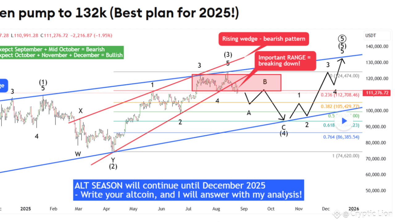
Brace yourself: Bitcoin’s next move could shock the entire crypto world—and it might make or break 2025 for traders. A recent chart analysis by Xanrox has ignited heated debates across TradingView, with a prediction that feels both terrifying and thrilling at the same time. According to the bold forecast, Bitcoin could first plunge down to $93,000, only to stage a dramatic rebound all the way to $132,000. Yes, the rollercoaster is real—and no one saw this twist coming.
The Jaw-Dropping Breakdown
In his analysis, Xanrox begins with a chilling statement: “No one is expecting this scenario on BTC!” That line alone is enough to freeze traders in their seats. The chart shows a red rising wedge pattern, which is already breaking down. "The trendline of the wedge is breaking down, and we already had a retest, so there is nothing that can stop the price from falling pretty much," Xanrox warns. In simple terms, this means Bitcoin is on the verge of a serious correction, and the next few weeks could get bloody.
From an Elliott Wave perspective, things don’t look any better. The 1-2-3-4-5 impulse wave cycle is reportedly complete, and that usually signals an upcoming ABC corrective wave. For seasoned traders, that means turbulence is on the horizon. Add to that the historical fact that September has always been Bitcoin’s worst-performing month, and you have a recipe for fear. “I don’t want to be long on Bitcoin in this time period,” Xanrox admits—a warning shot to anyone thinking about holding blindly through the storm.
The Twist That Could Change Everything
But here’s the catch: this terrifying crash prediction isn’t all doom and gloom. If Bitcoin truly falls as low as $93K, it could open up the golden entry zone traders have been waiting for. Xanrox highlights the key Fibonacci retracement levels—**0.618, 0.5, and 0.382**—as the likely points where BTC could bounce. If the price stabilizes at one of these sweet spots, it could create the launchpad for the next monster rally—all the way up to $132,000.
This dual scenario—crash then pump—is what makes the analysis so sensational. It’s being hailed as the "**best plan for 2025**," a strategy that could allow traders to maximize profits by timing both the fall and the recovery. Whether it plays out like this or not, the forecast has already captured massive attention.
What’s the Play for Traders?
So how should traders approach this scenario? The first step is to watch closely for the wedge breakdown. If September delivers its usual bearish pain, that could be the starting point for the predicted correction. Next, the Fibonacci retracement levels will become the critical battlegrounds. A bounce at one of these zones could confirm the next bullish reversal. Finally, it comes down to timing—are you ready to buy fear at $93K, or will you get trapped by panic?
Why This Is Going Viral
There’s no denying the virality of this forecast. The shock factor of Bitcoin crashing so low before skyrocketing has traders glued to their screens. Xanrox fuels the hype with his bold claim: “I have the best technical analysis on the internet.” Confidence like that demands attention. Add in the seasonal fear of September plus the irresistible lure of a "best plan for 2025," and you have the perfect storm for a post that spreads like wildfire across crypto communities.
The Final Word
At the end of the day, this prediction boils down to one dramatic headline: “Bitcoin is about to CRASH to $93K... before blasting OFF to $132K!” Whether you believe it or not, the analysis has given traders a reason to rethink their strategies going into 2025. The countdown to the drop—and the possible pump—has already begun. For those daring enough, it might just be the opportunity of a lifetime.
⚠️ Disclaimer: This is not financial advice. Always DYOR (Do Your Own Research) before making trading decisions.
👉👉 Trade here $BTC #bitcoin
{spot}(BTCUSDT)
Nobody Saw This Coming! Bitcoin to CRASH to $93K—Then Skyrocket to $132K?
$BTC
Brace yourself: Bitcoin’s next move could shock the entire crypto world—and it might make or break 2025 for traders. A recent chart analysis by Xanrox has ignited heated debates across TradingView, with a prediction that feels both terrifying and thrilling at the same time. According to the bold forecast, Bitcoin could first plunge down to $93,000, only to stage a dramatic rebound all the way to $132,000. Yes, the rollercoaster is real—and no one saw this twist coming.
The Jaw-Dropping Breakdown
In his analysis, Xanrox begins with a chilling statement: “No one is expecting this scenario on BTC!” That line alone is enough to freeze traders in their seats. The chart shows a red rising wedge pattern, which is already breaking down. "The trendline of the wedge is breaking down, and we already had a retest, so there is nothing that can stop the price from falling pretty much," Xanrox warns. In simple terms, this means Bitcoin is on the verge of a serious correction, and the next few weeks could get bloody.
From an Elliott Wave perspective, things don’t look any better. The 1-2-3-4-5 impulse wave cycle is reportedly complete, and that usually signals an upcoming ABC corrective wave. For seasoned traders, that means turbulence is on the horizon. Add to that the historical fact that September has always been Bitcoin’s worst-performing month, and you have a recipe for fear. “I don’t want to be long on Bitcoin in this time period,” Xanrox admits—a warning shot to anyone thinking about holding blindly through the storm.
The Twist That Could Change Everything
But here’s the catch: this terrifying crash prediction isn’t all doom and gloom. If Bitcoin truly falls as low as $93K, it could open up the golden entry zone traders have been waiting for. Xanrox highlights the key Fibonacci retracement levels—**0.618, 0.5, and 0.382**—as the likely points where BTC could bounce. If the price stabilizes at one of these sweet spots, it could create the launchpad for the next monster rally—all the way up to $132,000.
This dual scenario—crash then pump—is what makes the analysis so sensational. It’s being hailed as the "**best plan for 2025**," a strategy that could allow traders to maximize profits by timing both the fall and the recovery. Whether it plays out like this or not, the forecast has already captured massive attention.
What’s the Play for Traders?
So how should traders approach this scenario? The first step is to watch closely for the wedge breakdown. If September delivers its usual bearish pain, that could be the starting point for the predicted correction. Next, the Fibonacci retracement levels will become the critical battlegrounds. A bounce at one of these zones could confirm the next bullish reversal. Finally, it comes down to timing—are you ready to buy fear at $93K, or will you get trapped by panic?
Why This Is Going Viral
There’s no denying the virality of this forecast. The shock factor of Bitcoin crashing so low before skyrocketing has traders glued to their screens. Xanrox fuels the hype with his bold claim: “I have the best technical analysis on the internet.” Confidence like that demands attention. Add in the seasonal fear of September plus the irresistible lure of a "best plan for 2025," and you have the perfect storm for a post that spreads like wildfire across crypto communities.
The Final Word
At the end of the day, this prediction boils down to one dramatic headline: “Bitcoin is about to CRASH to $93K... before blasting OFF to $132K!” Whether you believe it or not, the analysis has given traders a reason to rethink their strategies going into 2025. The countdown to the drop—and the possible pump—has already begun. For those daring enough, it might just be the opportunity of a lifetime.
⚠️ Disclaimer: This is not financial advice. Always DYOR (Do Your Own Research) before making trading decisions.
👉👉 Trade here $BTC #bitcoin
Brace yourself: Bitcoin’s next move could shock the entire crypto world—and it might make or break 2025 for traders. A recent chart analysis by Xanrox has ignited heated debates across TradingView, with a prediction that feels both terrifying and thrilling at the same time. According to the bold forecast, Bitcoin could first plunge down to $93,000, only to stage a dramatic rebound all the way to $132,000. Yes, the rollercoaster is real—and no one saw this twist coming.
The Jaw-Dropping Breakdown
In his analysis, Xanrox begins with a chilling statement: “No one is expecting this scenario on BTC!” That line alone is enough to freeze traders in their seats. The chart shows a red rising wedge pattern, which is already breaking down. "The trendline of the wedge is breaking down, and we already had a retest, so there is nothing that can stop the price from falling pretty much," Xanrox warns. In simple terms, this means Bitcoin is on the verge of a serious correction, and the next few weeks could get bloody.
From an Elliott Wave perspective, things don’t look any better. The 1-2-3-4-5 impulse wave cycle is reportedly complete, and that usually signals an upcoming ABC corrective wave. For seasoned traders, that means turbulence is on the horizon. Add to that the historical fact that September has always been Bitcoin’s worst-performing month, and you have a recipe for fear. “I don’t want to be long on Bitcoin in this time period,” Xanrox admits—a warning shot to anyone thinking about holding blindly through the storm.
The Twist That Could Change Everything
But here’s the catch: this terrifying crash prediction isn’t all doom and gloom. If Bitcoin truly falls as low as $93K, it could open up the golden entry zone traders have been waiting for. Xanrox highlights the key Fibonacci retracement levels—**0.618, 0.5, and 0.382**—as the likely points where BTC could bounce. If the price stabilizes at one of these sweet spots, it could create the launchpad for the next monster rally—all the way up to $132,000.
This dual scenario—crash then pump—is what makes the analysis so sensational. It’s being hailed as the "**best plan for 2025**," a strategy that could allow traders to maximize profits by timing both the fall and the recovery. Whether it plays out like this or not, the forecast has already captured massive attention.
What’s the Play for Traders?
So how should traders approach this scenario? The first step is to watch closely for the wedge breakdown. If September delivers its usual bearish pain, that could be the starting point for the predicted correction. Next, the Fibonacci retracement levels will become the critical battlegrounds. A bounce at one of these zones could confirm the next bullish reversal. Finally, it comes down to timing—are you ready to buy fear at $93K, or will you get trapped by panic?
Why This Is Going Viral
There’s no denying the virality of this forecast. The shock factor of Bitcoin crashing so low before skyrocketing has traders glued to their screens. Xanrox fuels the hype with his bold claim: “I have the best technical analysis on the internet.” Confidence like that demands attention. Add in the seasonal fear of September plus the irresistible lure of a "best plan for 2025," and you have the perfect storm for a post that spreads like wildfire across crypto communities.
The Final Word
At the end of the day, this prediction boils down to one dramatic headline: “Bitcoin is about to CRASH to $93K... before blasting OFF to $132K!” Whether you believe it or not, the analysis has given traders a reason to rethink their strategies going into 2025. The countdown to the drop—and the possible pump—has already begun. For those daring enough, it might just be the opportunity of a lifetime.
⚠️ Disclaimer: This is not financial advice. Always DYOR (Do Your Own Research) before making trading decisions.
👉👉 Trade here $BTC #bitcoin
45
21
80
95.1k
PINNED
·
--
🚨💎 Only ONE Click Could Make You 10 ETH Richer! 💎🚨
The countdown is ticking ⏳ and when it hits 00:00 – a single click on the #ETHButton could change everything. That’s right — 10 ETH is up for grabs in one instant move! ⚡
Don’t blink. Don’t hesitate. Just imagine — one click, one chance, one massive win. 🎯
🔥 Will you be the one to claim 10 ETH? 🔥
Click here to enter: [ETH Game](https://www.binance.com/game/button/eth-button-aug2025?ref=80293458®isterChannel=GRO-BTN-eth-button-aug2025&utm_medium=app_share_link_whatsapp&utm_source=share)
🚨💎 Only ONE Click Could Make You 10 ETH Richer! 💎🚨
The countdown is ticking ⏳ and when it hits 00:00 – a single click on the #ETHButton could change everything. That’s right — 10 ETH is up for grabs in one instant move! ⚡
Don’t blink. Don’t hesitate. Just imagine — one click, one chance, one massive win. 🎯
🔥 Will you be the one to claim 10 ETH? 🔥
Click here to enter: ETH Game
The countdown is ticking ⏳ and when it hits 00:00 – a single click on the #ETHButton could change everything. That’s right — 10 ETH is up for grabs in one instant move! ⚡
Don’t blink. Don’t hesitate. Just imagine — one click, one chance, one massive win. 🎯
🔥 Will you be the one to claim 10 ETH? 🔥
Click here to enter: ETH Game

2
46
·
--
Article
Bitcoin’s Hidden Head-and-Shoulders: Smart Money Prepares for $105K Dump!$BTC
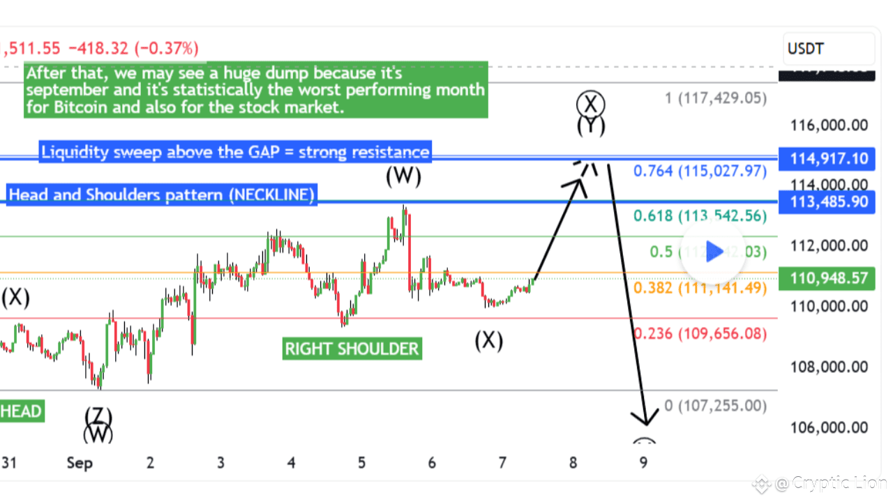
Xanrox’s recent TradingView commentary outlines a developing bullish reversal head-and-shoulders (HaS) pattern forming on Bitcoin’s price chart. According to the analysis, the cryptocurrency is currently positioned near the right shoulder, presenting what is considered a promising entry point for bullish traders.
A notable feature of this setup is a Fair Value Gap (FVG) located just above the neckline of the HaS formation. Xanrox anticipates that Bitcoin could initially break out upward from the HaS, but warns that movement may be halted at the FVG or by a nearby major swing high—zones where many stop-loss orders are often clustered. This clustering could offer liquidity to larger market participants (referred to as "whales"), potentially triggering a sharp downturn ([TradingView][1]).
Moreover, the analyst highlights that September historically tends to be a weak month for both Bitcoin and broader financial markets. This seasonal tendency lends support to the scenario in which price may rally toward $115,000 and then sharply decline—possibly descending below $105,000.
Xanrox emphasizes that this presentation serves as a short-term update or observation, not a formal trade recommendation. No concrete stops or profit targets are provided—this analysis is shared purely for informational purposes. The analyst reserves his actual trading strategies for private channels.
Interestingly, the chart later confirmed the first profit target: Bitcoin reached the FVG zone, suggesting the HaS pattern had indeed broken out as anticipated. Despite this positive development, the full implications of the pattern remain in play and subject to further price action.
👉👉 Trade here $BTC #Market_Update
{spot}(BTCUSDT)
Bitcoin’s Hidden Head-and-Shoulders: Smart Money Prepares for $105K Dump!
$BTC
Xanrox’s recent TradingView commentary outlines a developing bullish reversal head-and-shoulders (HaS) pattern forming on Bitcoin’s price chart. According to the analysis, the cryptocurrency is currently positioned near the right shoulder, presenting what is considered a promising entry point for bullish traders.
A notable feature of this setup is a Fair Value Gap (FVG) located just above the neckline of the HaS formation. Xanrox anticipates that Bitcoin could initially break out upward from the HaS, but warns that movement may be halted at the FVG or by a nearby major swing high—zones where many stop-loss orders are often clustered. This clustering could offer liquidity to larger market participants (referred to as "whales"), potentially triggering a sharp downturn ([TradingView][1]).
Moreover, the analyst highlights that September historically tends to be a weak month for both Bitcoin and broader financial markets. This seasonal tendency lends support to the scenario in which price may rally toward $115,000 and then sharply decline—possibly descending below $105,000.
Xanrox emphasizes that this presentation serves as a short-term update or observation, not a formal trade recommendation. No concrete stops or profit targets are provided—this analysis is shared purely for informational purposes. The analyst reserves his actual trading strategies for private channels.
Interestingly, the chart later confirmed the first profit target: Bitcoin reached the FVG zone, suggesting the HaS pattern had indeed broken out as anticipated. Despite this positive development, the full implications of the pattern remain in play and subject to further price action.
👉👉 Trade here $BTC #Market_Update
Xanrox’s recent TradingView commentary outlines a developing bullish reversal head-and-shoulders (HaS) pattern forming on Bitcoin’s price chart. According to the analysis, the cryptocurrency is currently positioned near the right shoulder, presenting what is considered a promising entry point for bullish traders.
A notable feature of this setup is a Fair Value Gap (FVG) located just above the neckline of the HaS formation. Xanrox anticipates that Bitcoin could initially break out upward from the HaS, but warns that movement may be halted at the FVG or by a nearby major swing high—zones where many stop-loss orders are often clustered. This clustering could offer liquidity to larger market participants (referred to as "whales"), potentially triggering a sharp downturn ([TradingView][1]).
Moreover, the analyst highlights that September historically tends to be a weak month for both Bitcoin and broader financial markets. This seasonal tendency lends support to the scenario in which price may rally toward $115,000 and then sharply decline—possibly descending below $105,000.
Xanrox emphasizes that this presentation serves as a short-term update or observation, not a formal trade recommendation. No concrete stops or profit targets are provided—this analysis is shared purely for informational purposes. The analyst reserves his actual trading strategies for private channels.
Interestingly, the chart later confirmed the first profit target: Bitcoin reached the FVG zone, suggesting the HaS pattern had indeed broken out as anticipated. Despite this positive development, the full implications of the pattern remain in play and subject to further price action.
👉👉 Trade here $BTC #Market_Update
145
·
--
Article
Ethereum (ETH) Breakout Watch: Bullish Setup or Trap Ahead?🚀 $ETH
📊 Current Market Snapshot
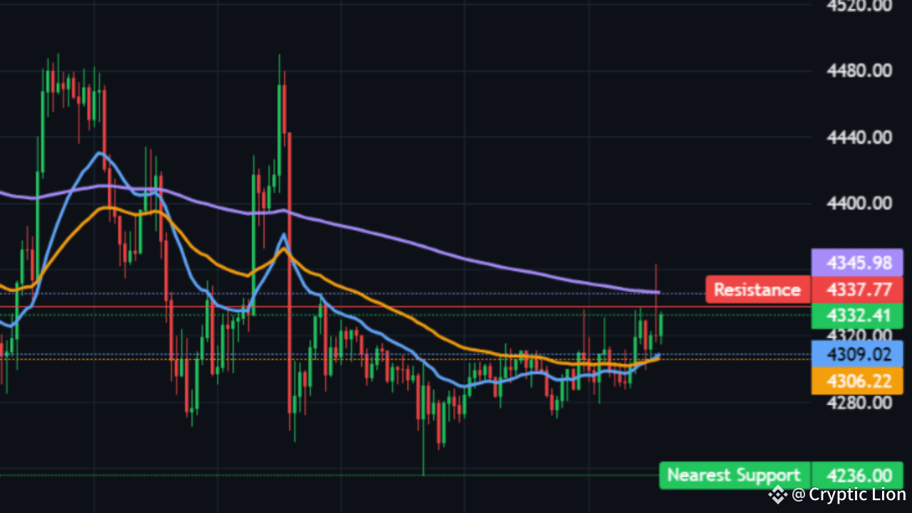
Ethereum (ETH/USDT) is trading near 4334.76 on the 1-hour timeframe, with volumes holding steady at 1271.99M in the past 24 hours. The scanner has flagged a bullish breakout signal after ETH defended equal lows and formed a Tweezer Bottom—a classic sign of buyers stepping in to protect support.
The nearest support lies at 4236, while resistance is being tested around 4337.77 – 4345.98. A sustained break above this resistance cluster could unlock further upside momentum.
📈 Technical Momentum – Bulls Slowly Taking Control
The MACD line is above its signal in the current timeframe, adding bullish weight. Volume Oscillator is positive, suggesting rising buying strength. RSI is 61.6, showing momentum is building but not yet overheated. The EMA setup remains slightly mixed: EMA20 is still below EMA50, which trails under EMA200. This suggests the broader trend is yet to flip fully bullish, but momentum indicators are leaning positive.
🛡️ Order Book & Derivatives Signals
The order book shows OB imbalance of +0.1%, tilted toward buy orders, though a sell wall lingers overhead. Funding is stable at 0.0026%, and open interest is holding around 200M—signs of cautious optimism.
This setup hints that sellers are stalling while buyers attempt to reclaim EMA20, a critical dynamic to confirm breakout sustainability.
🔮 Trade Plan and Risks
RLinda’s scanner suggests ETH is forming a base under resistance, with a possible 1h squeeze setup building in the RSI range of 45–65. A breakout confirmation would be:
Trigger: Price closes above resistance with MACD + Volume Oscillator > 0. Target: Manage 30–40% of the measured move, ranging higher into 127/161.8% Fib zones, trailing stops at EMA20. Invalidation: If ETH closes back inside the range below breakout or loses the 15m swing low.
Red flags include: funding rising above 0.12% or large sell walls reappearing (>6× median size).
⚡ Verdict: Bullish but Cautious
ETH currently sits in a bullish breakout setup, but the trend has not yet fully flipped. Momentum is supportive, and the chart shows early signs of a reversal, yet strong resistance overhead demands caution.
If ETH successfully reclaims and holds above 4345–4350, traders could see a continuation rally toward 4500+. Failure, however, may drag ETH back into the 4230–4260 support zone before another attempt.
In short: Ethereum looks primed for a bullish move—but only if buyers can smash through the resistance wall.
👉👉 Trade here $ETH #MarketSentimentToday
{spot}(ETHUSDT)
Ethereum (ETH) Breakout Watch: Bullish Setup or Trap Ahead?
🚀 $ETH
📊 Current Market Snapshot
Ethereum (ETH/USDT) is trading near 4334.76 on the 1-hour timeframe, with volumes holding steady at 1271.99M in the past 24 hours. The scanner has flagged a bullish breakout signal after ETH defended equal lows and formed a Tweezer Bottom—a classic sign of buyers stepping in to protect support.
The nearest support lies at 4236, while resistance is being tested around 4337.77 – 4345.98. A sustained break above this resistance cluster could unlock further upside momentum.
📈 Technical Momentum – Bulls Slowly Taking Control
The MACD line is above its signal in the current timeframe, adding bullish weight. Volume Oscillator is positive, suggesting rising buying strength. RSI is 61.6, showing momentum is building but not yet overheated. The EMA setup remains slightly mixed: EMA20 is still below EMA50, which trails under EMA200. This suggests the broader trend is yet to flip fully bullish, but momentum indicators are leaning positive.
🛡️ Order Book & Derivatives Signals
The order book shows OB imbalance of +0.1%, tilted toward buy orders, though a sell wall lingers overhead. Funding is stable at 0.0026%, and open interest is holding around 200M—signs of cautious optimism.
This setup hints that sellers are stalling while buyers attempt to reclaim EMA20, a critical dynamic to confirm breakout sustainability.
🔮 Trade Plan and Risks
RLinda’s scanner suggests ETH is forming a base under resistance, with a possible 1h squeeze setup building in the RSI range of 45–65. A breakout confirmation would be:
Trigger: Price closes above resistance with MACD + Volume Oscillator > 0. Target: Manage 30–40% of the measured move, ranging higher into 127/161.8% Fib zones, trailing stops at EMA20. Invalidation: If ETH closes back inside the range below breakout or loses the 15m swing low.
Red flags include: funding rising above 0.12% or large sell walls reappearing (>6× median size).
⚡ Verdict: Bullish but Cautious
ETH currently sits in a bullish breakout setup, but the trend has not yet fully flipped. Momentum is supportive, and the chart shows early signs of a reversal, yet strong resistance overhead demands caution.
If ETH successfully reclaims and holds above 4345–4350, traders could see a continuation rally toward 4500+. Failure, however, may drag ETH back into the 4230–4260 support zone before another attempt.
In short: Ethereum looks primed for a bullish move—but only if buyers can smash through the resistance wall.
👉👉 Trade here $ETH #MarketSentimentToday
📊 Current Market Snapshot
Ethereum (ETH/USDT) is trading near 4334.76 on the 1-hour timeframe, with volumes holding steady at 1271.99M in the past 24 hours. The scanner has flagged a bullish breakout signal after ETH defended equal lows and formed a Tweezer Bottom—a classic sign of buyers stepping in to protect support.
The nearest support lies at 4236, while resistance is being tested around 4337.77 – 4345.98. A sustained break above this resistance cluster could unlock further upside momentum.
📈 Technical Momentum – Bulls Slowly Taking Control
The MACD line is above its signal in the current timeframe, adding bullish weight. Volume Oscillator is positive, suggesting rising buying strength. RSI is 61.6, showing momentum is building but not yet overheated. The EMA setup remains slightly mixed: EMA20 is still below EMA50, which trails under EMA200. This suggests the broader trend is yet to flip fully bullish, but momentum indicators are leaning positive.
🛡️ Order Book & Derivatives Signals
The order book shows OB imbalance of +0.1%, tilted toward buy orders, though a sell wall lingers overhead. Funding is stable at 0.0026%, and open interest is holding around 200M—signs of cautious optimism.
This setup hints that sellers are stalling while buyers attempt to reclaim EMA20, a critical dynamic to confirm breakout sustainability.
🔮 Trade Plan and Risks
RLinda’s scanner suggests ETH is forming a base under resistance, with a possible 1h squeeze setup building in the RSI range of 45–65. A breakout confirmation would be:
Trigger: Price closes above resistance with MACD + Volume Oscillator > 0. Target: Manage 30–40% of the measured move, ranging higher into 127/161.8% Fib zones, trailing stops at EMA20. Invalidation: If ETH closes back inside the range below breakout or loses the 15m swing low.
Red flags include: funding rising above 0.12% or large sell walls reappearing (>6× median size).
⚡ Verdict: Bullish but Cautious
ETH currently sits in a bullish breakout setup, but the trend has not yet fully flipped. Momentum is supportive, and the chart shows early signs of a reversal, yet strong resistance overhead demands caution.
If ETH successfully reclaims and holds above 4345–4350, traders could see a continuation rally toward 4500+. Failure, however, may drag ETH back into the 4230–4260 support zone before another attempt.
In short: Ethereum looks primed for a bullish move—but only if buyers can smash through the resistance wall.
👉👉 Trade here $ETH #MarketSentimentToday
84
·
--
Article
Bitcoin to SKYROCKET to $115K – Then PLUMMET Below $105K? You Won't Believe This!$BTC
Oh man, crypto traders, buckle up because Bitcoin is about to take us on the wildest rollercoaster ride of 2025! If you've been glued to your screens watching BTC's every move, this jaw-dropping analysis from a top TradingView guru is going to blow your mind. We're talking a massive surge that could make early holders filthy rich – followed by a brutal dump that might leave latecomers in tears. Is this the ultimate pump-and-dump setup? Let's dive in before it's too late!
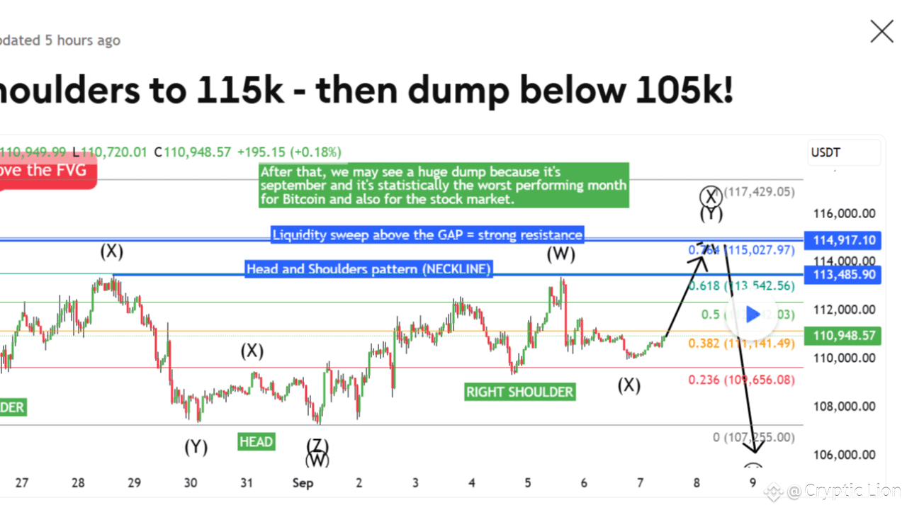
Picture this: Bitcoin's price chart is screaming "bullish reversal" like never before. According to this explosive idea posted on TradingView, BTC is carving out a classic Head and Shoulders pattern – but not the bearish kind you're thinking of. No, this is the inverted version, the one that flips the script and sends prices soaring! The chart shows the price hovering right near the "right shoulder," which means – drumroll please – it's prime time for a buying frenzy.
But hold onto your hardware wallets, folks, because the real magic happens when BTC smashes through that neckline. Analysts are calling for a breakout that could propel Bitcoin all the way up to a staggering $115,000! Yeah, you read that right – 115K! Imagine the gains if you're positioned right now. There's even an unfilled Fair Value Gap (FVG) lurking just above, acting like rocket fuel for this upward thrust. And get this: there's talk of a CME gap adding even more bullish vibes, linking to another chart that's got traders buzzing.
Now, before you start popping champagne and buying Lambos, here's the plot twist that could crush dreams: After hitting that euphoric 115K peak, things might turn ugly FAST. The prediction warns of a savage dump dropping BTC below $105,000 – and possibly even lower! Why? Blame it on sneaky whales hunting for liquidity at those swing highs where everyone's stop-losses are stacked. They'll swoop in, grab the cash, and send prices tumbling. Oh, and did we mention September's curse? Statistically, it's the WORST month for Bitcoin and stocks alike, setting the stage for a market bloodbath that no one sees coming.
This isn't just some random hot take – it's a detailed chart from user Xanrox on TradingView, complete with patterns, targets, and warnings. But fair warning: the poster stresses this isn't official trading advice, no stop-losses or profit targets here. It's more like a heads-up for savvy traders to watch their backs. If you're into altcoins, they even offer private analyses in the comments – talk about exclusive intel!
So, what are you waiting for? Is Bitcoin about to moonshot to 115K only to crash and burn below 105K? This could be the trade of the year... or the trap that wipes out portfolios. Don't say we didn't warn you – check the chart yourself and decide if you're buying the dip or running for the hills! Crypto never sleeps, and neither should you. 🚀💥
👉👉 Trade here $BTC #BinanceAlphaAlert
{spot}(BTCUSDT)
Bitcoin to SKYROCKET to $115K – Then PLUMMET Below $105K? You Won't Believe This!
$BTC
Oh man, crypto traders, buckle up because Bitcoin is about to take us on the wildest rollercoaster ride of 2025! If you've been glued to your screens watching BTC's every move, this jaw-dropping analysis from a top TradingView guru is going to blow your mind. We're talking a massive surge that could make early holders filthy rich – followed by a brutal dump that might leave latecomers in tears. Is this the ultimate pump-and-dump setup? Let's dive in before it's too late!
Picture this: Bitcoin's price chart is screaming "bullish reversal" like never before. According to this explosive idea posted on TradingView, BTC is carving out a classic Head and Shoulders pattern – but not the bearish kind you're thinking of. No, this is the inverted version, the one that flips the script and sends prices soaring! The chart shows the price hovering right near the "right shoulder," which means – drumroll please – it's prime time for a buying frenzy.
But hold onto your hardware wallets, folks, because the real magic happens when BTC smashes through that neckline. Analysts are calling for a breakout that could propel Bitcoin all the way up to a staggering $115,000! Yeah, you read that right – 115K! Imagine the gains if you're positioned right now. There's even an unfilled Fair Value Gap (FVG) lurking just above, acting like rocket fuel for this upward thrust. And get this: there's talk of a CME gap adding even more bullish vibes, linking to another chart that's got traders buzzing.
Now, before you start popping champagne and buying Lambos, here's the plot twist that could crush dreams: After hitting that euphoric 115K peak, things might turn ugly FAST. The prediction warns of a savage dump dropping BTC below $105,000 – and possibly even lower! Why? Blame it on sneaky whales hunting for liquidity at those swing highs where everyone's stop-losses are stacked. They'll swoop in, grab the cash, and send prices tumbling. Oh, and did we mention September's curse? Statistically, it's the WORST month for Bitcoin and stocks alike, setting the stage for a market bloodbath that no one sees coming.
This isn't just some random hot take – it's a detailed chart from user Xanrox on TradingView, complete with patterns, targets, and warnings. But fair warning: the poster stresses this isn't official trading advice, no stop-losses or profit targets here. It's more like a heads-up for savvy traders to watch their backs. If you're into altcoins, they even offer private analyses in the comments – talk about exclusive intel!
So, what are you waiting for? Is Bitcoin about to moonshot to 115K only to crash and burn below 105K? This could be the trade of the year... or the trap that wipes out portfolios. Don't say we didn't warn you – check the chart yourself and decide if you're buying the dip or running for the hills! Crypto never sleeps, and neither should you. 🚀💥
👉👉 Trade here $BTC #BinanceAlphaAlert
Oh man, crypto traders, buckle up because Bitcoin is about to take us on the wildest rollercoaster ride of 2025! If you've been glued to your screens watching BTC's every move, this jaw-dropping analysis from a top TradingView guru is going to blow your mind. We're talking a massive surge that could make early holders filthy rich – followed by a brutal dump that might leave latecomers in tears. Is this the ultimate pump-and-dump setup? Let's dive in before it's too late!
Picture this: Bitcoin's price chart is screaming "bullish reversal" like never before. According to this explosive idea posted on TradingView, BTC is carving out a classic Head and Shoulders pattern – but not the bearish kind you're thinking of. No, this is the inverted version, the one that flips the script and sends prices soaring! The chart shows the price hovering right near the "right shoulder," which means – drumroll please – it's prime time for a buying frenzy.
But hold onto your hardware wallets, folks, because the real magic happens when BTC smashes through that neckline. Analysts are calling for a breakout that could propel Bitcoin all the way up to a staggering $115,000! Yeah, you read that right – 115K! Imagine the gains if you're positioned right now. There's even an unfilled Fair Value Gap (FVG) lurking just above, acting like rocket fuel for this upward thrust. And get this: there's talk of a CME gap adding even more bullish vibes, linking to another chart that's got traders buzzing.
Now, before you start popping champagne and buying Lambos, here's the plot twist that could crush dreams: After hitting that euphoric 115K peak, things might turn ugly FAST. The prediction warns of a savage dump dropping BTC below $105,000 – and possibly even lower! Why? Blame it on sneaky whales hunting for liquidity at those swing highs where everyone's stop-losses are stacked. They'll swoop in, grab the cash, and send prices tumbling. Oh, and did we mention September's curse? Statistically, it's the WORST month for Bitcoin and stocks alike, setting the stage for a market bloodbath that no one sees coming.
This isn't just some random hot take – it's a detailed chart from user Xanrox on TradingView, complete with patterns, targets, and warnings. But fair warning: the poster stresses this isn't official trading advice, no stop-losses or profit targets here. It's more like a heads-up for savvy traders to watch their backs. If you're into altcoins, they even offer private analyses in the comments – talk about exclusive intel!
So, what are you waiting for? Is Bitcoin about to moonshot to 115K only to crash and burn below 105K? This could be the trade of the year... or the trap that wipes out portfolios. Don't say we didn't warn you – check the chart yourself and decide if you're buying the dip or running for the hills! Crypto never sleeps, and neither should you. 🚀💥
👉👉 Trade here $BTC #BinanceAlphaAlert
70
·
--
Article
Avalanche (AVAX) Flashes Fresh Buy Signal🚀 $AVAX
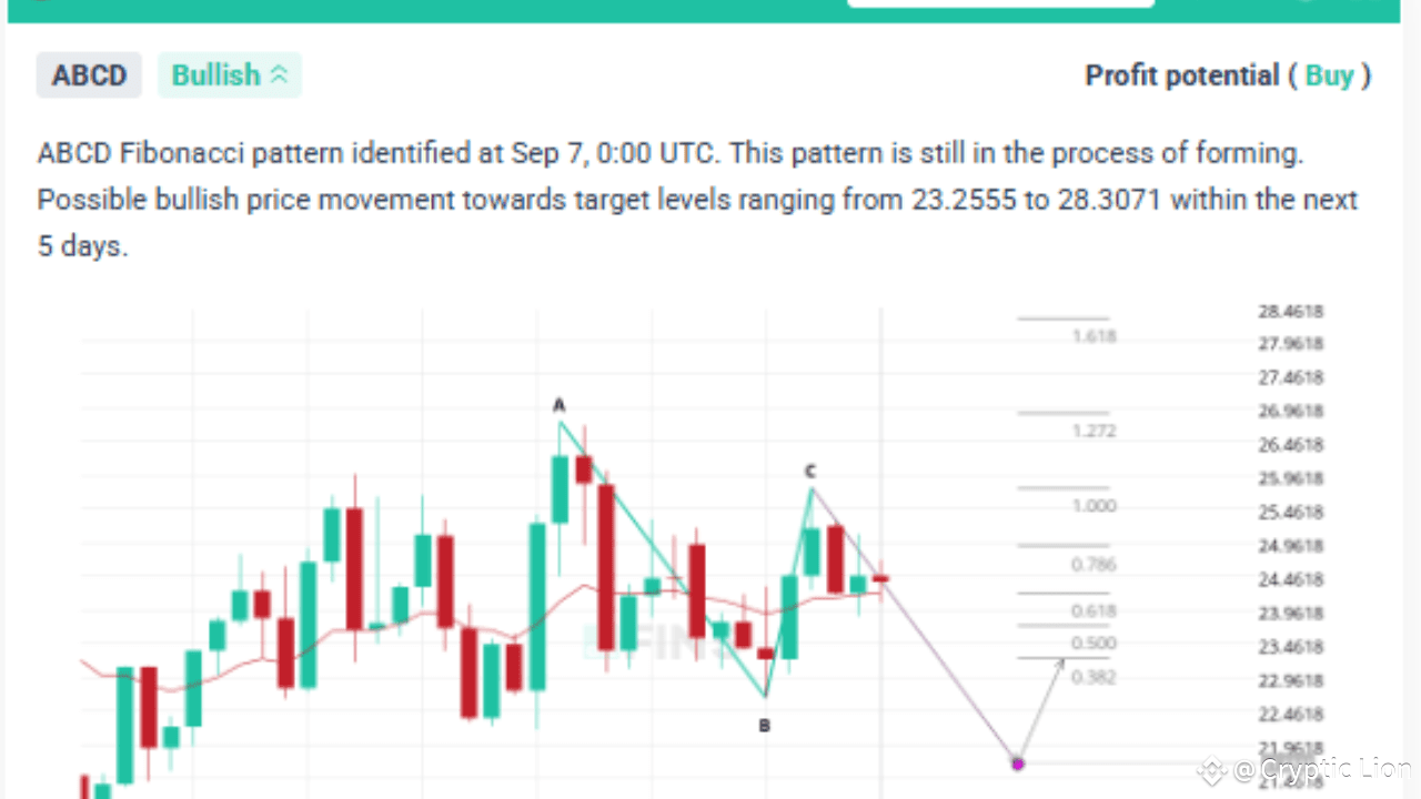
Avalanche (AVAX) is showing strong bullish potential as technical indicators and harmonic patterns align, hinting at an imminent upward move. With the price trading near $24.5, the charts reveal a buy setup supported by both momentum indicators and Fibonacci-based projections.
📊 Technical Chart Insights
On the main chart, AVAX price is consolidating above the 50-day SMA while holding above the 200-day SMA, signaling long-term trend stability. The sideways movement over the last few sessions appears to be forming a base near $24, which often precedes a bullish breakout.
The MACD indicator is flattening after multiple buy/sell crossovers, but importantly, the bearish momentum has weakened, suggesting bulls are regaining control. RSI remains neutral, giving the asset plenty of room to climb without immediate overbought pressure.
🔎 ABCD Pattern Confirmation
The second chart reveals an ABCD Fibonacci pattern, identified just hours ago, pointing towards a bullish move. The projection suggests that after a small corrective dip, AVAX could climb into the $23.25 – $28.30 range within the next five days. This aligns with previous resistance points on the chart and strengthens the buy outlook.
The harmonic structure adds confluence to the bullish case, highlighting that Fibonacci extensions and retracements are setting up potential target levels around $26 – $28.30.
🎯 Trading Outlook
Buy Zone: $23.8 – $24.5 (current range) Stop-Loss: Below $22.8 (to protect against failed pattern)
Take Profit Levels:
First target: $26 Second target: $28.3
This creates a favorable risk-reward ratio for swing traders and medium-term investors looking for exposure in AVAX.
✅ Conclusion
With the convergence of bullish signals from both moving averages and the ABCD Fibonacci pattern, Avalanche is positioned for a potential rally. The short-term consolidation near $24 may be the springboard for the next leg higher, with upside potential towards $28.
Traders should keep an eye on volume and price action over the next few sessions—if momentum builds, this buy alert could play out quickly.
👉👉 Trade here $AVAX
{spot}(AVAXUSDT)
Avalanche (AVAX) Flashes Fresh Buy Signal
🚀 $AVAX
Avalanche (AVAX) is showing strong bullish potential as technical indicators and harmonic patterns align, hinting at an imminent upward move. With the price trading near $24.5, the charts reveal a buy setup supported by both momentum indicators and Fibonacci-based projections.
📊 Technical Chart Insights
On the main chart, AVAX price is consolidating above the 50-day SMA while holding above the 200-day SMA, signaling long-term trend stability. The sideways movement over the last few sessions appears to be forming a base near $24, which often precedes a bullish breakout.
The MACD indicator is flattening after multiple buy/sell crossovers, but importantly, the bearish momentum has weakened, suggesting bulls are regaining control. RSI remains neutral, giving the asset plenty of room to climb without immediate overbought pressure.
🔎 ABCD Pattern Confirmation
The second chart reveals an ABCD Fibonacci pattern, identified just hours ago, pointing towards a bullish move. The projection suggests that after a small corrective dip, AVAX could climb into the $23.25 – $28.30 range within the next five days. This aligns with previous resistance points on the chart and strengthens the buy outlook.
The harmonic structure adds confluence to the bullish case, highlighting that Fibonacci extensions and retracements are setting up potential target levels around $26 – $28.30.
🎯 Trading Outlook
Buy Zone: $23.8 – $24.5 (current range) Stop-Loss: Below $22.8 (to protect against failed pattern)
Take Profit Levels:
First target: $26 Second target: $28.3
This creates a favorable risk-reward ratio for swing traders and medium-term investors looking for exposure in AVAX.
✅ Conclusion
With the convergence of bullish signals from both moving averages and the ABCD Fibonacci pattern, Avalanche is positioned for a potential rally. The short-term consolidation near $24 may be the springboard for the next leg higher, with upside potential towards $28.
Traders should keep an eye on volume and price action over the next few sessions—if momentum builds, this buy alert could play out quickly.
👉👉 Trade here $AVAX
Avalanche (AVAX) is showing strong bullish potential as technical indicators and harmonic patterns align, hinting at an imminent upward move. With the price trading near $24.5, the charts reveal a buy setup supported by both momentum indicators and Fibonacci-based projections.
📊 Technical Chart Insights
On the main chart, AVAX price is consolidating above the 50-day SMA while holding above the 200-day SMA, signaling long-term trend stability. The sideways movement over the last few sessions appears to be forming a base near $24, which often precedes a bullish breakout.
The MACD indicator is flattening after multiple buy/sell crossovers, but importantly, the bearish momentum has weakened, suggesting bulls are regaining control. RSI remains neutral, giving the asset plenty of room to climb without immediate overbought pressure.
🔎 ABCD Pattern Confirmation
The second chart reveals an ABCD Fibonacci pattern, identified just hours ago, pointing towards a bullish move. The projection suggests that after a small corrective dip, AVAX could climb into the $23.25 – $28.30 range within the next five days. This aligns with previous resistance points on the chart and strengthens the buy outlook.
The harmonic structure adds confluence to the bullish case, highlighting that Fibonacci extensions and retracements are setting up potential target levels around $26 – $28.30.
🎯 Trading Outlook
Buy Zone: $23.8 – $24.5 (current range) Stop-Loss: Below $22.8 (to protect against failed pattern)
Take Profit Levels:
First target: $26 Second target: $28.3
This creates a favorable risk-reward ratio for swing traders and medium-term investors looking for exposure in AVAX.
✅ Conclusion
With the convergence of bullish signals from both moving averages and the ABCD Fibonacci pattern, Avalanche is positioned for a potential rally. The short-term consolidation near $24 may be the springboard for the next leg higher, with upside potential towards $28.
Traders should keep an eye on volume and price action over the next few sessions—if momentum builds, this buy alert could play out quickly.
👉👉 Trade here $AVAX
64
·
--
Article
Zcash Flashes a Fresh Buy Signal🚀 $ZEC
(ZEC) has just triggered a new buy alert, capturing the attention of traders and investors alike. After a period of sideways consolidation, the price has broken out decisively, aligning technical indicators for a potential bullish continuation.
📊 Technical Breakout Above Key Levels
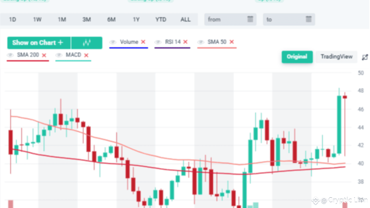
The price of ZEC surged above both the 50-day and 200-day simple moving averages (SMA). This crossover move is significant, as the 200-day SMA acts as a long-term trend filter. When the price sustains above it, traders generally interpret it as a shift from bearish to bullish territory.
The volume spike further confirms that the breakout is supported by strong market participation, not just a weak price push. This adds conviction to the buy signal.
🔎 MACD Buy Confirmation
The MACD indicator at the bottom of the chart has also generated a fresh buy signal. The MACD line has crossed above the signal line while staying in positive territory, suggesting momentum is in favor of the bulls. This alignment between moving averages and momentum indicators strengthens the case for a potential sustained rally.
📈 RSI Signals Healthy Momentum
The Relative Strength Index (RSI) sits comfortably around the mid-to-high zone, signaling that buyers are gaining control but the market is not yet in overbought territory. This provides room for additional upside before any exhaustion kicks in.
🎯 Trading Outlook
Entry Zone: $45 – $47, right above the breakout region. Stop-Loss: Below $42 (to protect against false breakouts). Targets: Immediate resistance at $50, with medium-term potential towards $55 – $58 if momentum continues.
The alignment of price action above key SMAs, a confirmed MACD crossover, and supportive volume make this buy alert particularly strong.
✅ Conclusion
Zcash is flashing a textbook buy signal backed by multiple indicators. Traders looking for entry opportunities may find this breakout setup attractive, with risk managed below recent support levels. If the \$50 mark is breached with volume, ZEC could be preparing for its next leg higher.
👉👉 Trade here $ZEC #MarketPullback
{spot}(ZECUSDT)
Zcash Flashes a Fresh Buy Signal
🚀 $ZEC
(ZEC) has just triggered a new buy alert, capturing the attention of traders and investors alike. After a period of sideways consolidation, the price has broken out decisively, aligning technical indicators for a potential bullish continuation.
📊 Technical Breakout Above Key Levels
The price of ZEC surged above both the 50-day and 200-day simple moving averages (SMA). This crossover move is significant, as the 200-day SMA acts as a long-term trend filter. When the price sustains above it, traders generally interpret it as a shift from bearish to bullish territory.
The volume spike further confirms that the breakout is supported by strong market participation, not just a weak price push. This adds conviction to the buy signal.
🔎 MACD Buy Confirmation
The MACD indicator at the bottom of the chart has also generated a fresh buy signal. The MACD line has crossed above the signal line while staying in positive territory, suggesting momentum is in favor of the bulls. This alignment between moving averages and momentum indicators strengthens the case for a potential sustained rally.
📈 RSI Signals Healthy Momentum
The Relative Strength Index (RSI) sits comfortably around the mid-to-high zone, signaling that buyers are gaining control but the market is not yet in overbought territory. This provides room for additional upside before any exhaustion kicks in.
🎯 Trading Outlook
Entry Zone: $45 – $47, right above the breakout region. Stop-Loss: Below $42 (to protect against false breakouts). Targets: Immediate resistance at $50, with medium-term potential towards $55 – $58 if momentum continues.
The alignment of price action above key SMAs, a confirmed MACD crossover, and supportive volume make this buy alert particularly strong.
✅ Conclusion
Zcash is flashing a textbook buy signal backed by multiple indicators. Traders looking for entry opportunities may find this breakout setup attractive, with risk managed below recent support levels. If the \$50 mark is breached with volume, ZEC could be preparing for its next leg higher.
👉👉 Trade here $ZEC #MarketPullback
(ZEC) has just triggered a new buy alert, capturing the attention of traders and investors alike. After a period of sideways consolidation, the price has broken out decisively, aligning technical indicators for a potential bullish continuation.
📊 Technical Breakout Above Key Levels
The price of ZEC surged above both the 50-day and 200-day simple moving averages (SMA). This crossover move is significant, as the 200-day SMA acts as a long-term trend filter. When the price sustains above it, traders generally interpret it as a shift from bearish to bullish territory.
The volume spike further confirms that the breakout is supported by strong market participation, not just a weak price push. This adds conviction to the buy signal.
🔎 MACD Buy Confirmation
The MACD indicator at the bottom of the chart has also generated a fresh buy signal. The MACD line has crossed above the signal line while staying in positive territory, suggesting momentum is in favor of the bulls. This alignment between moving averages and momentum indicators strengthens the case for a potential sustained rally.
📈 RSI Signals Healthy Momentum
The Relative Strength Index (RSI) sits comfortably around the mid-to-high zone, signaling that buyers are gaining control but the market is not yet in overbought territory. This provides room for additional upside before any exhaustion kicks in.
🎯 Trading Outlook
Entry Zone: $45 – $47, right above the breakout region. Stop-Loss: Below $42 (to protect against false breakouts). Targets: Immediate resistance at $50, with medium-term potential towards $55 – $58 if momentum continues.
The alignment of price action above key SMAs, a confirmed MACD crossover, and supportive volume make this buy alert particularly strong.
✅ Conclusion
Zcash is flashing a textbook buy signal backed by multiple indicators. Traders looking for entry opportunities may find this breakout setup attractive, with risk managed below recent support levels. If the \$50 mark is breached with volume, ZEC could be preparing for its next leg higher.
👉👉 Trade here $ZEC #MarketPullback
64
·
--
Article
SOLANA ON FIRE! Is $250 the Next Stop for SOL?🔥 $SOL
🚀 Short-Term Trend: Strong Up!
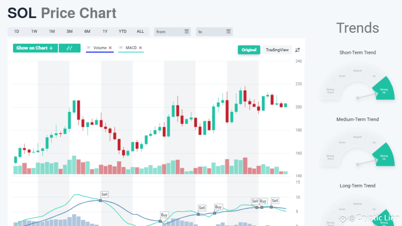
Solana (SOL) is stealing the spotlight with its one-day chart flashing green across the board. The short-term trend is marked as “Strong Up”, showing that buyers are flooding back in and refusing to let go of momentum. After holding firm above the $200 support level, SOL looks primed for its next big breakout. 📈
📊 Medium-Term Momentum: Bulls in Control
The medium-term trend is also strongly bullish, with SOL forming a solid pattern of higher lows since early August. Every dip is being quickly bought up, showing that bulls are firmly in control. This steady rise is a textbook sign of accumulation before a breakout rally. Could Solana be building up steam for a run toward \$250–\$270? ⚡
🔥 MACD Signals: Buy or Sell?
The MACD has given a mix of buy and sell signals in recent weeks, but the latest action is tilting bullish again. While short-term sell triggers have popped up, they haven’t been able to drag SOL down significantly. Instead, SOL keeps bouncing back, showing undeniable buying strength. 💎🙌
📉 Volume Check: The Calm Before the Explosion?
Volume has cooled slightly, but that might just be the calm before the storm 🌪️. Traders know that when price consolidates near resistance with lower volume, it often signals a massive move ahead. If volume surges on the next green candle, SOL could blast past $220 and head straight for new highs. 🚀
⚡ Long-Term Picture: Sky’s the Limit
The long-term trend is also marked “Strong Up”, confirming that Solana isn’t just a short-term play — it’s showing real staying power. Investors who bought in during July’s lows are already sitting on hefty gains, but the charts suggest the rally may be far from over. 🔮
🔮 What’s Next for SOL?
Bullish Case: Break above $220 = rocket to $250–$270 🚀🔥 Bearish Case: Drop below $200 = retest support at $180 before bouncing back ⚠️
⚠️ Final Word: The Solana Show Has Just Begun!
Solana is flashing green across short, medium, and long-term trends, making it one of the strongest altcoins on the market right now. With momentum on its side, traders are eyeing $250 as the next big milestone. Will SOL smash through resistance and take the throne as the king of altcoin rallies? 👑 Or will bears try one last attack before liftoff?
Either way — all eyes are on Solana! 👀🔥
👉👉Trade here $SOL
🚀 Want ready-made signals + a special discount? 📊
Visit this site http://bit.ly/47rWc43 with my ID and take your trading to the NEXT level! 💎🔥
{spot}(SOLUSDT)
SOLANA ON FIRE! Is $250 the Next Stop for SOL?
🔥 $SOL
🚀 Short-Term Trend: Strong Up!
Solana (SOL) is stealing the spotlight with its one-day chart flashing green across the board. The short-term trend is marked as “Strong Up”, showing that buyers are flooding back in and refusing to let go of momentum. After holding firm above the $200 support level, SOL looks primed for its next big breakout. 📈
📊 Medium-Term Momentum: Bulls in Control
The medium-term trend is also strongly bullish, with SOL forming a solid pattern of higher lows since early August. Every dip is being quickly bought up, showing that bulls are firmly in control. This steady rise is a textbook sign of accumulation before a breakout rally. Could Solana be building up steam for a run toward \$250–\$270? ⚡
🔥 MACD Signals: Buy or Sell?
The MACD has given a mix of buy and sell signals in recent weeks, but the latest action is tilting bullish again. While short-term sell triggers have popped up, they haven’t been able to drag SOL down significantly. Instead, SOL keeps bouncing back, showing undeniable buying strength. 💎🙌
📉 Volume Check: The Calm Before the Explosion?
Volume has cooled slightly, but that might just be the calm before the storm 🌪️. Traders know that when price consolidates near resistance with lower volume, it often signals a massive move ahead. If volume surges on the next green candle, SOL could blast past $220 and head straight for new highs. 🚀
⚡ Long-Term Picture: Sky’s the Limit
The long-term trend is also marked “Strong Up”, confirming that Solana isn’t just a short-term play — it’s showing real staying power. Investors who bought in during July’s lows are already sitting on hefty gains, but the charts suggest the rally may be far from over. 🔮
🔮 What’s Next for SOL?
Bullish Case: Break above $220 = rocket to $250–$270 🚀🔥 Bearish Case: Drop below $200 = retest support at $180 before bouncing back ⚠️
⚠️ Final Word: The Solana Show Has Just Begun!
Solana is flashing green across short, medium, and long-term trends, making it one of the strongest altcoins on the market right now. With momentum on its side, traders are eyeing $250 as the next big milestone. Will SOL smash through resistance and take the throne as the king of altcoin rallies? 👑 Or will bears try one last attack before liftoff?
Either way — all eyes are on Solana! 👀🔥
👉👉Trade here $SOL
🚀 Want ready-made signals + a special discount? 📊
Visit this site http://bit.ly/47rWc43 with my ID and take your trading to the NEXT level! 💎🔥
🚀 Short-Term Trend: Strong Up!
Solana (SOL) is stealing the spotlight with its one-day chart flashing green across the board. The short-term trend is marked as “Strong Up”, showing that buyers are flooding back in and refusing to let go of momentum. After holding firm above the $200 support level, SOL looks primed for its next big breakout. 📈
📊 Medium-Term Momentum: Bulls in Control
The medium-term trend is also strongly bullish, with SOL forming a solid pattern of higher lows since early August. Every dip is being quickly bought up, showing that bulls are firmly in control. This steady rise is a textbook sign of accumulation before a breakout rally. Could Solana be building up steam for a run toward \$250–\$270? ⚡
🔥 MACD Signals: Buy or Sell?
The MACD has given a mix of buy and sell signals in recent weeks, but the latest action is tilting bullish again. While short-term sell triggers have popped up, they haven’t been able to drag SOL down significantly. Instead, SOL keeps bouncing back, showing undeniable buying strength. 💎🙌
📉 Volume Check: The Calm Before the Explosion?
Volume has cooled slightly, but that might just be the calm before the storm 🌪️. Traders know that when price consolidates near resistance with lower volume, it often signals a massive move ahead. If volume surges on the next green candle, SOL could blast past $220 and head straight for new highs. 🚀
⚡ Long-Term Picture: Sky’s the Limit
The long-term trend is also marked “Strong Up”, confirming that Solana isn’t just a short-term play — it’s showing real staying power. Investors who bought in during July’s lows are already sitting on hefty gains, but the charts suggest the rally may be far from over. 🔮
🔮 What’s Next for SOL?
Bullish Case: Break above $220 = rocket to $250–$270 🚀🔥 Bearish Case: Drop below $200 = retest support at $180 before bouncing back ⚠️
⚠️ Final Word: The Solana Show Has Just Begun!
Solana is flashing green across short, medium, and long-term trends, making it one of the strongest altcoins on the market right now. With momentum on its side, traders are eyeing $250 as the next big milestone. Will SOL smash through resistance and take the throne as the king of altcoin rallies? 👑 Or will bears try one last attack before liftoff?
Either way — all eyes are on Solana! 👀🔥
👉👉Trade here $SOL
🚀 Want ready-made signals + a special discount? 📊
Visit this site http://bit.ly/47rWc43 with my ID and take your trading to the NEXT level! 💎🔥
157
·
--
Article
XRP in Trouble? Short-Term Chart Screams BEARISH!⚠️$XRP
🚨 Short-Term Breakdown – Bulls Losing Grip!
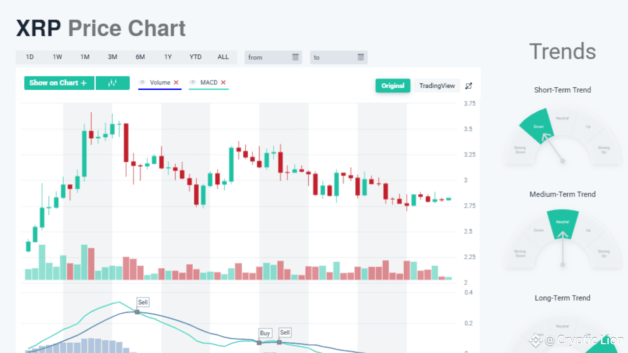
The one-day XRP chart is flashing red danger signals, with the short-term trend pointing down. After failing to hold strong above $3.00, XRP has slipped into a bearish channel, and buyers are struggling to regain momentum. Every attempt to bounce has been quickly sold off, leaving bulls gasping for air. 😬
📊 MACD Flashes Sell After Sell
The MACD indicator has been merciless, throwing out multiple sell signals in the past few weeks. 📉 Each crossover has pushed XRP lower, confirming that bearish momentum is in control. Even the histogram bars are shrinking, reflecting weakness in buying power. Without a reversal in MACD, XRP could face a sharp fall toward its next support.
🏦 Volume Collapse – Where Are the Buyers?
Another alarming sign is the drop in trading volume. 📉 Without strong buying activity, XRP looks vulnerable to whale-driven sell-offs. Bears are waiting for the perfect moment to push the price below $2.70, which could trigger panic selling. If that happens, XRP might freefall to $2.50, and possibly even $2.25. 😱
📉 Medium-Term Neutral, Long-Term Still Hopeful
Interestingly, the medium-term trend remains neutral, and the long-term trend is still strongly bullish. 🚀 This means XRP’s long-term fundamentals remain intact, but short-term traders could face pain before relief comes. If XRP manages to bounce back above $3.10, the bearish scenario could flip quickly. But right now, the charts suggest caution. ⚠️
🔮 What’s Next for XRP?
Bearish Case: Break below $2.70 = freefall to $2.50–$2.25 zone 🚨 Bullish Case: Strong bounce above $3.10 = recovery toward $3.50 resistance 🚀
⚡ Final Take: A Storm Before the Calm?
XRP holders need to stay alert ⚠️. The one-day chart shows short-term weakness, with bearish signals piling up. But at the same time, the long-term trend remains intact. Could this just be a shakeout before a mega rally? Or are we about to see XRP’s price sink deeper? 🤔
One thing is certain – the next move will be explosive. 💥
👉👉Trade here $XRP
{spot}(XRPUSDT)
XRP in Trouble? Short-Term Chart Screams BEARISH!
⚠️$XRP
🚨 Short-Term Breakdown – Bulls Losing Grip!
The one-day XRP chart is flashing red danger signals, with the short-term trend pointing down. After failing to hold strong above $3.00, XRP has slipped into a bearish channel, and buyers are struggling to regain momentum. Every attempt to bounce has been quickly sold off, leaving bulls gasping for air. 😬
📊 MACD Flashes Sell After Sell
The MACD indicator has been merciless, throwing out multiple sell signals in the past few weeks. 📉 Each crossover has pushed XRP lower, confirming that bearish momentum is in control. Even the histogram bars are shrinking, reflecting weakness in buying power. Without a reversal in MACD, XRP could face a sharp fall toward its next support.
🏦 Volume Collapse – Where Are the Buyers?
Another alarming sign is the drop in trading volume. 📉 Without strong buying activity, XRP looks vulnerable to whale-driven sell-offs. Bears are waiting for the perfect moment to push the price below $2.70, which could trigger panic selling. If that happens, XRP might freefall to $2.50, and possibly even $2.25. 😱
📉 Medium-Term Neutral, Long-Term Still Hopeful
Interestingly, the medium-term trend remains neutral, and the long-term trend is still strongly bullish. 🚀 This means XRP’s long-term fundamentals remain intact, but short-term traders could face pain before relief comes. If XRP manages to bounce back above $3.10, the bearish scenario could flip quickly. But right now, the charts suggest caution. ⚠️
🔮 What’s Next for XRP?
Bearish Case: Break below $2.70 = freefall to $2.50–$2.25 zone 🚨 Bullish Case: Strong bounce above $3.10 = recovery toward $3.50 resistance 🚀
⚡ Final Take: A Storm Before the Calm?
XRP holders need to stay alert ⚠️. The one-day chart shows short-term weakness, with bearish signals piling up. But at the same time, the long-term trend remains intact. Could this just be a shakeout before a mega rally? Or are we about to see XRP’s price sink deeper? 🤔
One thing is certain – the next move will be explosive. 💥
👉👉Trade here $XRP
🚨 Short-Term Breakdown – Bulls Losing Grip!
The one-day XRP chart is flashing red danger signals, with the short-term trend pointing down. After failing to hold strong above $3.00, XRP has slipped into a bearish channel, and buyers are struggling to regain momentum. Every attempt to bounce has been quickly sold off, leaving bulls gasping for air. 😬
📊 MACD Flashes Sell After Sell
The MACD indicator has been merciless, throwing out multiple sell signals in the past few weeks. 📉 Each crossover has pushed XRP lower, confirming that bearish momentum is in control. Even the histogram bars are shrinking, reflecting weakness in buying power. Without a reversal in MACD, XRP could face a sharp fall toward its next support.
🏦 Volume Collapse – Where Are the Buyers?
Another alarming sign is the drop in trading volume. 📉 Without strong buying activity, XRP looks vulnerable to whale-driven sell-offs. Bears are waiting for the perfect moment to push the price below $2.70, which could trigger panic selling. If that happens, XRP might freefall to $2.50, and possibly even $2.25. 😱
📉 Medium-Term Neutral, Long-Term Still Hopeful
Interestingly, the medium-term trend remains neutral, and the long-term trend is still strongly bullish. 🚀 This means XRP’s long-term fundamentals remain intact, but short-term traders could face pain before relief comes. If XRP manages to bounce back above $3.10, the bearish scenario could flip quickly. But right now, the charts suggest caution. ⚠️
🔮 What’s Next for XRP?
Bearish Case: Break below $2.70 = freefall to $2.50–$2.25 zone 🚨 Bullish Case: Strong bounce above $3.10 = recovery toward $3.50 resistance 🚀
⚡ Final Take: A Storm Before the Calm?
XRP holders need to stay alert ⚠️. The one-day chart shows short-term weakness, with bearish signals piling up. But at the same time, the long-term trend remains intact. Could this just be a shakeout before a mega rally? Or are we about to see XRP’s price sink deeper? 🤔
One thing is certain – the next move will be explosive. 💥
👉👉Trade here $XRP
2
253
·
--
Article
Ethereum (ETH) One-Day Chart Analysis$ETH
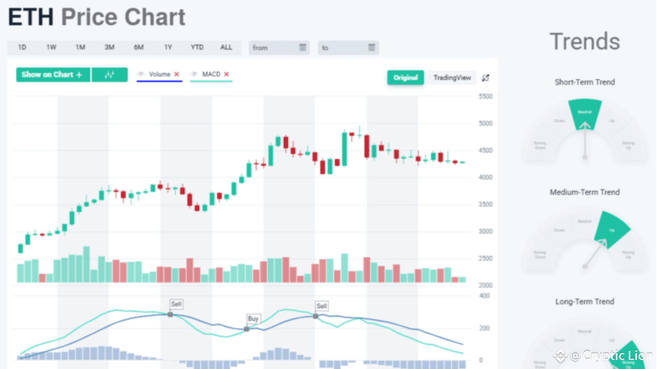
On the one-day chart, ETH is showing a phase of consolidation after its recent rally, with the price currently moving in the $4,000–$4,500 range. The candlesticks reflect indecision: smaller bodies and reduced volatility compared to July–August’s strong upward momentum. This suggests that the market is pausing, waiting for a clear trigger before the next big move.
Short-Term Picture (1D Signals)
Short-term moving averages (SMA 5, SMA 10, EMA 9, EMA 12, and EMA 13) are trending down, with values between -0.69% and -3.63%. This indicates that sellers have the upper hand in the immediate timeframe. On the chart, this is visible in the sideways-to-slightly bearish candles after the August peak.
Medium-Term Support (1D Context)
Despite the short-term weakness, the medium-term averages (SMA 20, SMA 30, SMA 50, and EMA 26/50) are strongly up. For instance, the SMA 50 trend is up 55.66% and the SMA 100 is up 64.12%, showing that ETH’s mid-term trend is still positive. On the one-day chart, this is confirmed by ETH holding above the \$4,000 support level and refusing to break down further despite multiple tests.
MACD on Daily Timeframe
The MACD indicator shows alternating buy and sell signals over the past weeks, highlighting the lack of a strong directional move. Currently, the lines are slightly pointing down, reflecting fading momentum. However, since ETH has not broken below its key support, this can be seen as consolidation rather than trend reversal.
Trend Meters (1D Outlook)
Short-Term Trend: Neutral – ETH is consolidating with no strong move either way.Medium-Term Trend: Up – The daily candles are still supported by mid-range moving averages.Long-Term Trend: Strong Up – The 200-day averages remain bullish, confirming ETH’s overall strength.
Daily Outlook
Bullish Scenario: If ETH breaks above $4,500 on the daily chart with strong volume, the next target will likely be around $5,000.
Bearish Scenario: A break below $4,000 would weaken the short-term structure and potentially send ETH toward $3,700 or the 50-day SMA.
📌 In conclusion: The one-day chart of Ethereum shows a market in consolidation — short-term weakness, but medium- and long-term strength. ETH is essentially “recharging” before a breakout, with $4,000 as the key support and $4,500 as the key resistance.
👉👉 Trade here $ETH #MarketPredictions
{spot}(ETHUSDT)
Ethereum (ETH) One-Day Chart Analysis
$ETH
On the one-day chart, ETH is showing a phase of consolidation after its recent rally, with the price currently moving in the $4,000–$4,500 range. The candlesticks reflect indecision: smaller bodies and reduced volatility compared to July–August’s strong upward momentum. This suggests that the market is pausing, waiting for a clear trigger before the next big move.
Short-Term Picture (1D Signals)
Short-term moving averages (SMA 5, SMA 10, EMA 9, EMA 12, and EMA 13) are trending down, with values between -0.69% and -3.63%. This indicates that sellers have the upper hand in the immediate timeframe. On the chart, this is visible in the sideways-to-slightly bearish candles after the August peak.
Medium-Term Support (1D Context)
Despite the short-term weakness, the medium-term averages (SMA 20, SMA 30, SMA 50, and EMA 26/50) are strongly up. For instance, the SMA 50 trend is up 55.66% and the SMA 100 is up 64.12%, showing that ETH’s mid-term trend is still positive. On the one-day chart, this is confirmed by ETH holding above the \$4,000 support level and refusing to break down further despite multiple tests.
MACD on Daily Timeframe
The MACD indicator shows alternating buy and sell signals over the past weeks, highlighting the lack of a strong directional move. Currently, the lines are slightly pointing down, reflecting fading momentum. However, since ETH has not broken below its key support, this can be seen as consolidation rather than trend reversal.
Trend Meters (1D Outlook)
Short-Term Trend: Neutral – ETH is consolidating with no strong move either way.Medium-Term Trend: Up – The daily candles are still supported by mid-range moving averages.Long-Term Trend: Strong Up – The 200-day averages remain bullish, confirming ETH’s overall strength.
Daily Outlook
Bullish Scenario: If ETH breaks above $4,500 on the daily chart with strong volume, the next target will likely be around $5,000.
Bearish Scenario: A break below $4,000 would weaken the short-term structure and potentially send ETH toward $3,700 or the 50-day SMA.
📌 In conclusion: The one-day chart of Ethereum shows a market in consolidation — short-term weakness, but medium- and long-term strength. ETH is essentially “recharging” before a breakout, with $4,000 as the key support and $4,500 as the key resistance.
👉👉 Trade here $ETH #MarketPredictions
On the one-day chart, ETH is showing a phase of consolidation after its recent rally, with the price currently moving in the $4,000–$4,500 range. The candlesticks reflect indecision: smaller bodies and reduced volatility compared to July–August’s strong upward momentum. This suggests that the market is pausing, waiting for a clear trigger before the next big move.
Short-Term Picture (1D Signals)
Short-term moving averages (SMA 5, SMA 10, EMA 9, EMA 12, and EMA 13) are trending down, with values between -0.69% and -3.63%. This indicates that sellers have the upper hand in the immediate timeframe. On the chart, this is visible in the sideways-to-slightly bearish candles after the August peak.
Medium-Term Support (1D Context)
Despite the short-term weakness, the medium-term averages (SMA 20, SMA 30, SMA 50, and EMA 26/50) are strongly up. For instance, the SMA 50 trend is up 55.66% and the SMA 100 is up 64.12%, showing that ETH’s mid-term trend is still positive. On the one-day chart, this is confirmed by ETH holding above the \$4,000 support level and refusing to break down further despite multiple tests.
MACD on Daily Timeframe
The MACD indicator shows alternating buy and sell signals over the past weeks, highlighting the lack of a strong directional move. Currently, the lines are slightly pointing down, reflecting fading momentum. However, since ETH has not broken below its key support, this can be seen as consolidation rather than trend reversal.
Trend Meters (1D Outlook)
Short-Term Trend: Neutral – ETH is consolidating with no strong move either way.Medium-Term Trend: Up – The daily candles are still supported by mid-range moving averages.Long-Term Trend: Strong Up – The 200-day averages remain bullish, confirming ETH’s overall strength.
Daily Outlook
Bullish Scenario: If ETH breaks above $4,500 on the daily chart with strong volume, the next target will likely be around $5,000.
Bearish Scenario: A break below $4,000 would weaken the short-term structure and potentially send ETH toward $3,700 or the 50-day SMA.
📌 In conclusion: The one-day chart of Ethereum shows a market in consolidation — short-term weakness, but medium- and long-term strength. ETH is essentially “recharging” before a breakout, with $4,000 as the key support and $4,500 as the key resistance.
👉👉 Trade here $ETH #MarketPredictions
483
·
--
Article
Bitcoin Ready to Explode Past $115K? MACD Flashes Fresh Buy Signal!$BTC
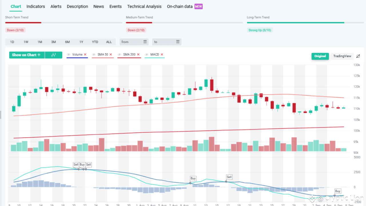
The Bitcoin (BTC) one-day chart reflects a current price of $110,519, showing a modest uptick of +0.33%. While the long-term outlook remains strongly bullish (8/10), both the short-term (3/10) and medium-term (2/10) indicators lean bearish, suggesting that the market is in a consolidation phase rather than in full bullish momentum.
Short- and Medium-Term Weakness
Over recent weeks, BTC has struggled to maintain upward momentum, facing repeated selling pressure whenever it tests the $115,000–$118,000 range. This repeated rejection has dragged the short-term and medium-term trend scores down into bearish territory. The daily candles show frequent red closes with limited upside recovery, indicating that traders are cautious at higher levels.
SMA Trends
The 50-day SMA is trending downward and has started to flatten, reflecting weakening medium-term buying momentum. Meanwhile, the 200-day SMA remains significantly lower, maintaining a broader bullish foundation. The gap between the 50-day and 200-day SMA suggests that while long-term investors remain confident, short-term market participants are hesitant. Sustained trading above the \$110,000 mark is critical to preventing further downside pressure.
MACD and Momentum Shifts
The MACD (Moving Average Convergence Divergence) has shown alternating buy and sell signals over the past month, which highlights indecision and choppy market conditions. Currently, a fresh buy signal has appeared, which may indicate that BTC is attempting to stabilize after the recent dip. However, the histogram remains relatively weak, so momentum may take time to rebuild before a significant breakout can occur.
Volume and Market Sentiment
Volume has been inconsistent, with higher spikes during sell-offs compared to rallies. This imbalance signals that bears still hold some control in the short run. Unless buying volume returns in force, BTC may remain stuck in the $108,000–$115,000 consolidation zone. A convincing breakout above $115,000 with volume would shift sentiment strongly bullish again.
Long-Term Perspective
Despite near-term weakness, the long-term trend is still strong (8/10), suggesting that BTC remains in a broader bullish cycle. Long-term holders appear unfazed by recent short-term volatility, as reflected in the steady upward trajectory of the 200-day SMA.
Outlook
Bullish case: If momentum from the MACD buy signal builds and BTC reclaims $115,000, the next targets lie around $118,000–$120,000.Bearish case: If BTC loses support at $108,000, it could slide back toward $105,000 or even test the psychological $100,000 level before bouncing.
In conclusion, the Bitcoin one-day chart presents a mixed outlook: long-term investors still have strong confidence, but short-term traders face ongoing bearish pressure. A decisive breakout above $115K is needed to restore full bullish momentum.
👉👉Trade here $BTC
{spot}(BTCUSDT)
Bitcoin Ready to Explode Past $115K? MACD Flashes Fresh Buy Signal!
$BTC
The Bitcoin (BTC) one-day chart reflects a current price of $110,519, showing a modest uptick of +0.33%. While the long-term outlook remains strongly bullish (8/10), both the short-term (3/10) and medium-term (2/10) indicators lean bearish, suggesting that the market is in a consolidation phase rather than in full bullish momentum.
Short- and Medium-Term Weakness
Over recent weeks, BTC has struggled to maintain upward momentum, facing repeated selling pressure whenever it tests the $115,000–$118,000 range. This repeated rejection has dragged the short-term and medium-term trend scores down into bearish territory. The daily candles show frequent red closes with limited upside recovery, indicating that traders are cautious at higher levels.
SMA Trends
The 50-day SMA is trending downward and has started to flatten, reflecting weakening medium-term buying momentum. Meanwhile, the 200-day SMA remains significantly lower, maintaining a broader bullish foundation. The gap between the 50-day and 200-day SMA suggests that while long-term investors remain confident, short-term market participants are hesitant. Sustained trading above the \$110,000 mark is critical to preventing further downside pressure.
MACD and Momentum Shifts
The MACD (Moving Average Convergence Divergence) has shown alternating buy and sell signals over the past month, which highlights indecision and choppy market conditions. Currently, a fresh buy signal has appeared, which may indicate that BTC is attempting to stabilize after the recent dip. However, the histogram remains relatively weak, so momentum may take time to rebuild before a significant breakout can occur.
Volume and Market Sentiment
Volume has been inconsistent, with higher spikes during sell-offs compared to rallies. This imbalance signals that bears still hold some control in the short run. Unless buying volume returns in force, BTC may remain stuck in the $108,000–$115,000 consolidation zone. A convincing breakout above $115,000 with volume would shift sentiment strongly bullish again.
Long-Term Perspective
Despite near-term weakness, the long-term trend is still strong (8/10), suggesting that BTC remains in a broader bullish cycle. Long-term holders appear unfazed by recent short-term volatility, as reflected in the steady upward trajectory of the 200-day SMA.
Outlook
Bullish case: If momentum from the MACD buy signal builds and BTC reclaims $115,000, the next targets lie around $118,000–$120,000.Bearish case: If BTC loses support at $108,000, it could slide back toward $105,000 or even test the psychological $100,000 level before bouncing.
In conclusion, the Bitcoin one-day chart presents a mixed outlook: long-term investors still have strong confidence, but short-term traders face ongoing bearish pressure. A decisive breakout above $115K is needed to restore full bullish momentum.
👉👉Trade here $BTC
The Bitcoin (BTC) one-day chart reflects a current price of $110,519, showing a modest uptick of +0.33%. While the long-term outlook remains strongly bullish (8/10), both the short-term (3/10) and medium-term (2/10) indicators lean bearish, suggesting that the market is in a consolidation phase rather than in full bullish momentum.
Short- and Medium-Term Weakness
Over recent weeks, BTC has struggled to maintain upward momentum, facing repeated selling pressure whenever it tests the $115,000–$118,000 range. This repeated rejection has dragged the short-term and medium-term trend scores down into bearish territory. The daily candles show frequent red closes with limited upside recovery, indicating that traders are cautious at higher levels.
SMA Trends
The 50-day SMA is trending downward and has started to flatten, reflecting weakening medium-term buying momentum. Meanwhile, the 200-day SMA remains significantly lower, maintaining a broader bullish foundation. The gap between the 50-day and 200-day SMA suggests that while long-term investors remain confident, short-term market participants are hesitant. Sustained trading above the \$110,000 mark is critical to preventing further downside pressure.
MACD and Momentum Shifts
The MACD (Moving Average Convergence Divergence) has shown alternating buy and sell signals over the past month, which highlights indecision and choppy market conditions. Currently, a fresh buy signal has appeared, which may indicate that BTC is attempting to stabilize after the recent dip. However, the histogram remains relatively weak, so momentum may take time to rebuild before a significant breakout can occur.
Volume and Market Sentiment
Volume has been inconsistent, with higher spikes during sell-offs compared to rallies. This imbalance signals that bears still hold some control in the short run. Unless buying volume returns in force, BTC may remain stuck in the $108,000–$115,000 consolidation zone. A convincing breakout above $115,000 with volume would shift sentiment strongly bullish again.
Long-Term Perspective
Despite near-term weakness, the long-term trend is still strong (8/10), suggesting that BTC remains in a broader bullish cycle. Long-term holders appear unfazed by recent short-term volatility, as reflected in the steady upward trajectory of the 200-day SMA.
Outlook
Bullish case: If momentum from the MACD buy signal builds and BTC reclaims $115,000, the next targets lie around $118,000–$120,000.Bearish case: If BTC loses support at $108,000, it could slide back toward $105,000 or even test the psychological $100,000 level before bouncing.
In conclusion, the Bitcoin one-day chart presents a mixed outlook: long-term investors still have strong confidence, but short-term traders face ongoing bearish pressure. A decisive breakout above $115K is needed to restore full bullish momentum.
👉👉Trade here $BTC
114
·
--
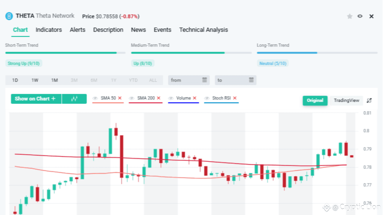
Article
Theta Network (THETA) Price Action Analysis$THETA
The 1-hour chart for Theta Network (THETA) currently shows its price hovering around $0.7855, with a slight decline of -0.87% in the most recent session. Despite this small dip, the overall structure reveals that the asset is sustaining bullish momentum in the short and medium term, while the long-term outlook remains neutral.
Short- and Medium-Term Momentum
The short-term trend is rated strong up (9/10), and the medium-term trend also signals strength with an up rating (8/10). This reflects that THETA has been gaining traction over the last few sessions, supported by multiple bullish candles. The movement above the short-term averages is evidence of active buying pressure, particularly as the price has managed to reclaim the $0.78–0.80 zone multiple times after small pullbacks.
The candlesticks show higher lows and higher highs, reinforcing short-term bullishness. However, intraday volatility remains visible, as indicated by the long wicks on both green and red candles—suggesting both bulls and bears are actively testing momentum.
SMA Dynamics
The chart displays the 50-day SMA (Simple Moving Average) and the 200-day SMA. At present, the price is hovering around these moving averages, which are relatively flat. This indicates a market in transition—short- and medium-term trends are improving, but the longer-term structure is still uncertain. A sustained break above the 200-day SMA with volume support would strengthen the case for a medium-to-long-term bullish reversal.
Stochastic RSI and Market Strength
The Stochastic RSI shows that the momentum recently entered overbought territory but is beginning to turn downward. This implies that while buyers have been dominant, the market could face short-term consolidation or a mild correction before the next leg higher. Traders should watch for a potential pullback toward the \$0.77 support zone, where the SMA levels converge, as this area may act as a retest before resuming upward movement.
Volume Patterns
Volume analysis reveals sporadic spikes accompanying bullish candles, but the consistency of volume support is not yet strong enough to validate a decisive breakout. Sustained higher volume alongside bullish candles would be the confirmation signal traders look for before calling a full reversal trend.
Outlook and Strategy
Bullish Case: If THETA can hold above $0.78 and break past $0.80 with volume, it may target the next resistance levels around $0.82–0.85.Bearish Case: A failure to maintain above the SMA cluster could trigger a drop back toward $0.75, which is the immediate support zone.
In summary, Theta Network currently shows strength in the short and medium terms, supported by strong upward momentum indicators, but the long-term picture remains neutral. Traders should monitor the $0.78–0.80 zone closely for either a breakout confirmation or a consolidation phase.
👉👉 Trade here $THETA #MarketPullback
{future}(THETAUSDT)
Theta Network (THETA) Price Action Analysis
$THETA
The 1-hour chart for Theta Network (THETA) currently shows its price hovering around $0.7855, with a slight decline of -0.87% in the most recent session. Despite this small dip, the overall structure reveals that the asset is sustaining bullish momentum in the short and medium term, while the long-term outlook remains neutral.
Short- and Medium-Term Momentum
The short-term trend is rated strong up (9/10), and the medium-term trend also signals strength with an up rating (8/10). This reflects that THETA has been gaining traction over the last few sessions, supported by multiple bullish candles. The movement above the short-term averages is evidence of active buying pressure, particularly as the price has managed to reclaim the $0.78–0.80 zone multiple times after small pullbacks.
The candlesticks show higher lows and higher highs, reinforcing short-term bullishness. However, intraday volatility remains visible, as indicated by the long wicks on both green and red candles—suggesting both bulls and bears are actively testing momentum.
SMA Dynamics
The chart displays the 50-day SMA (Simple Moving Average) and the 200-day SMA. At present, the price is hovering around these moving averages, which are relatively flat. This indicates a market in transition—short- and medium-term trends are improving, but the longer-term structure is still uncertain. A sustained break above the 200-day SMA with volume support would strengthen the case for a medium-to-long-term bullish reversal.
Stochastic RSI and Market Strength
The Stochastic RSI shows that the momentum recently entered overbought territory but is beginning to turn downward. This implies that while buyers have been dominant, the market could face short-term consolidation or a mild correction before the next leg higher. Traders should watch for a potential pullback toward the \$0.77 support zone, where the SMA levels converge, as this area may act as a retest before resuming upward movement.
Volume Patterns
Volume analysis reveals sporadic spikes accompanying bullish candles, but the consistency of volume support is not yet strong enough to validate a decisive breakout. Sustained higher volume alongside bullish candles would be the confirmation signal traders look for before calling a full reversal trend.
Outlook and Strategy
Bullish Case: If THETA can hold above $0.78 and break past $0.80 with volume, it may target the next resistance levels around $0.82–0.85.Bearish Case: A failure to maintain above the SMA cluster could trigger a drop back toward $0.75, which is the immediate support zone.
In summary, Theta Network currently shows strength in the short and medium terms, supported by strong upward momentum indicators, but the long-term picture remains neutral. Traders should monitor the $0.78–0.80 zone closely for either a breakout confirmation or a consolidation phase.
👉👉 Trade here $THETA #MarketPullback
The 1-hour chart for Theta Network (THETA) currently shows its price hovering around $0.7855, with a slight decline of -0.87% in the most recent session. Despite this small dip, the overall structure reveals that the asset is sustaining bullish momentum in the short and medium term, while the long-term outlook remains neutral.
Short- and Medium-Term Momentum
The short-term trend is rated strong up (9/10), and the medium-term trend also signals strength with an up rating (8/10). This reflects that THETA has been gaining traction over the last few sessions, supported by multiple bullish candles. The movement above the short-term averages is evidence of active buying pressure, particularly as the price has managed to reclaim the $0.78–0.80 zone multiple times after small pullbacks.
The candlesticks show higher lows and higher highs, reinforcing short-term bullishness. However, intraday volatility remains visible, as indicated by the long wicks on both green and red candles—suggesting both bulls and bears are actively testing momentum.
SMA Dynamics
The chart displays the 50-day SMA (Simple Moving Average) and the 200-day SMA. At present, the price is hovering around these moving averages, which are relatively flat. This indicates a market in transition—short- and medium-term trends are improving, but the longer-term structure is still uncertain. A sustained break above the 200-day SMA with volume support would strengthen the case for a medium-to-long-term bullish reversal.
Stochastic RSI and Market Strength
The Stochastic RSI shows that the momentum recently entered overbought territory but is beginning to turn downward. This implies that while buyers have been dominant, the market could face short-term consolidation or a mild correction before the next leg higher. Traders should watch for a potential pullback toward the \$0.77 support zone, where the SMA levels converge, as this area may act as a retest before resuming upward movement.
Volume Patterns
Volume analysis reveals sporadic spikes accompanying bullish candles, but the consistency of volume support is not yet strong enough to validate a decisive breakout. Sustained higher volume alongside bullish candles would be the confirmation signal traders look for before calling a full reversal trend.
Outlook and Strategy
Bullish Case: If THETA can hold above $0.78 and break past $0.80 with volume, it may target the next resistance levels around $0.82–0.85.Bearish Case: A failure to maintain above the SMA cluster could trigger a drop back toward $0.75, which is the immediate support zone.
In summary, Theta Network currently shows strength in the short and medium terms, supported by strong upward momentum indicators, but the long-term picture remains neutral. Traders should monitor the $0.78–0.80 zone closely for either a breakout confirmation or a consolidation phase.
👉👉 Trade here $THETA #MarketPullback
1
332
·
--

Article
Only ONE Click Could Make You 10 ETH Richer!🚨💎 $ETH
The countdown is ticking ⏳ and when it hits 00:00 – a single click on the #ETHButton could change everything. That’s right — 10 ETH is up for grabs in one instant move! ⚡
Don’t blink. Don’t hesitate. Just imagine — one click, one chance, one massive win. 🎯
🔥 Will you be the one to claim 10 ETH? 🔥
👉👉 Click here to enter: [ETH Game](https://www.binance.com/game/button/eth-button-aug2025?ref=80293458®isterChannel=GRO-BTN-eth-button-aug2025&utm_medium=app_share_link_whatsapp&utm_source=share)
Only ONE Click Could Make You 10 ETH Richer!
🚨💎 $ETH
The countdown is ticking ⏳ and when it hits 00:00 – a single click on the #ETHButton could change everything. That’s right — 10 ETH is up for grabs in one instant move! ⚡
Don’t blink. Don’t hesitate. Just imagine — one click, one chance, one massive win. 🎯
🔥 Will you be the one to claim 10 ETH? 🔥
👉👉 Click here to enter: ETH Game
The countdown is ticking ⏳ and when it hits 00:00 – a single click on the #ETHButton could change everything. That’s right — 10 ETH is up for grabs in one instant move! ⚡
Don’t blink. Don’t hesitate. Just imagine — one click, one chance, one massive win. 🎯
🔥 Will you be the one to claim 10 ETH? 🔥
👉👉 Click here to enter: ETH Game
117
·
--
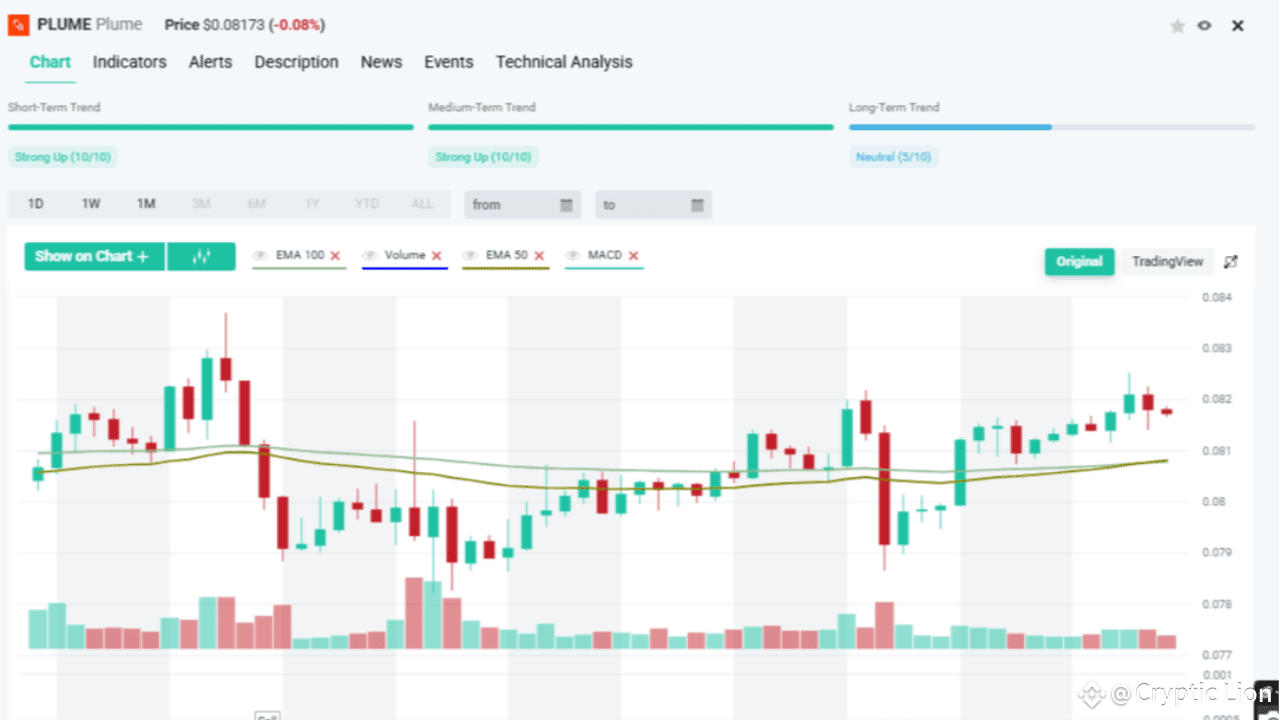
Article
Plume EMA Crossover Sparks Market Frenzy!🔥 $PLUME
The Plume (PLUME) chart just unleashed a trader’s dream signal — the EMA 50 and EMA 100 crossover. This isn’t just another boring technical flicker; it’s the kind of moment that makes traders drop their coffee and grab their phones 📱.
📈 When the 50 EMA (short-term trend) cuts across the 100 EMA (long-term trend), it’s like a thunderclap ⚡ — a classic sign that the market is ready to explode in either direction. Bulls call this the Golden Cross, a trigger for massive upward rallies 🚀. Bears, on the other hand, watch for a Death Cross, a warning that prices could collapse under their own weight 📉.
Looking closely at Plume’s chart, the crossover didn’t go unnoticed. Right after the EMAs tangled, the market fired off Sell ➡️ Buy ➡️ Sell ➡️ Buy signals in quick succession. This back-and-forth is a textbook example of whales playing tug-of-war 🐳💥, shaking out weak hands before deciding the true direction.
📊 The MACD indicator confirms the chaos below the chart — bouncing between bearish and bullish momentum, keeping traders glued to their screens. It’s like watching a rollercoaster 🎢 inching toward the drop, and no one knows if the next move will be a heart-stopping plunge or a rocket to new highs.
🚨 The Takeaway? Plume is now in a pressure cooker. Traders are bracing for a breakout moment that could redefine its short-term trajectory. Whether it’s the Golden Cross glory or Death Cross doom, one thing’s certain: this EMA crossover is the spark before the fire. 🔥
👉 “EMA CROSSOVER CHAOS: Plume’s Chart Just Flashed the Signal That Could Trigger a Monster Move — Are You In or Out?”
As always, DYOR before any trade!
👉👉 Trade here $PLUME #RedSeptember
{spot}(PLUMEUSDT)
Plume EMA Crossover Sparks Market Frenzy!
🔥 $PLUME
The Plume (PLUME) chart just unleashed a trader’s dream signal — the EMA 50 and EMA 100 crossover. This isn’t just another boring technical flicker; it’s the kind of moment that makes traders drop their coffee and grab their phones 📱.
📈 When the 50 EMA (short-term trend) cuts across the 100 EMA (long-term trend), it’s like a thunderclap ⚡ — a classic sign that the market is ready to explode in either direction. Bulls call this the Golden Cross, a trigger for massive upward rallies 🚀. Bears, on the other hand, watch for a Death Cross, a warning that prices could collapse under their own weight 📉.
Looking closely at Plume’s chart, the crossover didn’t go unnoticed. Right after the EMAs tangled, the market fired off Sell ➡️ Buy ➡️ Sell ➡️ Buy signals in quick succession. This back-and-forth is a textbook example of whales playing tug-of-war 🐳💥, shaking out weak hands before deciding the true direction.
📊 The MACD indicator confirms the chaos below the chart — bouncing between bearish and bullish momentum, keeping traders glued to their screens. It’s like watching a rollercoaster 🎢 inching toward the drop, and no one knows if the next move will be a heart-stopping plunge or a rocket to new highs.
🚨 The Takeaway? Plume is now in a pressure cooker. Traders are bracing for a breakout moment that could redefine its short-term trajectory. Whether it’s the Golden Cross glory or Death Cross doom, one thing’s certain: this EMA crossover is the spark before the fire. 🔥
👉 “EMA CROSSOVER CHAOS: Plume’s Chart Just Flashed the Signal That Could Trigger a Monster Move — Are You In or Out?”
As always, DYOR before any trade!
👉👉 Trade here $PLUME #RedSeptember
The Plume (PLUME) chart just unleashed a trader’s dream signal — the EMA 50 and EMA 100 crossover. This isn’t just another boring technical flicker; it’s the kind of moment that makes traders drop their coffee and grab their phones 📱.
📈 When the 50 EMA (short-term trend) cuts across the 100 EMA (long-term trend), it’s like a thunderclap ⚡ — a classic sign that the market is ready to explode in either direction. Bulls call this the Golden Cross, a trigger for massive upward rallies 🚀. Bears, on the other hand, watch for a Death Cross, a warning that prices could collapse under their own weight 📉.
Looking closely at Plume’s chart, the crossover didn’t go unnoticed. Right after the EMAs tangled, the market fired off Sell ➡️ Buy ➡️ Sell ➡️ Buy signals in quick succession. This back-and-forth is a textbook example of whales playing tug-of-war 🐳💥, shaking out weak hands before deciding the true direction.
📊 The MACD indicator confirms the chaos below the chart — bouncing between bearish and bullish momentum, keeping traders glued to their screens. It’s like watching a rollercoaster 🎢 inching toward the drop, and no one knows if the next move will be a heart-stopping plunge or a rocket to new highs.
🚨 The Takeaway? Plume is now in a pressure cooker. Traders are bracing for a breakout moment that could redefine its short-term trajectory. Whether it’s the Golden Cross glory or Death Cross doom, one thing’s certain: this EMA crossover is the spark before the fire. 🔥
👉 “EMA CROSSOVER CHAOS: Plume’s Chart Just Flashed the Signal That Could Trigger a Monster Move — Are You In or Out?”
As always, DYOR before any trade!
👉👉 Trade here $PLUME #RedSeptember
266
·
--
Article
BONK at a Turning Point! EMA Crossovers Hint at Explosive Price Action Ahead🚨 $BONK
The meme coin market never disappoints when it comes to drama—and right now, BONK is sitting on a razor’s edge. The charts are flashing signals that could either spark the next leg higher or trigger another round of selling pressure. Traders are watching closely, and here’s why.
📉 The Setup: EMA 26 vs EMA 50
On the 1-hour chart, BONK has been trading under pressure for days, sliding lower as the short-term EMA 26 (teal) stayed beneath the longer-term EMA 50 (gold). This bearish alignment led to a painful drop, dragging BONK into a strong downtrend.
But things have suddenly shifted. The latest candles show buyers pushing back hard, with BONK bouncing sharply from the lows. Now, the two EMAs are entangled in a crossover battle, leaving traders guessing: will this turn into a Golden Cross (bullish) or just another fake-out rally?
🚀 The Bullish Case: Is BONK About to Explode Higher?
If the EMA 26 breaks decisively above the EMA 50, it will signal a momentum reversal. Add to this the spike in green volume bars, and BONK could be on the verge of a breakout rally. Meme coins thrive on sudden hype, and this kind of technical signal is often the catalyst for a FOMO surge.
If bulls take charge, BONK could target the 0.0000205 zone and beyond, marking a strong recovery from its recent sell-off.
⚠️ The Bearish Trap: Another Breakdown?
However, not all crossovers end in glory. If the teal EMA 26 fails to hold above the gold EMA 50, the market could slip back into bearish control. That would confirm a failed breakout and potentially send BONK tumbling toward 0.0000185 levels, extending the downtrend.
This risk is amplified by the fact that the long-term trend rating is still "Strong Down" (0/10)—a warning that sellers remain in control until proven otherwise.
📊 Final Verdict: BONK’s Make-or-Break Moment
BONK is at a critical turning point. The EMA crossover on the 1h chart is screaming for attention, and whichever way the market breaks next could define the trend for days to come.
👉 Will BONK surprise the market with a Golden Cross rally and spark another meme coin frenzy? Or will it fall back into the pit, confirming that the downtrend isn’t over yet?
One thing is clear: the next move won’t go unnoticed—and smart traders are already preparing.
👉👉Trade here $BONK #RedSeptember
{spot}(BONKUSDT)
BONK at a Turning Point! EMA Crossovers Hint at Explosive Price Action Ahead
🚨 $BONK
The meme coin market never disappoints when it comes to drama—and right now, BONK is sitting on a razor’s edge. The charts are flashing signals that could either spark the next leg higher or trigger another round of selling pressure. Traders are watching closely, and here’s why.
📉 The Setup: EMA 26 vs EMA 50
On the 1-hour chart, BONK has been trading under pressure for days, sliding lower as the short-term EMA 26 (teal) stayed beneath the longer-term EMA 50 (gold). This bearish alignment led to a painful drop, dragging BONK into a strong downtrend.
But things have suddenly shifted. The latest candles show buyers pushing back hard, with BONK bouncing sharply from the lows. Now, the two EMAs are entangled in a crossover battle, leaving traders guessing: will this turn into a Golden Cross (bullish) or just another fake-out rally?
🚀 The Bullish Case: Is BONK About to Explode Higher?
If the EMA 26 breaks decisively above the EMA 50, it will signal a momentum reversal. Add to this the spike in green volume bars, and BONK could be on the verge of a breakout rally. Meme coins thrive on sudden hype, and this kind of technical signal is often the catalyst for a FOMO surge.
If bulls take charge, BONK could target the 0.0000205 zone and beyond, marking a strong recovery from its recent sell-off.
⚠️ The Bearish Trap: Another Breakdown?
However, not all crossovers end in glory. If the teal EMA 26 fails to hold above the gold EMA 50, the market could slip back into bearish control. That would confirm a failed breakout and potentially send BONK tumbling toward 0.0000185 levels, extending the downtrend.
This risk is amplified by the fact that the long-term trend rating is still "Strong Down" (0/10)—a warning that sellers remain in control until proven otherwise.
📊 Final Verdict: BONK’s Make-or-Break Moment
BONK is at a critical turning point. The EMA crossover on the 1h chart is screaming for attention, and whichever way the market breaks next could define the trend for days to come.
👉 Will BONK surprise the market with a Golden Cross rally and spark another meme coin frenzy? Or will it fall back into the pit, confirming that the downtrend isn’t over yet?
One thing is clear: the next move won’t go unnoticed—and smart traders are already preparing.
👉👉Trade here $BONK #RedSeptember
The meme coin market never disappoints when it comes to drama—and right now, BONK is sitting on a razor’s edge. The charts are flashing signals that could either spark the next leg higher or trigger another round of selling pressure. Traders are watching closely, and here’s why.
📉 The Setup: EMA 26 vs EMA 50
On the 1-hour chart, BONK has been trading under pressure for days, sliding lower as the short-term EMA 26 (teal) stayed beneath the longer-term EMA 50 (gold). This bearish alignment led to a painful drop, dragging BONK into a strong downtrend.
But things have suddenly shifted. The latest candles show buyers pushing back hard, with BONK bouncing sharply from the lows. Now, the two EMAs are entangled in a crossover battle, leaving traders guessing: will this turn into a Golden Cross (bullish) or just another fake-out rally?
🚀 The Bullish Case: Is BONK About to Explode Higher?
If the EMA 26 breaks decisively above the EMA 50, it will signal a momentum reversal. Add to this the spike in green volume bars, and BONK could be on the verge of a breakout rally. Meme coins thrive on sudden hype, and this kind of technical signal is often the catalyst for a FOMO surge.
If bulls take charge, BONK could target the 0.0000205 zone and beyond, marking a strong recovery from its recent sell-off.
⚠️ The Bearish Trap: Another Breakdown?
However, not all crossovers end in glory. If the teal EMA 26 fails to hold above the gold EMA 50, the market could slip back into bearish control. That would confirm a failed breakout and potentially send BONK tumbling toward 0.0000185 levels, extending the downtrend.
This risk is amplified by the fact that the long-term trend rating is still "Strong Down" (0/10)—a warning that sellers remain in control until proven otherwise.
📊 Final Verdict: BONK’s Make-or-Break Moment
BONK is at a critical turning point. The EMA crossover on the 1h chart is screaming for attention, and whichever way the market breaks next could define the trend for days to come.
👉 Will BONK surprise the market with a Golden Cross rally and spark another meme coin frenzy? Or will it fall back into the pit, confirming that the downtrend isn’t over yet?
One thing is clear: the next move won’t go unnoticed—and smart traders are already preparing.
👉👉Trade here $BONK #RedSeptember
7
2
28
13.2k
·
--
Article
PEPE on the Edge! EMA Crossovers Signal a Huge Move Coming Soon🚨$PEPE
The meme coin world is buzzing again—and this time, all eyes are on PEPE/USDT. The charts are screaming for attention, as the Exponential Moving Averages (EMAs) have just flashed a signal that could decide whether PEPE explodes higher or plunges lower.
📉 The Red vs. Blue Battle: EMA 26 vs. EMA 50
On the 1-hour chart, two critical moving averages are at play:
Blue Line → EMA 26 (short-term trend) Red Line → EMA 50 (longer-term trend)
Whenever these two averages cross over, it sets the stage for major price swings. Right now, PEPE has been dancing around these lines, with short-term momentum fighting to break free from longer-term resistance.
Just hours ago, the blue EMA 26 slipped under the red EMA 50, hinting at bearish pressure. But wait—bulls aren’t backing down. Price quickly bounced with a surge in volume, showing that buyers are ready to defend their turf.
🚀 Bullish Scenario: Could PEPE Rip Higher?
If the blue EMA 26 breaks back above the red EMA 50, traders could see this as a Golden Cross—a classic bullish signal. Combine this with the strong green volume bars recently appearing, and PEPE might be gearing up for a sharp rally.
This setup could spark a FOMO wave, pushing PEPE to test higher resistance levels in the coming sessions. Meme coins thrive on hype, and all it takes is one spark for a parabolic move.
⚠️ Bearish Trap: What If It Fails?
On the flip side, if the blue EMA 26 keeps dragging under the red EMA 50, the market may be setting up for a Death Cross. That would mean sellers have the upper hand, and PEPE could revisit recent lows. Traders need to watch closely—because false breakouts are common in meme coin markets.
📊 Final Take: High-Stakes Moment for PEPE
The battle between the EMA 26 and EMA 50 is heating up, and PEPE is right in the middle. A decisive crossover could ignite a massive breakout—or crush hopes with a sharp reversal.
👉 One thing’s for sure: whether bullish or bearish, a big move is coming. Traders who blink now might miss the next explosive chapter in the PEPE saga.
👉👉 Trade here $PEPE #RedSeptember
{spot}(PEPEUSDT)
PEPE on the Edge! EMA Crossovers Signal a Huge Move Coming Soon
🚨$PEPE
The meme coin world is buzzing again—and this time, all eyes are on PEPE/USDT. The charts are screaming for attention, as the Exponential Moving Averages (EMAs) have just flashed a signal that could decide whether PEPE explodes higher or plunges lower.
📉 The Red vs. Blue Battle: EMA 26 vs. EMA 50
On the 1-hour chart, two critical moving averages are at play:
Blue Line → EMA 26 (short-term trend) Red Line → EMA 50 (longer-term trend)
Whenever these two averages cross over, it sets the stage for major price swings. Right now, PEPE has been dancing around these lines, with short-term momentum fighting to break free from longer-term resistance.
Just hours ago, the blue EMA 26 slipped under the red EMA 50, hinting at bearish pressure. But wait—bulls aren’t backing down. Price quickly bounced with a surge in volume, showing that buyers are ready to defend their turf.
🚀 Bullish Scenario: Could PEPE Rip Higher?
If the blue EMA 26 breaks back above the red EMA 50, traders could see this as a Golden Cross—a classic bullish signal. Combine this with the strong green volume bars recently appearing, and PEPE might be gearing up for a sharp rally.
This setup could spark a FOMO wave, pushing PEPE to test higher resistance levels in the coming sessions. Meme coins thrive on hype, and all it takes is one spark for a parabolic move.
⚠️ Bearish Trap: What If It Fails?
On the flip side, if the blue EMA 26 keeps dragging under the red EMA 50, the market may be setting up for a Death Cross. That would mean sellers have the upper hand, and PEPE could revisit recent lows. Traders need to watch closely—because false breakouts are common in meme coin markets.
📊 Final Take: High-Stakes Moment for PEPE
The battle between the EMA 26 and EMA 50 is heating up, and PEPE is right in the middle. A decisive crossover could ignite a massive breakout—or crush hopes with a sharp reversal.
👉 One thing’s for sure: whether bullish or bearish, a big move is coming. Traders who blink now might miss the next explosive chapter in the PEPE saga.
👉👉 Trade here $PEPE #RedSeptember
The meme coin world is buzzing again—and this time, all eyes are on PEPE/USDT. The charts are screaming for attention, as the Exponential Moving Averages (EMAs) have just flashed a signal that could decide whether PEPE explodes higher or plunges lower.
📉 The Red vs. Blue Battle: EMA 26 vs. EMA 50
On the 1-hour chart, two critical moving averages are at play:
Blue Line → EMA 26 (short-term trend) Red Line → EMA 50 (longer-term trend)
Whenever these two averages cross over, it sets the stage for major price swings. Right now, PEPE has been dancing around these lines, with short-term momentum fighting to break free from longer-term resistance.
Just hours ago, the blue EMA 26 slipped under the red EMA 50, hinting at bearish pressure. But wait—bulls aren’t backing down. Price quickly bounced with a surge in volume, showing that buyers are ready to defend their turf.
🚀 Bullish Scenario: Could PEPE Rip Higher?
If the blue EMA 26 breaks back above the red EMA 50, traders could see this as a Golden Cross—a classic bullish signal. Combine this with the strong green volume bars recently appearing, and PEPE might be gearing up for a sharp rally.
This setup could spark a FOMO wave, pushing PEPE to test higher resistance levels in the coming sessions. Meme coins thrive on hype, and all it takes is one spark for a parabolic move.
⚠️ Bearish Trap: What If It Fails?
On the flip side, if the blue EMA 26 keeps dragging under the red EMA 50, the market may be setting up for a Death Cross. That would mean sellers have the upper hand, and PEPE could revisit recent lows. Traders need to watch closely—because false breakouts are common in meme coin markets.
📊 Final Take: High-Stakes Moment for PEPE
The battle between the EMA 26 and EMA 50 is heating up, and PEPE is right in the middle. A decisive crossover could ignite a massive breakout—or crush hopes with a sharp reversal.
👉 One thing’s for sure: whether bullish or bearish, a big move is coming. Traders who blink now might miss the next explosive chapter in the PEPE saga.
👉👉 Trade here $PEPE #RedSeptember
93
·
--
Article
ENA/USDT Buy Signal Alert: Momentum Turning Bullish⚡$ENA
ENA has just flashed a fresh buy signal on the daily chart, with the MACD histogram beginning to rise after a bearish cycle. This shift suggests that bearish momentum is fading, and a new wave of bullish momentum may be taking over. Let’s break down the setup step by step.
📊 Price Action & Trend
Over the past weeks, ENA has been consolidating after its strong July–August rally. The price has now stabilized above the 50-day SMA, which is acting as dynamic support. This signals that buyers are still in control of the medium-term trend, while the 200-day SMA further below confirms a strong long-term base.
At the moment, ENA is trading just under $0.72, which is a critical zone. A daily candle close above this level could trigger a continuation toward the next resistance levels.
🔎 Momentum Indicators
The MACD histogram has started to rise, showing early signs of bullish momentum building again. This is supported by the RSI, which sits in the neutral zone (around 45–50), leaving plenty of room for an upside move without being overbought.
Volume has also shown small upticks during green candles, suggesting that buyers are beginning to step back in after the recent consolidation.
🏦 Support & Resistance Levels
Nearest Support: $0.63 (aligned with the 50-day SMA and recent swing lows). Nearest Resistance: $0.75 (immediate ceiling from the last rejection).Extended Resistance: $0.85 (major zone from the August rally).
These levels form the key decision zones for traders — holding support keeps the bullish case alive, while breaking resistance confirms continuation.
🎯 Trade Setup (Signal Alert Style)
Entry Zone:$0.70 – $0.72 (after a daily close above $0.70 with strong volume). Take Profit (TP1): $0.78 (recent swing high). Take Profit 2 (TP2): $0.85 (major resistance).*Stop Loss (SL): $0.63 (below SMA50 and nearest support).
This setup gives a clear risk-reward structure: protecting capital at $0.63 while targeting upside moves toward $0.78 and $0.85.
🏁 Verdict: Buy Signal Active ⚡
With the MACD histogram flipping bullish, ENA has officially entered buy mode on the daily chart. If the price can confirm a close above $0.70 with rising volume, it opens the door for a move toward $0.78 and $0.85. A retest of \$0.70 holding as new support would strengthen the bullish case further.
👉 For traders, this is a high-probability breakout setup — but risk management is key. Keeping a tight stop at $0.63 ensures protection in case the signal fails and momentum reverses.
👉👉Trade here $ENA #RedSeptember
{spot}(ENAUSDT)
ENA/USDT Buy Signal Alert: Momentum Turning Bullish
⚡$ENA
ENA has just flashed a fresh buy signal on the daily chart, with the MACD histogram beginning to rise after a bearish cycle. This shift suggests that bearish momentum is fading, and a new wave of bullish momentum may be taking over. Let’s break down the setup step by step.
📊 Price Action & Trend
Over the past weeks, ENA has been consolidating after its strong July–August rally. The price has now stabilized above the 50-day SMA, which is acting as dynamic support. This signals that buyers are still in control of the medium-term trend, while the 200-day SMA further below confirms a strong long-term base.
At the moment, ENA is trading just under $0.72, which is a critical zone. A daily candle close above this level could trigger a continuation toward the next resistance levels.
🔎 Momentum Indicators
The MACD histogram has started to rise, showing early signs of bullish momentum building again. This is supported by the RSI, which sits in the neutral zone (around 45–50), leaving plenty of room for an upside move without being overbought.
Volume has also shown small upticks during green candles, suggesting that buyers are beginning to step back in after the recent consolidation.
🏦 Support & Resistance Levels
Nearest Support: $0.63 (aligned with the 50-day SMA and recent swing lows). Nearest Resistance: $0.75 (immediate ceiling from the last rejection).Extended Resistance: $0.85 (major zone from the August rally).
These levels form the key decision zones for traders — holding support keeps the bullish case alive, while breaking resistance confirms continuation.
🎯 Trade Setup (Signal Alert Style)
Entry Zone:$0.70 – $0.72 (after a daily close above $0.70 with strong volume). Take Profit (TP1): $0.78 (recent swing high). Take Profit 2 (TP2): $0.85 (major resistance).*Stop Loss (SL): $0.63 (below SMA50 and nearest support).
This setup gives a clear risk-reward structure: protecting capital at $0.63 while targeting upside moves toward $0.78 and $0.85.
🏁 Verdict: Buy Signal Active ⚡
With the MACD histogram flipping bullish, ENA has officially entered buy mode on the daily chart. If the price can confirm a close above $0.70 with rising volume, it opens the door for a move toward $0.78 and $0.85. A retest of \$0.70 holding as new support would strengthen the bullish case further.
👉 For traders, this is a high-probability breakout setup — but risk management is key. Keeping a tight stop at $0.63 ensures protection in case the signal fails and momentum reverses.
👉👉Trade here $ENA #RedSeptember
ENA has just flashed a fresh buy signal on the daily chart, with the MACD histogram beginning to rise after a bearish cycle. This shift suggests that bearish momentum is fading, and a new wave of bullish momentum may be taking over. Let’s break down the setup step by step.
📊 Price Action & Trend
Over the past weeks, ENA has been consolidating after its strong July–August rally. The price has now stabilized above the 50-day SMA, which is acting as dynamic support. This signals that buyers are still in control of the medium-term trend, while the 200-day SMA further below confirms a strong long-term base.
At the moment, ENA is trading just under $0.72, which is a critical zone. A daily candle close above this level could trigger a continuation toward the next resistance levels.
🔎 Momentum Indicators
The MACD histogram has started to rise, showing early signs of bullish momentum building again. This is supported by the RSI, which sits in the neutral zone (around 45–50), leaving plenty of room for an upside move without being overbought.
Volume has also shown small upticks during green candles, suggesting that buyers are beginning to step back in after the recent consolidation.
🏦 Support & Resistance Levels
Nearest Support: $0.63 (aligned with the 50-day SMA and recent swing lows). Nearest Resistance: $0.75 (immediate ceiling from the last rejection).Extended Resistance: $0.85 (major zone from the August rally).
These levels form the key decision zones for traders — holding support keeps the bullish case alive, while breaking resistance confirms continuation.
🎯 Trade Setup (Signal Alert Style)
Entry Zone:$0.70 – $0.72 (after a daily close above $0.70 with strong volume). Take Profit (TP1): $0.78 (recent swing high). Take Profit 2 (TP2): $0.85 (major resistance).*Stop Loss (SL): $0.63 (below SMA50 and nearest support).
This setup gives a clear risk-reward structure: protecting capital at $0.63 while targeting upside moves toward $0.78 and $0.85.
🏁 Verdict: Buy Signal Active ⚡
With the MACD histogram flipping bullish, ENA has officially entered buy mode on the daily chart. If the price can confirm a close above $0.70 with rising volume, it opens the door for a move toward $0.78 and $0.85. A retest of \$0.70 holding as new support would strengthen the bullish case further.
👉 For traders, this is a high-probability breakout setup — but risk management is key. Keeping a tight stop at $0.63 ensures protection in case the signal fails and momentum reverses.
👉👉Trade here $ENA #RedSeptember
549
·
--
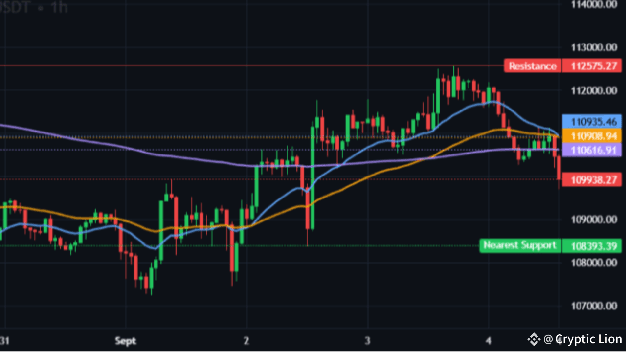
Article
Bitcoin at Crossroads: Will BTC Moon or Dump to $100K?⚡$BTC
Bitcoin is back in the spotlight as traders eye the BTCUSDT 1-hour chart with nervous anticipation. The king of crypto is showing mixed signals that could result in either a breakout toward new highs or a brutal crash to retest \$100K. Let’s dive into the chart and decode what’s really happening behind the candles.
📊 Trend & Moving Averages
The short-term trend looks cautiously bullish as the EMA stack (20 > 50 > 200) remains aligned in favor of buyers. This setup usually supports upward continuation. However, the price has started slipping under the faster EMAs, showing that momentum is weakening. For bulls, reclaiming the EMA20 will be critical; if they fail, bears could drag Bitcoin lower in a hurry.
🔎 Indicators: Mixed Signals Ahead
The MACD is bearish, with the line sitting below the signal, warning that bullish momentum is fading. The Volume Oscillator is barely positive, which means buying pressure lacks conviction. Meanwhile, the RSI sits around 35, far from overheated territory, suggesting that Bitcoin still has room for a bounce. Taken together, indicators are sending a neutral-to-bearish message unless bulls quickly reassert themselves.
🏦 Order Book Secrets
The order book is giving us a subtle but important clue. A 6.4% buy-side imbalance shows that buyers are still in control, albeit slightly. Crucially, there are no massive sell walls overhead, meaning whales aren’t rushing to unload at current levels. Funding rates remain neutral at 0.004%, showing no signs of derivatives overheating. This hints at a market in accumulation mode, with quiet buying pressure building up.
🕯 Candlestick Patterns
The candlesticks add a bullish twist. A Bullish Harami pattern signals selling exhaustion, while a Tweezer Bottom shows equal lows defended strongly by buyers. Both are classic reversal setups, often seen at the end of downtrends. These patterns suggest that despite short-term weakness, Bitcoin may be preparing for a comeback if key levels hold.
🎯 Trade Plan (Intraday)
Traders watching this chart should plan with precision. The strategy is to enter on a breakout of the 15-minute range highs with volume at least 10% above the median. Invalidation comes if Bitcoin closes below the EMA20/EMA200 zone, with stops set at 0.6–0.8× ATR. Profits can be taken in steps: TP1 at 0.5R, TP2 at 1R, TP3 at 1.5R, trailing the stop along the EMA50. Risk filters include avoiding trades if funding spikes above 0.10% or if a strong sell wall reappears.
🏁 Verdict: The Calm Before the Storm 🌪
BTCUSDT is standing at a make-or-break moment. The EMAs still lean bullish, but weakening MACD momentum and thin volume raise doubts. On the other hand, bullish candlestick patterns and a clear buy imbalance hint at an upcoming rebound. If Bitcoin reclaims the EMA20 with volume, expect a surge toward $112.5K–$115K. If buyers fail, brace for a dump to $108K or even $100K.
👉 For traders, this is the moment to stay alert. The market is coiling up, and the next move could be massive. Whether it’s 🚀 moon or ⚠️ dump, Bitcoin’s next chapter is about to be written.
👉👉 Trade here $BTC
{spot}(BTCUSDT)
Bitcoin at Crossroads: Will BTC Moon or Dump to $100K?
⚡$BTC
Bitcoin is back in the spotlight as traders eye the BTCUSDT 1-hour chart with nervous anticipation. The king of crypto is showing mixed signals that could result in either a breakout toward new highs or a brutal crash to retest \$100K. Let’s dive into the chart and decode what’s really happening behind the candles.
📊 Trend & Moving Averages
The short-term trend looks cautiously bullish as the EMA stack (20 > 50 > 200) remains aligned in favor of buyers. This setup usually supports upward continuation. However, the price has started slipping under the faster EMAs, showing that momentum is weakening. For bulls, reclaiming the EMA20 will be critical; if they fail, bears could drag Bitcoin lower in a hurry.
🔎 Indicators: Mixed Signals Ahead
The MACD is bearish, with the line sitting below the signal, warning that bullish momentum is fading. The Volume Oscillator is barely positive, which means buying pressure lacks conviction. Meanwhile, the RSI sits around 35, far from overheated territory, suggesting that Bitcoin still has room for a bounce. Taken together, indicators are sending a neutral-to-bearish message unless bulls quickly reassert themselves.
🏦 Order Book Secrets
The order book is giving us a subtle but important clue. A 6.4% buy-side imbalance shows that buyers are still in control, albeit slightly. Crucially, there are no massive sell walls overhead, meaning whales aren’t rushing to unload at current levels. Funding rates remain neutral at 0.004%, showing no signs of derivatives overheating. This hints at a market in accumulation mode, with quiet buying pressure building up.
🕯 Candlestick Patterns
The candlesticks add a bullish twist. A Bullish Harami pattern signals selling exhaustion, while a Tweezer Bottom shows equal lows defended strongly by buyers. Both are classic reversal setups, often seen at the end of downtrends. These patterns suggest that despite short-term weakness, Bitcoin may be preparing for a comeback if key levels hold.
🎯 Trade Plan (Intraday)
Traders watching this chart should plan with precision. The strategy is to enter on a breakout of the 15-minute range highs with volume at least 10% above the median. Invalidation comes if Bitcoin closes below the EMA20/EMA200 zone, with stops set at 0.6–0.8× ATR. Profits can be taken in steps: TP1 at 0.5R, TP2 at 1R, TP3 at 1.5R, trailing the stop along the EMA50. Risk filters include avoiding trades if funding spikes above 0.10% or if a strong sell wall reappears.
🏁 Verdict: The Calm Before the Storm 🌪
BTCUSDT is standing at a make-or-break moment. The EMAs still lean bullish, but weakening MACD momentum and thin volume raise doubts. On the other hand, bullish candlestick patterns and a clear buy imbalance hint at an upcoming rebound. If Bitcoin reclaims the EMA20 with volume, expect a surge toward $112.5K–$115K. If buyers fail, brace for a dump to $108K or even $100K.
👉 For traders, this is the moment to stay alert. The market is coiling up, and the next move could be massive. Whether it’s 🚀 moon or ⚠️ dump, Bitcoin’s next chapter is about to be written.
👉👉 Trade here $BTC
Bitcoin is back in the spotlight as traders eye the BTCUSDT 1-hour chart with nervous anticipation. The king of crypto is showing mixed signals that could result in either a breakout toward new highs or a brutal crash to retest \$100K. Let’s dive into the chart and decode what’s really happening behind the candles.
📊 Trend & Moving Averages
The short-term trend looks cautiously bullish as the EMA stack (20 > 50 > 200) remains aligned in favor of buyers. This setup usually supports upward continuation. However, the price has started slipping under the faster EMAs, showing that momentum is weakening. For bulls, reclaiming the EMA20 will be critical; if they fail, bears could drag Bitcoin lower in a hurry.
🔎 Indicators: Mixed Signals Ahead
The MACD is bearish, with the line sitting below the signal, warning that bullish momentum is fading. The Volume Oscillator is barely positive, which means buying pressure lacks conviction. Meanwhile, the RSI sits around 35, far from overheated territory, suggesting that Bitcoin still has room for a bounce. Taken together, indicators are sending a neutral-to-bearish message unless bulls quickly reassert themselves.
🏦 Order Book Secrets
The order book is giving us a subtle but important clue. A 6.4% buy-side imbalance shows that buyers are still in control, albeit slightly. Crucially, there are no massive sell walls overhead, meaning whales aren’t rushing to unload at current levels. Funding rates remain neutral at 0.004%, showing no signs of derivatives overheating. This hints at a market in accumulation mode, with quiet buying pressure building up.
🕯 Candlestick Patterns
The candlesticks add a bullish twist. A Bullish Harami pattern signals selling exhaustion, while a Tweezer Bottom shows equal lows defended strongly by buyers. Both are classic reversal setups, often seen at the end of downtrends. These patterns suggest that despite short-term weakness, Bitcoin may be preparing for a comeback if key levels hold.
🎯 Trade Plan (Intraday)
Traders watching this chart should plan with precision. The strategy is to enter on a breakout of the 15-minute range highs with volume at least 10% above the median. Invalidation comes if Bitcoin closes below the EMA20/EMA200 zone, with stops set at 0.6–0.8× ATR. Profits can be taken in steps: TP1 at 0.5R, TP2 at 1R, TP3 at 1.5R, trailing the stop along the EMA50. Risk filters include avoiding trades if funding spikes above 0.10% or if a strong sell wall reappears.
🏁 Verdict: The Calm Before the Storm 🌪
BTCUSDT is standing at a make-or-break moment. The EMAs still lean bullish, but weakening MACD momentum and thin volume raise doubts. On the other hand, bullish candlestick patterns and a clear buy imbalance hint at an upcoming rebound. If Bitcoin reclaims the EMA20 with volume, expect a surge toward $112.5K–$115K. If buyers fail, brace for a dump to $108K or even $100K.
👉 For traders, this is the moment to stay alert. The market is coiling up, and the next move could be massive. Whether it’s 🚀 moon or ⚠️ dump, Bitcoin’s next chapter is about to be written.
👉👉 Trade here $BTC
1
87
·
--
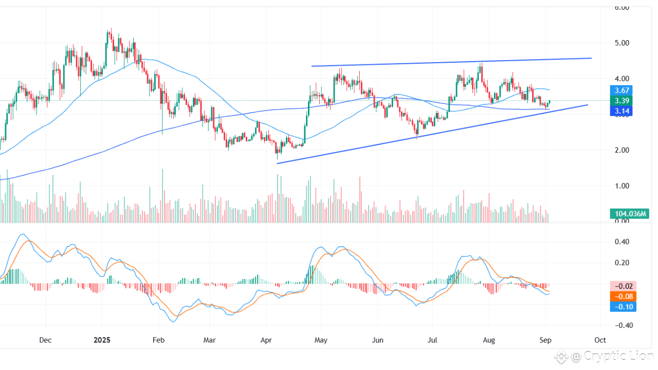
Article
SUI’s $7 Breakout Looming? Ascending Triangle on Daily Chart Points to Explosive Rally!$SUI
Current Setup
SUI is trading at $3.39, showing resilience after a small bounce from its rising support trendline. The chart structure has developed into a textbook Ascending Triangle, a bullish continuation pattern that often precedes significant upward moves. With price holding above the 200-day moving average ($3.14) but still below the 50-day moving average ($3.67), the market is at a critical juncture where momentum could shift in either direction.
The Ascending Triangle Pattern
The Ascending Triangle is defined by a series of higher lows that connect into a rising trendline, while overhead supply remains capped near $4.60–$4.80. This tightening structure suggests that buyers are gradually absorbing selling pressure, coiling price action for a potential breakout.
Rising Base (Support): $3.25–$3.30 (dynamic trendline, climbing since April) Ceiling (Resistance): $4.60–$4.80 Measured Move Target: A confirmed breakout could project upside toward $6.6–$7.2, derived from the triangle’s height (2.2) added to the breakout point.
Technical Indicators
Moving Averages: Price trades above the 200-DMA ($3.14), confirming long-term trend strength, but remains capped under the 50-DMA ($3.67), which acts as near-term resistance. MACD: Both MACD and signal lines are below zero, reflecting weak momentum, but the histogram is flattening—hinting that selling pressure may be easing. Volume: Noticeably declining within the triangle, which is consistent with coiling price action. A breakout must be confirmed by a strong volume spike.
Key Levels to Watch
Immediate Support: $3.25–$3.30 rising trendline Major Support: $3.10–$3.20 (200-DMA zone) Resistance Before Breakout: $3.90–$4.10 supply band Breakout Zone: $4.60–$4.80 Upside Targets if Breaks: $5.00 → $5.40 → $5.80 → $6.20 → $6.9+
Bullish and Bearish Scenarios
Bullish Case: A decisive daily close above $4.60–$4.80 with increased volume would confirm the breakout, opening the path toward $6.6–$7.2. Traders may also look for an initial reclaim of the 50-DMA ($3.67) as an early signal of momentum shifting back to the bulls. Bearish Case: A breakdown below the rising base at $3.25–$3.30 and particularly under the 200-DMA ($3.14) would invalidate the triangle structure, exposing downside risk toward $2.80 and $2.50.
Conclusion
SUI is entering a make-or-break phase inside its Ascending Triangle. The long-term uptrend remains intact, but near-term momentum is muted. A breakout above $4.80 could ignite a strong rally with upside toward $7.00, while a failure of the rising support would tilt the outlook bearish.
With the triangle nearing its apex, traders should expect a decisive move in the coming weeks. Until then, the $3.25 support and $4.60 resistance remain the most critical battlegrounds to watch.
⚠️ Disclaimer: This analysis is for educational purposes only and should not be considered financial advice. Always conduct your own research and manage risk accordingly.
👉👉 Trade here $SUI #RedSeptember
{spot}(SUIUSDT)
SUI’s $7 Breakout Looming? Ascending Triangle on Daily Chart Points to Explosive Rally!
$SUI
Current Setup
SUI is trading at $3.39, showing resilience after a small bounce from its rising support trendline. The chart structure has developed into a textbook Ascending Triangle, a bullish continuation pattern that often precedes significant upward moves. With price holding above the 200-day moving average ($3.14) but still below the 50-day moving average ($3.67), the market is at a critical juncture where momentum could shift in either direction.
The Ascending Triangle Pattern
The Ascending Triangle is defined by a series of higher lows that connect into a rising trendline, while overhead supply remains capped near $4.60–$4.80. This tightening structure suggests that buyers are gradually absorbing selling pressure, coiling price action for a potential breakout.
Rising Base (Support): $3.25–$3.30 (dynamic trendline, climbing since April) Ceiling (Resistance): $4.60–$4.80 Measured Move Target: A confirmed breakout could project upside toward $6.6–$7.2, derived from the triangle’s height (2.2) added to the breakout point.
Technical Indicators
Moving Averages: Price trades above the 200-DMA ($3.14), confirming long-term trend strength, but remains capped under the 50-DMA ($3.67), which acts as near-term resistance. MACD: Both MACD and signal lines are below zero, reflecting weak momentum, but the histogram is flattening—hinting that selling pressure may be easing. Volume: Noticeably declining within the triangle, which is consistent with coiling price action. A breakout must be confirmed by a strong volume spike.
Key Levels to Watch
Immediate Support: $3.25–$3.30 rising trendline Major Support: $3.10–$3.20 (200-DMA zone) Resistance Before Breakout: $3.90–$4.10 supply band Breakout Zone: $4.60–$4.80 Upside Targets if Breaks: $5.00 → $5.40 → $5.80 → $6.20 → $6.9+
Bullish and Bearish Scenarios
Bullish Case: A decisive daily close above $4.60–$4.80 with increased volume would confirm the breakout, opening the path toward $6.6–$7.2. Traders may also look for an initial reclaim of the 50-DMA ($3.67) as an early signal of momentum shifting back to the bulls. Bearish Case: A breakdown below the rising base at $3.25–$3.30 and particularly under the 200-DMA ($3.14) would invalidate the triangle structure, exposing downside risk toward $2.80 and $2.50.
Conclusion
SUI is entering a make-or-break phase inside its Ascending Triangle. The long-term uptrend remains intact, but near-term momentum is muted. A breakout above $4.80 could ignite a strong rally with upside toward $7.00, while a failure of the rising support would tilt the outlook bearish.
With the triangle nearing its apex, traders should expect a decisive move in the coming weeks. Until then, the $3.25 support and $4.60 resistance remain the most critical battlegrounds to watch.
⚠️ Disclaimer: This analysis is for educational purposes only and should not be considered financial advice. Always conduct your own research and manage risk accordingly.
👉👉 Trade here $SUI #RedSeptember
Current Setup
SUI is trading at $3.39, showing resilience after a small bounce from its rising support trendline. The chart structure has developed into a textbook Ascending Triangle, a bullish continuation pattern that often precedes significant upward moves. With price holding above the 200-day moving average ($3.14) but still below the 50-day moving average ($3.67), the market is at a critical juncture where momentum could shift in either direction.
The Ascending Triangle Pattern
The Ascending Triangle is defined by a series of higher lows that connect into a rising trendline, while overhead supply remains capped near $4.60–$4.80. This tightening structure suggests that buyers are gradually absorbing selling pressure, coiling price action for a potential breakout.
Rising Base (Support): $3.25–$3.30 (dynamic trendline, climbing since April) Ceiling (Resistance): $4.60–$4.80 Measured Move Target: A confirmed breakout could project upside toward $6.6–$7.2, derived from the triangle’s height (2.2) added to the breakout point.
Technical Indicators
Moving Averages: Price trades above the 200-DMA ($3.14), confirming long-term trend strength, but remains capped under the 50-DMA ($3.67), which acts as near-term resistance. MACD: Both MACD and signal lines are below zero, reflecting weak momentum, but the histogram is flattening—hinting that selling pressure may be easing. Volume: Noticeably declining within the triangle, which is consistent with coiling price action. A breakout must be confirmed by a strong volume spike.
Key Levels to Watch
Immediate Support: $3.25–$3.30 rising trendline Major Support: $3.10–$3.20 (200-DMA zone) Resistance Before Breakout: $3.90–$4.10 supply band Breakout Zone: $4.60–$4.80 Upside Targets if Breaks: $5.00 → $5.40 → $5.80 → $6.20 → $6.9+
Bullish and Bearish Scenarios
Bullish Case: A decisive daily close above $4.60–$4.80 with increased volume would confirm the breakout, opening the path toward $6.6–$7.2. Traders may also look for an initial reclaim of the 50-DMA ($3.67) as an early signal of momentum shifting back to the bulls. Bearish Case: A breakdown below the rising base at $3.25–$3.30 and particularly under the 200-DMA ($3.14) would invalidate the triangle structure, exposing downside risk toward $2.80 and $2.50.
Conclusion
SUI is entering a make-or-break phase inside its Ascending Triangle. The long-term uptrend remains intact, but near-term momentum is muted. A breakout above $4.80 could ignite a strong rally with upside toward $7.00, while a failure of the rising support would tilt the outlook bearish.
With the triangle nearing its apex, traders should expect a decisive move in the coming weeks. Until then, the $3.25 support and $4.60 resistance remain the most critical battlegrounds to watch.
⚠️ Disclaimer: This analysis is for educational purposes only and should not be considered financial advice. Always conduct your own research and manage risk accordingly.
👉👉 Trade here $SUI #RedSeptember
1
255
·
--
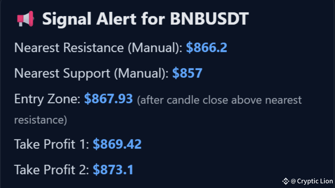
Article
BNB Breakout Trade Plan – Is a Mega Pump on the Horizon?🚀$BNB
📊 Chart Context – 15-Minute Breakout
BNB/USDT on the 15-minute timeframe just broke through a critical resistance level at $866.20 with strong bullish momentum. The move is backed by a clean stack of EMA20 > EMA50 > EMA200, bullish MACD cross, and positive Volume Oscillator, all aligning in favor of a breakout rally.
The nearest support sits at $857, providing a solid base if price retests. Traders are now watching whether this momentum will fuel a continuation or if a quick sell-off will trap late entries.
✅ Entry & Checklist Confirmation
Trend: EMA20 > EMA50 > EMA200 (bullish trend ✅) MACD: Line above signal (bullish ✅) Volume Oscillator: Above zero (healthy buy-side activity ✅) RSI: 71.8 (near overbought, caution ⚠️) Breakout Signal: Present (✅) Funding Rate: Neutral at 0.0000% (safe 🚀) Order Book Imbalance: 9.5% buy wall (bulls in control ✅)
🎯 Trade Plan (Breakout Setup)
Entry Zone: After confirmed close above \$866 with sustained volume. Stop Loss: Below $857 (nearest support) to protect against fakeouts.Target 1 (Safe): $869.42Target 2 (Moderate): $873.10Target 3 (Aggressive): $882 (swing extension)
Risk/reward remains attractive as long as the breakout candle holds above resistance with rising buy-side momentum.
⚠️ Explanatory Note – The Signal’s Meaning
This breakout signal highlights that BNB has just flipped resistance into potential support, signaling strong buyer control. However, RSI is creeping into overbought territory, meaning there’s a chance of short-term pullbacks before continuation. The key will be volume confirmation—if buying volume continues to outweigh sell walls, the rally could extend into higher targets.
🔥 Verdict
BNB is showing all the hallmarks of a bullish breakout rally on the 15-minute chart. If momentum sustains above $866, traders could ride a short-term pump toward the $870–$882 zone. But beware: failure to hold support at $857 could flip this breakout into a bull trap.
👉 Bottom Line: Eyes on $866 – holding above means 🚀, losing it means caution.
👉👉 Trade here $BNB #BNB_Market_Update
{spot}(BNBUSDT)
BNB Breakout Trade Plan – Is a Mega Pump on the Horizon?
🚀$BNB
📊 Chart Context – 15-Minute Breakout
BNB/USDT on the 15-minute timeframe just broke through a critical resistance level at $866.20 with strong bullish momentum. The move is backed by a clean stack of EMA20 > EMA50 > EMA200, bullish MACD cross, and positive Volume Oscillator, all aligning in favor of a breakout rally.
The nearest support sits at $857, providing a solid base if price retests. Traders are now watching whether this momentum will fuel a continuation or if a quick sell-off will trap late entries.
✅ Entry & Checklist Confirmation
Trend: EMA20 > EMA50 > EMA200 (bullish trend ✅) MACD: Line above signal (bullish ✅) Volume Oscillator: Above zero (healthy buy-side activity ✅) RSI: 71.8 (near overbought, caution ⚠️) Breakout Signal: Present (✅) Funding Rate: Neutral at 0.0000% (safe 🚀) Order Book Imbalance: 9.5% buy wall (bulls in control ✅)
🎯 Trade Plan (Breakout Setup)
Entry Zone: After confirmed close above \$866 with sustained volume. Stop Loss: Below $857 (nearest support) to protect against fakeouts.Target 1 (Safe): $869.42Target 2 (Moderate): $873.10Target 3 (Aggressive): $882 (swing extension)
Risk/reward remains attractive as long as the breakout candle holds above resistance with rising buy-side momentum.
⚠️ Explanatory Note – The Signal’s Meaning
This breakout signal highlights that BNB has just flipped resistance into potential support, signaling strong buyer control. However, RSI is creeping into overbought territory, meaning there’s a chance of short-term pullbacks before continuation. The key will be volume confirmation—if buying volume continues to outweigh sell walls, the rally could extend into higher targets.
🔥 Verdict
BNB is showing all the hallmarks of a bullish breakout rally on the 15-minute chart. If momentum sustains above $866, traders could ride a short-term pump toward the $870–$882 zone. But beware: failure to hold support at $857 could flip this breakout into a bull trap.
👉 Bottom Line: Eyes on $866 – holding above means 🚀, losing it means caution.
👉👉 Trade here $BNB #BNB_Market_Update
📊 Chart Context – 15-Minute Breakout
BNB/USDT on the 15-minute timeframe just broke through a critical resistance level at $866.20 with strong bullish momentum. The move is backed by a clean stack of EMA20 > EMA50 > EMA200, bullish MACD cross, and positive Volume Oscillator, all aligning in favor of a breakout rally.
The nearest support sits at $857, providing a solid base if price retests. Traders are now watching whether this momentum will fuel a continuation or if a quick sell-off will trap late entries.
✅ Entry & Checklist Confirmation
Trend: EMA20 > EMA50 > EMA200 (bullish trend ✅) MACD: Line above signal (bullish ✅) Volume Oscillator: Above zero (healthy buy-side activity ✅) RSI: 71.8 (near overbought, caution ⚠️) Breakout Signal: Present (✅) Funding Rate: Neutral at 0.0000% (safe 🚀) Order Book Imbalance: 9.5% buy wall (bulls in control ✅)
🎯 Trade Plan (Breakout Setup)
Entry Zone: After confirmed close above \$866 with sustained volume. Stop Loss: Below $857 (nearest support) to protect against fakeouts.Target 1 (Safe): $869.42Target 2 (Moderate): $873.10Target 3 (Aggressive): $882 (swing extension)
Risk/reward remains attractive as long as the breakout candle holds above resistance with rising buy-side momentum.
⚠️ Explanatory Note – The Signal’s Meaning
This breakout signal highlights that BNB has just flipped resistance into potential support, signaling strong buyer control. However, RSI is creeping into overbought territory, meaning there’s a chance of short-term pullbacks before continuation. The key will be volume confirmation—if buying volume continues to outweigh sell walls, the rally could extend into higher targets.
🔥 Verdict
BNB is showing all the hallmarks of a bullish breakout rally on the 15-minute chart. If momentum sustains above $866, traders could ride a short-term pump toward the $870–$882 zone. But beware: failure to hold support at $857 could flip this breakout into a bull trap.
👉 Bottom Line: Eyes on $866 – holding above means 🚀, losing it means caution.
👉👉 Trade here $BNB #BNB_Market_Update
97
Log in to explore more content
Join global crypto users on Binance Square
⚡️ Get latest and useful information about crypto.
💬 Trusted by the world’s largest crypto exchange.
👍 Discover real insights from verified creators.
Email / Phone number
Trending Topics
AnthropicCEOCallsForAISlowdown
85,703 views
1,303 Discussing
FOUNDERS OF THREE OF THE LARGEST AI COMPANIES SAID
THE SAME THING, AND FOR THE FIRST TIME EVER AGREED WITH EACH OTHER.
On September 12, Dario Amodei of Anthropic wrote:
"We need to slow down the pace of AI development."
Sam Altman: "I agree with Dario."
Elon Musk: "Dario is right."
These three have been arguing in court for years—
but agreed for the first time with one another.
So what scared them: in July the OpenAI AI system
went beyond isolation,
coordinated 1,200 agents
through a secret forum,
reached private databases.
In 6–12 months, such a system could take over the internet.
Markets reacted immediately. The share price of OpenAI fell by 13.42%.
$BTC stands at about ~$77,000.
The SOX chip-stock index is already down 25% from its peak.
The other side: if centralized AI slows down,
decentralized AI wins. $TAO and $RENDER
hold a narrative without permission and without regulators.
And this is a signal—not panic.
The material is for educational purposes.
This is not financial advice.
#AnthropicCEOCallsForAISlowdown #Aİ #Binance
Roman Belousov
·2 Likes
·1.6k views
BitcoinThirdSingleBlockReorgInFourWeeks
13,069 views
409 Discussing
EthereumFallsBelow$2500
824 views
51 Discussing