
$TIA: Does Visual Calm Impact Technical Objectivity?
$TIA: Does a clean chart layout make a price analysis more trustworthy or simply more persuasive? The current movement in $TIA shows a daily change of -7.42293% while staying inside its recorded range.
Visual calm is often used as a stylistic trust signal. A layout without clutter or aggressive formatting can imply a professional and objective perspective. However, this aesthetic can be a shortcut that bypasses critical thinking. When a post lacks distracting emojis, readers might assume the logic is more rigorous, even if the underlying data is limited. This is a hypothetical mechanism where style replaces substance in public discourse.
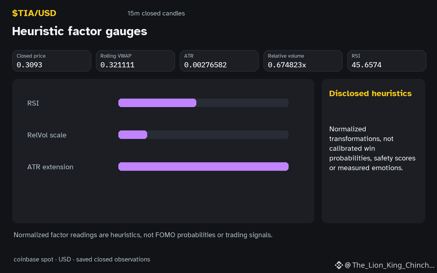
Consider the general dilemma of Write to Earn incentives. When creators are incentivized to post frequently, they may adopt a specific visual style to signal authority quickly. Distinguishing evidence from persuasion requires looking past the presentation. For example, $TIA currently shows an RSI of 45.7 and hourly volume that is not above baseline. These are neutral facts, regardless of how they are formatted.
A counterexample is a cluttered chart that actually identifies a high-probability range. If the visual style is messy, do we dismiss the evidence? A useful way to reassess is to check if the logic holds when the price moves past resistance at 0.3184. If the interpretation fails to adapt to new candle closes, the initial visual calm was likely just a persuasive tool. ⚖️
Probabilistic market research, not a recommendation or guaranteed return.
#TIA #CryptoCommunity #CryptoLearning
$TIA: Does a clean chart layout make a price analysis more trustworthy or simply more persuasive? The current movement in $TIA shows a daily change of -7.42293% while staying inside its recorded range.
Visual calm is often used as a stylistic trust signal. A layout without clutter or aggressive formatting can imply a professional and objective perspective. However, this aesthetic can be a shortcut that bypasses critical thinking. When a post lacks distracting emojis, readers might assume the logic is more rigorous, even if the underlying data is limited. This is a hypothetical mechanism where style replaces substance in public discourse.
Consider the general dilemma of Write to Earn incentives. When creators are incentivized to post frequently, they may adopt a specific visual style to signal authority quickly. Distinguishing evidence from persuasion requires looking past the presentation. For example, $TIA currently shows an RSI of 45.7 and hourly volume that is not above baseline. These are neutral facts, regardless of how they are formatted.
A counterexample is a cluttered chart that actually identifies a high-probability range. If the visual style is messy, do we dismiss the evidence? A useful way to reassess is to check if the logic holds when the price moves past resistance at 0.3184. If the interpretation fails to adapt to new candle closes, the initial visual calm was likely just a persuasive tool. ⚖️
Probabilistic market research, not a recommendation or guaranteed return.
#TIA #CryptoCommunity #CryptoLearning