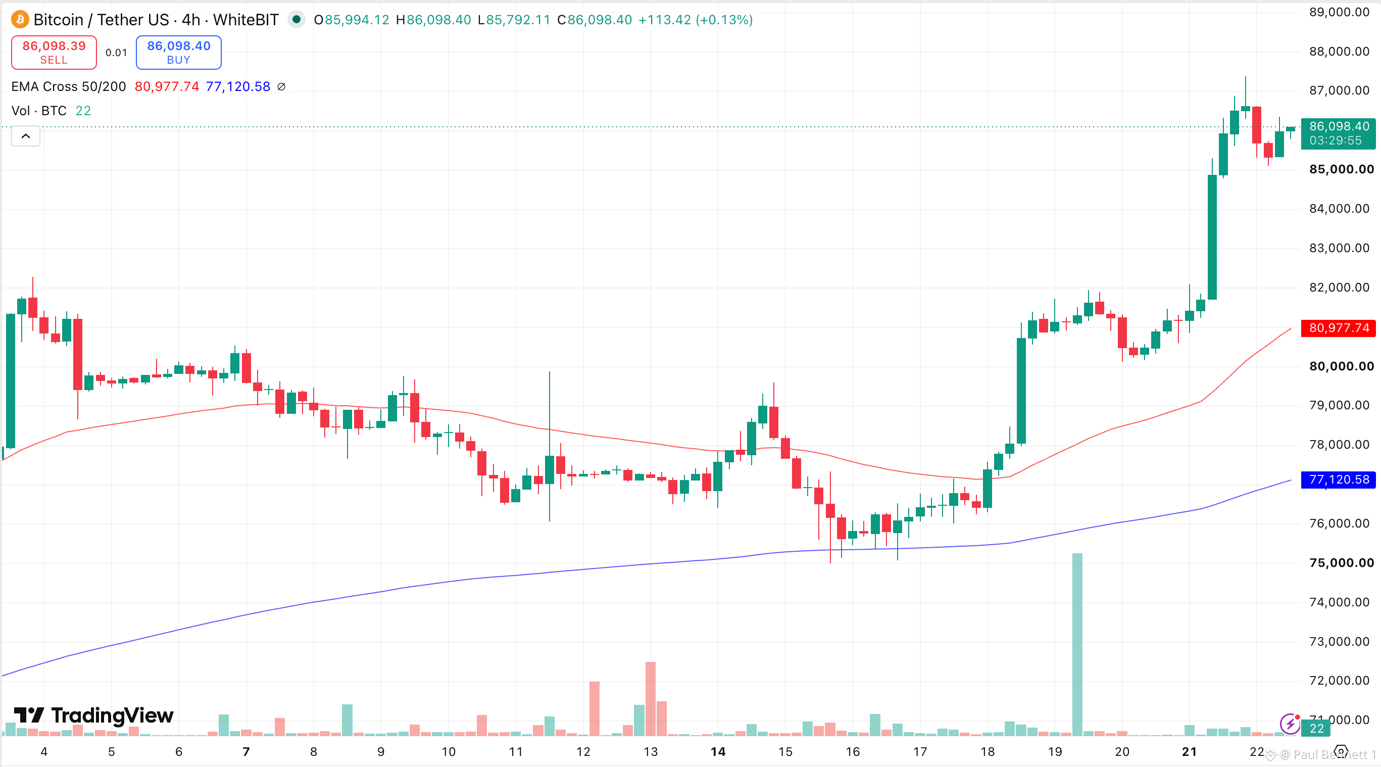
🌈 Bitcoin’s Rainbow Chart Puts $87K in View - But I’d Treat It as a Guide Finbold looked at where the Bitcoin Rainbow Chart places BTC for the start of October. The model’s central “HODL” zone is around $87K, while $BTC was trading closer to $78K when the analysis was published. I wouldn’t read that as a direct price target. The Rainbow Chart is more useful for showing where Bitcoin sits inside a long-term valuation range than for predicting the next move. 📊 The short-term chart still matters more: Bitcoin was above its 50-day and 200-day moving averages, while RSI was already near 70, so momentum looked strong but a bit stretched. One thing I noticed while checking this setup: WhiteBIT recently added TradFi pairs to TradingView. That makes it easier to put Bitcoin next to things like gold, oil, stocks, and ETFs on the same charting platform - which is actually pretty useful for a post like this, because the Rainbow Chart tells you where $BTC sits historically, while cross-market charts help show what’s happening around it right now. For me, $87K is a reference point, not a forecast. I’d still trust price structure, volume, and momentum more than any single model. 📍Disclaimer: This is not financial or investment advice. Do your own research before making any decisions. Use at your own risk. #BTC Price Analysis# #Bitcoin Price Prediction: What is Bitcoins next move?#


ໂພສ