


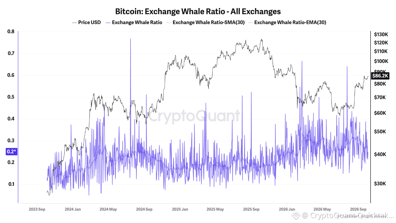
The 30-day smoothed average of the Exchange Whale Ratio is sitting near its highest levels on this entire three-year chart, right as price pushes back toward $86K, and that pairing is worth more attention than the raw daily spikes.
The ratio measures what share of total exchange inflow is coming from the largest wallets, so a rising smoothed average means whale-sized deposits are making up a growing portion of what's landing on exchanges, not just retail-sized flow. Looking at the SMA/EMA lines rather than the raw spikes, which are naturally noisy and spike on any single large transfer, the smoothed trend has climbed from roughly 0.2 back in 2024-2025 up toward 0.3-0.35 recently, among the highest sustained readings on this whole chart.
What stands out to me is the historical pattern this chart shows around prior price peaks. Looking back at the 2024 run toward $73K and the 2025 run toward $126K, elevated whale ratio readings showed up before and around those tops, large holders moving coins to exchanges tends to precede distribution, since that's typically what deposits are for. The current climb happening while price is also climbing, rather than after a top's already formed, is the detail worth sitting with.
Worth being careful about the causality here though, a deposit to an exchange isn't automatically a sell order, whales also move coins to exchanges for custody changes, OTC settlement, or to post collateral, and this ratio can't distinguish between those on its own. Elevated readings are a necessary condition for distribution-driven selling, not sufficient proof it's happening.
The open question isn't whether whale-sized flow has picked up, the smoothed trend confirms that clearly. It's whether this rising ratio resolves the way it has at prior tops on this same chart, into a period of price weakness following elevated whale deposits, or whether this time the deposits get absorbed by the kind of ETF and institutional demand that's been showing up .
Written by R3N