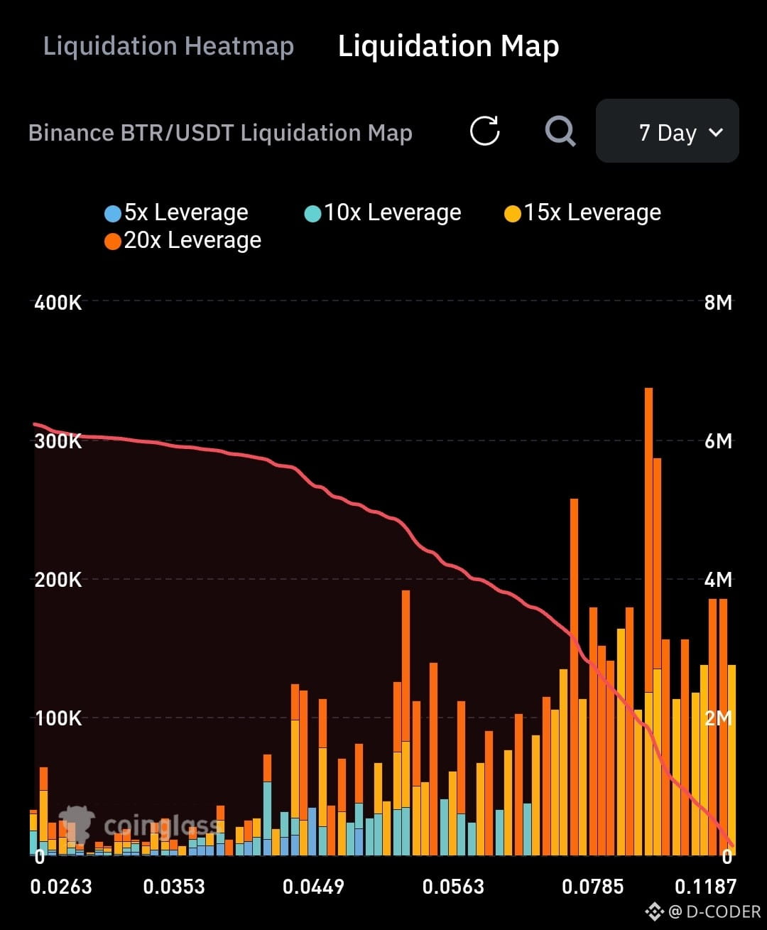
$BTR | This Coinglass Liquidation Map for Binance BTR/USDT (7-day view) visualizes estimated clusters of leveraged positions that would face forced liquidation at various price levels. The x-axis shows price (from ~0.0263 on the left to ~0.1187 on the right), while the colored bars represent the relative intensity or notional size of potential liquidations at each level, broken down by leverage: blue for 5x, cyan for 10x, yellow for 15x, and orange for 20x. Taller bars indicate denser concentrations of positions at risk. The overlaid red line typically tracks cumulative estimated liquidation volume as price moves across those levels (higher on the left, declining toward the right).
With BTR currently trading near ~0.12 USDT, the chart primarily covers prices below the spot level, so the bars largely reflect long-position liquidation risk. The most prominent orange (20x) and yellow (15x) clusters appear toward the higher-price side of the range (closer to current levels), meaning a relatively modest drop could trigger substantial forced selling. These dense zones often act as “magnets” that can accelerate downside moves through cascading liquidations, while sparser areas on the far left (much lower prices) suggest thinner risk. The map is a model derived from open interest, leverage distributions, and public data not a live order book so it estimates where forced flow is likely concentrated rather than guaranteeing exact amounts.
Trade from here to become my supporter on Binance Square (DYOR) 👇
With BTR currently trading near ~0.12 USDT, the chart primarily covers prices below the spot level, so the bars largely reflect long-position liquidation risk. The most prominent orange (20x) and yellow (15x) clusters appear toward the higher-price side of the range (closer to current levels), meaning a relatively modest drop could trigger substantial forced selling. These dense zones often act as “magnets” that can accelerate downside moves through cascading liquidations, while sparser areas on the far left (much lower prices) suggest thinner risk. The map is a model derived from open interest, leverage distributions, and public data not a live order book so it estimates where forced flow is likely concentrated rather than guaranteeing exact amounts.
Trade from here to become my supporter on Binance Square (DYOR) 👇