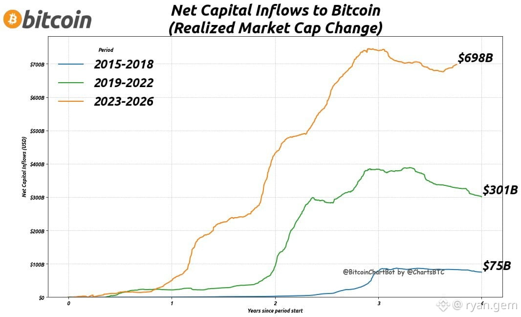
$BTC net capital inflows across halving cycles — all normalized to days since cycle start.
Notice the pattern? Each cycle shows distinct phases of capital rotation. Current cycle tracking similar accumulation zones as previous runs.
Realized cap data doesn't lie. Smart money leaves footprints. Follow the flows, not the noise.
Chart speaks louder than hopium.
Notice the pattern? Each cycle shows distinct phases of capital rotation. Current cycle tracking similar accumulation zones as previous runs.
Realized cap data doesn't lie. Smart money leaves footprints. Follow the flows, not the noise.
Chart speaks louder than hopium.