
CoinsProbe
3.4k Posts

CoinsProbe
 Square Verified+
Report
Block User
Coinsprobe is the leading cryptocurrency platform that provides the latest news, breakouts, price predictions, airdrops, events, and ICO presales.
1 Following
9.8K+ Followers
12.6K+ Liked
Posts
·
--

Article
Niu Lai (牛来) Jumps +25% After Binance Spot Listing AnnouncementKey Highlights
牛来 (Niu Lai) surged 26.11% in one hour and 43.50% in 24 hours after Binance officially confirmed a Spot listing — with a 30-day return of +12,860% from its August launch.The Spot listing completes a three-stage Binance integration: Alpha (August 18) → Futures (August 30, up to 10x leverage) → Spot (September 9, 14:30 UTC) — representing a major liquidity upgrade for a BNB Chain meme token.At $0.1207 with a $120.73 million market cap, Niu Lai is a high-risk meme asset — listing pumps of this magnitude can reverse as quickly as they arrive.
牛来 (Niu Lai) surged 26.11% in one hour and 43.50% in 24 hours after Binance officially confirmed a Spot listing — with a 30-day return of +12,860% from its August launch. The Spot listing completes a three-stage Binance integration: Alpha (August 18) → Futures (August 30, up to 10x leverage) → Spot (confirmed) — representing a major liquidity upgrade for a BNB Chain meme token.
At $0.1207 with a $120.73 million market cap, Niu Lai is a high-risk meme asset — listing pumps of this magnitude can reverse as quickly as they arrive.
牛来 (Niu Lai) Price on 09 Sept 2026 |Source: Coinmarketcap
Official Binance Spot Listing Details
Binance has published the full listing schedule and trading pair structure for 牛来:
Trading Pairs
PairExchange牛来/USDT Binance Spot牛来/USDC Binance Spot牛来/TRY Binance Spot
Full Listing Schedule
Event Time (UTC)Deposits Open September 9, 2026 — 13:30 UTC (1 hour before trading)Spot Trading Opens September 9, 2026 — 14:30 UTC Withdrawals Open September 10, 2026 — 14:30 UTC Listing Fee0 BNB
Contract Information
Network Contract Address BNB Smart Chain0xbeea1d618e533a387d941f58a7d4c9b7bd377777
Deposits open one hour before trading begins at 13:30 UTC on September 9 — giving holders time to move 牛来 to their Binance wallets before the trading window opens. Withdrawals follow 24 hours after spot trading begins on September 10 at 14:30 UTC.
Binance Confirms Spot Listing — The Three-Stage Journey
Niu Lai’s path through the Binance ecosystem has followed a clear escalating sequence that makes the September 9 Spot confirmation the logical — and most significant — step:
Stage Date Detail Binance Alpha August 18, 2026First Binance ecosystem entry Binance Futures August 30, 2026牛来USDT perpetual, up to 10x leverage Binance Spot September 9, 2026 — 14:30 UTC Full spot trading — 牛来/USDT, USDC, TRY
Each step expanded Niu Lai’s accessible trading audience and liquidity. The Spot listing is the final and most impactful stage — opening the token to Binance’s full retail user base across standard spot trading pairs rather than limiting access to Alpha participants or futures traders.
Each step expanded Niu Lai’s accessible trading audience and liquidity. The Spot listing is the final and most impactful stage — opening the token to Binance’s full retail user base across standard spot trading pairs rather than limiting access to Alpha participants or futures traders comfortable with leveraged perpetuals.
Binance published an official support notice confirming the listing — the headline that triggered the immediate one-hour price spike.
Binance Listing 牛来 (Niu Lai) | Source: @binance_announcements (TG)
What Is Niu Lai (牛来)?
As covered in our earlier Niu Lai 3,827% surge and smart money analysis, 牛来 is a BNB Chain meme coin inspired by a Chinese animated film that went viral for the wrong reasons — the movie generated almost no box office revenue but became a cultural phenomenon on Chinese social media due to its notoriously poor animation. The name 牛来 translates directly to “the bull is coming” — a phrase that has proven prescient for token holders.
The token has no utility or roadmap. It exists as a pure cultural meme play — and from its mid-August launch, it has delivered one of the most extreme 30-day returns visible on BNB Chain in 2026.
Why the Spot Listing Moves Price So Aggressively
A Binance Spot listing for a token that originated as a cultural meme on BNB Chain produces an outsized price reaction for one structural reason: accessibility step-change. The pool of people who can buy the token expands dramatically the moment Spot trading opens — from Alpha participants and futures traders to every Binance user globally.
The 26% one-hour spike reflects the market front-running that accessibility expansion before it fully arrives. Traders who anticipate new Binance retail buying are positioning ahead of it — creating the immediate price reaction even before the Spot pairs officially open.
That same mechanism is also the primary risk: the buyers who drove the one-hour spike are front-running expected demand. If post-listing retail demand does not materialize at the expected scale, profit-taking from those front-runners adds supply into the listing window — producing the sharp reversals that characterize many meme token listing events.
The Risk Profile — 12,860% in 30 Days
The 30-day gain of +12,860% is the most important number for contextualizing the current setup. It means every holder who bought in the first weeks of August and is still holding is sitting on extraordinary unrealized gains — representing significant latent selling pressure at any price.
A Binance Spot listing provides the liquidity for those early holders to exit into new buyers. Whether the new retail demand absorbs that selling or is overwhelmed by it will determine whether the listing pump extends or reverses.
Key risk factors:
30-day returns of 12,860% leave virtually no early holder underwater — creating broad profit-taking incentive at listingNo utility or roadmap means price is entirely narrative-driven and vulnerable to sentiment shiftsListing pumps on meme tokens after large prior moves have a historically poor track record of sustaining
Bottom Line
Niu Lai’s one-hour 26% spike is the market pricing in what a Binance Spot listing means for a token that has been building its Binance presence since August 18 — from Alpha to Futures to full Spot access. The three-stage escalation is complete. The liquidity upgrade is real.
What is equally real: a meme token up 12,860% in 30 days with no utility and a listing pump layered on top is one of the higher-risk configurations in the current market. The Spot listing is a genuine catalyst. Whether it produces a sustained move or a sharp reversal will be determined by the balance between new retail inflows and profit-taking from the existing holder base in the sessions immediately following the listing open.
Disclaimer: The views and analysis presented in this article are for informational purposes only and reflect the author’s perspective, not financial advice. Technical patterns and indicators discussed are subject to market volatility and may or may not yield anticipated results. Investors are advised to exercise caution, conduct independent research, and make decisions aligned with their individual risk tolerance.
Niu Lai (牛来) Jumps +25% After Binance Spot Listing Announcement
Key Highlights
牛来 (Niu Lai) surged 26.11% in one hour and 43.50% in 24 hours after Binance officially confirmed a Spot listing — with a 30-day return of +12,860% from its August launch.The Spot listing completes a three-stage Binance integration: Alpha (August 18) → Futures (August 30, up to 10x leverage) → Spot (September 9, 14:30 UTC) — representing a major liquidity upgrade for a BNB Chain meme token.At $0.1207 with a $120.73 million market cap, Niu Lai is a high-risk meme asset — listing pumps of this magnitude can reverse as quickly as they arrive.
牛来 (Niu Lai) surged 26.11% in one hour and 43.50% in 24 hours after Binance officially confirmed a Spot listing — with a 30-day return of +12,860% from its August launch. The Spot listing completes a three-stage Binance integration: Alpha (August 18) → Futures (August 30, up to 10x leverage) → Spot (confirmed) — representing a major liquidity upgrade for a BNB Chain meme token.
At $0.1207 with a $120.73 million market cap, Niu Lai is a high-risk meme asset — listing pumps of this magnitude can reverse as quickly as they arrive.
牛来 (Niu Lai) Price on 09 Sept 2026 |Source: Coinmarketcap
Official Binance Spot Listing Details
Binance has published the full listing schedule and trading pair structure for 牛来:
Trading Pairs
PairExchange牛来/USDT Binance Spot牛来/USDC Binance Spot牛来/TRY Binance Spot
Full Listing Schedule
Event Time (UTC)Deposits Open September 9, 2026 — 13:30 UTC (1 hour before trading)Spot Trading Opens September 9, 2026 — 14:30 UTC Withdrawals Open September 10, 2026 — 14:30 UTC Listing Fee0 BNB
Contract Information
Network Contract Address BNB Smart Chain0xbeea1d618e533a387d941f58a7d4c9b7bd377777
Deposits open one hour before trading begins at 13:30 UTC on September 9 — giving holders time to move 牛来 to their Binance wallets before the trading window opens. Withdrawals follow 24 hours after spot trading begins on September 10 at 14:30 UTC.
Binance Confirms Spot Listing — The Three-Stage Journey
Niu Lai’s path through the Binance ecosystem has followed a clear escalating sequence that makes the September 9 Spot confirmation the logical — and most significant — step:
Stage Date Detail Binance Alpha August 18, 2026First Binance ecosystem entry Binance Futures August 30, 2026牛来USDT perpetual, up to 10x leverage Binance Spot September 9, 2026 — 14:30 UTC Full spot trading — 牛来/USDT, USDC, TRY
Each step expanded Niu Lai’s accessible trading audience and liquidity. The Spot listing is the final and most impactful stage — opening the token to Binance’s full retail user base across standard spot trading pairs rather than limiting access to Alpha participants or futures traders.
Each step expanded Niu Lai’s accessible trading audience and liquidity. The Spot listing is the final and most impactful stage — opening the token to Binance’s full retail user base across standard spot trading pairs rather than limiting access to Alpha participants or futures traders comfortable with leveraged perpetuals.
Binance published an official support notice confirming the listing — the headline that triggered the immediate one-hour price spike.
Binance Listing 牛来 (Niu Lai) | Source: @binance_announcements (TG)
What Is Niu Lai (牛来)?
As covered in our earlier Niu Lai 3,827% surge and smart money analysis, 牛来 is a BNB Chain meme coin inspired by a Chinese animated film that went viral for the wrong reasons — the movie generated almost no box office revenue but became a cultural phenomenon on Chinese social media due to its notoriously poor animation. The name 牛来 translates directly to “the bull is coming” — a phrase that has proven prescient for token holders.
The token has no utility or roadmap. It exists as a pure cultural meme play — and from its mid-August launch, it has delivered one of the most extreme 30-day returns visible on BNB Chain in 2026.
Why the Spot Listing Moves Price So Aggressively
A Binance Spot listing for a token that originated as a cultural meme on BNB Chain produces an outsized price reaction for one structural reason: accessibility step-change. The pool of people who can buy the token expands dramatically the moment Spot trading opens — from Alpha participants and futures traders to every Binance user globally.
The 26% one-hour spike reflects the market front-running that accessibility expansion before it fully arrives. Traders who anticipate new Binance retail buying are positioning ahead of it — creating the immediate price reaction even before the Spot pairs officially open.
That same mechanism is also the primary risk: the buyers who drove the one-hour spike are front-running expected demand. If post-listing retail demand does not materialize at the expected scale, profit-taking from those front-runners adds supply into the listing window — producing the sharp reversals that characterize many meme token listing events.
The Risk Profile — 12,860% in 30 Days
The 30-day gain of +12,860% is the most important number for contextualizing the current setup. It means every holder who bought in the first weeks of August and is still holding is sitting on extraordinary unrealized gains — representing significant latent selling pressure at any price.
A Binance Spot listing provides the liquidity for those early holders to exit into new buyers. Whether the new retail demand absorbs that selling or is overwhelmed by it will determine whether the listing pump extends or reverses.
Key risk factors:
30-day returns of 12,860% leave virtually no early holder underwater — creating broad profit-taking incentive at listingNo utility or roadmap means price is entirely narrative-driven and vulnerable to sentiment shiftsListing pumps on meme tokens after large prior moves have a historically poor track record of sustaining
Bottom Line
Niu Lai’s one-hour 26% spike is the market pricing in what a Binance Spot listing means for a token that has been building its Binance presence since August 18 — from Alpha to Futures to full Spot access. The three-stage escalation is complete. The liquidity upgrade is real.
What is equally real: a meme token up 12,860% in 30 days with no utility and a listing pump layered on top is one of the higher-risk configurations in the current market. The Spot listing is a genuine catalyst. Whether it produces a sustained move or a sharp reversal will be determined by the balance between new retail inflows and profit-taking from the existing holder base in the sessions immediately following the listing open.
Disclaimer: The views and analysis presented in this article are for informational purposes only and reflect the author’s perspective, not financial advice. Technical patterns and indicators discussed are subject to market volatility and may or may not yield anticipated results. Investors are advised to exercise caution, conduct independent research, and make decisions aligned with their individual risk tolerance.
牛来 (Niu Lai) surged 26.11% in one hour and 43.50% in 24 hours after Binance officially confirmed a Spot listing — with a 30-day return of +12,860% from its August launch.The Spot listing completes a three-stage Binance integration: Alpha (August 18) → Futures (August 30, up to 10x leverage) → Spot (September 9, 14:30 UTC) — representing a major liquidity upgrade for a BNB Chain meme token.At $0.1207 with a $120.73 million market cap, Niu Lai is a high-risk meme asset — listing pumps of this magnitude can reverse as quickly as they arrive.
牛来 (Niu Lai) surged 26.11% in one hour and 43.50% in 24 hours after Binance officially confirmed a Spot listing — with a 30-day return of +12,860% from its August launch. The Spot listing completes a three-stage Binance integration: Alpha (August 18) → Futures (August 30, up to 10x leverage) → Spot (confirmed) — representing a major liquidity upgrade for a BNB Chain meme token.
At $0.1207 with a $120.73 million market cap, Niu Lai is a high-risk meme asset — listing pumps of this magnitude can reverse as quickly as they arrive.
牛来 (Niu Lai) Price on 09 Sept 2026 |Source: Coinmarketcap
Official Binance Spot Listing Details
Binance has published the full listing schedule and trading pair structure for 牛来:
Trading Pairs
PairExchange牛来/USDT Binance Spot牛来/USDC Binance Spot牛来/TRY Binance Spot
Full Listing Schedule
Event Time (UTC)Deposits Open September 9, 2026 — 13:30 UTC (1 hour before trading)Spot Trading Opens September 9, 2026 — 14:30 UTC Withdrawals Open September 10, 2026 — 14:30 UTC Listing Fee0 BNB
Contract Information
Network Contract Address BNB Smart Chain0xbeea1d618e533a387d941f58a7d4c9b7bd377777
Deposits open one hour before trading begins at 13:30 UTC on September 9 — giving holders time to move 牛来 to their Binance wallets before the trading window opens. Withdrawals follow 24 hours after spot trading begins on September 10 at 14:30 UTC.
Binance Confirms Spot Listing — The Three-Stage Journey
Niu Lai’s path through the Binance ecosystem has followed a clear escalating sequence that makes the September 9 Spot confirmation the logical — and most significant — step:
Stage Date Detail Binance Alpha August 18, 2026First Binance ecosystem entry Binance Futures August 30, 2026牛来USDT perpetual, up to 10x leverage Binance Spot September 9, 2026 — 14:30 UTC Full spot trading — 牛来/USDT, USDC, TRY
Each step expanded Niu Lai’s accessible trading audience and liquidity. The Spot listing is the final and most impactful stage — opening the token to Binance’s full retail user base across standard spot trading pairs rather than limiting access to Alpha participants or futures traders.
Each step expanded Niu Lai’s accessible trading audience and liquidity. The Spot listing is the final and most impactful stage — opening the token to Binance’s full retail user base across standard spot trading pairs rather than limiting access to Alpha participants or futures traders comfortable with leveraged perpetuals.
Binance published an official support notice confirming the listing — the headline that triggered the immediate one-hour price spike.
Binance Listing 牛来 (Niu Lai) | Source: @binance_announcements (TG)
What Is Niu Lai (牛来)?
As covered in our earlier Niu Lai 3,827% surge and smart money analysis, 牛来 is a BNB Chain meme coin inspired by a Chinese animated film that went viral for the wrong reasons — the movie generated almost no box office revenue but became a cultural phenomenon on Chinese social media due to its notoriously poor animation. The name 牛来 translates directly to “the bull is coming” — a phrase that has proven prescient for token holders.
The token has no utility or roadmap. It exists as a pure cultural meme play — and from its mid-August launch, it has delivered one of the most extreme 30-day returns visible on BNB Chain in 2026.
Why the Spot Listing Moves Price So Aggressively
A Binance Spot listing for a token that originated as a cultural meme on BNB Chain produces an outsized price reaction for one structural reason: accessibility step-change. The pool of people who can buy the token expands dramatically the moment Spot trading opens — from Alpha participants and futures traders to every Binance user globally.
The 26% one-hour spike reflects the market front-running that accessibility expansion before it fully arrives. Traders who anticipate new Binance retail buying are positioning ahead of it — creating the immediate price reaction even before the Spot pairs officially open.
That same mechanism is also the primary risk: the buyers who drove the one-hour spike are front-running expected demand. If post-listing retail demand does not materialize at the expected scale, profit-taking from those front-runners adds supply into the listing window — producing the sharp reversals that characterize many meme token listing events.
The Risk Profile — 12,860% in 30 Days
The 30-day gain of +12,860% is the most important number for contextualizing the current setup. It means every holder who bought in the first weeks of August and is still holding is sitting on extraordinary unrealized gains — representing significant latent selling pressure at any price.
A Binance Spot listing provides the liquidity for those early holders to exit into new buyers. Whether the new retail demand absorbs that selling or is overwhelmed by it will determine whether the listing pump extends or reverses.
Key risk factors:
30-day returns of 12,860% leave virtually no early holder underwater — creating broad profit-taking incentive at listingNo utility or roadmap means price is entirely narrative-driven and vulnerable to sentiment shiftsListing pumps on meme tokens after large prior moves have a historically poor track record of sustaining
Bottom Line
Niu Lai’s one-hour 26% spike is the market pricing in what a Binance Spot listing means for a token that has been building its Binance presence since August 18 — from Alpha to Futures to full Spot access. The three-stage escalation is complete. The liquidity upgrade is real.
What is equally real: a meme token up 12,860% in 30 days with no utility and a listing pump layered on top is one of the higher-risk configurations in the current market. The Spot listing is a genuine catalyst. Whether it produces a sustained move or a sharp reversal will be determined by the balance between new retail inflows and profit-taking from the existing holder base in the sessions immediately following the listing open.
Disclaimer: The views and analysis presented in this article are for informational purposes only and reflect the author’s perspective, not financial advice. Technical patterns and indicators discussed are subject to market volatility and may or may not yield anticipated results. Investors are advised to exercise caution, conduct independent research, and make decisions aligned with their individual risk tolerance.
122
·
--

Article
Venice Token (VVV) Rally Explained: Whale Accumulation Leads to $2M Unrealized ProfitKey Highlights
VVV is trading at $26.64 — up 47.64% in 24 hours and 117.93% over 30 days — with a market cap of ~$1.28 billion as one of the strongest AI token performers in the current cycle.A single wallet accumulated 181,250 VVV at an average of $16.69 between August 18 and September 4 — spending $3.025 million — and is now sitting on an unrealized profit of approximately $2 million (+66%) with the position worth ~$4.83 million.VVV's buy-and-burn model ties platform revenue directly to token supply reduction — differentiating it from pure narrative AI tokens and providing fundamental support for the current valuation.
Venice Token ($VVV) is delivering one of the more striking single-session moves in the AI token category — up 47.64% in 24 hours and 117.93% over 30 days — as the privacy-focused AI platform continues to attract both retail momentum and concentrated smart money positioning. The most visible on-chain story from the current move: a single wallet that spent $3.025 million accumulating VVV above $16 is now sitting on approximately $2 million in unrealized profit — still holding its full position into the $26 range.
At the time of writing, VVV is trading at approximately $26.64 with a market capitalization of approximately $1.28 billion.
Venice Token (VVV) Price on 09 Sept 2026 | Source: Coinmarketcap
What Is Venice Token (VVV)?
VVV is the native token of Venice.ai — a privacy-focused AI platform founded by Erik Voorhees, the serial crypto entrepreneur best known as the founder of ShapeShift. Venice.ai positions itself as the private alternative to consumer AI platforms like ChatGPT — offering AI inference without logging user queries or storing conversation history.
The token lives on Base and serves three distinct functions within the Venice ecosystem:
Staking for inference access: Staking VVV unlocks ongoing private AI inference capacity — giving stakers access to Venice’s AI services proportional to their staked amount. This creates a direct utility demand for VVV beyond pure speculation.
Buy-and-burn tied to platform revenue: A portion of platform revenue is used to buy VVV from the market and burn it — directly reducing circulating supply as platform usage grows. The burn mechanism creates a deflationary feedback loop where increased Venice.ai adoption reduces VVV supply.
Governance and ecosystem participation: VVV holders participate in the governance and development direction of the Venice ecosystem.
The combination of inference-access staking and a revenue-funded burn mechanism distinguishes VVV from the category of pure narrative AI tokens — giving it a fundamental token economics structure that is tied to actual platform usage rather than speculation alone. This is the narrative that has been attracting both retail and institutional-scale buyers during the current 30-day rally.
The Smart Wallet — $3.025 Million Into VVV, Now Up $2 Million
The most compelling on-chain story from the current VVV move was flagged by on-chain tracker Ai 姨 (@ai_9684xtpa) — a single wallet that has become one of the most visible and concentrated VVV buyers during the August–September rally.
Smart Whale’s $VVV Token Portfolio | Source: Arkham
The Position Details
Parameter Detail Wallet Address0x54e3055f6E307404d4bd69bF52f26C4D7c3a3F41Accumulation Period August 18 – September 4, 2026Total VVV Accumulated181,250 VVV Average Entry Price$16.69Total Capital Deployed~$3.025 million Current Holdings181,250 VVV (full position intact)Current Value (Arkham)~$4.83 million Unrealized Profit~$2.00 million Return on Position+66%
Reading the Trade
Several characteristics of this wallet’s behavior stand out beyond the raw profit figure:
Accumulation into strength, not weakness: The wallet built its position during the August 18 – September 4 uptrend — not during a dip or correction. This is a momentum entry, not a contrarian accumulation. The average price of $16.69 reflects buying during a period when VVV was already moving higher, which makes the conviction behind the position more significant than a standard low-buy.
Smart Whales VVV Token Accumulation | Source: @ai_9684xtpa (X)
Concentrated portfolio allocation: Arkham data shows the wallet’s portfolio is almost entirely in VVV — this was not a diversified position or a small allocation within a broader portfolio. The wallet committed its primary capital to a single concentrated bet on VVV during an uptrend. That level of concentration reflects high-conviction directional positioning rather than a hedge or diversification strategy.
Full position still held: With VVV up 47.64% in the past 24 hours and the position showing $2 million in unrealized profit, the wallet has not taken any profit. The full 181,250 VVV remains on-chain per Arkham tracking — suggesting the holder either has a higher price target in mind or is comfortable holding through short-term volatility at a +66% unrealized gain.
Why VVV Is Surging— The AI Privacy Narrative and Token Burn
The current VVV rally is not occurring in isolation from the broader market — the general rotation back into AI tokens as crypto’s bull environment strengthens has provided the macro tailwind. But VVV’s specific narrative is differentiated enough from the broader AI token category to attract focused capital.
The Privacy AI Differentiation
Most AI tokens in the current cycle are associated with AI agents, prediction markets, or infrastructure layers that have limited immediate utility for end users. Venice.ai offers a specific and immediately usable product: private AI inference — the ability to use AI tools without the platform logging, storing, or monetizing user queries.
As privacy concerns around mainstream AI platforms have grown, Venice.ai’s pitch — Erik Voorhees’ framing of it as the private alternative to surveillance-capitalism AI — has resonated with a segment of the crypto community that has a strong ideological alignment with privacy as a core value. That ideological alignment tends to produce sticky holders rather than pure momentum traders.
The Buy-and-Burn Mechanism as a Demand Sink
The revenue-funded buy-and-burn model is the token economic element that gives VVV’s narrative a measurable fundamental component. As Venice.ai’s platform usage grows — more users paying for AI inference — a portion of that revenue flows back into the market as buy-and-burn demand. This creates a direct link between platform adoption and token supply reduction that is verifiable on-chain.
The visible $3.025 million accumulation by a single wallet into an existing uptrend, combined with the buy-and-burn narrative and Erik Voorhees’ credibility as a founder, has created the specific demand dynamic that pushed VVV through the mid-$20s and toward its current $1.28 billion market cap — more than doubling from the 30-day starting price.
Bottom Line
Venice Token’s 47.64% single-session surge and 117.93% 30-day performance are being driven by the convergence of a differentiated AI privacy narrative, a revenue-funded buy-and-burn token economics model, and concentrated smart money positioning that turned $3.025 million into a $4.83 million unrealized gain — with the full position still held.
The smart wallet’s behavior is the most visible on-chain signal: a participant with conviction and capital entered at $16.69 into an uptrend, built a concentrated position, and has not sold despite being up 66% and sitting on $2 million in unrealized profit. Whether that conviction proves prescient or premature will be determined by whether VVV’s platform adoption generates the buy-and-burn demand to support a $1.28 billion market cap — and whether the smart wallet continues holding or begins distributing into the current strength.
Disclaimer: The views and analysis presented in this article are for informational purposes only and reflect the author’s perspective, not financial advice. Technical patterns and indicators discussed are subject to market volatility and may or may not yield anticipated results. Investors are advised to exercise caution, conduct independent research, and make decisions aligned with their individual risk tolerance.
Venice Token (VVV) Rally Explained: Whale Accumulation Leads to $2M Unrealized Profit
Key Highlights
VVV is trading at $26.64 — up 47.64% in 24 hours and 117.93% over 30 days — with a market cap of ~$1.28 billion as one of the strongest AI token performers in the current cycle.A single wallet accumulated 181,250 VVV at an average of $16.69 between August 18 and September 4 — spending $3.025 million — and is now sitting on an unrealized profit of approximately $2 million (+66%) with the position worth ~$4.83 million.VVV's buy-and-burn model ties platform revenue directly to token supply reduction — differentiating it from pure narrative AI tokens and providing fundamental support for the current valuation.
Venice Token ($VVV) is delivering one of the more striking single-session moves in the AI token category — up 47.64% in 24 hours and 117.93% over 30 days — as the privacy-focused AI platform continues to attract both retail momentum and concentrated smart money positioning. The most visible on-chain story from the current move: a single wallet that spent $3.025 million accumulating VVV above $16 is now sitting on approximately $2 million in unrealized profit — still holding its full position into the $26 range.
At the time of writing, VVV is trading at approximately $26.64 with a market capitalization of approximately $1.28 billion.
Venice Token (VVV) Price on 09 Sept 2026 | Source: Coinmarketcap
What Is Venice Token (VVV)?
VVV is the native token of Venice.ai — a privacy-focused AI platform founded by Erik Voorhees, the serial crypto entrepreneur best known as the founder of ShapeShift. Venice.ai positions itself as the private alternative to consumer AI platforms like ChatGPT — offering AI inference without logging user queries or storing conversation history.
The token lives on Base and serves three distinct functions within the Venice ecosystem:
Staking for inference access: Staking VVV unlocks ongoing private AI inference capacity — giving stakers access to Venice’s AI services proportional to their staked amount. This creates a direct utility demand for VVV beyond pure speculation.
Buy-and-burn tied to platform revenue: A portion of platform revenue is used to buy VVV from the market and burn it — directly reducing circulating supply as platform usage grows. The burn mechanism creates a deflationary feedback loop where increased Venice.ai adoption reduces VVV supply.
Governance and ecosystem participation: VVV holders participate in the governance and development direction of the Venice ecosystem.
The combination of inference-access staking and a revenue-funded burn mechanism distinguishes VVV from the category of pure narrative AI tokens — giving it a fundamental token economics structure that is tied to actual platform usage rather than speculation alone. This is the narrative that has been attracting both retail and institutional-scale buyers during the current 30-day rally.
The Smart Wallet — $3.025 Million Into VVV, Now Up $2 Million
The most compelling on-chain story from the current VVV move was flagged by on-chain tracker Ai 姨 (@ai_9684xtpa) — a single wallet that has become one of the most visible and concentrated VVV buyers during the August–September rally.
Smart Whale’s $VVV Token Portfolio | Source: Arkham
The Position Details
Parameter Detail Wallet Address0x54e3055f6E307404d4bd69bF52f26C4D7c3a3F41Accumulation Period August 18 – September 4, 2026Total VVV Accumulated181,250 VVV Average Entry Price$16.69Total Capital Deployed~$3.025 million Current Holdings181,250 VVV (full position intact)Current Value (Arkham)~$4.83 million Unrealized Profit~$2.00 million Return on Position+66%
Reading the Trade
Several characteristics of this wallet’s behavior stand out beyond the raw profit figure:
Accumulation into strength, not weakness: The wallet built its position during the August 18 – September 4 uptrend — not during a dip or correction. This is a momentum entry, not a contrarian accumulation. The average price of $16.69 reflects buying during a period when VVV was already moving higher, which makes the conviction behind the position more significant than a standard low-buy.
Smart Whales VVV Token Accumulation | Source: @ai_9684xtpa (X)
Concentrated portfolio allocation: Arkham data shows the wallet’s portfolio is almost entirely in VVV — this was not a diversified position or a small allocation within a broader portfolio. The wallet committed its primary capital to a single concentrated bet on VVV during an uptrend. That level of concentration reflects high-conviction directional positioning rather than a hedge or diversification strategy.
Full position still held: With VVV up 47.64% in the past 24 hours and the position showing $2 million in unrealized profit, the wallet has not taken any profit. The full 181,250 VVV remains on-chain per Arkham tracking — suggesting the holder either has a higher price target in mind or is comfortable holding through short-term volatility at a +66% unrealized gain.
Why VVV Is Surging— The AI Privacy Narrative and Token Burn
The current VVV rally is not occurring in isolation from the broader market — the general rotation back into AI tokens as crypto’s bull environment strengthens has provided the macro tailwind. But VVV’s specific narrative is differentiated enough from the broader AI token category to attract focused capital.
The Privacy AI Differentiation
Most AI tokens in the current cycle are associated with AI agents, prediction markets, or infrastructure layers that have limited immediate utility for end users. Venice.ai offers a specific and immediately usable product: private AI inference — the ability to use AI tools without the platform logging, storing, or monetizing user queries.
As privacy concerns around mainstream AI platforms have grown, Venice.ai’s pitch — Erik Voorhees’ framing of it as the private alternative to surveillance-capitalism AI — has resonated with a segment of the crypto community that has a strong ideological alignment with privacy as a core value. That ideological alignment tends to produce sticky holders rather than pure momentum traders.
The Buy-and-Burn Mechanism as a Demand Sink
The revenue-funded buy-and-burn model is the token economic element that gives VVV’s narrative a measurable fundamental component. As Venice.ai’s platform usage grows — more users paying for AI inference — a portion of that revenue flows back into the market as buy-and-burn demand. This creates a direct link between platform adoption and token supply reduction that is verifiable on-chain.
The visible $3.025 million accumulation by a single wallet into an existing uptrend, combined with the buy-and-burn narrative and Erik Voorhees’ credibility as a founder, has created the specific demand dynamic that pushed VVV through the mid-$20s and toward its current $1.28 billion market cap — more than doubling from the 30-day starting price.
Bottom Line
Venice Token’s 47.64% single-session surge and 117.93% 30-day performance are being driven by the convergence of a differentiated AI privacy narrative, a revenue-funded buy-and-burn token economics model, and concentrated smart money positioning that turned $3.025 million into a $4.83 million unrealized gain — with the full position still held.
The smart wallet’s behavior is the most visible on-chain signal: a participant with conviction and capital entered at $16.69 into an uptrend, built a concentrated position, and has not sold despite being up 66% and sitting on $2 million in unrealized profit. Whether that conviction proves prescient or premature will be determined by whether VVV’s platform adoption generates the buy-and-burn demand to support a $1.28 billion market cap — and whether the smart wallet continues holding or begins distributing into the current strength.
Disclaimer: The views and analysis presented in this article are for informational purposes only and reflect the author’s perspective, not financial advice. Technical patterns and indicators discussed are subject to market volatility and may or may not yield anticipated results. Investors are advised to exercise caution, conduct independent research, and make decisions aligned with their individual risk tolerance.
VVV is trading at $26.64 — up 47.64% in 24 hours and 117.93% over 30 days — with a market cap of ~$1.28 billion as one of the strongest AI token performers in the current cycle.A single wallet accumulated 181,250 VVV at an average of $16.69 between August 18 and September 4 — spending $3.025 million — and is now sitting on an unrealized profit of approximately $2 million (+66%) with the position worth ~$4.83 million.VVV's buy-and-burn model ties platform revenue directly to token supply reduction — differentiating it from pure narrative AI tokens and providing fundamental support for the current valuation.
Venice Token ($VVV) is delivering one of the more striking single-session moves in the AI token category — up 47.64% in 24 hours and 117.93% over 30 days — as the privacy-focused AI platform continues to attract both retail momentum and concentrated smart money positioning. The most visible on-chain story from the current move: a single wallet that spent $3.025 million accumulating VVV above $16 is now sitting on approximately $2 million in unrealized profit — still holding its full position into the $26 range.
At the time of writing, VVV is trading at approximately $26.64 with a market capitalization of approximately $1.28 billion.
Venice Token (VVV) Price on 09 Sept 2026 | Source: Coinmarketcap
What Is Venice Token (VVV)?
VVV is the native token of Venice.ai — a privacy-focused AI platform founded by Erik Voorhees, the serial crypto entrepreneur best known as the founder of ShapeShift. Venice.ai positions itself as the private alternative to consumer AI platforms like ChatGPT — offering AI inference without logging user queries or storing conversation history.
The token lives on Base and serves three distinct functions within the Venice ecosystem:
Staking for inference access: Staking VVV unlocks ongoing private AI inference capacity — giving stakers access to Venice’s AI services proportional to their staked amount. This creates a direct utility demand for VVV beyond pure speculation.
Buy-and-burn tied to platform revenue: A portion of platform revenue is used to buy VVV from the market and burn it — directly reducing circulating supply as platform usage grows. The burn mechanism creates a deflationary feedback loop where increased Venice.ai adoption reduces VVV supply.
Governance and ecosystem participation: VVV holders participate in the governance and development direction of the Venice ecosystem.
The combination of inference-access staking and a revenue-funded burn mechanism distinguishes VVV from the category of pure narrative AI tokens — giving it a fundamental token economics structure that is tied to actual platform usage rather than speculation alone. This is the narrative that has been attracting both retail and institutional-scale buyers during the current 30-day rally.
The Smart Wallet — $3.025 Million Into VVV, Now Up $2 Million
The most compelling on-chain story from the current VVV move was flagged by on-chain tracker Ai 姨 (@ai_9684xtpa) — a single wallet that has become one of the most visible and concentrated VVV buyers during the August–September rally.
Smart Whale’s $VVV Token Portfolio | Source: Arkham
The Position Details
Parameter Detail Wallet Address0x54e3055f6E307404d4bd69bF52f26C4D7c3a3F41Accumulation Period August 18 – September 4, 2026Total VVV Accumulated181,250 VVV Average Entry Price$16.69Total Capital Deployed~$3.025 million Current Holdings181,250 VVV (full position intact)Current Value (Arkham)~$4.83 million Unrealized Profit~$2.00 million Return on Position+66%
Reading the Trade
Several characteristics of this wallet’s behavior stand out beyond the raw profit figure:
Accumulation into strength, not weakness: The wallet built its position during the August 18 – September 4 uptrend — not during a dip or correction. This is a momentum entry, not a contrarian accumulation. The average price of $16.69 reflects buying during a period when VVV was already moving higher, which makes the conviction behind the position more significant than a standard low-buy.
Smart Whales VVV Token Accumulation | Source: @ai_9684xtpa (X)
Concentrated portfolio allocation: Arkham data shows the wallet’s portfolio is almost entirely in VVV — this was not a diversified position or a small allocation within a broader portfolio. The wallet committed its primary capital to a single concentrated bet on VVV during an uptrend. That level of concentration reflects high-conviction directional positioning rather than a hedge or diversification strategy.
Full position still held: With VVV up 47.64% in the past 24 hours and the position showing $2 million in unrealized profit, the wallet has not taken any profit. The full 181,250 VVV remains on-chain per Arkham tracking — suggesting the holder either has a higher price target in mind or is comfortable holding through short-term volatility at a +66% unrealized gain.
Why VVV Is Surging— The AI Privacy Narrative and Token Burn
The current VVV rally is not occurring in isolation from the broader market — the general rotation back into AI tokens as crypto’s bull environment strengthens has provided the macro tailwind. But VVV’s specific narrative is differentiated enough from the broader AI token category to attract focused capital.
The Privacy AI Differentiation
Most AI tokens in the current cycle are associated with AI agents, prediction markets, or infrastructure layers that have limited immediate utility for end users. Venice.ai offers a specific and immediately usable product: private AI inference — the ability to use AI tools without the platform logging, storing, or monetizing user queries.
As privacy concerns around mainstream AI platforms have grown, Venice.ai’s pitch — Erik Voorhees’ framing of it as the private alternative to surveillance-capitalism AI — has resonated with a segment of the crypto community that has a strong ideological alignment with privacy as a core value. That ideological alignment tends to produce sticky holders rather than pure momentum traders.
The Buy-and-Burn Mechanism as a Demand Sink
The revenue-funded buy-and-burn model is the token economic element that gives VVV’s narrative a measurable fundamental component. As Venice.ai’s platform usage grows — more users paying for AI inference — a portion of that revenue flows back into the market as buy-and-burn demand. This creates a direct link between platform adoption and token supply reduction that is verifiable on-chain.
The visible $3.025 million accumulation by a single wallet into an existing uptrend, combined with the buy-and-burn narrative and Erik Voorhees’ credibility as a founder, has created the specific demand dynamic that pushed VVV through the mid-$20s and toward its current $1.28 billion market cap — more than doubling from the 30-day starting price.
Bottom Line
Venice Token’s 47.64% single-session surge and 117.93% 30-day performance are being driven by the convergence of a differentiated AI privacy narrative, a revenue-funded buy-and-burn token economics model, and concentrated smart money positioning that turned $3.025 million into a $4.83 million unrealized gain — with the full position still held.
The smart wallet’s behavior is the most visible on-chain signal: a participant with conviction and capital entered at $16.69 into an uptrend, built a concentrated position, and has not sold despite being up 66% and sitting on $2 million in unrealized profit. Whether that conviction proves prescient or premature will be determined by whether VVV’s platform adoption generates the buy-and-burn demand to support a $1.28 billion market cap — and whether the smart wallet continues holding or begins distributing into the current strength.
Disclaimer: The views and analysis presented in this article are for informational purposes only and reflect the author’s perspective, not financial advice. Technical patterns and indicators discussed are subject to market volatility and may or may not yield anticipated results. Investors are advised to exercise caution, conduct independent research, and make decisions aligned with their individual risk tolerance.
210
·
--
Article
Bitcoin Reclaims Warm Supply Realized Price — Signal That Led 34%–159% RalliesKey Highlights
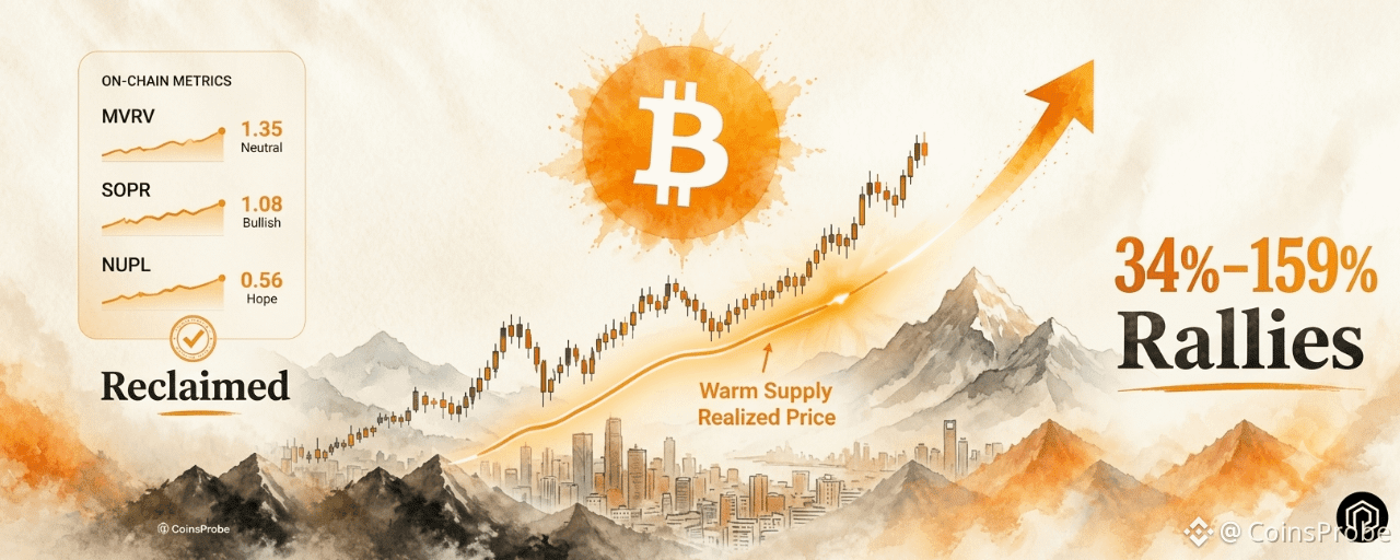
Bitcoin has reclaimed its Warm Supply Realized Price — the average cost basis of BTC held for 1 week to 6 months — a signal that has preceded rallies of +69%, +159%, +74%, and +34% in the four prior instances since 2023.Analyst consensus has flipped constructive — Unbias data shows a monthly BUY reading (+35 tilt, 112 analysts) and hourly STRONG BUY (+54, 52 opinions) as of September 8, 2026 — alongside a confirmed Bitcoin golden cross.BTC is trading at $78,911 — up 21.24% over 30 days — holding just below $80,000 with the key test being whether the warm supply reclaim holds and $80,000 converts from resistance to support.
Bitcoin is not just holding near $80,000 — it is doing so while two independent signals are aligning behind the move. The first comes from on-chain analyst Ali Charts (@alicharts), who flagged that Bitcoin has reclaimed its Warm Supply Realized Price — a metric that has preceded four consecutive rallies ranging from 34% to 159% since January 2023. The second comes from aggregated analyst sentiment, which has shifted from deeply negative to Buy and Strong Buy alongside the recovery.
At the time of writing, BTC is trading at approximately $78,911 — up 0.39% in 24 hours and 21.24% over 30 days — with a market capitalization of approximately $1.58 trillion.
Bitcoin (BTC) Price on 09 Sept 2026 | Source: Coinmarketcap
Signal 1 — Warm Supply Realized Price Reclaimed
The most structurally significant on-chain development flagged this week comes from Ali Charts (@alicharts) via Glassnode Bitcoin has reclaimed its Warm Supply Realized Price — and the historical track record of this specific event is one of the cleanest trend signals Bitcoin’s on-chain toolkit has produced.
What the Warm Supply Realized Price Measures
The Warm Supply Realized Price tracks the average cost basis of Bitcoin that last moved between 1 week and 6 months ago — the breakeven level for the most recently active portion of the Bitcoin supply, excluding both short-term traders (under 1 week) and long-term holders (over 6 months).
This cohort — often described as “warm” holders — represents the most behaviorally relevant group for near-term price dynamics. They are not day traders who might sell on any intraday move, and they are not diamond-handed long-term holders who are unlikely to sell at all. They are the active market participants whose profit/loss position most directly influences near-term selling pressure.
When price is below the warm supply realized price: This cohort is underwater — experiencing unrealized losses that create latent selling pressure as holders look for opportunities to exit at or near breakeven.
When price reclaims the warm supply realized price: This cohort moves back into profit — reducing the urgency to sell and historically marking a shift from distribution to accumulation dynamics in the near-term supply structure.
The Four-Signal Track Record
Ali Charts’ analysis documents four prior instances where Bitcoin reclaimed the Warm Supply Realized Price after trading below it — and the subsequent rallies in each case:
DateSignalSubsequent RallyJanuary 2023Warm Supply Reclaim+69%October 2023Warm Supply Reclaim+159%October 2024Warm Supply Reclaim+74%April 2025Warm Supply Reclaim+34%September 2026Warm Supply ReclaimPending
The range of outcomes across the four prior instances — from +34% to +159% — reflects different macro environments and cycle phases. But the consistency of the directional outcome (positive in all four cases) across a four-year period spanning two distinct market cycles is what gives the current reclaim its analytical weight.
As covered in our CryptoQuant Bitcoin bear cycle declared over analysis, the broader on-chain regime has already transitioned from bear to early bull — with the Bull Score reaching 80 and 8 of 10 underlying indicators flashing bullish. The warm supply realized price reclaim adds a specific and historically grounded demand-side confirmation to that broader regime shift.
Bitcoin Warm Supply Realized Price | Source: @alicharts (X)
The Glassnode Chart — What It Shows
The Glassnode-based chart shows the price-to-warm-supply-realized-price relationship across the full 2023–2026 period. The pattern is visible: Bitcoin slipped below the warm supply cost basis during the 2026 drawdown (when price declined toward the $60,000 range), then pushed back through it as price recovered toward the high-$70,000s. The current reclaim — with price at $78,911 — represents the fifth time this specific cost basis level has been crossed from below since 2023.
Ali called the reclaim “another strong bullish signal” for BTC — framing it as part of the accumulating body of on-chain evidence that the current recovery is structurally sound rather than a temporary bounce.
Signal 2 — Analyst Consensus Flips to Buy and Strong Buy
The second signal comes from a different analytical dimension — aggregated market sentiment rather than on-chain cost basis data.
Unbias data as of September 8, 2026 shows analyst sentiment has shifted materially alongside Bitcoin’s recovery from the mid-year lows near $60,000:
Timeframe Consensus Reading Bullish Tilt Analysts SurveyedMonthlyBUY+35112 analysts Hourly STRONG BUY+5452 opinions
The Analyst Consensus Index chart shows the reading flipping back to green — positive territory — as Bitcoin recovered from its 2026 lows. The transition from deeply negative consensus readings (visible during the correction phase) to the current BUY/STRONG BUY configuration represents the broadest analyst alignment behind Bitcoin that has been seen since the mid-year decline began.
Bitcoin Analysts Consensus Index | Source: @ki_young_ju (X)
What the Consensus Data Is Also Showing
Beyond the BUY reading, the Unbias dashboard highlights a confirmed Bitcoin golden cross — the 50-day moving average crossing above the 200-day moving average — as a top narrative among the analysts contributing to the consensus reading. The golden cross is one of the most widely watched technical trend indicators and its confirmation alongside the on-chain warm supply reclaim creates a technical-plus-on-chain alignment.
As covered in our Bitcoin reclaims 1,130-day SMA after 80 days below analysis, the technical structure has been progressively reclaiming key long-term levels throughout August — the 1,130-day SMA reclaim on August 20 being the most historically significant. The golden cross confirmation and warm supply realized price reclaim add two more layers to that technical recovery stack.
The Important Caveat — Consensus Can Lag Price
The shift in analyst consensus is constructive — but it carries an important limitation worth acknowledging directly. A BUY reading after a 21% monthly bounce is partially a reaction to the move that has already been made rather than a leading indicator of the move ahead. Analysts are human — sentiment aggregates tend to follow price rather than lead it, particularly after sharp directional moves.
The distinction between the warm supply realized price signal (on-chain, objective, leading) and the analyst consensus shift (sentiment-based, partially reactive) is important for weighting the two signals appropriately. The on-chain signal is the more analytically robust of the two. The consensus shift is confirmation rather than the primary driver.
That said, the transition from the deeply negative consensus readings that characterized the 2026 correction to the current BUY/STRONG BUY configuration is a meaningful shift — even accounting for the lag. It reflects a genuine change in how the analyst community is framing Bitcoin’s near-term trajectory.
What the Two Signals Together Are Saying
The warm supply realized price reclaim and the analyst consensus flip are not measuring the same thing — one is an objective on-chain cost basis metric, the other is an aggregated human sentiment reading. Their simultaneous alignment is what creates the combined signal worth noting.
The warm supply reclaim says: The most actively traded portion of Bitcoin’s supply has moved back into profit — reducing near-term selling pressure structurally and historically marking the beginning of expansion phases in four prior instances.
The consensus flip says: The analyst community — 112 observers on a monthly basis and 52 on an hourly basis — has shifted its collective view from negative to constructive alongside the on-chain recovery.
Together they describe a Bitcoin market where both the objective on-chain supply dynamics and the human analytical community are pointing in the same direction at the same time — a configuration that is more robust than either signal in isolation.
As documented in our Bitcoin spot demand ETF inflows and Binance $2.63B absorption analysis and Bitcoin highest demand of 2026 and 12-month RSI reset analysis, the August–September 2026 recovery has been progressively adding independent confirmation layers — spot demand, futures activity, on-chain regime shift, technical moving average reclaims, and now warm supply cost basis recovery. Each layer narrows the range of outcomes consistent with the data.
Bullish vs. Bearish Scenarios
Bullish Scenario
Bitcoin holds the warm supply realized price reclaim on a sustained basis — price maintaining above the high-$70,000s cost basis level rather than retreating back below it. A sustained daily close above $80,000 converts that level from resistance to support, confirming the reclaim is holding. The subsequent path follows the prior four warm supply reclaim instances toward a sustained expansion phase, with the $83,000 365-day MA as the next major confirmation level. Analyst consensus sustaining at BUY and the golden cross holding provide technical and sentiment confirmation of the trend.
Bearish Scenario
Bitcoin loses the warm supply realized price level — declining back below the high-$70,000s cost basis and pushing the warm supply cohort back into unrealized loss territory. This would break the five-signal track record of the warm supply reclaim and indicate that the current recovery has not yet built the structural foundation to sustain the trend. A return to the $72,000–$74,000 range would represent a partial retracement while keeping the broader bull market thesis intact. A sustained close below $70,000 would weaken the macro recovery narrative more significantly.
Bottom Line
Bitcoin’s reclaim of the Warm Supply Realized Price is the most specific and historically grounded on-chain signal the current recovery has produced. Four prior instances across 2023–2025 — each following a period of price trading below the warm supply cost basis — produced rallies of +69%, +159%, +74%, and +34% respectively. The current reclaim is the fifth.
Analyst consensus shifting to BUY and STRONG BUY across 112 and 52 observers respectively adds sentiment confirmation to the on-chain signal — with the additional backdrop of a confirmed golden cross providing technical alignment.
The immediate test is $80,000 — whether Bitcoin can convert that level from resistance to support and sustain the warm supply reclaim that history suggests is an early signal rather than a late one.
Disclaimer: The views and analysis presented in this article are for informational purposes only and reflect the author’s perspective, not financial advice. Technical patterns and indicators discussed are subject to market volatility and may or may not yield anticipated results. Investors are advised to exercise caution, conduct independent research, and make decisions aligned with their individual risk tolerance.
Bitcoin Reclaims Warm Supply Realized Price — Signal That Led 34%–159% Rallies
Key Highlights
Bitcoin has reclaimed its Warm Supply Realized Price — the average cost basis of BTC held for 1 week to 6 months — a signal that has preceded rallies of +69%, +159%, +74%, and +34% in the four prior instances since 2023.Analyst consensus has flipped constructive — Unbias data shows a monthly BUY reading (+35 tilt, 112 analysts) and hourly STRONG BUY (+54, 52 opinions) as of September 8, 2026 — alongside a confirmed Bitcoin golden cross.BTC is trading at $78,911 — up 21.24% over 30 days — holding just below $80,000 with the key test being whether the warm supply reclaim holds and $80,000 converts from resistance to support.
Bitcoin is not just holding near $80,000 — it is doing so while two independent signals are aligning behind the move. The first comes from on-chain analyst Ali Charts (@alicharts), who flagged that Bitcoin has reclaimed its Warm Supply Realized Price — a metric that has preceded four consecutive rallies ranging from 34% to 159% since January 2023. The second comes from aggregated analyst sentiment, which has shifted from deeply negative to Buy and Strong Buy alongside the recovery.
At the time of writing, BTC is trading at approximately $78,911 — up 0.39% in 24 hours and 21.24% over 30 days — with a market capitalization of approximately $1.58 trillion.
Bitcoin (BTC) Price on 09 Sept 2026 | Source: Coinmarketcap
Signal 1 — Warm Supply Realized Price Reclaimed
The most structurally significant on-chain development flagged this week comes from Ali Charts (@alicharts) via Glassnode Bitcoin has reclaimed its Warm Supply Realized Price — and the historical track record of this specific event is one of the cleanest trend signals Bitcoin’s on-chain toolkit has produced.
What the Warm Supply Realized Price Measures
The Warm Supply Realized Price tracks the average cost basis of Bitcoin that last moved between 1 week and 6 months ago — the breakeven level for the most recently active portion of the Bitcoin supply, excluding both short-term traders (under 1 week) and long-term holders (over 6 months).
This cohort — often described as “warm” holders — represents the most behaviorally relevant group for near-term price dynamics. They are not day traders who might sell on any intraday move, and they are not diamond-handed long-term holders who are unlikely to sell at all. They are the active market participants whose profit/loss position most directly influences near-term selling pressure.
When price is below the warm supply realized price: This cohort is underwater — experiencing unrealized losses that create latent selling pressure as holders look for opportunities to exit at or near breakeven.
When price reclaims the warm supply realized price: This cohort moves back into profit — reducing the urgency to sell and historically marking a shift from distribution to accumulation dynamics in the near-term supply structure.
The Four-Signal Track Record
Ali Charts’ analysis documents four prior instances where Bitcoin reclaimed the Warm Supply Realized Price after trading below it — and the subsequent rallies in each case:
DateSignalSubsequent RallyJanuary 2023Warm Supply Reclaim+69%October 2023Warm Supply Reclaim+159%October 2024Warm Supply Reclaim+74%April 2025Warm Supply Reclaim+34%September 2026Warm Supply ReclaimPending
The range of outcomes across the four prior instances — from +34% to +159% — reflects different macro environments and cycle phases. But the consistency of the directional outcome (positive in all four cases) across a four-year period spanning two distinct market cycles is what gives the current reclaim its analytical weight.
As covered in our CryptoQuant Bitcoin bear cycle declared over analysis, the broader on-chain regime has already transitioned from bear to early bull — with the Bull Score reaching 80 and 8 of 10 underlying indicators flashing bullish. The warm supply realized price reclaim adds a specific and historically grounded demand-side confirmation to that broader regime shift.
Bitcoin Warm Supply Realized Price | Source: @alicharts (X)
The Glassnode Chart — What It Shows
The Glassnode-based chart shows the price-to-warm-supply-realized-price relationship across the full 2023–2026 period. The pattern is visible: Bitcoin slipped below the warm supply cost basis during the 2026 drawdown (when price declined toward the $60,000 range), then pushed back through it as price recovered toward the high-$70,000s. The current reclaim — with price at $78,911 — represents the fifth time this specific cost basis level has been crossed from below since 2023.
Ali called the reclaim “another strong bullish signal” for BTC — framing it as part of the accumulating body of on-chain evidence that the current recovery is structurally sound rather than a temporary bounce.
Signal 2 — Analyst Consensus Flips to Buy and Strong Buy
The second signal comes from a different analytical dimension — aggregated market sentiment rather than on-chain cost basis data.
Unbias data as of September 8, 2026 shows analyst sentiment has shifted materially alongside Bitcoin’s recovery from the mid-year lows near $60,000:
Timeframe Consensus Reading Bullish Tilt Analysts SurveyedMonthlyBUY+35112 analysts Hourly STRONG BUY+5452 opinions
The Analyst Consensus Index chart shows the reading flipping back to green — positive territory — as Bitcoin recovered from its 2026 lows. The transition from deeply negative consensus readings (visible during the correction phase) to the current BUY/STRONG BUY configuration represents the broadest analyst alignment behind Bitcoin that has been seen since the mid-year decline began.
Bitcoin Analysts Consensus Index | Source: @ki_young_ju (X)
What the Consensus Data Is Also Showing
Beyond the BUY reading, the Unbias dashboard highlights a confirmed Bitcoin golden cross — the 50-day moving average crossing above the 200-day moving average — as a top narrative among the analysts contributing to the consensus reading. The golden cross is one of the most widely watched technical trend indicators and its confirmation alongside the on-chain warm supply reclaim creates a technical-plus-on-chain alignment.
As covered in our Bitcoin reclaims 1,130-day SMA after 80 days below analysis, the technical structure has been progressively reclaiming key long-term levels throughout August — the 1,130-day SMA reclaim on August 20 being the most historically significant. The golden cross confirmation and warm supply realized price reclaim add two more layers to that technical recovery stack.
The Important Caveat — Consensus Can Lag Price
The shift in analyst consensus is constructive — but it carries an important limitation worth acknowledging directly. A BUY reading after a 21% monthly bounce is partially a reaction to the move that has already been made rather than a leading indicator of the move ahead. Analysts are human — sentiment aggregates tend to follow price rather than lead it, particularly after sharp directional moves.
The distinction between the warm supply realized price signal (on-chain, objective, leading) and the analyst consensus shift (sentiment-based, partially reactive) is important for weighting the two signals appropriately. The on-chain signal is the more analytically robust of the two. The consensus shift is confirmation rather than the primary driver.
That said, the transition from the deeply negative consensus readings that characterized the 2026 correction to the current BUY/STRONG BUY configuration is a meaningful shift — even accounting for the lag. It reflects a genuine change in how the analyst community is framing Bitcoin’s near-term trajectory.
What the Two Signals Together Are Saying
The warm supply realized price reclaim and the analyst consensus flip are not measuring the same thing — one is an objective on-chain cost basis metric, the other is an aggregated human sentiment reading. Their simultaneous alignment is what creates the combined signal worth noting.
The warm supply reclaim says: The most actively traded portion of Bitcoin’s supply has moved back into profit — reducing near-term selling pressure structurally and historically marking the beginning of expansion phases in four prior instances.
The consensus flip says: The analyst community — 112 observers on a monthly basis and 52 on an hourly basis — has shifted its collective view from negative to constructive alongside the on-chain recovery.
Together they describe a Bitcoin market where both the objective on-chain supply dynamics and the human analytical community are pointing in the same direction at the same time — a configuration that is more robust than either signal in isolation.
As documented in our Bitcoin spot demand ETF inflows and Binance $2.63B absorption analysis and Bitcoin highest demand of 2026 and 12-month RSI reset analysis, the August–September 2026 recovery has been progressively adding independent confirmation layers — spot demand, futures activity, on-chain regime shift, technical moving average reclaims, and now warm supply cost basis recovery. Each layer narrows the range of outcomes consistent with the data.
Bullish vs. Bearish Scenarios
Bullish Scenario
Bitcoin holds the warm supply realized price reclaim on a sustained basis — price maintaining above the high-$70,000s cost basis level rather than retreating back below it. A sustained daily close above $80,000 converts that level from resistance to support, confirming the reclaim is holding. The subsequent path follows the prior four warm supply reclaim instances toward a sustained expansion phase, with the $83,000 365-day MA as the next major confirmation level. Analyst consensus sustaining at BUY and the golden cross holding provide technical and sentiment confirmation of the trend.
Bearish Scenario
Bitcoin loses the warm supply realized price level — declining back below the high-$70,000s cost basis and pushing the warm supply cohort back into unrealized loss territory. This would break the five-signal track record of the warm supply reclaim and indicate that the current recovery has not yet built the structural foundation to sustain the trend. A return to the $72,000–$74,000 range would represent a partial retracement while keeping the broader bull market thesis intact. A sustained close below $70,000 would weaken the macro recovery narrative more significantly.
Bottom Line
Bitcoin’s reclaim of the Warm Supply Realized Price is the most specific and historically grounded on-chain signal the current recovery has produced. Four prior instances across 2023–2025 — each following a period of price trading below the warm supply cost basis — produced rallies of +69%, +159%, +74%, and +34% respectively. The current reclaim is the fifth.
Analyst consensus shifting to BUY and STRONG BUY across 112 and 52 observers respectively adds sentiment confirmation to the on-chain signal — with the additional backdrop of a confirmed golden cross providing technical alignment.
The immediate test is $80,000 — whether Bitcoin can convert that level from resistance to support and sustain the warm supply reclaim that history suggests is an early signal rather than a late one.
Disclaimer: The views and analysis presented in this article are for informational purposes only and reflect the author’s perspective, not financial advice. Technical patterns and indicators discussed are subject to market volatility and may or may not yield anticipated results. Investors are advised to exercise caution, conduct independent research, and make decisions aligned with their individual risk tolerance.
Bitcoin has reclaimed its Warm Supply Realized Price — the average cost basis of BTC held for 1 week to 6 months — a signal that has preceded rallies of +69%, +159%, +74%, and +34% in the four prior instances since 2023.Analyst consensus has flipped constructive — Unbias data shows a monthly BUY reading (+35 tilt, 112 analysts) and hourly STRONG BUY (+54, 52 opinions) as of September 8, 2026 — alongside a confirmed Bitcoin golden cross.BTC is trading at $78,911 — up 21.24% over 30 days — holding just below $80,000 with the key test being whether the warm supply reclaim holds and $80,000 converts from resistance to support.
Bitcoin is not just holding near $80,000 — it is doing so while two independent signals are aligning behind the move. The first comes from on-chain analyst Ali Charts (@alicharts), who flagged that Bitcoin has reclaimed its Warm Supply Realized Price — a metric that has preceded four consecutive rallies ranging from 34% to 159% since January 2023. The second comes from aggregated analyst sentiment, which has shifted from deeply negative to Buy and Strong Buy alongside the recovery.
At the time of writing, BTC is trading at approximately $78,911 — up 0.39% in 24 hours and 21.24% over 30 days — with a market capitalization of approximately $1.58 trillion.
Bitcoin (BTC) Price on 09 Sept 2026 | Source: Coinmarketcap
Signal 1 — Warm Supply Realized Price Reclaimed
The most structurally significant on-chain development flagged this week comes from Ali Charts (@alicharts) via Glassnode Bitcoin has reclaimed its Warm Supply Realized Price — and the historical track record of this specific event is one of the cleanest trend signals Bitcoin’s on-chain toolkit has produced.
What the Warm Supply Realized Price Measures
The Warm Supply Realized Price tracks the average cost basis of Bitcoin that last moved between 1 week and 6 months ago — the breakeven level for the most recently active portion of the Bitcoin supply, excluding both short-term traders (under 1 week) and long-term holders (over 6 months).
This cohort — often described as “warm” holders — represents the most behaviorally relevant group for near-term price dynamics. They are not day traders who might sell on any intraday move, and they are not diamond-handed long-term holders who are unlikely to sell at all. They are the active market participants whose profit/loss position most directly influences near-term selling pressure.
When price is below the warm supply realized price: This cohort is underwater — experiencing unrealized losses that create latent selling pressure as holders look for opportunities to exit at or near breakeven.
When price reclaims the warm supply realized price: This cohort moves back into profit — reducing the urgency to sell and historically marking a shift from distribution to accumulation dynamics in the near-term supply structure.
The Four-Signal Track Record
Ali Charts’ analysis documents four prior instances where Bitcoin reclaimed the Warm Supply Realized Price after trading below it — and the subsequent rallies in each case:
DateSignalSubsequent RallyJanuary 2023Warm Supply Reclaim+69%October 2023Warm Supply Reclaim+159%October 2024Warm Supply Reclaim+74%April 2025Warm Supply Reclaim+34%September 2026Warm Supply ReclaimPending
The range of outcomes across the four prior instances — from +34% to +159% — reflects different macro environments and cycle phases. But the consistency of the directional outcome (positive in all four cases) across a four-year period spanning two distinct market cycles is what gives the current reclaim its analytical weight.
As covered in our CryptoQuant Bitcoin bear cycle declared over analysis, the broader on-chain regime has already transitioned from bear to early bull — with the Bull Score reaching 80 and 8 of 10 underlying indicators flashing bullish. The warm supply realized price reclaim adds a specific and historically grounded demand-side confirmation to that broader regime shift.
Bitcoin Warm Supply Realized Price | Source: @alicharts (X)
The Glassnode Chart — What It Shows
The Glassnode-based chart shows the price-to-warm-supply-realized-price relationship across the full 2023–2026 period. The pattern is visible: Bitcoin slipped below the warm supply cost basis during the 2026 drawdown (when price declined toward the $60,000 range), then pushed back through it as price recovered toward the high-$70,000s. The current reclaim — with price at $78,911 — represents the fifth time this specific cost basis level has been crossed from below since 2023.
Ali called the reclaim “another strong bullish signal” for BTC — framing it as part of the accumulating body of on-chain evidence that the current recovery is structurally sound rather than a temporary bounce.
Signal 2 — Analyst Consensus Flips to Buy and Strong Buy
The second signal comes from a different analytical dimension — aggregated market sentiment rather than on-chain cost basis data.
Unbias data as of September 8, 2026 shows analyst sentiment has shifted materially alongside Bitcoin’s recovery from the mid-year lows near $60,000:
Timeframe Consensus Reading Bullish Tilt Analysts SurveyedMonthlyBUY+35112 analysts Hourly STRONG BUY+5452 opinions
The Analyst Consensus Index chart shows the reading flipping back to green — positive territory — as Bitcoin recovered from its 2026 lows. The transition from deeply negative consensus readings (visible during the correction phase) to the current BUY/STRONG BUY configuration represents the broadest analyst alignment behind Bitcoin that has been seen since the mid-year decline began.
Bitcoin Analysts Consensus Index | Source: @ki_young_ju (X)
What the Consensus Data Is Also Showing
Beyond the BUY reading, the Unbias dashboard highlights a confirmed Bitcoin golden cross — the 50-day moving average crossing above the 200-day moving average — as a top narrative among the analysts contributing to the consensus reading. The golden cross is one of the most widely watched technical trend indicators and its confirmation alongside the on-chain warm supply reclaim creates a technical-plus-on-chain alignment.
As covered in our Bitcoin reclaims 1,130-day SMA after 80 days below analysis, the technical structure has been progressively reclaiming key long-term levels throughout August — the 1,130-day SMA reclaim on August 20 being the most historically significant. The golden cross confirmation and warm supply realized price reclaim add two more layers to that technical recovery stack.
The Important Caveat — Consensus Can Lag Price
The shift in analyst consensus is constructive — but it carries an important limitation worth acknowledging directly. A BUY reading after a 21% monthly bounce is partially a reaction to the move that has already been made rather than a leading indicator of the move ahead. Analysts are human — sentiment aggregates tend to follow price rather than lead it, particularly after sharp directional moves.
The distinction between the warm supply realized price signal (on-chain, objective, leading) and the analyst consensus shift (sentiment-based, partially reactive) is important for weighting the two signals appropriately. The on-chain signal is the more analytically robust of the two. The consensus shift is confirmation rather than the primary driver.
That said, the transition from the deeply negative consensus readings that characterized the 2026 correction to the current BUY/STRONG BUY configuration is a meaningful shift — even accounting for the lag. It reflects a genuine change in how the analyst community is framing Bitcoin’s near-term trajectory.
What the Two Signals Together Are Saying
The warm supply realized price reclaim and the analyst consensus flip are not measuring the same thing — one is an objective on-chain cost basis metric, the other is an aggregated human sentiment reading. Their simultaneous alignment is what creates the combined signal worth noting.
The warm supply reclaim says: The most actively traded portion of Bitcoin’s supply has moved back into profit — reducing near-term selling pressure structurally and historically marking the beginning of expansion phases in four prior instances.
The consensus flip says: The analyst community — 112 observers on a monthly basis and 52 on an hourly basis — has shifted its collective view from negative to constructive alongside the on-chain recovery.
Together they describe a Bitcoin market where both the objective on-chain supply dynamics and the human analytical community are pointing in the same direction at the same time — a configuration that is more robust than either signal in isolation.
As documented in our Bitcoin spot demand ETF inflows and Binance $2.63B absorption analysis and Bitcoin highest demand of 2026 and 12-month RSI reset analysis, the August–September 2026 recovery has been progressively adding independent confirmation layers — spot demand, futures activity, on-chain regime shift, technical moving average reclaims, and now warm supply cost basis recovery. Each layer narrows the range of outcomes consistent with the data.
Bullish vs. Bearish Scenarios
Bullish Scenario
Bitcoin holds the warm supply realized price reclaim on a sustained basis — price maintaining above the high-$70,000s cost basis level rather than retreating back below it. A sustained daily close above $80,000 converts that level from resistance to support, confirming the reclaim is holding. The subsequent path follows the prior four warm supply reclaim instances toward a sustained expansion phase, with the $83,000 365-day MA as the next major confirmation level. Analyst consensus sustaining at BUY and the golden cross holding provide technical and sentiment confirmation of the trend.
Bearish Scenario
Bitcoin loses the warm supply realized price level — declining back below the high-$70,000s cost basis and pushing the warm supply cohort back into unrealized loss territory. This would break the five-signal track record of the warm supply reclaim and indicate that the current recovery has not yet built the structural foundation to sustain the trend. A return to the $72,000–$74,000 range would represent a partial retracement while keeping the broader bull market thesis intact. A sustained close below $70,000 would weaken the macro recovery narrative more significantly.
Bottom Line
Bitcoin’s reclaim of the Warm Supply Realized Price is the most specific and historically grounded on-chain signal the current recovery has produced. Four prior instances across 2023–2025 — each following a period of price trading below the warm supply cost basis — produced rallies of +69%, +159%, +74%, and +34% respectively. The current reclaim is the fifth.
Analyst consensus shifting to BUY and STRONG BUY across 112 and 52 observers respectively adds sentiment confirmation to the on-chain signal — with the additional backdrop of a confirmed golden cross providing technical alignment.
The immediate test is $80,000 — whether Bitcoin can convert that level from resistance to support and sustain the warm supply reclaim that history suggests is an early signal rather than a late one.
Disclaimer: The views and analysis presented in this article are for informational purposes only and reflect the author’s perspective, not financial advice. Technical patterns and indicators discussed are subject to market volatility and may or may not yield anticipated results. Investors are advised to exercise caution, conduct independent research, and make decisions aligned with their individual risk tolerance.
1
122
·
--
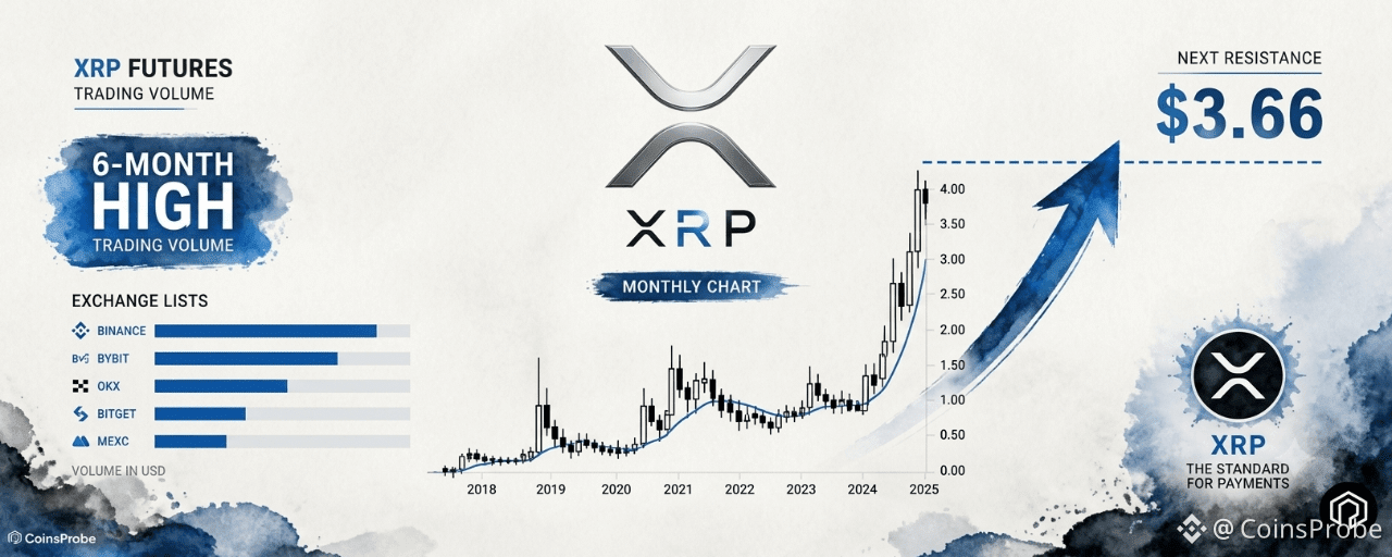
Article
XRP Futures Volume Hits 6-Month High as Monthly Chart Eyes $3.66 BreakoutKey Highlights
XRP August futures volume reached a 6-month high with over $64.6 billion across Binance, Bybit, and OKX — the strongest monthly derivatives print since February 2026 — confirming traders returned to XRP after months of thin activity.Analyst Ali Charts (@alicharts) identifies a decade-long monthly ascending triangle on XRP — with $3.66 as the breakout level that activates a measured move target of approximately $60, via intermediate markers at $9.49, $15.60, $31.87, and $57.40.XRP is trading at $1.39 — down 1.58% in 24 hours but up 34.49% over 30 days — sitting above the rising monthly support trendline while the $3.66 monthly close remains the confirmation threshold for the full pattern.
XRP is operating on two distinct timeframes simultaneously — and the story on each is different. In the short term, August delivered the strongest monthly futures volume in six months, confirming that derivatives traders returned to XRP with conviction after a prolonged quiet period. In the long term, a monthly ascending triangle that has been building for nearly a decade is waiting for a single level — $3.66 — to activate one of the more striking measured move targets in the current altcoin landscape.
At the time of writing, XRP is trading at approximately $1.39 — down 1.58% in 24 hours but still up 34.49% over 30 days — with a market capitalization of approximately $87.28 billion.
As covered in our XRP macro bottom 3 bullish signals analysis and XRP trend reversal and ETF momentum breakdown, the structural case for XRP has been building through 2026 across multiple independent frameworks. The August futures volume rebound and the decade-long monthly triangle add the derivatives activity and long-term technical dimensions to that picture.
XRP Price on 08 Sept 2026 | Source: Coinmarketcap
August Futures Volume Hits a 6-Month High — Derivatives Traders Return to XRP
The first major data point in the current XRP setup comes from CryptoQuant data highlighted by on-chain analyst Arab Chain (@ArabxChain): XRP futures trading volume in August 2026 climbed to a six-month high — the strongest monthly derivatives print since February.
XRP Monthly Futures Volume on Exchanges | Source: @ArabxChain (X)
The August Volume Breakdown
The three largest futures venues accounted for more than $64.6 billion in combined August volume:
ExchangeAugust Futures VolumeBinance~$37 billionBybit~$14.54 billionOKX~$12.88 billionCombined Total$64.6 billion+
The stacked exchange chart shows August volume climbing back above $60 billion — a clear break from the low-activity stretch that characterized XRP derivatives through April, May, June, and July 2026. July, in particular, marked one of the weakest monthly derivatives months of the year for XRP. August’s reversal to $64.6 billion represents a decisive return of trader interest after that multi-month quiet period.
What the Volume Spike Actually Means — And What It Doesn’t
High futures volume is not inherently bullish — and the distinction matters for interpreting the August data correctly.
Futures volume captures activity from both long and short positions — a volume spike can represent aggressive buying, aggressive shorting, or a contested two-sided market where both bulls and bears are adding exposure simultaneously. The August $64.6 billion reading tells us that derivatives traders returned to XRP in size. It does not tell us which direction they were positioned.
What the volume data does confirm with certainty:
Liquidity returned: After months of thin derivatives activity, August brought meaningful capital back to XRP futures across the three largest venues. Thin liquidity markets are more volatile and less efficient — deeper liquidity creates more stable price discovery.
Trader interest is back: $64.6 billion in monthly futures volume across three exchanges represents active institutional and retail derivatives participation — the kind of engagement that tends to accompany and sustain directional price moves rather than appearing in quiet, directionless markets.
Correlation with August performance: CryptoQuant noted that the volume pickup coincided directly with XRP’s stronger August price performance (+34.49% over 30 days). The causal direction is bidirectional — stronger price action attracted more futures traders, and futures activity amplified the directional move in both cases.
This pattern of derivatives returning alongside price recovery is consistent with what we documented in our Bitcoin whale accumulation and CryptoQuant on-chain signals analysis — where smart money positioning through derivatives and spot markets together creates more durable directional moves than either channel alone.
Ali Charts: Monthly Ascending Triangle — $3.66 Is the Line, $60 Is the Target
The second and longer-timeframe signal comes from analyst Ali Charts (@alicharts), whose analysis of XRP’s monthly chart identifies one of the more structurally significant pattern setups in the current crypto market — one that has been building for nearly a decade.
The Pattern — A Decade-Long Ascending Triangle
XRP Monthly Chart | Source: @alicharts (X)
An ascending triangle is a technical pattern characterized by:
A flat horizontal resistance line at the top — in XRP’s case, the $3.66 levelA rising support trendline at the bottom — which XRP has been respecting across multiple cyclesProgressively higher lows as price compresses toward the apex of the triangle
The longer a triangle builds before resolving, the more significant the eventual breakout tends to be — because longer patterns represent more sustained accumulation and more stored energy for the directional resolution. A monthly ascending triangle that has been developing for nearly a decade represents one of the most compressed and potentially powerful setups available in technical analysis.
At the current price of $1.39, XRP is:
Above the rising monthly support trendline — the lower boundary of the triangle is intactWell below the $3.66 flat top resistance — the breakout level has not been tested yet
The $3.66 Level — Why It Is the Only Level That Matters
Ali Charts’ analysis is precise about what is required for the pattern to activate: a monthly close above $3.66. Not an intraday touch. Not a weekly close. A sustained monthly closing price above $3.66 — the flat top resistance that has defined the upper boundary of the triangle across multiple years and multiple bull and bear cycles.
The specificity of the monthly close requirement reflects the timeframe of the pattern. A decade-long monthly triangle is not confirmed by a daily or weekly move — it requires the same timeframe (monthly) to produce the breakout confirmation.
The Intermediate Upside Markers and Final Target
The chart currently labels price around $1.388, sitting above the rising support trendline and well below the flat top of the triangle. Intermediate upside markers on the projection include $9.49, $15.60, $31.87, and $57.40.Until XRP reclaims $3.66 on a monthly close, that $60 target remains a long-term measured move, not an active breakout. The immediate structure still depends on holding the rising monthly support and rebuilding strength after the latest pullback.
What Is Required Before $60 Becomes Relevant
Ali Charts is explicit about the current status: until XRP produces a monthly close above $3.66, the $60 target remains a long-term measured move projection — not an active breakout that has been triggered. The full target is the mathematical outcome of the pattern completing. The pattern has not yet completed.
The immediate priority before the longer-term target becomes actionable is holding the rising monthly support trendline — the lower boundary of the triangle that price is currently respecting. A sustained monthly close below the rising support would weaken the ascending triangle structure and delay the breakout thesis.
Bullish vs. Bearish Scenarios
Bullish Scenario
XRP holds the rising monthly support trendline and continues building higher lows within the ascending triangle structure. Futures volume sustains above the $40–$50 billion monthly range — confirming that August’s rebound was a structural rather than temporary return of derivatives interest. Over subsequent months, XRP recovers toward the $3.66 monthly close threshold — the confirmation level that would activate the full triangle measured move toward $60 via the intermediate markers at $9.49, $15.60, $31.87, and $57.40.
Bearish Scenario
XRP loses the rising monthly support trendline on a sustained monthly close basis — breaking the ascending triangle’s lower boundary and indicating that the decade-long pattern has failed to hold its structural integrity. In this scenario, the $3.66 breakout thesis is delayed significantly and lower support levels come into focus. The short-term futures volume rebound would prove to have been activity rather than structural demand, and XRP would require a new base-building phase before the ascending triangle thesis can be reactivated.
Bottom Line
XRP is presenting a two-speed analytical picture that requires different lenses for different timeframes. In the short term, $64.6 billion in August futures volume — the highest in six months — confirms that derivatives traders returned to XRP after a multi-month quiet stretch, consistent with and contributing to the 34.49% monthly price performance. In the long term, a decade-long monthly ascending triangle is waiting for a $3.66 monthly close to activate a measured move that projects toward $60 via intermediate targets at $9.49, $15.60, $31.87, and $57.40.
The rising monthly support trendline — currently being respected — is the immediate structural level to watch. The $3.66 monthly close is the level that converts the long-term pattern from a forming structure into a confirmed breakout. Everything between the current price of $1.39 and those two levels defines the near-to-medium term XRP framework.
Disclaimer: The views and analysis presented in this article are for informational purposes only and reflect the author’s perspective, not financial advice. Technical patterns and indicators discussed are subject to market volatility and may or may not yield anticipated results. Investors are advised to exercise caution, conduct independent research, and make decisions aligned with their individual risk tolerance.
XRP Futures Volume Hits 6-Month High as Monthly Chart Eyes $3.66 Breakout
Key Highlights
XRP August futures volume reached a 6-month high with over $64.6 billion across Binance, Bybit, and OKX — the strongest monthly derivatives print since February 2026 — confirming traders returned to XRP after months of thin activity.Analyst Ali Charts (@alicharts) identifies a decade-long monthly ascending triangle on XRP — with $3.66 as the breakout level that activates a measured move target of approximately $60, via intermediate markers at $9.49, $15.60, $31.87, and $57.40.XRP is trading at $1.39 — down 1.58% in 24 hours but up 34.49% over 30 days — sitting above the rising monthly support trendline while the $3.66 monthly close remains the confirmation threshold for the full pattern.
XRP is operating on two distinct timeframes simultaneously — and the story on each is different. In the short term, August delivered the strongest monthly futures volume in six months, confirming that derivatives traders returned to XRP with conviction after a prolonged quiet period. In the long term, a monthly ascending triangle that has been building for nearly a decade is waiting for a single level — $3.66 — to activate one of the more striking measured move targets in the current altcoin landscape.
At the time of writing, XRP is trading at approximately $1.39 — down 1.58% in 24 hours but still up 34.49% over 30 days — with a market capitalization of approximately $87.28 billion.
As covered in our XRP macro bottom 3 bullish signals analysis and XRP trend reversal and ETF momentum breakdown, the structural case for XRP has been building through 2026 across multiple independent frameworks. The August futures volume rebound and the decade-long monthly triangle add the derivatives activity and long-term technical dimensions to that picture.
XRP Price on 08 Sept 2026 | Source: Coinmarketcap
August Futures Volume Hits a 6-Month High — Derivatives Traders Return to XRP
The first major data point in the current XRP setup comes from CryptoQuant data highlighted by on-chain analyst Arab Chain (@ArabxChain): XRP futures trading volume in August 2026 climbed to a six-month high — the strongest monthly derivatives print since February.
XRP Monthly Futures Volume on Exchanges | Source: @ArabxChain (X)
The August Volume Breakdown
The three largest futures venues accounted for more than $64.6 billion in combined August volume:
ExchangeAugust Futures VolumeBinance~$37 billionBybit~$14.54 billionOKX~$12.88 billionCombined Total$64.6 billion+
The stacked exchange chart shows August volume climbing back above $60 billion — a clear break from the low-activity stretch that characterized XRP derivatives through April, May, June, and July 2026. July, in particular, marked one of the weakest monthly derivatives months of the year for XRP. August’s reversal to $64.6 billion represents a decisive return of trader interest after that multi-month quiet period.
What the Volume Spike Actually Means — And What It Doesn’t
High futures volume is not inherently bullish — and the distinction matters for interpreting the August data correctly.
Futures volume captures activity from both long and short positions — a volume spike can represent aggressive buying, aggressive shorting, or a contested two-sided market where both bulls and bears are adding exposure simultaneously. The August $64.6 billion reading tells us that derivatives traders returned to XRP in size. It does not tell us which direction they were positioned.
What the volume data does confirm with certainty:
Liquidity returned: After months of thin derivatives activity, August brought meaningful capital back to XRP futures across the three largest venues. Thin liquidity markets are more volatile and less efficient — deeper liquidity creates more stable price discovery.
Trader interest is back: $64.6 billion in monthly futures volume across three exchanges represents active institutional and retail derivatives participation — the kind of engagement that tends to accompany and sustain directional price moves rather than appearing in quiet, directionless markets.
Correlation with August performance: CryptoQuant noted that the volume pickup coincided directly with XRP’s stronger August price performance (+34.49% over 30 days). The causal direction is bidirectional — stronger price action attracted more futures traders, and futures activity amplified the directional move in both cases.
This pattern of derivatives returning alongside price recovery is consistent with what we documented in our Bitcoin whale accumulation and CryptoQuant on-chain signals analysis — where smart money positioning through derivatives and spot markets together creates more durable directional moves than either channel alone.
Ali Charts: Monthly Ascending Triangle — $3.66 Is the Line, $60 Is the Target
The second and longer-timeframe signal comes from analyst Ali Charts (@alicharts), whose analysis of XRP’s monthly chart identifies one of the more structurally significant pattern setups in the current crypto market — one that has been building for nearly a decade.
The Pattern — A Decade-Long Ascending Triangle
XRP Monthly Chart | Source: @alicharts (X)
An ascending triangle is a technical pattern characterized by:
A flat horizontal resistance line at the top — in XRP’s case, the $3.66 levelA rising support trendline at the bottom — which XRP has been respecting across multiple cyclesProgressively higher lows as price compresses toward the apex of the triangle
The longer a triangle builds before resolving, the more significant the eventual breakout tends to be — because longer patterns represent more sustained accumulation and more stored energy for the directional resolution. A monthly ascending triangle that has been developing for nearly a decade represents one of the most compressed and potentially powerful setups available in technical analysis.
At the current price of $1.39, XRP is:
Above the rising monthly support trendline — the lower boundary of the triangle is intactWell below the $3.66 flat top resistance — the breakout level has not been tested yet
The $3.66 Level — Why It Is the Only Level That Matters
Ali Charts’ analysis is precise about what is required for the pattern to activate: a monthly close above $3.66. Not an intraday touch. Not a weekly close. A sustained monthly closing price above $3.66 — the flat top resistance that has defined the upper boundary of the triangle across multiple years and multiple bull and bear cycles.
The specificity of the monthly close requirement reflects the timeframe of the pattern. A decade-long monthly triangle is not confirmed by a daily or weekly move — it requires the same timeframe (monthly) to produce the breakout confirmation.
The Intermediate Upside Markers and Final Target
The chart currently labels price around $1.388, sitting above the rising support trendline and well below the flat top of the triangle. Intermediate upside markers on the projection include $9.49, $15.60, $31.87, and $57.40.Until XRP reclaims $3.66 on a monthly close, that $60 target remains a long-term measured move, not an active breakout. The immediate structure still depends on holding the rising monthly support and rebuilding strength after the latest pullback.
What Is Required Before $60 Becomes Relevant
Ali Charts is explicit about the current status: until XRP produces a monthly close above $3.66, the $60 target remains a long-term measured move projection — not an active breakout that has been triggered. The full target is the mathematical outcome of the pattern completing. The pattern has not yet completed.
The immediate priority before the longer-term target becomes actionable is holding the rising monthly support trendline — the lower boundary of the triangle that price is currently respecting. A sustained monthly close below the rising support would weaken the ascending triangle structure and delay the breakout thesis.
Bullish vs. Bearish Scenarios
Bullish Scenario
XRP holds the rising monthly support trendline and continues building higher lows within the ascending triangle structure. Futures volume sustains above the $40–$50 billion monthly range — confirming that August’s rebound was a structural rather than temporary return of derivatives interest. Over subsequent months, XRP recovers toward the $3.66 monthly close threshold — the confirmation level that would activate the full triangle measured move toward $60 via the intermediate markers at $9.49, $15.60, $31.87, and $57.40.
Bearish Scenario
XRP loses the rising monthly support trendline on a sustained monthly close basis — breaking the ascending triangle’s lower boundary and indicating that the decade-long pattern has failed to hold its structural integrity. In this scenario, the $3.66 breakout thesis is delayed significantly and lower support levels come into focus. The short-term futures volume rebound would prove to have been activity rather than structural demand, and XRP would require a new base-building phase before the ascending triangle thesis can be reactivated.
Bottom Line
XRP is presenting a two-speed analytical picture that requires different lenses for different timeframes. In the short term, $64.6 billion in August futures volume — the highest in six months — confirms that derivatives traders returned to XRP after a multi-month quiet stretch, consistent with and contributing to the 34.49% monthly price performance. In the long term, a decade-long monthly ascending triangle is waiting for a $3.66 monthly close to activate a measured move that projects toward $60 via intermediate targets at $9.49, $15.60, $31.87, and $57.40.
The rising monthly support trendline — currently being respected — is the immediate structural level to watch. The $3.66 monthly close is the level that converts the long-term pattern from a forming structure into a confirmed breakout. Everything between the current price of $1.39 and those two levels defines the near-to-medium term XRP framework.
Disclaimer: The views and analysis presented in this article are for informational purposes only and reflect the author’s perspective, not financial advice. Technical patterns and indicators discussed are subject to market volatility and may or may not yield anticipated results. Investors are advised to exercise caution, conduct independent research, and make decisions aligned with their individual risk tolerance.
XRP August futures volume reached a 6-month high with over $64.6 billion across Binance, Bybit, and OKX — the strongest monthly derivatives print since February 2026 — confirming traders returned to XRP after months of thin activity.Analyst Ali Charts (@alicharts) identifies a decade-long monthly ascending triangle on XRP — with $3.66 as the breakout level that activates a measured move target of approximately $60, via intermediate markers at $9.49, $15.60, $31.87, and $57.40.XRP is trading at $1.39 — down 1.58% in 24 hours but up 34.49% over 30 days — sitting above the rising monthly support trendline while the $3.66 monthly close remains the confirmation threshold for the full pattern.
XRP is operating on two distinct timeframes simultaneously — and the story on each is different. In the short term, August delivered the strongest monthly futures volume in six months, confirming that derivatives traders returned to XRP with conviction after a prolonged quiet period. In the long term, a monthly ascending triangle that has been building for nearly a decade is waiting for a single level — $3.66 — to activate one of the more striking measured move targets in the current altcoin landscape.
At the time of writing, XRP is trading at approximately $1.39 — down 1.58% in 24 hours but still up 34.49% over 30 days — with a market capitalization of approximately $87.28 billion.
As covered in our XRP macro bottom 3 bullish signals analysis and XRP trend reversal and ETF momentum breakdown, the structural case for XRP has been building through 2026 across multiple independent frameworks. The August futures volume rebound and the decade-long monthly triangle add the derivatives activity and long-term technical dimensions to that picture.
XRP Price on 08 Sept 2026 | Source: Coinmarketcap
August Futures Volume Hits a 6-Month High — Derivatives Traders Return to XRP
The first major data point in the current XRP setup comes from CryptoQuant data highlighted by on-chain analyst Arab Chain (@ArabxChain): XRP futures trading volume in August 2026 climbed to a six-month high — the strongest monthly derivatives print since February.
XRP Monthly Futures Volume on Exchanges | Source: @ArabxChain (X)
The August Volume Breakdown
The three largest futures venues accounted for more than $64.6 billion in combined August volume:
ExchangeAugust Futures VolumeBinance~$37 billionBybit~$14.54 billionOKX~$12.88 billionCombined Total$64.6 billion+
The stacked exchange chart shows August volume climbing back above $60 billion — a clear break from the low-activity stretch that characterized XRP derivatives through April, May, June, and July 2026. July, in particular, marked one of the weakest monthly derivatives months of the year for XRP. August’s reversal to $64.6 billion represents a decisive return of trader interest after that multi-month quiet period.
What the Volume Spike Actually Means — And What It Doesn’t
High futures volume is not inherently bullish — and the distinction matters for interpreting the August data correctly.
Futures volume captures activity from both long and short positions — a volume spike can represent aggressive buying, aggressive shorting, or a contested two-sided market where both bulls and bears are adding exposure simultaneously. The August $64.6 billion reading tells us that derivatives traders returned to XRP in size. It does not tell us which direction they were positioned.
What the volume data does confirm with certainty:
Liquidity returned: After months of thin derivatives activity, August brought meaningful capital back to XRP futures across the three largest venues. Thin liquidity markets are more volatile and less efficient — deeper liquidity creates more stable price discovery.
Trader interest is back: $64.6 billion in monthly futures volume across three exchanges represents active institutional and retail derivatives participation — the kind of engagement that tends to accompany and sustain directional price moves rather than appearing in quiet, directionless markets.
Correlation with August performance: CryptoQuant noted that the volume pickup coincided directly with XRP’s stronger August price performance (+34.49% over 30 days). The causal direction is bidirectional — stronger price action attracted more futures traders, and futures activity amplified the directional move in both cases.
This pattern of derivatives returning alongside price recovery is consistent with what we documented in our Bitcoin whale accumulation and CryptoQuant on-chain signals analysis — where smart money positioning through derivatives and spot markets together creates more durable directional moves than either channel alone.
Ali Charts: Monthly Ascending Triangle — $3.66 Is the Line, $60 Is the Target
The second and longer-timeframe signal comes from analyst Ali Charts (@alicharts), whose analysis of XRP’s monthly chart identifies one of the more structurally significant pattern setups in the current crypto market — one that has been building for nearly a decade.
The Pattern — A Decade-Long Ascending Triangle
XRP Monthly Chart | Source: @alicharts (X)
An ascending triangle is a technical pattern characterized by:
A flat horizontal resistance line at the top — in XRP’s case, the $3.66 levelA rising support trendline at the bottom — which XRP has been respecting across multiple cyclesProgressively higher lows as price compresses toward the apex of the triangle
The longer a triangle builds before resolving, the more significant the eventual breakout tends to be — because longer patterns represent more sustained accumulation and more stored energy for the directional resolution. A monthly ascending triangle that has been developing for nearly a decade represents one of the most compressed and potentially powerful setups available in technical analysis.
At the current price of $1.39, XRP is:
Above the rising monthly support trendline — the lower boundary of the triangle is intactWell below the $3.66 flat top resistance — the breakout level has not been tested yet
The $3.66 Level — Why It Is the Only Level That Matters
Ali Charts’ analysis is precise about what is required for the pattern to activate: a monthly close above $3.66. Not an intraday touch. Not a weekly close. A sustained monthly closing price above $3.66 — the flat top resistance that has defined the upper boundary of the triangle across multiple years and multiple bull and bear cycles.
The specificity of the monthly close requirement reflects the timeframe of the pattern. A decade-long monthly triangle is not confirmed by a daily or weekly move — it requires the same timeframe (monthly) to produce the breakout confirmation.
The Intermediate Upside Markers and Final Target
The chart currently labels price around $1.388, sitting above the rising support trendline and well below the flat top of the triangle. Intermediate upside markers on the projection include $9.49, $15.60, $31.87, and $57.40.Until XRP reclaims $3.66 on a monthly close, that $60 target remains a long-term measured move, not an active breakout. The immediate structure still depends on holding the rising monthly support and rebuilding strength after the latest pullback.
What Is Required Before $60 Becomes Relevant
Ali Charts is explicit about the current status: until XRP produces a monthly close above $3.66, the $60 target remains a long-term measured move projection — not an active breakout that has been triggered. The full target is the mathematical outcome of the pattern completing. The pattern has not yet completed.
The immediate priority before the longer-term target becomes actionable is holding the rising monthly support trendline — the lower boundary of the triangle that price is currently respecting. A sustained monthly close below the rising support would weaken the ascending triangle structure and delay the breakout thesis.
Bullish vs. Bearish Scenarios
Bullish Scenario
XRP holds the rising monthly support trendline and continues building higher lows within the ascending triangle structure. Futures volume sustains above the $40–$50 billion monthly range — confirming that August’s rebound was a structural rather than temporary return of derivatives interest. Over subsequent months, XRP recovers toward the $3.66 monthly close threshold — the confirmation level that would activate the full triangle measured move toward $60 via the intermediate markers at $9.49, $15.60, $31.87, and $57.40.
Bearish Scenario
XRP loses the rising monthly support trendline on a sustained monthly close basis — breaking the ascending triangle’s lower boundary and indicating that the decade-long pattern has failed to hold its structural integrity. In this scenario, the $3.66 breakout thesis is delayed significantly and lower support levels come into focus. The short-term futures volume rebound would prove to have been activity rather than structural demand, and XRP would require a new base-building phase before the ascending triangle thesis can be reactivated.
Bottom Line
XRP is presenting a two-speed analytical picture that requires different lenses for different timeframes. In the short term, $64.6 billion in August futures volume — the highest in six months — confirms that derivatives traders returned to XRP after a multi-month quiet stretch, consistent with and contributing to the 34.49% monthly price performance. In the long term, a decade-long monthly ascending triangle is waiting for a $3.66 monthly close to activate a measured move that projects toward $60 via intermediate targets at $9.49, $15.60, $31.87, and $57.40.
The rising monthly support trendline — currently being respected — is the immediate structural level to watch. The $3.66 monthly close is the level that converts the long-term pattern from a forming structure into a confirmed breakout. Everything between the current price of $1.39 and those two levels defines the near-to-medium term XRP framework.
Disclaimer: The views and analysis presented in this article are for informational purposes only and reflect the author’s perspective, not financial advice. Technical patterns and indicators discussed are subject to market volatility and may or may not yield anticipated results. Investors are advised to exercise caution, conduct independent research, and make decisions aligned with their individual risk tolerance.
153
·
--
Article
Why Is Bittensor (TAO) Surging? Key Catalysts and Price TargetsKey Highlights
TAO is trading at $265.51 — up 12.85% in 24 hours and 35.16% over 30 days — with a market cap of ~$3 billion, driven by a new Solana-native demand mechanism pulling retail flow into Bittensor through a TAO-paired memecoin.Buttensor ($BUTT) on Raydium uses TAO as its quote asset rather than SOL or USDC — creating a fee-recycling loop where Solana memecoin trading activity generates direct TAO buy pressure.The weekly chart shows TAO pressing into the descending resistance of a long-term falling wedge — a confirmed breakout targets $810.30, representing more than 200% upside from current levels.
Bittensor’s daily 12.85% and monthly surge has two distinct engines running simultaneously — one from Solana’s memecoin ecosystem creating a novel demand loop for TAO, and one from a weekly chart structure that is compressing toward one of the more clearly defined breakout setups in the current altcoin market. At the time of writing, TAO is trading at approximately $265.51 — up 12.85% in 24 hours — with a market capitalization of $3 billion.
The catalyst is specific, the chart structure is precise, and the two are arriving at the same moment.
Bittensor (TAO) Price on 07 Sept 2026 | Source: Coinmarketcap
The Catalyst — Buttensor ($BUTT) and the Solana TAO Demand Loop
The near-term spark behind TAO’s surge is not a protocol upgrade, an airdrop, or a CEX listing — it is a Solana memecoin called Buttensor ($BUTT) that has created an unusual and structurally novel demand mechanism for Bittensor.
Buttensor (BUTT) Coin Price on 07 Sept 2026/ Source: X
How the Loop Works
$BUTT is a memecoin trading on Raydium — Solana’s primary AMM — with one distinctive characteristic: it uses TAO as its quote asset rather than SOL or USDC, which are the standard base pairs for Solana memecoins.
This single structural decision creates a demand loop that connects Solana’s retail memecoin activity directly to TAO:
StepActivityTAO Impact1Solana traders buy $BUTTNeed TAO liquidity in the pair2BUTT/TAO pair generates trading feesFees are used to buy TAO3Purchased TAO is distributedCreates recurring TAO buy pressure
The mechanism means that Solana memecoin traders who have no specific intention of buying Bittensor are generating TAO buy pressure simply by trading BUTT. They are not buying TAO directly — but the fee recycling structure of the BUTT/TAO pair converts their activity into TAO demand regardless.
What Makes This Possible — The Sunrise Gateway
The BUTT/TAO pair exists because TAO is now accessible on Solana through the Sunrise gateway — giving Bittensor’s native token a canonical presence on Solana’s DeFi infrastructure, including Raydium, Jupiter, and other major Solana venues.
Without the Sunrise gateway, TAO could not serve as a Raydium quote asset. The gateway is the infrastructure layer that turned a theoretical Solana/Bittensor connection into a live, functioning demand mechanism that is currently generating real bid activity for TAO.
What Market Participants Are Saying
Mark Jeffrey, from a Bittensor-focused fund, characterized the BUTT/TAO setup as bringing new money into TAO that would not otherwise have found its way to the AI network token.
Trader 0xSammy described the rising demand as a potential “insane catalyst” that could place a structural premium on TAO’s price — framing the Solana demand loop not as a temporary memecoin effect but as a sustainable new demand source for Bittensor.
The distinction matters: if BUTT’s trading activity sustains on Raydium, the fee-recycling TAO buy pressure becomes an ongoing demand mechanism rather than a one-time spike — continuously converting Solana retail activity into TAO bids through the pair’s structure.
Weekly Chart — Falling Wedge Compressing Toward Decision Point
The Solana demand catalyst is landing at an analytically significant moment on TAO’s weekly chart — a long-term falling wedge that has been compressing since the 2025 peak is now testing its descending resistance line.
Bittensor (TAO) Weekly Chart – 07 Sept 2026 | CoinsProbe | Source: Tradingview
The Wedge Structure
TAO’s weekly chart shows a long-term falling wedge that has been building since the 2025 high near $714.5 — two converging trendlines (a descending resistance and an ascending support) that have been channeling price into progressively tighter compression.
Key structural levels visible on the weekly chart:
Local highs: $714.5 and $499.5Wedge lows: $184.2 and $160.5Current price: about $266Measured breakout target: $810.3
Price has bounced off the lower wedge support and is now testing the descending resistance line. A confirmed weekly breakout from that wedge would open the path toward the $810 area — more than 200% above current levels.
Until that breakout holds, the falling trendline remains the level that decides whether this is just another bounce or the start of a larger expansion.
Bullish vs. Bearish Scenarios
Bullish Scenario
TAO produces a confirmed weekly close above the descending resistance line of the falling wedge — validating the breakout with sustained price action above the trendline across consecutive sessions. The BUTT/TAO Solana demand loop continues generating recurring TAO buy pressure, providing the organic bid that sustains the breakout above the wedge trendline. In this scenario, the $810.30 measured move target becomes the primary longer-term objective — with intermediate resistance levels in the $400–$500 range (the prior secondary high zone) representing the first significant tests along the way.
Bearish Scenario
TAO is rejected at the descending wedge resistance and pulls back toward the $160–$184 support zone — the prior wedge lows that represent the pattern’s floor. If the BUTT/TAO demand loop fades or Solana memecoin activity shifts away from the pair, the primary near-term demand catalyst weakens and the falling wedge remains intact for further compression. A sustained weekly close below $160 would break the wedge structure entirely and require a reassessment of the technical framework at lower support levels.
Bottom Line
Bittensor’s 35% monthly surge has a specific structural foundation: a Solana memecoin pair (BUTT/TAO) that converts retail trading activity into recurring TAO buy pressure through fee recycling, combined with a long-term falling wedge on the weekly chart that is now testing its descending resistance at the $265 level.
The BUTT/TAO demand loop is the catalyst. The falling wedge breakout is the technical framework. And $810.30 — more than 200% above the current price — is what the measured move projects if a confirmed weekly close above the wedge resistance occurs.
The descending wedge resistance is the level that determines whether this is another bounce that fades at the trendline or the beginning of a larger expansion. How TAO’s weekly closes interact with that resistance in the sessions ahead will answer that question.
Disclaimer: The views and analysis presented in this article are for informational purposes only and reflect the author’s perspective, not financial advice. Technical patterns and indicators discussed are subject to market volatility and may or may not yield the anticipated results. Investors are advised to exercise caution, conduct independent research, and make decisions aligned with their individual risk tolerance.
Why Is Bittensor (TAO) Surging? Key Catalysts and Price Targets
Key Highlights
TAO is trading at $265.51 — up 12.85% in 24 hours and 35.16% over 30 days — with a market cap of ~$3 billion, driven by a new Solana-native demand mechanism pulling retail flow into Bittensor through a TAO-paired memecoin.Buttensor ($BUTT) on Raydium uses TAO as its quote asset rather than SOL or USDC — creating a fee-recycling loop where Solana memecoin trading activity generates direct TAO buy pressure.The weekly chart shows TAO pressing into the descending resistance of a long-term falling wedge — a confirmed breakout targets $810.30, representing more than 200% upside from current levels.
Bittensor’s daily 12.85% and monthly surge has two distinct engines running simultaneously — one from Solana’s memecoin ecosystem creating a novel demand loop for TAO, and one from a weekly chart structure that is compressing toward one of the more clearly defined breakout setups in the current altcoin market. At the time of writing, TAO is trading at approximately $265.51 — up 12.85% in 24 hours — with a market capitalization of $3 billion.
The catalyst is specific, the chart structure is precise, and the two are arriving at the same moment.
Bittensor (TAO) Price on 07 Sept 2026 | Source: Coinmarketcap
The Catalyst — Buttensor ($BUTT) and the Solana TAO Demand Loop
The near-term spark behind TAO’s surge is not a protocol upgrade, an airdrop, or a CEX listing — it is a Solana memecoin called Buttensor ($BUTT) that has created an unusual and structurally novel demand mechanism for Bittensor.
Buttensor (BUTT) Coin Price on 07 Sept 2026/ Source: X
How the Loop Works
$BUTT is a memecoin trading on Raydium — Solana’s primary AMM — with one distinctive characteristic: it uses TAO as its quote asset rather than SOL or USDC, which are the standard base pairs for Solana memecoins.
This single structural decision creates a demand loop that connects Solana’s retail memecoin activity directly to TAO:
StepActivityTAO Impact1Solana traders buy $BUTTNeed TAO liquidity in the pair2BUTT/TAO pair generates trading feesFees are used to buy TAO3Purchased TAO is distributedCreates recurring TAO buy pressure
The mechanism means that Solana memecoin traders who have no specific intention of buying Bittensor are generating TAO buy pressure simply by trading BUTT. They are not buying TAO directly — but the fee recycling structure of the BUTT/TAO pair converts their activity into TAO demand regardless.
What Makes This Possible — The Sunrise Gateway
The BUTT/TAO pair exists because TAO is now accessible on Solana through the Sunrise gateway — giving Bittensor’s native token a canonical presence on Solana’s DeFi infrastructure, including Raydium, Jupiter, and other major Solana venues.
Without the Sunrise gateway, TAO could not serve as a Raydium quote asset. The gateway is the infrastructure layer that turned a theoretical Solana/Bittensor connection into a live, functioning demand mechanism that is currently generating real bid activity for TAO.
What Market Participants Are Saying
Mark Jeffrey, from a Bittensor-focused fund, characterized the BUTT/TAO setup as bringing new money into TAO that would not otherwise have found its way to the AI network token.
Trader 0xSammy described the rising demand as a potential “insane catalyst” that could place a structural premium on TAO’s price — framing the Solana demand loop not as a temporary memecoin effect but as a sustainable new demand source for Bittensor.
The distinction matters: if BUTT’s trading activity sustains on Raydium, the fee-recycling TAO buy pressure becomes an ongoing demand mechanism rather than a one-time spike — continuously converting Solana retail activity into TAO bids through the pair’s structure.
Weekly Chart — Falling Wedge Compressing Toward Decision Point
The Solana demand catalyst is landing at an analytically significant moment on TAO’s weekly chart — a long-term falling wedge that has been compressing since the 2025 peak is now testing its descending resistance line.
Bittensor (TAO) Weekly Chart – 07 Sept 2026 | CoinsProbe | Source: Tradingview
The Wedge Structure
TAO’s weekly chart shows a long-term falling wedge that has been building since the 2025 high near $714.5 — two converging trendlines (a descending resistance and an ascending support) that have been channeling price into progressively tighter compression.
Key structural levels visible on the weekly chart:
Local highs: $714.5 and $499.5Wedge lows: $184.2 and $160.5Current price: about $266Measured breakout target: $810.3
Price has bounced off the lower wedge support and is now testing the descending resistance line. A confirmed weekly breakout from that wedge would open the path toward the $810 area — more than 200% above current levels.
Until that breakout holds, the falling trendline remains the level that decides whether this is just another bounce or the start of a larger expansion.
Bullish vs. Bearish Scenarios
Bullish Scenario
TAO produces a confirmed weekly close above the descending resistance line of the falling wedge — validating the breakout with sustained price action above the trendline across consecutive sessions. The BUTT/TAO Solana demand loop continues generating recurring TAO buy pressure, providing the organic bid that sustains the breakout above the wedge trendline. In this scenario, the $810.30 measured move target becomes the primary longer-term objective — with intermediate resistance levels in the $400–$500 range (the prior secondary high zone) representing the first significant tests along the way.
Bearish Scenario
TAO is rejected at the descending wedge resistance and pulls back toward the $160–$184 support zone — the prior wedge lows that represent the pattern’s floor. If the BUTT/TAO demand loop fades or Solana memecoin activity shifts away from the pair, the primary near-term demand catalyst weakens and the falling wedge remains intact for further compression. A sustained weekly close below $160 would break the wedge structure entirely and require a reassessment of the technical framework at lower support levels.
Bottom Line
Bittensor’s 35% monthly surge has a specific structural foundation: a Solana memecoin pair (BUTT/TAO) that converts retail trading activity into recurring TAO buy pressure through fee recycling, combined with a long-term falling wedge on the weekly chart that is now testing its descending resistance at the $265 level.
The BUTT/TAO demand loop is the catalyst. The falling wedge breakout is the technical framework. And $810.30 — more than 200% above the current price — is what the measured move projects if a confirmed weekly close above the wedge resistance occurs.
The descending wedge resistance is the level that determines whether this is another bounce that fades at the trendline or the beginning of a larger expansion. How TAO’s weekly closes interact with that resistance in the sessions ahead will answer that question.
Disclaimer: The views and analysis presented in this article are for informational purposes only and reflect the author’s perspective, not financial advice. Technical patterns and indicators discussed are subject to market volatility and may or may not yield the anticipated results. Investors are advised to exercise caution, conduct independent research, and make decisions aligned with their individual risk tolerance.
TAO is trading at $265.51 — up 12.85% in 24 hours and 35.16% over 30 days — with a market cap of ~$3 billion, driven by a new Solana-native demand mechanism pulling retail flow into Bittensor through a TAO-paired memecoin.Buttensor ($BUTT) on Raydium uses TAO as its quote asset rather than SOL or USDC — creating a fee-recycling loop where Solana memecoin trading activity generates direct TAO buy pressure.The weekly chart shows TAO pressing into the descending resistance of a long-term falling wedge — a confirmed breakout targets $810.30, representing more than 200% upside from current levels.
Bittensor’s daily 12.85% and monthly surge has two distinct engines running simultaneously — one from Solana’s memecoin ecosystem creating a novel demand loop for TAO, and one from a weekly chart structure that is compressing toward one of the more clearly defined breakout setups in the current altcoin market. At the time of writing, TAO is trading at approximately $265.51 — up 12.85% in 24 hours — with a market capitalization of $3 billion.
The catalyst is specific, the chart structure is precise, and the two are arriving at the same moment.
Bittensor (TAO) Price on 07 Sept 2026 | Source: Coinmarketcap
The Catalyst — Buttensor ($BUTT) and the Solana TAO Demand Loop
The near-term spark behind TAO’s surge is not a protocol upgrade, an airdrop, or a CEX listing — it is a Solana memecoin called Buttensor ($BUTT) that has created an unusual and structurally novel demand mechanism for Bittensor.
Buttensor (BUTT) Coin Price on 07 Sept 2026/ Source: X
How the Loop Works
$BUTT is a memecoin trading on Raydium — Solana’s primary AMM — with one distinctive characteristic: it uses TAO as its quote asset rather than SOL or USDC, which are the standard base pairs for Solana memecoins.
This single structural decision creates a demand loop that connects Solana’s retail memecoin activity directly to TAO:
StepActivityTAO Impact1Solana traders buy $BUTTNeed TAO liquidity in the pair2BUTT/TAO pair generates trading feesFees are used to buy TAO3Purchased TAO is distributedCreates recurring TAO buy pressure
The mechanism means that Solana memecoin traders who have no specific intention of buying Bittensor are generating TAO buy pressure simply by trading BUTT. They are not buying TAO directly — but the fee recycling structure of the BUTT/TAO pair converts their activity into TAO demand regardless.
What Makes This Possible — The Sunrise Gateway
The BUTT/TAO pair exists because TAO is now accessible on Solana through the Sunrise gateway — giving Bittensor’s native token a canonical presence on Solana’s DeFi infrastructure, including Raydium, Jupiter, and other major Solana venues.
Without the Sunrise gateway, TAO could not serve as a Raydium quote asset. The gateway is the infrastructure layer that turned a theoretical Solana/Bittensor connection into a live, functioning demand mechanism that is currently generating real bid activity for TAO.
What Market Participants Are Saying
Mark Jeffrey, from a Bittensor-focused fund, characterized the BUTT/TAO setup as bringing new money into TAO that would not otherwise have found its way to the AI network token.
Trader 0xSammy described the rising demand as a potential “insane catalyst” that could place a structural premium on TAO’s price — framing the Solana demand loop not as a temporary memecoin effect but as a sustainable new demand source for Bittensor.
The distinction matters: if BUTT’s trading activity sustains on Raydium, the fee-recycling TAO buy pressure becomes an ongoing demand mechanism rather than a one-time spike — continuously converting Solana retail activity into TAO bids through the pair’s structure.
Weekly Chart — Falling Wedge Compressing Toward Decision Point
The Solana demand catalyst is landing at an analytically significant moment on TAO’s weekly chart — a long-term falling wedge that has been compressing since the 2025 peak is now testing its descending resistance line.
Bittensor (TAO) Weekly Chart – 07 Sept 2026 | CoinsProbe | Source: Tradingview
The Wedge Structure
TAO’s weekly chart shows a long-term falling wedge that has been building since the 2025 high near $714.5 — two converging trendlines (a descending resistance and an ascending support) that have been channeling price into progressively tighter compression.
Key structural levels visible on the weekly chart:
Local highs: $714.5 and $499.5Wedge lows: $184.2 and $160.5Current price: about $266Measured breakout target: $810.3
Price has bounced off the lower wedge support and is now testing the descending resistance line. A confirmed weekly breakout from that wedge would open the path toward the $810 area — more than 200% above current levels.
Until that breakout holds, the falling trendline remains the level that decides whether this is just another bounce or the start of a larger expansion.
Bullish vs. Bearish Scenarios
Bullish Scenario
TAO produces a confirmed weekly close above the descending resistance line of the falling wedge — validating the breakout with sustained price action above the trendline across consecutive sessions. The BUTT/TAO Solana demand loop continues generating recurring TAO buy pressure, providing the organic bid that sustains the breakout above the wedge trendline. In this scenario, the $810.30 measured move target becomes the primary longer-term objective — with intermediate resistance levels in the $400–$500 range (the prior secondary high zone) representing the first significant tests along the way.
Bearish Scenario
TAO is rejected at the descending wedge resistance and pulls back toward the $160–$184 support zone — the prior wedge lows that represent the pattern’s floor. If the BUTT/TAO demand loop fades or Solana memecoin activity shifts away from the pair, the primary near-term demand catalyst weakens and the falling wedge remains intact for further compression. A sustained weekly close below $160 would break the wedge structure entirely and require a reassessment of the technical framework at lower support levels.
Bottom Line
Bittensor’s 35% monthly surge has a specific structural foundation: a Solana memecoin pair (BUTT/TAO) that converts retail trading activity into recurring TAO buy pressure through fee recycling, combined with a long-term falling wedge on the weekly chart that is now testing its descending resistance at the $265 level.
The BUTT/TAO demand loop is the catalyst. The falling wedge breakout is the technical framework. And $810.30 — more than 200% above the current price — is what the measured move projects if a confirmed weekly close above the wedge resistance occurs.
The descending wedge resistance is the level that determines whether this is another bounce that fades at the trendline or the beginning of a larger expansion. How TAO’s weekly closes interact with that resistance in the sessions ahead will answer that question.
Disclaimer: The views and analysis presented in this article are for informational purposes only and reflect the author’s perspective, not financial advice. Technical patterns and indicators discussed are subject to market volatility and may or may not yield the anticipated results. Investors are advised to exercise caution, conduct independent research, and make decisions aligned with their individual risk tolerance.
299
·
--

Article
Pi Network Pushes Utility With New Developer Tools and Official Docs HubKey Highlights
New Pi Developer Hub: Pi Network launched docs.minepi.com, consolidating developer resources into one platform.New Developer Tools: Local storage, a staking data API, and native file/video sharing via Pi.shareFile are rolling out to whitelisted apps.Infrastructure Upgrade: The updates aim to reduce backend workload and improve app functionality and user experience for Pioneers.
Pi Network has delivered a developer-focused infrastructure update that addresses one of the most consistent friction points in building on the Pi ecosystem: fragmented documentation and limited native app capabilities. The rollout includes three new technical tools for whitelisted developers and a centralized documentation site that consolidates the resources builders need into a single, structured destination.
The update is incremental by design — each new capability is rolling out on a whitelist basis so the Core Team can validate performance before broader availability. But the direction is deliberate and consistent with Pi’s ongoing utility build-out that has been accelerating through 2026.
Pi Network Introduced New Developers Capabilities | Source: @PiCoreTeam (X)
What’s New — Three Developer Capabilities
1. Local Storage in Pi Browser
Whitelisted apps can now store data directly on a Pioneer’s device through the Pi Browser — including preferences, session state, and other appropriate local data.
Key details of the implementation:
ParameterDetailData locationStored on device — not uploaded to Pi serversManagementManaged by Pi BrowserAccount bindingTied to a specific account and deviceCross-device syncDoes not automatically follow a user across phonesRolloutApp-by-app whitelist — performance validation phase
The practical impact for developers is meaningful: apps can now maintain user state and preferences without requiring a backend server call every session. This reduces backend overhead — one of the primary infrastructure costs for small development teams building on Pi — and makes app experiences feel more responsive and personalized without requiring data to leave the device.
Pi has explicitly framed this as an initial rollout on an app-by-app basis to validate performance and storage behavior before broader deployment — a characteristically measured approach to new capability expansion.
2. App-Specific Staking Data API
A new staking data API gives developers access to the effective amount a user has staked for their specific app through Ecosystem Directory Staking.
What “effective stake” includes:
The raw amount of Pi staked by the user for the appA boost factor based on stake duration — longer stakes receive a higher effective stake multiplier
The API access is app-specific and currently limited to whitelisted apps. This means each app can only see staking data for its own users — not staking data from other apps or the broader ecosystem.
The developer utility of this API is direct: apps can now recognize and differentiate users based on their stake commitment. An app could offer enhanced features, priority access, or recognition to users who have staked Pi behind it — creating a native loyalty and engagement mechanism that is tied directly to Pi’s tokenomics infrastructure.
As covered in our Pi Network SoloHost, Pi Sign-in, and PiVerify explainer, Pi’s utility layer has been progressively adding mechanisms that connect token economics to app-level behavior — and the staking data API is the most direct expression of that connection available to developers so far.
3. File and Video Sharing via Pi.shareFile
Apps can now use Pi.shareFile to let users share files — including video — through the phone’s native share sheet rather than requiring a custom sharing implementation inside the app.
Use cases the Pi Core Team highlighted:
Marketplaces — sharing receipts, invoices, or product images directly through a native share flowGames — sharing gameplay clips or screenshots with the phone’s native social sharing toolsContent apps — sharing video or media without requiring the app to build its own sharing infrastructure
The significance of tapping the native share sheet rather than a custom sharing process is primarily about user experience friction: native share sheets are familiar interfaces that users already know how to use, reducing the learning curve for sharing actions in Pi apps and making those interactions feel like natural extensions of the phone’s existing functionality.
The New Docs Hub — docs.minepi.com
Alongside the three new developer capabilities, Pi Network launched a centralized developer documentation site at docs.minepi.com — consolidating resources that were previously spread across multiple locations into a single, structured destination.
The Problem It Solves
Prior to the docs hub launch, Pi developer resources were distributed across:
SDK documentationThe Community Developer GuideA GitHub repository
Navigating between these sources was a friction point for new developers trying to onboard into the Pi ecosystem — particularly for builders who were new to Pi’s specific authentication, payment, and deployment patterns.
How the New Docs Hub Is Structured
The documentation is reorganized around the actual developer journey rather than documentation type:
StageDocumentation AreaStarting outAccount and app registrationBuilding locallySandbox setupTechnical referenceSDK and platform referencesCore integrationsAuthentication and paymentsGoing livePath from sandbox to Mainnet and launch
This journey-based organization — from registration through sandbox development to Mainnet launch — gives developers a clear sequential path rather than requiring them to piece together their workflow from disconnected documentation sources.
AI-Assisted Guidance
The new docs hub also includes AI-assisted guidance for integrating authentication and payments — two of the most technically complex and frequently asked-about areas in Pi app development. The AI assistance supplements the written documentation for developers who prefer interactive guidance over static reference material.
Additional clarifications based on community developer feedback have been incorporated throughout — reflecting the Core Team’s use of developer community input to identify and address the most common documentation gaps.
Why These Updates Matter for the Pi Ecosystem
The Core Team framed the developer tools update explicitly as part of Pi’s broader utility push — and the connection between developer tooling and ecosystem utility is direct:
Better tools → better apps → more utility for Pioneers. The capabilities that developers have access to determine the ceiling of what can actually be built for the Pioneer community. Each new tool expands that ceiling.
Local storage removes a significant backend overhead requirement for developers building lightweight apps — making it more feasible for smaller development teams to create polished, stateful app experiences without requiring server infrastructure for every session.
Staking data API creates a new dimension of app-native engagement — apps that recognize and reward staked users can build loyalty mechanisms that are native to Pi’s tokenomics rather than bolted on as external loyalty programs.
Native file sharing removes a development burden from apps that need sharing functionality — standardizing the sharing experience across Pi apps and making the ecosystem feel more cohesive from a user perspective.
As covered in our Pi Network SoloHost additions including OpenClaw and Atlassian MCP Server and Pi Network Protocol 27 node upgrade with enhanced smart contract features, Pi’s infrastructure development in 2026 has followed a consistent pattern: sequential capability additions that build on each other — SoloHost expanding compute, Protocol 27 enhancing smart contract authentication, and now developer tools reducing app-building friction at the Pi Browser and SDK layer.
The documentation hub consolidation reflects the same organizational maturity — a maturing developer ecosystem needs a centralized, well-structured reference point, not scattered resources across multiple repositories.
Current Rollout Status — What Developers Should Know
All three new capabilities are currently in whitelist-based rollout — not universally available to all Pi apps immediately:
CapabilityCurrent StatusLocal StorageWhitelisted apps — app-by-app validation phaseStaking Data APIWhitelisted apps — testing phasePi.shareFileWhitelisted apps — available nowdocs.minepi.comPublicly available — all developers
The whitelist approach is consistent with Pi’s established pattern for new capability releases — controlled initial deployment allows the Core Team to validate performance, identify edge cases, and refine the implementation before broader availability. Developers interested in early access to the whitelisted capabilities should monitor official Pi developer channels for whitelist application information.
The documentation hub at docs.minepi.com is publicly available to all developers immediately — no whitelist required.
Bottom Line
Pi Network’s latest developer update delivers on two dimensions simultaneously: new technical capabilities that expand what Pi apps can do, and a documentation hub that makes it meaningfully easier for new developers to start building. The combination of local storage, a staking data API, and native file sharing — while still in whitelist rollout — represents a meaningful expansion of the Pi Browser’s app development toolkit. And the consolidated docs hub at docs.minepi.com addresses a long-standing friction point that has been limiting developer onboarding into the ecosystem.
Both updates align with Pi’s stated priority of building practical utility infrastructure. Developers building on Pi now have better tools and better documentation — the foundational requirements for an ecosystem that wants to expand the number and quality of apps available to its Pioneer community.
Disclaimer: The views and analysis presented in this article are for informational purposes only and reflect the author’s perspective, not financial advice. Technical patterns and indicators discussed are subject to market volatility and may or may not yield the anticipated results. Investors are advised to exercise caution, conduct independent research, and make decisions aligned with their individual risk tolerance.
Pi Network Pushes Utility With New Developer Tools and Official Docs Hub
Key Highlights
New Pi Developer Hub: Pi Network launched docs.minepi.com, consolidating developer resources into one platform.New Developer Tools: Local storage, a staking data API, and native file/video sharing via Pi.shareFile are rolling out to whitelisted apps.Infrastructure Upgrade: The updates aim to reduce backend workload and improve app functionality and user experience for Pioneers.
Pi Network has delivered a developer-focused infrastructure update that addresses one of the most consistent friction points in building on the Pi ecosystem: fragmented documentation and limited native app capabilities. The rollout includes three new technical tools for whitelisted developers and a centralized documentation site that consolidates the resources builders need into a single, structured destination.
The update is incremental by design — each new capability is rolling out on a whitelist basis so the Core Team can validate performance before broader availability. But the direction is deliberate and consistent with Pi’s ongoing utility build-out that has been accelerating through 2026.
Pi Network Introduced New Developers Capabilities | Source: @PiCoreTeam (X)
What’s New — Three Developer Capabilities
1. Local Storage in Pi Browser
Whitelisted apps can now store data directly on a Pioneer’s device through the Pi Browser — including preferences, session state, and other appropriate local data.
Key details of the implementation:
ParameterDetailData locationStored on device — not uploaded to Pi serversManagementManaged by Pi BrowserAccount bindingTied to a specific account and deviceCross-device syncDoes not automatically follow a user across phonesRolloutApp-by-app whitelist — performance validation phase
The practical impact for developers is meaningful: apps can now maintain user state and preferences without requiring a backend server call every session. This reduces backend overhead — one of the primary infrastructure costs for small development teams building on Pi — and makes app experiences feel more responsive and personalized without requiring data to leave the device.
Pi has explicitly framed this as an initial rollout on an app-by-app basis to validate performance and storage behavior before broader deployment — a characteristically measured approach to new capability expansion.
2. App-Specific Staking Data API
A new staking data API gives developers access to the effective amount a user has staked for their specific app through Ecosystem Directory Staking.
What “effective stake” includes:
The raw amount of Pi staked by the user for the appA boost factor based on stake duration — longer stakes receive a higher effective stake multiplier
The API access is app-specific and currently limited to whitelisted apps. This means each app can only see staking data for its own users — not staking data from other apps or the broader ecosystem.
The developer utility of this API is direct: apps can now recognize and differentiate users based on their stake commitment. An app could offer enhanced features, priority access, or recognition to users who have staked Pi behind it — creating a native loyalty and engagement mechanism that is tied directly to Pi’s tokenomics infrastructure.
As covered in our Pi Network SoloHost, Pi Sign-in, and PiVerify explainer, Pi’s utility layer has been progressively adding mechanisms that connect token economics to app-level behavior — and the staking data API is the most direct expression of that connection available to developers so far.
3. File and Video Sharing via Pi.shareFile
Apps can now use Pi.shareFile to let users share files — including video — through the phone’s native share sheet rather than requiring a custom sharing implementation inside the app.
Use cases the Pi Core Team highlighted:
Marketplaces — sharing receipts, invoices, or product images directly through a native share flowGames — sharing gameplay clips or screenshots with the phone’s native social sharing toolsContent apps — sharing video or media without requiring the app to build its own sharing infrastructure
The significance of tapping the native share sheet rather than a custom sharing process is primarily about user experience friction: native share sheets are familiar interfaces that users already know how to use, reducing the learning curve for sharing actions in Pi apps and making those interactions feel like natural extensions of the phone’s existing functionality.
The New Docs Hub — docs.minepi.com
Alongside the three new developer capabilities, Pi Network launched a centralized developer documentation site at docs.minepi.com — consolidating resources that were previously spread across multiple locations into a single, structured destination.
The Problem It Solves
Prior to the docs hub launch, Pi developer resources were distributed across:
SDK documentationThe Community Developer GuideA GitHub repository
Navigating between these sources was a friction point for new developers trying to onboard into the Pi ecosystem — particularly for builders who were new to Pi’s specific authentication, payment, and deployment patterns.
How the New Docs Hub Is Structured
The documentation is reorganized around the actual developer journey rather than documentation type:
StageDocumentation AreaStarting outAccount and app registrationBuilding locallySandbox setupTechnical referenceSDK and platform referencesCore integrationsAuthentication and paymentsGoing livePath from sandbox to Mainnet and launch
This journey-based organization — from registration through sandbox development to Mainnet launch — gives developers a clear sequential path rather than requiring them to piece together their workflow from disconnected documentation sources.
AI-Assisted Guidance
The new docs hub also includes AI-assisted guidance for integrating authentication and payments — two of the most technically complex and frequently asked-about areas in Pi app development. The AI assistance supplements the written documentation for developers who prefer interactive guidance over static reference material.
Additional clarifications based on community developer feedback have been incorporated throughout — reflecting the Core Team’s use of developer community input to identify and address the most common documentation gaps.
Why These Updates Matter for the Pi Ecosystem
The Core Team framed the developer tools update explicitly as part of Pi’s broader utility push — and the connection between developer tooling and ecosystem utility is direct:
Better tools → better apps → more utility for Pioneers. The capabilities that developers have access to determine the ceiling of what can actually be built for the Pioneer community. Each new tool expands that ceiling.
Local storage removes a significant backend overhead requirement for developers building lightweight apps — making it more feasible for smaller development teams to create polished, stateful app experiences without requiring server infrastructure for every session.
Staking data API creates a new dimension of app-native engagement — apps that recognize and reward staked users can build loyalty mechanisms that are native to Pi’s tokenomics rather than bolted on as external loyalty programs.
Native file sharing removes a development burden from apps that need sharing functionality — standardizing the sharing experience across Pi apps and making the ecosystem feel more cohesive from a user perspective.
As covered in our Pi Network SoloHost additions including OpenClaw and Atlassian MCP Server and Pi Network Protocol 27 node upgrade with enhanced smart contract features, Pi’s infrastructure development in 2026 has followed a consistent pattern: sequential capability additions that build on each other — SoloHost expanding compute, Protocol 27 enhancing smart contract authentication, and now developer tools reducing app-building friction at the Pi Browser and SDK layer.
The documentation hub consolidation reflects the same organizational maturity — a maturing developer ecosystem needs a centralized, well-structured reference point, not scattered resources across multiple repositories.
Current Rollout Status — What Developers Should Know
All three new capabilities are currently in whitelist-based rollout — not universally available to all Pi apps immediately:
CapabilityCurrent StatusLocal StorageWhitelisted apps — app-by-app validation phaseStaking Data APIWhitelisted apps — testing phasePi.shareFileWhitelisted apps — available nowdocs.minepi.comPublicly available — all developers
The whitelist approach is consistent with Pi’s established pattern for new capability releases — controlled initial deployment allows the Core Team to validate performance, identify edge cases, and refine the implementation before broader availability. Developers interested in early access to the whitelisted capabilities should monitor official Pi developer channels for whitelist application information.
The documentation hub at docs.minepi.com is publicly available to all developers immediately — no whitelist required.
Bottom Line
Pi Network’s latest developer update delivers on two dimensions simultaneously: new technical capabilities that expand what Pi apps can do, and a documentation hub that makes it meaningfully easier for new developers to start building. The combination of local storage, a staking data API, and native file sharing — while still in whitelist rollout — represents a meaningful expansion of the Pi Browser’s app development toolkit. And the consolidated docs hub at docs.minepi.com addresses a long-standing friction point that has been limiting developer onboarding into the ecosystem.
Both updates align with Pi’s stated priority of building practical utility infrastructure. Developers building on Pi now have better tools and better documentation — the foundational requirements for an ecosystem that wants to expand the number and quality of apps available to its Pioneer community.
Disclaimer: The views and analysis presented in this article are for informational purposes only and reflect the author’s perspective, not financial advice. Technical patterns and indicators discussed are subject to market volatility and may or may not yield the anticipated results. Investors are advised to exercise caution, conduct independent research, and make decisions aligned with their individual risk tolerance.
New Pi Developer Hub: Pi Network launched docs.minepi.com, consolidating developer resources into one platform.New Developer Tools: Local storage, a staking data API, and native file/video sharing via Pi.shareFile are rolling out to whitelisted apps.Infrastructure Upgrade: The updates aim to reduce backend workload and improve app functionality and user experience for Pioneers.
Pi Network has delivered a developer-focused infrastructure update that addresses one of the most consistent friction points in building on the Pi ecosystem: fragmented documentation and limited native app capabilities. The rollout includes three new technical tools for whitelisted developers and a centralized documentation site that consolidates the resources builders need into a single, structured destination.
The update is incremental by design — each new capability is rolling out on a whitelist basis so the Core Team can validate performance before broader availability. But the direction is deliberate and consistent with Pi’s ongoing utility build-out that has been accelerating through 2026.
Pi Network Introduced New Developers Capabilities | Source: @PiCoreTeam (X)
What’s New — Three Developer Capabilities
1. Local Storage in Pi Browser
Whitelisted apps can now store data directly on a Pioneer’s device through the Pi Browser — including preferences, session state, and other appropriate local data.
Key details of the implementation:
ParameterDetailData locationStored on device — not uploaded to Pi serversManagementManaged by Pi BrowserAccount bindingTied to a specific account and deviceCross-device syncDoes not automatically follow a user across phonesRolloutApp-by-app whitelist — performance validation phase
The practical impact for developers is meaningful: apps can now maintain user state and preferences without requiring a backend server call every session. This reduces backend overhead — one of the primary infrastructure costs for small development teams building on Pi — and makes app experiences feel more responsive and personalized without requiring data to leave the device.
Pi has explicitly framed this as an initial rollout on an app-by-app basis to validate performance and storage behavior before broader deployment — a characteristically measured approach to new capability expansion.
2. App-Specific Staking Data API
A new staking data API gives developers access to the effective amount a user has staked for their specific app through Ecosystem Directory Staking.
What “effective stake” includes:
The raw amount of Pi staked by the user for the appA boost factor based on stake duration — longer stakes receive a higher effective stake multiplier
The API access is app-specific and currently limited to whitelisted apps. This means each app can only see staking data for its own users — not staking data from other apps or the broader ecosystem.
The developer utility of this API is direct: apps can now recognize and differentiate users based on their stake commitment. An app could offer enhanced features, priority access, or recognition to users who have staked Pi behind it — creating a native loyalty and engagement mechanism that is tied directly to Pi’s tokenomics infrastructure.
As covered in our Pi Network SoloHost, Pi Sign-in, and PiVerify explainer, Pi’s utility layer has been progressively adding mechanisms that connect token economics to app-level behavior — and the staking data API is the most direct expression of that connection available to developers so far.
3. File and Video Sharing via Pi.shareFile
Apps can now use Pi.shareFile to let users share files — including video — through the phone’s native share sheet rather than requiring a custom sharing implementation inside the app.
Use cases the Pi Core Team highlighted:
Marketplaces — sharing receipts, invoices, or product images directly through a native share flowGames — sharing gameplay clips or screenshots with the phone’s native social sharing toolsContent apps — sharing video or media without requiring the app to build its own sharing infrastructure
The significance of tapping the native share sheet rather than a custom sharing process is primarily about user experience friction: native share sheets are familiar interfaces that users already know how to use, reducing the learning curve for sharing actions in Pi apps and making those interactions feel like natural extensions of the phone’s existing functionality.
The New Docs Hub — docs.minepi.com
Alongside the three new developer capabilities, Pi Network launched a centralized developer documentation site at docs.minepi.com — consolidating resources that were previously spread across multiple locations into a single, structured destination.
The Problem It Solves
Prior to the docs hub launch, Pi developer resources were distributed across:
SDK documentationThe Community Developer GuideA GitHub repository
Navigating between these sources was a friction point for new developers trying to onboard into the Pi ecosystem — particularly for builders who were new to Pi’s specific authentication, payment, and deployment patterns.
How the New Docs Hub Is Structured
The documentation is reorganized around the actual developer journey rather than documentation type:
StageDocumentation AreaStarting outAccount and app registrationBuilding locallySandbox setupTechnical referenceSDK and platform referencesCore integrationsAuthentication and paymentsGoing livePath from sandbox to Mainnet and launch
This journey-based organization — from registration through sandbox development to Mainnet launch — gives developers a clear sequential path rather than requiring them to piece together their workflow from disconnected documentation sources.
AI-Assisted Guidance
The new docs hub also includes AI-assisted guidance for integrating authentication and payments — two of the most technically complex and frequently asked-about areas in Pi app development. The AI assistance supplements the written documentation for developers who prefer interactive guidance over static reference material.
Additional clarifications based on community developer feedback have been incorporated throughout — reflecting the Core Team’s use of developer community input to identify and address the most common documentation gaps.
Why These Updates Matter for the Pi Ecosystem
The Core Team framed the developer tools update explicitly as part of Pi’s broader utility push — and the connection between developer tooling and ecosystem utility is direct:
Better tools → better apps → more utility for Pioneers. The capabilities that developers have access to determine the ceiling of what can actually be built for the Pioneer community. Each new tool expands that ceiling.
Local storage removes a significant backend overhead requirement for developers building lightweight apps — making it more feasible for smaller development teams to create polished, stateful app experiences without requiring server infrastructure for every session.
Staking data API creates a new dimension of app-native engagement — apps that recognize and reward staked users can build loyalty mechanisms that are native to Pi’s tokenomics rather than bolted on as external loyalty programs.
Native file sharing removes a development burden from apps that need sharing functionality — standardizing the sharing experience across Pi apps and making the ecosystem feel more cohesive from a user perspective.
As covered in our Pi Network SoloHost additions including OpenClaw and Atlassian MCP Server and Pi Network Protocol 27 node upgrade with enhanced smart contract features, Pi’s infrastructure development in 2026 has followed a consistent pattern: sequential capability additions that build on each other — SoloHost expanding compute, Protocol 27 enhancing smart contract authentication, and now developer tools reducing app-building friction at the Pi Browser and SDK layer.
The documentation hub consolidation reflects the same organizational maturity — a maturing developer ecosystem needs a centralized, well-structured reference point, not scattered resources across multiple repositories.
Current Rollout Status — What Developers Should Know
All three new capabilities are currently in whitelist-based rollout — not universally available to all Pi apps immediately:
CapabilityCurrent StatusLocal StorageWhitelisted apps — app-by-app validation phaseStaking Data APIWhitelisted apps — testing phasePi.shareFileWhitelisted apps — available nowdocs.minepi.comPublicly available — all developers
The whitelist approach is consistent with Pi’s established pattern for new capability releases — controlled initial deployment allows the Core Team to validate performance, identify edge cases, and refine the implementation before broader availability. Developers interested in early access to the whitelisted capabilities should monitor official Pi developer channels for whitelist application information.
The documentation hub at docs.minepi.com is publicly available to all developers immediately — no whitelist required.
Bottom Line
Pi Network’s latest developer update delivers on two dimensions simultaneously: new technical capabilities that expand what Pi apps can do, and a documentation hub that makes it meaningfully easier for new developers to start building. The combination of local storage, a staking data API, and native file sharing — while still in whitelist rollout — represents a meaningful expansion of the Pi Browser’s app development toolkit. And the consolidated docs hub at docs.minepi.com addresses a long-standing friction point that has been limiting developer onboarding into the ecosystem.
Both updates align with Pi’s stated priority of building practical utility infrastructure. Developers building on Pi now have better tools and better documentation — the foundational requirements for an ecosystem that wants to expand the number and quality of apps available to its Pioneer community.
Disclaimer: The views and analysis presented in this article are for informational purposes only and reflect the author’s perspective, not financial advice. Technical patterns and indicators discussed are subject to market volatility and may or may not yield the anticipated results. Investors are advised to exercise caution, conduct independent research, and make decisions aligned with their individual risk tolerance.
2
297
·
--
Verified

Article
MARSCOIN Surges 79% After Binance Confirms Spot ListingKey Highlights
MARSCOIN is up 79.40% in 24 hours and 328% over 7 days, trading near $0.1870 with a market cap of ~$187.07 million — driven by Binance's official announcement of a Spot listing on September 4, 2026.Binance will open MARSCOIN/USDT, MARSCOIN/USDC, and MARSCOIN/TRY spot pairs at 13:00 UTC on September 4 with a 0 BNB listing fee on BNB Smart Chain.Binance has applied a Seed Tag to MARSCOIN — classifying it as a higher-risk, higher-volatility listing requiring a mandatory quiz every 90 days before trading is permitted.
MarsCoin is producing one of the stronger pre-listing surges seen on Binance in recent months — up 328% in seven days and 79.40% in the past 24 hours as traders position ahead of the official Binance Spot listing scheduled for September 4, 2026. The move is straightforward in its catalyst: a Binance Spot listing is one of the most potent near-term price drivers in the crypto ecosystem, and the market is pricing it in aggressively ahead of the trading window opening.
At the time of writing, MARSCOIN is trading at approximately $0.1870 with a market capitalization of approximately $187.07 million.
MARSCOIN Price on 04 Sept 2026 | Source: Coinmarketcap
Binance Spot Listing — Full Details
Binance officially confirmed the MARSCOIN Spot listing with the following schedule and trading pair structure:
MARSCOIN Listing on Binance | Source: @binance (X)
Trading Pairs
Pair Exchange MARSCOIN/USDT Binance Spot MARSCOIN/USDC Binance Spot MARSCOIN/TRY Binance Spot
Listing Schedule
Event Time Deposits Open12:00 UTC — September 4, 2026Spot Trading Opens13:00 UTC — September 4, 2026Withdrawals Open13:00 UTC — September 5, 2026Listing Fee0 BNB
Three trading pairs across USDT, USDC, and TRY — covering both major dollar-pegged stablecoins and the Turkish lira pair that Binance includes for its significant Turkish user base — give MARSCOIN broad trading accessibility from the moment Spot opens.
The 0 BNB listing fee is a standard Binance practice for select listings and does not carry specific analytical significance beyond confirming the listing terms.
The Seed Tag — What It Means for Traders
Binance has applied a Seed Tag to MARSCOIN — a classification that carries specific trading requirements and risk implications that every participant needs to understand before the September 4 trading window opens.
What the Seed Tag Means
Seed-tagged tokens on Binance are classified as higher-risk, higher-volatility assets — typically relatively new tokens with less established track records, smaller market caps, or narratives driven primarily by community momentum rather than established protocol utility.
Requirements for trading Seed-tagged tokens:
Users must pass a mandatory quiz before they are permitted to tradeThe quiz must be retaken every 90 days — passing once does not grant permanent accessUsers must accept Binance’s terms of use specific to Seed-tagged tokens before trading
The quiz requirement is not optional — users who have not completed it will be unable to place orders on MARSCOIN spot pairs regardless of when they attempt to trade. Traders intending to participate on September 4 should complete the quiz requirement before the 13:00 UTC trading window opens to avoid being locked out at launch.
What Binance’s Own Characterization Says
Binance itself flagged MARSCOIN as a relatively new meme asset on BNB Chain with higher-than-normal risk. This is the exchange’s own assessment — not an external opinion — and it is consistent with the Seed Tag classification. The combination of a new meme token, a BNB Chain native asset, and a Seed Tag collectively describes a listing in the higher-risk category by Binance’s own framework.
Moving From Binance Alpha to Spot — The Transition Process
MARSCOIN was already available on Binance Alpha prior to the Spot listing announcement. The transition from Alpha to Spot involves a specific process with defined windows that existing Alpha holders should be aware of:
ActionWindowTransfer MARSCOIN from Alpha to Spot accountFrom 15 minutes before spot trading startsSell via Alpha InstantUp to 1 hour after spot trading opensRemaining Alpha balances transferred by BinanceWithin 24 hours of spot listingAlpha Points eligibilityEnds when spot orders begin
The key practical point for Alpha holders: orders placed after the spot listing will no longer count toward Binance Alpha Points. Holders who have been accumulating Alpha Points through MARSCOIN trading should factor this into their strategy for the listing window — any trades after spot opens on September 4 at 13:00 UTC will not contribute to Alpha Points regardless of which interface is used.
The Risk Profile — What History Shows About Seed Tag Listings
The Seed Tag classification Binance has applied to MARSCOIN is not just a compliance formality — it is a signal about the historical behavior of tokens in this category that traders should weigh carefully alongside the listing excitement.
The typical Seed Tag listing pattern:
Seed-tagged tokens — particularly meme assets and newly launched BNB Chain tokens — have historically followed a relatively consistent pattern around their listing windows:
Pre-listing surge: Price rises sharply as traders position for the listing (MARSCOIN has already delivered 328% in 7 days)Listing-window volatility: Sharp price swings in both directions as the new trading pairs open and trading volume spikesProfit-taking correction: Early buyers who accumulated before the listing take profits into the liquidity provided by new Binance users — often producing sharp pullbacks from listing-day highs
This pattern does not apply universally — some Seed-tagged listings sustain and build on their pre-listing gains, particularly when the underlying narrative continues to attract new capital. But the pattern is common enough that Binance’s own risk characterization of MARSCOIN as a higher-risk, higher-volatility asset accurately reflects the expected post-listing behavior range.
Bullish vs. Bearish Scenarios
Bullish Scenario
MARSCOIN sustains demand after the September 4 Spot listing opens — new Binance users buying the token provide the demand absorption that prevents a sharp listing-day correction. The 79% pre-listing move proves to be early rather than complete, and continued buying through the USDT and USDC pairs extends the rally beyond the listing window. In this scenario, the market cap expansion from new Binance user adoption pushes MARSCOIN toward higher price levels as the meme narrative attracts the broader BNB Chain community.
Bearish Scenario
Early buyers who accumulated before and during the 79% pre-listing surge take profits into the listing-day liquidity — producing a sharp correction from the $0.1870 level as the anticipated demand from new Binance users does not materialize at the expected scale. The Seed Tag’s higher-risk classification proves accurate, and MARSCOIN retraces a meaningful portion of the pre-listing move in the 24–72 hours following the September 4 listing open. This is the more historically typical outcome for meme token Seed Tag listings following large pre-listing moves.
Bottom Line
MARSCOIN’s 328% weekly surge and 79.40% 24-hour gain are the market’s pricing of one of crypto’s most consistent near-term catalysts: a Binance Spot listing. The September 4 opening of MARSCOIN/USDT, MARSCOIN/USDC, and MARSCOIN/TRY pairs at 13:00 UTC delivers a step-change in accessibility for a token that was previously limited to Binance Alpha and DEX trading.
The Seed Tag classification — Binance’s own designation of MARSCOIN as a higher-risk, higher-volatility asset — is the essential counterbalance to the listing excitement. The quiz requirement (retaken every 90 days), the meme asset characterization, and the historical pattern of Seed Tag listings are all relevant inputs for anyone considering participation.
The listing window opens at 13:00 UTC on September 4. Whether MARSCOIN builds on its pre-listing gains or corrects into listing-day liquidity will be determined by whether new Binance user demand absorbs the profit-taking from early holders — the same dynamic that defines every major Binance listing event.
Disclaimer: The views and analysis presented in this article are for informational purposes only and reflect the author’s perspective, not financial advice. Technical patterns and indicators discussed are subject to market volatility and may or may not yield the anticipated results. Investors are advised to exercise caution, conduct independent research, and make decisions aligned with their individual risk tolerance.
MARSCOIN Surges 79% After Binance Confirms Spot Listing
Key Highlights
MARSCOIN is up 79.40% in 24 hours and 328% over 7 days, trading near $0.1870 with a market cap of ~$187.07 million — driven by Binance's official announcement of a Spot listing on September 4, 2026.Binance will open MARSCOIN/USDT, MARSCOIN/USDC, and MARSCOIN/TRY spot pairs at 13:00 UTC on September 4 with a 0 BNB listing fee on BNB Smart Chain.Binance has applied a Seed Tag to MARSCOIN — classifying it as a higher-risk, higher-volatility listing requiring a mandatory quiz every 90 days before trading is permitted.
MarsCoin is producing one of the stronger pre-listing surges seen on Binance in recent months — up 328% in seven days and 79.40% in the past 24 hours as traders position ahead of the official Binance Spot listing scheduled for September 4, 2026. The move is straightforward in its catalyst: a Binance Spot listing is one of the most potent near-term price drivers in the crypto ecosystem, and the market is pricing it in aggressively ahead of the trading window opening.
At the time of writing, MARSCOIN is trading at approximately $0.1870 with a market capitalization of approximately $187.07 million.
MARSCOIN Price on 04 Sept 2026 | Source: Coinmarketcap
Binance Spot Listing — Full Details
Binance officially confirmed the MARSCOIN Spot listing with the following schedule and trading pair structure:
MARSCOIN Listing on Binance | Source: @binance (X)
Trading Pairs
Pair Exchange MARSCOIN/USDT Binance Spot MARSCOIN/USDC Binance Spot MARSCOIN/TRY Binance Spot
Listing Schedule
Event Time Deposits Open12:00 UTC — September 4, 2026Spot Trading Opens13:00 UTC — September 4, 2026Withdrawals Open13:00 UTC — September 5, 2026Listing Fee0 BNB
Three trading pairs across USDT, USDC, and TRY — covering both major dollar-pegged stablecoins and the Turkish lira pair that Binance includes for its significant Turkish user base — give MARSCOIN broad trading accessibility from the moment Spot opens.
The 0 BNB listing fee is a standard Binance practice for select listings and does not carry specific analytical significance beyond confirming the listing terms.
The Seed Tag — What It Means for Traders
Binance has applied a Seed Tag to MARSCOIN — a classification that carries specific trading requirements and risk implications that every participant needs to understand before the September 4 trading window opens.
What the Seed Tag Means
Seed-tagged tokens on Binance are classified as higher-risk, higher-volatility assets — typically relatively new tokens with less established track records, smaller market caps, or narratives driven primarily by community momentum rather than established protocol utility.
Requirements for trading Seed-tagged tokens:
Users must pass a mandatory quiz before they are permitted to tradeThe quiz must be retaken every 90 days — passing once does not grant permanent accessUsers must accept Binance’s terms of use specific to Seed-tagged tokens before trading
The quiz requirement is not optional — users who have not completed it will be unable to place orders on MARSCOIN spot pairs regardless of when they attempt to trade. Traders intending to participate on September 4 should complete the quiz requirement before the 13:00 UTC trading window opens to avoid being locked out at launch.
What Binance’s Own Characterization Says
Binance itself flagged MARSCOIN as a relatively new meme asset on BNB Chain with higher-than-normal risk. This is the exchange’s own assessment — not an external opinion — and it is consistent with the Seed Tag classification. The combination of a new meme token, a BNB Chain native asset, and a Seed Tag collectively describes a listing in the higher-risk category by Binance’s own framework.
Moving From Binance Alpha to Spot — The Transition Process
MARSCOIN was already available on Binance Alpha prior to the Spot listing announcement. The transition from Alpha to Spot involves a specific process with defined windows that existing Alpha holders should be aware of:
ActionWindowTransfer MARSCOIN from Alpha to Spot accountFrom 15 minutes before spot trading startsSell via Alpha InstantUp to 1 hour after spot trading opensRemaining Alpha balances transferred by BinanceWithin 24 hours of spot listingAlpha Points eligibilityEnds when spot orders begin
The key practical point for Alpha holders: orders placed after the spot listing will no longer count toward Binance Alpha Points. Holders who have been accumulating Alpha Points through MARSCOIN trading should factor this into their strategy for the listing window — any trades after spot opens on September 4 at 13:00 UTC will not contribute to Alpha Points regardless of which interface is used.
The Risk Profile — What History Shows About Seed Tag Listings
The Seed Tag classification Binance has applied to MARSCOIN is not just a compliance formality — it is a signal about the historical behavior of tokens in this category that traders should weigh carefully alongside the listing excitement.
The typical Seed Tag listing pattern:
Seed-tagged tokens — particularly meme assets and newly launched BNB Chain tokens — have historically followed a relatively consistent pattern around their listing windows:
Pre-listing surge: Price rises sharply as traders position for the listing (MARSCOIN has already delivered 328% in 7 days)Listing-window volatility: Sharp price swings in both directions as the new trading pairs open and trading volume spikesProfit-taking correction: Early buyers who accumulated before the listing take profits into the liquidity provided by new Binance users — often producing sharp pullbacks from listing-day highs
This pattern does not apply universally — some Seed-tagged listings sustain and build on their pre-listing gains, particularly when the underlying narrative continues to attract new capital. But the pattern is common enough that Binance’s own risk characterization of MARSCOIN as a higher-risk, higher-volatility asset accurately reflects the expected post-listing behavior range.
Bullish vs. Bearish Scenarios
Bullish Scenario
MARSCOIN sustains demand after the September 4 Spot listing opens — new Binance users buying the token provide the demand absorption that prevents a sharp listing-day correction. The 79% pre-listing move proves to be early rather than complete, and continued buying through the USDT and USDC pairs extends the rally beyond the listing window. In this scenario, the market cap expansion from new Binance user adoption pushes MARSCOIN toward higher price levels as the meme narrative attracts the broader BNB Chain community.
Bearish Scenario
Early buyers who accumulated before and during the 79% pre-listing surge take profits into the listing-day liquidity — producing a sharp correction from the $0.1870 level as the anticipated demand from new Binance users does not materialize at the expected scale. The Seed Tag’s higher-risk classification proves accurate, and MARSCOIN retraces a meaningful portion of the pre-listing move in the 24–72 hours following the September 4 listing open. This is the more historically typical outcome for meme token Seed Tag listings following large pre-listing moves.
Bottom Line
MARSCOIN’s 328% weekly surge and 79.40% 24-hour gain are the market’s pricing of one of crypto’s most consistent near-term catalysts: a Binance Spot listing. The September 4 opening of MARSCOIN/USDT, MARSCOIN/USDC, and MARSCOIN/TRY pairs at 13:00 UTC delivers a step-change in accessibility for a token that was previously limited to Binance Alpha and DEX trading.
The Seed Tag classification — Binance’s own designation of MARSCOIN as a higher-risk, higher-volatility asset — is the essential counterbalance to the listing excitement. The quiz requirement (retaken every 90 days), the meme asset characterization, and the historical pattern of Seed Tag listings are all relevant inputs for anyone considering participation.
The listing window opens at 13:00 UTC on September 4. Whether MARSCOIN builds on its pre-listing gains or corrects into listing-day liquidity will be determined by whether new Binance user demand absorbs the profit-taking from early holders — the same dynamic that defines every major Binance listing event.
Disclaimer: The views and analysis presented in this article are for informational purposes only and reflect the author’s perspective, not financial advice. Technical patterns and indicators discussed are subject to market volatility and may or may not yield the anticipated results. Investors are advised to exercise caution, conduct independent research, and make decisions aligned with their individual risk tolerance.
MARSCOIN is up 79.40% in 24 hours and 328% over 7 days, trading near $0.1870 with a market cap of ~$187.07 million — driven by Binance's official announcement of a Spot listing on September 4, 2026.Binance will open MARSCOIN/USDT, MARSCOIN/USDC, and MARSCOIN/TRY spot pairs at 13:00 UTC on September 4 with a 0 BNB listing fee on BNB Smart Chain.Binance has applied a Seed Tag to MARSCOIN — classifying it as a higher-risk, higher-volatility listing requiring a mandatory quiz every 90 days before trading is permitted.
MarsCoin is producing one of the stronger pre-listing surges seen on Binance in recent months — up 328% in seven days and 79.40% in the past 24 hours as traders position ahead of the official Binance Spot listing scheduled for September 4, 2026. The move is straightforward in its catalyst: a Binance Spot listing is one of the most potent near-term price drivers in the crypto ecosystem, and the market is pricing it in aggressively ahead of the trading window opening.
At the time of writing, MARSCOIN is trading at approximately $0.1870 with a market capitalization of approximately $187.07 million.
MARSCOIN Price on 04 Sept 2026 | Source: Coinmarketcap
Binance Spot Listing — Full Details
Binance officially confirmed the MARSCOIN Spot listing with the following schedule and trading pair structure:
MARSCOIN Listing on Binance | Source: @binance (X)
Trading Pairs
Pair Exchange MARSCOIN/USDT Binance Spot MARSCOIN/USDC Binance Spot MARSCOIN/TRY Binance Spot
Listing Schedule
Event Time Deposits Open12:00 UTC — September 4, 2026Spot Trading Opens13:00 UTC — September 4, 2026Withdrawals Open13:00 UTC — September 5, 2026Listing Fee0 BNB
Three trading pairs across USDT, USDC, and TRY — covering both major dollar-pegged stablecoins and the Turkish lira pair that Binance includes for its significant Turkish user base — give MARSCOIN broad trading accessibility from the moment Spot opens.
The 0 BNB listing fee is a standard Binance practice for select listings and does not carry specific analytical significance beyond confirming the listing terms.
The Seed Tag — What It Means for Traders
Binance has applied a Seed Tag to MARSCOIN — a classification that carries specific trading requirements and risk implications that every participant needs to understand before the September 4 trading window opens.
What the Seed Tag Means
Seed-tagged tokens on Binance are classified as higher-risk, higher-volatility assets — typically relatively new tokens with less established track records, smaller market caps, or narratives driven primarily by community momentum rather than established protocol utility.
Requirements for trading Seed-tagged tokens:
Users must pass a mandatory quiz before they are permitted to tradeThe quiz must be retaken every 90 days — passing once does not grant permanent accessUsers must accept Binance’s terms of use specific to Seed-tagged tokens before trading
The quiz requirement is not optional — users who have not completed it will be unable to place orders on MARSCOIN spot pairs regardless of when they attempt to trade. Traders intending to participate on September 4 should complete the quiz requirement before the 13:00 UTC trading window opens to avoid being locked out at launch.
What Binance’s Own Characterization Says
Binance itself flagged MARSCOIN as a relatively new meme asset on BNB Chain with higher-than-normal risk. This is the exchange’s own assessment — not an external opinion — and it is consistent with the Seed Tag classification. The combination of a new meme token, a BNB Chain native asset, and a Seed Tag collectively describes a listing in the higher-risk category by Binance’s own framework.
Moving From Binance Alpha to Spot — The Transition Process
MARSCOIN was already available on Binance Alpha prior to the Spot listing announcement. The transition from Alpha to Spot involves a specific process with defined windows that existing Alpha holders should be aware of:
ActionWindowTransfer MARSCOIN from Alpha to Spot accountFrom 15 minutes before spot trading startsSell via Alpha InstantUp to 1 hour after spot trading opensRemaining Alpha balances transferred by BinanceWithin 24 hours of spot listingAlpha Points eligibilityEnds when spot orders begin
The key practical point for Alpha holders: orders placed after the spot listing will no longer count toward Binance Alpha Points. Holders who have been accumulating Alpha Points through MARSCOIN trading should factor this into their strategy for the listing window — any trades after spot opens on September 4 at 13:00 UTC will not contribute to Alpha Points regardless of which interface is used.
The Risk Profile — What History Shows About Seed Tag Listings
The Seed Tag classification Binance has applied to MARSCOIN is not just a compliance formality — it is a signal about the historical behavior of tokens in this category that traders should weigh carefully alongside the listing excitement.
The typical Seed Tag listing pattern:
Seed-tagged tokens — particularly meme assets and newly launched BNB Chain tokens — have historically followed a relatively consistent pattern around their listing windows:
Pre-listing surge: Price rises sharply as traders position for the listing (MARSCOIN has already delivered 328% in 7 days)Listing-window volatility: Sharp price swings in both directions as the new trading pairs open and trading volume spikesProfit-taking correction: Early buyers who accumulated before the listing take profits into the liquidity provided by new Binance users — often producing sharp pullbacks from listing-day highs
This pattern does not apply universally — some Seed-tagged listings sustain and build on their pre-listing gains, particularly when the underlying narrative continues to attract new capital. But the pattern is common enough that Binance’s own risk characterization of MARSCOIN as a higher-risk, higher-volatility asset accurately reflects the expected post-listing behavior range.
Bullish vs. Bearish Scenarios
Bullish Scenario
MARSCOIN sustains demand after the September 4 Spot listing opens — new Binance users buying the token provide the demand absorption that prevents a sharp listing-day correction. The 79% pre-listing move proves to be early rather than complete, and continued buying through the USDT and USDC pairs extends the rally beyond the listing window. In this scenario, the market cap expansion from new Binance user adoption pushes MARSCOIN toward higher price levels as the meme narrative attracts the broader BNB Chain community.
Bearish Scenario
Early buyers who accumulated before and during the 79% pre-listing surge take profits into the listing-day liquidity — producing a sharp correction from the $0.1870 level as the anticipated demand from new Binance users does not materialize at the expected scale. The Seed Tag’s higher-risk classification proves accurate, and MARSCOIN retraces a meaningful portion of the pre-listing move in the 24–72 hours following the September 4 listing open. This is the more historically typical outcome for meme token Seed Tag listings following large pre-listing moves.
Bottom Line
MARSCOIN’s 328% weekly surge and 79.40% 24-hour gain are the market’s pricing of one of crypto’s most consistent near-term catalysts: a Binance Spot listing. The September 4 opening of MARSCOIN/USDT, MARSCOIN/USDC, and MARSCOIN/TRY pairs at 13:00 UTC delivers a step-change in accessibility for a token that was previously limited to Binance Alpha and DEX trading.
The Seed Tag classification — Binance’s own designation of MARSCOIN as a higher-risk, higher-volatility asset — is the essential counterbalance to the listing excitement. The quiz requirement (retaken every 90 days), the meme asset characterization, and the historical pattern of Seed Tag listings are all relevant inputs for anyone considering participation.
The listing window opens at 13:00 UTC on September 4. Whether MARSCOIN builds on its pre-listing gains or corrects into listing-day liquidity will be determined by whether new Binance user demand absorbs the profit-taking from early holders — the same dynamic that defines every major Binance listing event.
Disclaimer: The views and analysis presented in this article are for informational purposes only and reflect the author’s perspective, not financial advice. Technical patterns and indicators discussed are subject to market volatility and may or may not yield the anticipated results. Investors are advised to exercise caution, conduct independent research, and make decisions aligned with their individual risk tolerance.
1.2k
·
--

Article
Bitcoin (BTC) Rallies 25% as Spot ETFs and CEX Lead Fresh Capital InflowsKey Highlights
BTC is trading at $80,890 — up 4.37% in 24 hours and 25.87% over 30 days — with a market cap of ~$1.62 trillion, supported by spot-led demand rather than leverage, per analyst Ali Charts (@alicharts).U.S. Bitcoin spot ETFs have already recorded $595.56 million in September inflows — extending August's $3.52 billion record and pushing total ETF net assets back above $103.34 billion.Spot trading volume grew 153% versus 109% for perpetuals, Bitcoin-denominated open interest actually declined as price moved higher, and Binance absorbed $2.63 billion in BTC — confirming this rally is fresh capital, not a leverage squeeze.
Bitcoin’s 25% monthly surge toward $81,000 is being validated by the data underneath the price — and that data is telling a specific and important story. This is not a short squeeze. It is not a leverage-driven pump. According to flow data and analyst Ali Charts (@alicharts), the move is being driven by two simultaneous spot demand engines: institutional capital flowing through ETFs and exchange-level spot buying absorbing billions in BTC without a matching expansion in leveraged open interest.
At the time of writing, BTC is trading at approximately $80,890 — up 4.37% in 24 hours and 25.87% over the past 30 days — with a market capitalization of approximately $1.62 trillion.
Bitcoin (BTC) Price on 04 Sept 2026 | Source: Coinmarketcap
September ETF Inflows — Institutional Demand Continues After August’s Record Month
The first signal that August’s institutional demand was not a one-month anomaly comes from the ETF flow September has already added $595.56 million in net inflows — and the month is not close to over.
Per SoSoValue monthly
MonthNet ETF FlowJune 2026-$4.51 billionJuly 2026+$172.43 millionAugust 2026+$3.52 billion (strongest of 2026)September 2026 (so far)+$595.56 millionCumulative Net Inflows$55.44 billionTotal Net Assets$103.34 billion
As covered in our BTC spot ETFs pull in $3.5B in August — strongest monthly inflow since July 2025 analysis, August’s $3.52 billion represented the most significant single-month institutional demand reversal of 2026 — following $4.51 billion in June outflows. The key question after that spike was whether institutional demand would sustain or quickly reverse.
September’s $595.56 million in early inflows answers that question: institutional spot demand did not disappear after the August spike. Total ETF net assets have climbed back above $103 billion — recovering a significant portion of the asset base that was eroded during the June–July outflow period and confirming that the structural demand recovery is ongoing rather than a one-month event.
Bitcoin Spot ETF Monthly Data 04 Sep 2026 | Source: Sosovalue
The 25% BTC Rally Was Spot-Led, Not Leverage-Driven
The most analytically important element of the current Bitcoin setup is not the price level — it is what the flow data reveals about the character of the demand driving it.
Analyst Ali Charts (@alicharts) analyzed the mechanics behind Bitcoin’s recent breakout and reached a conclusion that materially changes how the rally should be interpreted:
“Bitcoin’s recent breakout was a spot-led move, not a derivatives squeeze.”
The Four Data Points That Confirm Spot Leadership
Spot volume grew faster than perpetuals:Spot trading volume increased 153% during the rally period. Perpetual futures volume grew 109%. The gap — 44 percentage points of outperformance by spot versus perpetuals — indicates that the marginal buyer driving the move was purchasing actual BTC rather than leveraged exposure.Spot-to-perpetual ratio compressed:The spot-to-perpetual volume ratio moved from 6.02x to 4.97x — meaning spot volume declined as a share of total volume relative to perpetuals, but the absolute growth in spot volume still outpaced perpetuals. This reflects a market where both spot and derivatives activity increased, but spot demand was the primary driver of the directional move.ETF inflows turned positive before the breakout:Institutional demand through ETFs began flowing in before Bitcoin’s price broke higher — not after. Capital preceding price is the behavioral signature of accumulation rather than momentum chasing. This sequencing is structurally more constructive than ETF inflows that appear only after a price move has already begun.Bitcoin-denominated open interest declined as price moved higher:This is the single most definitive indicator that the move was not leverage-driven. In a short squeeze or leverage-fueled pump, open interest rises as price rises — more positions are being opened. In the current setup, BTC-denominated open interest declined even as price moved higher — meaning existing leveraged positions were closing or being reduced rather than expanding. The price move was being driven by spot buying, not by increasing derivatives exposure.
CEX Net Bitcoin Flows 04 Sep 2026 | Source: @alicharts (X)
Binance Absorbs $2.63 Billion in BTC — Almost Matching Total U.S. ETF Inflows
The exchange-level flow data adds the most concrete quantification of the spot demand behind the rally.
Binance added approximately $2.63 billion in BTC balances during the move — a figure that represents almost as much as the $3.05 billion that flowed into all U.S. spot Bitcoin ETFs over the same period. This parallel between Binance inflows and ETF inflows is remarkable: two separate, structurally different demand channels were absorbing comparable amounts of BTC during the same rally window.
Binance’s Dominant Market Position
The Binance flow data is further contextualized by the exchange’s market share during the rally period:
Only tracked exchange averaging more than $10 billion in daily spot volumeAccounted for nearly 46% of spot volume across all exchanges analyzed
At 46% of total spot volume, Binance’s $2.63 billion BTC absorption is not a niche data point — it represents the single largest venue-level demand signal available in the spot market. When the exchange responsible for nearly half of all spot volume is absorbing billions in BTC without a corresponding surge in leveraged open interest, the structural demand signal is as clean as the spot market can produce.
The Exchange Flow Picture
The CEX net-flow chart reinforces the Binance signal: Binance and OKX absorbed the largest Bitcoin inflows, while most other venues saw much smaller changes. The concentration of inflows at the two largest spot exchanges — rather than being distributed across derivatives-heavy venues — is consistent with the spot-led character of the demand Ali Charts identified.
Why Spot-Led Demand Is More Constructive Than a Short Squeeze
The distinction between spot-led demand and leverage-driven price action matters for assessing whether the current Bitcoin rally has durability.
Short squeeze rallies are mechanically amplified by forced buying — short positions being closed involuntarily, creating temporary upward pressure that fades once the squeeze is complete. The price move can be dramatic but is inherently self-limiting: once the shorts are closed, the forced buying stops and the underlying demand must be sufficient to sustain the higher price level.
Spot-led rallies reflect genuine capital deployment — real buyers acquiring and holding BTC rather than temporarily closing leveraged positions. Spot demand creates actual changes in the Bitcoin supply distribution: more BTC moves from short-term to long-term holders, less is available for immediate sale, and the bid-side of the market strengthens structurally rather than temporarily.
The current setup — 153% spot volume growth, declining BTC-denominated open interest, $2.63 billion in Binance BTC absorption, and $595.56 million in September ETF inflows — describes a rally with the structural characteristics of genuine demand rather than mechanical short-covering.
As covered in our CryptoQuant Bitcoin bear cycle declared over analysis and Bitcoin 1,130-day SMA reclaim breakdown, the macro and on-chain framework around Bitcoin’s current structure has been consistently pointing toward a genuine regime transition rather than a temporary bounce. The spot demand data now provides the flow-level confirmation of that thesis.
What to Watch — The Key Tests Ahead
September ETF inflow trajectory: The $595.56 million already recorded in early September is constructive — but the monthly total will be the key data point. A full September above $1 billion would confirm that institutional demand has genuinely sustained. A sharp reversal to outflows would raise questions about whether August’s inflows were front-loaded around the specific macro catalysts (Treasury buyback, White House summit) rather than structurally durable.
BTC-denominated open interest: If open interest begins rising sharply as price continues higher, the character of the demand is shifting from spot-led to leverage-driven — increasing the risk of a squeeze-driven correction. Sustained flat or declining open interest while price moves higher would confirm the spot-led character of the rally is persisting.
$83,000 — the 365-day MA: As identified in our CryptoQuant bull market analysis, a sustained weekly close above the 365-day moving average at approximately $83,000 is the final confirmation threshold for a fully validated new bull market. At $80,890, Bitcoin is approximately 2.6% below that level — within a single session’s move of the confirmation close.
Bottom Line
Bitcoin’s 25.87% monthly rally toward $81,000 is supported by the most structurally sound demand data the current recovery has produced. 153% spot volume growth versus 109% for perpetuals, declining BTC-denominated open interest as price moved higher, $2.63 billion absorbed by Binance, and $595.56 million in September ETF inflows continuing after August’s $3.52 billion record — all pointing to the same conclusion: this is fresh capital entering the market, not a leverage squeeze unwinding.
The next test is whether this spot demand holds as price pushes toward and potentially above $83,000 — the 365-day moving average that remains the sole remaining confirmation level for a fully validated Bitcoin bull market. The data underneath the current rally is the most constructive argument that it will.
Disclaimer: The views and analysis presented in this article are for informational purposes only and reflect the author’s perspective, not financial advice. Technical patterns and indicators discussed are subject to market volatility and may or may not yield the anticipated results. Investors are advised to exercise caution, conduct independent research, and make decisions aligned with their individual risk tolerance.
Bitcoin (BTC) Rallies 25% as Spot ETFs and CEX Lead Fresh Capital Inflows
Key Highlights
BTC is trading at $80,890 — up 4.37% in 24 hours and 25.87% over 30 days — with a market cap of ~$1.62 trillion, supported by spot-led demand rather than leverage, per analyst Ali Charts (@alicharts).U.S. Bitcoin spot ETFs have already recorded $595.56 million in September inflows — extending August's $3.52 billion record and pushing total ETF net assets back above $103.34 billion.Spot trading volume grew 153% versus 109% for perpetuals, Bitcoin-denominated open interest actually declined as price moved higher, and Binance absorbed $2.63 billion in BTC — confirming this rally is fresh capital, not a leverage squeeze.
Bitcoin’s 25% monthly surge toward $81,000 is being validated by the data underneath the price — and that data is telling a specific and important story. This is not a short squeeze. It is not a leverage-driven pump. According to flow data and analyst Ali Charts (@alicharts), the move is being driven by two simultaneous spot demand engines: institutional capital flowing through ETFs and exchange-level spot buying absorbing billions in BTC without a matching expansion in leveraged open interest.
At the time of writing, BTC is trading at approximately $80,890 — up 4.37% in 24 hours and 25.87% over the past 30 days — with a market capitalization of approximately $1.62 trillion.
Bitcoin (BTC) Price on 04 Sept 2026 | Source: Coinmarketcap
September ETF Inflows — Institutional Demand Continues After August’s Record Month
The first signal that August’s institutional demand was not a one-month anomaly comes from the ETF flow September has already added $595.56 million in net inflows — and the month is not close to over.
Per SoSoValue monthly
MonthNet ETF FlowJune 2026-$4.51 billionJuly 2026+$172.43 millionAugust 2026+$3.52 billion (strongest of 2026)September 2026 (so far)+$595.56 millionCumulative Net Inflows$55.44 billionTotal Net Assets$103.34 billion
As covered in our BTC spot ETFs pull in $3.5B in August — strongest monthly inflow since July 2025 analysis, August’s $3.52 billion represented the most significant single-month institutional demand reversal of 2026 — following $4.51 billion in June outflows. The key question after that spike was whether institutional demand would sustain or quickly reverse.
September’s $595.56 million in early inflows answers that question: institutional spot demand did not disappear after the August spike. Total ETF net assets have climbed back above $103 billion — recovering a significant portion of the asset base that was eroded during the June–July outflow period and confirming that the structural demand recovery is ongoing rather than a one-month event.
Bitcoin Spot ETF Monthly Data 04 Sep 2026 | Source: Sosovalue
The 25% BTC Rally Was Spot-Led, Not Leverage-Driven
The most analytically important element of the current Bitcoin setup is not the price level — it is what the flow data reveals about the character of the demand driving it.
Analyst Ali Charts (@alicharts) analyzed the mechanics behind Bitcoin’s recent breakout and reached a conclusion that materially changes how the rally should be interpreted:
“Bitcoin’s recent breakout was a spot-led move, not a derivatives squeeze.”
The Four Data Points That Confirm Spot Leadership
Spot volume grew faster than perpetuals:Spot trading volume increased 153% during the rally period. Perpetual futures volume grew 109%. The gap — 44 percentage points of outperformance by spot versus perpetuals — indicates that the marginal buyer driving the move was purchasing actual BTC rather than leveraged exposure.Spot-to-perpetual ratio compressed:The spot-to-perpetual volume ratio moved from 6.02x to 4.97x — meaning spot volume declined as a share of total volume relative to perpetuals, but the absolute growth in spot volume still outpaced perpetuals. This reflects a market where both spot and derivatives activity increased, but spot demand was the primary driver of the directional move.ETF inflows turned positive before the breakout:Institutional demand through ETFs began flowing in before Bitcoin’s price broke higher — not after. Capital preceding price is the behavioral signature of accumulation rather than momentum chasing. This sequencing is structurally more constructive than ETF inflows that appear only after a price move has already begun.Bitcoin-denominated open interest declined as price moved higher:This is the single most definitive indicator that the move was not leverage-driven. In a short squeeze or leverage-fueled pump, open interest rises as price rises — more positions are being opened. In the current setup, BTC-denominated open interest declined even as price moved higher — meaning existing leveraged positions were closing or being reduced rather than expanding. The price move was being driven by spot buying, not by increasing derivatives exposure.
CEX Net Bitcoin Flows 04 Sep 2026 | Source: @alicharts (X)
Binance Absorbs $2.63 Billion in BTC — Almost Matching Total U.S. ETF Inflows
The exchange-level flow data adds the most concrete quantification of the spot demand behind the rally.
Binance added approximately $2.63 billion in BTC balances during the move — a figure that represents almost as much as the $3.05 billion that flowed into all U.S. spot Bitcoin ETFs over the same period. This parallel between Binance inflows and ETF inflows is remarkable: two separate, structurally different demand channels were absorbing comparable amounts of BTC during the same rally window.
Binance’s Dominant Market Position
The Binance flow data is further contextualized by the exchange’s market share during the rally period:
Only tracked exchange averaging more than $10 billion in daily spot volumeAccounted for nearly 46% of spot volume across all exchanges analyzed
At 46% of total spot volume, Binance’s $2.63 billion BTC absorption is not a niche data point — it represents the single largest venue-level demand signal available in the spot market. When the exchange responsible for nearly half of all spot volume is absorbing billions in BTC without a corresponding surge in leveraged open interest, the structural demand signal is as clean as the spot market can produce.
The Exchange Flow Picture
The CEX net-flow chart reinforces the Binance signal: Binance and OKX absorbed the largest Bitcoin inflows, while most other venues saw much smaller changes. The concentration of inflows at the two largest spot exchanges — rather than being distributed across derivatives-heavy venues — is consistent with the spot-led character of the demand Ali Charts identified.
Why Spot-Led Demand Is More Constructive Than a Short Squeeze
The distinction between spot-led demand and leverage-driven price action matters for assessing whether the current Bitcoin rally has durability.
Short squeeze rallies are mechanically amplified by forced buying — short positions being closed involuntarily, creating temporary upward pressure that fades once the squeeze is complete. The price move can be dramatic but is inherently self-limiting: once the shorts are closed, the forced buying stops and the underlying demand must be sufficient to sustain the higher price level.
Spot-led rallies reflect genuine capital deployment — real buyers acquiring and holding BTC rather than temporarily closing leveraged positions. Spot demand creates actual changes in the Bitcoin supply distribution: more BTC moves from short-term to long-term holders, less is available for immediate sale, and the bid-side of the market strengthens structurally rather than temporarily.
The current setup — 153% spot volume growth, declining BTC-denominated open interest, $2.63 billion in Binance BTC absorption, and $595.56 million in September ETF inflows — describes a rally with the structural characteristics of genuine demand rather than mechanical short-covering.
As covered in our CryptoQuant Bitcoin bear cycle declared over analysis and Bitcoin 1,130-day SMA reclaim breakdown, the macro and on-chain framework around Bitcoin’s current structure has been consistently pointing toward a genuine regime transition rather than a temporary bounce. The spot demand data now provides the flow-level confirmation of that thesis.
What to Watch — The Key Tests Ahead
September ETF inflow trajectory: The $595.56 million already recorded in early September is constructive — but the monthly total will be the key data point. A full September above $1 billion would confirm that institutional demand has genuinely sustained. A sharp reversal to outflows would raise questions about whether August’s inflows were front-loaded around the specific macro catalysts (Treasury buyback, White House summit) rather than structurally durable.
BTC-denominated open interest: If open interest begins rising sharply as price continues higher, the character of the demand is shifting from spot-led to leverage-driven — increasing the risk of a squeeze-driven correction. Sustained flat or declining open interest while price moves higher would confirm the spot-led character of the rally is persisting.
$83,000 — the 365-day MA: As identified in our CryptoQuant bull market analysis, a sustained weekly close above the 365-day moving average at approximately $83,000 is the final confirmation threshold for a fully validated new bull market. At $80,890, Bitcoin is approximately 2.6% below that level — within a single session’s move of the confirmation close.
Bottom Line
Bitcoin’s 25.87% monthly rally toward $81,000 is supported by the most structurally sound demand data the current recovery has produced. 153% spot volume growth versus 109% for perpetuals, declining BTC-denominated open interest as price moved higher, $2.63 billion absorbed by Binance, and $595.56 million in September ETF inflows continuing after August’s $3.52 billion record — all pointing to the same conclusion: this is fresh capital entering the market, not a leverage squeeze unwinding.
The next test is whether this spot demand holds as price pushes toward and potentially above $83,000 — the 365-day moving average that remains the sole remaining confirmation level for a fully validated Bitcoin bull market. The data underneath the current rally is the most constructive argument that it will.
Disclaimer: The views and analysis presented in this article are for informational purposes only and reflect the author’s perspective, not financial advice. Technical patterns and indicators discussed are subject to market volatility and may or may not yield the anticipated results. Investors are advised to exercise caution, conduct independent research, and make decisions aligned with their individual risk tolerance.
BTC is trading at $80,890 — up 4.37% in 24 hours and 25.87% over 30 days — with a market cap of ~$1.62 trillion, supported by spot-led demand rather than leverage, per analyst Ali Charts (@alicharts).U.S. Bitcoin spot ETFs have already recorded $595.56 million in September inflows — extending August's $3.52 billion record and pushing total ETF net assets back above $103.34 billion.Spot trading volume grew 153% versus 109% for perpetuals, Bitcoin-denominated open interest actually declined as price moved higher, and Binance absorbed $2.63 billion in BTC — confirming this rally is fresh capital, not a leverage squeeze.
Bitcoin’s 25% monthly surge toward $81,000 is being validated by the data underneath the price — and that data is telling a specific and important story. This is not a short squeeze. It is not a leverage-driven pump. According to flow data and analyst Ali Charts (@alicharts), the move is being driven by two simultaneous spot demand engines: institutional capital flowing through ETFs and exchange-level spot buying absorbing billions in BTC without a matching expansion in leveraged open interest.
At the time of writing, BTC is trading at approximately $80,890 — up 4.37% in 24 hours and 25.87% over the past 30 days — with a market capitalization of approximately $1.62 trillion.
Bitcoin (BTC) Price on 04 Sept 2026 | Source: Coinmarketcap
September ETF Inflows — Institutional Demand Continues After August’s Record Month
The first signal that August’s institutional demand was not a one-month anomaly comes from the ETF flow September has already added $595.56 million in net inflows — and the month is not close to over.
Per SoSoValue monthly
MonthNet ETF FlowJune 2026-$4.51 billionJuly 2026+$172.43 millionAugust 2026+$3.52 billion (strongest of 2026)September 2026 (so far)+$595.56 millionCumulative Net Inflows$55.44 billionTotal Net Assets$103.34 billion
As covered in our BTC spot ETFs pull in $3.5B in August — strongest monthly inflow since July 2025 analysis, August’s $3.52 billion represented the most significant single-month institutional demand reversal of 2026 — following $4.51 billion in June outflows. The key question after that spike was whether institutional demand would sustain or quickly reverse.
September’s $595.56 million in early inflows answers that question: institutional spot demand did not disappear after the August spike. Total ETF net assets have climbed back above $103 billion — recovering a significant portion of the asset base that was eroded during the June–July outflow period and confirming that the structural demand recovery is ongoing rather than a one-month event.
Bitcoin Spot ETF Monthly Data 04 Sep 2026 | Source: Sosovalue
The 25% BTC Rally Was Spot-Led, Not Leverage-Driven
The most analytically important element of the current Bitcoin setup is not the price level — it is what the flow data reveals about the character of the demand driving it.
Analyst Ali Charts (@alicharts) analyzed the mechanics behind Bitcoin’s recent breakout and reached a conclusion that materially changes how the rally should be interpreted:
“Bitcoin’s recent breakout was a spot-led move, not a derivatives squeeze.”
The Four Data Points That Confirm Spot Leadership
Spot volume grew faster than perpetuals:Spot trading volume increased 153% during the rally period. Perpetual futures volume grew 109%. The gap — 44 percentage points of outperformance by spot versus perpetuals — indicates that the marginal buyer driving the move was purchasing actual BTC rather than leveraged exposure.Spot-to-perpetual ratio compressed:The spot-to-perpetual volume ratio moved from 6.02x to 4.97x — meaning spot volume declined as a share of total volume relative to perpetuals, but the absolute growth in spot volume still outpaced perpetuals. This reflects a market where both spot and derivatives activity increased, but spot demand was the primary driver of the directional move.ETF inflows turned positive before the breakout:Institutional demand through ETFs began flowing in before Bitcoin’s price broke higher — not after. Capital preceding price is the behavioral signature of accumulation rather than momentum chasing. This sequencing is structurally more constructive than ETF inflows that appear only after a price move has already begun.Bitcoin-denominated open interest declined as price moved higher:This is the single most definitive indicator that the move was not leverage-driven. In a short squeeze or leverage-fueled pump, open interest rises as price rises — more positions are being opened. In the current setup, BTC-denominated open interest declined even as price moved higher — meaning existing leveraged positions were closing or being reduced rather than expanding. The price move was being driven by spot buying, not by increasing derivatives exposure.
CEX Net Bitcoin Flows 04 Sep 2026 | Source: @alicharts (X)
Binance Absorbs $2.63 Billion in BTC — Almost Matching Total U.S. ETF Inflows
The exchange-level flow data adds the most concrete quantification of the spot demand behind the rally.
Binance added approximately $2.63 billion in BTC balances during the move — a figure that represents almost as much as the $3.05 billion that flowed into all U.S. spot Bitcoin ETFs over the same period. This parallel between Binance inflows and ETF inflows is remarkable: two separate, structurally different demand channels were absorbing comparable amounts of BTC during the same rally window.
Binance’s Dominant Market Position
The Binance flow data is further contextualized by the exchange’s market share during the rally period:
Only tracked exchange averaging more than $10 billion in daily spot volumeAccounted for nearly 46% of spot volume across all exchanges analyzed
At 46% of total spot volume, Binance’s $2.63 billion BTC absorption is not a niche data point — it represents the single largest venue-level demand signal available in the spot market. When the exchange responsible for nearly half of all spot volume is absorbing billions in BTC without a corresponding surge in leveraged open interest, the structural demand signal is as clean as the spot market can produce.
The Exchange Flow Picture
The CEX net-flow chart reinforces the Binance signal: Binance and OKX absorbed the largest Bitcoin inflows, while most other venues saw much smaller changes. The concentration of inflows at the two largest spot exchanges — rather than being distributed across derivatives-heavy venues — is consistent with the spot-led character of the demand Ali Charts identified.
Why Spot-Led Demand Is More Constructive Than a Short Squeeze
The distinction between spot-led demand and leverage-driven price action matters for assessing whether the current Bitcoin rally has durability.
Short squeeze rallies are mechanically amplified by forced buying — short positions being closed involuntarily, creating temporary upward pressure that fades once the squeeze is complete. The price move can be dramatic but is inherently self-limiting: once the shorts are closed, the forced buying stops and the underlying demand must be sufficient to sustain the higher price level.
Spot-led rallies reflect genuine capital deployment — real buyers acquiring and holding BTC rather than temporarily closing leveraged positions. Spot demand creates actual changes in the Bitcoin supply distribution: more BTC moves from short-term to long-term holders, less is available for immediate sale, and the bid-side of the market strengthens structurally rather than temporarily.
The current setup — 153% spot volume growth, declining BTC-denominated open interest, $2.63 billion in Binance BTC absorption, and $595.56 million in September ETF inflows — describes a rally with the structural characteristics of genuine demand rather than mechanical short-covering.
As covered in our CryptoQuant Bitcoin bear cycle declared over analysis and Bitcoin 1,130-day SMA reclaim breakdown, the macro and on-chain framework around Bitcoin’s current structure has been consistently pointing toward a genuine regime transition rather than a temporary bounce. The spot demand data now provides the flow-level confirmation of that thesis.
What to Watch — The Key Tests Ahead
September ETF inflow trajectory: The $595.56 million already recorded in early September is constructive — but the monthly total will be the key data point. A full September above $1 billion would confirm that institutional demand has genuinely sustained. A sharp reversal to outflows would raise questions about whether August’s inflows were front-loaded around the specific macro catalysts (Treasury buyback, White House summit) rather than structurally durable.
BTC-denominated open interest: If open interest begins rising sharply as price continues higher, the character of the demand is shifting from spot-led to leverage-driven — increasing the risk of a squeeze-driven correction. Sustained flat or declining open interest while price moves higher would confirm the spot-led character of the rally is persisting.
$83,000 — the 365-day MA: As identified in our CryptoQuant bull market analysis, a sustained weekly close above the 365-day moving average at approximately $83,000 is the final confirmation threshold for a fully validated new bull market. At $80,890, Bitcoin is approximately 2.6% below that level — within a single session’s move of the confirmation close.
Bottom Line
Bitcoin’s 25.87% monthly rally toward $81,000 is supported by the most structurally sound demand data the current recovery has produced. 153% spot volume growth versus 109% for perpetuals, declining BTC-denominated open interest as price moved higher, $2.63 billion absorbed by Binance, and $595.56 million in September ETF inflows continuing after August’s $3.52 billion record — all pointing to the same conclusion: this is fresh capital entering the market, not a leverage squeeze unwinding.
The next test is whether this spot demand holds as price pushes toward and potentially above $83,000 — the 365-day moving average that remains the sole remaining confirmation level for a fully validated Bitcoin bull market. The data underneath the current rally is the most constructive argument that it will.
Disclaimer: The views and analysis presented in this article are for informational purposes only and reflect the author’s perspective, not financial advice. Technical patterns and indicators discussed are subject to market volatility and may or may not yield the anticipated results. Investors are advised to exercise caution, conduct independent research, and make decisions aligned with their individual risk tolerance.
200
·
--
Partly True
Article
Aster (ASTER) Eyes Breakout as Team Allocation Cliff Extended by 12 MonthsKey Highlights
ASTER is trading at $0.7299 — up 4.22% in 24 hours and 20.11% over 30 days — testing the critical $0.7305 horizontal resistance of a right-angled descending broadening wedge that has been building since early 2026.Aster officially extended the Team allocation cliff by 12 months on September 1 — delaying 400 million ASTER (5% of max supply) from beginning to vest until September 17, 2027, removing the scheduled monthly unlock that was due to start this month.A confirmed weekly close above $0.7305 opens the path toward $0.8621 — approximately 18% above the current price — while $0.66 is the key support if the breakout attempt is rejected.
Aster ($ASTER) is converging two significant developments at the same time — a major technical breakout test and a tokenomics update that materially reduces near-term supply pressure. The token is sitting at $0.7299 — essentially at the $0.7305 horizontal resistance of a months-long wedge pattern — on the same week the team announced that 400 million tokens due to begin vesting this month will now remain locked for another year.
The timing is not coincidental. Less near-term supply and a test of the most important technical level on the weekly chart are arriving simultaneously — and the market appears to be pricing both in.
ASTER Price on 03 Sept 2026 | Source: Coinmarketcap
ASTER Tokenomics Update — Team Cliff Extended
On September 1, 2026, Aster officially announced an update to its tokenomics: the cliff on the Team allocation has been extended by 12 months — from September 17, 2026 to September 17, 2027.
The Full Detail of the Change
ParameterOriginal ScheduleUpdated ScheduleTeam Allocation400,000,000 ASTER (5% of max supply)UnchangedCliff DateSeptember 17, 2026September 17, 2027Monthly Vest Amount10,000,000 ASTER per monthDelayed — not starting until 2027Status Since TGEFully lockedRemains fully lockedExtension Duration—+12 months
The practical implication is direct: 10,000,000 ASTER that was scheduled to begin vesting this month will not unlock until September 17, 2027 — and then monthly vesting begins from that later date. The 400 million token Team allocation that has been fully locked since the Token Generation Event (TGE) continues to be locked for another full year.
Buyback-and-Burn Mechanism Unchanged
The tokenomics update does not affect Aster’s buyback-and-burn program. The mechanism remains active: for every ASTER bought back from the market, an equal amount is burned from reserves — with the Team allocation burned first. This creates a deflationary offset to future vesting activity and remains unchanged under the updated schedule.
Why This Matters at This Specific Moment
The original September 17, 2026 cliff date was approaching within weeks of the current price action. The market had reason to anticipate that monthly 10 million ASTER unlocks were about to begin — a source of new supply entering circulation on a predictable schedule starting this month. The cliff extension eliminates that anticipated supply pressure entirely for the next 12 months.
The combination of an extended cliff with an unchanged buyback-and-burn mechanism means Aster’s near-term supply dynamics have improved materially: no new Team allocation tokens will enter the market until September 2027, while buybacks continue reducing the existing float in parallel.
ASTER Chart Analysis
The chart structure accompanying the tokenomics update is equally significant — and the two are arriving at the same price level simultaneously.
The Pattern Structure
ASTER’s weekly chart is displaying a right-angled descending broadening wedge — a pattern characterized by:
A flat horizontal resistance line at the top (~$0.7305) that price has repeatedly tested without breakingA descending lower trendline that has been compressing price upward from belowBroadening price swings within the wedge that indicate increasing volatility as the pattern matures
The pattern has been building since early 2026 — visible on the weekly chart from approximately February, with successive lower swing lows defining the descending trendline and the $0.7305 level acting as a consistent ceiling.
ASTER Weekly Chart – 03 Sept 2026 | CoinsProbe | Source: Tradingview
The Key Structural Levels
$0.5989 — The Wedge Low:The most recent significant low within the pattern — the point at which price found support on the descending lower trendline and bounced sharply back toward the horizontal resistance. This low marks the deepest compression point of the wedge and the base of the current recovery move.
$0.7305 — Horizontal Resistance (The Breakout Line):The flat top of the right-angled wedge — a level that has been tested multiple times since early 2026 without being broken on a sustained weekly closing basis. At the current price of $0.7299, ASTER is sitting essentially at this level — making the next few weekly candles the most important in the pattern’s development.
$0.8621 — The Breakout Target:The measured move target if the wedge breakout confirms — approximately 18% above the current price. This level represents the projected price objective following a successful weekly close above $0.7305, based on the width of the wedge pattern applied to the breakout point.
$0.66 — Pullback Support:The first meaningful support zone below the resistance test — the level where bulls would need to defend a rejection if the $0.7305 breakout attempt fails to sustain. A hold above $0.66 on any pullback would keep the wedge structure intact for another breakout attempt.
The Inset Chart — A Parallel Structure
The weekly chart includes an inset showing what appears to be a similar ascending wedge or channel structure on a different timeframe — illustrating that the broadening pattern and upward momentum visible on the main chart has a comparable structure being tracked at a different scale. This suggests the breakout dynamic is being monitored across multiple timeframes simultaneously.
Why Both Stories Matter Together
The tokenomics update and the technical setup are not independent narratives — they are reinforcing the same near-term thesis from two different directions:
From the supply side: The 12-month cliff extension removes 10,000,000 ASTER per month from the near-term circulation schedule — supply that the market had anticipated would begin entering from this month. Removing anticipated supply at a resistance test reduces the overhead selling pressure at the exact level where the technical breakout needs the most help.
From the demand side: The right-angled descending broadening wedge approaching its horizontal resistance after bouncing from the $0.5989 low is a constructive technical setup — the pattern structure suggests accumulation has been occurring within the wedge, and the sharp bounce from the wedge’s lower trendline has brought price to the breakout line.
The convergence: ASTER is attempting to break the $0.7305 horizontal resistance — the most important technical level on its weekly chart — at the same time that a supply-reducing tokenomics change has removed the most immediate near-term selling catalyst. That combination of technical and fundamental alignment is what has put the token back in focus.
Bullish vs. Bearish Scenarios
Bullish Scenario
ASTER produces a sustained weekly close above $0.7305 — confirming the right-angled descending broadening wedge breakout. The cliff extension removes the anticipated monthly supply pressure, reducing overhead selling into the breakout. The pattern’s measured move target of $0.8621 becomes the primary objective — approximately +18% upside from the current price. In this scenario, the broader crypto bull environment (Bitcoin bear cycle declared over, Bull Score at 80) provides the macro tailwind that altcoin weekly breakouts require to sustain.
Bearish Scenario
The $0.7305 resistance holds — ASTER is rejected at the horizontal resistance line and pulls back toward the $0.66 support zone. The bullish wedge structure remains technically intact as long as $0.66 holds, allowing for a subsequent breakout attempt. However, a sustained close below $0.66 would weaken the wedge structure meaningfully and bring the $0.5989 wedge low back into focus as the next reference level.
Bottom Line
Aster is sitting at one of its most analytically defined moments since launch — testing the $0.7305 horizontal resistance of a right-angled descending broadening wedge on the same week the team extended the Team allocation cliff by 12 months, removing 10 million ASTER per month from the near-term vesting schedule for another year.
The technical setup is precise: a confirmed weekly close above $0.7305 targets $0.8621. The fundamental update is specific: 400 million tokens that were due to begin vesting this month will remain locked until September 17, 2027. Both are pointing in the same direction at the same price level.
$0.7305 is the line that resolves the setup — and the weekly close that confirms or rejects the breakout will determine whether ASTER’s current recovery from $0.5989 transitions into a measured move to $0.8621 or requires a deeper consolidation phase first.
Disclaimer: The views and analysis presented in this article are for informational purposes only and reflect the author’s perspective, not financial advice. Technical patterns and indicators discussed are subject to market volatility and may or may not yield the anticipated results. Investors are advised to exercise caution, conduct independent research, and make decisions aligned with their individual risk tolerance.
Aster (ASTER) Eyes Breakout as Team Allocation Cliff Extended by 12 Months
Key Highlights
ASTER is trading at $0.7299 — up 4.22% in 24 hours and 20.11% over 30 days — testing the critical $0.7305 horizontal resistance of a right-angled descending broadening wedge that has been building since early 2026.Aster officially extended the Team allocation cliff by 12 months on September 1 — delaying 400 million ASTER (5% of max supply) from beginning to vest until September 17, 2027, removing the scheduled monthly unlock that was due to start this month.A confirmed weekly close above $0.7305 opens the path toward $0.8621 — approximately 18% above the current price — while $0.66 is the key support if the breakout attempt is rejected.
Aster ($ASTER) is converging two significant developments at the same time — a major technical breakout test and a tokenomics update that materially reduces near-term supply pressure. The token is sitting at $0.7299 — essentially at the $0.7305 horizontal resistance of a months-long wedge pattern — on the same week the team announced that 400 million tokens due to begin vesting this month will now remain locked for another year.
The timing is not coincidental. Less near-term supply and a test of the most important technical level on the weekly chart are arriving simultaneously — and the market appears to be pricing both in.
ASTER Price on 03 Sept 2026 | Source: Coinmarketcap
ASTER Tokenomics Update — Team Cliff Extended
On September 1, 2026, Aster officially announced an update to its tokenomics: the cliff on the Team allocation has been extended by 12 months — from September 17, 2026 to September 17, 2027.
The Full Detail of the Change
ParameterOriginal ScheduleUpdated ScheduleTeam Allocation400,000,000 ASTER (5% of max supply)UnchangedCliff DateSeptember 17, 2026September 17, 2027Monthly Vest Amount10,000,000 ASTER per monthDelayed — not starting until 2027Status Since TGEFully lockedRemains fully lockedExtension Duration—+12 months
The practical implication is direct: 10,000,000 ASTER that was scheduled to begin vesting this month will not unlock until September 17, 2027 — and then monthly vesting begins from that later date. The 400 million token Team allocation that has been fully locked since the Token Generation Event (TGE) continues to be locked for another full year.
Buyback-and-Burn Mechanism Unchanged
The tokenomics update does not affect Aster’s buyback-and-burn program. The mechanism remains active: for every ASTER bought back from the market, an equal amount is burned from reserves — with the Team allocation burned first. This creates a deflationary offset to future vesting activity and remains unchanged under the updated schedule.
Why This Matters at This Specific Moment
The original September 17, 2026 cliff date was approaching within weeks of the current price action. The market had reason to anticipate that monthly 10 million ASTER unlocks were about to begin — a source of new supply entering circulation on a predictable schedule starting this month. The cliff extension eliminates that anticipated supply pressure entirely for the next 12 months.
The combination of an extended cliff with an unchanged buyback-and-burn mechanism means Aster’s near-term supply dynamics have improved materially: no new Team allocation tokens will enter the market until September 2027, while buybacks continue reducing the existing float in parallel.
ASTER Chart Analysis
The chart structure accompanying the tokenomics update is equally significant — and the two are arriving at the same price level simultaneously.
The Pattern Structure
ASTER’s weekly chart is displaying a right-angled descending broadening wedge — a pattern characterized by:
A flat horizontal resistance line at the top (~$0.7305) that price has repeatedly tested without breakingA descending lower trendline that has been compressing price upward from belowBroadening price swings within the wedge that indicate increasing volatility as the pattern matures
The pattern has been building since early 2026 — visible on the weekly chart from approximately February, with successive lower swing lows defining the descending trendline and the $0.7305 level acting as a consistent ceiling.
ASTER Weekly Chart – 03 Sept 2026 | CoinsProbe | Source: Tradingview
The Key Structural Levels
$0.5989 — The Wedge Low:The most recent significant low within the pattern — the point at which price found support on the descending lower trendline and bounced sharply back toward the horizontal resistance. This low marks the deepest compression point of the wedge and the base of the current recovery move.
$0.7305 — Horizontal Resistance (The Breakout Line):The flat top of the right-angled wedge — a level that has been tested multiple times since early 2026 without being broken on a sustained weekly closing basis. At the current price of $0.7299, ASTER is sitting essentially at this level — making the next few weekly candles the most important in the pattern’s development.
$0.8621 — The Breakout Target:The measured move target if the wedge breakout confirms — approximately 18% above the current price. This level represents the projected price objective following a successful weekly close above $0.7305, based on the width of the wedge pattern applied to the breakout point.
$0.66 — Pullback Support:The first meaningful support zone below the resistance test — the level where bulls would need to defend a rejection if the $0.7305 breakout attempt fails to sustain. A hold above $0.66 on any pullback would keep the wedge structure intact for another breakout attempt.
The Inset Chart — A Parallel Structure
The weekly chart includes an inset showing what appears to be a similar ascending wedge or channel structure on a different timeframe — illustrating that the broadening pattern and upward momentum visible on the main chart has a comparable structure being tracked at a different scale. This suggests the breakout dynamic is being monitored across multiple timeframes simultaneously.
Why Both Stories Matter Together
The tokenomics update and the technical setup are not independent narratives — they are reinforcing the same near-term thesis from two different directions:
From the supply side: The 12-month cliff extension removes 10,000,000 ASTER per month from the near-term circulation schedule — supply that the market had anticipated would begin entering from this month. Removing anticipated supply at a resistance test reduces the overhead selling pressure at the exact level where the technical breakout needs the most help.
From the demand side: The right-angled descending broadening wedge approaching its horizontal resistance after bouncing from the $0.5989 low is a constructive technical setup — the pattern structure suggests accumulation has been occurring within the wedge, and the sharp bounce from the wedge’s lower trendline has brought price to the breakout line.
The convergence: ASTER is attempting to break the $0.7305 horizontal resistance — the most important technical level on its weekly chart — at the same time that a supply-reducing tokenomics change has removed the most immediate near-term selling catalyst. That combination of technical and fundamental alignment is what has put the token back in focus.
Bullish vs. Bearish Scenarios
Bullish Scenario
ASTER produces a sustained weekly close above $0.7305 — confirming the right-angled descending broadening wedge breakout. The cliff extension removes the anticipated monthly supply pressure, reducing overhead selling into the breakout. The pattern’s measured move target of $0.8621 becomes the primary objective — approximately +18% upside from the current price. In this scenario, the broader crypto bull environment (Bitcoin bear cycle declared over, Bull Score at 80) provides the macro tailwind that altcoin weekly breakouts require to sustain.
Bearish Scenario
The $0.7305 resistance holds — ASTER is rejected at the horizontal resistance line and pulls back toward the $0.66 support zone. The bullish wedge structure remains technically intact as long as $0.66 holds, allowing for a subsequent breakout attempt. However, a sustained close below $0.66 would weaken the wedge structure meaningfully and bring the $0.5989 wedge low back into focus as the next reference level.
Bottom Line
Aster is sitting at one of its most analytically defined moments since launch — testing the $0.7305 horizontal resistance of a right-angled descending broadening wedge on the same week the team extended the Team allocation cliff by 12 months, removing 10 million ASTER per month from the near-term vesting schedule for another year.
The technical setup is precise: a confirmed weekly close above $0.7305 targets $0.8621. The fundamental update is specific: 400 million tokens that were due to begin vesting this month will remain locked until September 17, 2027. Both are pointing in the same direction at the same price level.
$0.7305 is the line that resolves the setup — and the weekly close that confirms or rejects the breakout will determine whether ASTER’s current recovery from $0.5989 transitions into a measured move to $0.8621 or requires a deeper consolidation phase first.
Disclaimer: The views and analysis presented in this article are for informational purposes only and reflect the author’s perspective, not financial advice. Technical patterns and indicators discussed are subject to market volatility and may or may not yield the anticipated results. Investors are advised to exercise caution, conduct independent research, and make decisions aligned with their individual risk tolerance.
ASTER is trading at $0.7299 — up 4.22% in 24 hours and 20.11% over 30 days — testing the critical $0.7305 horizontal resistance of a right-angled descending broadening wedge that has been building since early 2026.Aster officially extended the Team allocation cliff by 12 months on September 1 — delaying 400 million ASTER (5% of max supply) from beginning to vest until September 17, 2027, removing the scheduled monthly unlock that was due to start this month.A confirmed weekly close above $0.7305 opens the path toward $0.8621 — approximately 18% above the current price — while $0.66 is the key support if the breakout attempt is rejected.
Aster ($ASTER) is converging two significant developments at the same time — a major technical breakout test and a tokenomics update that materially reduces near-term supply pressure. The token is sitting at $0.7299 — essentially at the $0.7305 horizontal resistance of a months-long wedge pattern — on the same week the team announced that 400 million tokens due to begin vesting this month will now remain locked for another year.
The timing is not coincidental. Less near-term supply and a test of the most important technical level on the weekly chart are arriving simultaneously — and the market appears to be pricing both in.
ASTER Price on 03 Sept 2026 | Source: Coinmarketcap
ASTER Tokenomics Update — Team Cliff Extended
On September 1, 2026, Aster officially announced an update to its tokenomics: the cliff on the Team allocation has been extended by 12 months — from September 17, 2026 to September 17, 2027.
The Full Detail of the Change
ParameterOriginal ScheduleUpdated ScheduleTeam Allocation400,000,000 ASTER (5% of max supply)UnchangedCliff DateSeptember 17, 2026September 17, 2027Monthly Vest Amount10,000,000 ASTER per monthDelayed — not starting until 2027Status Since TGEFully lockedRemains fully lockedExtension Duration—+12 months
The practical implication is direct: 10,000,000 ASTER that was scheduled to begin vesting this month will not unlock until September 17, 2027 — and then monthly vesting begins from that later date. The 400 million token Team allocation that has been fully locked since the Token Generation Event (TGE) continues to be locked for another full year.
Buyback-and-Burn Mechanism Unchanged
The tokenomics update does not affect Aster’s buyback-and-burn program. The mechanism remains active: for every ASTER bought back from the market, an equal amount is burned from reserves — with the Team allocation burned first. This creates a deflationary offset to future vesting activity and remains unchanged under the updated schedule.
Why This Matters at This Specific Moment
The original September 17, 2026 cliff date was approaching within weeks of the current price action. The market had reason to anticipate that monthly 10 million ASTER unlocks were about to begin — a source of new supply entering circulation on a predictable schedule starting this month. The cliff extension eliminates that anticipated supply pressure entirely for the next 12 months.
The combination of an extended cliff with an unchanged buyback-and-burn mechanism means Aster’s near-term supply dynamics have improved materially: no new Team allocation tokens will enter the market until September 2027, while buybacks continue reducing the existing float in parallel.
ASTER Chart Analysis
The chart structure accompanying the tokenomics update is equally significant — and the two are arriving at the same price level simultaneously.
The Pattern Structure
ASTER’s weekly chart is displaying a right-angled descending broadening wedge — a pattern characterized by:
A flat horizontal resistance line at the top (~$0.7305) that price has repeatedly tested without breakingA descending lower trendline that has been compressing price upward from belowBroadening price swings within the wedge that indicate increasing volatility as the pattern matures
The pattern has been building since early 2026 — visible on the weekly chart from approximately February, with successive lower swing lows defining the descending trendline and the $0.7305 level acting as a consistent ceiling.
ASTER Weekly Chart – 03 Sept 2026 | CoinsProbe | Source: Tradingview
The Key Structural Levels
$0.5989 — The Wedge Low:The most recent significant low within the pattern — the point at which price found support on the descending lower trendline and bounced sharply back toward the horizontal resistance. This low marks the deepest compression point of the wedge and the base of the current recovery move.
$0.7305 — Horizontal Resistance (The Breakout Line):The flat top of the right-angled wedge — a level that has been tested multiple times since early 2026 without being broken on a sustained weekly closing basis. At the current price of $0.7299, ASTER is sitting essentially at this level — making the next few weekly candles the most important in the pattern’s development.
$0.8621 — The Breakout Target:The measured move target if the wedge breakout confirms — approximately 18% above the current price. This level represents the projected price objective following a successful weekly close above $0.7305, based on the width of the wedge pattern applied to the breakout point.
$0.66 — Pullback Support:The first meaningful support zone below the resistance test — the level where bulls would need to defend a rejection if the $0.7305 breakout attempt fails to sustain. A hold above $0.66 on any pullback would keep the wedge structure intact for another breakout attempt.
The Inset Chart — A Parallel Structure
The weekly chart includes an inset showing what appears to be a similar ascending wedge or channel structure on a different timeframe — illustrating that the broadening pattern and upward momentum visible on the main chart has a comparable structure being tracked at a different scale. This suggests the breakout dynamic is being monitored across multiple timeframes simultaneously.
Why Both Stories Matter Together
The tokenomics update and the technical setup are not independent narratives — they are reinforcing the same near-term thesis from two different directions:
From the supply side: The 12-month cliff extension removes 10,000,000 ASTER per month from the near-term circulation schedule — supply that the market had anticipated would begin entering from this month. Removing anticipated supply at a resistance test reduces the overhead selling pressure at the exact level where the technical breakout needs the most help.
From the demand side: The right-angled descending broadening wedge approaching its horizontal resistance after bouncing from the $0.5989 low is a constructive technical setup — the pattern structure suggests accumulation has been occurring within the wedge, and the sharp bounce from the wedge’s lower trendline has brought price to the breakout line.
The convergence: ASTER is attempting to break the $0.7305 horizontal resistance — the most important technical level on its weekly chart — at the same time that a supply-reducing tokenomics change has removed the most immediate near-term selling catalyst. That combination of technical and fundamental alignment is what has put the token back in focus.
Bullish vs. Bearish Scenarios
Bullish Scenario
ASTER produces a sustained weekly close above $0.7305 — confirming the right-angled descending broadening wedge breakout. The cliff extension removes the anticipated monthly supply pressure, reducing overhead selling into the breakout. The pattern’s measured move target of $0.8621 becomes the primary objective — approximately +18% upside from the current price. In this scenario, the broader crypto bull environment (Bitcoin bear cycle declared over, Bull Score at 80) provides the macro tailwind that altcoin weekly breakouts require to sustain.
Bearish Scenario
The $0.7305 resistance holds — ASTER is rejected at the horizontal resistance line and pulls back toward the $0.66 support zone. The bullish wedge structure remains technically intact as long as $0.66 holds, allowing for a subsequent breakout attempt. However, a sustained close below $0.66 would weaken the wedge structure meaningfully and bring the $0.5989 wedge low back into focus as the next reference level.
Bottom Line
Aster is sitting at one of its most analytically defined moments since launch — testing the $0.7305 horizontal resistance of a right-angled descending broadening wedge on the same week the team extended the Team allocation cliff by 12 months, removing 10 million ASTER per month from the near-term vesting schedule for another year.
The technical setup is precise: a confirmed weekly close above $0.7305 targets $0.8621. The fundamental update is specific: 400 million tokens that were due to begin vesting this month will remain locked until September 17, 2027. Both are pointing in the same direction at the same price level.
$0.7305 is the line that resolves the setup — and the weekly close that confirms or rejects the breakout will determine whether ASTER’s current recovery from $0.5989 transitions into a measured move to $0.8621 or requires a deeper consolidation phase first.
Disclaimer: The views and analysis presented in this article are for informational purposes only and reflect the author’s perspective, not financial advice. Technical patterns and indicators discussed are subject to market volatility and may or may not yield the anticipated results. Investors are advised to exercise caution, conduct independent research, and make decisions aligned with their individual risk tolerance.
1
416
·
--
Article
Cardano (ADA) Prints Fresh Buy Signal — Last Three Led to 11%–51% ReboundsKey Highlights
ADA is trading near $0.2053 — up 3.43% in 24 hours — after printing a Tom DeMark Sequential "9" buy signal on the daily chart at the $0.195 level, per analyst Ali Charts (@alicharts).The same TD Sequential signal has identified three consecutive ADA bottoms in 2026 — preceding rallies of +44.48%, +11.48%, and +50.85% respectively.Key levels: $0.1894 support (invalidation below) and $0.2584 resistance as the primary upside target if the fourth signal follows the pattern of the prior three.
Cardano is printing a technical signal that has done something rare in 2026 — it has been right three times in a row. After ADA’s +50.85% surge from the August 18 buy signal cooled and price pulled back toward the $0.195 zone, the Tom DeMark Sequential indicator has printed a new daily “9” buy signal at almost exactly the same technical exhaustion level. Analyst Ali Charts (@alicharts) has highlighted all four instances — and the track record of the prior three makes the fourth analytically significant.
At the time of writing, ADA is trading at approximately $0.2053 — up 3.43% in 24 hours — with a market capitalization of approximately $7.54 billion. The daily chart is showing the new buy signal while price sits in the $0.195–$0.205 support zone that has been the launching point for each of the three prior rebounds this summer.
Cardano (ADA) Price on 03 Sept 2026 | Source: Coinmarketcap
The TD Sequential Buy Signal — Three for Three in 2026
The analytical foundation of the current ADA setup is the Tom DeMark (TD) Sequential indicator’s track record on ADA’s daily chart over the past three months — and that track record is unusually clean.
Analyst Ali Charts (@alicharts) noted that the TD Sequential has done an “excellent job identifying recent bottoms” on ADA’s daily chart, with three consecutive buy signals each preceding a meaningful price recovery:
Signal DateSignal TypeRally ProducedJune 25, 2026TD Sequential “9” Buy+44.48%July 15, 2026TD Sequential “9” Buy+11.48%August 18, 2026TD Sequential “9” Buy+50.85%September 2026TD Sequential “9” BuyPending
The pattern across the three prior signals is consistent: the “9” buy marker appears after a sequence of declining daily closes that exhausts the selling pressure — the TD Sequential’s design specifically counts nine consecutive bars closing lower than a reference bar, which identifies momentum exhaustion rather than a price level.
The August 18 signal produced the largest of the three moves — +50.85% — carrying ADA from the ~$0.175 low to a peak near $0.2584 before the cooling pullback that has brought price back toward the current $0.195–$0.205 zone. The fact that the new buy signal is now appearing in almost exactly the same price area that launched the largest prior move adds structural weight to the current setup.
ADA Daily Chart | Source: @alicharts (X)
As covered in our Cardano ADA TD Sequential “9” bull trap or buy signal analysis following the SecondFi hack, the TD Sequential has been one of the most consistent short-term reversal tools on ADA’s daily chart throughout 2026 — and the current fourth signal is appearing against an even more constructive macro backdrop than prior instances.
What the Daily Chart Is Showing
The daily chart shared by Ali Charts maps the four TD Sequential buy signals across ADA’s summer 2026 price action — and the visual pattern is striking for its consistency.
The Three Prior Signals — A Pattern of Exhaustion Points
Each of the three prior “9” buy signals appeared after ADA had declined into a local exhaustion zone:
June 25 signal (~$0.130 area): The first “9” buy appeared after ADA’s early summer decline — price was deeply oversold at the summer lows before the +44.48% recovery toward the $0.186 range.
July 15 signal (~$0.175 area): After a partial retracement from the June high, a second “9” buy signal appeared — followed by a more modest +11.48% bounce before the next leg of the corrective phase.
August 18 signal (~$0.175 area): The third and most powerful signal appeared at a similar exhaustion level — producing the largest move of the three at +50.85% and carrying ADA to the $0.255+ peak visible on the chart.
The Current Signal — Fourth at the Same Zone
The fourth “9” buy signal has now appeared near the $0.195 level — the area where price has pulled back following the August rally’s cooling. The current signal is appearing after a similar sequence of declining daily closes that exhausted the selling pressure from the post-$0.255 pullback.
The chart shows the new “9” marker at the bottom of the current consolidation, with price at $0.2053 — already showing early signs of bounce from the signal zone.
The $0.1894 Support and $0.2584 Target — The Trade Framework
The current ADA setup has two clearly defined structural levels that bracket the setup:
$0.1894 — The Critical Support (Invalidation Level)
$0.1894 is the key support level that must hold for the TD Sequential buy signal thesis to remain valid. This level represents the structural floor below which the current signal zone would be broken — indicating that the buying exhaustion identified by the indicator has not yet fully absorbed the selling pressure, and that a deeper retest is required before the bounce can develop.
A sustained daily close below $0.1894 would weaken the setup and suggest the fourth TD Sequential signal is not following the pattern of the prior three.
$0.2584 — The Primary Target (Prior August High)
$0.2584 is the resistance level that represents the first major upside objective — the approximate peak of the August 18-driven +50.85% rally. If the fourth TD Sequential signal follows the pattern of its predecessors and produces a comparable move, the $0.2584 level is the natural first target — representing approximately +25.8% upside from the current price of $0.2053.
The $0.2584 level has a dual significance: it is both the prior cycle’s resistance and the point from which the most recent pullback began. A reclaim of this level would confirm that the pattern has repeated a fourth consecutive time.
As covered in our Cardano ADA whale accumulation and 100% move analysis, the large-holder accumulation that has been building in ADA throughout the corrective phase provides the structural demand foundation that gives technical signals like the TD Sequential the buying pressure they need to activate. The convergence of whale accumulation with the fourth consecutive daily buy signal creates a more complete setup than the technical pattern alone.
Why the Signal Is Appearing Here — The Technical Logic
The TD Sequential’s strength as a reversal identification tool comes from its mechanical design — it counts nine consecutive bars closing lower than a reference bar, which identifies when a downtrend has run for a statistically significant number of consecutive sessions. The signal is not based on price levels or moving averages — it is based on the duration and consistency of the selling sequence.
This is why the signal appeared in the current $0.195–$0.205 zone rather than at a specific price level. The selling sequence that followed the August $0.255+ peak reached its ninth consecutive lower close in this range — producing the “9” marker that indicates selling momentum exhaustion regardless of where the price happens to be.
The three prior signals worked not because the price level was structurally significant, but because the selling exhaustion they identified was genuine — and the market confirmed that exhaustion with a bounce in each case. The current signal is identifying the same exhaustion condition at the end of the post-August pullback.
Bullish vs. Bearish Scenarios
Bullish Scenario
ADA holds above the $0.1894 support — confirming that the TD Sequential buy signal’s exhaustion identification is valid and that the selling pressure from the post-August pullback has been absorbed. Price builds momentum from the $0.195–$0.205 zone and stages a recovery toward the first major resistance at $0.2584 — the prior August high. If the fourth signal produces a move comparable to the three prior instances, the $0.2584 target represents approximately +25.8% upside from the current level. In this scenario, the broader crypto bull environment (Bitcoin’s 1,130-day SMA reclaimed, CryptoQuant Bull Score at 80) provides the macro tailwind for the technical setup to activate.
Bearish Scenario
ADA loses the $0.1894 support on a sustained daily close — breaking below the signal zone and indicating that the fourth TD Sequential buy signal has failed to identify a genuine exhaustion point. In this scenario, the pattern’s three-for-three track record is broken, and lower support levels in the $0.165–$0.175 range become the next reference. The three-consecutive-signal track record would not be disproven by a single failure, but the invalidation of the current setup would require a reassessment of the signal’s reliability on ADA’s daily chart at this stage of the cycle.
Bottom Line
Cardano’s daily TD Sequential indicator has printed a “9” buy signal for the fourth time in the summer 2026 cycle — at almost exactly the same structural exhaustion zone that produced rebounds of +44.48%, +11.48%, and +50.85% on the three prior occasions. The signal is not appearing after a random dip — it is repeating at a consistent pattern of selling exhaustion points that the indicator has correctly identified three consecutive times.
$0.1894 is the support that must hold. $0.2584 is the primary target if the fourth signal follows its predecessors. At the current price of $0.2053, ADA is showing early signs of bounce from the signal zone — and the broader macro environment is the most constructive it has been all year for altcoin setups of this type to activate.
Three for three is a track record. Whether it becomes four for four will be answered at the $0.1894 and $0.2584 levels in the sessions ahead.
Disclaimer: The views and analysis presented in this article are for informational purposes only and reflect the author’s perspective, not financial advice. Technical patterns and indicators discussed are subject to market volatility and may or may not yield the anticipated results. Investors are advised to exercise caution, conduct independent research, and make decisions aligned with their individual risk tolerance.
Cardano (ADA) Prints Fresh Buy Signal — Last Three Led to 11%–51% Rebounds
Key Highlights
ADA is trading near $0.2053 — up 3.43% in 24 hours — after printing a Tom DeMark Sequential "9" buy signal on the daily chart at the $0.195 level, per analyst Ali Charts (@alicharts).The same TD Sequential signal has identified three consecutive ADA bottoms in 2026 — preceding rallies of +44.48%, +11.48%, and +50.85% respectively.Key levels: $0.1894 support (invalidation below) and $0.2584 resistance as the primary upside target if the fourth signal follows the pattern of the prior three.
Cardano is printing a technical signal that has done something rare in 2026 — it has been right three times in a row. After ADA’s +50.85% surge from the August 18 buy signal cooled and price pulled back toward the $0.195 zone, the Tom DeMark Sequential indicator has printed a new daily “9” buy signal at almost exactly the same technical exhaustion level. Analyst Ali Charts (@alicharts) has highlighted all four instances — and the track record of the prior three makes the fourth analytically significant.
At the time of writing, ADA is trading at approximately $0.2053 — up 3.43% in 24 hours — with a market capitalization of approximately $7.54 billion. The daily chart is showing the new buy signal while price sits in the $0.195–$0.205 support zone that has been the launching point for each of the three prior rebounds this summer.
Cardano (ADA) Price on 03 Sept 2026 | Source: Coinmarketcap
The TD Sequential Buy Signal — Three for Three in 2026
The analytical foundation of the current ADA setup is the Tom DeMark (TD) Sequential indicator’s track record on ADA’s daily chart over the past three months — and that track record is unusually clean.
Analyst Ali Charts (@alicharts) noted that the TD Sequential has done an “excellent job identifying recent bottoms” on ADA’s daily chart, with three consecutive buy signals each preceding a meaningful price recovery:
Signal DateSignal TypeRally ProducedJune 25, 2026TD Sequential “9” Buy+44.48%July 15, 2026TD Sequential “9” Buy+11.48%August 18, 2026TD Sequential “9” Buy+50.85%September 2026TD Sequential “9” BuyPending
The pattern across the three prior signals is consistent: the “9” buy marker appears after a sequence of declining daily closes that exhausts the selling pressure — the TD Sequential’s design specifically counts nine consecutive bars closing lower than a reference bar, which identifies momentum exhaustion rather than a price level.
The August 18 signal produced the largest of the three moves — +50.85% — carrying ADA from the ~$0.175 low to a peak near $0.2584 before the cooling pullback that has brought price back toward the current $0.195–$0.205 zone. The fact that the new buy signal is now appearing in almost exactly the same price area that launched the largest prior move adds structural weight to the current setup.
ADA Daily Chart | Source: @alicharts (X)
As covered in our Cardano ADA TD Sequential “9” bull trap or buy signal analysis following the SecondFi hack, the TD Sequential has been one of the most consistent short-term reversal tools on ADA’s daily chart throughout 2026 — and the current fourth signal is appearing against an even more constructive macro backdrop than prior instances.
What the Daily Chart Is Showing
The daily chart shared by Ali Charts maps the four TD Sequential buy signals across ADA’s summer 2026 price action — and the visual pattern is striking for its consistency.
The Three Prior Signals — A Pattern of Exhaustion Points
Each of the three prior “9” buy signals appeared after ADA had declined into a local exhaustion zone:
June 25 signal (~$0.130 area): The first “9” buy appeared after ADA’s early summer decline — price was deeply oversold at the summer lows before the +44.48% recovery toward the $0.186 range.
July 15 signal (~$0.175 area): After a partial retracement from the June high, a second “9” buy signal appeared — followed by a more modest +11.48% bounce before the next leg of the corrective phase.
August 18 signal (~$0.175 area): The third and most powerful signal appeared at a similar exhaustion level — producing the largest move of the three at +50.85% and carrying ADA to the $0.255+ peak visible on the chart.
The Current Signal — Fourth at the Same Zone
The fourth “9” buy signal has now appeared near the $0.195 level — the area where price has pulled back following the August rally’s cooling. The current signal is appearing after a similar sequence of declining daily closes that exhausted the selling pressure from the post-$0.255 pullback.
The chart shows the new “9” marker at the bottom of the current consolidation, with price at $0.2053 — already showing early signs of bounce from the signal zone.
The $0.1894 Support and $0.2584 Target — The Trade Framework
The current ADA setup has two clearly defined structural levels that bracket the setup:
$0.1894 — The Critical Support (Invalidation Level)
$0.1894 is the key support level that must hold for the TD Sequential buy signal thesis to remain valid. This level represents the structural floor below which the current signal zone would be broken — indicating that the buying exhaustion identified by the indicator has not yet fully absorbed the selling pressure, and that a deeper retest is required before the bounce can develop.
A sustained daily close below $0.1894 would weaken the setup and suggest the fourth TD Sequential signal is not following the pattern of the prior three.
$0.2584 — The Primary Target (Prior August High)
$0.2584 is the resistance level that represents the first major upside objective — the approximate peak of the August 18-driven +50.85% rally. If the fourth TD Sequential signal follows the pattern of its predecessors and produces a comparable move, the $0.2584 level is the natural first target — representing approximately +25.8% upside from the current price of $0.2053.
The $0.2584 level has a dual significance: it is both the prior cycle’s resistance and the point from which the most recent pullback began. A reclaim of this level would confirm that the pattern has repeated a fourth consecutive time.
As covered in our Cardano ADA whale accumulation and 100% move analysis, the large-holder accumulation that has been building in ADA throughout the corrective phase provides the structural demand foundation that gives technical signals like the TD Sequential the buying pressure they need to activate. The convergence of whale accumulation with the fourth consecutive daily buy signal creates a more complete setup than the technical pattern alone.
Why the Signal Is Appearing Here — The Technical Logic
The TD Sequential’s strength as a reversal identification tool comes from its mechanical design — it counts nine consecutive bars closing lower than a reference bar, which identifies when a downtrend has run for a statistically significant number of consecutive sessions. The signal is not based on price levels or moving averages — it is based on the duration and consistency of the selling sequence.
This is why the signal appeared in the current $0.195–$0.205 zone rather than at a specific price level. The selling sequence that followed the August $0.255+ peak reached its ninth consecutive lower close in this range — producing the “9” marker that indicates selling momentum exhaustion regardless of where the price happens to be.
The three prior signals worked not because the price level was structurally significant, but because the selling exhaustion they identified was genuine — and the market confirmed that exhaustion with a bounce in each case. The current signal is identifying the same exhaustion condition at the end of the post-August pullback.
Bullish vs. Bearish Scenarios
Bullish Scenario
ADA holds above the $0.1894 support — confirming that the TD Sequential buy signal’s exhaustion identification is valid and that the selling pressure from the post-August pullback has been absorbed. Price builds momentum from the $0.195–$0.205 zone and stages a recovery toward the first major resistance at $0.2584 — the prior August high. If the fourth signal produces a move comparable to the three prior instances, the $0.2584 target represents approximately +25.8% upside from the current level. In this scenario, the broader crypto bull environment (Bitcoin’s 1,130-day SMA reclaimed, CryptoQuant Bull Score at 80) provides the macro tailwind for the technical setup to activate.
Bearish Scenario
ADA loses the $0.1894 support on a sustained daily close — breaking below the signal zone and indicating that the fourth TD Sequential buy signal has failed to identify a genuine exhaustion point. In this scenario, the pattern’s three-for-three track record is broken, and lower support levels in the $0.165–$0.175 range become the next reference. The three-consecutive-signal track record would not be disproven by a single failure, but the invalidation of the current setup would require a reassessment of the signal’s reliability on ADA’s daily chart at this stage of the cycle.
Bottom Line
Cardano’s daily TD Sequential indicator has printed a “9” buy signal for the fourth time in the summer 2026 cycle — at almost exactly the same structural exhaustion zone that produced rebounds of +44.48%, +11.48%, and +50.85% on the three prior occasions. The signal is not appearing after a random dip — it is repeating at a consistent pattern of selling exhaustion points that the indicator has correctly identified three consecutive times.
$0.1894 is the support that must hold. $0.2584 is the primary target if the fourth signal follows its predecessors. At the current price of $0.2053, ADA is showing early signs of bounce from the signal zone — and the broader macro environment is the most constructive it has been all year for altcoin setups of this type to activate.
Three for three is a track record. Whether it becomes four for four will be answered at the $0.1894 and $0.2584 levels in the sessions ahead.
Disclaimer: The views and analysis presented in this article are for informational purposes only and reflect the author’s perspective, not financial advice. Technical patterns and indicators discussed are subject to market volatility and may or may not yield the anticipated results. Investors are advised to exercise caution, conduct independent research, and make decisions aligned with their individual risk tolerance.
ADA is trading near $0.2053 — up 3.43% in 24 hours — after printing a Tom DeMark Sequential "9" buy signal on the daily chart at the $0.195 level, per analyst Ali Charts (@alicharts).The same TD Sequential signal has identified three consecutive ADA bottoms in 2026 — preceding rallies of +44.48%, +11.48%, and +50.85% respectively.Key levels: $0.1894 support (invalidation below) and $0.2584 resistance as the primary upside target if the fourth signal follows the pattern of the prior three.
Cardano is printing a technical signal that has done something rare in 2026 — it has been right three times in a row. After ADA’s +50.85% surge from the August 18 buy signal cooled and price pulled back toward the $0.195 zone, the Tom DeMark Sequential indicator has printed a new daily “9” buy signal at almost exactly the same technical exhaustion level. Analyst Ali Charts (@alicharts) has highlighted all four instances — and the track record of the prior three makes the fourth analytically significant.
At the time of writing, ADA is trading at approximately $0.2053 — up 3.43% in 24 hours — with a market capitalization of approximately $7.54 billion. The daily chart is showing the new buy signal while price sits in the $0.195–$0.205 support zone that has been the launching point for each of the three prior rebounds this summer.
Cardano (ADA) Price on 03 Sept 2026 | Source: Coinmarketcap
The TD Sequential Buy Signal — Three for Three in 2026
The analytical foundation of the current ADA setup is the Tom DeMark (TD) Sequential indicator’s track record on ADA’s daily chart over the past three months — and that track record is unusually clean.
Analyst Ali Charts (@alicharts) noted that the TD Sequential has done an “excellent job identifying recent bottoms” on ADA’s daily chart, with three consecutive buy signals each preceding a meaningful price recovery:
Signal DateSignal TypeRally ProducedJune 25, 2026TD Sequential “9” Buy+44.48%July 15, 2026TD Sequential “9” Buy+11.48%August 18, 2026TD Sequential “9” Buy+50.85%September 2026TD Sequential “9” BuyPending
The pattern across the three prior signals is consistent: the “9” buy marker appears after a sequence of declining daily closes that exhausts the selling pressure — the TD Sequential’s design specifically counts nine consecutive bars closing lower than a reference bar, which identifies momentum exhaustion rather than a price level.
The August 18 signal produced the largest of the three moves — +50.85% — carrying ADA from the ~$0.175 low to a peak near $0.2584 before the cooling pullback that has brought price back toward the current $0.195–$0.205 zone. The fact that the new buy signal is now appearing in almost exactly the same price area that launched the largest prior move adds structural weight to the current setup.
ADA Daily Chart | Source: @alicharts (X)
As covered in our Cardano ADA TD Sequential “9” bull trap or buy signal analysis following the SecondFi hack, the TD Sequential has been one of the most consistent short-term reversal tools on ADA’s daily chart throughout 2026 — and the current fourth signal is appearing against an even more constructive macro backdrop than prior instances.
What the Daily Chart Is Showing
The daily chart shared by Ali Charts maps the four TD Sequential buy signals across ADA’s summer 2026 price action — and the visual pattern is striking for its consistency.
The Three Prior Signals — A Pattern of Exhaustion Points
Each of the three prior “9” buy signals appeared after ADA had declined into a local exhaustion zone:
June 25 signal (~$0.130 area): The first “9” buy appeared after ADA’s early summer decline — price was deeply oversold at the summer lows before the +44.48% recovery toward the $0.186 range.
July 15 signal (~$0.175 area): After a partial retracement from the June high, a second “9” buy signal appeared — followed by a more modest +11.48% bounce before the next leg of the corrective phase.
August 18 signal (~$0.175 area): The third and most powerful signal appeared at a similar exhaustion level — producing the largest move of the three at +50.85% and carrying ADA to the $0.255+ peak visible on the chart.
The Current Signal — Fourth at the Same Zone
The fourth “9” buy signal has now appeared near the $0.195 level — the area where price has pulled back following the August rally’s cooling. The current signal is appearing after a similar sequence of declining daily closes that exhausted the selling pressure from the post-$0.255 pullback.
The chart shows the new “9” marker at the bottom of the current consolidation, with price at $0.2053 — already showing early signs of bounce from the signal zone.
The $0.1894 Support and $0.2584 Target — The Trade Framework
The current ADA setup has two clearly defined structural levels that bracket the setup:
$0.1894 — The Critical Support (Invalidation Level)
$0.1894 is the key support level that must hold for the TD Sequential buy signal thesis to remain valid. This level represents the structural floor below which the current signal zone would be broken — indicating that the buying exhaustion identified by the indicator has not yet fully absorbed the selling pressure, and that a deeper retest is required before the bounce can develop.
A sustained daily close below $0.1894 would weaken the setup and suggest the fourth TD Sequential signal is not following the pattern of the prior three.
$0.2584 — The Primary Target (Prior August High)
$0.2584 is the resistance level that represents the first major upside objective — the approximate peak of the August 18-driven +50.85% rally. If the fourth TD Sequential signal follows the pattern of its predecessors and produces a comparable move, the $0.2584 level is the natural first target — representing approximately +25.8% upside from the current price of $0.2053.
The $0.2584 level has a dual significance: it is both the prior cycle’s resistance and the point from which the most recent pullback began. A reclaim of this level would confirm that the pattern has repeated a fourth consecutive time.
As covered in our Cardano ADA whale accumulation and 100% move analysis, the large-holder accumulation that has been building in ADA throughout the corrective phase provides the structural demand foundation that gives technical signals like the TD Sequential the buying pressure they need to activate. The convergence of whale accumulation with the fourth consecutive daily buy signal creates a more complete setup than the technical pattern alone.
Why the Signal Is Appearing Here — The Technical Logic
The TD Sequential’s strength as a reversal identification tool comes from its mechanical design — it counts nine consecutive bars closing lower than a reference bar, which identifies when a downtrend has run for a statistically significant number of consecutive sessions. The signal is not based on price levels or moving averages — it is based on the duration and consistency of the selling sequence.
This is why the signal appeared in the current $0.195–$0.205 zone rather than at a specific price level. The selling sequence that followed the August $0.255+ peak reached its ninth consecutive lower close in this range — producing the “9” marker that indicates selling momentum exhaustion regardless of where the price happens to be.
The three prior signals worked not because the price level was structurally significant, but because the selling exhaustion they identified was genuine — and the market confirmed that exhaustion with a bounce in each case. The current signal is identifying the same exhaustion condition at the end of the post-August pullback.
Bullish vs. Bearish Scenarios
Bullish Scenario
ADA holds above the $0.1894 support — confirming that the TD Sequential buy signal’s exhaustion identification is valid and that the selling pressure from the post-August pullback has been absorbed. Price builds momentum from the $0.195–$0.205 zone and stages a recovery toward the first major resistance at $0.2584 — the prior August high. If the fourth signal produces a move comparable to the three prior instances, the $0.2584 target represents approximately +25.8% upside from the current level. In this scenario, the broader crypto bull environment (Bitcoin’s 1,130-day SMA reclaimed, CryptoQuant Bull Score at 80) provides the macro tailwind for the technical setup to activate.
Bearish Scenario
ADA loses the $0.1894 support on a sustained daily close — breaking below the signal zone and indicating that the fourth TD Sequential buy signal has failed to identify a genuine exhaustion point. In this scenario, the pattern’s three-for-three track record is broken, and lower support levels in the $0.165–$0.175 range become the next reference. The three-consecutive-signal track record would not be disproven by a single failure, but the invalidation of the current setup would require a reassessment of the signal’s reliability on ADA’s daily chart at this stage of the cycle.
Bottom Line
Cardano’s daily TD Sequential indicator has printed a “9” buy signal for the fourth time in the summer 2026 cycle — at almost exactly the same structural exhaustion zone that produced rebounds of +44.48%, +11.48%, and +50.85% on the three prior occasions. The signal is not appearing after a random dip — it is repeating at a consistent pattern of selling exhaustion points that the indicator has correctly identified three consecutive times.
$0.1894 is the support that must hold. $0.2584 is the primary target if the fourth signal follows its predecessors. At the current price of $0.2053, ADA is showing early signs of bounce from the signal zone — and the broader macro environment is the most constructive it has been all year for altcoin setups of this type to activate.
Three for three is a track record. Whether it becomes four for four will be answered at the $0.1894 and $0.2584 levels in the sessions ahead.
Disclaimer: The views and analysis presented in this article are for informational purposes only and reflect the author’s perspective, not financial advice. Technical patterns and indicators discussed are subject to market volatility and may or may not yield the anticipated results. Investors are advised to exercise caution, conduct independent research, and make decisions aligned with their individual risk tolerance.
2
241
·
--
Article
Why Is Arbitrum (ARB) Surging? Major Catalysts Behind the 45% 30-Day RallyKey Highlights
ARB is trading at $0.1177 — up 26.81% in 7 days and 45.79% over 30 days — with a market cap of ~$766 million, driven by a direct revenue-share mechanism that links Robinhood Chain's record activity to the Arbitrum DAO treasury.Under the Arbitrum Expansion Program (AEP), Robinhood Chain remits 10% of Protocol Net Revenue back to Arbitrum — 8% to the DAO treasury and 2% to the Developer Guild — creating a cash-flow link that scales with every dollar of chain revenue.Robinhood Chain hit a $1.566 billion daily DEX volume record and ranked #1 globally in 24-hour chain revenue — meaning Arbitrum's 10% share scales directly with the most active revenue-generating chain in crypto right now.
Arbitrum’s 45% monthly surge is not a governance token bouncing on airdrop hopes or TVL narratives. It is the market pricing in a specific, contractual revenue relationship between one of the fastest-growing chains in crypto and the Arbitrum ecosystem — and the mechanism is written into Arbitrum’s official documentation, confirmed by the Arbitrum Foundation, and scaling in real time with Robinhood Chain’s record-breaking activity.
At the time of writing, ARB is trading at approximately $0.1177 — up 9.92% in 24 hours, 26.81% over 7 days, and 45.79% over 30 days — with a market capitalization of approximately $786 million.
Arbitrum (ARB) Price on 02 Sept 2026 | Source: Coinmarketcap
The Core Catalyst — Robinhood Chain’s 10% Revenue Flows to Arbitrum
The fundamental driver behind ARB’s rally is not speculative — it is a contractual obligation embedded in the Arbitrum Expansion Program (AEP), Arbitrum’s official framework for chains deployed outside Arbitrum One and Arbitrum Nova.
The AEP Revenue Share — How It Works
Robinhood Chain is built on Arbitrum’s technology stack. Under the AEP terms — which are written into Arbitrum’s official documentation and confirmed by the Arbitrum Foundation — Robinhood Chain is required to remit 10% of its Protocol Net Revenue back to the Arbitrum ecosystem.
The split is defined specifically:
RecipientShareArbitrum DAO Treasury8%Arbitrum Developer Guild2%Robinhood Chain (retained)90%
This is not a rumor, a projection, or an informal arrangement. It is the official AEP mechanism — confirmed by the Arbitrum Foundation — that governs the relationship between Robinhood Chain and the Arbitrum ecosystem. Every dollar of net protocol revenue Robinhood Chain generates produces a direct, proportional inflow to the Arbitrum DAO treasury.
What This Means in Dollar Terms
The revenue share math is straightforward and scales directly with Robinhood Chain’s activity:
Robinhood Chain Daily RevenueArbitrum’s 10% Share$1.0 million~$100,000$1.92 million~$192,000$3.38 million~$338,000
When Robinhood Chain generates $3.38 million in a single day — as it did on September 1, 2026, ranking #1 globally in 24-hour chain revenue — Arbitrum’s ecosystem share on that day alone is approximately $338,000. That is a direct, real-time cash-flow link between Robinhood Chain’s trading activity and the Arbitrum DAO treasury.
This mechanism transforms ARB’s value proposition in a specific and meaningful way — and the market appears to be recognizing that transformation in the current price action.
Robinhood Chain — The Activity Data Behind the Revenue
Robinhood Chain has become one of the most active venues in the market. Recent DeFiLlama data showed the chain hitting a new daily DEX volume high of about $1.566 billion, with 24-hour DEX volume around $1.51 billion and 30-day volume near $18.69 billion. Weekly DEX volume was up roughly 96%.
DEX Volume Data (DeFiLlama)
Robinhood Chain Daily DEX Volume | 02 Sept 2026 | Source: Defillama
Global Chain Revenue Ranking (24H)
Top Chains by Daily Revenue | 02 Sept 2026 | Source: Defillama
$3.38 million in 24-hour revenue — ranking #1 globally among all blockchains — is not a marginal data point. It is the highest daily chain revenue in the world, generated by a chain whose revenue share obligation to Arbitrum is contractually defined and publicly documented.
At $3.38 million in daily revenue, Arbitrum’s 10% AEP share generates approximately $338,000 per day for the ecosystem — a run rate that, if sustained, would represent meaningful treasury accumulation for a DAO governing a token with a $766 million market cap.
Why This Is Structurally Different From Standard L2 Token Narratives
Most L2 governance token price movements are driven by: TVL narratives, airdrop expectations, ecosystem incentive programs, or broad altcoin beta. ARB’s current move is driven by a fundamentally different mechanism — and the distinction matters for understanding whether the rally has structural legs or represents temporary speculation.
Standard L2 Narrative vs. ARB’s Current Driver
Standard L2 Rally DriverARB’s Current DriverTVL growthReal protocol revenue shareAirdrop speculationContractual AEP obligationEcosystem incentivesCash-flow linked to chain activityBroad altcoin momentumSpecific revenue-generating chain
The AEP framework turns Arbitrum into something the market has not fully priced into L2 tokens before: a software licensing business. Robinhood Chain is paying Arbitrum 10% of its revenue in exchange for the technology stack that powers the chain. The more Robinhood Chain trades, the more revenue flows through the licensing arrangement to the Arbitrum ecosystem.
This is analogous to how a software platform charges usage-based licensing fees to businesses running on its infrastructure. The difference is that Arbitrum’s “licensing revenue” flows to a DAO treasury governed by ARB holders — making ARB not just a governance token but a claim on the cash flows generated by Arbitrum’s expanding ecosystem of chains.
ARB holders do not automatically receive cash distributions from the DAO treasury — governance votes determine how treasury funds are deployed. But the accumulation of real revenue in the treasury governed by ARB holders creates a fundamental value proposition that is distinct from and more durable than TVL or airdrop narratives.
Why UNI and ARB Moved Together
The same Robinhood Chain activity surge that drove ARB’s rally also drove Uniswap’s UNI — but through a different mechanism:
UNI benefits from DEX trading volume: Uniswap is the primary DEX on Robinhood Chain. Every swap that contributes to the $1.566 billion daily volume record generates swap fees that flow through Uniswap’s contracts. More volume = more Uniswap fee revenue = stronger UNI fundamental backdrop.
ARB benefits from protocol-level revenue share: Arbitrum captures 10% of Robinhood Chain’s net protocol revenue regardless of which DEX is generating the volume. The AEP share is a chain-level mechanism, not a DEX-level one.
Both tokens rallied simultaneously because both are capturing different layers of the same Robinhood Chain activity surge — UNI at the application layer (DEX fees), ARB at the infrastructure layer (protocol revenue share). The layered nature of the value capture is what explains why both moved significantly rather than one at the expense of the other.
What Determines Whether the Rally Sustains
The sustainability of ARB’s 45% monthly gain depends on a single primary variable: whether Robinhood Chain sustains elevated revenue generation.
Bullish case for sustainability:If Robinhood Chain holds daily DEX volume above $500 million–$1 billion and daily revenue above $1–2 million, the AEP revenue share remains a meaningful and ongoing source of Arbitrum ecosystem cash flow. At $2 million in daily chain revenue, Arbitrum’s 10% share is $200,000 per day — a run rate that represents real treasury accumulation regardless of the broader altcoin market environment.
Risk to sustainability:The +96.05% weekly volume increase that drove September 1’s record is extraordinary and may not persist. If Robinhood Chain volume normalizes toward the pre-spike range of $300–$500 million daily, the revenue generation — and Arbitrum’s proportional share — declines accordingly. The fundamental driver remains valid at lower volume levels, but the magnitude of the near-term revenue contribution decreases proportionally.
The metric to track:DeFiLlama’s daily Robinhood Chain revenue and DEX volume figures are publicly available and update in real time. Sustained daily revenue above $1 million on Robinhood Chain — generating $100,000+ per day for the Arbitrum ecosystem — is the threshold that keeps the revenue-share narrative structurally intact.
The ARB Rally Loop — Summarized
The mechanism driving ARB is a four-step loop that scales automatically with Robinhood Chain activity:
Robinhood Chain volume hits record levels → $1.566B daily DEX recordChain revenue spikes → $3.38M in 24-hour revenue, #1 globally10% flows to Arbitrum → ~$338K to the DAO and Developer Guild per day at peak revenueMarket re-rates ARB → from L2 incentive token to revenue-linked governance asset
If the loop sustains, ARB’s fundamental valuation case improves with each high-revenue day on Robinhood Chain.
Bottom Line
Arbitrum’s 45.79% monthly surge is the market pricing in a specific, contractual, publicly documented mechanism: Robinhood Chain’s AEP obligation to remit 10% of Protocol Net Revenue to the Arbitrum ecosystem. When Robinhood Chain generates $3.38 million in a single day — ranking #1 globally in chain revenue — Arbitrum’s share scales to approximately $338,000 on that day alone.
This is not a TVL narrative or an airdrop play. It is a software-licensing revenue model applied to blockchain infrastructure — and the market is beginning to value ARB accordingly. Whether the re-rating sustains depends on whether Robinhood Chain’s activity spike represents a durable adoption inflection or a temporary surge. The DeFiLlama data will answer that question in real time.
Disclaimer: The views and analysis presented in this article are for informational purposes only and reflect the author’s perspective, not financial advice. Technical patterns and indicators discussed are subject to market volatility and may or may not yield the anticipated results. Investors are advised to exercise caution, conduct independent research, and make decisions aligned with their individual risk tolerance.
Why Is Arbitrum (ARB) Surging? Major Catalysts Behind the 45% 30-Day Rally
Key Highlights
ARB is trading at $0.1177 — up 26.81% in 7 days and 45.79% over 30 days — with a market cap of ~$766 million, driven by a direct revenue-share mechanism that links Robinhood Chain's record activity to the Arbitrum DAO treasury.Under the Arbitrum Expansion Program (AEP), Robinhood Chain remits 10% of Protocol Net Revenue back to Arbitrum — 8% to the DAO treasury and 2% to the Developer Guild — creating a cash-flow link that scales with every dollar of chain revenue.Robinhood Chain hit a $1.566 billion daily DEX volume record and ranked #1 globally in 24-hour chain revenue — meaning Arbitrum's 10% share scales directly with the most active revenue-generating chain in crypto right now.
Arbitrum’s 45% monthly surge is not a governance token bouncing on airdrop hopes or TVL narratives. It is the market pricing in a specific, contractual revenue relationship between one of the fastest-growing chains in crypto and the Arbitrum ecosystem — and the mechanism is written into Arbitrum’s official documentation, confirmed by the Arbitrum Foundation, and scaling in real time with Robinhood Chain’s record-breaking activity.
At the time of writing, ARB is trading at approximately $0.1177 — up 9.92% in 24 hours, 26.81% over 7 days, and 45.79% over 30 days — with a market capitalization of approximately $786 million.
Arbitrum (ARB) Price on 02 Sept 2026 | Source: Coinmarketcap
The Core Catalyst — Robinhood Chain’s 10% Revenue Flows to Arbitrum
The fundamental driver behind ARB’s rally is not speculative — it is a contractual obligation embedded in the Arbitrum Expansion Program (AEP), Arbitrum’s official framework for chains deployed outside Arbitrum One and Arbitrum Nova.
The AEP Revenue Share — How It Works
Robinhood Chain is built on Arbitrum’s technology stack. Under the AEP terms — which are written into Arbitrum’s official documentation and confirmed by the Arbitrum Foundation — Robinhood Chain is required to remit 10% of its Protocol Net Revenue back to the Arbitrum ecosystem.
The split is defined specifically:
RecipientShareArbitrum DAO Treasury8%Arbitrum Developer Guild2%Robinhood Chain (retained)90%
This is not a rumor, a projection, or an informal arrangement. It is the official AEP mechanism — confirmed by the Arbitrum Foundation — that governs the relationship between Robinhood Chain and the Arbitrum ecosystem. Every dollar of net protocol revenue Robinhood Chain generates produces a direct, proportional inflow to the Arbitrum DAO treasury.
What This Means in Dollar Terms
The revenue share math is straightforward and scales directly with Robinhood Chain’s activity:
Robinhood Chain Daily RevenueArbitrum’s 10% Share$1.0 million~$100,000$1.92 million~$192,000$3.38 million~$338,000
When Robinhood Chain generates $3.38 million in a single day — as it did on September 1, 2026, ranking #1 globally in 24-hour chain revenue — Arbitrum’s ecosystem share on that day alone is approximately $338,000. That is a direct, real-time cash-flow link between Robinhood Chain’s trading activity and the Arbitrum DAO treasury.
This mechanism transforms ARB’s value proposition in a specific and meaningful way — and the market appears to be recognizing that transformation in the current price action.
Robinhood Chain — The Activity Data Behind the Revenue
Robinhood Chain has become one of the most active venues in the market. Recent DeFiLlama data showed the chain hitting a new daily DEX volume high of about $1.566 billion, with 24-hour DEX volume around $1.51 billion and 30-day volume near $18.69 billion. Weekly DEX volume was up roughly 96%.
DEX Volume Data (DeFiLlama)
Robinhood Chain Daily DEX Volume | 02 Sept 2026 | Source: Defillama
Global Chain Revenue Ranking (24H)
Top Chains by Daily Revenue | 02 Sept 2026 | Source: Defillama
$3.38 million in 24-hour revenue — ranking #1 globally among all blockchains — is not a marginal data point. It is the highest daily chain revenue in the world, generated by a chain whose revenue share obligation to Arbitrum is contractually defined and publicly documented.
At $3.38 million in daily revenue, Arbitrum’s 10% AEP share generates approximately $338,000 per day for the ecosystem — a run rate that, if sustained, would represent meaningful treasury accumulation for a DAO governing a token with a $766 million market cap.
Why This Is Structurally Different From Standard L2 Token Narratives
Most L2 governance token price movements are driven by: TVL narratives, airdrop expectations, ecosystem incentive programs, or broad altcoin beta. ARB’s current move is driven by a fundamentally different mechanism — and the distinction matters for understanding whether the rally has structural legs or represents temporary speculation.
Standard L2 Narrative vs. ARB’s Current Driver
Standard L2 Rally DriverARB’s Current DriverTVL growthReal protocol revenue shareAirdrop speculationContractual AEP obligationEcosystem incentivesCash-flow linked to chain activityBroad altcoin momentumSpecific revenue-generating chain
The AEP framework turns Arbitrum into something the market has not fully priced into L2 tokens before: a software licensing business. Robinhood Chain is paying Arbitrum 10% of its revenue in exchange for the technology stack that powers the chain. The more Robinhood Chain trades, the more revenue flows through the licensing arrangement to the Arbitrum ecosystem.
This is analogous to how a software platform charges usage-based licensing fees to businesses running on its infrastructure. The difference is that Arbitrum’s “licensing revenue” flows to a DAO treasury governed by ARB holders — making ARB not just a governance token but a claim on the cash flows generated by Arbitrum’s expanding ecosystem of chains.
ARB holders do not automatically receive cash distributions from the DAO treasury — governance votes determine how treasury funds are deployed. But the accumulation of real revenue in the treasury governed by ARB holders creates a fundamental value proposition that is distinct from and more durable than TVL or airdrop narratives.
Why UNI and ARB Moved Together
The same Robinhood Chain activity surge that drove ARB’s rally also drove Uniswap’s UNI — but through a different mechanism:
UNI benefits from DEX trading volume: Uniswap is the primary DEX on Robinhood Chain. Every swap that contributes to the $1.566 billion daily volume record generates swap fees that flow through Uniswap’s contracts. More volume = more Uniswap fee revenue = stronger UNI fundamental backdrop.
ARB benefits from protocol-level revenue share: Arbitrum captures 10% of Robinhood Chain’s net protocol revenue regardless of which DEX is generating the volume. The AEP share is a chain-level mechanism, not a DEX-level one.
Both tokens rallied simultaneously because both are capturing different layers of the same Robinhood Chain activity surge — UNI at the application layer (DEX fees), ARB at the infrastructure layer (protocol revenue share). The layered nature of the value capture is what explains why both moved significantly rather than one at the expense of the other.
What Determines Whether the Rally Sustains
The sustainability of ARB’s 45% monthly gain depends on a single primary variable: whether Robinhood Chain sustains elevated revenue generation.
Bullish case for sustainability:If Robinhood Chain holds daily DEX volume above $500 million–$1 billion and daily revenue above $1–2 million, the AEP revenue share remains a meaningful and ongoing source of Arbitrum ecosystem cash flow. At $2 million in daily chain revenue, Arbitrum’s 10% share is $200,000 per day — a run rate that represents real treasury accumulation regardless of the broader altcoin market environment.
Risk to sustainability:The +96.05% weekly volume increase that drove September 1’s record is extraordinary and may not persist. If Robinhood Chain volume normalizes toward the pre-spike range of $300–$500 million daily, the revenue generation — and Arbitrum’s proportional share — declines accordingly. The fundamental driver remains valid at lower volume levels, but the magnitude of the near-term revenue contribution decreases proportionally.
The metric to track:DeFiLlama’s daily Robinhood Chain revenue and DEX volume figures are publicly available and update in real time. Sustained daily revenue above $1 million on Robinhood Chain — generating $100,000+ per day for the Arbitrum ecosystem — is the threshold that keeps the revenue-share narrative structurally intact.
The ARB Rally Loop — Summarized
The mechanism driving ARB is a four-step loop that scales automatically with Robinhood Chain activity:
Robinhood Chain volume hits record levels → $1.566B daily DEX recordChain revenue spikes → $3.38M in 24-hour revenue, #1 globally10% flows to Arbitrum → ~$338K to the DAO and Developer Guild per day at peak revenueMarket re-rates ARB → from L2 incentive token to revenue-linked governance asset
If the loop sustains, ARB’s fundamental valuation case improves with each high-revenue day on Robinhood Chain.
Bottom Line
Arbitrum’s 45.79% monthly surge is the market pricing in a specific, contractual, publicly documented mechanism: Robinhood Chain’s AEP obligation to remit 10% of Protocol Net Revenue to the Arbitrum ecosystem. When Robinhood Chain generates $3.38 million in a single day — ranking #1 globally in chain revenue — Arbitrum’s share scales to approximately $338,000 on that day alone.
This is not a TVL narrative or an airdrop play. It is a software-licensing revenue model applied to blockchain infrastructure — and the market is beginning to value ARB accordingly. Whether the re-rating sustains depends on whether Robinhood Chain’s activity spike represents a durable adoption inflection or a temporary surge. The DeFiLlama data will answer that question in real time.
Disclaimer: The views and analysis presented in this article are for informational purposes only and reflect the author’s perspective, not financial advice. Technical patterns and indicators discussed are subject to market volatility and may or may not yield the anticipated results. Investors are advised to exercise caution, conduct independent research, and make decisions aligned with their individual risk tolerance.
ARB is trading at $0.1177 — up 26.81% in 7 days and 45.79% over 30 days — with a market cap of ~$766 million, driven by a direct revenue-share mechanism that links Robinhood Chain's record activity to the Arbitrum DAO treasury.Under the Arbitrum Expansion Program (AEP), Robinhood Chain remits 10% of Protocol Net Revenue back to Arbitrum — 8% to the DAO treasury and 2% to the Developer Guild — creating a cash-flow link that scales with every dollar of chain revenue.Robinhood Chain hit a $1.566 billion daily DEX volume record and ranked #1 globally in 24-hour chain revenue — meaning Arbitrum's 10% share scales directly with the most active revenue-generating chain in crypto right now.
Arbitrum’s 45% monthly surge is not a governance token bouncing on airdrop hopes or TVL narratives. It is the market pricing in a specific, contractual revenue relationship between one of the fastest-growing chains in crypto and the Arbitrum ecosystem — and the mechanism is written into Arbitrum’s official documentation, confirmed by the Arbitrum Foundation, and scaling in real time with Robinhood Chain’s record-breaking activity.
At the time of writing, ARB is trading at approximately $0.1177 — up 9.92% in 24 hours, 26.81% over 7 days, and 45.79% over 30 days — with a market capitalization of approximately $786 million.
Arbitrum (ARB) Price on 02 Sept 2026 | Source: Coinmarketcap
The Core Catalyst — Robinhood Chain’s 10% Revenue Flows to Arbitrum
The fundamental driver behind ARB’s rally is not speculative — it is a contractual obligation embedded in the Arbitrum Expansion Program (AEP), Arbitrum’s official framework for chains deployed outside Arbitrum One and Arbitrum Nova.
The AEP Revenue Share — How It Works
Robinhood Chain is built on Arbitrum’s technology stack. Under the AEP terms — which are written into Arbitrum’s official documentation and confirmed by the Arbitrum Foundation — Robinhood Chain is required to remit 10% of its Protocol Net Revenue back to the Arbitrum ecosystem.
The split is defined specifically:
RecipientShareArbitrum DAO Treasury8%Arbitrum Developer Guild2%Robinhood Chain (retained)90%
This is not a rumor, a projection, or an informal arrangement. It is the official AEP mechanism — confirmed by the Arbitrum Foundation — that governs the relationship between Robinhood Chain and the Arbitrum ecosystem. Every dollar of net protocol revenue Robinhood Chain generates produces a direct, proportional inflow to the Arbitrum DAO treasury.
What This Means in Dollar Terms
The revenue share math is straightforward and scales directly with Robinhood Chain’s activity:
Robinhood Chain Daily RevenueArbitrum’s 10% Share$1.0 million~$100,000$1.92 million~$192,000$3.38 million~$338,000
When Robinhood Chain generates $3.38 million in a single day — as it did on September 1, 2026, ranking #1 globally in 24-hour chain revenue — Arbitrum’s ecosystem share on that day alone is approximately $338,000. That is a direct, real-time cash-flow link between Robinhood Chain’s trading activity and the Arbitrum DAO treasury.
This mechanism transforms ARB’s value proposition in a specific and meaningful way — and the market appears to be recognizing that transformation in the current price action.
Robinhood Chain — The Activity Data Behind the Revenue
Robinhood Chain has become one of the most active venues in the market. Recent DeFiLlama data showed the chain hitting a new daily DEX volume high of about $1.566 billion, with 24-hour DEX volume around $1.51 billion and 30-day volume near $18.69 billion. Weekly DEX volume was up roughly 96%.
DEX Volume Data (DeFiLlama)
Robinhood Chain Daily DEX Volume | 02 Sept 2026 | Source: Defillama
Global Chain Revenue Ranking (24H)
Top Chains by Daily Revenue | 02 Sept 2026 | Source: Defillama
$3.38 million in 24-hour revenue — ranking #1 globally among all blockchains — is not a marginal data point. It is the highest daily chain revenue in the world, generated by a chain whose revenue share obligation to Arbitrum is contractually defined and publicly documented.
At $3.38 million in daily revenue, Arbitrum’s 10% AEP share generates approximately $338,000 per day for the ecosystem — a run rate that, if sustained, would represent meaningful treasury accumulation for a DAO governing a token with a $766 million market cap.
Why This Is Structurally Different From Standard L2 Token Narratives
Most L2 governance token price movements are driven by: TVL narratives, airdrop expectations, ecosystem incentive programs, or broad altcoin beta. ARB’s current move is driven by a fundamentally different mechanism — and the distinction matters for understanding whether the rally has structural legs or represents temporary speculation.
Standard L2 Narrative vs. ARB’s Current Driver
Standard L2 Rally DriverARB’s Current DriverTVL growthReal protocol revenue shareAirdrop speculationContractual AEP obligationEcosystem incentivesCash-flow linked to chain activityBroad altcoin momentumSpecific revenue-generating chain
The AEP framework turns Arbitrum into something the market has not fully priced into L2 tokens before: a software licensing business. Robinhood Chain is paying Arbitrum 10% of its revenue in exchange for the technology stack that powers the chain. The more Robinhood Chain trades, the more revenue flows through the licensing arrangement to the Arbitrum ecosystem.
This is analogous to how a software platform charges usage-based licensing fees to businesses running on its infrastructure. The difference is that Arbitrum’s “licensing revenue” flows to a DAO treasury governed by ARB holders — making ARB not just a governance token but a claim on the cash flows generated by Arbitrum’s expanding ecosystem of chains.
ARB holders do not automatically receive cash distributions from the DAO treasury — governance votes determine how treasury funds are deployed. But the accumulation of real revenue in the treasury governed by ARB holders creates a fundamental value proposition that is distinct from and more durable than TVL or airdrop narratives.
Why UNI and ARB Moved Together
The same Robinhood Chain activity surge that drove ARB’s rally also drove Uniswap’s UNI — but through a different mechanism:
UNI benefits from DEX trading volume: Uniswap is the primary DEX on Robinhood Chain. Every swap that contributes to the $1.566 billion daily volume record generates swap fees that flow through Uniswap’s contracts. More volume = more Uniswap fee revenue = stronger UNI fundamental backdrop.
ARB benefits from protocol-level revenue share: Arbitrum captures 10% of Robinhood Chain’s net protocol revenue regardless of which DEX is generating the volume. The AEP share is a chain-level mechanism, not a DEX-level one.
Both tokens rallied simultaneously because both are capturing different layers of the same Robinhood Chain activity surge — UNI at the application layer (DEX fees), ARB at the infrastructure layer (protocol revenue share). The layered nature of the value capture is what explains why both moved significantly rather than one at the expense of the other.
What Determines Whether the Rally Sustains
The sustainability of ARB’s 45% monthly gain depends on a single primary variable: whether Robinhood Chain sustains elevated revenue generation.
Bullish case for sustainability:If Robinhood Chain holds daily DEX volume above $500 million–$1 billion and daily revenue above $1–2 million, the AEP revenue share remains a meaningful and ongoing source of Arbitrum ecosystem cash flow. At $2 million in daily chain revenue, Arbitrum’s 10% share is $200,000 per day — a run rate that represents real treasury accumulation regardless of the broader altcoin market environment.
Risk to sustainability:The +96.05% weekly volume increase that drove September 1’s record is extraordinary and may not persist. If Robinhood Chain volume normalizes toward the pre-spike range of $300–$500 million daily, the revenue generation — and Arbitrum’s proportional share — declines accordingly. The fundamental driver remains valid at lower volume levels, but the magnitude of the near-term revenue contribution decreases proportionally.
The metric to track:DeFiLlama’s daily Robinhood Chain revenue and DEX volume figures are publicly available and update in real time. Sustained daily revenue above $1 million on Robinhood Chain — generating $100,000+ per day for the Arbitrum ecosystem — is the threshold that keeps the revenue-share narrative structurally intact.
The ARB Rally Loop — Summarized
The mechanism driving ARB is a four-step loop that scales automatically with Robinhood Chain activity:
Robinhood Chain volume hits record levels → $1.566B daily DEX recordChain revenue spikes → $3.38M in 24-hour revenue, #1 globally10% flows to Arbitrum → ~$338K to the DAO and Developer Guild per day at peak revenueMarket re-rates ARB → from L2 incentive token to revenue-linked governance asset
If the loop sustains, ARB’s fundamental valuation case improves with each high-revenue day on Robinhood Chain.
Bottom Line
Arbitrum’s 45.79% monthly surge is the market pricing in a specific, contractual, publicly documented mechanism: Robinhood Chain’s AEP obligation to remit 10% of Protocol Net Revenue to the Arbitrum ecosystem. When Robinhood Chain generates $3.38 million in a single day — ranking #1 globally in chain revenue — Arbitrum’s share scales to approximately $338,000 on that day alone.
This is not a TVL narrative or an airdrop play. It is a software-licensing revenue model applied to blockchain infrastructure — and the market is beginning to value ARB accordingly. Whether the re-rating sustains depends on whether Robinhood Chain’s activity spike represents a durable adoption inflection or a temporary surge. The DeFiLlama data will answer that question in real time.
Disclaimer: The views and analysis presented in this article are for informational purposes only and reflect the author’s perspective, not financial advice. Technical patterns and indicators discussed are subject to market volatility and may or may not yield the anticipated results. Investors are advised to exercise caution, conduct independent research, and make decisions aligned with their individual risk tolerance.
299
·
--
Article
Why Is Uniswap (UNI) Surging? Price Jumps +50% in 30 Days — Here’s Key ReasonsKey Highlights
UNI is trading at $6.33 — up 9.34% in 24 hours, 48.11% in 7 days, and 52.96% over 30 days — with a market cap of ~$3.94 billion, driven by real on-chain activity rather than broad altcoin beta.Robinhood Chain set a new daily DEX volume record of $1.566 billion on September 1, 2026 — with weekly volume up +96.05% and 30-day volume reaching $18.69 billion per DeFiLlama.Robinhood Chain is now generating $3.38 million in 24-hour revenue — ranking #1 among all chains globally, ahead of Canton, Tron, Base, and Solana — feeding directly into Uniswap's fee engine.
Uniswap’s 50% monthly surge is not a story about altcoin season momentum or a short squeeze — it is a story about one specific chain producing record-breaking activity and Uniswap sitting at the center of it. Robinhood Chain just hit a new all-time daily DEX volume high of $1.566 billion on September 1, 2026, and simultaneously became the #1 revenue-generating chain globally on a 24-hour basis. Every swap on that chain flows through Uniswap’s contracts. The market is pricing that relationship in — and the numbers behind the move are specific and verifiable.
At the time of writing, UNI is trading at approximately $6.33 — up 9.34% in 24 hours, 48.11% over 7 days, and 52.96% over 30 days — with a market capitalization of approximately $3.94 billion.
Robinhood Chain Hits a New Daily DEX Volume Record
The catalyst behind UNI’s move is not speculative — it is directly traceable to on-chain data from DeFiLlama.
On September 1, 2026, Robinhood Chain printed a new all-time daily DEX volume high of $1.566 billion — a record for the chain that reflects the accelerating pace of trading activity flowing through its infrastructure.
The broader DeFiLlama data provides the full context:
Metric Value 24-Hour DEX Volume ~$1.51 billion All-Time Daily High $1.566 billion (September 1, 2026) 30-Day DEX Volume ~$18.69 billion Weekly Volume Change +96.05%
The +96.05% weekly volume increase is the data point that contextualizes the magnitude of the current activity spike. Robinhood Chain’s DEX volume has effectively doubled in a single week — a pace of adoption that is not consistent with organic gradual growth but reflects a specific inflection point in the chain’s usage trajectory.
Why Robinhood Chain Volume Flows Directly to UNI
The connection between Robinhood Chain DEX volume and UNI’s price is not indirect or speculative — it is structural. Uniswap is the primary DEX infrastructure on Robinhood Chain. Every swap, every liquidity pool interaction, every trade that contributes to that $1.566 billion daily volume flows through Uniswap’s contracts and generates fees for the protocol.
Higher DEX volume → more swaps → more protocol fee generation → greater Uniswap revenue → stronger UNI fundamental backdrop.
This is the mechanism that makes the Robinhood Chain volume record directly relevant to UNI’s price performance — and it is why the 50% monthly surge has a fundamental rather than purely speculative character.
Robinhood Chain Ranks #1 in Global Chain Revenue — Ahead of Canton, Tron, Base, and Solana
The second catalyst is even more structurally significant than the volume record — because revenue is a harder signal than volume alone.
DeFiLlama’s chain revenue rankings as of September 2, 2026 show Robinhood Chain at the top of the global daily revenue table:
$3.38 million in 24-hour revenue — placing Robinhood Chain ahead of every other blockchain in the world on a daily basis — is a meaningful signal that the volume spike is not noise. It is converting into real protocol income at a rate that no other chain is currently matching.
What Revenue-Leading Means for UNI
Volume without revenue conversion can be artificial — wash trading, incentivized activity, or thin-margin bot transactions can inflate volume figures without generating meaningful economic activity. Revenue is the filter that separates genuine usage from inflated metrics.
Robinhood Chain generating $3.38 million in a single day — more than double Canton’s $1.71 million and nearly 4x Tron’s $959,546 — confirms that the $1.566 billion in daily volume is converting into real economic output. That economic output flows through Uniswap’s fee structure on the chain — directly supporting the fundamental case for UNI’s current valuation and the sustainability of its rally.
As covered in our Uniswap fee switch activation analysis and earlier CASHCAT and Robinhood Chain ecosystem breakdown, Robinhood Chain’s DeFi and trading infrastructure has been building toward exactly this kind of volume inflection point. The September 1 record is the quantitative confirmation that the ecosystem has reached a scale where it is generating the highest daily chain revenue in the world.
Why UNI Is the Direct Beneficiary
The UNI token’s relationship to Uniswap’s protocol revenue has historically been the primary driver of its medium and longer-term price performance — particularly since the fee switch activation that created a more direct link between protocol usage and token economics.
The current Robinhood Chain environment creates two simultaneous tailwinds for UNI:
Record DEX volume: $1.566 billion in daily trades generating swap fees that flow through Uniswap’s contracts — the largest single-day volume the chain has produced.
#1 chain revenue globally: $3.38 million in 24-hour revenue confirming that the volume is generating real economic output rather than inflated metrics — and that Uniswap’s position as the primary DEX on the chain is capturing a meaningful share of that revenue.
The market’s pricing of these two factors — a 48.11% weekly surge and a 52.96% monthly gain — reflects traders and investors connecting the Robinhood Chain activity data to UNI’s fundamental revenue backdrop and concluding that the token was significantly undervalued relative to the platform’s actual usage trajectory.
Is the Rally Sustainable?
The question every trader is now asking is whether UNI’s 50% monthly gain can sustain — or whether the Robinhood Chain volume spike will fade and take UNI’s premium with it.
The bull case for sustainability: If Robinhood Chain volume holds in the $1.0–$1.5 billion daily range — even below the September 1 record — UNI’s fundamental backdrop remains significantly stronger than it was before the activity inflection. A chain generating $3+ million in daily revenue provides a durable foundation for Uniswap’s fee capture that is not dependent on a single day’s record.
The risk to sustainability: Robinhood Chain’s +96.05% weekly volume increase is extraordinary — and extraordinary increases often precede normalization. If volume reverts toward the pre-spike range of $500–$700 million daily, the revenue generation would decline proportionally, removing the fundamental catalyst that drove the initial price surge.
The key metric to watch: DeFiLlama’s daily Robinhood Chain DEX volume and revenue figures are publicly trackable in real time. Whether the chain sustains $1+ billion in daily volume and $2+ million in daily revenue will determine whether UNI’s current price level represents a genuine re-rating or a temporary spike that fades with the activity.
Bullish vs. Bearish Scenarios
Bullish Scenario
Robinhood Chain sustains elevated daily DEX volume in the $1.0–$1.5 billion range — maintaining its position as a top-3 global chain by daily revenue. UNI holds above $6.00 and builds toward the prior key resistance levels as the market continues pricing in Uniswap’s growing share of Robinhood Chain’s fee generation. The combination of sustained protocol revenue and the broader crypto bull environment (Bitcoin bull score at 80, bear cycle declared over) provides the fundamental and macro backdrop for UNI to continue recovering toward higher resistance levels.
Bearish Scenario
Robinhood Chain volume normalizes sharply below $500 million daily — reducing daily revenue toward the $500K–$1M range and removing the fundamental catalyst behind the 50% rally. UNI gives back a portion of its gains as traders who entered on the volume spike exit into the normalization. The key support level to watch on a volume normalization scenario is the $5.00–$5.50 range — the level from which the most recent acceleration began.
Bottom Line
Uniswap’s 52.96% monthly surge is one of the most fundamentally grounded altcoin rallies in the current market — because it is directly traceable to specific, verifiable on-chain data. Robinhood Chain hit a new daily DEX volume record of $1.566 billion on September 1, generated $3.38 million in 24-hour revenue (ranking #1 globally), and produced a +96.05% weekly volume increase — all feeding directly through Uniswap’s contracts as the chain’s primary DEX infrastructure.
The rally has a fundamental backdrop. Whether it sustains depends on whether Robinhood Chain’s volume inflection point represents a durable step-change in the chain’s adoption trajectory or a temporary spike. The DeFiLlama data will answer that question in real time — and it is the most important metric to track for anyone following UNI into the sessions ahead.
Disclaimer: The views and analysis presented in this article are for informational purposes only and reflect the author’s perspective, not financial advice. Technical patterns and indicators discussed are subject to market volatility and may or may not yield the anticipated results. Investors are advised to exercise caution, conduct independent research, and make decisions aligned with their individual risk tolerance.
Why Is Uniswap (UNI) Surging? Price Jumps +50% in 30 Days — Here’s Key Reasons
Key Highlights
UNI is trading at $6.33 — up 9.34% in 24 hours, 48.11% in 7 days, and 52.96% over 30 days — with a market cap of ~$3.94 billion, driven by real on-chain activity rather than broad altcoin beta.Robinhood Chain set a new daily DEX volume record of $1.566 billion on September 1, 2026 — with weekly volume up +96.05% and 30-day volume reaching $18.69 billion per DeFiLlama.Robinhood Chain is now generating $3.38 million in 24-hour revenue — ranking #1 among all chains globally, ahead of Canton, Tron, Base, and Solana — feeding directly into Uniswap's fee engine.
Uniswap’s 50% monthly surge is not a story about altcoin season momentum or a short squeeze — it is a story about one specific chain producing record-breaking activity and Uniswap sitting at the center of it. Robinhood Chain just hit a new all-time daily DEX volume high of $1.566 billion on September 1, 2026, and simultaneously became the #1 revenue-generating chain globally on a 24-hour basis. Every swap on that chain flows through Uniswap’s contracts. The market is pricing that relationship in — and the numbers behind the move are specific and verifiable.
At the time of writing, UNI is trading at approximately $6.33 — up 9.34% in 24 hours, 48.11% over 7 days, and 52.96% over 30 days — with a market capitalization of approximately $3.94 billion.
Robinhood Chain Hits a New Daily DEX Volume Record
The catalyst behind UNI’s move is not speculative — it is directly traceable to on-chain data from DeFiLlama.
On September 1, 2026, Robinhood Chain printed a new all-time daily DEX volume high of $1.566 billion — a record for the chain that reflects the accelerating pace of trading activity flowing through its infrastructure.
The broader DeFiLlama data provides the full context:
Metric Value 24-Hour DEX Volume ~$1.51 billion All-Time Daily High $1.566 billion (September 1, 2026) 30-Day DEX Volume ~$18.69 billion Weekly Volume Change +96.05%
The +96.05% weekly volume increase is the data point that contextualizes the magnitude of the current activity spike. Robinhood Chain’s DEX volume has effectively doubled in a single week — a pace of adoption that is not consistent with organic gradual growth but reflects a specific inflection point in the chain’s usage trajectory.
Why Robinhood Chain Volume Flows Directly to UNI
The connection between Robinhood Chain DEX volume and UNI’s price is not indirect or speculative — it is structural. Uniswap is the primary DEX infrastructure on Robinhood Chain. Every swap, every liquidity pool interaction, every trade that contributes to that $1.566 billion daily volume flows through Uniswap’s contracts and generates fees for the protocol.
Higher DEX volume → more swaps → more protocol fee generation → greater Uniswap revenue → stronger UNI fundamental backdrop.
This is the mechanism that makes the Robinhood Chain volume record directly relevant to UNI’s price performance — and it is why the 50% monthly surge has a fundamental rather than purely speculative character.
Robinhood Chain Ranks #1 in Global Chain Revenue — Ahead of Canton, Tron, Base, and Solana
The second catalyst is even more structurally significant than the volume record — because revenue is a harder signal than volume alone.
DeFiLlama’s chain revenue rankings as of September 2, 2026 show Robinhood Chain at the top of the global daily revenue table:
$3.38 million in 24-hour revenue — placing Robinhood Chain ahead of every other blockchain in the world on a daily basis — is a meaningful signal that the volume spike is not noise. It is converting into real protocol income at a rate that no other chain is currently matching.
What Revenue-Leading Means for UNI
Volume without revenue conversion can be artificial — wash trading, incentivized activity, or thin-margin bot transactions can inflate volume figures without generating meaningful economic activity. Revenue is the filter that separates genuine usage from inflated metrics.
Robinhood Chain generating $3.38 million in a single day — more than double Canton’s $1.71 million and nearly 4x Tron’s $959,546 — confirms that the $1.566 billion in daily volume is converting into real economic output. That economic output flows through Uniswap’s fee structure on the chain — directly supporting the fundamental case for UNI’s current valuation and the sustainability of its rally.
As covered in our Uniswap fee switch activation analysis and earlier CASHCAT and Robinhood Chain ecosystem breakdown, Robinhood Chain’s DeFi and trading infrastructure has been building toward exactly this kind of volume inflection point. The September 1 record is the quantitative confirmation that the ecosystem has reached a scale where it is generating the highest daily chain revenue in the world.
Why UNI Is the Direct Beneficiary
The UNI token’s relationship to Uniswap’s protocol revenue has historically been the primary driver of its medium and longer-term price performance — particularly since the fee switch activation that created a more direct link between protocol usage and token economics.
The current Robinhood Chain environment creates two simultaneous tailwinds for UNI:
Record DEX volume: $1.566 billion in daily trades generating swap fees that flow through Uniswap’s contracts — the largest single-day volume the chain has produced.
#1 chain revenue globally: $3.38 million in 24-hour revenue confirming that the volume is generating real economic output rather than inflated metrics — and that Uniswap’s position as the primary DEX on the chain is capturing a meaningful share of that revenue.
The market’s pricing of these two factors — a 48.11% weekly surge and a 52.96% monthly gain — reflects traders and investors connecting the Robinhood Chain activity data to UNI’s fundamental revenue backdrop and concluding that the token was significantly undervalued relative to the platform’s actual usage trajectory.
Is the Rally Sustainable?
The question every trader is now asking is whether UNI’s 50% monthly gain can sustain — or whether the Robinhood Chain volume spike will fade and take UNI’s premium with it.
The bull case for sustainability: If Robinhood Chain volume holds in the $1.0–$1.5 billion daily range — even below the September 1 record — UNI’s fundamental backdrop remains significantly stronger than it was before the activity inflection. A chain generating $3+ million in daily revenue provides a durable foundation for Uniswap’s fee capture that is not dependent on a single day’s record.
The risk to sustainability: Robinhood Chain’s +96.05% weekly volume increase is extraordinary — and extraordinary increases often precede normalization. If volume reverts toward the pre-spike range of $500–$700 million daily, the revenue generation would decline proportionally, removing the fundamental catalyst that drove the initial price surge.
The key metric to watch: DeFiLlama’s daily Robinhood Chain DEX volume and revenue figures are publicly trackable in real time. Whether the chain sustains $1+ billion in daily volume and $2+ million in daily revenue will determine whether UNI’s current price level represents a genuine re-rating or a temporary spike that fades with the activity.
Bullish vs. Bearish Scenarios
Bullish Scenario
Robinhood Chain sustains elevated daily DEX volume in the $1.0–$1.5 billion range — maintaining its position as a top-3 global chain by daily revenue. UNI holds above $6.00 and builds toward the prior key resistance levels as the market continues pricing in Uniswap’s growing share of Robinhood Chain’s fee generation. The combination of sustained protocol revenue and the broader crypto bull environment (Bitcoin bull score at 80, bear cycle declared over) provides the fundamental and macro backdrop for UNI to continue recovering toward higher resistance levels.
Bearish Scenario
Robinhood Chain volume normalizes sharply below $500 million daily — reducing daily revenue toward the $500K–$1M range and removing the fundamental catalyst behind the 50% rally. UNI gives back a portion of its gains as traders who entered on the volume spike exit into the normalization. The key support level to watch on a volume normalization scenario is the $5.00–$5.50 range — the level from which the most recent acceleration began.
Bottom Line
Uniswap’s 52.96% monthly surge is one of the most fundamentally grounded altcoin rallies in the current market — because it is directly traceable to specific, verifiable on-chain data. Robinhood Chain hit a new daily DEX volume record of $1.566 billion on September 1, generated $3.38 million in 24-hour revenue (ranking #1 globally), and produced a +96.05% weekly volume increase — all feeding directly through Uniswap’s contracts as the chain’s primary DEX infrastructure.
The rally has a fundamental backdrop. Whether it sustains depends on whether Robinhood Chain’s volume inflection point represents a durable step-change in the chain’s adoption trajectory or a temporary spike. The DeFiLlama data will answer that question in real time — and it is the most important metric to track for anyone following UNI into the sessions ahead.
Disclaimer: The views and analysis presented in this article are for informational purposes only and reflect the author’s perspective, not financial advice. Technical patterns and indicators discussed are subject to market volatility and may or may not yield the anticipated results. Investors are advised to exercise caution, conduct independent research, and make decisions aligned with their individual risk tolerance.
UNI is trading at $6.33 — up 9.34% in 24 hours, 48.11% in 7 days, and 52.96% over 30 days — with a market cap of ~$3.94 billion, driven by real on-chain activity rather than broad altcoin beta.Robinhood Chain set a new daily DEX volume record of $1.566 billion on September 1, 2026 — with weekly volume up +96.05% and 30-day volume reaching $18.69 billion per DeFiLlama.Robinhood Chain is now generating $3.38 million in 24-hour revenue — ranking #1 among all chains globally, ahead of Canton, Tron, Base, and Solana — feeding directly into Uniswap's fee engine.
Uniswap’s 50% monthly surge is not a story about altcoin season momentum or a short squeeze — it is a story about one specific chain producing record-breaking activity and Uniswap sitting at the center of it. Robinhood Chain just hit a new all-time daily DEX volume high of $1.566 billion on September 1, 2026, and simultaneously became the #1 revenue-generating chain globally on a 24-hour basis. Every swap on that chain flows through Uniswap’s contracts. The market is pricing that relationship in — and the numbers behind the move are specific and verifiable.
At the time of writing, UNI is trading at approximately $6.33 — up 9.34% in 24 hours, 48.11% over 7 days, and 52.96% over 30 days — with a market capitalization of approximately $3.94 billion.
Robinhood Chain Hits a New Daily DEX Volume Record
The catalyst behind UNI’s move is not speculative — it is directly traceable to on-chain data from DeFiLlama.
On September 1, 2026, Robinhood Chain printed a new all-time daily DEX volume high of $1.566 billion — a record for the chain that reflects the accelerating pace of trading activity flowing through its infrastructure.
The broader DeFiLlama data provides the full context:
Metric Value 24-Hour DEX Volume ~$1.51 billion All-Time Daily High $1.566 billion (September 1, 2026) 30-Day DEX Volume ~$18.69 billion Weekly Volume Change +96.05%
The +96.05% weekly volume increase is the data point that contextualizes the magnitude of the current activity spike. Robinhood Chain’s DEX volume has effectively doubled in a single week — a pace of adoption that is not consistent with organic gradual growth but reflects a specific inflection point in the chain’s usage trajectory.
Why Robinhood Chain Volume Flows Directly to UNI
The connection between Robinhood Chain DEX volume and UNI’s price is not indirect or speculative — it is structural. Uniswap is the primary DEX infrastructure on Robinhood Chain. Every swap, every liquidity pool interaction, every trade that contributes to that $1.566 billion daily volume flows through Uniswap’s contracts and generates fees for the protocol.
Higher DEX volume → more swaps → more protocol fee generation → greater Uniswap revenue → stronger UNI fundamental backdrop.
This is the mechanism that makes the Robinhood Chain volume record directly relevant to UNI’s price performance — and it is why the 50% monthly surge has a fundamental rather than purely speculative character.
Robinhood Chain Ranks #1 in Global Chain Revenue — Ahead of Canton, Tron, Base, and Solana
The second catalyst is even more structurally significant than the volume record — because revenue is a harder signal than volume alone.
DeFiLlama’s chain revenue rankings as of September 2, 2026 show Robinhood Chain at the top of the global daily revenue table:
$3.38 million in 24-hour revenue — placing Robinhood Chain ahead of every other blockchain in the world on a daily basis — is a meaningful signal that the volume spike is not noise. It is converting into real protocol income at a rate that no other chain is currently matching.
What Revenue-Leading Means for UNI
Volume without revenue conversion can be artificial — wash trading, incentivized activity, or thin-margin bot transactions can inflate volume figures without generating meaningful economic activity. Revenue is the filter that separates genuine usage from inflated metrics.
Robinhood Chain generating $3.38 million in a single day — more than double Canton’s $1.71 million and nearly 4x Tron’s $959,546 — confirms that the $1.566 billion in daily volume is converting into real economic output. That economic output flows through Uniswap’s fee structure on the chain — directly supporting the fundamental case for UNI’s current valuation and the sustainability of its rally.
As covered in our Uniswap fee switch activation analysis and earlier CASHCAT and Robinhood Chain ecosystem breakdown, Robinhood Chain’s DeFi and trading infrastructure has been building toward exactly this kind of volume inflection point. The September 1 record is the quantitative confirmation that the ecosystem has reached a scale where it is generating the highest daily chain revenue in the world.
Why UNI Is the Direct Beneficiary
The UNI token’s relationship to Uniswap’s protocol revenue has historically been the primary driver of its medium and longer-term price performance — particularly since the fee switch activation that created a more direct link between protocol usage and token economics.
The current Robinhood Chain environment creates two simultaneous tailwinds for UNI:
Record DEX volume: $1.566 billion in daily trades generating swap fees that flow through Uniswap’s contracts — the largest single-day volume the chain has produced.
#1 chain revenue globally: $3.38 million in 24-hour revenue confirming that the volume is generating real economic output rather than inflated metrics — and that Uniswap’s position as the primary DEX on the chain is capturing a meaningful share of that revenue.
The market’s pricing of these two factors — a 48.11% weekly surge and a 52.96% monthly gain — reflects traders and investors connecting the Robinhood Chain activity data to UNI’s fundamental revenue backdrop and concluding that the token was significantly undervalued relative to the platform’s actual usage trajectory.
Is the Rally Sustainable?
The question every trader is now asking is whether UNI’s 50% monthly gain can sustain — or whether the Robinhood Chain volume spike will fade and take UNI’s premium with it.
The bull case for sustainability: If Robinhood Chain volume holds in the $1.0–$1.5 billion daily range — even below the September 1 record — UNI’s fundamental backdrop remains significantly stronger than it was before the activity inflection. A chain generating $3+ million in daily revenue provides a durable foundation for Uniswap’s fee capture that is not dependent on a single day’s record.
The risk to sustainability: Robinhood Chain’s +96.05% weekly volume increase is extraordinary — and extraordinary increases often precede normalization. If volume reverts toward the pre-spike range of $500–$700 million daily, the revenue generation would decline proportionally, removing the fundamental catalyst that drove the initial price surge.
The key metric to watch: DeFiLlama’s daily Robinhood Chain DEX volume and revenue figures are publicly trackable in real time. Whether the chain sustains $1+ billion in daily volume and $2+ million in daily revenue will determine whether UNI’s current price level represents a genuine re-rating or a temporary spike that fades with the activity.
Bullish vs. Bearish Scenarios
Bullish Scenario
Robinhood Chain sustains elevated daily DEX volume in the $1.0–$1.5 billion range — maintaining its position as a top-3 global chain by daily revenue. UNI holds above $6.00 and builds toward the prior key resistance levels as the market continues pricing in Uniswap’s growing share of Robinhood Chain’s fee generation. The combination of sustained protocol revenue and the broader crypto bull environment (Bitcoin bull score at 80, bear cycle declared over) provides the fundamental and macro backdrop for UNI to continue recovering toward higher resistance levels.
Bearish Scenario
Robinhood Chain volume normalizes sharply below $500 million daily — reducing daily revenue toward the $500K–$1M range and removing the fundamental catalyst behind the 50% rally. UNI gives back a portion of its gains as traders who entered on the volume spike exit into the normalization. The key support level to watch on a volume normalization scenario is the $5.00–$5.50 range — the level from which the most recent acceleration began.
Bottom Line
Uniswap’s 52.96% monthly surge is one of the most fundamentally grounded altcoin rallies in the current market — because it is directly traceable to specific, verifiable on-chain data. Robinhood Chain hit a new daily DEX volume record of $1.566 billion on September 1, generated $3.38 million in 24-hour revenue (ranking #1 globally), and produced a +96.05% weekly volume increase — all feeding directly through Uniswap’s contracts as the chain’s primary DEX infrastructure.
The rally has a fundamental backdrop. Whether it sustains depends on whether Robinhood Chain’s volume inflection point represents a durable step-change in the chain’s adoption trajectory or a temporary spike. The DeFiLlama data will answer that question in real time — and it is the most important metric to track for anyone following UNI into the sessions ahead.
Disclaimer: The views and analysis presented in this article are for informational purposes only and reflect the author’s perspective, not financial advice. Technical patterns and indicators discussed are subject to market volatility and may or may not yield the anticipated results. Investors are advised to exercise caution, conduct independent research, and make decisions aligned with their individual risk tolerance.
350
·
--

Article
JasmyCoin (JASMY) Flashes 2023 Bullish Fractal - Is a 300% Rally Next?Key Highlights
JASMY is trading at approximately $0.00494 — up 5.12% in 24 hours and 14.89% over 30 days — with a market cap of ~$244.39 million, sitting at the same technical stage that preceded its 1,568% rally in 2023–2024.The weekly chart shows JASMY repeating the October 2023 fractal exactly: double top → deep correction → falling wedge compression — with the wedge breakout at ~$0.0055 and 50-week MA at $0.00649 as the next two confirmation levels.A confirmed breakout and 50-week MA reclaim opens the path toward the first major target at $0.02058 — the prior double-top zone — representing more than 300% upside from current prices.
JasmyCoin (JASMY) is sitting at one of the most precisely defined technical setups it has produced this year — a weekly chart structure that is tracking the October 2023 pattern almost point-for-point, at the exact stage that preceded one of its most explosive rallies. The question the chart is asking is the same one it asked in late 2023: will the falling wedge break out and the 50-week MA be reclaimed?
At the time of writing, JASMY is trading at approximately $0.00494 — up 5.12% in 24 hours and 14.89% over 30 days — with a market capitalization of approximately $244.39 million. The broader crypto market recovery — Bitcoin reclaiming the 1,130-day SMA and CryptoQuant declaring the bear cycle over — is providing the macro tailwind. The chart is providing the pattern. The confirmation levels are specific and testable.
Jasmycoin (JASMY) Price on 01 Sept 2026 | Source: Coinmarketcap
The October 2023 Jasmy’s Bullish Fractal
The analytical foundation of the current JASMY setup is a fractal comparison between the weekly chart structure forming now and the sequence that played out from October 2023 — a sequence that eventually produced a 1,568.42% rally from its wedge breakout lows to the subsequent peak.
The 2023 Sequence — Four Stages
The October 2023 fractal on JASMY’s weekly chart unfolded through a specific four-stage sequence:
Stage 1 — Double Top: JASMY formed a double top near a local high — the classical bearish reversal pattern where price makes two attempts at the same resistance level before rolling over into a sustained decline.
Stage 2 — Deep Correction into Falling Wedge: Following the double top, JASMY declined into a prolonged correction that compressed into a falling wedge pattern near the lows — two converging downward-sloping trendlines that build energy as price compresses toward the apex.
Stage 3 — Falling Wedge Breakout: In October 2023, JASMY broke out of the falling wedge — the technical signal that the compression phase was ending and a new directional move was beginning.
Stage 4 — 50-Week MA Reclaim: The breakout was confirmed by a sustained reclaim of the 50-week moving average — the long-term trend indicator that validated the structural shift from bearish to bullish. That reclaim was the point at which the 1,568.42% rally began accelerating.
Jasmycoin (JASMY) Weekly Fractal Chart | CoinsProbe | Source: Tradingview
The 2026 Sequence — Where JASMY Is Now
The current weekly chart is tracking the same four-stage sequence — with stages 1 and 2 already completed and stage 3 now in progress:
Stage 1 — Double Top at $0.02058: JASMY printed a double top near $0.02058 — visible on the weekly chart with both peaks labeled and the level marked as horizontal resistance. This double top triggered the prolonged decline that defined JASMY’s 2025–2026 corrective phase.
Stage 2 — Deep Correction into Falling Wedge: Following the $0.02058 double top, JASMY declined toward the ~$0.0033 low — a drop of approximately 84% from the double-top level. From that low, a falling wedge has been forming on the weekly chart — two converging downward-sloping trendlines compressing price into an apex, mirroring the exact structure from 2023.
Stage 3 — Falling Wedge Breakout (In Progress): Price has bounced off the falling wedge support trendline and recovered to the current level of ~$0.00494 — approaching the wedge’s upper boundary near $0.0055. The breakout has not yet been confirmed — a sustained weekly close above $0.0055 is the specific trigger.
Stage 4 — 50-Week MA Reclaim (Pending): The 50-week moving average sits at approximately $0.00649 — just above the wedge breakout level. In the 2023 fractal, reclaiming the 50-week MA was the confirmation that the breakout was valid and that the expansion phase was beginning. The same confirmation logic applies in 2026.
The Two-Stage Confirmation Sequence
The fractal’s confirmation is not a single event — it is a two-step sequence that the 2023 pattern also required before the full rally materialized:
Step 1 — Falling Wedge Breakout at ~$0.0055
A sustained weekly close above $0.0055 — the upper boundary of the current falling wedge — is the first confirmation that the compression phase is ending. At the current price of $0.00494, JASMY is approximately 11% below the breakout level.
The falling wedge structure on the weekly chart shows two clear touches of both the upper and lower trendlines — the minimum required for a valid wedge pattern. The current price action inside the wedge, combined with the bounce off the lower boundary, suggests the compression phase is in its later stages rather than its beginning.
Step 2 — 50-Week MA Reclaim at $0.00649
A sustained reclaim of the 50-week moving average at $0.00649 is the second and more definitive confirmation level. The 50-week MA is a long-term trend indicator — a sustained close above it signals that the weekly trend structure has shifted from bearish to constructive.
From the current price of $0.00494, reaching the 50-week MA at $0.00649 would represent approximately +31% upside — and it would confirm the fractal in the same way the 2023 MA reclaim confirmed that cycle’s expansion.
The 1,568% Precedent — What It Looked Like in Context
The 1,568.42% rally labeled on the weekly chart is annotated from the falling wedge breakout lows in late 2023 to JASMY’s subsequent peak in early 2025. The rally did not happen overnight — it unfolded over approximately 12–15 months from the wedge breakout through the cycle peak.
The fractal comparison is not projecting an identical 1,568% gain from the current setup. It is identifying that the structural sequence — double top → deep correction → falling wedge → breakout → 50-week MA reclaim — produced that outcome the last time it appeared on JASMY’s weekly chart. The first major target if the current fractal plays out is the $0.02058 prior double-top resistance level — still more than 300% above the current price — which represents the near-term structural objective before any discussion of higher targets becomes relevant.
Macro Context — Why the Setup Is Appearing Now
The JASMY fractal is not developing in isolation. The broader crypto market environment in which it is appearing is materially more constructive than the environment JASMY spent most of 2026 in:
Bitcoin has reclaimed the 1,130-day SMA — a signal that has marked the end of every bear market in four consecutive cyclesCryptoQuant has declared the Bitcoin bear cycle over with a Bull Score of 80August delivered $3.52 billion in Bitcoin ETF inflows — the strongest monthly institutional demand of 2026U.S. regulatory clarity is improving following Trump’s White House crypto summit
Smaller-cap altcoins like JASMY typically require a constructive macro environment for their technical setups to activate — the same pattern that is structurally forming on the chart needs a risk-on backdrop to generate the volume and momentum that produces the expansion phase. The current macro environment is the most favorable JASMY has had since the conditions that supported its 2023–2024 rally.
Bullish vs. Bearish Scenarios
Bullish Scenario
JASMY sustains its current momentum and produces a weekly close above $0.0055 — breaking the falling wedge and initiating the confirmation sequence. The 50-week MA at $0.00649 is reclaimed on a sustained basis in the following sessions — mirroring the October 2023 pattern’s step-by-step validation. In this scenario, the fractal’s first major target at $0.02058 — the prior double-top zone — becomes the primary medium-term objective, representing more than 300% upside from current prices. The broader macro tailwind (Bitcoin bull cycle beginning, improving regulatory environment) amplifies the move by providing the risk-on context that altcoin expansion phases require.
Bearish Scenario
JASMY’s current bounce fails to sustain above the falling wedge upper boundary — with a drop back below the $0.0033 falling-wedge support invalidating the October 2023 fractal entirely. This scenario would indicate that the wedge compression has not yet reached its apex and that the structure needs more time — or lower prices — before a genuine breakout can develop. The 2023 fractal comparison would be invalidated, and JASMY would revert to a broader downtrend framework without a clearly defined recovery structure.
Bottom Line
JasmyCoin’s weekly chart is presenting the same four-stage structural sequence that preceded its 1,568% rally in 2023–2024 — with two of the four stages already completed and the third now in progress. The double top at $0.02058 and the deep correction into a falling wedge have both played out. The falling wedge breakout at $0.0055 and the 50-week MA reclaim at $0.00649 are the two remaining confirmation levels.
At $0.00494, JASMY is approximately 11% below the breakout level and 31% below the 50-week MA. The fractal is promising but unconfirmed — and that specific distinction matters. The 2023 pattern only produced its full outcome after both confirmation steps were completed in sequence. The same threshold applies to the 2026 setup.
The pattern is in place. The macro environment is supportive. The confirmation levels are defined. Whether the fractal completes or fails will be answered at $0.0055 and $0.00649 in the sessions ahead.
Disclaimer: The views and analysis presented in this article are for informational purposes only and reflect the author’s perspective, not financial advice. Technical patterns and indicators discussed are subject to market volatility and may or may not yield the anticipated results. Investors are advised to exercise caution, conduct independent research, and make decisions aligned with their individual risk tolerance.
JasmyCoin (JASMY) Flashes 2023 Bullish Fractal - Is a 300% Rally Next?
Key Highlights
JASMY is trading at approximately $0.00494 — up 5.12% in 24 hours and 14.89% over 30 days — with a market cap of ~$244.39 million, sitting at the same technical stage that preceded its 1,568% rally in 2023–2024.The weekly chart shows JASMY repeating the October 2023 fractal exactly: double top → deep correction → falling wedge compression — with the wedge breakout at ~$0.0055 and 50-week MA at $0.00649 as the next two confirmation levels.A confirmed breakout and 50-week MA reclaim opens the path toward the first major target at $0.02058 — the prior double-top zone — representing more than 300% upside from current prices.
JasmyCoin (JASMY) is sitting at one of the most precisely defined technical setups it has produced this year — a weekly chart structure that is tracking the October 2023 pattern almost point-for-point, at the exact stage that preceded one of its most explosive rallies. The question the chart is asking is the same one it asked in late 2023: will the falling wedge break out and the 50-week MA be reclaimed?
At the time of writing, JASMY is trading at approximately $0.00494 — up 5.12% in 24 hours and 14.89% over 30 days — with a market capitalization of approximately $244.39 million. The broader crypto market recovery — Bitcoin reclaiming the 1,130-day SMA and CryptoQuant declaring the bear cycle over — is providing the macro tailwind. The chart is providing the pattern. The confirmation levels are specific and testable.
Jasmycoin (JASMY) Price on 01 Sept 2026 | Source: Coinmarketcap
The October 2023 Jasmy’s Bullish Fractal
The analytical foundation of the current JASMY setup is a fractal comparison between the weekly chart structure forming now and the sequence that played out from October 2023 — a sequence that eventually produced a 1,568.42% rally from its wedge breakout lows to the subsequent peak.
The 2023 Sequence — Four Stages
The October 2023 fractal on JASMY’s weekly chart unfolded through a specific four-stage sequence:
Stage 1 — Double Top: JASMY formed a double top near a local high — the classical bearish reversal pattern where price makes two attempts at the same resistance level before rolling over into a sustained decline.
Stage 2 — Deep Correction into Falling Wedge: Following the double top, JASMY declined into a prolonged correction that compressed into a falling wedge pattern near the lows — two converging downward-sloping trendlines that build energy as price compresses toward the apex.
Stage 3 — Falling Wedge Breakout: In October 2023, JASMY broke out of the falling wedge — the technical signal that the compression phase was ending and a new directional move was beginning.
Stage 4 — 50-Week MA Reclaim: The breakout was confirmed by a sustained reclaim of the 50-week moving average — the long-term trend indicator that validated the structural shift from bearish to bullish. That reclaim was the point at which the 1,568.42% rally began accelerating.
Jasmycoin (JASMY) Weekly Fractal Chart | CoinsProbe | Source: Tradingview
The 2026 Sequence — Where JASMY Is Now
The current weekly chart is tracking the same four-stage sequence — with stages 1 and 2 already completed and stage 3 now in progress:
Stage 1 — Double Top at $0.02058: JASMY printed a double top near $0.02058 — visible on the weekly chart with both peaks labeled and the level marked as horizontal resistance. This double top triggered the prolonged decline that defined JASMY’s 2025–2026 corrective phase.
Stage 2 — Deep Correction into Falling Wedge: Following the $0.02058 double top, JASMY declined toward the ~$0.0033 low — a drop of approximately 84% from the double-top level. From that low, a falling wedge has been forming on the weekly chart — two converging downward-sloping trendlines compressing price into an apex, mirroring the exact structure from 2023.
Stage 3 — Falling Wedge Breakout (In Progress): Price has bounced off the falling wedge support trendline and recovered to the current level of ~$0.00494 — approaching the wedge’s upper boundary near $0.0055. The breakout has not yet been confirmed — a sustained weekly close above $0.0055 is the specific trigger.
Stage 4 — 50-Week MA Reclaim (Pending): The 50-week moving average sits at approximately $0.00649 — just above the wedge breakout level. In the 2023 fractal, reclaiming the 50-week MA was the confirmation that the breakout was valid and that the expansion phase was beginning. The same confirmation logic applies in 2026.
The Two-Stage Confirmation Sequence
The fractal’s confirmation is not a single event — it is a two-step sequence that the 2023 pattern also required before the full rally materialized:
Step 1 — Falling Wedge Breakout at ~$0.0055
A sustained weekly close above $0.0055 — the upper boundary of the current falling wedge — is the first confirmation that the compression phase is ending. At the current price of $0.00494, JASMY is approximately 11% below the breakout level.
The falling wedge structure on the weekly chart shows two clear touches of both the upper and lower trendlines — the minimum required for a valid wedge pattern. The current price action inside the wedge, combined with the bounce off the lower boundary, suggests the compression phase is in its later stages rather than its beginning.
Step 2 — 50-Week MA Reclaim at $0.00649
A sustained reclaim of the 50-week moving average at $0.00649 is the second and more definitive confirmation level. The 50-week MA is a long-term trend indicator — a sustained close above it signals that the weekly trend structure has shifted from bearish to constructive.
From the current price of $0.00494, reaching the 50-week MA at $0.00649 would represent approximately +31% upside — and it would confirm the fractal in the same way the 2023 MA reclaim confirmed that cycle’s expansion.
The 1,568% Precedent — What It Looked Like in Context
The 1,568.42% rally labeled on the weekly chart is annotated from the falling wedge breakout lows in late 2023 to JASMY’s subsequent peak in early 2025. The rally did not happen overnight — it unfolded over approximately 12–15 months from the wedge breakout through the cycle peak.
The fractal comparison is not projecting an identical 1,568% gain from the current setup. It is identifying that the structural sequence — double top → deep correction → falling wedge → breakout → 50-week MA reclaim — produced that outcome the last time it appeared on JASMY’s weekly chart. The first major target if the current fractal plays out is the $0.02058 prior double-top resistance level — still more than 300% above the current price — which represents the near-term structural objective before any discussion of higher targets becomes relevant.
Macro Context — Why the Setup Is Appearing Now
The JASMY fractal is not developing in isolation. The broader crypto market environment in which it is appearing is materially more constructive than the environment JASMY spent most of 2026 in:
Bitcoin has reclaimed the 1,130-day SMA — a signal that has marked the end of every bear market in four consecutive cyclesCryptoQuant has declared the Bitcoin bear cycle over with a Bull Score of 80August delivered $3.52 billion in Bitcoin ETF inflows — the strongest monthly institutional demand of 2026U.S. regulatory clarity is improving following Trump’s White House crypto summit
Smaller-cap altcoins like JASMY typically require a constructive macro environment for their technical setups to activate — the same pattern that is structurally forming on the chart needs a risk-on backdrop to generate the volume and momentum that produces the expansion phase. The current macro environment is the most favorable JASMY has had since the conditions that supported its 2023–2024 rally.
Bullish vs. Bearish Scenarios
Bullish Scenario
JASMY sustains its current momentum and produces a weekly close above $0.0055 — breaking the falling wedge and initiating the confirmation sequence. The 50-week MA at $0.00649 is reclaimed on a sustained basis in the following sessions — mirroring the October 2023 pattern’s step-by-step validation. In this scenario, the fractal’s first major target at $0.02058 — the prior double-top zone — becomes the primary medium-term objective, representing more than 300% upside from current prices. The broader macro tailwind (Bitcoin bull cycle beginning, improving regulatory environment) amplifies the move by providing the risk-on context that altcoin expansion phases require.
Bearish Scenario
JASMY’s current bounce fails to sustain above the falling wedge upper boundary — with a drop back below the $0.0033 falling-wedge support invalidating the October 2023 fractal entirely. This scenario would indicate that the wedge compression has not yet reached its apex and that the structure needs more time — or lower prices — before a genuine breakout can develop. The 2023 fractal comparison would be invalidated, and JASMY would revert to a broader downtrend framework without a clearly defined recovery structure.
Bottom Line
JasmyCoin’s weekly chart is presenting the same four-stage structural sequence that preceded its 1,568% rally in 2023–2024 — with two of the four stages already completed and the third now in progress. The double top at $0.02058 and the deep correction into a falling wedge have both played out. The falling wedge breakout at $0.0055 and the 50-week MA reclaim at $0.00649 are the two remaining confirmation levels.
At $0.00494, JASMY is approximately 11% below the breakout level and 31% below the 50-week MA. The fractal is promising but unconfirmed — and that specific distinction matters. The 2023 pattern only produced its full outcome after both confirmation steps were completed in sequence. The same threshold applies to the 2026 setup.
The pattern is in place. The macro environment is supportive. The confirmation levels are defined. Whether the fractal completes or fails will be answered at $0.0055 and $0.00649 in the sessions ahead.
Disclaimer: The views and analysis presented in this article are for informational purposes only and reflect the author’s perspective, not financial advice. Technical patterns and indicators discussed are subject to market volatility and may or may not yield the anticipated results. Investors are advised to exercise caution, conduct independent research, and make decisions aligned with their individual risk tolerance.
JASMY is trading at approximately $0.00494 — up 5.12% in 24 hours and 14.89% over 30 days — with a market cap of ~$244.39 million, sitting at the same technical stage that preceded its 1,568% rally in 2023–2024.The weekly chart shows JASMY repeating the October 2023 fractal exactly: double top → deep correction → falling wedge compression — with the wedge breakout at ~$0.0055 and 50-week MA at $0.00649 as the next two confirmation levels.A confirmed breakout and 50-week MA reclaim opens the path toward the first major target at $0.02058 — the prior double-top zone — representing more than 300% upside from current prices.
JasmyCoin (JASMY) is sitting at one of the most precisely defined technical setups it has produced this year — a weekly chart structure that is tracking the October 2023 pattern almost point-for-point, at the exact stage that preceded one of its most explosive rallies. The question the chart is asking is the same one it asked in late 2023: will the falling wedge break out and the 50-week MA be reclaimed?
At the time of writing, JASMY is trading at approximately $0.00494 — up 5.12% in 24 hours and 14.89% over 30 days — with a market capitalization of approximately $244.39 million. The broader crypto market recovery — Bitcoin reclaiming the 1,130-day SMA and CryptoQuant declaring the bear cycle over — is providing the macro tailwind. The chart is providing the pattern. The confirmation levels are specific and testable.
Jasmycoin (JASMY) Price on 01 Sept 2026 | Source: Coinmarketcap
The October 2023 Jasmy’s Bullish Fractal
The analytical foundation of the current JASMY setup is a fractal comparison between the weekly chart structure forming now and the sequence that played out from October 2023 — a sequence that eventually produced a 1,568.42% rally from its wedge breakout lows to the subsequent peak.
The 2023 Sequence — Four Stages
The October 2023 fractal on JASMY’s weekly chart unfolded through a specific four-stage sequence:
Stage 1 — Double Top: JASMY formed a double top near a local high — the classical bearish reversal pattern where price makes two attempts at the same resistance level before rolling over into a sustained decline.
Stage 2 — Deep Correction into Falling Wedge: Following the double top, JASMY declined into a prolonged correction that compressed into a falling wedge pattern near the lows — two converging downward-sloping trendlines that build energy as price compresses toward the apex.
Stage 3 — Falling Wedge Breakout: In October 2023, JASMY broke out of the falling wedge — the technical signal that the compression phase was ending and a new directional move was beginning.
Stage 4 — 50-Week MA Reclaim: The breakout was confirmed by a sustained reclaim of the 50-week moving average — the long-term trend indicator that validated the structural shift from bearish to bullish. That reclaim was the point at which the 1,568.42% rally began accelerating.
Jasmycoin (JASMY) Weekly Fractal Chart | CoinsProbe | Source: Tradingview
The 2026 Sequence — Where JASMY Is Now
The current weekly chart is tracking the same four-stage sequence — with stages 1 and 2 already completed and stage 3 now in progress:
Stage 1 — Double Top at $0.02058: JASMY printed a double top near $0.02058 — visible on the weekly chart with both peaks labeled and the level marked as horizontal resistance. This double top triggered the prolonged decline that defined JASMY’s 2025–2026 corrective phase.
Stage 2 — Deep Correction into Falling Wedge: Following the $0.02058 double top, JASMY declined toward the ~$0.0033 low — a drop of approximately 84% from the double-top level. From that low, a falling wedge has been forming on the weekly chart — two converging downward-sloping trendlines compressing price into an apex, mirroring the exact structure from 2023.
Stage 3 — Falling Wedge Breakout (In Progress): Price has bounced off the falling wedge support trendline and recovered to the current level of ~$0.00494 — approaching the wedge’s upper boundary near $0.0055. The breakout has not yet been confirmed — a sustained weekly close above $0.0055 is the specific trigger.
Stage 4 — 50-Week MA Reclaim (Pending): The 50-week moving average sits at approximately $0.00649 — just above the wedge breakout level. In the 2023 fractal, reclaiming the 50-week MA was the confirmation that the breakout was valid and that the expansion phase was beginning. The same confirmation logic applies in 2026.
The Two-Stage Confirmation Sequence
The fractal’s confirmation is not a single event — it is a two-step sequence that the 2023 pattern also required before the full rally materialized:
Step 1 — Falling Wedge Breakout at ~$0.0055
A sustained weekly close above $0.0055 — the upper boundary of the current falling wedge — is the first confirmation that the compression phase is ending. At the current price of $0.00494, JASMY is approximately 11% below the breakout level.
The falling wedge structure on the weekly chart shows two clear touches of both the upper and lower trendlines — the minimum required for a valid wedge pattern. The current price action inside the wedge, combined with the bounce off the lower boundary, suggests the compression phase is in its later stages rather than its beginning.
Step 2 — 50-Week MA Reclaim at $0.00649
A sustained reclaim of the 50-week moving average at $0.00649 is the second and more definitive confirmation level. The 50-week MA is a long-term trend indicator — a sustained close above it signals that the weekly trend structure has shifted from bearish to constructive.
From the current price of $0.00494, reaching the 50-week MA at $0.00649 would represent approximately +31% upside — and it would confirm the fractal in the same way the 2023 MA reclaim confirmed that cycle’s expansion.
The 1,568% Precedent — What It Looked Like in Context
The 1,568.42% rally labeled on the weekly chart is annotated from the falling wedge breakout lows in late 2023 to JASMY’s subsequent peak in early 2025. The rally did not happen overnight — it unfolded over approximately 12–15 months from the wedge breakout through the cycle peak.
The fractal comparison is not projecting an identical 1,568% gain from the current setup. It is identifying that the structural sequence — double top → deep correction → falling wedge → breakout → 50-week MA reclaim — produced that outcome the last time it appeared on JASMY’s weekly chart. The first major target if the current fractal plays out is the $0.02058 prior double-top resistance level — still more than 300% above the current price — which represents the near-term structural objective before any discussion of higher targets becomes relevant.
Macro Context — Why the Setup Is Appearing Now
The JASMY fractal is not developing in isolation. The broader crypto market environment in which it is appearing is materially more constructive than the environment JASMY spent most of 2026 in:
Bitcoin has reclaimed the 1,130-day SMA — a signal that has marked the end of every bear market in four consecutive cyclesCryptoQuant has declared the Bitcoin bear cycle over with a Bull Score of 80August delivered $3.52 billion in Bitcoin ETF inflows — the strongest monthly institutional demand of 2026U.S. regulatory clarity is improving following Trump’s White House crypto summit
Smaller-cap altcoins like JASMY typically require a constructive macro environment for their technical setups to activate — the same pattern that is structurally forming on the chart needs a risk-on backdrop to generate the volume and momentum that produces the expansion phase. The current macro environment is the most favorable JASMY has had since the conditions that supported its 2023–2024 rally.
Bullish vs. Bearish Scenarios
Bullish Scenario
JASMY sustains its current momentum and produces a weekly close above $0.0055 — breaking the falling wedge and initiating the confirmation sequence. The 50-week MA at $0.00649 is reclaimed on a sustained basis in the following sessions — mirroring the October 2023 pattern’s step-by-step validation. In this scenario, the fractal’s first major target at $0.02058 — the prior double-top zone — becomes the primary medium-term objective, representing more than 300% upside from current prices. The broader macro tailwind (Bitcoin bull cycle beginning, improving regulatory environment) amplifies the move by providing the risk-on context that altcoin expansion phases require.
Bearish Scenario
JASMY’s current bounce fails to sustain above the falling wedge upper boundary — with a drop back below the $0.0033 falling-wedge support invalidating the October 2023 fractal entirely. This scenario would indicate that the wedge compression has not yet reached its apex and that the structure needs more time — or lower prices — before a genuine breakout can develop. The 2023 fractal comparison would be invalidated, and JASMY would revert to a broader downtrend framework without a clearly defined recovery structure.
Bottom Line
JasmyCoin’s weekly chart is presenting the same four-stage structural sequence that preceded its 1,568% rally in 2023–2024 — with two of the four stages already completed and the third now in progress. The double top at $0.02058 and the deep correction into a falling wedge have both played out. The falling wedge breakout at $0.0055 and the 50-week MA reclaim at $0.00649 are the two remaining confirmation levels.
At $0.00494, JASMY is approximately 11% below the breakout level and 31% below the 50-week MA. The fractal is promising but unconfirmed — and that specific distinction matters. The 2023 pattern only produced its full outcome after both confirmation steps were completed in sequence. The same threshold applies to the 2026 setup.
The pattern is in place. The macro environment is supportive. The confirmation levels are defined. Whether the fractal completes or fails will be answered at $0.0055 and $0.00649 in the sessions ahead.
Disclaimer: The views and analysis presented in this article are for informational purposes only and reflect the author’s perspective, not financial advice. Technical patterns and indicators discussed are subject to market volatility and may or may not yield the anticipated results. Investors are advised to exercise caution, conduct independent research, and make decisions aligned with their individual risk tolerance.
1
1
515
·
--
Article
Bitcoin Jumps 25% as Spot ETFs Hit Highest Inflow of 2026 — But Chart Signals Warning for BullsKey Highlights
U.S. Bitcoin spot ETFs recorded $3.52 billion in net inflows in August 2026 — the largest monthly total of 2026 — reversing $4.51 billion in June outflows as institutional demand returned in force.Bitcoin is trading near $79,155 — up 24.87% over 30 days — but stalling beneath the $79,400–$79,500 skyline resistance that analyst @Wild_Randomness identifies as the key fractal invalidation level.The October 2025 fractal remains active: a close above $79,500 and reclaim of $81,500 invalidates the bearish pattern, while a drop below $76,800–$77,000 opens the path toward a $67,000 downside target.
Bitcoin is sitting at one of the more precisely defined decision points it has produced in 2026 — and the data on either side of the debate is unusually clear. On the bullish side: U.S. spot ETFs just delivered $3.52 billion in August inflows, the strongest monthly institutional demand reading of the year. On the cautious side: the weekly chart is tracking a fractal that preceded one of 2025’s sharpest drawdowns — and the key rejection zone from that prior pattern sits almost exactly where Bitcoin is stalling right now.
At the time of writing, BTC is trading at approximately $79,155 — up 1.49% in 24 hours and 24.87% over 30 days — with a market capitalization of approximately $1.58 trillion. The decision level is here. The levels that resolve it are specific and testable.
Bitcoin (BTC) Price on 01 Sept 2026 | Source: Coinmarketcap
Bitcoin Spot ETF Flows — August Delivers the Strongest Month of 2026
The most concrete bullish data point in the current Bitcoin setup comes from institutional demand — and August’s ETF flow data is not ambiguous.
According to SoSoValue monthly data, U.S. Bitcoin spot ETFs recorded the following net flow trajectory through 2026:
MonthNet ETF FlowMay 2026-$2.43 billionJune 2026-$4.51 billionJuly 2026+$172.43 millionAugust 2026+$3.52 billion
The scale of the reversal is striking. Bitcoin ETFs went from -$4.51 billion in June — the worst monthly outflow of the year — to +$3.52 billion in August — the best monthly inflow of the year — in the span of two months. That is an approximately $8 billion swing in monthly institutional positioning in just 60 days.
Cumulative net inflows now sit near $54.85 billion, while total net assets have climbed back to approximately $99.61 billion — recovering a significant portion of the asset base that was eroded during the June–July outflow period.
Bitcoin Spot ETF Monthly Data | Source: Sosovalue
What the ETF Flow Reversal Means
The timing of the August inflow reversal is not coincidental. As covered in our Bitcoin $2.99 billion liquidation and Trump White House summit analysis and Bitcoin 1,130-day SMA reclaim breakdown, August brought a convergence of macro catalysts — U.S. Treasury doubling long-end bond buybacks, Trump declaring “the war on crypto is over” at the White House, and $2.74 billion in short liquidations — that provided institutional investors with both a macro rationale and a technical entry point to re-enter Bitcoin through ETF vehicles.
The $3.52 billion in August inflows represents the institutional demand response to those catalysts — capital that came back into Bitcoin through regulated, institutional-grade instruments rather than spot markets alone. This is the structural demand signal that differentiates August’s recovery from the short-squeeze-driven bounces that characterized earlier 2026 price attempts.
As documented in our Bitcoin spot demand flashing bullish reversal with 87% win rate analysis and CryptoQuant declaring the Bitcoin bear cycle over, the on-chain and institutional demand picture that has been building through August is among the most constructive Bitcoin has produced in 2026. The ETF data adds the most direct institutional flow confirmation to that picture.
The October 2025 Fractal — A Caution Flag at the Exact Wrong Level
While the ETF flow data makes the bullish case with concrete numbers, analyst Mandelbrot (@Wild_Randomness) is highlighting a technical setup that demands equal analytical attention — and the reason it demands attention is the precision of where the fractal’s key level sits relative to Bitcoin’s current price.
The October 2025 Precedent
In October 2025, Bitcoin formed a head-and-shoulders-style structure beneath a local high after a strong upward thrust. The pattern produced a specific rejection zone — a “skyline” level — before triggering a sharp decline. That decline extended significantly from the rejection zone before finding its floor.
The October 2025 pattern is now being mapped onto Bitcoin’s current weekly structure — and the overlay produces a structurally similar setup at a critical moment.
BTC Fractal Chart | Source: @Wild_Randomness (X)
The Current Fractal — Four Key Levels
The Skyline / Rejection Zone — $79,400–$79,500:This is the level where Bitcoin has stalled in the current setup — sitting almost exactly at the equivalent rejection zone from the October 2025 structure. Bitcoin is currently trading at $79,155 — approximately $250–$350 below the skyline — having failed to push through this level cleanly on multiple attempts.
The precision of the stall at this level is what gives the fractal analytical weight. Bitcoin is not stalling near a round number or an arbitrary resistance — it is stalling at the specific level that the October 2025 fractal identifies as the rejection zone.
Bullish Invalidation — Close Above $79,500 and Reclaim of $81,500:A sustained close above the $79,400–$79,500 skyline — followed by a reclaim of $81,500 — would break the fractal structure and invalidate the bearish comparison. This is the specific two-step condition that would confirm the October 2025 pattern is not playing out in 2026.
Bearish Trigger — Drop Below $76,800–$77,000:A drop below the $76,800–$77,000 support zone would be the first technical confirmation that the fractal is playing out — indicating that the stall beneath the skyline has resolved to the downside rather than breaking higher.
Downside Fractal Target — ~$67,000:If the fractal continues tracking the October 2025 template following a break below $76,800–$77,000, the projected downside target sits near $67,000 — representing approximately 15% downside from the current level.
The Tension — Strong ETF Demand vs. Technical Fractal Warning
The current Bitcoin setup presents a genuine analytical tension — not a situation where one side of the argument clearly dominates, but one where two credible and data-backed frameworks are pointing in different directions from the same price level.
The bullish case:$3.52 billion in August ETF inflows — the strongest month of 2026 — represents the return of institutional demand at scale. CryptoQuant has declared the bear cycle over with a Bull Score of 80. The 1,130-day SMA has been reclaimed. On-chain spot demand is at its fastest monthly growth pace since December 2025. These are not sentiment indicators — they are measurable data points reflecting genuine capital flows and on-chain behavior.
The cautious case:Bitcoin is stalling beneath $79,400–$79,500 — the precise skyline level that the October 2025 fractal identifies as the rejection zone. The head-and-shoulders-style structure that preceded October 2025’s sharp decline is visible on the current weekly chart. Until the skyline is cleared with a sustained close and $81,500 is reclaimed, the fractal’s bearish scenario remains structurally valid regardless of the ETF flow data.
The resolution:Price will resolve the tension at one of the three key levels: a close above $79,500 (bullish invalidation begins), a hold between $77,000 and $79,500 (fractal still live, tension unresolved), or a break below $76,800 (bearish fractal triggered).
Bullish vs. Bearish Scenarios
Bullish Scenario
Bitcoin pushes through the $79,400–$79,500 skyline on a sustained daily or weekly close — invalidating the October 2025 fractal structure. A subsequent reclaim of $81,500 confirms the break is holding and that the October pattern has not repeated. In this scenario, the $3.52 billion in August ETF inflows, the CryptoQuant Bull Score at 80, and the 1,130-day SMA reclaim collectively define the framework — and Bitcoin’s path toward the $83,000 365-day MA confirmation level covered in our CryptoQuant bear cycle over analysis becomes the next structural test.
Bearish Scenario
Bitcoin fails to sustain above the skyline at $79,400–$79,500 and rolls over through the $76,800–$77,000 support zone. This break would confirm the October 2025 fractal is repeating — with the downside target near $67,000 as the projected floor. In this scenario, the August ETF inflow data remains constructive for the longer-term view, but the near-term chart structure takes precedence — and the $67,000 zone would represent a deeper retest of prior support before a renewed recovery attempt.
Bottom Line
Bitcoin is at the exact level where the October 2025 fractal and the August 2026 ETF demand story are in direct conflict — and the resolution of that conflict will be measured in daily and weekly closes rather than intraday price action.
The $3.52 billion in August ETF inflows is the strongest institutional demand signal of 2026 — a concrete data point that reflects genuine capital returning to Bitcoin through regulated vehicles. The October 2025 fractal is a specific and visually precise chart comparison that places a critical rejection zone at $79,400–$79,500 — almost exactly where Bitcoin is currently stalling.
Both are real. One will be wrong. The resolution is binary and the levels are specific:
Above $79,500 sustained → fractal invalidation begins → $81,500 is next.Below $76,800 → fractal confirmed → $67,000 becomes the target.
Bitcoin is sitting right at the decision point.
Disclaimer: The views and analysis presented in this article are for informational purposes only and reflect the author’s perspective, not financial advice. Technical patterns and indicators discussed are subject to market volatility and may or may not yield the anticipated results. Investors are advised to exercise caution, conduct independent research, and make decisions aligned with their individual risk tolerance.
Bitcoin Jumps 25% as Spot ETFs Hit Highest Inflow of 2026 — But Chart Signals Warning for Bulls
Key Highlights
U.S. Bitcoin spot ETFs recorded $3.52 billion in net inflows in August 2026 — the largest monthly total of 2026 — reversing $4.51 billion in June outflows as institutional demand returned in force.Bitcoin is trading near $79,155 — up 24.87% over 30 days — but stalling beneath the $79,400–$79,500 skyline resistance that analyst @Wild_Randomness identifies as the key fractal invalidation level.The October 2025 fractal remains active: a close above $79,500 and reclaim of $81,500 invalidates the bearish pattern, while a drop below $76,800–$77,000 opens the path toward a $67,000 downside target.
Bitcoin is sitting at one of the more precisely defined decision points it has produced in 2026 — and the data on either side of the debate is unusually clear. On the bullish side: U.S. spot ETFs just delivered $3.52 billion in August inflows, the strongest monthly institutional demand reading of the year. On the cautious side: the weekly chart is tracking a fractal that preceded one of 2025’s sharpest drawdowns — and the key rejection zone from that prior pattern sits almost exactly where Bitcoin is stalling right now.
At the time of writing, BTC is trading at approximately $79,155 — up 1.49% in 24 hours and 24.87% over 30 days — with a market capitalization of approximately $1.58 trillion. The decision level is here. The levels that resolve it are specific and testable.
Bitcoin (BTC) Price on 01 Sept 2026 | Source: Coinmarketcap
Bitcoin Spot ETF Flows — August Delivers the Strongest Month of 2026
The most concrete bullish data point in the current Bitcoin setup comes from institutional demand — and August’s ETF flow data is not ambiguous.
According to SoSoValue monthly data, U.S. Bitcoin spot ETFs recorded the following net flow trajectory through 2026:
MonthNet ETF FlowMay 2026-$2.43 billionJune 2026-$4.51 billionJuly 2026+$172.43 millionAugust 2026+$3.52 billion
The scale of the reversal is striking. Bitcoin ETFs went from -$4.51 billion in June — the worst monthly outflow of the year — to +$3.52 billion in August — the best monthly inflow of the year — in the span of two months. That is an approximately $8 billion swing in monthly institutional positioning in just 60 days.
Cumulative net inflows now sit near $54.85 billion, while total net assets have climbed back to approximately $99.61 billion — recovering a significant portion of the asset base that was eroded during the June–July outflow period.
Bitcoin Spot ETF Monthly Data | Source: Sosovalue
What the ETF Flow Reversal Means
The timing of the August inflow reversal is not coincidental. As covered in our Bitcoin $2.99 billion liquidation and Trump White House summit analysis and Bitcoin 1,130-day SMA reclaim breakdown, August brought a convergence of macro catalysts — U.S. Treasury doubling long-end bond buybacks, Trump declaring “the war on crypto is over” at the White House, and $2.74 billion in short liquidations — that provided institutional investors with both a macro rationale and a technical entry point to re-enter Bitcoin through ETF vehicles.
The $3.52 billion in August inflows represents the institutional demand response to those catalysts — capital that came back into Bitcoin through regulated, institutional-grade instruments rather than spot markets alone. This is the structural demand signal that differentiates August’s recovery from the short-squeeze-driven bounces that characterized earlier 2026 price attempts.
As documented in our Bitcoin spot demand flashing bullish reversal with 87% win rate analysis and CryptoQuant declaring the Bitcoin bear cycle over, the on-chain and institutional demand picture that has been building through August is among the most constructive Bitcoin has produced in 2026. The ETF data adds the most direct institutional flow confirmation to that picture.
The October 2025 Fractal — A Caution Flag at the Exact Wrong Level
While the ETF flow data makes the bullish case with concrete numbers, analyst Mandelbrot (@Wild_Randomness) is highlighting a technical setup that demands equal analytical attention — and the reason it demands attention is the precision of where the fractal’s key level sits relative to Bitcoin’s current price.
The October 2025 Precedent
In October 2025, Bitcoin formed a head-and-shoulders-style structure beneath a local high after a strong upward thrust. The pattern produced a specific rejection zone — a “skyline” level — before triggering a sharp decline. That decline extended significantly from the rejection zone before finding its floor.
The October 2025 pattern is now being mapped onto Bitcoin’s current weekly structure — and the overlay produces a structurally similar setup at a critical moment.
BTC Fractal Chart | Source: @Wild_Randomness (X)
The Current Fractal — Four Key Levels
The Skyline / Rejection Zone — $79,400–$79,500:This is the level where Bitcoin has stalled in the current setup — sitting almost exactly at the equivalent rejection zone from the October 2025 structure. Bitcoin is currently trading at $79,155 — approximately $250–$350 below the skyline — having failed to push through this level cleanly on multiple attempts.
The precision of the stall at this level is what gives the fractal analytical weight. Bitcoin is not stalling near a round number or an arbitrary resistance — it is stalling at the specific level that the October 2025 fractal identifies as the rejection zone.
Bullish Invalidation — Close Above $79,500 and Reclaim of $81,500:A sustained close above the $79,400–$79,500 skyline — followed by a reclaim of $81,500 — would break the fractal structure and invalidate the bearish comparison. This is the specific two-step condition that would confirm the October 2025 pattern is not playing out in 2026.
Bearish Trigger — Drop Below $76,800–$77,000:A drop below the $76,800–$77,000 support zone would be the first technical confirmation that the fractal is playing out — indicating that the stall beneath the skyline has resolved to the downside rather than breaking higher.
Downside Fractal Target — ~$67,000:If the fractal continues tracking the October 2025 template following a break below $76,800–$77,000, the projected downside target sits near $67,000 — representing approximately 15% downside from the current level.
The Tension — Strong ETF Demand vs. Technical Fractal Warning
The current Bitcoin setup presents a genuine analytical tension — not a situation where one side of the argument clearly dominates, but one where two credible and data-backed frameworks are pointing in different directions from the same price level.
The bullish case:$3.52 billion in August ETF inflows — the strongest month of 2026 — represents the return of institutional demand at scale. CryptoQuant has declared the bear cycle over with a Bull Score of 80. The 1,130-day SMA has been reclaimed. On-chain spot demand is at its fastest monthly growth pace since December 2025. These are not sentiment indicators — they are measurable data points reflecting genuine capital flows and on-chain behavior.
The cautious case:Bitcoin is stalling beneath $79,400–$79,500 — the precise skyline level that the October 2025 fractal identifies as the rejection zone. The head-and-shoulders-style structure that preceded October 2025’s sharp decline is visible on the current weekly chart. Until the skyline is cleared with a sustained close and $81,500 is reclaimed, the fractal’s bearish scenario remains structurally valid regardless of the ETF flow data.
The resolution:Price will resolve the tension at one of the three key levels: a close above $79,500 (bullish invalidation begins), a hold between $77,000 and $79,500 (fractal still live, tension unresolved), or a break below $76,800 (bearish fractal triggered).
Bullish vs. Bearish Scenarios
Bullish Scenario
Bitcoin pushes through the $79,400–$79,500 skyline on a sustained daily or weekly close — invalidating the October 2025 fractal structure. A subsequent reclaim of $81,500 confirms the break is holding and that the October pattern has not repeated. In this scenario, the $3.52 billion in August ETF inflows, the CryptoQuant Bull Score at 80, and the 1,130-day SMA reclaim collectively define the framework — and Bitcoin’s path toward the $83,000 365-day MA confirmation level covered in our CryptoQuant bear cycle over analysis becomes the next structural test.
Bearish Scenario
Bitcoin fails to sustain above the skyline at $79,400–$79,500 and rolls over through the $76,800–$77,000 support zone. This break would confirm the October 2025 fractal is repeating — with the downside target near $67,000 as the projected floor. In this scenario, the August ETF inflow data remains constructive for the longer-term view, but the near-term chart structure takes precedence — and the $67,000 zone would represent a deeper retest of prior support before a renewed recovery attempt.
Bottom Line
Bitcoin is at the exact level where the October 2025 fractal and the August 2026 ETF demand story are in direct conflict — and the resolution of that conflict will be measured in daily and weekly closes rather than intraday price action.
The $3.52 billion in August ETF inflows is the strongest institutional demand signal of 2026 — a concrete data point that reflects genuine capital returning to Bitcoin through regulated vehicles. The October 2025 fractal is a specific and visually precise chart comparison that places a critical rejection zone at $79,400–$79,500 — almost exactly where Bitcoin is currently stalling.
Both are real. One will be wrong. The resolution is binary and the levels are specific:
Above $79,500 sustained → fractal invalidation begins → $81,500 is next.Below $76,800 → fractal confirmed → $67,000 becomes the target.
Bitcoin is sitting right at the decision point.
Disclaimer: The views and analysis presented in this article are for informational purposes only and reflect the author’s perspective, not financial advice. Technical patterns and indicators discussed are subject to market volatility and may or may not yield the anticipated results. Investors are advised to exercise caution, conduct independent research, and make decisions aligned with their individual risk tolerance.
U.S. Bitcoin spot ETFs recorded $3.52 billion in net inflows in August 2026 — the largest monthly total of 2026 — reversing $4.51 billion in June outflows as institutional demand returned in force.Bitcoin is trading near $79,155 — up 24.87% over 30 days — but stalling beneath the $79,400–$79,500 skyline resistance that analyst @Wild_Randomness identifies as the key fractal invalidation level.The October 2025 fractal remains active: a close above $79,500 and reclaim of $81,500 invalidates the bearish pattern, while a drop below $76,800–$77,000 opens the path toward a $67,000 downside target.
Bitcoin is sitting at one of the more precisely defined decision points it has produced in 2026 — and the data on either side of the debate is unusually clear. On the bullish side: U.S. spot ETFs just delivered $3.52 billion in August inflows, the strongest monthly institutional demand reading of the year. On the cautious side: the weekly chart is tracking a fractal that preceded one of 2025’s sharpest drawdowns — and the key rejection zone from that prior pattern sits almost exactly where Bitcoin is stalling right now.
At the time of writing, BTC is trading at approximately $79,155 — up 1.49% in 24 hours and 24.87% over 30 days — with a market capitalization of approximately $1.58 trillion. The decision level is here. The levels that resolve it are specific and testable.
Bitcoin (BTC) Price on 01 Sept 2026 | Source: Coinmarketcap
Bitcoin Spot ETF Flows — August Delivers the Strongest Month of 2026
The most concrete bullish data point in the current Bitcoin setup comes from institutional demand — and August’s ETF flow data is not ambiguous.
According to SoSoValue monthly data, U.S. Bitcoin spot ETFs recorded the following net flow trajectory through 2026:
MonthNet ETF FlowMay 2026-$2.43 billionJune 2026-$4.51 billionJuly 2026+$172.43 millionAugust 2026+$3.52 billion
The scale of the reversal is striking. Bitcoin ETFs went from -$4.51 billion in June — the worst monthly outflow of the year — to +$3.52 billion in August — the best monthly inflow of the year — in the span of two months. That is an approximately $8 billion swing in monthly institutional positioning in just 60 days.
Cumulative net inflows now sit near $54.85 billion, while total net assets have climbed back to approximately $99.61 billion — recovering a significant portion of the asset base that was eroded during the June–July outflow period.
Bitcoin Spot ETF Monthly Data | Source: Sosovalue
What the ETF Flow Reversal Means
The timing of the August inflow reversal is not coincidental. As covered in our Bitcoin $2.99 billion liquidation and Trump White House summit analysis and Bitcoin 1,130-day SMA reclaim breakdown, August brought a convergence of macro catalysts — U.S. Treasury doubling long-end bond buybacks, Trump declaring “the war on crypto is over” at the White House, and $2.74 billion in short liquidations — that provided institutional investors with both a macro rationale and a technical entry point to re-enter Bitcoin through ETF vehicles.
The $3.52 billion in August inflows represents the institutional demand response to those catalysts — capital that came back into Bitcoin through regulated, institutional-grade instruments rather than spot markets alone. This is the structural demand signal that differentiates August’s recovery from the short-squeeze-driven bounces that characterized earlier 2026 price attempts.
As documented in our Bitcoin spot demand flashing bullish reversal with 87% win rate analysis and CryptoQuant declaring the Bitcoin bear cycle over, the on-chain and institutional demand picture that has been building through August is among the most constructive Bitcoin has produced in 2026. The ETF data adds the most direct institutional flow confirmation to that picture.
The October 2025 Fractal — A Caution Flag at the Exact Wrong Level
While the ETF flow data makes the bullish case with concrete numbers, analyst Mandelbrot (@Wild_Randomness) is highlighting a technical setup that demands equal analytical attention — and the reason it demands attention is the precision of where the fractal’s key level sits relative to Bitcoin’s current price.
The October 2025 Precedent
In October 2025, Bitcoin formed a head-and-shoulders-style structure beneath a local high after a strong upward thrust. The pattern produced a specific rejection zone — a “skyline” level — before triggering a sharp decline. That decline extended significantly from the rejection zone before finding its floor.
The October 2025 pattern is now being mapped onto Bitcoin’s current weekly structure — and the overlay produces a structurally similar setup at a critical moment.
BTC Fractal Chart | Source: @Wild_Randomness (X)
The Current Fractal — Four Key Levels
The Skyline / Rejection Zone — $79,400–$79,500:This is the level where Bitcoin has stalled in the current setup — sitting almost exactly at the equivalent rejection zone from the October 2025 structure. Bitcoin is currently trading at $79,155 — approximately $250–$350 below the skyline — having failed to push through this level cleanly on multiple attempts.
The precision of the stall at this level is what gives the fractal analytical weight. Bitcoin is not stalling near a round number or an arbitrary resistance — it is stalling at the specific level that the October 2025 fractal identifies as the rejection zone.
Bullish Invalidation — Close Above $79,500 and Reclaim of $81,500:A sustained close above the $79,400–$79,500 skyline — followed by a reclaim of $81,500 — would break the fractal structure and invalidate the bearish comparison. This is the specific two-step condition that would confirm the October 2025 pattern is not playing out in 2026.
Bearish Trigger — Drop Below $76,800–$77,000:A drop below the $76,800–$77,000 support zone would be the first technical confirmation that the fractal is playing out — indicating that the stall beneath the skyline has resolved to the downside rather than breaking higher.
Downside Fractal Target — ~$67,000:If the fractal continues tracking the October 2025 template following a break below $76,800–$77,000, the projected downside target sits near $67,000 — representing approximately 15% downside from the current level.
The Tension — Strong ETF Demand vs. Technical Fractal Warning
The current Bitcoin setup presents a genuine analytical tension — not a situation where one side of the argument clearly dominates, but one where two credible and data-backed frameworks are pointing in different directions from the same price level.
The bullish case:$3.52 billion in August ETF inflows — the strongest month of 2026 — represents the return of institutional demand at scale. CryptoQuant has declared the bear cycle over with a Bull Score of 80. The 1,130-day SMA has been reclaimed. On-chain spot demand is at its fastest monthly growth pace since December 2025. These are not sentiment indicators — they are measurable data points reflecting genuine capital flows and on-chain behavior.
The cautious case:Bitcoin is stalling beneath $79,400–$79,500 — the precise skyline level that the October 2025 fractal identifies as the rejection zone. The head-and-shoulders-style structure that preceded October 2025’s sharp decline is visible on the current weekly chart. Until the skyline is cleared with a sustained close and $81,500 is reclaimed, the fractal’s bearish scenario remains structurally valid regardless of the ETF flow data.
The resolution:Price will resolve the tension at one of the three key levels: a close above $79,500 (bullish invalidation begins), a hold between $77,000 and $79,500 (fractal still live, tension unresolved), or a break below $76,800 (bearish fractal triggered).
Bullish vs. Bearish Scenarios
Bullish Scenario
Bitcoin pushes through the $79,400–$79,500 skyline on a sustained daily or weekly close — invalidating the October 2025 fractal structure. A subsequent reclaim of $81,500 confirms the break is holding and that the October pattern has not repeated. In this scenario, the $3.52 billion in August ETF inflows, the CryptoQuant Bull Score at 80, and the 1,130-day SMA reclaim collectively define the framework — and Bitcoin’s path toward the $83,000 365-day MA confirmation level covered in our CryptoQuant bear cycle over analysis becomes the next structural test.
Bearish Scenario
Bitcoin fails to sustain above the skyline at $79,400–$79,500 and rolls over through the $76,800–$77,000 support zone. This break would confirm the October 2025 fractal is repeating — with the downside target near $67,000 as the projected floor. In this scenario, the August ETF inflow data remains constructive for the longer-term view, but the near-term chart structure takes precedence — and the $67,000 zone would represent a deeper retest of prior support before a renewed recovery attempt.
Bottom Line
Bitcoin is at the exact level where the October 2025 fractal and the August 2026 ETF demand story are in direct conflict — and the resolution of that conflict will be measured in daily and weekly closes rather than intraday price action.
The $3.52 billion in August ETF inflows is the strongest institutional demand signal of 2026 — a concrete data point that reflects genuine capital returning to Bitcoin through regulated vehicles. The October 2025 fractal is a specific and visually precise chart comparison that places a critical rejection zone at $79,400–$79,500 — almost exactly where Bitcoin is currently stalling.
Both are real. One will be wrong. The resolution is binary and the levels are specific:
Above $79,500 sustained → fractal invalidation begins → $81,500 is next.Below $76,800 → fractal confirmed → $67,000 becomes the target.
Bitcoin is sitting right at the decision point.
Disclaimer: The views and analysis presented in this article are for informational purposes only and reflect the author’s perspective, not financial advice. Technical patterns and indicators discussed are subject to market volatility and may or may not yield the anticipated results. Investors are advised to exercise caution, conduct independent research, and make decisions aligned with their individual risk tolerance.
153
·
--
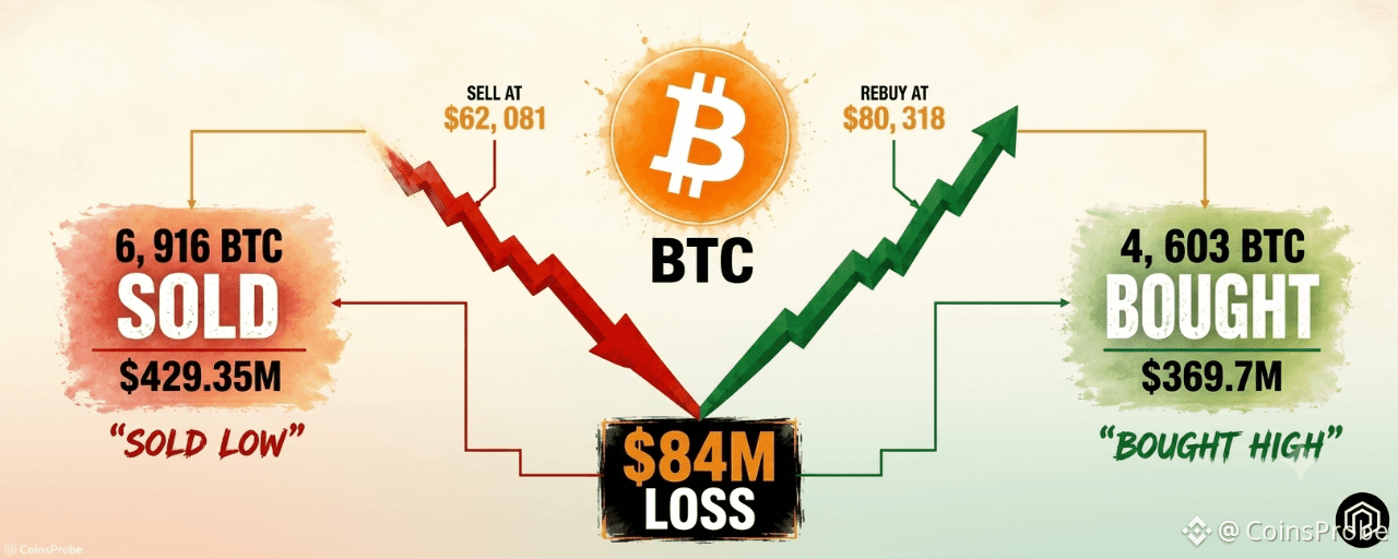
Article
Saylor Sells 6,916 BTC at $62,081 Then Buys 4,603 BTC at $80,318 — $84M LossKey Highlights
Michael Saylor sold 6,916 BTC worth $429.35M at an average price of $62,081 per coinStrategy repurchased 4,603 BTC at a much higher average of $80,318, spending $369.7MSimplified round-trip comparison yields an estimated $84M loss per Lookonchain dataThe buyback occurred Aug. 24–30, 2026, ending a ~10-week pause in accumulationSaylor's "We're Back" social post on Aug. 30, 2026 preceded the repurchase confirmation
Bitcoin has been trading in the $78,000–$80,000 range in recent sessions, with market sentiment showing signs of improvement following renewed institutional interest. The broader crypto market has stabilized after a period of volatility, and attention has turned sharply to the on-chain activity of one of Bitcoin’s most prominent corporate holders — Michael Saylor, executive chairman of Strategy (formerly MicroStrategy).
The Smart Money Move
According to on-chain data flagged by Lookonchain, over the past two months, Michael Saylor (@saylor) oversaw the sale of 6,916 BTC — valued at $429.35M — at an average price of $62,081 per coin. Strategy subsequently re-entered the market and purchased 4,603 BTC for $369.7M at a significantly higher average price of $80,318. The buyback, reported to have occurred between August 24–30, 2026, came just after Saylor posted “We’re Back” on social media on August 30, 2026 — a message that immediately reignited speculation about resumed accumulation after a roughly 10-week pause.
Track Record
The two-month trading sequence, when viewed in isolation as a round-trip comparison, reveals a notable cost differential:
Sold 6,916 BTC at an average of $62,081 per coin, generating $429.35M in proceedsBought back 4,603 BTC at an average of $80,318 per coin, deploying $369.7MNet result: acquired 2,313 fewer BTC than were sold, with the repurchase executed at a price $18,237 higher per coin than the sale averageEstimated simplified loss on the round-trip comparison: $84M
It is worth noting that web research indicates Strategy’s earlier BTC sales — some sources citing approximately 6,948 BTC sold for roughly $432.5M around $62,250 per coin — were framed internally as balance-sheet and liquidity management actions, including funding preferred dividends and buybacks, rather than a deliberate trading strategy designed to time the market.
Why This Matters
The $84M loss figure is a simplified directional estimate drawn by comparing the sale average against the repurchase average and is widely interpreted as illustrative of the risks inherent in selling Bitcoin during periods of price weakness and re-accumulating during strength. This is commonly viewed by on-chain analysts as a cautionary example of reactive rather than strategic positioning — even for sophisticated institutional actors. However, it is important to note that Strategy’s sales appear to have been driven by corporate treasury and liquidity needs rather than pure market-timing intent. Attributing a clean trading loss requires acknowledging that context. The $84M figure should therefore be treated as an analytical interpretation flagged by Lookonchain, not a formally audited or company-disclosed loss figure. No formal SEC filing or company announcement had confirmed the completed repurchase details at the time the signal was published.
Market Reaction and Forward Outlook
Bitcoin held near the $78,000–$80,000 range in the days surrounding Saylor’s “We’re Back” post on August 30, 2026, with sentiment improving on expectations that Strategy’s buying activity had resumed. The community reaction was divided — some observers expressed skepticism about the timing of the re-entry, while others interpreted the renewed accumulation as a long-term bullish signal for Bitcoin demand at the institutional level. With 4,603 BTC now added to Strategy’s holdings at an average of $80,318, the company’s cost basis on this tranche sits meaningfully above its prior sale price, making any sustained price recovery above that level the key threshold to watch going forward. The episode underscores how even the most publicly committed Bitcoin bulls can face execution risk in volatile market conditions.
Disclaimer: The views and analysis presented in this article are for informational purposes only and reflect the author’s perspective, not financial advice. Technical patterns and indicators discussed are subject to market volatility and may or may not yield the anticipated results. Investors are advised to exercise caution, conduct independent research, and make decisions aligned with their individual risk tolerance.
Saylor Sells 6,916 BTC at $62,081 Then Buys 4,603 BTC at $80,318 — $84M Loss
Key Highlights
Michael Saylor sold 6,916 BTC worth $429.35M at an average price of $62,081 per coinStrategy repurchased 4,603 BTC at a much higher average of $80,318, spending $369.7MSimplified round-trip comparison yields an estimated $84M loss per Lookonchain dataThe buyback occurred Aug. 24–30, 2026, ending a ~10-week pause in accumulationSaylor's "We're Back" social post on Aug. 30, 2026 preceded the repurchase confirmation
Bitcoin has been trading in the $78,000–$80,000 range in recent sessions, with market sentiment showing signs of improvement following renewed institutional interest. The broader crypto market has stabilized after a period of volatility, and attention has turned sharply to the on-chain activity of one of Bitcoin’s most prominent corporate holders — Michael Saylor, executive chairman of Strategy (formerly MicroStrategy).
The Smart Money Move
According to on-chain data flagged by Lookonchain, over the past two months, Michael Saylor (@saylor) oversaw the sale of 6,916 BTC — valued at $429.35M — at an average price of $62,081 per coin. Strategy subsequently re-entered the market and purchased 4,603 BTC for $369.7M at a significantly higher average price of $80,318. The buyback, reported to have occurred between August 24–30, 2026, came just after Saylor posted “We’re Back” on social media on August 30, 2026 — a message that immediately reignited speculation about resumed accumulation after a roughly 10-week pause.
Track Record
The two-month trading sequence, when viewed in isolation as a round-trip comparison, reveals a notable cost differential:
Sold 6,916 BTC at an average of $62,081 per coin, generating $429.35M in proceedsBought back 4,603 BTC at an average of $80,318 per coin, deploying $369.7MNet result: acquired 2,313 fewer BTC than were sold, with the repurchase executed at a price $18,237 higher per coin than the sale averageEstimated simplified loss on the round-trip comparison: $84M
It is worth noting that web research indicates Strategy’s earlier BTC sales — some sources citing approximately 6,948 BTC sold for roughly $432.5M around $62,250 per coin — were framed internally as balance-sheet and liquidity management actions, including funding preferred dividends and buybacks, rather than a deliberate trading strategy designed to time the market.
Why This Matters
The $84M loss figure is a simplified directional estimate drawn by comparing the sale average against the repurchase average and is widely interpreted as illustrative of the risks inherent in selling Bitcoin during periods of price weakness and re-accumulating during strength. This is commonly viewed by on-chain analysts as a cautionary example of reactive rather than strategic positioning — even for sophisticated institutional actors. However, it is important to note that Strategy’s sales appear to have been driven by corporate treasury and liquidity needs rather than pure market-timing intent. Attributing a clean trading loss requires acknowledging that context. The $84M figure should therefore be treated as an analytical interpretation flagged by Lookonchain, not a formally audited or company-disclosed loss figure. No formal SEC filing or company announcement had confirmed the completed repurchase details at the time the signal was published.
Market Reaction and Forward Outlook
Bitcoin held near the $78,000–$80,000 range in the days surrounding Saylor’s “We’re Back” post on August 30, 2026, with sentiment improving on expectations that Strategy’s buying activity had resumed. The community reaction was divided — some observers expressed skepticism about the timing of the re-entry, while others interpreted the renewed accumulation as a long-term bullish signal for Bitcoin demand at the institutional level. With 4,603 BTC now added to Strategy’s holdings at an average of $80,318, the company’s cost basis on this tranche sits meaningfully above its prior sale price, making any sustained price recovery above that level the key threshold to watch going forward. The episode underscores how even the most publicly committed Bitcoin bulls can face execution risk in volatile market conditions.
Disclaimer: The views and analysis presented in this article are for informational purposes only and reflect the author’s perspective, not financial advice. Technical patterns and indicators discussed are subject to market volatility and may or may not yield the anticipated results. Investors are advised to exercise caution, conduct independent research, and make decisions aligned with their individual risk tolerance.
Michael Saylor sold 6,916 BTC worth $429.35M at an average price of $62,081 per coinStrategy repurchased 4,603 BTC at a much higher average of $80,318, spending $369.7MSimplified round-trip comparison yields an estimated $84M loss per Lookonchain dataThe buyback occurred Aug. 24–30, 2026, ending a ~10-week pause in accumulationSaylor's "We're Back" social post on Aug. 30, 2026 preceded the repurchase confirmation
Bitcoin has been trading in the $78,000–$80,000 range in recent sessions, with market sentiment showing signs of improvement following renewed institutional interest. The broader crypto market has stabilized after a period of volatility, and attention has turned sharply to the on-chain activity of one of Bitcoin’s most prominent corporate holders — Michael Saylor, executive chairman of Strategy (formerly MicroStrategy).
The Smart Money Move
According to on-chain data flagged by Lookonchain, over the past two months, Michael Saylor (@saylor) oversaw the sale of 6,916 BTC — valued at $429.35M — at an average price of $62,081 per coin. Strategy subsequently re-entered the market and purchased 4,603 BTC for $369.7M at a significantly higher average price of $80,318. The buyback, reported to have occurred between August 24–30, 2026, came just after Saylor posted “We’re Back” on social media on August 30, 2026 — a message that immediately reignited speculation about resumed accumulation after a roughly 10-week pause.
Track Record
The two-month trading sequence, when viewed in isolation as a round-trip comparison, reveals a notable cost differential:
Sold 6,916 BTC at an average of $62,081 per coin, generating $429.35M in proceedsBought back 4,603 BTC at an average of $80,318 per coin, deploying $369.7MNet result: acquired 2,313 fewer BTC than were sold, with the repurchase executed at a price $18,237 higher per coin than the sale averageEstimated simplified loss on the round-trip comparison: $84M
It is worth noting that web research indicates Strategy’s earlier BTC sales — some sources citing approximately 6,948 BTC sold for roughly $432.5M around $62,250 per coin — were framed internally as balance-sheet and liquidity management actions, including funding preferred dividends and buybacks, rather than a deliberate trading strategy designed to time the market.
Why This Matters
The $84M loss figure is a simplified directional estimate drawn by comparing the sale average against the repurchase average and is widely interpreted as illustrative of the risks inherent in selling Bitcoin during periods of price weakness and re-accumulating during strength. This is commonly viewed by on-chain analysts as a cautionary example of reactive rather than strategic positioning — even for sophisticated institutional actors. However, it is important to note that Strategy’s sales appear to have been driven by corporate treasury and liquidity needs rather than pure market-timing intent. Attributing a clean trading loss requires acknowledging that context. The $84M figure should therefore be treated as an analytical interpretation flagged by Lookonchain, not a formally audited or company-disclosed loss figure. No formal SEC filing or company announcement had confirmed the completed repurchase details at the time the signal was published.
Market Reaction and Forward Outlook
Bitcoin held near the $78,000–$80,000 range in the days surrounding Saylor’s “We’re Back” post on August 30, 2026, with sentiment improving on expectations that Strategy’s buying activity had resumed. The community reaction was divided — some observers expressed skepticism about the timing of the re-entry, while others interpreted the renewed accumulation as a long-term bullish signal for Bitcoin demand at the institutional level. With 4,603 BTC now added to Strategy’s holdings at an average of $80,318, the company’s cost basis on this tranche sits meaningfully above its prior sale price, making any sustained price recovery above that level the key threshold to watch going forward. The episode underscores how even the most publicly committed Bitcoin bulls can face execution risk in volatile market conditions.
Disclaimer: The views and analysis presented in this article are for informational purposes only and reflect the author’s perspective, not financial advice. Technical patterns and indicators discussed are subject to market volatility and may or may not yield the anticipated results. Investors are advised to exercise caution, conduct independent research, and make decisions aligned with their individual risk tolerance.
221
·
--
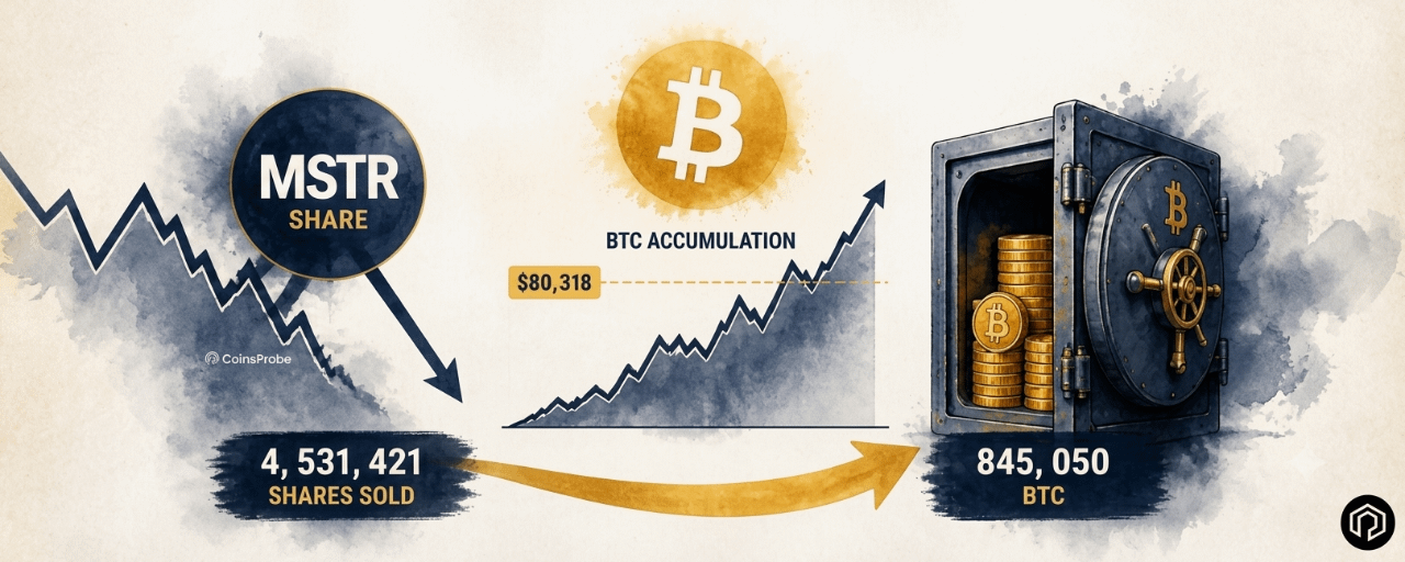
Article
Strategy Resumes BTC Accumulation — Buys 4,603 Bitcoin for $369.7M at $80,318Key Highlights
Strategy acquired 4,603 BTC for $369.7M at an average price of $80,318 per coin during Aug. 24–30, 2026Purchase ended an approximately 10-week pause in Strategy's Bitcoin accumulation activityBuy was funded by $602.8M in net proceeds from 4,531,421 MSTR at-the-market share salesStrategy's total Bitcoin holdings now stand at 845,050 BTC, acquired for ~$63.73B at a $75,412 averageRemaining proceeds allocated: $151.8M STRC repurchases, $50.7M STRC dividends, $30.0M added to cash.
Bitcoin has been trading in the high-$70,000s to around $80,000 range, with the broader market showing renewed bullish momentum heading into the final days of August 2026. It is within this backdrop that one of the most closely watched institutional Bitcoin holders made its return to active accumulation, drawing significant attention from on-chain observers and market participants alike.
The Smart Money Move
Michael Saylor’s publicly traded firm Strategy disclosed a fresh Bitcoin purchase via an SEC Form 8-K filing dated August 31, 2026. During the week of August 24–30, 2026, the company acquired 4,603 BTC at an average price of $80,318 per coin, bringing the total cost of the purchase to $369.7 million. The move ended an accumulation pause of approximately 10 weeks — the longest gap in recent Strategy buying history. According to the official 8-K filing, the purchase was funded through $602.8 million in net proceeds raised via at-the-market sales of 4,531,421 MSTR shares. The remaining capital was allocated as follows: $151.8 million went toward repurchasing STRC preferred shares, $50.7 million covered STRC dividends, and $30.0 million was added to cash reserves.
Track Record & Current Holdings
Strategy has been one of the most aggressive and consistent institutional Bitcoin accumulators on record. Following this latest purchase, the firm’s total treasury stands at the following:
Total Bitcoin held: 845,050 BTCTotal acquisition cost: approximately $63.73 billionAverage cost basis across all holdings: $75,412 per BitcoinLatest tranche: 4,603 BTC acquired at $80,318 average during the week of Aug. 24–30, 2026Funding source for latest buy: net proceeds from 4,531,421 MSTR share sales totaling $602.8 million
The current average entry price of $75,412 across Strategy’s full holdings means the firm is sitting on unrealized gains at the $80,318 acquisition level, having bought this latest tranche above its portfolio average cost.
Why This Matters
This purchase carries weight beyond its dollar size. The roughly 10-week pause in buying had drawn speculation in crypto circles about whether Strategy’s accumulation cadence was slowing. The resumption — at a price point above the company’s historical average cost basis — is widely interpreted by market observers as a signal of renewed institutional confidence in Bitcoin at current levels. Analysts commonly view Strategy’s buying activity as a sentiment indicator for broader institutional demand, given the firm’s public commitment to a Bitcoin treasury strategy and the scale at which it operates. The fact that the purchase was funded through equity sales rather than debt may also be seen as a more conservative capital allocation approach compared to prior leveraged strategies, though this remains an interpretation rather than a stated company position.
Forward Outlook
With 845,050 BTC now under management and an average cost of $75,412, Strategy remains the single largest known corporate Bitcoin holder globally. The disclosure — reported on August 31, 2026 — has reignited community discussion about whether the resumption signals a broader shift in institutional appetite after weeks of relative quiet. On-chain tracking accounts, including Lookonchain, flagged the move promptly, amplifying its visibility across the crypto intelligence community. Whether this marks the beginning of another sustained accumulation phase or remains an isolated re-entry will likely depend on BTC’s price trajectory and Strategy’s continued access to equity capital markets.
Disclaimer: The views and analysis presented in this article are for informational purposes only and reflect the author’s perspective, not financial advice. Technical patterns and indicators discussed are subject to market volatility and may or may not yield the anticipated results. Investors are advised to exercise caution, conduct independent research, and make decisions aligned with their individual risk tolerance.
Strategy Resumes BTC Accumulation — Buys 4,603 Bitcoin for $369.7M at $80,318
Key Highlights
Strategy acquired 4,603 BTC for $369.7M at an average price of $80,318 per coin during Aug. 24–30, 2026Purchase ended an approximately 10-week pause in Strategy's Bitcoin accumulation activityBuy was funded by $602.8M in net proceeds from 4,531,421 MSTR at-the-market share salesStrategy's total Bitcoin holdings now stand at 845,050 BTC, acquired for ~$63.73B at a $75,412 averageRemaining proceeds allocated: $151.8M STRC repurchases, $50.7M STRC dividends, $30.0M added to cash.
Bitcoin has been trading in the high-$70,000s to around $80,000 range, with the broader market showing renewed bullish momentum heading into the final days of August 2026. It is within this backdrop that one of the most closely watched institutional Bitcoin holders made its return to active accumulation, drawing significant attention from on-chain observers and market participants alike.
The Smart Money Move
Michael Saylor’s publicly traded firm Strategy disclosed a fresh Bitcoin purchase via an SEC Form 8-K filing dated August 31, 2026. During the week of August 24–30, 2026, the company acquired 4,603 BTC at an average price of $80,318 per coin, bringing the total cost of the purchase to $369.7 million. The move ended an accumulation pause of approximately 10 weeks — the longest gap in recent Strategy buying history. According to the official 8-K filing, the purchase was funded through $602.8 million in net proceeds raised via at-the-market sales of 4,531,421 MSTR shares. The remaining capital was allocated as follows: $151.8 million went toward repurchasing STRC preferred shares, $50.7 million covered STRC dividends, and $30.0 million was added to cash reserves.
Track Record & Current Holdings
Strategy has been one of the most aggressive and consistent institutional Bitcoin accumulators on record. Following this latest purchase, the firm’s total treasury stands at the following:
Total Bitcoin held: 845,050 BTCTotal acquisition cost: approximately $63.73 billionAverage cost basis across all holdings: $75,412 per BitcoinLatest tranche: 4,603 BTC acquired at $80,318 average during the week of Aug. 24–30, 2026Funding source for latest buy: net proceeds from 4,531,421 MSTR share sales totaling $602.8 million
The current average entry price of $75,412 across Strategy’s full holdings means the firm is sitting on unrealized gains at the $80,318 acquisition level, having bought this latest tranche above its portfolio average cost.
Why This Matters
This purchase carries weight beyond its dollar size. The roughly 10-week pause in buying had drawn speculation in crypto circles about whether Strategy’s accumulation cadence was slowing. The resumption — at a price point above the company’s historical average cost basis — is widely interpreted by market observers as a signal of renewed institutional confidence in Bitcoin at current levels. Analysts commonly view Strategy’s buying activity as a sentiment indicator for broader institutional demand, given the firm’s public commitment to a Bitcoin treasury strategy and the scale at which it operates. The fact that the purchase was funded through equity sales rather than debt may also be seen as a more conservative capital allocation approach compared to prior leveraged strategies, though this remains an interpretation rather than a stated company position.
Forward Outlook
With 845,050 BTC now under management and an average cost of $75,412, Strategy remains the single largest known corporate Bitcoin holder globally. The disclosure — reported on August 31, 2026 — has reignited community discussion about whether the resumption signals a broader shift in institutional appetite after weeks of relative quiet. On-chain tracking accounts, including Lookonchain, flagged the move promptly, amplifying its visibility across the crypto intelligence community. Whether this marks the beginning of another sustained accumulation phase or remains an isolated re-entry will likely depend on BTC’s price trajectory and Strategy’s continued access to equity capital markets.
Disclaimer: The views and analysis presented in this article are for informational purposes only and reflect the author’s perspective, not financial advice. Technical patterns and indicators discussed are subject to market volatility and may or may not yield the anticipated results. Investors are advised to exercise caution, conduct independent research, and make decisions aligned with their individual risk tolerance.
Strategy acquired 4,603 BTC for $369.7M at an average price of $80,318 per coin during Aug. 24–30, 2026Purchase ended an approximately 10-week pause in Strategy's Bitcoin accumulation activityBuy was funded by $602.8M in net proceeds from 4,531,421 MSTR at-the-market share salesStrategy's total Bitcoin holdings now stand at 845,050 BTC, acquired for ~$63.73B at a $75,412 averageRemaining proceeds allocated: $151.8M STRC repurchases, $50.7M STRC dividends, $30.0M added to cash.
Bitcoin has been trading in the high-$70,000s to around $80,000 range, with the broader market showing renewed bullish momentum heading into the final days of August 2026. It is within this backdrop that one of the most closely watched institutional Bitcoin holders made its return to active accumulation, drawing significant attention from on-chain observers and market participants alike.
The Smart Money Move
Michael Saylor’s publicly traded firm Strategy disclosed a fresh Bitcoin purchase via an SEC Form 8-K filing dated August 31, 2026. During the week of August 24–30, 2026, the company acquired 4,603 BTC at an average price of $80,318 per coin, bringing the total cost of the purchase to $369.7 million. The move ended an accumulation pause of approximately 10 weeks — the longest gap in recent Strategy buying history. According to the official 8-K filing, the purchase was funded through $602.8 million in net proceeds raised via at-the-market sales of 4,531,421 MSTR shares. The remaining capital was allocated as follows: $151.8 million went toward repurchasing STRC preferred shares, $50.7 million covered STRC dividends, and $30.0 million was added to cash reserves.
Track Record & Current Holdings
Strategy has been one of the most aggressive and consistent institutional Bitcoin accumulators on record. Following this latest purchase, the firm’s total treasury stands at the following:
Total Bitcoin held: 845,050 BTCTotal acquisition cost: approximately $63.73 billionAverage cost basis across all holdings: $75,412 per BitcoinLatest tranche: 4,603 BTC acquired at $80,318 average during the week of Aug. 24–30, 2026Funding source for latest buy: net proceeds from 4,531,421 MSTR share sales totaling $602.8 million
The current average entry price of $75,412 across Strategy’s full holdings means the firm is sitting on unrealized gains at the $80,318 acquisition level, having bought this latest tranche above its portfolio average cost.
Why This Matters
This purchase carries weight beyond its dollar size. The roughly 10-week pause in buying had drawn speculation in crypto circles about whether Strategy’s accumulation cadence was slowing. The resumption — at a price point above the company’s historical average cost basis — is widely interpreted by market observers as a signal of renewed institutional confidence in Bitcoin at current levels. Analysts commonly view Strategy’s buying activity as a sentiment indicator for broader institutional demand, given the firm’s public commitment to a Bitcoin treasury strategy and the scale at which it operates. The fact that the purchase was funded through equity sales rather than debt may also be seen as a more conservative capital allocation approach compared to prior leveraged strategies, though this remains an interpretation rather than a stated company position.
Forward Outlook
With 845,050 BTC now under management and an average cost of $75,412, Strategy remains the single largest known corporate Bitcoin holder globally. The disclosure — reported on August 31, 2026 — has reignited community discussion about whether the resumption signals a broader shift in institutional appetite after weeks of relative quiet. On-chain tracking accounts, including Lookonchain, flagged the move promptly, amplifying its visibility across the crypto intelligence community. Whether this marks the beginning of another sustained accumulation phase or remains an isolated re-entry will likely depend on BTC’s price trajectory and Strategy’s continued access to equity capital markets.
Disclaimer: The views and analysis presented in this article are for informational purposes only and reflect the author’s perspective, not financial advice. Technical patterns and indicators discussed are subject to market volatility and may or may not yield the anticipated results. Investors are advised to exercise caution, conduct independent research, and make decisions aligned with their individual risk tolerance.
379
·
--
Verified
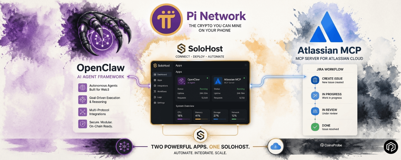
Article
Pi Network Adds OpenClaw and Atlassian MCP Server to SoloHostKey Highlights
Pi Network added OpenClaw and Atlassian MCP Server to SoloHost on Pi Desktop.OpenClaw enables locally hosted AI agents with on-device memory and containerized isolation.Atlassian MCP Server connects Jira with AI tools including Cursor, Claude, and Codex.The updates strengthen Pi Desktop’s role as a local AI and developer utility hub.
Pi Network is expanding what SoloHost means in practice. Two new additions — a local AI agent and a professional Jira-to-AI workflow tool — push Pi Desktop further from its blockchain-only origins and closer to a general-purpose self-hosting platform that serves both AI enthusiasts and professional developers.
Pi Network New Apps/Source: @PiCoreTeam (X)
What Is SoloHost and Why It Matters
SoloHost is Pi Network’s self-hosting layer built into Pi Desktop — designed to reduce the technical barrier of running local software by handling packaging and installation through a familiar interface rather than requiring users to manually configure Docker containers, server stacks, or networking infrastructure.
As we covered in our Pi2Day SoloHost launch article — SoloHost was introduced at Pi2Day 2026 as one of the platform’s most significant utility releases, enabling Pioneers to run compute infrastructure locally on their own machines. Each new app added to SoloHost extends that vision with practical tools that serve specific, real-world use cases.
The two new additions bring the total SoloHost catalogue further into AI agent and professional workflow territory — sitting alongside earlier releases like Hermes, the local AI agent focused on persistent memory and skill learning.
New App 1 — OpenClaw: Local AI Agent With Containerised Isolation
OpenClaw is a local AI agent designed to run on the user’s machine — providing AI assistant capabilities without requiring every interaction to pass through a remote cloud service.
Key features:
Local or external model support — OpenClaw can run with local AI models entirely on-device, or connect to external models including ChatGPT and Claude — giving users flexibility based on their hardware and privacy preferences.
Local memory storage — All memory and context is stored on the user’s own machine rather than in a cloud database. For users who want AI assistance without their conversation history and context living on third-party servers, this is a significant privacy advantage.
Containerised isolation — OpenClaw runs inside SoloHost’s container architecture, which means it does not automatically receive broad access to the rest of the user’s machine. Specific permissions can be granted when needed — but the default is contained rather than open.
Streamlined installation — The Core Team highlights that SoloHost makes OpenClaw’s installation significantly more accessible than setting up a comparable local AI agent from scratch, where Docker configuration and dependency management typically create meaningful setup friction.
Who this is for: Pioneers who want a persistent, locally-running AI assistant with privacy-first architecture — without the technical overhead of building the equivalent setup manually.
New App 2 — Atlassian MCP Server: Local Jira Integration for AI Tools
The Atlassian MCP Server solves a specific and practical problem for developers and project managers who use Jira and want AI-assisted workflows — without routing all of that data through a hosted remote service.
What it does:
The Atlassian MCP Server runs a local Model Context Protocol (MCP) connection for Jira — creating a locally hosted pathway that MCP-compatible AI tools can use to access Jira data, issues, and workflows directly.
Compatible AI tools:
ToolTypeCursorAI-powered code editorClaude DesktopAnthropic’s desktop AI assistantClaude CodeTerminal-based AI coding toolCodexOpenAI’s coding model
Any MCP-compatible AI tool can connect to the local Jira server — enabling AI-assisted project management, issue summarisation, sprint planning, and code workflow integration without sending project data to a remote hosted MCP service.
The practical advantage — avoiding quota and reliability limits:
The official Pi blog specifically notes that running the MCP server locally helps avoid quota and reliability limits that come with hosted options. For professional users with high-volume Jira usage or reliability requirements, a locally hosted MCP connection offers both performance consistency and data locality that hosted services cannot guarantee.
Who this is for: Developers and project managers who already use Jira professionally and want to integrate AI tools into their workflow without routing sensitive project data through external hosted services.
The Broader Picture — Pi Desktop as a Utility Hub
These two additions are part of a consistent and accelerating pattern in Pi Network’s 2026 development. As we covered in our Pi Network Protocol 27 node upgrade article — Pi’s infrastructure is advancing rapidly at the protocol level. And as we covered in our App Studio utility-based pricing article — Pi is simultaneously moving its application layer toward genuine utility and quality rather than subsidised experimentation.
SoloHost sits at the intersection of both directions — infrastructure that runs on Pi Node hardware, delivering practical applications that serve real user needs. The pattern across SoloHost releases is clear:
AppCategoryUse CaseHermesLocal AI agentPersistent memory and skill learningOpenClawLocal AI agentFlexible local/external model AI with isolationAtlassian MCP ServerDeveloper toolLocal Jira-to-AI workflow integration
Each addition expands Pi Desktop’s utility surface — gradually building toward a platform where running a Pi Node means running useful local infrastructure, not just participating in blockchain consensus.
Important Notes for Pioneers
SoloHost remains in beta — both new apps and all SoloHost packages should be assessed individually before installation. The open publisher flow means apps are not individually reviewed or endorsed by the Pi Core Team.
Installations are at the user’s own risk — standard due diligence applies for any self-hosted software, including reviewing what permissions each app requests and understanding what data each tool accesses.
How to access: Both OpenClaw and the Atlassian MCP Server are available inside the Pi mining app under SoloHost — the Core Team confirms users can learn more about both apps through the in-app interface.
Bottom Line
Pi Network’s addition of OpenClaw and the Atlassian MCP Server to SoloHost represents two meaningful steps in the platform’s evolution from blockchain node infrastructure toward a practical self-hosting hub for AI agents and professional developer tools. OpenClaw brings privacy-first local AI to Pioneers without technical setup overhead. The Atlassian MCP Server brings professional Jira-to-AI integration to developers who want local control over their project data.
Together — alongside Hermes and future SoloHost additions — they are building the case that Pi Desktop is becoming something genuinely useful for a broader range of Pioneers beyond those primarily motivated by mining and token accumulation.
Disclaimer: The views and analysis presented in this article are for informational purposes only and reflect the author’s perspective, not financial advice. Technical patterns and indicators discussed are subject to market volatility and may or may not yield the anticipated results. Investors are advised to exercise caution, conduct independent research, and make decisions aligned with their individual risk tolerance.
Pi Network Adds OpenClaw and Atlassian MCP Server to SoloHost
Key Highlights
Pi Network added OpenClaw and Atlassian MCP Server to SoloHost on Pi Desktop.OpenClaw enables locally hosted AI agents with on-device memory and containerized isolation.Atlassian MCP Server connects Jira with AI tools including Cursor, Claude, and Codex.The updates strengthen Pi Desktop’s role as a local AI and developer utility hub.
Pi Network is expanding what SoloHost means in practice. Two new additions — a local AI agent and a professional Jira-to-AI workflow tool — push Pi Desktop further from its blockchain-only origins and closer to a general-purpose self-hosting platform that serves both AI enthusiasts and professional developers.
Pi Network New Apps/Source: @PiCoreTeam (X)
What Is SoloHost and Why It Matters
SoloHost is Pi Network’s self-hosting layer built into Pi Desktop — designed to reduce the technical barrier of running local software by handling packaging and installation through a familiar interface rather than requiring users to manually configure Docker containers, server stacks, or networking infrastructure.
As we covered in our Pi2Day SoloHost launch article — SoloHost was introduced at Pi2Day 2026 as one of the platform’s most significant utility releases, enabling Pioneers to run compute infrastructure locally on their own machines. Each new app added to SoloHost extends that vision with practical tools that serve specific, real-world use cases.
The two new additions bring the total SoloHost catalogue further into AI agent and professional workflow territory — sitting alongside earlier releases like Hermes, the local AI agent focused on persistent memory and skill learning.
New App 1 — OpenClaw: Local AI Agent With Containerised Isolation
OpenClaw is a local AI agent designed to run on the user’s machine — providing AI assistant capabilities without requiring every interaction to pass through a remote cloud service.
Key features:
Local or external model support — OpenClaw can run with local AI models entirely on-device, or connect to external models including ChatGPT and Claude — giving users flexibility based on their hardware and privacy preferences.
Local memory storage — All memory and context is stored on the user’s own machine rather than in a cloud database. For users who want AI assistance without their conversation history and context living on third-party servers, this is a significant privacy advantage.
Containerised isolation — OpenClaw runs inside SoloHost’s container architecture, which means it does not automatically receive broad access to the rest of the user’s machine. Specific permissions can be granted when needed — but the default is contained rather than open.
Streamlined installation — The Core Team highlights that SoloHost makes OpenClaw’s installation significantly more accessible than setting up a comparable local AI agent from scratch, where Docker configuration and dependency management typically create meaningful setup friction.
Who this is for: Pioneers who want a persistent, locally-running AI assistant with privacy-first architecture — without the technical overhead of building the equivalent setup manually.
New App 2 — Atlassian MCP Server: Local Jira Integration for AI Tools
The Atlassian MCP Server solves a specific and practical problem for developers and project managers who use Jira and want AI-assisted workflows — without routing all of that data through a hosted remote service.
What it does:
The Atlassian MCP Server runs a local Model Context Protocol (MCP) connection for Jira — creating a locally hosted pathway that MCP-compatible AI tools can use to access Jira data, issues, and workflows directly.
Compatible AI tools:
ToolTypeCursorAI-powered code editorClaude DesktopAnthropic’s desktop AI assistantClaude CodeTerminal-based AI coding toolCodexOpenAI’s coding model
Any MCP-compatible AI tool can connect to the local Jira server — enabling AI-assisted project management, issue summarisation, sprint planning, and code workflow integration without sending project data to a remote hosted MCP service.
The practical advantage — avoiding quota and reliability limits:
The official Pi blog specifically notes that running the MCP server locally helps avoid quota and reliability limits that come with hosted options. For professional users with high-volume Jira usage or reliability requirements, a locally hosted MCP connection offers both performance consistency and data locality that hosted services cannot guarantee.
Who this is for: Developers and project managers who already use Jira professionally and want to integrate AI tools into their workflow without routing sensitive project data through external hosted services.
The Broader Picture — Pi Desktop as a Utility Hub
These two additions are part of a consistent and accelerating pattern in Pi Network’s 2026 development. As we covered in our Pi Network Protocol 27 node upgrade article — Pi’s infrastructure is advancing rapidly at the protocol level. And as we covered in our App Studio utility-based pricing article — Pi is simultaneously moving its application layer toward genuine utility and quality rather than subsidised experimentation.
SoloHost sits at the intersection of both directions — infrastructure that runs on Pi Node hardware, delivering practical applications that serve real user needs. The pattern across SoloHost releases is clear:
AppCategoryUse CaseHermesLocal AI agentPersistent memory and skill learningOpenClawLocal AI agentFlexible local/external model AI with isolationAtlassian MCP ServerDeveloper toolLocal Jira-to-AI workflow integration
Each addition expands Pi Desktop’s utility surface — gradually building toward a platform where running a Pi Node means running useful local infrastructure, not just participating in blockchain consensus.
Important Notes for Pioneers
SoloHost remains in beta — both new apps and all SoloHost packages should be assessed individually before installation. The open publisher flow means apps are not individually reviewed or endorsed by the Pi Core Team.
Installations are at the user’s own risk — standard due diligence applies for any self-hosted software, including reviewing what permissions each app requests and understanding what data each tool accesses.
How to access: Both OpenClaw and the Atlassian MCP Server are available inside the Pi mining app under SoloHost — the Core Team confirms users can learn more about both apps through the in-app interface.
Bottom Line
Pi Network’s addition of OpenClaw and the Atlassian MCP Server to SoloHost represents two meaningful steps in the platform’s evolution from blockchain node infrastructure toward a practical self-hosting hub for AI agents and professional developer tools. OpenClaw brings privacy-first local AI to Pioneers without technical setup overhead. The Atlassian MCP Server brings professional Jira-to-AI integration to developers who want local control over their project data.
Together — alongside Hermes and future SoloHost additions — they are building the case that Pi Desktop is becoming something genuinely useful for a broader range of Pioneers beyond those primarily motivated by mining and token accumulation.
Disclaimer: The views and analysis presented in this article are for informational purposes only and reflect the author’s perspective, not financial advice. Technical patterns and indicators discussed are subject to market volatility and may or may not yield the anticipated results. Investors are advised to exercise caution, conduct independent research, and make decisions aligned with their individual risk tolerance.
Pi Network added OpenClaw and Atlassian MCP Server to SoloHost on Pi Desktop.OpenClaw enables locally hosted AI agents with on-device memory and containerized isolation.Atlassian MCP Server connects Jira with AI tools including Cursor, Claude, and Codex.The updates strengthen Pi Desktop’s role as a local AI and developer utility hub.
Pi Network is expanding what SoloHost means in practice. Two new additions — a local AI agent and a professional Jira-to-AI workflow tool — push Pi Desktop further from its blockchain-only origins and closer to a general-purpose self-hosting platform that serves both AI enthusiasts and professional developers.
Pi Network New Apps/Source: @PiCoreTeam (X)
What Is SoloHost and Why It Matters
SoloHost is Pi Network’s self-hosting layer built into Pi Desktop — designed to reduce the technical barrier of running local software by handling packaging and installation through a familiar interface rather than requiring users to manually configure Docker containers, server stacks, or networking infrastructure.
As we covered in our Pi2Day SoloHost launch article — SoloHost was introduced at Pi2Day 2026 as one of the platform’s most significant utility releases, enabling Pioneers to run compute infrastructure locally on their own machines. Each new app added to SoloHost extends that vision with practical tools that serve specific, real-world use cases.
The two new additions bring the total SoloHost catalogue further into AI agent and professional workflow territory — sitting alongside earlier releases like Hermes, the local AI agent focused on persistent memory and skill learning.
New App 1 — OpenClaw: Local AI Agent With Containerised Isolation
OpenClaw is a local AI agent designed to run on the user’s machine — providing AI assistant capabilities without requiring every interaction to pass through a remote cloud service.
Key features:
Local or external model support — OpenClaw can run with local AI models entirely on-device, or connect to external models including ChatGPT and Claude — giving users flexibility based on their hardware and privacy preferences.
Local memory storage — All memory and context is stored on the user’s own machine rather than in a cloud database. For users who want AI assistance without their conversation history and context living on third-party servers, this is a significant privacy advantage.
Containerised isolation — OpenClaw runs inside SoloHost’s container architecture, which means it does not automatically receive broad access to the rest of the user’s machine. Specific permissions can be granted when needed — but the default is contained rather than open.
Streamlined installation — The Core Team highlights that SoloHost makes OpenClaw’s installation significantly more accessible than setting up a comparable local AI agent from scratch, where Docker configuration and dependency management typically create meaningful setup friction.
Who this is for: Pioneers who want a persistent, locally-running AI assistant with privacy-first architecture — without the technical overhead of building the equivalent setup manually.
New App 2 — Atlassian MCP Server: Local Jira Integration for AI Tools
The Atlassian MCP Server solves a specific and practical problem for developers and project managers who use Jira and want AI-assisted workflows — without routing all of that data through a hosted remote service.
What it does:
The Atlassian MCP Server runs a local Model Context Protocol (MCP) connection for Jira — creating a locally hosted pathway that MCP-compatible AI tools can use to access Jira data, issues, and workflows directly.
Compatible AI tools:
ToolTypeCursorAI-powered code editorClaude DesktopAnthropic’s desktop AI assistantClaude CodeTerminal-based AI coding toolCodexOpenAI’s coding model
Any MCP-compatible AI tool can connect to the local Jira server — enabling AI-assisted project management, issue summarisation, sprint planning, and code workflow integration without sending project data to a remote hosted MCP service.
The practical advantage — avoiding quota and reliability limits:
The official Pi blog specifically notes that running the MCP server locally helps avoid quota and reliability limits that come with hosted options. For professional users with high-volume Jira usage or reliability requirements, a locally hosted MCP connection offers both performance consistency and data locality that hosted services cannot guarantee.
Who this is for: Developers and project managers who already use Jira professionally and want to integrate AI tools into their workflow without routing sensitive project data through external hosted services.
The Broader Picture — Pi Desktop as a Utility Hub
These two additions are part of a consistent and accelerating pattern in Pi Network’s 2026 development. As we covered in our Pi Network Protocol 27 node upgrade article — Pi’s infrastructure is advancing rapidly at the protocol level. And as we covered in our App Studio utility-based pricing article — Pi is simultaneously moving its application layer toward genuine utility and quality rather than subsidised experimentation.
SoloHost sits at the intersection of both directions — infrastructure that runs on Pi Node hardware, delivering practical applications that serve real user needs. The pattern across SoloHost releases is clear:
AppCategoryUse CaseHermesLocal AI agentPersistent memory and skill learningOpenClawLocal AI agentFlexible local/external model AI with isolationAtlassian MCP ServerDeveloper toolLocal Jira-to-AI workflow integration
Each addition expands Pi Desktop’s utility surface — gradually building toward a platform where running a Pi Node means running useful local infrastructure, not just participating in blockchain consensus.
Important Notes for Pioneers
SoloHost remains in beta — both new apps and all SoloHost packages should be assessed individually before installation. The open publisher flow means apps are not individually reviewed or endorsed by the Pi Core Team.
Installations are at the user’s own risk — standard due diligence applies for any self-hosted software, including reviewing what permissions each app requests and understanding what data each tool accesses.
How to access: Both OpenClaw and the Atlassian MCP Server are available inside the Pi mining app under SoloHost — the Core Team confirms users can learn more about both apps through the in-app interface.
Bottom Line
Pi Network’s addition of OpenClaw and the Atlassian MCP Server to SoloHost represents two meaningful steps in the platform’s evolution from blockchain node infrastructure toward a practical self-hosting hub for AI agents and professional developer tools. OpenClaw brings privacy-first local AI to Pioneers without technical setup overhead. The Atlassian MCP Server brings professional Jira-to-AI integration to developers who want local control over their project data.
Together — alongside Hermes and future SoloHost additions — they are building the case that Pi Desktop is becoming something genuinely useful for a broader range of Pioneers beyond those primarily motivated by mining and token accumulation.
Disclaimer: The views and analysis presented in this article are for informational purposes only and reflect the author’s perspective, not financial advice. Technical patterns and indicators discussed are subject to market volatility and may or may not yield the anticipated results. Investors are advised to exercise caution, conduct independent research, and make decisions aligned with their individual risk tolerance.
3
290
·
--

Article
Bitcoin Bear Market Is Over After Fastest Bull Score Flip in a Year: CryptoQuantKey Highlights
CryptoQuant founder Ki Young Ju has stated definitively: "The Bitcoin bear cycle is over" — backed by the proprietary Bull-Bear Market Cycle Indicator transitioning out of the Bear zone toward Early Bull territory.Bitcoin's Bull Score surged from 30 to 80 in just seven days — the fastest regime flip in a year — with 8 of 10 underlying indicators now flashing bullish and spot demand growing at its fastest monthly pace since December 2025.$83,000 — the 365-day moving average — is the sole remaining confirmation threshold. A sustained weekly close above it would fully validate the new bull market signal.
Bitcoin is trading at approximately $79,011 — up 22.87% over 7 days with a market cap of $1.58 trillion — as CryptoQuant’s on-chain framework delivers one of the most direct and data-backed bull market declarations the analytics platform has issued in this cycle. This is not a sentiment call or a price target. It is a specific, indicator-driven assessment from the founder of one of crypto’s most respected on-chain analytics firms: the Bitcoin bear cycle is over.
The declaration is supported by two independent CryptoQuant metrics that are now aligned simultaneously — the Bull-Bear Market Cycle Indicator and the Bull Score Index — in a configuration that last appeared at the start of the previous bull phase in January 2023.
CryptoQuant Founder: “The Bitcoin Bear Cycle Is Over”
The clearest statement came directly from CryptoQuant founder Ki Young Ju: “The Bitcoin bear cycle is over.”
This is not a hedged observation or a probabilistic framework — it is a declarative conclusion from the founder of the platform whose data underpins the call. The assessment is backed by CryptoQuant’s proprietary Bitcoin Bull-Bear Market Cycle Indicator — a composite on-chain metric that classifies Bitcoin’s macro market regime into Bear, Transition, and Early Bull phases based on a defined set of underlying data inputs.
The current chart shows Bitcoin’s regime classification transitioning out of the prolonged blue “Bear” zone and moving toward the green “Early Bull” territory — the same directional shift that, when it occurred in January 2023, correctly identified the beginning of the cycle that eventually carried Bitcoin to its all-time high above $146,000.
The January 2023 precedent is the most directly relevant historical comparison: a market that had been in a deeply negative regime, producing a Bear zone classification, transitioned to Early Bull — and the subsequent bull phase produced one of the largest BTC advances in its history. As covered in our Bitcoin records highest demand of 2026 and 12-month RSI reset analysis and Bitcoin 1,130-day SMA reclaim breakdown, the on-chain and technical signals building through August 2026 have been pointing toward exactly this type of regime transition — and the CryptoQuant Bull-Bear Indicator is now formally confirming it.
Bull Score Surges From 30 to 80
The second and more quantitatively specific signal comes from CryptoQuant’s Bull Score Index — a composite reading that aggregates ten underlying on-chain indicators into a single 0–100 score reflecting Bitcoin’s market regime strength.
CryptoQuant’s official account framed the development directly:
“Bitcoin just entered a new bull market. Bull Score: 30 → 80 in a week, the fastest flip in a year. $83K is the only thing left standing in the way.”
What the Bull Score Measures
The Bull Score Index aggregates ten independent on-chain signals — each measuring a different dimension of Bitcoin’s market condition — into a composite reading. A score of 0–30 is characteristic of bear market conditions. A score of 70–100 is characteristic of bull market conditions. Movement between those zones reflects regime transitions.
A jump from 30 to 80 in seven days means the composite crossed from the lower bear range to the upper bull range in a single week — the most rapid regime reclassification the index has produced in the past year.
The Underlying Signal Breakdown
Signal Category Current Status Underlying Indicators Bullish 8 of 10 Apparent Spot Demand Growth Fastest monthly pace since December 2025 Spot and Futures Demand Expanding together for first time since October 2025 Highest Bull Score Since October 2025 (BTC ~$124,000)
8 of 10 underlying indicators now flashing bullish is the most critical data point within the Bull Score. A composite score can be elevated by a few strong signals — but 8-of-10 indicator agreement represents a near-consensus across the full measurement framework, with only two indicators still registering non-bullish conditions.
Apparent spot demand growing at its fastest monthly pace since late December confirms that the demand improvement flagged in our Bitcoin spot demand flashing bullish reversal analysis has now accelerated beyond the initial positive flip into the strongest monthly growth pace in approximately eight months.
Spot and futures demand expanding together for the first time since October 2025 is the most structurally significant of the underlying signals. As documented in our Bitcoin futures demand vs spot demand CryptoQuant heatmap analysis, the persistent absence of aligned spot and futures demand expansion was the primary structural weakness in Bitcoin’s demand framework throughout the corrective phase. Its resolution — both expanding together — removes the most significant demand-side objection to the bull market thesis.
Highest Bull Score since October 2025 — when Bitcoin was trading near $124,000 — provides the calibration for what this reading means in absolute terms. The Bull Score of 80 is not a weakly bullish reading sitting marginally above neutral — it is a strongly bullish reading that matches the level last seen when Bitcoin was at a price approximately 57% above the current level. The implication is not that Bitcoin will immediately return to $124,000 — it is that the demand structure and on-chain regime are as constructive now as they were at that price level.
$83,000 — The One Level That Remains
Despite the strength and clarity of both CryptoQuant signals, the firm is explicit about the single remaining confirmation threshold: a sustained weekly close above the 365-day moving average, currently near $83,000.
This is not a hedging caveat — it is a specific and testable condition that distinguishes a confirmed bull market from an early bull transition that requires further validation. The 365-day MA is one of the most widely watched long-term trend indicators in Bitcoin analysis — it represents the average price across a full calendar year of trading, and its relationship to spot price has historically been among the most reliable regime indicators.
At the current price of $79,011, Bitcoin sits approximately $4,000 — or roughly +5% — below the $83,000 confirmation threshold. The weekly surge from $62,700 has brought the price within striking distance of this level. Whether the current momentum is sufficient to produce a sustained weekly close above $83,000 — rather than a brief touch followed by rejection — is the specific question the next weekly candle will begin to answer.
As covered in our Bitcoin reclaims 1,130-day SMA after 80 days below analysis, the technical structure is now aligned with the on-chain regime signals — the 1,130-day SMA reclaim and the CryptoQuant Bull Score flip are independently confirming the same macro conclusion from different analytical frameworks.
Why This Is Different From Previous False Bull Starts
Bitcoin has produced brief periods of bullish sentiment during the 2026 corrective phase that ultimately did not sustain — making it reasonable to ask what distinguishes the current signal from those prior episodes.
Genuine demand, not just short-covering: The August 19 short squeeze ($2.74 billion in liquidations) contributed to the initial price surge — but the CryptoQuant Bull Score reflects on-chain spot demand data, not derivatives positioning. Spot demand growing at its fastest monthly pace since December independently confirms that real Bitcoin accumulation is occurring, not just leveraged short covering.
Multi-indicator alignment: The Bull Score reached 80 with 8-of-10 underlying indicators bullish. Prior episodes of temporary bullish sentiment in 2026 did not produce this level of broad indicator agreement — they typically reflected 4-5 bullish signals with significant structural weaknesses remaining in the broader framework.
Both spot and futures expanding together: The previous pattern in 2026 was futures expansion without spot support — a fragile structure that repeatedly failed to sustain rallies. The current environment has both expanding simultaneously for the first time since October 2025 — the structural condition that prior failed rallies lacked.
Institutional demand confirmed: As covered in our Bitcoin nears major accumulation levels analysis, the broader institutional demand framework has been building through August — ETF inflows, whale accumulation, and now the fastest spot demand growth in eight months are all aligned simultaneously.
Bullish vs. Bearish Scenarios
Bullish Scenario
Bitcoin sustains its momentum and posts a weekly close above $83,000 — the 365-day moving average — fully confirming the bull market transition that the CryptoQuant indicators are signaling. The Bull Score continues to hold above 70 as the 2 remaining non-bullish underlying indicators rotate positive. Spot demand sustains at elevated monthly growth rates, providing the organic buying pressure that distinguishes a genuine bull market from a technical bounce. In this scenario, the January 2023 precedent — where the same regime transition preceded Bitcoin’s most powerful bull cycle — becomes the primary historical template for the trajectory ahead.
Bearish Scenario
Bitcoin fails to sustain above $83,000 on a weekly close basis — encountering significant selling pressure at the 365-day MA and producing a rejection that sends price back toward the $74,000–$76,000 range. The Bull Score pulls back from 80 as some of the 8 bullish indicators revert — reducing the composite reading toward the 50–60 transition zone. In this scenario, the regime transition signal remains valid but the confirmation threshold is not cleared, requiring a further consolidation period before the $83,000 level can be decisively breached.
Bottom Line
CryptoQuant has delivered the most direct and data-backed bull market declaration of the current cycle: Ki Young Ju stating “The Bitcoin bear cycle is over” backed by the Bull-Bear Market Cycle Indicator transitioning to Early Bull, and the Bull Score jumping 30 to 80 in a single week — the fastest regime flip in a year — with 8-of-10 underlying indicators bullish and spot demand at its highest monthly growth pace since December 2025.
Bitcoin at $79,011 is +5% away from the sole remaining confirmation threshold — a sustained weekly close above the 365-day moving average at $83,000. The on-chain regime has already transitioned. The technical confirmation is the next step. The combination of both would represent the most comprehensively validated bull market signal Bitcoin has produced in this cycle.
Disclaimer: The views and analysis presented in this article are for informational purposes only and reflect the author’s perspective, not financial advice. Technical patterns and indicators discussed are subject to market volatility and may or may not yield the anticipated results. Investors are advised to exercise caution, conduct independent research, and make decisions aligned with their individual risk tolerance.
Bitcoin Bear Market Is Over After Fastest Bull Score Flip in a Year: CryptoQuant
Key Highlights
CryptoQuant founder Ki Young Ju has stated definitively: "The Bitcoin bear cycle is over" — backed by the proprietary Bull-Bear Market Cycle Indicator transitioning out of the Bear zone toward Early Bull territory.Bitcoin's Bull Score surged from 30 to 80 in just seven days — the fastest regime flip in a year — with 8 of 10 underlying indicators now flashing bullish and spot demand growing at its fastest monthly pace since December 2025.$83,000 — the 365-day moving average — is the sole remaining confirmation threshold. A sustained weekly close above it would fully validate the new bull market signal.
Bitcoin is trading at approximately $79,011 — up 22.87% over 7 days with a market cap of $1.58 trillion — as CryptoQuant’s on-chain framework delivers one of the most direct and data-backed bull market declarations the analytics platform has issued in this cycle. This is not a sentiment call or a price target. It is a specific, indicator-driven assessment from the founder of one of crypto’s most respected on-chain analytics firms: the Bitcoin bear cycle is over.
The declaration is supported by two independent CryptoQuant metrics that are now aligned simultaneously — the Bull-Bear Market Cycle Indicator and the Bull Score Index — in a configuration that last appeared at the start of the previous bull phase in January 2023.
CryptoQuant Founder: “The Bitcoin Bear Cycle Is Over”
The clearest statement came directly from CryptoQuant founder Ki Young Ju: “The Bitcoin bear cycle is over.”
This is not a hedged observation or a probabilistic framework — it is a declarative conclusion from the founder of the platform whose data underpins the call. The assessment is backed by CryptoQuant’s proprietary Bitcoin Bull-Bear Market Cycle Indicator — a composite on-chain metric that classifies Bitcoin’s macro market regime into Bear, Transition, and Early Bull phases based on a defined set of underlying data inputs.
The current chart shows Bitcoin’s regime classification transitioning out of the prolonged blue “Bear” zone and moving toward the green “Early Bull” territory — the same directional shift that, when it occurred in January 2023, correctly identified the beginning of the cycle that eventually carried Bitcoin to its all-time high above $146,000.
The January 2023 precedent is the most directly relevant historical comparison: a market that had been in a deeply negative regime, producing a Bear zone classification, transitioned to Early Bull — and the subsequent bull phase produced one of the largest BTC advances in its history. As covered in our Bitcoin records highest demand of 2026 and 12-month RSI reset analysis and Bitcoin 1,130-day SMA reclaim breakdown, the on-chain and technical signals building through August 2026 have been pointing toward exactly this type of regime transition — and the CryptoQuant Bull-Bear Indicator is now formally confirming it.
Bull Score Surges From 30 to 80
The second and more quantitatively specific signal comes from CryptoQuant’s Bull Score Index — a composite reading that aggregates ten underlying on-chain indicators into a single 0–100 score reflecting Bitcoin’s market regime strength.
CryptoQuant’s official account framed the development directly:
“Bitcoin just entered a new bull market. Bull Score: 30 → 80 in a week, the fastest flip in a year. $83K is the only thing left standing in the way.”
What the Bull Score Measures
The Bull Score Index aggregates ten independent on-chain signals — each measuring a different dimension of Bitcoin’s market condition — into a composite reading. A score of 0–30 is characteristic of bear market conditions. A score of 70–100 is characteristic of bull market conditions. Movement between those zones reflects regime transitions.
A jump from 30 to 80 in seven days means the composite crossed from the lower bear range to the upper bull range in a single week — the most rapid regime reclassification the index has produced in the past year.
The Underlying Signal Breakdown
Signal Category Current Status Underlying Indicators Bullish 8 of 10 Apparent Spot Demand Growth Fastest monthly pace since December 2025 Spot and Futures Demand Expanding together for first time since October 2025 Highest Bull Score Since October 2025 (BTC ~$124,000)
8 of 10 underlying indicators now flashing bullish is the most critical data point within the Bull Score. A composite score can be elevated by a few strong signals — but 8-of-10 indicator agreement represents a near-consensus across the full measurement framework, with only two indicators still registering non-bullish conditions.
Apparent spot demand growing at its fastest monthly pace since late December confirms that the demand improvement flagged in our Bitcoin spot demand flashing bullish reversal analysis has now accelerated beyond the initial positive flip into the strongest monthly growth pace in approximately eight months.
Spot and futures demand expanding together for the first time since October 2025 is the most structurally significant of the underlying signals. As documented in our Bitcoin futures demand vs spot demand CryptoQuant heatmap analysis, the persistent absence of aligned spot and futures demand expansion was the primary structural weakness in Bitcoin’s demand framework throughout the corrective phase. Its resolution — both expanding together — removes the most significant demand-side objection to the bull market thesis.
Highest Bull Score since October 2025 — when Bitcoin was trading near $124,000 — provides the calibration for what this reading means in absolute terms. The Bull Score of 80 is not a weakly bullish reading sitting marginally above neutral — it is a strongly bullish reading that matches the level last seen when Bitcoin was at a price approximately 57% above the current level. The implication is not that Bitcoin will immediately return to $124,000 — it is that the demand structure and on-chain regime are as constructive now as they were at that price level.
$83,000 — The One Level That Remains
Despite the strength and clarity of both CryptoQuant signals, the firm is explicit about the single remaining confirmation threshold: a sustained weekly close above the 365-day moving average, currently near $83,000.
This is not a hedging caveat — it is a specific and testable condition that distinguishes a confirmed bull market from an early bull transition that requires further validation. The 365-day MA is one of the most widely watched long-term trend indicators in Bitcoin analysis — it represents the average price across a full calendar year of trading, and its relationship to spot price has historically been among the most reliable regime indicators.
At the current price of $79,011, Bitcoin sits approximately $4,000 — or roughly +5% — below the $83,000 confirmation threshold. The weekly surge from $62,700 has brought the price within striking distance of this level. Whether the current momentum is sufficient to produce a sustained weekly close above $83,000 — rather than a brief touch followed by rejection — is the specific question the next weekly candle will begin to answer.
As covered in our Bitcoin reclaims 1,130-day SMA after 80 days below analysis, the technical structure is now aligned with the on-chain regime signals — the 1,130-day SMA reclaim and the CryptoQuant Bull Score flip are independently confirming the same macro conclusion from different analytical frameworks.
Why This Is Different From Previous False Bull Starts
Bitcoin has produced brief periods of bullish sentiment during the 2026 corrective phase that ultimately did not sustain — making it reasonable to ask what distinguishes the current signal from those prior episodes.
Genuine demand, not just short-covering: The August 19 short squeeze ($2.74 billion in liquidations) contributed to the initial price surge — but the CryptoQuant Bull Score reflects on-chain spot demand data, not derivatives positioning. Spot demand growing at its fastest monthly pace since December independently confirms that real Bitcoin accumulation is occurring, not just leveraged short covering.
Multi-indicator alignment: The Bull Score reached 80 with 8-of-10 underlying indicators bullish. Prior episodes of temporary bullish sentiment in 2026 did not produce this level of broad indicator agreement — they typically reflected 4-5 bullish signals with significant structural weaknesses remaining in the broader framework.
Both spot and futures expanding together: The previous pattern in 2026 was futures expansion without spot support — a fragile structure that repeatedly failed to sustain rallies. The current environment has both expanding simultaneously for the first time since October 2025 — the structural condition that prior failed rallies lacked.
Institutional demand confirmed: As covered in our Bitcoin nears major accumulation levels analysis, the broader institutional demand framework has been building through August — ETF inflows, whale accumulation, and now the fastest spot demand growth in eight months are all aligned simultaneously.
Bullish vs. Bearish Scenarios
Bullish Scenario
Bitcoin sustains its momentum and posts a weekly close above $83,000 — the 365-day moving average — fully confirming the bull market transition that the CryptoQuant indicators are signaling. The Bull Score continues to hold above 70 as the 2 remaining non-bullish underlying indicators rotate positive. Spot demand sustains at elevated monthly growth rates, providing the organic buying pressure that distinguishes a genuine bull market from a technical bounce. In this scenario, the January 2023 precedent — where the same regime transition preceded Bitcoin’s most powerful bull cycle — becomes the primary historical template for the trajectory ahead.
Bearish Scenario
Bitcoin fails to sustain above $83,000 on a weekly close basis — encountering significant selling pressure at the 365-day MA and producing a rejection that sends price back toward the $74,000–$76,000 range. The Bull Score pulls back from 80 as some of the 8 bullish indicators revert — reducing the composite reading toward the 50–60 transition zone. In this scenario, the regime transition signal remains valid but the confirmation threshold is not cleared, requiring a further consolidation period before the $83,000 level can be decisively breached.
Bottom Line
CryptoQuant has delivered the most direct and data-backed bull market declaration of the current cycle: Ki Young Ju stating “The Bitcoin bear cycle is over” backed by the Bull-Bear Market Cycle Indicator transitioning to Early Bull, and the Bull Score jumping 30 to 80 in a single week — the fastest regime flip in a year — with 8-of-10 underlying indicators bullish and spot demand at its highest monthly growth pace since December 2025.
Bitcoin at $79,011 is +5% away from the sole remaining confirmation threshold — a sustained weekly close above the 365-day moving average at $83,000. The on-chain regime has already transitioned. The technical confirmation is the next step. The combination of both would represent the most comprehensively validated bull market signal Bitcoin has produced in this cycle.
Disclaimer: The views and analysis presented in this article are for informational purposes only and reflect the author’s perspective, not financial advice. Technical patterns and indicators discussed are subject to market volatility and may or may not yield the anticipated results. Investors are advised to exercise caution, conduct independent research, and make decisions aligned with their individual risk tolerance.
CryptoQuant founder Ki Young Ju has stated definitively: "The Bitcoin bear cycle is over" — backed by the proprietary Bull-Bear Market Cycle Indicator transitioning out of the Bear zone toward Early Bull territory.Bitcoin's Bull Score surged from 30 to 80 in just seven days — the fastest regime flip in a year — with 8 of 10 underlying indicators now flashing bullish and spot demand growing at its fastest monthly pace since December 2025.$83,000 — the 365-day moving average — is the sole remaining confirmation threshold. A sustained weekly close above it would fully validate the new bull market signal.
Bitcoin is trading at approximately $79,011 — up 22.87% over 7 days with a market cap of $1.58 trillion — as CryptoQuant’s on-chain framework delivers one of the most direct and data-backed bull market declarations the analytics platform has issued in this cycle. This is not a sentiment call or a price target. It is a specific, indicator-driven assessment from the founder of one of crypto’s most respected on-chain analytics firms: the Bitcoin bear cycle is over.
The declaration is supported by two independent CryptoQuant metrics that are now aligned simultaneously — the Bull-Bear Market Cycle Indicator and the Bull Score Index — in a configuration that last appeared at the start of the previous bull phase in January 2023.
CryptoQuant Founder: “The Bitcoin Bear Cycle Is Over”
The clearest statement came directly from CryptoQuant founder Ki Young Ju: “The Bitcoin bear cycle is over.”
This is not a hedged observation or a probabilistic framework — it is a declarative conclusion from the founder of the platform whose data underpins the call. The assessment is backed by CryptoQuant’s proprietary Bitcoin Bull-Bear Market Cycle Indicator — a composite on-chain metric that classifies Bitcoin’s macro market regime into Bear, Transition, and Early Bull phases based on a defined set of underlying data inputs.
The current chart shows Bitcoin’s regime classification transitioning out of the prolonged blue “Bear” zone and moving toward the green “Early Bull” territory — the same directional shift that, when it occurred in January 2023, correctly identified the beginning of the cycle that eventually carried Bitcoin to its all-time high above $146,000.
The January 2023 precedent is the most directly relevant historical comparison: a market that had been in a deeply negative regime, producing a Bear zone classification, transitioned to Early Bull — and the subsequent bull phase produced one of the largest BTC advances in its history. As covered in our Bitcoin records highest demand of 2026 and 12-month RSI reset analysis and Bitcoin 1,130-day SMA reclaim breakdown, the on-chain and technical signals building through August 2026 have been pointing toward exactly this type of regime transition — and the CryptoQuant Bull-Bear Indicator is now formally confirming it.
Bull Score Surges From 30 to 80
The second and more quantitatively specific signal comes from CryptoQuant’s Bull Score Index — a composite reading that aggregates ten underlying on-chain indicators into a single 0–100 score reflecting Bitcoin’s market regime strength.
CryptoQuant’s official account framed the development directly:
“Bitcoin just entered a new bull market. Bull Score: 30 → 80 in a week, the fastest flip in a year. $83K is the only thing left standing in the way.”
What the Bull Score Measures
The Bull Score Index aggregates ten independent on-chain signals — each measuring a different dimension of Bitcoin’s market condition — into a composite reading. A score of 0–30 is characteristic of bear market conditions. A score of 70–100 is characteristic of bull market conditions. Movement between those zones reflects regime transitions.
A jump from 30 to 80 in seven days means the composite crossed from the lower bear range to the upper bull range in a single week — the most rapid regime reclassification the index has produced in the past year.
The Underlying Signal Breakdown
Signal Category Current Status Underlying Indicators Bullish 8 of 10 Apparent Spot Demand Growth Fastest monthly pace since December 2025 Spot and Futures Demand Expanding together for first time since October 2025 Highest Bull Score Since October 2025 (BTC ~$124,000)
8 of 10 underlying indicators now flashing bullish is the most critical data point within the Bull Score. A composite score can be elevated by a few strong signals — but 8-of-10 indicator agreement represents a near-consensus across the full measurement framework, with only two indicators still registering non-bullish conditions.
Apparent spot demand growing at its fastest monthly pace since late December confirms that the demand improvement flagged in our Bitcoin spot demand flashing bullish reversal analysis has now accelerated beyond the initial positive flip into the strongest monthly growth pace in approximately eight months.
Spot and futures demand expanding together for the first time since October 2025 is the most structurally significant of the underlying signals. As documented in our Bitcoin futures demand vs spot demand CryptoQuant heatmap analysis, the persistent absence of aligned spot and futures demand expansion was the primary structural weakness in Bitcoin’s demand framework throughout the corrective phase. Its resolution — both expanding together — removes the most significant demand-side objection to the bull market thesis.
Highest Bull Score since October 2025 — when Bitcoin was trading near $124,000 — provides the calibration for what this reading means in absolute terms. The Bull Score of 80 is not a weakly bullish reading sitting marginally above neutral — it is a strongly bullish reading that matches the level last seen when Bitcoin was at a price approximately 57% above the current level. The implication is not that Bitcoin will immediately return to $124,000 — it is that the demand structure and on-chain regime are as constructive now as they were at that price level.
$83,000 — The One Level That Remains
Despite the strength and clarity of both CryptoQuant signals, the firm is explicit about the single remaining confirmation threshold: a sustained weekly close above the 365-day moving average, currently near $83,000.
This is not a hedging caveat — it is a specific and testable condition that distinguishes a confirmed bull market from an early bull transition that requires further validation. The 365-day MA is one of the most widely watched long-term trend indicators in Bitcoin analysis — it represents the average price across a full calendar year of trading, and its relationship to spot price has historically been among the most reliable regime indicators.
At the current price of $79,011, Bitcoin sits approximately $4,000 — or roughly +5% — below the $83,000 confirmation threshold. The weekly surge from $62,700 has brought the price within striking distance of this level. Whether the current momentum is sufficient to produce a sustained weekly close above $83,000 — rather than a brief touch followed by rejection — is the specific question the next weekly candle will begin to answer.
As covered in our Bitcoin reclaims 1,130-day SMA after 80 days below analysis, the technical structure is now aligned with the on-chain regime signals — the 1,130-day SMA reclaim and the CryptoQuant Bull Score flip are independently confirming the same macro conclusion from different analytical frameworks.
Why This Is Different From Previous False Bull Starts
Bitcoin has produced brief periods of bullish sentiment during the 2026 corrective phase that ultimately did not sustain — making it reasonable to ask what distinguishes the current signal from those prior episodes.
Genuine demand, not just short-covering: The August 19 short squeeze ($2.74 billion in liquidations) contributed to the initial price surge — but the CryptoQuant Bull Score reflects on-chain spot demand data, not derivatives positioning. Spot demand growing at its fastest monthly pace since December independently confirms that real Bitcoin accumulation is occurring, not just leveraged short covering.
Multi-indicator alignment: The Bull Score reached 80 with 8-of-10 underlying indicators bullish. Prior episodes of temporary bullish sentiment in 2026 did not produce this level of broad indicator agreement — they typically reflected 4-5 bullish signals with significant structural weaknesses remaining in the broader framework.
Both spot and futures expanding together: The previous pattern in 2026 was futures expansion without spot support — a fragile structure that repeatedly failed to sustain rallies. The current environment has both expanding simultaneously for the first time since October 2025 — the structural condition that prior failed rallies lacked.
Institutional demand confirmed: As covered in our Bitcoin nears major accumulation levels analysis, the broader institutional demand framework has been building through August — ETF inflows, whale accumulation, and now the fastest spot demand growth in eight months are all aligned simultaneously.
Bullish vs. Bearish Scenarios
Bullish Scenario
Bitcoin sustains its momentum and posts a weekly close above $83,000 — the 365-day moving average — fully confirming the bull market transition that the CryptoQuant indicators are signaling. The Bull Score continues to hold above 70 as the 2 remaining non-bullish underlying indicators rotate positive. Spot demand sustains at elevated monthly growth rates, providing the organic buying pressure that distinguishes a genuine bull market from a technical bounce. In this scenario, the January 2023 precedent — where the same regime transition preceded Bitcoin’s most powerful bull cycle — becomes the primary historical template for the trajectory ahead.
Bearish Scenario
Bitcoin fails to sustain above $83,000 on a weekly close basis — encountering significant selling pressure at the 365-day MA and producing a rejection that sends price back toward the $74,000–$76,000 range. The Bull Score pulls back from 80 as some of the 8 bullish indicators revert — reducing the composite reading toward the 50–60 transition zone. In this scenario, the regime transition signal remains valid but the confirmation threshold is not cleared, requiring a further consolidation period before the $83,000 level can be decisively breached.
Bottom Line
CryptoQuant has delivered the most direct and data-backed bull market declaration of the current cycle: Ki Young Ju stating “The Bitcoin bear cycle is over” backed by the Bull-Bear Market Cycle Indicator transitioning to Early Bull, and the Bull Score jumping 30 to 80 in a single week — the fastest regime flip in a year — with 8-of-10 underlying indicators bullish and spot demand at its highest monthly growth pace since December 2025.
Bitcoin at $79,011 is +5% away from the sole remaining confirmation threshold — a sustained weekly close above the 365-day moving average at $83,000. The on-chain regime has already transitioned. The technical confirmation is the next step. The combination of both would represent the most comprehensively validated bull market signal Bitcoin has produced in this cycle.
Disclaimer: The views and analysis presented in this article are for informational purposes only and reflect the author’s perspective, not financial advice. Technical patterns and indicators discussed are subject to market volatility and may or may not yield the anticipated results. Investors are advised to exercise caution, conduct independent research, and make decisions aligned with their individual risk tolerance.
252
·
--
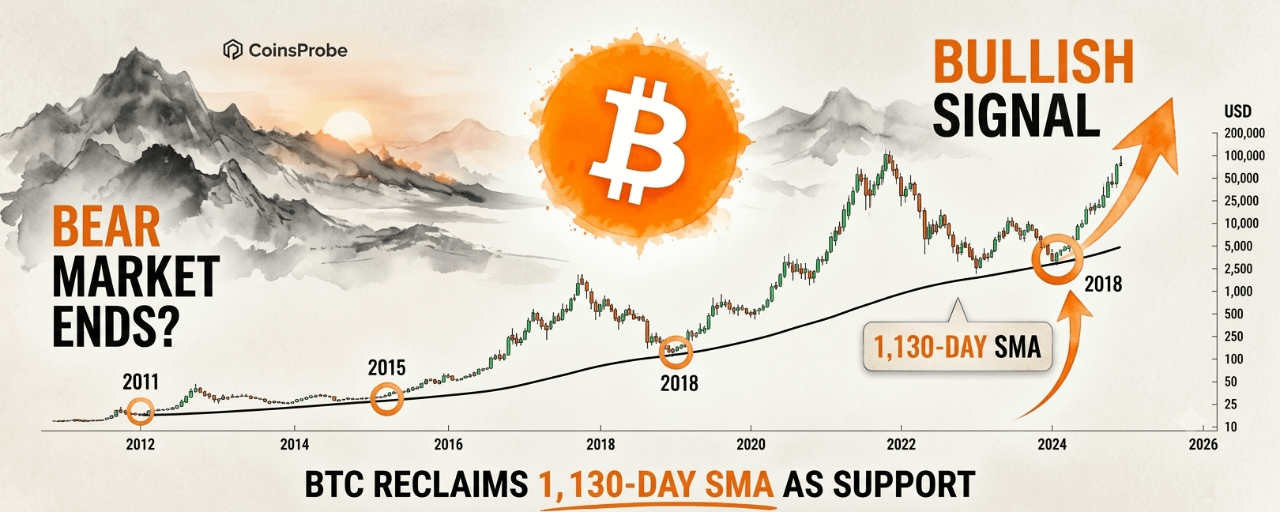
Article
Bitcoin Reclaims the 1,130-Day SMA — A Signal That Has Ended Every Bear MarketKey Highlights
BTC is trading at $80,697 — up 4.65% in 24 hours and 25.82% over 7 days — with a market cap of approximately $1.61 trillion after surging from ~$62,700 to nearly $80,000 in a single week.On August 20, 2026, Bitcoin reclaimed its 1,130-day Simple Moving Average after spending 80 days below it following the June 1 breakdown — a historically definitive long-term bullish signal.Across four consecutive market cycles, the reclaim of this moving average has marked the end of the bear market and the beginning of a new bull phase — without exception.
Bitcoin has just printed one of the most historically significant technical signals in its cycle history. On August 20, 2026 — after 80 days of trading below the level — Bitcoin reclaimed its 1,130-day Simple Moving Average as support, breaking above $74,000 to initiate the reclaim before extending to the current $80,697. According to analyst Ali Charts (@alicharts), this specific moving average has preceded the beginning of a new Bitcoin bull market in every one of the past four cycles — without a single exception.
The reclaim is not occurring in isolation. It is arriving on the back of a weekly surge from approximately $62,700 to nearly $80,000 — one of Bitcoin’s strongest 7-day performances in recent years — accompanied by $2.74 billion in short liquidations on August 19, a White House crypto summit where President Trump declared “the war on crypto is over,” and a macro environment that shifted materially with the U.S. Treasury doubling long-end bond buybacks.
Bitcoin (BTC) Price on 25 Aug 2026 | Source: Coinmarketcap
The 1,130-Day SMA — What It Is and Why It Matters
The 1,130-day Simple Moving Average is not a standard technical indicator used in everyday trading analysis. It is a long-cycle tool — averaging Bitcoin’s price across more than three years of daily closes — that filters out short-term noise and reflects the macro-level momentum of Bitcoin’s multi-year price structure.
Because it averages such a long period, the 1,130-day SMA moves slowly and deliberately. Price crossing above or below it is not a routine technical event — it reflects a sustained and significant directional shift in Bitcoin’s long-term trend. This is precisely what makes the indicator historically meaningful rather than arbitrary.
Bitcoin BTC Daily Chart | Source: @alicharts (X)
The Four-Cycle Track Record
Analyst Ali Charts (@alicharts) identified that across Bitcoin’s past four market cycles, the reclaim of the 1,130-day SMA has consistently marked the transition from bear market to bull market — each time:
Cycle1,130-Day SMA ReclaimWhat FollowedCycle 1After 2015 bear market low2016–2017 bull run → ATH $20,000Cycle 2After 2018–2019 bear market2020–2021 bull run → ATH $69,000Cycle 3After 2022 bear market low2023–2025 recovery → ATH $146,000+Cycle 4August 20, 2026Pending — current
In each prior instance, the reclaim of the 1,130-day SMA did not guarantee an immediate continuation higher — but it did mark the macro structural transition point from a market that was in long-term decline to one that was establishing a new bullish trend. The medium and longer-term outcomes in each case were significantly positive for investors who recognized the signal at the time it occurred.
The 80-Day Below — What the Breakdown and Reclaim Mean Together
Understanding the current reclaim requires understanding what happened before it.
The June 1 Breakdown
On June 1, 2026, Bitcoin lost the 1,130-day SMA — closing below the moving average for the first time since the prior cycle’s recovery phase. This breakdown triggered a deterioration in Bitcoin’s long-term technical structure and accompanied the deeply oversold conditions that characterized Bitcoin’s price action through June, July, and into August 2026.
The 80-day period below the 1,130-day SMA was not simply a price correction — it was a sustained bear phase by the definition this specific moving average provides. As documented across our August 2026 analysis series — including the Bitcoin ADCI accumulation zone at 21.74, LTH MVRV approaching historic lows, and Bitcoin’s Sharpe Ratio hitting -0.99 — the on-chain and macro evidence throughout this period was building the case that Bitcoin was in the later stages of a corrective cycle rather than the beginning of an extended decline.
The 80 days below the 1,130-day SMA was the bear market phase that the on-chain data was identifying as structurally limited — and the August 20 reclaim is the technical confirmation that the phase has ended.
The August 20 Reclaim
The reclaim of the 1,130-day SMA on August 20, 2026 required Bitcoin breaking above $74,000 — the approximate level at which the moving average was sitting when the reclaim occurred. The subsequent extension to $80,697 confirms that the reclaim was not a fleeting intraday breach but a sustained move that has maintained price above the moving average across multiple sessions.
In the four prior cycle instances, a sustained reclaim — price closing above the 1,130-day SMA for multiple consecutive sessions — was the specific condition that activated the historical signal. The current structure is tracking that pattern.
The Weekly Move — Context for the Reclaim
The 1,130-day SMA reclaim did not happen in a vacuum. It was the technical byproduct of one of Bitcoin’s strongest single-week performances in recent history:
Starting level: ~$62,700 (Bitcoin’s position heading into the August 19 catalyst week)
Current level: ~$80,697
Weekly gain: +25.82% — approximately $18,000 in absolute price terms in 7 days
This weekly move was driven by the convergence of catalysts covered in our August 19 $2.99 billion liquidation and Trump White House analysis and Bitcoin $68,500 surge and Treasury buyback breakdown:
U.S. Treasury doubling long-end bond buybacks ($2B → $4B+)President Trump declaring “the war on crypto is over” at the White House$2.74 billion in short liquidations — 8th largest in crypto history$487 million in two-day Bitcoin ETF inflowsImproving SEC regulatory framework
The scale of the weekly move — from $62,700 to $80,697 — is what carried Bitcoin through the 1,130-day SMA level and produced the multi-session sustained reclaim that activates the historical signal.
What the Signal Does and Doesn’t Say
Precision in interpreting the 1,130-day SMA reclaim is important — the historical track record is compelling, but it requires accurate framing:
What it says: The macro technical structure has transitioned from bearish to constructive. In every prior cycle, the sustained reclaim of this moving average has marked the structural end of the bear phase and the beginning of a sustained recovery period. The signal has a four-for-four historical success rate in identifying this transition.
What it doesn’t say: It does not specify the speed or path of the recovery that follows. Prior cycle recoveries that followed the 1,130-day SMA reclaim took different amounts of time and had different volatility profiles before delivering their full upside. Short-term corrections and retests of the moving average are possible — and historically have occurred — after the initial reclaim.
What to watch for continuation: A sustained series of weekly closes above the 1,130-day SMA — with price not dipping back below the moving average on a sustained basis — would confirm the reclaim is holding. A weekly close decisively back below the moving average would weaken the signal and require re-evaluation.
As covered in our Bitcoin spot demand flashing bullish reversal with 87% win rate analysis and Bitcoin records highest demand of 2026 alongside 12-month RSI reset, the on-chain demand and momentum framework that was building through August has now found its technical cycle confirmation in the 1,130-day SMA reclaim.
Bottom Line
Bitcoin’s reclaim of the 1,130-day Simple Moving Average on August 20, 2026 — after 80 days below following the June 1 breakdown — is the most historically grounded long-term technical signal Bitcoin has produced in the current cycle. A four-for-four track record of marking the transition from bear market to bull market across every prior cycle is not a coincidence or a cherry-picked pattern — it is the most specific and consistently validated macro technical signal in Bitcoin’s analytical toolkit.
The signal is now confirmed. $80,697 is where Bitcoin stands after the reclaim. The question the market will be answering over the coming weeks is not whether the bear market has ended — the 1,130-day SMA reclaim has historically answered that — but how the new bull phase unfolds in terms of pace, volatility, and magnitude relative to prior cycles.
Disclaimer: The views and analysis presented in this article are for informational purposes only and reflect the author’s perspective, not financial advice. Technical patterns and indicators discussed are subject to market volatility and may or may not yield the anticipated results. Investors are advised to exercise caution, conduct independent research, and make decisions aligned with their individual risk tolerance.
Bitcoin Reclaims the 1,130-Day SMA — A Signal That Has Ended Every Bear Market
Key Highlights
BTC is trading at $80,697 — up 4.65% in 24 hours and 25.82% over 7 days — with a market cap of approximately $1.61 trillion after surging from ~$62,700 to nearly $80,000 in a single week.On August 20, 2026, Bitcoin reclaimed its 1,130-day Simple Moving Average after spending 80 days below it following the June 1 breakdown — a historically definitive long-term bullish signal.Across four consecutive market cycles, the reclaim of this moving average has marked the end of the bear market and the beginning of a new bull phase — without exception.
Bitcoin has just printed one of the most historically significant technical signals in its cycle history. On August 20, 2026 — after 80 days of trading below the level — Bitcoin reclaimed its 1,130-day Simple Moving Average as support, breaking above $74,000 to initiate the reclaim before extending to the current $80,697. According to analyst Ali Charts (@alicharts), this specific moving average has preceded the beginning of a new Bitcoin bull market in every one of the past four cycles — without a single exception.
The reclaim is not occurring in isolation. It is arriving on the back of a weekly surge from approximately $62,700 to nearly $80,000 — one of Bitcoin’s strongest 7-day performances in recent years — accompanied by $2.74 billion in short liquidations on August 19, a White House crypto summit where President Trump declared “the war on crypto is over,” and a macro environment that shifted materially with the U.S. Treasury doubling long-end bond buybacks.
Bitcoin (BTC) Price on 25 Aug 2026 | Source: Coinmarketcap
The 1,130-Day SMA — What It Is and Why It Matters
The 1,130-day Simple Moving Average is not a standard technical indicator used in everyday trading analysis. It is a long-cycle tool — averaging Bitcoin’s price across more than three years of daily closes — that filters out short-term noise and reflects the macro-level momentum of Bitcoin’s multi-year price structure.
Because it averages such a long period, the 1,130-day SMA moves slowly and deliberately. Price crossing above or below it is not a routine technical event — it reflects a sustained and significant directional shift in Bitcoin’s long-term trend. This is precisely what makes the indicator historically meaningful rather than arbitrary.
Bitcoin BTC Daily Chart | Source: @alicharts (X)
The Four-Cycle Track Record
Analyst Ali Charts (@alicharts) identified that across Bitcoin’s past four market cycles, the reclaim of the 1,130-day SMA has consistently marked the transition from bear market to bull market — each time:
Cycle1,130-Day SMA ReclaimWhat FollowedCycle 1After 2015 bear market low2016–2017 bull run → ATH $20,000Cycle 2After 2018–2019 bear market2020–2021 bull run → ATH $69,000Cycle 3After 2022 bear market low2023–2025 recovery → ATH $146,000+Cycle 4August 20, 2026Pending — current
In each prior instance, the reclaim of the 1,130-day SMA did not guarantee an immediate continuation higher — but it did mark the macro structural transition point from a market that was in long-term decline to one that was establishing a new bullish trend. The medium and longer-term outcomes in each case were significantly positive for investors who recognized the signal at the time it occurred.
The 80-Day Below — What the Breakdown and Reclaim Mean Together
Understanding the current reclaim requires understanding what happened before it.
The June 1 Breakdown
On June 1, 2026, Bitcoin lost the 1,130-day SMA — closing below the moving average for the first time since the prior cycle’s recovery phase. This breakdown triggered a deterioration in Bitcoin’s long-term technical structure and accompanied the deeply oversold conditions that characterized Bitcoin’s price action through June, July, and into August 2026.
The 80-day period below the 1,130-day SMA was not simply a price correction — it was a sustained bear phase by the definition this specific moving average provides. As documented across our August 2026 analysis series — including the Bitcoin ADCI accumulation zone at 21.74, LTH MVRV approaching historic lows, and Bitcoin’s Sharpe Ratio hitting -0.99 — the on-chain and macro evidence throughout this period was building the case that Bitcoin was in the later stages of a corrective cycle rather than the beginning of an extended decline.
The 80 days below the 1,130-day SMA was the bear market phase that the on-chain data was identifying as structurally limited — and the August 20 reclaim is the technical confirmation that the phase has ended.
The August 20 Reclaim
The reclaim of the 1,130-day SMA on August 20, 2026 required Bitcoin breaking above $74,000 — the approximate level at which the moving average was sitting when the reclaim occurred. The subsequent extension to $80,697 confirms that the reclaim was not a fleeting intraday breach but a sustained move that has maintained price above the moving average across multiple sessions.
In the four prior cycle instances, a sustained reclaim — price closing above the 1,130-day SMA for multiple consecutive sessions — was the specific condition that activated the historical signal. The current structure is tracking that pattern.
The Weekly Move — Context for the Reclaim
The 1,130-day SMA reclaim did not happen in a vacuum. It was the technical byproduct of one of Bitcoin’s strongest single-week performances in recent history:
Starting level: ~$62,700 (Bitcoin’s position heading into the August 19 catalyst week)
Current level: ~$80,697
Weekly gain: +25.82% — approximately $18,000 in absolute price terms in 7 days
This weekly move was driven by the convergence of catalysts covered in our August 19 $2.99 billion liquidation and Trump White House analysis and Bitcoin $68,500 surge and Treasury buyback breakdown:
U.S. Treasury doubling long-end bond buybacks ($2B → $4B+)President Trump declaring “the war on crypto is over” at the White House$2.74 billion in short liquidations — 8th largest in crypto history$487 million in two-day Bitcoin ETF inflowsImproving SEC regulatory framework
The scale of the weekly move — from $62,700 to $80,697 — is what carried Bitcoin through the 1,130-day SMA level and produced the multi-session sustained reclaim that activates the historical signal.
What the Signal Does and Doesn’t Say
Precision in interpreting the 1,130-day SMA reclaim is important — the historical track record is compelling, but it requires accurate framing:
What it says: The macro technical structure has transitioned from bearish to constructive. In every prior cycle, the sustained reclaim of this moving average has marked the structural end of the bear phase and the beginning of a sustained recovery period. The signal has a four-for-four historical success rate in identifying this transition.
What it doesn’t say: It does not specify the speed or path of the recovery that follows. Prior cycle recoveries that followed the 1,130-day SMA reclaim took different amounts of time and had different volatility profiles before delivering their full upside. Short-term corrections and retests of the moving average are possible — and historically have occurred — after the initial reclaim.
What to watch for continuation: A sustained series of weekly closes above the 1,130-day SMA — with price not dipping back below the moving average on a sustained basis — would confirm the reclaim is holding. A weekly close decisively back below the moving average would weaken the signal and require re-evaluation.
As covered in our Bitcoin spot demand flashing bullish reversal with 87% win rate analysis and Bitcoin records highest demand of 2026 alongside 12-month RSI reset, the on-chain demand and momentum framework that was building through August has now found its technical cycle confirmation in the 1,130-day SMA reclaim.
Bottom Line
Bitcoin’s reclaim of the 1,130-day Simple Moving Average on August 20, 2026 — after 80 days below following the June 1 breakdown — is the most historically grounded long-term technical signal Bitcoin has produced in the current cycle. A four-for-four track record of marking the transition from bear market to bull market across every prior cycle is not a coincidence or a cherry-picked pattern — it is the most specific and consistently validated macro technical signal in Bitcoin’s analytical toolkit.
The signal is now confirmed. $80,697 is where Bitcoin stands after the reclaim. The question the market will be answering over the coming weeks is not whether the bear market has ended — the 1,130-day SMA reclaim has historically answered that — but how the new bull phase unfolds in terms of pace, volatility, and magnitude relative to prior cycles.
Disclaimer: The views and analysis presented in this article are for informational purposes only and reflect the author’s perspective, not financial advice. Technical patterns and indicators discussed are subject to market volatility and may or may not yield the anticipated results. Investors are advised to exercise caution, conduct independent research, and make decisions aligned with their individual risk tolerance.
BTC is trading at $80,697 — up 4.65% in 24 hours and 25.82% over 7 days — with a market cap of approximately $1.61 trillion after surging from ~$62,700 to nearly $80,000 in a single week.On August 20, 2026, Bitcoin reclaimed its 1,130-day Simple Moving Average after spending 80 days below it following the June 1 breakdown — a historically definitive long-term bullish signal.Across four consecutive market cycles, the reclaim of this moving average has marked the end of the bear market and the beginning of a new bull phase — without exception.
Bitcoin has just printed one of the most historically significant technical signals in its cycle history. On August 20, 2026 — after 80 days of trading below the level — Bitcoin reclaimed its 1,130-day Simple Moving Average as support, breaking above $74,000 to initiate the reclaim before extending to the current $80,697. According to analyst Ali Charts (@alicharts), this specific moving average has preceded the beginning of a new Bitcoin bull market in every one of the past four cycles — without a single exception.
The reclaim is not occurring in isolation. It is arriving on the back of a weekly surge from approximately $62,700 to nearly $80,000 — one of Bitcoin’s strongest 7-day performances in recent years — accompanied by $2.74 billion in short liquidations on August 19, a White House crypto summit where President Trump declared “the war on crypto is over,” and a macro environment that shifted materially with the U.S. Treasury doubling long-end bond buybacks.
Bitcoin (BTC) Price on 25 Aug 2026 | Source: Coinmarketcap
The 1,130-Day SMA — What It Is and Why It Matters
The 1,130-day Simple Moving Average is not a standard technical indicator used in everyday trading analysis. It is a long-cycle tool — averaging Bitcoin’s price across more than three years of daily closes — that filters out short-term noise and reflects the macro-level momentum of Bitcoin’s multi-year price structure.
Because it averages such a long period, the 1,130-day SMA moves slowly and deliberately. Price crossing above or below it is not a routine technical event — it reflects a sustained and significant directional shift in Bitcoin’s long-term trend. This is precisely what makes the indicator historically meaningful rather than arbitrary.
Bitcoin BTC Daily Chart | Source: @alicharts (X)
The Four-Cycle Track Record
Analyst Ali Charts (@alicharts) identified that across Bitcoin’s past four market cycles, the reclaim of the 1,130-day SMA has consistently marked the transition from bear market to bull market — each time:
Cycle1,130-Day SMA ReclaimWhat FollowedCycle 1After 2015 bear market low2016–2017 bull run → ATH $20,000Cycle 2After 2018–2019 bear market2020–2021 bull run → ATH $69,000Cycle 3After 2022 bear market low2023–2025 recovery → ATH $146,000+Cycle 4August 20, 2026Pending — current
In each prior instance, the reclaim of the 1,130-day SMA did not guarantee an immediate continuation higher — but it did mark the macro structural transition point from a market that was in long-term decline to one that was establishing a new bullish trend. The medium and longer-term outcomes in each case were significantly positive for investors who recognized the signal at the time it occurred.
The 80-Day Below — What the Breakdown and Reclaim Mean Together
Understanding the current reclaim requires understanding what happened before it.
The June 1 Breakdown
On June 1, 2026, Bitcoin lost the 1,130-day SMA — closing below the moving average for the first time since the prior cycle’s recovery phase. This breakdown triggered a deterioration in Bitcoin’s long-term technical structure and accompanied the deeply oversold conditions that characterized Bitcoin’s price action through June, July, and into August 2026.
The 80-day period below the 1,130-day SMA was not simply a price correction — it was a sustained bear phase by the definition this specific moving average provides. As documented across our August 2026 analysis series — including the Bitcoin ADCI accumulation zone at 21.74, LTH MVRV approaching historic lows, and Bitcoin’s Sharpe Ratio hitting -0.99 — the on-chain and macro evidence throughout this period was building the case that Bitcoin was in the later stages of a corrective cycle rather than the beginning of an extended decline.
The 80 days below the 1,130-day SMA was the bear market phase that the on-chain data was identifying as structurally limited — and the August 20 reclaim is the technical confirmation that the phase has ended.
The August 20 Reclaim
The reclaim of the 1,130-day SMA on August 20, 2026 required Bitcoin breaking above $74,000 — the approximate level at which the moving average was sitting when the reclaim occurred. The subsequent extension to $80,697 confirms that the reclaim was not a fleeting intraday breach but a sustained move that has maintained price above the moving average across multiple sessions.
In the four prior cycle instances, a sustained reclaim — price closing above the 1,130-day SMA for multiple consecutive sessions — was the specific condition that activated the historical signal. The current structure is tracking that pattern.
The Weekly Move — Context for the Reclaim
The 1,130-day SMA reclaim did not happen in a vacuum. It was the technical byproduct of one of Bitcoin’s strongest single-week performances in recent history:
Starting level: ~$62,700 (Bitcoin’s position heading into the August 19 catalyst week)
Current level: ~$80,697
Weekly gain: +25.82% — approximately $18,000 in absolute price terms in 7 days
This weekly move was driven by the convergence of catalysts covered in our August 19 $2.99 billion liquidation and Trump White House analysis and Bitcoin $68,500 surge and Treasury buyback breakdown:
U.S. Treasury doubling long-end bond buybacks ($2B → $4B+)President Trump declaring “the war on crypto is over” at the White House$2.74 billion in short liquidations — 8th largest in crypto history$487 million in two-day Bitcoin ETF inflowsImproving SEC regulatory framework
The scale of the weekly move — from $62,700 to $80,697 — is what carried Bitcoin through the 1,130-day SMA level and produced the multi-session sustained reclaim that activates the historical signal.
What the Signal Does and Doesn’t Say
Precision in interpreting the 1,130-day SMA reclaim is important — the historical track record is compelling, but it requires accurate framing:
What it says: The macro technical structure has transitioned from bearish to constructive. In every prior cycle, the sustained reclaim of this moving average has marked the structural end of the bear phase and the beginning of a sustained recovery period. The signal has a four-for-four historical success rate in identifying this transition.
What it doesn’t say: It does not specify the speed or path of the recovery that follows. Prior cycle recoveries that followed the 1,130-day SMA reclaim took different amounts of time and had different volatility profiles before delivering their full upside. Short-term corrections and retests of the moving average are possible — and historically have occurred — after the initial reclaim.
What to watch for continuation: A sustained series of weekly closes above the 1,130-day SMA — with price not dipping back below the moving average on a sustained basis — would confirm the reclaim is holding. A weekly close decisively back below the moving average would weaken the signal and require re-evaluation.
As covered in our Bitcoin spot demand flashing bullish reversal with 87% win rate analysis and Bitcoin records highest demand of 2026 alongside 12-month RSI reset, the on-chain demand and momentum framework that was building through August has now found its technical cycle confirmation in the 1,130-day SMA reclaim.
Bottom Line
Bitcoin’s reclaim of the 1,130-day Simple Moving Average on August 20, 2026 — after 80 days below following the June 1 breakdown — is the most historically grounded long-term technical signal Bitcoin has produced in the current cycle. A four-for-four track record of marking the transition from bear market to bull market across every prior cycle is not a coincidence or a cherry-picked pattern — it is the most specific and consistently validated macro technical signal in Bitcoin’s analytical toolkit.
The signal is now confirmed. $80,697 is where Bitcoin stands after the reclaim. The question the market will be answering over the coming weeks is not whether the bear market has ended — the 1,130-day SMA reclaim has historically answered that — but how the new bull phase unfolds in terms of pace, volatility, and magnitude relative to prior cycles.
Disclaimer: The views and analysis presented in this article are for informational purposes only and reflect the author’s perspective, not financial advice. Technical patterns and indicators discussed are subject to market volatility and may or may not yield the anticipated results. Investors are advised to exercise caution, conduct independent research, and make decisions aligned with their individual risk tolerance.
178
·
--

Article
Solana RWA Ecosystem Surpasses $4B While Disinflation Vote BeginsKey Highlights
SOL is trading at $94.28 — up 1.92% in 24 hours and an impressive 24.73% over 7 days — with a market cap of approximately $54.99 billion.Solana's Real World Asset (RWA) ecosystem has crossed $4 billion in total value — a new all-time high reflecting sharp acceleration in 2026 from near-zero in early 2024.Governance proposal SGP-0002: Double Disinflation is now in active voting (Epochs 1021–1024) — targeting a reduction of approximately 18.9 million SOL in issuance over the next six years and cutting the timeline to terminal inflation in half.
Solana is delivering two simultaneous milestones that independently strengthen its long-term narrative — and their convergence in the same week is not a coincidence. A network that is attracting institutional capital through real-world asset tokenization at record levels while its validator community votes on reducing future token supply is describing a maturation trajectory that few blockchain ecosystems have managed to execute at comparable speed.
At the time of writing, SOL is trading at $94.28 with a market capitalization of approximately $54.99 billion — up 1.92% in 24 hours and 24.73% over the past 7 days — reflecting the broader crypto market recovery that has been building since August 19.
Solana RWA Ecosystem Crosses $4 Billion — A New All-Time High
Official Solana accounts confirmed this week that the network’s Real World Asset (RWA) ecosystem has surpassed $4 billion in total value — a new all-time high that reflects one of the most rapid institutional adoption curves any blockchain has produced in the RWA category.
The Growth Trajectory
Data from RWA.xyz tells a story of accelerating institutional adoption that has gone from negligible to landmark in under three years:
Period RWA Value on Solana Early 2024 Near zero Through 2025 Gradual, steady growth 2026 (accelerating) Sharp expansion August 2026 $4 billion+ (All-Time High)
The curve is not linear — the 2026 acceleration phase has been dramatically steeper than the 2024–2025 growth period, reflecting a shift from early adoption by specialized RWA protocols to broader institutional deployment across multiple asset categories.
What Is Driving the $4 Billion Milestone
The Solana RWA ecosystem encompasses tokenized versions of multiple traditional financial asset classes, including:
U.S. Treasuries: Tokenized short-term and long-term U.S. government debt — one of the fastest-growing categories in the RWA space globally, driven by institutional demand for on-chain yield with traditional asset backing.
Equities: Tokenized stock exposure, including the xStocks expansion that has been bringing traditional equity access to Solana rails for global investors — as covered in our Solana ETF inflow record and 2023 bottom fractal analysis.
Private credit: On-chain lending and credit instruments that provide institutional-grade yield products accessible through blockchain infrastructure.
Other traditional financial products: The category continues to expand as more asset managers and financial institutions explore Solana’s speed, low cost, and institutional-grade infrastructure as the preferred blockchain for tokenization.
Why $4 Billion on Solana Is Significant
The milestone is not just a number — it is a signal about Solana’s competitive positioning in the institutional blockchain space. The RWA sector has multiple competing chains, but the pace of Solana’s growth from near-zero in early 2024 to $4 billion in August 2026 reflects specific advantages: sub-second finality, low transaction costs at scale, and an ecosystem of institutional-grade tooling that has been built progressively throughout 2025–2026.
As Solana’s RWA value grows, it attracts more institutional integrations, more developer resources, and more regulatory engagement — a compounding network effect that makes continued RWA growth progressively more likely rather than less.
SGP-0002: Double Disinflation — What the Governance Vote Means
In a separate but equally significant development, Solana Governance Proposal SGP-0002: Double Disinflation has entered its active voting phase — giving validators and stakers a direct voice in one of the most consequential tokenomics decisions in Solana’s history.
What the Proposal Changes
The Double Disinflation proposal targets a specific parameter in Solana’s inflation schedule: the [disinflation rate](https://github.com/solana-foundation/solana-improvement-documents/blob/main/proposals/0550-double-disinflation.md) — the annual rate at which Solana’s inflation percentage decreases each year toward its long-term terminal rate.
Parameter Current Proposed Annual Disinflation Rate -15% per year -30% per year Terminal Inflation Rate 1.5% (unchanged) 1.5% (unchanged) Timeline to Terminal Rate ~5.7 years ~2.8 years Cumulative SOL Reduction — ~18.9 million fewer SOL Cumulative Issuance Impact — ~2.6% lower
The proposal does not change Solana’s terminal inflation rate — 1.5% remains the long-term target. What it changes is how quickly the network reaches that target. By doubling the disinflation rate from -15% to -30%, the path to 1.5% annual inflation shortens from approximately 5.7 years to 2.8 years — cutting the transition timeline nearly in half.
The Supply Reduction Implications
The practical effect of accelerating to terminal inflation is a reduction in total SOL issuance between now and the point where inflation stabilizes at 1.5%. The proposal estimates approximately 18.9 million fewer SOL issued over the next six years — representing a 2.6% reduction in cumulative issuance compared to the current schedule.
For context: 18.9 million SOL at current prices (~$94.28) represents approximately $1.78 billion in supply reduction — a meaningful reduction in the inflationary pressure on existing SOL holders over the six-year horizon.
Voting Details
Detail Information Proposal SGP-0002: Double Disinflation Voting Stage Active Voting Epochs 1021–1024 Quorum Requirement 60% Who Can Vote Validators and stakers Voting Portal Official Solana governance portal
Validators and stakers should cast their votes through the official Solana governance portal before the Epoch 1024 deadline. The 60% quorum requirement means broad participation from the validator community is necessary for the vote to be valid — low turnout would prevent the proposal from passing regardless of the directional result.
Why Both Developments Matter Together
The RWA milestone and the Double Disinflation governance vote are not connected events — they are independent developments occurring in the same week. But their simultaneous appearance strengthens Solana’s narrative in complementary ways:
RWA growth → demand side: $4 billion in tokenized assets on Solana represents growing institutional demand for the network’s services. More RWA activity means more transactions, more fees, more developer engagement, and more institutional capital exposed to the Solana ecosystem. This is a demand-side strengthening of the SOL value proposition.
Double Disinflation → supply side: If SGP-0002 passes, approximately 18.9 million fewer SOL will be issued over the next six years than under the current schedule. This is a supply-side tightening — the same token that increasing institutional demand is purchasing will be issued at a faster-declining rate. Supply reduction and demand expansion occurring simultaneously is the classic setup for improved price dynamics over time.
The combination of accelerating RWA adoption (demand) and a potential disinflation acceleration (supply reduction) arriving in the same week as SOL trades up 24.73% over 7 days is one of the more complete fundamental-plus-technical convergences Solana has produced in 2026.
Bullish vs. Bearish Scenarios
Bullish Scenario
SGP-0002 passes with the required 60% quorum — accelerating Solana’s path to terminal inflation and reducing cumulative SOL issuance by 18.9 million over six years. RWA value continues growing beyond $4 billion as more institutional asset managers tokenize traditional instruments on Solana rails. SOL holds its post-rally gains above $90 and builds toward the $100+ level as the combined demand-side (RWA) and supply-side (disinflation) narratives attract institutional positioning.
Bearish Scenario
SGP-0002 fails to reach the 60% quorum threshold — either through low validator participation or directional rejection — leaving the current -15% disinflation schedule unchanged. RWA growth moderates from the current acceleration pace as broader market conditions shift. SOL gives back a portion of its 24.73% weekly gains if the broader crypto market (led by Bitcoin and Ethereum) enters a consolidation phase following the August 19 rally.
Bottom Line
Solana is executing on two parallel tracks simultaneously — institutional adoption and tokenomics governance — both delivering meaningful milestones in the same week. The $4 billion RWA all-time high confirms that institutional capital is choosing Solana as a preferred tokenization infrastructure in increasing volume. The Double Disinflation governance vote gives the community the opportunity to accelerate the path to terminal inflation — reducing cumulative SOL issuance by an estimated 18.9 million tokens over six years.
Both developments arrive as SOL trades at $94.28 — up 24.73% over 7 days — in a broader market environment that has just produced one of its strongest weekly performances of 2026. The fundamentals and the price action are pointing in the same direction. Whether the governance vote passes will be the next significant data point for the SOL narrative heading into September.
Solana RWA Ecosystem Surpasses $4B While Disinflation Vote Begins
Key Highlights
SOL is trading at $94.28 — up 1.92% in 24 hours and an impressive 24.73% over 7 days — with a market cap of approximately $54.99 billion.Solana's Real World Asset (RWA) ecosystem has crossed $4 billion in total value — a new all-time high reflecting sharp acceleration in 2026 from near-zero in early 2024.Governance proposal SGP-0002: Double Disinflation is now in active voting (Epochs 1021–1024) — targeting a reduction of approximately 18.9 million SOL in issuance over the next six years and cutting the timeline to terminal inflation in half.
Solana is delivering two simultaneous milestones that independently strengthen its long-term narrative — and their convergence in the same week is not a coincidence. A network that is attracting institutional capital through real-world asset tokenization at record levels while its validator community votes on reducing future token supply is describing a maturation trajectory that few blockchain ecosystems have managed to execute at comparable speed.
At the time of writing, SOL is trading at $94.28 with a market capitalization of approximately $54.99 billion — up 1.92% in 24 hours and 24.73% over the past 7 days — reflecting the broader crypto market recovery that has been building since August 19.
Solana RWA Ecosystem Crosses $4 Billion — A New All-Time High
Official Solana accounts confirmed this week that the network’s Real World Asset (RWA) ecosystem has surpassed $4 billion in total value — a new all-time high that reflects one of the most rapid institutional adoption curves any blockchain has produced in the RWA category.
The Growth Trajectory
Data from RWA.xyz tells a story of accelerating institutional adoption that has gone from negligible to landmark in under three years:
Period RWA Value on Solana Early 2024 Near zero Through 2025 Gradual, steady growth 2026 (accelerating) Sharp expansion August 2026 $4 billion+ (All-Time High)
The curve is not linear — the 2026 acceleration phase has been dramatically steeper than the 2024–2025 growth period, reflecting a shift from early adoption by specialized RWA protocols to broader institutional deployment across multiple asset categories.
What Is Driving the $4 Billion Milestone
The Solana RWA ecosystem encompasses tokenized versions of multiple traditional financial asset classes, including:
U.S. Treasuries: Tokenized short-term and long-term U.S. government debt — one of the fastest-growing categories in the RWA space globally, driven by institutional demand for on-chain yield with traditional asset backing.
Equities: Tokenized stock exposure, including the xStocks expansion that has been bringing traditional equity access to Solana rails for global investors — as covered in our Solana ETF inflow record and 2023 bottom fractal analysis.
Private credit: On-chain lending and credit instruments that provide institutional-grade yield products accessible through blockchain infrastructure.
Other traditional financial products: The category continues to expand as more asset managers and financial institutions explore Solana’s speed, low cost, and institutional-grade infrastructure as the preferred blockchain for tokenization.
Why $4 Billion on Solana Is Significant
The milestone is not just a number — it is a signal about Solana’s competitive positioning in the institutional blockchain space. The RWA sector has multiple competing chains, but the pace of Solana’s growth from near-zero in early 2024 to $4 billion in August 2026 reflects specific advantages: sub-second finality, low transaction costs at scale, and an ecosystem of institutional-grade tooling that has been built progressively throughout 2025–2026.
As Solana’s RWA value grows, it attracts more institutional integrations, more developer resources, and more regulatory engagement — a compounding network effect that makes continued RWA growth progressively more likely rather than less.
SGP-0002: Double Disinflation — What the Governance Vote Means
In a separate but equally significant development, Solana Governance Proposal SGP-0002: Double Disinflation has entered its active voting phase — giving validators and stakers a direct voice in one of the most consequential tokenomics decisions in Solana’s history.
What the Proposal Changes
The Double Disinflation proposal targets a specific parameter in Solana’s inflation schedule: the disinflation rate — the annual rate at which Solana’s inflation percentage decreases each year toward its long-term terminal rate.
Parameter Current Proposed Annual Disinflation Rate -15% per year -30% per year Terminal Inflation Rate 1.5% (unchanged) 1.5% (unchanged) Timeline to Terminal Rate ~5.7 years ~2.8 years Cumulative SOL Reduction — ~18.9 million fewer SOL Cumulative Issuance Impact — ~2.6% lower
The proposal does not change Solana’s terminal inflation rate — 1.5% remains the long-term target. What it changes is how quickly the network reaches that target. By doubling the disinflation rate from -15% to -30%, the path to 1.5% annual inflation shortens from approximately 5.7 years to 2.8 years — cutting the transition timeline nearly in half.
The Supply Reduction Implications
The practical effect of accelerating to terminal inflation is a reduction in total SOL issuance between now and the point where inflation stabilizes at 1.5%. The proposal estimates approximately 18.9 million fewer SOL issued over the next six years — representing a 2.6% reduction in cumulative issuance compared to the current schedule.
For context: 18.9 million SOL at current prices (~$94.28) represents approximately $1.78 billion in supply reduction — a meaningful reduction in the inflationary pressure on existing SOL holders over the six-year horizon.
Voting Details
Detail Information Proposal SGP-0002: Double Disinflation Voting Stage Active Voting Epochs 1021–1024 Quorum Requirement 60% Who Can Vote Validators and stakers Voting Portal Official Solana governance portal
Validators and stakers should cast their votes through the official Solana governance portal before the Epoch 1024 deadline. The 60% quorum requirement means broad participation from the validator community is necessary for the vote to be valid — low turnout would prevent the proposal from passing regardless of the directional result.
Why Both Developments Matter Together
The RWA milestone and the Double Disinflation governance vote are not connected events — they are independent developments occurring in the same week. But their simultaneous appearance strengthens Solana’s narrative in complementary ways:
RWA growth → demand side: $4 billion in tokenized assets on Solana represents growing institutional demand for the network’s services. More RWA activity means more transactions, more fees, more developer engagement, and more institutional capital exposed to the Solana ecosystem. This is a demand-side strengthening of the SOL value proposition.
Double Disinflation → supply side: If SGP-0002 passes, approximately 18.9 million fewer SOL will be issued over the next six years than under the current schedule. This is a supply-side tightening — the same token that increasing institutional demand is purchasing will be issued at a faster-declining rate. Supply reduction and demand expansion occurring simultaneously is the classic setup for improved price dynamics over time.
The combination of accelerating RWA adoption (demand) and a potential disinflation acceleration (supply reduction) arriving in the same week as SOL trades up 24.73% over 7 days is one of the more complete fundamental-plus-technical convergences Solana has produced in 2026.
Bullish vs. Bearish Scenarios
Bullish Scenario
SGP-0002 passes with the required 60% quorum — accelerating Solana’s path to terminal inflation and reducing cumulative SOL issuance by 18.9 million over six years. RWA value continues growing beyond $4 billion as more institutional asset managers tokenize traditional instruments on Solana rails. SOL holds its post-rally gains above $90 and builds toward the $100+ level as the combined demand-side (RWA) and supply-side (disinflation) narratives attract institutional positioning.
Bearish Scenario
SGP-0002 fails to reach the 60% quorum threshold — either through low validator participation or directional rejection — leaving the current -15% disinflation schedule unchanged. RWA growth moderates from the current acceleration pace as broader market conditions shift. SOL gives back a portion of its 24.73% weekly gains if the broader crypto market (led by Bitcoin and Ethereum) enters a consolidation phase following the August 19 rally.
Bottom Line
Solana is executing on two parallel tracks simultaneously — institutional adoption and tokenomics governance — both delivering meaningful milestones in the same week. The $4 billion RWA all-time high confirms that institutional capital is choosing Solana as a preferred tokenization infrastructure in increasing volume. The Double Disinflation governance vote gives the community the opportunity to accelerate the path to terminal inflation — reducing cumulative SOL issuance by an estimated 18.9 million tokens over six years.
Both developments arrive as SOL trades at $94.28 — up 24.73% over 7 days — in a broader market environment that has just produced one of its strongest weekly performances of 2026. The fundamentals and the price action are pointing in the same direction. Whether the governance vote passes will be the next significant data point for the SOL narrative heading into September.
SOL is trading at $94.28 — up 1.92% in 24 hours and an impressive 24.73% over 7 days — with a market cap of approximately $54.99 billion.Solana's Real World Asset (RWA) ecosystem has crossed $4 billion in total value — a new all-time high reflecting sharp acceleration in 2026 from near-zero in early 2024.Governance proposal SGP-0002: Double Disinflation is now in active voting (Epochs 1021–1024) — targeting a reduction of approximately 18.9 million SOL in issuance over the next six years and cutting the timeline to terminal inflation in half.
Solana is delivering two simultaneous milestones that independently strengthen its long-term narrative — and their convergence in the same week is not a coincidence. A network that is attracting institutional capital through real-world asset tokenization at record levels while its validator community votes on reducing future token supply is describing a maturation trajectory that few blockchain ecosystems have managed to execute at comparable speed.
At the time of writing, SOL is trading at $94.28 with a market capitalization of approximately $54.99 billion — up 1.92% in 24 hours and 24.73% over the past 7 days — reflecting the broader crypto market recovery that has been building since August 19.
Solana RWA Ecosystem Crosses $4 Billion — A New All-Time High
Official Solana accounts confirmed this week that the network’s Real World Asset (RWA) ecosystem has surpassed $4 billion in total value — a new all-time high that reflects one of the most rapid institutional adoption curves any blockchain has produced in the RWA category.
The Growth Trajectory
Data from RWA.xyz tells a story of accelerating institutional adoption that has gone from negligible to landmark in under three years:
Period RWA Value on Solana Early 2024 Near zero Through 2025 Gradual, steady growth 2026 (accelerating) Sharp expansion August 2026 $4 billion+ (All-Time High)
The curve is not linear — the 2026 acceleration phase has been dramatically steeper than the 2024–2025 growth period, reflecting a shift from early adoption by specialized RWA protocols to broader institutional deployment across multiple asset categories.
What Is Driving the $4 Billion Milestone
The Solana RWA ecosystem encompasses tokenized versions of multiple traditional financial asset classes, including:
U.S. Treasuries: Tokenized short-term and long-term U.S. government debt — one of the fastest-growing categories in the RWA space globally, driven by institutional demand for on-chain yield with traditional asset backing.
Equities: Tokenized stock exposure, including the xStocks expansion that has been bringing traditional equity access to Solana rails for global investors — as covered in our Solana ETF inflow record and 2023 bottom fractal analysis.
Private credit: On-chain lending and credit instruments that provide institutional-grade yield products accessible through blockchain infrastructure.
Other traditional financial products: The category continues to expand as more asset managers and financial institutions explore Solana’s speed, low cost, and institutional-grade infrastructure as the preferred blockchain for tokenization.
Why $4 Billion on Solana Is Significant
The milestone is not just a number — it is a signal about Solana’s competitive positioning in the institutional blockchain space. The RWA sector has multiple competing chains, but the pace of Solana’s growth from near-zero in early 2024 to $4 billion in August 2026 reflects specific advantages: sub-second finality, low transaction costs at scale, and an ecosystem of institutional-grade tooling that has been built progressively throughout 2025–2026.
As Solana’s RWA value grows, it attracts more institutional integrations, more developer resources, and more regulatory engagement — a compounding network effect that makes continued RWA growth progressively more likely rather than less.
SGP-0002: Double Disinflation — What the Governance Vote Means
In a separate but equally significant development, Solana Governance Proposal SGP-0002: Double Disinflation has entered its active voting phase — giving validators and stakers a direct voice in one of the most consequential tokenomics decisions in Solana’s history.
What the Proposal Changes
The Double Disinflation proposal targets a specific parameter in Solana’s inflation schedule: the disinflation rate — the annual rate at which Solana’s inflation percentage decreases each year toward its long-term terminal rate.
Parameter Current Proposed Annual Disinflation Rate -15% per year -30% per year Terminal Inflation Rate 1.5% (unchanged) 1.5% (unchanged) Timeline to Terminal Rate ~5.7 years ~2.8 years Cumulative SOL Reduction — ~18.9 million fewer SOL Cumulative Issuance Impact — ~2.6% lower
The proposal does not change Solana’s terminal inflation rate — 1.5% remains the long-term target. What it changes is how quickly the network reaches that target. By doubling the disinflation rate from -15% to -30%, the path to 1.5% annual inflation shortens from approximately 5.7 years to 2.8 years — cutting the transition timeline nearly in half.
The Supply Reduction Implications
The practical effect of accelerating to terminal inflation is a reduction in total SOL issuance between now and the point where inflation stabilizes at 1.5%. The proposal estimates approximately 18.9 million fewer SOL issued over the next six years — representing a 2.6% reduction in cumulative issuance compared to the current schedule.
For context: 18.9 million SOL at current prices (~$94.28) represents approximately $1.78 billion in supply reduction — a meaningful reduction in the inflationary pressure on existing SOL holders over the six-year horizon.
Voting Details
Detail Information Proposal SGP-0002: Double Disinflation Voting Stage Active Voting Epochs 1021–1024 Quorum Requirement 60% Who Can Vote Validators and stakers Voting Portal Official Solana governance portal
Validators and stakers should cast their votes through the official Solana governance portal before the Epoch 1024 deadline. The 60% quorum requirement means broad participation from the validator community is necessary for the vote to be valid — low turnout would prevent the proposal from passing regardless of the directional result.
Why Both Developments Matter Together
The RWA milestone and the Double Disinflation governance vote are not connected events — they are independent developments occurring in the same week. But their simultaneous appearance strengthens Solana’s narrative in complementary ways:
RWA growth → demand side: $4 billion in tokenized assets on Solana represents growing institutional demand for the network’s services. More RWA activity means more transactions, more fees, more developer engagement, and more institutional capital exposed to the Solana ecosystem. This is a demand-side strengthening of the SOL value proposition.
Double Disinflation → supply side: If SGP-0002 passes, approximately 18.9 million fewer SOL will be issued over the next six years than under the current schedule. This is a supply-side tightening — the same token that increasing institutional demand is purchasing will be issued at a faster-declining rate. Supply reduction and demand expansion occurring simultaneously is the classic setup for improved price dynamics over time.
The combination of accelerating RWA adoption (demand) and a potential disinflation acceleration (supply reduction) arriving in the same week as SOL trades up 24.73% over 7 days is one of the more complete fundamental-plus-technical convergences Solana has produced in 2026.
Bullish vs. Bearish Scenarios
Bullish Scenario
SGP-0002 passes with the required 60% quorum — accelerating Solana’s path to terminal inflation and reducing cumulative SOL issuance by 18.9 million over six years. RWA value continues growing beyond $4 billion as more institutional asset managers tokenize traditional instruments on Solana rails. SOL holds its post-rally gains above $90 and builds toward the $100+ level as the combined demand-side (RWA) and supply-side (disinflation) narratives attract institutional positioning.
Bearish Scenario
SGP-0002 fails to reach the 60% quorum threshold — either through low validator participation or directional rejection — leaving the current -15% disinflation schedule unchanged. RWA growth moderates from the current acceleration pace as broader market conditions shift. SOL gives back a portion of its 24.73% weekly gains if the broader crypto market (led by Bitcoin and Ethereum) enters a consolidation phase following the August 19 rally.
Bottom Line
Solana is executing on two parallel tracks simultaneously — institutional adoption and tokenomics governance — both delivering meaningful milestones in the same week. The $4 billion RWA all-time high confirms that institutional capital is choosing Solana as a preferred tokenization infrastructure in increasing volume. The Double Disinflation governance vote gives the community the opportunity to accelerate the path to terminal inflation — reducing cumulative SOL issuance by an estimated 18.9 million tokens over six years.
Both developments arrive as SOL trades at $94.28 — up 24.73% over 7 days — in a broader market environment that has just produced one of its strongest weekly performances of 2026. The fundamentals and the price action are pointing in the same direction. Whether the governance vote passes will be the next significant data point for the SOL narrative heading into September.
1
163
Log in to explore more content
Join global crypto users on Binance Square
⚡️ Get latest and useful information about crypto.
💬 Trusted by the world’s largest crypto exchange.
👍 Discover real insights from verified creators.
Email / Phone number
Trending Topics
USTreasuryToBuyBackUpTo$6BLongDatedDebt
5,945 views
111 Discussing
The U.S. Treasury just said it will buy back up to $6 billion of long-dated bonds this week.
Yields climbed anyway. The 10-year hit 4.845%, its highest since late 2023. The two-year also jumped. Markets clearly shrugged off the move.
Bitcoin slipped back near $78,500. Stocks fell. Oil stayed strong above $101.
Treasury Secretary Bessent wanted lower long-term rates. Instead, the bond market pushed yields higher and called the bluff. A buyer who always steps in can actually invite more selling.
This is the opposite of the late-August move that helped Bitcoin rally hard. Liquidity support looks weaker this time.
#USTreasuryToBuyBackUpTo$6BLongDatedDebt
$BTC $ETH $SNDK
CforCrypto7
·0 Likes
·250 views
BitcoinSurpasses$79K
44,335 views
234 Discussing
BrentCrudeTops$100
102,978 views
357 Discussing