
Introduction
Without reliable trading tools, it is impossible to conduct high-quality technical analysis. A strong trading strategy will help you avoid common mistakes, manage risk more effectively, and find and execute more trading opportunities.
For most traders, TradingView is a popular platform for chart analysis. A feature-rich HTML5 web application that offers a variety of technical analysis tools, it is used by millions of users to track movements in the forex, cryptocurrency and traditional stock markets.
TradingView offers a range of powerful features, allowing you to track assets across multiple trading platforms and share trading ideas on TradingView's own social network. In this article we will look at the options for customizing TradingView. We'll be using Pine Script, a TradingView programming language that provides granular control over chart layouts.
Let's begin!
What is Pine Script?
Pine Script is a scripting language that allows you to customize charts on TradingView. The platform already gives you a lot of functionality for this, but Pine Script allows you to expand the capabilities. Whether you want to change candle colors or test a new strategy, you can customize your real-time charts the way you want with the Pine editor.
Detailed documentation is available on the site, so you can always refer to the user manual for detailed instructions. In this article we would like to cover the basics of Pine Script and show how to create indicators that can be useful when trading cryptocurrency.
Setup
Getting started with Pine Script is very easy. All the code we write runs on TradingView servers, and we have access to a code editor and can write scripts directly in the browser - no need to download third-party applications or configure anything.
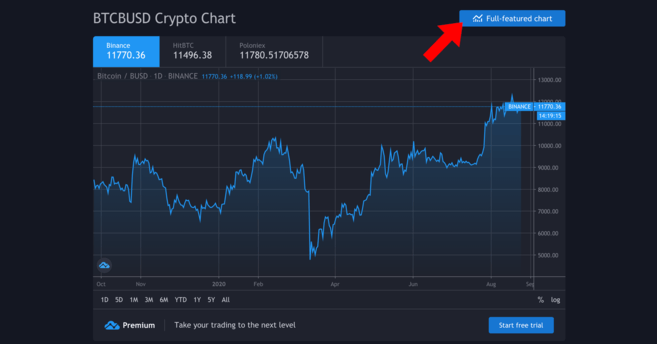
In this tutorial, we will chart the Bitcoin/Binance USD (BTCBUSD) currency pair. If you are not yet registered with TradingView, create a free account (a professional subscription is also available, but is not needed for this article).
Follow this link and you will see a graph like this:
Your schedule needs to be more up to date.
We need a detailed schedule - to go to it, click on the indicated button. We'll see more detailed charting, drawing tools, and trendline tools.
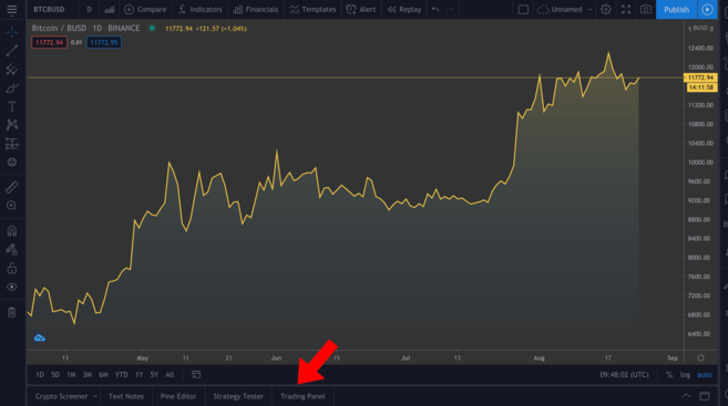
Detailed schedule. In the panel above the selected tabs you can set the desired time frames.
Now we will not discuss the use of the various tools available, but if you are serious about technical analysis, then we strongly recommend that you familiarize yourself with them. At the bottom left (highlighted in the picture) there are several tabs - click on Pine Editor.
Editor of Pine
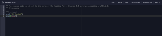
This editor is where the real magic happens. To see the result, you need to write instructions in the editor, and then click the “Add to chart” button. Please note: if you apply several custom indicators at the same time, the chart can become messy, so we will remove them between examples (right mouse button on the chart > Remove Indicators).
As you can see, we already have a couple of lines of code. Let's click the "Add to Chart" button and see what happens.
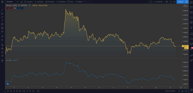
A second one appeared under the original graph. The new graph presents the same data. To delete the second graph, hover over My Script and click the cross. Now let's look at the code.
study("My Script")The first line specifies the name of the chart. This requires only the name of the indicator (in this case "My Script"), but you can also set additional parameters. One of them is overlay. It means placing the indicator on an existing chart (not in a new segment). As we can see from the first example, it is set to false by default. We won't test this now, but setting overlay=true will add the indicator to the existing chart.
plot(close)This line is an instruction for plotting the closing price of Bitcoin; plot specifies a line chart, but we can add candles and bars.
Now consider the following example:
//@version=4 study("My Script", overlay=true) plot(open, color=color.purple)By adding this line to the editor, you should see a second graph (which looks like the original one, but shifted to the right). We have plotted the opening price, and since the current day's open is the previous day's close, it is logical that the charts have the same shape.
Great! Let's delete the charts we created (remember that to do this you need to right-click on the chart and select “Delete indicators”). To clear the current chart, hover over the Bitcoin/BUSD chart and click the Hide button.
Many traders use candlestick charts because they provide more information than regular charts (like the one we just built). Now let's add candles to the chart.
//@version=4 study("My Script", overlay=true) plotcandle(open, high, low, close)It's better, but due to the lack of colors the graph is inexpressive. Ideally, we need to draw candles red if the opening price on the timeframe is greater than the closing price, and green if the closing price is greater than the opening price. Let's add a line above the plotcandle() function:
//@version=4 study("My Script", overlay=true) colors = open >= close ? color.red : color.green plotcandle(open, high, low, close)In this line we go through all the candles and check: is the opening price greater than or equal to the closing price? If so, then the price has fallen during the period and the candle will be red. Otherwise – green. To add a color scheme, modify the plotcandle() function as shown below:
//@version=4 study("My Script", overlay=true) colors = open >= close ? color.red : color.green plotcandle(open, high, low, close, color=colors)If you haven't already done so, delete the previous chart and add a new one. Now we should have a regular candlestick chart.
Wonderful!
Building moving averages (MA)
We've covered some basics. Let's move on to creating our first custom indicator, the exponential moving average, or EMA. This is a valuable indicator because it filters out market noise and smoothes out price movements.
The EMA differs from the simple moving average (SMA) in that it gives more weight to recent data. EMA reacts more actively to unexpected market movements and is often used in short-term strategies (for example, intraday trading).
Simple Moving Average (SMA)
We can plot the SMA and then compare it with the EMA. Add the following line to the script:
plot(sma(close, 10))This line will display the average for the previous 10 days. You can set different period values in brackets and see how the curve changes.
SMA for previous 10 days
Exponential Moving Average (EMA)
EMA is a little more difficult to understand, but don't worry. First let's look at the formula:
EMA = (closing price - previous day's EMA) * multiplier - previous day's EMAWhat does this formula say? For each day, we calculate a new moving average based on the previous one. The multiplier is the “weight” of the previous period, which is calculated using the following formula:
multiplier = 2 / (EMA period + 1)As in the case of a simple moving average, you need to specify the period for constructing the EMA. The syntax for the EMA function is similar to the SMA function. For clarity, let’s plot an EMA chart next to the SMA:
//@version=4 study("My Script", overlay=true) plot(sma(close, 10)) plot(ema(close,10))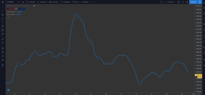
Difference between SMA and EMA
➟ Thinking about where to start working with cryptocurrencies? Buy Bitcoin on Binance!
Built-in scripts
Until now, we wrote the code manually to understand it in more detail. But let's explore a tool that will save us time, especially if we write more complex scripts and don't want to do it from scratch.
In the upper right corner of the editor, click on the “New” button. A drop-down menu will appear with various technical indicators. To see the source code of the EMA indicator, click on the “Exponential Moving Average” item.
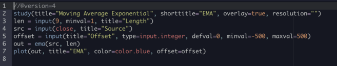
Add code to the chart
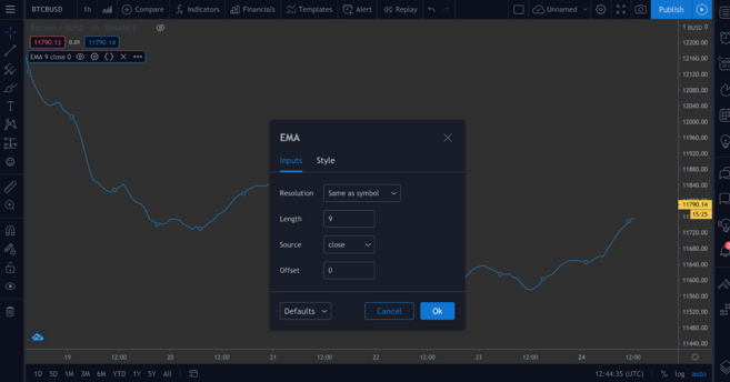
The template code will be different from what we wrote - pay attention to the input() functions. They are convenient because you can click in the upper left corner of the chart...
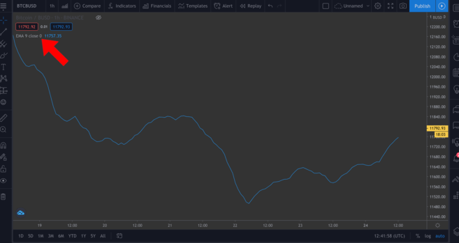
...and in the pop-up window it's easy to change some values by pressing the settings wheel.
To demonstrate this, we will add two input() functions to the following script.
Constructing the Relative Strength Index (RSI) indicator
Relative Strength Index (RSI) is another key technical analysis indicator. It is known as a momentum indicator. This means that it displays the rate at which assets are bought and sold. The RSI index, which ranges from 0 to 100, tells traders whether an asset is overbought or oversold. Generally, an asset is considered oversold if the RSI is less than or equal to 30, and overbought if the RSI is greater than or equal to 70.
You can check it yourself - go to the New menu > RSI Strategy. RSI is usually measured over periods of 14 units (i.e. 14 hours or 14 days), but you can customize this parameter to suit your own strategy.
Add it to the chart. You should see some arrows (defined in the code by the strategy.entry() function). RsiLE indicates the potential for a long position in an asset as it may be resold. RsiSE also indicates the potential to short an asset as it may be overbought. Please note: as with all indicators, you should not rely on them as a guarantee that prices will go down/up.
Testing strategies
We can test our own indicators. While performance on historical data is no guarantee of future results, testing scripts on historical data can give you an idea of how effective they are at tracking signals.
Let's take a simple script as an example. Let's create a simple strategy where we will enter a long position when the BTC price falls below $11,000 and close the position when the price exceeds $11,300. We can look at how profitable this strategy is when applied to market history.
//@version=4 strategy("ToDaMoon", overlay=true) enter = input(11000) exit = input(11300) price = close if (price <= enter) strategy.entry("BuyTheDip", strategy.long, comment="BuyTheDip") if (price >= exit) strategy.close_all(comment="SellTheNews")Here we have defined the entry and exit levels as variables - both are input, meaning we can then change them on the chart. We also created a price variable that takes the closing value for each period. The logic is presented in the form of if statements. If the part in parentheses is true, then the block with indentation below it will be run. Otherwise it will be ignored.
So, if the price is less than or equal to the desired entry value, the first expression evaluates to true and we go long. When the price equals or exceeds the desired exit value, the second block will be triggered, closing all open positions.
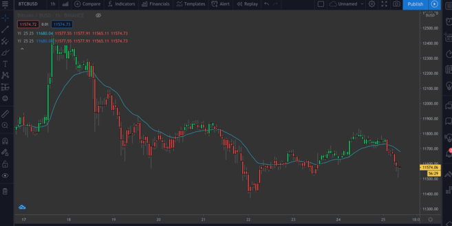
In addition, on the chart we showed with arrows the places of entry into positions and exits from them. We marked these points with a comment parameter (in this example "BuyTheDip" and "SellTheNews"). Copy the code and add it to the chart.
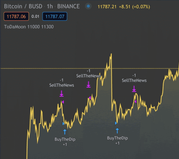
Indicators on the chart. You can zoom out
TradingView automatically applies your rules to older data. Please note that you have switched from Pine Editor to the Strategy Tester tab. Here you can analyze the potential profit, view the list of trades and the performance of each trade.
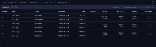
Open and closed positions
Let's sum it up
Now we can write our own script using familiar tools. We'll combine the EMA and RSI on the same chart, and then use their values to color the candles to create information that can be easily visualized.
The results of the graph do not constitute financial advice – there is no objectively correct way to use it. Like other indicators, it should be used in conjunction with other tools to develop your own strategy.
Let's write our new script. To have a clear space to work with, remove previous indicators from the chart and hide the Bitcoin/BUSD chart.
Let's start by defining our study. Name it as you wish, just making sure that overlay=true.
study(title="Binance Academy Script", overlay=true)Let's remember the EMA formula that we described above. We need to determine the multiplier for the EMA period. Let's make it a variable (input) that is an integer (that is, no decimal places). We will also set the minimum (minval) and the default value (defval).
study(title="Binance Academy Script", overlay=true) emaLength = input(title="EMA Length", type=input.integer, defval=25, minval=0)Using this new variable, we can calculate the EMA value for each candle:
study(title="Binance Academy Script", overlay=true) emaLength = input(title="EMA Length", type=input.integer, defval=25, minval=0) emaVal = ema(close, emaLength)Fine. Now let's move on to RSI. Let's set its period in a similar way:
study(title="Binance Academy Script", overlay=true) emaLength = input(title="EMA Length", type=input.integer, defval=25, minval=0) emaVal = ema(close, emaLength) rsiLength = input(title="RSI Length", type=input.integer, defval=25, minval=0)Now we can calculate it:
study(title="Binance Academy Script", overlay=true) emaLength = input(title="EMA Length", type=input.integer, defval=25, minval=0) emaVal = ema(close, emaLength) rsiLength = input(title="RSI Length", type=input.integer, defval=25, minval=0) rsiVal = rsi(close, rsiLength)At this stage, let's set the logic that colors the candles depending on the EMA and RSI values. Consider the situation when the closing price of the candle exceeds the EMA (a) and when the RSI is above 50 (b).
Why exactly these conditions? These indicators can be used together to tell you when to go long or short on Bitcoin. For example, if both conditions are met, it may mean that now is a good time to open a long position. Or, conversely, you can use this indicator to understand when not to go short, even if other indicators say otherwise.
The next line of our script will look like this:
study(title="Binance Academy Script", overlay=true) emaLength = input(title="EMA Length", type=input.integer, defval=25, minval=0) emaVal = ema(close, emaLength) rsiLength = input(title="RSI Length", type=input.integer, defval=25, minval=0) rsiVal = rsi(close, rsiLength) colors = close > emaVal and rsiVal > 50 ? color.green : color.redIf we translate the code into regular language, it turns out that if the EMA value exceeds the closing price and the RSI value exceeds 50, we color the candle green. Otherwise the color will be red.
Add EMA:
study(title="Binance Academy Script", overlay=true) emaLength = input(title="EMA Length", type=input.integer, defval=25, minval=0) emaVal = ema(close, emaLength) rsiLength = input(title="RSI Length", type=input.integer, defval=25, minval=0) rsiVal = rsi(close, rsiLength) colors = close > emaVal and rsiVal > 50 ? color.green : color.red plot(emaVal, "EMA")Finally, let's draw the candles by adding a color parameter:
study(title="Binance Academy Script", overlay=true) emaLength = input(title="EMA Length", type=input.integer, defval=25, minval=0) emaVal = ema(close, emaLength) rsiLength = input(title="RSI Length", type=input.integer, defval=25, minval=0) rsiVal = rsi(close, rsiLength) colors = close > emaVal and rsiVal > 50 ? color.green : color.red plot(emaVal, "EMA") plotcandle(open, high, low, close, color=colors)Here is our entire script! To see it in action, add it to your chart.
BTC/BUSD chart with EMA/RSI indicator.
Summary
In this article, we looked at some simple examples of using TradingView's Pine Editor. By now, if you have completed our examples, you can already build simple captions for price charts and get additional information from your own indicators.
In this article, we touched on only a couple of indicators, but you can analyze more complex ones yourself, either by selecting built-in scripts from the New list, or by writing them yourself.
Looking for inspiration? You can get ideas for your next project from the articles below:
A Quick Guide to Using a Parabolic SAR System
A Guide to Using Fibonacci Lines
Leading and lagging indicators
What is the MACD indicator