If you are a beginner trader, you have probably wondered at some point what chartism is or what chart figures are. If this is your case, keep reading! In this article, in addition to telling you what chartism is, we will show you the most common chart figures with Japanese candlestick charts so that your technical analysis can be as complete as possible.
chart figures

In this article we will teach you:
What is chartism
Trends
Supports and resistances
Chartistic figures. Trend continuation
Chartistic figures. Change of trend
Let's start!
Chartistic figures - What is chartism?
The word chartism comes from the English word 'chart' which means graph. In trading it refers to the price charts that traders use to make decisions. It is a basic tool for traders who prefer technical analysis to fundamental. If you are not sure what the difference is between one and the other, here we explain it to you:
Technical analysis is that which is based exclusively on the movement of the prices of financial assets, whether currencies, stocks, raw materials, etc.
Fundamental analysis is one that is based on external factors that can influence price movements: macroeconomic data, geopolitical tensions, unpredictable factors such as an earthquake or any natural disaster. An example would be the coronavirus pandemic, which has caused the equity markets to collapse.
Given this, we can define chartism in the following way:
The discipline that studies the price and volume of a certain asset over a period of time
That said, chartism:
Try to determine the volumes of price fluctuations
Helps choose the right time to enter and exit the market
As it does? On three premises:
The price discounts everything
Prices move in trends
History always repeats itself
Chart figures - Trends
Thanks to chart figures we can determine the direction that a trend will take. But before going into this topic in depth, let's see what a trend is.
A trend in #trading is the direction in which a certain market moves in a sustained manner over time. Prices vary continuously in a downward and upward direction, determining the trend. We can distinguish three types of trends: bullish, bearish and lateral.
We speak of an upward trend when prices register an upward movement in a certain period of time so that increasing minimums and maximums are chained. The downtrend is the same but with a downward movement. A lateral market is one that does not register a defined trend, with lateral minimums and maximums.
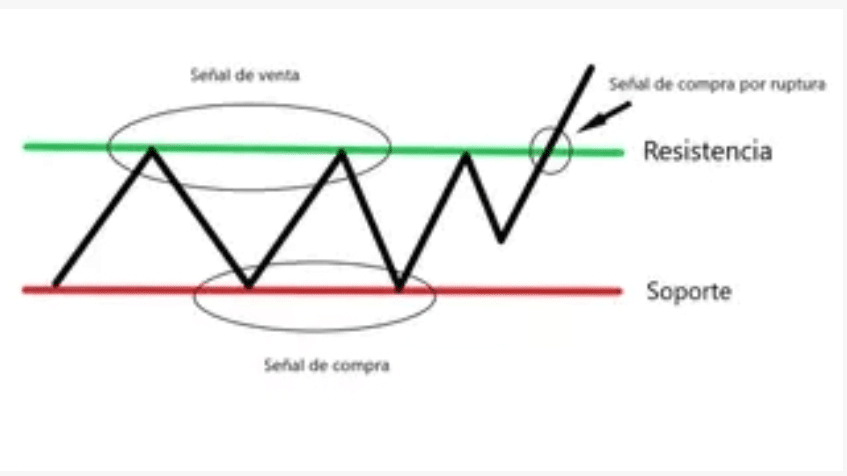
Chart figures - Supports and resistances
To better understand chartism, you must first be clear, like trends, about what supports and resistances are. When we talk about supports and resistances we refer to the levels where the price of the asset stops to continue in a direction opposite to what it was doing.
Medium. It is the lower level where the price stops to begin the rise.
Endurance. It is the upper level where the price stops rising and begins to decline.
chart figures
Depending on the times and the way the price draws when it hits a support or resistance or when it surpasses it, we will identify one chart figure or another. Of course, traders must learn to correctly identify and draw these levels in order to determine figures and trends.
Once the basic concepts have been explained, let's see which are the most used and common chart figures among traders, with an example of each of them. We will start with those figures that show us a change in trend. If you like technical analysis and use it to develop your trading plan, keep reading!
#1 Shoulder Head Shoulder
Without a doubt, you have surely read a technical analysis that talks about this chart figure, Shoulder Head Shoulder, since it is one of the most common and easiest to identify. In this case, the price forms three ceilings: a maximum in the center that simulates the head and is higher than the other two (shoulders), located on either side of the maximum. A breakout of the price after forming the right shoulder, below the neck line indicates that the price is likely to fall with an amplitude of at least that of the head.
Let's see an example on a real ADA/USDT chart
Chartist Figure - Shoulder Head Shoulder

Source: ADAUSDT Daily Chart. Data range: November 27, 2018 to April 2, 2020. Prepared on April 3, 2020. Please note that past returns do not guarantee future returns.
As we can see on the ADAUSDT chart, the price breaks support after forming a Head Shoulder Shoulder confirming a downward trend change. It may be the case that this chart figure forms in an inverted manner and would be confirmed by breaking the upward resistance behind the inverted shoulder on the right.
This is a setup that provides good trading signals, always keeping in mind that forex trading volumes are usually highest on the first shoulder and then gradually decrease on the head and then on the second shoulder.
#2 Double roof / Triple roof
We continue with the trend change figures. The double or triple top figure is characterized by having two or three consecutive highs at the same price level, separated by one or two considerable price lows. The price objective of this formation is the breadth of one of the highs. We are going to see two examples, one with a double roof and another with a triple roof.
chart figures - double top

Source: BTCUSDT Chart. Data range: March 16, 2020 to March 26, 2020. Prepared on April 3, 2020. Please note that past performance does not guarantee future returns.
chart figures - triple top

Source: SHIBABUSD Chart. Data range from February 27, 2020 to March 10, 2020. Prepared on April 3, 2020. Please note that past performance does not guarantee future returns.
#3 Double floor / Triple floor
The double or triple bottom tells us, unlike the ceiling, when it is good to close a sale. Thanks to this figure we can predict a trend change of a bearish market, the double bottom represents the same minimum that is hit twice.
During the formation of the first soil, the volumes increase and then decrease abruptly once the central peak has been created. From the moment the second channel ends, volumes increase sharply.
chart figures - double bottom triple bottom

Source: MATIC daily chart. Data range: May 16 to January 21, 2020. Prepared April 3, 2020. Please note that past performance does not guarantee future returns.
As we see in the example above, the Matic, after drawing a triple bottom, rebounds upwards and then registers a lateral period after which it marks a double bottom and, there, it rebounds strongly and maintains an upward movement that is not interrupted until mid-first quarter of 2020.
#4 Morning star
This curious chart figure name indicates a possible trend change in a bear market. It is formed by a bearish candle followed by a small indecision candle and a bullish candle that does not exceed the first one in height. This type of pattern can be applied to any periodicity, although the longer the time, the greater the reliability.
To interpret this figure we can look for some clues that confirm the change in trend, such as that it is close to a relevant support zone. Let's see it:
chartist figure - morning star

Source: LTCUSDT Chart. Data range: December 10, 2019 to December 24, 2019. Prepared on April 3, 2020. Please note that past performance does not guarantee future returns.
#5 Hammer
The hammer chart figure is formed by a small long lower tail and a square-shaped candle, thus giving the shape of a hammer. This drawing shows a beginning of the session in which sales have predominated but in the last minutes purchases prevail. It indicates a change in trend towards a bullish market, something that will be confirmed if the opening is higher in the next session. Let's see it.
chart figures - hammer

Source: DOGEBUSD Chart. Data range: March 31, 2020 to April 3, 2020. Prepared on April 4, 2020. Please note that past performance does not guarantee future returns.
Having seen the examples of chart figures that predict a trend change, let's now look at some examples of trend confirmation figures:
#6 Triangle
In the same way as the HCH figure, the trading triangle figure is a chart figure widely used by currency traders. Triangles are made up of support or resistance as well as a trend line to set a price target.
It reflects insecurity and uncertainty in the market. To form the triangle, at least two maximums and two minimums are needed, that is, four points of contact. It forms between 1 and three months and can be ascending or descending. In the example we see below, the triangle is descending.
chartist figure - triangle

Source: ETHUSDT. Data range: September 20, 2018 to January 31, 2020. Conducted April 4, 2020. Please note that past performance is not a reliable indicator of future results.
Triangles are high-performance tools, they allow you to anticipate the direction of the market price or a value in a very precise way. To confirm the trend, triangular exits take place with large volumes in case the transactions are small.
#7 Flag
Flags are figures similar to channels but of smaller duration and amplitude. We can find two types of flags, the bullish one and the bearish one (like the one in the example below).
chartist figures -flag

Source: BTC Chart. Data range: January 30, 2020 to February 5, 2020. Conducted April 4, 2020. Please note that past performance is not a reliable indicator of future results.
Both flags and pennants imply that current movements are sustainable. This figure is nothing more than a transitional balance between the forces that push to buy and the forces that push to sell.
Very similar to symmetrical triangles, flags and pennants are considered continuation figures on forex charts. They have a short lifespan and are usually formed as a result of a large sudden movement, as we see in the graph above.
#8 Rectangle
The rectangle is the most recognizable of all chart figures. Of course, the consolidation of the figure can lead to the continuation of the initial movement or, on the contrary, to a reversal of the trend.
chart figures - rectangle

Source: BNBUSDT, Chart H1. Data range: February 26, 2020 to March 6, 2020. Conducted April 4, 2020. Please note that past performance is not a reliable indicator of future results.
In a rectangle, currency prices vary within a horizontal channel that indicates equality between the forces of supply and demand. From the moment the price exceeds the resistance or support, the figure ends.
Good Trading!
This material does not contain and should not be construed as containing investment advice, investment recommendations, an offer or solicitation for any transaction in financial instruments. Please note that such trading analysis is not a reliable indicator for any current or future performance as circumstances may change over time. Before making any investment decisions, you should seek advice from independent financial advisors to ensure you understand the risks.
@Anfelia_Investmentv
Financial Content Creator at Binance
Anfelia is a Business Administration Professional specialized in finance and an expert in Blockchain Information. With more than 7 years of experience in Blockchain technology, Web3, NFts, Non-Fungible Tokens, Cryptocurrencies and the world of the Metaverse. Provides financial analysis and trading content with a didactic tone.
Risk Notice: Trading Cryptocurrencies (Cryptocurrencies) or (Derivatives) with leverage carries high risk and may not be suitable for all investors. There is a possibility that losses will be equal to or greater than your initial investment. Therefore, you should not invest or risk capital that you cannot afford to lose.
The content of this article should not be construed as personal advice. We recommend that you search on your own.