
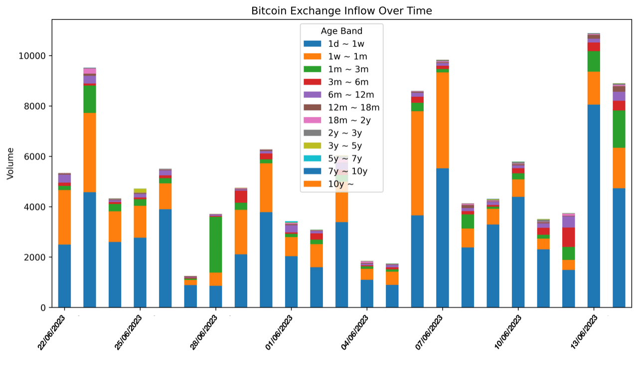
The unexpected decline in Bitcoin price from $31,800 to $29,800 has raised questions regarding the main sellers in the market. Are they long-term holders cashing out their investments, or short-term speculators seeking quick profits? Let's delve into this question and examine what the data reveals. Figure 1, a time-series chart, displays the daily inflow to exchanges by age band within the specified period. The color coding represents different age bands, each indicating the time elapsed since the last Bitcoin movement before the sale. A glance at the chart reveals that the inflow to exchanges fluctuates significantly across different age bands, and even from day to day. We observe clear spikes representing periods of intensified selling activity. The '1d ~ 1w' and '1w ~ 1m' age bands stand out, indicating that holders who last moved their Bitcoin during these periods are the predominant sellers. Another perspective is provided by Figure 2, a bar chart detailing the total inflow to exchanges by age band throughout the examined period. The color scheme aligns with Figure 1 for ease of comparison and understanding. The chart paints a clear picture - a significant portion of the sold Bitcoins comes from relatively new holders. The largest inflow originates from Bitcoins that were last moved within the 1-day to 1-week range, followed by those moved between 1 week and 1 month. We observe a steep drop in Bitcoin sales from holders who have retained their Bitcoin for extended periods, indicating that the main sellers are indeed short-term holders. Follow me on Twitter: 0nchained

Written by onchained


