

What are trend lines?
In the context of financial markets, trend lines are diagonal lines drawn on charts. They connect specific data points, making it easier to visualize price movements and identify market trends. Trendlines are considered basic technical analysis (TA) tools.
They are widely used in the stock markets, fiat currencies, derivatives and cryptocurrency markets. Essentially, trendlines function as support and resistance levels but are made with diagonals rather than horizontal lines. Therefore, they can have a positive or negative slope. Generally, the steeper the slope of the line, the stronger the trend.
We can divide trend lines into two basic categories: ascending (uptrend) and descending (downtrend). As the name suggests, an ascending trend line is drawn from a lower position to a higher position on the chart. It connects two or more low points, as illustrated in the image below.

On the other hand, a descending trend line is drawn from a higher position to a lower position on the chart. It connects two or more high points.
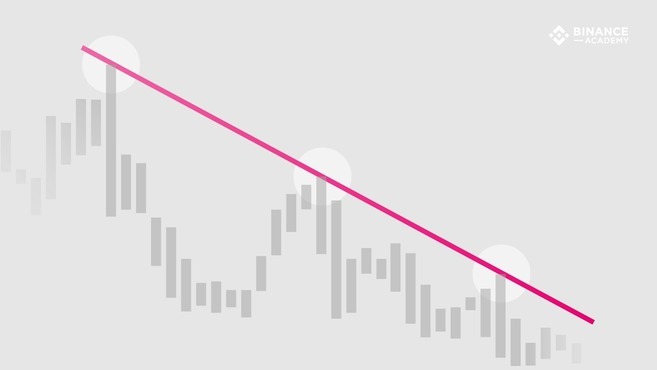
In short, the difference between the two types of lines is the selection of points used to draw them. In an ascender, the lines are drawn using the lowest points on the chart (i.e., at the points of lowest candle value). In a descender, the lines are drawn using the highest values (that is, at the points of highest candle value).
How to use trend lines
Based on highs and lows, trend lines indicate the points where price appears to challenge the prevailing trend, put it to the test, and then end up giving way in its favor. The line can be extended in an attempt to predict important levels in the future. As long as the trend line is not broken, it is considered valid.
Although trend lines can be used in all types of data charts, they are generally based on market prices. This means they can also provide information about market supply and demand. Naturally, rising trend lines indicate increasing buying strength (demand is greater than supply). Descending trend lines are associated with price declines, suggesting the opposite (supply is greater than demand).
However, the volume of transactions must also be considered in the analyses. For example, if the price increases but volume is decreasing or relatively low, this may give a false impression of increased demand.
As mentioned, trend lines are used to identify support and resistance levels, which are two basic but very important concepts of technical analysis. An ascending trendline indicates support levels with values unlikely to be surpassed by falling prices. On the other hand, the descending trend line indicates resistance levels with values unlikely to be surpassed by the price increase.
In other words, the market trend can be considered invalid when support and resistance levels are broken, either to the negative (ascending trend line) or positive (descending trend line) side. In many cases, when these key levels fail to maintain the trend, the market tends to change course.
Still, technical analysis is a subjective field and everyone may come up with a completely different method of drawing trend lines. Therefore, it may be interesting to combine several TA techniques, such as fundamental analysis, to reduce risks.
Drawing Valid Trendlines
Trendlines can technically connect any two points on a chart. However, most analysts agree that using three points or more is what makes a trendline valid. In some cases, the first two points can be used to define a potential trend and the third point (positioned in the future) can be used to test its validity.
Thus, when the price touches the trend line three or more times without exceeding it, the trend is considered valid. Testing the trend line multiple times is what indicates that the trend is not a mere coincidence caused by price fluctuations.
Scale Settings
In addition to choosing enough points to create a valid trendline, it is important to consider the proper settings when drawing them. Considering chart settings, scale settings are among the most important.
In financial charts, scale refers to the way in which price change is displayed. The two most popular scales are arithmetic and semi-logarithmic (semi-log). In an arithmetic chart, the change is expressed uniformly as the price increases or decreases on the Y-axis. Semi-log charts display changes in terms of percentage.
For example, a price change from $5 to $10 would cover the same distance on an arithmetic chart with values from $120 to $125. On a semi-log chart, however, the 100% gain ($5 to $10) would represent a much larger portion of the chart, relative to the 4% increase from $120 to $125.
It is important to consider scale settings when drawing trend lines. Each type of chart can present different high and low points and, consequently, slightly different trend lines.
Final considerations
Although they are useful tools for technical analysis, trend lines are far from foolproof. The choice of points used to draw trend lines will affect the degree to which they accurately represent actual trends. This makes them, in a way, subjective.
For example, some analysts draw trend lines based on the body of candles, disregarding shadows. Others prefer to draw lines according to the maximums and minimums of the shadows.
Therefore, it is important to use trendlines in conjunction with other tools and indicators. Some important examples of TA indicators include Ichimoku Clouds, Bollinger Bands(BB), MACD, Stochastic RSI, RSI and moving averages.