Good Morning Everyone 💫
👀 $CAP WALLET STRUCTURE DESERVES A CLOSER LOOK
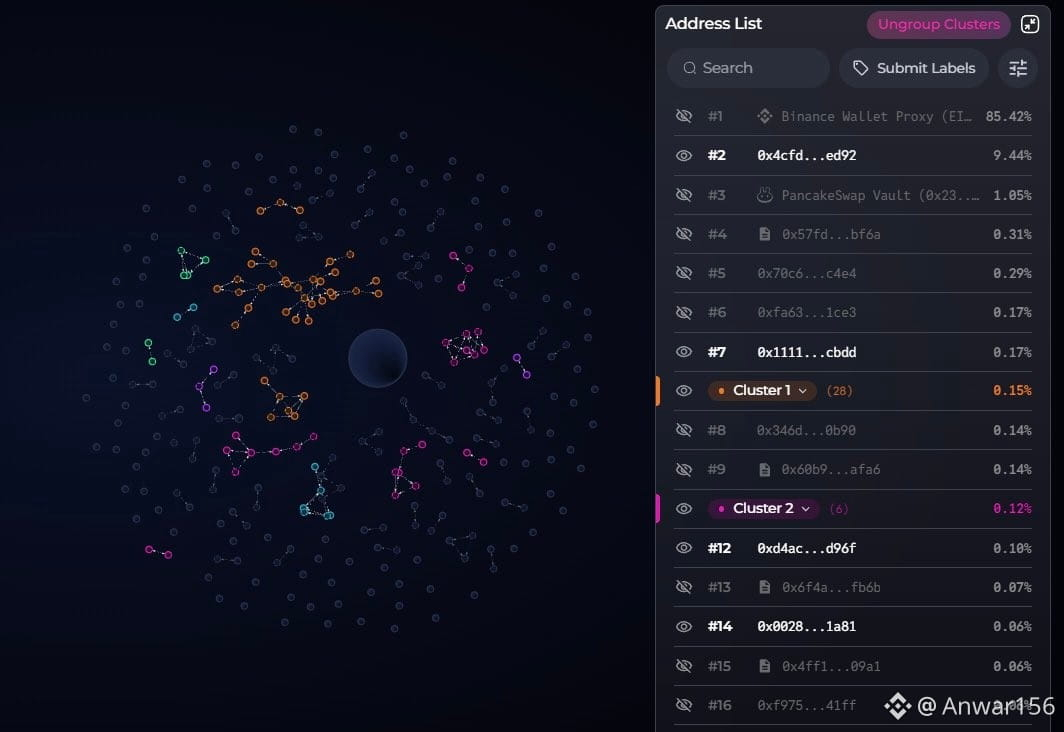
The $CAP Bubble Map is revealing an interesting concentration of supply.
🏦 Binance Wallet Proxy: 85.42%
🐋 2nd Largest Wallet: 9.44%
🥞 PancakeSwap Vault: 1.05%
That already accounts for the overwhelming majority of the supply.
But the smaller connected wallets are where things get more interesting. 👀
🟠 Cluster 1: 0.15%
🟣 Cluster 2: 0.12%
The bubble map shows multiple wallet connections and clusters outside the major holders.
The key question now is: are these smaller clusters simply organic holders, or could some of them be connected? 🕵️♂️
Definitely worth keeping an eye on the wallet flows around $CAP .
NFA. DYOR.
👀 $CAP WALLET STRUCTURE DESERVES A CLOSER LOOK
The $CAP Bubble Map is revealing an interesting concentration of supply.
🏦 Binance Wallet Proxy: 85.42%
🐋 2nd Largest Wallet: 9.44%
🥞 PancakeSwap Vault: 1.05%
That already accounts for the overwhelming majority of the supply.
But the smaller connected wallets are where things get more interesting. 👀
🟠 Cluster 1: 0.15%
🟣 Cluster 2: 0.12%
The bubble map shows multiple wallet connections and clusters outside the major holders.
The key question now is: are these smaller clusters simply organic holders, or could some of them be connected? 🕵️♂️
Definitely worth keeping an eye on the wallet flows around $CAP .
NFA. DYOR.