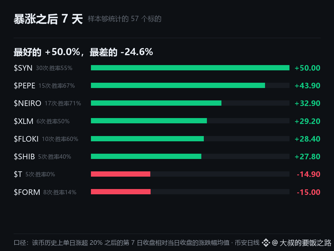
I did something that took quite a bit of time: I went through and tallied the subsequent performance of these 100 coins after their “single-day gain exceeded 20%” at some point in history. The sample is fairly decent—57 cases.
The result was a bit surprising: on day 7 after the surge, only 24 of them were still positive on average, while 33 were negative.
Best: $SYN . After 30 surges, the average after 7 days was +50.0%, with a win rate of 55%. Worst: $BABY . After 8 surges, the average after 7 days was -24.6%, with a win rate of 0%. There’s a 74 percentage-point gap between the two.
My view is that the biggest value of this analysis isn’t prediction—it’s helping you understand just how far apart the meaning of “a surge” is across different coins. For some coins, they can keep running after the spike; for others, the spike is basically just handing you their shares.
Has anyone done a similar retrospective? I’d like to ask how you use historical data like this. Not investment advice
#Historical statistics
The result was a bit surprising: on day 7 after the surge, only 24 of them were still positive on average, while 33 were negative.
Best: $SYN . After 30 surges, the average after 7 days was +50.0%, with a win rate of 55%. Worst: $BABY . After 8 surges, the average after 7 days was -24.6%, with a win rate of 0%. There’s a 74 percentage-point gap between the two.
My view is that the biggest value of this analysis isn’t prediction—it’s helping you understand just how far apart the meaning of “a surge” is across different coins. For some coins, they can keep running after the spike; for others, the spike is basically just handing you their shares.
Has anyone done a similar retrospective? I’d like to ask how you use historical data like this. Not investment advice
#Historical statistics