


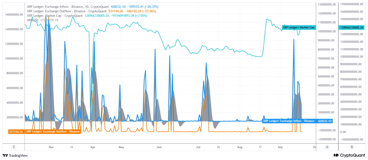
In this chart, the most notable signal may be that the difference between XRP entering Binance and XRP leaving the exchange remains negative in the latest period.
According to the latest data on the chart:
Exchange Inflow: -20.37%
Exchange Outflow: -25.96%
Net Flow: approximately -102,912 XRP
XRP Market Cap: $138.97 billion (+7.05%)
In other words, the amount of XRP leaving Binance has recently been higher than the amount of XRP entering Binance.
This indicates that a portion of the supply is moving out of exchanges in the short term. The fact that this is happening while the price is rising is particularly important. Investors may be keeping some of their XRP outside exchanges rather than sending it to exchanges to sell. Therefore, selling pressure may weaken and the potential for an upward price reaction may be supported. However, it is important to emphasize that this alone does not guarantee an upward move.
Another important point here is that not only outflows but also inflows have declined significantly. While Inflow is down 20.37%, Outflow is down 25.96%. This situation may reduce volatility.
When we evaluate these data together with Market Cap, the XRP Market Cap line has recently risen strongly from around the $103 billion region to above $150 billion. Afterward, a correction occurred, bringing the market cap back to approximately $139 billion.
With market cap still remaining at relatively high levels while net exchange flow is negative, this may indicate that the correction following the rally has not yet turned into a completely new wave of selling. This creates a supportive structure for XRP's supply dynamics in the short term.
In its current structure, this chart shows a supportive supply dynamic for XRP's short-term price action. If this structure remains intact, the potential for an upward reaction following the current correction could be further supported.
Written by PelinayPA