

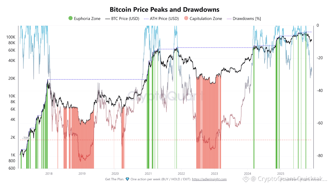
BTC history shows that price discovery rarely moves in a straight line. Major advances into euphoric territory have repeatedly been followed by sharp repricing, with deep corrections after confidence was highest. The chart puts that cycle behavior into context: the 2017 peak was followed by an extreme collapse, while 2021 also ended with a prolonged drawdown. These declines marked major shifts in market structure, liquidity, positioning.
What makes the current cycle more interesting is the scale of the drawdowns relative to new highs. Bitcoin has pushed into record territory without yet reproducing the extreme capitulation seen in earlier cycles. That does not remove downside risk. The market has so far absorbed corrections without the forced deleveraging seen during major reversals. The difference between a normal correction versus structural weakness becomes important as price remains elevated.
I would pay closer attention to what happens after each new peak than to the peak itself. If Bitcoin loses ground but quickly recovers, the market is absorbing profit-taking while maintaining demand. If recoveries become weaker while drawdowns deepen, the signal changes. A market can still look strong on a price chart while internal momentum deteriorates. Historically, the transition from shallow pullbacks to persistent drawdowns has been more revealing than any single red candle.
The macro backdrop adds another layer. Bitcoin now operates within a market shaped by global liquidity, institutional flows, financial conditions, risk appetite. Historical drawdowns are a reference, not a timetable. A 70% decline from a previous cycle cannot simply be projected onto the next one. The better question is whether demand can keep absorbing supply near record valuations. As long as drawdowns remain contained, the structure looks resilient. If downside expands materially, the market may enter a different phase.
Written by CryptoZeno