

What is a trend line?
In financial markets, trendlines are diagonals drawn on charts. These connect specific data points making it easier for traders and chartists to visualize price movements and identify market trends.
Trendlines are considered one of the basic tools of Technical Analysis (TA). These are widely used for stocks, fiat currencies, derivatives and cryptocurrencies.
Trendlines function like support and resistance levels, but take the form of diagonal lines, not horizontal lines. Thus, these can have a positive or negative slope. In general, the greater the slope of the line, the stronger the trend.
We can separate trendlines into two categories: ascending (upward trend) or descending (downward trend). As the name suggests, an uptrend line runs from a low position on the chart to a high position. This connects at least two low points, as illustrated in the image below.

Conversely, a bearish trend starts from a high position on the chart and moves towards a low position. This also connects at least two high points.
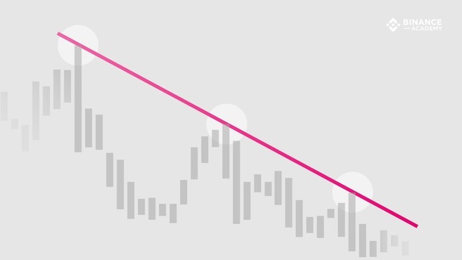
The difference between these two types of lines is therefore the selection of points used to draw them. In an uptrend, lines are drawn using the lowest points on the chart (the bottom of the candlesticks forming higher lows). On the other hand bearish trends are plotted using the highest points (the top of the candlesticks forming lower high points).
How to use trendlines
Based on the highs and lows on the chart, trendlines indicate where price challenged the current trend, tested it and then reversed. The lines can also be expanded to attempt to predict the next significant levels. The trend line can be tested several times, however, it remains valid as long as it is not broken.
While trendlines can be used in many types of data charts, they are typically applied to financial charts (based on market prices). They provide information on market supply and demand. Obviously, uptrend lines indicate an increase in buying pressure (demand is greater than supply). Downtrend lines are associated with consistent price declines, suggesting the opposite (supply is higher than demand).
However, trading volume should also be considered in these analyses. For example, if the price increases, but the volume decreases or is relatively low, this can give a false impression that demand is increasing.
As just mentioned, trendlines are used to identify support and resistance levels, two fundamental concepts in technical analysis. An uptrend line indicates support levels below which the price is unlikely to decline. In contrast, the downtrend line highlights resistance levels above which the price is unlikely to rise.
In other words, the market trend can be considered invalid when support and resistance levels are broken, either downward (for an uptrend line) or up (for a downtrend line). ). In many cases, when these key levels fail to maintain the trend, the market tends to change direction.
However, technical analysis remains subjective and each person may have a completely different method for drawing trend lines. Therefore, it is useful to combine several TA techniques, as well as fundamental analysis to reduce risks.
Drawing valid trend lines
In theory, trendlines can connect any two points on a chart. Nonetheless, most chartists agree that using three or more points is what makes a trendline valid. In some cases, the first two points can be used to define a potential trend, the third point (located in the future) can be used to test its validity.
So, when the price touches the trend zone at least three times without breaking it, it can be considered valid. Testing the trend line several times indicates that the trend may not just be a coincidence caused by price fluctuations.
Scale Settings
In addition to choosing enough points to create a valid trendline, it is important to consider the appropriate parameters when plotting them. Among the most important parameters of the chart is the scale.
In financial charts, scale refers to how the price change is displayed. The two most popular scales are arithmetic and semi-logarithmic (semi-log). On an arithmetic chart, change is expressed equally as the price moves up or down on the Y axis. In contrast, semi-log charts express changes in percentage terms.
For example, a price change of $5 to $10 would cover the same distance on an arithmetic chart as a change of $120 to $125. On a semi-logarithmic chart, however, the 100% gain (from $5 to $10) would take up a much larger portion of the chart, as opposed to the 4% increase from $120 to $125.
It is important to consider scale parameters when drawing trend lines. Each type of chart may result in different highs and lows and therefore slightly different trend lines.
To conclude
Although they are useful tools for technical analysis, trendlines are far from foolproof. The choice of points used to plot trendlines will impact how accurately they represent market cycles and actual trends, making them somewhat subjective.
For example, some chartists draw trend lines based on the body of candlesticks, ignoring wicks. Others prefer to draw lines based on the highs and lows of the strands!
It is therefore important to use trendlines in conjunction with other charting tools and indicators. Notable examples of other TA indicators include Ichimoku Clouds, Bollinger Bands (BB), MACD, Stochastic RSI, RSI, and Moving Averages.