
Contents
Introduction
What is a candlestick chart?
How do candlestick charts work?
How to read a candlestick chart?
What Candlestick Charts Don't Tell You
Chandeliers Heikin-Ashi
To conclude
Introduction
If you're new to trading or investing, reading charts can be a daunting task. Some people trust their instincts and invest by following them. Although this strategy can work in a bull market, it is not the best strategy.
Simply put, trading and investing are games of probability and risk management. It is essential to know how to read candlestick charts. This article explains what candlestick charts are and how to read them.
What is a candlestick chart?
A candlestick chart and financial chart that represents the movement of an asset for a given period of time. It is made up of candles each representing the same time interval. Candlesticks can represent seconds as well as years.
Candlestick charts date back to the 17th century. Their creation is often attributed to a Japanese rice trader named Homma. His idea was probably what formed the basis for the charts we use today. Homma's conclusions were refined by many people including Charles Dow, one of the fathers of modern technical analysis.
Although candlestick charts can be used for other types of data, they are primarily used for financial market analysis. Used correctly, they are tools that help traders assess the likelihood of price movements. These allow traders and investors to formulate their own ideas based on their analysis.
How do candlestick charts work?
To create a candle, you need:
Open — The first price of an asset over a period.
High — The highest price of an asset over a period.
Low — The lowest price of an asset over a period.
Close — The last price of an asset in a period.
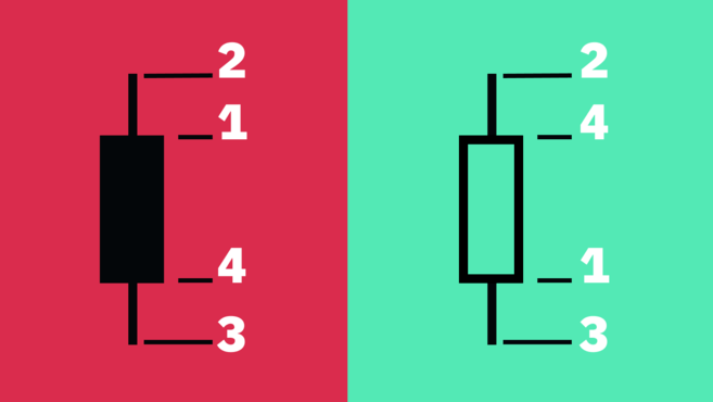
This data is called OHLC. The relationship between open, high, low and close determines the appearance of the candle.
The distance between the opening price and the closing price is the “body”, the distance between the body of the candle and the highest/lowest is the “wick” or “shadow”. The distance between the highest and lowest of the candle is its “range”.
How to read a candlestick chart?
Many traders consider candlestick charts to be easier to read than other charts (bars or lines). Candlestick charts can be read at a glance and provide a simple representation of the price.
In practice, a candle shows the battle between buyers and sellers for a certain period. In general, the longer the body, the more intense the buying or selling pressure. If the candle wick is short, it means that the high (or low) of the measured period is close to the closing price.
The color and settings may vary between different graphics tools, but in general, if the body is green, it means close is greater than open. Red means the price has fallen during the measured period, so the closing price is lower than the opening price.
Some traders prefer to use black and white representations. Instead of using green and red, the charts represent upward movements with white candles and downward movements with black candles.
What Candlestick Charts Don't Tell You
Although candlesticks are useful for giving you a general idea of price activity, they may not provide you with everything you need for a complete analysis. For example, candlesticks do not show in detail what happened in the interval between the opening price and the closing price, only the distance between the two points (as well as the highest and lowest prices). lower).
Even though a candle's wick indicates the high and low of a period, we cannot know which one formed first. However, in most charting tools, the time frame can be changed, allowing traders to zoom in for more detail.
Candlestick charts can contain a lot of noise, especially on small time frames (seconds, minutes). These candles can change very quickly, making them difficult to interpret.
Chandeliers Heikin-Ashi
We have covered Japanese candlesticks so far, but there are other types of candlesticks. The Heikin-Ashi for example.
Heikin-Ashi means “average bar” in Japanese. These candlestick charts are based on a formula using price averaging. The main goal is to smooth out price action and filter out noise. Thus, Heikin-Ashi candlesticks make it easier to spot market trends, price patterns and trend reversals.
Traders often use Heikin-Ashi candlesticks along with Japanese candlesticks to avoid false signals and more easily spot market trends. Green Heikin-Ashi candles without a lower wick generally indicate a strong upward trend, while red candles without a upper wick indicate a strong downward trend.
Although Heikin-Ashi candlesticks are a powerful tool, they have their limitations. Since these candles use price averaging, patterns may take longer to form. Additionally, they do not show price differentials and may hide other price data.
To conclude
Candlestick charts are one of the most used tools in TA. They provide a visual representation of the evolution of the price of an asset and enable market analysis.
A thorough study of charts and figures, along with a good analytical mind and practice, allows traders to stay ahead of the market. However, traders agree that fundamental analysis is also important.