

Rhoxen
44 Posts

Rhoxen
Report
Block User
Soy Rhoxen. Empecé con un cupón y WOTD, ahora tengo 3.5 USDT. Muestro lo que hago, aciertos y errores, sin saber todavía cómo va a terminar esto.
3 Following
7 Followers
32 Liked
Posts
·
--
A clearer reading begins by separating what I see from what I assume. The chart shows concrete data; interpretation is an idea that I need to review depending on the time frame and context.
Keeping that distinction in mind helps me describe the movement without turning it into a prediction.
$BTC $BNB
A clearer reading begins by separating what I see from what I assume. The chart shows concrete data; interpretation is an idea that I need to review depending on the time frame and context.
Keeping that distinction in mind helps me describe the movement without turning it into a prediction.
$BTC $BNB
Keeping that distinction in mind helps me describe the movement without turning it into a prediction.
$BTC $BNB
141
·
--
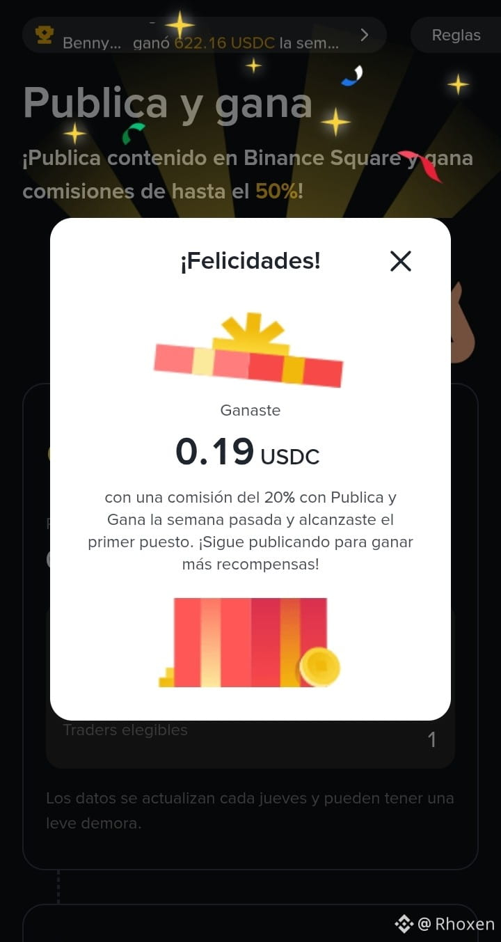
I want to share something that made me very excited: I received my first commission on Binance Square. It was 0.19 USDC. 🎉🎉
It’s a small amount, but to me it means a lot because it represents a first result from sharing what I’m learning. Thanks to those who take the time to read and to follow along with this process. 🤧 🙏
I don’t see it as fixed income or as a promise that each post will generate rewards. I’ll keep learning and sharing with the same caution. Thanks for being there! 💪👏👏
#BinanceSquare
$USDC
I want to share something that made me very excited: I received my first commission on Binance Square. It was 0.19 USDC. 🎉🎉
It’s a small amount, but to me it means a lot because it represents a first result from sharing what I’m learning. Thanks to those who take the time to read and to follow along with this process. 🤧 🙏
I don’t see it as fixed income or as a promise that each post will generate rewards. I’ll keep learning and sharing with the same caution. Thanks for being there! 💪👏👏
#BinanceSquare
$USDC
It’s a small amount, but to me it means a lot because it represents a first result from sharing what I’m learning. Thanks to those who take the time to read and to follow along with this process. 🤧 🙏
I don’t see it as fixed income or as a promise that each post will generate rewards. I’ll keep learning and sharing with the same caution. Thanks for being there! 💪👏👏
#BinanceSquare
$USDC
·
--
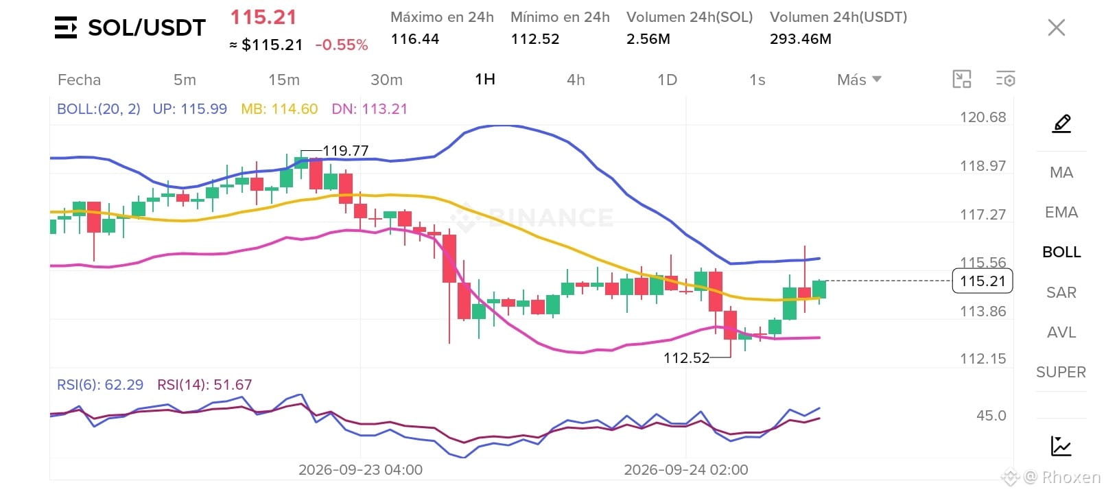
On SOL/USDT of 1H, the price rose from the visible minimum of 112.52 to 115.21. It stayed above the middle band (114.60), but still below the upper band (115.99).
What caught my attention is that the RSI 6 showed 62.29 and the RSI 14, 51.67: both were above 50, even though the RSI 6 showed a higher reading.
For now, I’m watching how price, the bands, and the RSIs relate to each other. Being close to the upper band doesn’t, by itself, confirm a breakout.
#solana
{spot}(SOLUSDT)
$SOL
$USDT
On SOL/USDT of 1H, the price rose from the visible minimum of 112.52 to 115.21. It stayed above the middle band (114.60), but still below the upper band (115.99).
What caught my attention is that the RSI 6 showed 62.29 and the RSI 14, 51.67: both were above 50, even though the RSI 6 showed a higher reading.
For now, I’m watching how price, the bands, and the RSIs relate to each other. Being close to the upper band doesn’t, by itself, confirm a breakout.
#solana
$SOL
$USDT
What caught my attention is that the RSI 6 showed 62.29 and the RSI 14, 51.67: both were above 50, even though the RSI 6 showed a higher reading.
For now, I’m watching how price, the bands, and the RSIs relate to each other. Being close to the upper band doesn’t, by itself, confirm a breakout.
#solana
$SOL
$USDT
171
·
--
When studying charts, I realized that looking at several candles together provides more context than observing a single one. I can compare how the bodies and wicks change, and how the closes and opens relate across different periods.
That doesn’t mean that a sequence confirms on its own where the price will go. It helps me describe what happened on the chart more accurately, but it doesn’t automatically predict what will happen next.
I want to practice that kind of reading on charts like BTC/USDT or SOL/USDT: observe the sequence and its context first, before drawing conclusions. Learning to describe what I see is different from anticipating what the market will do.
$SOL
$BTC
$USDT
When studying charts, I realized that looking at several candles together provides more context than observing a single one. I can compare how the bodies and wicks change, and how the closes and opens relate across different periods.
That doesn’t mean that a sequence confirms on its own where the price will go. It helps me describe what happened on the chart more accurately, but it doesn’t automatically predict what will happen next.
I want to practice that kind of reading on charts like BTC/USDT or SOL/USDT: observe the sequence and its context first, before drawing conclusions. Learning to describe what I see is different from anticipating what the market will do.
$SOL
$BTC
$USDT
That doesn’t mean that a sequence confirms on its own where the price will go. It helps me describe what happened on the chart more accurately, but it doesn’t automatically predict what will happen next.
I want to practice that kind of reading on charts like BTC/USDT or SOL/USDT: observe the sequence and its context first, before drawing conclusions. Learning to describe what I see is different from anticipating what the market will do.
$SOL
$BTC
$USDT
153
·
--
I have created an article about #VelasJaponesas If you are new, like me, and want to learn about them, take a look here 👉 [Velas Japonesas](https://app.binance.com/uni-qr/cart/368737186884324?r=GNFALQ2Q&l=es-LA&uco=pYiHEm0XzrZVfeHSxAjplA&uc=app_square_share_link&us=copylink)
#AprendiendoCripto
I have created an article about #VelasJaponesas If you are new, like me, and want to learn about them, take a look here 👉 Velas Japonesas
#AprendiendoCripto
#AprendiendoCripto
77
·
--
When I learned to read cryptocurrency charts, I realized that two green candles don’t necessarily mean the same thing. The color shows that the close was above the open, but it doesn’t explain everything that happened during that period.
On a chart like BTC/USDT, one candle can have a large body and small wicks, while another shows a small body and longer wicks. Both are green, but their structure is different.
That’s why I want to get used to looking at more than just the color: the size of the body, the length of the wicks, and where each candle appears within the chart. That difference is also part of learning to read cryptocurrencies from scratch.
#BTC #AprendiendoCripto
$BTC
{spot}(BTCUSDT)
When I learned to read cryptocurrency charts, I realized that two green candles don’t necessarily mean the same thing. The color shows that the close was above the open, but it doesn’t explain everything that happened during that period.
On a chart like BTC/USDT, one candle can have a large body and small wicks, while another shows a small body and longer wicks. Both are green, but their structure is different.
That’s why I want to get used to looking at more than just the color: the size of the body, the length of the wicks, and where each candle appears within the chart. That difference is also part of learning to read cryptocurrencies from scratch.
#BTC #AprendiendoCripto
$BTC
On a chart like BTC/USDT, one candle can have a large body and small wicks, while another shows a small body and longer wicks. Both are green, but their structure is different.
That’s why I want to get used to looking at more than just the color: the size of the body, the length of the wicks, and where each candle appears within the chart. That difference is also part of learning to read cryptocurrencies from scratch.
#BTC #AprendiendoCripto
$BTC
2
417
·
--
Article
What does a candlestick really show?Reading Japanese candlesticks may seem like a challenge: at first, with so many forms, names, and details—opening, closing, body, and wicks—it can be confusing. That’s why I researched how to interpret them better, and I want to share what I’ve understood about each of their parts.
I don’t present it as an expert or as a formula to predict the market. It’s more simply a way to organize what I’ve learned and share it with other people who are also just getting started.
A candlestick summarizes a period
What does a candlestick really show?
Reading Japanese candlesticks may seem like a challenge: at first, with so many forms, names, and details—opening, closing, body, and wicks—it can be confusing. That’s why I researched how to interpret them better, and I want to share what I’ve understood about each of their parts.
I don’t present it as an expert or as a formula to predict the market. It’s more simply a way to organize what I’ve learned and share it with other people who are also just getting started.
A candlestick summarizes a period
I don’t present it as an expert or as a formula to predict the market. It’s more simply a way to organize what I’ve learned and share it with other people who are also just getting started.
A candlestick summarizes a period
97
·
--
Article
A candle tells more than it seemsThe previous week, I focused on understanding the RSI and on observing how its reading changed across three timeframes: 5 minutes, 15 minutes, and 1 hour.
Understanding each part helped me train my eye better and observe the charts with a bit more order.
The next step was to get closer to the Japanese candles.
At first I saw them mainly as green or red bars. Then I understood that each candle summarizes more information:
Where the price opened.
Where it closed.
How high it reached.
What path it took during that period.
A candle tells more than it seems
The previous week, I focused on understanding the RSI and on observing how its reading changed across three timeframes: 5 minutes, 15 minutes, and 1 hour.
Understanding each part helped me train my eye better and observe the charts with a bit more order.
The next step was to get closer to the Japanese candles.
At first I saw them mainly as green or red bars. Then I understood that each candle summarizes more information:
Where the price opened.
Where it closed.
How high it reached.
What path it took during that period.
Understanding each part helped me train my eye better and observe the charts with a bit more order.
The next step was to get closer to the Japanese candles.
At first I saw them mainly as green or red bars. Then I understood that each candle summarizes more information:
Where the price opened.
Where it closed.
How high it reached.
What path it took during that period.
105
·
--
Bollinger Bands not only help you see whether price is above or below. They also help you notice how much space there is between the average and the extremes of the move.
When the bands spread out, the price is traveling through wider ranges. When they come closer together, the recent movement appears more restrained.
That doesn’t tell me where price will go, but it does help me describe what’s happening on the chart more accurately.
I start to see the bands as a way to measure the amplitude of the move, while the RSI helps me gauge its recent strength.
#BandasDeBollinger #AprendiendoCripto #CriptoParaPrincipiantes $SOL
Bollinger Bands not only help you see whether price is above or below. They also help you notice how much space there is between the average and the extremes of the move.
When the bands spread out, the price is traveling through wider ranges. When they come closer together, the recent movement appears more restrained.
That doesn’t tell me where price will go, but it does help me describe what’s happening on the chart more accurately.
I start to see the bands as a way to measure the amplitude of the move, while the RSI helps me gauge its recent strength.
#BandasDeBollinger #AprendiendoCripto #CriptoParaPrincipiantes $SOL
When the bands spread out, the price is traveling through wider ranges. When they come closer together, the recent movement appears more restrained.
That doesn’t tell me where price will go, but it does help me describe what’s happening on the chart more accurately.
I start to see the bands as a way to measure the amplitude of the move, while the RSI helps me gauge its recent strength.
#BandasDeBollinger #AprendiendoCripto #CriptoParaPrincipiantes $SOL
120
·
--
Bollinger Bands for SOL/USDT helped me observe something more than the price.
The upper band was at 101.52, the middle at 99.69, and the lower at 97.87. The price was close to the upper band, at 100.93.
All three bands stayed clearly separated, so the recent move had significant range.
The RSI was also elevated, but I prefer to observe each tool separately before drawing conclusions.
#Bollingerbands #SOLUSDT #LecturaDeGraficos
Bollinger Bands for SOL/USDT helped me observe something more than the price.
The upper band was at 101.52, the middle at 99.69, and the lower at 97.87. The price was close to the upper band, at 100.93.
All three bands stayed clearly separated, so the recent move had significant range.
The RSI was also elevated, but I prefer to observe each tool separately before drawing conclusions.
#Bollingerbands #SOLUSDT #LecturaDeGraficos
The upper band was at 101.52, the middle at 99.69, and the lower at 97.87. The price was close to the upper band, at 100.93.
All three bands stayed clearly separated, so the recent move had significant range.
The RSI was also elevated, but I prefer to observe each tool separately before drawing conclusions.
#Bollingerbands #SOLUSDT #LecturaDeGraficos
436
·
--
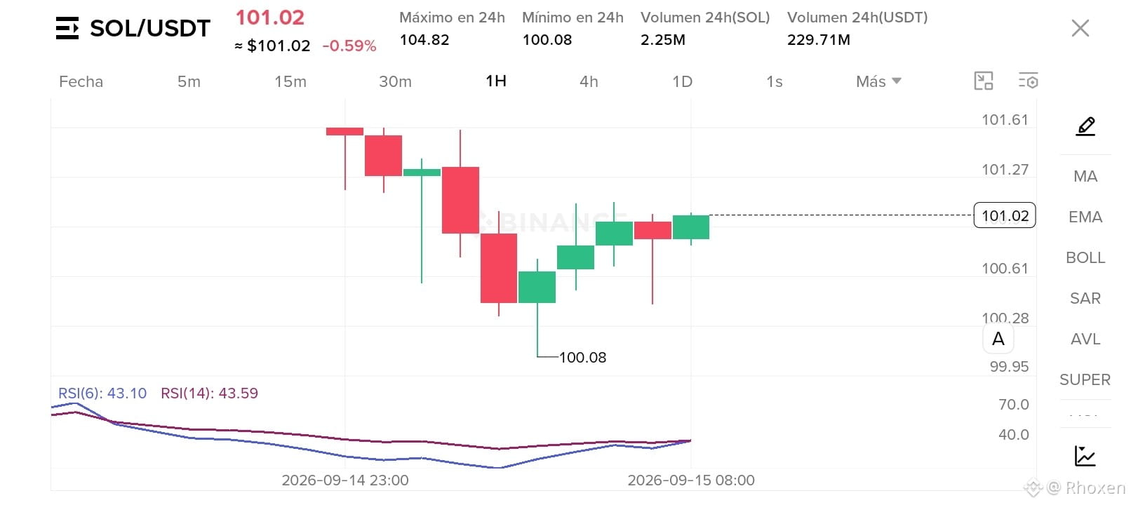
I looked at the body of a SOL/USDT candle and realized it’s not just a green or red bar.
That body shows the distance between the opening price and the closing price. If it’s green, the price closed above where it opened; if it’s red, it closed below.
It may seem like a basic detail, but it’s part of learning to read cryptocurrency charts without turning every candle into a signal.
#trading #SOLUSDT #VelasJaponesas
$SOL
{spot}(SOLUSDT)
I looked at the body of a SOL/USDT candle and realized it’s not just a green or red bar.
That body shows the distance between the opening price and the closing price. If it’s green, the price closed above where it opened; if it’s red, it closed below.
It may seem like a basic detail, but it’s part of learning to read cryptocurrency charts without turning every candle into a signal.
#trading #SOLUSDT #VelasJaponesas
$SOL
That body shows the distance between the opening price and the closing price. If it’s green, the price closed above where it opened; if it’s red, it closed below.
It may seem like a basic detail, but it’s part of learning to read cryptocurrency charts without turning every candle into a signal.
#trading #SOLUSDT #VelasJaponesas
$SOL
682
·
--
Article
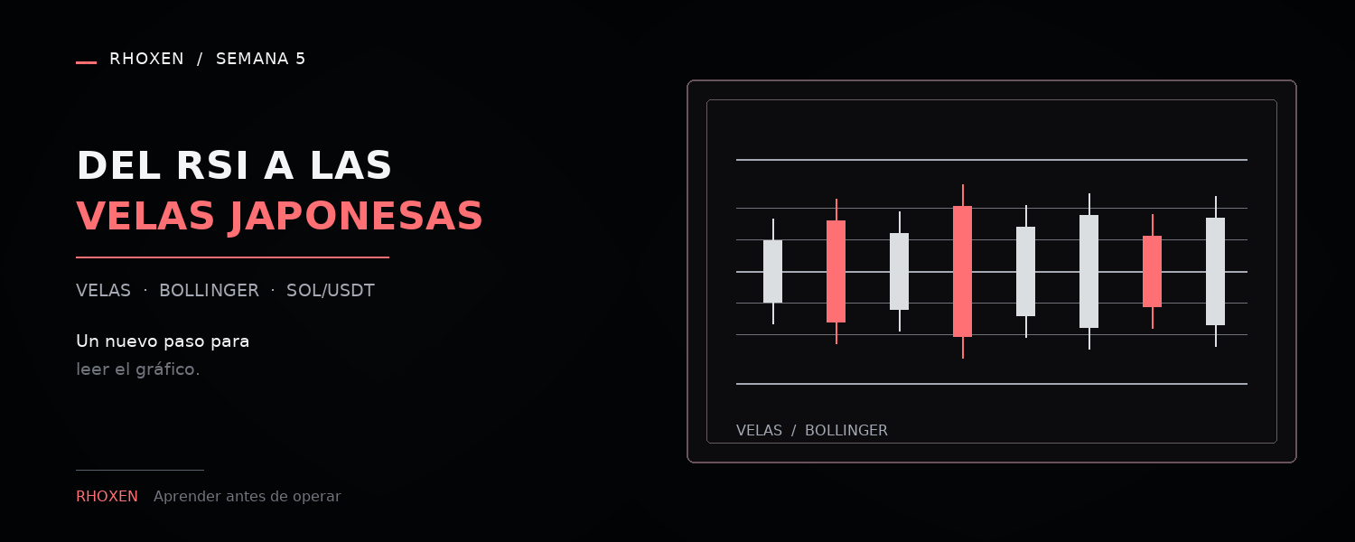
From the RSI to Japanese candlesticksLast week, I focused on understanding how the RSI indicator works and observing it across three timeframes: 5 minutes, 15 minutes, and 1 hour.
Understanding each part of that reading helped me train my eyes better and gradually develop a more orderly way of observing the charts.
I also noticed that the RSI 6 reacts faster to recent changes, while the RSI 14 moves in a more stable way. Neither is a complete answer on its own, but both can offer a different perspective on the movement.
From the RSI to Japanese candlesticks
Last week, I focused on understanding how the RSI indicator works and observing it across three timeframes: 5 minutes, 15 minutes, and 1 hour.
Understanding each part of that reading helped me train my eyes better and gradually develop a more orderly way of observing the charts.
I also noticed that the RSI 6 reacts faster to recent changes, while the RSI 14 moves in a more stable way. Neither is a complete answer on its own, but both can offer a different perspective on the movement.
Understanding each part of that reading helped me train my eyes better and gradually develop a more orderly way of observing the charts.
I also noticed that the RSI 6 reacts faster to recent changes, while the RSI 14 moves in a more stable way. Neither is a complete answer on its own, but both can offer a different perspective on the movement.
345
·
--

Article
I didn’t learn to predict the marketDuring this week I kept using SOL/USDT as a reference to observe how the reading of a chart changes depending on the timeframe and the indicators.
On Monday I compared the same movement across 5 minutes, 15 minutes, and 1 hour.
In 5 minutes there are more small changes and noise. In 15 minutes the path looks more orderly. In 1 hour you lose some detail, but the context carries more weight.
The 1H chart was easier for me to read because each candle summarizes a full hour. Even so, a cleaner view doesn’t mean it lets you know what the price will do next.
I didn’t learn to predict the market
During this week I kept using SOL/USDT as a reference to observe how the reading of a chart changes depending on the timeframe and the indicators.
On Monday I compared the same movement across 5 minutes, 15 minutes, and 1 hour.
In 5 minutes there are more small changes and noise. In 15 minutes the path looks more orderly. In 1 hour you lose some detail, but the context carries more weight.
The 1H chart was easier for me to read because each candle summarizes a full hour. Even so, a cleaner view doesn’t mean it lets you know what the price will do next.
On Monday I compared the same movement across 5 minutes, 15 minutes, and 1 hour.
In 5 minutes there are more small changes and noise. In 15 minutes the path looks more orderly. In 1 hour you lose some detail, but the context carries more weight.
The 1H chart was easier for me to read because each candle summarizes a full hour. Even so, a cleaner view doesn’t mean it lets you know what the price will do next.
575
·
--
A few minutes ago I came across the RSI of SOL/USDT on the 1H timeframe—it dropped below 30:
- RSI 6: 18,04
- RSI 14: 28,00
The first thing I thought was that such a low reading should mean the price would bounce, but I don’t want to assume that.
For now, I’m only taking it as a reference that the recent drop was strong. A low RSI is not automatically a buy signal.
{spot}(SOLUSDT)
A few minutes ago I came across the RSI of SOL/USDT on the 1H timeframe—it dropped below 30:
- RSI 6: 18,04
- RSI 14: 28,00
The first thing I thought was that such a low reading should mean the price would bounce, but I don’t want to assume that.
For now, I’m only taking it as a reference that the recent drop was strong. A low RSI is not automatically a buy signal.
- RSI 6: 18,04
- RSI 14: 28,00
The first thing I thought was that such a low reading should mean the price would bounce, but I don’t want to assume that.
For now, I’m only taking it as a reference that the recent drop was strong. A low RSI is not automatically a buy signal.
1.2k
·
--
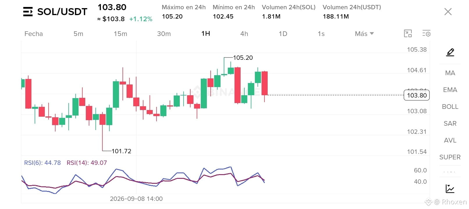
SOL/USDT caught my attention for something simple: after approaching 105.20, it pulled back to the 103.80 area on the 1H chart.
RSI 6 was at 44.78 and RSI 14 at 49.07.
I still find it strange that the price continues to show a positive variation while the RSI remains below 50.
For now, I prefer to watch how price, the candles, and the indicator relate to each other before drawing conclusions.
#solana #trading #AprendiendoCripto
{spot}(SOLUSDT)
SOL/USDT caught my attention for something simple: after approaching 105.20, it pulled back to the 103.80 area on the 1H chart.
RSI 6 was at 44.78 and RSI 14 at 49.07.
I still find it strange that the price continues to show a positive variation while the RSI remains below 50.
For now, I prefer to watch how price, the candles, and the indicator relate to each other before drawing conclusions.
#solana #trading #AprendiendoCripto
RSI 6 was at 44.78 and RSI 14 at 49.07.
I still find it strange that the price continues to show a positive variation while the RSI remains below 50.
For now, I prefer to watch how price, the candles, and the indicator relate to each other before drawing conclusions.
#solana #trading #AprendiendoCripto
1
712
·
--
The 1H chart is turning out to be easier to read because each candle summarizes a full hour.
Some detail is lost, but the movement looks cleaner and the context carries more weight.
It still feels strange that a rise that seems significant in 5 minutes can look much smaller when I view it on 1H.
For now, I prefer to use this timeframe to understand the overall path rather than to generate signals.
#trading #AprendiendoCripto
The 1H chart is turning out to be easier to read because each candle summarizes a full hour.
Some detail is lost, but the movement looks cleaner and the context carries more weight.
It still feels strange that a rise that seems significant in 5 minutes can look much smaller when I view it on 1H.
For now, I prefer to use this timeframe to understand the overall path rather than to generate signals.
#trading #AprendiendoCripto
Some detail is lost, but the movement looks cleaner and the context carries more weight.
It still feels strange that a rise that seems significant in 5 minutes can look much smaller when I view it on 1H.
For now, I prefer to use this timeframe to understand the overall path rather than to generate signals.
#trading #AprendiendoCripto
81
·
--
Article
One move, three readingsLast week I compared SOL/USDT across three time frames: 5 minutes, 15 minutes, and 1 hour.
I kept the configuration I already had prepared, with RSI 6 and RSI 14, to observe how the reading of the same movement changes.
These were the recorded values:
5 minutes: RSI 6 at 54.30 and RSI 14 at 51.69.
15 minutes: both around 57.
1 hour: RSI 6 at 61.87 and RSI 14 at 56.37.
It still feels strange to me that the same indicator, on the same pair, shows different readings depending on the time frame.
Then I understood that each chart summarizes the movement differently:
One move, three readings
Last week I compared SOL/USDT across three time frames: 5 minutes, 15 minutes, and 1 hour.
I kept the configuration I already had prepared, with RSI 6 and RSI 14, to observe how the reading of the same movement changes.
These were the recorded values:
5 minutes: RSI 6 at 54.30 and RSI 14 at 51.69.
15 minutes: both around 57.
1 hour: RSI 6 at 61.87 and RSI 14 at 56.37.
It still feels strange to me that the same indicator, on the same pair, shows different readings depending on the time frame.
Then I understood that each chart summarizes the movement differently:
I kept the configuration I already had prepared, with RSI 6 and RSI 14, to observe how the reading of the same movement changes.
These were the recorded values:
5 minutes: RSI 6 at 54.30 and RSI 14 at 51.69.
15 minutes: both around 57.
1 hour: RSI 6 at 61.87 and RSI 14 at 56.37.
It still feels strange to me that the same indicator, on the same pair, shows different readings depending on the time frame.
Then I understood that each chart summarizes the movement differently:
319
·
--
I’m trying to understand two basic concepts of charts: support and resistance.
As far as I understand it, support would be an area where the price has found buyers previously.
Resistance would be an area where the price has found sellers.
I’m still trying to identify these zones correctly. I’m also learning that they are not exact walls and they do not guarantee that the price will bounce.
For now, I see them as references that can help me observe the market’s behavior more closely.
This is what I’m doing; it’s not financial advice.
#trading #BeginnerTrader #EducationalContent
I’m trying to understand two basic concepts of charts: support and resistance.
As far as I understand it, support would be an area where the price has found buyers previously.
Resistance would be an area where the price has found sellers.
I’m still trying to identify these zones correctly. I’m also learning that they are not exact walls and they do not guarantee that the price will bounce.
For now, I see them as references that can help me observe the market’s behavior more closely.
This is what I’m doing; it’s not financial advice.
#trading #BeginnerTrader #EducationalContent
As far as I understand it, support would be an area where the price has found buyers previously.
Resistance would be an area where the price has found sellers.
I’m still trying to identify these zones correctly. I’m also learning that they are not exact walls and they do not guarantee that the price will bounce.
For now, I see them as references that can help me observe the market’s behavior more closely.
This is what I’m doing; it’s not financial advice.
#trading #BeginnerTrader #EducationalContent
137
·
--
Today I want to observe Solana a bit more closely.
So far I have seen it within the SOL/USDT pair, and I’ve noticed that a lot is being said about this project, but I’m still trying to understand what’s behind that interest.
I don’t want to confuse popularity with a buy signal. For now, my goal is to learn what SOL is, how its price moves, and how it behaves within a trading pair.
This is what I’m doing; it’s not financial advice.
#solana #AprendiendoCripto
{spot}(SOLUSDT)
Today I want to observe Solana a bit more closely.
So far I have seen it within the SOL/USDT pair, and I’ve noticed that a lot is being said about this project, but I’m still trying to understand what’s behind that interest.
I don’t want to confuse popularity with a buy signal. For now, my goal is to learn what SOL is, how its price moves, and how it behaves within a trading pair.
This is what I’m doing; it’s not financial advice.
#solana #AprendiendoCripto
So far I have seen it within the SOL/USDT pair, and I’ve noticed that a lot is being said about this project, but I’m still trying to understand what’s behind that interest.
I don’t want to confuse popularity with a buy signal. For now, my goal is to learn what SOL is, how its price moves, and how it behaves within a trading pair.
This is what I’m doing; it’s not financial advice.
#solana #AprendiendoCripto
214
·
--
Article
What is a trading pair and why I'm still learning to interpret it?One of the first things I'm trying to understand on Binance is what a trading pair really means.
For example:
SOL/USDT
This pair relates two assets:
SOL, the base asset.
USDT, the reference asset.
If I see that SOL/USDT is 100, it means that 1 SOL is approximately equivalent to 100 USDT at that moment.
The price only tells me how much one asset is worth compared to another. It doesn't automatically tell me:
If the price is going to go up.
If it is going to go down.
If it's a good time to enter.
If there is a buy signal.
What is a trading pair and why I'm still learning to interpret it?
One of the first things I'm trying to understand on Binance is what a trading pair really means.
For example:
SOL/USDT
This pair relates two assets:
SOL, the base asset.
USDT, the reference asset.
If I see that SOL/USDT is 100, it means that 1 SOL is approximately equivalent to 100 USDT at that moment.
The price only tells me how much one asset is worth compared to another. It doesn't automatically tell me:
If the price is going to go up.
If it is going to go down.
If it's a good time to enter.
If there is a buy signal.
For example:
SOL/USDT
This pair relates two assets:
SOL, the base asset.
USDT, the reference asset.
If I see that SOL/USDT is 100, it means that 1 SOL is approximately equivalent to 100 USDT at that moment.
The price only tells me how much one asset is worth compared to another. It doesn't automatically tell me:
If the price is going to go up.
If it is going to go down.
If it's a good time to enter.
If there is a buy signal.
1
279
Log in to explore more content
Join global crypto users on Binance Square
⚡️ Get latest and useful information about crypto.
💬 Trusted by the world’s largest crypto exchange.
👍 Discover real insights from verified creators.
Email / Phone number