
CryptoChan
1.9k Posts

CryptoChan
 Square Verified
Bitcoin on-chain & cycle analysis,比特币链上行情分析 || 不收费,无投资理财建议 || X:@0xCryptoChan

Excellence Award (OnChain)

原创之星

Level 1 Creator
15 Following
22.6K+ Followers
42.2K+ Liked
3 Badges
Posts
All
Quotes
PINNED
CryptoChan
·
--
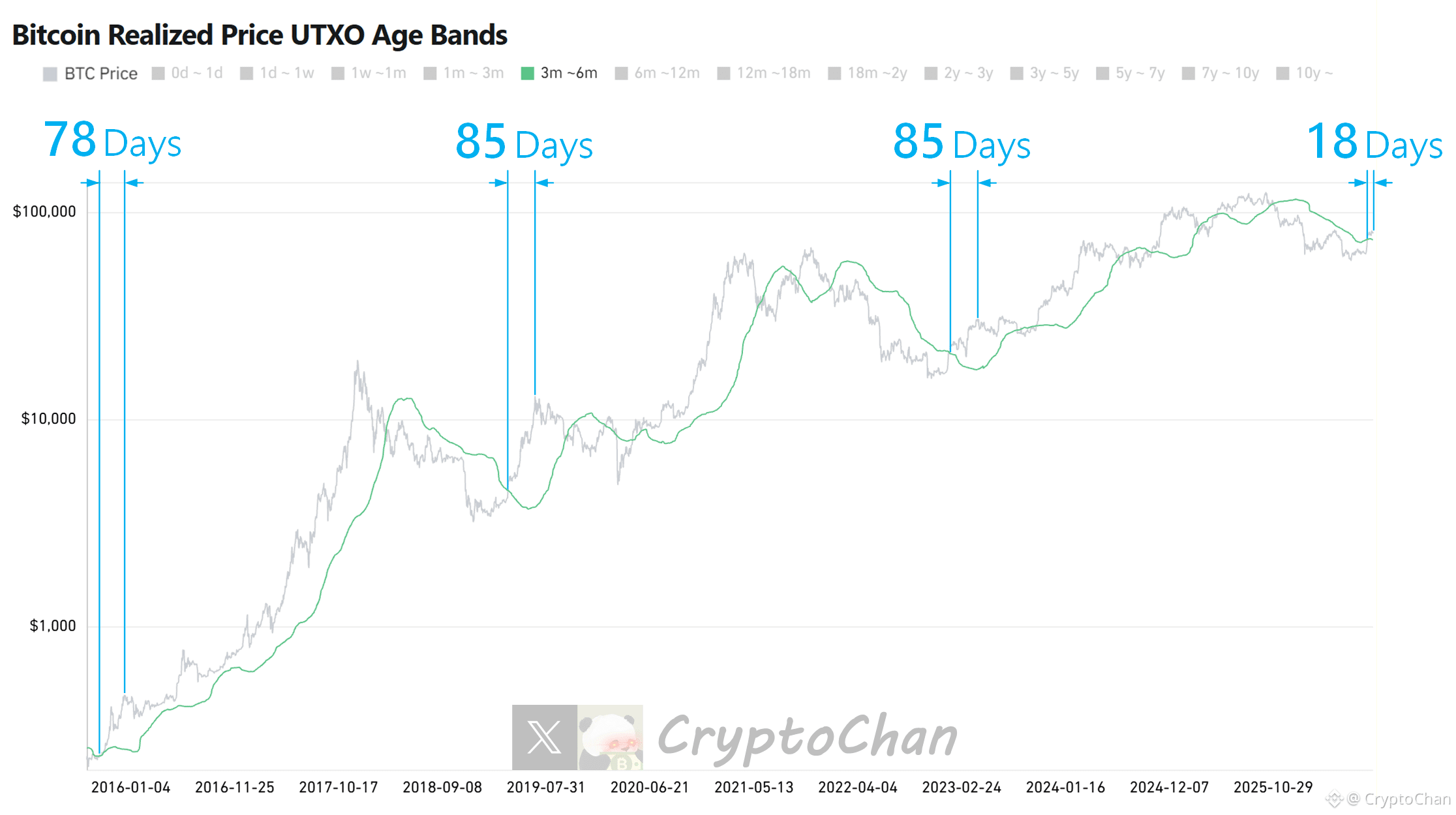
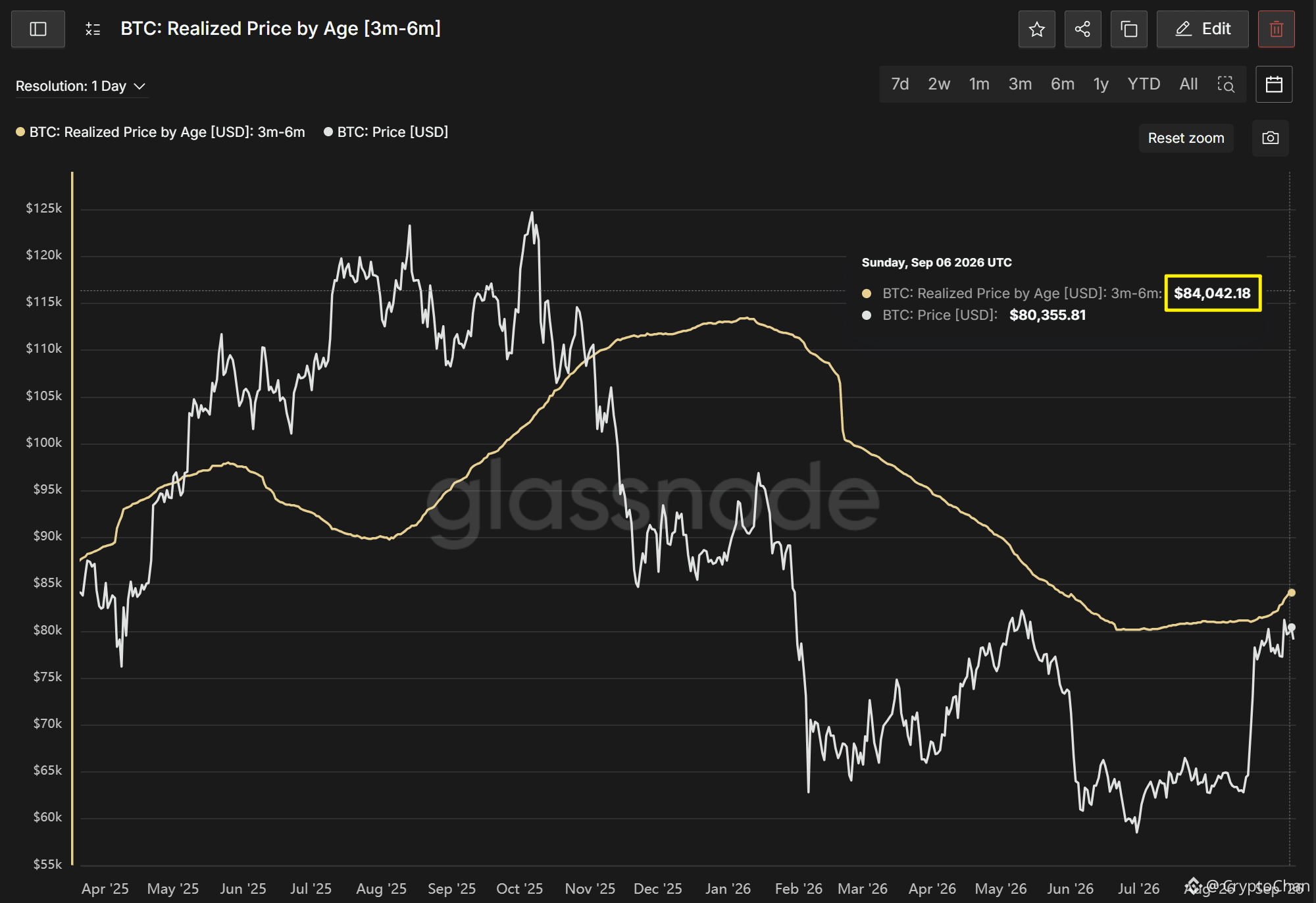
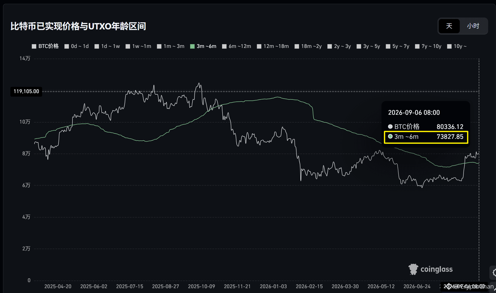
【 $BTC four-year cycle total engraving series 59】
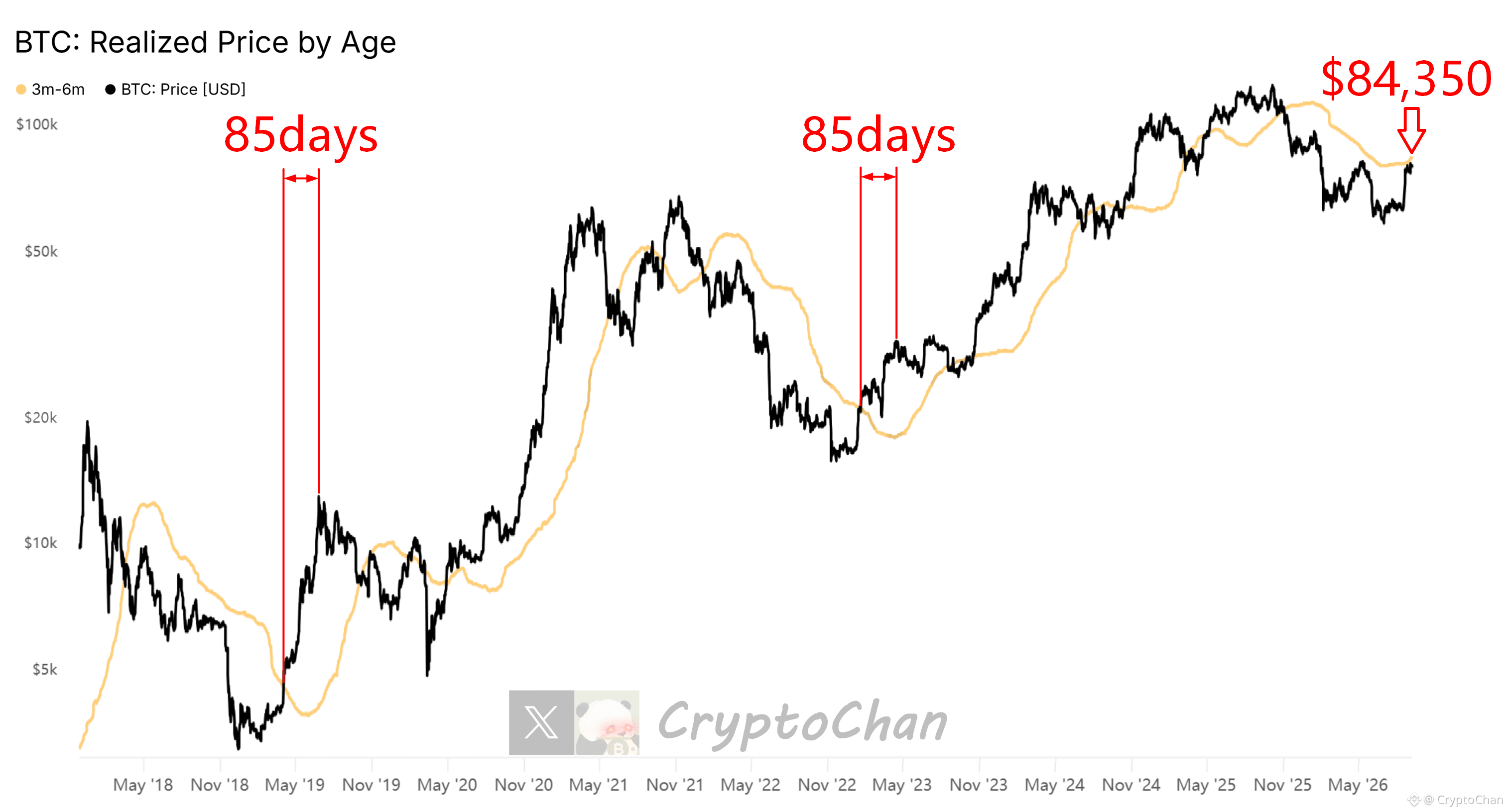
📌 April 2019: After Bitcoin broke above the orange-yellow line, 85 days to a recovery peak
📌 January 2023: After Bitcoin broke above the orange-yellow line, 85 days to a recovery secondary peak
📌 Current: Bitcoin has not yet broken above the orange-yellow line ($84,350)
┌── 🐼 On-chain data details ──┐
The black line in the chart is the Bitcoin price line; the orange-yellow line is the average entry price line of the accumulated chips when holding duration is between 3 and 6 months
📌 April 2019: After Bitcoin broke above the orange-yellow line, 85 days to a recovery peak
📌 January 2023: After Bitcoin broke above the orange-yellow line, 85 days to a recovery secondary peak
📌 Current: Bitcoin has not yet broken above the orange-yellow line ($84,350)
┌── 🐼 On-chain data details ──┐
The black line in the chart is the Bitcoin price line; the orange-yellow line is the average entry price line of the accumulated chips when holding duration is between 3 and 6 months
CryptoChan
·
--
【 $BTC four-year cycle total engraving series 59】
📌 April 2019: After Bitcoin broke above the orange-yellow line, 85 days to a recovery peak
📌 January 2023: After Bitcoin broke above the orange-yellow line, 85 days to a recovery secondary peak
📌 Current: Bitcoin has not yet broken above the orange-yellow line ($84,350)
┌── 🐼 On-chain data details ──┐
The black line in the chart is the Bitcoin price line; the orange-yellow line is the average entry price line of the accumulated chips when holding duration is between 3 and 6 months
📌 April 2019: After Bitcoin broke above the orange-yellow line, 85 days to a recovery peak
📌 January 2023: After Bitcoin broke above the orange-yellow line, 85 days to a recovery secondary peak
📌 Current: Bitcoin has not yet broken above the orange-yellow line ($84,350)
┌── 🐼 On-chain data details ──┐
The black line in the chart is the Bitcoin price line; the orange-yellow line is the average entry price line of the accumulated chips when holding duration is between 3 and 6 months
CryptoChan
·
--
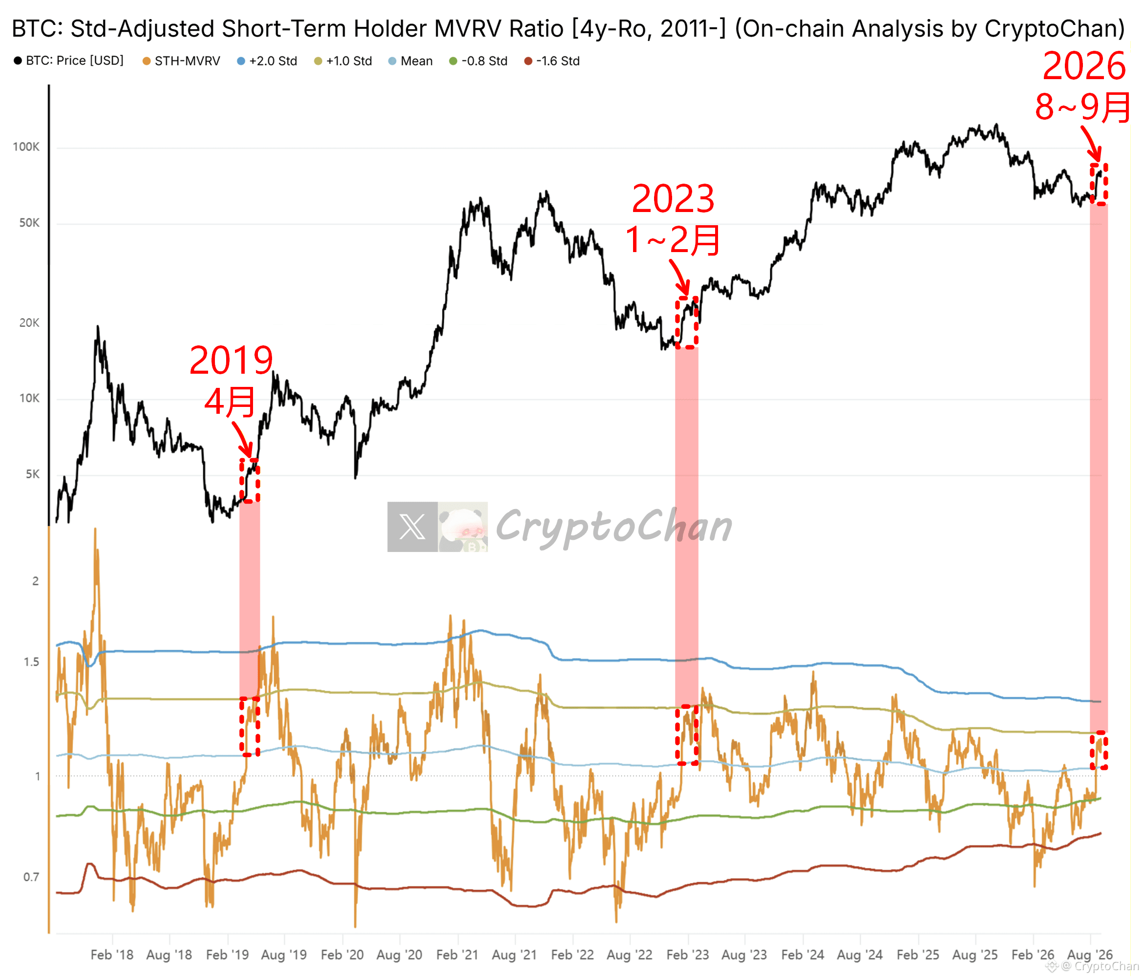
【 $BTC Four-Year Cycle Total Engraving Series 58】
Engraving 2019: There are still two big waves
Engraving 2023: There is still one big wave
┌── 🐼 On-chain data details ──┐
The upper indicator in the chart is the Bitcoin price; the lower indicator in the chart is the Bitcoin on-chain short-term holder MVRV (calculated using a 4-year rolling window), as well as its 5 standard deviation lines: +2σ, +1σ, 0σ, -0.8σ, -1.6σ
Engraving 2019: There are still two big waves
Engraving 2023: There is still one big wave
┌── 🐼 On-chain data details ──┐
The upper indicator in the chart is the Bitcoin price; the lower indicator in the chart is the Bitcoin on-chain short-term holder MVRV (calculated using a 4-year rolling window), as well as its 5 standard deviation lines: +2σ, +1σ, 0σ, -0.8σ, -1.6σ
CryptoChan
·
--
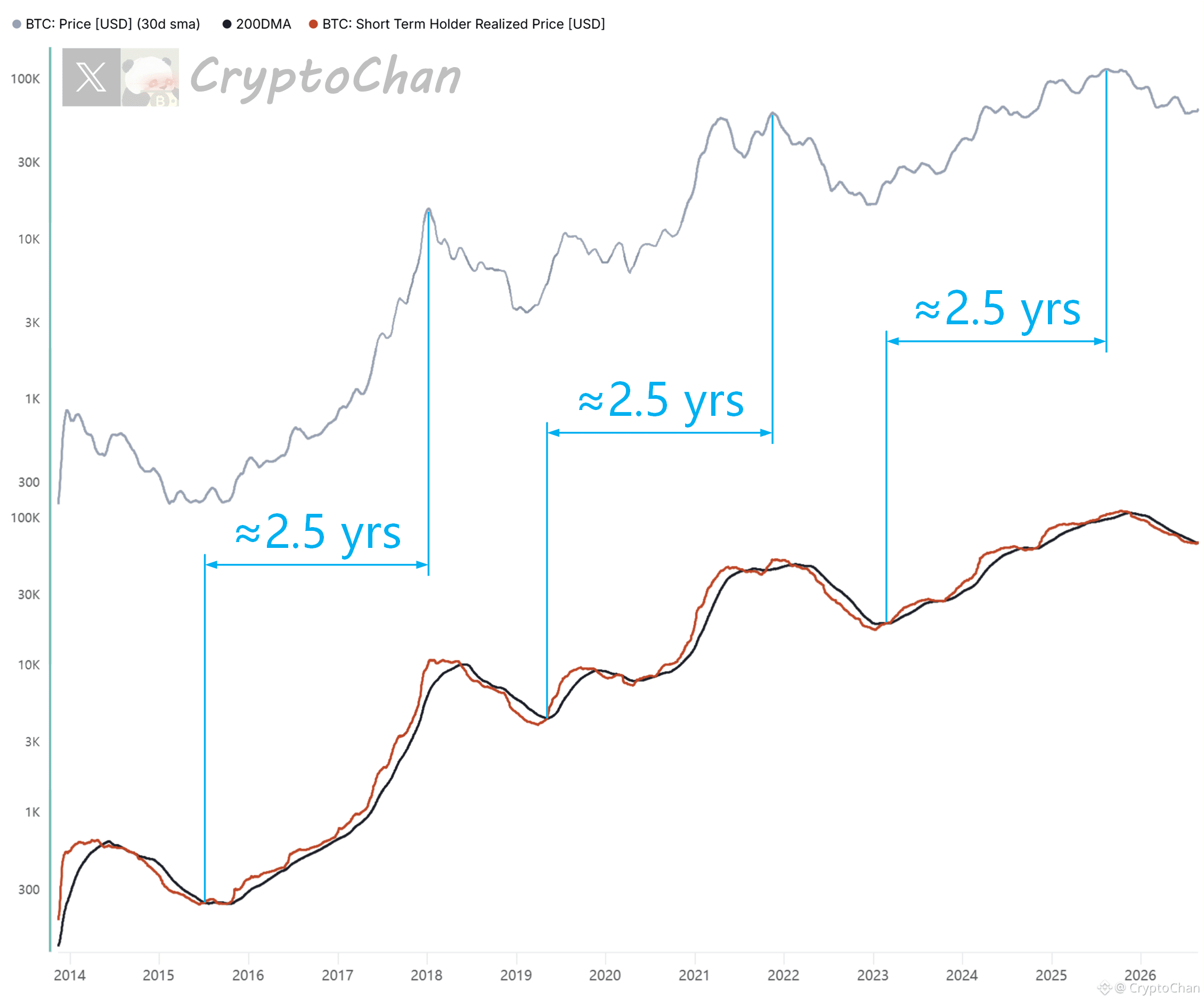
【 $BTC Bull market top-calling countdown series 02】
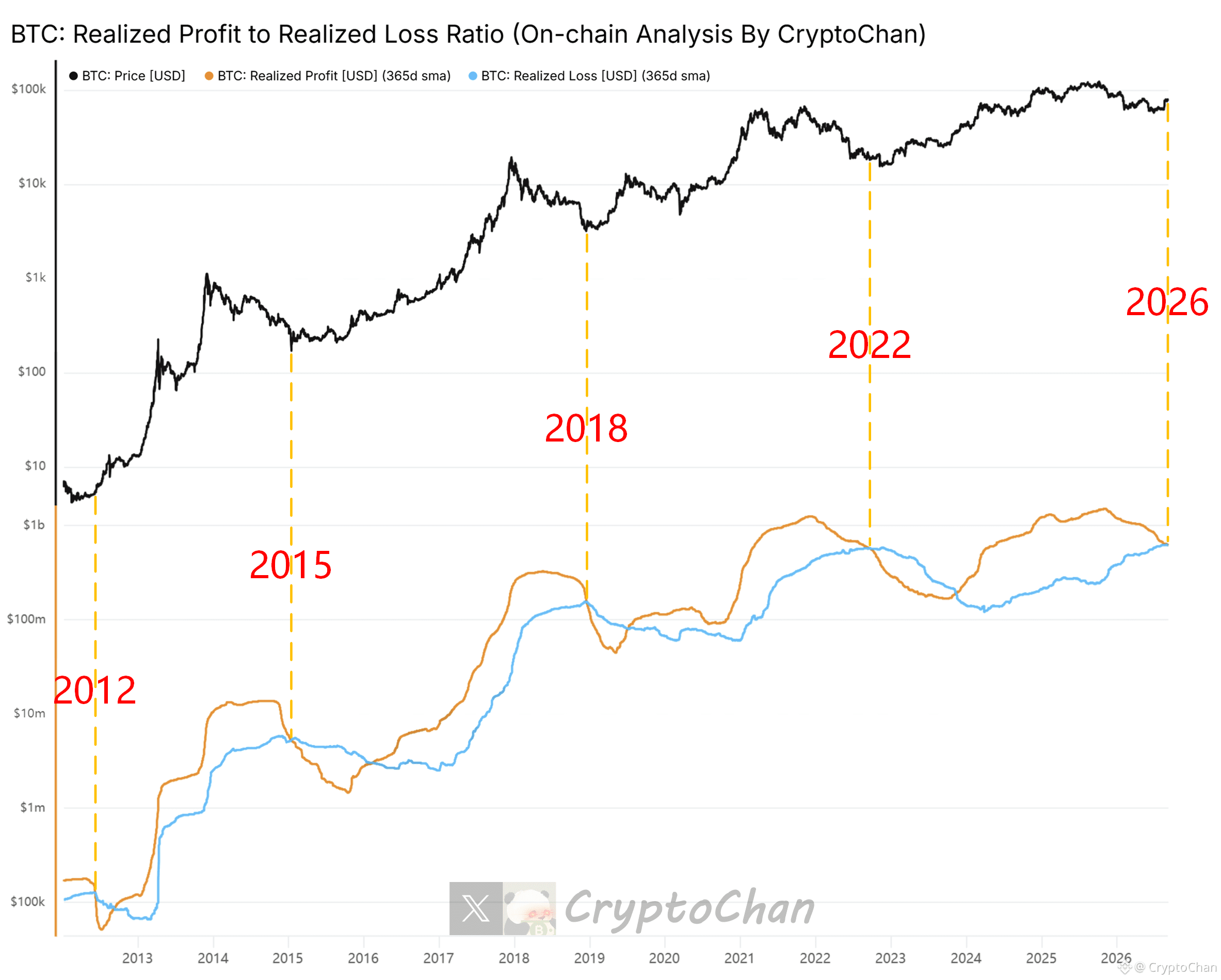
2015 red-black crossover: about one “kun” year later to the bull market top
2019 red-black crossover: about one “kun” year later to the bull market top
2023 red-black crossover: about one “kun” year later to the bull market top
2026 red-black crossover: 4 days and 5 hours have already passed
┌── 🐼 Indicator details ──┐
Gray line: Bitcoin price 30-day moving average
Red line: Bitcoin on-chain short-term holders’ average buy-in cost (average cost of holdings)
Black line: Bitcoin price 200-day moving average
2015 red-black crossover: about one “kun” year later to the bull market top
2019 red-black crossover: about one “kun” year later to the bull market top
2023 red-black crossover: about one “kun” year later to the bull market top
2026 red-black crossover: 4 days and 5 hours have already passed
┌── 🐼 Indicator details ──┐
Gray line: Bitcoin price 30-day moving average
Red line: Bitcoin on-chain short-term holders’ average buy-in cost (average cost of holdings)
Black line: Bitcoin price 200-day moving average
CryptoChan
·
--
【 $BTC four-year cycle total engraving series 50】
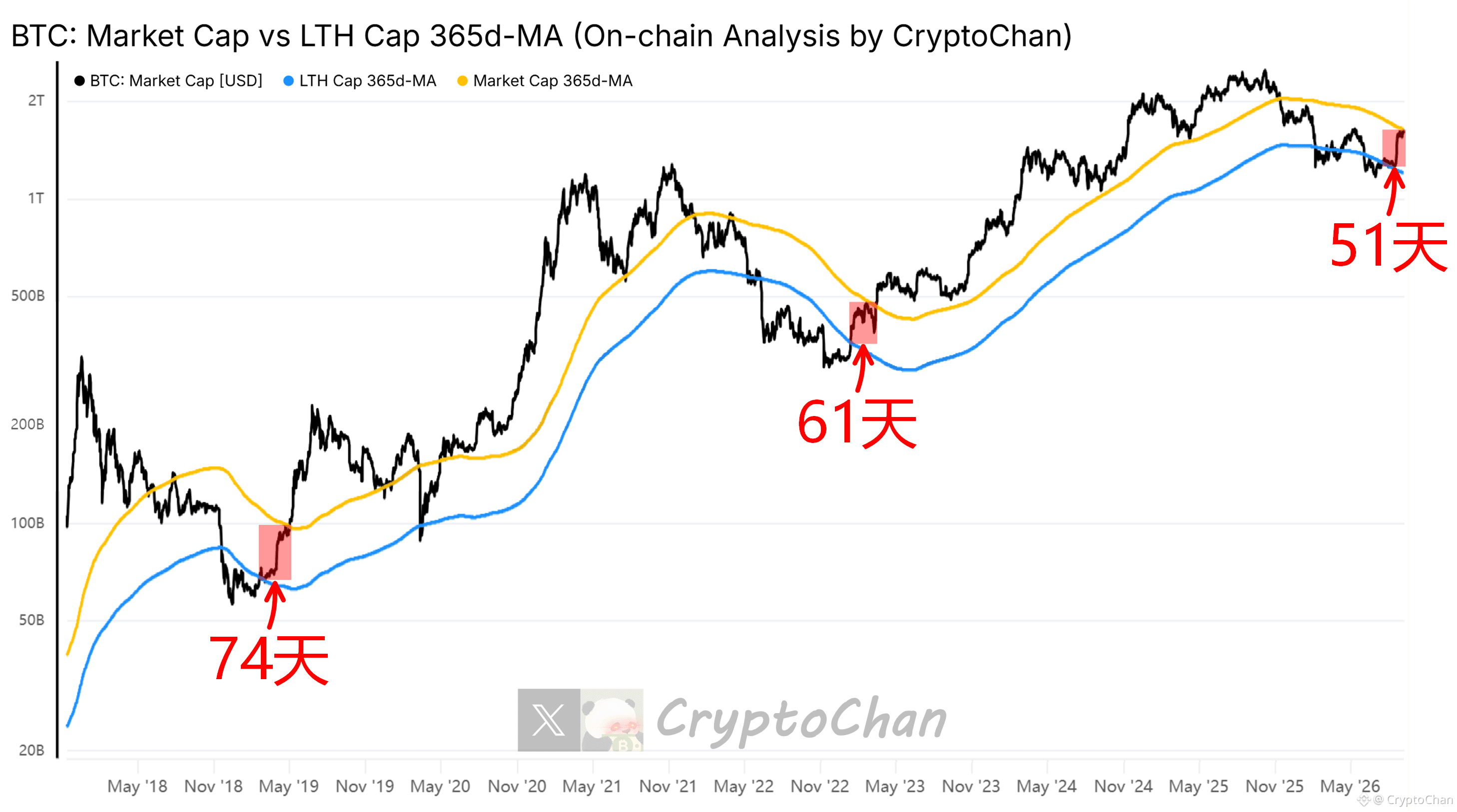
2019 “turn to bull” phase lasted 74 days
2023 “turn to bull” phase lasted 61 days
The current “turn to bull” phase has already lasted 39 days
┌── 🐼 KPI Details ──┐
Black line: Bitcoin market cap
Orange line: Bitcoin market cap 365-day MA
Blue line: Bitcoin on-chain long-term holder cohort total market cap 365-day MA
2019 “turn to bull” phase lasted 74 days
2023 “turn to bull” phase lasted 61 days
The current “turn to bull” phase has already lasted 39 days
┌── 🐼 KPI Details ──┐
Black line: Bitcoin market cap
Orange line: Bitcoin market cap 365-day MA
Blue line: Bitcoin on-chain long-term holder cohort total market cap 365-day MA
CryptoChan
·
--
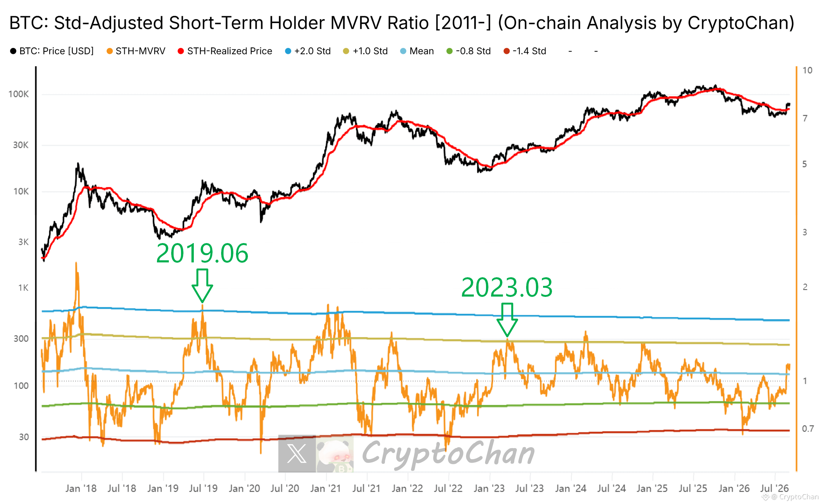
【 $BTC Four-Year Cycle Total Carve Series 57】
2019 bull market recovery period: this metric reached a peak above +2σ
2023 bull market recovery period: this metric reached a peak above +1σ
┌── 🐼 On-Chain Data Details ──┐
The indicator at the bottom of the chart is Bitcoin’s on-chain short-term holder MVRV (data begins in 2011), along with its five standard deviation lines (+2σ, +1σ, 0σ, -0.8σ, -1.4σ)
2019 bull market recovery period: this metric reached a peak above +2σ
2023 bull market recovery period: this metric reached a peak above +1σ
┌── 🐼 On-Chain Data Details ──┐
The indicator at the bottom of the chart is Bitcoin’s on-chain short-term holder MVRV (data begins in 2011), along with its five standard deviation lines (+2σ, +1σ, 0σ, -0.8σ, -1.4σ)
CryptoChan
·
--
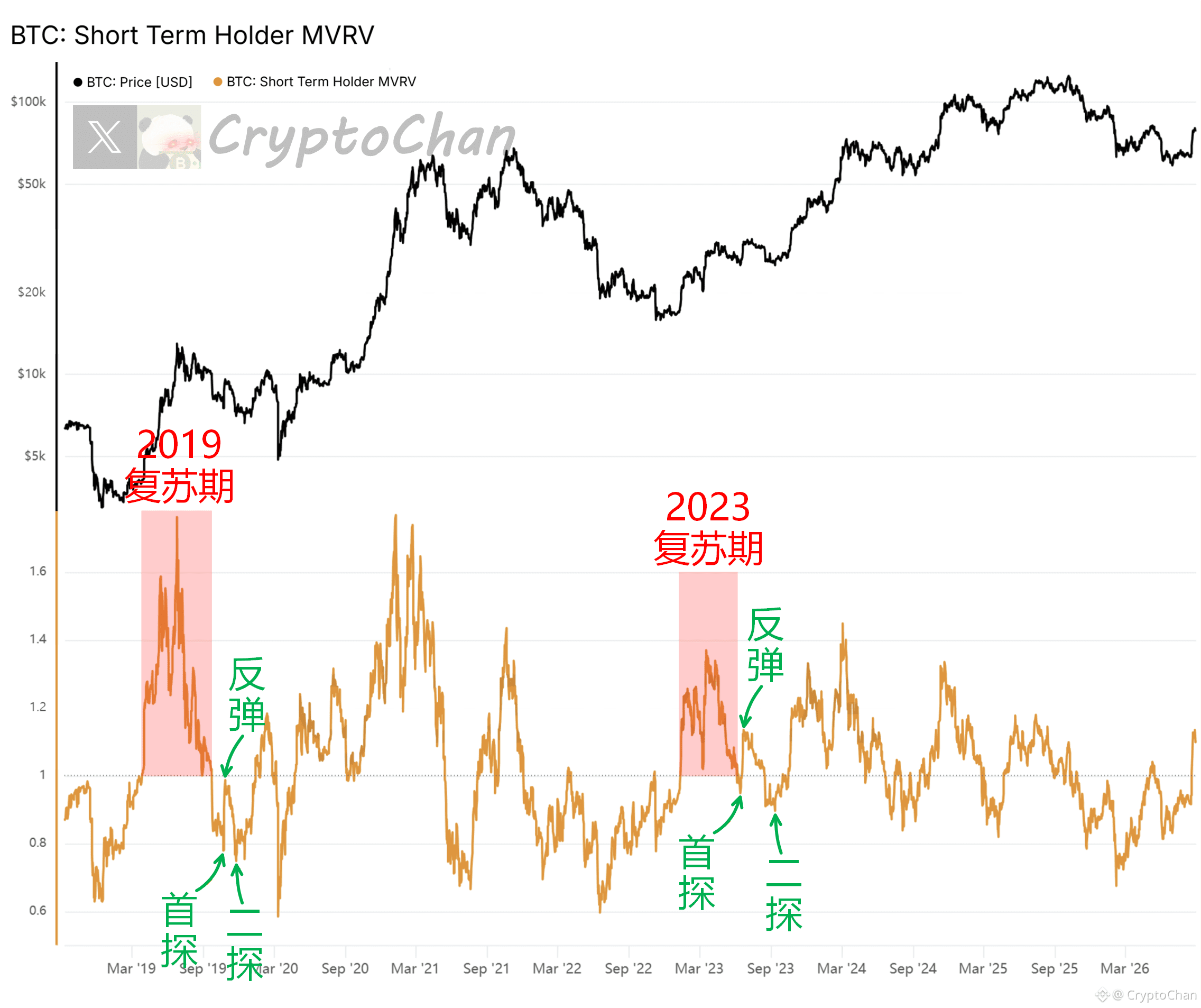
【 $BTC Four-year cycle total carving series 56】
After the two previous bull-market recovery periods concluded, they both went through the classic second pullback before the main rally (ignoring the 20-year 312 black swan event)
┌── 🐼 On-chain data details ──┐
The indicator at the top of the chart is the Bitcoin price; the indicator at the bottom of the chart is the Bitcoin on-chain metric for short-term holders’ MVRV
After the two previous bull-market recovery periods concluded, they both went through the classic second pullback before the main rally (ignoring the 20-year 312 black swan event)
┌── 🐼 On-chain data details ──┐
The indicator at the top of the chart is the Bitcoin price; the indicator at the bottom of the chart is the Bitcoin on-chain metric for short-term holders’ MVRV
CryptoChan
·
--
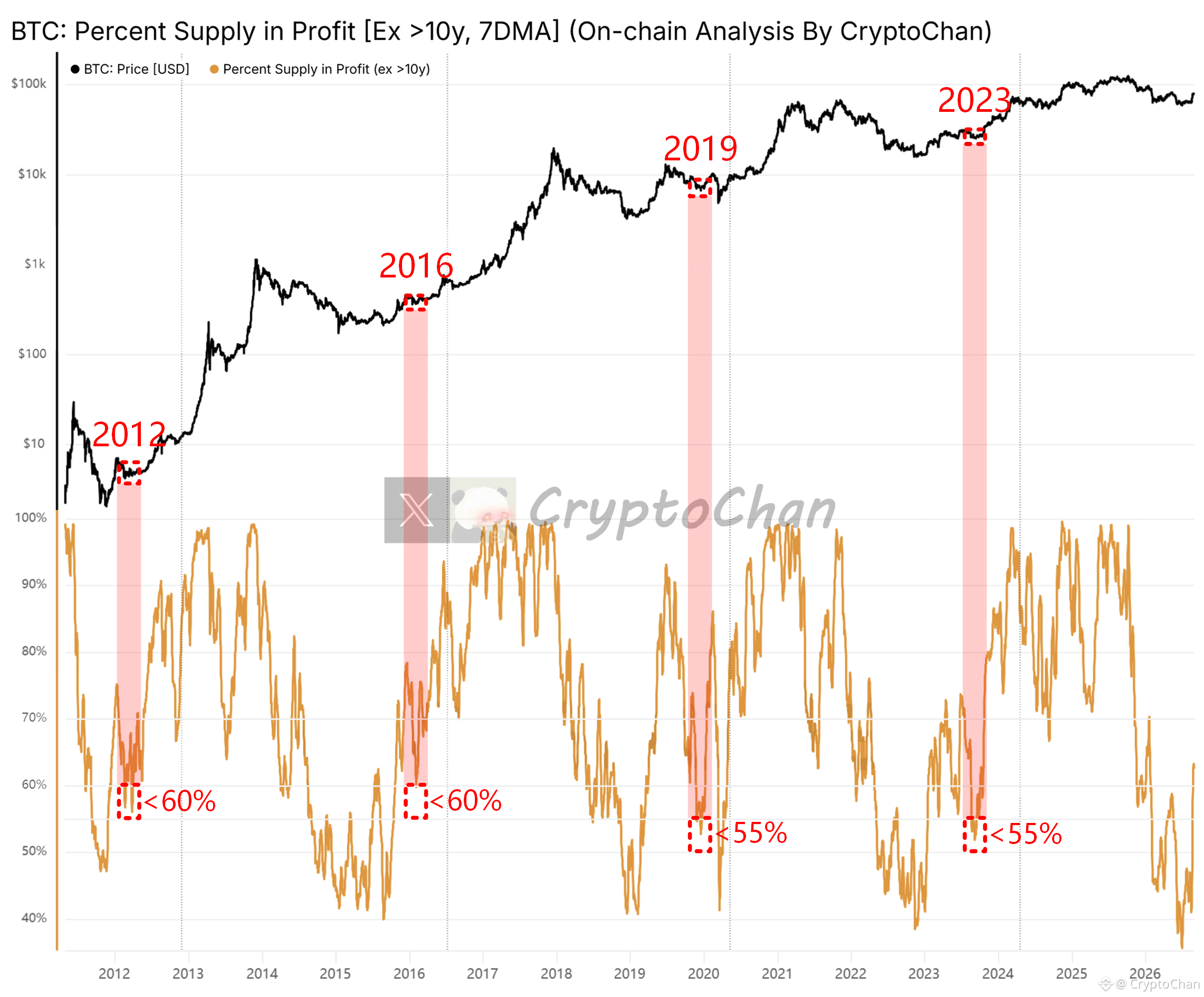
【 $BTC Four-Year Cycle Total Marking Series 55】
After the bull market recovery phase of 2012 concluded, before the main upswing: the final drop before the rally—this indicator fell to below 60% at its lowest.
After the bull market recovery phase of 2016 concluded, before the main upswing: the final drop before the rally—this indicator fell to below 60% at its lowest.
After the bull market recovery phase of 2019 concluded, before the main upswing: the final drop before the rally—this indicator fell to below 55% (ignore the subsequent 312 black swan event).
After the bull market recovery phase of 2023 concluded, before the main upswing: the final drop before the rally—this indicator fell to below 55%.
┌── 🐼 On-Chain Data Details ──┐
The black line at the top of the chart represents the Bitcoin price; the indicator at the bottom represents the percentage of supply that consists of coin holdings on the Bitcoin chain currently sitting in profit (treat coins that have not moved for more than 10 years as long-term dormant or lost, and exclude them from the calculation).
After the bull market recovery phase of 2012 concluded, before the main upswing: the final drop before the rally—this indicator fell to below 60% at its lowest.
After the bull market recovery phase of 2016 concluded, before the main upswing: the final drop before the rally—this indicator fell to below 60% at its lowest.
After the bull market recovery phase of 2019 concluded, before the main upswing: the final drop before the rally—this indicator fell to below 55% (ignore the subsequent 312 black swan event).
After the bull market recovery phase of 2023 concluded, before the main upswing: the final drop before the rally—this indicator fell to below 55%.
┌── 🐼 On-Chain Data Details ──┐
The black line at the top of the chart represents the Bitcoin price; the indicator at the bottom represents the percentage of supply that consists of coin holdings on the Bitcoin chain currently sitting in profit (treat coins that have not moved for more than 10 years as long-term dormant or lost, and exclude them from the calculation).
CryptoChan
·
--
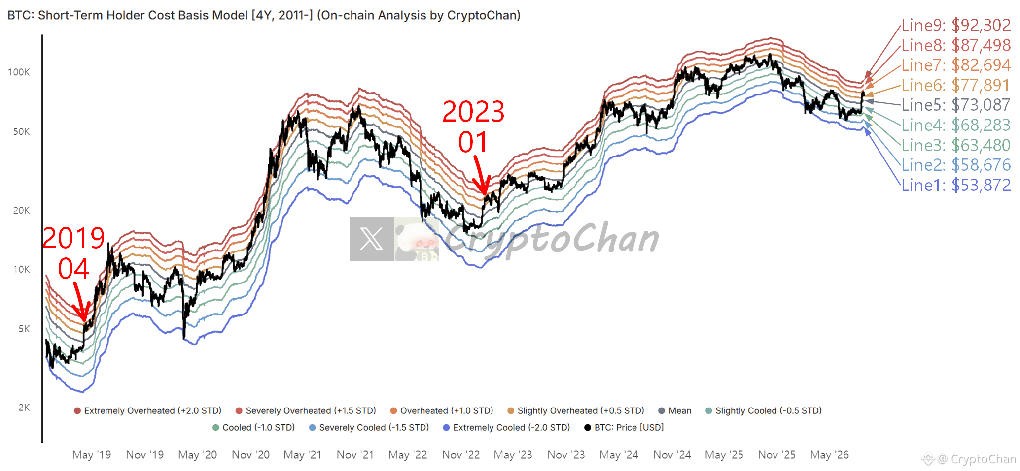
【 $BTC four-year cycle total engraving series 54】
How soon will this coin price reach Line 7? 🗡️ Down in April 2019 & January 2023
┌── 🐼 On-chain data details ──┐
The nine lines in the chart correspond to the [+2, +1.5, +1, +0.5, 0, -0.5, -1, -1.5, -2] standard deviation points for the average buy-in cost line of short-term holders’ coin holdings on the Bitcoin chain.
How soon will this coin price reach Line 7? 🗡️ Down in April 2019 & January 2023
┌── 🐼 On-chain data details ──┐
The nine lines in the chart correspond to the [+2, +1.5, +1, +0.5, 0, -0.5, -1, -1.5, -2] standard deviation points for the average buy-in cost line of short-term holders’ coin holdings on the Bitcoin chain.
CryptoChan
·
--
【 $BTC 4-Year Cycle Total Mark Series 53】
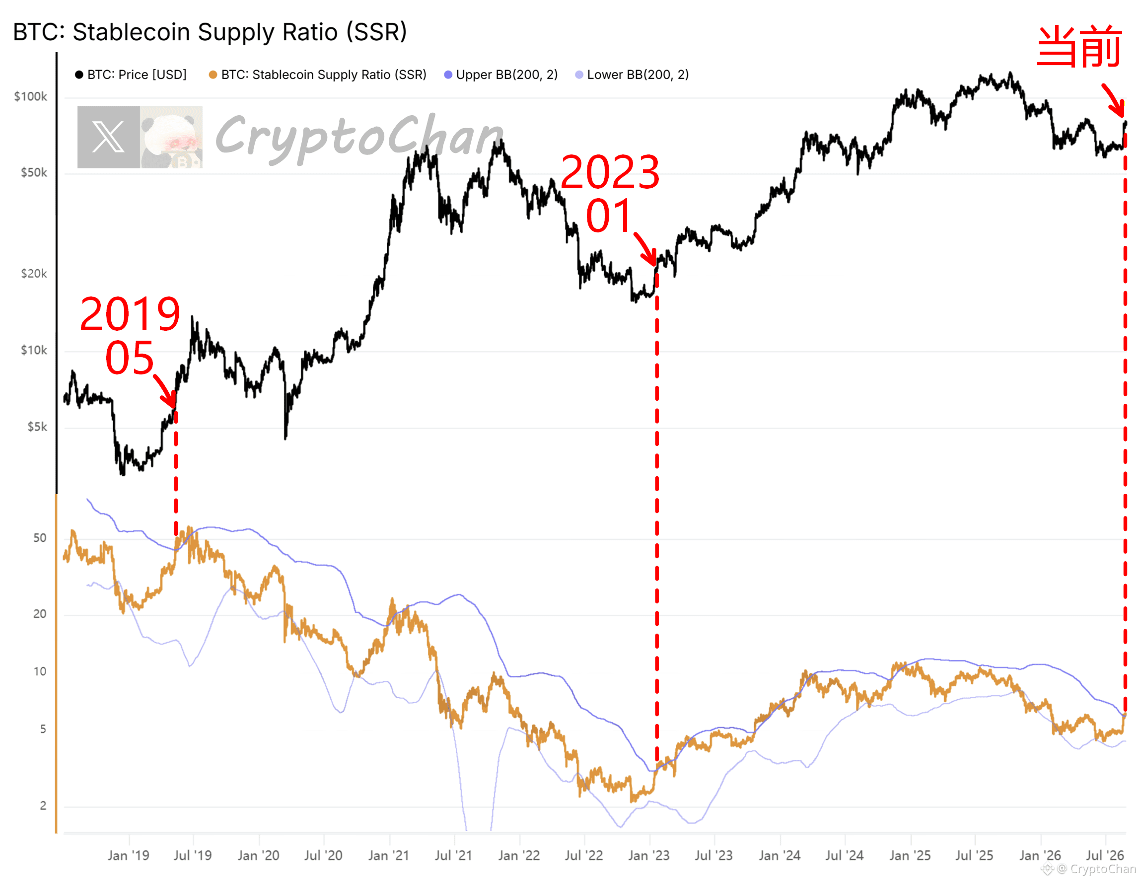
The current orange line has broken above the upper band. 🗡️ Below: May 2019 & January 2023
┌── 🐼 On-Chain Data Details ──┐
The orange line indicator at the bottom of the chart is SSR (Stablecoin Supply Ratio). The calculation formula is: Bitcoin total market cap ➗ total stablecoin market cap
SSR upper band = 200-day moving average + 2× standard deviation. Breaking above the upper band indicates SSR is in an extremely high range.
SSR lower band = 200-day moving average − 2× standard deviation. Dropping below the lower band indicates SSR is in an extremely low range.
The current orange line has broken above the upper band. 🗡️ Below: May 2019 & January 2023
┌── 🐼 On-Chain Data Details ──┐
The orange line indicator at the bottom of the chart is SSR (Stablecoin Supply Ratio). The calculation formula is: Bitcoin total market cap ➗ total stablecoin market cap
SSR upper band = 200-day moving average + 2× standard deviation. Breaking above the upper band indicates SSR is in an extremely high range.
SSR lower band = 200-day moving average − 2× standard deviation. Dropping below the lower band indicates SSR is in an extremely low range.
CryptoChan
·
--
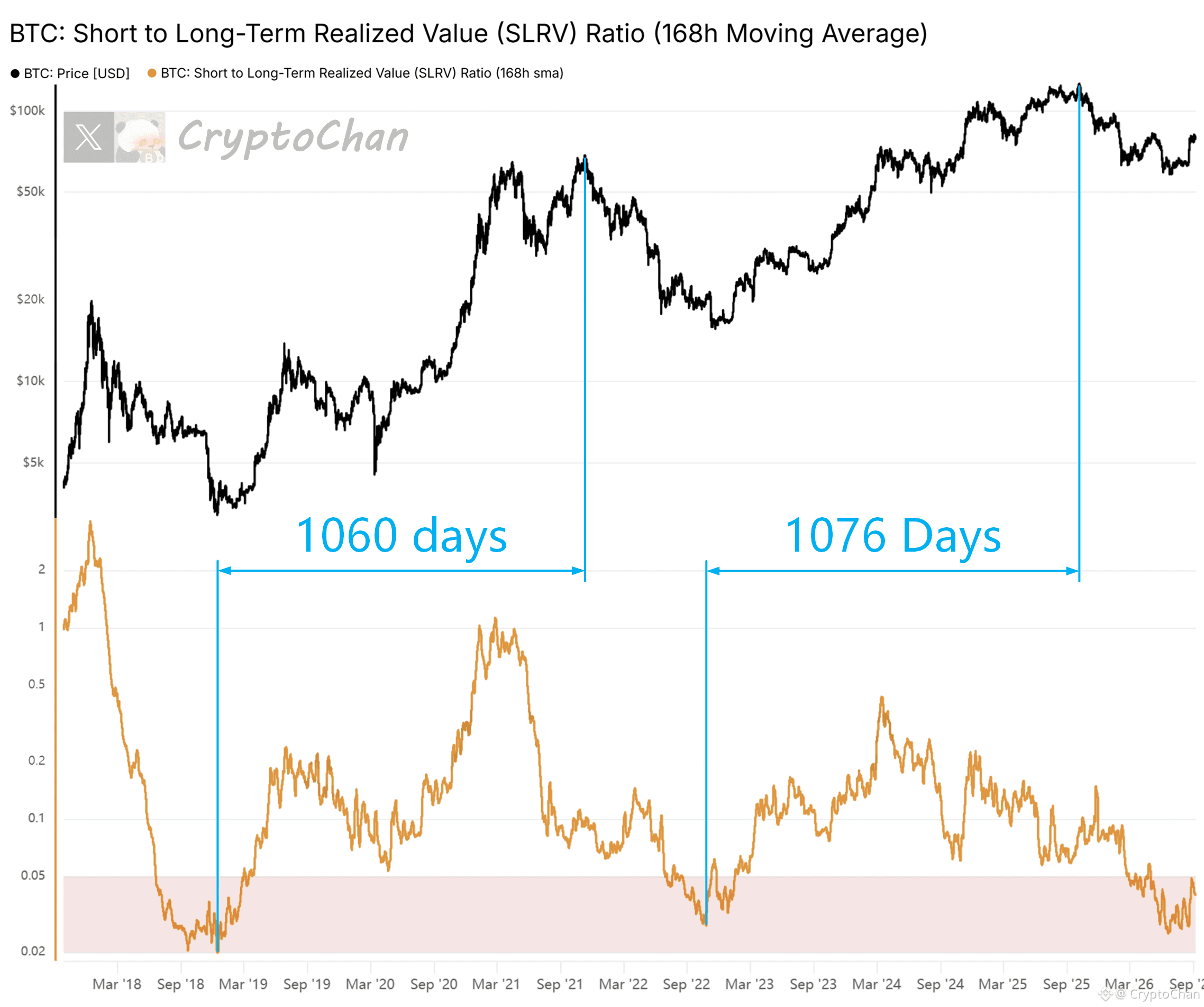
The core of those BTC bear-bottom indicators that have perfectly triggered in the past: the price drops enough and hard enough—hard enough that long-term holders (LTH) capitulate and mass-sell to complete the final leg of the decline
But if, in a given bear market cycle, the price never breaks below the LTH cost line and no large-scale LTH capitulation event occurs, then it’s also possible to go through the bear market without triggering the relevant indicators
Q: Do you think that “a given bear market cycle” will be this one? 🤭
But if, in a given bear market cycle, the price never breaks below the LTH cost line and no large-scale LTH capitulation event occurs, then it’s also possible to go through the bear market without triggering the relevant indicators
Q: Do you think that “a given bear market cycle” will be this one? 🤭

CryptoChan
·
--
【 $BTC Four-Year Cycle Total Slice Series 52】
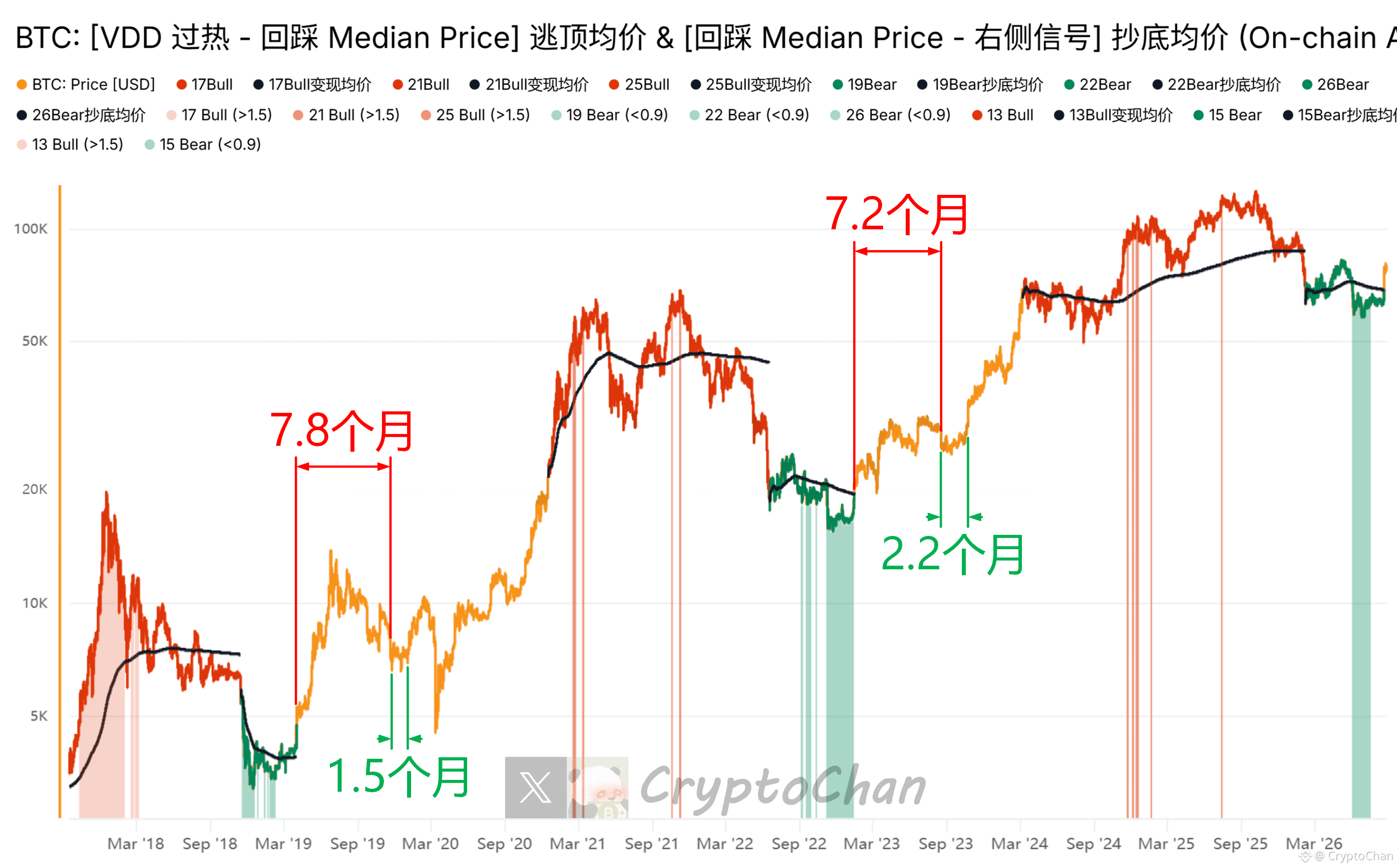
After breaking away from the bear base in 2019, 7.8 months later: the bull market recovery phase comes to a close. The market entered the last pullback-and-base range before the main upmove, creating an excellent 1.5-month trading window (ignore the 312 Black Swan)
After breaking away from the bear base in 2023, 7.2 months later: the bull market recovery phase comes to a close. The market entered the last pullback-and-base range before the main upmove, creating an excellent 2.2-month trading window
This round has already been 0.25 months since breaking away from the bear base
┌── 🐼 Indicator Details ──┐
The indicators shown in the chart are developed based on a bull-market top-escape & bear-market bottom-catch model built from Bitcoin VDD, Median Price, and multiple sets of confirmed indicators on the right side of bear bases
After breaking away from the bear base in 2019, 7.8 months later: the bull market recovery phase comes to a close. The market entered the last pullback-and-base range before the main upmove, creating an excellent 1.5-month trading window (ignore the 312 Black Swan)
After breaking away from the bear base in 2023, 7.2 months later: the bull market recovery phase comes to a close. The market entered the last pullback-and-base range before the main upmove, creating an excellent 2.2-month trading window
This round has already been 0.25 months since breaking away from the bear base
┌── 🐼 Indicator Details ──┐
The indicators shown in the chart are developed based on a bull-market top-escape & bear-market bottom-catch model built from Bitcoin VDD, Median Price, and multiple sets of confirmed indicators on the right side of bear bases
CryptoChan
·
--
【 $BTC Four-year cycle total engraving series 51】
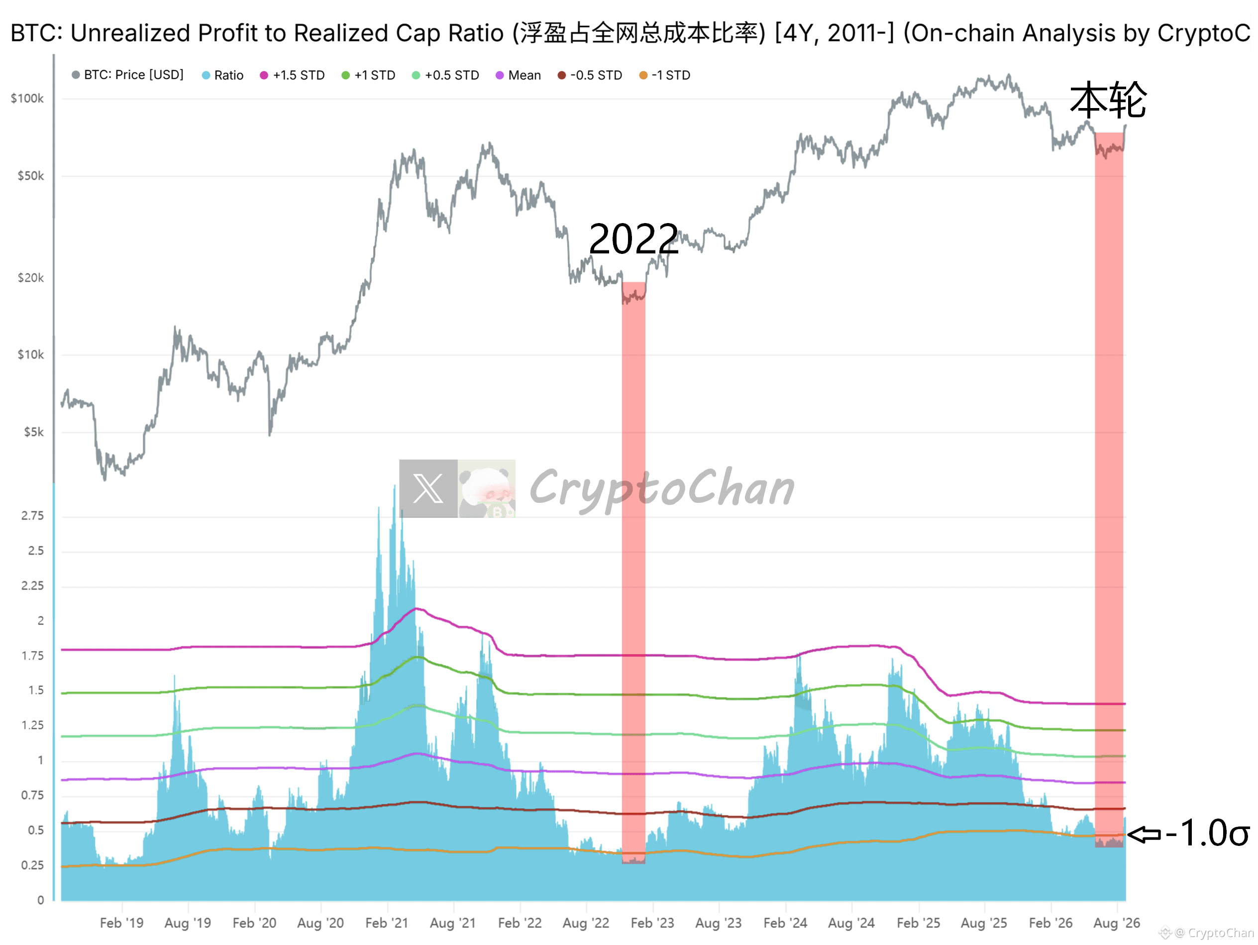
Bear-bottom in 2022: this indicator dropped below the orange line for 65 days
This bear-bottom: this indicator dropped below the orange line for 78 days
That is, in both of these past bear-bottom cycles, there was more than a two-month, ample bottom-picking window
┌── 🐼 On-chain data details ──┐
The indicator at the bottom of the chart is the ratio of “Bitcoin’s total net unrealized profit amount from all on-chain holdings” to “Bitcoin’s total purchase cost from all on-chain holdings.” The orange line is the “-1 standard deviation” line for this ratio
Bear-bottom in 2022: this indicator dropped below the orange line for 65 days
This bear-bottom: this indicator dropped below the orange line for 78 days
That is, in both of these past bear-bottom cycles, there was more than a two-month, ample bottom-picking window
┌── 🐼 On-chain data details ──┐
The indicator at the bottom of the chart is the ratio of “Bitcoin’s total net unrealized profit amount from all on-chain holdings” to “Bitcoin’s total purchase cost from all on-chain holdings.” The orange line is the “-1 standard deviation” line for this ratio
CryptoChan
·
--
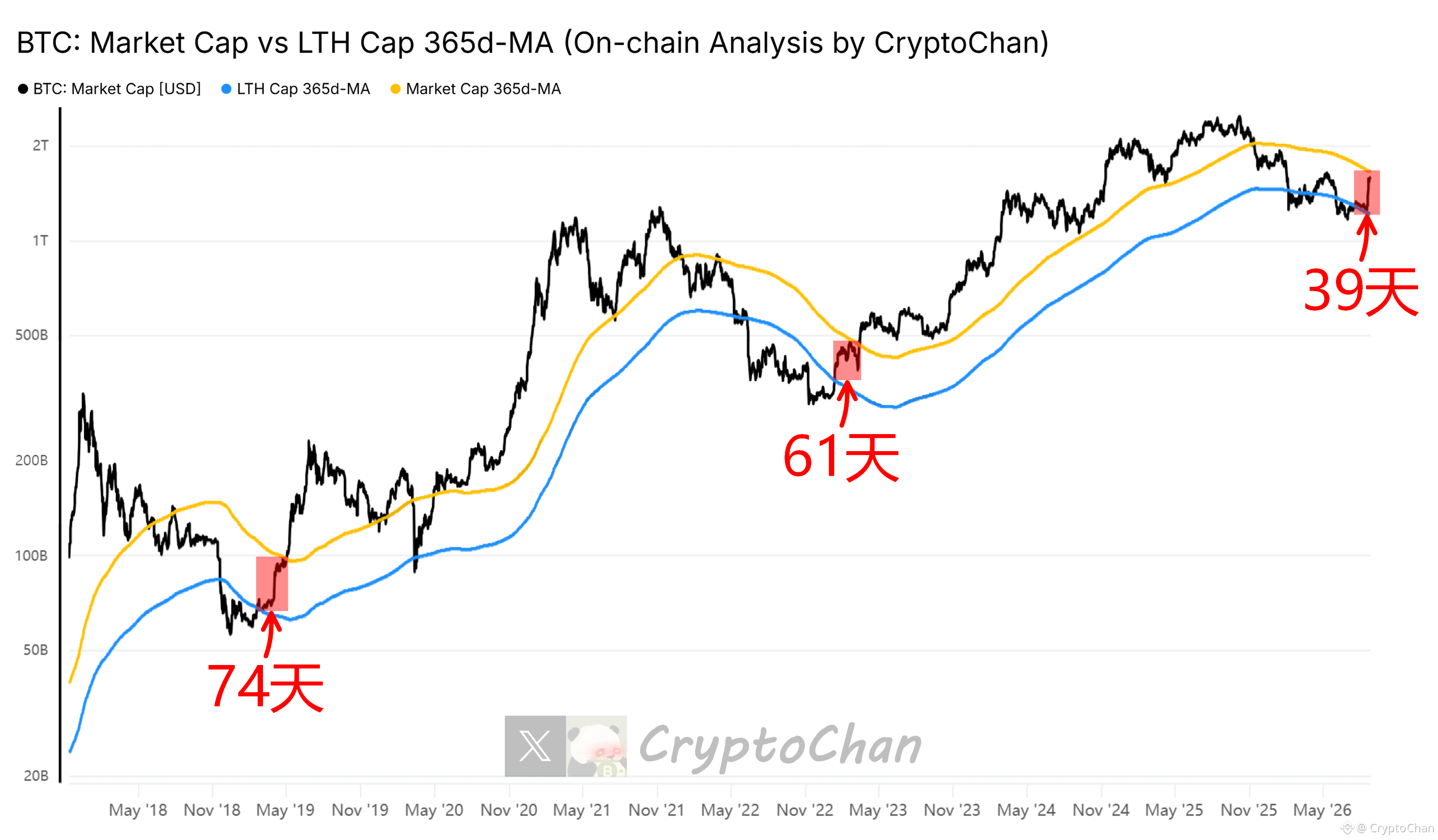
【 $BTC four-year cycle total engraving series 50】
2019 “turn to bull” phase lasted 74 days
2023 “turn to bull” phase lasted 61 days
The current “turn to bull” phase has already lasted 39 days
┌── 🐼 KPI Details ──┐
Black line: Bitcoin market cap
Orange line: Bitcoin market cap 365-day MA
Blue line: Bitcoin on-chain long-term holder cohort total market cap 365-day MA
2019 “turn to bull” phase lasted 74 days
2023 “turn to bull” phase lasted 61 days
The current “turn to bull” phase has already lasted 39 days
┌── 🐼 KPI Details ──┐
Black line: Bitcoin market cap
Orange line: Bitcoin market cap 365-day MA
Blue line: Bitcoin on-chain long-term holder cohort total market cap 365-day MA
CryptoChan
·
--
Cow's coming!!️【$BTC four-year cycle total engraving series 49】
March 2012: Blue-Orange crossover
July 2015: Blue-Orange crossover
April 2019: Blue-Orange crossover
January 2023: Blue-Orange crossover
Current: Blue and Orange have crossed
┌─ 🐼 On-chain data details ─┐
The blue line is the ratio of “average purchase cost of long-term on-chain holders” to “average purchase cost of short-term on-chain holders”; the orange line is the blue line’s 60-day MA.
Historically, Blue-Orange crossovers often correspond to the end of a bear market and the start of a bull market
March 2012: Blue-Orange crossover
July 2015: Blue-Orange crossover
April 2019: Blue-Orange crossover
January 2023: Blue-Orange crossover
Current: Blue and Orange have crossed
┌─ 🐼 On-chain data details ─┐
The blue line is the ratio of “average purchase cost of long-term on-chain holders” to “average purchase cost of short-term on-chain holders”; the orange line is the blue line’s 60-day MA.
Historically, Blue-Orange crossovers often correspond to the end of a bear market and the start of a bull market
CryptoChan
·
--
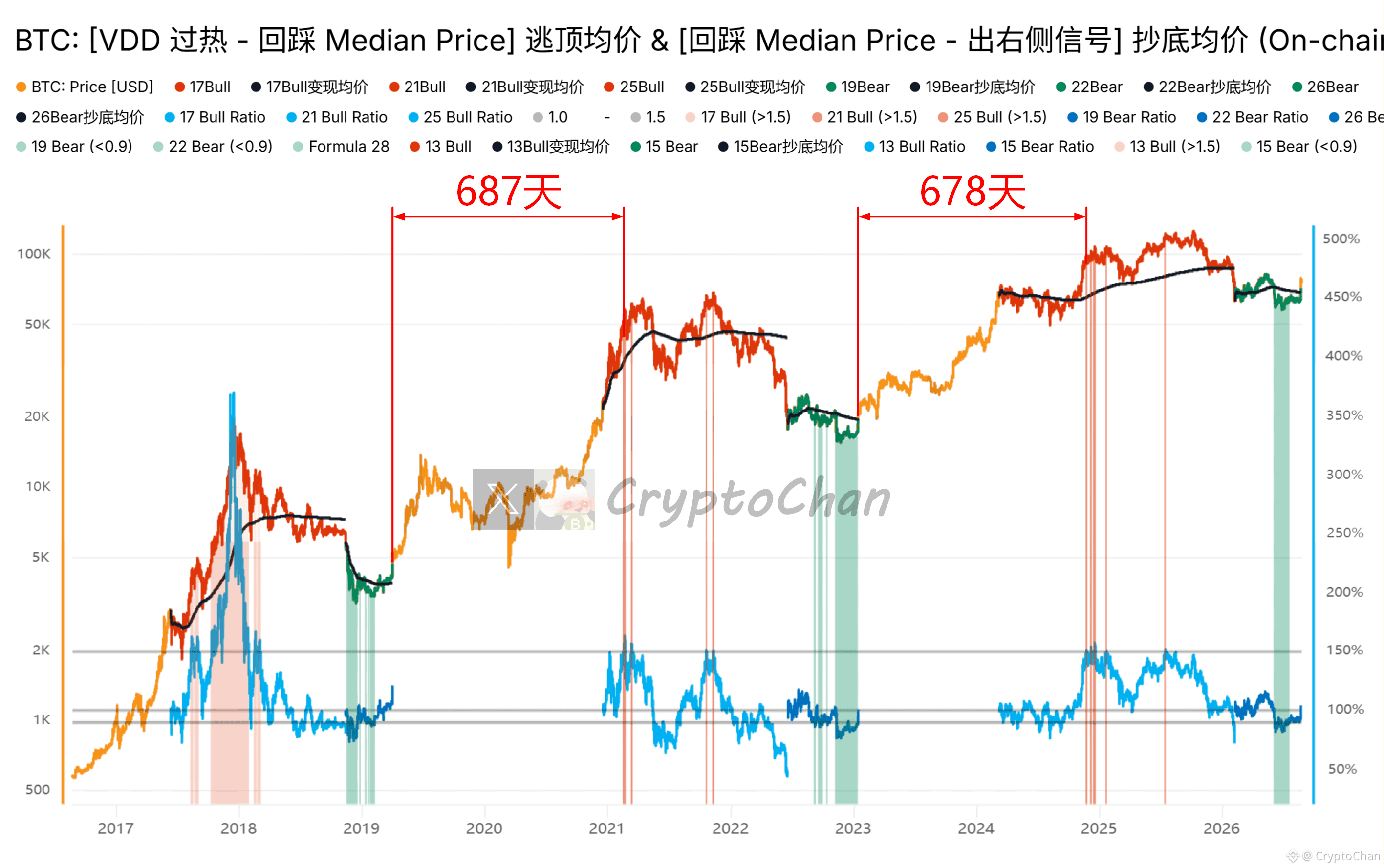
【 $BTC 2028-29 Bull Market Top-Escape Countdown Series 01】
After finishing the 2019 bear-market bottom-buy, 687 days later, the first top-escape red column appeared in 2021
After finishing the 2023 bear-market bottom-buy, 678 days later, the first top-escape red column appeared in 2024
The 2026 bear-market bottom-buy has already passed by 4 days and 2 hours
┌── 🐼 Indicator Details ──┐
The indicator shown is a bull-market top-escape & bear-market bottom-buy model developed based on Bitcoin VDD, Median Price, and multiple related indicators on the right side of bear-market bottoms
After finishing the 2019 bear-market bottom-buy, 687 days later, the first top-escape red column appeared in 2021
After finishing the 2023 bear-market bottom-buy, 678 days later, the first top-escape red column appeared in 2024
The 2026 bear-market bottom-buy has already passed by 4 days and 2 hours
┌── 🐼 Indicator Details ──┐
The indicator shown is a bull-market top-escape & bear-market bottom-buy model developed based on Bitcoin VDD, Median Price, and multiple related indicators on the right side of bear-market bottoms
Log in to explore more content