Introduction
Without the right trading tools, you will not be able to carry out effective technical analysis. A solid trading strategy will help you avoid common mistakes, improve your risk management and increase your ability to identify and take advantage of opportunities.
For many, TradingView is the reference chart platform. Offering a hub of technical analysis tools, this powerful HTML5 web application is used by millions of people to monitor the movements of the Forex, cryptocurrency and traditional stock markets.
TradingView has many powerful features: it allows you to monitor assets across numerous trading platforms, as well as post trade ideas within your social network. In this article, we will focus on its customization capacity. We will use Pine Script, TradingView's own programming language, which guarantees us granular control over our graphic formats.
Let us begin!
What is PineScript?
Pine Script is a scripting language that you can use to modify your TradingView charts. The platform already provides you with many functionalities to do so, but Pine Script allows you to go one step further. Whether it's changing the colors of your candles or backtesting a new strategy, the Pine Editor will allow you to customize your real-time charts as you see fit.
The code itself is excellently documented, so be sure to consult the user manual for more information. Our goal in this tutorial is to discuss some of the basic principles and present indicators that may be useful for cryptocurrency trading.
Setting
Getting started with Pine Script is incredibly simple. Any code we write will run on TradingView's servers, so we can access the editor and develop our scripts from a browser – without any extra downloads or configuration required.
In this tutorial, we are going to "chart" the Bitcoin/Binance USD (BTCBUSD) currency pair. If you haven't already, take the step and register a free account (a pro subscription is also available, but not necessary for this guide).
Follow this link, and you will find a graph similar to the following:
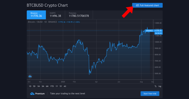
Yours will probably be more up to date.
Once here, we will want to have the full-featured chart – click on the button to access it. This will give us a much more detailed view, drawing tools and options to draw trend lines, among other things.
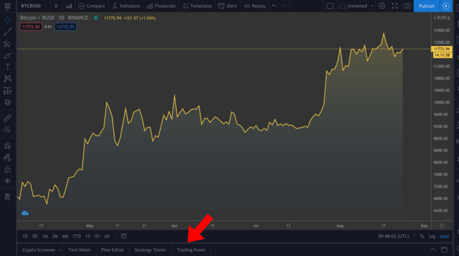
Full-featured chart. You can adjust the time interval by clicking on the views that appear above the highlighted tabs.
We won't go into how to use the different tools available, but if you are very serious about technical analysis, we highly recommend that you familiarize yourself with them. At the bottom left (indicated in the image), you will see a series of different tabs – click on Pine Editor.
The Pine Editor
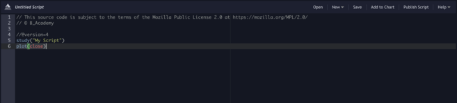
This editor is where the magic happens. We will tell it what we want to do, and then we will click on Add to Chart to see how our annotations appear above. Keep in mind that things can get complicated if we include several annotations at once, so we will remove them between the different examples - right click on the chart > Remove Indicators.
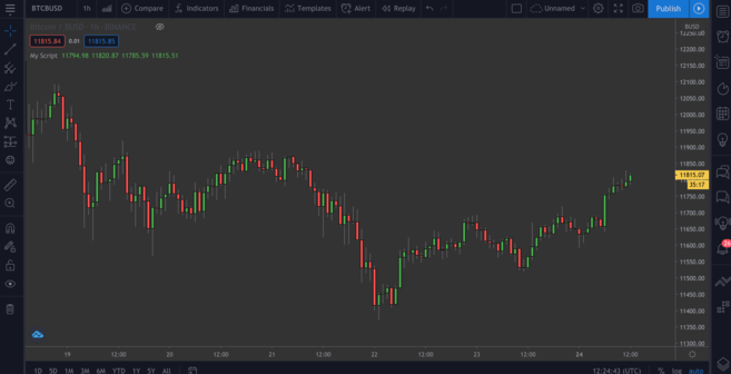
You can see that we already have a couple of lines of code there. Let's proceed to click on Add to Chart to see what happens.
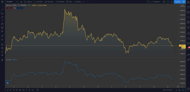
A second graph is added below the original. The new graph represents the same data. Hover over My Script and click the cross to delete it. Now, let's analyze the code in detail.
study("My Script")This first line simply sets up our annotation. It only requires the name you want to give the indicator ("My Script", in this case), although there are also a series of optional parameters that we can add. One of them is overlay, which tells TradingView to place the indicator on the existing chart (rather than on a new segment). As you can see in our first example, by default it appears as false. Although we won't see it in action now, overlay=true adds the indicator to the existing chart.
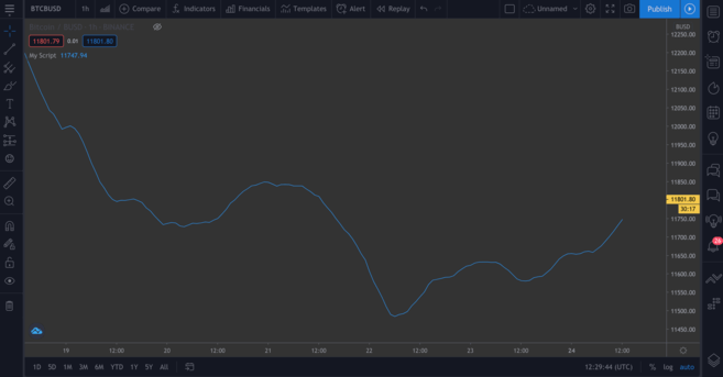
plot(close)This line is the instruction to mark the closing price of Bitcoin. plot simply provides us with a line graph, although we can also display candles and bars, as we will see shortly.
Now, let's try the following:
//@version=4
study("My Script", overlay=true)
plot(open, color=color.purple)
Once you add this, you should be able to see a second graph (which will be like the original one shifted to the right). All we have done is capture the opening price, and since the current day's open is the previous day's close, it is logical that these present an identical shape.
Very good! We are going to get rid of the current annotations - remember, to do this we have to right click and select Remove Indicators. Hover over Bitcoin/BUSD and click the Hide button to also clear the current chart.
Many traders prefer candlestick charts since they provide us with more information than a simple diagram like the one we just made. Let's proceed to add them below.
//@version=4
study("My Script", overlay=true)
plotcandle(open, high, low, close)
It's a good start, but the lack of colors makes it a bit bland. Ideally, we should have red candles when the open is greater than the close in the period in question, and green when the close exceeds the open. So we'll add a line above the plotcandle() function:
//@version=4
study("My Script", overlay=true)
colors = open >= close ? color.red : color.green
plotcandle(open, high, low, close)
This will look at each candle and check if the opening is greater than or equal to the close. If it is, it means that prices have fallen during the period, so it will color the candle red. Otherwise, it will color it green. Modify the plotcandle() function to approve this color scheme:
//@version=4
study("My Script", overlay=true)
colors = open >= close ? color.red : color.green
plotcandle(open, high, low, close, color=colors)
Delete the current indicators if you haven't already, and add this one to the chart. Now, we should have something that looks like an ordinary candlestick chart.
Precious!
Plot moving averages (MA)
We already have some of the basic elements. Let's now look at our first custom indicator – the exponential moving average or EMA. This is a valuable tool as it allows us to filter out any market noise and smooth out price action.
The EMA differs slightly from the simple moving average (SMA) in that it gives greater weight to the most recent data. It tends to be more reactive to sudden movements, and is often used for short-term plays (like in day trading, for example).
The simple moving average (SMA)
We could also plot the SMA, so we can compare the two means later. Add this line to your script:
plot(sma(close, 10))This will plot the average of the previous ten days. Adjust the number in parentheses to see how the curve changes when considering different lengths.
The SMA, based on the previous ten days.
The exponential moving average (EMA)
The EMA will be a little more difficult to understand, but there is no need to worry. Let's break down the formula first:
EMA = (Close - Previous Day's EMA) * Multiplier - Previous Day's EMASo, what is this telling us? Well, for each day we calculate a new moving average, based on that of the previous day. The multiplier is what “weights” the most recent period, and is calculated with the following formula:
Multiplier = 2 / (EMA Length + 1)As with simple moving averages, we need to specify how long the EMA will be. Syntactically, the function for plotting the EMA is similar to that of the SMA. Plot it next to the SMA so you can compare the two:
//@version=4
study("My Script", overlay=true)
plot(sma(close, 10))
plot(ema(close,10))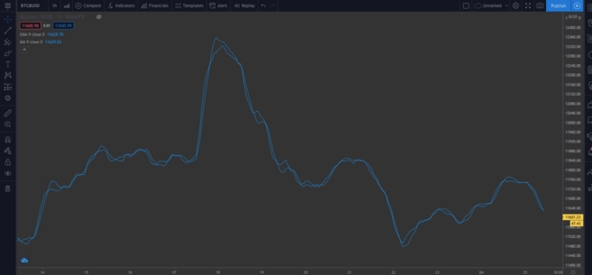
You can see that there is a slight difference between both types of MA.
➠ Are you thinking about getting started in the world of cryptocurrencies? Buy Bitcoin on Binance!
Built-in scripts
Until now, we've written our code manually so you'll be familiar with it. Next, we will introduce an element that can save us time, especially if we are going to write more complex scripts and we do not want to do it from scratch.
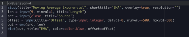
At the top right of your editor, click New. You will come across a drop-down menu with all kinds of different technical indicators. Click on Moving Average Exponential to see the source code of an EMA indicator.
Go ahead and add this to the graph.
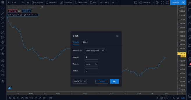
This one is different from ours – you will recognize the input() functions. They are great from a usability point of view, since you can click on this box…
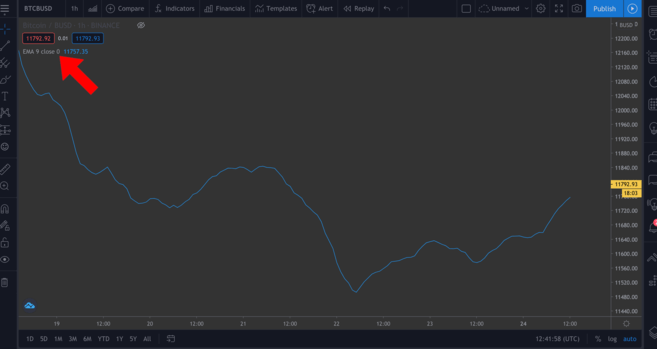
...and easily change some of the values in a pop-up window by clicking on the Settings wheel.
We'll add a couple of input() functions in our next script to demonstrate this.
Flag the Relative Strength Index (RSI) indicator
The Relative Strength Index (RSI) is another essential technical analysis indicator. It is known as a "momentum" indicator, meaning it measures the speed at which assets are bought and sold. Presented on a scale of 0 to 100, an RSI score attempts to inform investors whether assets are "overbought" or "oversold." Typically, an asset may be considered oversold if it has a score less than or equal to 30, and overbought with a score greater than or equal to 70.
If you head to New > RSI Strategy, you can check it out for yourself. The RSI is usually measured in periods of 14 (i.e. 14 hours or 14 days), but you can modify those settings to suit your own strategy.
Add this to the graph. You should see some arrows displayed now (defined by the strategy.entry() function in the code). RsiLE indicates a potential opportunity to prolong the asset as it may be oversold. RsiSE highlights possible points at which to short the asset when it is overbought. Keep in mind that, as with all indicators, you shouldn't necessarily rely on them as infallible proof that prices will rise or fall.
Backtesting
There is a way for us to test our custom indicators. Although past performance is no guarantee of future results, backtesting our scripts can give us an idea of how effective they are at picking up signals.
Below we will give an example of a simple script. Let's create a simple strategy that enters a long position when the price of BTC falls below $11,000 and exits the position when the price exceeds $11,300. So we can see how profitable this strategy would have been historically.
//@version=4
strategy("ALaLuna", overlay=true)
enter = input(11000)
exit = input(11300)
price = close

if (price <= enter)
    strategy.entry("CompraLaCaída", strategy.long, comment="CompraLaCaída")
if (price >= exit)
    strategy.close_all(comment="VendeLasNoticias")
Here we have defined the input and output as variables; they are both inputs, which means we can change them on the graph later. We also set the price variable, which takes the close of each period. So, we have some logic in the form of if statements. If the part in the square brackets is true, the block indented below will be executed. Otherwise it will be skipped.
So, if the price is less than or equal to our desired entry, the first expression evaluates to true and we will open a long position. Once the price equals or exceeds the desired output, the second block will be activated, closing all open positions.
We'll annotate the chart with arrows showing where we enter/exit, so we specify what to label these points with the comment parameter (in this example, "BuyTheDip" and "SellTheNews"). Copy the code and add it to the graph.
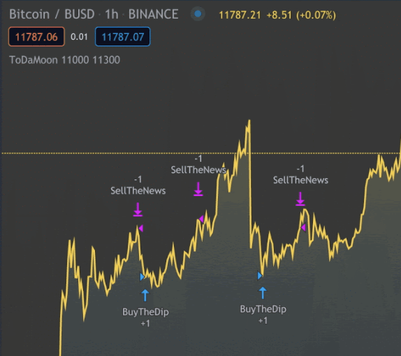
Now you can see the indicators on the chart. You may need to zoom out.
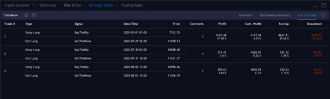
TradingView automatically applies your rules to older data. You will also notice that it switches from the Pine Editor to the Strategy Tester tab. This allows you to see an overview of your potential profits, a list of trades and each of your individual performances.
Positions we have entered and exited.
Put the pieces together
It's time to write our own script using some of the concepts we've seen so far. We will combine EMA and RSI and use their values to color candles, which will return information that we can easily visualize.
This should not be construed as financial advice; There is no objectively correct way to use this indicator. As with all the others, it should be used with other tools to develop your own strategy.
Now let's work on our new script. Remove all your indicators from the chart and hide the Bitcoin/BUSD chart as well, so we have a clean canvas to work on.
Let's start by defining our study. Feel free to name it whatever you want, just make sure to set overlay = true.
study(title="Binance Academy Script", overlay=true)Remember our EMA formula from before. We need to provide the multiplier with the length of the EMA. Let's convert it to an input that requires an integer (so no decimal places). We will also set a minimum which can be (minval) and a default value (defval).
study(title="Binance Academy Script", overlay=true)
emaLength = input(title="EMA Length", type=input.integer, defval=25, minval=0)
Using this new variable, we can calculate the EMA value for each candle on our chart:
study(title="Binance Academy Script", overlay=true)
emaLength = input(title="EMA Length", type=input.integer, defval=25, minval=0)
emaVal = ema(close, emaLength)
Excellent. About the RSI. We will give it a length similarly:
study(title="Binance Academy Script", overlay=true)
emaLength = input(title="EMA Length", type=input.integer, defval=25, minval=0)
emaVal = ema(close, emaLength)
rsiLength = input(title="RSI Length", type=input.integer, defval=25, minval=0)
And now, we can calculate it:
study(title="Binance Academy Script", overlay=true)
emaLength = input(title="EMA Length", type=input.integer, defval=25, minval=0)
emaVal = ema(close, emaLength)
rsiLength = input(title="RSI Length", type=input.integer, defval=25, minval=0)
rsiVal = rsi(close, rsiLength)
At this stage, we are going to put together the logic that colors the candles based on the EMA and RSI values. Let's take a situation where (a) the closing price of the candle exceeds the EMA and (b) where the RSI is above 50.
Because? Well, you can decide that these indicators can be used together to tell you when to buy Bitcoin in the short or long term. For example, you might think that meeting both conditions means it's a good time to enter a long position. Or conversely, you can use it to inform you when not to go short, even if other indicators say otherwise.
So our next line will look like this:
study(title="Binance Academy Script", overlay=true)
emaLength = input(title="EMA Length", type=input.integer, defval=25, minval=0)
emaVal = ema(close, emaLength)
rsiLength = input(title="RSI Length", type=input.integer, defval=25, minval=0)
rsiVal = rsi(close, rsiLength)
colors = close > emaVal and rsiVal > 50 ? color.green : color.red
If we translate this into simple language, we are simply saying that if the EMA value exceeds the closing price and the RSI score exceeds 50, we will color the candle green. Otherwise, we will color it red.
Next, plot the EMA:
study(title="Binance Academy Script", overlay=true)
emaLength = input(title="EMA Length", type=input.integer, defval=25, minval=0)
emaVal = ema(close, emaLength)
rsiLength = input(title="RSI Length", type=input.integer, defval=25, minval=0)
rsiVal = rsi(close, rsiLength)
colors = close > emaVal and rsiVal > 50 ? color.green : color.red
plot(emaVal, "EMA")
Finally, plot the candles, making sure to include the color parameter:
study(title="Binance Academy Script", overlay=true)
emaLength = input(title="EMA Length", type=input.integer, defval=25, minval=0)
emaVal = ema(close, emaLength)
rsiLength = input(title="RSI Length", type=input.integer, defval=25, minval=0)
rsiVal = rsi(close, rsiLength)
colors = close > emaVal and rsiVal > 50 ? color.green : color.red
plot(emaVal, "EMA")
plotcandle(open, high, low, close, color=colors)
And that's the script! Add it to the chart to see it in action.
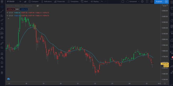
A BTC/BUSD chart with the EMA/RSI indicator.
In conclusion
In this article, we look at some basic examples of what you can do with TradingView's Pine editor. At this point, you should be sure to make simple annotations on price charts to gain additional information from your own indicators.
We've only been interested in a couple of indicators here, but it's easy to generate more complex indicators, either by selecting New's built-in scripts or writing them yourself.
Lack of inspiration? The following articles may provide you with some ideas for your next project:
Brief Guide to the Parabolic SAR Indicator
Guide to Mastering Fibonacci Retracements
Introduction to Leading and Lagging Indicators (Leading/Lagging Indicators)
MACD indicator explained


