

技术流谬皮
352 Posts

技术流谬皮
Report
Block User
专注量价行为与微观盘面博弈
每日巨鲸/做市商异动与链上流动性监控
清算热力图 & 衍生品数据解读
头部 KOL 观点数据化复盘与信号打假、客观胜率归纳与留白周报,聚合分析
严选 Alpha 资讯与实时异动预警
内部实时预警,请咨询

USD1 Holder
High-Frequency Trader
1.3 Years
61 Following
105 Followers
34 Liked
Posts
All
Quotes
Videos
PINNED
·
--
Honestly, before, I also got dizzy and overwhelmed by all kinds of “insider information” in various groups. If I chased the price, I’d get trapped; if I didn’t, I’d be afraid of missing the big opportunities……
When information isn’t overloaded, trading becomes clear. To fully solve the problem of information gaps and timing, I developed 【Investment Intelligence Bureau Alpha Station】— an automated trading system that combines high-accuracy signal aggregation + OI anomaly monitoring + strategy backtesting + millisecond-level notifications.
📌
The system’s 4 core capabilities:
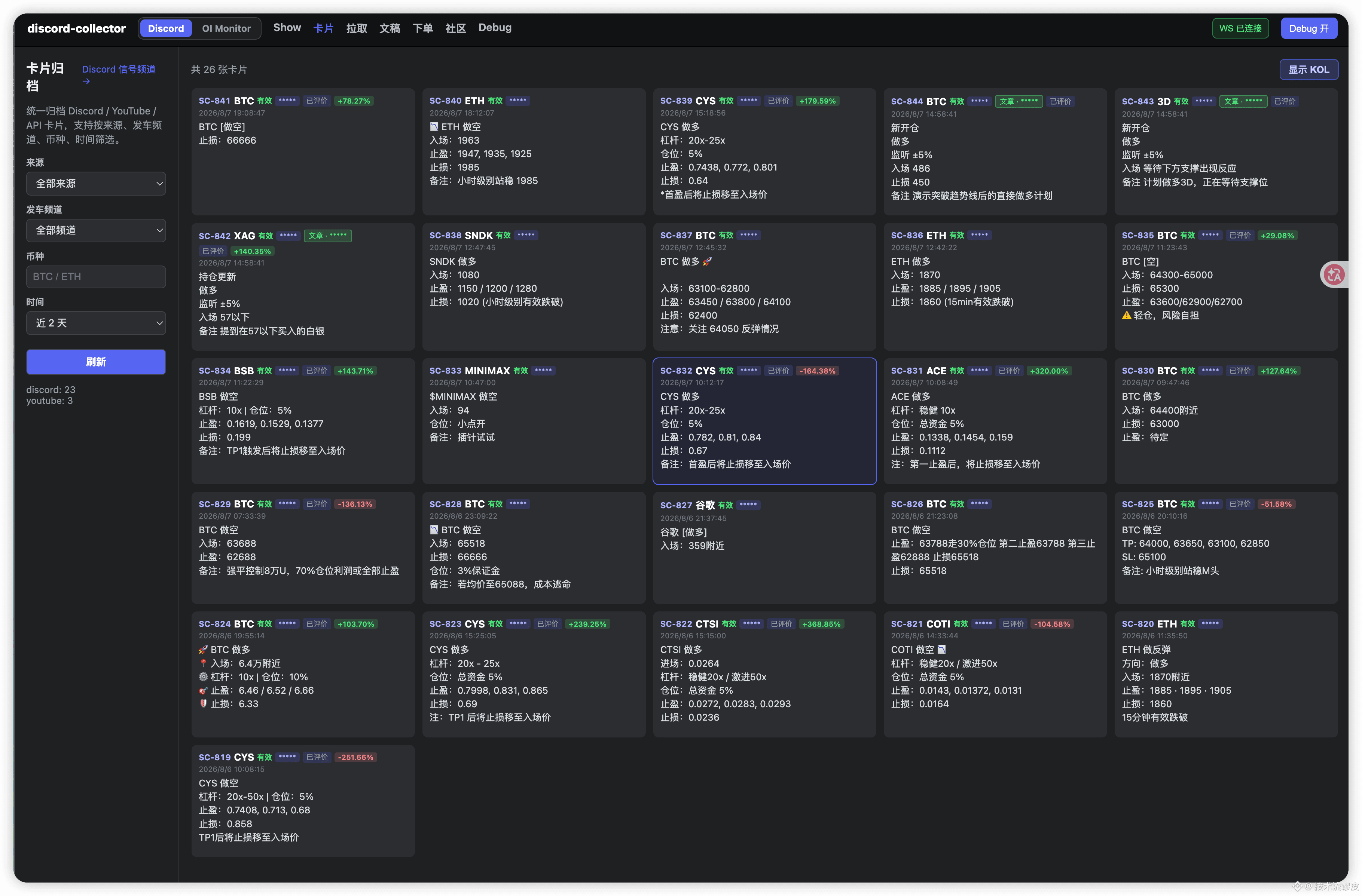
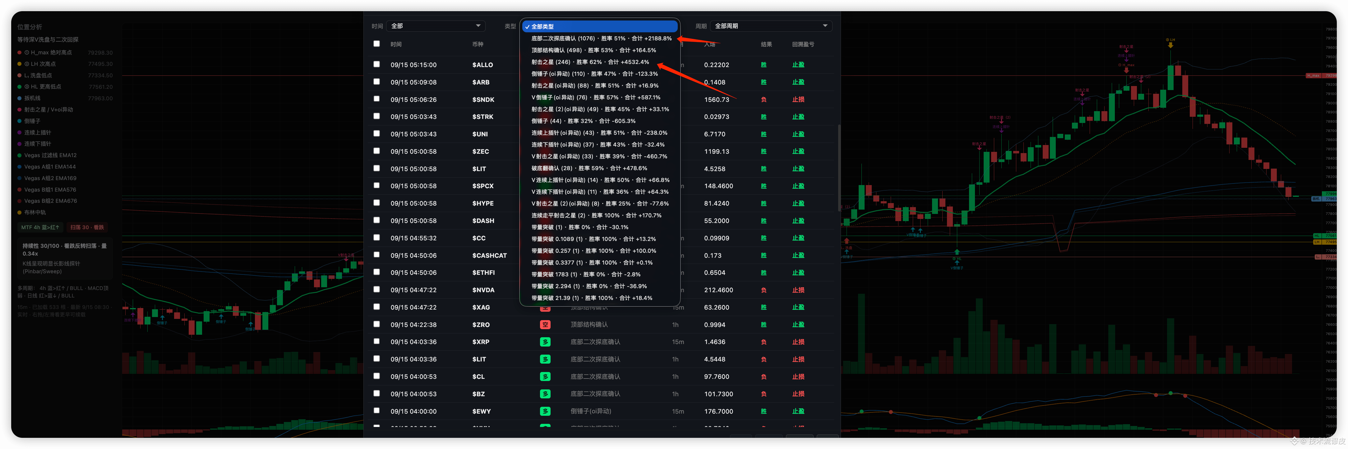
1️⃣Refined KOL signals from across the web: Grab 50+ top influencer signals in seconds, extract structured entry/take-profit levels and dynamic win rates, and filter out low-quality noise (Figure 1)
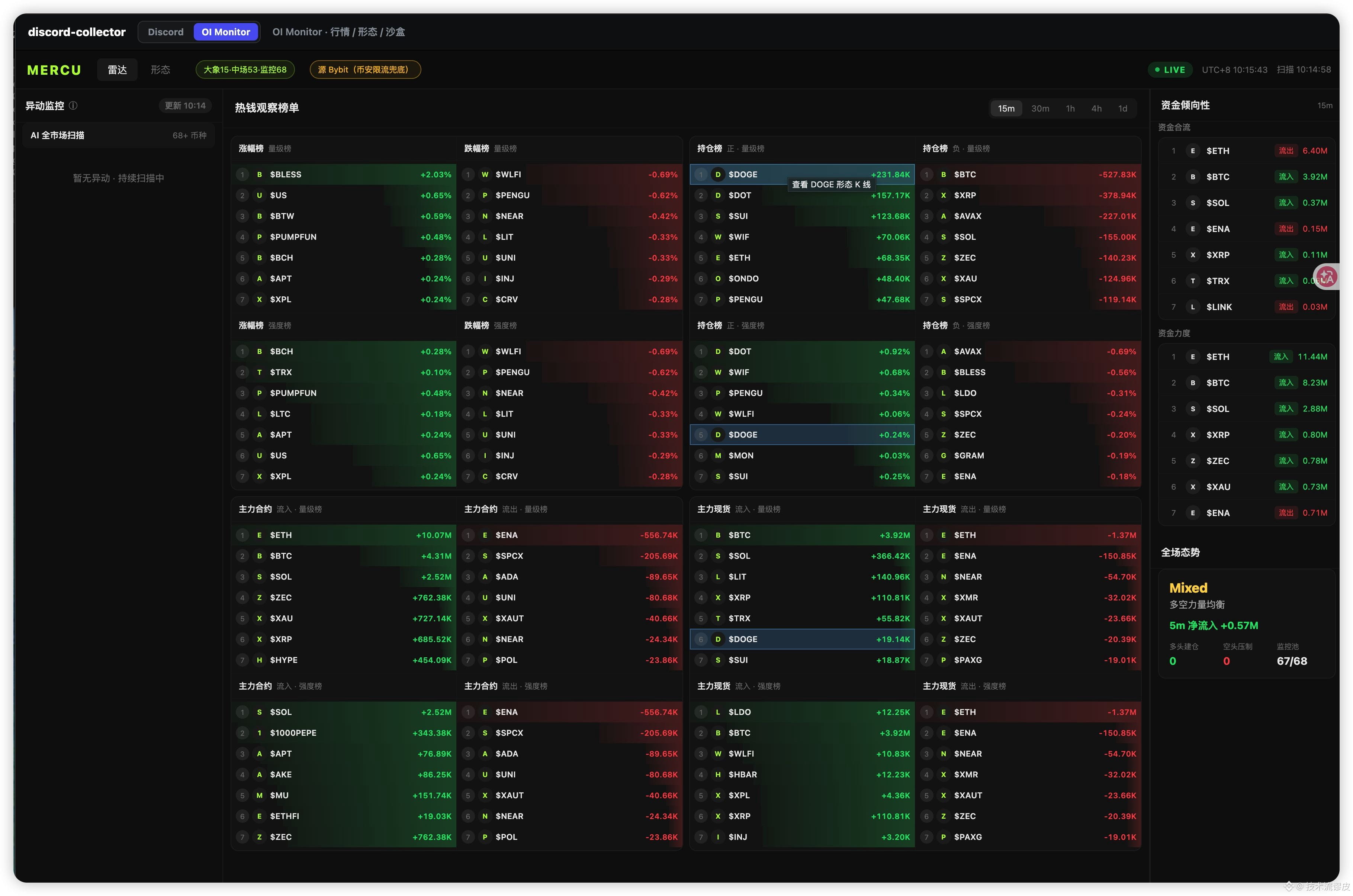
2️⃣Real-time OI & hot-money anomaly detection: Monitor open interest (OI) and capital flow for coins that see explosive rises or crashes across the entire web, supporting precise decision-making and tracking Smart Money (Figure 3)
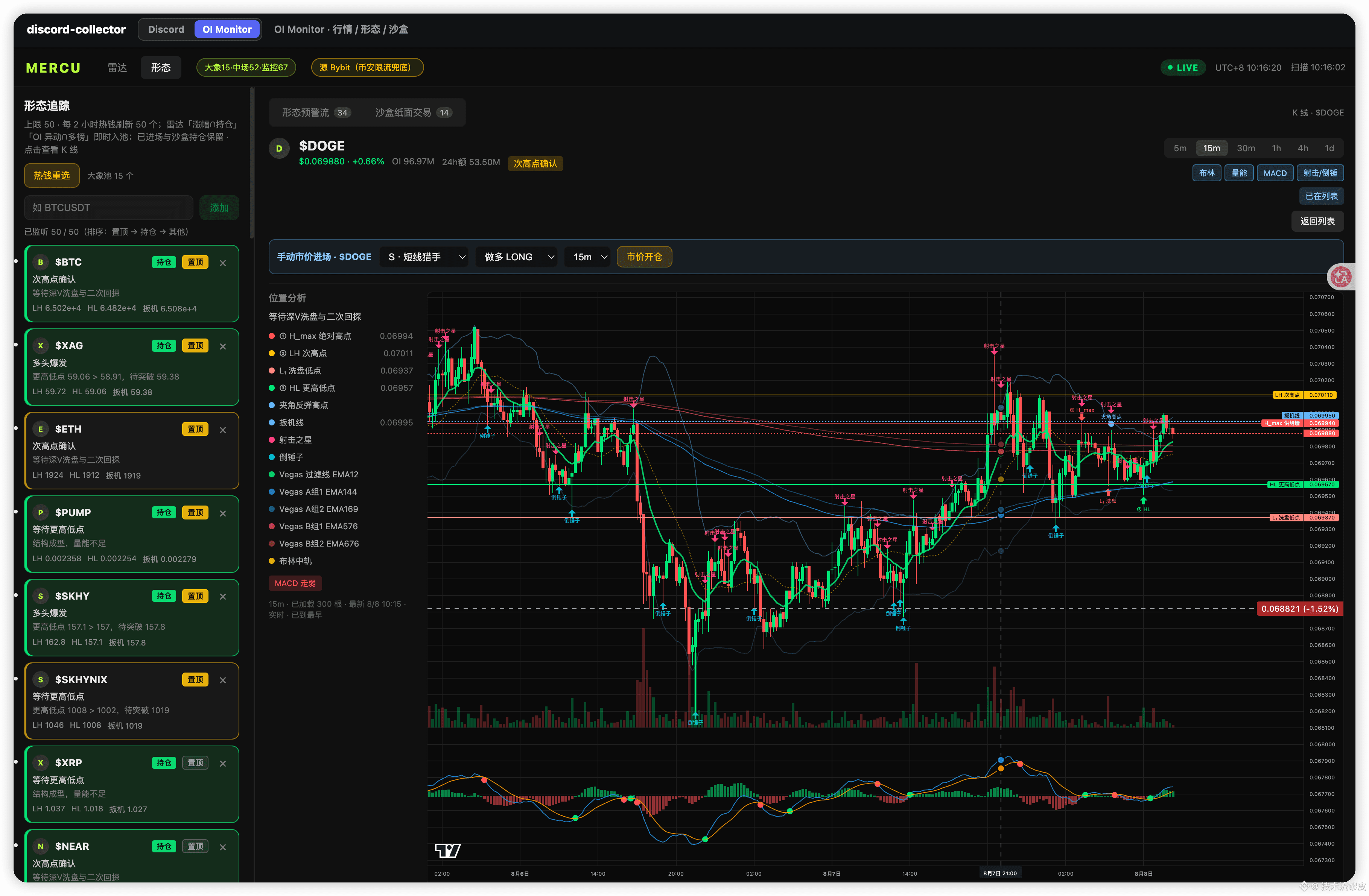
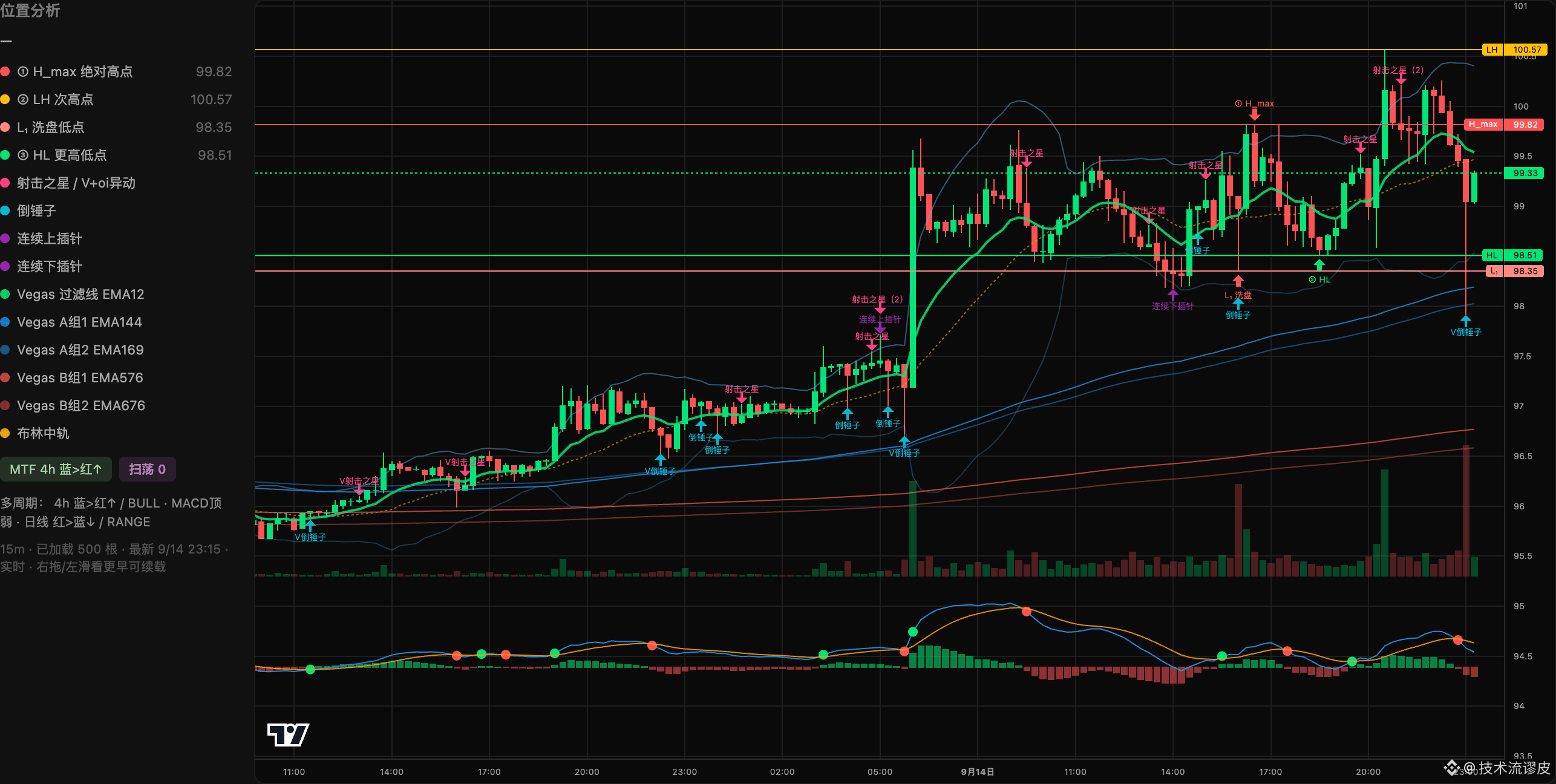
3️⃣TradingView intelligent pattern validation: Combine key breakout moments on the K-line, confirmation from the secondary high, and sandbox simulations to significantly improve signal trigger accuracy (Figure 2)
4️⃣TG millisecond push notifications: Synchronize TradingView strategy signals and OI anomaly signals to Telegram with zero delay, ensuring you can step in at the first moment (Figure 4)
🛠️No indicator sales, no calling trades—just empowered trading with high-accuracy data and an automated system.
(Since it’s something I use every day for my own trading, I might as well share it with fellow traders. Trading isn’t easy—helping everyone avoid pitfalls is the real hard truth!)
Honestly, before, I also got dizzy and overwhelmed by all kinds of “insider information” in various groups. If I chased the price, I’d get trapped; if I didn’t, I’d be afraid of missing the big opportunities……
When information isn’t overloaded, trading becomes clear. To fully solve the problem of information gaps and timing, I developed 【Investment Intelligence Bureau Alpha Station】— an automated trading system that combines high-accuracy signal aggregation + OI anomaly monitoring + strategy backtesting + millisecond-level notifications.
📌
The system’s 4 core capabilities:
1️⃣Refined KOL signals from across the web: Grab 50+ top influencer signals in seconds, extract structured entry/take-profit levels and dynamic win rates, and filter out low-quality noise (Figure 1)
2️⃣Real-time OI & hot-money anomaly detection: Monitor open interest (OI) and capital flow for coins that see explosive rises or crashes across the entire web, supporting precise decision-making and tracking Smart Money (Figure 3)
3️⃣TradingView intelligent pattern validation: Combine key breakout moments on the K-line, confirmation from the secondary high, and sandbox simulations to significantly improve signal trigger accuracy (Figure 2)
4️⃣TG millisecond push notifications: Synchronize TradingView strategy signals and OI anomaly signals to Telegram with zero delay, ensuring you can step in at the first moment (Figure 4)
🛠️No indicator sales, no calling trades—just empowered trading with high-accuracy data and an automated system.
(Since it’s something I use every day for my own trading, I might as well share it with fellow traders. Trading isn’t easy—helping everyone avoid pitfalls is the real hard truth!)
When information isn’t overloaded, trading becomes clear. To fully solve the problem of information gaps and timing, I developed 【Investment Intelligence Bureau Alpha Station】— an automated trading system that combines high-accuracy signal aggregation + OI anomaly monitoring + strategy backtesting + millisecond-level notifications.
📌
The system’s 4 core capabilities:
1️⃣Refined KOL signals from across the web: Grab 50+ top influencer signals in seconds, extract structured entry/take-profit levels and dynamic win rates, and filter out low-quality noise (Figure 1)
2️⃣Real-time OI & hot-money anomaly detection: Monitor open interest (OI) and capital flow for coins that see explosive rises or crashes across the entire web, supporting precise decision-making and tracking Smart Money (Figure 3)
3️⃣TradingView intelligent pattern validation: Combine key breakout moments on the K-line, confirmation from the secondary high, and sandbox simulations to significantly improve signal trigger accuracy (Figure 2)
4️⃣TG millisecond push notifications: Synchronize TradingView strategy signals and OI anomaly signals to Telegram with zero delay, ensuring you can step in at the first moment (Figure 4)
🛠️No indicator sales, no calling trades—just empowered trading with high-accuracy data and an automated system.
(Since it’s something I use every day for my own trading, I might as well share it with fellow traders. Trading isn’t easy—helping everyone avoid pitfalls is the real hard truth!)

4
2
1.2k
·
--
Partly True
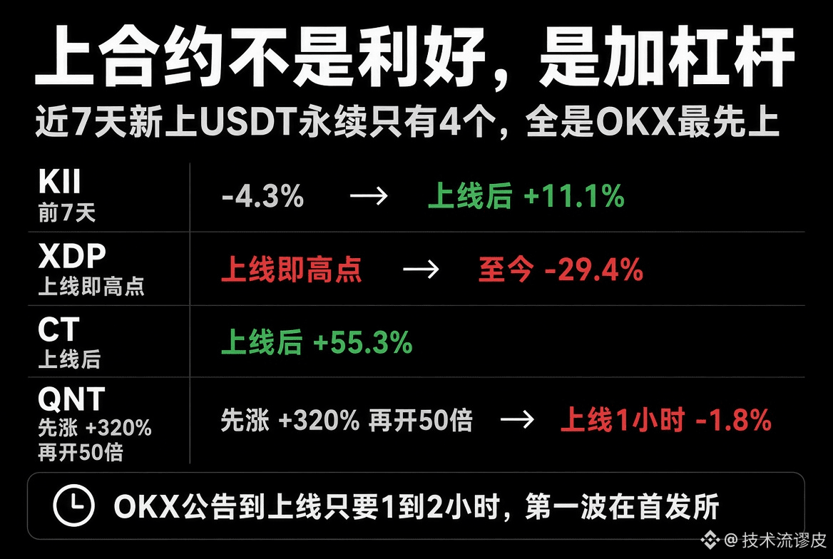
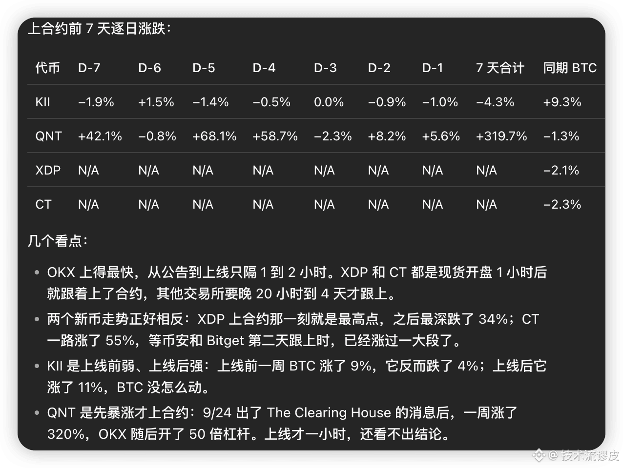
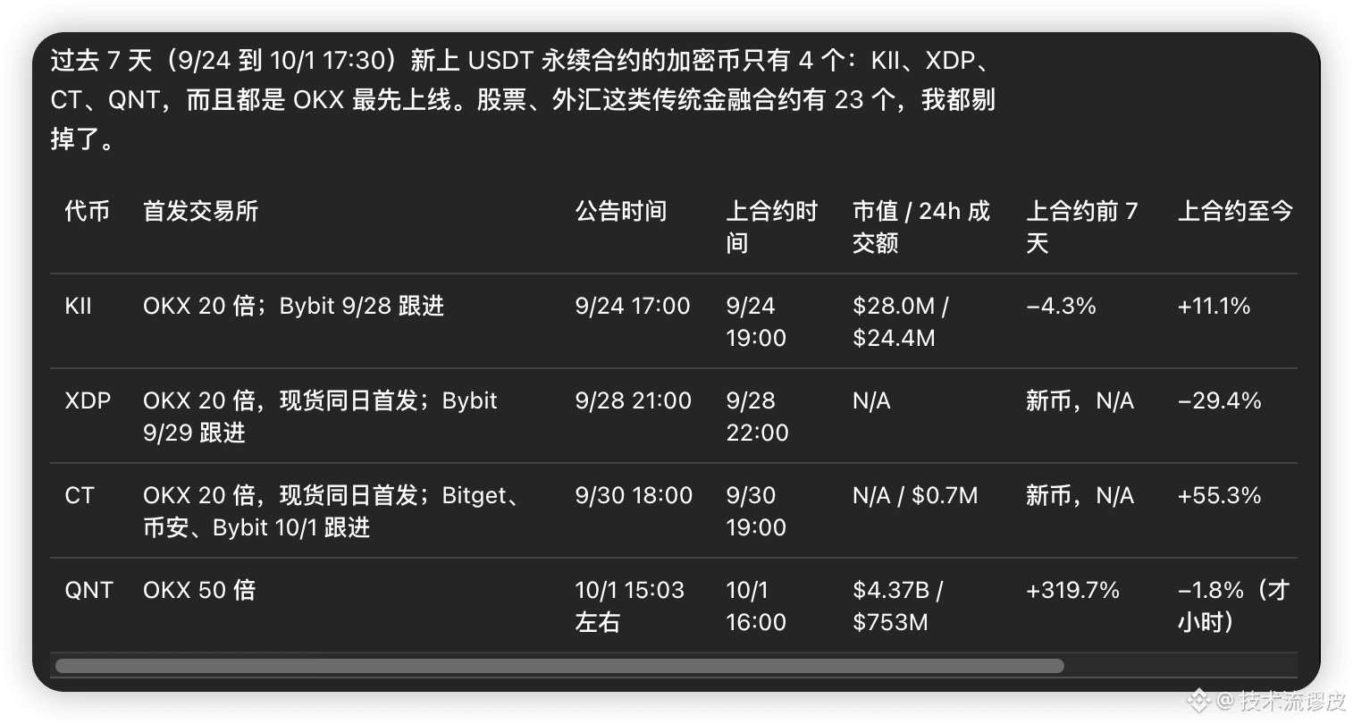
In the past 7 days, there were only 4 USDT perpetual contracts newly listed—keep an eye on the exchange announcements.
The listing itself isn’t a positive signal; it’s leverage. Before KII launched, it fell 4%. After it listed, it rose 11%. When the new coin XDP launched, it was close to the high; afterward, it dropped as much as 34% at its worst. CT, on the other hand, climbed all the way up by 55%—by the time other exchanges followed, it was already too late. QNT first surged 320%, then opened 50x leverage; the listing looked more like it was already priced in.
It only takes 1 to 2 hours from the exchange announcement to the listing. The first wave is on the initial exchange, and follow-up exchanges are often the second wave.
#KII #XDP #CT #QNT
In the past 7 days, there were only 4 USDT perpetual contracts newly listed—keep an eye on the exchange announcements.
The listing itself isn’t a positive signal; it’s leverage. Before KII launched, it fell 4%. After it listed, it rose 11%. When the new coin XDP launched, it was close to the high; afterward, it dropped as much as 34% at its worst. CT, on the other hand, climbed all the way up by 55%—by the time other exchanges followed, it was already too late. QNT first surged 320%, then opened 50x leverage; the listing looked more like it was already priced in.
It only takes 1 to 2 hours from the exchange announcement to the listing. The first wave is on the initial exchange, and follow-up exchanges are often the second wave.
#KII #XDP #CT #QNT
The listing itself isn’t a positive signal; it’s leverage. Before KII launched, it fell 4%. After it listed, it rose 11%. When the new coin XDP launched, it was close to the high; afterward, it dropped as much as 34% at its worst. CT, on the other hand, climbed all the way up by 55%—by the time other exchanges followed, it was already too late. QNT first surged 320%, then opened 50x leverage; the listing looked more like it was already priced in.
It only takes 1 to 2 hours from the exchange announcement to the listing. The first wave is on the initial exchange, and follow-up exchanges are often the second wave.
#KII #XDP #CT #QNT
1
1.1k
·
--
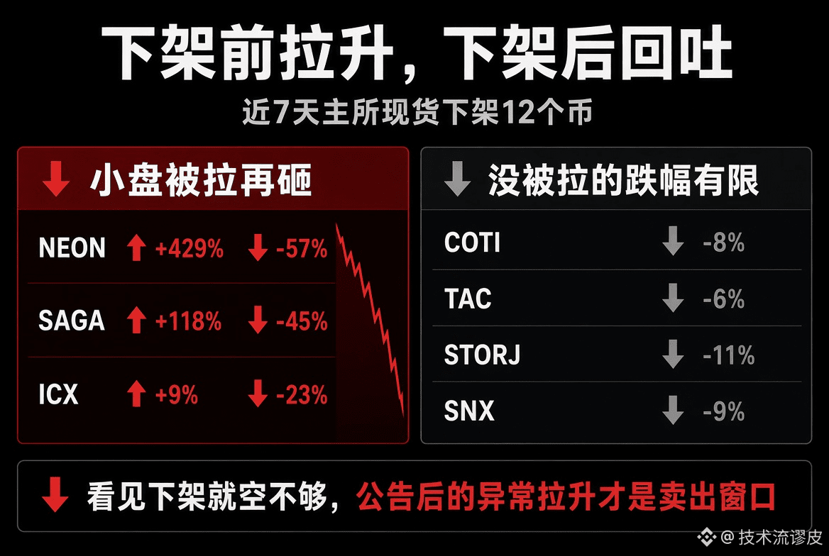
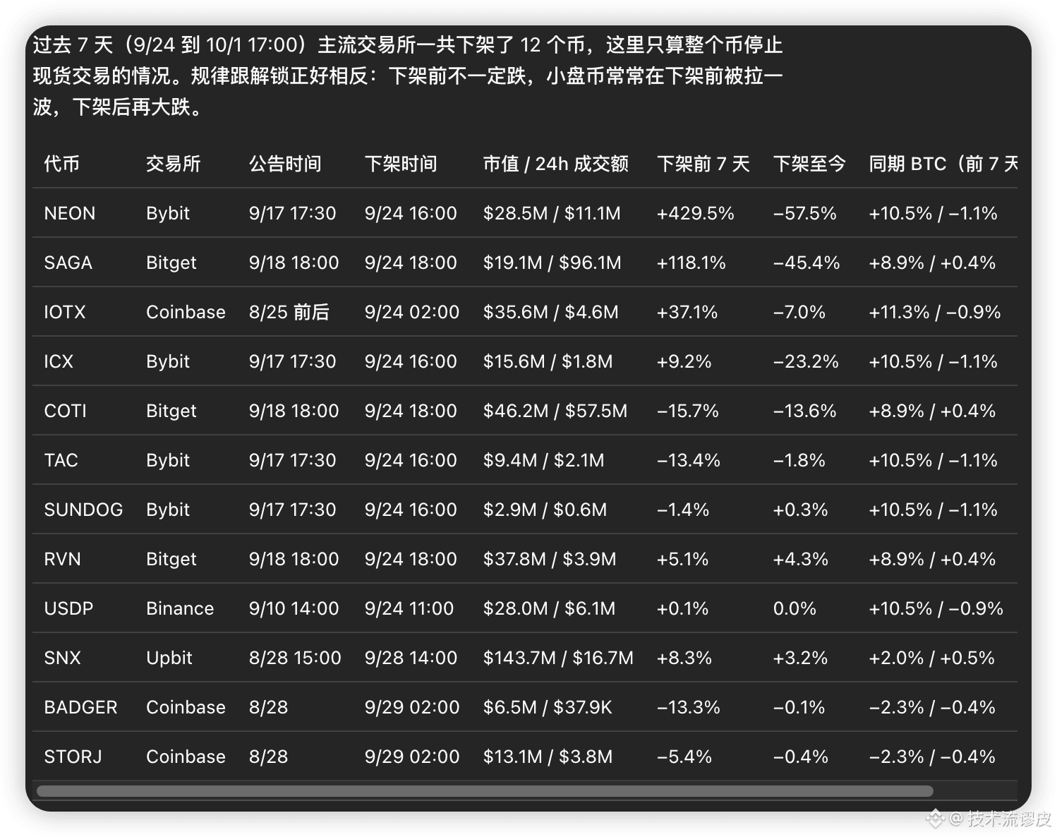
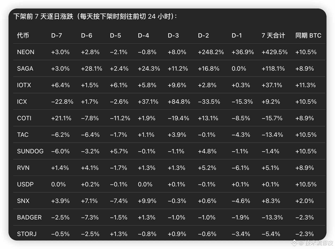
In the past 7 days, 12 mainstream coins were removed from the spot market; the pattern is the opposite of the unlock.
Before delisting, they don’t necessarily fall. Small-cap coins often get pulled up for a round before delisting, then drop hard after delisting. NEON was +429% in the prior 7 days, then -57% after delisting; SAGA was +118% before, then -45% afterward. If it hasn’t been pumped, the drawdown after delisting is limited.
Delisting isn’t something you short just because you see it. It’s the abnormal surge after the announcement that’s worth treating as a sell opportunity.
#NEON #SAGA #IOTX #ICX #COTI #TAC #SUNDOG #RVN #USDP #SNX #BADGER #STORJ
In the past 7 days, 12 mainstream coins were removed from the spot market; the pattern is the opposite of the unlock.
Before delisting, they don’t necessarily fall. Small-cap coins often get pulled up for a round before delisting, then drop hard after delisting. NEON was +429% in the prior 7 days, then -57% after delisting; SAGA was +118% before, then -45% afterward. If it hasn’t been pumped, the drawdown after delisting is limited.
Delisting isn’t something you short just because you see it. It’s the abnormal surge after the announcement that’s worth treating as a sell opportunity.
#NEON #SAGA #IOTX #ICX #COTI #TAC #SUNDOG #RVN #USDP #SNX #BADGER #STORJ
Before delisting, they don’t necessarily fall. Small-cap coins often get pulled up for a round before delisting, then drop hard after delisting. NEON was +429% in the prior 7 days, then -57% after delisting; SAGA was +118% before, then -45% afterward. If it hasn’t been pumped, the drawdown after delisting is limited.
Delisting isn’t something you short just because you see it. It’s the abnormal surge after the announcement that’s worth treating as a sell opportunity.
#NEON #SAGA #IOTX #ICX #COTI #TAC #SUNDOG #RVN #USDP #SNX #BADGER #STORJ
740
·
--
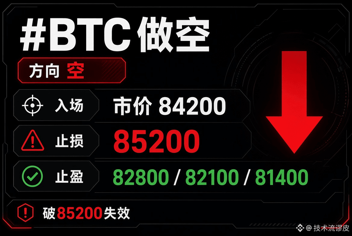
#BTC buy at market 84200
stop loss 85300
take profit 82800 / 82100 / 81400
Order invalid above 85200; first look at 82800. Take profit in batches—don't go all-in at once.
#BTC buy at market 84200
stop loss 85300
take profit 82800 / 82100 / 81400
Order invalid above 85200; first look at 82800. Take profit in batches—don't go all-in at once.
stop loss 85300
take profit 82800 / 82100 / 81400
Order invalid above 85200; first look at 82800. Take profit in batches—don't go all-in at once.
77
·
--
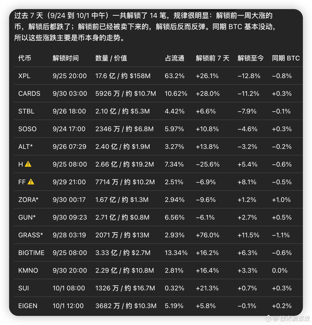
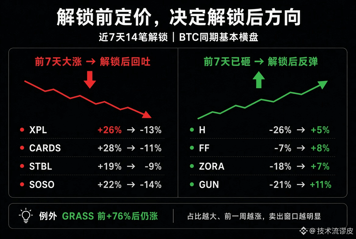
Over the past 7 days, 14 unlocks were followed by clear patterns. The main opportunity usually isn’t in “betting the direction on the unlock day,” but whether pricing has already been done before the unlock.
Key pattern (BTC was roughly range-bound during the same period, so this is mostly the behavior of the coin itself):
If the price surged in the 7 days before the unlock, it often gives back most of the gains after the unlock (sell on unlock / sell the news).
If the price was already smashed down before the unlock, it’s more likely to rebound after the unlock (buy again after the sell-off).
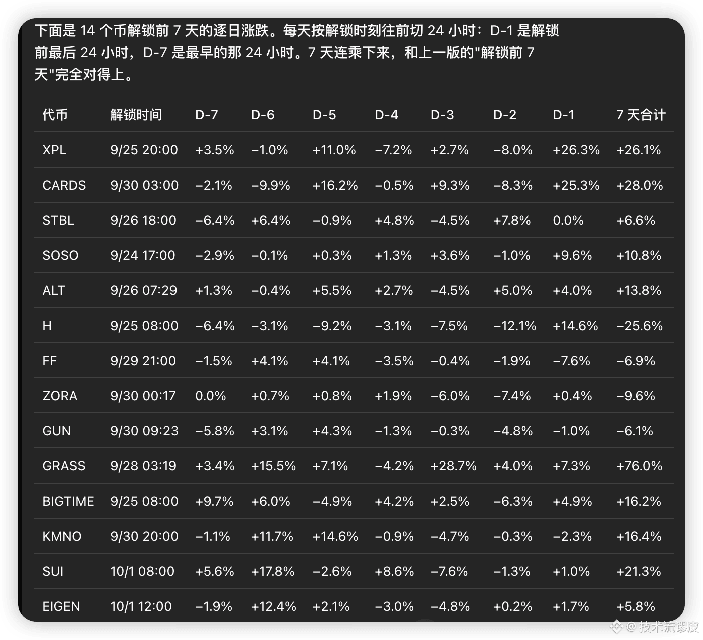
In the last 24 hours (D-1), there’s often another impulse wave—don’t mistake it for trend confirmation.
Typical cases
High before, then lower after: XPL (+26% before / -13% after, circulation ratio 63%), CARDS (+28% / -11%), STBL, SOSO, ALT.
Low before, then higher after: H (-26% / +5% after), FF (-7% / +8%), ZORA, GUN.
Exception: GRASS surged +76% before the unlock and can still rise further—so don’t treat this as a hard rule.
Where the opportunities are
High circulation ratio + a big jump in the prior 7 days: prioritize it as a “selling window,” rather than chasing the unlock catalyst. XPL at this scale is the most typical example.
Clearly hammered in the prior 7 days, but the circulation ratio isn’t too extreme: it looks more like the downside is already priced in, so a repair after the unlock is more likely.
Extremely small ratio (e.g., SUI 0.32%): the unlock itself has limited impact—don’t attribute the whole move to the unlock.
Don’t look only at the “unlock day.” The real pricing window is often from D-7 to D-1—especially the D-1 bullish candle, which is easiest to mislead.
Over the past 7 days, 14 unlocks were followed by clear patterns. The main opportunity usually isn’t in “betting the direction on the unlock day,” but whether pricing has already been done before the unlock.
Key pattern (BTC was roughly range-bound during the same period, so this is mostly the behavior of the coin itself):
If the price surged in the 7 days before the unlock, it often gives back most of the gains after the unlock (sell on unlock / sell the news).
If the price was already smashed down before the unlock, it’s more likely to rebound after the unlock (buy again after the sell-off).
In the last 24 hours (D-1), there’s often another impulse wave—don’t mistake it for trend confirmation.
Typical cases
High before, then lower after: XPL (+26% before / -13% after, circulation ratio 63%), CARDS (+28% / -11%), STBL, SOSO, ALT.
Low before, then higher after: H (-26% / +5% after), FF (-7% / +8%), ZORA, GUN.
Exception: GRASS surged +76% before the unlock and can still rise further—so don’t treat this as a hard rule.
Where the opportunities are
High circulation ratio + a big jump in the prior 7 days: prioritize it as a “selling window,” rather than chasing the unlock catalyst. XPL at this scale is the most typical example.
Clearly hammered in the prior 7 days, but the circulation ratio isn’t too extreme: it looks more like the downside is already priced in, so a repair after the unlock is more likely.
Extremely small ratio (e.g., SUI 0.32%): the unlock itself has limited impact—don’t attribute the whole move to the unlock.
Don’t look only at the “unlock day.” The real pricing window is often from D-7 to D-1—especially the D-1 bullish candle, which is easiest to mislead.
Key pattern (BTC was roughly range-bound during the same period, so this is mostly the behavior of the coin itself):
If the price surged in the 7 days before the unlock, it often gives back most of the gains after the unlock (sell on unlock / sell the news).
If the price was already smashed down before the unlock, it’s more likely to rebound after the unlock (buy again after the sell-off).
In the last 24 hours (D-1), there’s often another impulse wave—don’t mistake it for trend confirmation.
Typical cases
High before, then lower after: XPL (+26% before / -13% after, circulation ratio 63%), CARDS (+28% / -11%), STBL, SOSO, ALT.
Low before, then higher after: H (-26% / +5% after), FF (-7% / +8%), ZORA, GUN.
Exception: GRASS surged +76% before the unlock and can still rise further—so don’t treat this as a hard rule.
Where the opportunities are
High circulation ratio + a big jump in the prior 7 days: prioritize it as a “selling window,” rather than chasing the unlock catalyst. XPL at this scale is the most typical example.
Clearly hammered in the prior 7 days, but the circulation ratio isn’t too extreme: it looks more like the downside is already priced in, so a repair after the unlock is more likely.
Extremely small ratio (e.g., SUI 0.32%): the unlock itself has limited impact—don’t attribute the whole move to the unlock.
Don’t look only at the “unlock day.” The real pricing window is often from D-7 to D-1—especially the D-1 bullish candle, which is easiest to mislead.
608
·
--
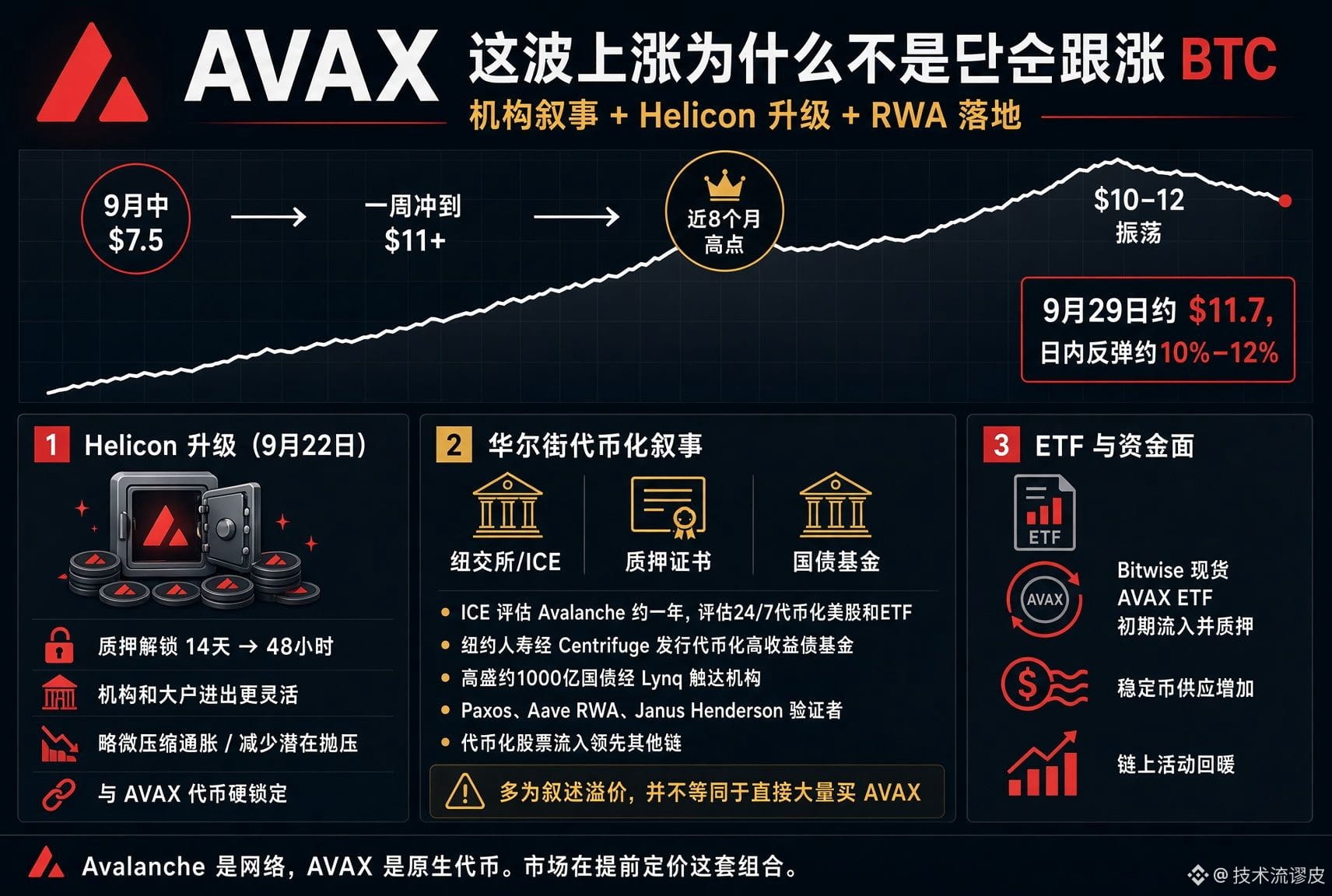
This AVAX rally isn’t just following BTC—it’s driven by an institutional narrative that combines network upgrades plus real-world asset (RWA) adoption, with the market pricing it in early.
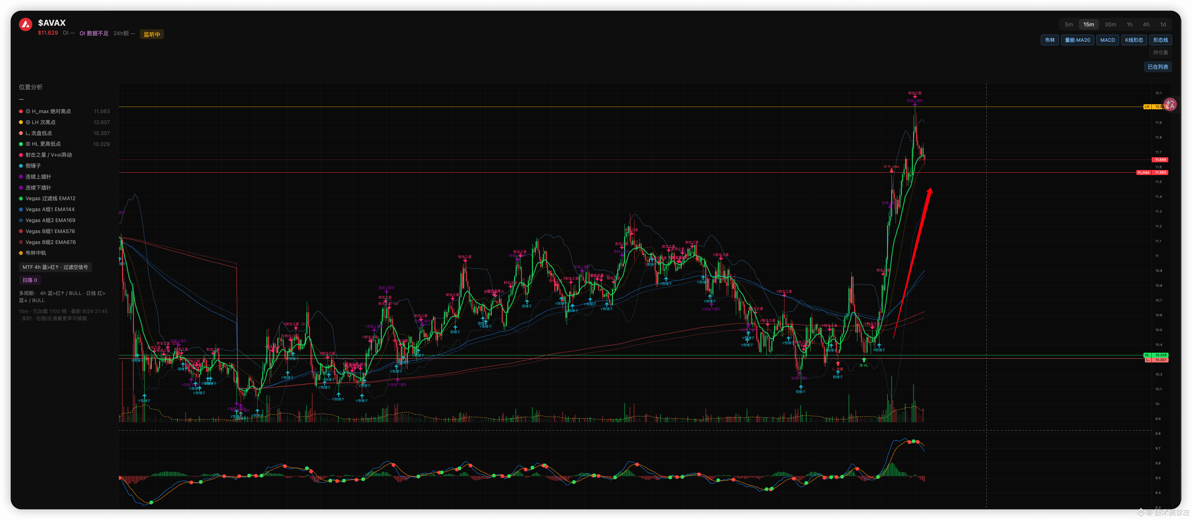
Starting in mid-September around the $7.5 area, it surged to above $11 within a week, briefly hitting an almost 8-month high. After that, it consolidated in a $10–$12 range. Today (Sept. 29) there’s another rebound of roughly 10%–12%, and the current price is around $11.7.
Key catalysts (Avalanche is the network; AVAX is the native token of this network)
1. Helicon upgrade (live as of Sept. 22, tightly hard-bound to AVAX)
The staking-unlock cycle was shortened from 14 days to 48 hours. For institutions and large holders, capital moves in and out more flexibly, while slightly compressing inflation and reducing potential sell pressure. The market is front-running the move—price elasticity around the upgrade has been明显.
2. The Wall Street tokenization narrative (the biggest imagination space)
ICE (the parent company of the NYSE) has been testing Avalanche for about a year, evaluating it for 24/7 tokenized US equity and ETF trading. While no final partnership has been officially announced, senior figures at Ava Labs confirmed both sides are still in close contact, and option premium has already been priced by the market.
New York Life (via Centrifuge) launched the first tokenized high-yield bond fund on Avalanche.
Goldman Sachs plans to provide roughly $100 billion in US Treasury fund exposure to institutional clients via Lynq (a licensed chain on Avalanche) (news reported Sept. 28).
Additional deployments include Paxos, RWA lending by Aave, Janus Henderson becoming a validator, and more.Bifu
Avalanche has also been strong in the inflow of tokenized stocks; in the past week alone, its inflows exceeded the total of other chains combined. Institutions treat Avalanche as a “compliant, customizable L1 with high throughput” settlement layer—this narrative is more substantial than mere DeFi hype.
3. ETFs and liquidity conditions
After the launch of Bitwise’s spot AVAX ETF (BAVA), there were initial inflows, and the fund also stakes most of its tokens to earn yield. Combined with increased stablecoin supply and a recovery in on-chain activity, this creates a positive feedback loop.
This AVAX rally isn’t just following BTC—it’s driven by an institutional narrative that combines network upgrades plus real-world asset (RWA) adoption, with the market pricing it in early.
Starting in mid-September around the $7.5 area, it surged to above $11 within a week, briefly hitting an almost 8-month high. After that, it consolidated in a $10–$12 range. Today (Sept. 29) there’s another rebound of roughly 10%–12%, and the current price is around $11.7.
Key catalysts (Avalanche is the network; AVAX is the native token of this network)
1. Helicon upgrade (live as of Sept. 22, tightly hard-bound to AVAX)
The staking-unlock cycle was shortened from 14 days to 48 hours. For institutions and large holders, capital moves in and out more flexibly, while slightly compressing inflation and reducing potential sell pressure. The market is front-running the move—price elasticity around the upgrade has been明显.
2. The Wall Street tokenization narrative (the biggest imagination space)
ICE (the parent company of the NYSE) has been testing Avalanche for about a year, evaluating it for 24/7 tokenized US equity and ETF trading. While no final partnership has been officially announced, senior figures at Ava Labs confirmed both sides are still in close contact, and option premium has already been priced by the market.
New York Life (via Centrifuge) launched the first tokenized high-yield bond fund on Avalanche.
Goldman Sachs plans to provide roughly $100 billion in US Treasury fund exposure to institutional clients via Lynq (a licensed chain on Avalanche) (news reported Sept. 28).
Additional deployments include Paxos, RWA lending by Aave, Janus Henderson becoming a validator, and more.Bifu
Avalanche has also been strong in the inflow of tokenized stocks; in the past week alone, its inflows exceeded the total of other chains combined. Institutions treat Avalanche as a “compliant, customizable L1 with high throughput” settlement layer—this narrative is more substantial than mere DeFi hype.
3. ETFs and liquidity conditions
After the launch of Bitwise’s spot AVAX ETF (BAVA), there were initial inflows, and the fund also stakes most of its tokens to earn yield. Combined with increased stablecoin supply and a recovery in on-chain activity, this creates a positive feedback loop.
Starting in mid-September around the $7.5 area, it surged to above $11 within a week, briefly hitting an almost 8-month high. After that, it consolidated in a $10–$12 range. Today (Sept. 29) there’s another rebound of roughly 10%–12%, and the current price is around $11.7.
Key catalysts (Avalanche is the network; AVAX is the native token of this network)
1. Helicon upgrade (live as of Sept. 22, tightly hard-bound to AVAX)
The staking-unlock cycle was shortened from 14 days to 48 hours. For institutions and large holders, capital moves in and out more flexibly, while slightly compressing inflation and reducing potential sell pressure. The market is front-running the move—price elasticity around the upgrade has been明显.
2. The Wall Street tokenization narrative (the biggest imagination space)
ICE (the parent company of the NYSE) has been testing Avalanche for about a year, evaluating it for 24/7 tokenized US equity and ETF trading. While no final partnership has been officially announced, senior figures at Ava Labs confirmed both sides are still in close contact, and option premium has already been priced by the market.
New York Life (via Centrifuge) launched the first tokenized high-yield bond fund on Avalanche.
Goldman Sachs plans to provide roughly $100 billion in US Treasury fund exposure to institutional clients via Lynq (a licensed chain on Avalanche) (news reported Sept. 28).
Additional deployments include Paxos, RWA lending by Aave, Janus Henderson becoming a validator, and more.Bifu
Avalanche has also been strong in the inflow of tokenized stocks; in the past week alone, its inflows exceeded the total of other chains combined. Institutions treat Avalanche as a “compliant, customizable L1 with high throughput” settlement layer—this narrative is more substantial than mere DeFi hype.
3. ETFs and liquidity conditions
After the launch of Bitwise’s spot AVAX ETF (BAVA), there were initial inflows, and the fund also stakes most of its tokens to earn yield. Combined with increased stablecoin supply and a recovery in on-chain activity, this creates a positive feedback loop.
510
·
--
ETH trading logic:
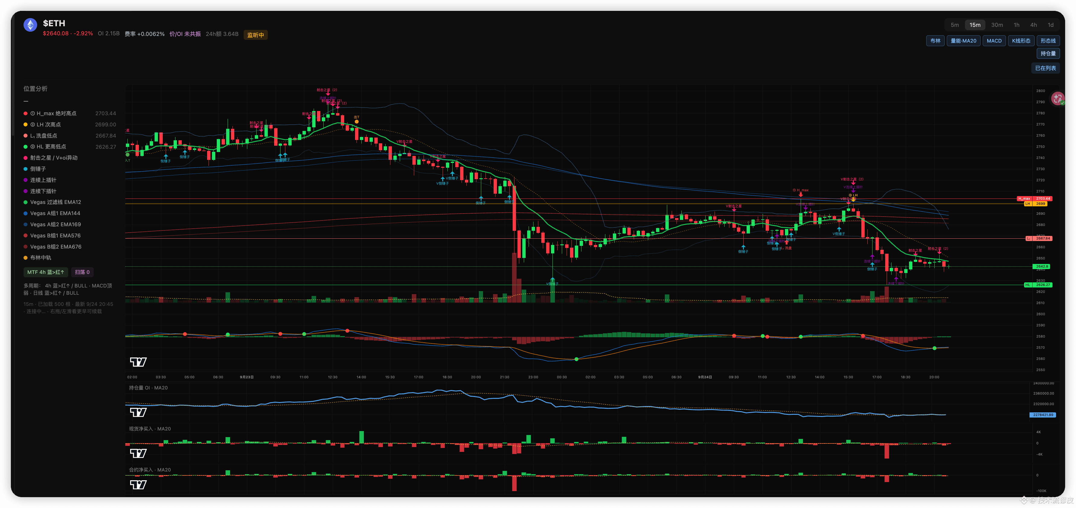
Using the current 15m chart as an example: Don’t buy at 2640.
Wait: If price drops to 2626 and prints a reversal K → go long. Stop loss 2618. Targets 2668 / 2699.
Or: If price goes up to 2668 and fails → stand aside. Stop loss 2678. Targets 2640 / 2626.
If 2626 breaks, don’t catch the falling knife—wait for a pullback. Don’t chase if it breaks above 2703; wait for a retest. Why not now?
Where is the current price? It’s at 2640 in the middle. Below it is the HL at 2626. Above it is the washout low at 2668. Even higher is 2699–2703.
You’re neither at a support area where a reversal is confirmed, nor at a resistance area where failure is confirmed—you’re in between two segments of the path.
Why does going long here have a worse stop-loss? If your stop is below 2626 (2618), the room is about 22 points.
First target 2668—about 28 points. The risk-reward ratio is barely 1:1.3; fees and slippage eat up the difference.
There’s also overhead: moving averages, the old low at 2668, and the pressure left by the large bearish candle from last night. The first leg could be capped.
After that big bearish candle in the night session, the move is a repair, not a new trend. OI is still trending downward, which doesn’t look like someone is urgently opening longs at 2640.
Why does shorting here also have poor reward? It just bounced up from the low; you’re shorting halfway up. Then your stop-loss can only be awkwardly placed (2668 or 2703). Either it’s too close and you get swept, or it’s too far and you lose a chunk.
The target at 2626 is only around ten-odd points—doesn’t justify it.
There’s no sustained increase in net selling for spot/futures, so the short setup isn’t aligning both “position + momentum” at the same time.
The reason to wait for 2626 / 2668 is that those two lines are already validated structures:
2626 is a higher low; only when price falls to here does the long thesis hold. The stop is short and the target only becomes long enough when aiming for 2668.
2668 is prior-low resistance. Only if price goes up and fails there does the short thesis hold. The stop is short, and below it you have two layers of meat at 2640 and 2626.
Same direction—but if you choose a different location, risk is smaller and room is larger. Entering now means you’re paying with a worse price for an idea the market hasn’t fully confirmed yet.
ETH trading logic:
Using the current 15m chart as an example: Don’t buy at 2640.
Wait: If price drops to 2626 and prints a reversal K → go long. Stop loss 2618. Targets 2668 / 2699.
Or: If price goes up to 2668 and fails → stand aside. Stop loss 2678. Targets 2640 / 2626.
If 2626 breaks, don’t catch the falling knife—wait for a pullback. Don’t chase if it breaks above 2703; wait for a retest. Why not now?
Where is the current price? It’s at 2640 in the middle. Below it is the HL at 2626. Above it is the washout low at 2668. Even higher is 2699–2703.
You’re neither at a support area where a reversal is confirmed, nor at a resistance area where failure is confirmed—you’re in between two segments of the path.
Why does going long here have a worse stop-loss? If your stop is below 2626 (2618), the room is about 22 points.
First target 2668—about 28 points. The risk-reward ratio is barely 1:1.3; fees and slippage eat up the difference.
There’s also overhead: moving averages, the old low at 2668, and the pressure left by the large bearish candle from last night. The first leg could be capped.
After that big bearish candle in the night session, the move is a repair, not a new trend. OI is still trending downward, which doesn’t look like someone is urgently opening longs at 2640.
Why does shorting here also have poor reward? It just bounced up from the low; you’re shorting halfway up. Then your stop-loss can only be awkwardly placed (2668 or 2703). Either it’s too close and you get swept, or it’s too far and you lose a chunk.
The target at 2626 is only around ten-odd points—doesn’t justify it.
There’s no sustained increase in net selling for spot/futures, so the short setup isn’t aligning both “position + momentum” at the same time.
The reason to wait for 2626 / 2668 is that those two lines are already validated structures:
2626 is a higher low; only when price falls to here does the long thesis hold. The stop is short and the target only becomes long enough when aiming for 2668.
2668 is prior-low resistance. Only if price goes up and fails there does the short thesis hold. The stop is short, and below it you have two layers of meat at 2640 and 2626.
Same direction—but if you choose a different location, risk is smaller and room is larger. Entering now means you’re paying with a worse price for an idea the market hasn’t fully confirmed yet.
Using the current 15m chart as an example: Don’t buy at 2640.
Wait: If price drops to 2626 and prints a reversal K → go long. Stop loss 2618. Targets 2668 / 2699.
Or: If price goes up to 2668 and fails → stand aside. Stop loss 2678. Targets 2640 / 2626.
If 2626 breaks, don’t catch the falling knife—wait for a pullback. Don’t chase if it breaks above 2703; wait for a retest. Why not now?
Where is the current price? It’s at 2640 in the middle. Below it is the HL at 2626. Above it is the washout low at 2668. Even higher is 2699–2703.
You’re neither at a support area where a reversal is confirmed, nor at a resistance area where failure is confirmed—you’re in between two segments of the path.
Why does going long here have a worse stop-loss? If your stop is below 2626 (2618), the room is about 22 points.
First target 2668—about 28 points. The risk-reward ratio is barely 1:1.3; fees and slippage eat up the difference.
There’s also overhead: moving averages, the old low at 2668, and the pressure left by the large bearish candle from last night. The first leg could be capped.
After that big bearish candle in the night session, the move is a repair, not a new trend. OI is still trending downward, which doesn’t look like someone is urgently opening longs at 2640.
Why does shorting here also have poor reward? It just bounced up from the low; you’re shorting halfway up. Then your stop-loss can only be awkwardly placed (2668 or 2703). Either it’s too close and you get swept, or it’s too far and you lose a chunk.
The target at 2626 is only around ten-odd points—doesn’t justify it.
There’s no sustained increase in net selling for spot/futures, so the short setup isn’t aligning both “position + momentum” at the same time.
The reason to wait for 2626 / 2668 is that those two lines are already validated structures:
2626 is a higher low; only when price falls to here does the long thesis hold. The stop is short and the target only becomes long enough when aiming for 2668.
2668 is prior-low resistance. Only if price goes up and fails there does the short thesis hold. The stop is short, and below it you have two layers of meat at 2640 and 2626.
Same direction—but if you choose a different location, risk is smaller and room is larger. Entering now means you’re paying with a worse price for an idea the market hasn’t fully confirmed yet.
1.6k
·
--
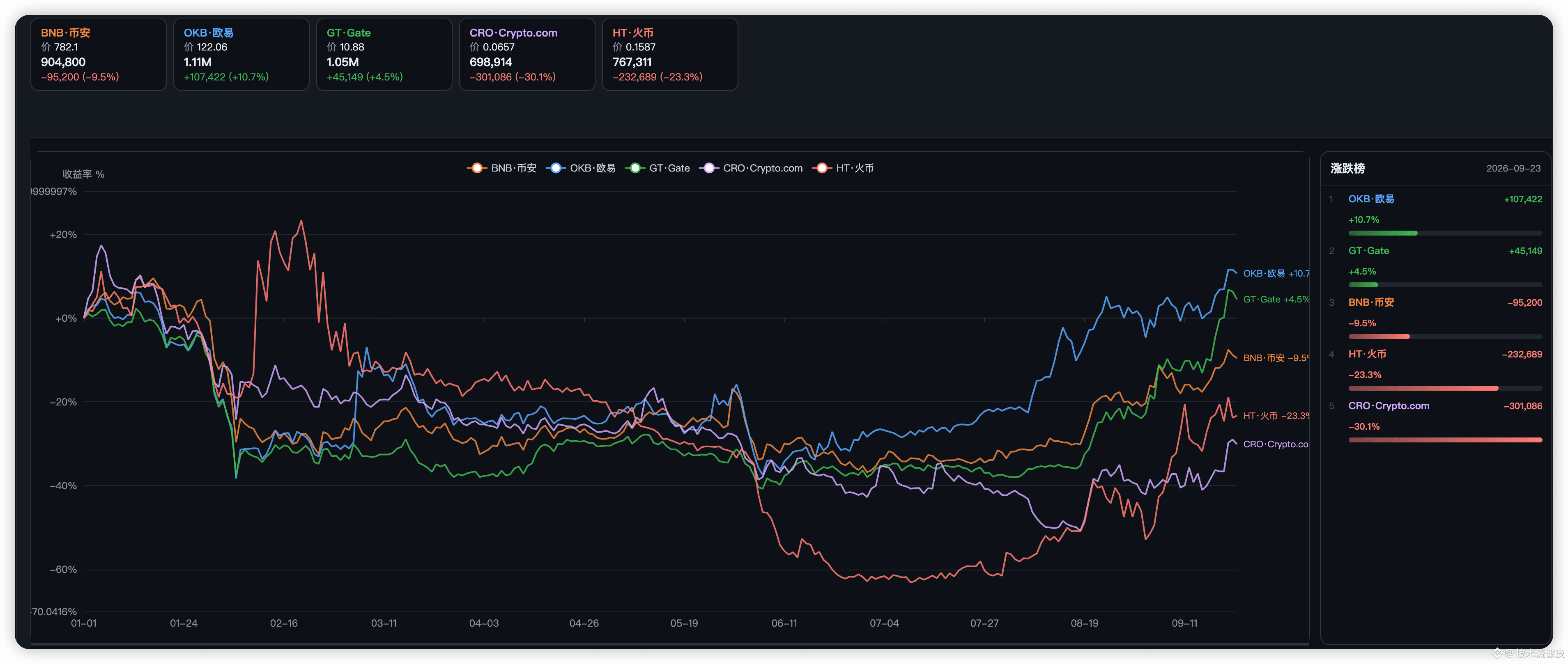
Platform tokens have completely diverged this year. From the same starting line to now: OKB +11%, GT +4%, BNB −10%, HT −23%, CRO −30%.
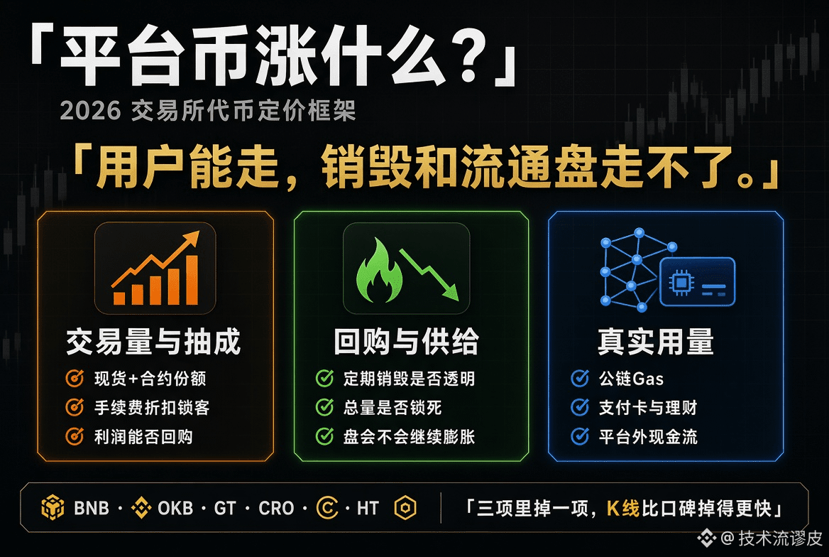
Platform tokens aren’t “exchange stocks.” They depend on three things:
1) Whether the exchange’s trading-fee take can sustainably buy back / burn
2) Whether the chain and products have real usage (Gas, wealth management, fee discounts)
3) Whether the supply narrative is clear. OKB wins on supply: the total supply is locked, and large-scale burns happen. Its upside/downside flexibility is firmer than the revenue-story.
BNB is still the largest platform token, but the market is too big. YTD looks more like broad-market beta than an elastic/leveraged play.
GT follows Gate’s self-ownership share—neither too small nor too big—so it’s relatively steady.
CRO / HT are on the other side: the card organization, brand migration, and the usage narrative have broken, and the token is basically left with just a ticker. The platform-token pricing formula is essentially one sentence:
Exchange is still making money × the token can get a share of that money × supply will decrease.
If you lose one of the three, the price chart drops faster than platform reputation.
Platform tokens have completely diverged this year. From the same starting line to now: OKB +11%, GT +4%, BNB −10%, HT −23%, CRO −30%.
Platform tokens aren’t “exchange stocks.” They depend on three things:
1) Whether the exchange’s trading-fee take can sustainably buy back / burn
2) Whether the chain and products have real usage (Gas, wealth management, fee discounts)
3) Whether the supply narrative is clear. OKB wins on supply: the total supply is locked, and large-scale burns happen. Its upside/downside flexibility is firmer than the revenue-story.
BNB is still the largest platform token, but the market is too big. YTD looks more like broad-market beta than an elastic/leveraged play.
GT follows Gate’s self-ownership share—neither too small nor too big—so it’s relatively steady.
CRO / HT are on the other side: the card organization, brand migration, and the usage narrative have broken, and the token is basically left with just a ticker. The platform-token pricing formula is essentially one sentence:
Exchange is still making money × the token can get a share of that money × supply will decrease.
If you lose one of the three, the price chart drops faster than platform reputation.
Platform tokens aren’t “exchange stocks.” They depend on three things:
1) Whether the exchange’s trading-fee take can sustainably buy back / burn
2) Whether the chain and products have real usage (Gas, wealth management, fee discounts)
3) Whether the supply narrative is clear. OKB wins on supply: the total supply is locked, and large-scale burns happen. Its upside/downside flexibility is firmer than the revenue-story.
BNB is still the largest platform token, but the market is too big. YTD looks more like broad-market beta than an elastic/leveraged play.
GT follows Gate’s self-ownership share—neither too small nor too big—so it’s relatively steady.
CRO / HT are on the other side: the card organization, brand migration, and the usage narrative have broken, and the token is basically left with just a ticker. The platform-token pricing formula is essentially one sentence:
Exchange is still making money × the token can get a share of that money × supply will decrease.
If you lose one of the three, the price chart drops faster than platform reputation.
192
·
--
The previous post covered the on-chain data that has already been fulfilled this week. Below is what’s about to happen.
1. $AVAX
Fact: The upgrade happened on the 22nd; around the 21st, about 27 million was unlocked.
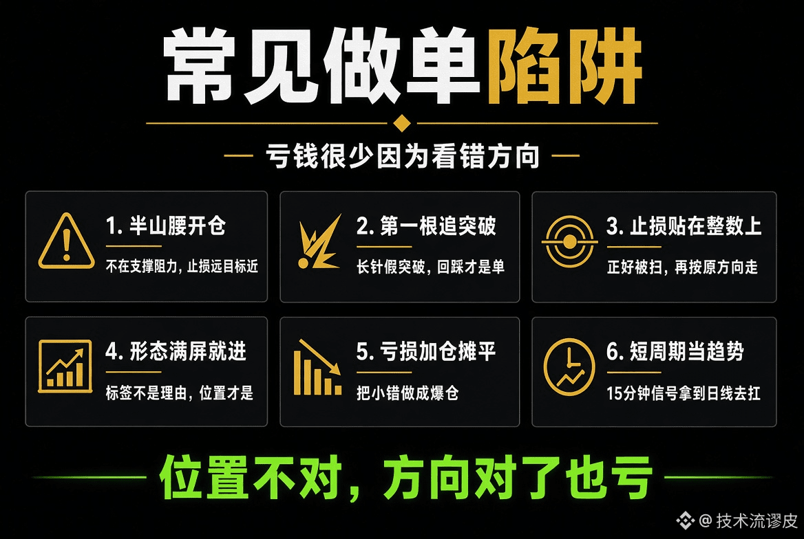
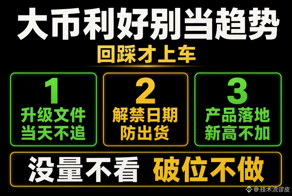
Judgment: Don’t chase on the day of the upgrade. Wait for a pullback and stabilization. If this swing low breaks, give up.
2. $ENA
Fact: The lock-up exemption is set; it won’t truly be released until October 5.
Judgment: Before 10/5, it can only be treated as a short-term expectation. After that day, if there’s a volume-backed bearish candle, prioritize reducing, and don’t buy the first big red candle.
3. $SEI
Fact: The ETF amendment proposal wasn’t approved.
Judgment: The news “pulse” can be traded, but don’t hold through it. Sell into the spike; only consider again once it returns to the original level—otherwise, you’ll get trapped if it becomes a trend trade.
4. $NEAR
Fact: Privacy + Hyper Perpetual are already live, and the incentives have also been triggered.
Judgment: This batch is the only one you can hold for a while. After it’s already pumped, wait for a pullback. If there’s a volume-backed stagnation, reduce positions. Don’t chase the second entry at new highs.
5. $POL
Fact: The plan is to burn 100 million, but it hasn’t been burned yet.
Judgment: The positive news is too thin to be the main position. If the burn succeeds, at most it’s a short-lived pop—don’t chase unless it holds and doesn’t break down.
6. $AAVE
Fact: The share buyback date hasn’t been decided yet.
Judgment: Since there’s no announced scale or start time, don’t pre-position. On announcement day, see if it can put up real volume and stand above; otherwise, it’ll just be a one-day move.
$ZAMA
Fact: Funds are still being pushed; liquidity is small.
Judgment: It can be traded in swings, but keep position size small. If volume contracts, exit—don’t treat it like a large-cap.
$ONDO
Fact: There’s distribution/exit flow.
Judgment: Reduce on rebounds—don’t bottom-fish. If there isn’t sustained buy-side demand, don’t go long.
The previous post covered the on-chain data that has already been fulfilled this week. Below is what’s about to happen.
1. $AVAX
Fact: The upgrade happened on the 22nd; around the 21st, about 27 million was unlocked.
Judgment: Don’t chase on the day of the upgrade. Wait for a pullback and stabilization. If this swing low breaks, give up.
2. $ENA
Fact: The lock-up exemption is set; it won’t truly be released until October 5.
Judgment: Before 10/5, it can only be treated as a short-term expectation. After that day, if there’s a volume-backed bearish candle, prioritize reducing, and don’t buy the first big red candle.
3. $SEI
Fact: The ETF amendment proposal wasn’t approved.
Judgment: The news “pulse” can be traded, but don’t hold through it. Sell into the spike; only consider again once it returns to the original level—otherwise, you’ll get trapped if it becomes a trend trade.
4. $NEAR
Fact: Privacy + Hyper Perpetual are already live, and the incentives have also been triggered.
Judgment: This batch is the only one you can hold for a while. After it’s already pumped, wait for a pullback. If there’s a volume-backed stagnation, reduce positions. Don’t chase the second entry at new highs.
5. $POL
Fact: The plan is to burn 100 million, but it hasn’t been burned yet.
Judgment: The positive news is too thin to be the main position. If the burn succeeds, at most it’s a short-lived pop—don’t chase unless it holds and doesn’t break down.
6. $AAVE
Fact: The share buyback date hasn’t been decided yet.
Judgment: Since there’s no announced scale or start time, don’t pre-position. On announcement day, see if it can put up real volume and stand above; otherwise, it’ll just be a one-day move.
$ZAMA
Fact: Funds are still being pushed; liquidity is small.
Judgment: It can be traded in swings, but keep position size small. If volume contracts, exit—don’t treat it like a large-cap.
$ONDO
Fact: There’s distribution/exit flow.
Judgment: Reduce on rebounds—don’t bottom-fish. If there isn’t sustained buy-side demand, don’t go long.
1. $AVAX
Fact: The upgrade happened on the 22nd; around the 21st, about 27 million was unlocked.
Judgment: Don’t chase on the day of the upgrade. Wait for a pullback and stabilization. If this swing low breaks, give up.
2. $ENA
Fact: The lock-up exemption is set; it won’t truly be released until October 5.
Judgment: Before 10/5, it can only be treated as a short-term expectation. After that day, if there’s a volume-backed bearish candle, prioritize reducing, and don’t buy the first big red candle.
3. $SEI
Fact: The ETF amendment proposal wasn’t approved.
Judgment: The news “pulse” can be traded, but don’t hold through it. Sell into the spike; only consider again once it returns to the original level—otherwise, you’ll get trapped if it becomes a trend trade.
4. $NEAR
Fact: Privacy + Hyper Perpetual are already live, and the incentives have also been triggered.
Judgment: This batch is the only one you can hold for a while. After it’s already pumped, wait for a pullback. If there’s a volume-backed stagnation, reduce positions. Don’t chase the second entry at new highs.
5. $POL
Fact: The plan is to burn 100 million, but it hasn’t been burned yet.
Judgment: The positive news is too thin to be the main position. If the burn succeeds, at most it’s a short-lived pop—don’t chase unless it holds and doesn’t break down.
6. $AAVE
Fact: The share buyback date hasn’t been decided yet.
Judgment: Since there’s no announced scale or start time, don’t pre-position. On announcement day, see if it can put up real volume and stand above; otherwise, it’ll just be a one-day move.
$ZAMA
Fact: Funds are still being pushed; liquidity is small.
Judgment: It can be traded in swings, but keep position size small. If volume contracts, exit—don’t treat it like a large-cap.
$ONDO
Fact: There’s distribution/exit flow.
Judgment: Reduce on rebounds—don’t bottom-fish. If there isn’t sustained buy-side demand, don’t go long.
1
2
4.3k
·
--
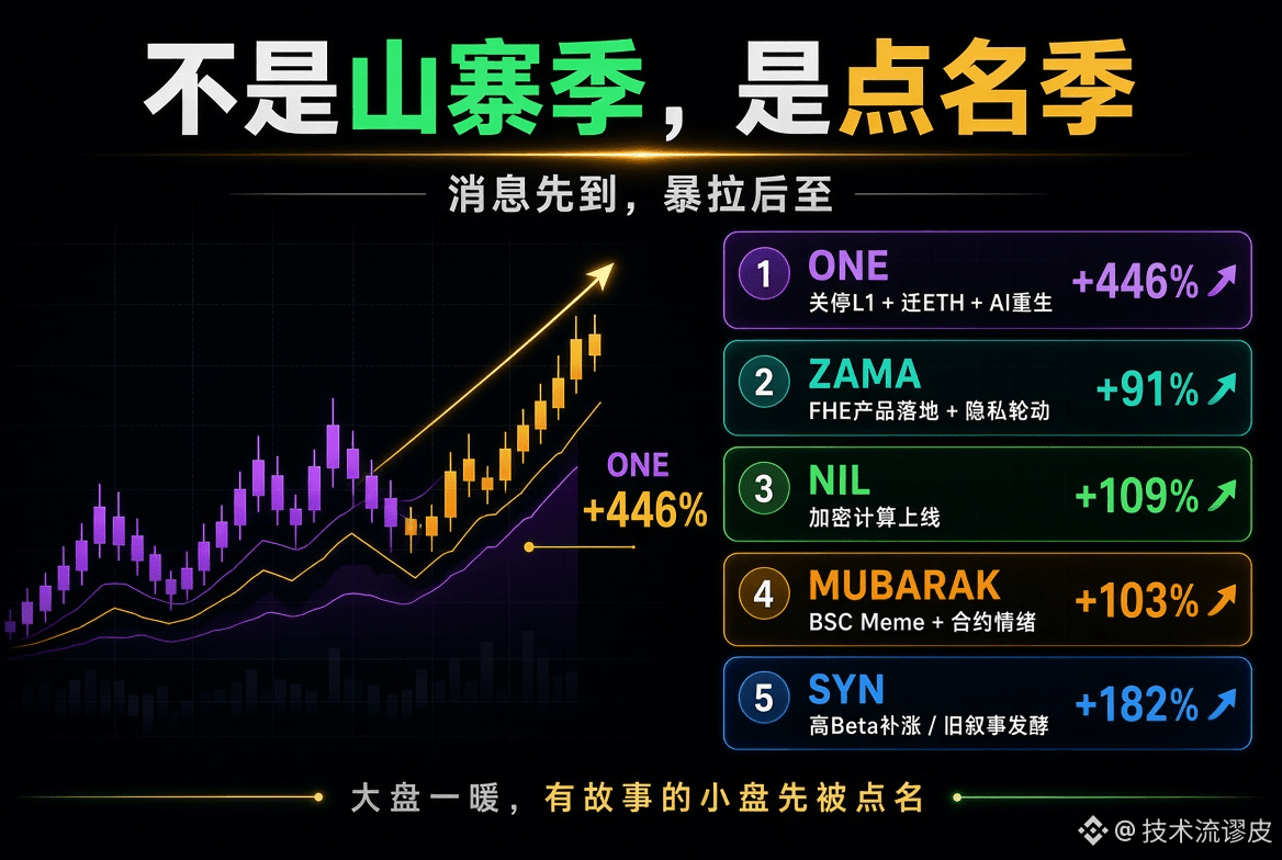
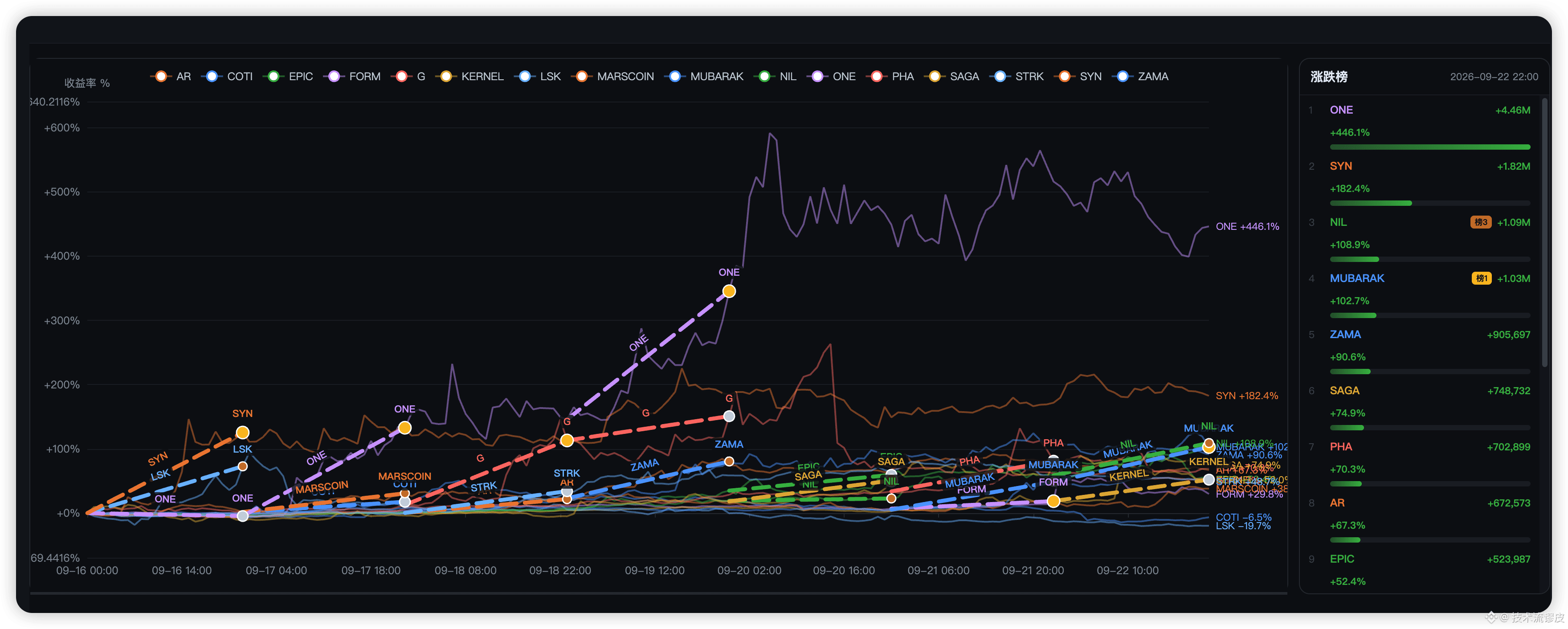
I整理了本周每天最佳前三,他们原来早有内部消息
ONE +446%(最典型)
9 月 6 日官宣:关停 Harmony L1,ONE 迁到以太坊做 ERC-20,转向 AI 视频 Remix。前面 8 月还有增发漏洞。
逻辑是“死链重生 + 迁移空投预期 + 新叙事”。消息比暴拉早了约两周。
ZAMA +90%
9 月 15 日扩容机密 Morpho 金库、上线 Confidential Swap;17 日上机密激励。再叠 ZEC 带起的隐私行情外溢到 FHE。
这是“产品落地 + 赛道轮动”,可跟踪性最强。
NIL +109%
隐私计算/Blind Computer,Encrypted Covenants 等产品推进,吃同一波隐私叙事。属于二线跟涨,弹性靠市值小。
MUBARAK +103%
BSC Meme,历史有 CZ 联想,合约盘活跃。这周更多是 Meme 轮动 + 成交额暴增,基本面消息弱,纯情绪和杠杆。
SYN +182%
更早有 Arthur Hayes 买入和 Hypercall(Hyperliquid 上的期权 DEX)叙事。这几天更像高 Beta 补涨,不一定有新爆点。
I整理了本周每天最佳前三,他们原来早有内部消息
ONE +446%(最典型)
9 月 6 日官宣:关停 Harmony L1,ONE 迁到以太坊做 ERC-20,转向 AI 视频 Remix。前面 8 月还有增发漏洞。
逻辑是“死链重生 + 迁移空投预期 + 新叙事”。消息比暴拉早了约两周。
ZAMA +90%
9 月 15 日扩容机密 Morpho 金库、上线 Confidential Swap;17 日上机密激励。再叠 ZEC 带起的隐私行情外溢到 FHE。
这是“产品落地 + 赛道轮动”,可跟踪性最强。
NIL +109%
隐私计算/Blind Computer,Encrypted Covenants 等产品推进,吃同一波隐私叙事。属于二线跟涨,弹性靠市值小。
MUBARAK +103%
BSC Meme,历史有 CZ 联想,合约盘活跃。这周更多是 Meme 轮动 + 成交额暴增,基本面消息弱,纯情绪和杠杆。
SYN +182%
更早有 Arthur Hayes 买入和 Hypercall(Hyperliquid 上的期权 DEX)叙事。这几天更像高 Beta 补涨,不一定有新爆点。
ONE +446%(最典型)
9 月 6 日官宣:关停 Harmony L1,ONE 迁到以太坊做 ERC-20,转向 AI 视频 Remix。前面 8 月还有增发漏洞。
逻辑是“死链重生 + 迁移空投预期 + 新叙事”。消息比暴拉早了约两周。
ZAMA +90%
9 月 15 日扩容机密 Morpho 金库、上线 Confidential Swap;17 日上机密激励。再叠 ZEC 带起的隐私行情外溢到 FHE。
这是“产品落地 + 赛道轮动”,可跟踪性最强。
NIL +109%
隐私计算/Blind Computer,Encrypted Covenants 等产品推进,吃同一波隐私叙事。属于二线跟涨,弹性靠市值小。
MUBARAK +103%
BSC Meme,历史有 CZ 联想,合约盘活跃。这周更多是 Meme 轮动 + 成交额暴增,基本面消息弱,纯情绪和杠杆。
SYN +182%
更早有 Arthur Hayes 买入和 Hypercall(Hyperliquid 上的期权 DEX)叙事。这几天更像高 Beta 补涨,不一定有新爆点。
1
1.5k
·
--
The two most common price-volume patterns are also the easiest to misread.
First: a short candle body + a large volume surge
The real body is short and there aren’t many wicks, but the volume suddenly spikes.
This indicates that bulls and bears are fighting fiercely at this price level, and the price can’t be pushed further for now.
After that, there are two possible outcomes:
Continue in the same direction after the volume surge → the trend accelerates (extension)
Or reverse after the volume surge → a reversal; the prior move was the climax of selling pressure/accumulation
In the first pattern, the ultra-large-volume candle on the right is very typical: volume is extremely high, but the candlestick doesn’t crash into a big bearish candle. This is most easily mistaken for “it’s about to collapse,” but in reality it’s more like rotation/turnover.
Second: a big candle body + a small volume
The real body is long, but the volume can’t keep up.
A strong up candle with high prices but low volume means momentum is insufficient and the price is likely to pull back.
A strong down candle with low volume means selling force is weakening and the price is likely to stop falling.
A bullish breakthrough should come with high volume; a bearish breakdown should come with high volume. The selected bullish candle in the middle has decent volume and a sufficiently large body—it’s more of a “healthy” continuation. So don’t just chase because volume is increasing, or run away because volume is shrinking.
First, look at the size of the candle body; then check whether the volume confirms or diverges; finally, look at how the next candle behaves after the volume surge.
Whether it continues (extension) or reverses is often determined within the 1–3 candles after the peak volume.
Watch your own chart—your gains or losses are your own responsibility.
The two most common price-volume patterns are also the easiest to misread.
First: a short candle body + a large volume surge
The real body is short and there aren’t many wicks, but the volume suddenly spikes.
This indicates that bulls and bears are fighting fiercely at this price level, and the price can’t be pushed further for now.
After that, there are two possible outcomes:
Continue in the same direction after the volume surge → the trend accelerates (extension)
Or reverse after the volume surge → a reversal; the prior move was the climax of selling pressure/accumulation
In the first pattern, the ultra-large-volume candle on the right is very typical: volume is extremely high, but the candlestick doesn’t crash into a big bearish candle. This is most easily mistaken for “it’s about to collapse,” but in reality it’s more like rotation/turnover.
Second: a big candle body + a small volume
The real body is long, but the volume can’t keep up.
A strong up candle with high prices but low volume means momentum is insufficient and the price is likely to pull back.
A strong down candle with low volume means selling force is weakening and the price is likely to stop falling.
A bullish breakthrough should come with high volume; a bearish breakdown should come with high volume. The selected bullish candle in the middle has decent volume and a sufficiently large body—it’s more of a “healthy” continuation. So don’t just chase because volume is increasing, or run away because volume is shrinking.
First, look at the size of the candle body; then check whether the volume confirms or diverges; finally, look at how the next candle behaves after the volume surge.
Whether it continues (extension) or reverses is often determined within the 1–3 candles after the peak volume.
Watch your own chart—your gains or losses are your own responsibility.
First: a short candle body + a large volume surge
The real body is short and there aren’t many wicks, but the volume suddenly spikes.
This indicates that bulls and bears are fighting fiercely at this price level, and the price can’t be pushed further for now.
After that, there are two possible outcomes:
Continue in the same direction after the volume surge → the trend accelerates (extension)
Or reverse after the volume surge → a reversal; the prior move was the climax of selling pressure/accumulation
In the first pattern, the ultra-large-volume candle on the right is very typical: volume is extremely high, but the candlestick doesn’t crash into a big bearish candle. This is most easily mistaken for “it’s about to collapse,” but in reality it’s more like rotation/turnover.
Second: a big candle body + a small volume
The real body is long, but the volume can’t keep up.
A strong up candle with high prices but low volume means momentum is insufficient and the price is likely to pull back.
A strong down candle with low volume means selling force is weakening and the price is likely to stop falling.
A bullish breakthrough should come with high volume; a bearish breakdown should come with high volume. The selected bullish candle in the middle has decent volume and a sufficiently large body—it’s more of a “healthy” continuation. So don’t just chase because volume is increasing, or run away because volume is shrinking.
First, look at the size of the candle body; then check whether the volume confirms or diverges; finally, look at how the next candle behaves after the volume surge.
Whether it continues (extension) or reverses is often determined within the 1–3 candles after the peak volume.
Watch your own chart—your gains or losses are your own responsibility.
71
·
--
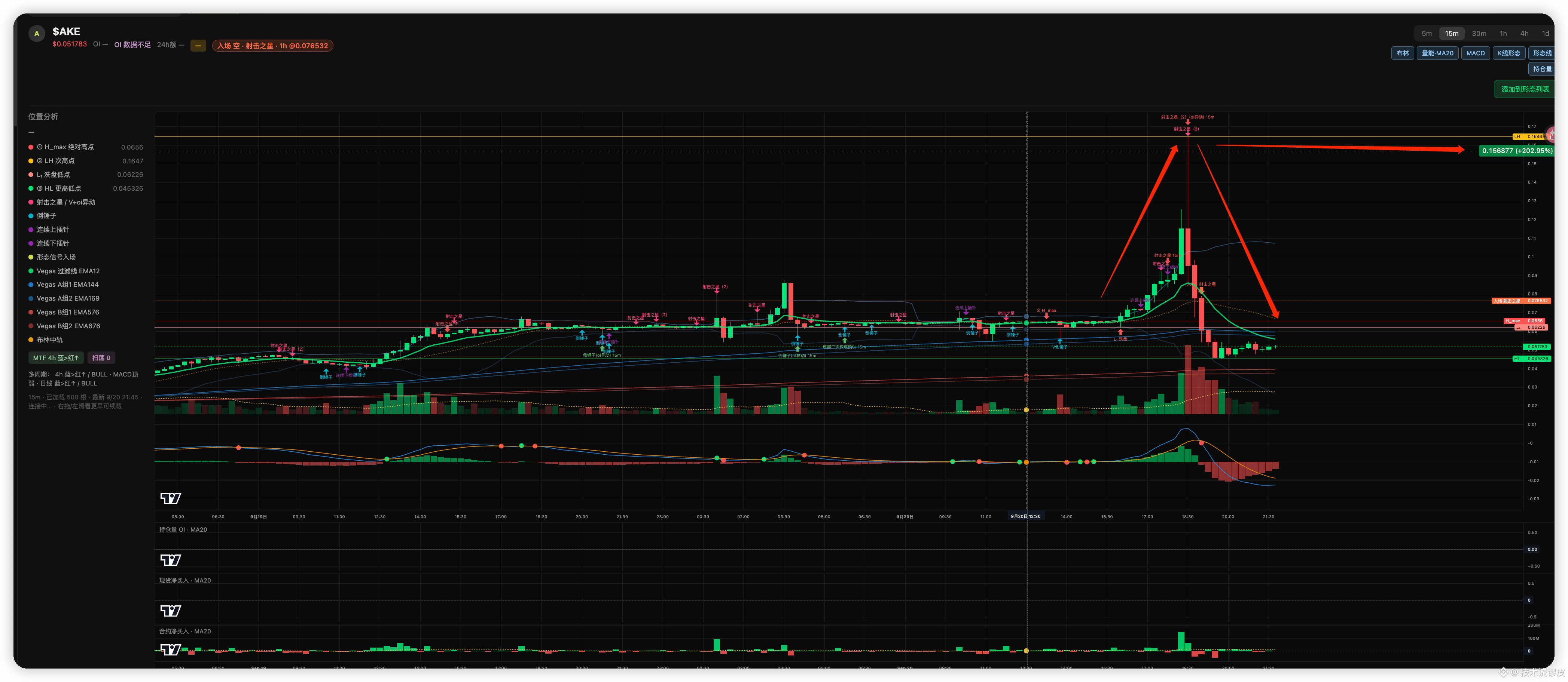
$AKE Three hours to double first and then unload everything. It’s not because of good news—it’s because the order book is too thin (a thin book), and it can’t withstand a single market buy/sell order. The only focus is this:
What you see as “buyers scrambling to buy” is, in large part, shorts being force-liquidated, with the exchange buying back for them using market orders. That’s why the wick becomes long and fast.
At the highs there’s no spot liquidity to hold the price up. The chasing longs also get force-liquidated, and the system switches to market selling. The path the price went up is the path it gets smashed back down. So this wick isn’t answering whether to go long.
It’s answering: in this burst of trades, how much was people proactively adding positions, and how much was positions being forcibly liquidated. If it’s mostly the latter—spot doesn’t follow, and only the contracts blow out—then it’s mainly about retracing (giving back), not a trend. Don’t chase the first candle.
In that first candle, what gets bought is often orders from other people’s liquidations.
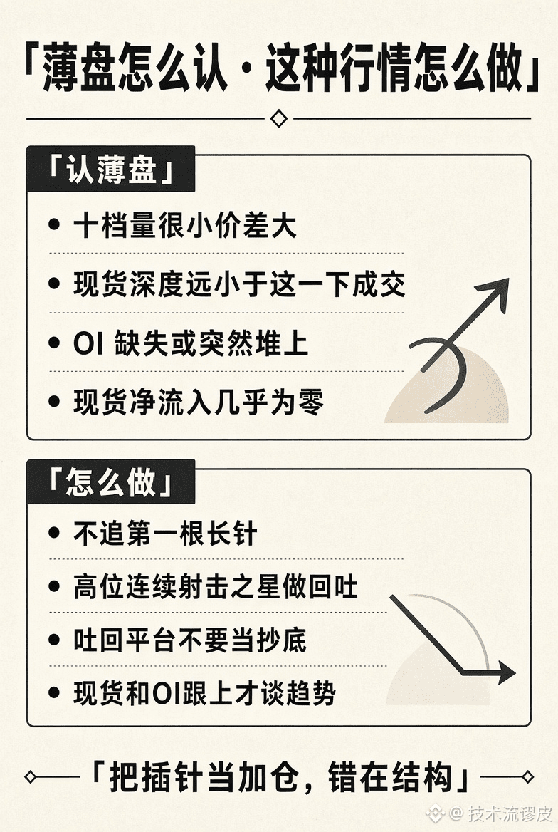
How to recognize a thin order book:
Don’t judge by percentage change. Judge by “how far this single order can push the price.”
The order book at levels 10 is very thin—sweep one layer and the price jumps. Even the spot depth is smaller than the single contract trade that just happened. That’s a thin book.
The meaning of a thin book isn’t “it can still rise.” It’s that price can be misaligned by forced matching of trades.
How to play this kind of market:
If the wick is still accelerating, don’t do anything. You’re competing with liquidation orders for execution.
If the wick has appeared but spot still doesn’t follow, the trades are about retracing.
Before this round ends, you’ll see the platform it pulls back to and then rises from—but it’s not a brand-new cheap entry point.
Unless spot and your positions both start following together, don’t upgrade the thin-book wick into a trend.
$AKE Three hours to double first and then unload everything. It’s not because of good news—it’s because the order book is too thin (a thin book), and it can’t withstand a single market buy/sell order. The only focus is this:
What you see as “buyers scrambling to buy” is, in large part, shorts being force-liquidated, with the exchange buying back for them using market orders. That’s why the wick becomes long and fast.
At the highs there’s no spot liquidity to hold the price up. The chasing longs also get force-liquidated, and the system switches to market selling. The path the price went up is the path it gets smashed back down. So this wick isn’t answering whether to go long.
It’s answering: in this burst of trades, how much was people proactively adding positions, and how much was positions being forcibly liquidated. If it’s mostly the latter—spot doesn’t follow, and only the contracts blow out—then it’s mainly about retracing (giving back), not a trend. Don’t chase the first candle.
In that first candle, what gets bought is often orders from other people’s liquidations.
How to recognize a thin order book:
Don’t judge by percentage change. Judge by “how far this single order can push the price.”
The order book at levels 10 is very thin—sweep one layer and the price jumps. Even the spot depth is smaller than the single contract trade that just happened. That’s a thin book.
The meaning of a thin book isn’t “it can still rise.” It’s that price can be misaligned by forced matching of trades.
How to play this kind of market:
If the wick is still accelerating, don’t do anything. You’re competing with liquidation orders for execution.
If the wick has appeared but spot still doesn’t follow, the trades are about retracing.
Before this round ends, you’ll see the platform it pulls back to and then rises from—but it’s not a brand-new cheap entry point.
Unless spot and your positions both start following together, don’t upgrade the thin-book wick into a trend.
What you see as “buyers scrambling to buy” is, in large part, shorts being force-liquidated, with the exchange buying back for them using market orders. That’s why the wick becomes long and fast.
At the highs there’s no spot liquidity to hold the price up. The chasing longs also get force-liquidated, and the system switches to market selling. The path the price went up is the path it gets smashed back down. So this wick isn’t answering whether to go long.
It’s answering: in this burst of trades, how much was people proactively adding positions, and how much was positions being forcibly liquidated. If it’s mostly the latter—spot doesn’t follow, and only the contracts blow out—then it’s mainly about retracing (giving back), not a trend. Don’t chase the first candle.
In that first candle, what gets bought is often orders from other people’s liquidations.
How to recognize a thin order book:
Don’t judge by percentage change. Judge by “how far this single order can push the price.”
The order book at levels 10 is very thin—sweep one layer and the price jumps. Even the spot depth is smaller than the single contract trade that just happened. That’s a thin book.
The meaning of a thin book isn’t “it can still rise.” It’s that price can be misaligned by forced matching of trades.
How to play this kind of market:
If the wick is still accelerating, don’t do anything. You’re competing with liquidation orders for execution.
If the wick has appeared but spot still doesn’t follow, the trades are about retracing.
Before this round ends, you’ll see the platform it pulls back to and then rises from—but it’s not a brand-new cheap entry point.
Unless spot and your positions both start following together, don’t upgrade the thin-book wick into a trend.
469
·
--
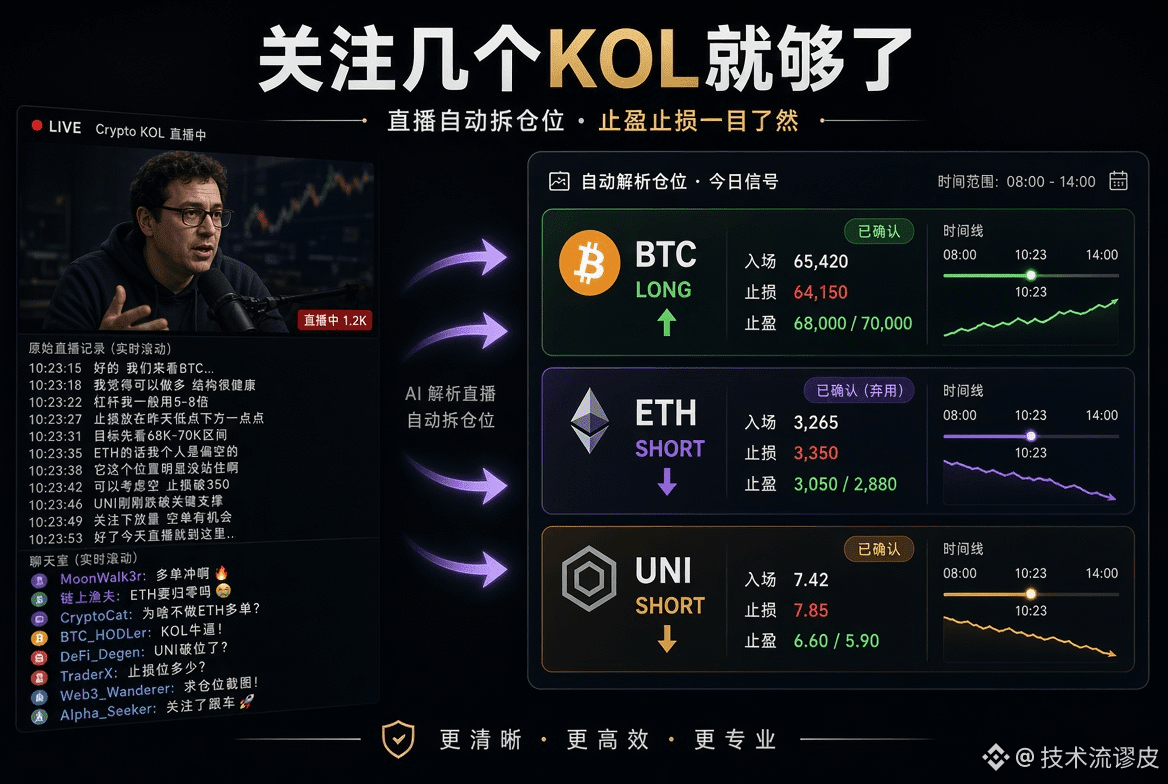
No need to squat in livestreams every day, replay over and over, or pick out the key points yourself. Just follow a few genuinely reliable trading KOLs.
Break down everything—real-time positions, direction, take-profit/stop-loss, and market analysis—into a card and summary that you can understand at a glance, then send it directly out. All you need to do is:
Watch the results, compare them with your own plan, and decide whether to follow and how much to follow. Leave time for trading and rest—don’t waste it on information noise.
Going forward, we’ll keep publishing analyses like this.
No need to squat in livestreams every day, replay over and over, or pick out the key points yourself. Just follow a few genuinely reliable trading KOLs.
Break down everything—real-time positions, direction, take-profit/stop-loss, and market analysis—into a card and summary that you can understand at a glance, then send it directly out. All you need to do is:
Watch the results, compare them with your own plan, and decide whether to follow and how much to follow. Leave time for trading and rest—don’t waste it on information noise.
Going forward, we’ll keep publishing analyses like this.
Break down everything—real-time positions, direction, take-profit/stop-loss, and market analysis—into a card and summary that you can understand at a glance, then send it directly out. All you need to do is:
Watch the results, compare them with your own plan, and decide whether to follow and how much to follow. Leave time for trading and rest—don’t waste it on information noise.
Going forward, we’ll keep publishing analyses like this.
24
·
--
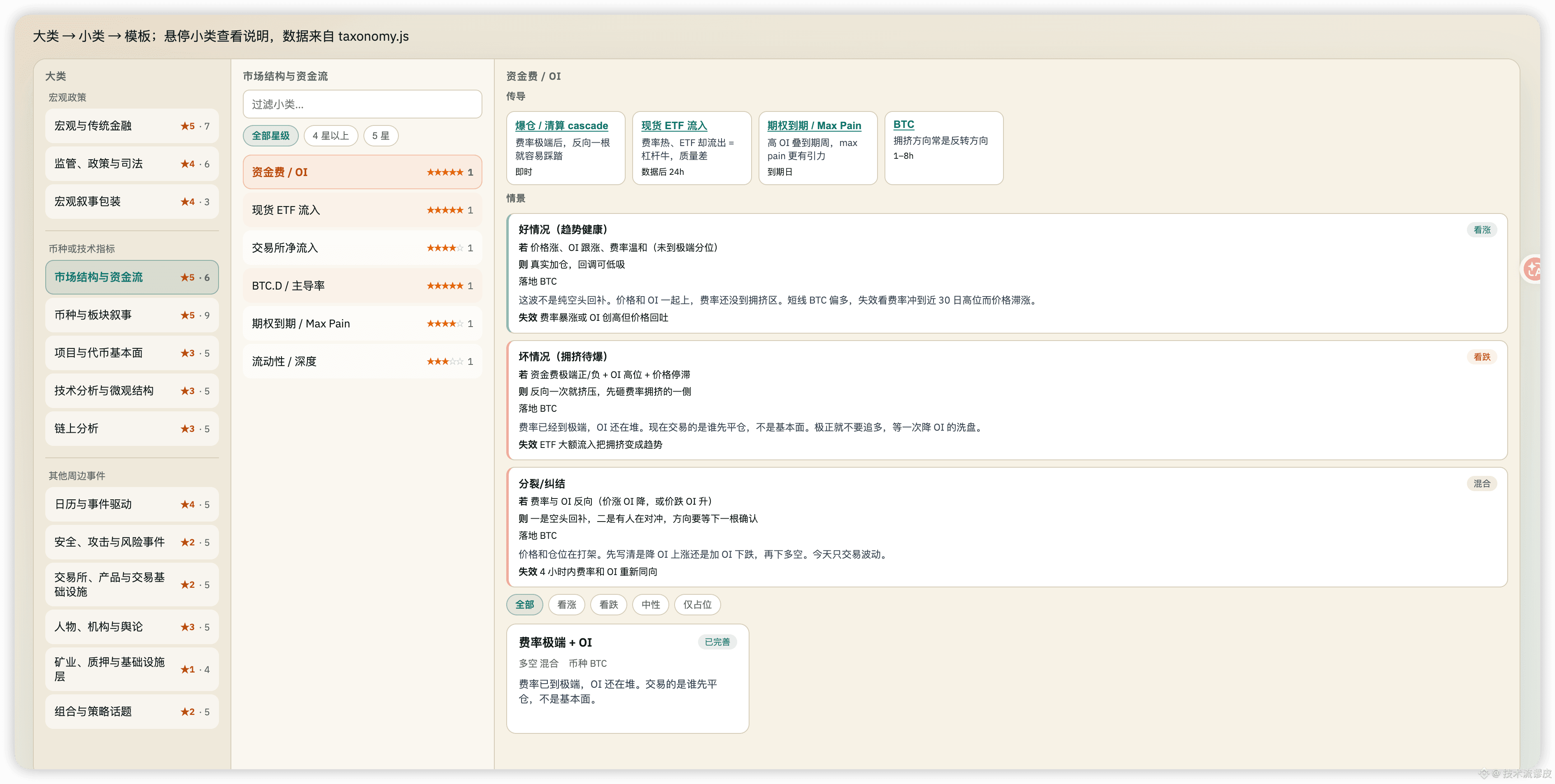
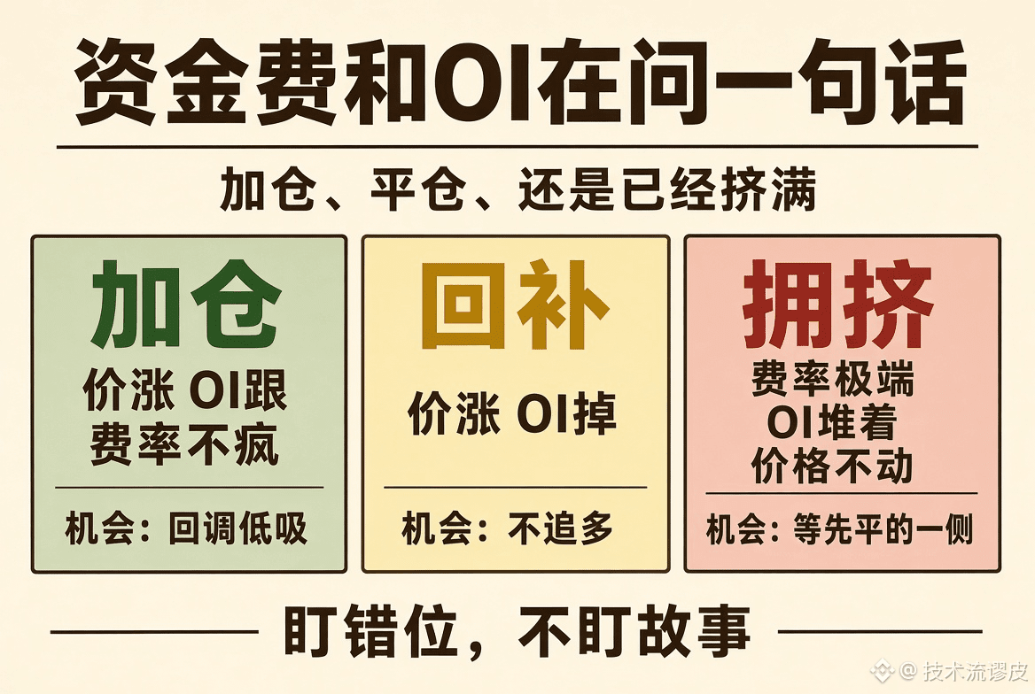
Funding fees and OI are not indicators. It’s about answering one sentence: in the current market, are the people in the market adding to positions, closing positions, or already fully crowded?
Three high-probability windows:
Price is rising, OI is also rising, and the funding rate hasn’t gone crazy = someone still believes in this direction. The opportunity is in buying the dip on pullbacks, not chasing the very first candle.
Price is rising, but OI is falling = shorts are closing, not new longs entering. The opportunity is not to chase longs; wait until this round of short covering is over and then reassess.
The funding rate spikes to extreme levels, OI is still building, and price can’t move = position size matters more than direction. The opportunity is to wait for the side that closes first, not to guess the fundamentals.
One more commonly ignored point:
The funding rate is very hot, yet spot ETFs are seeing outflows = leveraged bulls with poor quality. The “next step” often becomes the trigger for a stampede; it’s not a new trend. I’m watching for the mismatch, not the story. Only when there’s a mismatch is there room for repeatable price spreads.
Funding fees and OI are not indicators. It’s about answering one sentence: in the current market, are the people in the market adding to positions, closing positions, or already fully crowded?
Three high-probability windows:
Price is rising, OI is also rising, and the funding rate hasn’t gone crazy = someone still believes in this direction. The opportunity is in buying the dip on pullbacks, not chasing the very first candle.
Price is rising, but OI is falling = shorts are closing, not new longs entering. The opportunity is not to chase longs; wait until this round of short covering is over and then reassess.
The funding rate spikes to extreme levels, OI is still building, and price can’t move = position size matters more than direction. The opportunity is to wait for the side that closes first, not to guess the fundamentals.
One more commonly ignored point:
The funding rate is very hot, yet spot ETFs are seeing outflows = leveraged bulls with poor quality. The “next step” often becomes the trigger for a stampede; it’s not a new trend. I’m watching for the mismatch, not the story. Only when there’s a mismatch is there room for repeatable price spreads.
Three high-probability windows:
Price is rising, OI is also rising, and the funding rate hasn’t gone crazy = someone still believes in this direction. The opportunity is in buying the dip on pullbacks, not chasing the very first candle.
Price is rising, but OI is falling = shorts are closing, not new longs entering. The opportunity is not to chase longs; wait until this round of short covering is over and then reassess.
The funding rate spikes to extreme levels, OI is still building, and price can’t move = position size matters more than direction. The opportunity is to wait for the side that closes first, not to guess the fundamentals.
One more commonly ignored point:
The funding rate is very hot, yet spot ETFs are seeing outflows = leveraged bulls with poor quality. The “next step” often becomes the trigger for a stampede; it’s not a new trend. I’m watching for the mismatch, not the story. Only when there’s a mismatch is there room for repeatable price spreads.
2
191
·
--
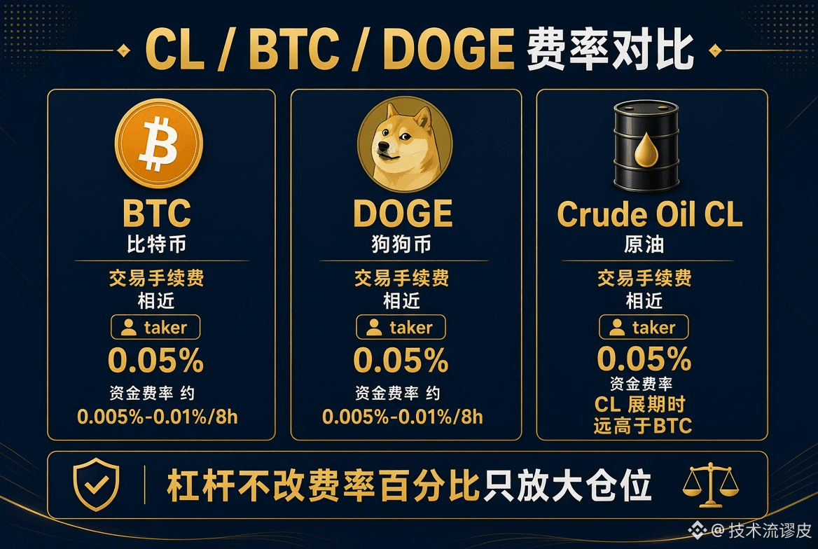
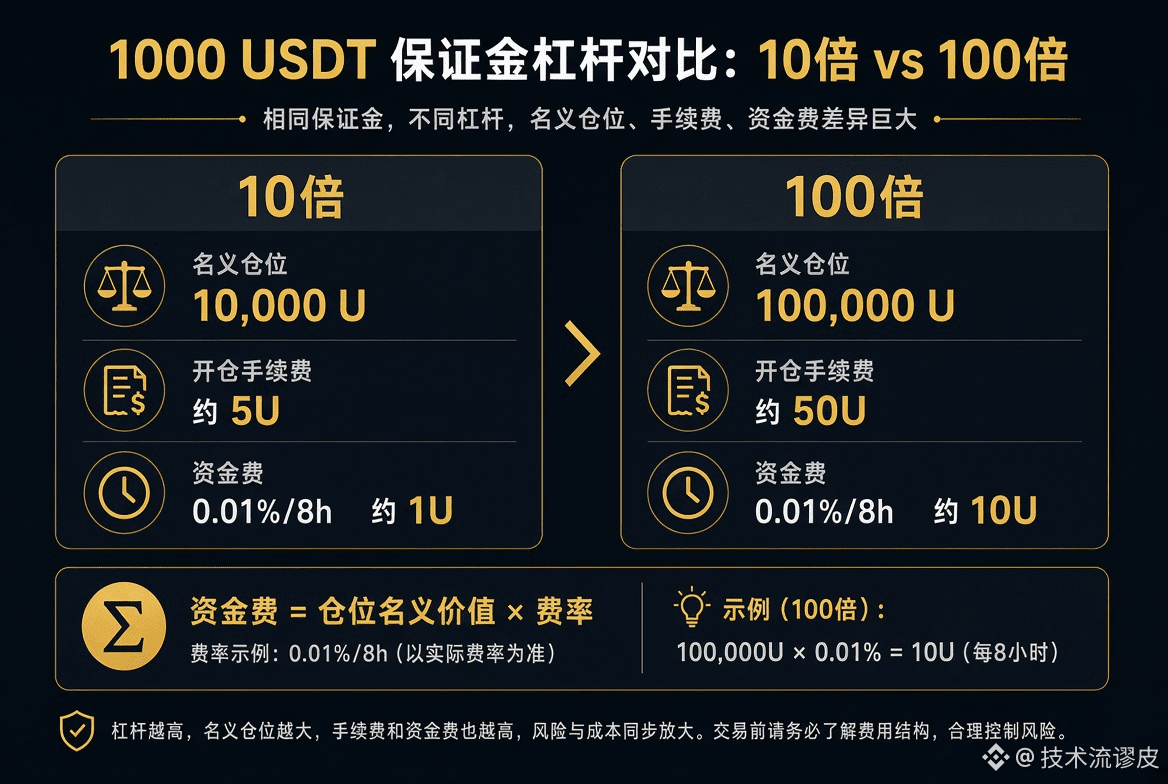
Spot/trading fees for CL/BTC/DOGE, funding rates—which are higher and which are lower? Is leverage proportional to fees? With 1000 USDT and 10x or 100x leverage, what are the fees? Even many traders who have been doing this for years often don’t really know—because money compounds on itself repeatedly and adds up to a lot. Still, you need to understand it.
First, distinguish two different kinds of money:
① Trading fees: charged once for opening and once for closing (both sides), based on the notional position size.
② Funding fees: during the holding period, longs and shorts pay each other, also based on the notional position size.
Trading fee (common tier for regular users; using Binance USDT-based as an example—VIP is lower):
Typically maker 0.02%, taker 0.05%.
BTC, DOGE, and CL mostly use the same contract trading-fee structure. It’s not that crude oil fees are especially expensive. What truly creates the gap is the funding rate (recently stable but can change).
• BTC: about 0.005%~0.01% per 8 hours; annualized roughly 5%~11%—the most stable and lowest
• DOGE: roughly the same 0.005%~0.01% per 8 hours, but slightly easier to be swayed by sentiment
• CL (crude oil): settlement is often in 4-hour intervals; normally it can be close to 0, but once you enter a rollover/one-sided market, it can spike far above BTC (in extreme cases, hundreds of percent annualized have occurred)
Which is higher and which is lower?
Fees: the three are pretty similar
Funding: BTC ≈ DOGE (much lower) ≪ CL (CL is highest when it “goes crazy”)
Is leverage proportional to the fee rate?
The fee *percentage* is not proportional; the absolute amount is proportional.
The higher the leverage, the larger the notional position opened with the same 1000 USDT, and both trading fees and funding fees are amplified by position size.
Rough example of 1000 USDT margin (using taker 0.05%, and counting only the opening trade once):
• 10x → notional 10,000 USDT → fee about 5 USDT
• 100x → notional 100,000 USDT → fee about 50 USDT
Closing charges the same fee again. So round-trip is 10 USDT vs 100 USDT.
Funding fees are similar: assume the period’s funding is 0.01% per 8 hours:
• 10x: about 1 USDT per 8 hours
• 100x: about 10 USDT per 8 hours
Conclusion
To save money: use fewer market orders, lower leverage, and avoid holding CL overnight.
BTC is suitable as a “fee-rate benchmark”; CL is suitable as a “structure tax”—not because the platform is charging randomly, but because futures roll/contango dynamics squeeze shorts together.
The above is not financial advice. Fee rates in real time are shown by the exchange and should be used as the reference.
Spot/trading fees for CL/BTC/DOGE, funding rates—which are higher and which are lower? Is leverage proportional to fees? With 1000 USDT and 10x or 100x leverage, what are the fees? Even many traders who have been doing this for years often don’t really know—because money compounds on itself repeatedly and adds up to a lot. Still, you need to understand it.
First, distinguish two different kinds of money:
① Trading fees: charged once for opening and once for closing (both sides), based on the notional position size.
② Funding fees: during the holding period, longs and shorts pay each other, also based on the notional position size.
Trading fee (common tier for regular users; using Binance USDT-based as an example—VIP is lower):
Typically maker 0.02%, taker 0.05%.
BTC, DOGE, and CL mostly use the same contract trading-fee structure. It’s not that crude oil fees are especially expensive. What truly creates the gap is the funding rate (recently stable but can change).
• BTC: about 0.005%~0.01% per 8 hours; annualized roughly 5%~11%—the most stable and lowest
• DOGE: roughly the same 0.005%~0.01% per 8 hours, but slightly easier to be swayed by sentiment
• CL (crude oil): settlement is often in 4-hour intervals; normally it can be close to 0, but once you enter a rollover/one-sided market, it can spike far above BTC (in extreme cases, hundreds of percent annualized have occurred)
Which is higher and which is lower?
Fees: the three are pretty similar
Funding: BTC ≈ DOGE (much lower) ≪ CL (CL is highest when it “goes crazy”)
Is leverage proportional to the fee rate?
The fee *percentage* is not proportional; the absolute amount is proportional.
The higher the leverage, the larger the notional position opened with the same 1000 USDT, and both trading fees and funding fees are amplified by position size.
Rough example of 1000 USDT margin (using taker 0.05%, and counting only the opening trade once):
• 10x → notional 10,000 USDT → fee about 5 USDT
• 100x → notional 100,000 USDT → fee about 50 USDT
Closing charges the same fee again. So round-trip is 10 USDT vs 100 USDT.
Funding fees are similar: assume the period’s funding is 0.01% per 8 hours:
• 10x: about 1 USDT per 8 hours
• 100x: about 10 USDT per 8 hours
Conclusion
To save money: use fewer market orders, lower leverage, and avoid holding CL overnight.
BTC is suitable as a “fee-rate benchmark”; CL is suitable as a “structure tax”—not because the platform is charging randomly, but because futures roll/contango dynamics squeeze shorts together.
The above is not financial advice. Fee rates in real time are shown by the exchange and should be used as the reference.
First, distinguish two different kinds of money:
① Trading fees: charged once for opening and once for closing (both sides), based on the notional position size.
② Funding fees: during the holding period, longs and shorts pay each other, also based on the notional position size.
Trading fee (common tier for regular users; using Binance USDT-based as an example—VIP is lower):
Typically maker 0.02%, taker 0.05%.
BTC, DOGE, and CL mostly use the same contract trading-fee structure. It’s not that crude oil fees are especially expensive. What truly creates the gap is the funding rate (recently stable but can change).
• BTC: about 0.005%~0.01% per 8 hours; annualized roughly 5%~11%—the most stable and lowest
• DOGE: roughly the same 0.005%~0.01% per 8 hours, but slightly easier to be swayed by sentiment
• CL (crude oil): settlement is often in 4-hour intervals; normally it can be close to 0, but once you enter a rollover/one-sided market, it can spike far above BTC (in extreme cases, hundreds of percent annualized have occurred)
Which is higher and which is lower?
Fees: the three are pretty similar
Funding: BTC ≈ DOGE (much lower) ≪ CL (CL is highest when it “goes crazy”)
Is leverage proportional to the fee rate?
The fee *percentage* is not proportional; the absolute amount is proportional.
The higher the leverage, the larger the notional position opened with the same 1000 USDT, and both trading fees and funding fees are amplified by position size.
Rough example of 1000 USDT margin (using taker 0.05%, and counting only the opening trade once):
• 10x → notional 10,000 USDT → fee about 5 USDT
• 100x → notional 100,000 USDT → fee about 50 USDT
Closing charges the same fee again. So round-trip is 10 USDT vs 100 USDT.
Funding fees are similar: assume the period’s funding is 0.01% per 8 hours:
• 10x: about 1 USDT per 8 hours
• 100x: about 10 USDT per 8 hours
Conclusion
To save money: use fewer market orders, lower leverage, and avoid holding CL overnight.
BTC is suitable as a “fee-rate benchmark”; CL is suitable as a “structure tax”—not because the platform is charging randomly, but because futures roll/contango dynamics squeeze shorts together.
The above is not financial advice. Fee rates in real time are shown by the exchange and should be used as the reference.
537
·
--
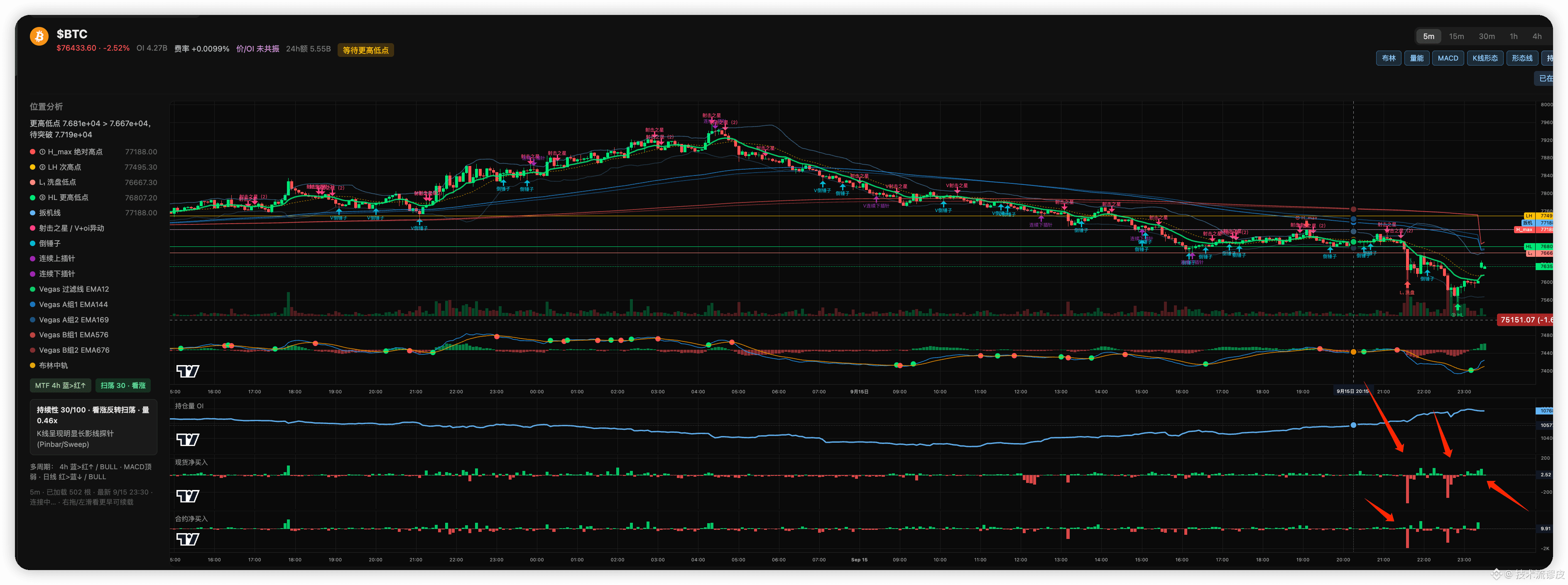
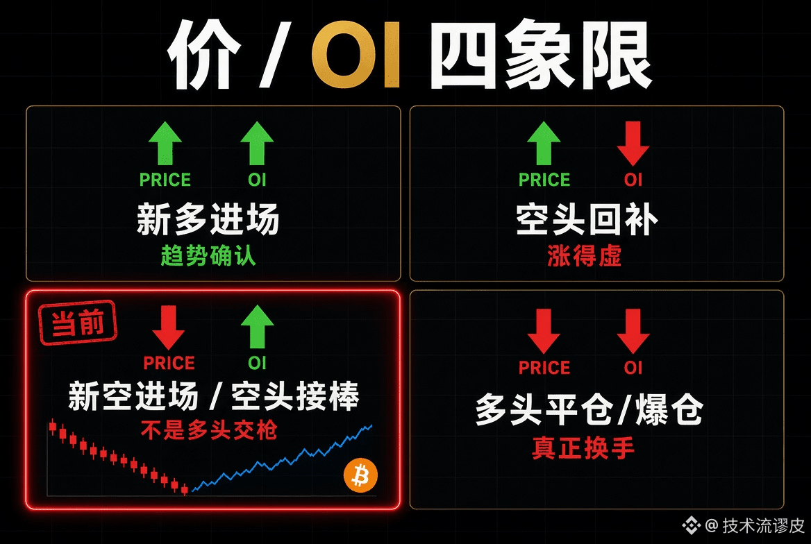
BTC This move isn’t the long side “capitulating and rotating,” it’s the shorts taking over.
Price is falling while OI is rising—this means it’s not that the old longs are being shaken out. Instead, new shorts are piling in.
Spot and futures net buys turning red at the same time signals that the shorts have begun to take control of the order book.
The sign that the rotation is complete is when OI drops along with the price. Right now, OI is still rising, which means the short side’s ammunition hasn’t been fully used up.
Don’t treat a big bearish candle as a bottom handover ceremony.
The rotation isn’t complete yet. It looks more like the shorts are taking the baton, not the longs handing in their weapons.
A true long/short rotation is usually: a big bearish candle + OI dropping in sync + the longs being swept out of the market.
This chart is the opposite—price is being smashed, while OI is climbing. That indicates it’s not that the old long positions got knocked out and exited; instead, someone is continuing to open new shorts during the downtrend. The old longs haven’t been cleared out completely, and the new shorts are already in.
Paired with the two lower panels—spot net buys and futures net buys turning red—both sides are selling together. This isn’t “bottom rotation completed.” It’s the shorts starting to take pricing power.
BTC This move isn’t the long side “capitulating and rotating,” it’s the shorts taking over.
Price is falling while OI is rising—this means it’s not that the old longs are being shaken out. Instead, new shorts are piling in.
Spot and futures net buys turning red at the same time signals that the shorts have begun to take control of the order book.
The sign that the rotation is complete is when OI drops along with the price. Right now, OI is still rising, which means the short side’s ammunition hasn’t been fully used up.
Don’t treat a big bearish candle as a bottom handover ceremony.
The rotation isn’t complete yet. It looks more like the shorts are taking the baton, not the longs handing in their weapons.
A true long/short rotation is usually: a big bearish candle + OI dropping in sync + the longs being swept out of the market.
This chart is the opposite—price is being smashed, while OI is climbing. That indicates it’s not that the old long positions got knocked out and exited; instead, someone is continuing to open new shorts during the downtrend. The old longs haven’t been cleared out completely, and the new shorts are already in.
Paired with the two lower panels—spot net buys and futures net buys turning red—both sides are selling together. This isn’t “bottom rotation completed.” It’s the shorts starting to take pricing power.
Price is falling while OI is rising—this means it’s not that the old longs are being shaken out. Instead, new shorts are piling in.
Spot and futures net buys turning red at the same time signals that the shorts have begun to take control of the order book.
The sign that the rotation is complete is when OI drops along with the price. Right now, OI is still rising, which means the short side’s ammunition hasn’t been fully used up.
Don’t treat a big bearish candle as a bottom handover ceremony.
The rotation isn’t complete yet. It looks more like the shorts are taking the baton, not the longs handing in their weapons.
A true long/short rotation is usually: a big bearish candle + OI dropping in sync + the longs being swept out of the market.
This chart is the opposite—price is being smashed, while OI is climbing. That indicates it’s not that the old long positions got knocked out and exited; instead, someone is continuing to open new shorts during the downtrend. The old longs haven’t been cleared out completely, and the new shorts are already in.
Paired with the two lower panels—spot net buys and futures net buys turning red—both sides are selling together. This isn’t “bottom rotation completed.” It’s the shorts starting to take pricing power.
215
·
--
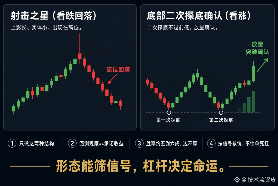
Only do two types of K-lines: one harvests at the mountaintop, and the other picks up a weapon at the pit bottom.
Others chase 20 different patterns every day.
I only watch two: the shooting star at the high level, and the second bottom retest at the low level.
One bets on downside, one bets on more upside.
Win rate isn’t mysticism—it’s whether you dare to only trade structures that repeat.
Patterns handle the selection; leverage amplifies—what’s amplified might also be a drawdown.
Only do two types of K-lines: one harvests at the mountaintop, and the other picks up a weapon at the pit bottom.
Others chase 20 different patterns every day.
I only watch two: the shooting star at the high level, and the second bottom retest at the low level.
One bets on downside, one bets on more upside.
Win rate isn’t mysticism—it’s whether you dare to only trade structures that repeat.
Patterns handle the selection; leverage amplifies—what’s amplified might also be a drawdown.
Others chase 20 different patterns every day.
I only watch two: the shooting star at the high level, and the second bottom retest at the low level.
One bets on downside, one bets on more upside.
Win rate isn’t mysticism—it’s whether you dare to only trade structures that repeat.
Patterns handle the selection; leverage amplifies—what’s amplified might also be a drawdown.
74
·
--
Oil is back at 100 again. Go ahead and open a short position directly—I don’t believe it can reach 120. Take profit if it hits 80.
Oil is back at 100 again. Go ahead and open a short position directly—I don’t believe it can reach 120. Take profit if it hits 80.
3
1
806
·
--
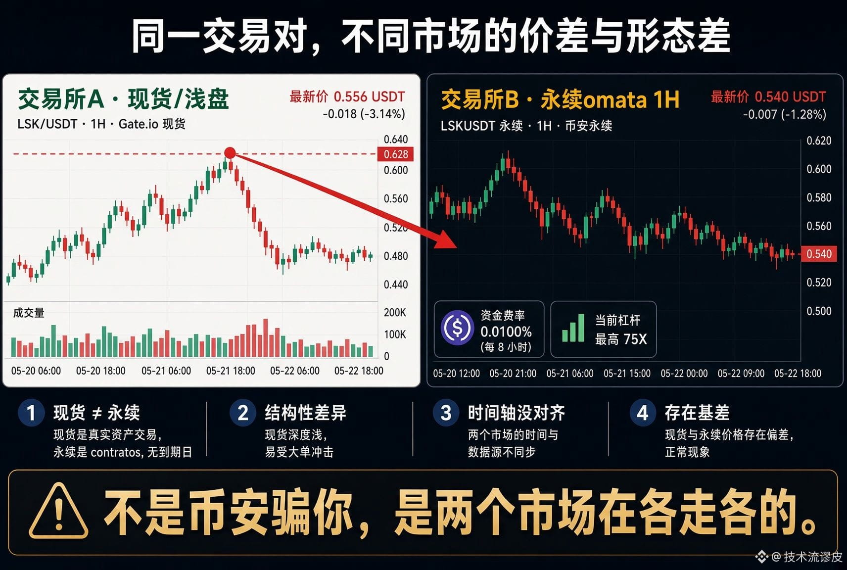
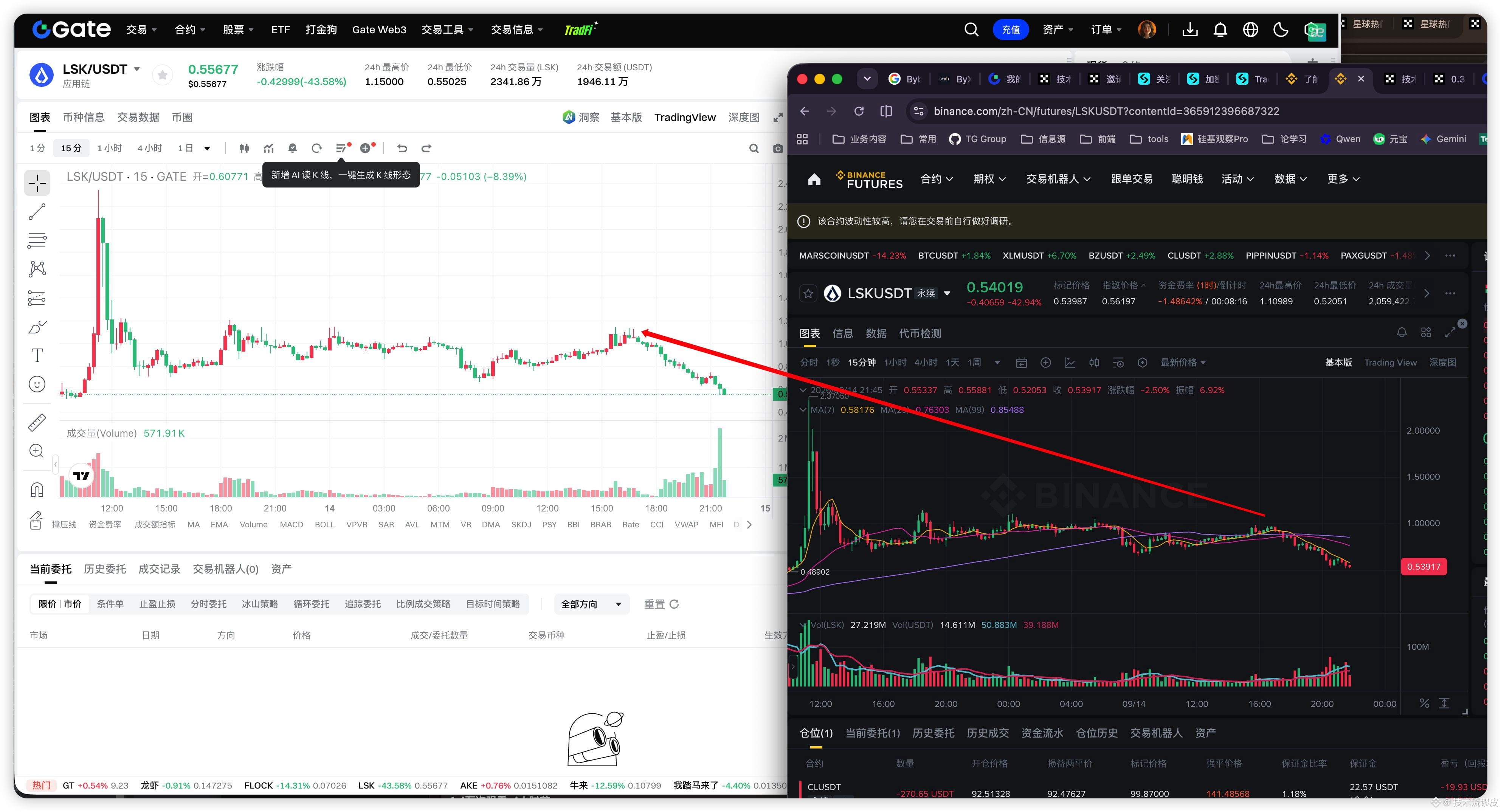
Why do these two formations look different? It clearly seems like the left side would be shorted, but the right side wouldn’t. Why is Binance trying to trick me?
The two order book formations are different. It’s not that Binance is trying to trick you—this is just a normal phenomenon. Gate on the left and Binance futures on the right are not actually the same market. The main reasons are:
1. Spot vs perpetual contracts
The left Gate appears to be a spot order book (or contracts with relatively lower liquidity). The right side is clearly Binance USDT perpetuals.
Perpetuals are affected by funding rates, leverage, and liquidation orders. As a result, price movements tend to be “more aggressive” and more fragmented than spot. Recently, the LSK funding rate has been significantly negative. Shorts have to pay longs, so the contract price action may diverge slightly from spot.
2. Liquidity is vastly different
Binance’s LSK perpetuals trading volume and depth are usually much larger than Gate’s. Large orders, arbitrage traders, and market makers mainly operate on Binance. So during the same drop, Binance often moves more smoothly or reacts earlier, while Gate is more likely to show relatively lagging behavior or a more “standard” top formation.
3. The time axis and scaling don’t fully line up
In your chart, at the red arrow positions, the local highs and lows after the most recent big bearish candle are not perfectly synchronized between the two sides. On the 15-minute chart, there are a few candles difference. It can look like “the left side is clearly set to short, while the right side still seems to hold on.” This is a visual mismatch caused by the screenshot moment and each side’s last candle not being fully completed—it's not data fabrication.
Why do these two formations look different? It clearly seems like the left side would be shorted, but the right side wouldn’t. Why is Binance trying to trick me?
The two order book formations are different. It’s not that Binance is trying to trick you—this is just a normal phenomenon. Gate on the left and Binance futures on the right are not actually the same market. The main reasons are:
1. Spot vs perpetual contracts
The left Gate appears to be a spot order book (or contracts with relatively lower liquidity). The right side is clearly Binance USDT perpetuals.
Perpetuals are affected by funding rates, leverage, and liquidation orders. As a result, price movements tend to be “more aggressive” and more fragmented than spot. Recently, the LSK funding rate has been significantly negative. Shorts have to pay longs, so the contract price action may diverge slightly from spot.
2. Liquidity is vastly different
Binance’s LSK perpetuals trading volume and depth are usually much larger than Gate’s. Large orders, arbitrage traders, and market makers mainly operate on Binance. So during the same drop, Binance often moves more smoothly or reacts earlier, while Gate is more likely to show relatively lagging behavior or a more “standard” top formation.
3. The time axis and scaling don’t fully line up
In your chart, at the red arrow positions, the local highs and lows after the most recent big bearish candle are not perfectly synchronized between the two sides. On the 15-minute chart, there are a few candles difference. It can look like “the left side is clearly set to short, while the right side still seems to hold on.” This is a visual mismatch caused by the screenshot moment and each side’s last candle not being fully completed—it's not data fabrication.
The two order book formations are different. It’s not that Binance is trying to trick you—this is just a normal phenomenon. Gate on the left and Binance futures on the right are not actually the same market. The main reasons are:
1. Spot vs perpetual contracts
The left Gate appears to be a spot order book (or contracts with relatively lower liquidity). The right side is clearly Binance USDT perpetuals.
Perpetuals are affected by funding rates, leverage, and liquidation orders. As a result, price movements tend to be “more aggressive” and more fragmented than spot. Recently, the LSK funding rate has been significantly negative. Shorts have to pay longs, so the contract price action may diverge slightly from spot.
2. Liquidity is vastly different
Binance’s LSK perpetuals trading volume and depth are usually much larger than Gate’s. Large orders, arbitrage traders, and market makers mainly operate on Binance. So during the same drop, Binance often moves more smoothly or reacts earlier, while Gate is more likely to show relatively lagging behavior or a more “standard” top formation.
3. The time axis and scaling don’t fully line up
In your chart, at the red arrow positions, the local highs and lows after the most recent big bearish candle are not perfectly synchronized between the two sides. On the 15-minute chart, there are a few candles difference. It can look like “the left side is clearly set to short, while the right side still seems to hold on.” This is a visual mismatch caused by the screenshot moment and each side’s last candle not being fully completed—it's not data fabrication.
274
·
--
Why, when looking at the same kind of “shanzhai” coins, do some people see 8% in a day while others see 30% every day? What are the most common daily ranges for most coin types?
For most shanzhai coins that can be traded on margin/futures, the typical daily swing is about 5%–10%. Don’t mix this up with the gainers/losers leaderboard:
• BTC on a normal day is about 1.5%–3%
• Coins like ETH / SOL are about 2.5%–5%
• Mid-cap shanzhai coins are mostly 4%–8%, with active days at 10%–15%
• Small caps, new listings, and memes of 15%–40% are also common. For those that truly make it onto a high-volume leaderboard, the move on that day is often already ±10%–25%.
Over 30% is mostly for small coins or extreme days—not the usual daily structure for mid-cap coins. Coins that are easy to attract attention include high-beta types like: ZEC / DASH, NEAR / ICP / SUI, ENA / ETHFI, PEPE / PENGU, and the like.
Tokens that tend to trigger rising hype: ZEC / DASH, NEAR / ICP / SUI, ENA / ETHFI, PEPE / PENGU, etc. These tokens have very high activity.
Even if OI is insufficient or a new listing on a single venue with shallow depth can still surge hard, that surge can’t serve as a pattern sample. For alerts, don’t use the same percentages across the board:
For BTC, using 3%–5% as an “effective swing” is acceptable. Most shanzhai coins usually need to be set to 6%–10%, and for small caps you should base it on ATR.
Otherwise your charts will be nothing but peaks—not structure, just noise.
Why, when looking at the same kind of “shanzhai” coins, do some people see 8% in a day while others see 30% every day? What are the most common daily ranges for most coin types?
For most shanzhai coins that can be traded on margin/futures, the typical daily swing is about 5%–10%. Don’t mix this up with the gainers/losers leaderboard:
• BTC on a normal day is about 1.5%–3%
• Coins like ETH / SOL are about 2.5%–5%
• Mid-cap shanzhai coins are mostly 4%–8%, with active days at 10%–15%
• Small caps, new listings, and memes of 15%–40% are also common. For those that truly make it onto a high-volume leaderboard, the move on that day is often already ±10%–25%.
Over 30% is mostly for small coins or extreme days—not the usual daily structure for mid-cap coins. Coins that are easy to attract attention include high-beta types like: ZEC / DASH, NEAR / ICP / SUI, ENA / ETHFI, PEPE / PENGU, and the like.
Tokens that tend to trigger rising hype: ZEC / DASH, NEAR / ICP / SUI, ENA / ETHFI, PEPE / PENGU, etc. These tokens have very high activity.
Even if OI is insufficient or a new listing on a single venue with shallow depth can still surge hard, that surge can’t serve as a pattern sample. For alerts, don’t use the same percentages across the board:
For BTC, using 3%–5% as an “effective swing” is acceptable. Most shanzhai coins usually need to be set to 6%–10%, and for small caps you should base it on ATR.
Otherwise your charts will be nothing but peaks—not structure, just noise.
For most shanzhai coins that can be traded on margin/futures, the typical daily swing is about 5%–10%. Don’t mix this up with the gainers/losers leaderboard:
• BTC on a normal day is about 1.5%–3%
• Coins like ETH / SOL are about 2.5%–5%
• Mid-cap shanzhai coins are mostly 4%–8%, with active days at 10%–15%
• Small caps, new listings, and memes of 15%–40% are also common. For those that truly make it onto a high-volume leaderboard, the move on that day is often already ±10%–25%.
Over 30% is mostly for small coins or extreme days—not the usual daily structure for mid-cap coins. Coins that are easy to attract attention include high-beta types like: ZEC / DASH, NEAR / ICP / SUI, ENA / ETHFI, PEPE / PENGU, and the like.
Tokens that tend to trigger rising hype: ZEC / DASH, NEAR / ICP / SUI, ENA / ETHFI, PEPE / PENGU, etc. These tokens have very high activity.
Even if OI is insufficient or a new listing on a single venue with shallow depth can still surge hard, that surge can’t serve as a pattern sample. For alerts, don’t use the same percentages across the board:
For BTC, using 3%–5% as an “effective swing” is acceptable. Most shanzhai coins usually need to be set to 6%–10%, and for small caps you should base it on ATR.
Otherwise your charts will be nothing but peaks—not structure, just noise.
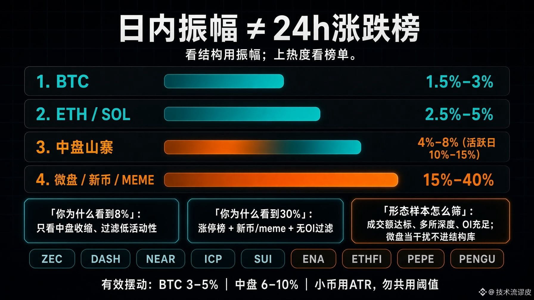
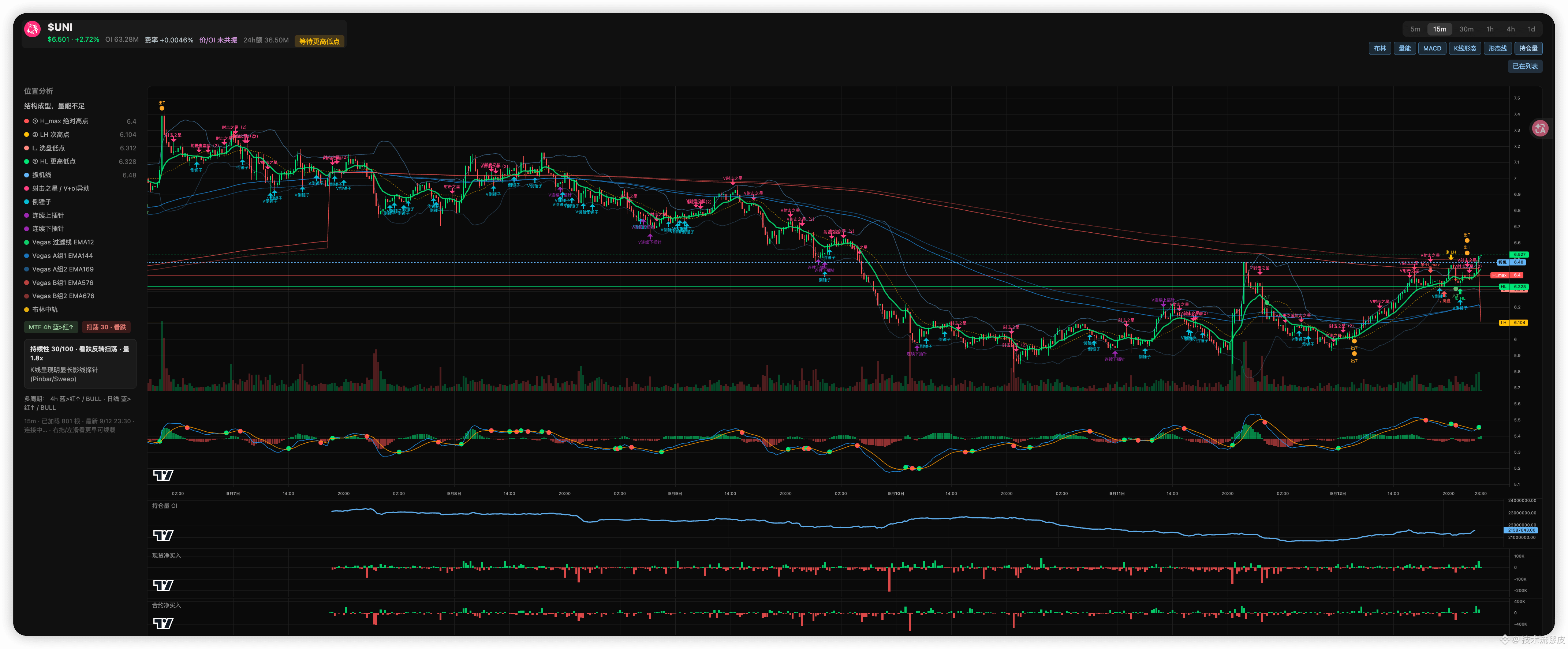
589
Log in to explore more content
Join global crypto users on Binance Square
⚡️ Get latest and useful information about crypto.
💬 Trusted by the world’s largest crypto exchange.
👍 Discover real insights from verified creators.
Email / Phone number
Trending Topics
EtherGains70.9%InQ3
43,218 views
554 Discussing
One of the best third quarters in history 💰
September closed out last night, and with it, the quarter. For the quarter, BTC is up 42%—the second-best Q3 on record. ETH had a record-breaking Q3 overall, up 70%.
Looking at the chart, things are still looking good: we’re holding support, but we’re testing it more and more often. Plus, ETF momentum is weakening — inflows are gradually declining, and yesterday saw outflows for the first time in a long while.
Yes, historically, October has been a good month for crypto — it’s not called “Uptober” for nothing. But it’s also one of the most volatile months. Last year, for example, we managed to hit a new all-time high (ATH) and experience a flash crash.
🚀 High Accuracy Trades.
$BTC
$ETH
$SOL
#EtherGains70.9%InQ3 #DollarIndexHitsHighestSinceMay2025 #CFTCSubmitsTwoEventContractRulesToWhiteHouse #MicronBeatsEarningsLiftsGuidance
Knowledge is Power
·0 Likes
·112 views
TreasuryLetsStatesFileStablecoinCertificationsEarly
1,104 views
20 Discussing
US10YearYieldNears5.3%
76,071 views
718 Discussing