
CoinQuest
25.4k Posts

CoinQuest
 Square Verified+
Report
Block User
X(Twitter):@CQuestOfficial_

#BinanceTurns7

Top Voices
High-Frequency Trader
3.6 Years
407 Following
125.5K+ Followers
228.3K+ Liked
2 Badges
Posts
All
Quotes
Videos
Live
·
--
Plan before execution✌️
#VTHO/USDT
Follow for more signals....❤️
Plan before execution✌️
#VTHO/USDT
Follow for more signals....❤️
#VTHO/USDT
Follow for more signals....❤️
CoinQuest
·
--
Bearish$VTHO just went vertical but is this where late buyers get trapped? 🚨
$VTHO just ripped more than 50% from around $0.000306 to $0.000720, and now it’s running straight into major higher-tf resistance.
The 3D EMA99 is sitting around $0.000723, while the 15m chart is already showing upper wicks around the highs. Price is also stretched far above the 15m EMA25 and SuperTrend, so I’m more interested in a pullback than chasing this candle.
I’m watching $0.000695 to $0.000720 for a short but I want to see actual rejection first. If buyers break and hold above $0.000720, I’m out of the idea. Invalidation is $0.000742.
If the rejection confirms, I’m watching $0.000640 first, then $0.000605 and $0.000582.
This is a counter-trend scalp, so position size matters. A coin moving 50% in a straight line can easily move another 10% before it finally cools off.
Would you short the rejection or let VTHO run? 👀
Follow CoinQuest for more setups and market reads.
I prefer a short position on this one. Trade Here👇
#VTHO
$VTHO just ripped more than 50% from around $0.000306 to $0.000720, and now it’s running straight into major higher-tf resistance.
The 3D EMA99 is sitting around $0.000723, while the 15m chart is already showing upper wicks around the highs. Price is also stretched far above the 15m EMA25 and SuperTrend, so I’m more interested in a pullback than chasing this candle.
I’m watching $0.000695 to $0.000720 for a short but I want to see actual rejection first. If buyers break and hold above $0.000720, I’m out of the idea. Invalidation is $0.000742.
If the rejection confirms, I’m watching $0.000640 first, then $0.000605 and $0.000582.
This is a counter-trend scalp, so position size matters. A coin moving 50% in a straight line can easily move another 10% before it finally cools off.
Would you short the rejection or let VTHO run? 👀
Follow CoinQuest for more setups and market reads.
I prefer a short position on this one. Trade Here👇
#VTHO
2
332
·
--
Bearish
$VTHO just went vertical but is this where late buyers get trapped? 🚨
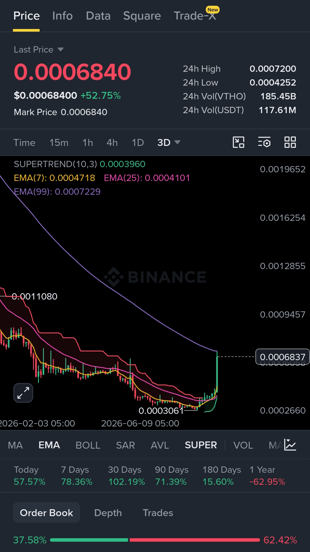
$VTHO just ripped more than 50% from around $0.000306 to $0.000720, and now it’s running straight into major higher-tf resistance.
The 3D EMA99 is sitting around $0.000723, while the 15m chart is already showing upper wicks around the highs. Price is also stretched far above the 15m EMA25 and SuperTrend, so I’m more interested in a pullback than chasing this candle.
I’m watching $0.000695 to $0.000720 for a short but I want to see actual rejection first. If buyers break and hold above $0.000720, I’m out of the idea. Invalidation is $0.000742.
If the rejection confirms, I’m watching $0.000640 first, then $0.000605 and $0.000582.
This is a counter-trend scalp, so position size matters. A coin moving 50% in a straight line can easily move another 10% before it finally cools off.
Would you short the rejection or let VTHO run? 👀
Follow CoinQuest for more setups and market reads.
I prefer a short position on this one. Trade Here👇
{future}(VTHOUSDT)
#VTHO
$VTHO just went vertical but is this where late buyers get trapped? 🚨
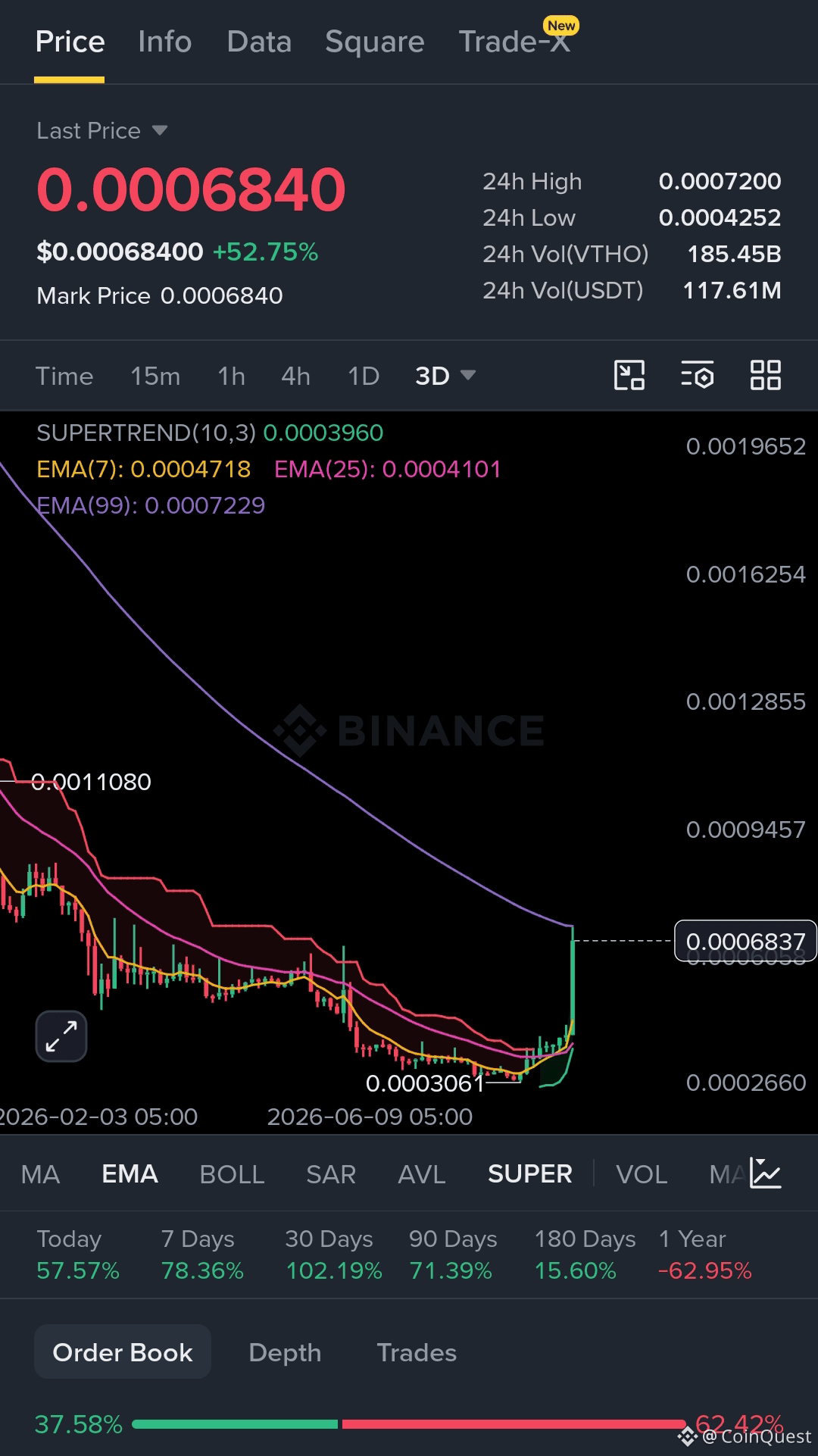
$VTHO just ripped more than 50% from around $0.000306 to $0.000720, and now it’s running straight into major higher-tf resistance.
The 3D EMA99 is sitting around $0.000723, while the 15m chart is already showing upper wicks around the highs. Price is also stretched far above the 15m EMA25 and SuperTrend, so I’m more interested in a pullback than chasing this candle.
I’m watching $0.000695 to $0.000720 for a short but I want to see actual rejection first. If buyers break and hold above $0.000720, I’m out of the idea. Invalidation is $0.000742.
If the rejection confirms, I’m watching $0.000640 first, then $0.000605 and $0.000582.
This is a counter-trend scalp, so position size matters. A coin moving 50% in a straight line can easily move another 10% before it finally cools off.
Would you short the rejection or let VTHO run? 👀
Follow CoinQuest for more setups and market reads.
I prefer a short position on this one. Trade Here👇
#VTHO
$VTHO just ripped more than 50% from around $0.000306 to $0.000720, and now it’s running straight into major higher-tf resistance.
The 3D EMA99 is sitting around $0.000723, while the 15m chart is already showing upper wicks around the highs. Price is also stretched far above the 15m EMA25 and SuperTrend, so I’m more interested in a pullback than chasing this candle.
I’m watching $0.000695 to $0.000720 for a short but I want to see actual rejection first. If buyers break and hold above $0.000720, I’m out of the idea. Invalidation is $0.000742.
If the rejection confirms, I’m watching $0.000640 first, then $0.000605 and $0.000582.
This is a counter-trend scalp, so position size matters. A coin moving 50% in a straight line can easily move another 10% before it finally cools off.
Would you short the rejection or let VTHO run? 👀
Follow CoinQuest for more setups and market reads.
I prefer a short position on this one. Trade Here👇
#VTHO
1
526
·
--
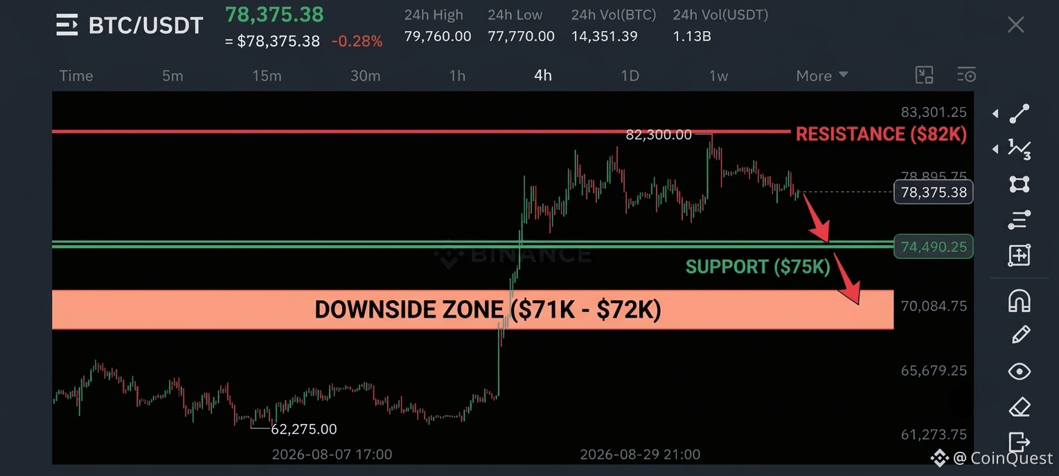
$BTC tried to break above $82K, failed, and is now back around $78K.
After the NFP reaction, the chart is starting to look weaker, but I don't think the real decision has happened yet. For me, $75K is the level that matters most.
If BTC holds $75K, this can still turn into another range and recovery attempt. But if $75K breaks and price starts accepting below it, I’d be looking toward $71K to $72K next.
So I’m not calling for a crash here. I’m watching one level.
$75K holds = bulls still have a chance.
$75K breaks = things get much more interesting for bears.
What do you think comes first, $82K reclaim or $72K? 👀
{future}(BTCUSDT)
#BTC #coinquest
$BTC tried to break above $82K, failed, and is now back around $78K.
After the NFP reaction, the chart is starting to look weaker, but I don't think the real decision has happened yet. For me, $75K is the level that matters most.
If BTC holds $75K, this can still turn into another range and recovery attempt. But if $75K breaks and price starts accepting below it, I’d be looking toward $71K to $72K next.
So I’m not calling for a crash here. I’m watching one level.
$75K holds = bulls still have a chance.
$75K breaks = things get much more interesting for bears.
What do you think comes first, $82K reclaim or $72K? 👀
#BTC #coinquest
After the NFP reaction, the chart is starting to look weaker, but I don't think the real decision has happened yet. For me, $75K is the level that matters most.
If BTC holds $75K, this can still turn into another range and recovery attempt. But if $75K breaks and price starts accepting below it, I’d be looking toward $71K to $72K next.
So I’m not calling for a crash here. I’m watching one level.
$75K holds = bulls still have a chance.
$75K breaks = things get much more interesting for bears.
What do you think comes first, $82K reclaim or $72K? 👀
#BTC #coinquest
2
641
·
--
Bearish
Ah yes… another political coin 😂
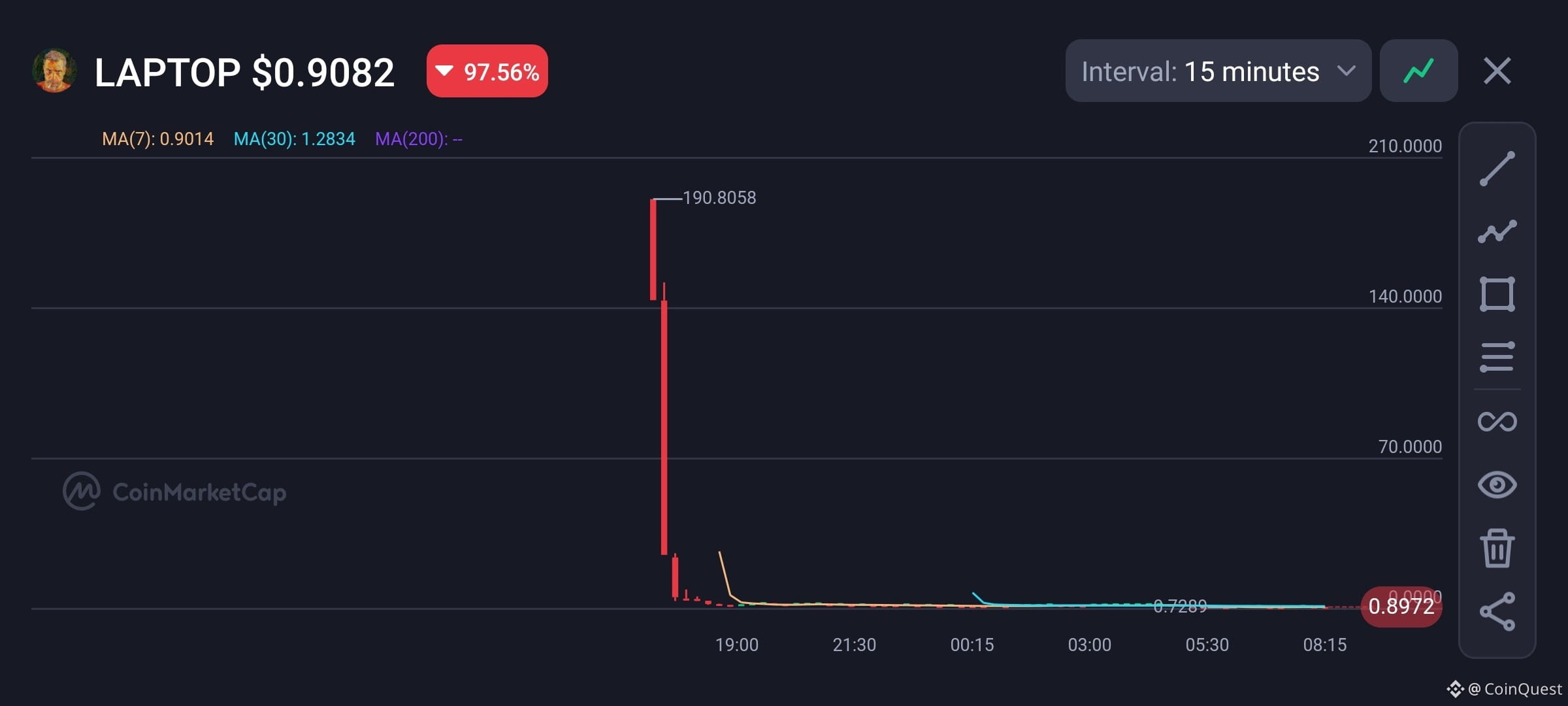
$LAPTOP went from $200+ to around $0.9 in basically no time.Stay Away from memes especially from Political ones.
Crypto really said: politics is temporary, liquidity is forever💀
#Laptop
Ah yes… another political coin 😂
$LAPTOP went from $200+ to around $0.9 in basically no time.Stay Away from memes especially from Political ones.
Crypto really said: politics is temporary, liquidity is forever💀
#Laptop
$LAPTOP went from $200+ to around $0.9 in basically no time.Stay Away from memes especially from Political ones.
Crypto really said: politics is temporary, liquidity is forever💀
#Laptop
1
1.1k
·
--
Bullish
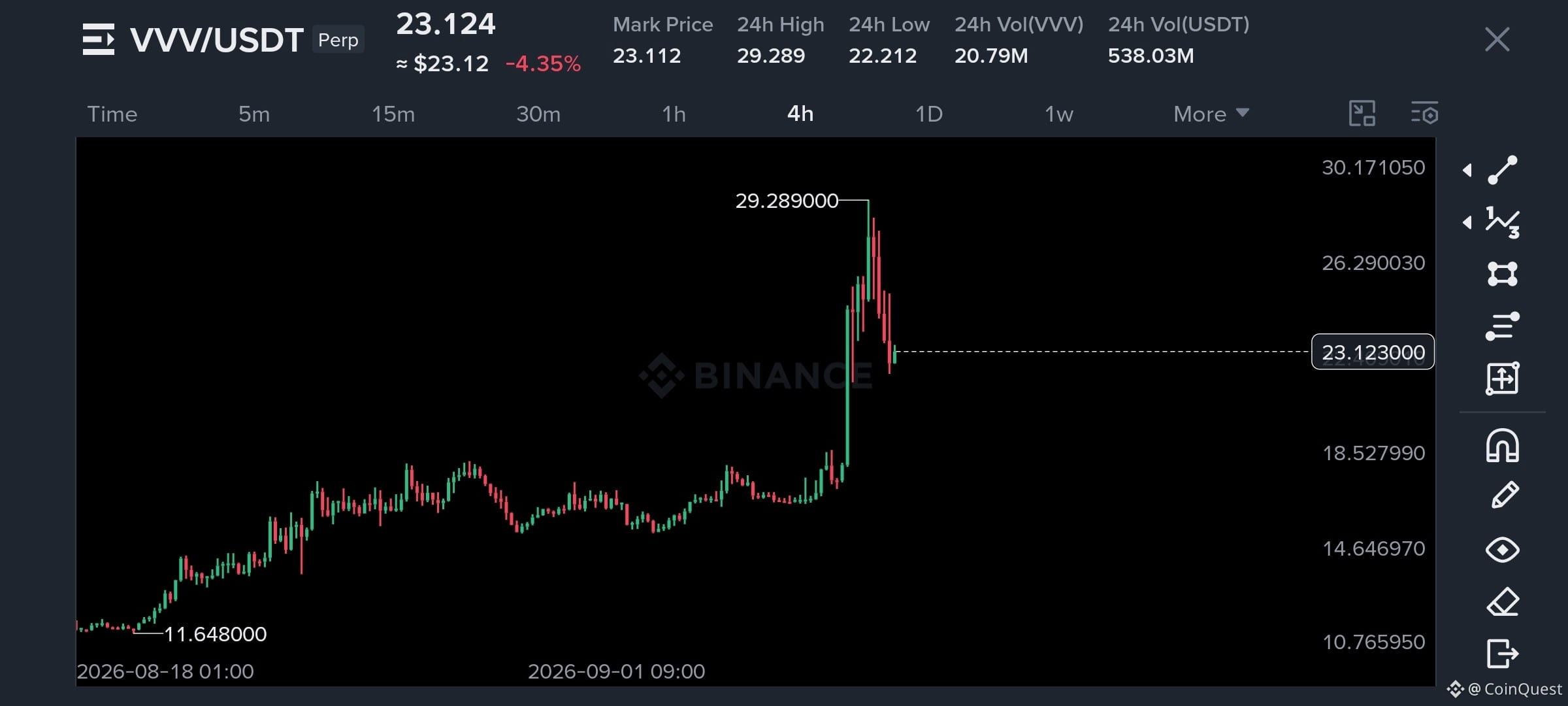
$VVV is down 20%… & suddenly everyone is screaming “crash” 😭
I’m not there yet.
I’ve been watching VVV since the $2.5 area & this move still looks more like a pullback into support than a confirmed trend reversal to me. It reminds me of what happened with $RIVER earlier, where a long period of accumulation was followed by a much bigger expansion.
That doesn't mean VVV goes straight back up from here. Late longs can still get punished & I wouldn't be surprised by more volatility before the next move.
But I also wouldn't short this just because price is down 20% from the highs. I want to see actual support break and sellers prove they can keep price below it.
As long as the higher-tf structure stays intact, I’m still bullish and I’m watching the $30 to $40+ area as the bigger upside zone.
The question isn't whether VVV pulled back. It’s whether this pullback actually changes the trend.
Follow CoinQuest. I’ll keep watching the levels, not the noise.
#VVV
$VVV is down 20%… & suddenly everyone is screaming “crash” 😭
I’m not there yet.
I’ve been watching VVV since the $2.5 area & this move still looks more like a pullback into support than a confirmed trend reversal to me. It reminds me of what happened with $RIVER earlier, where a long period of accumulation was followed by a much bigger expansion.
That doesn't mean VVV goes straight back up from here. Late longs can still get punished & I wouldn't be surprised by more volatility before the next move.
But I also wouldn't short this just because price is down 20% from the highs. I want to see actual support break and sellers prove they can keep price below it.
As long as the higher-tf structure stays intact, I’m still bullish and I’m watching the $30 to $40+ area as the bigger upside zone.
The question isn't whether VVV pulled back. It’s whether this pullback actually changes the trend.
Follow CoinQuest. I’ll keep watching the levels, not the noise.
#VVV
I’m not there yet.
I’ve been watching VVV since the $2.5 area & this move still looks more like a pullback into support than a confirmed trend reversal to me. It reminds me of what happened with $RIVER earlier, where a long period of accumulation was followed by a much bigger expansion.
That doesn't mean VVV goes straight back up from here. Late longs can still get punished & I wouldn't be surprised by more volatility before the next move.
But I also wouldn't short this just because price is down 20% from the highs. I want to see actual support break and sellers prove they can keep price below it.
As long as the higher-tf structure stays intact, I’m still bullish and I’m watching the $30 to $40+ area as the bigger upside zone.
The question isn't whether VVV pulled back. It’s whether this pullback actually changes the trend.
Follow CoinQuest. I’ll keep watching the levels, not the noise.
#VVV
925
·
--
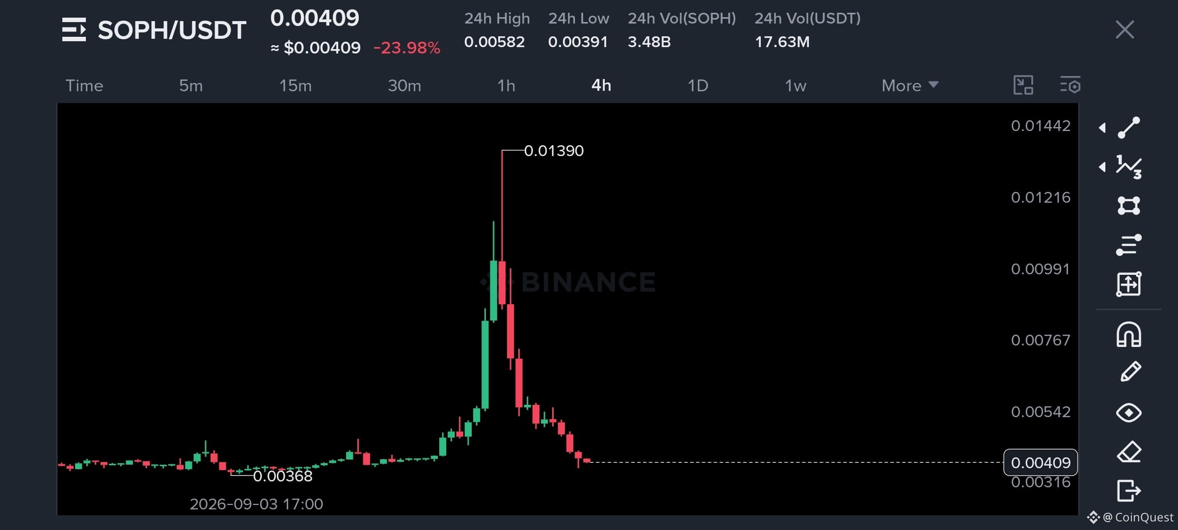
$SOPH dumped exactly through the level we were watching yesterday 👀
Yesterday I said $SOPH needed to hold the $0.0055–$0.0058 area. If that support broke, I was watching $0.00328 next.
Well... $SOPH is now around $0.0041.
That support didn't hold as Told in comments & now the downside move played out pretty much the way we were watching for. This is also why I don't like forcing a bounce just because a coin has already dumped hard.
Now I'm watching the $0.0040 area. If buyers finally step in and build a base here, we could get a relief move back toward $0.0055. But if $0.0040 keeps getting rejected as support, $0.00328 is still the level I'd keep on the radar.
The short idea is done. Now I'm looking for the next setup.
Did you catch the breakdown or are you waiting for SOPH to give another entry? 👀
Follow CoinQuest for the next move....
$SOPH dumped exactly through the level we were watching yesterday 👀
Yesterday I said $SOPH needed to hold the $0.0055–$0.0058 area. If that support broke, I was watching $0.00328 next.
Well... $SOPH is now around $0.0041.
That support didn't hold as Told in comments & now the downside move played out pretty much the way we were watching for. This is also why I don't like forcing a bounce just because a coin has already dumped hard.
Now I'm watching the $0.0040 area. If buyers finally step in and build a base here, we could get a relief move back toward $0.0055. But if $0.0040 keeps getting rejected as support, $0.00328 is still the level I'd keep on the radar.
The short idea is done. Now I'm looking for the next setup.
Did you catch the breakdown or are you waiting for SOPH to give another entry? 👀
Follow CoinQuest for the next move....
Yesterday I said $SOPH needed to hold the $0.0055–$0.0058 area. If that support broke, I was watching $0.00328 next.
Well... $SOPH is now around $0.0041.
That support didn't hold as Told in comments & now the downside move played out pretty much the way we were watching for. This is also why I don't like forcing a bounce just because a coin has already dumped hard.
Now I'm watching the $0.0040 area. If buyers finally step in and build a base here, we could get a relief move back toward $0.0055. But if $0.0040 keeps getting rejected as support, $0.00328 is still the level I'd keep on the radar.
The short idea is done. Now I'm looking for the next setup.
Did you catch the breakdown or are you waiting for SOPH to give another entry? 👀
Follow CoinQuest for the next move....
CoinQuest
·
--
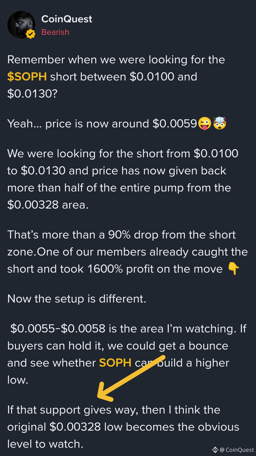
BearishRemember when we were looking for the $SOPH short between $0.0100 and $0.0130?
Yeah… price is now around $0.0059😜🤯
We were looking for the short from $0.0100 to $0.0130 and price has now given back more than half of the entire pump from the $0.00328 area.
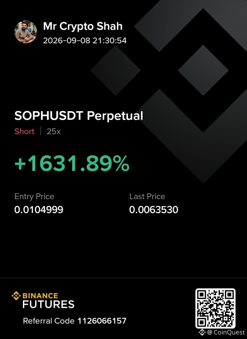
That’s more than a 90% drop from the short zone.One of our members already caught the short and took 1600% profit on the move 👇
Now the setup is different.
$0.0055-$0.0058 is the area I’m watching. If buyers can hold it, we could get a bounce and see whether SOPH can build a higher low.
If that support gives way, then I think the original $0.00328 low becomes the obvious level to watch.
For now, I’m not chasing the move down. The short already did its job.
#SOPH
Trade Here👇
Yeah… price is now around $0.0059😜🤯
We were looking for the short from $0.0100 to $0.0130 and price has now given back more than half of the entire pump from the $0.00328 area.
That’s more than a 90% drop from the short zone.One of our members already caught the short and took 1600% profit on the move 👇
Now the setup is different.
$0.0055-$0.0058 is the area I’m watching. If buyers can hold it, we could get a bounce and see whether SOPH can build a higher low.
If that support gives way, then I think the original $0.00328 low becomes the obvious level to watch.
For now, I’m not chasing the move down. The short already did its job.
#SOPH
Trade Here👇
753
·
--
Bullish
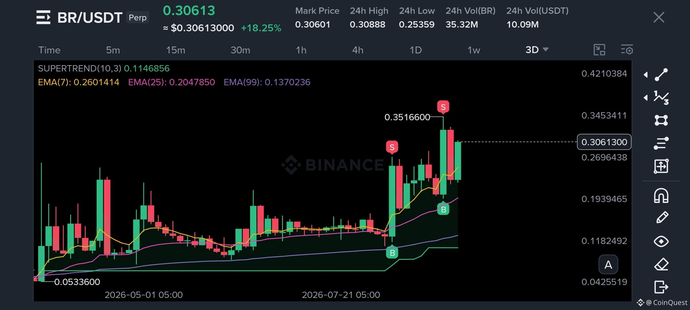
I’ve just opened a long on $BR
The reason I took it isn’t really the breakout. $BR is reversing from a 1D support rang & buyers are starting to push price back toward the recent highs. That gives me a much better risk point than chasing after the move has already happened.
I’m watching $0.295 to $0.309 for the position, with $0.33, $0.34 & $0.40 as the upside levels. If price loses $0.2730, the setup is invalid for me.
Now I want to see whether this daily support actually turns into the base for another leg higher.
If you're watching $BR too, keep an eye on how price reacts around $0.30-0.31 range
Follow CoinQuest for more real-time setups and market analysis.
Trade Here👇
{future}(BRUSDT)
I’ve just opened a long on $BR
The reason I took it isn’t really the breakout. $BR is reversing from a 1D support rang & buyers are starting to push price back toward the recent highs. That gives me a much better risk point than chasing after the move has already happened.
I’m watching $0.295 to $0.309 for the position, with $0.33, $0.34 & $0.40 as the upside levels. If price loses $0.2730, the setup is invalid for me.
Now I want to see whether this daily support actually turns into the base for another leg higher.
If you're watching $BR too, keep an eye on how price reacts around $0.30-0.31 range
Follow CoinQuest for more real-time setups and market analysis.
Trade Here👇
The reason I took it isn’t really the breakout. $BR is reversing from a 1D support rang & buyers are starting to push price back toward the recent highs. That gives me a much better risk point than chasing after the move has already happened.
I’m watching $0.295 to $0.309 for the position, with $0.33, $0.34 & $0.40 as the upside levels. If price loses $0.2730, the setup is invalid for me.
Now I want to see whether this daily support actually turns into the base for another leg higher.
If you're watching $BR too, keep an eye on how price reacts around $0.30-0.31 range
Follow CoinQuest for more real-time setups and market analysis.
Trade Here👇
2
364
·
--
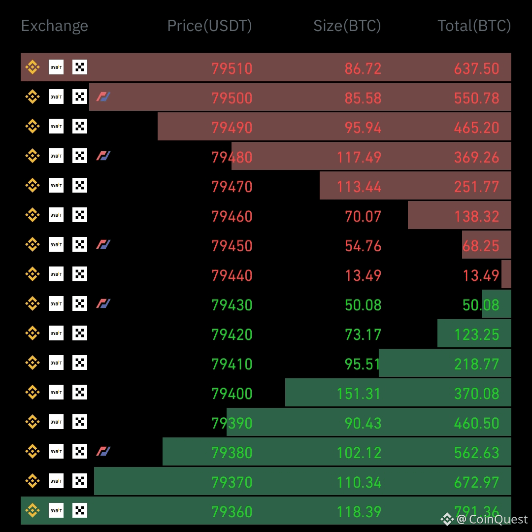
$BTC taker buy/sell ratio on Binance Futures has dropped to 0.917, which means aggressive sell orders are currently outweighing aggressive buys.
But I wouldn’t treat that as a bearish confirmation on its own.
When sellers start hitting the market harder while price continues holding its structure, it can also mean those shorts are providing liquidity for buyers to absorb. The real question is whether BTC actually starts losing important support or simply absorbs the selling pressure and pushes higher again.
I’m watching price reaction more than the ratio itself. If sellers have control, price should eventually show it.
Are sellers building the start of a reversal or just becoming exit liquidity? 👀
Follow CoinQuest for more market reads.
{future}(BTCUSDT)
#BTC
$BTC taker buy/sell ratio on Binance Futures has dropped to 0.917, which means aggressive sell orders are currently outweighing aggressive buys.
But I wouldn’t treat that as a bearish confirmation on its own.
When sellers start hitting the market harder while price continues holding its structure, it can also mean those shorts are providing liquidity for buyers to absorb. The real question is whether BTC actually starts losing important support or simply absorbs the selling pressure and pushes higher again.
I’m watching price reaction more than the ratio itself. If sellers have control, price should eventually show it.
Are sellers building the start of a reversal or just becoming exit liquidity? 👀
Follow CoinQuest for more market reads.
#BTC
But I wouldn’t treat that as a bearish confirmation on its own.
When sellers start hitting the market harder while price continues holding its structure, it can also mean those shorts are providing liquidity for buyers to absorb. The real question is whether BTC actually starts losing important support or simply absorbs the selling pressure and pushes higher again.
I’m watching price reaction more than the ratio itself. If sellers have control, price should eventually show it.
Are sellers building the start of a reversal or just becoming exit liquidity? 👀
Follow CoinQuest for more market reads.
#BTC
1
577
·
--
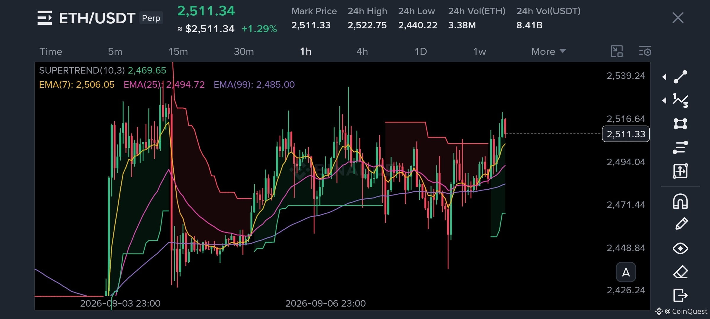
$ETH is sitting around $2,520 and I’m watching this area for a potential long
The daily trend is bullish, while the 15m RSI around 63 still has room before ETH looks overheated. My entry zone is $2,517 to $2,521, with TP1 at $2,547, TP2 at $2,566 and TP3 at $2,595. I’m keeping the invalidation around $2,481.80.
The first level I want to see reclaimed is $2,547. If buyers push through it with decent volume, $2,566 and $2,595 become the next levels I’d watch. If the entry zone fails, I’m not interested in forcing the trade.
Would you take this long here or wait for a better entry? 👀
Follow CoinQuest for more real-time setups and market analysis.
#ETH🔥🔥🔥🔥🔥🔥
$ETH is sitting around $2,520 and I’m watching this area for a potential long
The daily trend is bullish, while the 15m RSI around 63 still has room before ETH looks overheated. My entry zone is $2,517 to $2,521, with TP1 at $2,547, TP2 at $2,566 and TP3 at $2,595. I’m keeping the invalidation around $2,481.80.
The first level I want to see reclaimed is $2,547. If buyers push through it with decent volume, $2,566 and $2,595 become the next levels I’d watch. If the entry zone fails, I’m not interested in forcing the trade.
Would you take this long here or wait for a better entry? 👀
Follow CoinQuest for more real-time setups and market analysis.
#ETH🔥🔥🔥🔥🔥🔥
The daily trend is bullish, while the 15m RSI around 63 still has room before ETH looks overheated. My entry zone is $2,517 to $2,521, with TP1 at $2,547, TP2 at $2,566 and TP3 at $2,595. I’m keeping the invalidation around $2,481.80.
The first level I want to see reclaimed is $2,547. If buyers push through it with decent volume, $2,566 and $2,595 become the next levels I’d watch. If the entry zone fails, I’m not interested in forcing the trade.
Would you take this long here or wait for a better entry? 👀
Follow CoinQuest for more real-time setups and market analysis.
#ETH🔥🔥🔥🔥🔥🔥
1
1
538
·
--
🟢 $82K
53%
🔴 $76K
46%
⚖️ Neutral / Both possible
1%
76 votes • Voting closed
1
2
655
·
--
Bullish
Someone just drained roughly $320M worth of BTC from a Bitcoin sidechain😯
And yet $BTC didn't even flinch.
That might actually be the most interesting part of this whole story.
The exploit wasn't against Bitcoin itself. It hit Liquid's federation and the software around its L-BTC peg. The attacker was able to turn fake L-BTC into real BTC but Bitcoin's own network, consensus and settlement layer were never compromised.
That's why the market didn't treat this like a $320M Bitcoin hack.
It was a $320M infrastructure failure built around Bitcoin.
And honestly, that's an important distinction.
If someone finds a bug in a bridge, sidechain or wrapped version of BTC, it doesn't automatically mean Bitcoin is broken.
The market seems to understand that difference pretty well.
#BTC
Someone just drained roughly $320M worth of BTC from a Bitcoin sidechain😯
And yet $BTC didn't even flinch.
That might actually be the most interesting part of this whole story.
The exploit wasn't against Bitcoin itself. It hit Liquid's federation and the software around its L-BTC peg. The attacker was able to turn fake L-BTC into real BTC but Bitcoin's own network, consensus and settlement layer were never compromised.
That's why the market didn't treat this like a $320M Bitcoin hack.
It was a $320M infrastructure failure built around Bitcoin.
And honestly, that's an important distinction.
If someone finds a bug in a bridge, sidechain or wrapped version of BTC, it doesn't automatically mean Bitcoin is broken.
The market seems to understand that difference pretty well.
#BTC
And yet $BTC didn't even flinch.
That might actually be the most interesting part of this whole story.
The exploit wasn't against Bitcoin itself. It hit Liquid's federation and the software around its L-BTC peg. The attacker was able to turn fake L-BTC into real BTC but Bitcoin's own network, consensus and settlement layer were never compromised.
That's why the market didn't treat this like a $320M Bitcoin hack.
It was a $320M infrastructure failure built around Bitcoin.
And honestly, that's an important distinction.
If someone finds a bug in a bridge, sidechain or wrapped version of BTC, it doesn't automatically mean Bitcoin is broken.
The market seems to understand that difference pretty well.
#BTC
1
494
·
--
Another political memecoin is about to hit Base but the airdrop strategy behind this one is what caught my attention🙄
$LAPTOP is targeting $TRUMP memecoin holders who lost money, along with Biden's Substack subscribers and another mailing list.
That's a very different way of launching a political coin.
Instead of starting with zero audience and hoping the narrative spreads, they're going straight after people who already have a reason to pay attention.
And that's probably the smartest part of the whole launch.
But getting people in is one thing. Keeping liquidity and demand after the launch hype fades is another.
I'll be watching what happens after the first few days, because that's when we'll find out whether this is more than another political memecoin pump.
#TRUMP #Biden #Laptop
{future}(TRUMPUSDT)
Another political memecoin is about to hit Base but the airdrop strategy behind this one is what caught my attention🙄
$LAPTOP is targeting $TRUMP memecoin holders who lost money, along with Biden's Substack subscribers and another mailing list.
That's a very different way of launching a political coin.
Instead of starting with zero audience and hoping the narrative spreads, they're going straight after people who already have a reason to pay attention.
And that's probably the smartest part of the whole launch.
But getting people in is one thing. Keeping liquidity and demand after the launch hype fades is another.
I'll be watching what happens after the first few days, because that's when we'll find out whether this is more than another political memecoin pump.
#TRUMP #Biden #Laptop
$LAPTOP is targeting $TRUMP memecoin holders who lost money, along with Biden's Substack subscribers and another mailing list.
That's a very different way of launching a political coin.
Instead of starting with zero audience and hoping the narrative spreads, they're going straight after people who already have a reason to pay attention.
And that's probably the smartest part of the whole launch.
But getting people in is one thing. Keeping liquidity and demand after the launch hype fades is another.
I'll be watching what happens after the first few days, because that's when we'll find out whether this is more than another political memecoin pump.
#TRUMP #Biden #Laptop
1
1
5.3k
·
--
Bullish
Don't Become Someone's Exit Liquidity
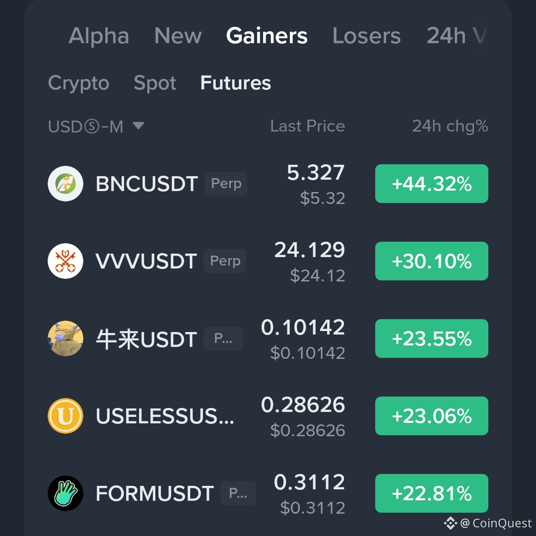
$BNC , $USELESS ,$FORM & $VVV are moving hard today but I wouldn't be surprised if these become the coins everyone starts chasing after the move is already underway.
BNC is up around 45%,USELESS is up around 32% while $FORM and VVV are both up more than 30%.
Strong momentum is great but the question is always where you're entering it. Buying after a 30% to 45% move is a very different trade from catching the setup before the expansion.You guys can wait for the healthy pullback for better entry opportunity .
I'm watching these 4 but I'm not buying just because they're on the leaderboard😉💯
Plan is better than Losing real money. Plan the trade ,then execute rather than entering.
{future}(VVVUSDT)
Don't Become Someone's Exit Liquidity
$BNC , $USELESS ,$FORM & $VVV are moving hard today but I wouldn't be surprised if these become the coins everyone starts chasing after the move is already underway.
BNC is up around 45%,USELESS is up around 32% while $FORM and VVV are both up more than 30%.
Strong momentum is great but the question is always where you're entering it. Buying after a 30% to 45% move is a very different trade from catching the setup before the expansion.You guys can wait for the healthy pullback for better entry opportunity .
I'm watching these 4 but I'm not buying just because they're on the leaderboard😉💯
Plan is better than Losing real money. Plan the trade ,then execute rather than entering.
$BNC , $USELESS ,$FORM & $VVV are moving hard today but I wouldn't be surprised if these become the coins everyone starts chasing after the move is already underway.
BNC is up around 45%,USELESS is up around 32% while $FORM and VVV are both up more than 30%.
Strong momentum is great but the question is always where you're entering it. Buying after a 30% to 45% move is a very different trade from catching the setup before the expansion.You guys can wait for the healthy pullback for better entry opportunity .
I'm watching these 4 but I'm not buying just because they're on the leaderboard😉💯
Plan is better than Losing real money. Plan the trade ,then execute rather than entering.
3
9
7k
·
--
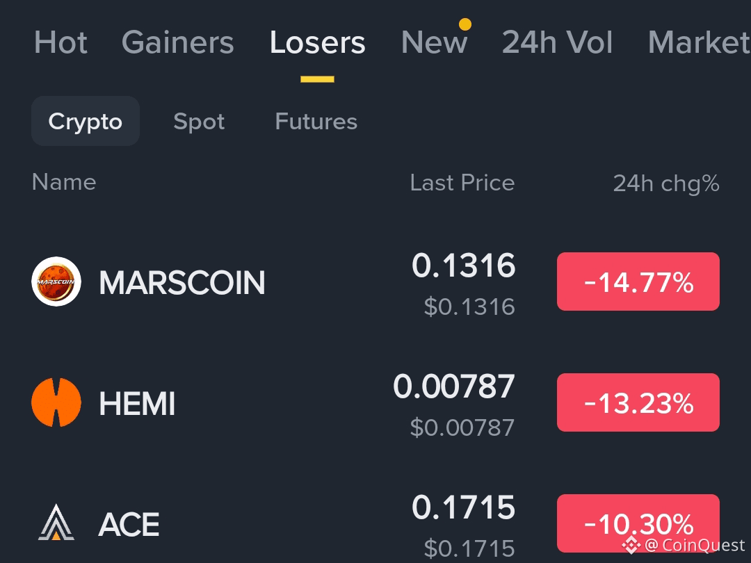
Last week's top gainer is today's exit liquidity💯
I keep seeing the same cycle in these moves. A coin runs hard, late longs start chasing, leverage builds up & eventually there’s a point where the same momentum that attracted buyers starts working against them.
It doesn't mean every gainer has to crash tomorrow. It's more about timing & liquidity position. The longer you stay in a crowded long after the easy move is gone, the more dangerous the downside becomes.
That's also why I prefer keeping short positions small, around 1-2% of the wallet. It gives you room to survive the volatility, add at better levels if the setup develops & avoid getting wiped out trying to nail the exact top.
Sometimes the trade isn't about being early....It's about having enough liquidity to still be there when the market finally turns.
#MARSCOINPriceAnalysis $MARSCOIN $HEMI $ACE
Last week's top gainer is today's exit liquidity💯
I keep seeing the same cycle in these moves. A coin runs hard, late longs start chasing, leverage builds up & eventually there’s a point where the same momentum that attracted buyers starts working against them.
It doesn't mean every gainer has to crash tomorrow. It's more about timing & liquidity position. The longer you stay in a crowded long after the easy move is gone, the more dangerous the downside becomes.
That's also why I prefer keeping short positions small, around 1-2% of the wallet. It gives you room to survive the volatility, add at better levels if the setup develops & avoid getting wiped out trying to nail the exact top.
Sometimes the trade isn't about being early....It's about having enough liquidity to still be there when the market finally turns.
#MARSCOINPriceAnalysis $MARSCOIN $HEMI $ACE
I keep seeing the same cycle in these moves. A coin runs hard, late longs start chasing, leverage builds up & eventually there’s a point where the same momentum that attracted buyers starts working against them.
It doesn't mean every gainer has to crash tomorrow. It's more about timing & liquidity position. The longer you stay in a crowded long after the easy move is gone, the more dangerous the downside becomes.
That's also why I prefer keeping short positions small, around 1-2% of the wallet. It gives you room to survive the volatility, add at better levels if the setup develops & avoid getting wiped out trying to nail the exact top.
Sometimes the trade isn't about being early....It's about having enough liquidity to still be there when the market finally turns.
#MARSCOINPriceAnalysis $MARSCOIN $HEMI $ACE
1
5.5k
·
--
Bearish
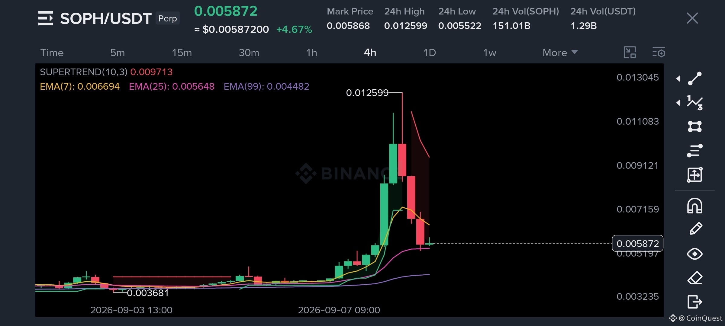
Remember when we were looking for the $SOPH short between $0.0100 and $0.0130?
Yeah… price is now around $0.0059😜🤯
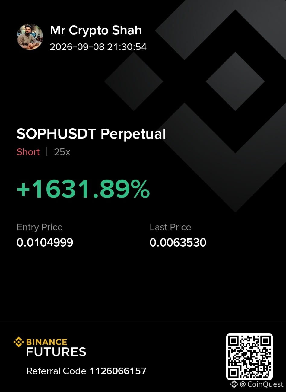
We were looking for the short from $0.0100 to $0.0130 and price has now given back more than half of the entire pump from the $0.00328 area.
That’s more than a 90% drop from the short zone.One of our members already caught the short and took 1600% profit on the move 👇
Now the setup is different.
$0.0055-$0.0058 is the area I’m watching. If buyers can hold it, we could get a bounce and see whether SOPH can build a higher low.
If that support gives way, then I think the original $0.00328 low becomes the obvious level to watch.
For now, I’m not chasing the move down. The short already did its job.
#SOPH
Trade Here👇
{future}(SOPHUSDT)
Remember when we were looking for the $SOPH short between $0.0100 and $0.0130?
Yeah… price is now around $0.0059😜🤯
We were looking for the short from $0.0100 to $0.0130 and price has now given back more than half of the entire pump from the $0.00328 area.
That’s more than a 90% drop from the short zone.One of our members already caught the short and took 1600% profit on the move 👇
Now the setup is different.
$0.0055-$0.0058 is the area I’m watching. If buyers can hold it, we could get a bounce and see whether SOPH can build a higher low.
If that support gives way, then I think the original $0.00328 low becomes the obvious level to watch.
For now, I’m not chasing the move down. The short already did its job.
#SOPH
Trade Here👇
Yeah… price is now around $0.0059😜🤯
We were looking for the short from $0.0100 to $0.0130 and price has now given back more than half of the entire pump from the $0.00328 area.
That’s more than a 90% drop from the short zone.One of our members already caught the short and took 1600% profit on the move 👇
Now the setup is different.
$0.0055-$0.0058 is the area I’m watching. If buyers can hold it, we could get a bounce and see whether SOPH can build a higher low.
If that support gives way, then I think the original $0.00328 low becomes the obvious level to watch.
For now, I’m not chasing the move down. The short already did its job.
#SOPH
Trade Here👇
2
1
469
·
--
Bullish
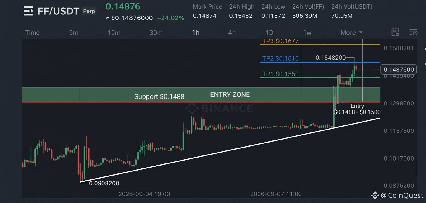
$FF is still holding the breakout area after that 24% move, and this is where I’d be watching the reaction rather than chasing the candle.
As long as $0.1488 holds, the structure still looks good for another push. My levels are $0.1550, $0.1610 and $0.1677, with $0.1420 as the invalidation.
If price starts losing $0.1488, I’d rather step aside than force the long.
{future}(FFUSDT)
#ff #coinquest #TradingSignals
$FF is still holding the breakout area after that 24% move, and this is where I’d be watching the reaction rather than chasing the candle.
As long as $0.1488 holds, the structure still looks good for another push. My levels are $0.1550, $0.1610 and $0.1677, with $0.1420 as the invalidation.
If price starts losing $0.1488, I’d rather step aside than force the long.
#ff #coinquest #TradingSignals
As long as $0.1488 holds, the structure still looks good for another push. My levels are $0.1550, $0.1610 and $0.1677, with $0.1420 as the invalidation.
If price starts losing $0.1488, I’d rather step aside than force the long.
#ff #coinquest #TradingSignals
1
424
·
--
Bearish
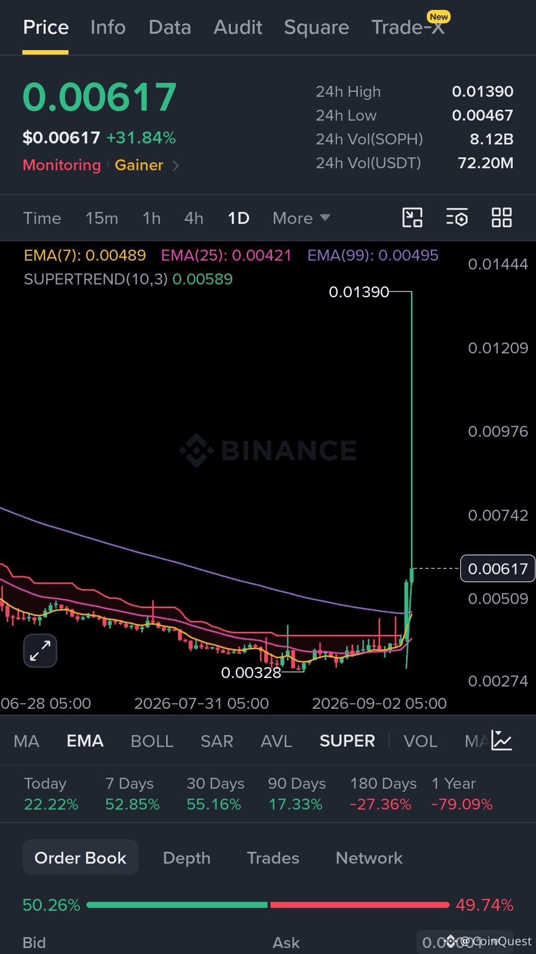
$SOPH is a good example of why I don't like chasing vertical pumps. We called the short around $0.0100 to $0.0130 while everyone was still talking about the upside.
Since then, SOPH pushed into $0.01390 and completely lost the momentum, retracing more than 50% of the pump. One of our members caught the short and locked the profit 👇
Now I'm not interested in celebrating the dump. I'm watching $0.00550 to $0.00580.
If that holds, SOPH could build a higher low and try another move. If it breaks, I think the market starts looking back toward the original breakout area around $0.00328.
The easy part was calling the top. The harder part is figuring out where the next real buyers show up.
{future}(SOPHUSDT)
$SOPH is a good example of why I don't like chasing vertical pumps. We called the short around $0.0100 to $0.0130 while everyone was still talking about the upside.
Since then, SOPH pushed into $0.01390 and completely lost the momentum, retracing more than 50% of the pump. One of our members caught the short and locked the profit 👇
Now I'm not interested in celebrating the dump. I'm watching $0.00550 to $0.00580.
If that holds, SOPH could build a higher low and try another move. If it breaks, I think the market starts looking back toward the original breakout area around $0.00328.
The easy part was calling the top. The harder part is figuring out where the next real buyers show up.
Since then, SOPH pushed into $0.01390 and completely lost the momentum, retracing more than 50% of the pump. One of our members caught the short and locked the profit 👇
Now I'm not interested in celebrating the dump. I'm watching $0.00550 to $0.00580.
If that holds, SOPH could build a higher low and try another move. If it breaks, I think the market starts looking back toward the original breakout area around $0.00328.
The easy part was calling the top. The harder part is figuring out where the next real buyers show up.
2
662
·
--
Bullish
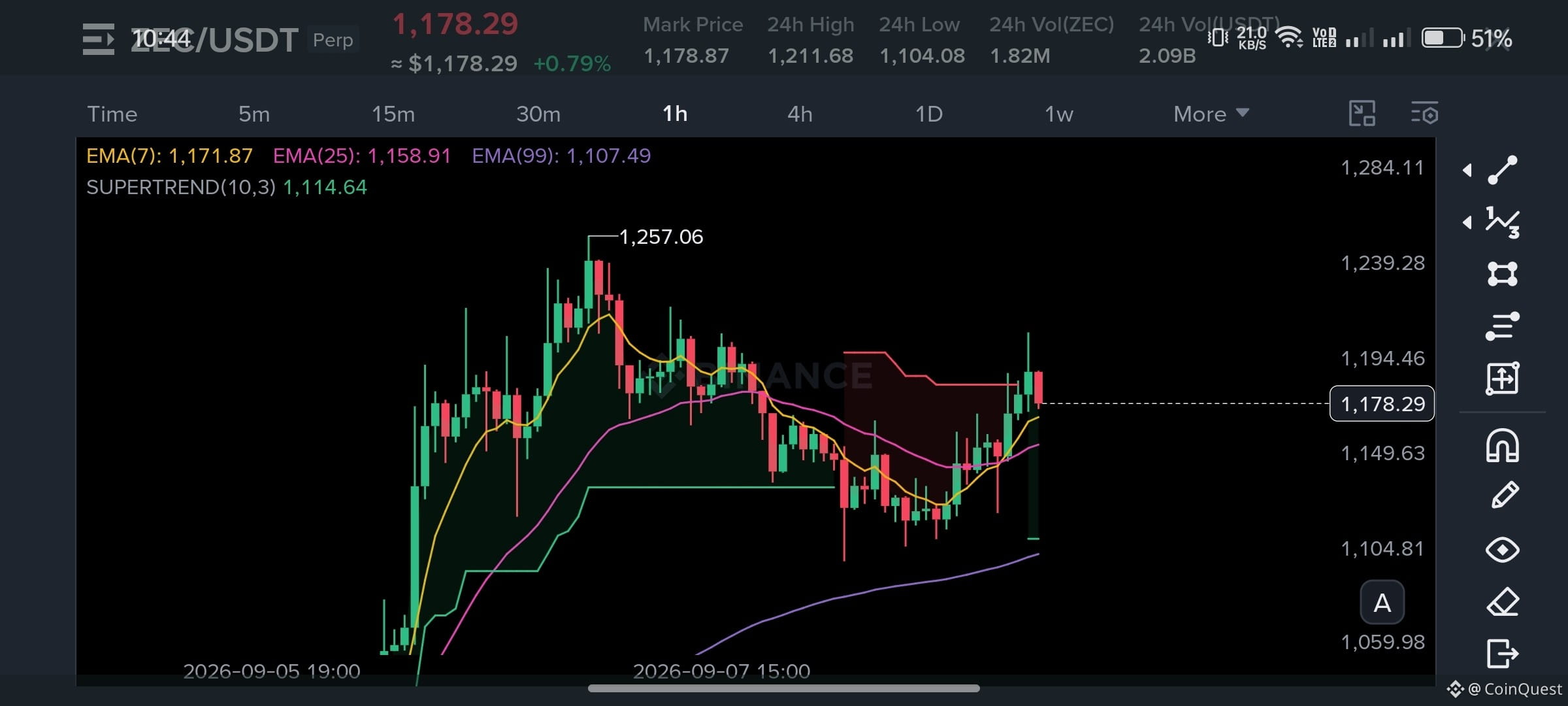
$ZEC is giving back some of the move & honestly, I’m more interested in what happens around $1,000 than $1,150.
The move from the $800s to above $1,200 was too fast. A deeper pullback wouldn’t surprise me at all.
What I don’t want to see is ZEC slowly losing the levels that made this breakout possible in the first place.
If $1,000 holds, I can still treat this as a correction inside the bigger move.
If $1,000 breaks and price starts accepting below it, then the whole setup needs to be looked at differently.
I’m not buying just because ZEC is cheaper than it was yesterday.
I want to see where buyers actually show up💯
Trade Here👇
{future}(ZECUSDT)
#zec
$ZEC is giving back some of the move & honestly, I’m more interested in what happens around $1,000 than $1,150.
The move from the $800s to above $1,200 was too fast. A deeper pullback wouldn’t surprise me at all.
What I don’t want to see is ZEC slowly losing the levels that made this breakout possible in the first place.
If $1,000 holds, I can still treat this as a correction inside the bigger move.
If $1,000 breaks and price starts accepting below it, then the whole setup needs to be looked at differently.
I’m not buying just because ZEC is cheaper than it was yesterday.
I want to see where buyers actually show up💯
Trade Here👇
#zec
The move from the $800s to above $1,200 was too fast. A deeper pullback wouldn’t surprise me at all.
What I don’t want to see is ZEC slowly losing the levels that made this breakout possible in the first place.
If $1,000 holds, I can still treat this as a correction inside the bigger move.
If $1,000 breaks and price starts accepting below it, then the whole setup needs to be looked at differently.
I’m not buying just because ZEC is cheaper than it was yesterday.
I want to see where buyers actually show up💯
Trade Here👇
#zec
1
3
1k
·
--
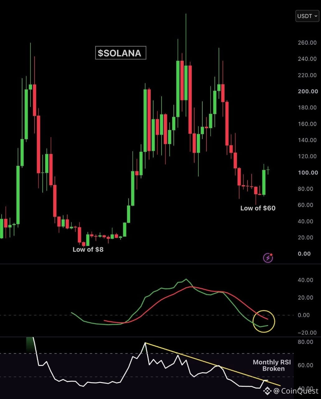
⚠️ $SOL May Be Starting Something Big 😲
First green monthly candle after 10 months
Monthly MACD is getting close to a bullish crossover
Monthly RSI just broke a 2 year downtrend
Is this the beginning of $SOL ’s major reversal? 🚀
Source: X/AshCrypto
{future}(SOLUSDT)
#sol
⚠️ $SOL May Be Starting Something Big 😲
First green monthly candle after 10 months
Monthly MACD is getting close to a bullish crossover
Monthly RSI just broke a 2 year downtrend
Is this the beginning of $SOL ’s major reversal? 🚀
Source: X/AshCrypto
#sol
First green monthly candle after 10 months
Monthly MACD is getting close to a bullish crossover
Monthly RSI just broke a 2 year downtrend
Is this the beginning of $SOL ’s major reversal? 🚀
Source: X/AshCrypto
#sol
3
990
·
--
🚨 The Next 2 Weeks Could Get Very Interesting For Crypto
$BTC is heading into a busy stretch with PPI, CPI, the CLARITY Act vote and the Fed decision all coming up within days
📌 PPI — Thursday
📌 CPI — Friday
📌 CLARITY Act — September 15
📌 Fed decision — September 16
That’s a lot of potential volatility packed into a very short window
And honestly I don’t think anyone knows which way this breaks
That’s exactly why I’m not chasing
I’d rather let the data come out, hear from the Fed and see how the market reacts before taking a serious position
No guessing
No FOMO
Wait for confirmation
The next 2 weeks could be important 👀
#BTC #TradingCommunity #cpi #CLARITYAct #Fed
🚨 The Next 2 Weeks Could Get Very Interesting For Crypto
$BTC is heading into a busy stretch with PPI, CPI, the CLARITY Act vote and the Fed decision all coming up within days
📌 PPI — Thursday
📌 CPI — Friday
📌 CLARITY Act — September 15
📌 Fed decision — September 16
That’s a lot of potential volatility packed into a very short window
And honestly I don’t think anyone knows which way this breaks
That’s exactly why I’m not chasing
I’d rather let the data come out, hear from the Fed and see how the market reacts before taking a serious position
No guessing
No FOMO
Wait for confirmation
The next 2 weeks could be important 👀
#BTC #TradingCommunity #cpi #CLARITYAct #Fed
$BTC is heading into a busy stretch with PPI, CPI, the CLARITY Act vote and the Fed decision all coming up within days
📌 PPI — Thursday
📌 CPI — Friday
📌 CLARITY Act — September 15
📌 Fed decision — September 16
That’s a lot of potential volatility packed into a very short window
And honestly I don’t think anyone knows which way this breaks
That’s exactly why I’m not chasing
I’d rather let the data come out, hear from the Fed and see how the market reacts before taking a serious position
No guessing
No FOMO
Wait for confirmation
The next 2 weeks could be important 👀
#BTC #TradingCommunity #cpi #CLARITYAct #Fed

3
615
Log in to explore more content
Join global crypto users on Binance Square
⚡️ Get latest and useful information about crypto.
💬 Trusted by the world’s largest crypto exchange.
👍 Discover real insights from verified creators.
Email / Phone number
Trending Topics
AppleDebutsFoldablePhone
49,050 views
959 Discussing
Apple just dropped the foldable iPhone — and the market is paying attention. This isn't just another product cycle; it's a new product category, a new CEO on stage, and a $1,999 price tag that pushes $AAPL further into ultra-premium territory. Foldables are the narrative, and Apple is now the headline.
#appledebutsfoldablephone #EUExtendsCentralContactPointToCASPs #US10YTreasuryYieldHitsHighestSinceNov2023 #BrentCrudeTops$100 #USTreasuryToBuyBackUpTo$6BLongDatedDebt
KimHotbae
·2 Likes
·3k views
TSMCAugustRevenueUp53.3%YoY
11,569 views
330 Discussing
IranSaysReadyToEscalateWarWithUS
14,665 views
338 Discussing