

Pelin Ay 1
156 Posts

Pelin Ay 1
Report
Block User
TRADER-ANALİST-YAZAR
0 Following
1 Followers
0 Liked
Posts
·
--
NVIDIA: Critical Threshold at 240.90 Resistance
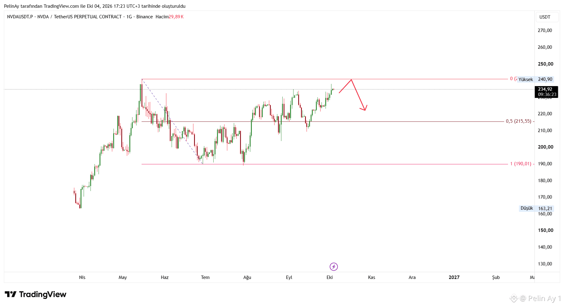
The chart shows NVIDIA’s price rising to 234.92 USDT, coming very close to the key resistance at 240.90 USDT. The 240.90 area is not only horizontal resistance but also a strong supply zone, as it coincides with a previous high. If the price closes above this level on the daily chart, it could technically begin exploring new highs. On the other hand, if selling emerges at resistance, 215.55 USDT stands out as the first significant support on the chart.
Fundamentally, the story supporting the rally remains quite strong. In NVIDIA’s latest financial results, revenue rose 106% to $96.2 billion, while Data Center revenue climbed 117% to $89 billion. In addition, the expansion plan with AWS to deploy 2 million additional NVIDIA GPUs in 2027–2028 points to continued demand for AI infrastructure.
More importantly, Morgan Stanley recently maintained its $300 price target for NVIDIA, while noting that AI demand could be stronger than the company’s management expects in 2028. This is an important factor that could support upward momentum if the 240.90 resistance is broken.
However, on the risk side, rising U.S. Treasury yields and the sensitivity of high-valuation technology stocks to interest rates should be monitored. In addition, chip export restrictions targeting China remain a significant uncertainty for NVIDIA.
In summary, a strong daily close above 240.90 could bring a continuation of the current uptrend and new highs into view. However, if selling emerges in this area, the 215.55 support level is critical. Unless 240.90 is breached, consolidation below resistance or a short-term correction would represent healthier price action.
$NVDA #NVDA #RWA
NVIDIA: Critical Threshold at 240.90 Resistance
The chart shows NVIDIA’s price rising to 234.92 USDT, coming very close to the key resistance at 240.90 USDT. The 240.90 area is not only horizontal resistance but also a strong supply zone, as it coincides with a previous high. If the price closes above this level on the daily chart, it could technically begin exploring new highs. On the other hand, if selling emerges at resistance, 215.55 USDT stands out as the first significant support on the chart.
Fundamentally, the story supporting the rally remains quite strong. In NVIDIA’s latest financial results, revenue rose 106% to $96.2 billion, while Data Center revenue climbed 117% to $89 billion. In addition, the expansion plan with AWS to deploy 2 million additional NVIDIA GPUs in 2027–2028 points to continued demand for AI infrastructure.
More importantly, Morgan Stanley recently maintained its $300 price target for NVIDIA, while noting that AI demand could be stronger than the company’s management expects in 2028. This is an important factor that could support upward momentum if the 240.90 resistance is broken.
However, on the risk side, rising U.S. Treasury yields and the sensitivity of high-valuation technology stocks to interest rates should be monitored. In addition, chip export restrictions targeting China remain a significant uncertainty for NVIDIA.
In summary, a strong daily close above 240.90 could bring a continuation of the current uptrend and new highs into view. However, if selling emerges in this area, the 215.55 support level is critical. Unless 240.90 is breached, consolidation below resistance or a short-term correction would represent healthier price action.
$NVDA #NVDA #RWA
The chart shows NVIDIA’s price rising to 234.92 USDT, coming very close to the key resistance at 240.90 USDT. The 240.90 area is not only horizontal resistance but also a strong supply zone, as it coincides with a previous high. If the price closes above this level on the daily chart, it could technically begin exploring new highs. On the other hand, if selling emerges at resistance, 215.55 USDT stands out as the first significant support on the chart.
Fundamentally, the story supporting the rally remains quite strong. In NVIDIA’s latest financial results, revenue rose 106% to $96.2 billion, while Data Center revenue climbed 117% to $89 billion. In addition, the expansion plan with AWS to deploy 2 million additional NVIDIA GPUs in 2027–2028 points to continued demand for AI infrastructure.
More importantly, Morgan Stanley recently maintained its $300 price target for NVIDIA, while noting that AI demand could be stronger than the company’s management expects in 2028. This is an important factor that could support upward momentum if the 240.90 resistance is broken.
However, on the risk side, rising U.S. Treasury yields and the sensitivity of high-valuation technology stocks to interest rates should be monitored. In addition, chip export restrictions targeting China remain a significant uncertainty for NVIDIA.
In summary, a strong daily close above 240.90 could bring a continuation of the current uptrend and new highs into view. However, if selling emerges in this area, the 215.55 support level is critical. Unless 240.90 is breached, consolidation below resistance or a short-term correction would represent healthier price action.
$NVDA #NVDA #RWA
77
·
--
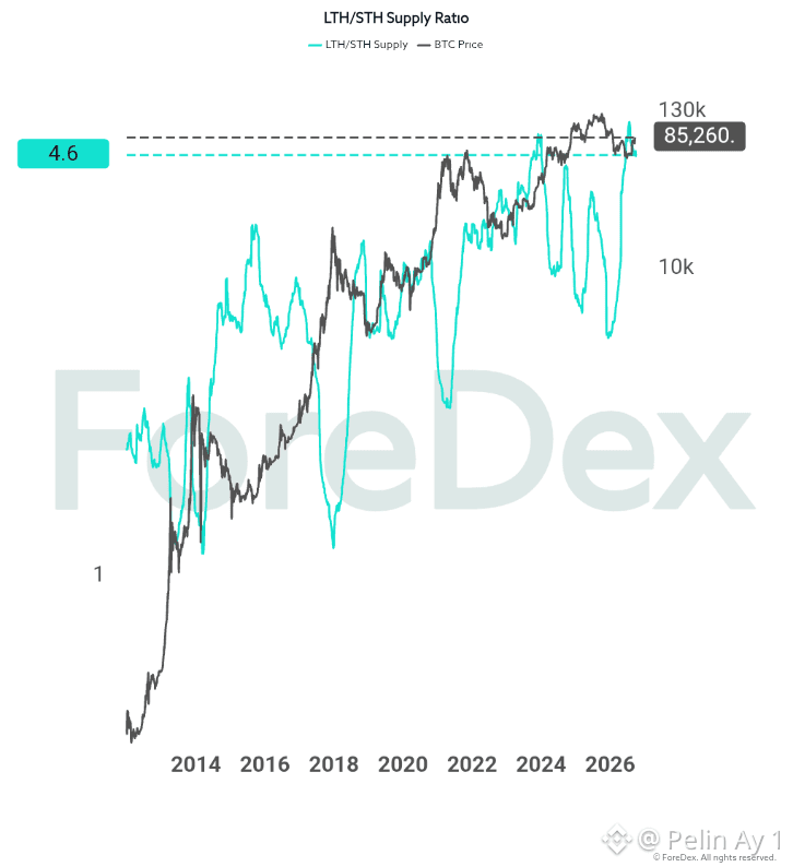
I think the most important point in this chart may be that the ratio is rising very quickly and is now approaching the high levels seen in the past, at 4.6.
A rising LTH/STH ratio shows that the share of the BTC supply held by long-term investors is increasing relative to that held by short-term investors. In other words, a significant portion of the coins in the market is moving from short-term speculators into more patient hands or being held for a long time.
Currently, the ratio is 4.6, quite close to past highs. What’s more, this rise comes after Bitcoin fell from a peak of around $130,000 to $85,260.
Looking at previous periods in the chart, sharp rises in the LTH/STH ratio do not, by themselves, mean that Bitcoin is about to fall. On the contrary, in some periods the ratio has risen as the price prepared for a new uptrend. However, when the ratio approaches extremely high levels, it indicates that the market’s structure is changing and that the short-term supply is shrinking significantly.
When long-term investors continue holding BTC instead of selling, the liquid supply in the market decreases. If demand strengthens again, the price has greater potential to react upward. In that case, the area around $85,000 could become an accumulation zone, and BTC could try to move back into the $100,000–$110,000 range, then toward its previous peak. However, given the 4.6 level and the steepness of the recent rise, caution is warranted in the short term. BTC’s decline from $130,000 to $85,000 also shows that the market has undergone a significant repricing. $BTC #Bitcoin #BTC
I think the most important point in this chart may be that the ratio is rising very quickly and is now approaching the high levels seen in the past, at 4.6.
A rising LTH/STH ratio shows that the share of the BTC supply held by long-term investors is increasing relative to that held by short-term investors. In other words, a significant portion of the coins in the market is moving from short-term speculators into more patient hands or being held for a long time.
Currently, the ratio is 4.6, quite close to past highs. What’s more, this rise comes after Bitcoin fell from a peak of around $130,000 to $85,260.
Looking at previous periods in the chart, sharp rises in the LTH/STH ratio do not, by themselves, mean that Bitcoin is about to fall. On the contrary, in some periods the ratio has risen as the price prepared for a new uptrend. However, when the ratio approaches extremely high levels, it indicates that the market’s structure is changing and that the short-term supply is shrinking significantly.
When long-term investors continue holding BTC instead of selling, the liquid supply in the market decreases. If demand strengthens again, the price has greater potential to react upward. In that case, the area around $85,000 could become an accumulation zone, and BTC could try to move back into the $100,000–$110,000 range, then toward its previous peak. However, given the 4.6 level and the steepness of the recent rise, caution is warranted in the short term. BTC’s decline from $130,000 to $85,000 also shows that the market has undergone a significant repricing. $BTC #Bitcoin #BTC
A rising LTH/STH ratio shows that the share of the BTC supply held by long-term investors is increasing relative to that held by short-term investors. In other words, a significant portion of the coins in the market is moving from short-term speculators into more patient hands or being held for a long time.
Currently, the ratio is 4.6, quite close to past highs. What’s more, this rise comes after Bitcoin fell from a peak of around $130,000 to $85,260.
Looking at previous periods in the chart, sharp rises in the LTH/STH ratio do not, by themselves, mean that Bitcoin is about to fall. On the contrary, in some periods the ratio has risen as the price prepared for a new uptrend. However, when the ratio approaches extremely high levels, it indicates that the market’s structure is changing and that the short-term supply is shrinking significantly.
When long-term investors continue holding BTC instead of selling, the liquid supply in the market decreases. If demand strengthens again, the price has greater potential to react upward. In that case, the area around $85,000 could become an accumulation zone, and BTC could try to move back into the $100,000–$110,000 range, then toward its previous peak. However, given the 4.6 level and the steepness of the recent rise, caution is warranted in the short term. BTC’s decline from $130,000 to $85,000 also shows that the market has undergone a significant repricing. $BTC #Bitcoin #BTC
60
·
--
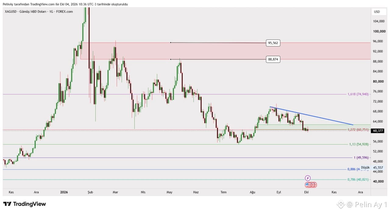
The chart shows silver trading around $60.38 per ounce, with the descending trendline that has been in place particularly since August putting pressure on the price. Following the sharp sell-off at the end of September, the price fell from around $67.5 to the $60 area.
Technically, the most critical level is the Fibonacci level around $60.75. A move below this level signals that selling pressure could persist in the short term. If buyers step in around $60 and the price regains the $60.75–$63 range, a rebound toward the area around 63–64$ , where the descending trendline on the chart is located, could follow. Daily closes above this trendline would significantly strengthen the outlook and could lead to a retest of the 68–70$ area. Conversely, if support at 60$ is decisively lost, the next significant support on the chart is at 54.93$ .
On the macro front, however, the outlook is not entirely negative. After US September employment data came in well below expectations, the likelihood of a Fed rate hike in October declined. The market is currently pricing in the possibility that the Fed will hold rates steady at its October meeting. If this eases pressure on the dollar and Treasury yields, it could be a positive catalyst for silver, which pays no interest. However, inflation remains above the Fed's target and US 10-year Treasury yields remain high, continuing to weigh on precious metals in the short term.
In conclusion, silver is currently at a critical juncture, both technically and macroeconomically. Holding the $60 area could pave the way for a rebound; reclaiming $60.75 would be the first positive signal, while a break above 63–64$ could indicate that the downtrend is weakening. Conversely, if the price remains below 60$ , the 54.93$ area could come into play. Although a supply deficit is supportive over the medium term, the Fed, Treasury yields, and the direction of the dollar will continue to be key drivers of the price in the short term. $XAG #Silver $SILVER #XAGUSD
The chart shows silver trading around $60.38 per ounce, with the descending trendline that has been in place particularly since August putting pressure on the price. Following the sharp sell-off at the end of September, the price fell from around $67.5 to the $60 area.
Technically, the most critical level is the Fibonacci level around $60.75. A move below this level signals that selling pressure could persist in the short term. If buyers step in around $60 and the price regains the $60.75–$63 range, a rebound toward the area around 63–64$ , where the descending trendline on the chart is located, could follow. Daily closes above this trendline would significantly strengthen the outlook and could lead to a retest of the 68–70$ area. Conversely, if support at 60$ is decisively lost, the next significant support on the chart is at 54.93$ .
On the macro front, however, the outlook is not entirely negative. After US September employment data came in well below expectations, the likelihood of a Fed rate hike in October declined. The market is currently pricing in the possibility that the Fed will hold rates steady at its October meeting. If this eases pressure on the dollar and Treasury yields, it could be a positive catalyst for silver, which pays no interest. However, inflation remains above the Fed's target and US 10-year Treasury yields remain high, continuing to weigh on precious metals in the short term.
In conclusion, silver is currently at a critical juncture, both technically and macroeconomically. Holding the $60 area could pave the way for a rebound; reclaiming $60.75 would be the first positive signal, while a break above 63–64$ could indicate that the downtrend is weakening. Conversely, if the price remains below 60$ , the 54.93$ area could come into play. Although a supply deficit is supportive over the medium term, the Fed, Treasury yields, and the direction of the dollar will continue to be key drivers of the price in the short term. $XAG #Silver $SILVER #XAGUSD
Technically, the most critical level is the Fibonacci level around $60.75. A move below this level signals that selling pressure could persist in the short term. If buyers step in around $60 and the price regains the $60.75–$63 range, a rebound toward the area around 63–64$ , where the descending trendline on the chart is located, could follow. Daily closes above this trendline would significantly strengthen the outlook and could lead to a retest of the 68–70$ area. Conversely, if support at 60$ is decisively lost, the next significant support on the chart is at 54.93$ .
On the macro front, however, the outlook is not entirely negative. After US September employment data came in well below expectations, the likelihood of a Fed rate hike in October declined. The market is currently pricing in the possibility that the Fed will hold rates steady at its October meeting. If this eases pressure on the dollar and Treasury yields, it could be a positive catalyst for silver, which pays no interest. However, inflation remains above the Fed's target and US 10-year Treasury yields remain high, continuing to weigh on precious metals in the short term.
In conclusion, silver is currently at a critical juncture, both technically and macroeconomically. Holding the $60 area could pave the way for a rebound; reclaiming $60.75 would be the first positive signal, while a break above 63–64$ could indicate that the downtrend is weakening. Conversely, if the price remains below 60$ , the 54.93$ area could come into play. Although a supply deficit is supportive over the medium term, the Fed, Treasury yields, and the direction of the dollar will continue to be key drivers of the price in the short term. $XAG #Silver $SILVER #XAGUSD
214
·
--
GOLD CRITICAL THRESHOLD: CAN THE $4,000 SUPPORT BE MAINTAINED? 🟡
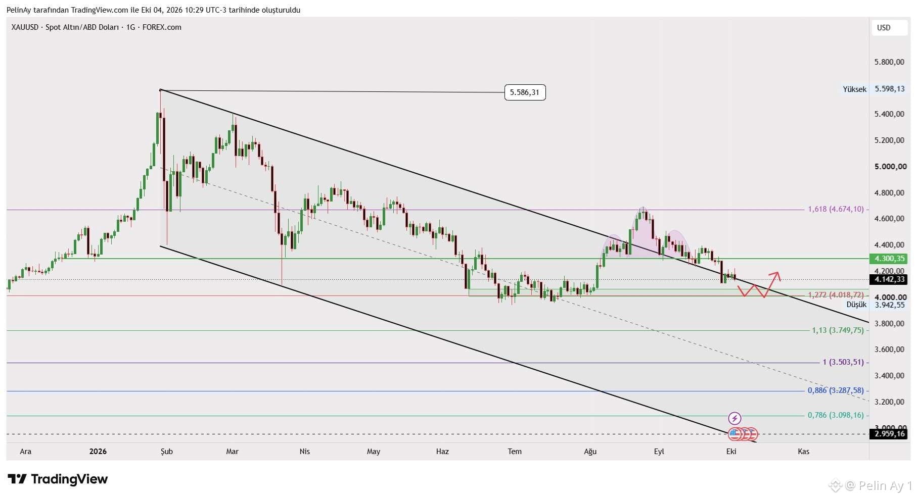
Spot gold is moving within a declining channel on the daily chart, after the $5,586 peak seen in February. The fact that the price, which rose as high as $4,674 in August, couldn’t sustain itself in this area and instead faced renewed selling pressure suggests that weakness is continuing in the medium-term technical outlook.
At the current price around $4,142, the first notable resistance is located at the $4,300 level on the chart. Breaking above this zone could allow the price to develop a reaction toward resistances at $4,400 and higher. For a stronger recovery, the $4,674 resistance needs to be revisited and surpassed.
On the downside, the $4,018–$4,000 range is critical. This area, which also includes a Fibonacci extension level, can be monitored for a potential upside rebound. However, if price fails to hold below $4,000, levels such as $3,750 and $3,504 may come into focus.
In the U.S., the non-farm payrolls increase being limited to 29K provided an important signal for the economic outlook and the Fed’s monetary policy. While weak employment data may support expectations for rate cuts, high U.S. Treasury yields and a strong dollar are limiting gold’s advance.
On the other hand, conflicts in the Middle East, tensions around Iran, and risks related to the Strait of Hormuz could support demand for safe-haven assets. However, if rising energy prices reignite inflation, it may increase the likelihood that the Fed adopts a tighter policy—creating downward pressure on gold.
Gold’s short-term outlook depends on whether the $4,000 support can hold. A strong reaction from this level could pave the way for a technical recovery. A break of support could deepen selling. Along with geopolitical developments, the U.S. dollar index, Treasury yields, and expectations for the Fed should be closely watched. $XAU $GOLD #Gold #XAUUSD
GOLD CRITICAL THRESHOLD: CAN THE $4,000 SUPPORT BE MAINTAINED? 🟡
Spot gold is moving within a declining channel on the daily chart, after the $5,586 peak seen in February. The fact that the price, which rose as high as $4,674 in August, couldn’t sustain itself in this area and instead faced renewed selling pressure suggests that weakness is continuing in the medium-term technical outlook.
At the current price around $4,142, the first notable resistance is located at the $4,300 level on the chart. Breaking above this zone could allow the price to develop a reaction toward resistances at $4,400 and higher. For a stronger recovery, the $4,674 resistance needs to be revisited and surpassed.
On the downside, the $4,018–$4,000 range is critical. This area, which also includes a Fibonacci extension level, can be monitored for a potential upside rebound. However, if price fails to hold below $4,000, levels such as $3,750 and $3,504 may come into focus.
In the U.S., the non-farm payrolls increase being limited to 29K provided an important signal for the economic outlook and the Fed’s monetary policy. While weak employment data may support expectations for rate cuts, high U.S. Treasury yields and a strong dollar are limiting gold’s advance.
On the other hand, conflicts in the Middle East, tensions around Iran, and risks related to the Strait of Hormuz could support demand for safe-haven assets. However, if rising energy prices reignite inflation, it may increase the likelihood that the Fed adopts a tighter policy—creating downward pressure on gold.
Gold’s short-term outlook depends on whether the $4,000 support can hold. A strong reaction from this level could pave the way for a technical recovery. A break of support could deepen selling. Along with geopolitical developments, the U.S. dollar index, Treasury yields, and expectations for the Fed should be closely watched. $XAU $GOLD #Gold #XAUUSD
Spot gold is moving within a declining channel on the daily chart, after the $5,586 peak seen in February. The fact that the price, which rose as high as $4,674 in August, couldn’t sustain itself in this area and instead faced renewed selling pressure suggests that weakness is continuing in the medium-term technical outlook.
At the current price around $4,142, the first notable resistance is located at the $4,300 level on the chart. Breaking above this zone could allow the price to develop a reaction toward resistances at $4,400 and higher. For a stronger recovery, the $4,674 resistance needs to be revisited and surpassed.
On the downside, the $4,018–$4,000 range is critical. This area, which also includes a Fibonacci extension level, can be monitored for a potential upside rebound. However, if price fails to hold below $4,000, levels such as $3,750 and $3,504 may come into focus.
In the U.S., the non-farm payrolls increase being limited to 29K provided an important signal for the economic outlook and the Fed’s monetary policy. While weak employment data may support expectations for rate cuts, high U.S. Treasury yields and a strong dollar are limiting gold’s advance.
On the other hand, conflicts in the Middle East, tensions around Iran, and risks related to the Strait of Hormuz could support demand for safe-haven assets. However, if rising energy prices reignite inflation, it may increase the likelihood that the Fed adopts a tighter policy—creating downward pressure on gold.
Gold’s short-term outlook depends on whether the $4,000 support can hold. A strong reaction from this level could pave the way for a technical recovery. A break of support could deepen selling. Along with geopolitical developments, the U.S. dollar index, Treasury yields, and expectations for the Fed should be closely watched. $XAU $GOLD #Gold #XAUUSD
62
·
--
🚨 BACKPACK (BP) PRICE CHART’S UNUSUAL CANDLE STRUCTURE: WHAT’S BEHIND THE SHARP PRICE JUMPS?
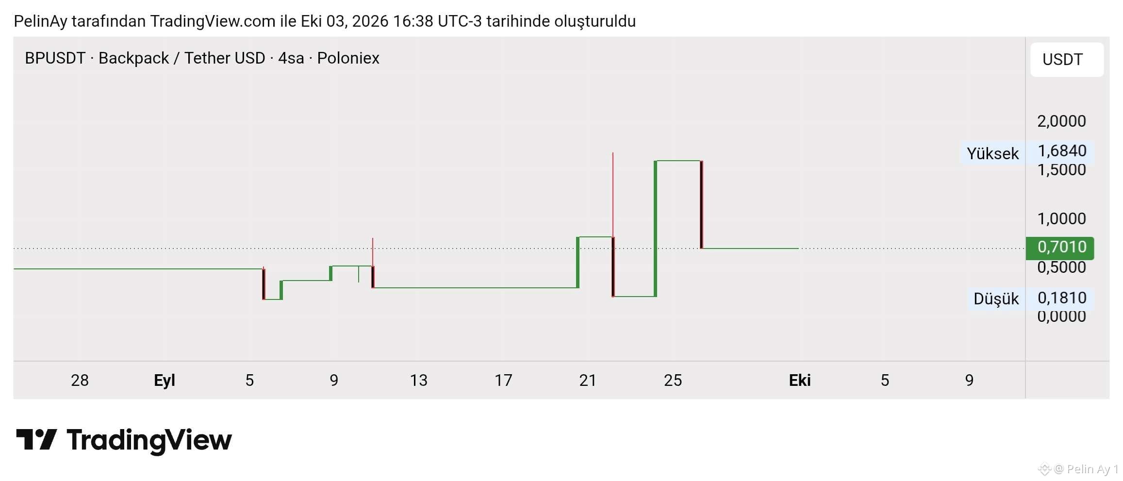
On the BPUSDT pair of Backpack, an attention-grabbing unusual price movement can be observed. After the price remained sideways for a long time, it moved through different levels with sharp “steps,” and it also made sudden reversals within wide price ranges—posing a scenario that should be examined from a technical perspective.
What could be the possible reasons for this image?
-Low liquidity and a shallow order book may cause even limited-sized trades to impact the price sharply.
-In four-hour time frames, infrequent trading can lead to the price staying at the same level for a long time and then making sudden spikes.
-Exchange-specific price formation can create significant differences between price and volume data across different platforms.
-Missing OHLC data or chart rendering issues may also result in candles that look unusual. Therefore, it would not be accurate to explain the entire move directly as buy-sell pressure alone.
What’s happening on the project side?
Backpack offers exchange and wallet services within the Solana ecosystem. The BP token stands out with use cases such as platform advantages, trading-fee discounts, and a program that converts it into company shares under certain conditions.
At the beginning of October 2026, news circulated that BP reached an all-time high around $1.65. In addition, Backpack’s addition of tokenized Nokia shares to its platform at the end of September and its expansion of Arc support indicate that the product development roadmap is ongoing.
The unusual candles on the chart are not, by themselves, an indicator of a rise or a drop. In particular, movements within the 0.1810–1.6840 USDT range need to be confirmed with real trades—by checking Poloniex trading volume and comparing prices with other exchanges.
For a healthy technical assessment of BP, it’s important to track liquidity, trading volume, and the timing of news together, alongside price action. $BP #Backpack #BP
🚨 BACKPACK (BP) PRICE CHART’S UNUSUAL CANDLE STRUCTURE: WHAT’S BEHIND THE SHARP PRICE JUMPS?
On the BPUSDT pair of Backpack, an attention-grabbing unusual price movement can be observed. After the price remained sideways for a long time, it moved through different levels with sharp “steps,” and it also made sudden reversals within wide price ranges—posing a scenario that should be examined from a technical perspective.
What could be the possible reasons for this image?
-Low liquidity and a shallow order book may cause even limited-sized trades to impact the price sharply.
-In four-hour time frames, infrequent trading can lead to the price staying at the same level for a long time and then making sudden spikes.
-Exchange-specific price formation can create significant differences between price and volume data across different platforms.
-Missing OHLC data or chart rendering issues may also result in candles that look unusual. Therefore, it would not be accurate to explain the entire move directly as buy-sell pressure alone.
What’s happening on the project side?
Backpack offers exchange and wallet services within the Solana ecosystem. The BP token stands out with use cases such as platform advantages, trading-fee discounts, and a program that converts it into company shares under certain conditions.
At the beginning of October 2026, news circulated that BP reached an all-time high around $1.65. In addition, Backpack’s addition of tokenized Nokia shares to its platform at the end of September and its expansion of Arc support indicate that the product development roadmap is ongoing.
The unusual candles on the chart are not, by themselves, an indicator of a rise or a drop. In particular, movements within the 0.1810–1.6840 USDT range need to be confirmed with real trades—by checking Poloniex trading volume and comparing prices with other exchanges.
For a healthy technical assessment of BP, it’s important to track liquidity, trading volume, and the timing of news together, alongside price action. $BP #Backpack #BP
On the BPUSDT pair of Backpack, an attention-grabbing unusual price movement can be observed. After the price remained sideways for a long time, it moved through different levels with sharp “steps,” and it also made sudden reversals within wide price ranges—posing a scenario that should be examined from a technical perspective.
What could be the possible reasons for this image?
-Low liquidity and a shallow order book may cause even limited-sized trades to impact the price sharply.
-In four-hour time frames, infrequent trading can lead to the price staying at the same level for a long time and then making sudden spikes.
-Exchange-specific price formation can create significant differences between price and volume data across different platforms.
-Missing OHLC data or chart rendering issues may also result in candles that look unusual. Therefore, it would not be accurate to explain the entire move directly as buy-sell pressure alone.
What’s happening on the project side?
Backpack offers exchange and wallet services within the Solana ecosystem. The BP token stands out with use cases such as platform advantages, trading-fee discounts, and a program that converts it into company shares under certain conditions.
At the beginning of October 2026, news circulated that BP reached an all-time high around $1.65. In addition, Backpack’s addition of tokenized Nokia shares to its platform at the end of September and its expansion of Arc support indicate that the product development roadmap is ongoing.
The unusual candles on the chart are not, by themselves, an indicator of a rise or a drop. In particular, movements within the 0.1810–1.6840 USDT range need to be confirmed with real trades—by checking Poloniex trading volume and comparing prices with other exchanges.
For a healthy technical assessment of BP, it’s important to track liquidity, trading volume, and the timing of news together, alongside price action. $BP #Backpack #BP
78
·
--
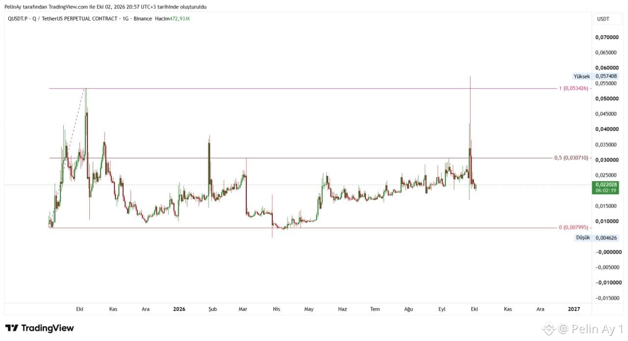
The 27 September move shown in the chart is quite noteworthy. The Q price rose from approximately the 0.025 USDT area to the 0.055–0.057 USDT range in a very short time, and it also broke above the chart-indicated 0.053426 Fibonacci 1.0 level, but it failed to hold above that zone and then pulled back sharply. The high volatility and increased volume on the Binance QUSDT perpetual chart suggest that the move may have been supported not only by spot market activity, but also by aggressive positioning on the derivatives side.
Moreover, I couldn’t find a clear project news item that directly explains the 27 September rally. Instead, in Phemex’s assessment dated 29 September, it is stated that there was no specific Quack AI announcement explaining the timing of the sharp move on 26–27 September. On 26 September, Q rose by about 40.3%, while trading volume reached $55.16 million; on 27 September, volume increased to $86.08 million. During the same period, the price climbed to around 0.0555 USDT, breaking above the previous highs.
The key point here is the Bithumb development. On 28 September, Bithumb announced that Q would be listed in the KRW market and announced the start of trading as 16:00 KST. Therefore, this news cannot be considered the direct cause of the first sharp uptrend that began on 27 September in the chart; however, it does appear to be a strong reaction immediately following the move.
Technically, the 0.030710 Fibonacci 0.5 level is a critical threshold. The fact that the price has pulled back to around the 0.0220 USDT level now indicates that the break above 0.0534 has not been sustained and that a sharp profit-taking wave has occurred. Unless daily closes form again above 0.0307, it is more accurate to read the 27 September move as speculative pricing within a high-volatility environment rather than a lasting trend reversal. Below, the 0.017–0.020 band is highlighted as a short-term support zone, while the main Fibonacci base shown in the chart is at the 0.007995 level. $Q #Q #Altcoin
The 27 September move shown in the chart is quite noteworthy. The Q price rose from approximately the 0.025 USDT area to the 0.055–0.057 USDT range in a very short time, and it also broke above the chart-indicated 0.053426 Fibonacci 1.0 level, but it failed to hold above that zone and then pulled back sharply. The high volatility and increased volume on the Binance QUSDT perpetual chart suggest that the move may have been supported not only by spot market activity, but also by aggressive positioning on the derivatives side.
Moreover, I couldn’t find a clear project news item that directly explains the 27 September rally. Instead, in Phemex’s assessment dated 29 September, it is stated that there was no specific Quack AI announcement explaining the timing of the sharp move on 26–27 September. On 26 September, Q rose by about 40.3%, while trading volume reached $55.16 million; on 27 September, volume increased to $86.08 million. During the same period, the price climbed to around 0.0555 USDT, breaking above the previous highs.
The key point here is the Bithumb development. On 28 September, Bithumb announced that Q would be listed in the KRW market and announced the start of trading as 16:00 KST. Therefore, this news cannot be considered the direct cause of the first sharp uptrend that began on 27 September in the chart; however, it does appear to be a strong reaction immediately following the move.
Technically, the 0.030710 Fibonacci 0.5 level is a critical threshold. The fact that the price has pulled back to around the 0.0220 USDT level now indicates that the break above 0.0534 has not been sustained and that a sharp profit-taking wave has occurred. Unless daily closes form again above 0.0307, it is more accurate to read the 27 September move as speculative pricing within a high-volatility environment rather than a lasting trend reversal. Below, the 0.017–0.020 band is highlighted as a short-term support zone, while the main Fibonacci base shown in the chart is at the 0.007995 level. $Q #Q #Altcoin
Moreover, I couldn’t find a clear project news item that directly explains the 27 September rally. Instead, in Phemex’s assessment dated 29 September, it is stated that there was no specific Quack AI announcement explaining the timing of the sharp move on 26–27 September. On 26 September, Q rose by about 40.3%, while trading volume reached $55.16 million; on 27 September, volume increased to $86.08 million. During the same period, the price climbed to around 0.0555 USDT, breaking above the previous highs.
The key point here is the Bithumb development. On 28 September, Bithumb announced that Q would be listed in the KRW market and announced the start of trading as 16:00 KST. Therefore, this news cannot be considered the direct cause of the first sharp uptrend that began on 27 September in the chart; however, it does appear to be a strong reaction immediately following the move.
Technically, the 0.030710 Fibonacci 0.5 level is a critical threshold. The fact that the price has pulled back to around the 0.0220 USDT level now indicates that the break above 0.0534 has not been sustained and that a sharp profit-taking wave has occurred. Unless daily closes form again above 0.0307, it is more accurate to read the 27 September move as speculative pricing within a high-volatility environment rather than a lasting trend reversal. Below, the 0.017–0.020 band is highlighted as a short-term support zone, while the main Fibonacci base shown in the chart is at the 0.007995 level. $Q #Q #Altcoin
65
·
--
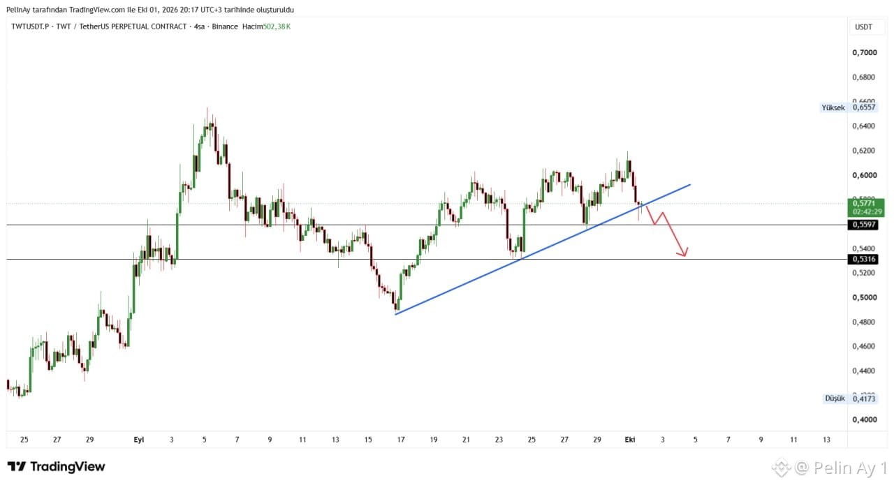
It appears that the short-term uptrend on the TWT/USDT chart is at a critical level. The price is currently around $0.5771 and is testing the area where the rising trendline intersects with the approximately $0.5597 horizontal support. Sustaining above this zone could allow the latest drop to remain a correction and potentially push the price back toward the resistance levels in the $0.60–$0.62 range. In particular, a move above $0.62 could create fresh momentum toward $0.6557, which is the most recent peak region on the chart. Conversely, if the trendline and the $0.5597 support are lost, the risk of a pullback toward the $0.5316 level becomes more pronounced.
On the fundamental side, there have been noteworthy developments for TWT recently. Trust Wallet launched a trading contest on September 23 with a $50,000 prize pool for Robinhood Stock Tokens transactions. In addition, during September, promotional initiatives offering 0% swap fees on eligible assets and aimed at increasing trading activity within the Trust Wallet ecosystem are attracting attention. Furthermore, Trust Wallet is set to host a meet-up in Singapore on October 6 as part of TOKEN2049, which could be a near-term catalyst for the ecosystem. More importantly, TWT’s use case continues through Trust Alpha; on the platform, TWT is used for participation in reward pools of new projects and for various ecosystem advantages.
In summary, the news flow is supportive in terms of TWT’s usage and ecosystem activity, but technically the main determining factor is the $0.5597–trendline area. If this zone holds, $0.60–$0.62 could be retested; if it breaks, the $0.5316 support may come into focus. The current structure suggests that the possibility of a rise hasn’t been completely eliminated, but the price is currently in a decision zone. $TWT #TWT
It appears that the short-term uptrend on the TWT/USDT chart is at a critical level. The price is currently around $0.5771 and is testing the area where the rising trendline intersects with the approximately $0.5597 horizontal support. Sustaining above this zone could allow the latest drop to remain a correction and potentially push the price back toward the resistance levels in the $0.60–$0.62 range. In particular, a move above $0.62 could create fresh momentum toward $0.6557, which is the most recent peak region on the chart. Conversely, if the trendline and the $0.5597 support are lost, the risk of a pullback toward the $0.5316 level becomes more pronounced.
On the fundamental side, there have been noteworthy developments for TWT recently. Trust Wallet launched a trading contest on September 23 with a $50,000 prize pool for Robinhood Stock Tokens transactions. In addition, during September, promotional initiatives offering 0% swap fees on eligible assets and aimed at increasing trading activity within the Trust Wallet ecosystem are attracting attention. Furthermore, Trust Wallet is set to host a meet-up in Singapore on October 6 as part of TOKEN2049, which could be a near-term catalyst for the ecosystem. More importantly, TWT’s use case continues through Trust Alpha; on the platform, TWT is used for participation in reward pools of new projects and for various ecosystem advantages.
In summary, the news flow is supportive in terms of TWT’s usage and ecosystem activity, but technically the main determining factor is the $0.5597–trendline area. If this zone holds, $0.60–$0.62 could be retested; if it breaks, the $0.5316 support may come into focus. The current structure suggests that the possibility of a rise hasn’t been completely eliminated, but the price is currently in a decision zone. $TWT #TWT
On the fundamental side, there have been noteworthy developments for TWT recently. Trust Wallet launched a trading contest on September 23 with a $50,000 prize pool for Robinhood Stock Tokens transactions. In addition, during September, promotional initiatives offering 0% swap fees on eligible assets and aimed at increasing trading activity within the Trust Wallet ecosystem are attracting attention. Furthermore, Trust Wallet is set to host a meet-up in Singapore on October 6 as part of TOKEN2049, which could be a near-term catalyst for the ecosystem. More importantly, TWT’s use case continues through Trust Alpha; on the platform, TWT is used for participation in reward pools of new projects and for various ecosystem advantages.
In summary, the news flow is supportive in terms of TWT’s usage and ecosystem activity, but technically the main determining factor is the $0.5597–trendline area. If this zone holds, $0.60–$0.62 could be retested; if it breaks, the $0.5316 support may come into focus. The current structure suggests that the possibility of a rise hasn’t been completely eliminated, but the price is currently in a decision zone. $TWT #TWT
53
·
--
Bitcoin Finally Looks Positive
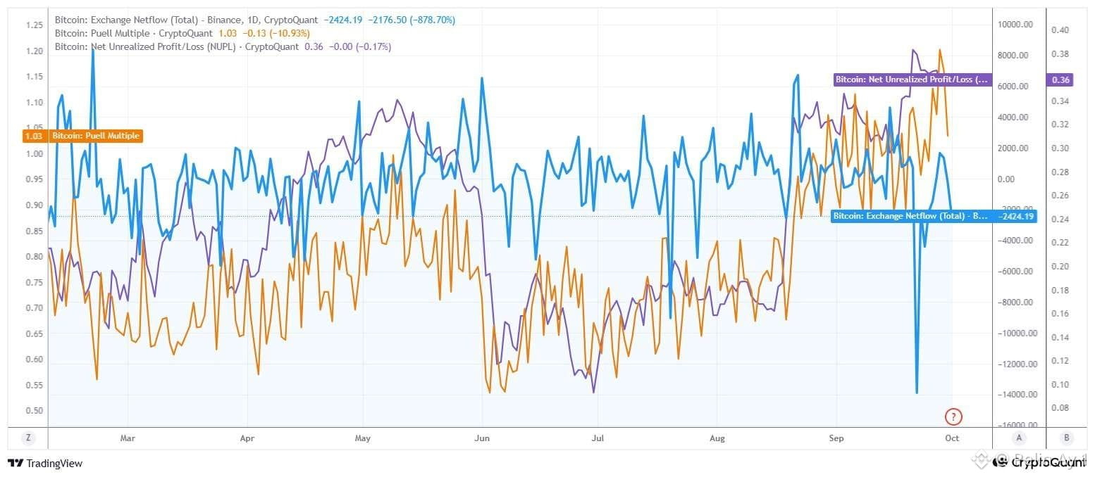
Netflow being negative indicates that BTC is being withdrawn from exchanges rather than entering them. This is especially significant given the recent sharp negative move, because it means the amount of BTC available for sale on exchanges is decreasing, liquid BTC supply is getting tight, and when demand strengthens again, price movements can occur more quickly.
Puell Multiple is at 1.03. The indicator has been moving around the 1 level recently, and the current value does not point to excessively high miner profitability. At the same time, the 1.03 level does not suggest that miners are under serious revenue stress. Therefore, strong sell pressure stemming from miners is not confirmed on the chart.
NUPL is at 0.36. This value shows that the market is still in the unrealized net profit zone. However, the drop in NUPL from around 0.38–0.39 to 0.36 in the latest part of the chart suggests that investor profitability has cooled somewhat. NUPL has not yet fallen into a serious sell-off area. So, this movement does not indicate that the market has fully moved out of risk, but rather that post-rally profitability is normalizing a bit.
Putting it all together, I believe the short-term outlook is more favorable for an upward recovery. The main reason is that exchange netflow is strongly negative, and the Puell Multiple shows that miner sell pressure is not at an extreme level.
In summary, the chart currently shows a structure where selling pressure for Bitcoin is easing, the risk from miners remains limited, and the market is still in the profit zone. Therefore, the first price scenario is a test to the upside after a sideways move; for that to turn into a lasting rise, it’s important for NUPL to strengthen again and for the negative nature of netflow to be preserved. $BTC #BTC #Bitcoin
Bitcoin Finally Looks Positive
Netflow being negative indicates that BTC is being withdrawn from exchanges rather than entering them. This is especially significant given the recent sharp negative move, because it means the amount of BTC available for sale on exchanges is decreasing, liquid BTC supply is getting tight, and when demand strengthens again, price movements can occur more quickly.
Puell Multiple is at 1.03. The indicator has been moving around the 1 level recently, and the current value does not point to excessively high miner profitability. At the same time, the 1.03 level does not suggest that miners are under serious revenue stress. Therefore, strong sell pressure stemming from miners is not confirmed on the chart.
NUPL is at 0.36. This value shows that the market is still in the unrealized net profit zone. However, the drop in NUPL from around 0.38–0.39 to 0.36 in the latest part of the chart suggests that investor profitability has cooled somewhat. NUPL has not yet fallen into a serious sell-off area. So, this movement does not indicate that the market has fully moved out of risk, but rather that post-rally profitability is normalizing a bit.
Putting it all together, I believe the short-term outlook is more favorable for an upward recovery. The main reason is that exchange netflow is strongly negative, and the Puell Multiple shows that miner sell pressure is not at an extreme level.
In summary, the chart currently shows a structure where selling pressure for Bitcoin is easing, the risk from miners remains limited, and the market is still in the profit zone. Therefore, the first price scenario is a test to the upside after a sideways move; for that to turn into a lasting rise, it’s important for NUPL to strengthen again and for the negative nature of netflow to be preserved. $BTC #BTC #Bitcoin
Netflow being negative indicates that BTC is being withdrawn from exchanges rather than entering them. This is especially significant given the recent sharp negative move, because it means the amount of BTC available for sale on exchanges is decreasing, liquid BTC supply is getting tight, and when demand strengthens again, price movements can occur more quickly.
Puell Multiple is at 1.03. The indicator has been moving around the 1 level recently, and the current value does not point to excessively high miner profitability. At the same time, the 1.03 level does not suggest that miners are under serious revenue stress. Therefore, strong sell pressure stemming from miners is not confirmed on the chart.
NUPL is at 0.36. This value shows that the market is still in the unrealized net profit zone. However, the drop in NUPL from around 0.38–0.39 to 0.36 in the latest part of the chart suggests that investor profitability has cooled somewhat. NUPL has not yet fallen into a serious sell-off area. So, this movement does not indicate that the market has fully moved out of risk, but rather that post-rally profitability is normalizing a bit.
Putting it all together, I believe the short-term outlook is more favorable for an upward recovery. The main reason is that exchange netflow is strongly negative, and the Puell Multiple shows that miner sell pressure is not at an extreme level.
In summary, the chart currently shows a structure where selling pressure for Bitcoin is easing, the risk from miners remains limited, and the market is still in the profit zone. Therefore, the first price scenario is a test to the upside after a sideways move; for that to turn into a lasting rise, it’s important for NUPL to strengthen again and for the negative nature of netflow to be preserved. $BTC #BTC #Bitcoin
73
·
--
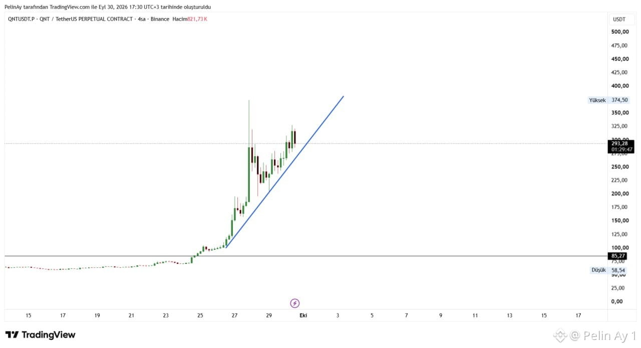
We can see that in the QNT chart, the rise is not merely a technical move; it combines a very strong institutional tokenization narrative with a technical breakdown.
After QNT broke through its long-standing horizontal resistance around the 85$ region on the chart, it gained very strong momentum. In the latest segment, as the rising lows are preserved, the rising trendline is also positioned as the main support for the short-term move. However, because the move has become steeper, volatility has increased significantly.
On the fundamental side, the key determining factor was that on September 24, The Clearing House selected Quant as the technology provider for the On-Chain Money Initiative. The project aims to enable financial institutions to exchange and transfer tokenized deposits. Quant will provide the interoperability, transaction orchestration, and transaction management layers. The network is planned to be opened to participating institutions in the first half of 2027. The news doesn’t end there. In the Great British Tokenised Deposit project in the UK, the first real customer transactions were carried out within a structure that includes Barclays, HSBC, Lloyds, NatWest, Santander, Nationwide, and Monzo. It was announced that the platform was developed by Quant. In addition, Quant’s integration of the tokenized deposit and digital bond infrastructure with Murex into MX.3, and its current emphasis on tokenization, programmable money, and institutional payments infrastructure at the Sibos 2026 event in Miami, also supports the story.
Technically, the price around $293 is well above the uptrend on the chart. Therefore, profit-taking at current levels and sharp pullbacks would not be surprising. Losing the rising trendline in particular will be an important signal for near-term momentum. On the other hand, consolidation after the rally and forming higher lows could show whether the move is continuing in a healthy way. $QNT
We can see that in the QNT chart, the rise is not merely a technical move; it combines a very strong institutional tokenization narrative with a technical breakdown.
After QNT broke through its long-standing horizontal resistance around the 85$ region on the chart, it gained very strong momentum. In the latest segment, as the rising lows are preserved, the rising trendline is also positioned as the main support for the short-term move. However, because the move has become steeper, volatility has increased significantly.
On the fundamental side, the key determining factor was that on September 24, The Clearing House selected Quant as the technology provider for the On-Chain Money Initiative. The project aims to enable financial institutions to exchange and transfer tokenized deposits. Quant will provide the interoperability, transaction orchestration, and transaction management layers. The network is planned to be opened to participating institutions in the first half of 2027. The news doesn’t end there. In the Great British Tokenised Deposit project in the UK, the first real customer transactions were carried out within a structure that includes Barclays, HSBC, Lloyds, NatWest, Santander, Nationwide, and Monzo. It was announced that the platform was developed by Quant. In addition, Quant’s integration of the tokenized deposit and digital bond infrastructure with Murex into MX.3, and its current emphasis on tokenization, programmable money, and institutional payments infrastructure at the Sibos 2026 event in Miami, also supports the story.
Technically, the price around $293 is well above the uptrend on the chart. Therefore, profit-taking at current levels and sharp pullbacks would not be surprising. Losing the rising trendline in particular will be an important signal for near-term momentum. On the other hand, consolidation after the rally and forming higher lows could show whether the move is continuing in a healthy way. $QNT
After QNT broke through its long-standing horizontal resistance around the 85$ region on the chart, it gained very strong momentum. In the latest segment, as the rising lows are preserved, the rising trendline is also positioned as the main support for the short-term move. However, because the move has become steeper, volatility has increased significantly.
On the fundamental side, the key determining factor was that on September 24, The Clearing House selected Quant as the technology provider for the On-Chain Money Initiative. The project aims to enable financial institutions to exchange and transfer tokenized deposits. Quant will provide the interoperability, transaction orchestration, and transaction management layers. The network is planned to be opened to participating institutions in the first half of 2027. The news doesn’t end there. In the Great British Tokenised Deposit project in the UK, the first real customer transactions were carried out within a structure that includes Barclays, HSBC, Lloyds, NatWest, Santander, Nationwide, and Monzo. It was announced that the platform was developed by Quant. In addition, Quant’s integration of the tokenized deposit and digital bond infrastructure with Murex into MX.3, and its current emphasis on tokenization, programmable money, and institutional payments infrastructure at the Sibos 2026 event in Miami, also supports the story.
Technically, the price around $293 is well above the uptrend on the chart. Therefore, profit-taking at current levels and sharp pullbacks would not be surprising. Losing the rising trendline in particular will be an important signal for near-term momentum. On the other hand, consolidation after the rally and forming higher lows could show whether the move is continuing in a healthy way. $QNT
37
·
--
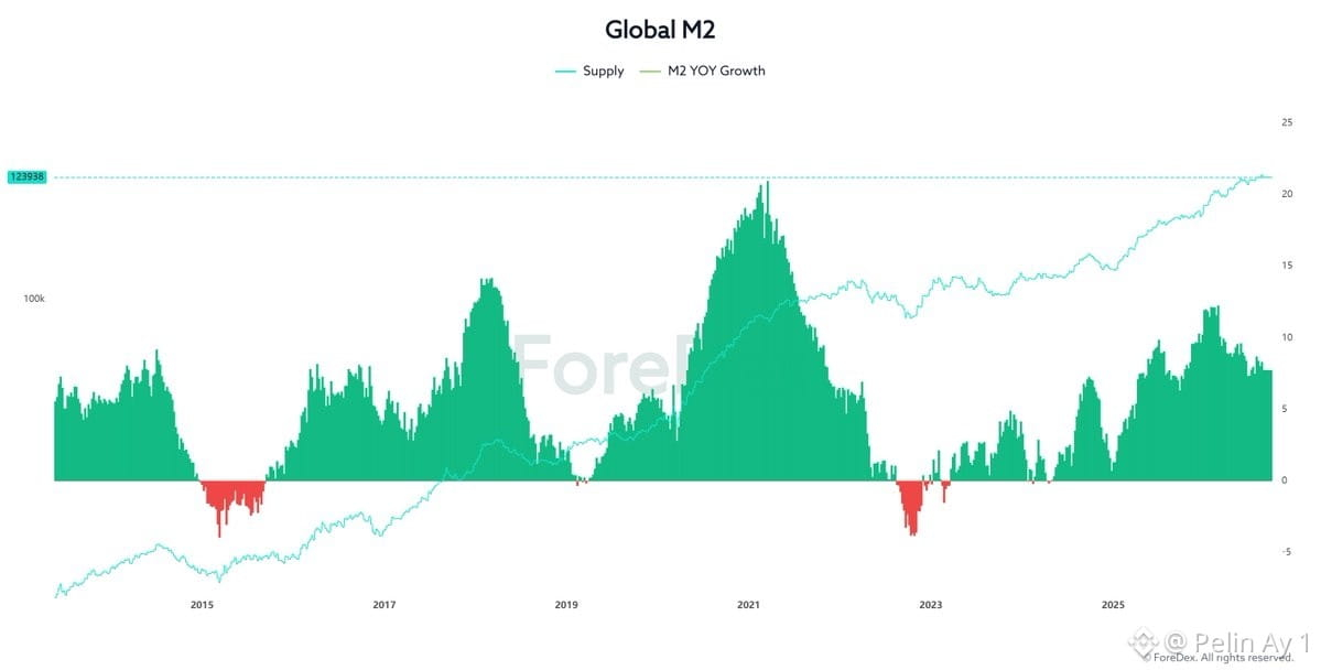
The structure in the chart shows that the amount of global liquidity continues to rise in terms of quantity, but the rate of liquidity growth has lost momentum throughout 2026. This distinction is especially important for #Bitcoin and other risk assets.
In the chart, Global M2 Supply is reaching approximately 123.938, forming new peaks. In other words, there is no evidence of a structural contraction in global money supply. By contrast, the M2 bars have pulled back from the double-digit levels they reached at the end of 2025 and the beginning of 2026, falling to roughly the 7–8% range in the latest segment. Therefore, we can read it as liquidity still expanding, but with a slower pace of expansion.
While a strong long-term relationship between Global M2 and Bitcoin can be observed, that relationship is not consistent in the short term; factors such as interest rates, the US dollar, risk appetite, and the crypto market’s own liquidity can significantly change timing.
As of September 2026, the policy of the major central banks has not yet fully moved onto a more easing-oriented footing. On September 16, the Fed raised the policy rate by 25 basis points to the 3.75–4.00% range. This was the first rate hike since 2023 and indicates that the Fed is still maintaining a tight stance in its fight against inflation.
Moreover, in the latest set of four major economic indicators, by the end of August 2026, Global M2 was at roughly $103.4 trillion; the three-month change was +1.17%, while the six-month change was weaker. This supports the idea that the money supply is expanding, but momentum is not exceptionally strong.
For Bitcoin, what will matter going forward is less whether M2 continues to rise, and more whether the M2 growth rate re-accelerates. If the green histogram rises again and shows that M2 YoY Growth is picking up, then—combined with the current high liquidity base—monetary support for risk assets could strengthen.
In summary, the macro backdrop remains liquidity-supportive for Bitcoin, but it does not offer the same strong liquidity momentum as at the beginning of 2026. $BTC
The structure in the chart shows that the amount of global liquidity continues to rise in terms of quantity, but the rate of liquidity growth has lost momentum throughout 2026. This distinction is especially important for #Bitcoin and other risk assets.
In the chart, Global M2 Supply is reaching approximately 123.938, forming new peaks. In other words, there is no evidence of a structural contraction in global money supply. By contrast, the M2 bars have pulled back from the double-digit levels they reached at the end of 2025 and the beginning of 2026, falling to roughly the 7–8% range in the latest segment. Therefore, we can read it as liquidity still expanding, but with a slower pace of expansion.
While a strong long-term relationship between Global M2 and Bitcoin can be observed, that relationship is not consistent in the short term; factors such as interest rates, the US dollar, risk appetite, and the crypto market’s own liquidity can significantly change timing.
As of September 2026, the policy of the major central banks has not yet fully moved onto a more easing-oriented footing. On September 16, the Fed raised the policy rate by 25 basis points to the 3.75–4.00% range. This was the first rate hike since 2023 and indicates that the Fed is still maintaining a tight stance in its fight against inflation.
Moreover, in the latest set of four major economic indicators, by the end of August 2026, Global M2 was at roughly $103.4 trillion; the three-month change was +1.17%, while the six-month change was weaker. This supports the idea that the money supply is expanding, but momentum is not exceptionally strong.
For Bitcoin, what will matter going forward is less whether M2 continues to rise, and more whether the M2 growth rate re-accelerates. If the green histogram rises again and shows that M2 YoY Growth is picking up, then—combined with the current high liquidity base—monetary support for risk assets could strengthen.
In summary, the macro backdrop remains liquidity-supportive for Bitcoin, but it does not offer the same strong liquidity momentum as at the beginning of 2026. $BTC
In the chart, Global M2 Supply is reaching approximately 123.938, forming new peaks. In other words, there is no evidence of a structural contraction in global money supply. By contrast, the M2 bars have pulled back from the double-digit levels they reached at the end of 2025 and the beginning of 2026, falling to roughly the 7–8% range in the latest segment. Therefore, we can read it as liquidity still expanding, but with a slower pace of expansion.
While a strong long-term relationship between Global M2 and Bitcoin can be observed, that relationship is not consistent in the short term; factors such as interest rates, the US dollar, risk appetite, and the crypto market’s own liquidity can significantly change timing.
As of September 2026, the policy of the major central banks has not yet fully moved onto a more easing-oriented footing. On September 16, the Fed raised the policy rate by 25 basis points to the 3.75–4.00% range. This was the first rate hike since 2023 and indicates that the Fed is still maintaining a tight stance in its fight against inflation.
Moreover, in the latest set of four major economic indicators, by the end of August 2026, Global M2 was at roughly $103.4 trillion; the three-month change was +1.17%, while the six-month change was weaker. This supports the idea that the money supply is expanding, but momentum is not exceptionally strong.
For Bitcoin, what will matter going forward is less whether M2 continues to rise, and more whether the M2 growth rate re-accelerates. If the green histogram rises again and shows that M2 YoY Growth is picking up, then—combined with the current high liquidity base—monetary support for risk assets could strengthen.
In summary, the macro backdrop remains liquidity-supportive for Bitcoin, but it does not offer the same strong liquidity momentum as at the beginning of 2026. $BTC
43
·
--
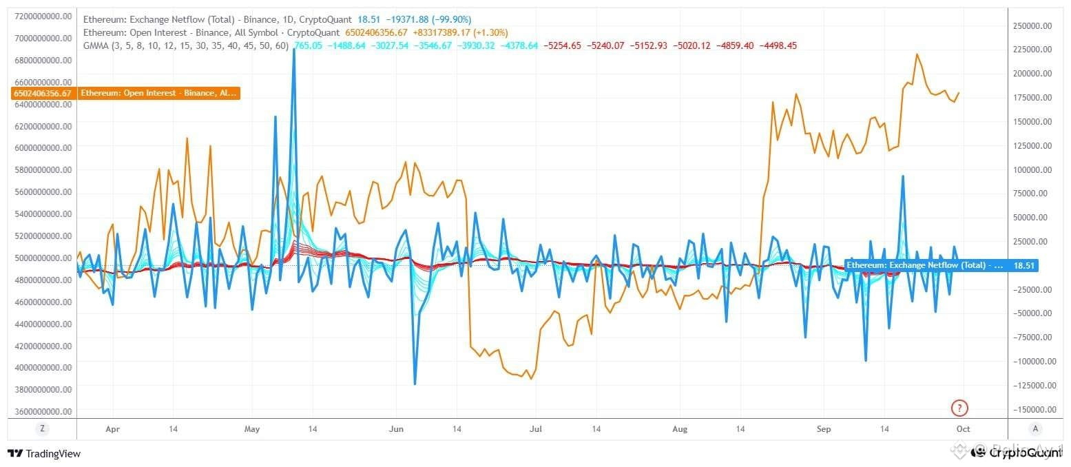
We can say the graph’s most important takeaways are that Binance OI has risen to the $650.2 million level, and that Netflow has stayed almost neutral at just 18.51.
On the OI side, there is a clear regime shift especially since mid-August. OI has been pushed to levels far above the roughly $470–500 million range. This indicates that position sizes in the #ETH derivatives market have increased, and price movements have become more sensitive to leverage effects. In the latest data, ETH is trading at around $2,670.
Meanwhile, Netflow being very close to zero suggests there is no strong and continuous ETH spot inflow on the Binance side at this stage. Therefore, the current structure in the chart makes the impact of accumulated positions in the derivatives market more important than direct heavy spot selling pressure.
GMMA also stands out here. The latest GMMA data appears to be in the range of approximately -4500/ -5250. In other words, the short-term GMMA averages are rebounding quickly toward the long-term averages. In this case, the 3-day GMMA turning positive indicates a short-term improvement in Binance #Ethereum netflow in recent days. On the other hand, the 5–60 day averages are still in negative territory, which suggests that from a broader perspective, ETH’s tendency is still more toward withdrawals from exchanges rather than exchange net inflows. Therefore, Open Interest and netflow signals are supported as bullish by GMMA. $ETH
We can say the graph’s most important takeaways are that Binance OI has risen to the $650.2 million level, and that Netflow has stayed almost neutral at just 18.51.
On the OI side, there is a clear regime shift especially since mid-August. OI has been pushed to levels far above the roughly $470–500 million range. This indicates that position sizes in the #ETH derivatives market have increased, and price movements have become more sensitive to leverage effects. In the latest data, ETH is trading at around $2,670.
Meanwhile, Netflow being very close to zero suggests there is no strong and continuous ETH spot inflow on the Binance side at this stage. Therefore, the current structure in the chart makes the impact of accumulated positions in the derivatives market more important than direct heavy spot selling pressure.
GMMA also stands out here. The latest GMMA data appears to be in the range of approximately -4500/ -5250. In other words, the short-term GMMA averages are rebounding quickly toward the long-term averages. In this case, the 3-day GMMA turning positive indicates a short-term improvement in Binance #Ethereum netflow in recent days. On the other hand, the 5–60 day averages are still in negative territory, which suggests that from a broader perspective, ETH’s tendency is still more toward withdrawals from exchanges rather than exchange net inflows. Therefore, Open Interest and netflow signals are supported as bullish by GMMA. $ETH
On the OI side, there is a clear regime shift especially since mid-August. OI has been pushed to levels far above the roughly $470–500 million range. This indicates that position sizes in the #ETH derivatives market have increased, and price movements have become more sensitive to leverage effects. In the latest data, ETH is trading at around $2,670.
Meanwhile, Netflow being very close to zero suggests there is no strong and continuous ETH spot inflow on the Binance side at this stage. Therefore, the current structure in the chart makes the impact of accumulated positions in the derivatives market more important than direct heavy spot selling pressure.
GMMA also stands out here. The latest GMMA data appears to be in the range of approximately -4500/ -5250. In other words, the short-term GMMA averages are rebounding quickly toward the long-term averages. In this case, the 3-day GMMA turning positive indicates a short-term improvement in Binance #Ethereum netflow in recent days. On the other hand, the 5–60 day averages are still in negative territory, which suggests that from a broader perspective, ETH’s tendency is still more toward withdrawals from exchanges rather than exchange net inflows. Therefore, Open Interest and netflow signals are supported as bullish by GMMA. $ETH
64
·
--
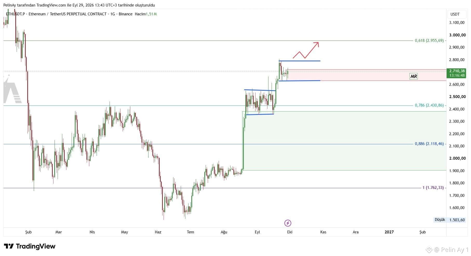
Last month, #Ethereum's technical structure is very similar to today's. This brings to mind the question: will another uptrend wave come again? For now, this possibility stands out as a strong option. Therefore, I expect #ETH to first test the $2955–$3000 range.
$ETH
Last month, #Ethereum's technical structure is very similar to today's. This brings to mind the question: will another uptrend wave come again? For now, this possibility stands out as a strong option. Therefore, I expect #ETH to first test the $2955–$3000 range.
$ETH
$ETH
40
·
--
Under Technical View and Macro Pressure Is Strengthening
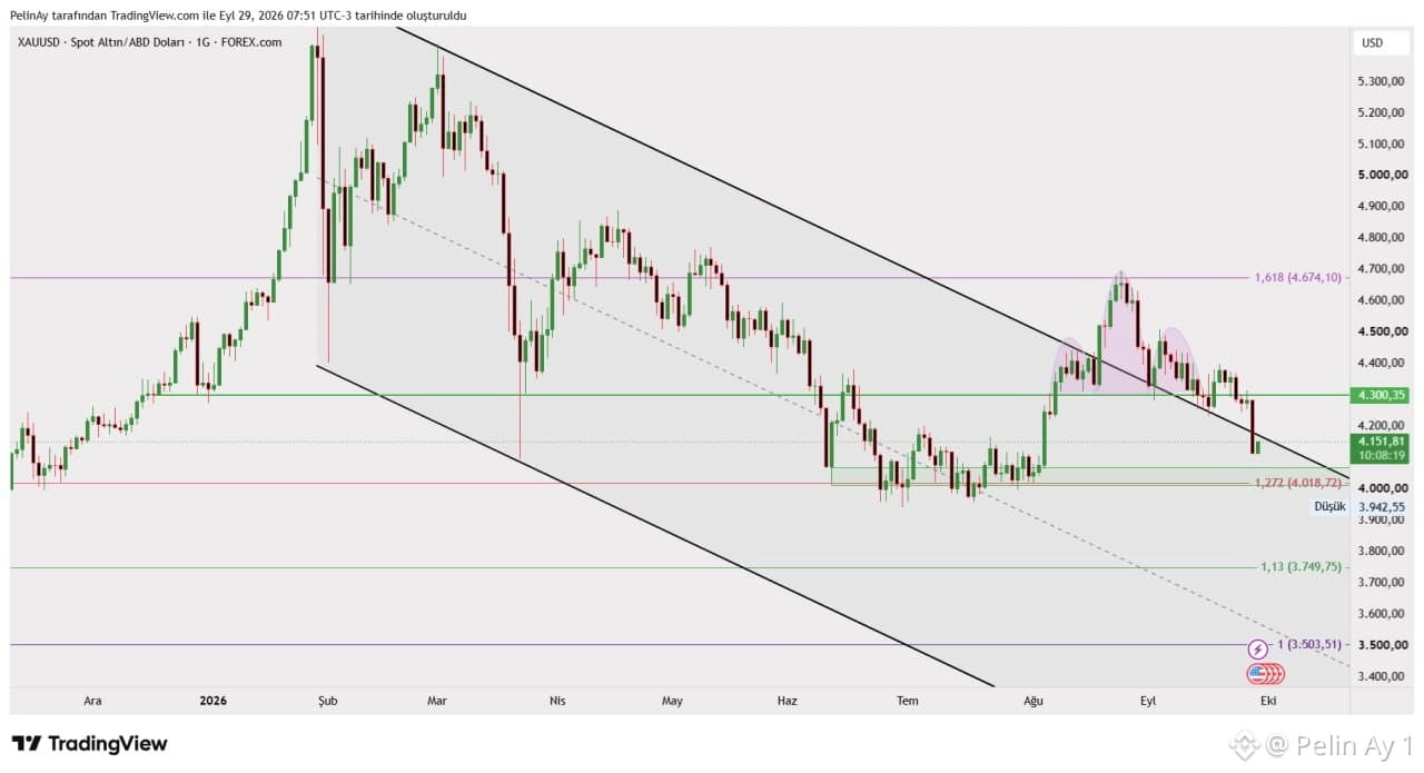
The short-term outlook on the XAU/USD chart is clearly weakening. In particular, the strong rally that began in August appears to have met resistance around 4.674$ . After this area, the price has pulled back by forming lower highs, indicating that the upward momentum has weakened. With the most recent move, the support around 4.300$ has been broken to the downside, and the price has retreated to approximately 4.151$ . Moreover, the price is currently trading below the long-term falling trend line on the chart.
The next critical zone is support around 4.018$ . The most recent low on the chart is around 3.942$ . Therefore, if the 4.018 area cannot be defended, the risk of selling pressure widening toward the 3.950–3.750$ band could come into focus technically.
On the macro side, there is currently significant pressure on gold. The Fed raised the policy rate by 25 basis points on September 16 to the 3.75%–4.00% range and stated that inflation remains elevated. In addition, rising U.S. Treasury yields and a strong dollar increase the opportunity cost of gold, which does not generate interest. On September 28, gold fell by about 4% to around 4.110$ , as reports noted that rising oil prices strengthened inflation concerns and expectations for a tighter Fed.
That said, the long-term outlook has not turned fully negative. According to the World Gold Council, net gold purchases by central banks in the second quarter of 2026 rose to 289 tons—about five times the first quarter. Therefore, it may be more accurate to read the current move not as the complete disappearance of strong structural demand for gold, but rather as the near-term pressure on price coming from high interest rates, a strong dollar, and rising Treasury yields. For now, the decisive thresholds on the chart are the 4.018$ support and the 4.300$ resistance; it will be critical for the next direction whether the price can reclaim or lose either of these two levels. $XAU $GOLD #RWA #XAUUSD #GOLD
Under Technical View and Macro Pressure Is Strengthening
The short-term outlook on the XAU/USD chart is clearly weakening. In particular, the strong rally that began in August appears to have met resistance around 4.674$ . After this area, the price has pulled back by forming lower highs, indicating that the upward momentum has weakened. With the most recent move, the support around 4.300$ has been broken to the downside, and the price has retreated to approximately 4.151$ . Moreover, the price is currently trading below the long-term falling trend line on the chart.
The next critical zone is support around 4.018$ . The most recent low on the chart is around 3.942$ . Therefore, if the 4.018 area cannot be defended, the risk of selling pressure widening toward the 3.950–3.750$ band could come into focus technically.
On the macro side, there is currently significant pressure on gold. The Fed raised the policy rate by 25 basis points on September 16 to the 3.75%–4.00% range and stated that inflation remains elevated. In addition, rising U.S. Treasury yields and a strong dollar increase the opportunity cost of gold, which does not generate interest. On September 28, gold fell by about 4% to around 4.110$ , as reports noted that rising oil prices strengthened inflation concerns and expectations for a tighter Fed.
That said, the long-term outlook has not turned fully negative. According to the World Gold Council, net gold purchases by central banks in the second quarter of 2026 rose to 289 tons—about five times the first quarter. Therefore, it may be more accurate to read the current move not as the complete disappearance of strong structural demand for gold, but rather as the near-term pressure on price coming from high interest rates, a strong dollar, and rising Treasury yields. For now, the decisive thresholds on the chart are the 4.018$ support and the 4.300$ resistance; it will be critical for the next direction whether the price can reclaim or lose either of these two levels. $XAU $GOLD #RWA #XAUUSD #GOLD
The short-term outlook on the XAU/USD chart is clearly weakening. In particular, the strong rally that began in August appears to have met resistance around 4.674$ . After this area, the price has pulled back by forming lower highs, indicating that the upward momentum has weakened. With the most recent move, the support around 4.300$ has been broken to the downside, and the price has retreated to approximately 4.151$ . Moreover, the price is currently trading below the long-term falling trend line on the chart.
The next critical zone is support around 4.018$ . The most recent low on the chart is around 3.942$ . Therefore, if the 4.018 area cannot be defended, the risk of selling pressure widening toward the 3.950–3.750$ band could come into focus technically.
On the macro side, there is currently significant pressure on gold. The Fed raised the policy rate by 25 basis points on September 16 to the 3.75%–4.00% range and stated that inflation remains elevated. In addition, rising U.S. Treasury yields and a strong dollar increase the opportunity cost of gold, which does not generate interest. On September 28, gold fell by about 4% to around 4.110$ , as reports noted that rising oil prices strengthened inflation concerns and expectations for a tighter Fed.
That said, the long-term outlook has not turned fully negative. According to the World Gold Council, net gold purchases by central banks in the second quarter of 2026 rose to 289 tons—about five times the first quarter. Therefore, it may be more accurate to read the current move not as the complete disappearance of strong structural demand for gold, but rather as the near-term pressure on price coming from high interest rates, a strong dollar, and rising Treasury yields. For now, the decisive thresholds on the chart are the 4.018$ support and the 4.300$ resistance; it will be critical for the next direction whether the price can reclaim or lose either of these two levels. $XAU $GOLD #RWA #XAUUSD #GOLD
59
·
--
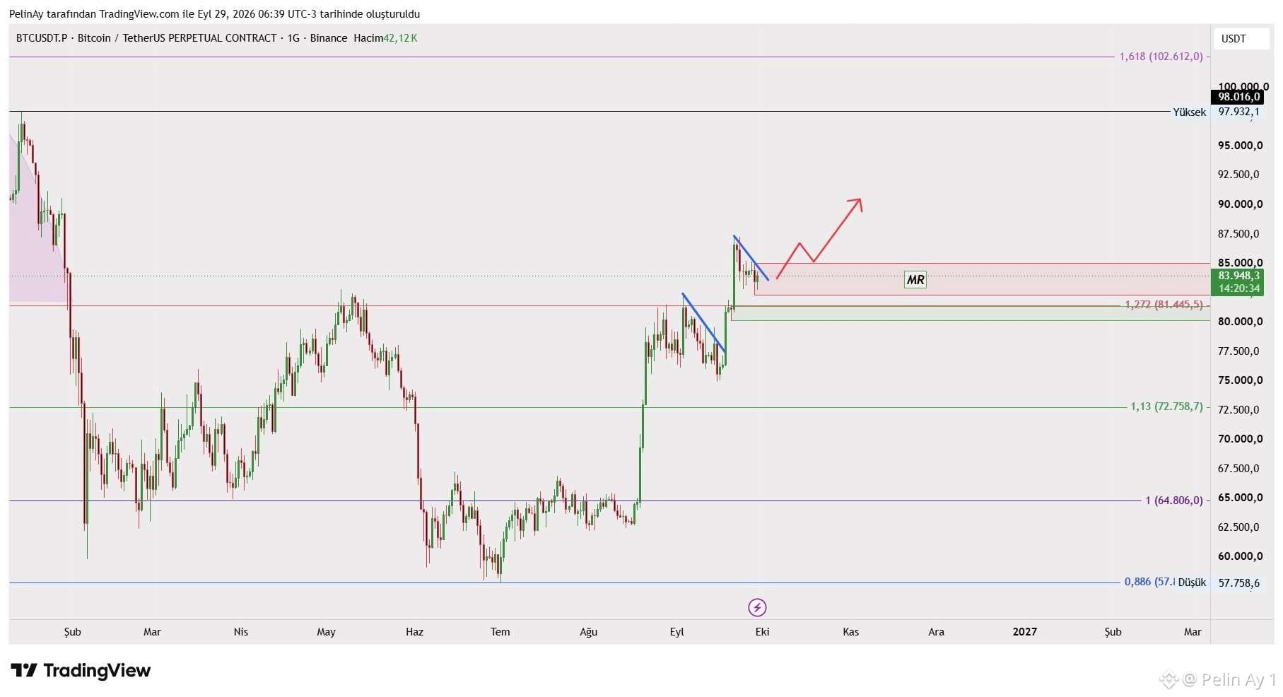
Between August and September, could the flag pattern formed around #Bitcoin be repeating? If this scenario happens, the price could quickly rise to the $102K level. Technically, this possibility looks very strong. Do you think this scenario will happen for #BTC? $BTC
Between August and September, could the flag pattern formed around #Bitcoin be repeating? If this scenario happens, the price could quickly rise to the $102K level. Technically, this possibility looks very strong. Do you think this scenario will happen for #BTC? $BTC
58
·
--
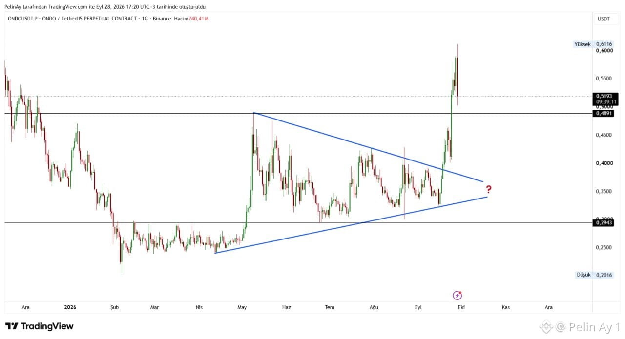
Last week, I shared which direction the breakout of the price would take. This week, on the ONDO chart, it is clearly visible that a long-lasting broad triangle consolidation has been broken upward strongly. The price delivered a sharp rally up to the $0.6116 level by surpassing the declining trend line and the key horizontal resistance at the 0,4891$ level. The asset, currently trading around 0,5193$ , has entered a potential support test, as it tries to stabilize the price after the breakout. The former resistance at the 0,4891$ level may now be expected to act as a critical support. In the lower region, the 0,2943$ level continues to maintain its position as a major bottom support.
This remarkable technical breakout on the chart directly aligns with the very strong fundamental analysis data and institutional news flow that have come in over the past few days.
BlackRock & Chain-Top Portfolios: On September 24–25, 2026, Ondo Finance launched automated investment portfolios on-chain to investors in collaboration with BlackRock. This strategic move with the world’s largest asset manager became the main trigger behind the sharp jump of over 25% on the chart and the 0,6116$ peak.
As the tokenization of real-world assets (RWA) tailwind gained speed, ONDO managed to dominate 12% of the RWA market and became a focal point for investors.
Ongoing management processes and sell-off rumors tied to past founder losses were explicitly denied by the company. The market capitalization approaching the $2.7 billion range suggests that institutional trust in the project remains solid and that ONDO is positioned as one of the leading tokens in the DeFi space.
When the technical picture and the latest news are combined, it appears that the RWA story behind ONDO is gaining strong momentum with the BlackRock integration. For the persistence of this strong upward momentum, holding above the 0,4891$ support will be the most critical technical indicator to be watched by the market. $ONDO #Ondo
Last week, I shared which direction the breakout of the price would take. This week, on the ONDO chart, it is clearly visible that a long-lasting broad triangle consolidation has been broken upward strongly. The price delivered a sharp rally up to the $0.6116 level by surpassing the declining trend line and the key horizontal resistance at the 0,4891$ level. The asset, currently trading around 0,5193$ , has entered a potential support test, as it tries to stabilize the price after the breakout. The former resistance at the 0,4891$ level may now be expected to act as a critical support. In the lower region, the 0,2943$ level continues to maintain its position as a major bottom support.
This remarkable technical breakout on the chart directly aligns with the very strong fundamental analysis data and institutional news flow that have come in over the past few days.
BlackRock & Chain-Top Portfolios: On September 24–25, 2026, Ondo Finance launched automated investment portfolios on-chain to investors in collaboration with BlackRock. This strategic move with the world’s largest asset manager became the main trigger behind the sharp jump of over 25% on the chart and the 0,6116$ peak.
As the tokenization of real-world assets (RWA) tailwind gained speed, ONDO managed to dominate 12% of the RWA market and became a focal point for investors.
Ongoing management processes and sell-off rumors tied to past founder losses were explicitly denied by the company. The market capitalization approaching the $2.7 billion range suggests that institutional trust in the project remains solid and that ONDO is positioned as one of the leading tokens in the DeFi space.
When the technical picture and the latest news are combined, it appears that the RWA story behind ONDO is gaining strong momentum with the BlackRock integration. For the persistence of this strong upward momentum, holding above the 0,4891$ support will be the most critical technical indicator to be watched by the market. $ONDO #Ondo
This remarkable technical breakout on the chart directly aligns with the very strong fundamental analysis data and institutional news flow that have come in over the past few days.
BlackRock & Chain-Top Portfolios: On September 24–25, 2026, Ondo Finance launched automated investment portfolios on-chain to investors in collaboration with BlackRock. This strategic move with the world’s largest asset manager became the main trigger behind the sharp jump of over 25% on the chart and the 0,6116$ peak.
As the tokenization of real-world assets (RWA) tailwind gained speed, ONDO managed to dominate 12% of the RWA market and became a focal point for investors.
Ongoing management processes and sell-off rumors tied to past founder losses were explicitly denied by the company. The market capitalization approaching the $2.7 billion range suggests that institutional trust in the project remains solid and that ONDO is positioned as one of the leading tokens in the DeFi space.
When the technical picture and the latest news are combined, it appears that the RWA story behind ONDO is gaining strong momentum with the BlackRock integration. For the persistence of this strong upward momentum, holding above the 0,4891$ support will be the most critical technical indicator to be watched by the market. $ONDO #Ondo
54
·
--
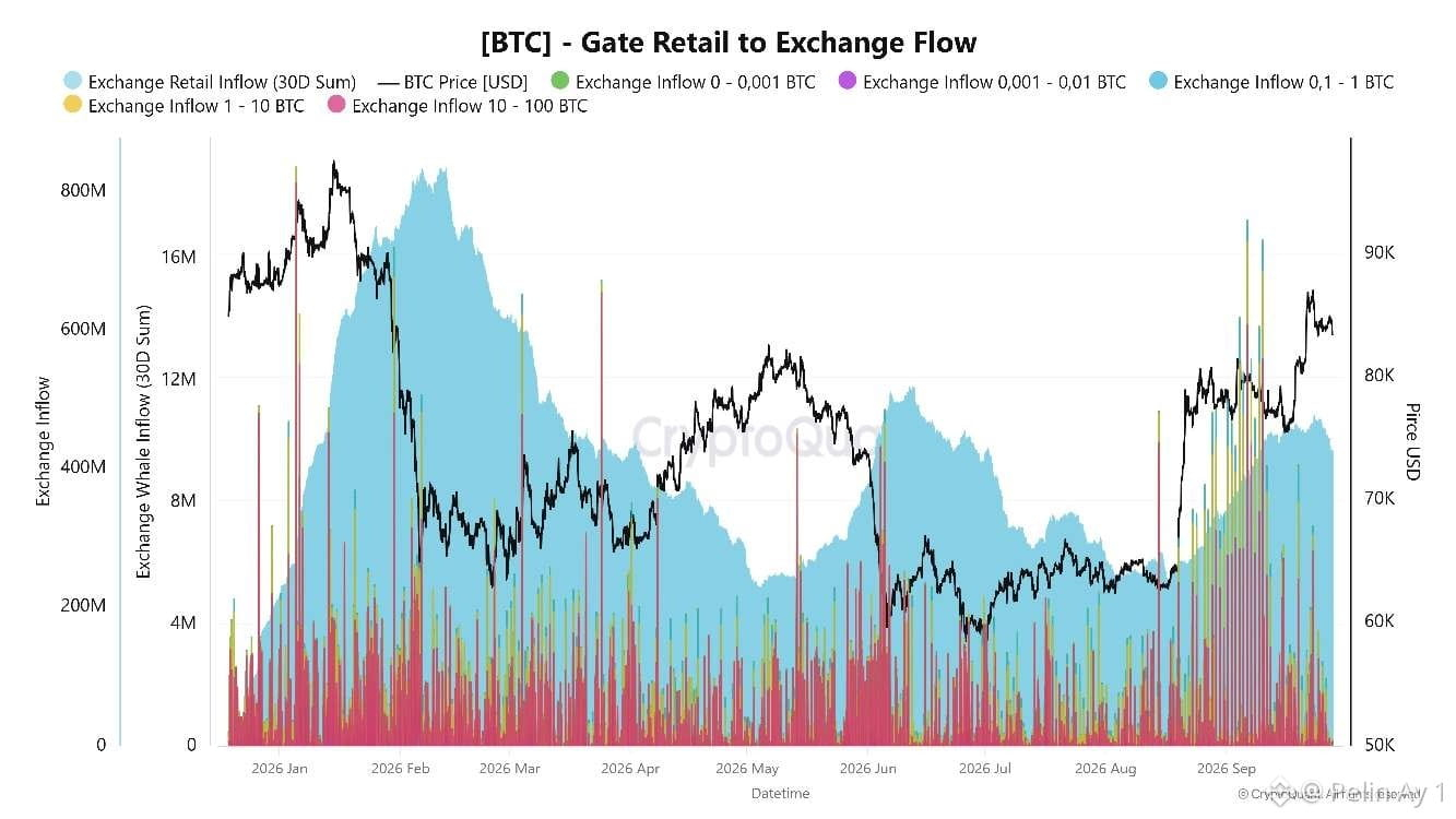
Whale Activity on Bitcoin Rises Again: Selling or Position Change?
First, in the chart, as the Bitcoin price rises, it stands out that the amounts of BTC sent to exchanges increase noticeably, especially in September. In particular, the Gate transfers in the 1–10 BTC and 10–100 BTC ranges—which represent large transaction groups—appear much higher and more frequent in the current section of the chart. This suggests that whales have become more active in the market and that some wallets are moving BTC to exchange liquidity that can be used for trading. From a professional perspective, BTC entering exchanges could be prepared for sale, used as collateral, shifted between positions for different strategies, or moved for liquidity purposes.
As this activity increases during the period when the price rises from around the $75K area to above $87K, it raises the possibility that some whales may have used the move to create liquidity on the way up or to realize profits. Indeed, after BTC climbed to roughly $87.3K on September 21, it pulled back to around $84K.
In the current chart, in my view, the risk of profit-taking in the short term is increasing, but there is not yet confirmation of a strong whale selloff. This is because as the price quickly moved from the $75–77K area into the $85–87K range, large transfers also increased. This suggests that more BTC liquidity is coming into the market during the rally and that the $84–87K zone could turn into a significant supply area.
On the other hand, strong inflows in US spot Bitcoin ETFs during the last weeks of September and a speeding up of exchange outflows across the market indicate that this sell supply is not completely dominant at this stage. So, we can say that whales are active in the chart.
Keeping BTC around the $84K area and testing the $86–87K range again will be important to understand whether the high inflows on Gate are being absorbed or not.
$BTC #BTC
Whale Activity on Bitcoin Rises Again: Selling or Position Change?
First, in the chart, as the Bitcoin price rises, it stands out that the amounts of BTC sent to exchanges increase noticeably, especially in September. In particular, the Gate transfers in the 1–10 BTC and 10–100 BTC ranges—which represent large transaction groups—appear much higher and more frequent in the current section of the chart. This suggests that whales have become more active in the market and that some wallets are moving BTC to exchange liquidity that can be used for trading. From a professional perspective, BTC entering exchanges could be prepared for sale, used as collateral, shifted between positions for different strategies, or moved for liquidity purposes.
As this activity increases during the period when the price rises from around the $75K area to above $87K, it raises the possibility that some whales may have used the move to create liquidity on the way up or to realize profits. Indeed, after BTC climbed to roughly $87.3K on September 21, it pulled back to around $84K.
In the current chart, in my view, the risk of profit-taking in the short term is increasing, but there is not yet confirmation of a strong whale selloff. This is because as the price quickly moved from the $75–77K area into the $85–87K range, large transfers also increased. This suggests that more BTC liquidity is coming into the market during the rally and that the $84–87K zone could turn into a significant supply area.
On the other hand, strong inflows in US spot Bitcoin ETFs during the last weeks of September and a speeding up of exchange outflows across the market indicate that this sell supply is not completely dominant at this stage. So, we can say that whales are active in the chart.
Keeping BTC around the $84K area and testing the $86–87K range again will be important to understand whether the high inflows on Gate are being absorbed or not.
$BTC #BTC
First, in the chart, as the Bitcoin price rises, it stands out that the amounts of BTC sent to exchanges increase noticeably, especially in September. In particular, the Gate transfers in the 1–10 BTC and 10–100 BTC ranges—which represent large transaction groups—appear much higher and more frequent in the current section of the chart. This suggests that whales have become more active in the market and that some wallets are moving BTC to exchange liquidity that can be used for trading. From a professional perspective, BTC entering exchanges could be prepared for sale, used as collateral, shifted between positions for different strategies, or moved for liquidity purposes.
As this activity increases during the period when the price rises from around the $75K area to above $87K, it raises the possibility that some whales may have used the move to create liquidity on the way up or to realize profits. Indeed, after BTC climbed to roughly $87.3K on September 21, it pulled back to around $84K.
In the current chart, in my view, the risk of profit-taking in the short term is increasing, but there is not yet confirmation of a strong whale selloff. This is because as the price quickly moved from the $75–77K area into the $85–87K range, large transfers also increased. This suggests that more BTC liquidity is coming into the market during the rally and that the $84–87K zone could turn into a significant supply area.
On the other hand, strong inflows in US spot Bitcoin ETFs during the last weeks of September and a speeding up of exchange outflows across the market indicate that this sell supply is not completely dominant at this stage. So, we can say that whales are active in the chart.
Keeping BTC around the $84K area and testing the $86–87K range again will be important to understand whether the high inflows on Gate are being absorbed or not.
$BTC #BTC
94
·
--
What’s Behind the Sharp Rise on SOON?
On the SOON chart, especially in the last section, after a long consolidation in the 0.18–0,20$ band, we see a very sharp upward breakout. In the chart, the price rose from around 0,18$ to 0.2967$, making a move of over 60% in a short time. Moreover, the formation of a long wick on the daily candle testing the 0,3147$ resistance suggests that there are significant sell orders in this area.
One of the most important developments that could explain this move was the unlock of 20.24 million SOON tokens that took place on September 23. This amount was equivalent to about 3.6% of the circulating supply. After this unlock, which initially created selling pressure, the fact that the price then rose strongly again suggests that the market’s sell orders may have been absorbed.
In addition, SOON’s core story continues. The project runs an SVM-based rollup infrastructure on Ethereum, BNB Chain, and Base; the TON–Solana connection via InterSOON is also active. This multi-L1 approach is one of the factors that could bring speculative demand to SOON, especially if the SVM narrative regains attention.
In CMC’s September 26 analysis, it was also noted that there was no specific, confirmed factor for the rally and that the move may have been strengthened by relatively low speculative flows. Therefore, it may be more accurate to assess the current move as being driven by the reduction of sell pressure after the unlock, low liquidity, technical breakout effects, and speculative trading.
On the chart, 0.3147 is a critical resistance level. If a daily close occurs above this zone, the continuity of the breakout could strengthen; however, if rejected, profit-taking could be seen toward 0.25–0.26 and then the 0.20–0,22$ zone. Considering the high Binance volume shown on the chart, it should be taken into account that the move may have been amplified not only by spot demand but also by leveraged trades. $SOON #SOON
What’s Behind the Sharp Rise on SOON?
On the SOON chart, especially in the last section, after a long consolidation in the 0.18–0,20$ band, we see a very sharp upward breakout. In the chart, the price rose from around 0,18$ to 0.2967$, making a move of over 60% in a short time. Moreover, the formation of a long wick on the daily candle testing the 0,3147$ resistance suggests that there are significant sell orders in this area.
One of the most important developments that could explain this move was the unlock of 20.24 million SOON tokens that took place on September 23. This amount was equivalent to about 3.6% of the circulating supply. After this unlock, which initially created selling pressure, the fact that the price then rose strongly again suggests that the market’s sell orders may have been absorbed.
In addition, SOON’s core story continues. The project runs an SVM-based rollup infrastructure on Ethereum, BNB Chain, and Base; the TON–Solana connection via InterSOON is also active. This multi-L1 approach is one of the factors that could bring speculative demand to SOON, especially if the SVM narrative regains attention.
In CMC’s September 26 analysis, it was also noted that there was no specific, confirmed factor for the rally and that the move may have been strengthened by relatively low speculative flows. Therefore, it may be more accurate to assess the current move as being driven by the reduction of sell pressure after the unlock, low liquidity, technical breakout effects, and speculative trading.
On the chart, 0.3147 is a critical resistance level. If a daily close occurs above this zone, the continuity of the breakout could strengthen; however, if rejected, profit-taking could be seen toward 0.25–0.26 and then the 0.20–0,22$ zone. Considering the high Binance volume shown on the chart, it should be taken into account that the move may have been amplified not only by spot demand but also by leveraged trades. $SOON #SOON
On the SOON chart, especially in the last section, after a long consolidation in the 0.18–0,20$ band, we see a very sharp upward breakout. In the chart, the price rose from around 0,18$ to 0.2967$, making a move of over 60% in a short time. Moreover, the formation of a long wick on the daily candle testing the 0,3147$ resistance suggests that there are significant sell orders in this area.
One of the most important developments that could explain this move was the unlock of 20.24 million SOON tokens that took place on September 23. This amount was equivalent to about 3.6% of the circulating supply. After this unlock, which initially created selling pressure, the fact that the price then rose strongly again suggests that the market’s sell orders may have been absorbed.
In addition, SOON’s core story continues. The project runs an SVM-based rollup infrastructure on Ethereum, BNB Chain, and Base; the TON–Solana connection via InterSOON is also active. This multi-L1 approach is one of the factors that could bring speculative demand to SOON, especially if the SVM narrative regains attention.
In CMC’s September 26 analysis, it was also noted that there was no specific, confirmed factor for the rally and that the move may have been strengthened by relatively low speculative flows. Therefore, it may be more accurate to assess the current move as being driven by the reduction of sell pressure after the unlock, low liquidity, technical breakout effects, and speculative trading.
On the chart, 0.3147 is a critical resistance level. If a daily close occurs above this zone, the continuity of the breakout could strengthen; however, if rejected, profit-taking could be seen toward 0.25–0.26 and then the 0.20–0,22$ zone. Considering the high Binance volume shown on the chart, it should be taken into account that the move may have been amplified not only by spot demand but also by leveraged trades. $SOON #SOON
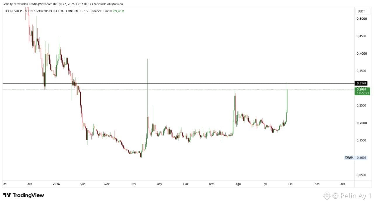
89
·
--
The symmetric triangle formation in the Sun chart is intriguing. The price is strongly compressed around the 0.01722 level.
In symmetric triangles, the breakout direction is initially unclear and is mostly determined by the trading volume during the breakout. It is important for confirmation of the pattern that investors see a noticeable increase in volume in the direction where the trendline breaks before making their trading decisions.
SUN is a one-stop DeFi platform built on the TRON blockchain that supports stablecoin swaps, token mining, and decentralized governance (DAO).
Latest News and Ecosystem Developments
SunX Ecosystem Expansion: SunPerp, the decentralized perpetual trading platform, was rebranded as SunX in November 2025 to evolve into a comprehensive trading ecosystem.
Buyback and Burn Transparency: In April 2026, SUN.io released a public control panel that allows the buyback and burn program to be tracked on-chain. Revenues generated from products such as SunSwap, SunPump, and SunX are automatically used to buy and burn SUN tokens from the market. As of the end of August 2026, more than 678 million SUN tokens—equivalent to approximately 3.4% of the total supply—have been permanently removed from circulation.
Shift Toward AI Infrastructure: In a strategic live stream held on September 3, 2026, it was announced that SUN’s narrative of AI infrastructure was incorporated by discussing projects related to decentralized compute routing and AI gateways together with ecosystem partners.
Justin Sun Academic Award: TRON founder Justin Sun announced on September 16, 2026 the launch of a zero-trust, decentralized academic awards system, including a prize pool of up to $1 million for solving fundamental mathematics problems. This development aims to increase ecosystem prestige by drawing academic and institutional capital interest to the TRON network, where the SUN token is one of the core DeFi assets. #sun $SUN
The symmetric triangle formation in the Sun chart is intriguing. The price is strongly compressed around the 0.01722 level.
In symmetric triangles, the breakout direction is initially unclear and is mostly determined by the trading volume during the breakout. It is important for confirmation of the pattern that investors see a noticeable increase in volume in the direction where the trendline breaks before making their trading decisions.
SUN is a one-stop DeFi platform built on the TRON blockchain that supports stablecoin swaps, token mining, and decentralized governance (DAO).
Latest News and Ecosystem Developments
SunX Ecosystem Expansion: SunPerp, the decentralized perpetual trading platform, was rebranded as SunX in November 2025 to evolve into a comprehensive trading ecosystem.
Buyback and Burn Transparency: In April 2026, SUN.io released a public control panel that allows the buyback and burn program to be tracked on-chain. Revenues generated from products such as SunSwap, SunPump, and SunX are automatically used to buy and burn SUN tokens from the market. As of the end of August 2026, more than 678 million SUN tokens—equivalent to approximately 3.4% of the total supply—have been permanently removed from circulation.
Shift Toward AI Infrastructure: In a strategic live stream held on September 3, 2026, it was announced that SUN’s narrative of AI infrastructure was incorporated by discussing projects related to decentralized compute routing and AI gateways together with ecosystem partners.
Justin Sun Academic Award: TRON founder Justin Sun announced on September 16, 2026 the launch of a zero-trust, decentralized academic awards system, including a prize pool of up to $1 million for solving fundamental mathematics problems. This development aims to increase ecosystem prestige by drawing academic and institutional capital interest to the TRON network, where the SUN token is one of the core DeFi assets. #sun $SUN
In symmetric triangles, the breakout direction is initially unclear and is mostly determined by the trading volume during the breakout. It is important for confirmation of the pattern that investors see a noticeable increase in volume in the direction where the trendline breaks before making their trading decisions.
SUN is a one-stop DeFi platform built on the TRON blockchain that supports stablecoin swaps, token mining, and decentralized governance (DAO).
Latest News and Ecosystem Developments
SunX Ecosystem Expansion: SunPerp, the decentralized perpetual trading platform, was rebranded as SunX in November 2025 to evolve into a comprehensive trading ecosystem.
Buyback and Burn Transparency: In April 2026, SUN.io released a public control panel that allows the buyback and burn program to be tracked on-chain. Revenues generated from products such as SunSwap, SunPump, and SunX are automatically used to buy and burn SUN tokens from the market. As of the end of August 2026, more than 678 million SUN tokens—equivalent to approximately 3.4% of the total supply—have been permanently removed from circulation.
Shift Toward AI Infrastructure: In a strategic live stream held on September 3, 2026, it was announced that SUN’s narrative of AI infrastructure was incorporated by discussing projects related to decentralized compute routing and AI gateways together with ecosystem partners.
Justin Sun Academic Award: TRON founder Justin Sun announced on September 16, 2026 the launch of a zero-trust, decentralized academic awards system, including a prize pool of up to $1 million for solving fundamental mathematics problems. This development aims to increase ecosystem prestige by drawing academic and institutional capital interest to the TRON network, where the SUN token is one of the core DeFi assets. #sun $SUN
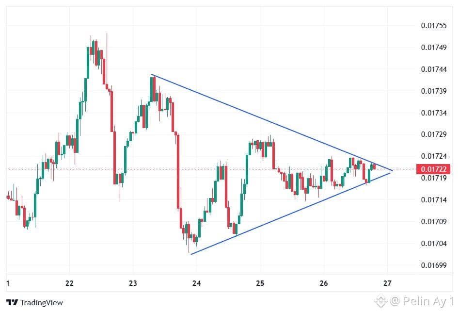
45
·
--
FLOKI’s Critical Resistance Test: Eyes on the 0,000031 Zone
After a long-standing downtrend on FLOKI’s daily chart, a strong base has formed in the 0,000019–0,000020 area. With the recovery that began after August, the price has moved back into the 0,000028–0,000031 range. The current price on the chart is approximately at the 0,00002830 level, and horizontal resistance around 0,00003104 is being tested.
The critical point here is whether FLOKI can post a daily close above the 0,000031 level. If this zone is broken through with volume, then, in line with the scenario drawn on the chart, first 0,000035 and then the 0,000038–0,000040 area could come into focus. On the other hand, if selling emerges at resistance, the 0,000025–0,000026 zone would be the first support; below that, the 0,000020 area may be watched as an important base.
On the fundamentals side, there is also a notable new development. As of September 24, FLOKI became eligible to be used as collateral for USDC borrowings on Morpho. The integration carried out via API3 is moving FLOKI’s use case into the DeFi lending segment.
In addition, in CoinMarketCap’s September 24 analysis, it was stated that if FLOKI stays above $0.000027, the $0.000030 area could be tested; however, if this support is lost, around $0.000025 could come into play.
In summary, from a technical perspective, FLOKI is at an important decision zone. Sustained strength above 0,000031 could pave the way for a move toward 0,000035 and 0,000038/0,000040 on the chart. But if it is rejected at resistance, the risk of a short-term correction remains. The Morpho integration is an important development that, beyond the technical structure, shows FLOKI’s DeFi use cases are expanding. $FLOKI #floki
FLOKI’s Critical Resistance Test: Eyes on the 0,000031 Zone
After a long-standing downtrend on FLOKI’s daily chart, a strong base has formed in the 0,000019–0,000020 area. With the recovery that began after August, the price has moved back into the 0,000028–0,000031 range. The current price on the chart is approximately at the 0,00002830 level, and horizontal resistance around 0,00003104 is being tested.
The critical point here is whether FLOKI can post a daily close above the 0,000031 level. If this zone is broken through with volume, then, in line with the scenario drawn on the chart, first 0,000035 and then the 0,000038–0,000040 area could come into focus. On the other hand, if selling emerges at resistance, the 0,000025–0,000026 zone would be the first support; below that, the 0,000020 area may be watched as an important base.
On the fundamentals side, there is also a notable new development. As of September 24, FLOKI became eligible to be used as collateral for USDC borrowings on Morpho. The integration carried out via API3 is moving FLOKI’s use case into the DeFi lending segment.
In addition, in CoinMarketCap’s September 24 analysis, it was stated that if FLOKI stays above $0.000027, the $0.000030 area could be tested; however, if this support is lost, around $0.000025 could come into play.
In summary, from a technical perspective, FLOKI is at an important decision zone. Sustained strength above 0,000031 could pave the way for a move toward 0,000035 and 0,000038/0,000040 on the chart. But if it is rejected at resistance, the risk of a short-term correction remains. The Morpho integration is an important development that, beyond the technical structure, shows FLOKI’s DeFi use cases are expanding. $FLOKI #floki
After a long-standing downtrend on FLOKI’s daily chart, a strong base has formed in the 0,000019–0,000020 area. With the recovery that began after August, the price has moved back into the 0,000028–0,000031 range. The current price on the chart is approximately at the 0,00002830 level, and horizontal resistance around 0,00003104 is being tested.
The critical point here is whether FLOKI can post a daily close above the 0,000031 level. If this zone is broken through with volume, then, in line with the scenario drawn on the chart, first 0,000035 and then the 0,000038–0,000040 area could come into focus. On the other hand, if selling emerges at resistance, the 0,000025–0,000026 zone would be the first support; below that, the 0,000020 area may be watched as an important base.
On the fundamentals side, there is also a notable new development. As of September 24, FLOKI became eligible to be used as collateral for USDC borrowings on Morpho. The integration carried out via API3 is moving FLOKI’s use case into the DeFi lending segment.
In addition, in CoinMarketCap’s September 24 analysis, it was stated that if FLOKI stays above $0.000027, the $0.000030 area could be tested; however, if this support is lost, around $0.000025 could come into play.
In summary, from a technical perspective, FLOKI is at an important decision zone. Sustained strength above 0,000031 could pave the way for a move toward 0,000035 and 0,000038/0,000040 on the chart. But if it is rejected at resistance, the risk of a short-term correction remains. The Morpho integration is an important development that, beyond the technical structure, shows FLOKI’s DeFi use cases are expanding. $FLOKI #floki
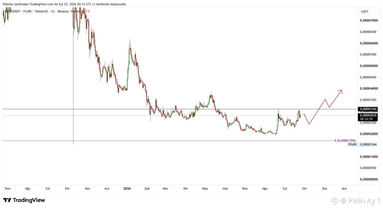
36
·
--
On the DUSK/USDT chart, the long-term outlook draws attention with a notable recovery structure. The chart shows that it entered an uptrend after August. The current price is at approximately the 0,0869$ level on the chart.
Technically, the first important zone is 0,10$ , followed by the 0,11184$ level, which is marked on the chart as a horizontal resistance. If daily closes arrive above this zone, there may be room for the price to move toward the 0,12–0,14$ band, where heavy trading previously took place. The main resistance on the chart is at 0,16473$ . Therefore, if 0,1118$ is broken, the next key area to watch in the medium term will be 0,1647$ . Conversely, in order to preserve the current bullish structure, price action around 0,08$ is important; below that, especially the 0,06–0,07$ zone could come back into focus.
There are also current developments on the project side. The latest post dated September 15, officially published by Dusk, focuses on the interoperability of RWA across different blockchains. Dusk aims for the issuance of real-world assets—such as securities and fund shares—directly on the blockchain and for these assets to be used with applications on other chains. Dusk also leverages Chainlink CCIP, DataLink, and Data Streams integrations.
On the project’s technical side, the Boreas upgrade in 2026 has been deployed on the mainnet. DUSK is also positioned as the local token used in the network’s transaction fees and staking mechanism. According to Dusk’s documentation, the total supply model was designed to start with 500 million DUSK and, over time, emissions would cap it at a maximum of 1 billion DUSK.
In summary, the project’s improvements around RWA, regulated finance, and cross-chain interoperability are among the key developments that support the story shown in the price chart.
$DUSK #DUSK
On the DUSK/USDT chart, the long-term outlook draws attention with a notable recovery structure. The chart shows that it entered an uptrend after August. The current price is at approximately the 0,0869$ level on the chart.
Technically, the first important zone is 0,10$ , followed by the 0,11184$ level, which is marked on the chart as a horizontal resistance. If daily closes arrive above this zone, there may be room for the price to move toward the 0,12–0,14$ band, where heavy trading previously took place. The main resistance on the chart is at 0,16473$ . Therefore, if 0,1118$ is broken, the next key area to watch in the medium term will be 0,1647$ . Conversely, in order to preserve the current bullish structure, price action around 0,08$ is important; below that, especially the 0,06–0,07$ zone could come back into focus.
There are also current developments on the project side. The latest post dated September 15, officially published by Dusk, focuses on the interoperability of RWA across different blockchains. Dusk aims for the issuance of real-world assets—such as securities and fund shares—directly on the blockchain and for these assets to be used with applications on other chains. Dusk also leverages Chainlink CCIP, DataLink, and Data Streams integrations.
On the project’s technical side, the Boreas upgrade in 2026 has been deployed on the mainnet. DUSK is also positioned as the local token used in the network’s transaction fees and staking mechanism. According to Dusk’s documentation, the total supply model was designed to start with 500 million DUSK and, over time, emissions would cap it at a maximum of 1 billion DUSK.
In summary, the project’s improvements around RWA, regulated finance, and cross-chain interoperability are among the key developments that support the story shown in the price chart.
$DUSK #DUSK
Technically, the first important zone is 0,10$ , followed by the 0,11184$ level, which is marked on the chart as a horizontal resistance. If daily closes arrive above this zone, there may be room for the price to move toward the 0,12–0,14$ band, where heavy trading previously took place. The main resistance on the chart is at 0,16473$ . Therefore, if 0,1118$ is broken, the next key area to watch in the medium term will be 0,1647$ . Conversely, in order to preserve the current bullish structure, price action around 0,08$ is important; below that, especially the 0,06–0,07$ zone could come back into focus.
There are also current developments on the project side. The latest post dated September 15, officially published by Dusk, focuses on the interoperability of RWA across different blockchains. Dusk aims for the issuance of real-world assets—such as securities and fund shares—directly on the blockchain and for these assets to be used with applications on other chains. Dusk also leverages Chainlink CCIP, DataLink, and Data Streams integrations.
On the project’s technical side, the Boreas upgrade in 2026 has been deployed on the mainnet. DUSK is also positioned as the local token used in the network’s transaction fees and staking mechanism. According to Dusk’s documentation, the total supply model was designed to start with 500 million DUSK and, over time, emissions would cap it at a maximum of 1 billion DUSK.
In summary, the project’s improvements around RWA, regulated finance, and cross-chain interoperability are among the key developments that support the story shown in the price chart.
$DUSK #DUSK
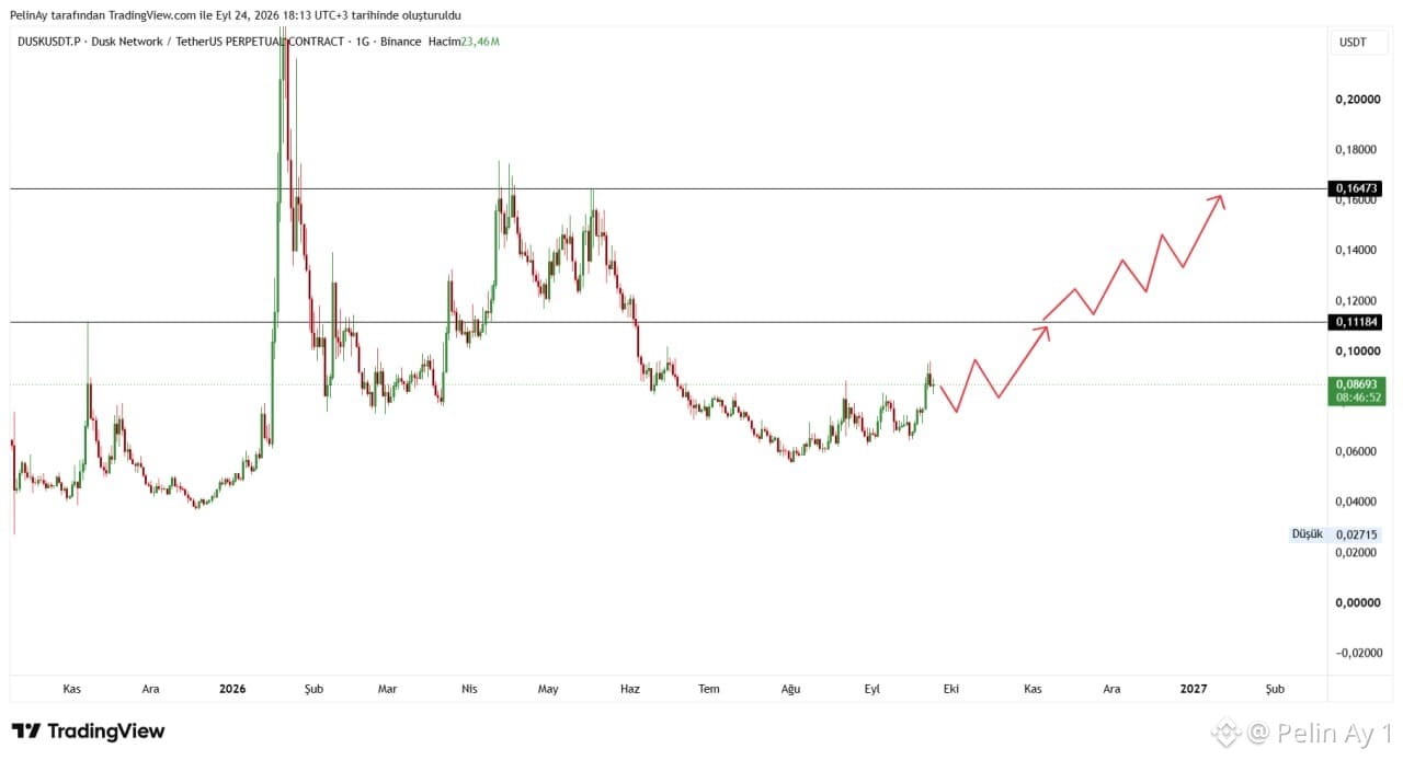
55
Log in to explore more content
Join global crypto users on Binance Square
⚡️ Get latest and useful information about crypto.
💬 Trusted by the world’s largest crypto exchange.
👍 Discover real insights from verified creators.
Email / Phone number
Trending Topics
BinanceLaunchesBinanceIntelligence
292,973 views
2,527 Discussing
The real test for Binance Intelligence isn’t whether AI can generate a strategy
Zaki Web3 Media
·8 Likes
·10.6k views
BitcoinTargets2026OpenAt$87570
669 views
41 Discussing
BitcoinRejectedAt$87KThirdTime
900 views
43 Discussing