

We treat almost every important market variable as a time series:
- Price over time
- Volume over time
- Open interest over time
- Liquidity over time
Token ownership is weirdly still analyzed as a snapshot.
You open a tool like @Bubblemaps.io look at the current wallet clusters and try to reconstruct how the supply ended up there.
The new Bubblemaps revamped version changes that.
You can now click directly on a historical candle and see the holder distribution at that point in time.
That sounds simple, but it creates a completely different way of investigating a token.
Imagine price starts running on Monday and a suspicious cluster is obvious by Friday.
The useful question isn't just whether those wallets are connected today.
I want to know what the map looked like before Monday.
Was the cluster already formed?
Did those wallets accumulate during the move?
Did concentration increase while price expanded, or did distribution actually become healthier?
Now you're comparing changes in ownership structure against changes in price instead of trying to infer everything from the final state.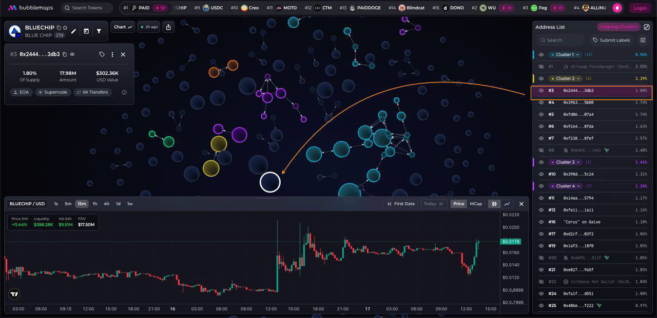
Bubblemaps Score adds another layer by flagging things like insider clusters and bundled wallets, while professionally reviewed wallet labels give more context around what you're looking at.
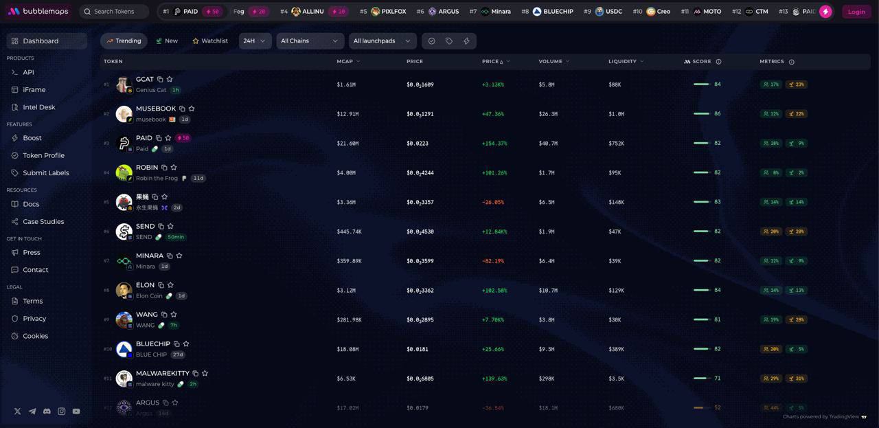
The revamped platform also adds fresh/trending feeds across chains, customizable market filters, reviewed project socials and execution through the built-in swap.
But historical distribution is the part I'd spend some time with if you already use Bubblemaps.
A bubble map tells you how supply is connected.
A sequence of bubble maps can tell you how those connections evolved.
🔗 A much richer dataset is now available on v2.bubblemaps.io