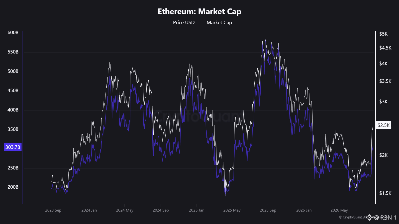
The exchange reserve chart everyone's posting as "supply shock incoming" actually refutes its own thesis if you follow it past the last two weeks. Reserves fell from about 21.5M ETH to 15.1M over this window, a 6.4M drop. But over that same span, staked ETH rose 15.3M and ETFs went from zero to 5.6M. Combined, roughly 20.8M ETH moved into staking and custody while circulating supply only grew 1.7M. Staking alone absorbed 2.4x the entire reserve decline. This chart is mostly coins migrating from exchanges into yield bearing wrappers, not a change in demand. The timing kills the bullish read too. Reserves peaked near 21.5M around September 2025, the same month ETH topped near $4,400. High reserves marked the cycle high, not the low. The steepest, most sustained reserve decline on the chart runs from that peak through mid 2026, the same window ETH fell 62% to $1,570. If falling reserves were reliably bullish, that stretch should have been the best buy in three years. It was the worst drawdown on the chart. What's actually worth watching is narrower. ETF holdings bottomed at 4.96M in June and climbed to 5.58M, up 12.5% in two months, real dated demand turning from distribution to accumulation. Staked ETH also added 1.09M in a single month while price ran 31%, and a sharp rally usually pulls coins toward exchanges to sell. This one didn't. Worth being honest about scale though. $ETH 's at $2,511, up 31% off the low but still 43% below last year's high, and L1 is generating roughly $190M annualized in fees against a $302B market cap. This is still a monetary bet, not a cash flow one. The reserve chart isn't proof of a squeeze. The ETF inflection and staking behavior during strength are the two things here that actually hold up. #BTC Price Analysis# #Altcoin Season#

Veröffentlichen

--
Haftungsausschluss: Enthält Meinungen von Drittanbietern. Keine Beratung. Binance AI wird ohne Gewähr bereitgestellt. Siehe AGB.