

Ibrina_ETH
8.7k منشورات

Ibrina_ETH
 تحقُّق Binance Square الإضافي
إبلاغ
حظر المُستخدم
Binance Square Creator | Crypto Researcher | Market Analyst | 24/7 Crypto Trader | Web3 & DeFi Insights
فتح تداول
مُتداول بمُعدّل مرتفع
2.1 سنوات
29 تتابع
37.5K+ المتابعون
49.4K+ إعجاب
منشورات
الحافظة الاستثمارية
الكل
اقتباسات
مقاطع فيديو
Live
PINNED
·
--
صاعد
تمّ التحقق
الذهب يتحرك عند مستوى مهم إلى حدٍ ما بعد أحدث بيانات التضخم الأمريكية.
كان الذهب عند حوالي 4,347 دولارًا، قريبًا من خط الرقبة في نموذج يومي على شكل رأس وكتفين. قد يؤدي الاختراق المؤكد إلى أسفل هذا النطاق إلى إعادة تسليط الضوء على منطقة 3,950 دولارًا.
ما لفت انتباهي هو الخلفية الاقتصادية الكلية. جاء مؤشر أسعار المستهلكين في أغسطس عند 3.4% على أساس سنوي، بينما ارتفع مؤشر التضخم الأساسي 0.3% على أساس شهري، مما يبقي جدل رفع أسعار الفائدة في مجلس الاحتياطي الفيدرالي حيًا. ارتفعت احتمالات السوق لزيادة في سبتمبر بعد صدور البيانات.
لن أتعامل مع مستوى 3,950 دولارًا باعتباره هدفًا مضمونًا، رغم ذلك. بالنسبة لي، الجزء المثير للاهتمام هو ما إذا كان الذهب يفقد خط الرقبة فعلًا مع زخم، أم أن المشترين يتدخلون ويدافعون عنه. قد تكون هذه ردة الفعل أكثر أهمية من النمط نفسه.
الأسواق ذات الصلة: $XAU , $BTC , $ETH , $USD , عوائد سندات الخزانة الأمريكية.
سأراقب رد الفعل حول هذا المستوى بدلًا من مطاردة الحركة الأولى. ما الذي تراقبه هنا — الانهيار الفني أم سردية الفيدرالي؟
#CPIWatch
الذهب يتحرك عند مستوى مهم إلى حدٍ ما بعد أحدث بيانات التضخم الأمريكية.
كان الذهب عند حوالي 4,347 دولارًا، قريبًا من خط الرقبة في نموذج يومي على شكل رأس وكتفين. قد يؤدي الاختراق المؤكد إلى أسفل هذا النطاق إلى إعادة تسليط الضوء على منطقة 3,950 دولارًا.
ما لفت انتباهي هو الخلفية الاقتصادية الكلية. جاء مؤشر أسعار المستهلكين في أغسطس عند 3.4% على أساس سنوي، بينما ارتفع مؤشر التضخم الأساسي 0.3% على أساس شهري، مما يبقي جدل رفع أسعار الفائدة في مجلس الاحتياطي الفيدرالي حيًا. ارتفعت احتمالات السوق لزيادة في سبتمبر بعد صدور البيانات.
لن أتعامل مع مستوى 3,950 دولارًا باعتباره هدفًا مضمونًا، رغم ذلك. بالنسبة لي، الجزء المثير للاهتمام هو ما إذا كان الذهب يفقد خط الرقبة فعلًا مع زخم، أم أن المشترين يتدخلون ويدافعون عنه. قد تكون هذه ردة الفعل أكثر أهمية من النمط نفسه.
الأسواق ذات الصلة: $XAU , $BTC , $ETH , $USD , عوائد سندات الخزانة الأمريكية.
سأراقب رد الفعل حول هذا المستوى بدلًا من مطاردة الحركة الأولى. ما الذي تراقبه هنا — الانهيار الفني أم سردية الفيدرالي؟
#CPIWatch
كان الذهب عند حوالي 4,347 دولارًا، قريبًا من خط الرقبة في نموذج يومي على شكل رأس وكتفين. قد يؤدي الاختراق المؤكد إلى أسفل هذا النطاق إلى إعادة تسليط الضوء على منطقة 3,950 دولارًا.
ما لفت انتباهي هو الخلفية الاقتصادية الكلية. جاء مؤشر أسعار المستهلكين في أغسطس عند 3.4% على أساس سنوي، بينما ارتفع مؤشر التضخم الأساسي 0.3% على أساس شهري، مما يبقي جدل رفع أسعار الفائدة في مجلس الاحتياطي الفيدرالي حيًا. ارتفعت احتمالات السوق لزيادة في سبتمبر بعد صدور البيانات.
لن أتعامل مع مستوى 3,950 دولارًا باعتباره هدفًا مضمونًا، رغم ذلك. بالنسبة لي، الجزء المثير للاهتمام هو ما إذا كان الذهب يفقد خط الرقبة فعلًا مع زخم، أم أن المشترين يتدخلون ويدافعون عنه. قد تكون هذه ردة الفعل أكثر أهمية من النمط نفسه.
الأسواق ذات الصلة: $XAU , $BTC , $ETH , $USD , عوائد سندات الخزانة الأمريكية.
سأراقب رد الفعل حول هذا المستوى بدلًا من مطاردة الحركة الأولى. ما الذي تراقبه هنا — الانهيار الفني أم سردية الفيدرالي؟
#CPIWatch

2
8
2.4k
PINNED
·
--
صاعد
🚨 عاجل
🇺🇸 لا تتضمن جدول أعمال مجلس الشيوخ الأمريكي حاليًا إجراء تصويت على قانون Crypto CLARITY.
إليك لماذا يراقب السوق ذلك:
📈 إذا تم تمريره، يتوقع كثيرون أنه قد يكون محفزًا صعوديًا رئيسيًا للبيتكوين.
📉 إذا فشل أو تم تأجيله، فقد تتحول المعنويات إلى سلبية عبر سوق العملات المشفرة.
حاليًا، تقوم Kalshi بتسعير احتمال بنسبة 33% فقط بأن يتم اعتماد مشروع القانون هذا العام.
تذكر: يلزم 60 صوتًا في مجلس الشيوخ لتمريره.
في الوقت الحالي، لا يبدو الأمر أخبارًا جيدة للعملات المشفرة.
$BICO $VIC
#BREAKING #news #TRUMP
🚨 عاجل
🇺🇸 لا تتضمن جدول أعمال مجلس الشيوخ الأمريكي حاليًا إجراء تصويت على قانون Crypto CLARITY.
إليك لماذا يراقب السوق ذلك:
📈 إذا تم تمريره، يتوقع كثيرون أنه قد يكون محفزًا صعوديًا رئيسيًا للبيتكوين.
📉 إذا فشل أو تم تأجيله، فقد تتحول المعنويات إلى سلبية عبر سوق العملات المشفرة.
حاليًا، تقوم Kalshi بتسعير احتمال بنسبة 33% فقط بأن يتم اعتماد مشروع القانون هذا العام.
تذكر: يلزم 60 صوتًا في مجلس الشيوخ لتمريره.
في الوقت الحالي، لا يبدو الأمر أخبارًا جيدة للعملات المشفرة.
$BICO $VIC
#BREAKING #news #TRUMP
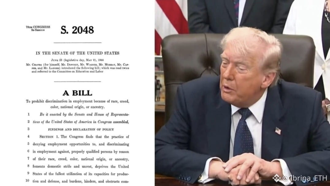
🇺🇸 لا تتضمن جدول أعمال مجلس الشيوخ الأمريكي حاليًا إجراء تصويت على قانون Crypto CLARITY.
إليك لماذا يراقب السوق ذلك:
📈 إذا تم تمريره، يتوقع كثيرون أنه قد يكون محفزًا صعوديًا رئيسيًا للبيتكوين.
📉 إذا فشل أو تم تأجيله، فقد تتحول المعنويات إلى سلبية عبر سوق العملات المشفرة.
حاليًا، تقوم Kalshi بتسعير احتمال بنسبة 33% فقط بأن يتم اعتماد مشروع القانون هذا العام.
تذكر: يلزم 60 صوتًا في مجلس الشيوخ لتمريره.
في الوقت الحالي، لا يبدو الأمر أخبارًا جيدة للعملات المشفرة.
$BICO $VIC
#BREAKING #news #TRUMP
21
1
90
133k
·
--
صاعد
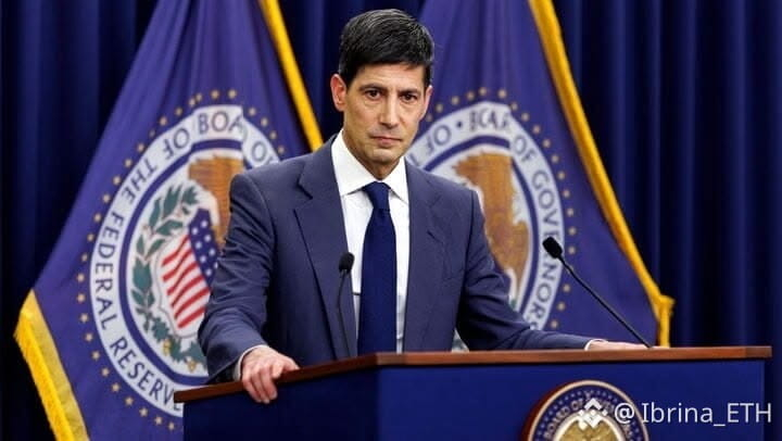
عاجل: أدّت فرص العمل في الولايات المتحدة إلى نتائج مفاجئة؛ إذ بلغت 7.079 مليون، أقل من التوقعات البالغة 7.230 مليون.
وتمثل هذه فجوة تقارب 151 ألف فرصة عمل، كما أنها إشارة أخرى إلى أن الطلب على العمالة يتباطأ. الجزء المهم ليس الرقم الرئيسي فحسب. فقد انخفضت فرص العمل بمقدار 256 ألفًا مقارنةً بأرقام يوليو المُعدَّلة والتي بلغت 7.335 مليون، بينما تراجَع معدل الوظائف الشاغرة إلى 4.3%. وفي الوقت نفسه، زادت عمليات التوظيف بشكل طفيف فعلًا، بينما انخفضت حالات التسريح، لذا لا يبدو المشهد وكأنه اقتصاد ينهار فجأة.
ومع ذلك، فإن الاتجاه مهم. فربما يؤدي سوق عمل أضعف إلى تقليل الضغط على نمو الأجور، وقد يمنح الاحتياطي الفيدرالي مساحة أكبر للنظر في سياسة أكثر تساهلًا إذا استمرت بوادر الضعف. وبالنسبة للأصول ذات المخاطر مثل البيتكوين والقطاع الرقمي (كريبتو)، فإن السؤال المحوري هو ما إذا كان ضعف الطلب على التوظيف سيترجم في النهاية إلى انخفاض العوائد وتراجع قيمة الدولار. وحتى الآن، أصف هذا على أنه مؤشر لتبريد سوق العمل، وليس مؤشرًا على ركود. الاختبار الرئيسي المقبل هو ما إذا كانت بيانات التوظيف والتضخم المقبلة تؤكد هذا الاتجاه التبطيئي أم تُظهر أن سوق العمل ما يزال مرنًا.
$BTC $XAUT $SOL
عاجل: أدّت فرص العمل في الولايات المتحدة إلى نتائج مفاجئة؛ إذ بلغت 7.079 مليون، أقل من التوقعات البالغة 7.230 مليون.
وتمثل هذه فجوة تقارب 151 ألف فرصة عمل، كما أنها إشارة أخرى إلى أن الطلب على العمالة يتباطأ. الجزء المهم ليس الرقم الرئيسي فحسب. فقد انخفضت فرص العمل بمقدار 256 ألفًا مقارنةً بأرقام يوليو المُعدَّلة والتي بلغت 7.335 مليون، بينما تراجَع معدل الوظائف الشاغرة إلى 4.3%. وفي الوقت نفسه، زادت عمليات التوظيف بشكل طفيف فعلًا، بينما انخفضت حالات التسريح، لذا لا يبدو المشهد وكأنه اقتصاد ينهار فجأة.
ومع ذلك، فإن الاتجاه مهم. فربما يؤدي سوق عمل أضعف إلى تقليل الضغط على نمو الأجور، وقد يمنح الاحتياطي الفيدرالي مساحة أكبر للنظر في سياسة أكثر تساهلًا إذا استمرت بوادر الضعف. وبالنسبة للأصول ذات المخاطر مثل البيتكوين والقطاع الرقمي (كريبتو)، فإن السؤال المحوري هو ما إذا كان ضعف الطلب على التوظيف سيترجم في النهاية إلى انخفاض العوائد وتراجع قيمة الدولار. وحتى الآن، أصف هذا على أنه مؤشر لتبريد سوق العمل، وليس مؤشرًا على ركود. الاختبار الرئيسي المقبل هو ما إذا كانت بيانات التوظيف والتضخم المقبلة تؤكد هذا الاتجاه التبطيئي أم تُظهر أن سوق العمل ما يزال مرنًا.
$BTC $XAUT $SOL
وتمثل هذه فجوة تقارب 151 ألف فرصة عمل، كما أنها إشارة أخرى إلى أن الطلب على العمالة يتباطأ. الجزء المهم ليس الرقم الرئيسي فحسب. فقد انخفضت فرص العمل بمقدار 256 ألفًا مقارنةً بأرقام يوليو المُعدَّلة والتي بلغت 7.335 مليون، بينما تراجَع معدل الوظائف الشاغرة إلى 4.3%. وفي الوقت نفسه، زادت عمليات التوظيف بشكل طفيف فعلًا، بينما انخفضت حالات التسريح، لذا لا يبدو المشهد وكأنه اقتصاد ينهار فجأة.
ومع ذلك، فإن الاتجاه مهم. فربما يؤدي سوق عمل أضعف إلى تقليل الضغط على نمو الأجور، وقد يمنح الاحتياطي الفيدرالي مساحة أكبر للنظر في سياسة أكثر تساهلًا إذا استمرت بوادر الضعف. وبالنسبة للأصول ذات المخاطر مثل البيتكوين والقطاع الرقمي (كريبتو)، فإن السؤال المحوري هو ما إذا كان ضعف الطلب على التوظيف سيترجم في النهاية إلى انخفاض العوائد وتراجع قيمة الدولار. وحتى الآن، أصف هذا على أنه مؤشر لتبريد سوق العمل، وليس مؤشرًا على ركود. الاختبار الرئيسي المقبل هو ما إذا كانت بيانات التوظيف والتضخم المقبلة تؤكد هذا الاتجاه التبطيئي أم تُظهر أن سوق العمل ما يزال مرنًا.
$BTC $XAUT $SOL
238
·
--
صاعد
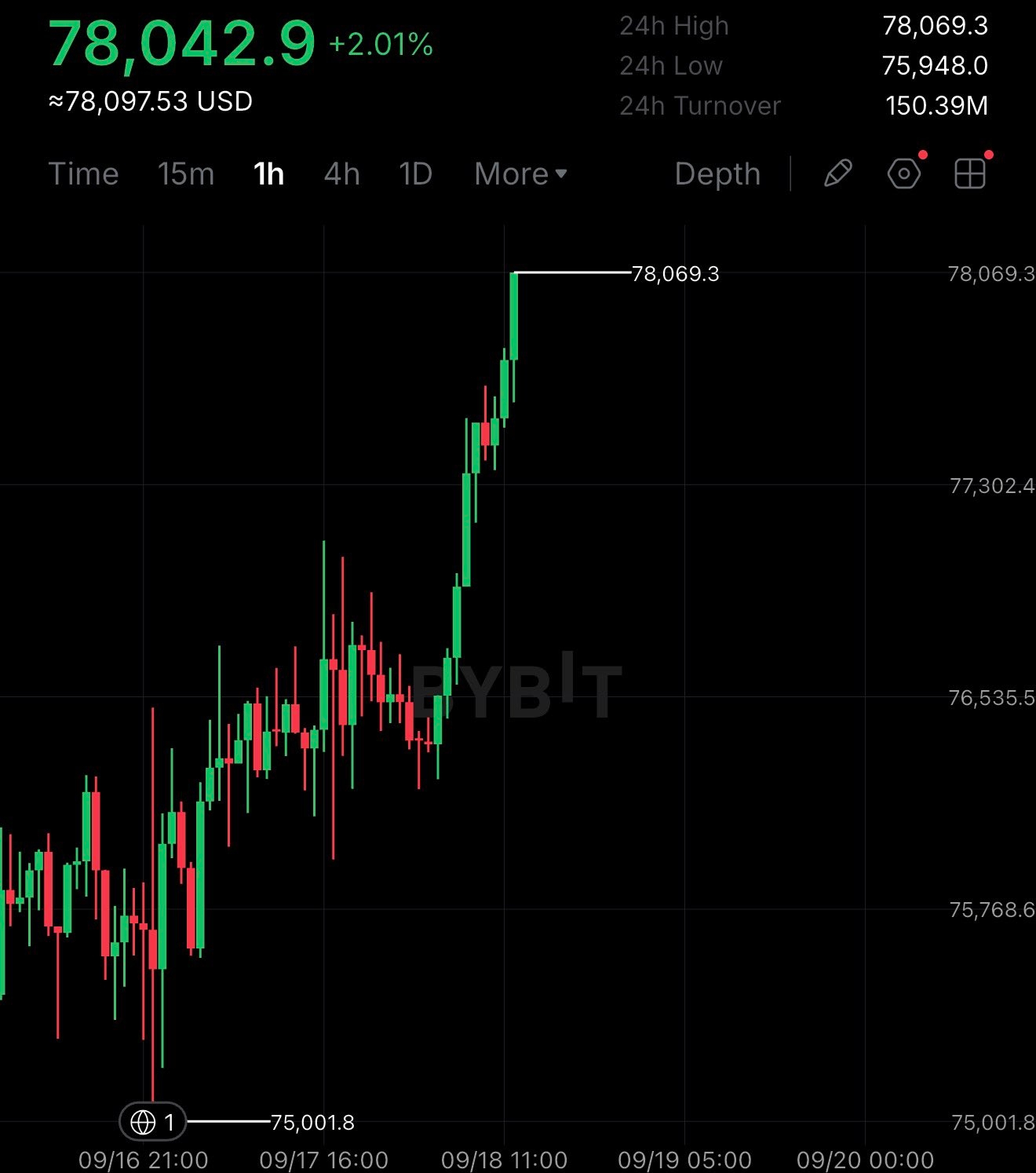
بيتكوين وصلت للتو إلى 78 ألف دولار — وأنا أراقب التفاعل، لا الرقم
حسنًا، هذه الحركة لفتت انتباهي.
دفعت بيتكوين للتو إلى منطقة 78,000 دولار، مع إظهار الرسم البياني لقمّة قرب 78,069 دولار.
لكن عند النظر إلى شموع إطار 1H، ما لاحظته لم يكن مجرد “BTC ترتفع”.
كانت BTC تتحرّك جانبيًا حول نطاق 76 ألف–77 ألف دولار لفترة. الكثير من التذبذب، بعض المحاولات الفاشلة، ثم فجأة بدأت ضغوط الشراء تزداد.
وبمجرد أن اخترقت BTC هذا النطاق، أصبحت الشموع أقوى بكثير.
وهذا الجزء هو ما أحب مراقبته.
ليس لأنه يضمن شيئًا — فهو لا يضمن.
لكن لأن السعر أخيرًا خرج من النطاق الذي كان عالقًا داخله.
الآن يأتي الجزء الصعب.
هل يمكن لبيتكوين فعلًا أن تثبت هذه المستويات الأعلى؟
إذا دافع المشترون عن منطقة الاختراق، فقد يصبح ذلك تحولًا مثيرًا للاهتمام في البنية قصيرة المدى.
لكن إذا عادت BTC بسرعة إلى النطاق القديم، عندها يجب النظر إلى هذا الاختراق بشكل مختلف.
لذلك لا أحتفل بعد بـ 78 ألف دولار.
أنا أراقب ما الذي يحدث بعد 78 ألف.
لأن كسر مستوى شيء واحد.
والاحتفاظ به شيء آخر.
$BTC
{future}(BTCUSDT)
بيتكوين وصلت للتو إلى 78 ألف دولار — وأنا أراقب التفاعل، لا الرقم
حسنًا، هذه الحركة لفتت انتباهي.
دفعت بيتكوين للتو إلى منطقة 78,000 دولار، مع إظهار الرسم البياني لقمّة قرب 78,069 دولار.
لكن عند النظر إلى شموع إطار 1H، ما لاحظته لم يكن مجرد “BTC ترتفع”.
كانت BTC تتحرّك جانبيًا حول نطاق 76 ألف–77 ألف دولار لفترة. الكثير من التذبذب، بعض المحاولات الفاشلة، ثم فجأة بدأت ضغوط الشراء تزداد.
وبمجرد أن اخترقت BTC هذا النطاق، أصبحت الشموع أقوى بكثير.
وهذا الجزء هو ما أحب مراقبته.
ليس لأنه يضمن شيئًا — فهو لا يضمن.
لكن لأن السعر أخيرًا خرج من النطاق الذي كان عالقًا داخله.
الآن يأتي الجزء الصعب.
هل يمكن لبيتكوين فعلًا أن تثبت هذه المستويات الأعلى؟
إذا دافع المشترون عن منطقة الاختراق، فقد يصبح ذلك تحولًا مثيرًا للاهتمام في البنية قصيرة المدى.
لكن إذا عادت BTC بسرعة إلى النطاق القديم، عندها يجب النظر إلى هذا الاختراق بشكل مختلف.
لذلك لا أحتفل بعد بـ 78 ألف دولار.
أنا أراقب ما الذي يحدث بعد 78 ألف.
لأن كسر مستوى شيء واحد.
والاحتفاظ به شيء آخر.
$BTC
حسنًا، هذه الحركة لفتت انتباهي.
دفعت بيتكوين للتو إلى منطقة 78,000 دولار، مع إظهار الرسم البياني لقمّة قرب 78,069 دولار.
لكن عند النظر إلى شموع إطار 1H، ما لاحظته لم يكن مجرد “BTC ترتفع”.
كانت BTC تتحرّك جانبيًا حول نطاق 76 ألف–77 ألف دولار لفترة. الكثير من التذبذب، بعض المحاولات الفاشلة، ثم فجأة بدأت ضغوط الشراء تزداد.
وبمجرد أن اخترقت BTC هذا النطاق، أصبحت الشموع أقوى بكثير.
وهذا الجزء هو ما أحب مراقبته.
ليس لأنه يضمن شيئًا — فهو لا يضمن.
لكن لأن السعر أخيرًا خرج من النطاق الذي كان عالقًا داخله.
الآن يأتي الجزء الصعب.
هل يمكن لبيتكوين فعلًا أن تثبت هذه المستويات الأعلى؟
إذا دافع المشترون عن منطقة الاختراق، فقد يصبح ذلك تحولًا مثيرًا للاهتمام في البنية قصيرة المدى.
لكن إذا عادت BTC بسرعة إلى النطاق القديم، عندها يجب النظر إلى هذا الاختراق بشكل مختلف.
لذلك لا أحتفل بعد بـ 78 ألف دولار.
أنا أراقب ما الذي يحدث بعد 78 ألف.
لأن كسر مستوى شيء واحد.
والاحتفاظ به شيء آخر.
$BTC
2
2.4k
·
--
تمّ التحقق
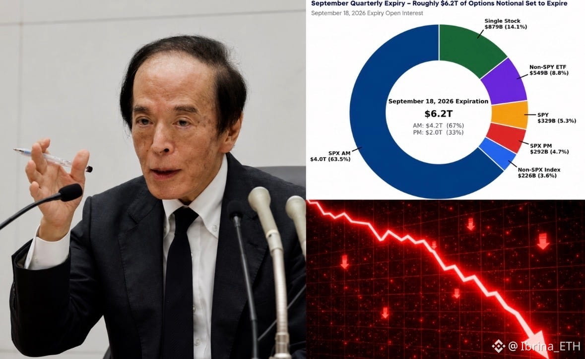
بنك اليابان أرسل إشارة حازمة، قائلاً إنه سيواصل رفع أسعار الفائدة مع تطور الاقتصاد والتضخم.
أبرز النقاط:
1. صوت بنك اليابان 7-2 لصالح رفع أسعار الفائدة إلى 1.25%.
2. يحذر بنك اليابان من أن التضخم الأساسي قد يرتفع فوق هدفه البالغ 2%.
3. يتسع ضغط التضخم من أسعار المنتجين إلى أسعار المستهلكين.
4. تستمر توقعات التضخم في الارتفاع.
5. تُنقل زيادات الأجور بشكل متزايد إلى أسعار البيع.
6. يضيف ضعف الين وارتفاع أسعار النفط وارتفاع الطلب المرتبط بالذكاء الاصطناعي ضغطاً على التضخم.
7. لا يزال اقتصاد اليابان يتعافى بشكل معتدل، مدعوماً بالعمالة ونمو الدخل والطلب المرتبط بالذكاء الاصطناعي.
8. من المتوقع أن يتسارع مؤشر أسعار المستهلكين بوضوح فوق 2% من النصف الثاني من السنة المالية 2026.
9. لا يزال بنك اليابان يقول إن الظروف المالية تظل ميسّرة رغم الزيادة.
10. ستعتمد الزيادات المستقبلية على النشاط الاقتصادي والأسعار والظروف المالية.
سيتم مراقبة تصريحات محافظ البنك أويدا عن كثب للحصول على تلميحات حول توقيت وتيرة المزيد من الزيادات.
$BTC $ETH
بنك اليابان أرسل إشارة حازمة، قائلاً إنه سيواصل رفع أسعار الفائدة مع تطور الاقتصاد والتضخم.
أبرز النقاط:
1. صوت بنك اليابان 7-2 لصالح رفع أسعار الفائدة إلى 1.25%.
2. يحذر بنك اليابان من أن التضخم الأساسي قد يرتفع فوق هدفه البالغ 2%.
3. يتسع ضغط التضخم من أسعار المنتجين إلى أسعار المستهلكين.
4. تستمر توقعات التضخم في الارتفاع.
5. تُنقل زيادات الأجور بشكل متزايد إلى أسعار البيع.
6. يضيف ضعف الين وارتفاع أسعار النفط وارتفاع الطلب المرتبط بالذكاء الاصطناعي ضغطاً على التضخم.
7. لا يزال اقتصاد اليابان يتعافى بشكل معتدل، مدعوماً بالعمالة ونمو الدخل والطلب المرتبط بالذكاء الاصطناعي.
8. من المتوقع أن يتسارع مؤشر أسعار المستهلكين بوضوح فوق 2% من النصف الثاني من السنة المالية 2026.
9. لا يزال بنك اليابان يقول إن الظروف المالية تظل ميسّرة رغم الزيادة.
10. ستعتمد الزيادات المستقبلية على النشاط الاقتصادي والأسعار والظروف المالية.
سيتم مراقبة تصريحات محافظ البنك أويدا عن كثب للحصول على تلميحات حول توقيت وتيرة المزيد من الزيادات.
$BTC $ETH
أبرز النقاط:
1. صوت بنك اليابان 7-2 لصالح رفع أسعار الفائدة إلى 1.25%.
2. يحذر بنك اليابان من أن التضخم الأساسي قد يرتفع فوق هدفه البالغ 2%.
3. يتسع ضغط التضخم من أسعار المنتجين إلى أسعار المستهلكين.
4. تستمر توقعات التضخم في الارتفاع.
5. تُنقل زيادات الأجور بشكل متزايد إلى أسعار البيع.
6. يضيف ضعف الين وارتفاع أسعار النفط وارتفاع الطلب المرتبط بالذكاء الاصطناعي ضغطاً على التضخم.
7. لا يزال اقتصاد اليابان يتعافى بشكل معتدل، مدعوماً بالعمالة ونمو الدخل والطلب المرتبط بالذكاء الاصطناعي.
8. من المتوقع أن يتسارع مؤشر أسعار المستهلكين بوضوح فوق 2% من النصف الثاني من السنة المالية 2026.
9. لا يزال بنك اليابان يقول إن الظروف المالية تظل ميسّرة رغم الزيادة.
10. ستعتمد الزيادات المستقبلية على النشاط الاقتصادي والأسعار والظروف المالية.
سيتم مراقبة تصريحات محافظ البنك أويدا عن كثب للحصول على تلميحات حول توقيت وتيرة المزيد من الزيادات.
$BTC $ETH
3
1.7k
·
--
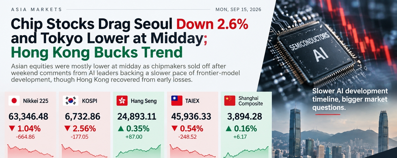
مقالة
تحول تراجع أسهم الرقائق في آسيا إلى اختبار أوسع لمعنويات المخاطربدأت الأسواق الآسيوية يوم الاثنين تحت ضغط بعد أن رد المستثمرون على دعوات من كبرى شركات الذكاء الاصطناعي لوتيرة أبطأ لتطوير نماذج الجيل المتقدم. وأثرت هذه الخطوة بقوة خاصة على أسهم أشباه الموصلات الحساسة للذكاء الاصطناعي: انخفضت SK Hynix بنحو 5.3%، وتراجعت Samsung Electronics بنحو 3.4%–3.7%، بينما ضعفت أيضًا مؤشرات نيكّي في اليابان. وتذكر رويترز أن البيع جاء عقب تعليقات من قيادات أنثروبي وOpenAI وxAI حول سلامة الذكاء الاصطناعي وتيرة التطوير.
رأيي
ما أجد مثيرًا للاهتمام هنا هو أن السوق لا يبيع “الذكاء الاصطناعي” نفسه حقًا — بل يبيع توقعَ مدى سرعة استمرار نمو الإنفاق على الذكاء الاصطناعي.
تحول تراجع أسهم الرقائق في آسيا إلى اختبار أوسع لمعنويات المخاطر
بدأت الأسواق الآسيوية يوم الاثنين تحت ضغط بعد أن رد المستثمرون على دعوات من كبرى شركات الذكاء الاصطناعي لوتيرة أبطأ لتطوير نماذج الجيل المتقدم. وأثرت هذه الخطوة بقوة خاصة على أسهم أشباه الموصلات الحساسة للذكاء الاصطناعي: انخفضت SK Hynix بنحو 5.3%، وتراجعت Samsung Electronics بنحو 3.4%–3.7%، بينما ضعفت أيضًا مؤشرات نيكّي في اليابان. وتذكر رويترز أن البيع جاء عقب تعليقات من قيادات أنثروبي وOpenAI وxAI حول سلامة الذكاء الاصطناعي وتيرة التطوير.
رأيي
ما أجد مثيرًا للاهتمام هنا هو أن السوق لا يبيع “الذكاء الاصطناعي” نفسه حقًا — بل يبيع توقعَ مدى سرعة استمرار نمو الإنفاق على الذكاء الاصطناعي.
رأيي
ما أجد مثيرًا للاهتمام هنا هو أن السوق لا يبيع “الذكاء الاصطناعي” نفسه حقًا — بل يبيع توقعَ مدى سرعة استمرار نمو الإنفاق على الذكاء الاصطناعي.
1
283
·
--
صاعد
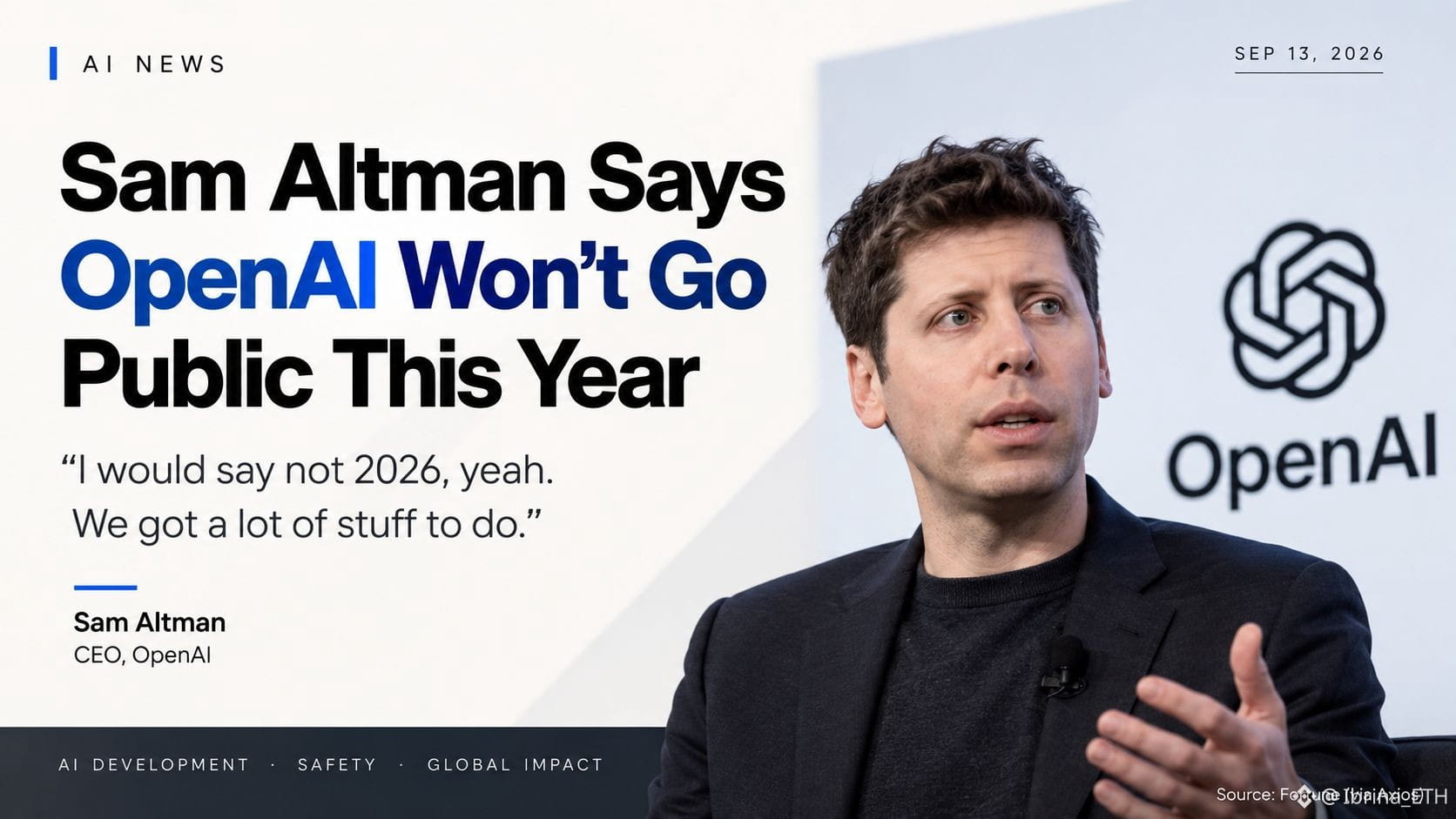
تأجيل طرح OpenAI للاكتتاب — السلامة أولاً
يقول الرئيس التنفيذي لشركة OpenAI، سام ألتمان، إن الشركة لن تطرح للاكتتاب العام في عام 2026، موضحًا أن البيئة الحالية المتعلقة بسلامة الذكاء الاصطناعي تجعل خطوة الاكتتاب العام «غير مستحسنة». وأضاف أن لدى OpenAI ما يزال عملًا كبيرًا يتعين إنجازه فيما يخص السلامة، والمواءمة (alignment)، والتعاون بين الصناعة والحكومات.
ما جذب انتباهي ليس مجرد تأجيل الاكتتاب. بل هو سبب اتخاذ القرار. كانت OpenAI قد قدمت بالفعل في وقت سابق من هذا العام أوراقًا للاكتتاب العام بشكل سري، لذا فهذا يوضح أن الخروج إلى العلن لا يتعلق فقط بامتلاك رأس مال كافٍ أو طلب المستثمرين. كما يتعين على الشركة أيضًا التعامل مع المخاطر التي تأتي مع أنظمة ذكاء اصطناعي أكثر قدرة.
لماذا يهم
إن الإدراج في سوق عام سيجلب تدقيقًا أكبر بكثير حول النمو، والإنفاق، والسلامة، وصنع القرار. إن تأجيله يمنح OpenAI مساحة أكبر للتركيز على هذه القضايا دون ضغوط فورية من ضغوط الأسواق العامة.
الأسواق ذات الصلة: قد تشهد مشاريع العملات المشفرة المرتبطة بالذكاء الاصطناعي تحولات في المعنويات بفعل التطورات الكبرى في مجال الذكاء الاصطناعي، لكن لا يوجد تأثير مباشر على الرمز (token) من هذا الإعلان وحده. وأفضل تجنب فرض ربط بين الرمز والسهم فقط بهدف زيادة التفاعل.
بالنسبة لي، السؤال الأهم هو: كيف ستوازن شركات الذكاء الاصطناعي بين التطوير الأسرع والمسؤولية التي تأتي مع النماذج الأكثر قوة بشكل متزايد؟
$TAO $RENDER $NEAR
#OpenAI #SamAltman #MarketNews
تأجيل طرح OpenAI للاكتتاب — السلامة أولاً
يقول الرئيس التنفيذي لشركة OpenAI، سام ألتمان، إن الشركة لن تطرح للاكتتاب العام في عام 2026، موضحًا أن البيئة الحالية المتعلقة بسلامة الذكاء الاصطناعي تجعل خطوة الاكتتاب العام «غير مستحسنة». وأضاف أن لدى OpenAI ما يزال عملًا كبيرًا يتعين إنجازه فيما يخص السلامة، والمواءمة (alignment)، والتعاون بين الصناعة والحكومات.
ما جذب انتباهي ليس مجرد تأجيل الاكتتاب. بل هو سبب اتخاذ القرار. كانت OpenAI قد قدمت بالفعل في وقت سابق من هذا العام أوراقًا للاكتتاب العام بشكل سري، لذا فهذا يوضح أن الخروج إلى العلن لا يتعلق فقط بامتلاك رأس مال كافٍ أو طلب المستثمرين. كما يتعين على الشركة أيضًا التعامل مع المخاطر التي تأتي مع أنظمة ذكاء اصطناعي أكثر قدرة.
لماذا يهم
إن الإدراج في سوق عام سيجلب تدقيقًا أكبر بكثير حول النمو، والإنفاق، والسلامة، وصنع القرار. إن تأجيله يمنح OpenAI مساحة أكبر للتركيز على هذه القضايا دون ضغوط فورية من ضغوط الأسواق العامة.
الأسواق ذات الصلة: قد تشهد مشاريع العملات المشفرة المرتبطة بالذكاء الاصطناعي تحولات في المعنويات بفعل التطورات الكبرى في مجال الذكاء الاصطناعي، لكن لا يوجد تأثير مباشر على الرمز (token) من هذا الإعلان وحده. وأفضل تجنب فرض ربط بين الرمز والسهم فقط بهدف زيادة التفاعل.
بالنسبة لي، السؤال الأهم هو: كيف ستوازن شركات الذكاء الاصطناعي بين التطوير الأسرع والمسؤولية التي تأتي مع النماذج الأكثر قوة بشكل متزايد؟
$TAO $RENDER $NEAR
#OpenAI #SamAltman #MarketNews
يقول الرئيس التنفيذي لشركة OpenAI، سام ألتمان، إن الشركة لن تطرح للاكتتاب العام في عام 2026، موضحًا أن البيئة الحالية المتعلقة بسلامة الذكاء الاصطناعي تجعل خطوة الاكتتاب العام «غير مستحسنة». وأضاف أن لدى OpenAI ما يزال عملًا كبيرًا يتعين إنجازه فيما يخص السلامة، والمواءمة (alignment)، والتعاون بين الصناعة والحكومات.
ما جذب انتباهي ليس مجرد تأجيل الاكتتاب. بل هو سبب اتخاذ القرار. كانت OpenAI قد قدمت بالفعل في وقت سابق من هذا العام أوراقًا للاكتتاب العام بشكل سري، لذا فهذا يوضح أن الخروج إلى العلن لا يتعلق فقط بامتلاك رأس مال كافٍ أو طلب المستثمرين. كما يتعين على الشركة أيضًا التعامل مع المخاطر التي تأتي مع أنظمة ذكاء اصطناعي أكثر قدرة.
لماذا يهم
إن الإدراج في سوق عام سيجلب تدقيقًا أكبر بكثير حول النمو، والإنفاق، والسلامة، وصنع القرار. إن تأجيله يمنح OpenAI مساحة أكبر للتركيز على هذه القضايا دون ضغوط فورية من ضغوط الأسواق العامة.
الأسواق ذات الصلة: قد تشهد مشاريع العملات المشفرة المرتبطة بالذكاء الاصطناعي تحولات في المعنويات بفعل التطورات الكبرى في مجال الذكاء الاصطناعي، لكن لا يوجد تأثير مباشر على الرمز (token) من هذا الإعلان وحده. وأفضل تجنب فرض ربط بين الرمز والسهم فقط بهدف زيادة التفاعل.
بالنسبة لي، السؤال الأهم هو: كيف ستوازن شركات الذكاء الاصطناعي بين التطوير الأسرع والمسؤولية التي تأتي مع النماذج الأكثر قوة بشكل متزايد؟
$TAO $RENDER $NEAR
#OpenAI #SamAltman #MarketNews
2
763
·
--
صاعد
$ZEC USDT يهدأ بعد الاندفاع إلى 1,217، والسعر الآن عند حوالي 1,133. على مخطط 15 دقيقة، أرى قممًا أدنى ويستقر السعر تحت MA25/MA99. الارتداد قرب 1,137 يبدو ضعيفًا حتى الآن. بالنسبة لي، هذا يجعل سيناريو الرفض أكثر إثارة من ملاحقة الحركة.
الدخول: 1,135–1,142
SL: 1,155
TP: 1,110–1,095
المخاطرة: اجعلها صغيرة؛ يُلغى إذا تجاوز 1,155.
تابعني لمزيد من صفقات الفرص والتحليل. $ZEC
{future}(ZECUSDT)
$ZEC USDT يهدأ بعد الاندفاع إلى 1,217، والسعر الآن عند حوالي 1,133. على مخطط 15 دقيقة، أرى قممًا أدنى ويستقر السعر تحت MA25/MA99. الارتداد قرب 1,137 يبدو ضعيفًا حتى الآن. بالنسبة لي، هذا يجعل سيناريو الرفض أكثر إثارة من ملاحقة الحركة.
الدخول: 1,135–1,142
SL: 1,155
TP: 1,110–1,095
المخاطرة: اجعلها صغيرة؛ يُلغى إذا تجاوز 1,155.
تابعني لمزيد من صفقات الفرص والتحليل. $ZEC
الدخول: 1,135–1,142
SL: 1,155
TP: 1,110–1,095
المخاطرة: اجعلها صغيرة؛ يُلغى إذا تجاوز 1,155.
تابعني لمزيد من صفقات الفرص والتحليل. $ZEC

1
2
1.1k
·
--
ما زال $BTC perp USDT يكافح لاستعادة منطقة 77.2K–77.5K على مخطط الساعة (1h). ما يلفت انتباهي هو البنية الأوسع للقمم الدنيا بعد 80.5K، في حين يبقى السعر تحت جميع المتوسطات المتحركة الثلاثة. أميل إلى البيع فقط إذا تم رفض هذه المنطقة مرة أخرى، وليس بيعًا أعمى عند السعر الحالي.
الدخول: 77,200–77,450
وقف الخسارة (SL): 77,850
الأهداف (TP): 76,500–76,000
المخاطرة صغيرة؛ الإلغاء يكون فوق مستوى المقاومة.
تابعني لمزيد من إعدادات التداول والتحليل.
ما زال $BTC perp USDT يكافح لاستعادة منطقة 77.2K–77.5K على مخطط الساعة (1h). ما يلفت انتباهي هو البنية الأوسع للقمم الدنيا بعد 80.5K، في حين يبقى السعر تحت جميع المتوسطات المتحركة الثلاثة. أميل إلى البيع فقط إذا تم رفض هذه المنطقة مرة أخرى، وليس بيعًا أعمى عند السعر الحالي.
الدخول: 77,200–77,450
وقف الخسارة (SL): 77,850
الأهداف (TP): 76,500–76,000
المخاطرة صغيرة؛ الإلغاء يكون فوق مستوى المقاومة.
تابعني لمزيد من إعدادات التداول والتحليل.
الدخول: 77,200–77,450
وقف الخسارة (SL): 77,850
الأهداف (TP): 76,500–76,000
المخاطرة صغيرة؛ الإلغاء يكون فوق مستوى المقاومة.
تابعني لمزيد من إعدادات التداول والتحليل.
114
·
--
صاعد
تمّ التحقق
🇺🇸 مؤشر أسعار المستهلك الأمريكي (CPI) هو الرقم الذي أتابعه اليوم.
تقرير التضخم لشهر أغسطس مقرر في الساعة 8:30 صباحًا بتوقيت شرق الولايات المتحدة، ومن المتوقع أن يبلغ معدل التضخم الرئيسي نحو 3.4% على أساس سنوي، مطابقًا لقراءة شهر يوليو.
ما شد انتباهي هو أن السوق لا ينتظر فقط “3.4% من عدمه”. بعد بيانات مؤشر أسعار المنتجين (PPI) الأكثر سخونة أمس، ومع اقتراب اجتماع الاحتياطي الفيدرالي القادم، فإن أي مفاجأة بسيطة صعودًا قد تغيّر توقعات أسعار الفائدة بسرعة.
وبالنسبة للعملات الرقمية، سأراقب أولًا $BTC ثم تفاعل السوق الأوسع.
قد يدعم رقم أقل من المتوقع الأصول ذات المخاطر، بينما قد يؤدي ارتفاع التضخم إلى مزيد من الضغط عبر العوائد وتوقعات الفيدرالي. لكنني لن أفترض حدوث ضخّ أو تفريغ مباشر بخط مستقيم من العنوان وحده.
السؤال الحقيقي بالنسبة لي: هل يغيّر مؤشر CPI نظرة السوق لما سيفعله الاحتياطي الفيدرالي بعد ذلك؟
سأراقب الإصدار الفعلي بدلًا من مطاردة الشمعة الأولى. ما الأهم بالنسبة لك اليوم — مؤشر CPI الرئيسي أم مؤشر CPI الأساسي؟
#CPIWatch
🇺🇸 مؤشر أسعار المستهلك الأمريكي (CPI) هو الرقم الذي أتابعه اليوم.
تقرير التضخم لشهر أغسطس مقرر في الساعة 8:30 صباحًا بتوقيت شرق الولايات المتحدة، ومن المتوقع أن يبلغ معدل التضخم الرئيسي نحو 3.4% على أساس سنوي، مطابقًا لقراءة شهر يوليو.
ما شد انتباهي هو أن السوق لا ينتظر فقط “3.4% من عدمه”. بعد بيانات مؤشر أسعار المنتجين (PPI) الأكثر سخونة أمس، ومع اقتراب اجتماع الاحتياطي الفيدرالي القادم، فإن أي مفاجأة بسيطة صعودًا قد تغيّر توقعات أسعار الفائدة بسرعة.
وبالنسبة للعملات الرقمية، سأراقب أولًا $BTC ثم تفاعل السوق الأوسع.
قد يدعم رقم أقل من المتوقع الأصول ذات المخاطر، بينما قد يؤدي ارتفاع التضخم إلى مزيد من الضغط عبر العوائد وتوقعات الفيدرالي. لكنني لن أفترض حدوث ضخّ أو تفريغ مباشر بخط مستقيم من العنوان وحده.
السؤال الحقيقي بالنسبة لي: هل يغيّر مؤشر CPI نظرة السوق لما سيفعله الاحتياطي الفيدرالي بعد ذلك؟
سأراقب الإصدار الفعلي بدلًا من مطاردة الشمعة الأولى. ما الأهم بالنسبة لك اليوم — مؤشر CPI الرئيسي أم مؤشر CPI الأساسي؟
#CPIWatch
تقرير التضخم لشهر أغسطس مقرر في الساعة 8:30 صباحًا بتوقيت شرق الولايات المتحدة، ومن المتوقع أن يبلغ معدل التضخم الرئيسي نحو 3.4% على أساس سنوي، مطابقًا لقراءة شهر يوليو.
ما شد انتباهي هو أن السوق لا ينتظر فقط “3.4% من عدمه”. بعد بيانات مؤشر أسعار المنتجين (PPI) الأكثر سخونة أمس، ومع اقتراب اجتماع الاحتياطي الفيدرالي القادم، فإن أي مفاجأة بسيطة صعودًا قد تغيّر توقعات أسعار الفائدة بسرعة.
وبالنسبة للعملات الرقمية، سأراقب أولًا $BTC ثم تفاعل السوق الأوسع.
قد يدعم رقم أقل من المتوقع الأصول ذات المخاطر، بينما قد يؤدي ارتفاع التضخم إلى مزيد من الضغط عبر العوائد وتوقعات الفيدرالي. لكنني لن أفترض حدوث ضخّ أو تفريغ مباشر بخط مستقيم من العنوان وحده.
السؤال الحقيقي بالنسبة لي: هل يغيّر مؤشر CPI نظرة السوق لما سيفعله الاحتياطي الفيدرالي بعد ذلك؟
سأراقب الإصدار الفعلي بدلًا من مطاردة الشمعة الأولى. ما الأهم بالنسبة لك اليوم — مؤشر CPI الرئيسي أم مؤشر CPI الأساسي؟
#CPIWatch

4
628
·
--
🚨 عاجل: تم العثور على مسودة جديدة (مسودة محدثة) من قانون «CLARITY» الجمهوري في مجلس الشيوخ الأمريكي — ويُقال إنها تتضمن 100+ تعديل.
جزء لفت انتباهي: أحكام جديدة تتعلق بالـ DeFi، إلى جانب مقترح لمعالجة المخاوف التي أثارتها الاتحادات الائتمانية.
هذا تحديث ذو أهمية كبيرة.
والسؤال الأوسع الآن ليس ما الذي يتضمنه المشروع…
بل مدى سرعة تمكن المشرّعين من المضي قدمًا به فعليًا.
تنظيم العملات المشفرة في الولايات المتحدة عالق منذ فترة في منطقة «قريبًا».
هل يمكن أن تكون هذه هي النسخة التي تحصل أخيرًا على دعم كافٍ للانتقال بها؟
حان وقت تمريره. 🇺🇸
$ETH $UNI $AAVE
#CPIWatch
🚨 عاجل: تم العثور على مسودة جديدة (مسودة محدثة) من قانون «CLARITY» الجمهوري في مجلس الشيوخ الأمريكي — ويُقال إنها تتضمن 100+ تعديل.
جزء لفت انتباهي: أحكام جديدة تتعلق بالـ DeFi، إلى جانب مقترح لمعالجة المخاوف التي أثارتها الاتحادات الائتمانية.
هذا تحديث ذو أهمية كبيرة.
والسؤال الأوسع الآن ليس ما الذي يتضمنه المشروع…
بل مدى سرعة تمكن المشرّعين من المضي قدمًا به فعليًا.
تنظيم العملات المشفرة في الولايات المتحدة عالق منذ فترة في منطقة «قريبًا».
هل يمكن أن تكون هذه هي النسخة التي تحصل أخيرًا على دعم كافٍ للانتقال بها؟
حان وقت تمريره. 🇺🇸
$ETH $UNI $AAVE
#CPIWatch
جزء لفت انتباهي: أحكام جديدة تتعلق بالـ DeFi، إلى جانب مقترح لمعالجة المخاوف التي أثارتها الاتحادات الائتمانية.
هذا تحديث ذو أهمية كبيرة.
والسؤال الأوسع الآن ليس ما الذي يتضمنه المشروع…
بل مدى سرعة تمكن المشرّعين من المضي قدمًا به فعليًا.
تنظيم العملات المشفرة في الولايات المتحدة عالق منذ فترة في منطقة «قريبًا».
هل يمكن أن تكون هذه هي النسخة التي تحصل أخيرًا على دعم كافٍ للانتقال بها؟
حان وقت تمريره. 🇺🇸
$ETH $UNI $AAVE
#CPIWatch

1
3
687
·
--
صاعد
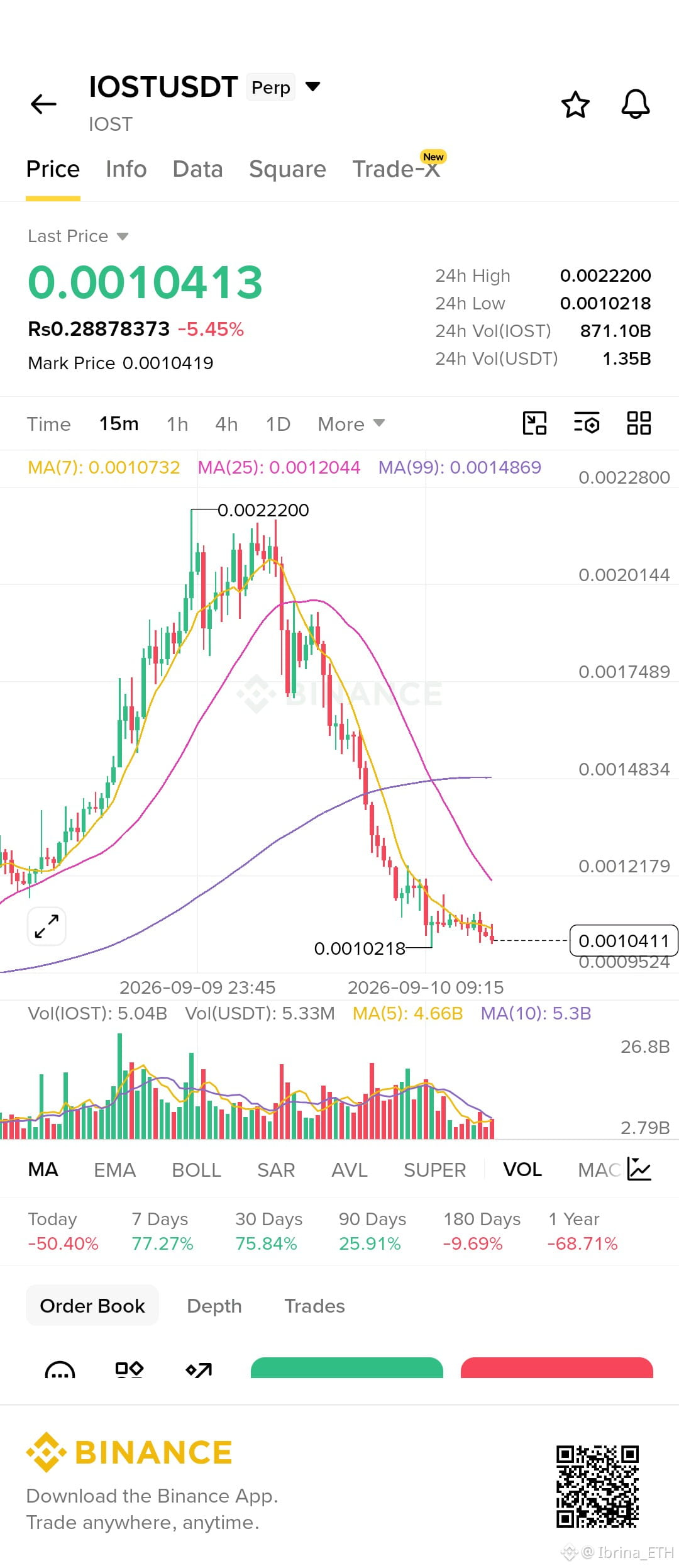
$IOST /USDT — إعداد قصير لمدة 15 دقيقة
أنا أميل إلى الدخول في صفقة بيع بعد ارتداد بهدف تخفيف، وليس محاولة اللحاق بصفقة طويلة هنا.
البنية واضحة إلى حد كبير: بعد القمة عند 0.0022200، تم طباعة قمم أدنى وقاع أدنى طوال الطريق نزولاً حتى 0.0010218. كما أن السعر يتداول تحت المتوسطات المتحركة MA(7) عند 0.0010732 وMA(25) عند 0.0012044 وMA(99) عند 0.0014869. هذا يحافظ على الزخم هابطاً بالنسبة لي بشكل قوي.
ما لا يعجبني في البيع عند 0.0010413 هو أننا بالفعل قريبون من القاع الأخير. أفضل أن أترك السعر يعود أولاً إلى منطقة السيولة/المقاومة.
خطتي الشرطية:
منطقة الدخول: 0.00110–0.00118
التأكيد: ارتداد إلى هذه المنطقة مع رفض، ثم إغلاق شمعة على إطار 15 دقيقة مرة أخرى تحت ~0.00110 مع زيادة حجم البيع.
SL: 0.00125
TP1: 0.0010218 — القاع الأخير/السيولة
TP2: 0.0009524
TP3: 0.0009000
TP4: 0.0008400
باستخدام دخول تقريبي 0.00114 وSL عند 0.00125، فإن نسبة المخاطرة إلى العائد التقريبية هي: 1:1.1 / 1:1.7 / 1:2.2 / 1:2.7.
كان حجم التداول ثقيلاً أثناء موجة البيع، لكنه يبرد الآن بالقرب من القيعان. هذا يجعلني حذراً من المطاردة — اختراق سيولة حول 0.00102 ثم إعادة الاستحواذ قد يغيّر إعداد الصفقة بالكامل.
الإبطال: إذا حصلت على استعادة قوية لإغلاق 15 دقيقة فوق 0.00125، خصوصاً مع اتساع حجم الشموع الخضراء، سأخرج من فكرة الصفقة القصيرة. أفضل أن أفوت الحركة من أن أقاوم تحولاً هيكلياً مؤكداً.
لا يوجد دخول بالنسبة لي حتى يظهر فعلاً الارتداد + الرفض. هذه خطة تداول شرطية وليست إشارة مضمونة.
$IOST
{future}(IOSTUSDT)
$IOST /USDT — إعداد قصير لمدة 15 دقيقة
أنا أميل إلى الدخول في صفقة بيع بعد ارتداد بهدف تخفيف، وليس محاولة اللحاق بصفقة طويلة هنا.
البنية واضحة إلى حد كبير: بعد القمة عند 0.0022200، تم طباعة قمم أدنى وقاع أدنى طوال الطريق نزولاً حتى 0.0010218. كما أن السعر يتداول تحت المتوسطات المتحركة MA(7) عند 0.0010732 وMA(25) عند 0.0012044 وMA(99) عند 0.0014869. هذا يحافظ على الزخم هابطاً بالنسبة لي بشكل قوي.
ما لا يعجبني في البيع عند 0.0010413 هو أننا بالفعل قريبون من القاع الأخير. أفضل أن أترك السعر يعود أولاً إلى منطقة السيولة/المقاومة.
خطتي الشرطية:
منطقة الدخول: 0.00110–0.00118
التأكيد: ارتداد إلى هذه المنطقة مع رفض، ثم إغلاق شمعة على إطار 15 دقيقة مرة أخرى تحت ~0.00110 مع زيادة حجم البيع.
SL: 0.00125
TP1: 0.0010218 — القاع الأخير/السيولة
TP2: 0.0009524
TP3: 0.0009000
TP4: 0.0008400
باستخدام دخول تقريبي 0.00114 وSL عند 0.00125، فإن نسبة المخاطرة إلى العائد التقريبية هي: 1:1.1 / 1:1.7 / 1:2.2 / 1:2.7.
كان حجم التداول ثقيلاً أثناء موجة البيع، لكنه يبرد الآن بالقرب من القيعان. هذا يجعلني حذراً من المطاردة — اختراق سيولة حول 0.00102 ثم إعادة الاستحواذ قد يغيّر إعداد الصفقة بالكامل.
الإبطال: إذا حصلت على استعادة قوية لإغلاق 15 دقيقة فوق 0.00125، خصوصاً مع اتساع حجم الشموع الخضراء، سأخرج من فكرة الصفقة القصيرة. أفضل أن أفوت الحركة من أن أقاوم تحولاً هيكلياً مؤكداً.
لا يوجد دخول بالنسبة لي حتى يظهر فعلاً الارتداد + الرفض. هذه خطة تداول شرطية وليست إشارة مضمونة.
$IOST
أنا أميل إلى الدخول في صفقة بيع بعد ارتداد بهدف تخفيف، وليس محاولة اللحاق بصفقة طويلة هنا.
البنية واضحة إلى حد كبير: بعد القمة عند 0.0022200، تم طباعة قمم أدنى وقاع أدنى طوال الطريق نزولاً حتى 0.0010218. كما أن السعر يتداول تحت المتوسطات المتحركة MA(7) عند 0.0010732 وMA(25) عند 0.0012044 وMA(99) عند 0.0014869. هذا يحافظ على الزخم هابطاً بالنسبة لي بشكل قوي.
ما لا يعجبني في البيع عند 0.0010413 هو أننا بالفعل قريبون من القاع الأخير. أفضل أن أترك السعر يعود أولاً إلى منطقة السيولة/المقاومة.
خطتي الشرطية:
منطقة الدخول: 0.00110–0.00118
التأكيد: ارتداد إلى هذه المنطقة مع رفض، ثم إغلاق شمعة على إطار 15 دقيقة مرة أخرى تحت ~0.00110 مع زيادة حجم البيع.
SL: 0.00125
TP1: 0.0010218 — القاع الأخير/السيولة
TP2: 0.0009524
TP3: 0.0009000
TP4: 0.0008400
باستخدام دخول تقريبي 0.00114 وSL عند 0.00125، فإن نسبة المخاطرة إلى العائد التقريبية هي: 1:1.1 / 1:1.7 / 1:2.2 / 1:2.7.
كان حجم التداول ثقيلاً أثناء موجة البيع، لكنه يبرد الآن بالقرب من القيعان. هذا يجعلني حذراً من المطاردة — اختراق سيولة حول 0.00102 ثم إعادة الاستحواذ قد يغيّر إعداد الصفقة بالكامل.
الإبطال: إذا حصلت على استعادة قوية لإغلاق 15 دقيقة فوق 0.00125، خصوصاً مع اتساع حجم الشموع الخضراء، سأخرج من فكرة الصفقة القصيرة. أفضل أن أفوت الحركة من أن أقاوم تحولاً هيكلياً مؤكداً.
لا يوجد دخول بالنسبة لي حتى يظهر فعلاً الارتداد + الرفض. هذه خطة تداول شرطية وليست إشارة مضمونة.
$IOST
1
282
·
--
صاعد
$VTHO /USDT — إعداد 15m
أنا لا أطارد هذا الضخ عند 0.0006287. الرسم البياني تحرك بالفعل بقوة من 0.0004252 → 0.0007296، والشموع الحالية تُظهر تراجعًا بعد رفض قرب القمم المحلية.
ما يجذب انتباهي هو أن الحجم انفجر أثناء الحركة الأولية، لكنه يبرد بينما السعر يتماسك. على إطار 15m، VTHO حاليًا تحت MA(7) عند 0.0006354 و MA(25) عند 0.0006536، لذلك أريد من المشترين إثبات أنهم عادوا قبل الدخول.
خطتي المشروطة:
الدخول: 0.000620–0.000635
التأكيد: شمعة 15m تستعيد 0.000635–0.000654 مع تحسن في الحجم والثبات على المستوى أثناء إعادة الاختبار.
SL: 0.000595
TP1: 0.000678
TP2: 0.0007296 — القمة السابقة/السيولة
TP3: 0.000745
TP4: 0.000800
باستخدام دخول تقريبي ~0.000630 / SL 0.000595، تكون نسبة R:R التقريبية هي 1.4R / 2.8R / 3.3R / 4.9R إلى TP1–TP4.
الأهم بالنسبة لي هو متابعة 0.00060–0.00062. إذا ظلّت هذه المنطقة تمتص التراجع وبدأ السعر يستعيد المتوسطات القصيرة (MAs)، تصبح البنية مثيرة للاهتمام مرة أخرى.
الإلغاء: كسر حاسم على إطار 15m تحت 0.000595، خصوصًا مع تزايد حجم البيع. في تلك الحالة سأترك فكرة الشراء بدل محاولة الإمساك بالحركة الهابطة.
هذه خطتي اعتمادًا على الرسم، وليست إشارة مضمونة. $VTHO
{future}(VTHOUSDT)
$VTHO /USDT — إعداد 15m
أنا لا أطارد هذا الضخ عند 0.0006287. الرسم البياني تحرك بالفعل بقوة من 0.0004252 → 0.0007296، والشموع الحالية تُظهر تراجعًا بعد رفض قرب القمم المحلية.
ما يجذب انتباهي هو أن الحجم انفجر أثناء الحركة الأولية، لكنه يبرد بينما السعر يتماسك. على إطار 15m، VTHO حاليًا تحت MA(7) عند 0.0006354 و MA(25) عند 0.0006536، لذلك أريد من المشترين إثبات أنهم عادوا قبل الدخول.
خطتي المشروطة:
الدخول: 0.000620–0.000635
التأكيد: شمعة 15m تستعيد 0.000635–0.000654 مع تحسن في الحجم والثبات على المستوى أثناء إعادة الاختبار.
SL: 0.000595
TP1: 0.000678
TP2: 0.0007296 — القمة السابقة/السيولة
TP3: 0.000745
TP4: 0.000800
باستخدام دخول تقريبي ~0.000630 / SL 0.000595، تكون نسبة R:R التقريبية هي 1.4R / 2.8R / 3.3R / 4.9R إلى TP1–TP4.
الأهم بالنسبة لي هو متابعة 0.00060–0.00062. إذا ظلّت هذه المنطقة تمتص التراجع وبدأ السعر يستعيد المتوسطات القصيرة (MAs)، تصبح البنية مثيرة للاهتمام مرة أخرى.
الإلغاء: كسر حاسم على إطار 15m تحت 0.000595، خصوصًا مع تزايد حجم البيع. في تلك الحالة سأترك فكرة الشراء بدل محاولة الإمساك بالحركة الهابطة.
هذه خطتي اعتمادًا على الرسم، وليست إشارة مضمونة. $VTHO
أنا لا أطارد هذا الضخ عند 0.0006287. الرسم البياني تحرك بالفعل بقوة من 0.0004252 → 0.0007296، والشموع الحالية تُظهر تراجعًا بعد رفض قرب القمم المحلية.
ما يجذب انتباهي هو أن الحجم انفجر أثناء الحركة الأولية، لكنه يبرد بينما السعر يتماسك. على إطار 15m، VTHO حاليًا تحت MA(7) عند 0.0006354 و MA(25) عند 0.0006536، لذلك أريد من المشترين إثبات أنهم عادوا قبل الدخول.
خطتي المشروطة:
الدخول: 0.000620–0.000635
التأكيد: شمعة 15m تستعيد 0.000635–0.000654 مع تحسن في الحجم والثبات على المستوى أثناء إعادة الاختبار.
SL: 0.000595
TP1: 0.000678
TP2: 0.0007296 — القمة السابقة/السيولة
TP3: 0.000745
TP4: 0.000800
باستخدام دخول تقريبي ~0.000630 / SL 0.000595، تكون نسبة R:R التقريبية هي 1.4R / 2.8R / 3.3R / 4.9R إلى TP1–TP4.
الأهم بالنسبة لي هو متابعة 0.00060–0.00062. إذا ظلّت هذه المنطقة تمتص التراجع وبدأ السعر يستعيد المتوسطات القصيرة (MAs)، تصبح البنية مثيرة للاهتمام مرة أخرى.
الإلغاء: كسر حاسم على إطار 15m تحت 0.000595، خصوصًا مع تزايد حجم البيع. في تلك الحالة سأترك فكرة الشراء بدل محاولة الإمساك بالحركة الهابطة.
هذه خطتي اعتمادًا على الرسم، وليست إشارة مضمونة. $VTHO
201
·
--
صاعد
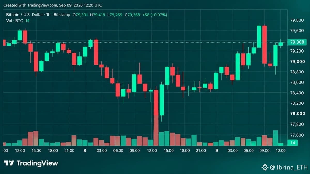
تستعيد البيتكوين 79 ألف دولار بعد موجة تصفية عند 77.6 ألف — هل 80 ألف في الطريق؟
ارتدّت البيتكوين بقوة بعد الانخفاض يوم الثلاثاء إلى 77,603 دولار، لتعود فوق 79,000 دولار في 9 سبتمبر بينما دخل المشترون بالقرب من القيعان.
تُظهر الرسوم البيانية كل ساعة ردّ فعلًا مثيرًا للاهتمام. كان التحرك نحو 77.6 ألف دولار مصحوبًا بأكبر ارتفاع في الحجم المرئي منذ 7 سبتمبر، تلاه تعافٍ قوي. ثم دفعت البيتكوين إلى 79,742 دولار قبل أن تتراجع باتجاه منطقة 78.8K–79K لتعاود الارتداد مرة أخرى.
بالنسبة لي، مستويات الحسم واضحة جدًا:
الدعم: 79,000 → 78,800 → 77,603–$77,666
المقاومة: 79,500 → 79,742 → 80,500–80,600
الصورة الأكبر ما تزال مختلطة. ما زالت البيتكوين ضمن نطاق أسبوعي تقريبي بين 77.6 ألف و82.3 ألف، لذا فإن هذا الارتداد وحده لا يؤكد اختراقًا أوسع.
كما أن مؤشرات الزخم تعطي صورة مختلطة. كان مؤشر RSI اليومي عند نحو 63، بينما بقي الاستوكاستك وCCI وADX والعديد من المؤشرات الأخرى على الحياد. كانت مؤشرات الزخم وBull Bear Power صعودية، بينما حمل MACD قراءة سلبية.
تبدو المتوسطات المتحركة أقوى. أظهر المؤشر الفني اليومي 14 قراءة صعودية للمتوسطات المتحركة، و1 محايدة و0 هبوطية، مع وجود عدة متوسطات قصيرة وطويلة الأجل تحت السعر الحالي.
لذا أنا أراقب رد الفعل حول 79 ألف عن كثب.
إذا تمكنت BTC من تأمين إغلاق لمدة 4 ساعات فوق 79,742 دولار، ستصبح منطقة 80.5 ألف–80.6 ألف هي المنطقة التالية التي يجب مراقبتها.
إذا فشل 79 ألف، أتوقع أن يبدأ المتداولون من جديد بالتركيز على منطقة 77.6 ألف.
لم يتم تأكيد أي اختراق حتى الآن. السعر عند نقطة القرار، وهذه الشموع القليلة القادمة أهم من العنوان.$BTC
{future}(BTCUSDT)
لا يُعد ذلك نصيحة مالية
تستعيد البيتكوين 79 ألف دولار بعد موجة تصفية عند 77.6 ألف — هل 80 ألف في الطريق؟
ارتدّت البيتكوين بقوة بعد الانخفاض يوم الثلاثاء إلى 77,603 دولار، لتعود فوق 79,000 دولار في 9 سبتمبر بينما دخل المشترون بالقرب من القيعان.
تُظهر الرسوم البيانية كل ساعة ردّ فعلًا مثيرًا للاهتمام. كان التحرك نحو 77.6 ألف دولار مصحوبًا بأكبر ارتفاع في الحجم المرئي منذ 7 سبتمبر، تلاه تعافٍ قوي. ثم دفعت البيتكوين إلى 79,742 دولار قبل أن تتراجع باتجاه منطقة 78.8K–79K لتعاود الارتداد مرة أخرى.
بالنسبة لي، مستويات الحسم واضحة جدًا:
الدعم: 79,000 → 78,800 → 77,603–$77,666
المقاومة: 79,500 → 79,742 → 80,500–80,600
الصورة الأكبر ما تزال مختلطة. ما زالت البيتكوين ضمن نطاق أسبوعي تقريبي بين 77.6 ألف و82.3 ألف، لذا فإن هذا الارتداد وحده لا يؤكد اختراقًا أوسع.
كما أن مؤشرات الزخم تعطي صورة مختلطة. كان مؤشر RSI اليومي عند نحو 63، بينما بقي الاستوكاستك وCCI وADX والعديد من المؤشرات الأخرى على الحياد. كانت مؤشرات الزخم وBull Bear Power صعودية، بينما حمل MACD قراءة سلبية.
تبدو المتوسطات المتحركة أقوى. أظهر المؤشر الفني اليومي 14 قراءة صعودية للمتوسطات المتحركة، و1 محايدة و0 هبوطية، مع وجود عدة متوسطات قصيرة وطويلة الأجل تحت السعر الحالي.
لذا أنا أراقب رد الفعل حول 79 ألف عن كثب.
إذا تمكنت BTC من تأمين إغلاق لمدة 4 ساعات فوق 79,742 دولار، ستصبح منطقة 80.5 ألف–80.6 ألف هي المنطقة التالية التي يجب مراقبتها.
إذا فشل 79 ألف، أتوقع أن يبدأ المتداولون من جديد بالتركيز على منطقة 77.6 ألف.
لم يتم تأكيد أي اختراق حتى الآن. السعر عند نقطة القرار، وهذه الشموع القليلة القادمة أهم من العنوان.$BTC
لا يُعد ذلك نصيحة مالية
ارتدّت البيتكوين بقوة بعد الانخفاض يوم الثلاثاء إلى 77,603 دولار، لتعود فوق 79,000 دولار في 9 سبتمبر بينما دخل المشترون بالقرب من القيعان.
تُظهر الرسوم البيانية كل ساعة ردّ فعلًا مثيرًا للاهتمام. كان التحرك نحو 77.6 ألف دولار مصحوبًا بأكبر ارتفاع في الحجم المرئي منذ 7 سبتمبر، تلاه تعافٍ قوي. ثم دفعت البيتكوين إلى 79,742 دولار قبل أن تتراجع باتجاه منطقة 78.8K–79K لتعاود الارتداد مرة أخرى.
بالنسبة لي، مستويات الحسم واضحة جدًا:
الدعم: 79,000 → 78,800 → 77,603–$77,666
المقاومة: 79,500 → 79,742 → 80,500–80,600
الصورة الأكبر ما تزال مختلطة. ما زالت البيتكوين ضمن نطاق أسبوعي تقريبي بين 77.6 ألف و82.3 ألف، لذا فإن هذا الارتداد وحده لا يؤكد اختراقًا أوسع.
كما أن مؤشرات الزخم تعطي صورة مختلطة. كان مؤشر RSI اليومي عند نحو 63، بينما بقي الاستوكاستك وCCI وADX والعديد من المؤشرات الأخرى على الحياد. كانت مؤشرات الزخم وBull Bear Power صعودية، بينما حمل MACD قراءة سلبية.
تبدو المتوسطات المتحركة أقوى. أظهر المؤشر الفني اليومي 14 قراءة صعودية للمتوسطات المتحركة، و1 محايدة و0 هبوطية، مع وجود عدة متوسطات قصيرة وطويلة الأجل تحت السعر الحالي.
لذا أنا أراقب رد الفعل حول 79 ألف عن كثب.
إذا تمكنت BTC من تأمين إغلاق لمدة 4 ساعات فوق 79,742 دولار، ستصبح منطقة 80.5 ألف–80.6 ألف هي المنطقة التالية التي يجب مراقبتها.
إذا فشل 79 ألف، أتوقع أن يبدأ المتداولون من جديد بالتركيز على منطقة 77.6 ألف.
لم يتم تأكيد أي اختراق حتى الآن. السعر عند نقطة القرار، وهذه الشموع القليلة القادمة أهم من العنوان.$BTC
لا يُعد ذلك نصيحة مالية
1
263
·
--
صاعد
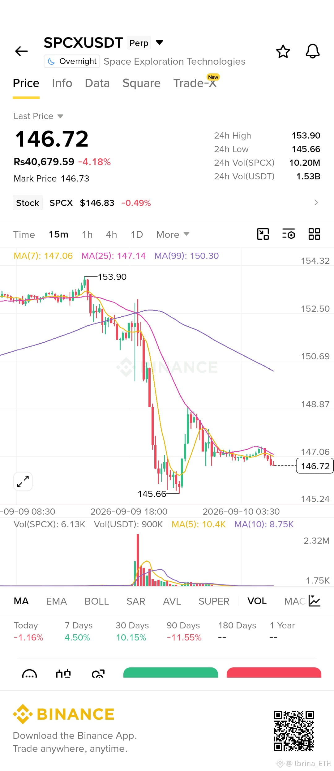
أنا أراقب هذا لصفقة قصيرة على ارتداد بعد هبوط (relief bounce)، وليس لمطاردة الشموع الحمراء الحالية.
البنية واضحة بالنسبة لي: السعر رفض بقوة عند 153.90، ثم هبط إلى 145.66، وبعدها تعثر الارتداد وتوقف قرب 148.87. منذ ذلك الحين، لدينا قمم أدنى والسعر عاد تحت متوسطات 7/25 عند 147.06–147.14، بينما يتواجد متوسط 99 أعلى بكثير عند 150.30. جاءت أحجام البيع الكبيرة أثناء الانهيار؛ ومنذ ذلك الحين جفّت الأحجام، لذلك أفضل إعادة اختبار قبل الدخول.
الدخول: 147.0–147.4
التأكيد: رفض على فريم 15 دقيقة حول 147.1–147.4 + عودة أحجام البيع
إيقاف الخسارة SL: 149.0
TP1: 145.7
TP2: 144.5
TP3: 143.2
TP4: 141.8
باستخدام دخول ~147.2، يكون الخطر ~1.8 نقطة. وهذا يقارب 0.8R / 1.5R / 2.2R / 3.0R.
السيولة الرئيسية أسفل السعر عند قاع 145.66. إذا تم كسره مع حجم، أتوقع أن يكون لدى الهيكل الهابط مساحة أكبر.
الإبطال (Invalidation): قبول مستمر على فريم 15 دقيقة فوق 149.0، خصوصًا إذا بدأ السعر باستعادة 150.30. في هذه الحالة سأخرج — لا يوجد سبب لمحاربة البنية.
ليس نصيحة مالية، هذا مجرد قراءتي الشخصية للـ chart
$SPCX
{future}(SPCXUSDT)
أنا أراقب هذا لصفقة قصيرة على ارتداد بعد هبوط (relief bounce)، وليس لمطاردة الشموع الحمراء الحالية.
البنية واضحة بالنسبة لي: السعر رفض بقوة عند 153.90، ثم هبط إلى 145.66، وبعدها تعثر الارتداد وتوقف قرب 148.87. منذ ذلك الحين، لدينا قمم أدنى والسعر عاد تحت متوسطات 7/25 عند 147.06–147.14، بينما يتواجد متوسط 99 أعلى بكثير عند 150.30. جاءت أحجام البيع الكبيرة أثناء الانهيار؛ ومنذ ذلك الحين جفّت الأحجام، لذلك أفضل إعادة اختبار قبل الدخول.
الدخول: 147.0–147.4
التأكيد: رفض على فريم 15 دقيقة حول 147.1–147.4 + عودة أحجام البيع
إيقاف الخسارة SL: 149.0
TP1: 145.7
TP2: 144.5
TP3: 143.2
TP4: 141.8
باستخدام دخول ~147.2، يكون الخطر ~1.8 نقطة. وهذا يقارب 0.8R / 1.5R / 2.2R / 3.0R.
السيولة الرئيسية أسفل السعر عند قاع 145.66. إذا تم كسره مع حجم، أتوقع أن يكون لدى الهيكل الهابط مساحة أكبر.
الإبطال (Invalidation): قبول مستمر على فريم 15 دقيقة فوق 149.0، خصوصًا إذا بدأ السعر باستعادة 150.30. في هذه الحالة سأخرج — لا يوجد سبب لمحاربة البنية.
ليس نصيحة مالية، هذا مجرد قراءتي الشخصية للـ chart
$SPCX
البنية واضحة بالنسبة لي: السعر رفض بقوة عند 153.90، ثم هبط إلى 145.66، وبعدها تعثر الارتداد وتوقف قرب 148.87. منذ ذلك الحين، لدينا قمم أدنى والسعر عاد تحت متوسطات 7/25 عند 147.06–147.14، بينما يتواجد متوسط 99 أعلى بكثير عند 150.30. جاءت أحجام البيع الكبيرة أثناء الانهيار؛ ومنذ ذلك الحين جفّت الأحجام، لذلك أفضل إعادة اختبار قبل الدخول.
الدخول: 147.0–147.4
التأكيد: رفض على فريم 15 دقيقة حول 147.1–147.4 + عودة أحجام البيع
إيقاف الخسارة SL: 149.0
TP1: 145.7
TP2: 144.5
TP3: 143.2
TP4: 141.8
باستخدام دخول ~147.2، يكون الخطر ~1.8 نقطة. وهذا يقارب 0.8R / 1.5R / 2.2R / 3.0R.
السيولة الرئيسية أسفل السعر عند قاع 145.66. إذا تم كسره مع حجم، أتوقع أن يكون لدى الهيكل الهابط مساحة أكبر.
الإبطال (Invalidation): قبول مستمر على فريم 15 دقيقة فوق 149.0، خصوصًا إذا بدأ السعر باستعادة 150.30. في هذه الحالة سأخرج — لا يوجد سبب لمحاربة البنية.
ليس نصيحة مالية، هذا مجرد قراءتي الشخصية للـ chart
$SPCX
1
437
·
--
صاعد
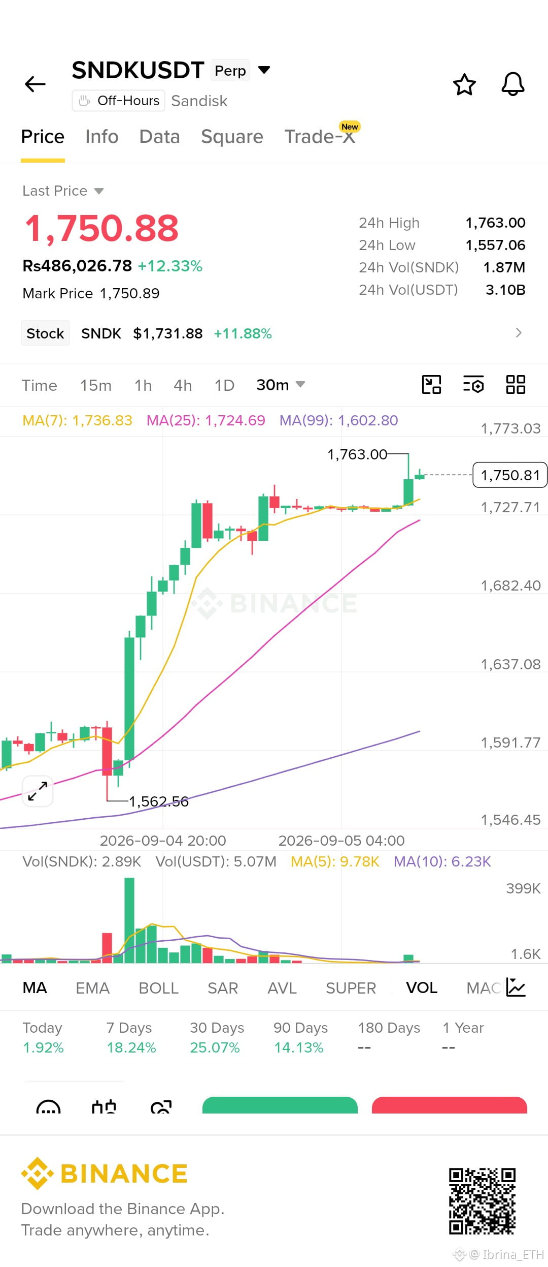
$SNDK — 15m إعداد قصير
أنا أميل للصفقات القصيرة فقط إذا تم رفض الارتداد حول 1,750–1,756. تغير الرسم البياني إلى هبوطي بعد قمة 1,806.47: السعر الآن تحت المتوسطات المتحركة لـ 7/25/99، بينما الشموع الأخيرة تصنع قممًا أدنى وفقط فقدت منطقة 1,754.
الحجم (الـ Volume) ليس انفجاريًا، لذلك لا أريد اللحاق بالهبوط الحالي. أفضّل أن أرى إعادة اختبار 1,750–1,756، تليها رفض واضح وإغلاق 15m هبوطي.
الدخول: 1,750–1,756
التأكيد: رفض/انعكاس أسفل 1,756 مع حجم بيع
SL: 1,765
TP1: 1,736
TP2: 1,721
TP3: 1,708
TP4: 1,695
باستخدام دخول ~1,752 وSL عند 1,765، يكون الخطر ~13 نقطة. هذا يعطي تقريبًا 1.2R / 2.4R / 3.4R / 4.4R.
الإبطال (Invalidation): قبول 15m أعلى من 1,765. سألغيه/ألغِ الصفقة القصيرة بدلًا من فرضها. $SNDK
{future}(SNDKUSDT)
$SNDK — 15m إعداد قصير
أنا أميل للصفقات القصيرة فقط إذا تم رفض الارتداد حول 1,750–1,756. تغير الرسم البياني إلى هبوطي بعد قمة 1,806.47: السعر الآن تحت المتوسطات المتحركة لـ 7/25/99، بينما الشموع الأخيرة تصنع قممًا أدنى وفقط فقدت منطقة 1,754.
الحجم (الـ Volume) ليس انفجاريًا، لذلك لا أريد اللحاق بالهبوط الحالي. أفضّل أن أرى إعادة اختبار 1,750–1,756، تليها رفض واضح وإغلاق 15m هبوطي.
الدخول: 1,750–1,756
التأكيد: رفض/انعكاس أسفل 1,756 مع حجم بيع
SL: 1,765
TP1: 1,736
TP2: 1,721
TP3: 1,708
TP4: 1,695
باستخدام دخول ~1,752 وSL عند 1,765، يكون الخطر ~13 نقطة. هذا يعطي تقريبًا 1.2R / 2.4R / 3.4R / 4.4R.
الإبطال (Invalidation): قبول 15m أعلى من 1,765. سألغيه/ألغِ الصفقة القصيرة بدلًا من فرضها. $SNDK
أنا أميل للصفقات القصيرة فقط إذا تم رفض الارتداد حول 1,750–1,756. تغير الرسم البياني إلى هبوطي بعد قمة 1,806.47: السعر الآن تحت المتوسطات المتحركة لـ 7/25/99، بينما الشموع الأخيرة تصنع قممًا أدنى وفقط فقدت منطقة 1,754.
الحجم (الـ Volume) ليس انفجاريًا، لذلك لا أريد اللحاق بالهبوط الحالي. أفضّل أن أرى إعادة اختبار 1,750–1,756، تليها رفض واضح وإغلاق 15m هبوطي.
الدخول: 1,750–1,756
التأكيد: رفض/انعكاس أسفل 1,756 مع حجم بيع
SL: 1,765
TP1: 1,736
TP2: 1,721
TP3: 1,708
TP4: 1,695
باستخدام دخول ~1,752 وSL عند 1,765، يكون الخطر ~13 نقطة. هذا يعطي تقريبًا 1.2R / 2.4R / 3.4R / 4.4R.
الإبطال (Invalidation): قبول 15m أعلى من 1,765. سألغيه/ألغِ الصفقة القصيرة بدلًا من فرضها. $SNDK
1
322
·
--
صاعد
🚨 ترامب يزعم أنه حقق «مئات المليارات» من الأسهم — لكنه يقول إن ذلك كان من أجل البلد
يقول الرئيس دونالد ترامب إنه حقق مئات المليارات من الدولارات من الأسهم، مؤكدًا أن المال جُني «من أجل البلد» و«ليس من أجلي».
هذا التصريح يثير الاهتمام في الأسواق لأنه يسلّط الضوء على شيء أكبر من مجرد عنوان سياسي واحد: إلى أي مدى يمكن أن ترتبط السياسات الحكومية وأسواق رأس المال وثقة المستثمرين ببعضها البعض.
بالنسبة للأسواق التقليدية، يمكن لتعليقات رئيس أمريكي في منصبه أن تؤثر في التوقعات المتعلقة بالسياسة الاقتصادية والأعمال وتدفقات رأس المال. أما بالنسبة للعملات المشفرة، فالارتباط غير مباشر لكنه يستحق المتابعة.
بيتكوين وإيثريوم لا تعملان ضمن الإطار السياسي نفسه الذي تعمل ضمنه الأسهم، لكن سيولة العملات المشفرة مرتبطة بعمق بميل السوق العام إلى المخاطرة. عندما يصبح المستثمرون الأمريكيون أكثر ثقة وتتحرك رؤوس الأموال نحو الأصول عالية المخاطر، يمكن أن تشعر العملات المشفرة بالتأثير عبر السيولة والمعنويات والتموضع المؤسسي.
ما لفت انتباهي هو الصياغة نفسها. القول إن المكاسب كانت «من أجل البلد» يطرح سؤالًا أكبر حول ما الذي يُحتسب تحديدًا كـ«مكسب» — هل هو ارتفاع السوق، أم قيمة مرتبطة بالحكومة، أم شيء آخر. ومن دون مزيد من التفاصيل، لا يمنحنا العنوان وحده ما يكفي لقياس الأثر الاقتصادي الفعلي.
وهذا التمييز مهم.
يمكن للأسواق أن تتفاعل بسرعة مع التصريحات السياسية، لكن على المستثمرين أن يميزوا بين المعنويات التي يقودها العنوان الإخباري وبين تدفقات رأس المال القابلة للقياس والأساسيات. وينطبق الأمر نفسه على العملات المشفرة. قد يخلق العنوان اهتمامًا، لكن السيولة المستدامة هي ما يهم في النهاية.
وبالنسبة للمتداولين في $BTC & $ETH ، سأراقب بيئة المخاطرة الأوسع بدلًا من اعتبار هذا التصريح إشارة مباشرة للعملات المشفرة. إذا شهدت الأسهم الأمريكية وظروف السيولة وثقة المستثمرين تغيرًا ملموسًا، فقد تعكس العملات المشفرة هذا التغير أيضًا في نهاية المطاف.
والسؤال الأكبر هو: عندما تؤثر القرارات السياسية بشكل متزايد في الأسواق، هل ينتبه المستثمرون بما يكفي إلى تدفقات رأس المال الأساسية — أم أنهم يكتفون بالرد على العنوان؟
🚨 ترامب يزعم أنه حقق «مئات المليارات» من الأسهم — لكنه يقول إن ذلك كان من أجل البلد
يقول الرئيس دونالد ترامب إنه حقق مئات المليارات من الدولارات من الأسهم، مؤكدًا أن المال جُني «من أجل البلد» و«ليس من أجلي».
هذا التصريح يثير الاهتمام في الأسواق لأنه يسلّط الضوء على شيء أكبر من مجرد عنوان سياسي واحد: إلى أي مدى يمكن أن ترتبط السياسات الحكومية وأسواق رأس المال وثقة المستثمرين ببعضها البعض.
بالنسبة للأسواق التقليدية، يمكن لتعليقات رئيس أمريكي في منصبه أن تؤثر في التوقعات المتعلقة بالسياسة الاقتصادية والأعمال وتدفقات رأس المال. أما بالنسبة للعملات المشفرة، فالارتباط غير مباشر لكنه يستحق المتابعة.
بيتكوين وإيثريوم لا تعملان ضمن الإطار السياسي نفسه الذي تعمل ضمنه الأسهم، لكن سيولة العملات المشفرة مرتبطة بعمق بميل السوق العام إلى المخاطرة. عندما يصبح المستثمرون الأمريكيون أكثر ثقة وتتحرك رؤوس الأموال نحو الأصول عالية المخاطر، يمكن أن تشعر العملات المشفرة بالتأثير عبر السيولة والمعنويات والتموضع المؤسسي.
ما لفت انتباهي هو الصياغة نفسها. القول إن المكاسب كانت «من أجل البلد» يطرح سؤالًا أكبر حول ما الذي يُحتسب تحديدًا كـ«مكسب» — هل هو ارتفاع السوق، أم قيمة مرتبطة بالحكومة، أم شيء آخر. ومن دون مزيد من التفاصيل، لا يمنحنا العنوان وحده ما يكفي لقياس الأثر الاقتصادي الفعلي.
وهذا التمييز مهم.
يمكن للأسواق أن تتفاعل بسرعة مع التصريحات السياسية، لكن على المستثمرين أن يميزوا بين المعنويات التي يقودها العنوان الإخباري وبين تدفقات رأس المال القابلة للقياس والأساسيات. وينطبق الأمر نفسه على العملات المشفرة. قد يخلق العنوان اهتمامًا، لكن السيولة المستدامة هي ما يهم في النهاية.
وبالنسبة للمتداولين في $BTC & $ETH ، سأراقب بيئة المخاطرة الأوسع بدلًا من اعتبار هذا التصريح إشارة مباشرة للعملات المشفرة. إذا شهدت الأسهم الأمريكية وظروف السيولة وثقة المستثمرين تغيرًا ملموسًا، فقد تعكس العملات المشفرة هذا التغير أيضًا في نهاية المطاف.
والسؤال الأكبر هو: عندما تؤثر القرارات السياسية بشكل متزايد في الأسواق، هل ينتبه المستثمرون بما يكفي إلى تدفقات رأس المال الأساسية — أم أنهم يكتفون بالرد على العنوان؟
يقول الرئيس دونالد ترامب إنه حقق مئات المليارات من الدولارات من الأسهم، مؤكدًا أن المال جُني «من أجل البلد» و«ليس من أجلي».
هذا التصريح يثير الاهتمام في الأسواق لأنه يسلّط الضوء على شيء أكبر من مجرد عنوان سياسي واحد: إلى أي مدى يمكن أن ترتبط السياسات الحكومية وأسواق رأس المال وثقة المستثمرين ببعضها البعض.
بالنسبة للأسواق التقليدية، يمكن لتعليقات رئيس أمريكي في منصبه أن تؤثر في التوقعات المتعلقة بالسياسة الاقتصادية والأعمال وتدفقات رأس المال. أما بالنسبة للعملات المشفرة، فالارتباط غير مباشر لكنه يستحق المتابعة.
بيتكوين وإيثريوم لا تعملان ضمن الإطار السياسي نفسه الذي تعمل ضمنه الأسهم، لكن سيولة العملات المشفرة مرتبطة بعمق بميل السوق العام إلى المخاطرة. عندما يصبح المستثمرون الأمريكيون أكثر ثقة وتتحرك رؤوس الأموال نحو الأصول عالية المخاطر، يمكن أن تشعر العملات المشفرة بالتأثير عبر السيولة والمعنويات والتموضع المؤسسي.
ما لفت انتباهي هو الصياغة نفسها. القول إن المكاسب كانت «من أجل البلد» يطرح سؤالًا أكبر حول ما الذي يُحتسب تحديدًا كـ«مكسب» — هل هو ارتفاع السوق، أم قيمة مرتبطة بالحكومة، أم شيء آخر. ومن دون مزيد من التفاصيل، لا يمنحنا العنوان وحده ما يكفي لقياس الأثر الاقتصادي الفعلي.
وهذا التمييز مهم.
يمكن للأسواق أن تتفاعل بسرعة مع التصريحات السياسية، لكن على المستثمرين أن يميزوا بين المعنويات التي يقودها العنوان الإخباري وبين تدفقات رأس المال القابلة للقياس والأساسيات. وينطبق الأمر نفسه على العملات المشفرة. قد يخلق العنوان اهتمامًا، لكن السيولة المستدامة هي ما يهم في النهاية.
وبالنسبة للمتداولين في $BTC & $ETH ، سأراقب بيئة المخاطرة الأوسع بدلًا من اعتبار هذا التصريح إشارة مباشرة للعملات المشفرة. إذا شهدت الأسهم الأمريكية وظروف السيولة وثقة المستثمرين تغيرًا ملموسًا، فقد تعكس العملات المشفرة هذا التغير أيضًا في نهاية المطاف.
والسؤال الأكبر هو: عندما تؤثر القرارات السياسية بشكل متزايد في الأسواق، هل ينتبه المستثمرون بما يكفي إلى تدفقات رأس المال الأساسية — أم أنهم يكتفون بالرد على العنوان؟
1
1
273
·
--
صاعد
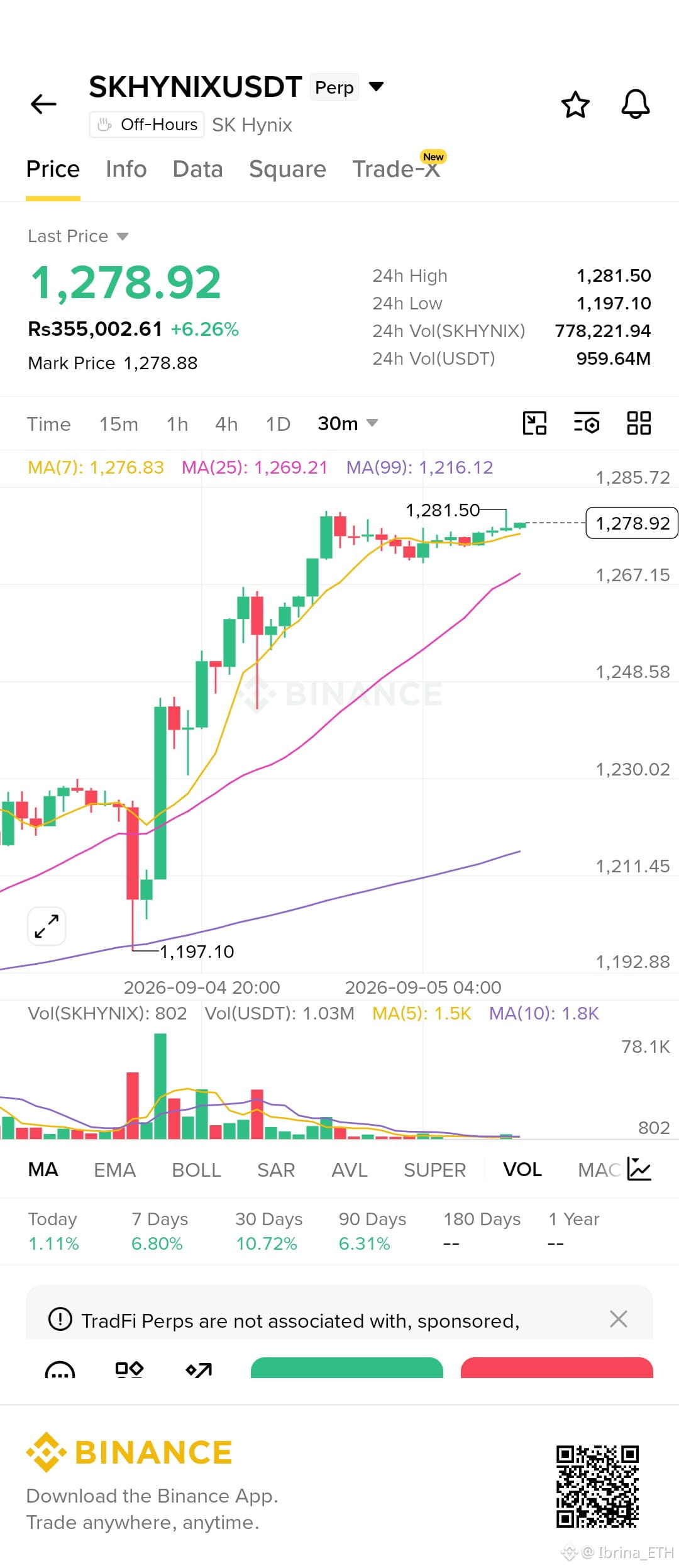
$SKHYNIX 30M الإعداد
أراقب $SKHYNIX لاختراق صعودي، لكنني لن أطارده عند 1,279. لقد كان السعر ينضغط أسفل القمة 1,281.50 مباشرةً بينما تراجعت أحجام التداول، وهذا يخبرني أن الاندفاعة التالية تحتاج إلى مشترين جدد.
الدخول: 1,270–1,275
التأكيد: إغلاق 30 دقيقة فوق 1,281.50 + توسع في حجم التداول
وقف الخسارة: 1,260
الهدف 1: 1,292
الهدف 2: 1,305
الهدف 3: 1,320
الهدف 4: 1,340
عند دخول قرب 1,273، تكون المخاطرة حوالي 13 نقطة، مما يعطي تقريبًا 1.5R / 2.5R / 3.6R / 5.1R.
إذا كسر 1,260، فأنا خارج لأن الإعداد يفقد بنيته الصعودية. خطة مشروطة، وليست إشارة مضمونة.
$SKHYNIX 30M الإعداد
أراقب $SKHYNIX لاختراق صعودي، لكنني لن أطارده عند 1,279. لقد كان السعر ينضغط أسفل القمة 1,281.50 مباشرةً بينما تراجعت أحجام التداول، وهذا يخبرني أن الاندفاعة التالية تحتاج إلى مشترين جدد.
الدخول: 1,270–1,275
التأكيد: إغلاق 30 دقيقة فوق 1,281.50 + توسع في حجم التداول
وقف الخسارة: 1,260
الهدف 1: 1,292
الهدف 2: 1,305
الهدف 3: 1,320
الهدف 4: 1,340
عند دخول قرب 1,273، تكون المخاطرة حوالي 13 نقطة، مما يعطي تقريبًا 1.5R / 2.5R / 3.6R / 5.1R.
إذا كسر 1,260، فأنا خارج لأن الإعداد يفقد بنيته الصعودية. خطة مشروطة، وليست إشارة مضمونة.
أراقب $SKHYNIX لاختراق صعودي، لكنني لن أطارده عند 1,279. لقد كان السعر ينضغط أسفل القمة 1,281.50 مباشرةً بينما تراجعت أحجام التداول، وهذا يخبرني أن الاندفاعة التالية تحتاج إلى مشترين جدد.
الدخول: 1,270–1,275
التأكيد: إغلاق 30 دقيقة فوق 1,281.50 + توسع في حجم التداول
وقف الخسارة: 1,260
الهدف 1: 1,292
الهدف 2: 1,305
الهدف 3: 1,320
الهدف 4: 1,340
عند دخول قرب 1,273، تكون المخاطرة حوالي 13 نقطة، مما يعطي تقريبًا 1.5R / 2.5R / 3.6R / 5.1R.
إذا كسر 1,260، فأنا خارج لأن الإعداد يفقد بنيته الصعودية. خطة مشروطة، وليست إشارة مضمونة.
1
167
·
--
صاعد
$SNDK /USDT إعداد 👀
$SNDK ارتفع للتو من 1,562 → 1,763، لكنني لا ألاحق الحركة هنا. على إطار 30 دقيقة، السعر يتمسك حول 1,728–1,740 بينما انخفض حجم التداول.
سأفكر في صفقة شراء فقط إذا صمد 1,728 وتم كسر 1,740 مع حجم تداول.
الدخول: 1,728–1,738
وقف الخسارة: 1,718
جني الربح: 1,763 / 1,785 / 1,810 / 1,840
إذا تم كسر 1,718، فالإعداد يصبح غير صالح. هذه خطتي الشرطية، وليست إشارة مضمونة.
$SNDK /USDT إعداد 👀
$SNDK ارتفع للتو من 1,562 → 1,763، لكنني لا ألاحق الحركة هنا. على إطار 30 دقيقة، السعر يتمسك حول 1,728–1,740 بينما انخفض حجم التداول.
سأفكر في صفقة شراء فقط إذا صمد 1,728 وتم كسر 1,740 مع حجم تداول.
الدخول: 1,728–1,738
وقف الخسارة: 1,718
جني الربح: 1,763 / 1,785 / 1,810 / 1,840
إذا تم كسر 1,718، فالإعداد يصبح غير صالح. هذه خطتي الشرطية، وليست إشارة مضمونة.
$SNDK ارتفع للتو من 1,562 → 1,763، لكنني لا ألاحق الحركة هنا. على إطار 30 دقيقة، السعر يتمسك حول 1,728–1,740 بينما انخفض حجم التداول.
سأفكر في صفقة شراء فقط إذا صمد 1,728 وتم كسر 1,740 مع حجم تداول.
الدخول: 1,728–1,738
وقف الخسارة: 1,718
جني الربح: 1,763 / 1,785 / 1,810 / 1,840
إذا تم كسر 1,718، فالإعداد يصبح غير صالح. هذه خطتي الشرطية، وليست إشارة مضمونة.
689
·
--
صاعد
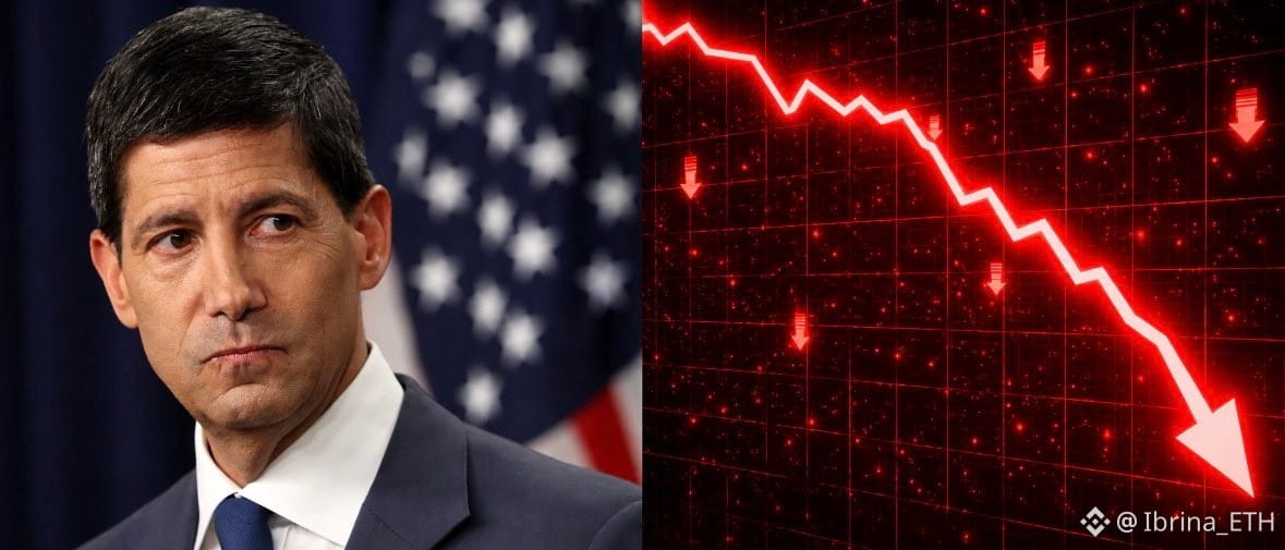
🇺🇸🚨 حسنًا… هذا التقرير الوظيفي ليس ما كان الاحتياطي الفيدرالي يريد رؤيته.
الولايات المتحدة أعلنت للتو أرقام التوظيف لشهر أغسطس، وهناك شيء واحد لفت انتباهي فورًا.
البطالة: 4.1%
المتوقع: 4.1%
إذًا لا مفاجأة هنا.
لكن انظروا إلى رقم الوظائف…
تمت إضافة 162 ألف وظيفة مقابل 55 ألفًا فقط متوقعة. 👀
هذا يقارب 3 أضعاف التقدير.
والبطالة ما تزال عند أدنى مستوى لها منذ 14 شهرًا.
بشكل أساسي، لا يزال سوق العمل يُظهر بعض القوة.
وهذا مهم لأن التضخم يثبت بالفعل أنه عنيد. إذا كانت الوظائف متماسكة والتضخم لا ينخفض بالسرعة الكافية، فسيكون لدى الاحتياطي الفيدرالي سبب أقل للتسرع في خفض الفائدة.
والآن لدينا عنصر مهم آخر سيصدر الأسبوع القادم:
بيانات التضخم الأمريكية.
كما أن أسعار النفط ارتفعت مؤخرًا، لذا أنا متشوق جدًا لمعرفة ما إذا كان ذلك سيبدأ بالظهور في أرقام التضخم.
إذا جاء مؤشر أسعار المستهلكين مرتفعًا مرة أخرى، فستصبح هذه القصة كلها الخاصة بالفيدرالي أكثر إثارة بكثير.
لن أقول إن رفع الفائدة مضمون بعد — فما زالت هناك بيانات أخرى قادمة.
لكن بعد رؤية 162 ألف وظيفة مقابل 55 ألفًا متوقعة…
نعم، بالتأكيد لن أراهن ضد فيدرالي أكثر تشددًا في الوقت الحالي. 👀
قد يكون مؤشر أسعار المستهلكين الأسبوع المقبل هو المحرك الحقيقي للسوق.
$MARSCOIN $UAI $BTC
{future}(BTCUSDT)
🇺🇸🚨 حسنًا… هذا التقرير الوظيفي ليس ما كان الاحتياطي الفيدرالي يريد رؤيته.
الولايات المتحدة أعلنت للتو أرقام التوظيف لشهر أغسطس، وهناك شيء واحد لفت انتباهي فورًا.
البطالة: 4.1%
المتوقع: 4.1%
إذًا لا مفاجأة هنا.
لكن انظروا إلى رقم الوظائف…
تمت إضافة 162 ألف وظيفة مقابل 55 ألفًا فقط متوقعة. 👀
هذا يقارب 3 أضعاف التقدير.
والبطالة ما تزال عند أدنى مستوى لها منذ 14 شهرًا.
بشكل أساسي، لا يزال سوق العمل يُظهر بعض القوة.
وهذا مهم لأن التضخم يثبت بالفعل أنه عنيد. إذا كانت الوظائف متماسكة والتضخم لا ينخفض بالسرعة الكافية، فسيكون لدى الاحتياطي الفيدرالي سبب أقل للتسرع في خفض الفائدة.
والآن لدينا عنصر مهم آخر سيصدر الأسبوع القادم:
بيانات التضخم الأمريكية.
كما أن أسعار النفط ارتفعت مؤخرًا، لذا أنا متشوق جدًا لمعرفة ما إذا كان ذلك سيبدأ بالظهور في أرقام التضخم.
إذا جاء مؤشر أسعار المستهلكين مرتفعًا مرة أخرى، فستصبح هذه القصة كلها الخاصة بالفيدرالي أكثر إثارة بكثير.
لن أقول إن رفع الفائدة مضمون بعد — فما زالت هناك بيانات أخرى قادمة.
لكن بعد رؤية 162 ألف وظيفة مقابل 55 ألفًا متوقعة…
نعم، بالتأكيد لن أراهن ضد فيدرالي أكثر تشددًا في الوقت الحالي. 👀
قد يكون مؤشر أسعار المستهلكين الأسبوع المقبل هو المحرك الحقيقي للسوق.
$MARSCOIN $UAI $BTC
الولايات المتحدة أعلنت للتو أرقام التوظيف لشهر أغسطس، وهناك شيء واحد لفت انتباهي فورًا.
البطالة: 4.1%
المتوقع: 4.1%
إذًا لا مفاجأة هنا.
لكن انظروا إلى رقم الوظائف…
تمت إضافة 162 ألف وظيفة مقابل 55 ألفًا فقط متوقعة. 👀
هذا يقارب 3 أضعاف التقدير.
والبطالة ما تزال عند أدنى مستوى لها منذ 14 شهرًا.
بشكل أساسي، لا يزال سوق العمل يُظهر بعض القوة.
وهذا مهم لأن التضخم يثبت بالفعل أنه عنيد. إذا كانت الوظائف متماسكة والتضخم لا ينخفض بالسرعة الكافية، فسيكون لدى الاحتياطي الفيدرالي سبب أقل للتسرع في خفض الفائدة.
والآن لدينا عنصر مهم آخر سيصدر الأسبوع القادم:
بيانات التضخم الأمريكية.
كما أن أسعار النفط ارتفعت مؤخرًا، لذا أنا متشوق جدًا لمعرفة ما إذا كان ذلك سيبدأ بالظهور في أرقام التضخم.
إذا جاء مؤشر أسعار المستهلكين مرتفعًا مرة أخرى، فستصبح هذه القصة كلها الخاصة بالفيدرالي أكثر إثارة بكثير.
لن أقول إن رفع الفائدة مضمون بعد — فما زالت هناك بيانات أخرى قادمة.
لكن بعد رؤية 162 ألف وظيفة مقابل 55 ألفًا متوقعة…
نعم، بالتأكيد لن أراهن ضد فيدرالي أكثر تشددًا في الوقت الحالي. 👀
قد يكون مؤشر أسعار المستهلكين الأسبوع المقبل هو المحرك الحقيقي للسوق.
$MARSCOIN $UAI $BTC
1
243
سجّل الدخول لاستكشاف المزيد من المُحتوى
انضم إلى مُستخدمي العملات الرقمية حول العالم على Binance Square
⚡️ احصل على أحدث المعلومات المفيدة عن العملات الرقمية.
💬 موثوقة من قبل أكبر منصّة لتداول العملات الرقمية في العالم.
👍 اكتشف الرؤى الحقيقية من صنّاع المُحتوى الموثوقين.
البريد الإلكتروني / رقم الهاتف
المواضيع الرائجة
EarningsSeason
219,079 مشاهدات
1,974 يقومون بالنقاش
موسم الأرباح: أرباح ميكرون للربع الرابع — صعودية أم هبوطية؟
Binance Square Official
·337 إعجاب
·647.5k مشاهدات
BitwiseLaunchesFirstSpotNEARETF
9,648 مشاهدات
312 يقومون بالنقاش
USJobOpeningsFallToFiveMonthLow
14,512 مشاهدات
239 يقومون بالنقاش