


Short-term analysis of the Bitcoin (BTCUSDT) chart, 3-minute timeframe.
The current chart on the 3-minute timeframe reflects the short-term dynamics of the market, where after the rise, the correction phase and search for a new balance occur simultaneously.
Particular attention should be paid to the area highlighted by the red rectangle, as it is here that a sharp collision of buying and selling sentiments occurred with the formation of a local maximum.
Reasons for the rise and formation of a peak in the red rectangle zone.
If we consider the price movement before entering the red zone, we can notice that the price was steadily rising, following short-term moving averages. The candles were moving along the upper boundary of the Bollinger Bands, indicating a pronounced short-term advantage for the bulls.
At the beginning of the marked area, a strong bullish candle appeared, sharply pushing the price upward. Meanwhile, the distance to the upper Bollinger Band rapidly increased.
This can be interpreted as a simultaneous influx of impulse buying and closing short positions. At this stage, market expectations dominated for continued growth.
The reversal value represented by a bearish candle after the peak.
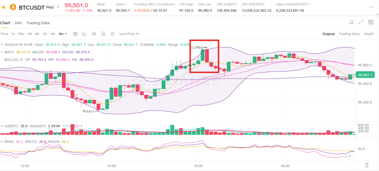
However, immediately after the formation of a local maximum, a bearish candle with a long upper shadow appeared. This is no longer just a technical correction, but a signal that near the maximum, profit-taking and opening new short positions began actively.
It is particularly important that at the moment of reversal, trading volume did not decrease. This indicates that the buying impulse did not simply fade away but was met with targeted pressure from sellers.
As a result, this area became a confirmation zone of the short-term peak, rather than an acceleration of the trend.
Analysis from the perspective of moving averages and Bollinger Bands.
After exiting the red zone, the price briefly dropped below the short-term moving averages (MA7 and MA25), entering a correction phase. However, the decline was controlled and looked like a pullback to the averages, not the beginning of a sharp reversal.
The Bollinger Bands, after expanding, began to gradually narrow without sharp collapse, indicating a release of overbought conditions and a phase of consolidation, rather than the destruction of the upward structure.
The current state of the market and the key meaning of the red zone.
Overall, the red zone reflects not the end of an upward movement, but the phase of removing short-term market overheating. Instead of continuing the upward impulse, the market chose a scenario of price cooling and seeking new equilibrium.
The fact that the price did not transition to a sharp decline but formed sideways movement allows us to view this area not as a trend reversal signal, but as a stage of volume redistribution after the local maximum.
Final conclusion.
The red zone on the chart represents:
local maximum formed due to impulse buying and short-covering.
the point where strong selling pressure immediately manifested.
the correction phase that did not lead to a breakdown of the trend structure.
At the current stage, it is more rational to monitor not the breakout of the maximum, but where the next minimum will form, as well as whether an increase in volume will occur during a repeated attempt to move upward.
In this situation, a cautious strategy focused on pullbacks and maintaining structure is more justified than an aggressive chase for price.