



Short-term analysis of the Bitcoin (BCHUSDT) chart, 3-minute timeframe
The current chart on the 3-minute timeframe shows short-term price movement, generally remaining in a sideways range with periodic expansions of volatility.
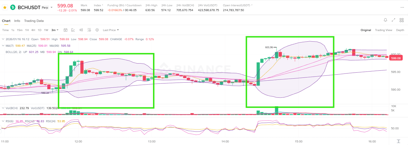
Particular attention should be paid to the two sections marked on the chart with rectangles, as they reflect not just candle movements but real changes in market sentiment and position structures.
Left zone: short-term rebound with rapid exhaustion of the impulse
Considering the left-marked area, one can see that strong bullish candles formed in a short period, which sharply pushed the price upwards. At this moment, the upper boundary of the Bollinger Bands significantly expanded, indicating a sharp increase in short-term volatility.
This movement can be interpreted as a result of an influx of short-term buyers and partial closure of previously accumulated short positions. However, after the initial growth, trading volume did not receive further development, and near the local maximum, selling pressure quickly emerged, leading to a price pullback.
As a result, this rebound did not evolve into a trend change, and the growth impulse was quickly exhausted, after which the market returned to a phase of sideways movement. Thus, this section should be viewed not as the beginning of a trend, but as an unsuccessful attempt at short-term recovery.
Right zone: rebound with a change in price structure
The right-marked zone is significantly different in its nature. After a sufficient correction, the price began to rise with the formation of a much stronger bullish candle, while trading volume notably increased.
The Bollinger Bands have significantly expanded again, and the price confidently broke through the short-term moving averages and stayed above them. This section represents not just a technical rebound but a process of changing the very structure of positions in the market.
The mass liquidation of accumulated short positions at the bottom led to a sharp price increase, followed by an influx of new long positions. As a result, the upper boundary of the previous sideways range was shifted higher, and the market began to form a new equilibrium at a higher price level.
Current phase: energy accumulation after growth
After the second marked section, the current price dynamics show not a continuation of sharp growth but the formation of stable sideways movement in the upper part of the range.
This indicates a temporary balance between buyers and sellers, during which the market either accumulates energy for further growth or prepares for another correction.
The RSI indicator is also in the neutral zone, showing no signs of overbought or oversold conditions, confirming the absence of a clearly defined direction.
Trading volume is not sharply decreasing and remains at a stable level, so it is premature to speak of a complete exhaustion of buying interest.
Final conclusion: the key importance of the marked zones
In summary, the left-marked area should be considered as an unsuccessful growth attempt that did not lead to trend formation.
At the same time, the right zone represents a more significant rebound, accompanied by a change in price structure and an upward shift in the trading range.
At the moment, the price is moving within the upper range formed after the second rebound and is in the process of finding the next direction.
In such a situation, a cautious approach focusing on maintaining support levels and volume dynamics, rather than aggressive buying on breakouts, seems more justified.
If the upper resistance is broken on the rise in volumes, the likelihood of a continuation of the short-term upward movement will increase.
Otherwise, if support is broken downwards, the market may return to a scenario where the second rise turns out to be just another short covering, requiring a re-evaluation of the situation.