
Crypto4light
5.5k Posts

Crypto4light
 Square Verified+
Report
Block User
Find everywhere - @Crypto4light 🔥 | Daily trading ideas | My custom indicators analysis | Educational content | Crypto News |

Level 1 Creator
Open Trade
Frequent Trader
5.8 Years
0 Following
67.7K+ Followers
39.5K+ Liked
1 Badges
Posts
Portfolio
All
Quotes
Videos
Live
PINNED
·
--

Article
The best indicators set for tradingCrypto4light Indicators Set
I spent a lot of time with backtesting and coding to create this set. 6 indicators which can cut all noise on your charts and bring more light in your trading strategy.🐳 Trade ON indicator
➡️ Buy/Sell The signal appears when you can open a position for buying or selling. Stop Loss can be set according to your risk management. Entry into the position can be at the appearance of the Buy/Sell signal and the closing of the candle. Stop Loss by the body or wick of this candle. Another entry option is to wait for the closing of 40-50% of the body of the candle on which you saw the Buy/Sell signal. Stop Loss by the body or wick of the candle on which you saw the Buy/Sell signal. On example you can see 35% profit on spot, 4H timeframe trade. Sometimes you can see signal just blinking, so wait until signal confirmed or try go to lower timeframe to see confirmation for entry by your risk management and strategy.
➡️ Red or Green triangles
Once a Buy/Sell signal appears and you enter a position, you have several options. It all depends on your trading style and risk management.
The first option - If, for example, you entered on the Buy signal, you can close the purchase at the appearance of the Take Profit signal, or at the appearance of the Sell signal, and open a position in another direction.The second option, after opening a position when triangles appear, this is a signal to close a certain percentage of the position in the plus. With each new triangle, you can close % of your position and move the Stop Loss to breakeven.The third option, after opening a position at the appearance of triangles, closing a full position and looking for a possible option to open a position in the other direction, closing the position after the triangles should take place at the appearance of the main Buy/Sell signal.
➡️ Take Profit
➡️ Two identical signals in a row
🐳 Direction indicator
Circles will appear from above or below. The circles will signal that the main market makers are starting to reduce or gain their position. Big players always need liquidity, so they can build or reduce a position for quite a long time. Round dots are not the main signal for tradingA red or green triangle signals a final change in the local or global trend, depending on your timeframe. Market Makers or players with large positions have exited the market, or conversely gained enough position to change the direction of price movement.The green and red solid lines are the levels where the trend is most likely to end
The green and red dashed lines are the levels where the big players are more likely to start gradually selling off or gaining a position to change the trend before the momentum. In the style settings, you can change the input positions of each of the lines, for yourself or for a specific asset. But the settings are already set in the most optimal way.
🐳 ADZ (Accumulation/Distribution Zones)
The red solid zone shows the zone where the big players will complete the sale of their position.The solid green area shows where the big players will accumulate their positions.The middle blue zone shows where medium and small players start to accumulate or sell off their positions.The yellow zone inside the blue zone shows a trend change and this means that most likely the big players have already gained a position to start selling or gaining it depending on the timeframe in which you are trading.
🐳 Take Profit indicator
The first lower "Buy" line, when the price drops to this line is a good point to enter a position or gradually build a position.The bottom green line "Fundamental price" is the real value of the asset. Sometimes when the media background about the asset is negative and buyers are not interested in the asset, the price can fall below its fundamental price. Then this is the best time to buy the asset.The first upper Take Profit line is a line where you can lock part of the profit or close the entire position. There is a possibility of opening a short position if you trade on the futures market
The very top Exit line is the line where you need to close 100% of the trade position. If you are an investor, you do not need to close the entire position and exit the asset, because all lines are dynamic and change depending on the cycle in which the asset is located.
🐳 Market Mood Indicator
On different timeframes, you can view the mood that is currently present in the market. Trend, euphoria, position selection, or lack of interest.
Red and orange color - fear and overbought in the market
Green - Accumulation and purchases on the market
Yellow - Gradual set of position
White - purchases and lack of interest from small investors
Blue - Neutral mood in the market
I rename color zones so you can turn on alerts and easier understand notifications. Some colors got 2 alerts because of gradation based on input data, so you can choose any. You should understand on downtrend for example orange zone can be still be a belief sentiment because traders belief price will not drop.
Dark red - Euphoria
Light red - Thrill
Orange (light and dark) - Belief / Strong Belief
Yellow - Optimism
Green - Hope
Light blue - Disbelief
Dark blue - Capitulation
White - Depression
🐳 Money Power Indicator
When the asset reaches one of the zones, it can serve as a good signal to close a part of the position or to start a gradual acquisition of the position according to your trading timeframe.
An almost ideal signal for deciding whether to enter or exit a position would be a divergence on the price chart and the curve on the Money Power indicator. If you are in a long position, for example, and you see that the price on the chart continues to rise, but in the overbought zone, the lines of the Money Power indicator show lower highs, this is a signal that a large player has almost completely sold out his position on this timeframe.
Of course, the price may continue to grow for some time depending on the timeframe, but such indicators usually indicate the outflow of money from large investors and small players will not be able to keep the asset from falling for a long time. Everything is the same but in a different direction in the oversold zone. When a big player gradually gains a position and we see that the money flow curve goes up, and the price on the chart and candles show lower minimums. This will be a great signal to enter a position. You can enter or close a position by analyzing older timeframes W, 3D 1D depending on your trading style.
In new version you also can find a new signals (explanation with default colors, but you can modify it to your theme)
Yellow block - Whales sell or close % of position
Yellow block with arrow down - Whales strong sell
Blue block - Whales buy
Blue block with arrow up - Whales strong buy
Triangle down - Bearish RSI divergency
Triangle Up - Bullish RSI divergency
Red Circle - Bearish MACD divergency
Green Circle - Bullish MACD divergency
I am not a financial advisor. All indicators created with my own personal experience. Do NOT trade or invest based only on indicators. Always do your own research and due diligence before investing.
All indicators can be used on different timeframes. The higher timeframe, the stronger signal. Your entry or exit point should be base on several indicators from the set, your trading strategy and your risk management. Indicators cannot predict or analyze future events in the world, the release of data in economic reports, statements in the media by public figures, so always follow your risk management when you open trades.
☑️ Always follow risk management and this set of indicators will help you. I wish you successful trading.
#trading #crypto
The best indicators set for trading
Crypto4light Indicators Set
I spent a lot of time with backtesting and coding to create this set. 6 indicators which can cut all noise on your charts and bring more light in your trading strategy.🐳 Trade ON indicator
➡️ Buy/Sell The signal appears when you can open a position for buying or selling. Stop Loss can be set according to your risk management. Entry into the position can be at the appearance of the Buy/Sell signal and the closing of the candle. Stop Loss by the body or wick of this candle. Another entry option is to wait for the closing of 40-50% of the body of the candle on which you saw the Buy/Sell signal. Stop Loss by the body or wick of the candle on which you saw the Buy/Sell signal. On example you can see 35% profit on spot, 4H timeframe trade. Sometimes you can see signal just blinking, so wait until signal confirmed or try go to lower timeframe to see confirmation for entry by your risk management and strategy.
➡️ Red or Green triangles
Once a Buy/Sell signal appears and you enter a position, you have several options. It all depends on your trading style and risk management.
The first option - If, for example, you entered on the Buy signal, you can close the purchase at the appearance of the Take Profit signal, or at the appearance of the Sell signal, and open a position in another direction.The second option, after opening a position when triangles appear, this is a signal to close a certain percentage of the position in the plus. With each new triangle, you can close % of your position and move the Stop Loss to breakeven.The third option, after opening a position at the appearance of triangles, closing a full position and looking for a possible option to open a position in the other direction, closing the position after the triangles should take place at the appearance of the main Buy/Sell signal.
➡️ Take Profit
➡️ Two identical signals in a row
🐳 Direction indicator
Circles will appear from above or below. The circles will signal that the main market makers are starting to reduce or gain their position. Big players always need liquidity, so they can build or reduce a position for quite a long time. Round dots are not the main signal for tradingA red or green triangle signals a final change in the local or global trend, depending on your timeframe. Market Makers or players with large positions have exited the market, or conversely gained enough position to change the direction of price movement.The green and red solid lines are the levels where the trend is most likely to end
The green and red dashed lines are the levels where the big players are more likely to start gradually selling off or gaining a position to change the trend before the momentum. In the style settings, you can change the input positions of each of the lines, for yourself or for a specific asset. But the settings are already set in the most optimal way.
🐳 ADZ (Accumulation/Distribution Zones)
The red solid zone shows the zone where the big players will complete the sale of their position.The solid green area shows where the big players will accumulate their positions.The middle blue zone shows where medium and small players start to accumulate or sell off their positions.The yellow zone inside the blue zone shows a trend change and this means that most likely the big players have already gained a position to start selling or gaining it depending on the timeframe in which you are trading.
🐳 Take Profit indicator
The first lower "Buy" line, when the price drops to this line is a good point to enter a position or gradually build a position.The bottom green line "Fundamental price" is the real value of the asset. Sometimes when the media background about the asset is negative and buyers are not interested in the asset, the price can fall below its fundamental price. Then this is the best time to buy the asset.The first upper Take Profit line is a line where you can lock part of the profit or close the entire position. There is a possibility of opening a short position if you trade on the futures market
The very top Exit line is the line where you need to close 100% of the trade position. If you are an investor, you do not need to close the entire position and exit the asset, because all lines are dynamic and change depending on the cycle in which the asset is located.
🐳 Market Mood Indicator
On different timeframes, you can view the mood that is currently present in the market. Trend, euphoria, position selection, or lack of interest.
Red and orange color - fear and overbought in the market
Green - Accumulation and purchases on the market
Yellow - Gradual set of position
White - purchases and lack of interest from small investors
Blue - Neutral mood in the market
I rename color zones so you can turn on alerts and easier understand notifications. Some colors got 2 alerts because of gradation based on input data, so you can choose any. You should understand on downtrend for example orange zone can be still be a belief sentiment because traders belief price will not drop.
Dark red - Euphoria
Light red - Thrill
Orange (light and dark) - Belief / Strong Belief
Yellow - Optimism
Green - Hope
Light blue - Disbelief
Dark blue - Capitulation
White - Depression
🐳 Money Power Indicator
When the asset reaches one of the zones, it can serve as a good signal to close a part of the position or to start a gradual acquisition of the position according to your trading timeframe.
An almost ideal signal for deciding whether to enter or exit a position would be a divergence on the price chart and the curve on the Money Power indicator. If you are in a long position, for example, and you see that the price on the chart continues to rise, but in the overbought zone, the lines of the Money Power indicator show lower highs, this is a signal that a large player has almost completely sold out his position on this timeframe.
Of course, the price may continue to grow for some time depending on the timeframe, but such indicators usually indicate the outflow of money from large investors and small players will not be able to keep the asset from falling for a long time. Everything is the same but in a different direction in the oversold zone. When a big player gradually gains a position and we see that the money flow curve goes up, and the price on the chart and candles show lower minimums. This will be a great signal to enter a position. You can enter or close a position by analyzing older timeframes W, 3D 1D depending on your trading style.
In new version you also can find a new signals (explanation with default colors, but you can modify it to your theme)
Yellow block - Whales sell or close % of position
Yellow block with arrow down - Whales strong sell
Blue block - Whales buy
Blue block with arrow up - Whales strong buy
Triangle down - Bearish RSI divergency
Triangle Up - Bullish RSI divergency
Red Circle - Bearish MACD divergency
Green Circle - Bullish MACD divergency
I am not a financial advisor. All indicators created with my own personal experience. Do NOT trade or invest based only on indicators. Always do your own research and due diligence before investing.
All indicators can be used on different timeframes. The higher timeframe, the stronger signal. Your entry or exit point should be base on several indicators from the set, your trading strategy and your risk management. Indicators cannot predict or analyze future events in the world, the release of data in economic reports, statements in the media by public figures, so always follow your risk management when you open trades.
☑️ Always follow risk management and this set of indicators will help you. I wish you successful trading.
#trading #crypto
I spent a lot of time with backtesting and coding to create this set. 6 indicators which can cut all noise on your charts and bring more light in your trading strategy.🐳 Trade ON indicator
➡️ Buy/Sell The signal appears when you can open a position for buying or selling. Stop Loss can be set according to your risk management. Entry into the position can be at the appearance of the Buy/Sell signal and the closing of the candle. Stop Loss by the body or wick of this candle. Another entry option is to wait for the closing of 40-50% of the body of the candle on which you saw the Buy/Sell signal. Stop Loss by the body or wick of the candle on which you saw the Buy/Sell signal. On example you can see 35% profit on spot, 4H timeframe trade. Sometimes you can see signal just blinking, so wait until signal confirmed or try go to lower timeframe to see confirmation for entry by your risk management and strategy.
➡️ Red or Green triangles
Once a Buy/Sell signal appears and you enter a position, you have several options. It all depends on your trading style and risk management.
The first option - If, for example, you entered on the Buy signal, you can close the purchase at the appearance of the Take Profit signal, or at the appearance of the Sell signal, and open a position in another direction.The second option, after opening a position when triangles appear, this is a signal to close a certain percentage of the position in the plus. With each new triangle, you can close % of your position and move the Stop Loss to breakeven.The third option, after opening a position at the appearance of triangles, closing a full position and looking for a possible option to open a position in the other direction, closing the position after the triangles should take place at the appearance of the main Buy/Sell signal.
➡️ Take Profit
➡️ Two identical signals in a row
🐳 Direction indicator
Circles will appear from above or below. The circles will signal that the main market makers are starting to reduce or gain their position. Big players always need liquidity, so they can build or reduce a position for quite a long time. Round dots are not the main signal for tradingA red or green triangle signals a final change in the local or global trend, depending on your timeframe. Market Makers or players with large positions have exited the market, or conversely gained enough position to change the direction of price movement.The green and red solid lines are the levels where the trend is most likely to end
The green and red dashed lines are the levels where the big players are more likely to start gradually selling off or gaining a position to change the trend before the momentum. In the style settings, you can change the input positions of each of the lines, for yourself or for a specific asset. But the settings are already set in the most optimal way.
🐳 ADZ (Accumulation/Distribution Zones)
The red solid zone shows the zone where the big players will complete the sale of their position.The solid green area shows where the big players will accumulate their positions.The middle blue zone shows where medium and small players start to accumulate or sell off their positions.The yellow zone inside the blue zone shows a trend change and this means that most likely the big players have already gained a position to start selling or gaining it depending on the timeframe in which you are trading.
🐳 Take Profit indicator
The first lower "Buy" line, when the price drops to this line is a good point to enter a position or gradually build a position.The bottom green line "Fundamental price" is the real value of the asset. Sometimes when the media background about the asset is negative and buyers are not interested in the asset, the price can fall below its fundamental price. Then this is the best time to buy the asset.The first upper Take Profit line is a line where you can lock part of the profit or close the entire position. There is a possibility of opening a short position if you trade on the futures market
The very top Exit line is the line where you need to close 100% of the trade position. If you are an investor, you do not need to close the entire position and exit the asset, because all lines are dynamic and change depending on the cycle in which the asset is located.
🐳 Market Mood Indicator
On different timeframes, you can view the mood that is currently present in the market. Trend, euphoria, position selection, or lack of interest.
Red and orange color - fear and overbought in the market
Green - Accumulation and purchases on the market
Yellow - Gradual set of position
White - purchases and lack of interest from small investors
Blue - Neutral mood in the market
I rename color zones so you can turn on alerts and easier understand notifications. Some colors got 2 alerts because of gradation based on input data, so you can choose any. You should understand on downtrend for example orange zone can be still be a belief sentiment because traders belief price will not drop.
Dark red - Euphoria
Light red - Thrill
Orange (light and dark) - Belief / Strong Belief
Yellow - Optimism
Green - Hope
Light blue - Disbelief
Dark blue - Capitulation
White - Depression
🐳 Money Power Indicator
When the asset reaches one of the zones, it can serve as a good signal to close a part of the position or to start a gradual acquisition of the position according to your trading timeframe.
An almost ideal signal for deciding whether to enter or exit a position would be a divergence on the price chart and the curve on the Money Power indicator. If you are in a long position, for example, and you see that the price on the chart continues to rise, but in the overbought zone, the lines of the Money Power indicator show lower highs, this is a signal that a large player has almost completely sold out his position on this timeframe.
Of course, the price may continue to grow for some time depending on the timeframe, but such indicators usually indicate the outflow of money from large investors and small players will not be able to keep the asset from falling for a long time. Everything is the same but in a different direction in the oversold zone. When a big player gradually gains a position and we see that the money flow curve goes up, and the price on the chart and candles show lower minimums. This will be a great signal to enter a position. You can enter or close a position by analyzing older timeframes W, 3D 1D depending on your trading style.
In new version you also can find a new signals (explanation with default colors, but you can modify it to your theme)
Yellow block - Whales sell or close % of position
Yellow block with arrow down - Whales strong sell
Blue block - Whales buy
Blue block with arrow up - Whales strong buy
Triangle down - Bearish RSI divergency
Triangle Up - Bullish RSI divergency
Red Circle - Bearish MACD divergency
Green Circle - Bullish MACD divergency
I am not a financial advisor. All indicators created with my own personal experience. Do NOT trade or invest based only on indicators. Always do your own research and due diligence before investing.
All indicators can be used on different timeframes. The higher timeframe, the stronger signal. Your entry or exit point should be base on several indicators from the set, your trading strategy and your risk management. Indicators cannot predict or analyze future events in the world, the release of data in economic reports, statements in the media by public figures, so always follow your risk management when you open trades.
☑️ Always follow risk management and this set of indicators will help you. I wish you successful trading.
#trading #crypto
37
17
153
3.6k
·
--
Bullish
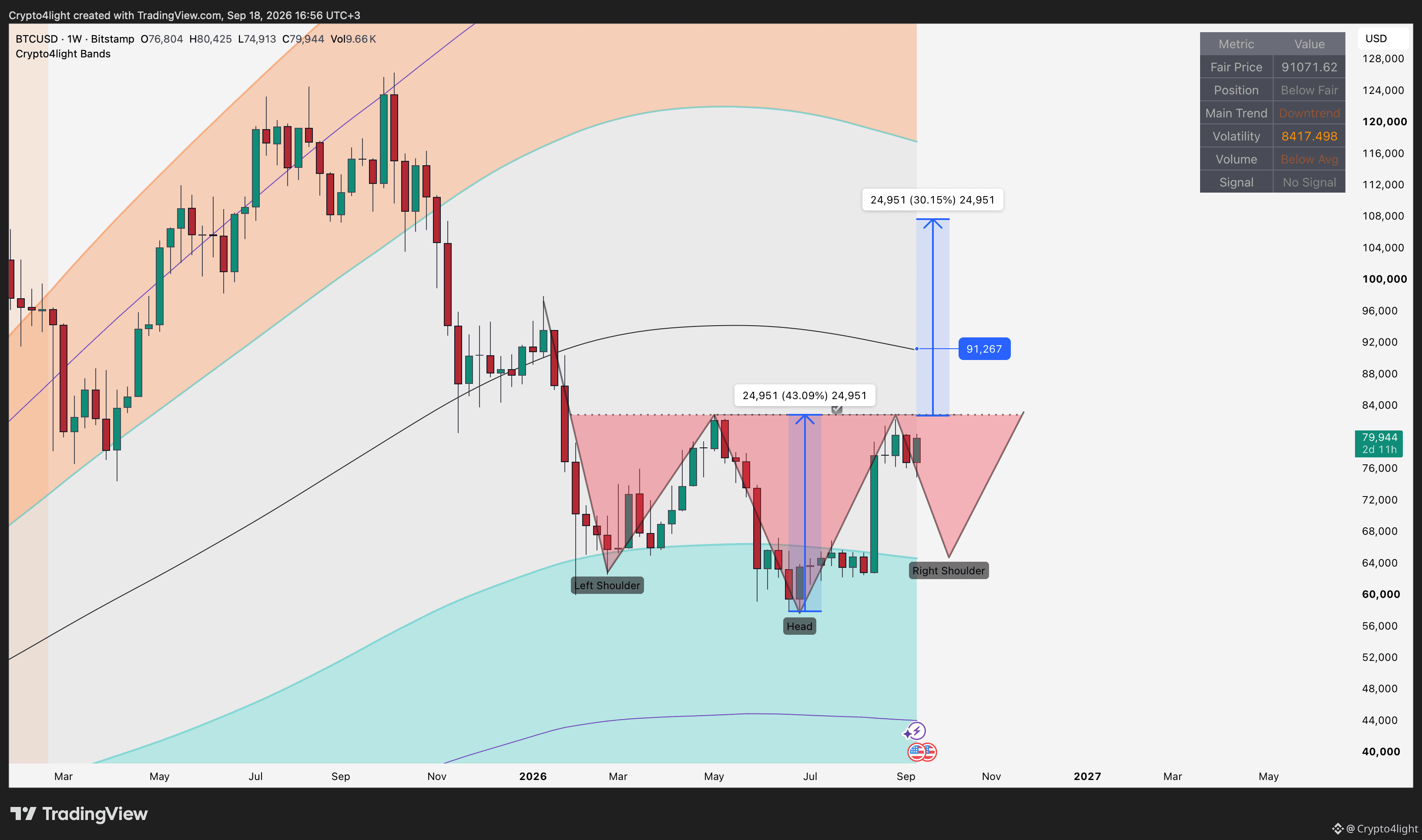
The Bitcoin scenario would be absolutely insane if we get an inverse head-and-shoulders pattern on the weekly chart 😅 Hopefully, we won’t!
As for the price action:
1. The decline before the US drama around the CLARITY Act and the rate hike was already priced in, and we’ve already seen the subsequent move higher.
2. On the weekly chart, I’ve marked the levels from the Fair Price Line.
3. A Wyckoff accumulation is theoretically still possible, but I’m becoming more and more convinced that we may have already put in the bottom this summer without a spring and a liquidity sweep of the lows. I made a video about the potential bottom.
4. Bitcoin dominance is also looking encouraging. It has started moving lower, giving altcoins a little room to breathe! $BTC
{future}(BTCUSDT)
The Bitcoin scenario would be absolutely insane if we get an inverse head-and-shoulders pattern on the weekly chart 😅 Hopefully, we won’t!
As for the price action:
1. The decline before the US drama around the CLARITY Act and the rate hike was already priced in, and we’ve already seen the subsequent move higher.
2. On the weekly chart, I’ve marked the levels from the Fair Price Line.
3. A Wyckoff accumulation is theoretically still possible, but I’m becoming more and more convinced that we may have already put in the bottom this summer without a spring and a liquidity sweep of the lows. I made a video about the potential bottom.
4. Bitcoin dominance is also looking encouraging. It has started moving lower, giving altcoins a little room to breathe! $BTC
As for the price action:
1. The decline before the US drama around the CLARITY Act and the rate hike was already priced in, and we’ve already seen the subsequent move higher.
2. On the weekly chart, I’ve marked the levels from the Fair Price Line.
3. A Wyckoff accumulation is theoretically still possible, but I’m becoming more and more convinced that we may have already put in the bottom this summer without a spring and a liquidity sweep of the lows. I made a video about the potential bottom.
4. Bitcoin dominance is also looking encouraging. It has started moving lower, giving altcoins a little room to breathe! $BTC
2
2
3.9k
·
--
NEAR Protocol Analysis. Should You Buy $NEAR Now?
NEAR Protocol Analysis. Should You Buy $NEAR Now?
1
1
2.1k
·
--
Harmony One Price Analysis: Should You Buy $ONE Now?
Harmony One Price Analysis: Should You Buy $ONE Now?
2
2.1k
·
--
Bearish
Verified
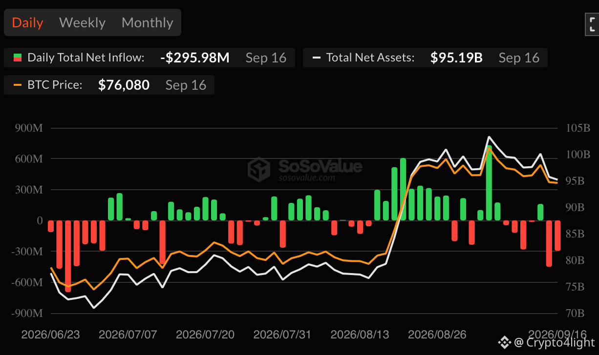
Priced in 💩 show 🇺🇸
Spot Bitcoin (BTC) ETFs in the US experienced outflows of $450 million after the Senate failed to advance the CLARITY Act.
Treat people something big is coming and rekt everyone after that) $BTC #BTCETF
{future}(BTCUSDT)
Priced in 💩 show 🇺🇸
Spot Bitcoin (BTC) ETFs in the US experienced outflows of $450 million after the Senate failed to advance the CLARITY Act.
Treat people something big is coming and rekt everyone after that) $BTC #BTCETF
Spot Bitcoin (BTC) ETFs in the US experienced outflows of $450 million after the Senate failed to advance the CLARITY Act.
Treat people something big is coming and rekt everyone after that) $BTC #BTCETF
1
1
738
·
--
Bearish
Done $ZEC
{future}(ZECUSDT)
Done $ZEC
Crypto4light
·
--
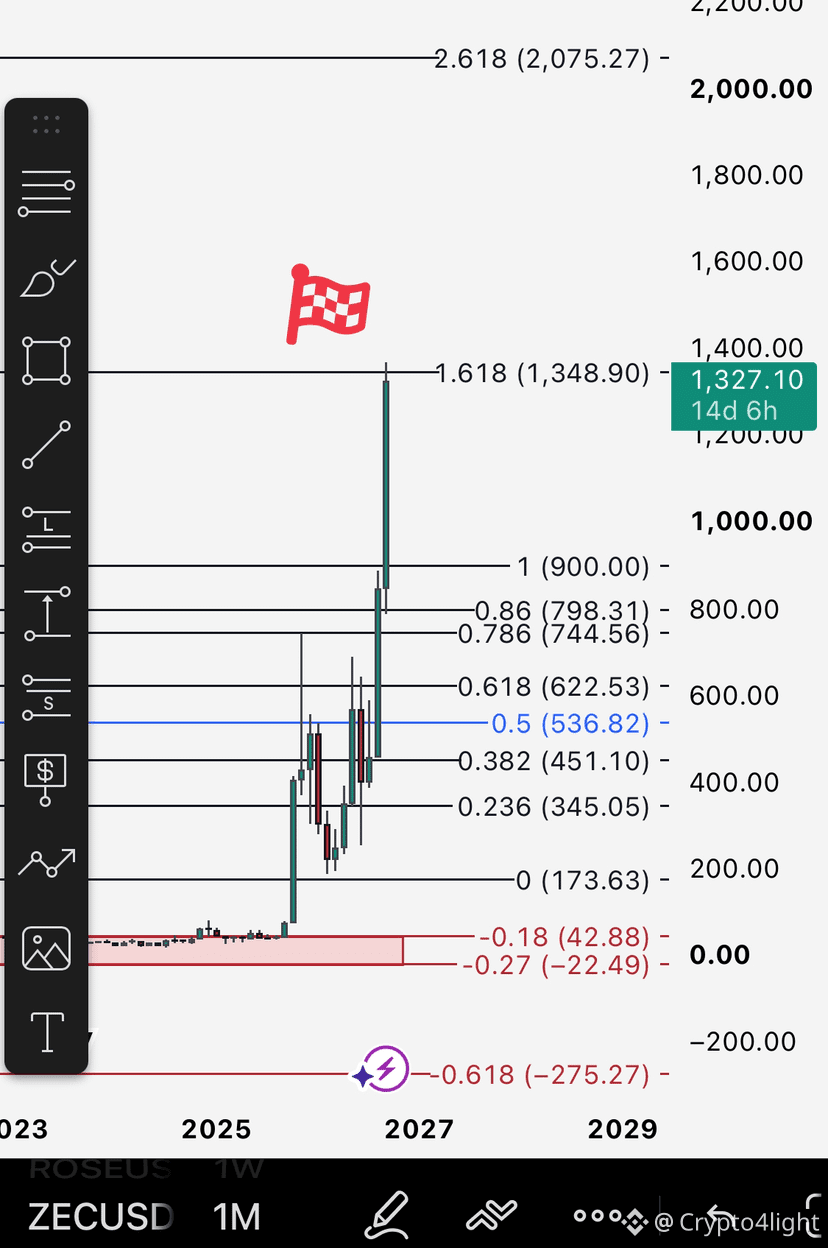
I’ve been tracking $ZEC targets since 2022!
This is the entire chart on the weekly timeframe, and all the levels are still valid for now.
The accumulation zone was around $30–$50. From here, we can assume that we’re moving through growth waves, with the final stage potentially reaching the $1,300–$1,400 area. #zec
This is the entire chart on the weekly timeframe, and all the levels are still valid for now.
The accumulation zone was around $30–$50. From here, we can assume that we’re moving through growth waves, with the final stage potentially reaching the $1,300–$1,400 area. #zec
2
1k
·
--
Litecoin Price Analysis. $LTC Zones of Interest
Litecoin Price Analysis. $LTC Zones of Interest
2
2
1.3k
·
--
CLARITY Act FAILED! Bitcoin Is Heading Lower? $BTC Price Analysis
CLARITY Act FAILED! Bitcoin Is Heading Lower? $BTC Price Analysis
1
2
953
·
--
3 Altcoins Worth Watching! $VTHO , $AXL & $STEEM
3 Altcoins Worth Watching! $VTHO , $AXL & $STEEM
4
830
·
--
$ARB Price Analysis: Is This the Perfect Buy Entry?
$ARB Price Analysis: Is This the Perfect Buy Entry?
2
626
·
--
This is a perfect example of why, just because you see some whales, funds, or a billionaire buying and accumulating Bitcoin or another coin, it doesn’t mean they’re the smartest people in the room or that they know the future. No! There are real insiders — usually people close to the U.S. president, someone from the token’s team, or market makers. And then there are simply wealthy people who buy and end up taking losses just like ordinary retail traders.
KULR Technology sold 764 Bitcoin for $58 million, effectively ending its Bitcoin treasury strategy.
• Its holdings peaked at 1,092 BTC in June 2026.
• Total investment losses reached $30 million. $BTC Open trade now 👍
{future}(BTCUSDT)
This is a perfect example of why, just because you see some whales, funds, or a billionaire buying and accumulating Bitcoin or another coin, it doesn’t mean they’re the smartest people in the room or that they know the future. No! There are real insiders — usually people close to the U.S. president, someone from the token’s team, or market makers. And then there are simply wealthy people who buy and end up taking losses just like ordinary retail traders.
KULR Technology sold 764 Bitcoin for $58 million, effectively ending its Bitcoin treasury strategy.
• Its holdings peaked at 1,092 BTC in June 2026.
• Total investment losses reached $30 million. $BTC Open trade now 👍
KULR Technology sold 764 Bitcoin for $58 million, effectively ending its Bitcoin treasury strategy.
• Its holdings peaked at 1,092 BTC in June 2026.
• Total investment losses reached $30 million. $BTC Open trade now 👍
1
436
·
--
$STEEM price analysis! What next? Trade today #STEEM
$STEEM price analysis! What next? Trade today #STEEM
1
2
2.2k
·
--
Bitcoin: CRUCIAL Moment Before the Next Move! $BTC #BTC
Bitcoin: CRUCIAL Moment Before the Next Move! $BTC #BTC
215
·
--
Bearish
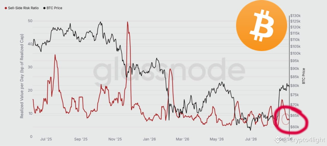
Sales pressure #BTC has reached a yearly high. Open trade now $BTC
{future}(BTCUSDT)
Sales pressure #BTC has reached a yearly high. Open trade now $BTC
1
523
·
--
$VTHO price prediction. Trade today #VTHOUSDT
$VTHO price prediction. Trade today #VTHOUSDT
1
2
1.9k
·
--
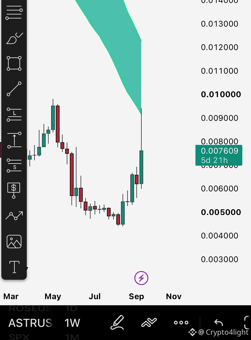
Fundamental line test done ✅ Everything else relevant.
There still a lot of coins under the line
$ASTR
{future}(ASTRUSDT)
Fundamental line test done ✅ Everything else relevant.
There still a lot of coins under the line
$ASTR
There still a lot of coins under the line
$ASTR
Crypto4light
·
--
$ASTR Price Analysis: Is Astar Finally Ready to Explode?
8
7
4.2k
·
--
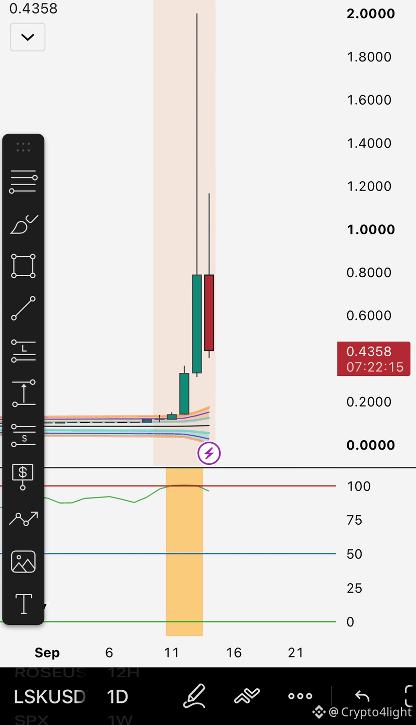
People start searching for a token only when it’s already too late 🤦♂️
All the targets have already been reached, even on the monthly timeframe. Now, if you want, just watch the test of the Fair Price DTF.
Basically, nothing new. $LSK
{future}(LSKUSDT)
People start searching for a token only when it’s already too late 🤦♂️
All the targets have already been reached, even on the monthly timeframe. Now, if you want, just watch the test of the Fair Price DTF.
Basically, nothing new. $LSK
All the targets have already been reached, even on the monthly timeframe. Now, if you want, just watch the test of the Fair Price DTF.
Basically, nothing new. $LSK
Crypto4light
·
--
LSK Price Analysis. $LSK Could Be Setting Up for a BIG Move?
1
1.4k
Log in to explore more content
Join global crypto users on Binance Square
⚡️ Get latest and useful information about crypto.
💬 Trusted by the world’s largest crypto exchange.
👍 Discover real insights from verified creators.
Email / Phone number
Trending Topics
BTCBreaks80K
27,325 views
777 Discussing
🚨 BITCOIN $80K IS BACK IN FOCUS! 🔥
BTC is pushing toward the $80,000 psychological resistance after reclaiming the $78K zone. A clean breakout and hold above $80K could bring $82K–$85K into focus next. 📈
But traders need to watch the rejection zone carefully — losing $77K–$78K could trigger another pullback.
🎯 Key levels:
• 🔥 Breakout: $80K
• 🚀 Next zone: $82K–$85K
• ⚠️ Support: $77K–$78K
$80K isn’t just a number — it’s the level bulls need to conquer.
Are we about to see the next BTC breakout? 👇
#bitcoin #BTC #BinanceSquare #btcbreaks80k
$BTC
ASHFAQ NAEEM
·4 Likes
·4.8k views
BuffettBecomesBerkshireChairmanEmeritus
3,415 views
209 Discussing
ZcashSpotETFTops$230MMonthlyInflow
1,305 views
47 Discussing