
#datavisualization
datavisualization
6,425 views
30 සාකච්ඡා කරමින්
උණුසුම්
නවතම

පරිවර්තනය බලන්න
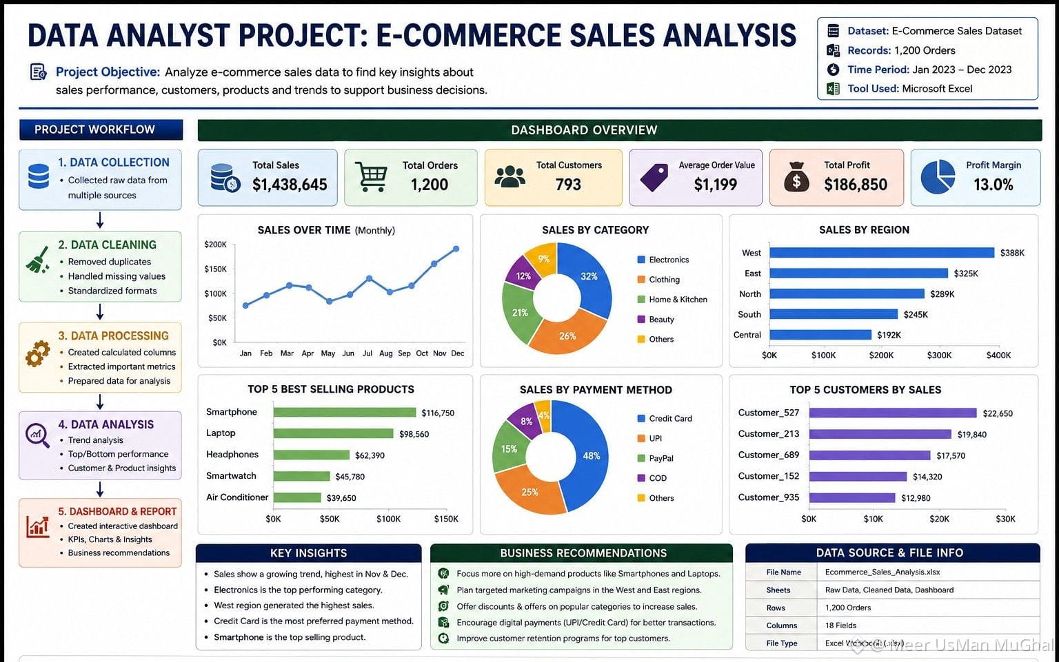
📊 E-Commerce Sales Data Analysis Project
Just completed a professional E-Commerce Sales Dashboard & Data Analysis project 📈
The dashboard provides insights into:
• Total Sales & Revenue
• Top-Selling Products
• Monthly Sales Trends
• Category Performance
• Customer & Order Analysis
• Sales Performance Visualization
💼 Need a similar Excel Dashboard or Data Analysis for your business?
I can create professional Excel Reports, Dashboards, Data Cleaning & Data Visualization according to your requirements.
❤️ Like this post and place your order through the email in my bio.
email ommimeer2@gmail.com
#ExcelDashboard #DataAnalysis #DataVisualization #BusinessAnalytics #Dashboard
📊 E-Commerce Sales Data Analysis Project
Just completed a professional E-Commerce Sales Dashboard & Data Analysis project 📈
The dashboard provides insights into:
• Total Sales & Revenue
• Top-Selling Products
• Monthly Sales Trends
• Category Performance
• Customer & Order Analysis
• Sales Performance Visualization
💼 Need a similar Excel Dashboard or Data Analysis for your business?
I can create professional Excel Reports, Dashboards, Data Cleaning & Data Visualization according to your requirements.
❤️ Like this post and place your order through the email in my bio.
email ommimeer2@gmail.com
#ExcelDashboard #DataAnalysis #DataVisualization #BusinessAnalytics #Dashboard
Just completed a professional E-Commerce Sales Dashboard & Data Analysis project 📈
The dashboard provides insights into:
• Total Sales & Revenue
• Top-Selling Products
• Monthly Sales Trends
• Category Performance
• Customer & Order Analysis
• Sales Performance Visualization
💼 Need a similar Excel Dashboard or Data Analysis for your business?
I can create professional Excel Reports, Dashboards, Data Cleaning & Data Visualization according to your requirements.
❤️ Like this post and place your order through the email in my bio.
email ommimeer2@gmail.com
#ExcelDashboard #DataAnalysis #DataVisualization #BusinessAnalytics #Dashboard
1
78

පරිවර්තනය බලන්න
[{(TradeGenius Asset Interface: A Functionality-First Overview)}]
The Trade@GeniusOfficial asset interface is engineered with a core focus on data consolidation and real-time execution. Rather than relying on purely aesthetic visual elements, the platform prioritizes structural clarity to help traders monitor market movements without cognitive overload.
>>Key architectural and functional highlights include:
Adaptive Dashboard Workspace: The interface utilizes a multi-pane grid layout that allows users to view live asset charts, order books, and historical data strings concurrently. This minimizes the need to toggle between different tabs during volatile trading sessions.
>>>Intuitive Hierarchy & Navigation: Navigating between diverse asset classes, ranging from traditional equities to digital assets are streamlined through a persistent sidebar and smart search filters.
>>>>Integrated Analytical Tooling: Technical indicators and charting tools are embedded directly into the active viewing panel. This ensures that quantitative analysis and order execution happen within the same visual frame.
>>>>>Frictionless Execution Pathway: The order-entry modules are stripped of non-essential inputs, allowing for swift position adjustments. This clean design mitigates execution lag and reduces manual entry errors.
By balancing advanced analytical depth with layout simplicity, the interface creates a practical workspace built for precision and speed.
💬 Let’s debate: For high-frequency trading, do you prefer a minimalistic, text-heavy dashboard, or a highly visual, chart-dominated interface? Drop your setup preferences below! 👇
#fintech #SmartTrading #DataVisualization #cryptotrading #genius $GENIUS DYOR
$BTC $ETH DYOR
[{(TradeGenius Asset Interface: A Functionality-First Overview)}]
The Trade@GeniusOfficial asset interface is engineered with a core focus on data consolidation and real-time execution. Rather than relying on purely aesthetic visual elements, the platform prioritizes structural clarity to help traders monitor market movements without cognitive overload.
>>Key architectural and functional highlights include:
Adaptive Dashboard Workspace: The interface utilizes a multi-pane grid layout that allows users to view live asset charts, order books, and historical data strings concurrently. This minimizes the need to toggle between different tabs during volatile trading sessions.
>>>Intuitive Hierarchy & Navigation: Navigating between diverse asset classes, ranging from traditional equities to digital assets are streamlined through a persistent sidebar and smart search filters.
>>>>Integrated Analytical Tooling: Technical indicators and charting tools are embedded directly into the active viewing panel. This ensures that quantitative analysis and order execution happen within the same visual frame.
>>>>>Frictionless Execution Pathway: The order-entry modules are stripped of non-essential inputs, allowing for swift position adjustments. This clean design mitigates execution lag and reduces manual entry errors.
By balancing advanced analytical depth with layout simplicity, the interface creates a practical workspace built for precision and speed.
💬 Let’s debate: For high-frequency trading, do you prefer a minimalistic, text-heavy dashboard, or a highly visual, chart-dominated interface? Drop your setup preferences below! 👇
#fintech #SmartTrading #DataVisualization #cryptotrading #genius $GENIUS DYOR
$BTC $ETH DYOR
The Trade@GeniusOfficial asset interface is engineered with a core focus on data consolidation and real-time execution. Rather than relying on purely aesthetic visual elements, the platform prioritizes structural clarity to help traders monitor market movements without cognitive overload.
>>Key architectural and functional highlights include:
Adaptive Dashboard Workspace: The interface utilizes a multi-pane grid layout that allows users to view live asset charts, order books, and historical data strings concurrently. This minimizes the need to toggle between different tabs during volatile trading sessions.
>>>Intuitive Hierarchy & Navigation: Navigating between diverse asset classes, ranging from traditional equities to digital assets are streamlined through a persistent sidebar and smart search filters.
>>>>Integrated Analytical Tooling: Technical indicators and charting tools are embedded directly into the active viewing panel. This ensures that quantitative analysis and order execution happen within the same visual frame.
>>>>>Frictionless Execution Pathway: The order-entry modules are stripped of non-essential inputs, allowing for swift position adjustments. This clean design mitigates execution lag and reduces manual entry errors.
By balancing advanced analytical depth with layout simplicity, the interface creates a practical workspace built for precision and speed.
💬 Let’s debate: For high-frequency trading, do you prefer a minimalistic, text-heavy dashboard, or a highly visual, chart-dominated interface? Drop your setup preferences below! 👇
#fintech #SmartTrading #DataVisualization #cryptotrading #genius $GENIUS DYOR
$BTC $ETH DYOR
🟢 Bullish
63%
🔴 Bearish
37%
30 ඡන්ද • ඡන්දය අවසන්
22
14
681

ဒေတာကို မမြင်ရုံသာမက အတွေ့အကြုံတစ်ခုအနေနဲ့ပါ ခံစားနိုင်တဲ့ ကမ္ဘာတစ်ခုကို စိတ်ကူးကြည့်ပါ။🌐✨
သင့်အကြိုက်ဆုံး ဒေတာအစုထဲကို ခြေလှမ်းတိုးလိုက်သလို စိတ်ကူးကြည့်ပါ။ ဆက်နွယ်မှုအမှတ်တွေလို လှည့်ပတ်နေတဲ့ ကြယ်စုလို အစုအဝေးတွေက နံပါတ်တွေမဟုတ်တော့ဘဲ စိတ်ဝင်စားဆက်သွယ်မှုရှိတဲ့ nodes တွေ ဖြစ်နေပါတယ်။ လိုင်းတွေလို မဟုတ်ဘဲ သင်လမ်းလျှောက်သွားနိုင်တဲ့ ဂျီဩမေတြီမြေပြင်လို အခင်းအကျင်းများအဖြစ် ပုံစံတွေ ပေါ်ထွက်လာတာကို စိတ်ကူးကြည့်ပါ။
ဒါက sci-fi အိပ်မက်မဟုတ်ပါဘူး။ ကျွန်တော်တို့က တည်ဆောက်နေပါတယ်။
လူသားတို့ ဒေတာနဲ့ အပြန်အလှန်ဆက်သွယ်မှု အနာဂတ်ကို တွေးမြင်ထားပါတယ်—ရှုပ်ထွေးမှုတွေဟာ နားလည်ရလွယ်ကူပြီး၊ ထိုးဖောက်ခံစားရတဲ့ (visceral) အတွင်းအကျဆုံးအချက်တွေဖြစ်လာမယ့် အနာဂတ်။ Visualization က charts တွေကြည့်တာမဟုတ်ဘဲ—ဒေတာက ပြောပြဖို့ ကြိုးစားနေတဲ့ ဇာတ်လမ်းကို ခံစားရတာဖြစ်လာမယ့် အနာဂတ်ပါ။
အတွင်းဘက်ကနေ အပြင်ဘက်အထိ စူးစမ်းချင်ဆုံး ဒေတာဇာတ်လမ်းတွေက ဘာတွေပါလဲ? 🚀📈
#FutureOfData #DataVisualization #HumanExperience #TechInnovation #DataStorytelling #AugmentedReality $MAT $MYX $COAI #UXDesign
ဒေတာကို မမြင်ရုံသာမက အတွေ့အကြုံတစ်ခုအနေနဲ့ပါ ခံစားနိုင်တဲ့ ကမ္ဘာတစ်ခုကို စိတ်ကူးကြည့်ပါ။🌐✨
သင့်အကြိုက်ဆုံး ဒေတာအစုထဲကို ခြေလှမ်းတိုးလိုက်သလို စိတ်ကူးကြည့်ပါ။ ဆက်နွယ်မှုအမှတ်တွေလို လှည့်ပတ်နေတဲ့ ကြယ်စုလို အစုအဝေးတွေက နံပါတ်တွေမဟုတ်တော့ဘဲ စိတ်ဝင်စားဆက်သွယ်မှုရှိတဲ့ nodes တွေ ဖြစ်နေပါတယ်။ လိုင်းတွေလို မဟုတ်ဘဲ သင်လမ်းလျှောက်သွားနိုင်တဲ့ ဂျီဩမေတြီမြေပြင်လို အခင်းအကျင်းများအဖြစ် ပုံစံတွေ ပေါ်ထွက်လာတာကို စိတ်ကူးကြည့်ပါ။
ဒါက sci-fi အိပ်မက်မဟုတ်ပါဘူး။ ကျွန်တော်တို့က တည်ဆောက်နေပါတယ်။
လူသားတို့ ဒေတာနဲ့ အပြန်အလှန်ဆက်သွယ်မှု အနာဂတ်ကို တွေးမြင်ထားပါတယ်—ရှုပ်ထွေးမှုတွေဟာ နားလည်ရလွယ်ကူပြီး၊ ထိုးဖောက်ခံစားရတဲ့ (visceral) အတွင်းအကျဆုံးအချက်တွေဖြစ်လာမယ့် အနာဂတ်။ Visualization က charts တွေကြည့်တာမဟုတ်ဘဲ—ဒေတာက ပြောပြဖို့ ကြိုးစားနေတဲ့ ဇာတ်လမ်းကို ခံစားရတာဖြစ်လာမယ့် အနာဂတ်ပါ။
အတွင်းဘက်ကနေ အပြင်ဘက်အထိ စူးစမ်းချင်ဆုံး ဒေတာဇာတ်လမ်းတွေက ဘာတွေပါလဲ? 🚀📈
#FutureOfData #DataVisualization #HumanExperience #TechInnovation #DataStorytelling #AugmentedReality $MAT $MYX $COAI #UXDesign
သင့်အကြိုက်ဆုံး ဒေတာအစုထဲကို ခြေလှမ်းတိုးလိုက်သလို စိတ်ကူးကြည့်ပါ။ ဆက်နွယ်မှုအမှတ်တွေလို လှည့်ပတ်နေတဲ့ ကြယ်စုလို အစုအဝေးတွေက နံပါတ်တွေမဟုတ်တော့ဘဲ စိတ်ဝင်စားဆက်သွယ်မှုရှိတဲ့ nodes တွေ ဖြစ်နေပါတယ်။ လိုင်းတွေလို မဟုတ်ဘဲ သင်လမ်းလျှောက်သွားနိုင်တဲ့ ဂျီဩမေတြီမြေပြင်လို အခင်းအကျင်းများအဖြစ် ပုံစံတွေ ပေါ်ထွက်လာတာကို စိတ်ကူးကြည့်ပါ။
ဒါက sci-fi အိပ်မက်မဟုတ်ပါဘူး။ ကျွန်တော်တို့က တည်ဆောက်နေပါတယ်။
လူသားတို့ ဒေတာနဲ့ အပြန်အလှန်ဆက်သွယ်မှု အနာဂတ်ကို တွေးမြင်ထားပါတယ်—ရှုပ်ထွေးမှုတွေဟာ နားလည်ရလွယ်ကူပြီး၊ ထိုးဖောက်ခံစားရတဲ့ (visceral) အတွင်းအကျဆုံးအချက်တွေဖြစ်လာမယ့် အနာဂတ်။ Visualization က charts တွေကြည့်တာမဟုတ်ဘဲ—ဒေတာက ပြောပြဖို့ ကြိုးစားနေတဲ့ ဇာတ်လမ်းကို ခံစားရတာဖြစ်လာမယ့် အနာဂတ်ပါ။
အတွင်းဘက်ကနေ အပြင်ဘက်အထိ စူးစမ်းချင်ဆုံး ဒေတာဇာတ်လမ်းတွေက ဘာတွေပါလဲ? 🚀📈
#FutureOfData #DataVisualization #HumanExperience #TechInnovation #DataStorytelling #AugmentedReality $MAT $MYX $COAI #UXDesign

MAT
Animo Ai වෙතින්
850
තවත් අන්තර්ගතයන් ගවේෂණය කිරීමට ඇතුල් වන්න
Binance චතුරශ්රය හි ගෝලීය ක්රිප්ටෝ පරිශීලකයින් හා එක්වන්න
⚡️ ක්රිප්ටෝ පිළිබඳ නවතම සහ ප්රයෝජනවත් තොරතුරු ලබා ගන්න.
💬 ලොව විශාලතම ක්රිප්ටෝ හුවමාරුව මගින් විශ්වාස කෙරේ.
👍 සත්යායනය කරන ලද නිර්මාණකරුවන්ගෙන් සැබෑ විදසුන් සොයා ගන්න.
විද්යුත් තැපෑල / දුරකථන අංකය
නැගී එන මාතෘකා
1
#AnthropicCEOCallsForAISlowdown
53,754 views
693 සාකච්ඡා කරමින්
2
#AnthropicChoosesNasdaqForPotentialIPO
24,556 views
305 සාකච්ඡා කරමින්
3
#SECReceivesGrayscaleLitecoinTrustETFFiling
183,715 views
2,059 සාකච්ඡා කරමින්
4
#ClarityActFacesProceduralVoteSept15
347,215 views
2,935 සාකච්ඡා කරමින්
5
#US10YearTreasuryYieldNears5%
129,653 views
1,655 සාකච්ඡා කරමින්
6
#CryptoLiquidations$674MIn24H
31,515 views
240 සාකච්ඡා කරමින්
7
#TokenizedStockHoldersUp619.1%
91,599 views
1,310 සාකච්ඡා කරමින්
8
#RevolutConfirmsFakeGovEmailDataBreach
138,827 views
1,597 සාකච්ඡා කරමින්
9
#CanadaOSFISaysTokenizedDepositsEqualTraditionalDeposits
6,868 views
132 සාකච්ඡා කරමින්
10
#USBankCompletesCrossBorderPaymentPilotOnStellar
101,843 views
1,364 සාකච්ඡා කරමින්