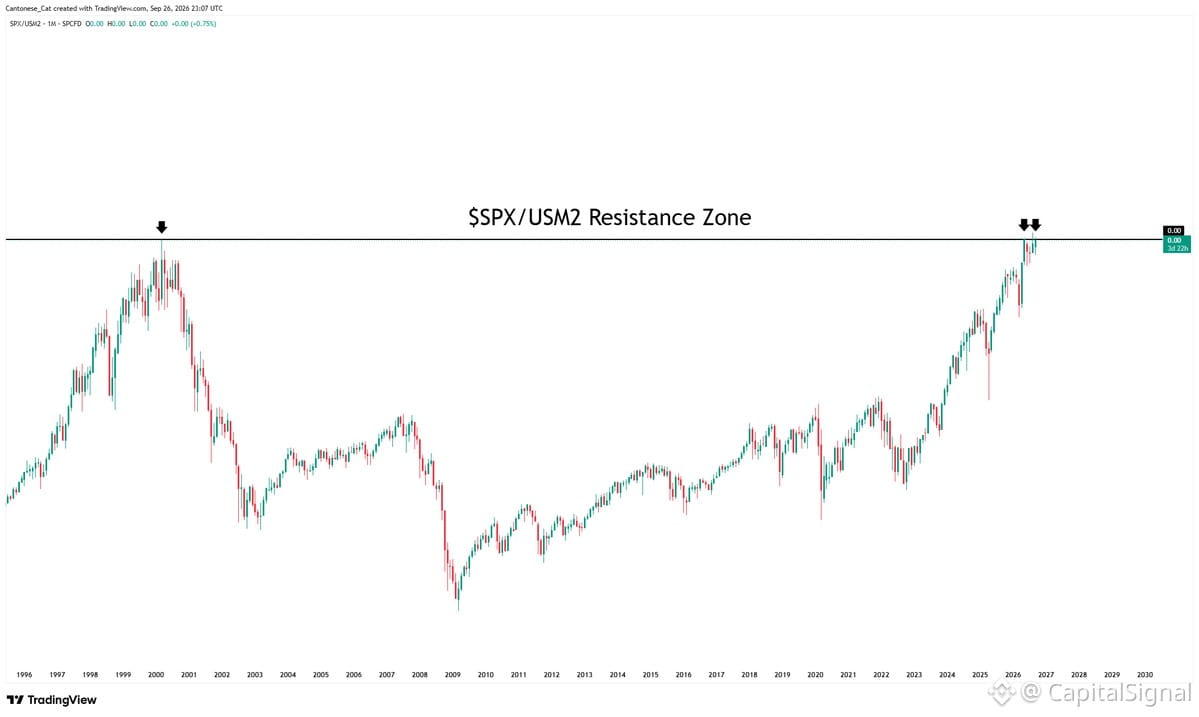
Quick ratio check: $SPX vs. M2 money supply over 30 years.
When you strip out the liquidity backdrop, the picture changes. Stocks look a lot less impressive when measured against the money printer's output rather than nominal dollars.
This chart's basically asking: are we actually making real gains, or just riding the liquidity wave?
Right now, on an M2-adjusted basis, we're nowhere near as rich as the headline $SPX number suggests. The gap between nominal price and real purchasing power keeps widening.
If the Fed tightens or even holds steady while markets expect more juice, this ratio could get ugly fast. It's a positioning risk most retail traders aren't watching—they see $SPX up, assume wealth creation, miss the denominator problem.
Watch liquidity conditions more than price action. When M2 growth slows or reverses, risk assets reprice violently.
When you strip out the liquidity backdrop, the picture changes. Stocks look a lot less impressive when measured against the money printer's output rather than nominal dollars.
This chart's basically asking: are we actually making real gains, or just riding the liquidity wave?
Right now, on an M2-adjusted basis, we're nowhere near as rich as the headline $SPX number suggests. The gap between nominal price and real purchasing power keeps widening.
If the Fed tightens or even holds steady while markets expect more juice, this ratio could get ugly fast. It's a positioning risk most retail traders aren't watching—they see $SPX up, assume wealth creation, miss the denominator problem.
Watch liquidity conditions more than price action. When M2 growth slows or reverses, risk assets reprice violently.