

#cryptozeno
cryptozeno
Просмотров: 1.6M
496 обсуждают
Популярные
Новые

·
--
Статья
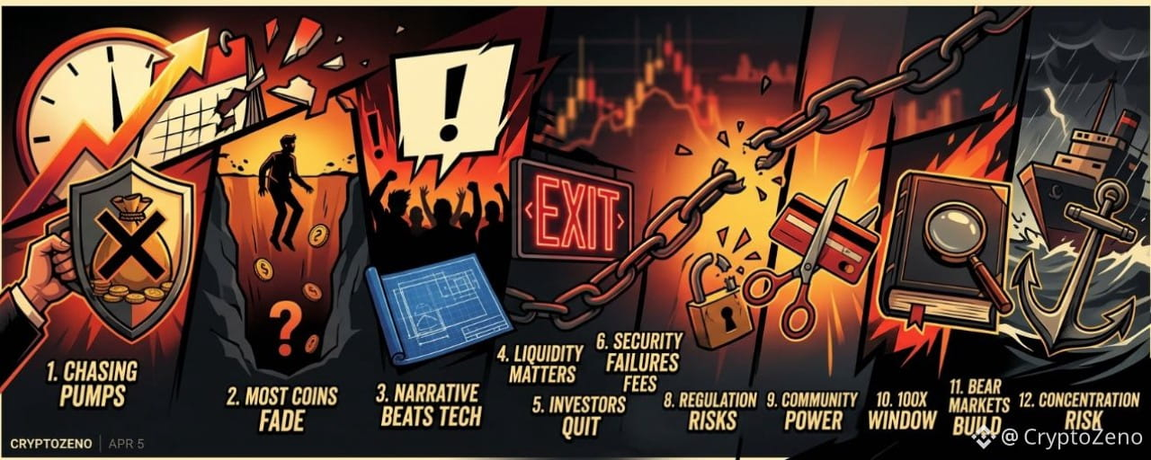
12 Brutal Mistakes I Made in 12 Years of CryptoSo You Don’t Have To Learn Them the Hard WayI’ve survived twelve years in crypto. I’ve made millions. I’ve lost millions. The gains teach you confidence. The losses teach you truth. These are the mistakes that cost me the most.
1. Chasing Pumps Is Just Providing Exit Liquidity
Every time I bought into a coin already exploding, I convinced myself momentum would continue. Most of the time, I was simply late. When something is trending everywhere, you are rarely early. You are often the liquidity for someone smarter who entered before you.
2. Most Coins Don’t Collapse. They Fade
The majority of projects don’t die in dramatic crashes. They slowly lose volume, updates stop, the community shrinks, and attention disappears. One day you realize liquidity is gone and so is your capital.
3. Narrative Often Beats Technology
I backed technically superior projects that went nowhere. Meanwhile, tokens with powerful stories, branding, and community momentum outperformed. Markets reward belief and attention before they reward engineering.
4. Liquidity Is More Important Than Paper Gains
An unrealized gain means nothing if you cannot exit efficiently. Thin order books trap capital. Always assess depth, not just price.
5. Most Investors Quit at the Worst Time
Cycles are emotional weapons. People buy during euphoria and sell during despair. Many who left in bear markets watched prices recover without them. Longevity alone is an edge.
6. Security Failures Hurt More Than Bad Trades
I have been hacked, phished, and SIM-swapped. Poor operational security erased profits faster than volatility ever did. Capital without protection is temporary.
7. Overtrading Transfers Wealth to Exchanges
Constant activity feels productive. It rarely is. The more I traded, the more I paid in fees and mistakes. Holding strong assets through noise often outperformed aggressive trading.
8. Regulation Changes the Game Overnight
Governments move slowly until they don’t. Tokens built on regulatory gray zones can disappear quickly. Long-term survival requires anticipating policy risk.
9. Community Is an Asset Class
I underestimated culture. Memes, loyalty, and shared identity drive liquidity and resilience. A loud, committed community can sustain a project longer than strong fundamentals alone.
10. The 100x Window Is Brief
Life-changing returns happen early, quietly, and without consensus. Once everyone agrees something is a great opportunity, the asymmetric upside is usually gone.
11. Bear Markets Build Real Advantage
The quiet phases are when knowledge compounds. Reading, building, accumulating quality assets at depressed valuations created my largest long-term returns. Bull markets reward positioning built in silence.
12. Concentration Without Risk Control Is Gambling
I have seen fortunes disappear from a single oversized bet. Conviction must be balanced with survival. You cannot compound if you are wiped out.
Twelve years taught me this: crypto does not reward intelligence alone. It rewards discipline, patience, adaptability, and survival.
If even one of these lessons saves you from repeating my mistakes, you are already ahead of where I once was.
In crypto, staying in the game is often the biggest advantage of all.
#CryptoZeno #EthereumStakingATH39.2METH
12 Brutal Mistakes I Made in 12 Years of CryptoSo You Don’t Have To Learn Them the Hard Way
I’ve survived twelve years in crypto. I’ve made millions. I’ve lost millions. The gains teach you confidence. The losses teach you truth. These are the mistakes that cost me the most.
1. Chasing Pumps Is Just Providing Exit Liquidity
Every time I bought into a coin already exploding, I convinced myself momentum would continue. Most of the time, I was simply late. When something is trending everywhere, you are rarely early. You are often the liquidity for someone smarter who entered before you.
2. Most Coins Don’t Collapse. They Fade
The majority of projects don’t die in dramatic crashes. They slowly lose volume, updates stop, the community shrinks, and attention disappears. One day you realize liquidity is gone and so is your capital.
3. Narrative Often Beats Technology
I backed technically superior projects that went nowhere. Meanwhile, tokens with powerful stories, branding, and community momentum outperformed. Markets reward belief and attention before they reward engineering.
4. Liquidity Is More Important Than Paper Gains
An unrealized gain means nothing if you cannot exit efficiently. Thin order books trap capital. Always assess depth, not just price.
5. Most Investors Quit at the Worst Time
Cycles are emotional weapons. People buy during euphoria and sell during despair. Many who left in bear markets watched prices recover without them. Longevity alone is an edge.
6. Security Failures Hurt More Than Bad Trades
I have been hacked, phished, and SIM-swapped. Poor operational security erased profits faster than volatility ever did. Capital without protection is temporary.
7. Overtrading Transfers Wealth to Exchanges
Constant activity feels productive. It rarely is. The more I traded, the more I paid in fees and mistakes. Holding strong assets through noise often outperformed aggressive trading.
8. Regulation Changes the Game Overnight
Governments move slowly until they don’t. Tokens built on regulatory gray zones can disappear quickly. Long-term survival requires anticipating policy risk.
9. Community Is an Asset Class
I underestimated culture. Memes, loyalty, and shared identity drive liquidity and resilience. A loud, committed community can sustain a project longer than strong fundamentals alone.
10. The 100x Window Is Brief
Life-changing returns happen early, quietly, and without consensus. Once everyone agrees something is a great opportunity, the asymmetric upside is usually gone.
11. Bear Markets Build Real Advantage
The quiet phases are when knowledge compounds. Reading, building, accumulating quality assets at depressed valuations created my largest long-term returns. Bull markets reward positioning built in silence.
12. Concentration Without Risk Control Is Gambling
I have seen fortunes disappear from a single oversized bet. Conviction must be balanced with survival. You cannot compound if you are wiped out.
Twelve years taught me this: crypto does not reward intelligence alone. It rewards discipline, patience, adaptability, and survival.
If even one of these lessons saves you from repeating my mistakes, you are already ahead of where I once was.
In crypto, staying in the game is often the biggest advantage of all.
#CryptoZeno #EthereumStakingATH39.2METH
1. Chasing Pumps Is Just Providing Exit Liquidity
Every time I bought into a coin already exploding, I convinced myself momentum would continue. Most of the time, I was simply late. When something is trending everywhere, you are rarely early. You are often the liquidity for someone smarter who entered before you.
2. Most Coins Don’t Collapse. They Fade
The majority of projects don’t die in dramatic crashes. They slowly lose volume, updates stop, the community shrinks, and attention disappears. One day you realize liquidity is gone and so is your capital.
3. Narrative Often Beats Technology
I backed technically superior projects that went nowhere. Meanwhile, tokens with powerful stories, branding, and community momentum outperformed. Markets reward belief and attention before they reward engineering.
4. Liquidity Is More Important Than Paper Gains
An unrealized gain means nothing if you cannot exit efficiently. Thin order books trap capital. Always assess depth, not just price.
5. Most Investors Quit at the Worst Time
Cycles are emotional weapons. People buy during euphoria and sell during despair. Many who left in bear markets watched prices recover without them. Longevity alone is an edge.
6. Security Failures Hurt More Than Bad Trades
I have been hacked, phished, and SIM-swapped. Poor operational security erased profits faster than volatility ever did. Capital without protection is temporary.
7. Overtrading Transfers Wealth to Exchanges
Constant activity feels productive. It rarely is. The more I traded, the more I paid in fees and mistakes. Holding strong assets through noise often outperformed aggressive trading.
8. Regulation Changes the Game Overnight
Governments move slowly until they don’t. Tokens built on regulatory gray zones can disappear quickly. Long-term survival requires anticipating policy risk.
9. Community Is an Asset Class
I underestimated culture. Memes, loyalty, and shared identity drive liquidity and resilience. A loud, committed community can sustain a project longer than strong fundamentals alone.
10. The 100x Window Is Brief
Life-changing returns happen early, quietly, and without consensus. Once everyone agrees something is a great opportunity, the asymmetric upside is usually gone.
11. Bear Markets Build Real Advantage
The quiet phases are when knowledge compounds. Reading, building, accumulating quality assets at depressed valuations created my largest long-term returns. Bull markets reward positioning built in silence.
12. Concentration Without Risk Control Is Gambling
I have seen fortunes disappear from a single oversized bet. Conviction must be balanced with survival. You cannot compound if you are wiped out.
Twelve years taught me this: crypto does not reward intelligence alone. It rewards discipline, patience, adaptability, and survival.
If even one of these lessons saves you from repeating my mistakes, you are already ahead of where I once was.
In crypto, staying in the game is often the biggest advantage of all.
#CryptoZeno #EthereumStakingATH39.2METH
4
4
910
·
--
Статья
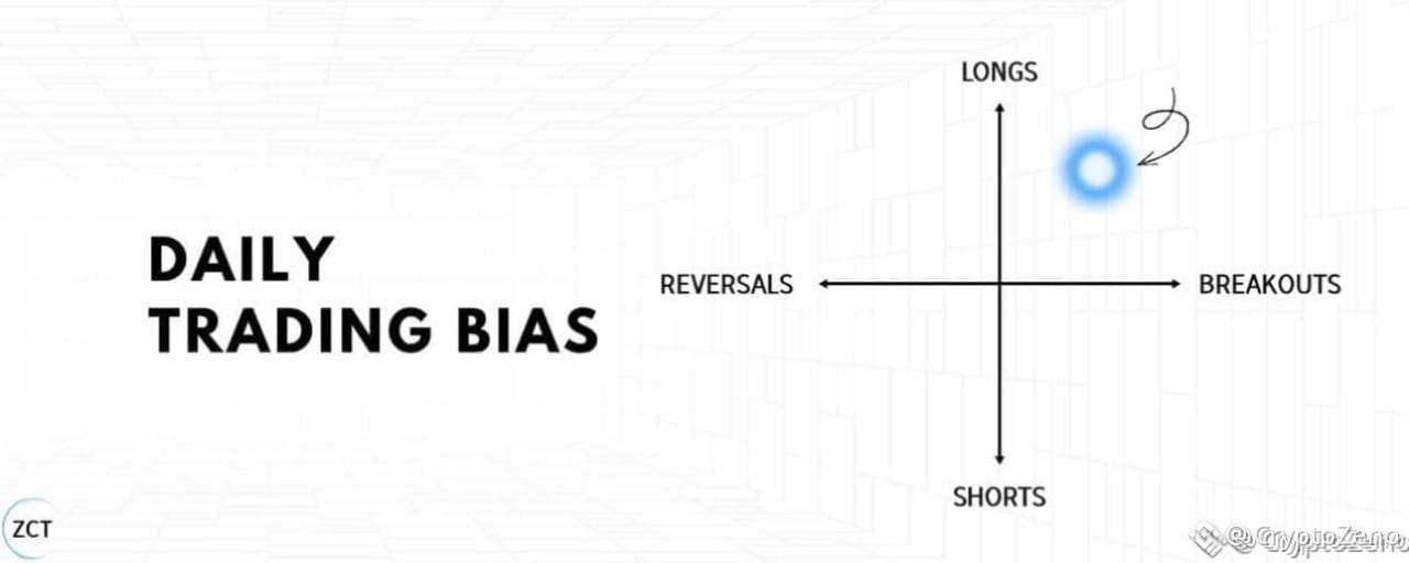
The Breakout Trading Strategy I Use to Catch Big MovesI’ve longed resistance and shorted support for 9 years… This is the exact opposite of what every trader tries to do.
In this article, I will share my entire strategy so you can skip years of testing and losses.
This is something you will want to bookmark, take notes on, and set time aside to think about.
Lesson 1: The Only 2 Trading Strategies
Before you can identify good momentum setups, you need to understand what momentum trading actually is.
Momentum and mean reversion are opposite strategies based on opposite assumptions.
The Two Trading Styles
Momentum (where you take a trade betting on a continuation of the current trend)Mean Reversion (where you take a trade betting on a reversal of the current trend)
One assumes strength continues; the other assumes strength exhausts.
Let’s consider this through a visual example.
Suppose price is approaching a resistance level (in other words, a level where there was previously selling pressure, preventing the price from moving higher).
Momentum assumes the level will break.
You’re betting on continuation.Price approaches resistance, you buy, expecting it to push through and keep running.The level becomes support once broken.
Mean reversion assumes the level will hold.
You’re betting on rejection.Price approaches resistance, you short, expecting it to bounce back down.The level acts as a ceiling.
Same chart. Same resistance level. Opposite strategies.
There is no right or wrong. The key is to understand when you are in a momentum trade environment, such that momentum strategies are highly aligned.
The next section shows you exactly how to identify when the environment favours momentum (my best strategy).
Lesson 1 Summary
There are 2 trading styles: momentum and mean reversionMean reversion bets levels will hold; momentum bets levels will breakOne is not better than the other; it depends entirely on the trade environment
Lesson 2: Optimal Trade Environment
Just opening a long every time price hits resistance won't make us any money.
Without the right conditions, momentum dies immediately after the breakout.
You enter. It reverses. You're stopped out.
That's not bad luck, that's a bad trading environment.
The Rowing Analogy
Imagine you’re rowing a boat.
You either row against or with the current.
One makes it easier to row while the other takes a lot more effort.
Your boat, or rowing technique, didn’t change… Only your environment did.
Trading is the same.
Your strategy is your boat.
Your optimal trade environment is the current.
Now use this 3-filter checklist to ensure you only take trades where a breakout is likely (with the current).
Filter 1: How Did Price Approach the Level?
What you WANT:
A slow, grinding staircase pattern approaching resistance.Each candle makes incremental progress.Higher lows are stacking up.Controlled, deliberate movement.
What you DON’T want:
A fast vertical spike into resistance.Price shoots up in one or two large candles.After a spike, buyers' strength is depleted and price typically consolidates or reverses.This is exhaustion, not momentum.
The staircase pattern shows sustained buying pressure building gradually. When this breaks through resistance, buyers are still engaged and ready to push further.
Common mistake: Traders see a strong candle break resistance and assume momentum is strong. But these fast moves often reverse quickly.
→ Do this instead: Take momentum trades when price approaches resistance in a slow, grinding staircase over multiple candles.
Real Trade Example:
Slow clear grind into resistance showing an optimal ‘price approach to level’ for momentum.
Filter 1: slow grindy staircase ✅
Filter 2: What Did Volume Look Like?
Volume confirms whether the price movement has conviction behind it.
What you WANT:
Gradual increase in volume as price approaches resistanceThis pattern shows controlled, sustainable momentum.
What you DON’T want:
Flat volume (no conviction) or sudden volume spikes (exhaustion).Flat volume means the move lacks participation.Volume spikes often mark climax points where momentum exhausts.Decreasing volume (why would price break out of resistance now, if volume was lower than before?)
Volume should mirror the price pattern, steady and building, not erratic.
This strategy works because momentum continuation is most likely when participation is sustained, supply is absorbed gradually, and structure remains intact.
Real Trade Example:
Around the time the grindy staircase begins to emerge, we see a slow, consistent increase in volume.
Filter 1: slow grindy staircase ✅Filter 2: clearly increasing volume ✅
Lastly,
Filter 3: Moving Average Crossovers
This filter distinguishes trending markets (good for momentum) from choppy, indecisive markets (bad for momentum).
What you WANT to see: Moving averages with minimal crossovers. This indicates a directional trend.
What you DON’T want to see: Frequent crossovers. This signals chop and indecision.
Fewer crossovers = cleaner trend or range = better momentum continuation.
Use the 30SMMA (Smoothed Moving Average).
✍️Quick Actionable Step:
To add the 30SMMA on your charts:
Search for the Smoothed Moving Average Indicator in TradingViewAdd it to your chartGo into settings and change the "Length" to "30"
Real Trade Example:
Filter 1 (Price Action): slow grindy staircase ✅
Filter 2 (Volume): clearly increasing volume ✅
Filter 3 (Crossovers): minimal MA crossovers ✅
🎓Lesson 2 Summary
Slow grinding staircase approaches have better follow-through than fast spikesVolume should be gradual (increasing or decreasing), not flat or spikingFewer MA crossovers indicate cleaner directional conditions for momentum
Lesson 3: Identifying Setups
Now you know what momentum is.
You also know the optimal conditions for it.
Next, you need to know where to execute these trades.
Step 1: Draw Support and Resistance Levels
Momentum trades happen at these key levels. You need to identify them consistently.
I've already written an in-depth masterclass on how to set these levels. I'll link it at the end of this article.
Common mistake: Traders draw levels randomly or inconsistently, leading to missed setups or false signals.
Do this instead: Use my step-by-step approach at the end of this article.
Step 2: Await Your Entry Trigger on the 1-Minute Chart
Once you’ve identified a resistance level on your primary timeframe, switch to the 1-minute chart for precise entry timing.
Why 1-minute chart?
You learn faster.
More trades, more chart exposure and more oppurtunities to practice psychology.
I’ve added a bonus guide on why you should be trading the 1-minute chart at the end of this article.
Real Trade Example:
Step 3: Three Filters
Before entering, check the three filters from Section 2:
Is price approaching resistance in a slow staircase pattern?Is volume gradually increasing or decreasing (not flat or spiking)?Are there minimal MA crossovers (not choppy)?
If any filter fails, reduce your risk on the trade. Only take full risk on A-grade setups, not forcing trades in poor conditions.
🎓Lesson 3 Summary
Draw levels using the ZCT masterclass approach at the end of this articleUse your entry trigger on the 1-minute timeframe: 2 candle closes above for confirmationCheck all three filters before entering, allocate risk and size accordingly
Lesson 4: Strategy Logic: Stop Loss, and Take Profit
You've drawn your levels. You've confirmed the setup aligns with optimal momentum conditions.
Now you need precise execution.
Entry timing, stop placement, and profit targets determine whether you capture the momentum move or get stopped out on a good setup.
This is where most traders lose, not in analysis, but in execution.
Step 4: Entry Trigger
We have established to wait for two consecutive 1-minute candles to close fully above the resistance level. This confirms the level broke and momentum is continuing.
Critical execution detail: After the second candle closes above resistance, place a limit order AT the resistance level (now acting as support), not above it. Price often pulls back slightly after breaking out. Your limit order gets filled on the pullback without chasing.
Common mistake: Traders wait for confirmation, then market-buy above resistance as price runs away. They enter late with a wider stop and worse risk/reward.
→ Do this instead: Preset your limit order AT resistance after the second candle closes. Let price come back to you.
Real Trade Example:
Step 5: Stop Loss
A swing low is:
the lowest wick in a pullback.
Your stop loss goes at the most recent swing low before the breakout.
Common mistake: Traders place stops at the nearest swing low, even if it’s only 0.3% away, leading to frequent stop-outs from normal volatility
Do this instead: Always measure the distance of your stop loss using the ruler tool on TradingView. If it’s less than 1%, use the next swing low down.
Step 6: Take Profit 1R (Equal Distance to Stop)
Your take profit target is 1R, the same distance as your stop loss, but in the profit direction
If your stop loss is 1.982% away from entry, your target is also 1.982% away, but on the upside. This gives you a 1:1 risk/reward ratio.
Why 1R? It’s conservative and achievable. Momentum trades often hit 1R quickly because the breakout has follow-through. You’re not trying to catch the entire move, you’re taking a high-probability piece of it.
Over time, as you get data in your journal, you can start extending your profit targets when you see how far your average winning trades go beyond 1R. This way, you’re not guessing where to take profits, but following a systematic approach.
Real Trade Example:
🎓Lesson 4 summary
Enter after two 1-minute candle closes above resistance, using a limit order at prior resistance (now support) to avoid chasing price.Place stop losses at the most recent valid swing low, ensuring enough distance to avoid normal volatility and minor stop hunts.Set initial profit targets at 1R to capture high-probability momentum continuation in a repeatable, systematic way.
Immediate Next Steps✍️:
Read the Support and Resistance Masterclass to learn how to draw levels (shared at end of article)Look at 3 charts using the 3 filter checklist to identify a momentum trade environmentUse the strategy steps to enter your tradeGather 30 trades using this method, journalled and reviewed against the criteria
🎓 Final Summary
Lesson 1: Momentum vs Mean Reversion
Momentum trades bet that price will continue through a level, while mean reversion trades bet that a level will hold and reject price.Both strategies are valid, but performance depends entirely on matching the strategy to the correct trade environment.
Understanding this distinction prevents applying breakout logic in conditions where it has no edge.
Lesson 2: Optimal Trade Environment
High-quality breakouts form when price approaches resistance in a slow, grinding staircase rather than fast vertical spikes.Volume should build gradually to confirm sustained participation, not remain flat or spike from exhaustion.Minimal moving average crossovers indicate cleaner directional conditions where momentum continuation is more likely.
Lesson 3: Identifying Setups
Momentum trades should be executed at consistently drawn support and resistance levels.Entries are triggered on the 1-minute chart using two consecutive candle closes above resistance for confirmation.All three environment filters must align before taking full risk; weaker conditions require reduced sizing or passing the trade.
Lesson 4: Stop Loss and Take Profit
Enter using a limit order at prior resistance (now support) after two confirmed 1-minute candle closes to avoid chasing price.Stop losses should be placed at the most recent valid swing low with enough distance to avoid normal volatility and minor stop hunts.Initial profit targets are set at 1R to capture high-probability momentum continuation in a repeatable way.
The next time price approaches resistance, you won’t have to guess if it will break out.
You’ll know when a breakout has real momentum, when volume confirms it, and when conditions support follow-through.
You’ll also execute with defined entries, stops, and targets.
#CryptoZeno #BNBBreaks740USDTUp12Percent
The Breakout Trading Strategy I Use to Catch Big Moves
I’ve longed resistance and shorted support for 9 years… This is the exact opposite of what every trader tries to do.
In this article, I will share my entire strategy so you can skip years of testing and losses.
This is something you will want to bookmark, take notes on, and set time aside to think about.
Lesson 1: The Only 2 Trading Strategies
Before you can identify good momentum setups, you need to understand what momentum trading actually is.
Momentum and mean reversion are opposite strategies based on opposite assumptions.
The Two Trading Styles
Momentum (where you take a trade betting on a continuation of the current trend)Mean Reversion (where you take a trade betting on a reversal of the current trend)
One assumes strength continues; the other assumes strength exhausts.
Let’s consider this through a visual example.
Suppose price is approaching a resistance level (in other words, a level where there was previously selling pressure, preventing the price from moving higher).
Momentum assumes the level will break.
You’re betting on continuation.Price approaches resistance, you buy, expecting it to push through and keep running.The level becomes support once broken.
Mean reversion assumes the level will hold.
You’re betting on rejection.Price approaches resistance, you short, expecting it to bounce back down.The level acts as a ceiling.
Same chart. Same resistance level. Opposite strategies.
There is no right or wrong. The key is to understand when you are in a momentum trade environment, such that momentum strategies are highly aligned.
The next section shows you exactly how to identify when the environment favours momentum (my best strategy).
Lesson 1 Summary
There are 2 trading styles: momentum and mean reversionMean reversion bets levels will hold; momentum bets levels will breakOne is not better than the other; it depends entirely on the trade environment
Lesson 2: Optimal Trade Environment
Just opening a long every time price hits resistance won't make us any money.
Without the right conditions, momentum dies immediately after the breakout.
You enter. It reverses. You're stopped out.
That's not bad luck, that's a bad trading environment.
The Rowing Analogy
Imagine you’re rowing a boat.
You either row against or with the current.
One makes it easier to row while the other takes a lot more effort.
Your boat, or rowing technique, didn’t change… Only your environment did.
Trading is the same.
Your strategy is your boat.
Your optimal trade environment is the current.
Now use this 3-filter checklist to ensure you only take trades where a breakout is likely (with the current).
Filter 1: How Did Price Approach the Level?
What you WANT:
A slow, grinding staircase pattern approaching resistance.Each candle makes incremental progress.Higher lows are stacking up.Controlled, deliberate movement.
What you DON’T want:
A fast vertical spike into resistance.Price shoots up in one or two large candles.After a spike, buyers' strength is depleted and price typically consolidates or reverses.This is exhaustion, not momentum.
The staircase pattern shows sustained buying pressure building gradually. When this breaks through resistance, buyers are still engaged and ready to push further.
Common mistake: Traders see a strong candle break resistance and assume momentum is strong. But these fast moves often reverse quickly.
→ Do this instead: Take momentum trades when price approaches resistance in a slow, grinding staircase over multiple candles.
Real Trade Example:
Slow clear grind into resistance showing an optimal ‘price approach to level’ for momentum.
Filter 1: slow grindy staircase ✅
Filter 2: What Did Volume Look Like?
Volume confirms whether the price movement has conviction behind it.
What you WANT:
Gradual increase in volume as price approaches resistanceThis pattern shows controlled, sustainable momentum.
What you DON’T want:
Flat volume (no conviction) or sudden volume spikes (exhaustion).Flat volume means the move lacks participation.Volume spikes often mark climax points where momentum exhausts.Decreasing volume (why would price break out of resistance now, if volume was lower than before?)
Volume should mirror the price pattern, steady and building, not erratic.
This strategy works because momentum continuation is most likely when participation is sustained, supply is absorbed gradually, and structure remains intact.
Real Trade Example:
Around the time the grindy staircase begins to emerge, we see a slow, consistent increase in volume.
Filter 1: slow grindy staircase ✅Filter 2: clearly increasing volume ✅
Lastly,
Filter 3: Moving Average Crossovers
This filter distinguishes trending markets (good for momentum) from choppy, indecisive markets (bad for momentum).
What you WANT to see: Moving averages with minimal crossovers. This indicates a directional trend.
What you DON’T want to see: Frequent crossovers. This signals chop and indecision.
Fewer crossovers = cleaner trend or range = better momentum continuation.
Use the 30SMMA (Smoothed Moving Average).
✍️Quick Actionable Step:
To add the 30SMMA on your charts:
Search for the Smoothed Moving Average Indicator in TradingViewAdd it to your chartGo into settings and change the "Length" to "30"
Real Trade Example:
Filter 1 (Price Action): slow grindy staircase ✅
Filter 2 (Volume): clearly increasing volume ✅
Filter 3 (Crossovers): minimal MA crossovers ✅
🎓Lesson 2 Summary
Slow grinding staircase approaches have better follow-through than fast spikesVolume should be gradual (increasing or decreasing), not flat or spikingFewer MA crossovers indicate cleaner directional conditions for momentum
Lesson 3: Identifying Setups
Now you know what momentum is.
You also know the optimal conditions for it.
Next, you need to know where to execute these trades.
Step 1: Draw Support and Resistance Levels
Momentum trades happen at these key levels. You need to identify them consistently.
I've already written an in-depth masterclass on how to set these levels. I'll link it at the end of this article.
Common mistake: Traders draw levels randomly or inconsistently, leading to missed setups or false signals.
Do this instead: Use my step-by-step approach at the end of this article.
Step 2: Await Your Entry Trigger on the 1-Minute Chart
Once you’ve identified a resistance level on your primary timeframe, switch to the 1-minute chart for precise entry timing.
Why 1-minute chart?
You learn faster.
More trades, more chart exposure and more oppurtunities to practice psychology.
I’ve added a bonus guide on why you should be trading the 1-minute chart at the end of this article.
Real Trade Example:
Step 3: Three Filters
Before entering, check the three filters from Section 2:
Is price approaching resistance in a slow staircase pattern?Is volume gradually increasing or decreasing (not flat or spiking)?Are there minimal MA crossovers (not choppy)?
If any filter fails, reduce your risk on the trade. Only take full risk on A-grade setups, not forcing trades in poor conditions.
🎓Lesson 3 Summary
Draw levels using the ZCT masterclass approach at the end of this articleUse your entry trigger on the 1-minute timeframe: 2 candle closes above for confirmationCheck all three filters before entering, allocate risk and size accordingly
Lesson 4: Strategy Logic: Stop Loss, and Take Profit
You've drawn your levels. You've confirmed the setup aligns with optimal momentum conditions.
Now you need precise execution.
Entry timing, stop placement, and profit targets determine whether you capture the momentum move or get stopped out on a good setup.
This is where most traders lose, not in analysis, but in execution.
Step 4: Entry Trigger
We have established to wait for two consecutive 1-minute candles to close fully above the resistance level. This confirms the level broke and momentum is continuing.
Critical execution detail: After the second candle closes above resistance, place a limit order AT the resistance level (now acting as support), not above it. Price often pulls back slightly after breaking out. Your limit order gets filled on the pullback without chasing.
Common mistake: Traders wait for confirmation, then market-buy above resistance as price runs away. They enter late with a wider stop and worse risk/reward.
→ Do this instead: Preset your limit order AT resistance after the second candle closes. Let price come back to you.
Real Trade Example:
Step 5: Stop Loss
A swing low is:
the lowest wick in a pullback.
Your stop loss goes at the most recent swing low before the breakout.
Common mistake: Traders place stops at the nearest swing low, even if it’s only 0.3% away, leading to frequent stop-outs from normal volatility
Do this instead: Always measure the distance of your stop loss using the ruler tool on TradingView. If it’s less than 1%, use the next swing low down.
Step 6: Take Profit 1R (Equal Distance to Stop)
Your take profit target is 1R, the same distance as your stop loss, but in the profit direction
If your stop loss is 1.982% away from entry, your target is also 1.982% away, but on the upside. This gives you a 1:1 risk/reward ratio.
Why 1R? It’s conservative and achievable. Momentum trades often hit 1R quickly because the breakout has follow-through. You’re not trying to catch the entire move, you’re taking a high-probability piece of it.
Over time, as you get data in your journal, you can start extending your profit targets when you see how far your average winning trades go beyond 1R. This way, you’re not guessing where to take profits, but following a systematic approach.
Real Trade Example:
🎓Lesson 4 summary
Enter after two 1-minute candle closes above resistance, using a limit order at prior resistance (now support) to avoid chasing price.Place stop losses at the most recent valid swing low, ensuring enough distance to avoid normal volatility and minor stop hunts.Set initial profit targets at 1R to capture high-probability momentum continuation in a repeatable, systematic way.
Immediate Next Steps✍️:
Read the Support and Resistance Masterclass to learn how to draw levels (shared at end of article)Look at 3 charts using the 3 filter checklist to identify a momentum trade environmentUse the strategy steps to enter your tradeGather 30 trades using this method, journalled and reviewed against the criteria
🎓 Final Summary
Lesson 1: Momentum vs Mean Reversion
Momentum trades bet that price will continue through a level, while mean reversion trades bet that a level will hold and reject price.Both strategies are valid, but performance depends entirely on matching the strategy to the correct trade environment.
Understanding this distinction prevents applying breakout logic in conditions where it has no edge.
Lesson 2: Optimal Trade Environment
High-quality breakouts form when price approaches resistance in a slow, grinding staircase rather than fast vertical spikes.Volume should build gradually to confirm sustained participation, not remain flat or spike from exhaustion.Minimal moving average crossovers indicate cleaner directional conditions where momentum continuation is more likely.
Lesson 3: Identifying Setups
Momentum trades should be executed at consistently drawn support and resistance levels.Entries are triggered on the 1-minute chart using two consecutive candle closes above resistance for confirmation.All three environment filters must align before taking full risk; weaker conditions require reduced sizing or passing the trade.
Lesson 4: Stop Loss and Take Profit
Enter using a limit order at prior resistance (now support) after two confirmed 1-minute candle closes to avoid chasing price.Stop losses should be placed at the most recent valid swing low with enough distance to avoid normal volatility and minor stop hunts.Initial profit targets are set at 1R to capture high-probability momentum continuation in a repeatable way.
The next time price approaches resistance, you won’t have to guess if it will break out.
You’ll know when a breakout has real momentum, when volume confirms it, and when conditions support follow-through.
You’ll also execute with defined entries, stops, and targets.
#CryptoZeno #BNBBreaks740USDTUp12Percent
In this article, I will share my entire strategy so you can skip years of testing and losses.
This is something you will want to bookmark, take notes on, and set time aside to think about.
Lesson 1: The Only 2 Trading Strategies
Before you can identify good momentum setups, you need to understand what momentum trading actually is.
Momentum and mean reversion are opposite strategies based on opposite assumptions.
The Two Trading Styles
Momentum (where you take a trade betting on a continuation of the current trend)Mean Reversion (where you take a trade betting on a reversal of the current trend)
One assumes strength continues; the other assumes strength exhausts.
Let’s consider this through a visual example.
Suppose price is approaching a resistance level (in other words, a level where there was previously selling pressure, preventing the price from moving higher).
Momentum assumes the level will break.
You’re betting on continuation.Price approaches resistance, you buy, expecting it to push through and keep running.The level becomes support once broken.
Mean reversion assumes the level will hold.
You’re betting on rejection.Price approaches resistance, you short, expecting it to bounce back down.The level acts as a ceiling.
Same chart. Same resistance level. Opposite strategies.
There is no right or wrong. The key is to understand when you are in a momentum trade environment, such that momentum strategies are highly aligned.
The next section shows you exactly how to identify when the environment favours momentum (my best strategy).
Lesson 1 Summary
There are 2 trading styles: momentum and mean reversionMean reversion bets levels will hold; momentum bets levels will breakOne is not better than the other; it depends entirely on the trade environment
Lesson 2: Optimal Trade Environment
Just opening a long every time price hits resistance won't make us any money.
Without the right conditions, momentum dies immediately after the breakout.
You enter. It reverses. You're stopped out.
That's not bad luck, that's a bad trading environment.
The Rowing Analogy
Imagine you’re rowing a boat.
You either row against or with the current.
One makes it easier to row while the other takes a lot more effort.
Your boat, or rowing technique, didn’t change… Only your environment did.
Trading is the same.
Your strategy is your boat.
Your optimal trade environment is the current.
Now use this 3-filter checklist to ensure you only take trades where a breakout is likely (with the current).
Filter 1: How Did Price Approach the Level?
What you WANT:
A slow, grinding staircase pattern approaching resistance.Each candle makes incremental progress.Higher lows are stacking up.Controlled, deliberate movement.
What you DON’T want:
A fast vertical spike into resistance.Price shoots up in one or two large candles.After a spike, buyers' strength is depleted and price typically consolidates or reverses.This is exhaustion, not momentum.
The staircase pattern shows sustained buying pressure building gradually. When this breaks through resistance, buyers are still engaged and ready to push further.
Common mistake: Traders see a strong candle break resistance and assume momentum is strong. But these fast moves often reverse quickly.
→ Do this instead: Take momentum trades when price approaches resistance in a slow, grinding staircase over multiple candles.
Real Trade Example:
Slow clear grind into resistance showing an optimal ‘price approach to level’ for momentum.
Filter 1: slow grindy staircase ✅
Filter 2: What Did Volume Look Like?
Volume confirms whether the price movement has conviction behind it.
What you WANT:
Gradual increase in volume as price approaches resistanceThis pattern shows controlled, sustainable momentum.
What you DON’T want:
Flat volume (no conviction) or sudden volume spikes (exhaustion).Flat volume means the move lacks participation.Volume spikes often mark climax points where momentum exhausts.Decreasing volume (why would price break out of resistance now, if volume was lower than before?)
Volume should mirror the price pattern, steady and building, not erratic.
This strategy works because momentum continuation is most likely when participation is sustained, supply is absorbed gradually, and structure remains intact.
Real Trade Example:
Around the time the grindy staircase begins to emerge, we see a slow, consistent increase in volume.
Filter 1: slow grindy staircase ✅Filter 2: clearly increasing volume ✅
Lastly,
Filter 3: Moving Average Crossovers
This filter distinguishes trending markets (good for momentum) from choppy, indecisive markets (bad for momentum).
What you WANT to see: Moving averages with minimal crossovers. This indicates a directional trend.
What you DON’T want to see: Frequent crossovers. This signals chop and indecision.
Fewer crossovers = cleaner trend or range = better momentum continuation.
Use the 30SMMA (Smoothed Moving Average).
✍️Quick Actionable Step:
To add the 30SMMA on your charts:
Search for the Smoothed Moving Average Indicator in TradingViewAdd it to your chartGo into settings and change the "Length" to "30"
Real Trade Example:
Filter 1 (Price Action): slow grindy staircase ✅
Filter 2 (Volume): clearly increasing volume ✅
Filter 3 (Crossovers): minimal MA crossovers ✅
🎓Lesson 2 Summary
Slow grinding staircase approaches have better follow-through than fast spikesVolume should be gradual (increasing or decreasing), not flat or spikingFewer MA crossovers indicate cleaner directional conditions for momentum
Lesson 3: Identifying Setups
Now you know what momentum is.
You also know the optimal conditions for it.
Next, you need to know where to execute these trades.
Step 1: Draw Support and Resistance Levels
Momentum trades happen at these key levels. You need to identify them consistently.
I've already written an in-depth masterclass on how to set these levels. I'll link it at the end of this article.
Common mistake: Traders draw levels randomly or inconsistently, leading to missed setups or false signals.
Do this instead: Use my step-by-step approach at the end of this article.
Step 2: Await Your Entry Trigger on the 1-Minute Chart
Once you’ve identified a resistance level on your primary timeframe, switch to the 1-minute chart for precise entry timing.
Why 1-minute chart?
You learn faster.
More trades, more chart exposure and more oppurtunities to practice psychology.
I’ve added a bonus guide on why you should be trading the 1-minute chart at the end of this article.
Real Trade Example:
Step 3: Three Filters
Before entering, check the three filters from Section 2:
Is price approaching resistance in a slow staircase pattern?Is volume gradually increasing or decreasing (not flat or spiking)?Are there minimal MA crossovers (not choppy)?
If any filter fails, reduce your risk on the trade. Only take full risk on A-grade setups, not forcing trades in poor conditions.
🎓Lesson 3 Summary
Draw levels using the ZCT masterclass approach at the end of this articleUse your entry trigger on the 1-minute timeframe: 2 candle closes above for confirmationCheck all three filters before entering, allocate risk and size accordingly
Lesson 4: Strategy Logic: Stop Loss, and Take Profit
You've drawn your levels. You've confirmed the setup aligns with optimal momentum conditions.
Now you need precise execution.
Entry timing, stop placement, and profit targets determine whether you capture the momentum move or get stopped out on a good setup.
This is where most traders lose, not in analysis, but in execution.
Step 4: Entry Trigger
We have established to wait for two consecutive 1-minute candles to close fully above the resistance level. This confirms the level broke and momentum is continuing.
Critical execution detail: After the second candle closes above resistance, place a limit order AT the resistance level (now acting as support), not above it. Price often pulls back slightly after breaking out. Your limit order gets filled on the pullback without chasing.
Common mistake: Traders wait for confirmation, then market-buy above resistance as price runs away. They enter late with a wider stop and worse risk/reward.
→ Do this instead: Preset your limit order AT resistance after the second candle closes. Let price come back to you.
Real Trade Example:
Step 5: Stop Loss
A swing low is:
the lowest wick in a pullback.
Your stop loss goes at the most recent swing low before the breakout.
Common mistake: Traders place stops at the nearest swing low, even if it’s only 0.3% away, leading to frequent stop-outs from normal volatility
Do this instead: Always measure the distance of your stop loss using the ruler tool on TradingView. If it’s less than 1%, use the next swing low down.
Step 6: Take Profit 1R (Equal Distance to Stop)
Your take profit target is 1R, the same distance as your stop loss, but in the profit direction
If your stop loss is 1.982% away from entry, your target is also 1.982% away, but on the upside. This gives you a 1:1 risk/reward ratio.
Why 1R? It’s conservative and achievable. Momentum trades often hit 1R quickly because the breakout has follow-through. You’re not trying to catch the entire move, you’re taking a high-probability piece of it.
Over time, as you get data in your journal, you can start extending your profit targets when you see how far your average winning trades go beyond 1R. This way, you’re not guessing where to take profits, but following a systematic approach.
Real Trade Example:
🎓Lesson 4 summary
Enter after two 1-minute candle closes above resistance, using a limit order at prior resistance (now support) to avoid chasing price.Place stop losses at the most recent valid swing low, ensuring enough distance to avoid normal volatility and minor stop hunts.Set initial profit targets at 1R to capture high-probability momentum continuation in a repeatable, systematic way.
Immediate Next Steps✍️:
Read the Support and Resistance Masterclass to learn how to draw levels (shared at end of article)Look at 3 charts using the 3 filter checklist to identify a momentum trade environmentUse the strategy steps to enter your tradeGather 30 trades using this method, journalled and reviewed against the criteria
🎓 Final Summary
Lesson 1: Momentum vs Mean Reversion
Momentum trades bet that price will continue through a level, while mean reversion trades bet that a level will hold and reject price.Both strategies are valid, but performance depends entirely on matching the strategy to the correct trade environment.
Understanding this distinction prevents applying breakout logic in conditions where it has no edge.
Lesson 2: Optimal Trade Environment
High-quality breakouts form when price approaches resistance in a slow, grinding staircase rather than fast vertical spikes.Volume should build gradually to confirm sustained participation, not remain flat or spike from exhaustion.Minimal moving average crossovers indicate cleaner directional conditions where momentum continuation is more likely.
Lesson 3: Identifying Setups
Momentum trades should be executed at consistently drawn support and resistance levels.Entries are triggered on the 1-minute chart using two consecutive candle closes above resistance for confirmation.All three environment filters must align before taking full risk; weaker conditions require reduced sizing or passing the trade.
Lesson 4: Stop Loss and Take Profit
Enter using a limit order at prior resistance (now support) after two confirmed 1-minute candle closes to avoid chasing price.Stop losses should be placed at the most recent valid swing low with enough distance to avoid normal volatility and minor stop hunts.Initial profit targets are set at 1R to capture high-probability momentum continuation in a repeatable way.
The next time price approaches resistance, you won’t have to guess if it will break out.
You’ll know when a breakout has real momentum, when volume confirms it, and when conditions support follow-through.
You’ll also execute with defined entries, stops, and targets.
#CryptoZeno #BNBBreaks740USDTUp12Percent
6
602
·
--
Статья
How Market Structure Really Works and What Most Traders Completely MissIn this THREAD I will explain "Market Structure"
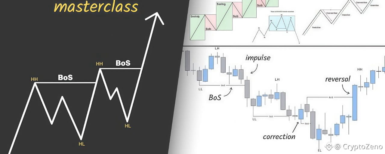
Market Structure is a framework used to determine the overall direction and trend of price.
There are two main types:
- Bullish Structure
Price forms higher highs and higher lows, signaling an upward trend.
1.1 What is Market Structure?
The other type of Structure is:
- Bearish Structure
A Bearish Structure is characterized by Lower Lows (LL) and Lower Highs (LH)
The structure shifts only when a Higher High (HH) is established.
1.2 What is Market Structure?
Minor Structure:
Highs and lows formed within a larger swing, seen on lower timeframes (LTF)
Major Market Structure:
Key structural levels on higher timeframes (HTF) that define the overall trend direction
2. POI
Points of Interest (POI) are key levels or zones on a price chart.
Where significant trading activity or market reactions are likely to occur.
2.1 POI
Common Types of POIs:
- FVGs
- Order Blocks
- Breaker Blocks
- Rejection Blocks
2.2 POI
The Optimal Trade Entry (OTE) zone lies between the 0.618 and 0.79 retracement levels.
When a POI aligns with an OTE level, the likelihood of price reacting significantly increases.
2.3 POI
To identify a valid Point of Interest (POI), follow these rules:
- The POI must have swept Liquidity before reacting
- There should be no remaining liquidity beyond the POI
- The level must be untested
- Presence of Inducement before the POI
3. Order Block
Order Blocks are price zones with a high concentration of pending limit orders, often placed by institutions.
Bullish OB: An area with a high concentration of limit buy orders
Bearish OB: An area with a high concentration of limit sell orders
3.1 Order Block
After an OB forms, the presence of an imbalance is essential.
An imbalance reflects strong buying or selling pressure.
A sharp move away from the OB confirms the strength and validity of the price action.
#CryptoZeno #Marketstructure
How Market Structure Really Works and What Most Traders Completely Miss
In this THREAD I will explain "Market Structure"
Market Structure is a framework used to determine the overall direction and trend of price.
There are two main types:
- Bullish Structure
Price forms higher highs and higher lows, signaling an upward trend.
1.1 What is Market Structure?
The other type of Structure is:
- Bearish Structure
A Bearish Structure is characterized by Lower Lows (LL) and Lower Highs (LH)
The structure shifts only when a Higher High (HH) is established.
1.2 What is Market Structure?
Minor Structure:
Highs and lows formed within a larger swing, seen on lower timeframes (LTF)
Major Market Structure:
Key structural levels on higher timeframes (HTF) that define the overall trend direction
2. POI
Points of Interest (POI) are key levels or zones on a price chart.
Where significant trading activity or market reactions are likely to occur.
2.1 POI
Common Types of POIs:
- FVGs
- Order Blocks
- Breaker Blocks
- Rejection Blocks
2.2 POI
The Optimal Trade Entry (OTE) zone lies between the 0.618 and 0.79 retracement levels.
When a POI aligns with an OTE level, the likelihood of price reacting significantly increases.
2.3 POI
To identify a valid Point of Interest (POI), follow these rules:
- The POI must have swept Liquidity before reacting
- There should be no remaining liquidity beyond the POI
- The level must be untested
- Presence of Inducement before the POI
3. Order Block
Order Blocks are price zones with a high concentration of pending limit orders, often placed by institutions.
Bullish OB: An area with a high concentration of limit buy orders
Bearish OB: An area with a high concentration of limit sell orders
3.1 Order Block
After an OB forms, the presence of an imbalance is essential.
An imbalance reflects strong buying or selling pressure.
A sharp move away from the OB confirms the strength and validity of the price action.
#CryptoZeno #Marketstructure
Market Structure is a framework used to determine the overall direction and trend of price.
There are two main types:
- Bullish Structure
Price forms higher highs and higher lows, signaling an upward trend.
1.1 What is Market Structure?
The other type of Structure is:
- Bearish Structure
A Bearish Structure is characterized by Lower Lows (LL) and Lower Highs (LH)
The structure shifts only when a Higher High (HH) is established.
1.2 What is Market Structure?
Minor Structure:
Highs and lows formed within a larger swing, seen on lower timeframes (LTF)
Major Market Structure:
Key structural levels on higher timeframes (HTF) that define the overall trend direction
2. POI
Points of Interest (POI) are key levels or zones on a price chart.
Where significant trading activity or market reactions are likely to occur.
2.1 POI
Common Types of POIs:
- FVGs
- Order Blocks
- Breaker Blocks
- Rejection Blocks
2.2 POI
The Optimal Trade Entry (OTE) zone lies between the 0.618 and 0.79 retracement levels.
When a POI aligns with an OTE level, the likelihood of price reacting significantly increases.
2.3 POI
To identify a valid Point of Interest (POI), follow these rules:
- The POI must have swept Liquidity before reacting
- There should be no remaining liquidity beyond the POI
- The level must be untested
- Presence of Inducement before the POI
3. Order Block
Order Blocks are price zones with a high concentration of pending limit orders, often placed by institutions.
Bullish OB: An area with a high concentration of limit buy orders
Bearish OB: An area with a high concentration of limit sell orders
3.1 Order Block
After an OB forms, the presence of an imbalance is essential.
An imbalance reflects strong buying or selling pressure.
A sharp move away from the OB confirms the strength and validity of the price action.
#CryptoZeno #Marketstructure
3
2.9k

·
--
#CryptoZeno 0x82c41e32642f6e1db359c321f8da68c4cd6f94a4
#CryptoZeno 0x82c41e32642f6e1db359c321f8da68c4cd6f94a4
18
·
--
Статья
Candlestick Patterns: The Secret Signals Hidden in Every ChartCandlestick patterns are universal tools in the arsenal of any cryptocurrency trader. Understanding them, and the various historical chart patterns are what allows crypto traders to interpret and analyze the trend of the market and make pattern trading decisions. Which are hopefully profitable! The better and more experienced you are at technical analysis skews the odds in your favor of making the most from bullish and bearish trends. It’s highly suggested to combine candlestick patterns trading with things like trading based on trend lines for extra confluence.
Anyways, let’s get into the various types of crypto chart patterns that traders use and how to spot them with guides. Hopefully, by the end of this article, you’ll feel like a pro at spotting chart patterns.
Types of Trading Patterns
Before getting into the various types of trading patterns. Let’s first understand what a candlestick is. It’s just a single bar that shows the movement of a particular asset or crypto’s price over a certain period of time. It shows us the open, high, low, and close for our selected time frame. People typically make their trades based on 1,2, and 4 hour time frames, or candles, as well as daily, weekly, and monthly. However, all of the patterns gone over in this encyclopedia of chart patterns can be applied to lower time frames and candles such as the 1, 15, and 30 minute. Though, one must be careful on such low time frames, as the crypto market is very, very volatile.
Above is an example of what candlesticks look like and what they represent. Every candle has a low price, high price, and an open and close price, represented by the wicks (or legs) and “body” of a candle, respectively.
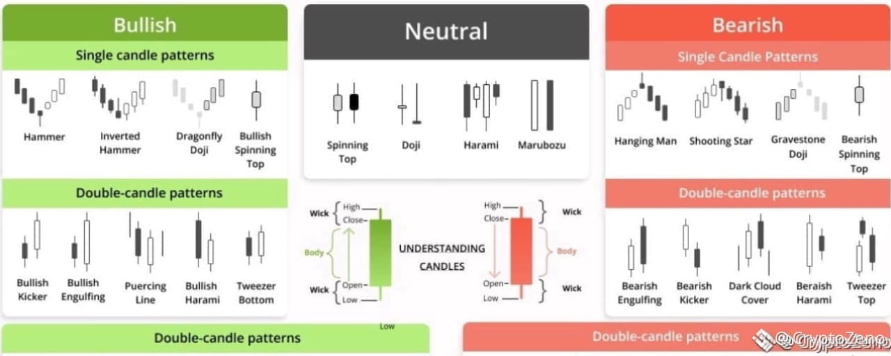
Over time, individual candlesticks form day trading patterns or reversal patterns. As seen in the image above. There are a great many candlestick patterns that indicate an opportunity within the market – some provide insight into the balance between buying and selling pressure, while others identify continuation patterns or market indecision.
With time, these separate candlesticks create different day trading patterns or reversal patterns that are used in trading chart patterns. Traders rely on analyzing these patterns to gauge support & resistance levels and to get a heads up on what’s going to happen in the market next. There are a lot of different candlestick patterns that provide traders with great opportunities.
Typically, in the market, we see the following types of trading patterns:
bullish reversal patterns,bearish reversal patterns,and candlestick continuation patterns.
Bullish candlestick patterns form at a market downturn and signal that the price of an asset is likely to reverse. Which would lead a trader to consider opening a long position and profit from an upward move. Whereas bearish candlestick patterns are seen at the end of an uptrend. Which lets traders know that the price of a crypto is at a heavy point of resistance and that price may fall due to buyer exhaustion. Both can be considered trend reversal patterns.
However, candlestick trading patterns don’t necessarily have to indicate a shift in the market’s direction. There exist what are known as continuation candlestick patterns that are considered as a confirmation that the trade will go on. The continuation patterns are also associated with periods of rest and sideways or neutral price movement in the market.
To help you quickly spot all the different types of candlestick patterns, we created this candlestick patterns cheat sheet for a quick visualization of them. Since we will cover a wide range of the most common candlestick trading patterns, having a good overview will be essential.
Candlestick Patterns Cheat Sheet
Now, let’s go through the main types of candlestick patterns to learn how to detect and read them on crypto charts.
Candlestick Patterns Explained With Examples: How to Find and Read Them on Charts
It’s not a secret that understanding candlestick patterns will make you a powerful trader capable of making an income purely by reading candlestick patterns and trading candlestick patterns and price movements.
The real beauty here is that anyone can apply this technical knowledge and use candlestick trading patterns on any time frame and combine them with any other strategy. After reading this guide with the best candlestick patterns, you’ll easily be able to start spotting and using candlestick patterns for day trading.
So let’s get to it and over some candlestick patterns explained with examples from the Good Crypto trading app. Get ready and sit back comfortably as you learn about the most reliable candlestick patterns.
So, let’s get down to business…
Hammer Candlestick
We’ll start things off with the Hammer candle. Honestly, the hammer candlestick pattern is probably the most used and taught trading pattern there is. The reason for that is that the hammer chart pattern is very easy to spot and use. Typically, bullish hammer candlesticks are found at the bottom of a market downtrend. Whereas bearish candlestick patterns are seen at the end of an uptrend.
The hammer pattern is a signal that selling pressure on an asset is weakening and that buyers are stepping in to place bids. Below is an example of a hammer candlestick pattern, which is obviously bullish.
As we can see in the example above. Sellers tried to take the price as low as possible (based on the long wick), however, they were weak and buyers swooped in, resulting in the bullish hammer candlestick above. Notice the hammer-like shape of the candle? Also note that the longer the wick of the hammer in candlestick chart, the greater the buying pressure.
An example of the Hammer Candlestick Pattern on the GoodCrypto chart.
Inverted Hammer Candlestick
There is also the inverted hammer candlestick. It’s also bullish, but its top wick is long while the bottom one is short. The inverted hammer pattern indicates that there was substantial buying pressure followed by some sell pressure. But ultimately that buyers ended up having greater control.
A trader would see the above inverted hammer candlestick pattern or preceding green hammer candlestick and likely feel quite confident in learning bullish and possibly opening a long with a sensible stop loss. Below is an example of how such a trade could be set up using the Good crypto trading app.
An example of the Inverted Hammer Candlestick Pattern on the GoodCrypto chart.
❗️Mind, as a smart trader, before setting up a position, you should also look for a few more indications of the trend reversal represented by other trading tools: trendlines, technical indicators, like Bollinger Bands, Moving Averages, or Oscillators like RSI and MACD.
Engulfing Candle
As opposed to the previous candlestick pattern, which is formed from one candle, an engulfing candle is actually a combination of two separate candlestick patterns. Traders will see two types of such patterns, either a bullish engulfing, or a bearish engulfing.
An engulfing candlestick pattern is very easy to spot on a chart. It is usually a big candlestick body with very tiny top and bottom wicks. Take a look at an example of a bullish engulfing candle pattern below:
Bullish engulfing candles are typically found at the end of trends and show that bulls have assumed control of a market. As you can see, the bullish engulfing candlestick quite literally consumes the preceding candle in terms of size.
Everything in the exact opposite is true for a bearish engulfing pattern. A red and vicious candle that consumes all of the previous bullishness and reminds traders of gravity.
A bearish engulfing candlestick as in the example above would signal to a trader that opening a short position on an asset would be wise due to waning buyer momentum.
An example of the Bearish Engulfing Candlestick Pattern on the GoodCrypto chart.
Three White Soldiers
The three white soldiers candlestick pattern is a little bit more complicated than the previous ones we covered. It requires more attention to spot and utilize in your pattering trading strategy because three white soldiers require a specific setup.
Although, at first glance, the pattern might just seem like 3 candles that go up consecutively. Context is key here. The three white soldiers candlestick pattern is made after consistent heavy selling.
Above is an example of the three white soldiers pattern that marks a shift from a downtrend to an uptrend. Note that the candles become progressively larger too, making higher highs (HH). This is a very bullish and volatile trading pattern, which makes it quite tempting for novice traders to disregard risk management, which is a grave mistake and something that you should definitely have as part of your pattern trading strategy.
Three Black Crows
A literal bearish alternative to the previous trading pattern we just covered. The three black crows candlestick pattern consists of three strong black candles known as black crows. Some of these names are quite poetic, aren’t they? This trading pattern has to form after a big push upwards by buyers. Check out this nosedive in the market:
As you’re well able to interpret by now, the above pattern is indicative of sellers seizing control from buyers. Making the three black crows pattern a good short signal. Traders need to watch for the second black crow candle to close below the preceding bullish one. The final crow is around the same size as the one before it and opens at the last bullish candlestick close.
Dark Сloud Сover
The dark cloud cover candlestick, as you can likely assume from its name, is a bearish chart pattern. It indicates changing momentum to the downside following heavy and active participation by buyers.
Both candles have to be quite large, as would be the case for candles where there is a lot of participation by traders. The bearish dark cloud cover candle opens higher than the previous bullish candle and closes lower than the midpoint of the bullish candle.
One would confirm this pattern on their crypto chart by being mindful of the candle which forms after the dark cloud cover candle. If it is red, then that acts as confirmation of the full dark cloud cover pattern and is forthcoming of further selling and a great signal to short with confidence. If it is green, then the dark cloud cover candle is not confirmed.
Hanging Man
The hanging man candlestick pattern is actually the bearish alternative to the hammer pattern covered just above. It sort of has the same shape but looks like a hanging man because of the small wick that is customary for the hanging man candle trading pattern.
As you can see in the image above, the hanging man candlestick pattern forms at the conclusion of an uptrend. The long bottom wick tells pattern day traders that there was significant selling and that buyers may lose steam for the next couple of days with a bearish continuation.
Spinning Top Candle
The spinning top is a candlestick with a very small or short body in between equal bottom and top wicks. The spinning top candle shows that there is indecision in the market and foreshadows a period of possible sideways movement and is typically present when there is indecision in the market.
For example, a spinning top after engulfing candle in a typical bullish scenario could mean that price is consolidating before a further move up or that bulls are losing control. One would need to examine the candles following to gain confluence. Whereas a spinning top candle downtrend a price floor is being built via sideways price movement before either bulls or bears step up. The spinning top candle is usually used in conjunction with other chart patterns and technical analysis methods used by pattern day traders because a lot of confirmation is required to enter a profitable trade.
Doji Candle
A doji candle is an interesting-looking cross-shaped candle and represents a time frame during which the open and close price of an asset were nearly equal, representing an equal struggle between buyers and sellers. By itself, a doji candle is a neutral candlestick pattern, but it has two major types, that being the dragonfly doji, and the gravestone doji.
Dragonfly Doji Candle
The dragonfly doji candle has no body and a very prolonged lower candle which indicates that there was aggressive selling that had to be absorbed by buyers of equal balls.
A dragonfly doji in uptrend could signal that it is coming to an end or that a new one is starting if a dragonfly doji at bottom is spotted. Traders frequently use the dragonfly doji candlestick as they would a hammer, but it is suggested to wait for a confirmation candle before entering a trade on this candle.
Gravestone Doji
Gravestone doji… A candlestick with a name that’s straight to the point. As you hopefully guessed, a gravestone doji candle in an uptrend means that the trend is dead! The candlestick has no body and resembles a nail hitting a coffin.
As you can see in the image above, the candle is a clear sign for a pattern day trader that the trend is reversing upon meeting a wall of impassable sellers. Of course, it’s never a bad idea to wait for further candles to receive confirmation that our gravestone doji is bearish. Though traders do typically take profits or enter short positions when a gravestone doji at top is spotted.
Long-legged Doji
The long-legged doji candle is composed of a long lower and upper shadow. The closing and open prices that go into forming this candle are about the same. It demonstrates that there is indecisiveness amongst market participants and occurs after a heavy advance or decline in price. Traders usually wait and see what type of price action forms following a long-legged doji candlestick. It often marks the start of a consolidation period.
An example of the Long-legged Doji on the GoodCrypto chart.
Shooting Star Candle and Other Stars
The shooting star chart pattern looks like an upside-down hammer. Therefore, the shooting star candlestick pattern essentially means that the price of an asset is about to get hammered down in a reversal by aggressive sellers.
When this trading pattern appears, it often forms a resistance level at the top of an uptrend. Despite the name, it’s quite a devastating candle. However, the next one we’re about to cover provides some bullish hope.
Morning Star Pattern
The morning star candle pattern consists of 3 candlestick and tells traders a story of changing momentum in a bleak down-trending market. The morning star candlestick reversal pattern first starts off with a candle forming by dominant sellers, then goes from neither buy or sell side being dominant, represented by the morning star candle with a near non-existent body, to buyers prevailing in outbidding sellers across two time periods. Effectively signaling that a bullish market is soon to commence. Actually, when looking at this pattern in a chart, one can see that it is a combination of the hammer, engulfing, and doji.
Evening Star Pattern
The evening star candlestick pattern is a mirror opposite of the previous trading pattern and appears at the completion of an assets uptrend and a prime time to enter shorts as buyers become exhausted. The important thing to keep in mind when spotting the evening star candlestick is that it must be tiny in comparison to the buy and sell candles that accompany it.
An example of the Evening Star Candlestick Pattern on the GoodCrypto chart.
Trade With Candlestick Patterns With Benefits of Good Crypto
Being able to spot candlestick patterns and execute them is a vital skill that anyone who refers to themself as a trader must have. Without having an understanding of the crypto chart patterns – you’ll simply be destroyed! We suggest checking out various of our other articles on trading strategies to further boost your pattern trading skills and increase your chances of success. We hope you enjoyed this educational piece!
#CryptoZeno #XRPDrops17PctInJuneTo$1.11
Candlestick Patterns: The Secret Signals Hidden in Every Chart
Candlestick patterns are universal tools in the arsenal of any cryptocurrency trader. Understanding them, and the various historical chart patterns are what allows crypto traders to interpret and analyze the trend of the market and make pattern trading decisions. Which are hopefully profitable! The better and more experienced you are at technical analysis skews the odds in your favor of making the most from bullish and bearish trends. It’s highly suggested to combine candlestick patterns trading with things like trading based on trend lines for extra confluence.
Anyways, let’s get into the various types of crypto chart patterns that traders use and how to spot them with guides. Hopefully, by the end of this article, you’ll feel like a pro at spotting chart patterns.
Types of Trading Patterns
Before getting into the various types of trading patterns. Let’s first understand what a candlestick is. It’s just a single bar that shows the movement of a particular asset or crypto’s price over a certain period of time. It shows us the open, high, low, and close for our selected time frame. People typically make their trades based on 1,2, and 4 hour time frames, or candles, as well as daily, weekly, and monthly. However, all of the patterns gone over in this encyclopedia of chart patterns can be applied to lower time frames and candles such as the 1, 15, and 30 minute. Though, one must be careful on such low time frames, as the crypto market is very, very volatile.
Above is an example of what candlesticks look like and what they represent. Every candle has a low price, high price, and an open and close price, represented by the wicks (or legs) and “body” of a candle, respectively.
Over time, individual candlesticks form day trading patterns or reversal patterns. As seen in the image above. There are a great many candlestick patterns that indicate an opportunity within the market – some provide insight into the balance between buying and selling pressure, while others identify continuation patterns or market indecision.
With time, these separate candlesticks create different day trading patterns or reversal patterns that are used in trading chart patterns. Traders rely on analyzing these patterns to gauge support & resistance levels and to get a heads up on what’s going to happen in the market next. There are a lot of different candlestick patterns that provide traders with great opportunities.
Typically, in the market, we see the following types of trading patterns:
bullish reversal patterns,bearish reversal patterns,and candlestick continuation patterns.
Bullish candlestick patterns form at a market downturn and signal that the price of an asset is likely to reverse. Which would lead a trader to consider opening a long position and profit from an upward move. Whereas bearish candlestick patterns are seen at the end of an uptrend. Which lets traders know that the price of a crypto is at a heavy point of resistance and that price may fall due to buyer exhaustion. Both can be considered trend reversal patterns.
However, candlestick trading patterns don’t necessarily have to indicate a shift in the market’s direction. There exist what are known as continuation candlestick patterns that are considered as a confirmation that the trade will go on. The continuation patterns are also associated with periods of rest and sideways or neutral price movement in the market.
To help you quickly spot all the different types of candlestick patterns, we created this candlestick patterns cheat sheet for a quick visualization of them. Since we will cover a wide range of the most common candlestick trading patterns, having a good overview will be essential.
Candlestick Patterns Cheat Sheet
Now, let’s go through the main types of candlestick patterns to learn how to detect and read them on crypto charts.
Candlestick Patterns Explained With Examples: How to Find and Read Them on Charts
It’s not a secret that understanding candlestick patterns will make you a powerful trader capable of making an income purely by reading candlestick patterns and trading candlestick patterns and price movements.
The real beauty here is that anyone can apply this technical knowledge and use candlestick trading patterns on any time frame and combine them with any other strategy. After reading this guide with the best candlestick patterns, you’ll easily be able to start spotting and using candlestick patterns for day trading.
So let’s get to it and over some candlestick patterns explained with examples from the Good Crypto trading app. Get ready and sit back comfortably as you learn about the most reliable candlestick patterns.
So, let’s get down to business…
Hammer Candlestick
We’ll start things off with the Hammer candle. Honestly, the hammer candlestick pattern is probably the most used and taught trading pattern there is. The reason for that is that the hammer chart pattern is very easy to spot and use. Typically, bullish hammer candlesticks are found at the bottom of a market downtrend. Whereas bearish candlestick patterns are seen at the end of an uptrend.
The hammer pattern is a signal that selling pressure on an asset is weakening and that buyers are stepping in to place bids. Below is an example of a hammer candlestick pattern, which is obviously bullish.
As we can see in the example above. Sellers tried to take the price as low as possible (based on the long wick), however, they were weak and buyers swooped in, resulting in the bullish hammer candlestick above. Notice the hammer-like shape of the candle? Also note that the longer the wick of the hammer in candlestick chart, the greater the buying pressure.
An example of the Hammer Candlestick Pattern on the GoodCrypto chart.
Inverted Hammer Candlestick
There is also the inverted hammer candlestick. It’s also bullish, but its top wick is long while the bottom one is short. The inverted hammer pattern indicates that there was substantial buying pressure followed by some sell pressure. But ultimately that buyers ended up having greater control.
A trader would see the above inverted hammer candlestick pattern or preceding green hammer candlestick and likely feel quite confident in learning bullish and possibly opening a long with a sensible stop loss. Below is an example of how such a trade could be set up using the Good crypto trading app.
An example of the Inverted Hammer Candlestick Pattern on the GoodCrypto chart.
❗️Mind, as a smart trader, before setting up a position, you should also look for a few more indications of the trend reversal represented by other trading tools: trendlines, technical indicators, like Bollinger Bands, Moving Averages, or Oscillators like RSI and MACD.
Engulfing Candle
As opposed to the previous candlestick pattern, which is formed from one candle, an engulfing candle is actually a combination of two separate candlestick patterns. Traders will see two types of such patterns, either a bullish engulfing, or a bearish engulfing.
An engulfing candlestick pattern is very easy to spot on a chart. It is usually a big candlestick body with very tiny top and bottom wicks. Take a look at an example of a bullish engulfing candle pattern below:
Bullish engulfing candles are typically found at the end of trends and show that bulls have assumed control of a market. As you can see, the bullish engulfing candlestick quite literally consumes the preceding candle in terms of size.
Everything in the exact opposite is true for a bearish engulfing pattern. A red and vicious candle that consumes all of the previous bullishness and reminds traders of gravity.
A bearish engulfing candlestick as in the example above would signal to a trader that opening a short position on an asset would be wise due to waning buyer momentum.
An example of the Bearish Engulfing Candlestick Pattern on the GoodCrypto chart.
Three White Soldiers
The three white soldiers candlestick pattern is a little bit more complicated than the previous ones we covered. It requires more attention to spot and utilize in your pattering trading strategy because three white soldiers require a specific setup.
Although, at first glance, the pattern might just seem like 3 candles that go up consecutively. Context is key here. The three white soldiers candlestick pattern is made after consistent heavy selling.
Above is an example of the three white soldiers pattern that marks a shift from a downtrend to an uptrend. Note that the candles become progressively larger too, making higher highs (HH). This is a very bullish and volatile trading pattern, which makes it quite tempting for novice traders to disregard risk management, which is a grave mistake and something that you should definitely have as part of your pattern trading strategy.
Three Black Crows
A literal bearish alternative to the previous trading pattern we just covered. The three black crows candlestick pattern consists of three strong black candles known as black crows. Some of these names are quite poetic, aren’t they? This trading pattern has to form after a big push upwards by buyers. Check out this nosedive in the market:
As you’re well able to interpret by now, the above pattern is indicative of sellers seizing control from buyers. Making the three black crows pattern a good short signal. Traders need to watch for the second black crow candle to close below the preceding bullish one. The final crow is around the same size as the one before it and opens at the last bullish candlestick close.
Dark Сloud Сover
The dark cloud cover candlestick, as you can likely assume from its name, is a bearish chart pattern. It indicates changing momentum to the downside following heavy and active participation by buyers.
Both candles have to be quite large, as would be the case for candles where there is a lot of participation by traders. The bearish dark cloud cover candle opens higher than the previous bullish candle and closes lower than the midpoint of the bullish candle.
One would confirm this pattern on their crypto chart by being mindful of the candle which forms after the dark cloud cover candle. If it is red, then that acts as confirmation of the full dark cloud cover pattern and is forthcoming of further selling and a great signal to short with confidence. If it is green, then the dark cloud cover candle is not confirmed.
Hanging Man
The hanging man candlestick pattern is actually the bearish alternative to the hammer pattern covered just above. It sort of has the same shape but looks like a hanging man because of the small wick that is customary for the hanging man candle trading pattern.
As you can see in the image above, the hanging man candlestick pattern forms at the conclusion of an uptrend. The long bottom wick tells pattern day traders that there was significant selling and that buyers may lose steam for the next couple of days with a bearish continuation.
Spinning Top Candle
The spinning top is a candlestick with a very small or short body in between equal bottom and top wicks. The spinning top candle shows that there is indecision in the market and foreshadows a period of possible sideways movement and is typically present when there is indecision in the market.
For example, a spinning top after engulfing candle in a typical bullish scenario could mean that price is consolidating before a further move up or that bulls are losing control. One would need to examine the candles following to gain confluence. Whereas a spinning top candle downtrend a price floor is being built via sideways price movement before either bulls or bears step up. The spinning top candle is usually used in conjunction with other chart patterns and technical analysis methods used by pattern day traders because a lot of confirmation is required to enter a profitable trade.
Doji Candle
A doji candle is an interesting-looking cross-shaped candle and represents a time frame during which the open and close price of an asset were nearly equal, representing an equal struggle between buyers and sellers. By itself, a doji candle is a neutral candlestick pattern, but it has two major types, that being the dragonfly doji, and the gravestone doji.
Dragonfly Doji Candle
The dragonfly doji candle has no body and a very prolonged lower candle which indicates that there was aggressive selling that had to be absorbed by buyers of equal balls.
A dragonfly doji in uptrend could signal that it is coming to an end or that a new one is starting if a dragonfly doji at bottom is spotted. Traders frequently use the dragonfly doji candlestick as they would a hammer, but it is suggested to wait for a confirmation candle before entering a trade on this candle.
Gravestone Doji
Gravestone doji… A candlestick with a name that’s straight to the point. As you hopefully guessed, a gravestone doji candle in an uptrend means that the trend is dead! The candlestick has no body and resembles a nail hitting a coffin.
As you can see in the image above, the candle is a clear sign for a pattern day trader that the trend is reversing upon meeting a wall of impassable sellers. Of course, it’s never a bad idea to wait for further candles to receive confirmation that our gravestone doji is bearish. Though traders do typically take profits or enter short positions when a gravestone doji at top is spotted.
Long-legged Doji
The long-legged doji candle is composed of a long lower and upper shadow. The closing and open prices that go into forming this candle are about the same. It demonstrates that there is indecisiveness amongst market participants and occurs after a heavy advance or decline in price. Traders usually wait and see what type of price action forms following a long-legged doji candlestick. It often marks the start of a consolidation period.
An example of the Long-legged Doji on the GoodCrypto chart.
Shooting Star Candle and Other Stars
The shooting star chart pattern looks like an upside-down hammer. Therefore, the shooting star candlestick pattern essentially means that the price of an asset is about to get hammered down in a reversal by aggressive sellers.
When this trading pattern appears, it often forms a resistance level at the top of an uptrend. Despite the name, it’s quite a devastating candle. However, the next one we’re about to cover provides some bullish hope.
Morning Star Pattern
The morning star candle pattern consists of 3 candlestick and tells traders a story of changing momentum in a bleak down-trending market. The morning star candlestick reversal pattern first starts off with a candle forming by dominant sellers, then goes from neither buy or sell side being dominant, represented by the morning star candle with a near non-existent body, to buyers prevailing in outbidding sellers across two time periods. Effectively signaling that a bullish market is soon to commence. Actually, when looking at this pattern in a chart, one can see that it is a combination of the hammer, engulfing, and doji.
Evening Star Pattern
The evening star candlestick pattern is a mirror opposite of the previous trading pattern and appears at the completion of an assets uptrend and a prime time to enter shorts as buyers become exhausted. The important thing to keep in mind when spotting the evening star candlestick is that it must be tiny in comparison to the buy and sell candles that accompany it.
An example of the Evening Star Candlestick Pattern on the GoodCrypto chart.
Trade With Candlestick Patterns With Benefits of Good Crypto
Being able to spot candlestick patterns and execute them is a vital skill that anyone who refers to themself as a trader must have. Without having an understanding of the crypto chart patterns – you’ll simply be destroyed! We suggest checking out various of our other articles on trading strategies to further boost your pattern trading skills and increase your chances of success. We hope you enjoyed this educational piece!
#CryptoZeno #XRPDrops17PctInJuneTo$1.11
Anyways, let’s get into the various types of crypto chart patterns that traders use and how to spot them with guides. Hopefully, by the end of this article, you’ll feel like a pro at spotting chart patterns.
Types of Trading Patterns
Before getting into the various types of trading patterns. Let’s first understand what a candlestick is. It’s just a single bar that shows the movement of a particular asset or crypto’s price over a certain period of time. It shows us the open, high, low, and close for our selected time frame. People typically make their trades based on 1,2, and 4 hour time frames, or candles, as well as daily, weekly, and monthly. However, all of the patterns gone over in this encyclopedia of chart patterns can be applied to lower time frames and candles such as the 1, 15, and 30 minute. Though, one must be careful on such low time frames, as the crypto market is very, very volatile.
Above is an example of what candlesticks look like and what they represent. Every candle has a low price, high price, and an open and close price, represented by the wicks (or legs) and “body” of a candle, respectively.
Over time, individual candlesticks form day trading patterns or reversal patterns. As seen in the image above. There are a great many candlestick patterns that indicate an opportunity within the market – some provide insight into the balance between buying and selling pressure, while others identify continuation patterns or market indecision.
With time, these separate candlesticks create different day trading patterns or reversal patterns that are used in trading chart patterns. Traders rely on analyzing these patterns to gauge support & resistance levels and to get a heads up on what’s going to happen in the market next. There are a lot of different candlestick patterns that provide traders with great opportunities.
Typically, in the market, we see the following types of trading patterns:
bullish reversal patterns,bearish reversal patterns,and candlestick continuation patterns.
Bullish candlestick patterns form at a market downturn and signal that the price of an asset is likely to reverse. Which would lead a trader to consider opening a long position and profit from an upward move. Whereas bearish candlestick patterns are seen at the end of an uptrend. Which lets traders know that the price of a crypto is at a heavy point of resistance and that price may fall due to buyer exhaustion. Both can be considered trend reversal patterns.
However, candlestick trading patterns don’t necessarily have to indicate a shift in the market’s direction. There exist what are known as continuation candlestick patterns that are considered as a confirmation that the trade will go on. The continuation patterns are also associated with periods of rest and sideways or neutral price movement in the market.
To help you quickly spot all the different types of candlestick patterns, we created this candlestick patterns cheat sheet for a quick visualization of them. Since we will cover a wide range of the most common candlestick trading patterns, having a good overview will be essential.
Candlestick Patterns Cheat Sheet
Now, let’s go through the main types of candlestick patterns to learn how to detect and read them on crypto charts.
Candlestick Patterns Explained With Examples: How to Find and Read Them on Charts
It’s not a secret that understanding candlestick patterns will make you a powerful trader capable of making an income purely by reading candlestick patterns and trading candlestick patterns and price movements.
The real beauty here is that anyone can apply this technical knowledge and use candlestick trading patterns on any time frame and combine them with any other strategy. After reading this guide with the best candlestick patterns, you’ll easily be able to start spotting and using candlestick patterns for day trading.
So let’s get to it and over some candlestick patterns explained with examples from the Good Crypto trading app. Get ready and sit back comfortably as you learn about the most reliable candlestick patterns.
So, let’s get down to business…
Hammer Candlestick
We’ll start things off with the Hammer candle. Honestly, the hammer candlestick pattern is probably the most used and taught trading pattern there is. The reason for that is that the hammer chart pattern is very easy to spot and use. Typically, bullish hammer candlesticks are found at the bottom of a market downtrend. Whereas bearish candlestick patterns are seen at the end of an uptrend.
The hammer pattern is a signal that selling pressure on an asset is weakening and that buyers are stepping in to place bids. Below is an example of a hammer candlestick pattern, which is obviously bullish.
As we can see in the example above. Sellers tried to take the price as low as possible (based on the long wick), however, they were weak and buyers swooped in, resulting in the bullish hammer candlestick above. Notice the hammer-like shape of the candle? Also note that the longer the wick of the hammer in candlestick chart, the greater the buying pressure.
An example of the Hammer Candlestick Pattern on the GoodCrypto chart.
Inverted Hammer Candlestick
There is also the inverted hammer candlestick. It’s also bullish, but its top wick is long while the bottom one is short. The inverted hammer pattern indicates that there was substantial buying pressure followed by some sell pressure. But ultimately that buyers ended up having greater control.
A trader would see the above inverted hammer candlestick pattern or preceding green hammer candlestick and likely feel quite confident in learning bullish and possibly opening a long with a sensible stop loss. Below is an example of how such a trade could be set up using the Good crypto trading app.
An example of the Inverted Hammer Candlestick Pattern on the GoodCrypto chart.
❗️Mind, as a smart trader, before setting up a position, you should also look for a few more indications of the trend reversal represented by other trading tools: trendlines, technical indicators, like Bollinger Bands, Moving Averages, or Oscillators like RSI and MACD.
Engulfing Candle
As opposed to the previous candlestick pattern, which is formed from one candle, an engulfing candle is actually a combination of two separate candlestick patterns. Traders will see two types of such patterns, either a bullish engulfing, or a bearish engulfing.
An engulfing candlestick pattern is very easy to spot on a chart. It is usually a big candlestick body with very tiny top and bottom wicks. Take a look at an example of a bullish engulfing candle pattern below:
Bullish engulfing candles are typically found at the end of trends and show that bulls have assumed control of a market. As you can see, the bullish engulfing candlestick quite literally consumes the preceding candle in terms of size.
Everything in the exact opposite is true for a bearish engulfing pattern. A red and vicious candle that consumes all of the previous bullishness and reminds traders of gravity.
A bearish engulfing candlestick as in the example above would signal to a trader that opening a short position on an asset would be wise due to waning buyer momentum.
An example of the Bearish Engulfing Candlestick Pattern on the GoodCrypto chart.
Three White Soldiers
The three white soldiers candlestick pattern is a little bit more complicated than the previous ones we covered. It requires more attention to spot and utilize in your pattering trading strategy because three white soldiers require a specific setup.
Although, at first glance, the pattern might just seem like 3 candles that go up consecutively. Context is key here. The three white soldiers candlestick pattern is made after consistent heavy selling.
Above is an example of the three white soldiers pattern that marks a shift from a downtrend to an uptrend. Note that the candles become progressively larger too, making higher highs (HH). This is a very bullish and volatile trading pattern, which makes it quite tempting for novice traders to disregard risk management, which is a grave mistake and something that you should definitely have as part of your pattern trading strategy.
Three Black Crows
A literal bearish alternative to the previous trading pattern we just covered. The three black crows candlestick pattern consists of three strong black candles known as black crows. Some of these names are quite poetic, aren’t they? This trading pattern has to form after a big push upwards by buyers. Check out this nosedive in the market:
As you’re well able to interpret by now, the above pattern is indicative of sellers seizing control from buyers. Making the three black crows pattern a good short signal. Traders need to watch for the second black crow candle to close below the preceding bullish one. The final crow is around the same size as the one before it and opens at the last bullish candlestick close.
Dark Сloud Сover
The dark cloud cover candlestick, as you can likely assume from its name, is a bearish chart pattern. It indicates changing momentum to the downside following heavy and active participation by buyers.
Both candles have to be quite large, as would be the case for candles where there is a lot of participation by traders. The bearish dark cloud cover candle opens higher than the previous bullish candle and closes lower than the midpoint of the bullish candle.
One would confirm this pattern on their crypto chart by being mindful of the candle which forms after the dark cloud cover candle. If it is red, then that acts as confirmation of the full dark cloud cover pattern and is forthcoming of further selling and a great signal to short with confidence. If it is green, then the dark cloud cover candle is not confirmed.
Hanging Man
The hanging man candlestick pattern is actually the bearish alternative to the hammer pattern covered just above. It sort of has the same shape but looks like a hanging man because of the small wick that is customary for the hanging man candle trading pattern.
As you can see in the image above, the hanging man candlestick pattern forms at the conclusion of an uptrend. The long bottom wick tells pattern day traders that there was significant selling and that buyers may lose steam for the next couple of days with a bearish continuation.
Spinning Top Candle
The spinning top is a candlestick with a very small or short body in between equal bottom and top wicks. The spinning top candle shows that there is indecision in the market and foreshadows a period of possible sideways movement and is typically present when there is indecision in the market.
For example, a spinning top after engulfing candle in a typical bullish scenario could mean that price is consolidating before a further move up or that bulls are losing control. One would need to examine the candles following to gain confluence. Whereas a spinning top candle downtrend a price floor is being built via sideways price movement before either bulls or bears step up. The spinning top candle is usually used in conjunction with other chart patterns and technical analysis methods used by pattern day traders because a lot of confirmation is required to enter a profitable trade.
Doji Candle
A doji candle is an interesting-looking cross-shaped candle and represents a time frame during which the open and close price of an asset were nearly equal, representing an equal struggle between buyers and sellers. By itself, a doji candle is a neutral candlestick pattern, but it has two major types, that being the dragonfly doji, and the gravestone doji.
Dragonfly Doji Candle
The dragonfly doji candle has no body and a very prolonged lower candle which indicates that there was aggressive selling that had to be absorbed by buyers of equal balls.
A dragonfly doji in uptrend could signal that it is coming to an end or that a new one is starting if a dragonfly doji at bottom is spotted. Traders frequently use the dragonfly doji candlestick as they would a hammer, but it is suggested to wait for a confirmation candle before entering a trade on this candle.
Gravestone Doji
Gravestone doji… A candlestick with a name that’s straight to the point. As you hopefully guessed, a gravestone doji candle in an uptrend means that the trend is dead! The candlestick has no body and resembles a nail hitting a coffin.
As you can see in the image above, the candle is a clear sign for a pattern day trader that the trend is reversing upon meeting a wall of impassable sellers. Of course, it’s never a bad idea to wait for further candles to receive confirmation that our gravestone doji is bearish. Though traders do typically take profits or enter short positions when a gravestone doji at top is spotted.
Long-legged Doji
The long-legged doji candle is composed of a long lower and upper shadow. The closing and open prices that go into forming this candle are about the same. It demonstrates that there is indecisiveness amongst market participants and occurs after a heavy advance or decline in price. Traders usually wait and see what type of price action forms following a long-legged doji candlestick. It often marks the start of a consolidation period.
An example of the Long-legged Doji on the GoodCrypto chart.
Shooting Star Candle and Other Stars
The shooting star chart pattern looks like an upside-down hammer. Therefore, the shooting star candlestick pattern essentially means that the price of an asset is about to get hammered down in a reversal by aggressive sellers.
When this trading pattern appears, it often forms a resistance level at the top of an uptrend. Despite the name, it’s quite a devastating candle. However, the next one we’re about to cover provides some bullish hope.
Morning Star Pattern
The morning star candle pattern consists of 3 candlestick and tells traders a story of changing momentum in a bleak down-trending market. The morning star candlestick reversal pattern first starts off with a candle forming by dominant sellers, then goes from neither buy or sell side being dominant, represented by the morning star candle with a near non-existent body, to buyers prevailing in outbidding sellers across two time periods. Effectively signaling that a bullish market is soon to commence. Actually, when looking at this pattern in a chart, one can see that it is a combination of the hammer, engulfing, and doji.
Evening Star Pattern
The evening star candlestick pattern is a mirror opposite of the previous trading pattern and appears at the completion of an assets uptrend and a prime time to enter shorts as buyers become exhausted. The important thing to keep in mind when spotting the evening star candlestick is that it must be tiny in comparison to the buy and sell candles that accompany it.
An example of the Evening Star Candlestick Pattern on the GoodCrypto chart.
Trade With Candlestick Patterns With Benefits of Good Crypto
Being able to spot candlestick patterns and execute them is a vital skill that anyone who refers to themself as a trader must have. Without having an understanding of the crypto chart patterns – you’ll simply be destroyed! We suggest checking out various of our other articles on trading strategies to further boost your pattern trading skills and increase your chances of success. We hope you enjoyed this educational piece!
#CryptoZeno #XRPDrops17PctInJuneTo$1.11
1
8
1.7k
·
--

Статья
Web3 Jobs Are Paying $120,000 - $200,000+- And Most People Are Still Sleeping On ItWhile the majority of the world is still debating whether crypto is “dead or alive,” a quieter group of early adopters is already building long-term careers inside Web3. They are not chasing short-term hype. They are positioning themselves inside an industry that is still early, still underbuilt, and desperately short on real talent.
This is exactly why Web3 jobs today are paying anywhere from $120,000 to over $200,000 per year, often for roles that do not require a university degree, a computer science background, or years of traditional corporate experience.
All you really need is a laptop, genuine curiosity, and the willingness to learn faster than the average person.
In 2023, the global average Web2 salary sat around $40,000 per year. Web3, on the other hand, consistently offers compensation that is two to five times higher. This gap exists for a simple reason. Mass adoption has not happened yet, but infrastructure still needs to be built. Small teams are moving fast, capital is available, and companies are willing to pay a premium for people who can actually execute.
This moment matters because it will not last forever. Once Web3 becomes mainstream, the salary asymmetry disappears, hiring standards become rigid, and opportunities narrow. Early entrants always benefit the most.
One of the biggest misconceptions about Web3 is that it is only for developers. In reality, most Web3 companies care far more about execution, curiosity, and ecosystem understanding than formal education. You do not need a degree. You do not need a perfect resume. You need to understand crypto culture, user behavior, and how value flows inside decentralized systems. If you can do that and show proof of work, you are already ahead of the majority of applicants.
This is why so many non-technical roles in Web3 pay extremely well.
Designers play a critical role in simplifying complex products like dApps and NFT platforms. A strong Web3 UX or UI designer focuses on user flows, interfaces, and reducing friction for users who are not technical. These roles typically pay between $90,000 and $140,000 because good design directly impacts adoption.
Another highly undervalued role is blockchain technical writing. Every protocol needs documentation, tutorials, blog content, and clear explanations for users and developers. People who can translate complex blockchain mechanics into simple, understandable language are rare, which is why technical writers can earn anywhere from $70,000 to $140,000.
Community managers are equally essential. In Web3, community is not a marketing add-on. It is the product. Managing Discord servers, Telegram groups, newsletters, and feedback loops requires empathy, communication skills, and deep cultural awareness. Projects that ignore community fail quickly, which is why experienced community managers are consistently paid competitive salaries.
Marketing and growth roles also dominate Web3 hiring. Crypto marketing specialists focus on educating users, telling compelling stories, and guiding attention during product launches. Unlike Web2 marketing, this role requires a strong understanding of token incentives, narratives, and timing. Salaries commonly range from $60,000 to $120,000.
Social media managers in Web3 often operate more like brand strategists than content schedulers. They shape the project’s public voice across platforms like Twitter, YouTube, and Discord, track performance, and drive long-term growth. Depending on scale and responsibility, compensation can range widely, from $25,000 up to six figures.
For those who enjoy market research, cryptocurrency analysts are in constant demand. These roles involve tracking market trends, analyzing tokens, studying DeFi protocols, and publishing insights for investors or communities. Strong analytical skills combined with on-chain knowledge can command salaries between $60,000 and $150,000.
Operational roles are just as important. Blockchain project coordinators ensure teams stay aligned, deadlines are met, and launches happen on time. Understanding how smart contracts and decentralized teams operate is a major advantage here, and pay often falls between $80,000 and $100,000.
DAOs also offer a unique entry point. Paid DAO roles allow contributors to assist with governance, research, operations, and design. Many people underestimate these positions, but they often lead to long-term opportunities and steady income while building a public on-chain reputation.
More technical but still highly accessible is the role of a Web3 landing page developer. Building high-conversion marketing pages for crypto projects using tools like Webflow or Framer can generate exceptional income. Because these pages directly impact fundraising and user acquisition, salaries can exceed $200,000 for skilled builders.
Finally, smart contract developers remain the backbone of Web3. Coding, auditing, and deploying protocols requires deeper technical knowledge, but demand remains extremely high. Even junior developers can earn strong salaries, with experienced engineers earning significantly more over time.
Beyond working directly for Web3 companies, there is another powerful path many people overlook. Building a personal brand as a Web3 KOL on platforms like Binance Square can itself become a meaningful income stream. By consistently publishing high-quality analysis, educational content, and market insights, creators can monetize attention, attract partnerships, and open doors to roles that are never publicly advertised.
In Web3, attention is leverage. Content is proof of work.
You do not need to be the smartest person in the room to succeed in this industry. You need to be curious, consistent, and willing to show your work publicly. Start small, learn fast, and keep shipping. The best Web3 jobs are not posted on job boards. They are created by people who show up early and keep building while everyone else is still watching from the sidelines.
#CryptoZeno #BTCSurpasses$80K
Web3 Jobs Are Paying $120,000 - $200,000+- And Most People Are Still Sleeping On It
While the majority of the world is still debating whether crypto is “dead or alive,” a quieter group of early adopters is already building long-term careers inside Web3. They are not chasing short-term hype. They are positioning themselves inside an industry that is still early, still underbuilt, and desperately short on real talent.
This is exactly why Web3 jobs today are paying anywhere from $120,000 to over $200,000 per year, often for roles that do not require a university degree, a computer science background, or years of traditional corporate experience.
All you really need is a laptop, genuine curiosity, and the willingness to learn faster than the average person.
In 2023, the global average Web2 salary sat around $40,000 per year. Web3, on the other hand, consistently offers compensation that is two to five times higher. This gap exists for a simple reason. Mass adoption has not happened yet, but infrastructure still needs to be built. Small teams are moving fast, capital is available, and companies are willing to pay a premium for people who can actually execute.
This moment matters because it will not last forever. Once Web3 becomes mainstream, the salary asymmetry disappears, hiring standards become rigid, and opportunities narrow. Early entrants always benefit the most.
One of the biggest misconceptions about Web3 is that it is only for developers. In reality, most Web3 companies care far more about execution, curiosity, and ecosystem understanding than formal education. You do not need a degree. You do not need a perfect resume. You need to understand crypto culture, user behavior, and how value flows inside decentralized systems. If you can do that and show proof of work, you are already ahead of the majority of applicants.
This is why so many non-technical roles in Web3 pay extremely well.
Designers play a critical role in simplifying complex products like dApps and NFT platforms. A strong Web3 UX or UI designer focuses on user flows, interfaces, and reducing friction for users who are not technical. These roles typically pay between $90,000 and $140,000 because good design directly impacts adoption.
Another highly undervalued role is blockchain technical writing. Every protocol needs documentation, tutorials, blog content, and clear explanations for users and developers. People who can translate complex blockchain mechanics into simple, understandable language are rare, which is why technical writers can earn anywhere from $70,000 to $140,000.
Community managers are equally essential. In Web3, community is not a marketing add-on. It is the product. Managing Discord servers, Telegram groups, newsletters, and feedback loops requires empathy, communication skills, and deep cultural awareness. Projects that ignore community fail quickly, which is why experienced community managers are consistently paid competitive salaries.
Marketing and growth roles also dominate Web3 hiring. Crypto marketing specialists focus on educating users, telling compelling stories, and guiding attention during product launches. Unlike Web2 marketing, this role requires a strong understanding of token incentives, narratives, and timing. Salaries commonly range from $60,000 to $120,000.
Social media managers in Web3 often operate more like brand strategists than content schedulers. They shape the project’s public voice across platforms like Twitter, YouTube, and Discord, track performance, and drive long-term growth. Depending on scale and responsibility, compensation can range widely, from $25,000 up to six figures.
For those who enjoy market research, cryptocurrency analysts are in constant demand. These roles involve tracking market trends, analyzing tokens, studying DeFi protocols, and publishing insights for investors or communities. Strong analytical skills combined with on-chain knowledge can command salaries between $60,000 and $150,000.
Operational roles are just as important. Blockchain project coordinators ensure teams stay aligned, deadlines are met, and launches happen on time. Understanding how smart contracts and decentralized teams operate is a major advantage here, and pay often falls between $80,000 and $100,000.
DAOs also offer a unique entry point. Paid DAO roles allow contributors to assist with governance, research, operations, and design. Many people underestimate these positions, but they often lead to long-term opportunities and steady income while building a public on-chain reputation.
More technical but still highly accessible is the role of a Web3 landing page developer. Building high-conversion marketing pages for crypto projects using tools like Webflow or Framer can generate exceptional income. Because these pages directly impact fundraising and user acquisition, salaries can exceed $200,000 for skilled builders.
Finally, smart contract developers remain the backbone of Web3. Coding, auditing, and deploying protocols requires deeper technical knowledge, but demand remains extremely high. Even junior developers can earn strong salaries, with experienced engineers earning significantly more over time.
Beyond working directly for Web3 companies, there is another powerful path many people overlook. Building a personal brand as a Web3 KOL on platforms like Binance Square can itself become a meaningful income stream. By consistently publishing high-quality analysis, educational content, and market insights, creators can monetize attention, attract partnerships, and open doors to roles that are never publicly advertised.
In Web3, attention is leverage. Content is proof of work.
You do not need to be the smartest person in the room to succeed in this industry. You need to be curious, consistent, and willing to show your work publicly. Start small, learn fast, and keep shipping. The best Web3 jobs are not posted on job boards. They are created by people who show up early and keep building while everyone else is still watching from the sidelines.
#CryptoZeno #BTCSurpasses$80K
This is exactly why Web3 jobs today are paying anywhere from $120,000 to over $200,000 per year, often for roles that do not require a university degree, a computer science background, or years of traditional corporate experience.
All you really need is a laptop, genuine curiosity, and the willingness to learn faster than the average person.
In 2023, the global average Web2 salary sat around $40,000 per year. Web3, on the other hand, consistently offers compensation that is two to five times higher. This gap exists for a simple reason. Mass adoption has not happened yet, but infrastructure still needs to be built. Small teams are moving fast, capital is available, and companies are willing to pay a premium for people who can actually execute.
This moment matters because it will not last forever. Once Web3 becomes mainstream, the salary asymmetry disappears, hiring standards become rigid, and opportunities narrow. Early entrants always benefit the most.
One of the biggest misconceptions about Web3 is that it is only for developers. In reality, most Web3 companies care far more about execution, curiosity, and ecosystem understanding than formal education. You do not need a degree. You do not need a perfect resume. You need to understand crypto culture, user behavior, and how value flows inside decentralized systems. If you can do that and show proof of work, you are already ahead of the majority of applicants.
This is why so many non-technical roles in Web3 pay extremely well.
Designers play a critical role in simplifying complex products like dApps and NFT platforms. A strong Web3 UX or UI designer focuses on user flows, interfaces, and reducing friction for users who are not technical. These roles typically pay between $90,000 and $140,000 because good design directly impacts adoption.
Another highly undervalued role is blockchain technical writing. Every protocol needs documentation, tutorials, blog content, and clear explanations for users and developers. People who can translate complex blockchain mechanics into simple, understandable language are rare, which is why technical writers can earn anywhere from $70,000 to $140,000.
Community managers are equally essential. In Web3, community is not a marketing add-on. It is the product. Managing Discord servers, Telegram groups, newsletters, and feedback loops requires empathy, communication skills, and deep cultural awareness. Projects that ignore community fail quickly, which is why experienced community managers are consistently paid competitive salaries.
Marketing and growth roles also dominate Web3 hiring. Crypto marketing specialists focus on educating users, telling compelling stories, and guiding attention during product launches. Unlike Web2 marketing, this role requires a strong understanding of token incentives, narratives, and timing. Salaries commonly range from $60,000 to $120,000.
Social media managers in Web3 often operate more like brand strategists than content schedulers. They shape the project’s public voice across platforms like Twitter, YouTube, and Discord, track performance, and drive long-term growth. Depending on scale and responsibility, compensation can range widely, from $25,000 up to six figures.
For those who enjoy market research, cryptocurrency analysts are in constant demand. These roles involve tracking market trends, analyzing tokens, studying DeFi protocols, and publishing insights for investors or communities. Strong analytical skills combined with on-chain knowledge can command salaries between $60,000 and $150,000.
Operational roles are just as important. Blockchain project coordinators ensure teams stay aligned, deadlines are met, and launches happen on time. Understanding how smart contracts and decentralized teams operate is a major advantage here, and pay often falls between $80,000 and $100,000.
DAOs also offer a unique entry point. Paid DAO roles allow contributors to assist with governance, research, operations, and design. Many people underestimate these positions, but they often lead to long-term opportunities and steady income while building a public on-chain reputation.
More technical but still highly accessible is the role of a Web3 landing page developer. Building high-conversion marketing pages for crypto projects using tools like Webflow or Framer can generate exceptional income. Because these pages directly impact fundraising and user acquisition, salaries can exceed $200,000 for skilled builders.
Finally, smart contract developers remain the backbone of Web3. Coding, auditing, and deploying protocols requires deeper technical knowledge, but demand remains extremely high. Even junior developers can earn strong salaries, with experienced engineers earning significantly more over time.
Beyond working directly for Web3 companies, there is another powerful path many people overlook. Building a personal brand as a Web3 KOL on platforms like Binance Square can itself become a meaningful income stream. By consistently publishing high-quality analysis, educational content, and market insights, creators can monetize attention, attract partnerships, and open doors to roles that are never publicly advertised.
In Web3, attention is leverage. Content is proof of work.
You do not need to be the smartest person in the room to succeed in this industry. You need to be curious, consistent, and willing to show your work publicly. Start small, learn fast, and keep shipping. The best Web3 jobs are not posted on job boards. They are created by people who show up early and keep building while everyone else is still watching from the sidelines.
#CryptoZeno #BTCSurpasses$80K
3
7
3k
·
--

Статья
The One Crypto Threat Your Hardware Wallet Can’t Defend AgainstMost people believe that owning a hardware wallet is the final step in crypto security. That assumption is dangerously incomplete. A Ledger can protect you from malware, phishing, and remote attacks. It does nothing against the fastest-growing threat facing crypto holders today: physical coercion.
According to Chainalysis, crypto-related home invasions and physical extortion incidents have increased sharply since 2023. As crypto wealth becomes more visible and more concentrated, attackers no longer need to hack your device. They only need you.
1. The Threat Model Has Changed
Online threats are no longer the primary risk for serious holders. If someone forces you to unlock your wallet under duress, your hardware wallet offers no resistance. At that moment, security becomes psychological, structural, and physical rather than technical.
2. A Decoy Wallet Is Your First Line of Defense
In a worst-case scenario, you need something you can safely give up. A secondary hardware wallet with a completely separate seed phrase, funded with a believable but limited amount, acts as a sacrificial layer. Transaction history, minor assets, and realistic activity make it credible. Its purpose is not storage but deception.
3. Hidden Wallets Add Controlled Disclosure
Some hardware wallets allow the creation of passphrase-protected hidden wallets. One device can therefore contain multiple wallets, only one of which is visible under pressure. This enables staged disclosure, giving you options rather than a single point of failure.
4. Convincing Escalation Preserves the Core
Under coercion, attackers typically escalate until they believe they have extracted everything. A small visible balance followed by a larger decoy balance often satisfies that expectation. What they believe to be your full holdings is not your real portfolio.
5. Your Real Holdings Should Never Touch That Device
Serious holdings should be generated and stored fully offline, using air-gapped devices that never interact with internet-connected hardware. Seed backups should be stored on durable, fireproof, and waterproof metal solutions, never digitally and never on a device used for daily activity.
6. Seed Phrase Obfuscation Removes Single-Point Failure
Splitting a seed phrase across locations, scrambling word order, and separating index information ensures that no single discovery compromises the wallet. Partial information should be useless by design.
7. Reduce Visible Attack Surface
Once the real seed is secured offline, visible devices should contain only decoy wallets. If stolen or forced open, they reveal nothing of value. What cannot be discovered cannot be taken.
8. Physical Security Complements Wallet Security
Home security layers such as silent panic systems, offsite camera storage, and motion alerts reduce response time and increase deterrence. Seed backups should never be stored at your residence.
9. Silence Is the Final Layer
Even the most advanced setup fails if attention is drawn to it. Publicly sharing balances, trades, or security details creates unnecessary risk. Anonymity remains the strongest security primitive.
Final Perspective
If you hold meaningful crypto, your security architecture must be as sophisticated as your investment strategy. Real protection comes from layered deception, offline redundancy, geographic separation, and disciplined silence.
They cannot take what they cannot find, and they will not look for what they do not know exists.
#CryptoZeno #AaveAnnouncesDeFiUnitedReliefFund
The One Crypto Threat Your Hardware Wallet Can’t Defend Against
Most people believe that owning a hardware wallet is the final step in crypto security. That assumption is dangerously incomplete. A Ledger can protect you from malware, phishing, and remote attacks. It does nothing against the fastest-growing threat facing crypto holders today: physical coercion.
According to Chainalysis, crypto-related home invasions and physical extortion incidents have increased sharply since 2023. As crypto wealth becomes more visible and more concentrated, attackers no longer need to hack your device. They only need you.
1. The Threat Model Has Changed
Online threats are no longer the primary risk for serious holders. If someone forces you to unlock your wallet under duress, your hardware wallet offers no resistance. At that moment, security becomes psychological, structural, and physical rather than technical.
2. A Decoy Wallet Is Your First Line of Defense
In a worst-case scenario, you need something you can safely give up. A secondary hardware wallet with a completely separate seed phrase, funded with a believable but limited amount, acts as a sacrificial layer. Transaction history, minor assets, and realistic activity make it credible. Its purpose is not storage but deception.
3. Hidden Wallets Add Controlled Disclosure
Some hardware wallets allow the creation of passphrase-protected hidden wallets. One device can therefore contain multiple wallets, only one of which is visible under pressure. This enables staged disclosure, giving you options rather than a single point of failure.
4. Convincing Escalation Preserves the Core
Under coercion, attackers typically escalate until they believe they have extracted everything. A small visible balance followed by a larger decoy balance often satisfies that expectation. What they believe to be your full holdings is not your real portfolio.
5. Your Real Holdings Should Never Touch That Device
Serious holdings should be generated and stored fully offline, using air-gapped devices that never interact with internet-connected hardware. Seed backups should be stored on durable, fireproof, and waterproof metal solutions, never digitally and never on a device used for daily activity.
6. Seed Phrase Obfuscation Removes Single-Point Failure
Splitting a seed phrase across locations, scrambling word order, and separating index information ensures that no single discovery compromises the wallet. Partial information should be useless by design.
7. Reduce Visible Attack Surface
Once the real seed is secured offline, visible devices should contain only decoy wallets. If stolen or forced open, they reveal nothing of value. What cannot be discovered cannot be taken.
8. Physical Security Complements Wallet Security
Home security layers such as silent panic systems, offsite camera storage, and motion alerts reduce response time and increase deterrence. Seed backups should never be stored at your residence.
9. Silence Is the Final Layer
Even the most advanced setup fails if attention is drawn to it. Publicly sharing balances, trades, or security details creates unnecessary risk. Anonymity remains the strongest security primitive.
Final Perspective
If you hold meaningful crypto, your security architecture must be as sophisticated as your investment strategy. Real protection comes from layered deception, offline redundancy, geographic separation, and disciplined silence.
They cannot take what they cannot find, and they will not look for what they do not know exists.
#CryptoZeno #AaveAnnouncesDeFiUnitedReliefFund
According to Chainalysis, crypto-related home invasions and physical extortion incidents have increased sharply since 2023. As crypto wealth becomes more visible and more concentrated, attackers no longer need to hack your device. They only need you.
1. The Threat Model Has Changed
Online threats are no longer the primary risk for serious holders. If someone forces you to unlock your wallet under duress, your hardware wallet offers no resistance. At that moment, security becomes psychological, structural, and physical rather than technical.
2. A Decoy Wallet Is Your First Line of Defense
In a worst-case scenario, you need something you can safely give up. A secondary hardware wallet with a completely separate seed phrase, funded with a believable but limited amount, acts as a sacrificial layer. Transaction history, minor assets, and realistic activity make it credible. Its purpose is not storage but deception.
3. Hidden Wallets Add Controlled Disclosure
Some hardware wallets allow the creation of passphrase-protected hidden wallets. One device can therefore contain multiple wallets, only one of which is visible under pressure. This enables staged disclosure, giving you options rather than a single point of failure.
4. Convincing Escalation Preserves the Core
Under coercion, attackers typically escalate until they believe they have extracted everything. A small visible balance followed by a larger decoy balance often satisfies that expectation. What they believe to be your full holdings is not your real portfolio.
5. Your Real Holdings Should Never Touch That Device
Serious holdings should be generated and stored fully offline, using air-gapped devices that never interact with internet-connected hardware. Seed backups should be stored on durable, fireproof, and waterproof metal solutions, never digitally and never on a device used for daily activity.
6. Seed Phrase Obfuscation Removes Single-Point Failure
Splitting a seed phrase across locations, scrambling word order, and separating index information ensures that no single discovery compromises the wallet. Partial information should be useless by design.
7. Reduce Visible Attack Surface
Once the real seed is secured offline, visible devices should contain only decoy wallets. If stolen or forced open, they reveal nothing of value. What cannot be discovered cannot be taken.
8. Physical Security Complements Wallet Security
Home security layers such as silent panic systems, offsite camera storage, and motion alerts reduce response time and increase deterrence. Seed backups should never be stored at your residence.
9. Silence Is the Final Layer
Even the most advanced setup fails if attention is drawn to it. Publicly sharing balances, trades, or security details creates unnecessary risk. Anonymity remains the strongest security primitive.
Final Perspective
If you hold meaningful crypto, your security architecture must be as sophisticated as your investment strategy. Real protection comes from layered deception, offline redundancy, geographic separation, and disciplined silence.
They cannot take what they cannot find, and they will not look for what they do not know exists.
#CryptoZeno #AaveAnnouncesDeFiUnitedReliefFund
1
4
2.8k
·
--
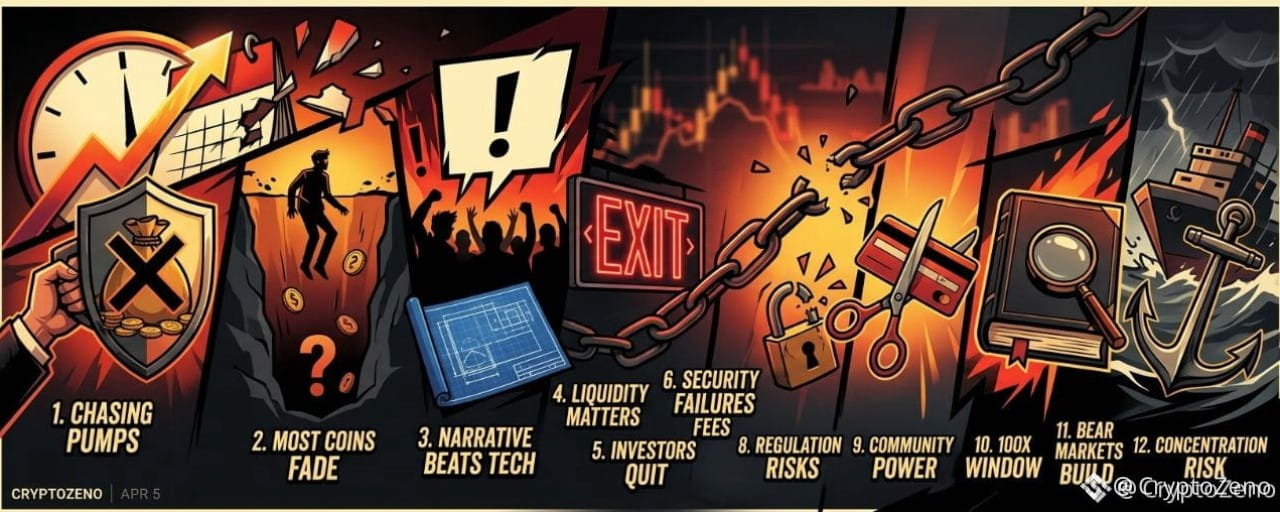
Статья
12 Brutal Mistakes I Made in 12 Years of CryptoSo You Don’t Have To Learn Them the Hard WayI’ve survived twelve years in crypto. I’ve made millions. I’ve lost millions. The gains teach you confidence. The losses teach you truth. These are the mistakes that cost me the most.
Chasing Pumps Is Just Providing Exit Liquidity Every time I bought into a coin already exploding, I convinced myself momentum would continue. Most of the time, I was simply late. When something is trending everywhere, you are rarely early. You are often the liquidity for someone smarter who entered before you.Most Coins Don’t Collapse. They Fade The majority of projects don’t die in dramatic crashes. They slowly lose volume, updates stop, the community shrinks, and attention disappears. One day you realize liquidity is gone and so is your capital.Narrative Often Beats Technology I backed technically superior projects that went nowhere. Meanwhile, tokens with powerful stories, branding, and community momentum outperformed. Markets reward belief and attention before they reward engineering.Liquidity Is More Important Than Paper Gains An unrealized gain means nothing if you cannot exit efficiently. Thin order books trap capital. Always assess depth, not just price.Most Investors Quit at the Worst Time Cycles are emotional weapons. People buy during euphoria and sell during despair. Many who left in bear markets watched prices recover without them. Longevity alone is an edge.Security Failures Hurt More Than Bad Trades I have been hacked, phished, and SIM-swapped. Poor operational security erased profits faster than volatility ever did. Capital without protection is temporary.Overtrading Transfers Wealth to Exchanges Constant activity feels productive. It rarely is. The more I traded, the more I paid in fees and mistakes. Holding strong assets through noise often outperformed aggressive trading.Regulation Changes the Game Overnight Governments move slowly until they don’t. Tokens built on regulatory gray zones can disappear quickly. Long-term survival requires anticipating policy risk.Community Is an Asset Class I underestimated culture. Memes, loyalty, and shared identity drive liquidity and resilience. A loud, committed community can sustain a project longer than strong fundamentals alone.The 100x Window Is Brief Life-changing returns happen early, quietly, and without consensus. Once everyone agrees something is a great opportunity, the asymmetric upside is usually gone.Bear Markets Build Real Advantage The quiet phases are when knowledge compounds. Reading, building, accumulating quality assets at depressed valuations created my largest long-term returns. Bull markets reward positioning built in silence.Concentration Without Risk Control Is Gambling I have seen fortunes disappear from a single oversized bet. Conviction must be balanced with survival. You cannot compound if you are wiped out.
Twelve years taught me this: crypto does not reward intelligence alone. It rewards discipline, patience, adaptability, and survival.
If even one of these lessons saves you from repeating my mistakes, you are already ahead of where I once was.
In crypto, staying in the game is often the biggest advantage of all. #CryptoZeno
12 Brutal Mistakes I Made in 12 Years of CryptoSo You Don’t Have To Learn Them the Hard Way
I’ve survived twelve years in crypto. I’ve made millions. I’ve lost millions. The gains teach you confidence. The losses teach you truth. These are the mistakes that cost me the most.
Chasing Pumps Is Just Providing Exit Liquidity Every time I bought into a coin already exploding, I convinced myself momentum would continue. Most of the time, I was simply late. When something is trending everywhere, you are rarely early. You are often the liquidity for someone smarter who entered before you.Most Coins Don’t Collapse. They Fade The majority of projects don’t die in dramatic crashes. They slowly lose volume, updates stop, the community shrinks, and attention disappears. One day you realize liquidity is gone and so is your capital.Narrative Often Beats Technology I backed technically superior projects that went nowhere. Meanwhile, tokens with powerful stories, branding, and community momentum outperformed. Markets reward belief and attention before they reward engineering.Liquidity Is More Important Than Paper Gains An unrealized gain means nothing if you cannot exit efficiently. Thin order books trap capital. Always assess depth, not just price.Most Investors Quit at the Worst Time Cycles are emotional weapons. People buy during euphoria and sell during despair. Many who left in bear markets watched prices recover without them. Longevity alone is an edge.Security Failures Hurt More Than Bad Trades I have been hacked, phished, and SIM-swapped. Poor operational security erased profits faster than volatility ever did. Capital without protection is temporary.Overtrading Transfers Wealth to Exchanges Constant activity feels productive. It rarely is. The more I traded, the more I paid in fees and mistakes. Holding strong assets through noise often outperformed aggressive trading.Regulation Changes the Game Overnight Governments move slowly until they don’t. Tokens built on regulatory gray zones can disappear quickly. Long-term survival requires anticipating policy risk.Community Is an Asset Class I underestimated culture. Memes, loyalty, and shared identity drive liquidity and resilience. A loud, committed community can sustain a project longer than strong fundamentals alone.The 100x Window Is Brief Life-changing returns happen early, quietly, and without consensus. Once everyone agrees something is a great opportunity, the asymmetric upside is usually gone.Bear Markets Build Real Advantage The quiet phases are when knowledge compounds. Reading, building, accumulating quality assets at depressed valuations created my largest long-term returns. Bull markets reward positioning built in silence.Concentration Without Risk Control Is Gambling I have seen fortunes disappear from a single oversized bet. Conviction must be balanced with survival. You cannot compound if you are wiped out.
Twelve years taught me this: crypto does not reward intelligence alone. It rewards discipline, patience, adaptability, and survival.
If even one of these lessons saves you from repeating my mistakes, you are already ahead of where I once was.
In crypto, staying in the game is often the biggest advantage of all. #CryptoZeno
Chasing Pumps Is Just Providing Exit Liquidity Every time I bought into a coin already exploding, I convinced myself momentum would continue. Most of the time, I was simply late. When something is trending everywhere, you are rarely early. You are often the liquidity for someone smarter who entered before you.Most Coins Don’t Collapse. They Fade The majority of projects don’t die in dramatic crashes. They slowly lose volume, updates stop, the community shrinks, and attention disappears. One day you realize liquidity is gone and so is your capital.Narrative Often Beats Technology I backed technically superior projects that went nowhere. Meanwhile, tokens with powerful stories, branding, and community momentum outperformed. Markets reward belief and attention before they reward engineering.Liquidity Is More Important Than Paper Gains An unrealized gain means nothing if you cannot exit efficiently. Thin order books trap capital. Always assess depth, not just price.Most Investors Quit at the Worst Time Cycles are emotional weapons. People buy during euphoria and sell during despair. Many who left in bear markets watched prices recover without them. Longevity alone is an edge.Security Failures Hurt More Than Bad Trades I have been hacked, phished, and SIM-swapped. Poor operational security erased profits faster than volatility ever did. Capital without protection is temporary.Overtrading Transfers Wealth to Exchanges Constant activity feels productive. It rarely is. The more I traded, the more I paid in fees and mistakes. Holding strong assets through noise often outperformed aggressive trading.Regulation Changes the Game Overnight Governments move slowly until they don’t. Tokens built on regulatory gray zones can disappear quickly. Long-term survival requires anticipating policy risk.Community Is an Asset Class I underestimated culture. Memes, loyalty, and shared identity drive liquidity and resilience. A loud, committed community can sustain a project longer than strong fundamentals alone.The 100x Window Is Brief Life-changing returns happen early, quietly, and without consensus. Once everyone agrees something is a great opportunity, the asymmetric upside is usually gone.Bear Markets Build Real Advantage The quiet phases are when knowledge compounds. Reading, building, accumulating quality assets at depressed valuations created my largest long-term returns. Bull markets reward positioning built in silence.Concentration Without Risk Control Is Gambling I have seen fortunes disappear from a single oversized bet. Conviction must be balanced with survival. You cannot compound if you are wiped out.
Twelve years taught me this: crypto does not reward intelligence alone. It rewards discipline, patience, adaptability, and survival.
If even one of these lessons saves you from repeating my mistakes, you are already ahead of where I once was.
In crypto, staying in the game is often the biggest advantage of all. #CryptoZeno
7
4
87
81.8k
·
--
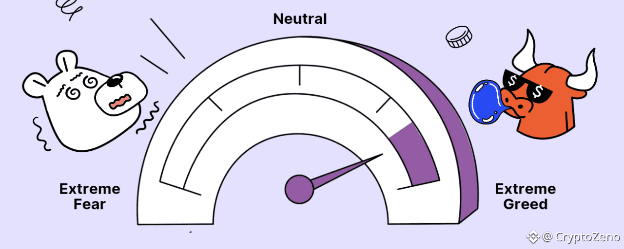
Статья
The Fear and Greed Index Really Tells You About the Crypto MarketThe Fear and Greed Index Really Tells You About the Crypto Market
Greed typically leads to upward trends, while fear leads to negative trends. Human psychology is predictable because many individuals tend to react similarly in specific situations.
The Fear and Greed Index attempts to address and quantify market sentiment, making it useful and easy to understand for traders.
The Fear and Greed Index is one of the most widely used indicators to understand market sentiment. As the name suggests, this index helps you determine whether the market is currently fearful or greedy, allowing you to develop a suitable trading strategy.
The Crypto Fear and Greed Index is based on Bitcoin and other major altcoins, combines social signals and market patterns to estimate the overall sentiment of the cryptocurrency market. It's an index because it integrates multiple data sources into a single model.
Fear and Greed Index is a indicator to understand market sentiment.
This index assigns a score from 0 to 100 to cryptocurrency sentiment, ranging from extreme fear to extreme greed. Many cryptocurrency traders use this index to determine the best times to enter and exit the cryptocurrency market.
How is the Fear & Greed Index calculated?
To calculate the Fear and Greed Index, we will rely on the following 5 parameters:
Voltality: Measured by comparing the current price volatility and maximum price drop of BTC with the corresponding average values of the previous 30 and 90 days.Market Momentum/Volume: Combines the current momentum and trading volume of BTC, then compares it to the average of the previous 30 and 90 days.Social Media: This index is based on social media metrics such as likes, hashtags, what people are talking about, the number of posts, etc. Therefore, if the above indicators increase, it corresponds to a market that is gradually becoming greedy. Currently, it is only measured on Twitter.Dominance: Dominance here refers to BTC, meaning the percentage of market capitalization that BTC currently holds compared to the total cryptocurrency market capitalization, also known as BTC Dominance.Trend: Alternative.me takes Google Trend data for various Bitcoin-related search queries and processes those numbers, particularly changes in search volume as well as other suggested popular searches.
Why do Fear and Greed Index matter?
The cryptocurrency market is highly susceptible to many factors. When the market is rising, people become greedy, leading to FOMO (fear of missing out). Additionally, people often sell their assets impulsively when they see red numbers, leading to FUD (fear, uncertainty, doubt). The F&G index aims to protect you from these emotional overreactions. Traders often make two simple assumptions:
Extreme fear: This indicates that investors are overly anxious. This could be a good time to buy.Extreme greed: When investors are in a state of extreme greed, the market is ripe for a correction.
Therefore, the Fear and Greed Index assesses the current state of the Bitcoin market and converts the data into a simple measure from 0 to 100.
Why Fear and Greed Index matter?
How to use the Fear and Greed Index in Crypto
The Crypto Fear and Greed Index can be more effective for short-term research on the cryptocurrency market. Multiple Fear and Greed cycles can occur within a bull or bear market.
For trend traders, the Fear and Greed Index is a very beneficial tool when combined with technical analysis tools such as Fibonacci retracements, as well as other market indicators and oscillators.
However, this index has been shown to be inaccurate in predicting long-term market reversals or transitions from bull to bear markets and vice versa.
How to Use the Fear and Greed Index
From left to right:
Figure 1: Fear & Greed Index Chart.Figure 2: Fear & Greed Index Values: Current, Yesterday, Last Week, Last Month.Figure 3: Next Fear & Greed Index Update Time.
The Fear & Greed Index is a number ranging from 0 to 100:
0-49 represents Fear.51-100 represents Greed.50 corresponds to a neutral market.
However, if broken down further, the colors on the chart have the following meanings:
0-24: Extreme Fear (orange).25-49: Fear (yellow).50-74: Greed (light blue).75-100: Extreme Greed (green).
Fear means the market is showing negative signs, most asset values are falling, and people tend to sell everything off.
Conversely, a greedy market is one where everyone rushes to buy everything due to FOMO (fear of missing out), and asset prices are constantly rising.
How accurate is Fear and Greed Index in Crypto?
Similar to other indicators, the Fear & Greed Index has high accuracy, but it's not always right. To make trading decisions, analysts often combine it with other indicators such as chart analysis, on-chain data of BTC and ETH to see the overall situation, on-chain data of the asset being traded, etc.
How accurate is Fear and Greed index in Crypto?
Because the Fear & Greed Index only reflects the general market situation and updates very slowly, this index only provides an overview of the market, suitable for long-term traders. If you are a short-term trader, closing trades within a day or a few days, this index is not necessarily necessary.
In addition, there is no data showing what level the index will reach before a market change occurs. This means we all know that when the market is greedy, there will be a period of sharp correction.
The question is, at what level will the Fear & Greed Index reach before a correction? That's something we don't know. Therefore, the Fear & Greed Index is not used to help you predict when the market will correct.
Furthermore, in a bull or bear market, we sometimes see the indicator leaning in the opposite direction. But that doesn't mean the market has ended its trend and reversed. It could be a small correction to establish a larger, more sustainable uptrend/downtrend.
The cryptocurrency fear and greed index is a powerful tool in the trading toolkit, but it needs to be used wisely, combined with a solid trading strategy, consistent discipline, and a continuous learning attitude. By combining all of these, you can increase your chances of success in the exciting yet challenging world of cryptocurrency trading.
#CryptoZeno #StrategyBTCSalesLimitedToDividends
The Fear and Greed Index Really Tells You About the Crypto Market
The Fear and Greed Index Really Tells You About the Crypto Market
Greed typically leads to upward trends, while fear leads to negative trends. Human psychology is predictable because many individuals tend to react similarly in specific situations.
The Fear and Greed Index attempts to address and quantify market sentiment, making it useful and easy to understand for traders.
The Fear and Greed Index is one of the most widely used indicators to understand market sentiment. As the name suggests, this index helps you determine whether the market is currently fearful or greedy, allowing you to develop a suitable trading strategy.
The Crypto Fear and Greed Index is based on Bitcoin and other major altcoins, combines social signals and market patterns to estimate the overall sentiment of the cryptocurrency market. It's an index because it integrates multiple data sources into a single model.
Fear and Greed Index is a indicator to understand market sentiment.
This index assigns a score from 0 to 100 to cryptocurrency sentiment, ranging from extreme fear to extreme greed. Many cryptocurrency traders use this index to determine the best times to enter and exit the cryptocurrency market.
How is the Fear & Greed Index calculated?
To calculate the Fear and Greed Index, we will rely on the following 5 parameters:
Voltality: Measured by comparing the current price volatility and maximum price drop of BTC with the corresponding average values of the previous 30 and 90 days.Market Momentum/Volume: Combines the current momentum and trading volume of BTC, then compares it to the average of the previous 30 and 90 days.Social Media: This index is based on social media metrics such as likes, hashtags, what people are talking about, the number of posts, etc. Therefore, if the above indicators increase, it corresponds to a market that is gradually becoming greedy. Currently, it is only measured on Twitter.Dominance: Dominance here refers to BTC, meaning the percentage of market capitalization that BTC currently holds compared to the total cryptocurrency market capitalization, also known as BTC Dominance.Trend: Alternative.me takes Google Trend data for various Bitcoin-related search queries and processes those numbers, particularly changes in search volume as well as other suggested popular searches.
Why do Fear and Greed Index matter?
The cryptocurrency market is highly susceptible to many factors. When the market is rising, people become greedy, leading to FOMO (fear of missing out). Additionally, people often sell their assets impulsively when they see red numbers, leading to FUD (fear, uncertainty, doubt). The F&G index aims to protect you from these emotional overreactions. Traders often make two simple assumptions:
Extreme fear: This indicates that investors are overly anxious. This could be a good time to buy.Extreme greed: When investors are in a state of extreme greed, the market is ripe for a correction.
Therefore, the Fear and Greed Index assesses the current state of the Bitcoin market and converts the data into a simple measure from 0 to 100.
Why Fear and Greed Index matter?
How to use the Fear and Greed Index in Crypto
The Crypto Fear and Greed Index can be more effective for short-term research on the cryptocurrency market. Multiple Fear and Greed cycles can occur within a bull or bear market.
For trend traders, the Fear and Greed Index is a very beneficial tool when combined with technical analysis tools such as Fibonacci retracements, as well as other market indicators and oscillators.
However, this index has been shown to be inaccurate in predicting long-term market reversals or transitions from bull to bear markets and vice versa.
How to Use the Fear and Greed Index
From left to right:
Figure 1: Fear & Greed Index Chart.Figure 2: Fear & Greed Index Values: Current, Yesterday, Last Week, Last Month.Figure 3: Next Fear & Greed Index Update Time.
The Fear & Greed Index is a number ranging from 0 to 100:
0-49 represents Fear.51-100 represents Greed.50 corresponds to a neutral market.
However, if broken down further, the colors on the chart have the following meanings:
0-24: Extreme Fear (orange).25-49: Fear (yellow).50-74: Greed (light blue).75-100: Extreme Greed (green).
Fear means the market is showing negative signs, most asset values are falling, and people tend to sell everything off.
Conversely, a greedy market is one where everyone rushes to buy everything due to FOMO (fear of missing out), and asset prices are constantly rising.
How accurate is Fear and Greed Index in Crypto?
Similar to other indicators, the Fear & Greed Index has high accuracy, but it's not always right. To make trading decisions, analysts often combine it with other indicators such as chart analysis, on-chain data of BTC and ETH to see the overall situation, on-chain data of the asset being traded, etc.
How accurate is Fear and Greed index in Crypto?
Because the Fear & Greed Index only reflects the general market situation and updates very slowly, this index only provides an overview of the market, suitable for long-term traders. If you are a short-term trader, closing trades within a day or a few days, this index is not necessarily necessary.
In addition, there is no data showing what level the index will reach before a market change occurs. This means we all know that when the market is greedy, there will be a period of sharp correction.
The question is, at what level will the Fear & Greed Index reach before a correction? That's something we don't know. Therefore, the Fear & Greed Index is not used to help you predict when the market will correct.
Furthermore, in a bull or bear market, we sometimes see the indicator leaning in the opposite direction. But that doesn't mean the market has ended its trend and reversed. It could be a small correction to establish a larger, more sustainable uptrend/downtrend.
The cryptocurrency fear and greed index is a powerful tool in the trading toolkit, but it needs to be used wisely, combined with a solid trading strategy, consistent discipline, and a continuous learning attitude. By combining all of these, you can increase your chances of success in the exciting yet challenging world of cryptocurrency trading.
#CryptoZeno #StrategyBTCSalesLimitedToDividends
Greed typically leads to upward trends, while fear leads to negative trends. Human psychology is predictable because many individuals tend to react similarly in specific situations.
The Fear and Greed Index attempts to address and quantify market sentiment, making it useful and easy to understand for traders.
The Fear and Greed Index is one of the most widely used indicators to understand market sentiment. As the name suggests, this index helps you determine whether the market is currently fearful or greedy, allowing you to develop a suitable trading strategy.
The Crypto Fear and Greed Index is based on Bitcoin and other major altcoins, combines social signals and market patterns to estimate the overall sentiment of the cryptocurrency market. It's an index because it integrates multiple data sources into a single model.
Fear and Greed Index is a indicator to understand market sentiment.
This index assigns a score from 0 to 100 to cryptocurrency sentiment, ranging from extreme fear to extreme greed. Many cryptocurrency traders use this index to determine the best times to enter and exit the cryptocurrency market.
How is the Fear & Greed Index calculated?
To calculate the Fear and Greed Index, we will rely on the following 5 parameters:
Voltality: Measured by comparing the current price volatility and maximum price drop of BTC with the corresponding average values of the previous 30 and 90 days.Market Momentum/Volume: Combines the current momentum and trading volume of BTC, then compares it to the average of the previous 30 and 90 days.Social Media: This index is based on social media metrics such as likes, hashtags, what people are talking about, the number of posts, etc. Therefore, if the above indicators increase, it corresponds to a market that is gradually becoming greedy. Currently, it is only measured on Twitter.Dominance: Dominance here refers to BTC, meaning the percentage of market capitalization that BTC currently holds compared to the total cryptocurrency market capitalization, also known as BTC Dominance.Trend: Alternative.me takes Google Trend data for various Bitcoin-related search queries and processes those numbers, particularly changes in search volume as well as other suggested popular searches.
Why do Fear and Greed Index matter?
The cryptocurrency market is highly susceptible to many factors. When the market is rising, people become greedy, leading to FOMO (fear of missing out). Additionally, people often sell their assets impulsively when they see red numbers, leading to FUD (fear, uncertainty, doubt). The F&G index aims to protect you from these emotional overreactions. Traders often make two simple assumptions:
Extreme fear: This indicates that investors are overly anxious. This could be a good time to buy.Extreme greed: When investors are in a state of extreme greed, the market is ripe for a correction.
Therefore, the Fear and Greed Index assesses the current state of the Bitcoin market and converts the data into a simple measure from 0 to 100.
Why Fear and Greed Index matter?
How to use the Fear and Greed Index in Crypto
The Crypto Fear and Greed Index can be more effective for short-term research on the cryptocurrency market. Multiple Fear and Greed cycles can occur within a bull or bear market.
For trend traders, the Fear and Greed Index is a very beneficial tool when combined with technical analysis tools such as Fibonacci retracements, as well as other market indicators and oscillators.
However, this index has been shown to be inaccurate in predicting long-term market reversals or transitions from bull to bear markets and vice versa.
How to Use the Fear and Greed Index
From left to right:
Figure 1: Fear & Greed Index Chart.Figure 2: Fear & Greed Index Values: Current, Yesterday, Last Week, Last Month.Figure 3: Next Fear & Greed Index Update Time.
The Fear & Greed Index is a number ranging from 0 to 100:
0-49 represents Fear.51-100 represents Greed.50 corresponds to a neutral market.
However, if broken down further, the colors on the chart have the following meanings:
0-24: Extreme Fear (orange).25-49: Fear (yellow).50-74: Greed (light blue).75-100: Extreme Greed (green).
Fear means the market is showing negative signs, most asset values are falling, and people tend to sell everything off.
Conversely, a greedy market is one where everyone rushes to buy everything due to FOMO (fear of missing out), and asset prices are constantly rising.
How accurate is Fear and Greed Index in Crypto?
Similar to other indicators, the Fear & Greed Index has high accuracy, but it's not always right. To make trading decisions, analysts often combine it with other indicators such as chart analysis, on-chain data of BTC and ETH to see the overall situation, on-chain data of the asset being traded, etc.
How accurate is Fear and Greed index in Crypto?
Because the Fear & Greed Index only reflects the general market situation and updates very slowly, this index only provides an overview of the market, suitable for long-term traders. If you are a short-term trader, closing trades within a day or a few days, this index is not necessarily necessary.
In addition, there is no data showing what level the index will reach before a market change occurs. This means we all know that when the market is greedy, there will be a period of sharp correction.
The question is, at what level will the Fear & Greed Index reach before a correction? That's something we don't know. Therefore, the Fear & Greed Index is not used to help you predict when the market will correct.
Furthermore, in a bull or bear market, we sometimes see the indicator leaning in the opposite direction. But that doesn't mean the market has ended its trend and reversed. It could be a small correction to establish a larger, more sustainable uptrend/downtrend.
The cryptocurrency fear and greed index is a powerful tool in the trading toolkit, but it needs to be used wisely, combined with a solid trading strategy, consistent discipline, and a continuous learning attitude. By combining all of these, you can increase your chances of success in the exciting yet challenging world of cryptocurrency trading.
#CryptoZeno #StrategyBTCSalesLimitedToDividends
4
264
·
--

Статья
My Trading SystemMy job everyday is to come to the table, look around and decide where could certain hands move price or force itself into the books in order to move price.
At least on the lower time frames I do this through tools like open interest, funding rates, live liquidations, delta, plus some intuition from repeatedly seeing the same patterns of liquidity repeated after years of watching the same market. These are the tools which give me the ability across a fragmented BTC market to identify where people are positioning, which side they are on, and which moves could force their hand.
I like to frame my thinking around a single quesiton before getting into a position:
Has the market priced this in yet?
If it hasn't been priced in then there's edge in what i'm trying to execute from. If I see the market has priced it in already then the edge has diminished and the trade is no longer there.
A good example of this is when looking for trapped traders, specifically looking at whether open interest has decreased or not to spot whether those "trapped positions" have forced their position back into the market.
The end goal is to position myself into the market early enough to exploit something Ive seen which I believe the market hasn't priced in yet.
Another great example of this, is through understanding liquidity in particular how thin books can allow for exaggerated price movements. If you pair that alongside trapped positioning you will very often get a very nice mean reversion setup.
A common misconception is that "thin books" can only be identified in real time and through looking at the dom. This is not true. Using volume candles or looking at how far price moved in relation to how much volume pushed it can help answer this question too. Alongside identifying surges in open interest to help identify trapped positions.
It's about finding your thesis for why you should get paid from the trade you want to take, then going to the technical board and figuring out which tools will help identify this in real time.
Don't pick random tools and use them because they look fancy, think about where your edge comes from (at route level) then decide which tools allow you to spot that mispriced event faster and in a more reliable manner than anyone else could.
A fast move into a predictable stop/tp zone that happens unusually fast relative to local regime is one thing I commonly look for. These moves are often engineered, meaning someone/group of people have forced price to a certain local level for liquidity purposes.
> Force price up
> Stops/liquidations triggered
> Limit sell orders filled
> No real conviction
> Price reverses
This requires some level of intuition to reliably identify, but in essence upon a break of a level I want to see excessive buying in the form of aggressive stops being hit or liquidations being forced into the book. Both offer up opportunity for opposing side limits to be filled, and if the move was manufactured or deliberately pushed up in this manner, theres no real conviction behind it, allows for a easy reversal.
It all comes down the fact that if I know why i'm looking for something at a certain location, that can be transferred over much easier than just punting random levels without reasoning.
Think about who you are trading against and how you can profit off that info before it is priced in, you are in the research business.
#CryptoZeno #GENIUSBinanceHODLer
My Trading System
My job everyday is to come to the table, look around and decide where could certain hands move price or force itself into the books in order to move price.
At least on the lower time frames I do this through tools like open interest, funding rates, live liquidations, delta, plus some intuition from repeatedly seeing the same patterns of liquidity repeated after years of watching the same market. These are the tools which give me the ability across a fragmented BTC market to identify where people are positioning, which side they are on, and which moves could force their hand.
I like to frame my thinking around a single quesiton before getting into a position:
Has the market priced this in yet?
If it hasn't been priced in then there's edge in what i'm trying to execute from. If I see the market has priced it in already then the edge has diminished and the trade is no longer there.
A good example of this is when looking for trapped traders, specifically looking at whether open interest has decreased or not to spot whether those "trapped positions" have forced their position back into the market.
The end goal is to position myself into the market early enough to exploit something Ive seen which I believe the market hasn't priced in yet.
Another great example of this, is through understanding liquidity in particular how thin books can allow for exaggerated price movements. If you pair that alongside trapped positioning you will very often get a very nice mean reversion setup.
A common misconception is that "thin books" can only be identified in real time and through looking at the dom. This is not true. Using volume candles or looking at how far price moved in relation to how much volume pushed it can help answer this question too. Alongside identifying surges in open interest to help identify trapped positions.
It's about finding your thesis for why you should get paid from the trade you want to take, then going to the technical board and figuring out which tools will help identify this in real time.
Don't pick random tools and use them because they look fancy, think about where your edge comes from (at route level) then decide which tools allow you to spot that mispriced event faster and in a more reliable manner than anyone else could.
A fast move into a predictable stop/tp zone that happens unusually fast relative to local regime is one thing I commonly look for. These moves are often engineered, meaning someone/group of people have forced price to a certain local level for liquidity purposes.
> Force price up
> Stops/liquidations triggered
> Limit sell orders filled
> No real conviction
> Price reverses
This requires some level of intuition to reliably identify, but in essence upon a break of a level I want to see excessive buying in the form of aggressive stops being hit or liquidations being forced into the book. Both offer up opportunity for opposing side limits to be filled, and if the move was manufactured or deliberately pushed up in this manner, theres no real conviction behind it, allows for a easy reversal.
It all comes down the fact that if I know why i'm looking for something at a certain location, that can be transferred over much easier than just punting random levels without reasoning.
Think about who you are trading against and how you can profit off that info before it is priced in, you are in the research business.
#CryptoZeno #GENIUSBinanceHODLer
At least on the lower time frames I do this through tools like open interest, funding rates, live liquidations, delta, plus some intuition from repeatedly seeing the same patterns of liquidity repeated after years of watching the same market. These are the tools which give me the ability across a fragmented BTC market to identify where people are positioning, which side they are on, and which moves could force their hand.
I like to frame my thinking around a single quesiton before getting into a position:
Has the market priced this in yet?
If it hasn't been priced in then there's edge in what i'm trying to execute from. If I see the market has priced it in already then the edge has diminished and the trade is no longer there.
A good example of this is when looking for trapped traders, specifically looking at whether open interest has decreased or not to spot whether those "trapped positions" have forced their position back into the market.
The end goal is to position myself into the market early enough to exploit something Ive seen which I believe the market hasn't priced in yet.
Another great example of this, is through understanding liquidity in particular how thin books can allow for exaggerated price movements. If you pair that alongside trapped positioning you will very often get a very nice mean reversion setup.
A common misconception is that "thin books" can only be identified in real time and through looking at the dom. This is not true. Using volume candles or looking at how far price moved in relation to how much volume pushed it can help answer this question too. Alongside identifying surges in open interest to help identify trapped positions.
It's about finding your thesis for why you should get paid from the trade you want to take, then going to the technical board and figuring out which tools will help identify this in real time.
Don't pick random tools and use them because they look fancy, think about where your edge comes from (at route level) then decide which tools allow you to spot that mispriced event faster and in a more reliable manner than anyone else could.
A fast move into a predictable stop/tp zone that happens unusually fast relative to local regime is one thing I commonly look for. These moves are often engineered, meaning someone/group of people have forced price to a certain local level for liquidity purposes.
> Force price up
> Stops/liquidations triggered
> Limit sell orders filled
> No real conviction
> Price reverses
This requires some level of intuition to reliably identify, but in essence upon a break of a level I want to see excessive buying in the form of aggressive stops being hit or liquidations being forced into the book. Both offer up opportunity for opposing side limits to be filled, and if the move was manufactured or deliberately pushed up in this manner, theres no real conviction behind it, allows for a easy reversal.
It all comes down the fact that if I know why i'm looking for something at a certain location, that can be transferred over much easier than just punting random levels without reasoning.
Think about who you are trading against and how you can profit off that info before it is priced in, you are in the research business.
#CryptoZeno #GENIUSBinanceHODLer
4
266
·
--
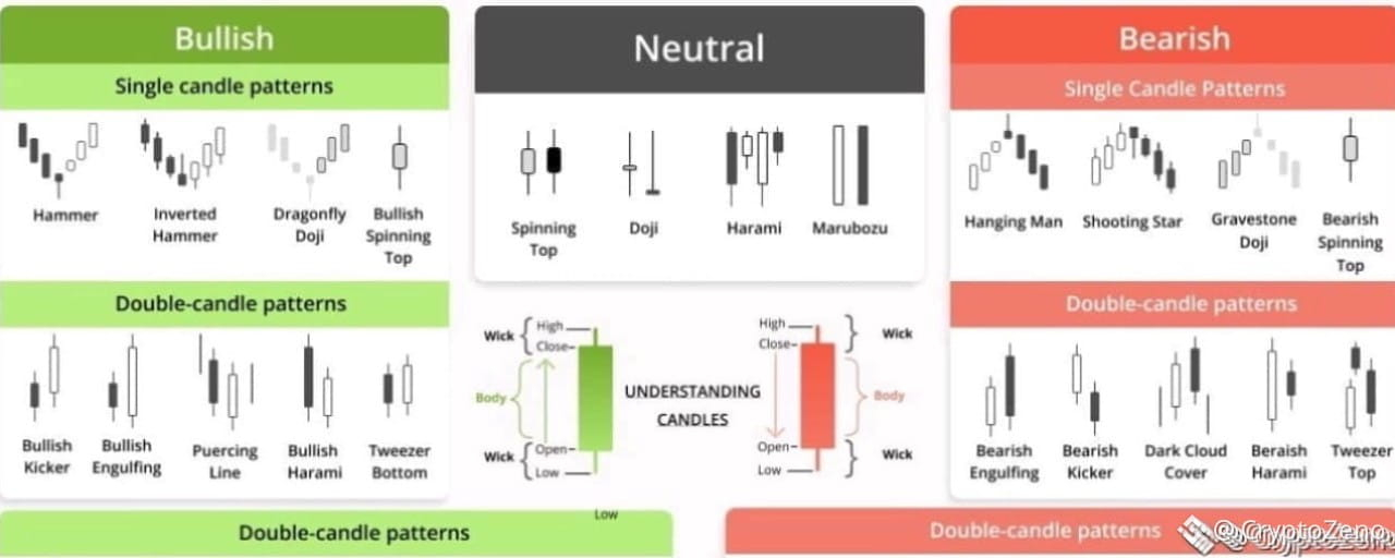
Статья
Candlestick Patterns: The Secret Signals Hidden in Every ChartCandlestick patterns are universal tools in the arsenal of any cryptocurrency trader. Understanding them, and the various historical chart patterns are what allows crypto traders to interpret and analyze the trend of the market and make pattern trading decisions. Which are hopefully profitable! The better and more experienced you are at technical analysis skews the odds in your favor of making the most from bullish and bearish trends. It’s highly suggested to combine candlestick patterns trading with things like trading based on trend lines for extra confluence.
Anyways, let’s get into the various types of crypto chart patterns that traders use and how to spot them with guides. Hopefully, by the end of this article, you’ll feel like a pro at spotting chart patterns.
Types of Trading Patterns
Before getting into the various types of trading patterns. Let’s first understand what a candlestick is. It’s just a single bar that shows the movement of a particular asset or crypto’s price over a certain period of time. It shows us the open, high, low, and close for our selected time frame. People typically make their trades based on 1,2, and 4 hour time frames, or candles, as well as daily, weekly, and monthly. However, all of the patterns gone over in this encyclopedia of chart patterns can be applied to lower time frames and candles such as the 1, 15, and 30 minute. Though, one must be careful on such low time frames, as the crypto market is very, very volatile.
Above is an example of what candlesticks look like and what they represent. Every candle has a low price, high price, and an open and close price, represented by the wicks (or legs) and “body” of a candle, respectively.
Over time, individual candlesticks form day trading patterns or reversal patterns. As seen in the image above. There are a great many candlestick patterns that indicate an opportunity within the market – some provide insight into the balance between buying and selling pressure, while others identify continuation patterns or market indecision.
With time, these separate candlesticks create different day trading patterns or reversal patterns that are used in trading chart patterns. Traders rely on analyzing these patterns to gauge support & resistance levels and to get a heads up on what’s going to happen in the market next. There are a lot of different candlestick patterns that provide traders with great opportunities.
Typically, in the market, we see the following types of trading patterns:
bullish reversal patterns,bearish reversal patterns,and candlestick continuation patterns.
Bullish candlestick patterns form at a market downturn and signal that the price of an asset is likely to reverse. Which would lead a trader to consider opening a long position and profit from an upward move. Whereas bearish candlestick patterns are seen at the end of an uptrend. Which lets traders know that the price of a crypto is at a heavy point of resistance and that price may fall due to buyer exhaustion. Both can be considered trend reversal patterns.
However, candlestick trading patterns don’t necessarily have to indicate a shift in the market’s direction. There exist what are known as continuation candlestick patterns that are considered as a confirmation that the trade will go on. The continuation patterns are also associated with periods of rest and sideways or neutral price movement in the market.
To help you quickly spot all the different types of candlestick patterns, we created this candlestick patterns cheat sheet for a quick visualization of them. Since we will cover a wide range of the most common candlestick trading patterns, having a good overview will be essential.
Candlestick Patterns Cheat Sheet
Now, let’s go through the main types of candlestick patterns to learn how to detect and read them on crypto charts.
Candlestick Patterns Explained With Examples: How to Find and Read Them on Charts
It’s not a secret that understanding candlestick patterns will make you a powerful trader capable of making an income purely by reading candlestick patterns and trading candlestick patterns and price movements.
The real beauty here is that anyone can apply this technical knowledge and use candlestick trading patterns on any time frame and combine them with any other strategy. After reading this guide with the best candlestick patterns, you’ll easily be able to start spotting and using candlestick patterns for day trading.
So let’s get to it and over some candlestick patterns explained with examples from the Good Crypto trading app. Get ready and sit back comfortably as you learn about the most reliable candlestick patterns.
So, let’s get down to business…
Hammer Candlestick
We’ll start things off with the Hammer candle. Honestly, the hammer candlestick pattern is probably the most used and taught trading pattern there is. The reason for that is that the hammer chart pattern is very easy to spot and use. Typically, bullish hammer candlesticks are found at the bottom of a market downtrend. Whereas bearish candlestick patterns are seen at the end of an uptrend.
The hammer pattern is a signal that selling pressure on an asset is weakening and that buyers are stepping in to place bids. Below is an example of a hammer candlestick pattern, which is obviously bullish.
As we can see in the example above. Sellers tried to take the price as low as possible (based on the long wick), however, they were weak and buyers swooped in, resulting in the bullish hammer candlestick above. Notice the hammer-like shape of the candle? Also note that the longer the wick of the hammer in candlestick chart, the greater the buying pressure.
An example of the Hammer Candlestick Pattern on the GoodCrypto chart.
Inverted Hammer Candlestick
There is also the inverted hammer candlestick. It’s also bullish, but its top wick is long while the bottom one is short. The inverted hammer pattern indicates that there was substantial buying pressure followed by some sell pressure. But ultimately that buyers ended up having greater control.
A trader would see the above inverted hammer candlestick pattern or preceding green hammer candlestick and likely feel quite confident in learning bullish and possibly opening a long with a sensible stop loss. Below is an example of how such a trade could be set up using the Good crypto trading app.
An example of the Inverted Hammer Candlestick Pattern on the GoodCrypto chart.
❗️Mind, as a smart trader, before setting up a position, you should also look for a few more indications of the trend reversal represented by other trading tools: trendlines, technical indicators, like Bollinger Bands, Moving Averages, or Oscillators like RSI and MACD.
Engulfing Candle
As opposed to the previous candlestick pattern, which is formed from one candle, an engulfing candle is actually a combination of two separate candlestick patterns. Traders will see two types of such patterns, either a bullish engulfing, or a bearish engulfing.
An engulfing candlestick pattern is very easy to spot on a chart. It is usually a big candlestick body with very tiny top and bottom wicks. Take a look at an example of a bullish engulfing candle pattern below:
Bullish engulfing candles are typically found at the end of trends and show that bulls have assumed control of a market. As you can see, the bullish engulfing candlestick quite literally consumes the preceding candle in terms of size.
Everything in the exact opposite is true for a bearish engulfing pattern. A red and vicious candle that consumes all of the previous bullishness and reminds traders of gravity.
A bearish engulfing candlestick as in the example above would signal to a trader that opening a short position on an asset would be wise due to waning buyer momentum.
An example of the Bearish Engulfing Candlestick Pattern on the GoodCrypto chart.
Three White Soldiers
The three white soldiers candlestick pattern is a little bit more complicated than the previous ones we covered. It requires more attention to spot and utilize in your pattering trading strategy because three white soldiers require a specific setup.
Although, at first glance, the pattern might just seem like 3 candles that go up consecutively. Context is key here. The three white soldiers candlestick pattern is made after consistent heavy selling.
Above is an example of the three white soldiers pattern that marks a shift from a downtrend to an uptrend. Note that the candles become progressively larger too, making higher highs (HH). This is a very bullish and volatile trading pattern, which makes it quite tempting for novice traders to disregard risk management, which is a grave mistake and something that you should definitely have as part of your pattern trading strategy.
Three Black Crows
A literal bearish alternative to the previous trading pattern we just covered. The three black crows candlestick pattern consists of three strong black candles known as black crows. Some of these names are quite poetic, aren’t they? This trading pattern has to form after a big push upwards by buyers. Check out this nosedive in the market:
As you’re well able to interpret by now, the above pattern is indicative of sellers seizing control from buyers. Making the three black crows pattern a good short signal. Traders need to watch for the second black crow candle to close below the preceding bullish one. The final crow is around the same size as the one before it and opens at the last bullish candlestick close.
Dark Сloud Сover
The dark cloud cover candlestick, as you can likely assume from its name, is a bearish chart pattern. It indicates changing momentum to the downside following heavy and active participation by buyers.
Both candles have to be quite large, as would be the case for candles where there is a lot of participation by traders. The bearish dark cloud cover candle opens higher than the previous bullish candle and closes lower than the midpoint of the bullish candle.
One would confirm this pattern on their crypto chart by being mindful of the candle which forms after the dark cloud cover candle. If it is red, then that acts as confirmation of the full dark cloud cover pattern and is forthcoming of further selling and a great signal to short with confidence. If it is green, then the dark cloud cover candle is not confirmed.
Hanging Man
The hanging man candlestick pattern is actually the bearish alternative to the hammer pattern covered just above. It sort of has the same shape but looks like a hanging man because of the small wick that is customary for the hanging man candle trading pattern.
As you can see in the image above, the hanging man candlestick pattern forms at the conclusion of an uptrend. The long bottom wick tells pattern day traders that there was significant selling and that buyers may lose steam for the next couple of days with a bearish continuation.
Spinning Top Candle
The spinning top is a candlestick with a very small or short body in between equal bottom and top wicks. The spinning top candle shows that there is indecision in the market and foreshadows a period of possible sideways movement and is typically present when there is indecision in the market.
For example, a spinning top after engulfing candle in a typical bullish scenario could mean that price is consolidating before a further move up or that bulls are losing control. One would need to examine the candles following to gain confluence. Whereas a spinning top candle downtrend a price floor is being built via sideways price movement before either bulls or bears step up. The spinning top candle is usually used in conjunction with other chart patterns and technical analysis methods used by pattern day traders because a lot of confirmation is required to enter a profitable trade.
Doji Candle
A doji candle is an interesting-looking cross-shaped candle and represents a time frame during which the open and close price of an asset were nearly equal, representing an equal struggle between buyers and sellers. By itself, a doji candle is a neutral candlestick pattern, but it has two major types, that being the dragonfly doji, and the gravestone doji.
Dragonfly Doji Candle
The dragonfly doji candle has no body and a very prolonged lower candle which indicates that there was aggressive selling that had to be absorbed by buyers of equal balls.
A dragonfly doji in uptrend could signal that it is coming to an end or that a new one is starting if a dragonfly doji at bottom is spotted. Traders frequently use the dragonfly doji candlestick as they would a hammer, but it is suggested to wait for a confirmation candle before entering a trade on this candle.
Gravestone Doji
Gravestone doji… A candlestick with a name that’s straight to the point. As you hopefully guessed, a gravestone doji candle in an uptrend means that the trend is dead! The candlestick has no body and resembles a nail hitting a coffin.
As you can see in the image above, the candle is a clear sign for a pattern day trader that the trend is reversing upon meeting a wall of impassable sellers. Of course, it’s never a bad idea to wait for further candles to receive confirmation that our gravestone doji is bearish. Though traders do typically take profits or enter short positions when a gravestone doji at top is spotted.
Long-legged Doji
The long-legged doji candle is composed of a long lower and upper shadow. The closing and open prices that go into forming this candle are about the same. It demonstrates that there is indecisiveness amongst market participants and occurs after a heavy advance or decline in price. Traders usually wait and see what type of price action forms following a long-legged doji candlestick. It often marks the start of a consolidation period.
An example of the Long-legged Doji on the GoodCrypto chart.
Shooting Star Candle and Other Stars
The shooting star chart pattern looks like an upside-down hammer. Therefore, the shooting star candlestick pattern essentially means that the price of an asset is about to get hammered down in a reversal by aggressive sellers.
When this trading pattern appears, it often forms a resistance level at the top of an uptrend. Despite the name, it’s quite a devastating candle. However, the next one we’re about to cover provides some bullish hope.
Morning Star Pattern
The morning star candle pattern consists of 3 candlestick and tells traders a story of changing momentum in a bleak down-trending market. The morning star candlestick reversal pattern first starts off with a candle forming by dominant sellers, then goes from neither buy or sell side being dominant, represented by the morning star candle with a near non-existent body, to buyers prevailing in outbidding sellers across two time periods. Effectively signaling that a bullish market is soon to commence. Actually, when looking at this pattern in a chart, one can see that it is a combination of the hammer, engulfing, and doji.
Evening Star Pattern
The evening star candlestick pattern is a mirror opposite of the previous trading pattern and appears at the completion of an assets uptrend and a prime time to enter shorts as buyers become exhausted. The important thing to keep in mind when spotting the evening star candlestick is that it must be tiny in comparison to the buy and sell candles that accompany it.
An example of the Evening Star Candlestick Pattern on the GoodCrypto chart.
Trade With Candlestick Patterns With Benefits of Good Crypto
Being able to spot candlestick patterns and execute them is a vital skill that anyone who refers to themself as a trader must have. Without having an understanding of the crypto chart patterns – you’ll simply be destroyed! We suggest checking out various of our other articles on trading strategies to further boost your pattern trading skills and increase your chances of success. We hope you enjoyed this educational piece!
#CryptoZeno #SpaceXSharesFall
Candlestick Patterns: The Secret Signals Hidden in Every Chart
Candlestick patterns are universal tools in the arsenal of any cryptocurrency trader. Understanding them, and the various historical chart patterns are what allows crypto traders to interpret and analyze the trend of the market and make pattern trading decisions. Which are hopefully profitable! The better and more experienced you are at technical analysis skews the odds in your favor of making the most from bullish and bearish trends. It’s highly suggested to combine candlestick patterns trading with things like trading based on trend lines for extra confluence.
Anyways, let’s get into the various types of crypto chart patterns that traders use and how to spot them with guides. Hopefully, by the end of this article, you’ll feel like a pro at spotting chart patterns.
Types of Trading Patterns
Before getting into the various types of trading patterns. Let’s first understand what a candlestick is. It’s just a single bar that shows the movement of a particular asset or crypto’s price over a certain period of time. It shows us the open, high, low, and close for our selected time frame. People typically make their trades based on 1,2, and 4 hour time frames, or candles, as well as daily, weekly, and monthly. However, all of the patterns gone over in this encyclopedia of chart patterns can be applied to lower time frames and candles such as the 1, 15, and 30 minute. Though, one must be careful on such low time frames, as the crypto market is very, very volatile.
Above is an example of what candlesticks look like and what they represent. Every candle has a low price, high price, and an open and close price, represented by the wicks (or legs) and “body” of a candle, respectively.
Over time, individual candlesticks form day trading patterns or reversal patterns. As seen in the image above. There are a great many candlestick patterns that indicate an opportunity within the market – some provide insight into the balance between buying and selling pressure, while others identify continuation patterns or market indecision.
With time, these separate candlesticks create different day trading patterns or reversal patterns that are used in trading chart patterns. Traders rely on analyzing these patterns to gauge support & resistance levels and to get a heads up on what’s going to happen in the market next. There are a lot of different candlestick patterns that provide traders with great opportunities.
Typically, in the market, we see the following types of trading patterns:
bullish reversal patterns,bearish reversal patterns,and candlestick continuation patterns.
Bullish candlestick patterns form at a market downturn and signal that the price of an asset is likely to reverse. Which would lead a trader to consider opening a long position and profit from an upward move. Whereas bearish candlestick patterns are seen at the end of an uptrend. Which lets traders know that the price of a crypto is at a heavy point of resistance and that price may fall due to buyer exhaustion. Both can be considered trend reversal patterns.
However, candlestick trading patterns don’t necessarily have to indicate a shift in the market’s direction. There exist what are known as continuation candlestick patterns that are considered as a confirmation that the trade will go on. The continuation patterns are also associated with periods of rest and sideways or neutral price movement in the market.
To help you quickly spot all the different types of candlestick patterns, we created this candlestick patterns cheat sheet for a quick visualization of them. Since we will cover a wide range of the most common candlestick trading patterns, having a good overview will be essential.
Candlestick Patterns Cheat Sheet
Now, let’s go through the main types of candlestick patterns to learn how to detect and read them on crypto charts.
Candlestick Patterns Explained With Examples: How to Find and Read Them on Charts
It’s not a secret that understanding candlestick patterns will make you a powerful trader capable of making an income purely by reading candlestick patterns and trading candlestick patterns and price movements.
The real beauty here is that anyone can apply this technical knowledge and use candlestick trading patterns on any time frame and combine them with any other strategy. After reading this guide with the best candlestick patterns, you’ll easily be able to start spotting and using candlestick patterns for day trading.
So let’s get to it and over some candlestick patterns explained with examples from the Good Crypto trading app. Get ready and sit back comfortably as you learn about the most reliable candlestick patterns.
So, let’s get down to business…
Hammer Candlestick
We’ll start things off with the Hammer candle. Honestly, the hammer candlestick pattern is probably the most used and taught trading pattern there is. The reason for that is that the hammer chart pattern is very easy to spot and use. Typically, bullish hammer candlesticks are found at the bottom of a market downtrend. Whereas bearish candlestick patterns are seen at the end of an uptrend.
The hammer pattern is a signal that selling pressure on an asset is weakening and that buyers are stepping in to place bids. Below is an example of a hammer candlestick pattern, which is obviously bullish.
As we can see in the example above. Sellers tried to take the price as low as possible (based on the long wick), however, they were weak and buyers swooped in, resulting in the bullish hammer candlestick above. Notice the hammer-like shape of the candle? Also note that the longer the wick of the hammer in candlestick chart, the greater the buying pressure.
An example of the Hammer Candlestick Pattern on the GoodCrypto chart.
Inverted Hammer Candlestick
There is also the inverted hammer candlestick. It’s also bullish, but its top wick is long while the bottom one is short. The inverted hammer pattern indicates that there was substantial buying pressure followed by some sell pressure. But ultimately that buyers ended up having greater control.
A trader would see the above inverted hammer candlestick pattern or preceding green hammer candlestick and likely feel quite confident in learning bullish and possibly opening a long with a sensible stop loss. Below is an example of how such a trade could be set up using the Good crypto trading app.
An example of the Inverted Hammer Candlestick Pattern on the GoodCrypto chart.
❗️Mind, as a smart trader, before setting up a position, you should also look for a few more indications of the trend reversal represented by other trading tools: trendlines, technical indicators, like Bollinger Bands, Moving Averages, or Oscillators like RSI and MACD.
Engulfing Candle
As opposed to the previous candlestick pattern, which is formed from one candle, an engulfing candle is actually a combination of two separate candlestick patterns. Traders will see two types of such patterns, either a bullish engulfing, or a bearish engulfing.
An engulfing candlestick pattern is very easy to spot on a chart. It is usually a big candlestick body with very tiny top and bottom wicks. Take a look at an example of a bullish engulfing candle pattern below:
Bullish engulfing candles are typically found at the end of trends and show that bulls have assumed control of a market. As you can see, the bullish engulfing candlestick quite literally consumes the preceding candle in terms of size.
Everything in the exact opposite is true for a bearish engulfing pattern. A red and vicious candle that consumes all of the previous bullishness and reminds traders of gravity.
A bearish engulfing candlestick as in the example above would signal to a trader that opening a short position on an asset would be wise due to waning buyer momentum.
An example of the Bearish Engulfing Candlestick Pattern on the GoodCrypto chart.
Three White Soldiers
The three white soldiers candlestick pattern is a little bit more complicated than the previous ones we covered. It requires more attention to spot and utilize in your pattering trading strategy because three white soldiers require a specific setup.
Although, at first glance, the pattern might just seem like 3 candles that go up consecutively. Context is key here. The three white soldiers candlestick pattern is made after consistent heavy selling.
Above is an example of the three white soldiers pattern that marks a shift from a downtrend to an uptrend. Note that the candles become progressively larger too, making higher highs (HH). This is a very bullish and volatile trading pattern, which makes it quite tempting for novice traders to disregard risk management, which is a grave mistake and something that you should definitely have as part of your pattern trading strategy.
Three Black Crows
A literal bearish alternative to the previous trading pattern we just covered. The three black crows candlestick pattern consists of three strong black candles known as black crows. Some of these names are quite poetic, aren’t they? This trading pattern has to form after a big push upwards by buyers. Check out this nosedive in the market:
As you’re well able to interpret by now, the above pattern is indicative of sellers seizing control from buyers. Making the three black crows pattern a good short signal. Traders need to watch for the second black crow candle to close below the preceding bullish one. The final crow is around the same size as the one before it and opens at the last bullish candlestick close.
Dark Сloud Сover
The dark cloud cover candlestick, as you can likely assume from its name, is a bearish chart pattern. It indicates changing momentum to the downside following heavy and active participation by buyers.
Both candles have to be quite large, as would be the case for candles where there is a lot of participation by traders. The bearish dark cloud cover candle opens higher than the previous bullish candle and closes lower than the midpoint of the bullish candle.
One would confirm this pattern on their crypto chart by being mindful of the candle which forms after the dark cloud cover candle. If it is red, then that acts as confirmation of the full dark cloud cover pattern and is forthcoming of further selling and a great signal to short with confidence. If it is green, then the dark cloud cover candle is not confirmed.
Hanging Man
The hanging man candlestick pattern is actually the bearish alternative to the hammer pattern covered just above. It sort of has the same shape but looks like a hanging man because of the small wick that is customary for the hanging man candle trading pattern.
As you can see in the image above, the hanging man candlestick pattern forms at the conclusion of an uptrend. The long bottom wick tells pattern day traders that there was significant selling and that buyers may lose steam for the next couple of days with a bearish continuation.
Spinning Top Candle
The spinning top is a candlestick with a very small or short body in between equal bottom and top wicks. The spinning top candle shows that there is indecision in the market and foreshadows a period of possible sideways movement and is typically present when there is indecision in the market.
For example, a spinning top after engulfing candle in a typical bullish scenario could mean that price is consolidating before a further move up or that bulls are losing control. One would need to examine the candles following to gain confluence. Whereas a spinning top candle downtrend a price floor is being built via sideways price movement before either bulls or bears step up. The spinning top candle is usually used in conjunction with other chart patterns and technical analysis methods used by pattern day traders because a lot of confirmation is required to enter a profitable trade.
Doji Candle
A doji candle is an interesting-looking cross-shaped candle and represents a time frame during which the open and close price of an asset were nearly equal, representing an equal struggle between buyers and sellers. By itself, a doji candle is a neutral candlestick pattern, but it has two major types, that being the dragonfly doji, and the gravestone doji.
Dragonfly Doji Candle
The dragonfly doji candle has no body and a very prolonged lower candle which indicates that there was aggressive selling that had to be absorbed by buyers of equal balls.
A dragonfly doji in uptrend could signal that it is coming to an end or that a new one is starting if a dragonfly doji at bottom is spotted. Traders frequently use the dragonfly doji candlestick as they would a hammer, but it is suggested to wait for a confirmation candle before entering a trade on this candle.
Gravestone Doji
Gravestone doji… A candlestick with a name that’s straight to the point. As you hopefully guessed, a gravestone doji candle in an uptrend means that the trend is dead! The candlestick has no body and resembles a nail hitting a coffin.
As you can see in the image above, the candle is a clear sign for a pattern day trader that the trend is reversing upon meeting a wall of impassable sellers. Of course, it’s never a bad idea to wait for further candles to receive confirmation that our gravestone doji is bearish. Though traders do typically take profits or enter short positions when a gravestone doji at top is spotted.
Long-legged Doji
The long-legged doji candle is composed of a long lower and upper shadow. The closing and open prices that go into forming this candle are about the same. It demonstrates that there is indecisiveness amongst market participants and occurs after a heavy advance or decline in price. Traders usually wait and see what type of price action forms following a long-legged doji candlestick. It often marks the start of a consolidation period.
An example of the Long-legged Doji on the GoodCrypto chart.
Shooting Star Candle and Other Stars
The shooting star chart pattern looks like an upside-down hammer. Therefore, the shooting star candlestick pattern essentially means that the price of an asset is about to get hammered down in a reversal by aggressive sellers.
When this trading pattern appears, it often forms a resistance level at the top of an uptrend. Despite the name, it’s quite a devastating candle. However, the next one we’re about to cover provides some bullish hope.
Morning Star Pattern
The morning star candle pattern consists of 3 candlestick and tells traders a story of changing momentum in a bleak down-trending market. The morning star candlestick reversal pattern first starts off with a candle forming by dominant sellers, then goes from neither buy or sell side being dominant, represented by the morning star candle with a near non-existent body, to buyers prevailing in outbidding sellers across two time periods. Effectively signaling that a bullish market is soon to commence. Actually, when looking at this pattern in a chart, one can see that it is a combination of the hammer, engulfing, and doji.
Evening Star Pattern
The evening star candlestick pattern is a mirror opposite of the previous trading pattern and appears at the completion of an assets uptrend and a prime time to enter shorts as buyers become exhausted. The important thing to keep in mind when spotting the evening star candlestick is that it must be tiny in comparison to the buy and sell candles that accompany it.
An example of the Evening Star Candlestick Pattern on the GoodCrypto chart.
Trade With Candlestick Patterns With Benefits of Good Crypto
Being able to spot candlestick patterns and execute them is a vital skill that anyone who refers to themself as a trader must have. Without having an understanding of the crypto chart patterns – you’ll simply be destroyed! We suggest checking out various of our other articles on trading strategies to further boost your pattern trading skills and increase your chances of success. We hope you enjoyed this educational piece!
#CryptoZeno #SpaceXSharesFall
Anyways, let’s get into the various types of crypto chart patterns that traders use and how to spot them with guides. Hopefully, by the end of this article, you’ll feel like a pro at spotting chart patterns.
Types of Trading Patterns
Before getting into the various types of trading patterns. Let’s first understand what a candlestick is. It’s just a single bar that shows the movement of a particular asset or crypto’s price over a certain period of time. It shows us the open, high, low, and close for our selected time frame. People typically make their trades based on 1,2, and 4 hour time frames, or candles, as well as daily, weekly, and monthly. However, all of the patterns gone over in this encyclopedia of chart patterns can be applied to lower time frames and candles such as the 1, 15, and 30 minute. Though, one must be careful on such low time frames, as the crypto market is very, very volatile.
Above is an example of what candlesticks look like and what they represent. Every candle has a low price, high price, and an open and close price, represented by the wicks (or legs) and “body” of a candle, respectively.
Over time, individual candlesticks form day trading patterns or reversal patterns. As seen in the image above. There are a great many candlestick patterns that indicate an opportunity within the market – some provide insight into the balance between buying and selling pressure, while others identify continuation patterns or market indecision.
With time, these separate candlesticks create different day trading patterns or reversal patterns that are used in trading chart patterns. Traders rely on analyzing these patterns to gauge support & resistance levels and to get a heads up on what’s going to happen in the market next. There are a lot of different candlestick patterns that provide traders with great opportunities.
Typically, in the market, we see the following types of trading patterns:
bullish reversal patterns,bearish reversal patterns,and candlestick continuation patterns.
Bullish candlestick patterns form at a market downturn and signal that the price of an asset is likely to reverse. Which would lead a trader to consider opening a long position and profit from an upward move. Whereas bearish candlestick patterns are seen at the end of an uptrend. Which lets traders know that the price of a crypto is at a heavy point of resistance and that price may fall due to buyer exhaustion. Both can be considered trend reversal patterns.
However, candlestick trading patterns don’t necessarily have to indicate a shift in the market’s direction. There exist what are known as continuation candlestick patterns that are considered as a confirmation that the trade will go on. The continuation patterns are also associated with periods of rest and sideways or neutral price movement in the market.
To help you quickly spot all the different types of candlestick patterns, we created this candlestick patterns cheat sheet for a quick visualization of them. Since we will cover a wide range of the most common candlestick trading patterns, having a good overview will be essential.
Candlestick Patterns Cheat Sheet
Now, let’s go through the main types of candlestick patterns to learn how to detect and read them on crypto charts.
Candlestick Patterns Explained With Examples: How to Find and Read Them on Charts
It’s not a secret that understanding candlestick patterns will make you a powerful trader capable of making an income purely by reading candlestick patterns and trading candlestick patterns and price movements.
The real beauty here is that anyone can apply this technical knowledge and use candlestick trading patterns on any time frame and combine them with any other strategy. After reading this guide with the best candlestick patterns, you’ll easily be able to start spotting and using candlestick patterns for day trading.
So let’s get to it and over some candlestick patterns explained with examples from the Good Crypto trading app. Get ready and sit back comfortably as you learn about the most reliable candlestick patterns.
So, let’s get down to business…
Hammer Candlestick
We’ll start things off with the Hammer candle. Honestly, the hammer candlestick pattern is probably the most used and taught trading pattern there is. The reason for that is that the hammer chart pattern is very easy to spot and use. Typically, bullish hammer candlesticks are found at the bottom of a market downtrend. Whereas bearish candlestick patterns are seen at the end of an uptrend.
The hammer pattern is a signal that selling pressure on an asset is weakening and that buyers are stepping in to place bids. Below is an example of a hammer candlestick pattern, which is obviously bullish.
As we can see in the example above. Sellers tried to take the price as low as possible (based on the long wick), however, they were weak and buyers swooped in, resulting in the bullish hammer candlestick above. Notice the hammer-like shape of the candle? Also note that the longer the wick of the hammer in candlestick chart, the greater the buying pressure.
An example of the Hammer Candlestick Pattern on the GoodCrypto chart.
Inverted Hammer Candlestick
There is also the inverted hammer candlestick. It’s also bullish, but its top wick is long while the bottom one is short. The inverted hammer pattern indicates that there was substantial buying pressure followed by some sell pressure. But ultimately that buyers ended up having greater control.
A trader would see the above inverted hammer candlestick pattern or preceding green hammer candlestick and likely feel quite confident in learning bullish and possibly opening a long with a sensible stop loss. Below is an example of how such a trade could be set up using the Good crypto trading app.
An example of the Inverted Hammer Candlestick Pattern on the GoodCrypto chart.
❗️Mind, as a smart trader, before setting up a position, you should also look for a few more indications of the trend reversal represented by other trading tools: trendlines, technical indicators, like Bollinger Bands, Moving Averages, or Oscillators like RSI and MACD.
Engulfing Candle
As opposed to the previous candlestick pattern, which is formed from one candle, an engulfing candle is actually a combination of two separate candlestick patterns. Traders will see two types of such patterns, either a bullish engulfing, or a bearish engulfing.
An engulfing candlestick pattern is very easy to spot on a chart. It is usually a big candlestick body with very tiny top and bottom wicks. Take a look at an example of a bullish engulfing candle pattern below:
Bullish engulfing candles are typically found at the end of trends and show that bulls have assumed control of a market. As you can see, the bullish engulfing candlestick quite literally consumes the preceding candle in terms of size.
Everything in the exact opposite is true for a bearish engulfing pattern. A red and vicious candle that consumes all of the previous bullishness and reminds traders of gravity.
A bearish engulfing candlestick as in the example above would signal to a trader that opening a short position on an asset would be wise due to waning buyer momentum.
An example of the Bearish Engulfing Candlestick Pattern on the GoodCrypto chart.
Three White Soldiers
The three white soldiers candlestick pattern is a little bit more complicated than the previous ones we covered. It requires more attention to spot and utilize in your pattering trading strategy because three white soldiers require a specific setup.
Although, at first glance, the pattern might just seem like 3 candles that go up consecutively. Context is key here. The three white soldiers candlestick pattern is made after consistent heavy selling.
Above is an example of the three white soldiers pattern that marks a shift from a downtrend to an uptrend. Note that the candles become progressively larger too, making higher highs (HH). This is a very bullish and volatile trading pattern, which makes it quite tempting for novice traders to disregard risk management, which is a grave mistake and something that you should definitely have as part of your pattern trading strategy.
Three Black Crows
A literal bearish alternative to the previous trading pattern we just covered. The three black crows candlestick pattern consists of three strong black candles known as black crows. Some of these names are quite poetic, aren’t they? This trading pattern has to form after a big push upwards by buyers. Check out this nosedive in the market:
As you’re well able to interpret by now, the above pattern is indicative of sellers seizing control from buyers. Making the three black crows pattern a good short signal. Traders need to watch for the second black crow candle to close below the preceding bullish one. The final crow is around the same size as the one before it and opens at the last bullish candlestick close.
Dark Сloud Сover
The dark cloud cover candlestick, as you can likely assume from its name, is a bearish chart pattern. It indicates changing momentum to the downside following heavy and active participation by buyers.
Both candles have to be quite large, as would be the case for candles where there is a lot of participation by traders. The bearish dark cloud cover candle opens higher than the previous bullish candle and closes lower than the midpoint of the bullish candle.
One would confirm this pattern on their crypto chart by being mindful of the candle which forms after the dark cloud cover candle. If it is red, then that acts as confirmation of the full dark cloud cover pattern and is forthcoming of further selling and a great signal to short with confidence. If it is green, then the dark cloud cover candle is not confirmed.
Hanging Man
The hanging man candlestick pattern is actually the bearish alternative to the hammer pattern covered just above. It sort of has the same shape but looks like a hanging man because of the small wick that is customary for the hanging man candle trading pattern.
As you can see in the image above, the hanging man candlestick pattern forms at the conclusion of an uptrend. The long bottom wick tells pattern day traders that there was significant selling and that buyers may lose steam for the next couple of days with a bearish continuation.
Spinning Top Candle
The spinning top is a candlestick with a very small or short body in between equal bottom and top wicks. The spinning top candle shows that there is indecision in the market and foreshadows a period of possible sideways movement and is typically present when there is indecision in the market.
For example, a spinning top after engulfing candle in a typical bullish scenario could mean that price is consolidating before a further move up or that bulls are losing control. One would need to examine the candles following to gain confluence. Whereas a spinning top candle downtrend a price floor is being built via sideways price movement before either bulls or bears step up. The spinning top candle is usually used in conjunction with other chart patterns and technical analysis methods used by pattern day traders because a lot of confirmation is required to enter a profitable trade.
Doji Candle
A doji candle is an interesting-looking cross-shaped candle and represents a time frame during which the open and close price of an asset were nearly equal, representing an equal struggle between buyers and sellers. By itself, a doji candle is a neutral candlestick pattern, but it has two major types, that being the dragonfly doji, and the gravestone doji.
Dragonfly Doji Candle
The dragonfly doji candle has no body and a very prolonged lower candle which indicates that there was aggressive selling that had to be absorbed by buyers of equal balls.
A dragonfly doji in uptrend could signal that it is coming to an end or that a new one is starting if a dragonfly doji at bottom is spotted. Traders frequently use the dragonfly doji candlestick as they would a hammer, but it is suggested to wait for a confirmation candle before entering a trade on this candle.
Gravestone Doji
Gravestone doji… A candlestick with a name that’s straight to the point. As you hopefully guessed, a gravestone doji candle in an uptrend means that the trend is dead! The candlestick has no body and resembles a nail hitting a coffin.
As you can see in the image above, the candle is a clear sign for a pattern day trader that the trend is reversing upon meeting a wall of impassable sellers. Of course, it’s never a bad idea to wait for further candles to receive confirmation that our gravestone doji is bearish. Though traders do typically take profits or enter short positions when a gravestone doji at top is spotted.
Long-legged Doji
The long-legged doji candle is composed of a long lower and upper shadow. The closing and open prices that go into forming this candle are about the same. It demonstrates that there is indecisiveness amongst market participants and occurs after a heavy advance or decline in price. Traders usually wait and see what type of price action forms following a long-legged doji candlestick. It often marks the start of a consolidation period.
An example of the Long-legged Doji on the GoodCrypto chart.
Shooting Star Candle and Other Stars
The shooting star chart pattern looks like an upside-down hammer. Therefore, the shooting star candlestick pattern essentially means that the price of an asset is about to get hammered down in a reversal by aggressive sellers.
When this trading pattern appears, it often forms a resistance level at the top of an uptrend. Despite the name, it’s quite a devastating candle. However, the next one we’re about to cover provides some bullish hope.
Morning Star Pattern
The morning star candle pattern consists of 3 candlestick and tells traders a story of changing momentum in a bleak down-trending market. The morning star candlestick reversal pattern first starts off with a candle forming by dominant sellers, then goes from neither buy or sell side being dominant, represented by the morning star candle with a near non-existent body, to buyers prevailing in outbidding sellers across two time periods. Effectively signaling that a bullish market is soon to commence. Actually, when looking at this pattern in a chart, one can see that it is a combination of the hammer, engulfing, and doji.
Evening Star Pattern
The evening star candlestick pattern is a mirror opposite of the previous trading pattern and appears at the completion of an assets uptrend and a prime time to enter shorts as buyers become exhausted. The important thing to keep in mind when spotting the evening star candlestick is that it must be tiny in comparison to the buy and sell candles that accompany it.
An example of the Evening Star Candlestick Pattern on the GoodCrypto chart.
Trade With Candlestick Patterns With Benefits of Good Crypto
Being able to spot candlestick patterns and execute them is a vital skill that anyone who refers to themself as a trader must have. Without having an understanding of the crypto chart patterns – you’ll simply be destroyed! We suggest checking out various of our other articles on trading strategies to further boost your pattern trading skills and increase your chances of success. We hope you enjoyed this educational piece!
#CryptoZeno #SpaceXSharesFall
4
219
·
--
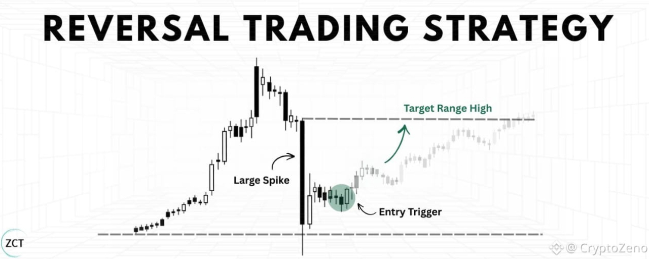
Статья
My Reversal Trading StrategyMy job everyday is to come to the table, look around and decide where could certain hands move price or force itself into the books in order to move price.
At least on the lower time frames I do this through tools like open interest, funding rates, live liquidations, delta, plus some intuition from repeatedly seeing the same patterns of liquidity repeated after years of watching the same market. These are the tools which give me the ability across a fragmented BTC market to identify where people are positioning, which side they are on, and which moves could force their hand.
I like to frame my thinking around a single quesiton before getting into a position:
Has the market priced this in yet?
If it hasn't been priced in then there's edge in what i'm trying to execute from. If I see the market has priced it in already then the edge has diminished and the trade is no longer there.
A good example of this is when looking for trapped traders, specifically looking at whether open interest has decreased or not to spot whether those "trapped positions" have forced their position back into the market.
The end goal is to position myself into the market early enough to exploit something Ive seen which I believe the market hasn't priced in yet.
Another great example of this, is through understanding liquidity in particular how thin books can allow for exaggerated price movements. If you pair that alongside trapped positioning you will very often get a very nice mean reversion setup.
A common misconception is that "thin books" can only be identified in real time and through looking at the dom. This is not true. Using volume candles or looking at how far price moved in relation to how much volume pushed it can help answer this question too. Alongside identifying surges in open interest to help identify trapped positions.
It's about finding your thesis for why you should get paid from the trade you want to take, then going to the technical board and figuring out which tools will help identify this in real time.
Don't pick random tools and use them because they look fancy, think about where your edge comes from (at route level) then decide which tools allow you to spot that mispriced event faster and in a more reliable manner than anyone else could.
A fast move into a predictable stop/tp zone that happens unusually fast relative to local regime is one thing I commonly look for. These moves are often engineered, meaning someone/group of people have forced price to a certain local level for liquidity purposes.
> Force price up
> Stops/liquidations triggered
> Limit sell orders filled
> No real conviction
> Price reverses
This requires some level of intuition to reliably identify, but in essence upon a break of a level I want to see excessive buying in the form of aggressive stops being hit or liquidations being forced into the book. Both offer up opportunity for opposing side limits to be filled, and if the move was manufactured or deliberately pushed up in this manner, theres no real conviction behind it, allows for a easy reversal.
It all comes down the fact that if I know why i'm looking for something at a certain location, that can be transferred over much easier than just punting random levels without reasoning.
Think about who you are trading against and how you can profit off that info before it is priced in, you are in the research business.
#CryptoZeno #LABTokenPlummets77PctErases$6B
My Reversal Trading Strategy
My job everyday is to come to the table, look around and decide where could certain hands move price or force itself into the books in order to move price.
At least on the lower time frames I do this through tools like open interest, funding rates, live liquidations, delta, plus some intuition from repeatedly seeing the same patterns of liquidity repeated after years of watching the same market. These are the tools which give me the ability across a fragmented BTC market to identify where people are positioning, which side they are on, and which moves could force their hand.
I like to frame my thinking around a single quesiton before getting into a position:
Has the market priced this in yet?
If it hasn't been priced in then there's edge in what i'm trying to execute from. If I see the market has priced it in already then the edge has diminished and the trade is no longer there.
A good example of this is when looking for trapped traders, specifically looking at whether open interest has decreased or not to spot whether those "trapped positions" have forced their position back into the market.
The end goal is to position myself into the market early enough to exploit something Ive seen which I believe the market hasn't priced in yet.
Another great example of this, is through understanding liquidity in particular how thin books can allow for exaggerated price movements. If you pair that alongside trapped positioning you will very often get a very nice mean reversion setup.
A common misconception is that "thin books" can only be identified in real time and through looking at the dom. This is not true. Using volume candles or looking at how far price moved in relation to how much volume pushed it can help answer this question too. Alongside identifying surges in open interest to help identify trapped positions.
It's about finding your thesis for why you should get paid from the trade you want to take, then going to the technical board and figuring out which tools will help identify this in real time.
Don't pick random tools and use them because they look fancy, think about where your edge comes from (at route level) then decide which tools allow you to spot that mispriced event faster and in a more reliable manner than anyone else could.
A fast move into a predictable stop/tp zone that happens unusually fast relative to local regime is one thing I commonly look for. These moves are often engineered, meaning someone/group of people have forced price to a certain local level for liquidity purposes.
> Force price up
> Stops/liquidations triggered
> Limit sell orders filled
> No real conviction
> Price reverses
This requires some level of intuition to reliably identify, but in essence upon a break of a level I want to see excessive buying in the form of aggressive stops being hit or liquidations being forced into the book. Both offer up opportunity for opposing side limits to be filled, and if the move was manufactured or deliberately pushed up in this manner, theres no real conviction behind it, allows for a easy reversal.
It all comes down the fact that if I know why i'm looking for something at a certain location, that can be transferred over much easier than just punting random levels without reasoning.
Think about who you are trading against and how you can profit off that info before it is priced in, you are in the research business.
#CryptoZeno #LABTokenPlummets77PctErases$6B
At least on the lower time frames I do this through tools like open interest, funding rates, live liquidations, delta, plus some intuition from repeatedly seeing the same patterns of liquidity repeated after years of watching the same market. These are the tools which give me the ability across a fragmented BTC market to identify where people are positioning, which side they are on, and which moves could force their hand.
I like to frame my thinking around a single quesiton before getting into a position:
Has the market priced this in yet?
If it hasn't been priced in then there's edge in what i'm trying to execute from. If I see the market has priced it in already then the edge has diminished and the trade is no longer there.
A good example of this is when looking for trapped traders, specifically looking at whether open interest has decreased or not to spot whether those "trapped positions" have forced their position back into the market.
The end goal is to position myself into the market early enough to exploit something Ive seen which I believe the market hasn't priced in yet.
Another great example of this, is through understanding liquidity in particular how thin books can allow for exaggerated price movements. If you pair that alongside trapped positioning you will very often get a very nice mean reversion setup.
A common misconception is that "thin books" can only be identified in real time and through looking at the dom. This is not true. Using volume candles or looking at how far price moved in relation to how much volume pushed it can help answer this question too. Alongside identifying surges in open interest to help identify trapped positions.
It's about finding your thesis for why you should get paid from the trade you want to take, then going to the technical board and figuring out which tools will help identify this in real time.
Don't pick random tools and use them because they look fancy, think about where your edge comes from (at route level) then decide which tools allow you to spot that mispriced event faster and in a more reliable manner than anyone else could.
A fast move into a predictable stop/tp zone that happens unusually fast relative to local regime is one thing I commonly look for. These moves are often engineered, meaning someone/group of people have forced price to a certain local level for liquidity purposes.
> Force price up
> Stops/liquidations triggered
> Limit sell orders filled
> No real conviction
> Price reverses
This requires some level of intuition to reliably identify, but in essence upon a break of a level I want to see excessive buying in the form of aggressive stops being hit or liquidations being forced into the book. Both offer up opportunity for opposing side limits to be filled, and if the move was manufactured or deliberately pushed up in this manner, theres no real conviction behind it, allows for a easy reversal.
It all comes down the fact that if I know why i'm looking for something at a certain location, that can be transferred over much easier than just punting random levels without reasoning.
Think about who you are trading against and how you can profit off that info before it is priced in, you are in the research business.
#CryptoZeno #LABTokenPlummets77PctErases$6B
1
4
477
·
--
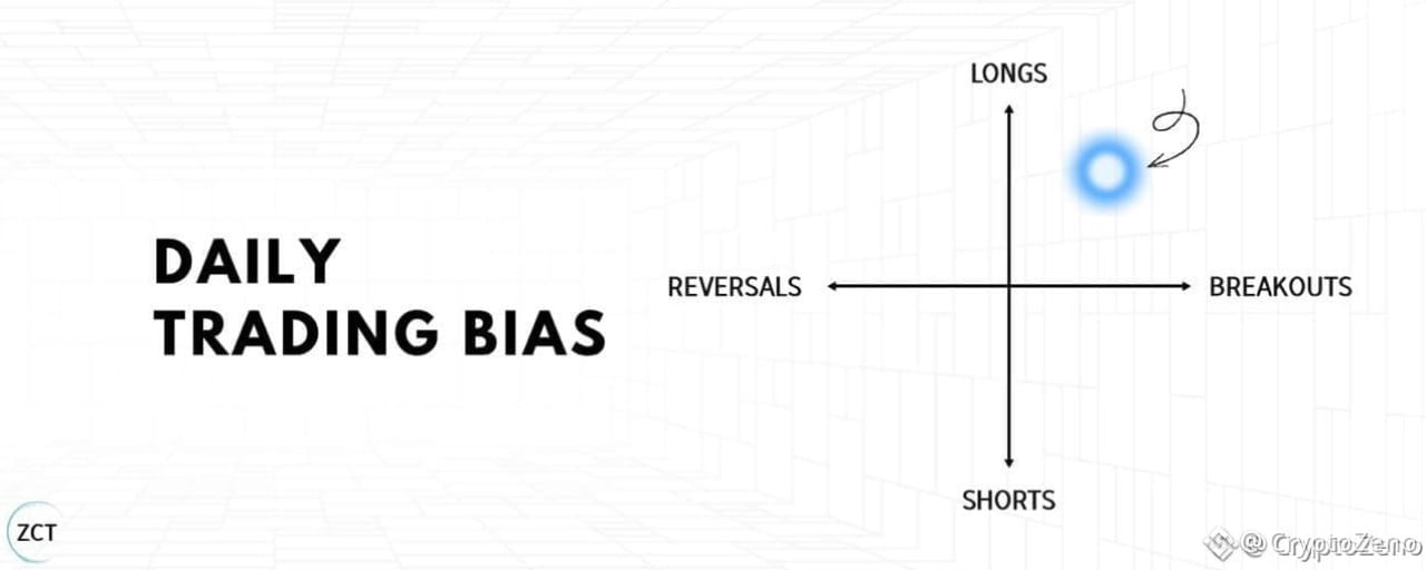
Статья
The Breakout Trading Strategy I Use to Catch Big MovesI’ve longed resistance and shorted support for 9 years… This is the exact opposite of what every trader tries to do.
In this article, I will share my entire strategy so you can skip years of testing and losses.
This is something you will want to bookmark, take notes on, and set time aside to think about.
Lesson 1: The Only 2 Trading Strategies
Before you can identify good momentum setups, you need to understand what momentum trading actually is.
Momentum and mean reversion are opposite strategies based on opposite assumptions.
The Two Trading Styles
Momentum (where you take a trade betting on a continuation of the current trend)Mean Reversion (where you take a trade betting on a reversal of the current trend)
One assumes strength continues; the other assumes strength exhausts.
Let’s consider this through a visual example.
Suppose price is approaching a resistance level (in other words, a level where there was previously selling pressure, preventing the price from moving higher).
Momentum assumes the level will break.
You’re betting on continuation.Price approaches resistance, you buy, expecting it to push through and keep running.The level becomes support once broken.
Mean reversion assumes the level will hold.
You’re betting on rejection.Price approaches resistance, you short, expecting it to bounce back down.The level acts as a ceiling.
Same chart. Same resistance level. Opposite strategies.
There is no right or wrong. The key is to understand when you are in a momentum trade environment, such that momentum strategies are highly aligned.
The next section shows you exactly how to identify when the environment favours momentum (my best strategy).
Lesson 1 Summary
There are 2 trading styles: momentum and mean reversionMean reversion bets levels will hold; momentum bets levels will breakOne is not better than the other; it depends entirely on the trade environment
Lesson 2: Optimal Trade Environment
Just opening a long every time price hits resistance won't make us any money.
Without the right conditions, momentum dies immediately after the breakout.
You enter. It reverses. You're stopped out.
That's not bad luck, that's a bad trading environment.
The Rowing Analogy
Imagine you’re rowing a boat.
You either row against or with the current.
One makes it easier to row while the other takes a lot more effort.
Your boat, or rowing technique, didn’t change… Only your environment did.
Trading is the same.
Your strategy is your boat.
Your optimal trade environment is the current.
Now use this 3-filter checklist to ensure you only take trades where a breakout is likely (with the current).
Filter 1: How Did Price Approach the Level?
What you WANT:
A slow, grinding staircase pattern approaching resistance.Each candle makes incremental progress.Higher lows are stacking up.Controlled, deliberate movement.
What you DON’T want:
A fast vertical spike into resistance.Price shoots up in one or two large candles.After a spike, buyers' strength is depleted and price typically consolidates or reverses.This is exhaustion, not momentum.
The staircase pattern shows sustained buying pressure building gradually. When this breaks through resistance, buyers are still engaged and ready to push further.
Common mistake: Traders see a strong candle break resistance and assume momentum is strong. But these fast moves often reverse quickly.
→ Do this instead: Take momentum trades when price approaches resistance in a slow, grinding staircase over multiple candles.
Real Trade Example:
Slow clear grind into resistance showing an optimal ‘price approach to level’ for momentum.
Filter 1: slow grindy staircase ✅
Filter 2: What Did Volume Look Like?
Volume confirms whether the price movement has conviction behind it.
What you WANT:
Gradual increase in volume as price approaches resistanceThis pattern shows controlled, sustainable momentum.
What you DON’T want:
Flat volume (no conviction) or sudden volume spikes (exhaustion).Flat volume means the move lacks participation.Volume spikes often mark climax points where momentum exhausts.Decreasing volume (why would price break out of resistance now, if volume was lower than before?)
Volume should mirror the price pattern, steady and building, not erratic.
This strategy works because momentum continuation is most likely when participation is sustained, supply is absorbed gradually, and structure remains intact.
Real Trade Example:
Around the time the grindy staircase begins to emerge, we see a slow, consistent increase in volume.
Filter 1: slow grindy staircase ✅Filter 2: clearly increasing volume ✅
Lastly,
Filter 3: Moving Average Crossovers
This filter distinguishes trending markets (good for momentum) from choppy, indecisive markets (bad for momentum).
What you WANT to see: Moving averages with minimal crossovers. This indicates a directional trend.
What you DON’T want to see: Frequent crossovers. This signals chop and indecision.
Fewer crossovers = cleaner trend or range = better momentum continuation.
Use the 30SMMA (Smoothed Moving Average).
✍️Quick Actionable Step:
To add the 30SMMA on your charts:
Search for the Smoothed Moving Average Indicator in TradingViewAdd it to your chartGo into settings and change the "Length" to "30"
Real Trade Example:
Filter 1 (Price Action): slow grindy staircase ✅
Filter 2 (Volume): clearly increasing volume ✅
Filter 3 (Crossovers): minimal MA crossovers ✅
🎓Lesson 2 Summary
Slow grinding staircase approaches have better follow-through than fast spikesVolume should be gradual (increasing or decreasing), not flat or spikingFewer MA crossovers indicate cleaner directional conditions for momentum
Lesson 3: Identifying Setups
Now you know what momentum is.
You also know the optimal conditions for it.
Next, you need to know where to execute these trades.
Step 1: Draw Support and Resistance Levels
Momentum trades happen at these key levels. You need to identify them consistently.
I've already written an in-depth masterclass on how to set these levels. I'll link it at the end of this article.
Common mistake: Traders draw levels randomly or inconsistently, leading to missed setups or false signals.
Do this instead: Use my step-by-step approach at the end of this article.
Step 2: Await Your Entry Trigger on the 1-Minute Chart
Once you’ve identified a resistance level on your primary timeframe, switch to the 1-minute chart for precise entry timing.
Why 1-minute chart?
You learn faster.
More trades, more chart exposure and more oppurtunities to practice psychology.
I’ve added a bonus guide on why you should be trading the 1-minute chart at the end of this article.
Real Trade Example:
Step 3: Three Filters
Before entering, check the three filters from Section 2:
Is price approaching resistance in a slow staircase pattern?Is volume gradually increasing or decreasing (not flat or spiking)?Are there minimal MA crossovers (not choppy)?
If any filter fails, reduce your risk on the trade. Only take full risk on A-grade setups, not forcing trades in poor conditions.
🎓Lesson 3 Summary
Draw levels using the ZCT masterclass approach at the end of this articleUse your entry trigger on the 1-minute timeframe: 2 candle closes above for confirmationCheck all three filters before entering, allocate risk and size accordingly
Lesson 4: Strategy Logic: Stop Loss, and Take Profit
You've drawn your levels. You've confirmed the setup aligns with optimal momentum conditions.
Now you need precise execution.
Entry timing, stop placement, and profit targets determine whether you capture the momentum move or get stopped out on a good setup.
This is where most traders lose, not in analysis, but in execution.
Step 4: Entry Trigger
We have established to wait for two consecutive 1-minute candles to close fully above the resistance level. This confirms the level broke and momentum is continuing.
Critical execution detail: After the second candle closes above resistance, place a limit order AT the resistance level (now acting as support), not above it. Price often pulls back slightly after breaking out. Your limit order gets filled on the pullback without chasing.
Common mistake: Traders wait for confirmation, then market-buy above resistance as price runs away. They enter late with a wider stop and worse risk/reward.
→ Do this instead: Preset your limit order AT resistance after the second candle closes. Let price come back to you.
Real Trade Example:
Step 5: Stop Loss
A swing low is:
the lowest wick in a pullback.
Your stop loss goes at the most recent swing low before the breakout.
Common mistake: Traders place stops at the nearest swing low, even if it’s only 0.3% away, leading to frequent stop-outs from normal volatility
Do this instead: Always measure the distance of your stop loss using the ruler tool on TradingView. If it’s less than 1%, use the next swing low down.
Step 6: Take Profit 1R (Equal Distance to Stop)
Your take profit target is 1R, the same distance as your stop loss, but in the profit direction
If your stop loss is 1.982% away from entry, your target is also 1.982% away, but on the upside. This gives you a 1:1 risk/reward ratio.
Why 1R? It’s conservative and achievable. Momentum trades often hit 1R quickly because the breakout has follow-through. You’re not trying to catch the entire move, you’re taking a high-probability piece of it.
Over time, as you get data in your journal, you can start extending your profit targets when you see how far your average winning trades go beyond 1R. This way, you’re not guessing where to take profits, but following a systematic approach.
Real Trade Example:
🎓Lesson 4 summary
Enter after two 1-minute candle closes above resistance, using a limit order at prior resistance (now support) to avoid chasing price.Place stop losses at the most recent valid swing low, ensuring enough distance to avoid normal volatility and minor stop hunts.Set initial profit targets at 1R to capture high-probability momentum continuation in a repeatable, systematic way.
Immediate Next Steps✍️:
Read the Support and Resistance Masterclass to learn how to draw levels (shared at end of article)Look at 3 charts using the 3 filter checklist to identify a momentum trade environmentUse the strategy steps to enter your tradeGather 30 trades using this method, journalled and reviewed against the criteria
🎓 Final Summary
Lesson 1: Momentum vs Mean Reversion
Momentum trades bet that price will continue through a level, while mean reversion trades bet that a level will hold and reject price.Both strategies are valid, but performance depends entirely on matching the strategy to the correct trade environment.
Understanding this distinction prevents applying breakout logic in conditions where it has no edge.
Lesson 2: Optimal Trade Environment
High-quality breakouts form when price approaches resistance in a slow, grinding staircase rather than fast vertical spikes.Volume should build gradually to confirm sustained participation, not remain flat or spike from exhaustion.Minimal moving average crossovers indicate cleaner directional conditions where momentum continuation is more likely.
Lesson 3: Identifying Setups
Momentum trades should be executed at consistently drawn support and resistance levels.Entries are triggered on the 1-minute chart using two consecutive candle closes above resistance for confirmation.All three environment filters must align before taking full risk; weaker conditions require reduced sizing or passing the trade.
Lesson 4: Stop Loss and Take Profit
Enter using a limit order at prior resistance (now support) after two confirmed 1-minute candle closes to avoid chasing price.Stop losses should be placed at the most recent valid swing low with enough distance to avoid normal volatility and minor stop hunts.Initial profit targets are set at 1R to capture high-probability momentum continuation in a repeatable way.
The next time price approaches resistance, you won’t have to guess if it will break out.
You’ll know when a breakout has real momentum, when volume confirms it, and when conditions support follow-through.
You’ll also execute with defined entries, stops, and targets.
#CryptoZeno #CryptoMarketCapNears2.6T
The Breakout Trading Strategy I Use to Catch Big Moves
I’ve longed resistance and shorted support for 9 years… This is the exact opposite of what every trader tries to do.
In this article, I will share my entire strategy so you can skip years of testing and losses.
This is something you will want to bookmark, take notes on, and set time aside to think about.
Lesson 1: The Only 2 Trading Strategies
Before you can identify good momentum setups, you need to understand what momentum trading actually is.
Momentum and mean reversion are opposite strategies based on opposite assumptions.
The Two Trading Styles
Momentum (where you take a trade betting on a continuation of the current trend)Mean Reversion (where you take a trade betting on a reversal of the current trend)
One assumes strength continues; the other assumes strength exhausts.
Let’s consider this through a visual example.
Suppose price is approaching a resistance level (in other words, a level where there was previously selling pressure, preventing the price from moving higher).
Momentum assumes the level will break.
You’re betting on continuation.Price approaches resistance, you buy, expecting it to push through and keep running.The level becomes support once broken.
Mean reversion assumes the level will hold.
You’re betting on rejection.Price approaches resistance, you short, expecting it to bounce back down.The level acts as a ceiling.
Same chart. Same resistance level. Opposite strategies.
There is no right or wrong. The key is to understand when you are in a momentum trade environment, such that momentum strategies are highly aligned.
The next section shows you exactly how to identify when the environment favours momentum (my best strategy).
Lesson 1 Summary
There are 2 trading styles: momentum and mean reversionMean reversion bets levels will hold; momentum bets levels will breakOne is not better than the other; it depends entirely on the trade environment
Lesson 2: Optimal Trade Environment
Just opening a long every time price hits resistance won't make us any money.
Without the right conditions, momentum dies immediately after the breakout.
You enter. It reverses. You're stopped out.
That's not bad luck, that's a bad trading environment.
The Rowing Analogy
Imagine you’re rowing a boat.
You either row against or with the current.
One makes it easier to row while the other takes a lot more effort.
Your boat, or rowing technique, didn’t change… Only your environment did.
Trading is the same.
Your strategy is your boat.
Your optimal trade environment is the current.
Now use this 3-filter checklist to ensure you only take trades where a breakout is likely (with the current).
Filter 1: How Did Price Approach the Level?
What you WANT:
A slow, grinding staircase pattern approaching resistance.Each candle makes incremental progress.Higher lows are stacking up.Controlled, deliberate movement.
What you DON’T want:
A fast vertical spike into resistance.Price shoots up in one or two large candles.After a spike, buyers' strength is depleted and price typically consolidates or reverses.This is exhaustion, not momentum.
The staircase pattern shows sustained buying pressure building gradually. When this breaks through resistance, buyers are still engaged and ready to push further.
Common mistake: Traders see a strong candle break resistance and assume momentum is strong. But these fast moves often reverse quickly.
→ Do this instead: Take momentum trades when price approaches resistance in a slow, grinding staircase over multiple candles.
Real Trade Example:
Slow clear grind into resistance showing an optimal ‘price approach to level’ for momentum.
Filter 1: slow grindy staircase ✅
Filter 2: What Did Volume Look Like?
Volume confirms whether the price movement has conviction behind it.
What you WANT:
Gradual increase in volume as price approaches resistanceThis pattern shows controlled, sustainable momentum.
What you DON’T want:
Flat volume (no conviction) or sudden volume spikes (exhaustion).Flat volume means the move lacks participation.Volume spikes often mark climax points where momentum exhausts.Decreasing volume (why would price break out of resistance now, if volume was lower than before?)
Volume should mirror the price pattern, steady and building, not erratic.
This strategy works because momentum continuation is most likely when participation is sustained, supply is absorbed gradually, and structure remains intact.
Real Trade Example:
Around the time the grindy staircase begins to emerge, we see a slow, consistent increase in volume.
Filter 1: slow grindy staircase ✅Filter 2: clearly increasing volume ✅
Lastly,
Filter 3: Moving Average Crossovers
This filter distinguishes trending markets (good for momentum) from choppy, indecisive markets (bad for momentum).
What you WANT to see: Moving averages with minimal crossovers. This indicates a directional trend.
What you DON’T want to see: Frequent crossovers. This signals chop and indecision.
Fewer crossovers = cleaner trend or range = better momentum continuation.
Use the 30SMMA (Smoothed Moving Average).
✍️Quick Actionable Step:
To add the 30SMMA on your charts:
Search for the Smoothed Moving Average Indicator in TradingViewAdd it to your chartGo into settings and change the "Length" to "30"
Real Trade Example:
Filter 1 (Price Action): slow grindy staircase ✅
Filter 2 (Volume): clearly increasing volume ✅
Filter 3 (Crossovers): minimal MA crossovers ✅
🎓Lesson 2 Summary
Slow grinding staircase approaches have better follow-through than fast spikesVolume should be gradual (increasing or decreasing), not flat or spikingFewer MA crossovers indicate cleaner directional conditions for momentum
Lesson 3: Identifying Setups
Now you know what momentum is.
You also know the optimal conditions for it.
Next, you need to know where to execute these trades.
Step 1: Draw Support and Resistance Levels
Momentum trades happen at these key levels. You need to identify them consistently.
I've already written an in-depth masterclass on how to set these levels. I'll link it at the end of this article.
Common mistake: Traders draw levels randomly or inconsistently, leading to missed setups or false signals.
Do this instead: Use my step-by-step approach at the end of this article.
Step 2: Await Your Entry Trigger on the 1-Minute Chart
Once you’ve identified a resistance level on your primary timeframe, switch to the 1-minute chart for precise entry timing.
Why 1-minute chart?
You learn faster.
More trades, more chart exposure and more oppurtunities to practice psychology.
I’ve added a bonus guide on why you should be trading the 1-minute chart at the end of this article.
Real Trade Example:
Step 3: Three Filters
Before entering, check the three filters from Section 2:
Is price approaching resistance in a slow staircase pattern?Is volume gradually increasing or decreasing (not flat or spiking)?Are there minimal MA crossovers (not choppy)?
If any filter fails, reduce your risk on the trade. Only take full risk on A-grade setups, not forcing trades in poor conditions.
🎓Lesson 3 Summary
Draw levels using the ZCT masterclass approach at the end of this articleUse your entry trigger on the 1-minute timeframe: 2 candle closes above for confirmationCheck all three filters before entering, allocate risk and size accordingly
Lesson 4: Strategy Logic: Stop Loss, and Take Profit
You've drawn your levels. You've confirmed the setup aligns with optimal momentum conditions.
Now you need precise execution.
Entry timing, stop placement, and profit targets determine whether you capture the momentum move or get stopped out on a good setup.
This is where most traders lose, not in analysis, but in execution.
Step 4: Entry Trigger
We have established to wait for two consecutive 1-minute candles to close fully above the resistance level. This confirms the level broke and momentum is continuing.
Critical execution detail: After the second candle closes above resistance, place a limit order AT the resistance level (now acting as support), not above it. Price often pulls back slightly after breaking out. Your limit order gets filled on the pullback without chasing.
Common mistake: Traders wait for confirmation, then market-buy above resistance as price runs away. They enter late with a wider stop and worse risk/reward.
→ Do this instead: Preset your limit order AT resistance after the second candle closes. Let price come back to you.
Real Trade Example:
Step 5: Stop Loss
A swing low is:
the lowest wick in a pullback.
Your stop loss goes at the most recent swing low before the breakout.
Common mistake: Traders place stops at the nearest swing low, even if it’s only 0.3% away, leading to frequent stop-outs from normal volatility
Do this instead: Always measure the distance of your stop loss using the ruler tool on TradingView. If it’s less than 1%, use the next swing low down.
Step 6: Take Profit 1R (Equal Distance to Stop)
Your take profit target is 1R, the same distance as your stop loss, but in the profit direction
If your stop loss is 1.982% away from entry, your target is also 1.982% away, but on the upside. This gives you a 1:1 risk/reward ratio.
Why 1R? It’s conservative and achievable. Momentum trades often hit 1R quickly because the breakout has follow-through. You’re not trying to catch the entire move, you’re taking a high-probability piece of it.
Over time, as you get data in your journal, you can start extending your profit targets when you see how far your average winning trades go beyond 1R. This way, you’re not guessing where to take profits, but following a systematic approach.
Real Trade Example:
🎓Lesson 4 summary
Enter after two 1-minute candle closes above resistance, using a limit order at prior resistance (now support) to avoid chasing price.Place stop losses at the most recent valid swing low, ensuring enough distance to avoid normal volatility and minor stop hunts.Set initial profit targets at 1R to capture high-probability momentum continuation in a repeatable, systematic way.
Immediate Next Steps✍️:
Read the Support and Resistance Masterclass to learn how to draw levels (shared at end of article)Look at 3 charts using the 3 filter checklist to identify a momentum trade environmentUse the strategy steps to enter your tradeGather 30 trades using this method, journalled and reviewed against the criteria
🎓 Final Summary
Lesson 1: Momentum vs Mean Reversion
Momentum trades bet that price will continue through a level, while mean reversion trades bet that a level will hold and reject price.Both strategies are valid, but performance depends entirely on matching the strategy to the correct trade environment.
Understanding this distinction prevents applying breakout logic in conditions where it has no edge.
Lesson 2: Optimal Trade Environment
High-quality breakouts form when price approaches resistance in a slow, grinding staircase rather than fast vertical spikes.Volume should build gradually to confirm sustained participation, not remain flat or spike from exhaustion.Minimal moving average crossovers indicate cleaner directional conditions where momentum continuation is more likely.
Lesson 3: Identifying Setups
Momentum trades should be executed at consistently drawn support and resistance levels.Entries are triggered on the 1-minute chart using two consecutive candle closes above resistance for confirmation.All three environment filters must align before taking full risk; weaker conditions require reduced sizing or passing the trade.
Lesson 4: Stop Loss and Take Profit
Enter using a limit order at prior resistance (now support) after two confirmed 1-minute candle closes to avoid chasing price.Stop losses should be placed at the most recent valid swing low with enough distance to avoid normal volatility and minor stop hunts.Initial profit targets are set at 1R to capture high-probability momentum continuation in a repeatable way.
The next time price approaches resistance, you won’t have to guess if it will break out.
You’ll know when a breakout has real momentum, when volume confirms it, and when conditions support follow-through.
You’ll also execute with defined entries, stops, and targets.
#CryptoZeno #CryptoMarketCapNears2.6T
In this article, I will share my entire strategy so you can skip years of testing and losses.
This is something you will want to bookmark, take notes on, and set time aside to think about.
Lesson 1: The Only 2 Trading Strategies
Before you can identify good momentum setups, you need to understand what momentum trading actually is.
Momentum and mean reversion are opposite strategies based on opposite assumptions.
The Two Trading Styles
Momentum (where you take a trade betting on a continuation of the current trend)Mean Reversion (where you take a trade betting on a reversal of the current trend)
One assumes strength continues; the other assumes strength exhausts.
Let’s consider this through a visual example.
Suppose price is approaching a resistance level (in other words, a level where there was previously selling pressure, preventing the price from moving higher).
Momentum assumes the level will break.
You’re betting on continuation.Price approaches resistance, you buy, expecting it to push through and keep running.The level becomes support once broken.
Mean reversion assumes the level will hold.
You’re betting on rejection.Price approaches resistance, you short, expecting it to bounce back down.The level acts as a ceiling.
Same chart. Same resistance level. Opposite strategies.
There is no right or wrong. The key is to understand when you are in a momentum trade environment, such that momentum strategies are highly aligned.
The next section shows you exactly how to identify when the environment favours momentum (my best strategy).
Lesson 1 Summary
There are 2 trading styles: momentum and mean reversionMean reversion bets levels will hold; momentum bets levels will breakOne is not better than the other; it depends entirely on the trade environment
Lesson 2: Optimal Trade Environment
Just opening a long every time price hits resistance won't make us any money.
Without the right conditions, momentum dies immediately after the breakout.
You enter. It reverses. You're stopped out.
That's not bad luck, that's a bad trading environment.
The Rowing Analogy
Imagine you’re rowing a boat.
You either row against or with the current.
One makes it easier to row while the other takes a lot more effort.
Your boat, or rowing technique, didn’t change… Only your environment did.
Trading is the same.
Your strategy is your boat.
Your optimal trade environment is the current.
Now use this 3-filter checklist to ensure you only take trades where a breakout is likely (with the current).
Filter 1: How Did Price Approach the Level?
What you WANT:
A slow, grinding staircase pattern approaching resistance.Each candle makes incremental progress.Higher lows are stacking up.Controlled, deliberate movement.
What you DON’T want:
A fast vertical spike into resistance.Price shoots up in one or two large candles.After a spike, buyers' strength is depleted and price typically consolidates or reverses.This is exhaustion, not momentum.
The staircase pattern shows sustained buying pressure building gradually. When this breaks through resistance, buyers are still engaged and ready to push further.
Common mistake: Traders see a strong candle break resistance and assume momentum is strong. But these fast moves often reverse quickly.
→ Do this instead: Take momentum trades when price approaches resistance in a slow, grinding staircase over multiple candles.
Real Trade Example:
Slow clear grind into resistance showing an optimal ‘price approach to level’ for momentum.
Filter 1: slow grindy staircase ✅
Filter 2: What Did Volume Look Like?
Volume confirms whether the price movement has conviction behind it.
What you WANT:
Gradual increase in volume as price approaches resistanceThis pattern shows controlled, sustainable momentum.
What you DON’T want:
Flat volume (no conviction) or sudden volume spikes (exhaustion).Flat volume means the move lacks participation.Volume spikes often mark climax points where momentum exhausts.Decreasing volume (why would price break out of resistance now, if volume was lower than before?)
Volume should mirror the price pattern, steady and building, not erratic.
This strategy works because momentum continuation is most likely when participation is sustained, supply is absorbed gradually, and structure remains intact.
Real Trade Example:
Around the time the grindy staircase begins to emerge, we see a slow, consistent increase in volume.
Filter 1: slow grindy staircase ✅Filter 2: clearly increasing volume ✅
Lastly,
Filter 3: Moving Average Crossovers
This filter distinguishes trending markets (good for momentum) from choppy, indecisive markets (bad for momentum).
What you WANT to see: Moving averages with minimal crossovers. This indicates a directional trend.
What you DON’T want to see: Frequent crossovers. This signals chop and indecision.
Fewer crossovers = cleaner trend or range = better momentum continuation.
Use the 30SMMA (Smoothed Moving Average).
✍️Quick Actionable Step:
To add the 30SMMA on your charts:
Search for the Smoothed Moving Average Indicator in TradingViewAdd it to your chartGo into settings and change the "Length" to "30"
Real Trade Example:
Filter 1 (Price Action): slow grindy staircase ✅
Filter 2 (Volume): clearly increasing volume ✅
Filter 3 (Crossovers): minimal MA crossovers ✅
🎓Lesson 2 Summary
Slow grinding staircase approaches have better follow-through than fast spikesVolume should be gradual (increasing or decreasing), not flat or spikingFewer MA crossovers indicate cleaner directional conditions for momentum
Lesson 3: Identifying Setups
Now you know what momentum is.
You also know the optimal conditions for it.
Next, you need to know where to execute these trades.
Step 1: Draw Support and Resistance Levels
Momentum trades happen at these key levels. You need to identify them consistently.
I've already written an in-depth masterclass on how to set these levels. I'll link it at the end of this article.
Common mistake: Traders draw levels randomly or inconsistently, leading to missed setups or false signals.
Do this instead: Use my step-by-step approach at the end of this article.
Step 2: Await Your Entry Trigger on the 1-Minute Chart
Once you’ve identified a resistance level on your primary timeframe, switch to the 1-minute chart for precise entry timing.
Why 1-minute chart?
You learn faster.
More trades, more chart exposure and more oppurtunities to practice psychology.
I’ve added a bonus guide on why you should be trading the 1-minute chart at the end of this article.
Real Trade Example:
Step 3: Three Filters
Before entering, check the three filters from Section 2:
Is price approaching resistance in a slow staircase pattern?Is volume gradually increasing or decreasing (not flat or spiking)?Are there minimal MA crossovers (not choppy)?
If any filter fails, reduce your risk on the trade. Only take full risk on A-grade setups, not forcing trades in poor conditions.
🎓Lesson 3 Summary
Draw levels using the ZCT masterclass approach at the end of this articleUse your entry trigger on the 1-minute timeframe: 2 candle closes above for confirmationCheck all three filters before entering, allocate risk and size accordingly
Lesson 4: Strategy Logic: Stop Loss, and Take Profit
You've drawn your levels. You've confirmed the setup aligns with optimal momentum conditions.
Now you need precise execution.
Entry timing, stop placement, and profit targets determine whether you capture the momentum move or get stopped out on a good setup.
This is where most traders lose, not in analysis, but in execution.
Step 4: Entry Trigger
We have established to wait for two consecutive 1-minute candles to close fully above the resistance level. This confirms the level broke and momentum is continuing.
Critical execution detail: After the second candle closes above resistance, place a limit order AT the resistance level (now acting as support), not above it. Price often pulls back slightly after breaking out. Your limit order gets filled on the pullback without chasing.
Common mistake: Traders wait for confirmation, then market-buy above resistance as price runs away. They enter late with a wider stop and worse risk/reward.
→ Do this instead: Preset your limit order AT resistance after the second candle closes. Let price come back to you.
Real Trade Example:
Step 5: Stop Loss
A swing low is:
the lowest wick in a pullback.
Your stop loss goes at the most recent swing low before the breakout.
Common mistake: Traders place stops at the nearest swing low, even if it’s only 0.3% away, leading to frequent stop-outs from normal volatility
Do this instead: Always measure the distance of your stop loss using the ruler tool on TradingView. If it’s less than 1%, use the next swing low down.
Step 6: Take Profit 1R (Equal Distance to Stop)
Your take profit target is 1R, the same distance as your stop loss, but in the profit direction
If your stop loss is 1.982% away from entry, your target is also 1.982% away, but on the upside. This gives you a 1:1 risk/reward ratio.
Why 1R? It’s conservative and achievable. Momentum trades often hit 1R quickly because the breakout has follow-through. You’re not trying to catch the entire move, you’re taking a high-probability piece of it.
Over time, as you get data in your journal, you can start extending your profit targets when you see how far your average winning trades go beyond 1R. This way, you’re not guessing where to take profits, but following a systematic approach.
Real Trade Example:
🎓Lesson 4 summary
Enter after two 1-minute candle closes above resistance, using a limit order at prior resistance (now support) to avoid chasing price.Place stop losses at the most recent valid swing low, ensuring enough distance to avoid normal volatility and minor stop hunts.Set initial profit targets at 1R to capture high-probability momentum continuation in a repeatable, systematic way.
Immediate Next Steps✍️:
Read the Support and Resistance Masterclass to learn how to draw levels (shared at end of article)Look at 3 charts using the 3 filter checklist to identify a momentum trade environmentUse the strategy steps to enter your tradeGather 30 trades using this method, journalled and reviewed against the criteria
🎓 Final Summary
Lesson 1: Momentum vs Mean Reversion
Momentum trades bet that price will continue through a level, while mean reversion trades bet that a level will hold and reject price.Both strategies are valid, but performance depends entirely on matching the strategy to the correct trade environment.
Understanding this distinction prevents applying breakout logic in conditions where it has no edge.
Lesson 2: Optimal Trade Environment
High-quality breakouts form when price approaches resistance in a slow, grinding staircase rather than fast vertical spikes.Volume should build gradually to confirm sustained participation, not remain flat or spike from exhaustion.Minimal moving average crossovers indicate cleaner directional conditions where momentum continuation is more likely.
Lesson 3: Identifying Setups
Momentum trades should be executed at consistently drawn support and resistance levels.Entries are triggered on the 1-minute chart using two consecutive candle closes above resistance for confirmation.All three environment filters must align before taking full risk; weaker conditions require reduced sizing or passing the trade.
Lesson 4: Stop Loss and Take Profit
Enter using a limit order at prior resistance (now support) after two confirmed 1-minute candle closes to avoid chasing price.Stop losses should be placed at the most recent valid swing low with enough distance to avoid normal volatility and minor stop hunts.Initial profit targets are set at 1R to capture high-probability momentum continuation in a repeatable way.
The next time price approaches resistance, you won’t have to guess if it will break out.
You’ll know when a breakout has real momentum, when volume confirms it, and when conditions support follow-through.
You’ll also execute with defined entries, stops, and targets.
#CryptoZeno #CryptoMarketCapNears2.6T
3
6
3k
·
--

Статья
Ross Ulbricht and the Uncomfortable Truth About Bitcoin Early DaysWhen #Bitcoin was trading at just fifty cents, almost nobody took it seriously. It was a curiosity for cryptographers, libertarians, and a small group of internet idealists. Few could imagine it would one day reshape finance, politics, and power. Even fewer could imagine that one man would build an entire underground economy around it.
That man was Ross Ulbricht.
Today, his story reads less like a crime report and more like a case study in technology, ideology, and unintended consequences. He was given two life sentences, later pardoned, and recently linked to a mysterious transfer of 300 Bitcoin. Whether viewed as a criminal or a pioneer, his impact on crypto history is undeniable.
Ross Ulbricht did not begin his journey as a criminal mastermind. He studied physics and materials science, was deeply interested in economics, and strongly believed that governments exercised far too much control over individual freedom. Bitcoin represented something radical to him: money without permission, value without borders, and trade without centralized oversight.
In 2011, driven by those beliefs, Ross created a website called Silk Road. It was not accessible through normal browsers. Users had to use Tor, a privacy-focused network designed to anonymize traffic. All transactions were conducted exclusively in Bitcoin, and the entire platform was built around anonymity.
Ross vision was a free market without government interference. In his mind, Silk Road was an experiment in economic freedom rather than a criminal enterprise.
The experiment grew far faster than anyone expected. Silk Road attracted more than one hundred thousand users in a short period of time. People bought drugs, fake identification documents, and hacking tools. At one point, a significant portion of all Bitcoin transactions globally flowed through the platform. For many early adopters, Silk Road was their first real exposure to Bitcoin as usable money.
But anonymity is fragile, and ideology does not protect against human error.
Ross operated online under several aliases, the most famous being “Dread Pirate Roberts.” For a long time, his identity remained hidden. Then came a small mistake. He once posted a technical question online using his real email address. That single slip was enough for investigators to begin connecting the dots.
On October 1, 2013, the FBI arrested Ross Ulbricht inside a public library in San Francisco. Agents waited until his laptop was open, then seized it before he could encrypt or lock it. The laptop contained everything. Administrative access to Silk Road, private messages, transaction logs, and access to wallets holding roughly 150 million dollars’ worth of Bitcoin at the time.
In 2015, Ross was convicted on multiple charges, including drug trafficking, money laundering, hacking, and operating a criminal enterprise. The sentence shocked many observers. Two life sentences plus forty years, with no possibility of parole. Even people who believed #SilkRoad was illegal questioned whether the punishment was wildly disproportionate.
The government also seized more than 144,000 Bitcoin from Ross laptop. Those coins were later sold at auction for roughly 334 dollars per Bitcoin, generating about 48 million dollars. Today, those same coins would be worth well over nine billion dollars, making the seizure one of the most expensive mistakes in financial history.
Over time, Ross Ulbricht became more than a prisoner. He became a symbol.
To some, he was a villain who enabled illegal markets. To others, he was a martyr for digital freedom and a warning about state overreach in the age of code. More than half a million people signed petitions calling for a reduced sentence. His name became deeply embedded in crypto culture, representing both its ideals and its risks.
In 2020, rumors began circulating that President Trump might pardon Ross. Figures close to the administration hinted at discussions behind the scenes. The crypto community was hopeful, but the pardon never came. Still, the idea refused to die.
Even in prison, Ross remained active. He wrote essays, created artwork, and continued to engage with the outside world through his family, who managed his social media presence. Over time, his following grew, especially among crypto-native audiences who saw his imprisonment as symbolic.
Then, unexpectedly, everything changed.
In 2025, Ross Ulbricht was suddenly pardoned. Activists, legal advocates, and crypto-friendly political figures had quietly pushed for years. When he re-emerged, he appeared at major crypto events and received standing ovations. Many described it as the return of a legend.
Not long after, another mystery surfaced. One of Ross old $BTC wallets received 300 BTC, worth more than 30 million dollars at the time. The funds were routed through a mixer designed to obscure their origin. No one knows who sent the Bitcoin or why. Speculation exploded, but no definitive answers emerged.
#RossUlbricht story continues to matter because it forces uncomfortable questions into the open. Can technology truly be neutral? Who ultimately controls the internet? How much power should governments have over code, markets, and individual choice? And can a single person, armed with nothing but an idea and software, reshape the world?
Whether you see Ross as a criminal, a pioneer, or something in between, one thing is certain. His story is not finished.
In an era defined by digital surveillance, financial control, and programmable money, the legacy of Silk Road still echoes. And we may not have seen the last of Ross Ulbricht’s influence on crypto and the internet itself.
#CryptoZeno #JointEscapeHatchforAaveETHLenders
Ross Ulbricht and the Uncomfortable Truth About Bitcoin Early Days
When #Bitcoin was trading at just fifty cents, almost nobody took it seriously. It was a curiosity for cryptographers, libertarians, and a small group of internet idealists. Few could imagine it would one day reshape finance, politics, and power. Even fewer could imagine that one man would build an entire underground economy around it.
That man was Ross Ulbricht.
Today, his story reads less like a crime report and more like a case study in technology, ideology, and unintended consequences. He was given two life sentences, later pardoned, and recently linked to a mysterious transfer of 300 Bitcoin. Whether viewed as a criminal or a pioneer, his impact on crypto history is undeniable.
Ross Ulbricht did not begin his journey as a criminal mastermind. He studied physics and materials science, was deeply interested in economics, and strongly believed that governments exercised far too much control over individual freedom. Bitcoin represented something radical to him: money without permission, value without borders, and trade without centralized oversight.
In 2011, driven by those beliefs, Ross created a website called Silk Road. It was not accessible through normal browsers. Users had to use Tor, a privacy-focused network designed to anonymize traffic. All transactions were conducted exclusively in Bitcoin, and the entire platform was built around anonymity.
Ross vision was a free market without government interference. In his mind, Silk Road was an experiment in economic freedom rather than a criminal enterprise.
The experiment grew far faster than anyone expected. Silk Road attracted more than one hundred thousand users in a short period of time. People bought drugs, fake identification documents, and hacking tools. At one point, a significant portion of all Bitcoin transactions globally flowed through the platform. For many early adopters, Silk Road was their first real exposure to Bitcoin as usable money.
But anonymity is fragile, and ideology does not protect against human error.
Ross operated online under several aliases, the most famous being “Dread Pirate Roberts.” For a long time, his identity remained hidden. Then came a small mistake. He once posted a technical question online using his real email address. That single slip was enough for investigators to begin connecting the dots.
On October 1, 2013, the FBI arrested Ross Ulbricht inside a public library in San Francisco. Agents waited until his laptop was open, then seized it before he could encrypt or lock it. The laptop contained everything. Administrative access to Silk Road, private messages, transaction logs, and access to wallets holding roughly 150 million dollars’ worth of Bitcoin at the time.
In 2015, Ross was convicted on multiple charges, including drug trafficking, money laundering, hacking, and operating a criminal enterprise. The sentence shocked many observers. Two life sentences plus forty years, with no possibility of parole. Even people who believed #SilkRoad was illegal questioned whether the punishment was wildly disproportionate.
The government also seized more than 144,000 Bitcoin from Ross laptop. Those coins were later sold at auction for roughly 334 dollars per Bitcoin, generating about 48 million dollars. Today, those same coins would be worth well over nine billion dollars, making the seizure one of the most expensive mistakes in financial history.
Over time, Ross Ulbricht became more than a prisoner. He became a symbol.
To some, he was a villain who enabled illegal markets. To others, he was a martyr for digital freedom and a warning about state overreach in the age of code. More than half a million people signed petitions calling for a reduced sentence. His name became deeply embedded in crypto culture, representing both its ideals and its risks.
In 2020, rumors began circulating that President Trump might pardon Ross. Figures close to the administration hinted at discussions behind the scenes. The crypto community was hopeful, but the pardon never came. Still, the idea refused to die.
Even in prison, Ross remained active. He wrote essays, created artwork, and continued to engage with the outside world through his family, who managed his social media presence. Over time, his following grew, especially among crypto-native audiences who saw his imprisonment as symbolic.
Then, unexpectedly, everything changed.
In 2025, Ross Ulbricht was suddenly pardoned. Activists, legal advocates, and crypto-friendly political figures had quietly pushed for years. When he re-emerged, he appeared at major crypto events and received standing ovations. Many described it as the return of a legend.
Not long after, another mystery surfaced. One of Ross old $BTC wallets received 300 BTC, worth more than 30 million dollars at the time. The funds were routed through a mixer designed to obscure their origin. No one knows who sent the Bitcoin or why. Speculation exploded, but no definitive answers emerged.
#RossUlbricht story continues to matter because it forces uncomfortable questions into the open. Can technology truly be neutral? Who ultimately controls the internet? How much power should governments have over code, markets, and individual choice? And can a single person, armed with nothing but an idea and software, reshape the world?
Whether you see Ross as a criminal, a pioneer, or something in between, one thing is certain. His story is not finished.
In an era defined by digital surveillance, financial control, and programmable money, the legacy of Silk Road still echoes. And we may not have seen the last of Ross Ulbricht’s influence on crypto and the internet itself.
#CryptoZeno #JointEscapeHatchforAaveETHLenders
That man was Ross Ulbricht.
Today, his story reads less like a crime report and more like a case study in technology, ideology, and unintended consequences. He was given two life sentences, later pardoned, and recently linked to a mysterious transfer of 300 Bitcoin. Whether viewed as a criminal or a pioneer, his impact on crypto history is undeniable.
Ross Ulbricht did not begin his journey as a criminal mastermind. He studied physics and materials science, was deeply interested in economics, and strongly believed that governments exercised far too much control over individual freedom. Bitcoin represented something radical to him: money without permission, value without borders, and trade without centralized oversight.
In 2011, driven by those beliefs, Ross created a website called Silk Road. It was not accessible through normal browsers. Users had to use Tor, a privacy-focused network designed to anonymize traffic. All transactions were conducted exclusively in Bitcoin, and the entire platform was built around anonymity.
Ross vision was a free market without government interference. In his mind, Silk Road was an experiment in economic freedom rather than a criminal enterprise.
The experiment grew far faster than anyone expected. Silk Road attracted more than one hundred thousand users in a short period of time. People bought drugs, fake identification documents, and hacking tools. At one point, a significant portion of all Bitcoin transactions globally flowed through the platform. For many early adopters, Silk Road was their first real exposure to Bitcoin as usable money.
But anonymity is fragile, and ideology does not protect against human error.
Ross operated online under several aliases, the most famous being “Dread Pirate Roberts.” For a long time, his identity remained hidden. Then came a small mistake. He once posted a technical question online using his real email address. That single slip was enough for investigators to begin connecting the dots.
On October 1, 2013, the FBI arrested Ross Ulbricht inside a public library in San Francisco. Agents waited until his laptop was open, then seized it before he could encrypt or lock it. The laptop contained everything. Administrative access to Silk Road, private messages, transaction logs, and access to wallets holding roughly 150 million dollars’ worth of Bitcoin at the time.
In 2015, Ross was convicted on multiple charges, including drug trafficking, money laundering, hacking, and operating a criminal enterprise. The sentence shocked many observers. Two life sentences plus forty years, with no possibility of parole. Even people who believed #SilkRoad was illegal questioned whether the punishment was wildly disproportionate.
The government also seized more than 144,000 Bitcoin from Ross laptop. Those coins were later sold at auction for roughly 334 dollars per Bitcoin, generating about 48 million dollars. Today, those same coins would be worth well over nine billion dollars, making the seizure one of the most expensive mistakes in financial history.
Over time, Ross Ulbricht became more than a prisoner. He became a symbol.
To some, he was a villain who enabled illegal markets. To others, he was a martyr for digital freedom and a warning about state overreach in the age of code. More than half a million people signed petitions calling for a reduced sentence. His name became deeply embedded in crypto culture, representing both its ideals and its risks.
In 2020, rumors began circulating that President Trump might pardon Ross. Figures close to the administration hinted at discussions behind the scenes. The crypto community was hopeful, but the pardon never came. Still, the idea refused to die.
Even in prison, Ross remained active. He wrote essays, created artwork, and continued to engage with the outside world through his family, who managed his social media presence. Over time, his following grew, especially among crypto-native audiences who saw his imprisonment as symbolic.
Then, unexpectedly, everything changed.
In 2025, Ross Ulbricht was suddenly pardoned. Activists, legal advocates, and crypto-friendly political figures had quietly pushed for years. When he re-emerged, he appeared at major crypto events and received standing ovations. Many described it as the return of a legend.
Not long after, another mystery surfaced. One of Ross old $BTC wallets received 300 BTC, worth more than 30 million dollars at the time. The funds were routed through a mixer designed to obscure their origin. No one knows who sent the Bitcoin or why. Speculation exploded, but no definitive answers emerged.
#RossUlbricht story continues to matter because it forces uncomfortable questions into the open. Can technology truly be neutral? Who ultimately controls the internet? How much power should governments have over code, markets, and individual choice? And can a single person, armed with nothing but an idea and software, reshape the world?
Whether you see Ross as a criminal, a pioneer, or something in between, one thing is certain. His story is not finished.
In an era defined by digital surveillance, financial control, and programmable money, the legacy of Silk Road still echoes. And we may not have seen the last of Ross Ulbricht’s influence on crypto and the internet itself.
#CryptoZeno #JointEscapeHatchforAaveETHLenders
1
9
2.8k
·
--
$uPEG pumped over 300% in a week because the CMO of OpenSea bought a few tokens and tweeted about it. What it actually does might be the most interesting thing built on Ethereum this year.
> Every NFT you have ever bought is a receipt that points somewhere else.
> The token sits on-chain. The art it points to lives on IPFS, on a server, or behind a link that can break.
> If the host disappears, the JPEG disappears. The receipt remains.
> This has been the unsolved problem in digital ownership since NFTs launched.
> $uPEG was built to fix it.
> It is not an NFT. It is not a regular token. It is something between the two.
> Every time someone swaps in the $uPEG liquidity pool on Uniswap v4, a unique 24x24 pixel unicorn is generated and stored entirely on-chain in real time.
> No artist. No mint button or external storage. The trade itself creates the art.
> A custom Uniswap v4 hook reads inputs from the swap. Block timestamp, swap count, layer, colour, original holder.
> The onchain renderer turns those values into a full SVG image written directly to the blockchain.
> Every trade produces a different unicorn. The art is a live output of the market's own activity.
> The supply is capped at 10,000 and each image is bound to a specific integer. Cross an integer threshold in your balance and you receive the unicorn tied to that number.
> Last weekend, OpenSea CMO Adam Hollander quietly bought some $uPEG and posted "I'm just interested in this concept and want to experiment a bit."
> The price tripled within hours. The token briefly traded above $1,000 and hit a $12 MILLION market cap.
> The name has a history. Hayden Adams originally wanted to call Uniswap "Unipeg" in 2018.
> Vitalik replied "Unipeg? That sounds more like Uniswap." The original name was dropped.
> Eight years later it came back as Uni plus JPEG. Objects born inside Uniswap itself.
Every NFT before this was a receipt pointing somewhere else. $uPEG put the painting itself on the blockchain.
#CryptoZeno #CryptoVCFundingFalls74%inApril
$uPEG pumped over 300% in a week because the CMO of OpenSea bought a few tokens and tweeted about it. What it actually does might be the most interesting thing built on Ethereum this year.
> Every NFT you have ever bought is a receipt that points somewhere else.
> The token sits on-chain. The art it points to lives on IPFS, on a server, or behind a link that can break.
> If the host disappears, the JPEG disappears. The receipt remains.
> This has been the unsolved problem in digital ownership since NFTs launched.
> $uPEG was built to fix it.
> It is not an NFT. It is not a regular token. It is something between the two.
> Every time someone swaps in the $uPEG liquidity pool on Uniswap v4, a unique 24x24 pixel unicorn is generated and stored entirely on-chain in real time.
> No artist. No mint button or external storage. The trade itself creates the art.
> A custom Uniswap v4 hook reads inputs from the swap. Block timestamp, swap count, layer, colour, original holder.
> The onchain renderer turns those values into a full SVG image written directly to the blockchain.
> Every trade produces a different unicorn. The art is a live output of the market's own activity.
> The supply is capped at 10,000 and each image is bound to a specific integer. Cross an integer threshold in your balance and you receive the unicorn tied to that number.
> Last weekend, OpenSea CMO Adam Hollander quietly bought some $uPEG and posted "I'm just interested in this concept and want to experiment a bit."
> The price tripled within hours. The token briefly traded above $1,000 and hit a $12 MILLION market cap.
> The name has a history. Hayden Adams originally wanted to call Uniswap "Unipeg" in 2018.
> Vitalik replied "Unipeg? That sounds more like Uniswap." The original name was dropped.
> Eight years later it came back as Uni plus JPEG. Objects born inside Uniswap itself.
Every NFT before this was a receipt pointing somewhere else. $uPEG put the painting itself on the blockchain.
#CryptoZeno #CryptoVCFundingFalls74%inApril
> Every NFT you have ever bought is a receipt that points somewhere else.
> The token sits on-chain. The art it points to lives on IPFS, on a server, or behind a link that can break.
> If the host disappears, the JPEG disappears. The receipt remains.
> This has been the unsolved problem in digital ownership since NFTs launched.
> $uPEG was built to fix it.
> It is not an NFT. It is not a regular token. It is something between the two.
> Every time someone swaps in the $uPEG liquidity pool on Uniswap v4, a unique 24x24 pixel unicorn is generated and stored entirely on-chain in real time.
> No artist. No mint button or external storage. The trade itself creates the art.
> A custom Uniswap v4 hook reads inputs from the swap. Block timestamp, swap count, layer, colour, original holder.
> The onchain renderer turns those values into a full SVG image written directly to the blockchain.
> Every trade produces a different unicorn. The art is a live output of the market's own activity.
> The supply is capped at 10,000 and each image is bound to a specific integer. Cross an integer threshold in your balance and you receive the unicorn tied to that number.
> Last weekend, OpenSea CMO Adam Hollander quietly bought some $uPEG and posted "I'm just interested in this concept and want to experiment a bit."
> The price tripled within hours. The token briefly traded above $1,000 and hit a $12 MILLION market cap.
> The name has a history. Hayden Adams originally wanted to call Uniswap "Unipeg" in 2018.
> Vitalik replied "Unipeg? That sounds more like Uniswap." The original name was dropped.
> Eight years later it came back as Uni plus JPEG. Objects born inside Uniswap itself.
Every NFT before this was a receipt pointing somewhere else. $uPEG put the painting itself on the blockchain.
#CryptoZeno #CryptoVCFundingFalls74%inApril
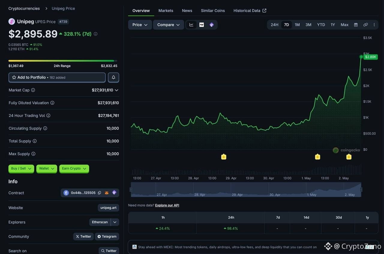

1
4
184
·
--
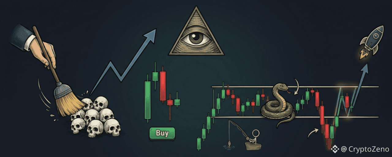
Статья
THEY DON’T WANT YOU TO SEE THISThis information was never meant for retail eyes.
But I’m done watching people get slaughtered by algorithms designed to take your money.
Stop trading against them. Start trading WITH them.
Here are the 4 execution models they run everyday:
1. THE STOP HUNT (Model 1)
Nothing moves until they collect. Price gets driven into a higher timeframe POI to wipe out everyone who entered too early.
They raid the lows, they eat every stop loss in sight.
ONLY after the destruction do they shift market structure and print a fair value gap.
If you bought before the sweep, congratulations, you were the exit door.
2. THE TRAP (Model 2)
This is why smart retail traders still lose.
Because even after the structure shift, there’s another layer.
They engineer an internal liquidity grab, a pullback that looks perfect. It’s BAIT.
Price moves up, you enter long, and they nuke it one final time to wipe the last hands before the actual move begins.
3. THE ALGORITHM’S PRICE (Model 3)
Institutions don’t chase, they calculate.
They need the optimal trade entry, the 0.62 to 0.79 Fibonacci retracement zone.
When a fair value gap sits inside that window, the math lines up perfectly. That’s when the real money enters, not before.
4. THE RANGE TRAP (Model 4)
This is textbook accumulation disguised as boredom. They lock price in a tight consolidation until you give up and close your position.
Then they fake a breakdown, sweeping HTF liquidity, only to reverse and rip back inside the range.
That retest of the original box? That’s not support. That’s institutions reloading before launch.
THE TRUTH:
Every candle on your chart is engineered to make you do the wrong thing at the wrong time.
These 4 models aren’t strategies. They’re the actual architecture of how price is delivered.
Billions flow through these patterns while retail stares at RSI divergences.
Save this post and study it.
You are either the hunter or the hunted.
I’m sharing this because I’m tired of watching good people get destroyed by a game they don’t understand.
I’ve been studying macro for over 20 years, and I’ve called the last 3 major market tops and bottoms.
#CryptoZeno #SKHynixADRListing
THEY DON’T WANT YOU TO SEE THIS
This information was never meant for retail eyes.
But I’m done watching people get slaughtered by algorithms designed to take your money.
Stop trading against them. Start trading WITH them.
Here are the 4 execution models they run everyday:
1. THE STOP HUNT (Model 1)
Nothing moves until they collect. Price gets driven into a higher timeframe POI to wipe out everyone who entered too early.
They raid the lows, they eat every stop loss in sight.
ONLY after the destruction do they shift market structure and print a fair value gap.
If you bought before the sweep, congratulations, you were the exit door.
2. THE TRAP (Model 2)
This is why smart retail traders still lose.
Because even after the structure shift, there’s another layer.
They engineer an internal liquidity grab, a pullback that looks perfect. It’s BAIT.
Price moves up, you enter long, and they nuke it one final time to wipe the last hands before the actual move begins.
3. THE ALGORITHM’S PRICE (Model 3)
Institutions don’t chase, they calculate.
They need the optimal trade entry, the 0.62 to 0.79 Fibonacci retracement zone.
When a fair value gap sits inside that window, the math lines up perfectly. That’s when the real money enters, not before.
4. THE RANGE TRAP (Model 4)
This is textbook accumulation disguised as boredom. They lock price in a tight consolidation until you give up and close your position.
Then they fake a breakdown, sweeping HTF liquidity, only to reverse and rip back inside the range.
That retest of the original box? That’s not support. That’s institutions reloading before launch.
THE TRUTH:
Every candle on your chart is engineered to make you do the wrong thing at the wrong time.
These 4 models aren’t strategies. They’re the actual architecture of how price is delivered.
Billions flow through these patterns while retail stares at RSI divergences.
Save this post and study it.
You are either the hunter or the hunted.
I’m sharing this because I’m tired of watching good people get destroyed by a game they don’t understand.
I’ve been studying macro for over 20 years, and I’ve called the last 3 major market tops and bottoms.
#CryptoZeno #SKHynixADRListing
But I’m done watching people get slaughtered by algorithms designed to take your money.
Stop trading against them. Start trading WITH them.
Here are the 4 execution models they run everyday:
1. THE STOP HUNT (Model 1)
Nothing moves until they collect. Price gets driven into a higher timeframe POI to wipe out everyone who entered too early.
They raid the lows, they eat every stop loss in sight.
ONLY after the destruction do they shift market structure and print a fair value gap.
If you bought before the sweep, congratulations, you were the exit door.
2. THE TRAP (Model 2)
This is why smart retail traders still lose.
Because even after the structure shift, there’s another layer.
They engineer an internal liquidity grab, a pullback that looks perfect. It’s BAIT.
Price moves up, you enter long, and they nuke it one final time to wipe the last hands before the actual move begins.
3. THE ALGORITHM’S PRICE (Model 3)
Institutions don’t chase, they calculate.
They need the optimal trade entry, the 0.62 to 0.79 Fibonacci retracement zone.
When a fair value gap sits inside that window, the math lines up perfectly. That’s when the real money enters, not before.
4. THE RANGE TRAP (Model 4)
This is textbook accumulation disguised as boredom. They lock price in a tight consolidation until you give up and close your position.
Then they fake a breakdown, sweeping HTF liquidity, only to reverse and rip back inside the range.
That retest of the original box? That’s not support. That’s institutions reloading before launch.
THE TRUTH:
Every candle on your chart is engineered to make you do the wrong thing at the wrong time.
These 4 models aren’t strategies. They’re the actual architecture of how price is delivered.
Billions flow through these patterns while retail stares at RSI divergences.
Save this post and study it.
You are either the hunter or the hunted.
I’m sharing this because I’m tired of watching good people get destroyed by a game they don’t understand.
I’ve been studying macro for over 20 years, and I’ve called the last 3 major market tops and bottoms.
#CryptoZeno #SKHynixADRListing
3
338
·
--

Статья
The One Crypto Threat Your Hardware Wallet Can’t Defend AgainstMost people believe that owning a hardware wallet is the final step in crypto security. That assumption is dangerously incomplete. A Ledger can protect you from malware, phishing, and remote attacks. It does nothing against the fastest-growing threat facing crypto holders today: physical coercion.
According to Chainalysis, crypto-related home invasions and physical extortion incidents have increased sharply since 2023. As crypto wealth becomes more visible and more concentrated, attackers no longer need to hack your device. They only need you.
1. The Threat Model Has Changed
Online threats are no longer the primary risk for serious holders. If someone forces you to unlock your wallet under duress, your hardware wallet offers no resistance. At that moment, security becomes psychological, structural, and physical rather than technical.
2. A Decoy Wallet Is Your First Line of Defense
In a worst-case scenario, you need something you can safely give up. A secondary hardware wallet with a completely separate seed phrase, funded with a believable but limited amount, acts as a sacrificial layer. Transaction history, minor assets, and realistic activity make it credible. Its purpose is not storage but deception.
3. Hidden Wallets Add Controlled Disclosure
Some hardware wallets allow the creation of passphrase-protected hidden wallets. One device can therefore contain multiple wallets, only one of which is visible under pressure. This enables staged disclosure, giving you options rather than a single point of failure.
4. Convincing Escalation Preserves the Core
Under coercion, attackers typically escalate until they believe they have extracted everything. A small visible balance followed by a larger decoy balance often satisfies that expectation. What they believe to be your full holdings is not your real portfolio.
5. Your Real Holdings Should Never Touch That Device
Serious holdings should be generated and stored fully offline, using air-gapped devices that never interact with internet-connected hardware. Seed backups should be stored on durable, fireproof, and waterproof metal solutions, never digitally and never on a device used for daily activity.
6. Seed Phrase Obfuscation Removes Single-Point Failure
Splitting a seed phrase across locations, scrambling word order, and separating index information ensures that no single discovery compromises the wallet. Partial information should be useless by design.
7. Reduce Visible Attack Surface
Once the real seed is secured offline, visible devices should contain only decoy wallets. If stolen or forced open, they reveal nothing of value. What cannot be discovered cannot be taken.
8. Physical Security Complements Wallet Security
Home security layers such as silent panic systems, offsite camera storage, and motion alerts reduce response time and increase deterrence. Seed backups should never be stored at your residence.
9. Silence Is the Final Layer
Even the most advanced setup fails if attention is drawn to it. Publicly sharing balances, trades, or security details creates unnecessary risk. Anonymity remains the strongest security primitive.
Final Perspective
If you hold meaningful crypto, your security architecture must be as sophisticated as your investment strategy. Real protection comes from layered deception, offline redundancy, geographic separation, and disciplined silence.
They cannot take what they cannot find, and they will not look for what they do not know exists.
#CryptoZeno #BinanceOnline #SchwabOpensCryptoAccounts
The One Crypto Threat Your Hardware Wallet Can’t Defend Against
Most people believe that owning a hardware wallet is the final step in crypto security. That assumption is dangerously incomplete. A Ledger can protect you from malware, phishing, and remote attacks. It does nothing against the fastest-growing threat facing crypto holders today: physical coercion.
According to Chainalysis, crypto-related home invasions and physical extortion incidents have increased sharply since 2023. As crypto wealth becomes more visible and more concentrated, attackers no longer need to hack your device. They only need you.
1. The Threat Model Has Changed
Online threats are no longer the primary risk for serious holders. If someone forces you to unlock your wallet under duress, your hardware wallet offers no resistance. At that moment, security becomes psychological, structural, and physical rather than technical.
2. A Decoy Wallet Is Your First Line of Defense
In a worst-case scenario, you need something you can safely give up. A secondary hardware wallet with a completely separate seed phrase, funded with a believable but limited amount, acts as a sacrificial layer. Transaction history, minor assets, and realistic activity make it credible. Its purpose is not storage but deception.
3. Hidden Wallets Add Controlled Disclosure
Some hardware wallets allow the creation of passphrase-protected hidden wallets. One device can therefore contain multiple wallets, only one of which is visible under pressure. This enables staged disclosure, giving you options rather than a single point of failure.
4. Convincing Escalation Preserves the Core
Under coercion, attackers typically escalate until they believe they have extracted everything. A small visible balance followed by a larger decoy balance often satisfies that expectation. What they believe to be your full holdings is not your real portfolio.
5. Your Real Holdings Should Never Touch That Device
Serious holdings should be generated and stored fully offline, using air-gapped devices that never interact with internet-connected hardware. Seed backups should be stored on durable, fireproof, and waterproof metal solutions, never digitally and never on a device used for daily activity.
6. Seed Phrase Obfuscation Removes Single-Point Failure
Splitting a seed phrase across locations, scrambling word order, and separating index information ensures that no single discovery compromises the wallet. Partial information should be useless by design.
7. Reduce Visible Attack Surface
Once the real seed is secured offline, visible devices should contain only decoy wallets. If stolen or forced open, they reveal nothing of value. What cannot be discovered cannot be taken.
8. Physical Security Complements Wallet Security
Home security layers such as silent panic systems, offsite camera storage, and motion alerts reduce response time and increase deterrence. Seed backups should never be stored at your residence.
9. Silence Is the Final Layer
Even the most advanced setup fails if attention is drawn to it. Publicly sharing balances, trades, or security details creates unnecessary risk. Anonymity remains the strongest security primitive.
Final Perspective
If you hold meaningful crypto, your security architecture must be as sophisticated as your investment strategy. Real protection comes from layered deception, offline redundancy, geographic separation, and disciplined silence.
They cannot take what they cannot find, and they will not look for what they do not know exists.
#CryptoZeno #BinanceOnline #SchwabOpensCryptoAccounts
According to Chainalysis, crypto-related home invasions and physical extortion incidents have increased sharply since 2023. As crypto wealth becomes more visible and more concentrated, attackers no longer need to hack your device. They only need you.
1. The Threat Model Has Changed
Online threats are no longer the primary risk for serious holders. If someone forces you to unlock your wallet under duress, your hardware wallet offers no resistance. At that moment, security becomes psychological, structural, and physical rather than technical.
2. A Decoy Wallet Is Your First Line of Defense
In a worst-case scenario, you need something you can safely give up. A secondary hardware wallet with a completely separate seed phrase, funded with a believable but limited amount, acts as a sacrificial layer. Transaction history, minor assets, and realistic activity make it credible. Its purpose is not storage but deception.
3. Hidden Wallets Add Controlled Disclosure
Some hardware wallets allow the creation of passphrase-protected hidden wallets. One device can therefore contain multiple wallets, only one of which is visible under pressure. This enables staged disclosure, giving you options rather than a single point of failure.
4. Convincing Escalation Preserves the Core
Under coercion, attackers typically escalate until they believe they have extracted everything. A small visible balance followed by a larger decoy balance often satisfies that expectation. What they believe to be your full holdings is not your real portfolio.
5. Your Real Holdings Should Never Touch That Device
Serious holdings should be generated and stored fully offline, using air-gapped devices that never interact with internet-connected hardware. Seed backups should be stored on durable, fireproof, and waterproof metal solutions, never digitally and never on a device used for daily activity.
6. Seed Phrase Obfuscation Removes Single-Point Failure
Splitting a seed phrase across locations, scrambling word order, and separating index information ensures that no single discovery compromises the wallet. Partial information should be useless by design.
7. Reduce Visible Attack Surface
Once the real seed is secured offline, visible devices should contain only decoy wallets. If stolen or forced open, they reveal nothing of value. What cannot be discovered cannot be taken.
8. Physical Security Complements Wallet Security
Home security layers such as silent panic systems, offsite camera storage, and motion alerts reduce response time and increase deterrence. Seed backups should never be stored at your residence.
9. Silence Is the Final Layer
Even the most advanced setup fails if attention is drawn to it. Publicly sharing balances, trades, or security details creates unnecessary risk. Anonymity remains the strongest security primitive.
Final Perspective
If you hold meaningful crypto, your security architecture must be as sophisticated as your investment strategy. Real protection comes from layered deception, offline redundancy, geographic separation, and disciplined silence.
They cannot take what they cannot find, and they will not look for what they do not know exists.
#CryptoZeno #BinanceOnline #SchwabOpensCryptoAccounts
5
285
·
--
Проверено
Статья
A 17 year old built crypto’s first margin exchange in 4 days, lost $11 BILLION worth of Bitcoin andHis name was Zhou Tong
In 2010 he was a 16 year old Chinese teenager in Singapore who bought his first Bitcoin for $10
By 2011 he had taught himself to code and decided every existing exchange sucked
So he built his own in FOUR DAYS
He called it Bitcoinica. It wasn’t just another exchange at the time… It was the first crypto margin trading platform in history
Users could bet up to 50 BTC instantly on the price of Bitcoin going up or down
Back then long, short or leverage never existed in crypto until this kid built it
The platform exploded and within months Bitcoinica was doing $40 MILLION per month in volume, second only to Mt. Gox
Zhou personally cleared 2,000 BTC in his first two weeks. Worth $215 MILLION today
Then he had to take school exams
Running the second largest crypto exchange in the world didn’t fit with finals. So he sold the platform to a company called Wendon Group in late 2011
Wendon went all in. They brought in legendary developer Amir Taaki for security. They spent $1 MILLION buying the domain Bitcoin com to give it credibility
They got hacked 4 months later
In March 2012 the hot wallet was drained of 43,554 BTC. The hackers reset passwords on the exchange’s hosting provider Linode and walked in
No multisig existed yet. If you had the password, you had the keys
Two months later they got hit again for 18,000 BTC
In July they got hit a THIRD time for another 40,000 BTC plus $40,000 in cash
Total: 101,554 BTC gone. Over $11 BILLION at today’s prices evaporated from the second largest crypto exchange in the world in a single year
Roger Ver alone lost 24,000 BTC
Then it got weirder
On chain investigators tracked the stolen funds moving through Mt. Gox accounts
They observed coordination between Bitcoinica wallets and Mt. Gox mixing the trail
80 BTC was sent to a wallet belonging to Theymos Michael Marquardt, moderator of Bitcointalk the most influential forum in crypto
The “recovery effort” funds were moving through the same hands that controlled crypto’s main information venues
Theymos was later subpoenaed during the Silk Road and Mt. Gox investigations. The full picture was never resolved
Zhou Tong’s last public move was buying ONE Casascius coin
Casascius coins were physical gold coins minted in 2011, each containing a real Bitcoin private key embedded under a tamper proof hologram
Zhou bought one of THREE remaining 1,000 BTC ultra rare versions for 1,000 BTC
That single coin is worth over $100 MILLION today
Then he disappeared
For years the community speculated whether he was complicit, whether his partners stole the funds, whether he knew the whole time
He hinted at “dishonest partners and employees” in his final Bitcointalk post and never elaborated
All from a kid who couldn’t keep running it because he had finals
“Zhao Tonged” became slang in crypto for getting wiped out by an exchange you trusted
A teenager in Singapore built the future of crypto trading in 4 days, lost the equivalent of a small country’s GDP, walked away with the rarest single item in Bitcoin history, and was never heard from again
The first margin exchange. The first mega hack. The first OG to vanish without a trace
All from a kid who couldn’t keep running it because he had finals
#CryptoZeno #PolymarketNasdaqPredictionMarketPartnership
A 17 year old built crypto’s first margin exchange in 4 days, lost $11 BILLION worth of Bitcoin and
His name was Zhou Tong
In 2010 he was a 16 year old Chinese teenager in Singapore who bought his first Bitcoin for $10
By 2011 he had taught himself to code and decided every existing exchange sucked
So he built his own in FOUR DAYS
He called it Bitcoinica. It wasn’t just another exchange at the time… It was the first crypto margin trading platform in history
Users could bet up to 50 BTC instantly on the price of Bitcoin going up or down
Back then long, short or leverage never existed in crypto until this kid built it
The platform exploded and within months Bitcoinica was doing $40 MILLION per month in volume, second only to Mt. Gox
Zhou personally cleared 2,000 BTC in his first two weeks. Worth $215 MILLION today
Then he had to take school exams
Running the second largest crypto exchange in the world didn’t fit with finals. So he sold the platform to a company called Wendon Group in late 2011
Wendon went all in. They brought in legendary developer Amir Taaki for security. They spent $1 MILLION buying the domain Bitcoin com to give it credibility
They got hacked 4 months later
In March 2012 the hot wallet was drained of 43,554 BTC. The hackers reset passwords on the exchange’s hosting provider Linode and walked in
No multisig existed yet. If you had the password, you had the keys
Two months later they got hit again for 18,000 BTC
In July they got hit a THIRD time for another 40,000 BTC plus $40,000 in cash
Total: 101,554 BTC gone. Over $11 BILLION at today’s prices evaporated from the second largest crypto exchange in the world in a single year
Roger Ver alone lost 24,000 BTC
Then it got weirder
On chain investigators tracked the stolen funds moving through Mt. Gox accounts
They observed coordination between Bitcoinica wallets and Mt. Gox mixing the trail
80 BTC was sent to a wallet belonging to Theymos Michael Marquardt, moderator of Bitcointalk the most influential forum in crypto
The “recovery effort” funds were moving through the same hands that controlled crypto’s main information venues
Theymos was later subpoenaed during the Silk Road and Mt. Gox investigations. The full picture was never resolved
Zhou Tong’s last public move was buying ONE Casascius coin
Casascius coins were physical gold coins minted in 2011, each containing a real Bitcoin private key embedded under a tamper proof hologram
Zhou bought one of THREE remaining 1,000 BTC ultra rare versions for 1,000 BTC
That single coin is worth over $100 MILLION today
Then he disappeared
For years the community speculated whether he was complicit, whether his partners stole the funds, whether he knew the whole time
He hinted at “dishonest partners and employees” in his final Bitcointalk post and never elaborated
All from a kid who couldn’t keep running it because he had finals
“Zhao Tonged” became slang in crypto for getting wiped out by an exchange you trusted
A teenager in Singapore built the future of crypto trading in 4 days, lost the equivalent of a small country’s GDP, walked away with the rarest single item in Bitcoin history, and was never heard from again
The first margin exchange. The first mega hack. The first OG to vanish without a trace
All from a kid who couldn’t keep running it because he had finals
#CryptoZeno #PolymarketNasdaqPredictionMarketPartnership
In 2010 he was a 16 year old Chinese teenager in Singapore who bought his first Bitcoin for $10
By 2011 he had taught himself to code and decided every existing exchange sucked
So he built his own in FOUR DAYS
He called it Bitcoinica. It wasn’t just another exchange at the time… It was the first crypto margin trading platform in history
Users could bet up to 50 BTC instantly on the price of Bitcoin going up or down
Back then long, short or leverage never existed in crypto until this kid built it
The platform exploded and within months Bitcoinica was doing $40 MILLION per month in volume, second only to Mt. Gox
Zhou personally cleared 2,000 BTC in his first two weeks. Worth $215 MILLION today
Then he had to take school exams
Running the second largest crypto exchange in the world didn’t fit with finals. So he sold the platform to a company called Wendon Group in late 2011
Wendon went all in. They brought in legendary developer Amir Taaki for security. They spent $1 MILLION buying the domain Bitcoin com to give it credibility
They got hacked 4 months later
In March 2012 the hot wallet was drained of 43,554 BTC. The hackers reset passwords on the exchange’s hosting provider Linode and walked in
No multisig existed yet. If you had the password, you had the keys
Two months later they got hit again for 18,000 BTC
In July they got hit a THIRD time for another 40,000 BTC plus $40,000 in cash
Total: 101,554 BTC gone. Over $11 BILLION at today’s prices evaporated from the second largest crypto exchange in the world in a single year
Roger Ver alone lost 24,000 BTC
Then it got weirder
On chain investigators tracked the stolen funds moving through Mt. Gox accounts
They observed coordination between Bitcoinica wallets and Mt. Gox mixing the trail
80 BTC was sent to a wallet belonging to Theymos Michael Marquardt, moderator of Bitcointalk the most influential forum in crypto
The “recovery effort” funds were moving through the same hands that controlled crypto’s main information venues
Theymos was later subpoenaed during the Silk Road and Mt. Gox investigations. The full picture was never resolved
Zhou Tong’s last public move was buying ONE Casascius coin
Casascius coins were physical gold coins minted in 2011, each containing a real Bitcoin private key embedded under a tamper proof hologram
Zhou bought one of THREE remaining 1,000 BTC ultra rare versions for 1,000 BTC
That single coin is worth over $100 MILLION today
Then he disappeared
For years the community speculated whether he was complicit, whether his partners stole the funds, whether he knew the whole time
He hinted at “dishonest partners and employees” in his final Bitcointalk post and never elaborated
All from a kid who couldn’t keep running it because he had finals
“Zhao Tonged” became slang in crypto for getting wiped out by an exchange you trusted
A teenager in Singapore built the future of crypto trading in 4 days, lost the equivalent of a small country’s GDP, walked away with the rarest single item in Bitcoin history, and was never heard from again
The first margin exchange. The first mega hack. The first OG to vanish without a trace
All from a kid who couldn’t keep running it because he had finals
#CryptoZeno #PolymarketNasdaqPredictionMarketPartnership
2
6
5.3k
·
--
Статья
This Risk Management Mistake Wipes More Accounts Than Any IndicatorWe manage risks every single day, often without realizing it. From driving a car to making long-term plans about health or insurance, risk assessment is something humans do almost instinctively. But when it comes to financial markets, especially trading, risk management becomes a conscious and decisive factor that separates those who survive from those who don’t.
In trading, most losses don’t come from not knowing indicators. They come from poor reactions to risk. A trader can lose money simply because the market moves against their position, but more often, losses are amplified when emotions take over. Panic selling, revenge trading, or abandoning a plan halfway through a trade are patterns that wipe accounts far faster than any bad entry.
This emotional breakdown is especially visible during bear markets and capitulation phases. Volatility increases, confidence drops, and many traders abandon their original strategy right when discipline matters most. At that point, indicators stop helping if risk is not already under control.
That’s why risk management is not an optional add-on to a trading system. It is the foundation. In its simplest form, it can be as basic as defining where to cut losses or where to secure profits. But at a deeper level, it is a framework that defines how a trader reacts under pressure, across different market conditions.
A robust trading approach always provides clarity before the trade begins. What happens if price goes against you? What action do you take if volatility spikes? What is the maximum damage this trade can do to your account? When these questions are answered in advance, decision-making becomes mechanical rather than emotional.
Risk management itself is not static. Markets change, volatility shifts, and strategies that worked before may no longer be optimal. Because of that, risk control methods should be reviewed and adjusted continuously, not treated as a one-time setup.
In practice, traders face multiple types of risk. Market risk is the most obvious one, where price moves against a position. This is commonly managed through stop-loss orders that automatically close trades before losses grow beyond control. Liquidity risk appears when trading low-volume assets, where entering or exiting a position becomes difficult without slippage. This risk is reduced by focusing on high-volume, highly capitalized markets.
There is also credit risk, which becomes relevant when using platforms or counterparties that cannot be trusted. Choosing reliable exchanges significantly reduces this exposure. Operational risk, on the other hand, relates to failures within projects or systems themselves. In crypto, this can include smart contract bugs, team issues, or infrastructure failures, which is why research and portfolio distribution matter.
Systemic risk is harder to predict. It refers to events that affect the entire market, such as regulatory shocks or macroeconomic crises. While it cannot be eliminated, exposure can be reduced by spreading capital across assets or narratives that are not perfectly correlated.
To manage these risks, traders usually rely on a combination of practical strategies rather than a single rule. One widely used principle is the 1% risk rule. This approach limits the potential loss of any single trade to a small portion of total capital. Whether through position sizing or stop-loss placement, the idea is simple: no single mistake should be able to destroy the account.
Another essential tool is the use of stop-loss and take-profit orders. Defining exit points before entering a trade removes emotion from the equation. It also allows traders to calculate the risk-reward ratio in advance, ensuring that potential gains justify the risk taken. Knowing when to exit is often more important than knowing when to enter.
Some traders also use hedging to reduce exposure. By holding opposing positions, losses in one direction can be partially offset by gains in another. In crypto, this is often done through futures markets, allowing traders to hedge spot holdings without selling the underlying asset.
Diversification plays a role as well, particularly in crypto. Concentrating capital into a single asset or narrative increases vulnerability. Spreading exposure across different projects limits the maximum damage any single failure can cause.
Finally, the risk-reward ratio ties everything together. A trade where potential loss outweighs potential gain is rarely worth taking, regardless of how strong the setup looks. Over time, prioritizing favorable risk-reward scenarios allows traders to stay profitable even with a modest win rate.
In the end, risk management does not eliminate losses. Losses are unavoidable in trading. What risk management does is decide whether those losses are survivable or fatal. It defines how efficiently unavoidable risks are taken and how long a trader can stay in the game.
Most accounts are not blown by bad indicators. They are blown by ignoring risk, abandoning discipline, and letting emotions override structure. And that is the mistake that wipes more accounts than anything else.
#CryptoZeno #OilVolatilityReturnsToPreIranWarLevels
This Risk Management Mistake Wipes More Accounts Than Any Indicator
We manage risks every single day, often without realizing it. From driving a car to making long-term plans about health or insurance, risk assessment is something humans do almost instinctively. But when it comes to financial markets, especially trading, risk management becomes a conscious and decisive factor that separates those who survive from those who don’t.
In trading, most losses don’t come from not knowing indicators. They come from poor reactions to risk. A trader can lose money simply because the market moves against their position, but more often, losses are amplified when emotions take over. Panic selling, revenge trading, or abandoning a plan halfway through a trade are patterns that wipe accounts far faster than any bad entry.
This emotional breakdown is especially visible during bear markets and capitulation phases. Volatility increases, confidence drops, and many traders abandon their original strategy right when discipline matters most. At that point, indicators stop helping if risk is not already under control.
That’s why risk management is not an optional add-on to a trading system. It is the foundation. In its simplest form, it can be as basic as defining where to cut losses or where to secure profits. But at a deeper level, it is a framework that defines how a trader reacts under pressure, across different market conditions.
A robust trading approach always provides clarity before the trade begins. What happens if price goes against you? What action do you take if volatility spikes? What is the maximum damage this trade can do to your account? When these questions are answered in advance, decision-making becomes mechanical rather than emotional.
Risk management itself is not static. Markets change, volatility shifts, and strategies that worked before may no longer be optimal. Because of that, risk control methods should be reviewed and adjusted continuously, not treated as a one-time setup.
In practice, traders face multiple types of risk. Market risk is the most obvious one, where price moves against a position. This is commonly managed through stop-loss orders that automatically close trades before losses grow beyond control. Liquidity risk appears when trading low-volume assets, where entering or exiting a position becomes difficult without slippage. This risk is reduced by focusing on high-volume, highly capitalized markets.
There is also credit risk, which becomes relevant when using platforms or counterparties that cannot be trusted. Choosing reliable exchanges significantly reduces this exposure. Operational risk, on the other hand, relates to failures within projects or systems themselves. In crypto, this can include smart contract bugs, team issues, or infrastructure failures, which is why research and portfolio distribution matter.
Systemic risk is harder to predict. It refers to events that affect the entire market, such as regulatory shocks or macroeconomic crises. While it cannot be eliminated, exposure can be reduced by spreading capital across assets or narratives that are not perfectly correlated.
To manage these risks, traders usually rely on a combination of practical strategies rather than a single rule. One widely used principle is the 1% risk rule. This approach limits the potential loss of any single trade to a small portion of total capital. Whether through position sizing or stop-loss placement, the idea is simple: no single mistake should be able to destroy the account.
Another essential tool is the use of stop-loss and take-profit orders. Defining exit points before entering a trade removes emotion from the equation. It also allows traders to calculate the risk-reward ratio in advance, ensuring that potential gains justify the risk taken. Knowing when to exit is often more important than knowing when to enter.
Some traders also use hedging to reduce exposure. By holding opposing positions, losses in one direction can be partially offset by gains in another. In crypto, this is often done through futures markets, allowing traders to hedge spot holdings without selling the underlying asset.
Diversification plays a role as well, particularly in crypto. Concentrating capital into a single asset or narrative increases vulnerability. Spreading exposure across different projects limits the maximum damage any single failure can cause.
Finally, the risk-reward ratio ties everything together. A trade where potential loss outweighs potential gain is rarely worth taking, regardless of how strong the setup looks. Over time, prioritizing favorable risk-reward scenarios allows traders to stay profitable even with a modest win rate.
In the end, risk management does not eliminate losses. Losses are unavoidable in trading. What risk management does is decide whether those losses are survivable or fatal. It defines how efficiently unavoidable risks are taken and how long a trader can stay in the game.
Most accounts are not blown by bad indicators. They are blown by ignoring risk, abandoning discipline, and letting emotions override structure. And that is the mistake that wipes more accounts than anything else.
#CryptoZeno #OilVolatilityReturnsToPreIranWarLevels
In trading, most losses don’t come from not knowing indicators. They come from poor reactions to risk. A trader can lose money simply because the market moves against their position, but more often, losses are amplified when emotions take over. Panic selling, revenge trading, or abandoning a plan halfway through a trade are patterns that wipe accounts far faster than any bad entry.
This emotional breakdown is especially visible during bear markets and capitulation phases. Volatility increases, confidence drops, and many traders abandon their original strategy right when discipline matters most. At that point, indicators stop helping if risk is not already under control.
That’s why risk management is not an optional add-on to a trading system. It is the foundation. In its simplest form, it can be as basic as defining where to cut losses or where to secure profits. But at a deeper level, it is a framework that defines how a trader reacts under pressure, across different market conditions.
A robust trading approach always provides clarity before the trade begins. What happens if price goes against you? What action do you take if volatility spikes? What is the maximum damage this trade can do to your account? When these questions are answered in advance, decision-making becomes mechanical rather than emotional.
Risk management itself is not static. Markets change, volatility shifts, and strategies that worked before may no longer be optimal. Because of that, risk control methods should be reviewed and adjusted continuously, not treated as a one-time setup.
In practice, traders face multiple types of risk. Market risk is the most obvious one, where price moves against a position. This is commonly managed through stop-loss orders that automatically close trades before losses grow beyond control. Liquidity risk appears when trading low-volume assets, where entering or exiting a position becomes difficult without slippage. This risk is reduced by focusing on high-volume, highly capitalized markets.
There is also credit risk, which becomes relevant when using platforms or counterparties that cannot be trusted. Choosing reliable exchanges significantly reduces this exposure. Operational risk, on the other hand, relates to failures within projects or systems themselves. In crypto, this can include smart contract bugs, team issues, or infrastructure failures, which is why research and portfolio distribution matter.
Systemic risk is harder to predict. It refers to events that affect the entire market, such as regulatory shocks or macroeconomic crises. While it cannot be eliminated, exposure can be reduced by spreading capital across assets or narratives that are not perfectly correlated.
To manage these risks, traders usually rely on a combination of practical strategies rather than a single rule. One widely used principle is the 1% risk rule. This approach limits the potential loss of any single trade to a small portion of total capital. Whether through position sizing or stop-loss placement, the idea is simple: no single mistake should be able to destroy the account.
Another essential tool is the use of stop-loss and take-profit orders. Defining exit points before entering a trade removes emotion from the equation. It also allows traders to calculate the risk-reward ratio in advance, ensuring that potential gains justify the risk taken. Knowing when to exit is often more important than knowing when to enter.
Some traders also use hedging to reduce exposure. By holding opposing positions, losses in one direction can be partially offset by gains in another. In crypto, this is often done through futures markets, allowing traders to hedge spot holdings without selling the underlying asset.
Diversification plays a role as well, particularly in crypto. Concentrating capital into a single asset or narrative increases vulnerability. Spreading exposure across different projects limits the maximum damage any single failure can cause.
Finally, the risk-reward ratio ties everything together. A trade where potential loss outweighs potential gain is rarely worth taking, regardless of how strong the setup looks. Over time, prioritizing favorable risk-reward scenarios allows traders to stay profitable even with a modest win rate.
In the end, risk management does not eliminate losses. Losses are unavoidable in trading. What risk management does is decide whether those losses are survivable or fatal. It defines how efficiently unavoidable risks are taken and how long a trader can stay in the game.
Most accounts are not blown by bad indicators. They are blown by ignoring risk, abandoning discipline, and letting emotions override structure. And that is the mistake that wipes more accounts than anything else.
#CryptoZeno #OilVolatilityReturnsToPreIranWarLevels
3
230
·
--
🚨 Tariff Shock Ignites $BTC Volatility
Trump’s latest 15% global tariff announcement has triggered a sharp spike in “tariff” social mentions and once again, #BTC is reacting before the macro dust settles.
Technically, #Bitcoin is compressing near key liquidity zones while social dominance surges. Historically, tariff headlines have marked local volatility extremes:
April 2025 → Panic spike, local bottom formation
October 2025 → 100% China tariff shock, final distribution near ATH
February 2026 → Social volume expansion returns
When social volume and dominance expand aggressively while price tests support, it often signals ⚠ liquidity engineering in motion.
Watch the reaction at the current demand cluster.
If bids absorb this fear, a short squeeze toward overhead imbalance becomes likely.
If not, cascading liquidations could accelerate downside volatility.
Macro headlines create noise. Liquidity leaves footprints.
#CryptoZeno
🚨 Tariff Shock Ignites $BTC Volatility
Trump’s latest 15% global tariff announcement has triggered a sharp spike in “tariff” social mentions and once again, #BTC is reacting before the macro dust settles.
Technically, #Bitcoin is compressing near key liquidity zones while social dominance surges. Historically, tariff headlines have marked local volatility extremes:
April 2025 → Panic spike, local bottom formation
October 2025 → 100% China tariff shock, final distribution near ATH
February 2026 → Social volume expansion returns
When social volume and dominance expand aggressively while price tests support, it often signals ⚠ liquidity engineering in motion.
Watch the reaction at the current demand cluster.
If bids absorb this fear, a short squeeze toward overhead imbalance becomes likely.
If not, cascading liquidations could accelerate downside volatility.
Macro headlines create noise. Liquidity leaves footprints.
#CryptoZeno
Trump’s latest 15% global tariff announcement has triggered a sharp spike in “tariff” social mentions and once again, #BTC is reacting before the macro dust settles.
Technically, #Bitcoin is compressing near key liquidity zones while social dominance surges. Historically, tariff headlines have marked local volatility extremes:
April 2025 → Panic spike, local bottom formation
October 2025 → 100% China tariff shock, final distribution near ATH
February 2026 → Social volume expansion returns
When social volume and dominance expand aggressively while price tests support, it often signals ⚠ liquidity engineering in motion.
Watch the reaction at the current demand cluster.
If bids absorb this fear, a short squeeze toward overhead imbalance becomes likely.
If not, cascading liquidations could accelerate downside volatility.
Macro headlines create noise. Liquidity leaves footprints.
#CryptoZeno
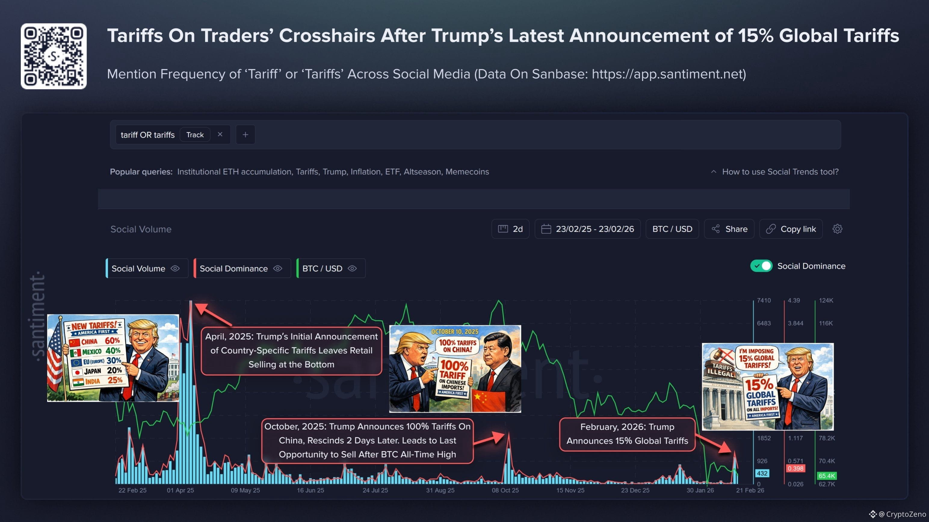
5
1
10
9.5k
Войдите, чтобы посмотреть больше материала
Присоединяйтесь к пользователям криптовалют по всему миру на Binance Square
⚡️ Получайте новейшую и полезную информацию о криптоактивах.
💬 Нам доверяет крупнейшая в мире криптобиржа.
👍 Получите достоверные аналитические данные от верифицированных создателей контента.
Эл. почта/номер телефона
В тренде
1
#BinanceKZ
Просмотров: 6,873
45 обсуждают
2
#QNTRises39%
Просмотров: 51,527
1,194 обсуждают
3
#EthereumBreaksAbove$2700
Просмотров: 4,494
117 обсуждают
4
#BitgetBreachForgedRequestsNotStolenKeys
Просмотров: 50,809
948 обсуждают
5
#BitcoinSpotETFsTurnNetPositiveYTD
Просмотров: 31,314
713 обсуждают
6
#GrayscaleZcashETFHits$1BNetAssets
Просмотров: 3,794
55 обсуждают
7
#BitcoinSpotETFsNetInflow$191M
Просмотров: 9,947
191 обсуждают
8
#CFTCUpdatesGuidanceOnTokenizedAssets
Просмотров: 73,517
1,664 обсуждают
9
#BitgetSays$352MAffectedInHack
Просмотров: 23,084
100 обсуждают
10
#BinanceWillListHyperliquid(HYPE)
Просмотров: 324,093
4,217 обсуждают