

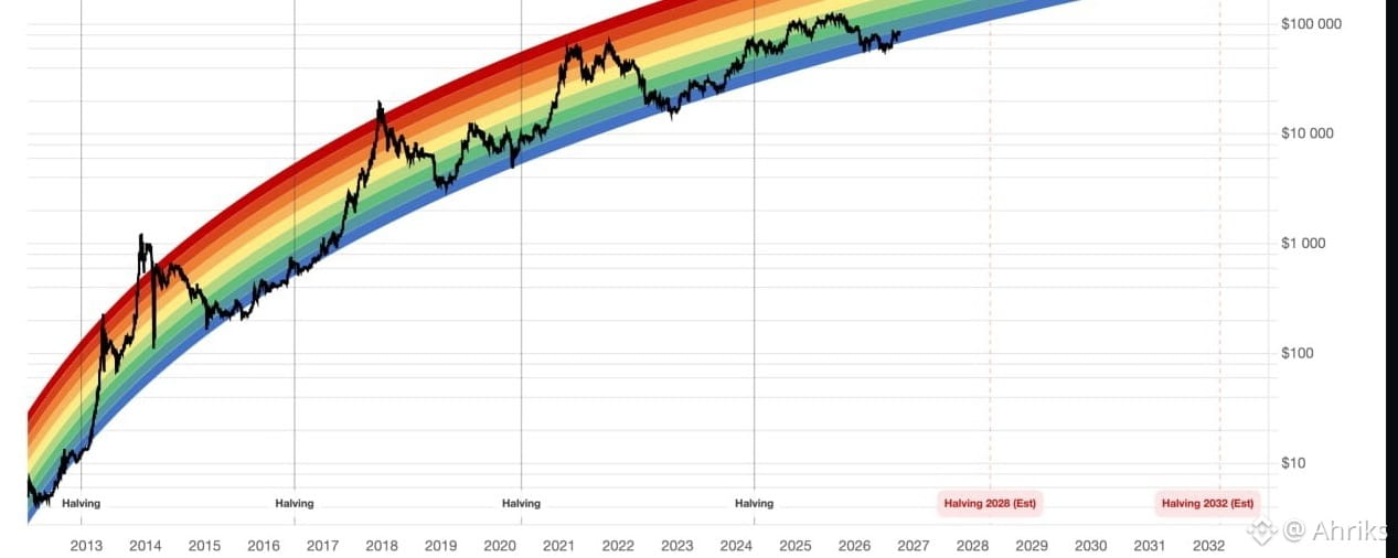

At first glance, it looks like a colorful joke—a whimsical graphic Born on the internet forums of 2014. But don't let appearances fool you. Beneath the playful colors of the Bitcoin Rainbow Chart lies a powerhouse of data-driven psychology and brutal, relentless mathematics.
This is the ultimate macro-lens for the world's most revolutionary asset.
📈 Why the Rainbow Defies Market Chaos
When you look at Bitcoin on a standard linear chart, its early years look like a flat line, while recent years look like a vertical cliff. It distorts reality.
The Rainbow Chart solves this by plotting Bitcoin’s price on a logarithmic scale.
Equal Growth, Equal Space: A move from $10 to $100 takes up the exact same visual space as a move from $10,000 to $100,000.
The Macro View: It compresses the daily market "noise" and reveals the grand design: all major market cycles and all four historic halvings beautifully aligned on a single growth curve.
🧬 The Formula of Hopium
This isn't a chart drawn by hand; it is dictated by a strict mathematical law mapping out the asset's history since its very inception:
{Price}=10^{(5.6715\times \log _{10}{days})-16.6773)}\)
Here, "days" represents the steady, unyielding march of time since the Genesis Block was mined on January 3, 2009. Today, we are deep into this grand experiment, and the math holds a staggering R² metric of 97.14%. In pure statistical terms, that means this regression model has accurately tracked the historical peaks, valleys, and structural soul of Bitcoin's macroeconomic cycles with near-perfect precision.
🗺️ Where Are We Now? (The Ultimate Toolkit)$BTC
Historically, whenever Bitcoin has dipped its toes into the lowest, deepest blue bands of the rainbow, a predictable macro shift has followed. It happened in 2015. It happened in 2019. It happened during the dark winter of 2022. Each time the asset touched this Accumulation Zone, the spring coiled tighter before snapping upward.
Currently, Bitcoin is sitting right in this lowest band, hovering mere inches away from breaking into the next tier up. In a world where people panic over daily fluctuations, the Rainbow Chart offers a grounding perspective. Talking about a massive "sell-off" when Bitcoin sits at an historically undervalued macro floor is a textbook example of missing the forest for the trees.
The Rainbow isn't a crystal ball—smart trading still requires strict structure, confirmations, and disciplined risk management. But as a guide to understanding exactly where we sit in the grand theater of Bitcoin's multi-decade adoption curve, it is an indispensable weapon for your financial toolkit.
Track the live bands, watch the oncoming 2028 and 2032 halvings, and anchor your strategy in your trades.
