

After much thought, I decided to share my short-term trading strategies that took me from 50,000 to 53.98 million in just two years in the crypto space!
If you are currently losing and want to consider trading cryptocurrencies as a second profession in the future, then please read carefully; you will definitely gain something, and I suggest you bookmark it!
I went from losing a lot to financial freedom, achieving a 2000 square meter villa and a Land Rover + a small Rolls in Shanghai! [Remember to check the comments section]
With ten years of experience, I can tell you that if you haven't understood 'candlestick chart patterns', you should definitely not enter the market! Otherwise, you will definitely lose! (with illustrations)
Candlestick chart patterns are a way to read market price actions.
It is well known that candlestick charts originated in Japan, invented by a rice trader named Munehisa Homma, who used historical rice prices to observe technical analysis patterns like head and shoulders and resistance lines.
After hundreds of years of continuous development and refinement, candlestick charts have become very popular and are adopted by most traders worldwide, mainly because candlestick charts are easy to read and gather information.
Candlestick charts consist of four main data points: opening price, highest price, lowest price, and closing price.
Through candlestick charts, we can simply and clearly see the opening price, closing price, and the highest and lowest prices.
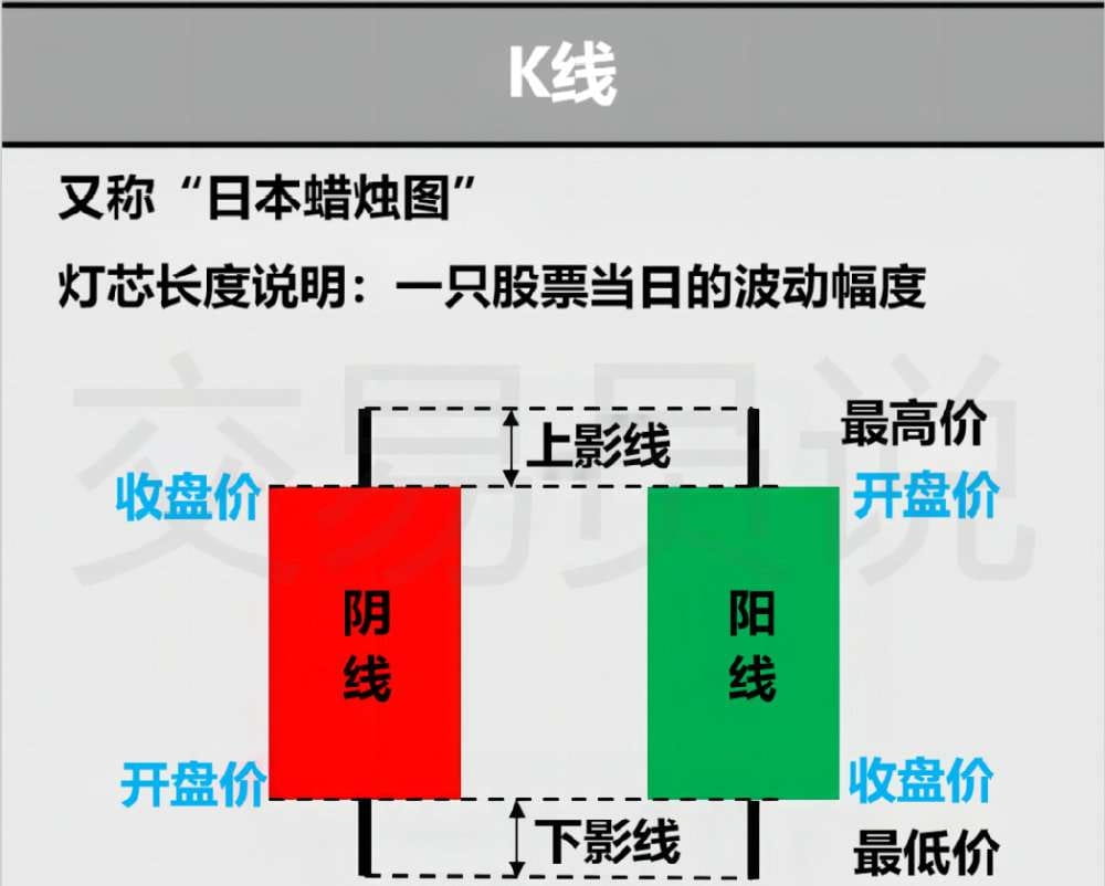
If the candlestick closes in green (white on some other charts), it means the price has risen; conversely, if it closes in red (or black), it means the price has fallen.
It is important to note that in international markets, red candlesticks indicate 'down', while green candlesticks indicate 'up'; this is exactly the opposite in the Chinese market, where red indicates 'up' and green indicates 'down'.
Additionally, in candlestick charts, the opening price of a bullish candlestick is always below the closing price, while for a bearish candlestick, it is the opposite.
Time frames are also important. You can use 1-minute charts, 5-minute charts, hourly charts, daily, monthly, or yearly. Which time frame to use mainly depends on what type of trader you are.
By using candlesticks and looking for candlestick patterns, emotional trading can be reduced, and trades can be made in line with market directions, leveraging it to gain advantages in trading.
◑ What is a candlestick chart pattern?
Regarding candlestick patterns (or what is also called 'K-line patterns'), we have introduced many types in our previous articles. In fact, candlestick patterns are specific candlesticks or combinations of candlesticks on the chart that often indicate changes in the market.
A good way to understand is: each candlestick tells a 'story'.
For example, let’s take the 'bullish engulfing' candlestick pattern to understand the 'truth' behind it.
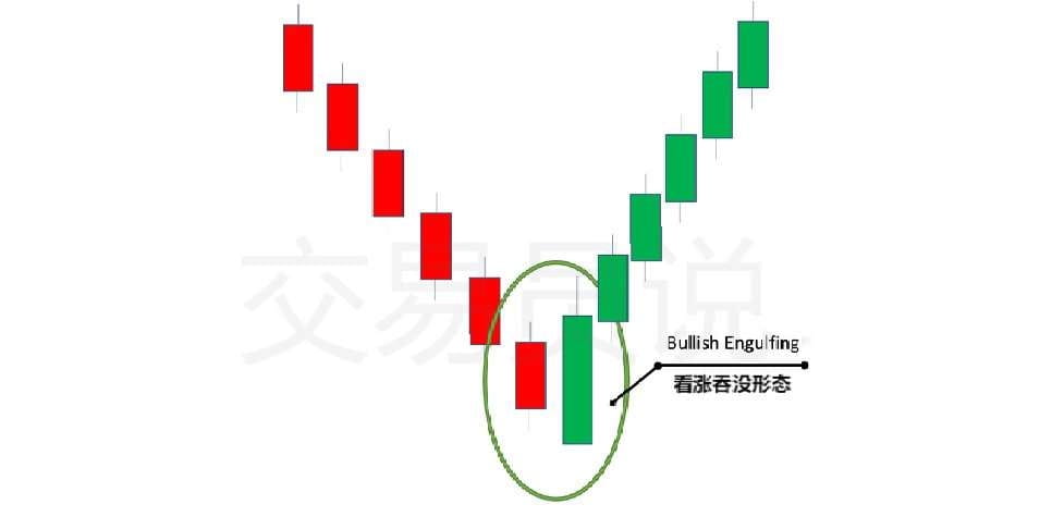
In fact, bullish candlestick patterns are essentially chart patterns in lower time frames.
This means that for every bullish candlestick pattern observed in lower time frames, there is always a 'story' or a 'battle' between buyers and sellers.
Why is this important?
The reasons are as follows:
Many traders may overly focus on specific candlestick patterns before entering a trade.
“Oh, I must wait for the bullish engulfing pattern before I can enter a trade.”
“Morning star candlestick pattern? Uh, I’d rather wait for the hammer candlestick pattern.”
◑ Finding Support and Resistance
You can use candlestick patterns to find support and resistance levels just as you would with any other chart.
But remember, don't just look at the opening and closing prices; you should also observe the upper or lower shadows of the candlestick, as this highlights the highest and lowest points, giving you a clearer understanding of support and resistance levels.
◑ Determining Trend Reversals
This might be the most useful thing you can do with candlestick chart patterns. If you trade trends, then candlestick patterns are very useful.
Long shadows and small bodies in candlesticks may suggest that the current trend is about to end, and a new trend will begin.
That is to say, you should still wait for confirmation from the next candlestick to determine whether the signal indicated by the previous candlestick will actually occur.
Remember, never trade based on a single candlestick’s information.
◑ Most Commonly Used Candlestick Chart Patterns
As we mentioned, each candlestick tells a story; no two candlesticks are exactly the same. Many may look similar, but their market context is different.
For example, the shooting star and inverted hammer we will mention below look the same; inexperienced traders can easily confuse them. What makes them different is the positions they are in and the market conditions at that time.
Next, let's take a look at some of the most commonly traded candlestick patterns.
◍ Hammer
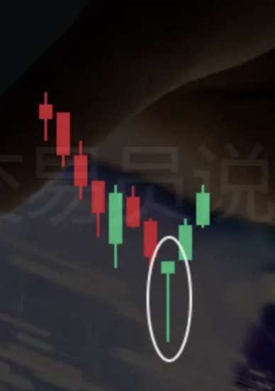
Hammer candlestick pattern indicates that a bearish trend may be ending and a bullish trend may be about to begin.
The opening and closing prices are very close, and it looks like a hammer because there is a long shadow below the candlestick.
For the hammer pattern to be considered valid, the shadow must be at least twice as long as the body. If there is a shadow above, it must be very short.
The hammer candlestick is a bullish pattern, but it does not mean that the trend will reverse immediately; you need to wait for further confirmation of trend signals.
◍ Inverted Hammer

The inverted hammer pattern is completely opposite to the hammer pattern.
The inverted hammer pattern is a variant of the traditional hammer pattern. Essentially, it is an upside-down hammer line, meaning that in the inverted hammer candlestick, the relatively long shadow is above the candlestick body and usually at least two-thirds the length of the entire candlestick structure.
In the inverted hammer pattern, the lower shadow is very short or almost nonexistent, named because it resembles an 'upside-down' hammer.
◍ Hanging Man
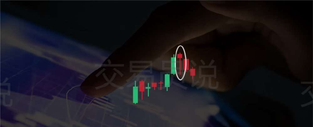
The hanging man has a long lower shadow, no upper shadow (or a very short one), and a small body located at the upper end of the trading range. The hanging man is similar to the hammer.
The difference is that it appears in an uptrend, generally indicating that the uptrend is about to end.
The shadows of the hanging man candlestick pattern are also usually twice as long as the body.
◍ Spinning Top
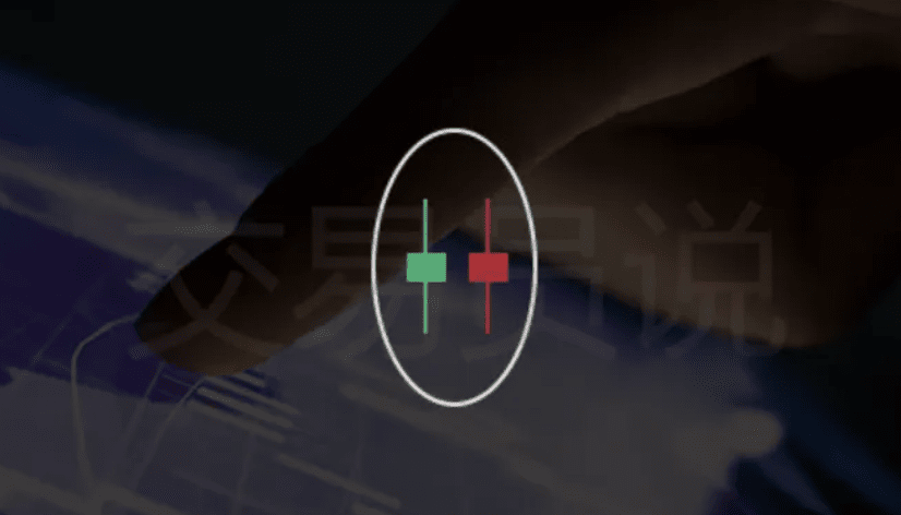
The spinning top pattern may indicate that the price direction is unclear. It is characterized by long upper and lower shadows and a short body.
This indicates that the forces between buyers and sellers are evenly matched, with neither side having an advantage in the market and neither controlling the market.
If a spinning top forms in an uptrend, it means that buyer strength is weak, and the price trend may reverse from up to down.
Conversely, if formed in a downtrend, it means that seller strength is weak, and the price trend may reverse from down to up.
◍ White Marubozu
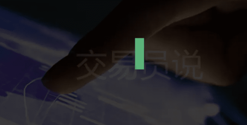
In fact, the white marubozu is a type of bullish candlestick; it is a very simple candlestick pattern with a long body and bullish candlestick.
This essentially means that the opening price is the lowest price, and the closing price is the highest price.
◍ Black Marubozu
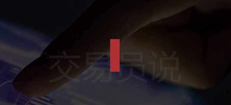
The black marubozu is exactly the opposite of the white marubozu; it is a bearish candlestick pattern. This candlestick pattern means that the opening price is the highest price, and the closing price is the lowest price.
◍ Doji
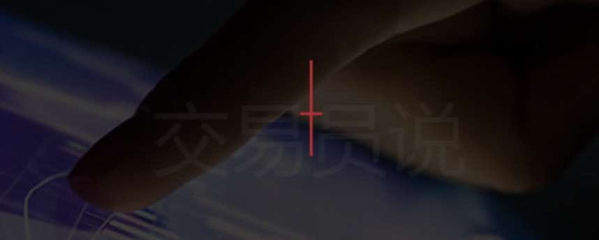
The doji candlestick pattern has many different variants, such as the classic doji, dragonfly doji, gravestone doji, and more.
The characteristic of the doji is that the opening and closing prices are very close or almost the same, and both the upper and lower shadows are very short and of approximately equal length.
The difference between these dojis lies in the length of the upper shadow.
◍ Dragonfly
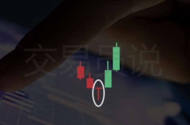
As mentioned above, the doji pattern has many variants, and the dragonfly doji is one of them.
The opening and closing prices of the dragonfly doji are close to the high point, with a very long lower shadow and almost no upper shadow. This indicates increased buying pressure, pushing the market to change to a higher price.
◍ Gravestone
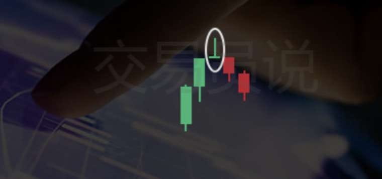
The gravestone doji is very similar to the shooting star; it is characterized by a long upper shadow and very little or no lower shadow.
It is the opposite of the dragonfly doji, indicating that there is significant selling pressure above, making it difficult for prices to rise further, signaling that the price trend may reverse downwards.
◍ Shooting Star
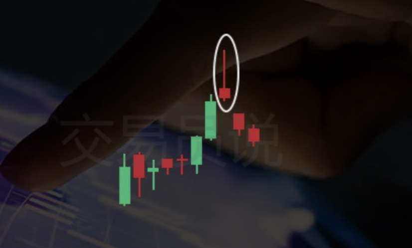
The shooting star has no lower shadow and has a long upper shadow, generally 2-3 times the length of the body. Only candlestick patterns formed in an uptrend are considered shooting star patterns.
The shooting star pattern has the same shape as the inverted hammer, but the position is different.
The inverted hammer generally appears at the bottom of a downtrend, while the shooting star appears at the top of an uptrend.
The appearance of the shooting star pattern generally means that at the market opening, buyers control the market, and prices rise.
But over time, selling pressure increases and pushes the price down, with the closing price below the opening price.
[Check the comments section]