Binance Square
Crypto4light
5.3k Posts

Crypto4light

Square Verified+
Find everywhere - @Crypto4light 🔥 | Daily trading ideas | My custom indicators analysis | Educational content | Crypto News |
Level 1 Creator
Level 1 Creator
Open Trade
High-Frequency Trader
5.7 Years
0 Following
67.4K+ Followers
39.1K+ Liked
1 Badges
Posts
Portfolio
PINNED
·
--
Article
The best indicators set for tradingCrypto4light Indicators Set I spent a lot of time with backtesting and coding to create this set. 6 indicators which can cut all noise on your charts and bring more light in your trading strategy.🐳 Trade ON indicator ➡️ Buy/Sell The signal appears when you can open a position for buying or selling. Stop Loss can be set according to your risk management. Entry into the position can be at the appearance of the Buy/Sell signal and the closing of the candle. Stop Loss by the body or wick of this candle. Another entry option is to wait for the closing of 40-50% of the body of the candle on which you saw the Buy/Sell signal. Stop Loss by the body or wick of the candle on which you saw the Buy/Sell signal. On example you can see 35% profit on spot, 4H timeframe trade. Sometimes you can see signal just blinking, so wait until signal confirmed or try go to lower timeframe to see confirmation for entry by your risk management and strategy. ➡️ Red or Green triangles Once a Buy/Sell signal appears and you enter a position, you have several options. It all depends on your trading style and risk management. The first option - If, for example, you entered on the Buy signal, you can close the purchase at the appearance of the Take Profit signal, or at the appearance of the Sell signal, and open a position in another direction.The second option, after opening a position when triangles appear, this is a signal to close a certain percentage of the position in the plus. With each new triangle, you can close % of your position and move the Stop Loss to breakeven.The third option, after opening a position at the appearance of triangles, closing a full position and looking for a possible option to open a position in the other direction, closing the position after the triangles should take place at the appearance of the main Buy/Sell signal. ➡️ Take Profit ➡️ Two identical signals in a row 🐳 Direction indicator Circles will appear from above or below. The circles will signal that the main market makers are starting to reduce or gain their position. Big players always need liquidity, so they can build or reduce a position for quite a long time. Round dots are not the main signal for tradingA red or green triangle signals a final change in the local or global trend, depending on your timeframe. Market Makers or players with large positions have exited the market, or conversely gained enough position to change the direction of price movement.The green and red solid lines are the levels where the trend is most likely to end The green and red dashed lines are the levels where the big players are more likely to start gradually selling off or gaining a position to change the trend before the momentum. In the style settings, you can change the input positions of each of the lines, for yourself or for a specific asset. But the settings are already set in the most optimal way. 🐳 ADZ (Accumulation/Distribution Zones) The red solid zone shows the zone where the big players will complete the sale of their position.The solid green area shows where the big players will accumulate their positions.The middle blue zone shows where medium and small players start to accumulate or sell off their positions.The yellow zone inside the blue zone shows a trend change and this means that most likely the big players have already gained a position to start selling or gaining it depending on the timeframe in which you are trading. 🐳 Take Profit indicator The first lower "Buy" line, when the price drops to this line is a good point to enter a position or gradually build a position.The bottom green line "Fundamental price" is the real value of the asset. Sometimes when the media background about the asset is negative and buyers are not interested in the asset, the price can fall below its fundamental price. Then this is the best time to buy the asset.The first upper Take Profit line is a line where you can lock part of the profit or close the entire position. There is a possibility of opening a short position if you trade on the futures market The very top Exit line is the line where you need to close 100% of the trade position. If you are an investor, you do not need to close the entire position and exit the asset, because all lines are dynamic and change depending on the cycle in which the asset is located. 🐳 Market Mood Indicator On different timeframes, you can view the mood that is currently present in the market. Trend, euphoria, position selection, or lack of interest. Red and orange color - fear and overbought in the market  Green - Accumulation and purchases on the market  Yellow - Gradual set of position  White - purchases and lack of interest from small investors  Blue - Neutral mood in the market I rename color zones so you can turn on alerts and easier understand notifications. Some colors got 2 alerts because of gradation based on input data, so you can choose any. You should understand on downtrend for example orange zone can be still be a belief sentiment because traders belief price will not drop. Dark red - Euphoria Light red - Thrill Orange (light and dark) - Belief / Strong Belief Yellow - Optimism Green - Hope Light blue - Disbelief Dark blue - Capitulation White - Depression 🐳 Money Power Indicator When the asset reaches one of the zones, it can serve as a good signal to close a part of the position or to start a gradual acquisition of the position according to your trading timeframe. An almost ideal signal for deciding whether to enter or exit a position would be a divergence on the price chart and the curve on the Money Power indicator. If you are in a long position, for example, and you see that the price on the chart continues to rise, but in the overbought zone, the lines of the Money Power indicator show lower highs, this is a signal that a large player has almost completely sold out his position on this timeframe. Of course, the price may continue to grow for some time depending on the timeframe, but such indicators usually indicate the outflow of money from large investors and small players will not be able to keep the asset from falling for a long time. Everything is the same but in a different direction in the oversold zone. When a big player gradually gains a position and we see that the money flow curve goes up, and the price on the chart and candles show lower minimums. This will be a great signal to enter a position. You can enter or close a position by analyzing older timeframes W, 3D 1D depending on your trading style. In new version you also can find a new signals (explanation with default colors, but you can modify it to your theme) Yellow block - Whales sell or close % of position Yellow block with arrow down - Whales strong sell Blue block - Whales buy Blue block with arrow up - Whales strong buy Triangle down - Bearish RSI divergency Triangle Up - Bullish RSI divergency Red Circle - Bearish MACD divergency Green Circle - Bullish MACD divergency I am not a financial advisor. All indicators created with my own personal experience. Do NOT trade or invest based only on indicators. Always do your own research and due diligence before investing. All indicators can be used on different timeframes. The higher timeframe, the stronger signal. Your entry or exit point should be base on several indicators from the set, your trading strategy and your risk management. Indicators cannot predict or analyze future events in the world, the release of data in economic reports, statements in the media by public figures, so always follow your risk management when you open trades. ☑️ Always follow risk management and this set of indicators will help you. I wish you successful trading. #trading #crypto

The best indicators set for trading

Crypto4light Indicators Set
I spent a lot of time with backtesting and coding to create this set. 6 indicators which can cut all noise on your charts and bring more light in your trading strategy.🐳 Trade ON indicator
➡️ Buy/Sell The signal appears when you can open a position for buying or selling. Stop Loss can be set according to your risk management. Entry into the position can be at the appearance of the Buy/Sell signal and the closing of the candle. Stop Loss by the body or wick of this candle. Another entry option is to wait for the closing of 40-50% of the body of the candle on which you saw the Buy/Sell signal. Stop Loss by the body or wick of the candle on which you saw the Buy/Sell signal. On example you can see 35% profit on spot, 4H timeframe trade. Sometimes you can see signal just blinking, so wait until signal confirmed or try go to lower timeframe to see confirmation for entry by your risk management and strategy.
➡️ Red or Green triangles
Once a Buy/Sell signal appears and you enter a position, you have several options. It all depends on your trading style and risk management.
The first option - If, for example, you entered on the Buy signal, you can close the purchase at the appearance of the Take Profit signal, or at the appearance of the Sell signal, and open a position in another direction.The second option, after opening a position when triangles appear, this is a signal to close a certain percentage of the position in the plus. With each new triangle, you can close % of your position and move the Stop Loss to breakeven.The third option, after opening a position at the appearance of triangles, closing a full position and looking for a possible option to open a position in the other direction, closing the position after the triangles should take place at the appearance of the main Buy/Sell signal.
➡️ Take Profit
➡️ Two identical signals in a row
🐳 Direction indicator
Circles will appear from above or below. The circles will signal that the main market makers are starting to reduce or gain their position. Big players always need liquidity, so they can build or reduce a position for quite a long time. Round dots are not the main signal for tradingA red or green triangle signals a final change in the local or global trend, depending on your timeframe. Market Makers or players with large positions have exited the market, or conversely gained enough position to change the direction of price movement.The green and red solid lines are the levels where the trend is most likely to end
The green and red dashed lines are the levels where the big players are more likely to start gradually selling off or gaining a position to change the trend before the momentum. In the style settings, you can change the input positions of each of the lines, for yourself or for a specific asset. But the settings are already set in the most optimal way.
🐳 ADZ (Accumulation/Distribution Zones)
The red solid zone shows the zone where the big players will complete the sale of their position.The solid green area shows where the big players will accumulate their positions.The middle blue zone shows where medium and small players start to accumulate or sell off their positions.The yellow zone inside the blue zone shows a trend change and this means that most likely the big players have already gained a position to start selling or gaining it depending on the timeframe in which you are trading.
🐳 Take Profit indicator
The first lower "Buy" line, when the price drops to this line is a good point to enter a position or gradually build a position.The bottom green line "Fundamental price" is the real value of the asset. Sometimes when the media background about the asset is negative and buyers are not interested in the asset, the price can fall below its fundamental price. Then this is the best time to buy the asset.The first upper Take Profit line is a line where you can lock part of the profit or close the entire position. There is a possibility of opening a short position if you trade on the futures market
The very top Exit line is the line where you need to close 100% of the trade position. If you are an investor, you do not need to close the entire position and exit the asset, because all lines are dynamic and change depending on the cycle in which the asset is located.
🐳 Market Mood Indicator
On different timeframes, you can view the mood that is currently present in the market. Trend, euphoria, position selection, or lack of interest.
Red and orange color - fear and overbought in the market
Green - Accumulation and purchases on the market
Yellow - Gradual set of position
White - purchases and lack of interest from small investors
Blue - Neutral mood in the market
I rename color zones so you can turn on alerts and easier understand notifications. Some colors got 2 alerts because of gradation based on input data, so you can choose any. You should understand on downtrend for example orange zone can be still be a belief sentiment because traders belief price will not drop.
Dark red - Euphoria
Light red - Thrill
Orange (light and dark) - Belief / Strong Belief
Yellow - Optimism
Green - Hope
Light blue - Disbelief
Dark blue - Capitulation
White - Depression
🐳 Money Power Indicator
When the asset reaches one of the zones, it can serve as a good signal to close a part of the position or to start a gradual acquisition of the position according to your trading timeframe.
An almost ideal signal for deciding whether to enter or exit a position would be a divergence on the price chart and the curve on the Money Power indicator. If you are in a long position, for example, and you see that the price on the chart continues to rise, but in the overbought zone, the lines of the Money Power indicator show lower highs, this is a signal that a large player has almost completely sold out his position on this timeframe.
Of course, the price may continue to grow for some time depending on the timeframe, but such indicators usually indicate the outflow of money from large investors and small players will not be able to keep the asset from falling for a long time. Everything is the same but in a different direction in the oversold zone. When a big player gradually gains a position and we see that the money flow curve goes up, and the price on the chart and candles show lower minimums. This will be a great signal to enter a position. You can enter or close a position by analyzing older timeframes W, 3D 1D depending on your trading style.
In new version you also can find a new signals (explanation with default colors, but you can modify it to your theme)
Yellow block - Whales sell or close % of position
Yellow block with arrow down - Whales strong sell
Blue block - Whales buy
Blue block with arrow up - Whales strong buy
Triangle down - Bearish RSI divergency
Triangle Up - Bullish RSI divergency
Red Circle - Bearish MACD divergency
Green Circle - Bullish MACD divergency
I am not a financial advisor. All indicators created with my own personal experience. Do NOT trade or invest based only on indicators. Always do your own research and due diligence before investing.
All indicators can be used on different timeframes. The higher timeframe, the stronger signal. Your entry or exit point should be base on several indicators from the set, your trading strategy and your risk management. Indicators cannot predict or analyze future events in the world, the release of data in economic reports, statements in the media by public figures, so always follow your risk management when you open trades.
☑️ Always follow risk management and this set of indicators will help you. I wish you successful trading.
#trading #crypto
$SUI Price Analysis: Why You Should Ignore the Media
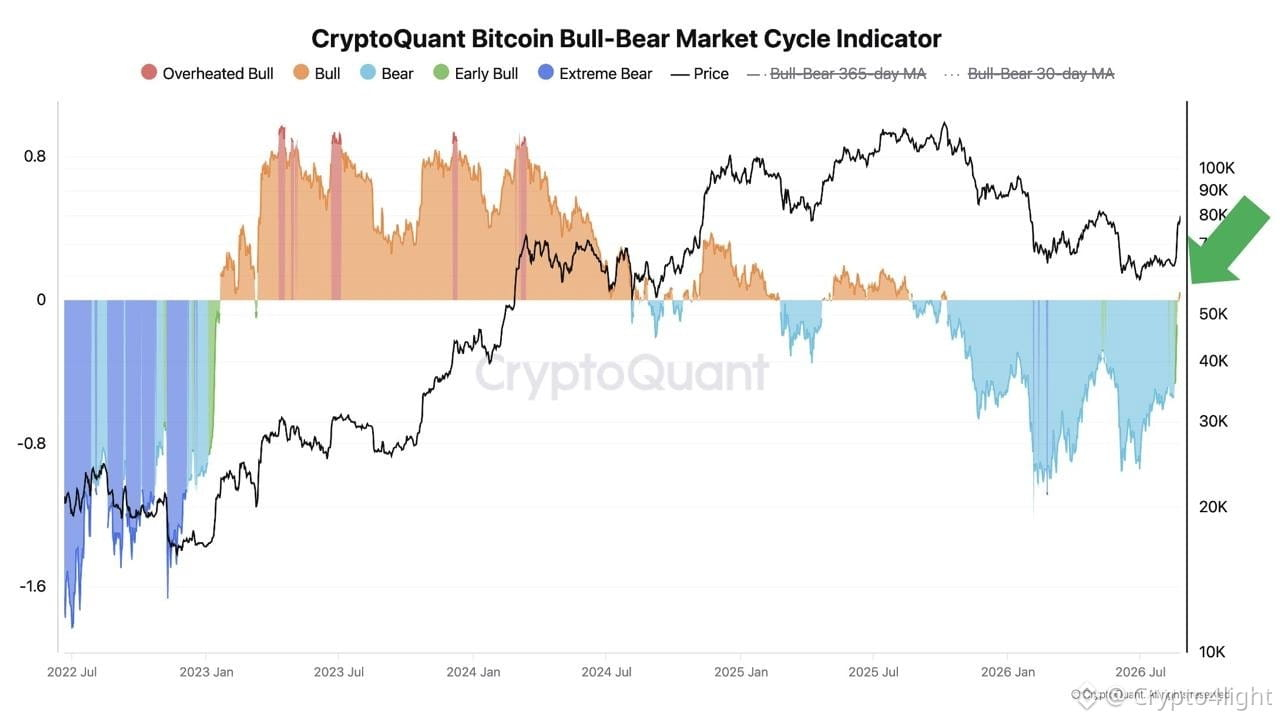
Ki-Young Ju: The Bitcoin bear market cycle is over. 🤦‍♂️ Only at 80k.... The CEO of CryptoQuant stated that the $BTC Bull-Bear market cycle indicator has exited the bear zone and is signaling the beginning of an early bullish phase. According to the analyst, this same indicator registered a similar transition in January 2023, after the end of the previous bear market. CryptoQuant's model analyzes on-chain data and compares current network activity with historical market phases. Honestly, I wouldn’t be surprised if we correct in September and this “super indicator” suddenly starts showing something completely different. Then they’ll switch back into their bearish shoes and say: “It was all just a fakeout!”
Ki-Young Ju: The Bitcoin bear market cycle is over. 🤦‍♂️ Only at 80k....

The CEO of CryptoQuant stated that the $BTC Bull-Bear market cycle indicator has exited the bear zone and is signaling the beginning of an early bullish phase.

According to the analyst, this same indicator registered a similar transition in January 2023, after the end of the previous bear market.

CryptoQuant's model analyzes on-chain data and compares current network activity with historical market phases.

Honestly, I wouldn’t be surprised if we correct in September and this “super indicator” suddenly starts showing something completely different.
Then they’ll switch back into their bearish shoes and say:
“It was all just a fakeout!”
Do you believe in 4y $BTC cycle?
Yes
No
6 hr(s) left
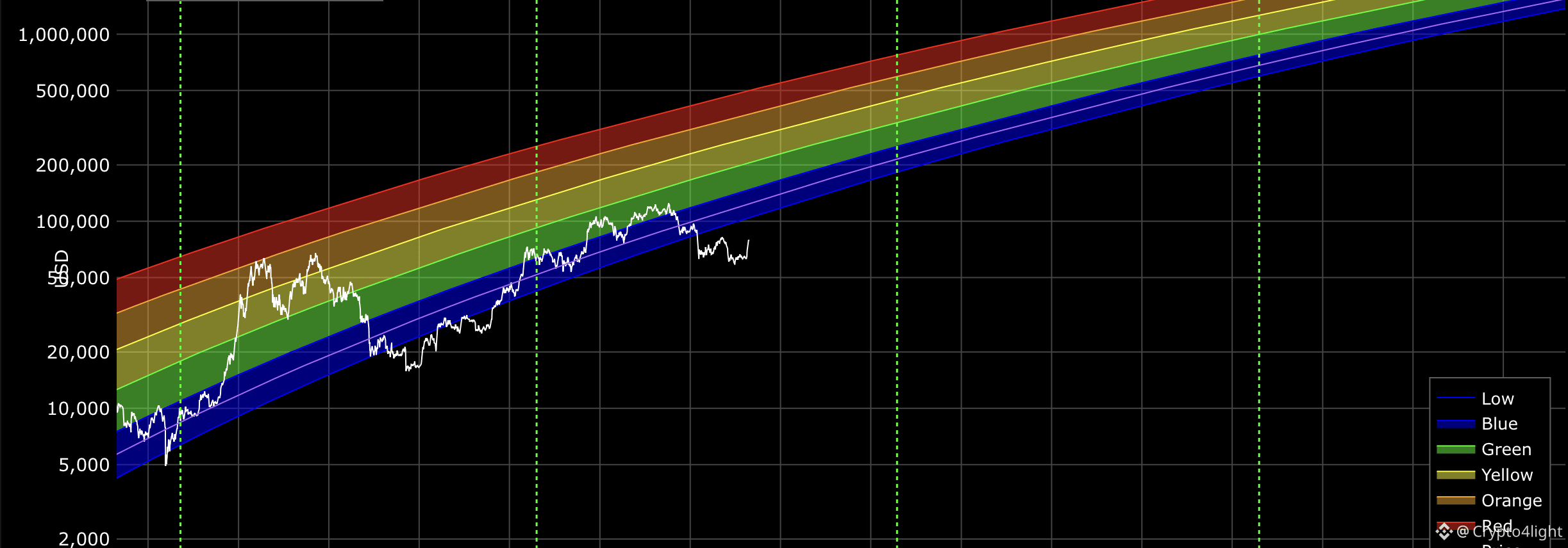
Can somebody explaine me whats a point of Rainbow chart if we always out of rainbow? So if last line doesnt work why other lines should be correct? And problem is Rainbow chart so popular back in 2020-2021. Thousands people believe in this 💩 $BTC {future}(BTCUSDT)
Can somebody explaine me whats a point of Rainbow chart if we always out of rainbow? So if last line doesnt work why other lines should be correct? And problem is Rainbow chart so popular back in 2020-2021. Thousands people believe in this 💩
$BTC
·
--
Bullish
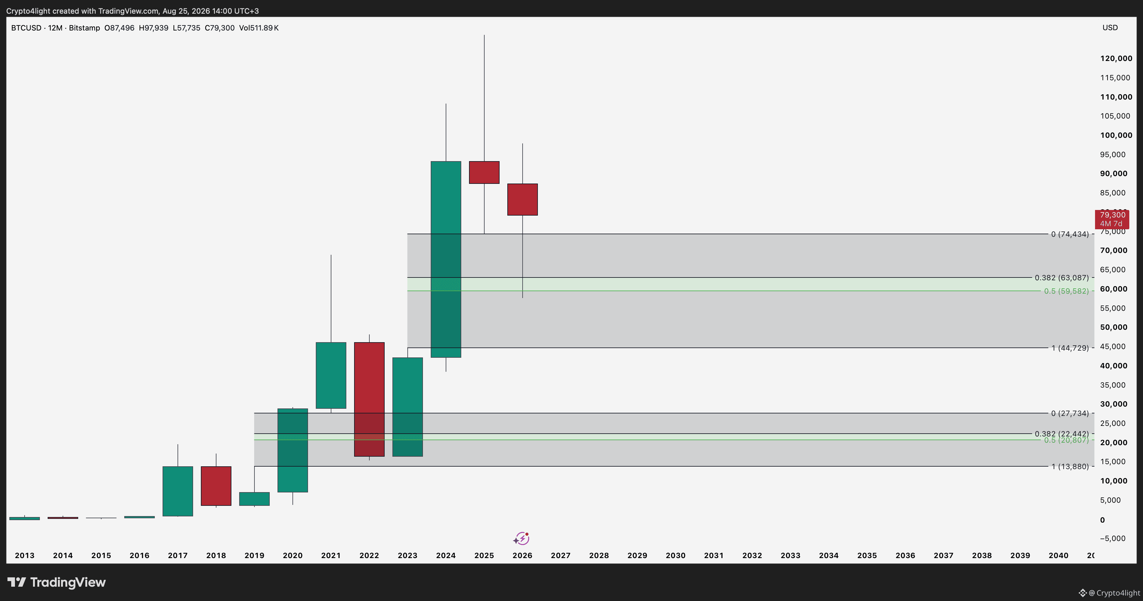
On the Bitcoin yearly chart since 2019, we have dipped slightly below the 0.5 level twice in order to fill the FVG. $BTC {future}(BTCUSDT)
On the Bitcoin yearly chart since 2019, we have dipped slightly below the 0.5 level twice in order to fill the FVG. $BTC
·
--
Bearish
$SUI  💧 Every time, the crypto community reacts to this kind of news with either extreme euphoria or extreme negativity! But this is simply part of marketing and partnerships that actually provide no real benefit or information about price movement! January 2025 and August 2026. $SUI {future}(SUIUSDT)
$SUI 💧 Every time, the crypto community reacts to this kind of news with either extreme euphoria or extreme negativity!
But this is simply part of marketing and partnerships that actually provide no real benefit or information about price movement!
January 2025 and August 2026. $SUI

{future}(BTCUSDT) Strive acquired 1110 BTC for $81.5 million. The average purchase price during the period from August 17th to 21st was $73,409 per BTC. Following the transaction, the company's BTC reserves increased by approximately 5.5% – from 20,246 to 21,356 BTC. According to Bitcoin Treasuries, Strive remains the seventh-largest publicly traded company in terms of BTC holdings. $BTC

Strive acquired 1110 BTC for $81.5 million.

The average purchase price during the period from August 17th to 21st was $73,409 per BTC. Following the transaction, the company's BTC reserves increased by approximately 5.5% – from 20,246 to 21,356 BTC.

According to Bitcoin Treasuries, Strive remains the seventh-largest publicly traded company in terms of BTC holdings. $BTC
·
--
Bullish
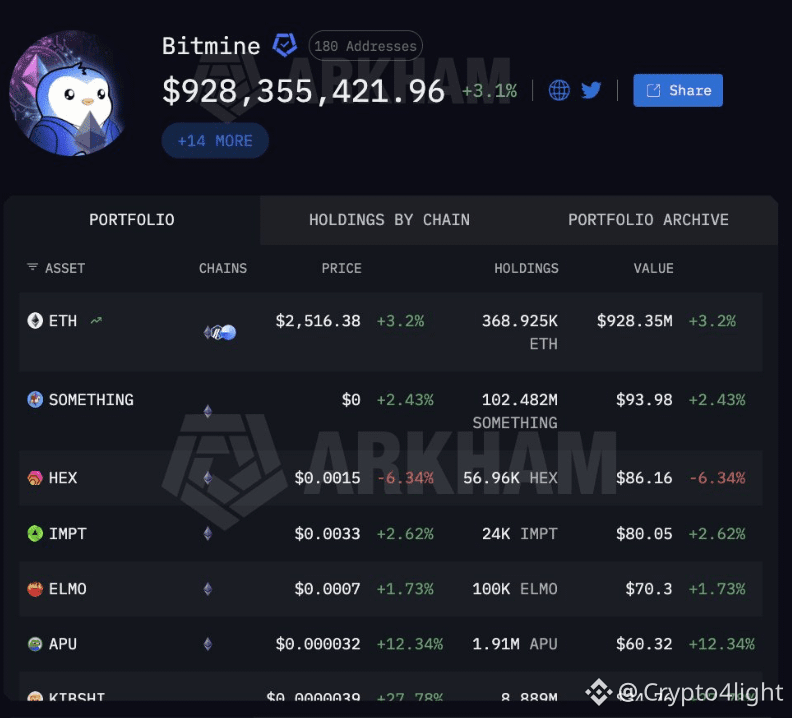
Tom Lee is buying $ETH {future}(ETHUSDT) Bitmine acquired ETH worth $79.2 million in the past week – the largest weekly purchase by the company in over a month and a half. #ETH
Tom Lee is buying $ETH

Bitmine acquired ETH worth $79.2 million in the past week – the largest weekly purchase by the company in over a month and a half.
#ETH
Current $BTC situation now =)
·
--
Bullish
Jeffrey Kendrick (head of digital asset research at Standard Chartered) predicts that the price of BTC will reach $500,000 by 2030. $BTC #BTC {future}(BTCUSDT)
Jeffrey Kendrick (head of digital asset research at Standard Chartered) predicts that the price of BTC will reach $500,000 by 2030. $BTC #BTC
·
--
Bullish
Strategy has increased its dollar reserve by 1.59 billion, bringing it to $5.1 billion. Additionally, STRC worth $136 million was purchased. As of August 26, 2023, Strategy owns approximately 4% of the total $BTC volume {future}(BTCUSDT)
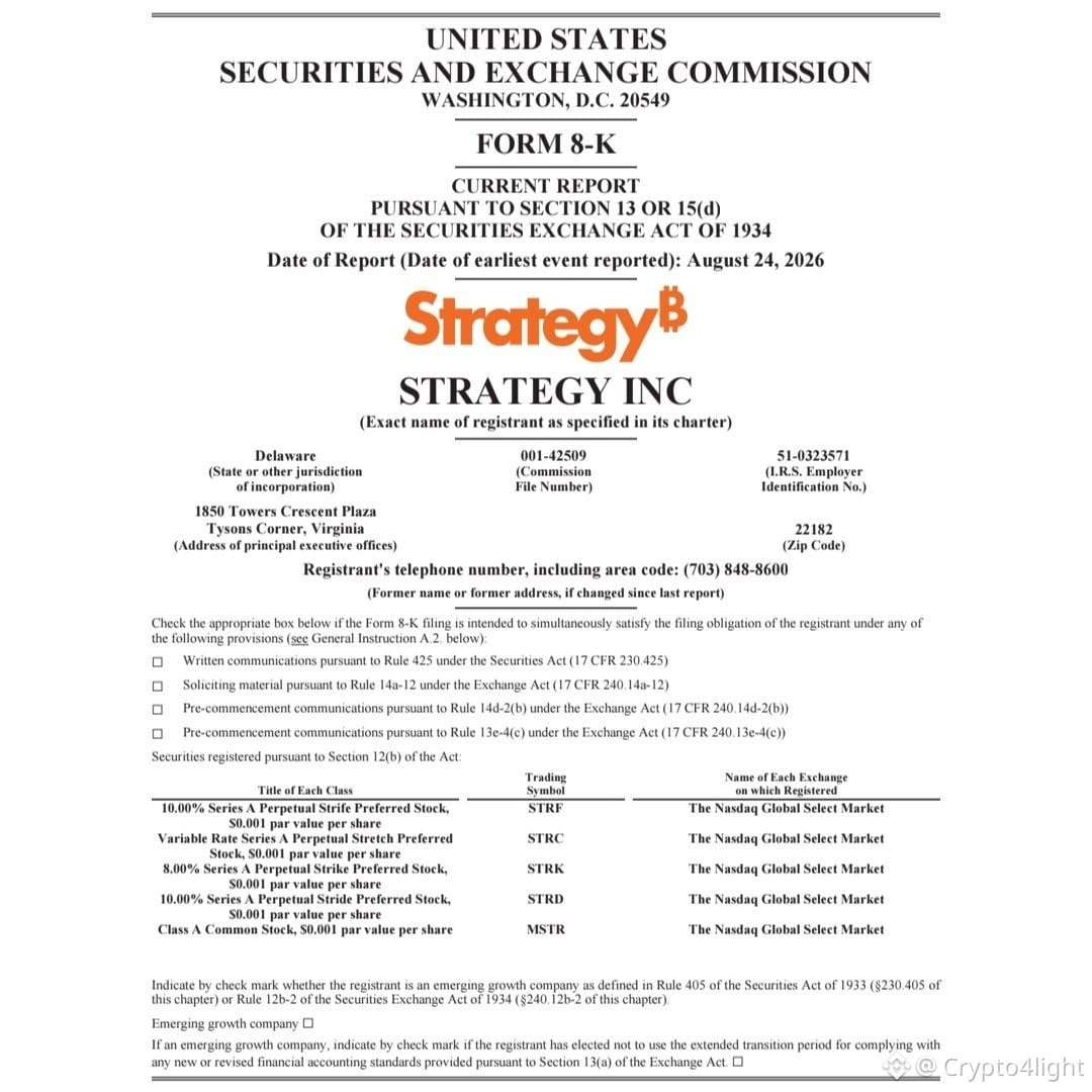
Strategy has increased its dollar reserve by 1.59 billion, bringing it to $5.1 billion.

Additionally, STRC worth $136 million was purchased.

As of August 26, 2023, Strategy owns approximately 4% of the total $BTC volume
🚨 Arthur Hayes: Fed Currency Swaps Could Become a Hidden Money Printer Arthur Hayes believes the US and Japan could use an unlimited USD/JPY swap line to support the Japanese yen without forcing Japan to raise rates or dump its US Treasury holdings. In Hayes’ view, the result could look similar to yield-curve control: the Fed creates additional dollars, Treasury yields come under pressure, and global liquidity expands. That could be bullish for stocks and crypto, as a growing supply of dollars and yen chases scarce assets. Under this scenario, Hayes believes Bitcoin could potentially reach $1M+. 👀 The key indicators to watch: • USD/JPY • The size of Fed dollar swap lines • Any sudden expansion of swap activity A major increase in dollar swaps could signal that this liquidity mechanism is being activated. ⚠️ The biggest risk: excessive dollar debasement could eventually undermine the US dollar’s role as the world’s reserve currency. $BTC {future}(BTCUSDT)
🚨 Arthur Hayes: Fed Currency Swaps Could Become a Hidden Money Printer
Arthur Hayes believes the US and Japan could use an unlimited USD/JPY swap line to support the Japanese yen without forcing Japan to raise rates or dump its US Treasury holdings.
In Hayes’ view, the result could look similar to yield-curve control: the Fed creates additional dollars, Treasury yields come under pressure, and global liquidity expands.
That could be bullish for stocks and crypto, as a growing supply of dollars and yen chases scarce assets.
Under this scenario, Hayes believes Bitcoin could potentially reach $1M+.
👀 The key indicators to watch:
• USD/JPY
• The size of Fed dollar swap lines
• Any sudden expansion of swap activity
A major increase in dollar swaps could signal that this liquidity mechanism is being activated.
⚠️ The biggest risk: excessive dollar debasement could eventually undermine the US dollar’s role as the world’s reserve currency.
$BTC
Is the bottom in? 🟢
38%
Will we see lower prices? 🔴
62%
32 votes • Voting closed
·
--
Bearish
Morpho took the liquidity level exactly one year and one day later) All levels based on the iAP model remain valid! $MORPHO {future}(MORPHOUSDT)
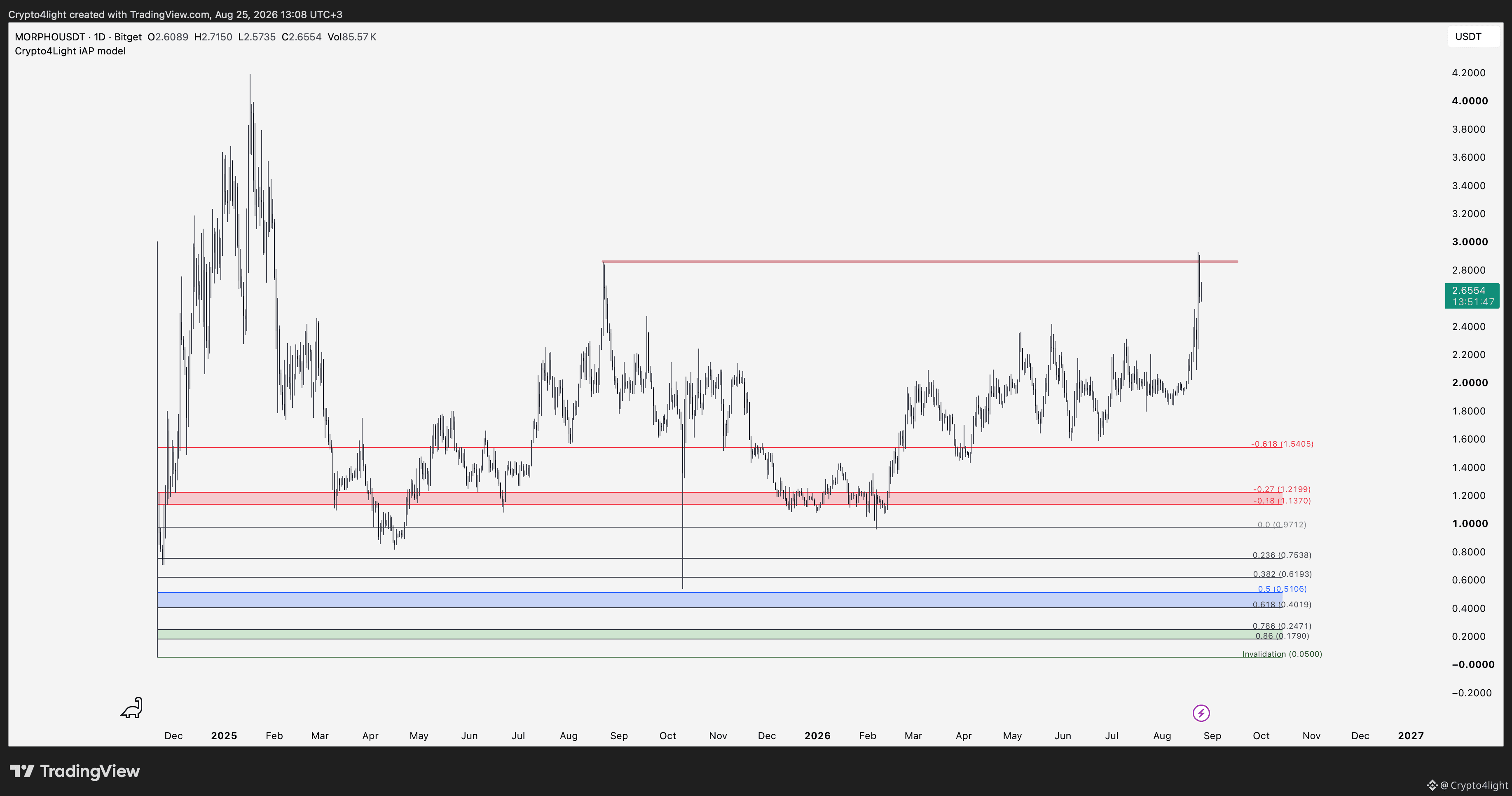
Morpho took the liquidity level exactly one year and one day later)
All levels based on the iAP model remain valid! $MORPHO
·
--
Bearish
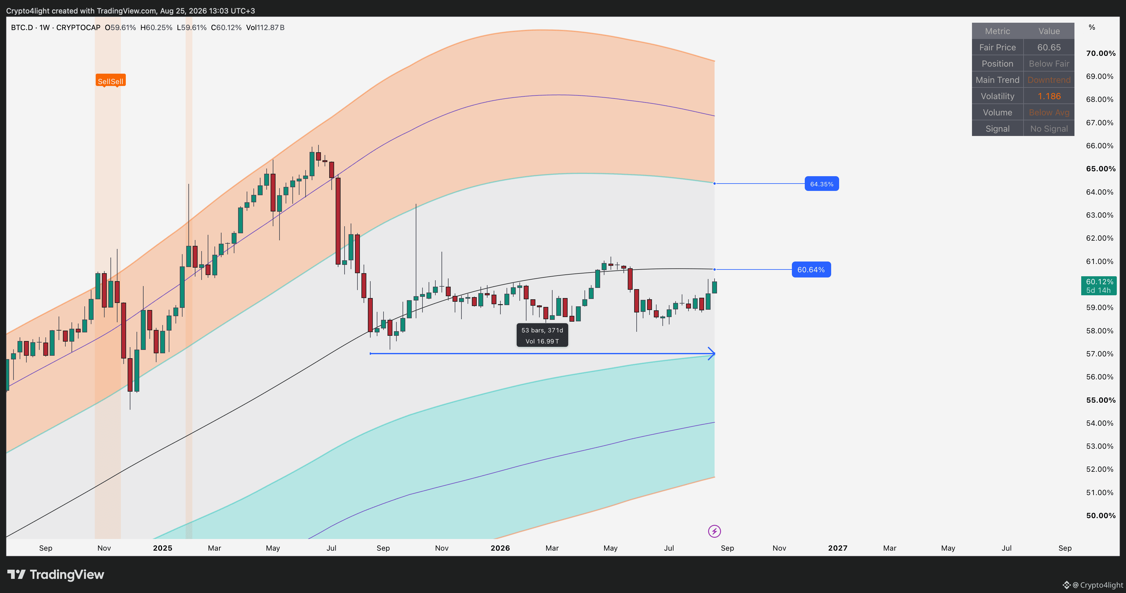
For 371 days, we have been watching Bitcoin Dominance moving in a range! Key levels on the weekly chart: Fair Price Line / Inner Resistance. Maybe someday we will see the marked zone where we will need to sell our “super technological” altcoins with “insane” profits, but that’s definitely not guaranteed 🙊 $BTC {future}(BTCUSDT) #bitcoin
For 371 days, we have been watching Bitcoin Dominance moving in a range!
Key levels on the weekly chart: Fair Price Line / Inner Resistance.
Maybe someday we will see the marked zone where we will need to sell our “super technological” altcoins with “insane” profits, but that’s definitely not guaranteed 🙊 $BTC
#bitcoin
·
--
Bearish
Coldcard Wallet Hack: Over $114M in $BTC Stolen {future}(BTCUSDT) The median loss per affected Bitcoin address was around 0.0152 BTC (~$1,200) following the Coldcard cold wallet breaches. In total, attackers stole approximately 1,789 BTC, worth more than $114 million at the time of the analysis. Interestingly, the value of the stolen BTC has since increased by roughly $24 million. 📊 Data from Alex Thorn, Galaxy Research. Cold storage clearly isn’t synonymous with zero risk — security ultimately comes down to the entire setup, not just the hardware wallet.🙈 #BTC
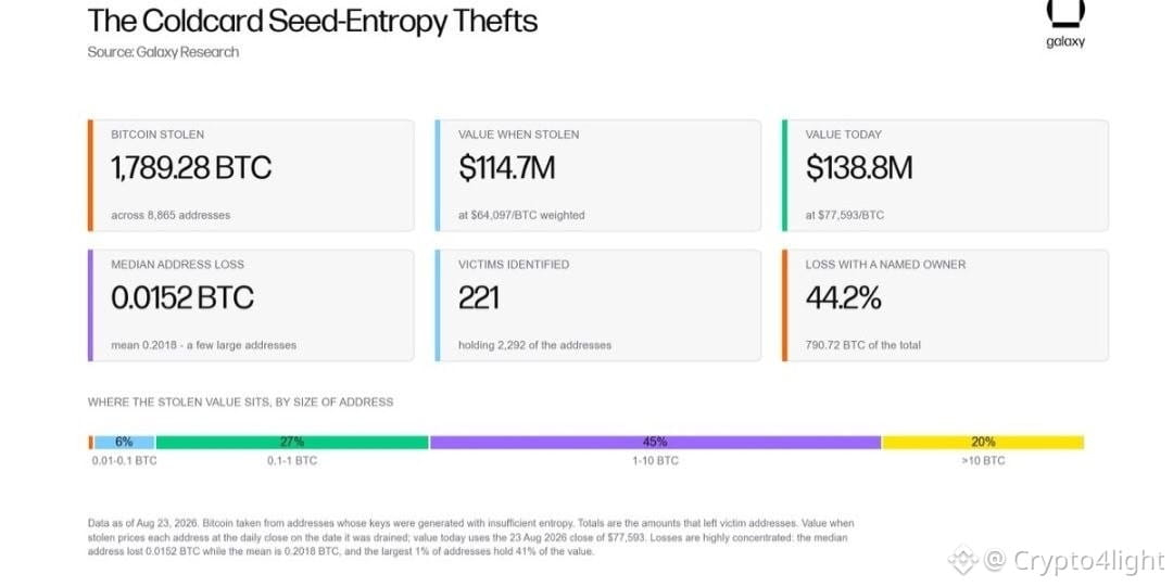
Coldcard Wallet Hack: Over $114M in $BTC Stolen
The median loss per affected Bitcoin address was around 0.0152 BTC (~$1,200) following the Coldcard cold wallet breaches.
In total, attackers stole approximately 1,789 BTC, worth more than $114 million at the time of the analysis.
Interestingly, the value of the stolen BTC has since increased by roughly $24 million.
📊 Data from Alex Thorn, Galaxy Research.
Cold storage clearly isn’t synonymous with zero risk — security ultimately comes down to the entire setup, not just the hardware wallet.🙈 #BTC
·
--
Bearish
Verified
China Warns the US Over Iran Sanctions China has warned Washington that it is prepared to take “all necessary measures” to defend its interests if the US significantly expands sanctions targeting Chinese companies doing business with Iran. The warning comes after the US threatened secondary sanctions against countries that continue trading with Tehran. China is at the center of the pressure, accounting for roughly 90% of Iran’s oil exports. 🔥 Another potential escalation between the world’s two biggest powers — and markets will be watching closely. How do you think $BTC will react on this? {future}(BTCUSDT)
China Warns the US Over Iran Sanctions
China has warned Washington that it is prepared to take “all necessary measures” to defend its interests if the US significantly expands sanctions targeting Chinese companies doing business with Iran.
The warning comes after the US threatened secondary sanctions against countries that continue trading with Tehran.
China is at the center of the pressure, accounting for roughly 90% of Iran’s oil exports.
🔥 Another potential escalation between the world’s two biggest powers — and markets will be watching closely. How do you think $BTC will react on this?
·
--
Bullish
🚨 NYT: What If We Just Forgave America’s $40T Debt? 😂 Journalist Paul Vigna suggests revisiting the ancient Sumerian concept of amargi — essentially a debt reset used to restart the economic system. His point isn’t literally to erase $40T, but to remind us that money and debt are human-made rules — and rules can be changed. The only tiny problem? Someone actually owns that $40T. “Thanks for lending us $40T. Now forget it ever happened.” Sounds like some kind of massive global memecoin scam. 😂 #UnitedStates $BTC {future}(BTCUSDT)

🚨 NYT: What If We Just Forgave America’s $40T Debt? 😂
Journalist Paul Vigna suggests revisiting the ancient Sumerian concept of amargi — essentially a debt reset used to restart the economic system.
His point isn’t literally to erase $40T, but to remind us that money and debt are human-made rules — and rules can be changed.
The only tiny problem?

Someone actually owns that $40T.
“Thanks for lending us $40T. Now forget it ever happened.”

Sounds like some kind of massive global memecoin scam. 😂
#UnitedStates $BTC
Log in to explore more content
Join global crypto users on Binance Square
⚡️ Get latest and useful information about crypto.
💬 Trusted by the world’s largest crypto exchange.
👍 Discover real insights from verified creators.
Email / Phone number
Sitemap
Cookie Preferences
Platform T&Cs