The loudest chart isn't always the most interesting one. 👀
Sometimes the better signal is hidden inside the numbers nobody is talking about.
🦊 $MOG — gaining attention with meaningful trading activity rather than just a tiny liquidity spike.
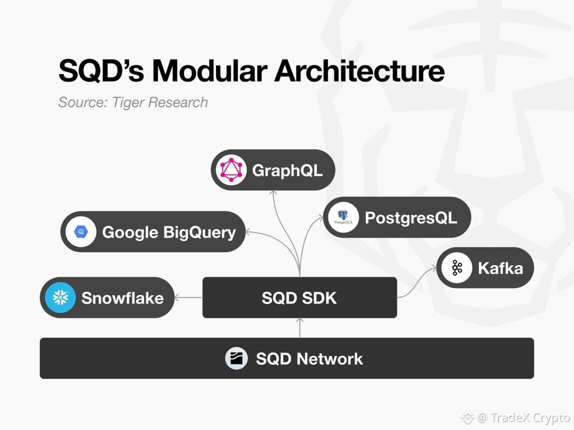
⚙️ $SQD — another move worth tracking, with volume giving the recent price action more credibility.
🌲 $FOREST — much smaller liquidity makes this one extremely volatile, but that also means volume changes can become noticeable very quickly.
🧩 $XPIN — showing stronger turnover than some of the other small-cap movers, making its liquidity profile worth monitoring.
🔎 $COLLECT — after a huge historical retracement and long consolidation, renewed activity could make the structure interesting if real spot demand appears.
The important part?
A green percentage alone means almost nothing.
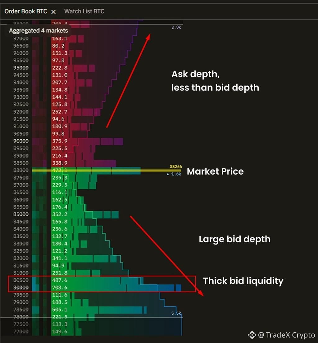
Price + volume + liquidity + order-book depth tell a much better story. 📊
Some of these moves could continue.
Some could disappear just as quickly.
That's exactly why the opportunity isn't simply:
“Which token is pumping?”
The better question is:
WHERE IS THE NEW LIQUIDITY ACTUALLY STAYING? 👀🔥
Which one deserves a deeper look?
👇 Drop the ticker.
DYOR. Not financial advice.
#Crypto #Binance #TokenOpportunity #BinanceAlpha #CryptoTrading #Web3 #BinanceSquare
Sometimes the better signal is hidden inside the numbers nobody is talking about.
🦊 $MOG — gaining attention with meaningful trading activity rather than just a tiny liquidity spike.
⚙️ $SQD — another move worth tracking, with volume giving the recent price action more credibility.
🌲 $FOREST — much smaller liquidity makes this one extremely volatile, but that also means volume changes can become noticeable very quickly.
🧩 $XPIN — showing stronger turnover than some of the other small-cap movers, making its liquidity profile worth monitoring.
🔎 $COLLECT — after a huge historical retracement and long consolidation, renewed activity could make the structure interesting if real spot demand appears.
The important part?
A green percentage alone means almost nothing.
Price + volume + liquidity + order-book depth tell a much better story. 📊
Some of these moves could continue.
Some could disappear just as quickly.
That's exactly why the opportunity isn't simply:
“Which token is pumping?”
The better question is:
WHERE IS THE NEW LIQUIDITY ACTUALLY STAYING? 👀🔥
Which one deserves a deeper look?
👇 Drop the ticker.
DYOR. Not financial advice.
#Crypto #Binance #TokenOpportunity #BinanceAlpha #CryptoTrading #Web3 #BinanceSquare