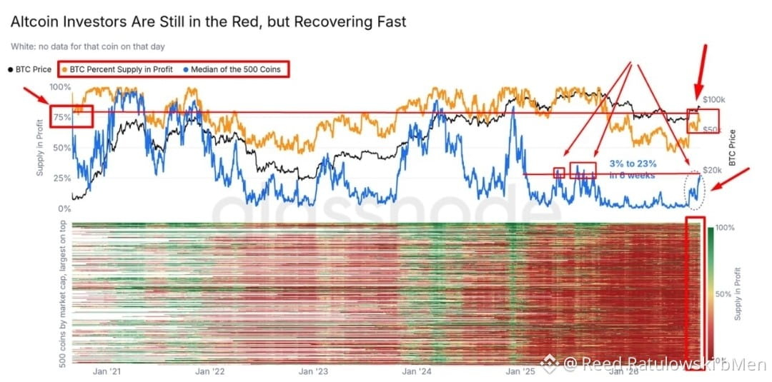
🟢 #Altcoins have begun climbing out of the “average loss” fairly confidently ⠀ • A quick overview of the chart. The blue line is the median across 500 altcoins (not to be confused with the average): what share of holders of the alts in this list (500 coins) are already in profit (i.e., last moved them below the current price). The orange line shows the same for BTC, while the heatmap below lays out all 500 coins by market capitalization: red means almost the entire supply is at a loss, green means it is in profit ⠀ This will probably be most relevant for those who got into alts with deep losses. For almost the entire year, the median hovered at the very bottom of the scale, but over the past 6 weeks it jumped from 3% to 23%—the strongest move in more than a year. Even after that move, however, more than 3/4 of the supply of a typical altcoin is still at a loss, so the heatmap below is still mostly red, while for BTC the number of wallets in profit is already much higher, at 70-75% (i.e., conversely, 3/4 of the supply is in profit)


Posting