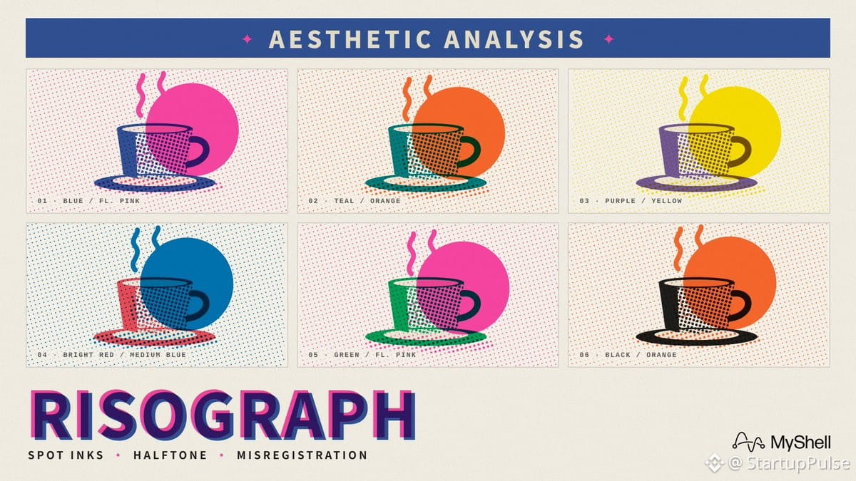
Most "riso" filters are lazy—they just slap grain on an image and call it authentic. Real risograph printing works by laying down one ink layer at a time, which means registration is never perfect. Where two inks overlap, you get bonus colors for free. Shading uses halftone dots instead of smooth gradients, and you're limited to 2-3 colors max, which is exactly why riso prints look intentionally designed rather than filtered.
To actually nail the riso look in prompts:
→ Specify two-color risograph (e.g., fluorescent pink + blue)
→ Add halftone shading
→ Include slight misregistration (the offset between layers)
→ Request uncoated paper texture
The constraint is the aesthetic. Limited colors + mechanical imperfection = that signature riso vibe.
To actually nail the riso look in prompts:
→ Specify two-color risograph (e.g., fluorescent pink + blue)
→ Add halftone shading
→ Include slight misregistration (the offset between layers)
→ Request uncoated paper texture
The constraint is the aesthetic. Limited colors + mechanical imperfection = that signature riso vibe.