

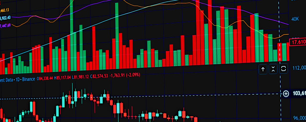

Trader biasanya hanya fokus pada pergerakan harga saja. Namun, 11 chart berikut memberikan pemahaman tentang alasan di balik perubahan harga.
Orang yang baru mengenal Binance melihat chart candlestick yang sama dan mengira chart tersebut menceritakan semuanya tentang pasar kripto. Mereka tidak mengetahui alasan sebenarnya dari perubahan harga dan gagal memahami mengapa terkadang perilakunya berbeda. Trader yang tahu mengapa harga bergerak secara berbeda melihat
11 chart yang tercantum di bawah ini.
1. Open Interest
Open Interest (OI) merujuk pada total jumlah kontrak futures yang masih terbuka dan belum ditutup. Kenaikan harga dan OI menunjukkan munculnya uang baru dalam tren—ini adalah hal yang normal. Jika harga meningkat sementara OI turun, itu berarti pergerakan didasarkan pada short covering. Kebanyakan pemula tidak memperhatikan chart ini sebelum memutuskan untuk masuk ke pasar.
2. Funding Rate
Saat membahas perpetual futures, funding rate membantu melihat apakah long atau short saling membayar untuk mempertahankan posisinya. Jika funding rate sangat positif, itu menunjukkan kerumunan long
3. Liquidation Heatmaps
Ini menunjukkan area dengan konsentrasi posisi leverage yang besar, yang akan dipaksa ditutup secara paksa ketika harga mencapai level tertentu. Harga biasanya akan cenderung menuju area-area tersebut karena sering kali menguntungkan bagi pembuat pasar dan pemain besar untuk memicu rangkaian likuidasi tersebut. Berdagang dengan leverage tanpa melihat peta ini berarti tidak mengetahui di mana pasar akan berusaha memburu stop.
4. Exchange Net flow
Ini menghitung seberapa banyak sebuah koin sedang ditransfer dari/ke bursa (yang merupakan indikator bagus apakah seseorang berencana membuang koin atau mengakumulasinya, masing-masing). Lonjakan kuat sebuah koin yang ditransfer ke Binance dan bursa lain sering kali menjadi salah satu indikator paling awal dari penjualan yang akan datang sebelum harga itu sendiri mulai jatuh.
5. Rasio Suplai Stablecoin
Ini adalah rasio antara total kapitalisasi pasar stablecoin (seperti USDT, USDC) dan total kapitalisasi pasar seluruh kripto. Jika rasio meningkat, artinya ada lebih banyak “serbuk bubuk kering” yang siap untuk membeli—sering kali menjadi sinyal bearish.
6. Dominasi Kapitalisasi Pasar
Bitcoin dominance (BTC.D) mengukur proporsi kapitalisasi pasar Bitcoin dibandingkan dengan seluruh pasar kripto. Meningkatnya dominasi menunjukkan bahwa modal mengalir dari altcoin dan menuju Bitcoin—tanda perilaku risk-off. Sementara itu, penurunan dominasi menunjukkan bahwa arus modal mengarah ke altcoin, yang biasanya diikuti oleh reli altcoin (altcoin trap).
7. Divergence RSI
Banyak orang sudah familiar dengan Relative Strength Index (RSI), tetapi sedikit yang benar-benar memperhatikan divergensinya. Ketika harga membuat high baru tetapi RSI membuat lower high, momentum menjadi melemah meski aksi harga—ini bisa dilihat sebagai peringatan tersembunyi tentang kemungkinan pembalikan yang akan datang.
8. Profil Volume
Grafik profil volume berbeda dari grafik volume biasa karena menampilkan volume untuk setiap level harga secara individual. Hasilnya, Anda dapat mengidentifikasi level harga yang menerima sebagian besar aktivitas perdagangan, dan level-level ini menjadi area support/resistance karena di sana terdapat banyak posisi terbuka.
9. Pergerakan Dompet Whale
Alat on-chain memberikan informasi tentang wallet yang memegang jumlah besar token (“whales”) dan pergerakan mereka—terutama saat memindahkan koin ke bursa. Jika banyak
Tidak ada satu pun dari grafik-grafik itu yang akan memprediksi apa pun untuk masa depan. Di kripto, tidak ada hal seperti itu. Tapi grafik-grafik tersebut akan menceritakan apa yang sedang terjadi di balik layar. Mereka akan menunjukkan posisi para trader, leverage mereka, serta tempat-tempat yang secara struktural diperkirakan pasar akan bereaksi. Harga akan memberi tahu Anda apa yang sudah terjadi. Dan grafik-grafik itu akan memberi tahu mengapa itu terjadi, memberi Anda kesempatan untuk memahami apa yang sedang dibangun di bawah permukaan sebelum terlihat di grafik harga.
Catatan Singkat Sebelum Anda Trading
Ini bukan nasihat keuangan, dan saya bukan penasihat keuangan. Saya memberikan konsep edukasi di sini. Pasar cryptocurrency itu volatil, dan penggunaan leverage meningkatkan peluang keuntungan sekaligus risiko. Perdagangan berdasarkan analisis grafik harus dilakukan dengan hati-hati, dengan riset pribadi dan manajemen risiko yang sesuai.
Pemikiran Penutup
Para trader yang sukses di pasar ini adalah mereka yang cukup jeli pada struktur pasar untuk memahami kondisi kerumunan dan mengetahui apakah pasar sedang overleveraged, terlalu percaya diri, atau terjepit. Cobalah melihat 11 grafik ini bersama dengan harga, dan Anda akan melihat pasar dengan cara yang berbeda dari yang Anda lakukan sebelumnya.