

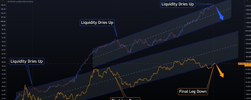

The blue and red candles on the top are global liquidity. While the orange🟠 line on the bottom is Bitcoin (BTC).
The idea behind this chart📊 is so simple ;
When liquidity expands, risk assets like Bitcoin tend to benefit. When liquidity begins to contract, the support starts to disappear and capital can begin rotating away from risk.
The historical example on the charts📊 show period where the liquidity began to roll over first , followed by a final leg down in Bitcoin.
My current thesis is that we may be seeing a similar setup developing again.
Right now the global liquidity appear to be approaching an area where I believe it could begin rolling over. If it happens Bitcoin may not react immediately, but BTC is a liquidity_sensitive risk asset, so a continued contraction in liquidity could eventually put more pressure on price.
Liquidity rollS over __risk appetite weakens _ BTC comes under pressure.
I also have separate work in the credit markets that is begging to support the same boarders risk_off thesis. I will go deeper into that side of the model in future analysis.
Important; The arrows on the chart are not exact price target🎯 or excat timing projections. They are simply there to illustrate the directional move.I m watching of liquidity continues to weaken. The historical example are meant to show the relationship and sequence, not suggest that every cycle will play out exactly the same way.
And sorry for the spacing on the chart📊__ this is the best, I could get the M2 indicator to line up. It's a little difficult to adjust cleanly.
For now the massage is simple
Follow the money $BTC #BTC #crashmarket #Cycle2026 #pumpNdump