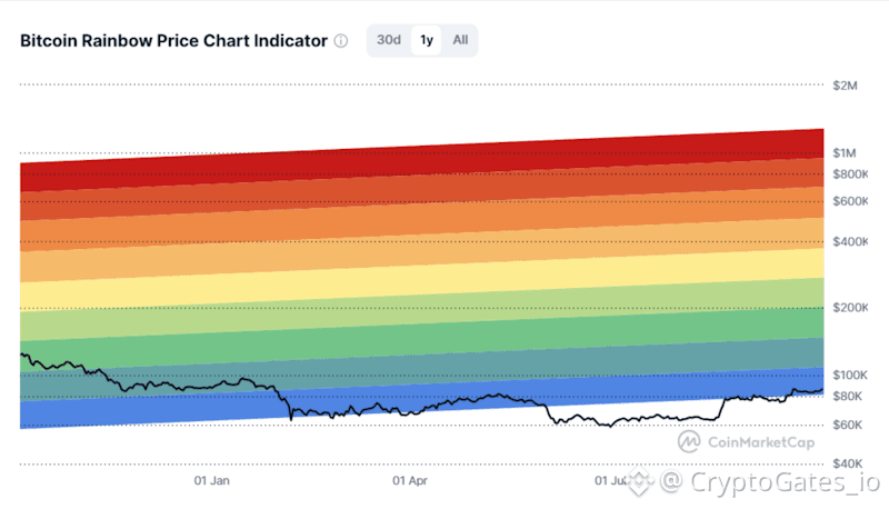
$BTC Price is trading inside the lower bands of the Rainbow Chart.
The Rainbow Chart plots BTC against a long-term logarithmic regression curve, divided into color bands.
Interpretation: lower bands mark the zone where valuation looks stretched to the downside relative to history. The model fits past cycles, so treat it as context, not a signal.
Lesson: in zones like this, execution risk matters more than the entry price. Staged DCA entries with preset rules reduce timing risk. Set your interval and size, then backtest before going live.
Backtest this scenario before you trade it...
#BTC #RainbowChart #DCAStrategy
The Rainbow Chart plots BTC against a long-term logarithmic regression curve, divided into color bands.
Interpretation: lower bands mark the zone where valuation looks stretched to the downside relative to history. The model fits past cycles, so treat it as context, not a signal.
Lesson: in zones like this, execution risk matters more than the entry price. Staged DCA entries with preset rules reduce timing risk. Set your interval and size, then backtest before going live.
Backtest this scenario before you trade it...
#BTC #RainbowChart #DCAStrategy