$BTC THAT LITTLE KNOWN CHART! 🚨
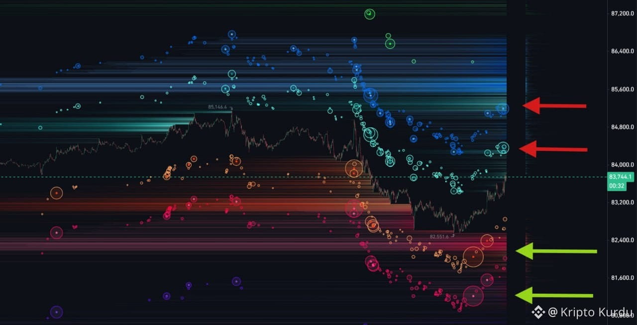
This #Bitcoin liquidation map is a little different from what everyone is used to. Instead of showing all liquidations occurring directly at that level, it shows us how much liquidation would occur if the price were to crash in a bubble like manner.
I can hear you asking, “So what’s the difference?” First of all, as you’ve probably noticed, these bubbles aren’t concentrated at a single price they’re distributed in stages. For example, the bubble at the $82,000 level doesn’t burst immediately at that exact price. It liquidates gradually.
This not only helps us see the price levels more clearly but also gives us a sense of the potential snowball effect based on the scale.
Looking at the chart, the downside continues to look quite dangerous. If the sideways trend persists, we may see small, gradual declines like this. Hopefully, a bullish candle will appear, and we’ll continue moving upward again.
This #Bitcoin liquidation map is a little different from what everyone is used to. Instead of showing all liquidations occurring directly at that level, it shows us how much liquidation would occur if the price were to crash in a bubble like manner.
I can hear you asking, “So what’s the difference?” First of all, as you’ve probably noticed, these bubbles aren’t concentrated at a single price they’re distributed in stages. For example, the bubble at the $82,000 level doesn’t burst immediately at that exact price. It liquidates gradually.
This not only helps us see the price levels more clearly but also gives us a sense of the potential snowball effect based on the scale.
Looking at the chart, the downside continues to look quite dangerous. If the sideways trend persists, we may see small, gradual declines like this. Hopefully, a bullish candle will appear, and we’ll continue moving upward again.