
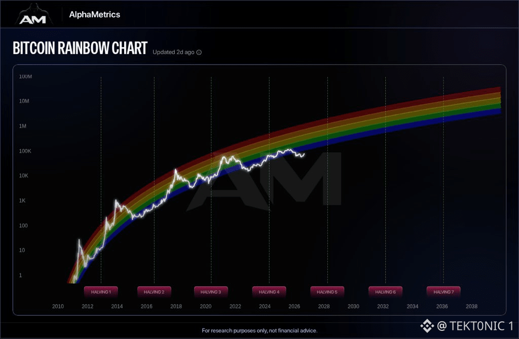
the rainbow chart has $BTC in the lower half of the band, not in blow-off red. AlphaMetrics plots price on a log scale against a long-run regression. the colors are just zones around that curve. after the 2024 halving, the white line is holding in the cooler bands while the model still slopes up toward the 2028 halving and beyond. that is the whole pitch. if price mean-reverts to the middle of a multi-year log fit, the distance to the upper bands looks large from ~$77,000. prior cycle tops tagged the hot colors. prior bottoms tagged the blue. the catch is the word “usually.” this chart is a fitted curve, not a clock. it can look right for years and still miss a cycle high or spend extra time in the cheap zone. 2025 already showed price can leave a band and come back. so the rainbow says there is room above if the long-term log trend holds. it does not say $BTC has to tag red from here, and it does not time the move. the model is a map. the Fed week still trades first. #BTC Price Analysis# #Bitcoin Price Prediction: What is Bitcoins next move?# $ETH

Publicación
Aviso legal: Incluye opiniones de terceros. No es asesoramiento. Binance Ai puede utilizarse sin garantía. Consultar Términos y condiciones.