
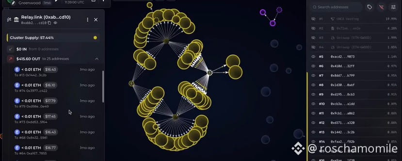

If you’ve been around memes, you’ll probably see bundled tokens pretty often.
And for me, the fact that something is bundled isn’t enough to tell me whether it’s good or bad. There can be legitimate reasons for supply to be concentrated or coordinated early on.
What I actually want to know is
How much is bundled?
Who might be behind it?
And what happened to that supply after launch?
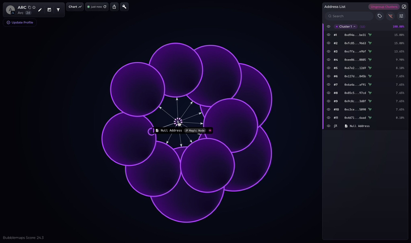
A token can look well distributed because no single wallet holds a huge amount. But if several of those wallets bought together at launch or are connected onchain, I’d want to understand whether that supply is actually as distributed as it looks.
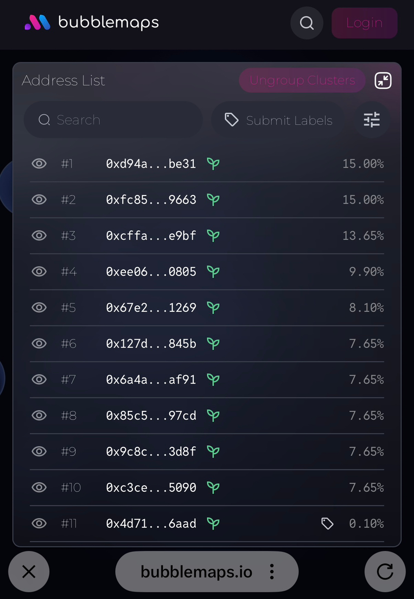
This is where the new @Bubblemaps.io revamp gets interesting for me.
The whole flow is basically find → vet → buy, without having to jump between different platforms.
1. Find
There’s a Trending + Fresh feed across chains, with Arc supported from day one.
The feed also filters out extremely high-risk tokens and bundles before they surface, which I think is useful when you’re digging through fresh memes.
And I can filter by chain, launchpad, price, volume, liquidity and more.
2. Check the supply
Hover over a token and its bubble map shows up instantly.
My simple way of reading it
1 bubble = 1 holder address.
Bigger bubble = bigger holding.
Connected bubbles = there’s an onchain relationship worth looking into.
So instead of only reading a top-holder list, I can see whether some of those holders are connected.
Connected doesn’t automatically mean insider though.
It could be an LP, exchange, treasury or another entity. That’s where wallet labels, reviewed by professional onchain sleuths, give me more context.
3. Check the bundle
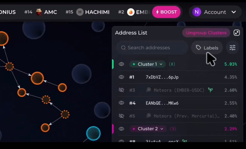
Bundles and clusters tell me slightly different things.
A bundle is more about what happened around launch multiple wallets buying within the same block or a very short time window.
A cluster is more about wallets having onchain connections.
For early memes, I care about both.
Not because bundled = bad.
I just want to understand how much supply was accumulated early, who might be behind those wallets, and how significant that position is relative to the liquidity.
There’s also a Bubblemaps Score that flags insider clusters and bundled wallets, which gives me another place to start digging
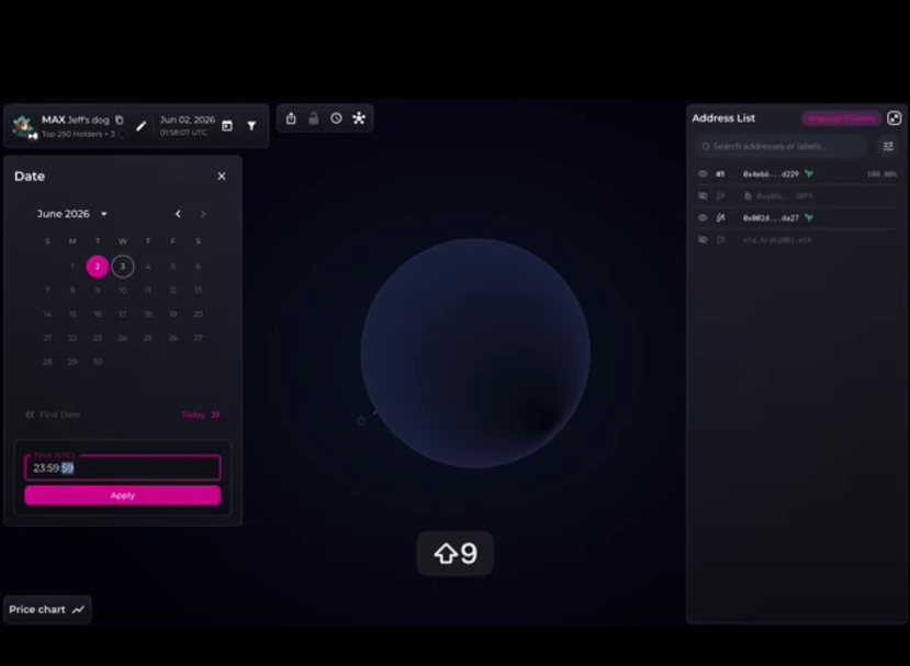
4. Go back in time
This is probably the part I find most useful.
With Historical Holder Distribution, I can click a candle and see what the holder distribution looked like at that exact moment.
At launch → who had the supply?
First pump → how did the distribution change?
Now → where did that supply end up?
Because today’s holder list only gives me today’s picture.
For an early meme, I’m much more curious about What happened before I got here?
Project socials are also reviewed, and if I eventually decide to trade, there’s a built-in swap with a 0.5% fee. There’s even in-app token boosting.
So the interesting part of this revamp for me isn’t one individual feature.
It’s having the whole flow in one place !
Find → check the holders → investigate the bundle → look back in time → decide → trade.
We’re not fortune tellers. We don’t know what’s going to pump next.
But we can know a little more about what we’re getting into before we ape.
Who got in before me?
How concentrated was the supply?
What happened to it after launch?
The chart tells what the price is doing.
The bubbles give me more context on what’s happening behind the supply.
#$BMT #Bubblemaps