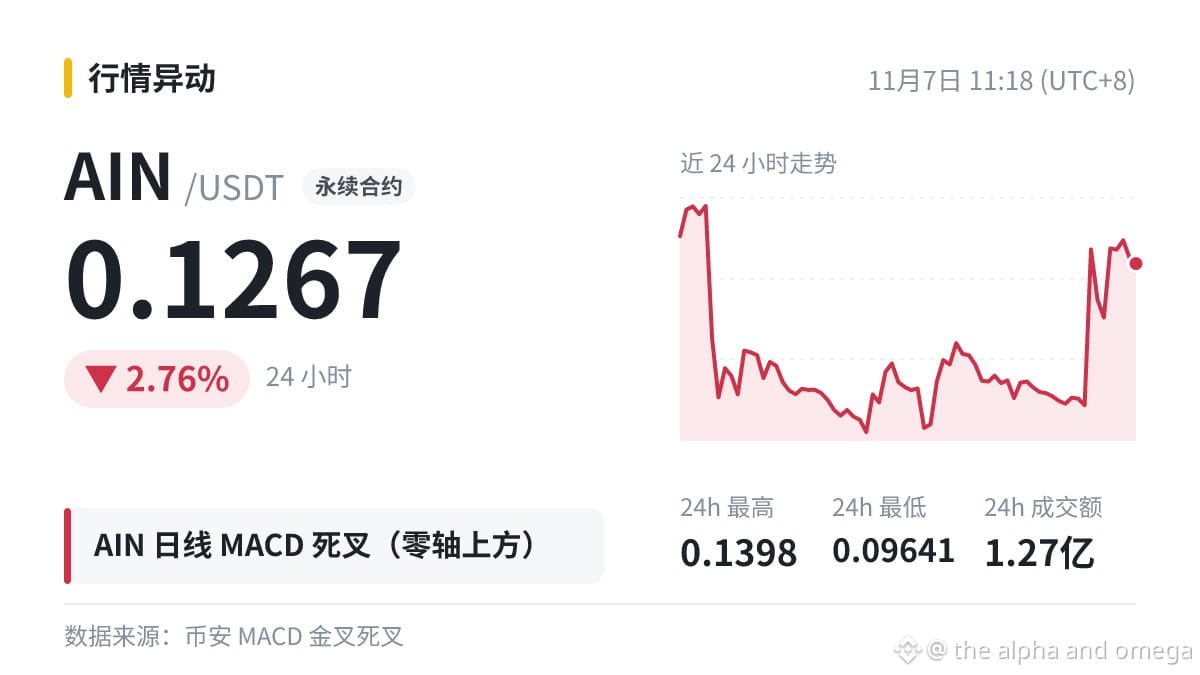
Let's talk about the MACD death cross on the $AIN daily chart. First, we should be clear about its two shortcomings:
First, it's lagging. MACD is derived from moving averages, so by the time a death cross appears, the price has often already fallen some distance from its high (24h -2.76%).
Second, it's vulnerable to choppy markets. In a sideways market, golden crosses and death crosses can appear repeatedly, creating a lot of noise.
Before this crossover, the opposing histogram bars persisted for 12 daily candles. The one-way move lasted a while, making this crossover cleaner than one in a choppy market. Also, since it is above the zero line, treat it as a pullback for now—not necessarily a reversal.
#AIN
First, it's lagging. MACD is derived from moving averages, so by the time a death cross appears, the price has often already fallen some distance from its high (24h -2.76%).
Second, it's vulnerable to choppy markets. In a sideways market, golden crosses and death crosses can appear repeatedly, creating a lot of noise.
Before this crossover, the opposing histogram bars persisted for 12 daily candles. The one-way move lasted a while, making this crossover cleaner than one in a choppy market. Also, since it is above the zero line, treat it as a pullback for now—not necessarily a reversal.
#AIN