



Whether the rebound can be sustained—watch the supply and demand within the consolidation at the low level.
BTC dropped for a while, then started moving back and forth around the low level, occasionally pushing out a bullish candle. Is this what looks like accumulation?
After reading the section “distribution at the lows” in the original book, I think the most worth pursuing question is: in the rebounds during the consolidation, how much of the selloff did they actually repair, and how much progress did they leave behind? Let’s use a real market example to observe.
Before the sideways range, what was the price doing when it fell?
This is an independent post-event teaching example and is not stitched together with the previous lesson. Binance BTCUSDT U-margined USDT perpetual, 4-hour candlestick trading price chart, all in UTC+8. Figure 1 starts at 2026-06-22 00:00, and we look up to 04:00 on 06-28 only including closed data.#BTC
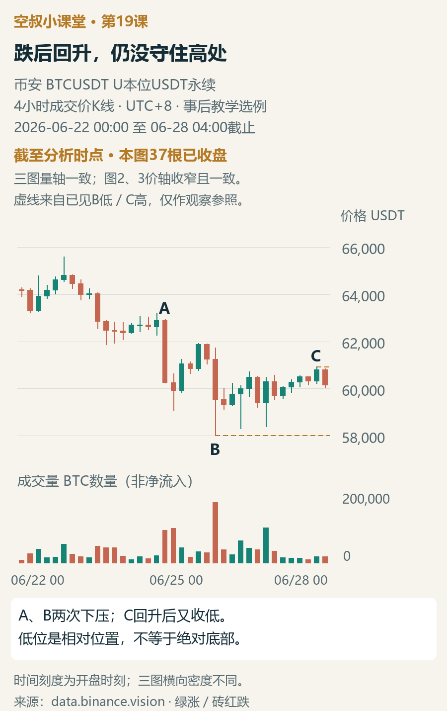
First look at A on the left: the drop magnitude expands noticeably, and the trading volume also increases compared with the previous candle. The price then rebounds, but it is pushed down even lower by B. B’s trading volume is greater than that of the previous candle, and the low reaches 58,030.
Both pushes down are accompanied by increased trading volume, and they indeed push the price lower. This is the background for observing the later sideways movement. The book uses SOW to denote “weakness appearing.” In this example, A and B also show such weakness in both volume and price action combined.
After B, the price doesn’t keep falling: two dips are pulled back, and both lows are higher than B’s low. Then it moves upward and closes C at a higher position within this rebound. But the very next candle closes clearly lower, taking back the upward progress achieved by C.
What you can see at this point is: the decline met resistance, and the recovery met pressure. To interpret this consolidation as accumulation, you also need to see that the buyers gradually gain and maintain more upward progress.
The book’s “low-level distribution” discusses consolidation at a lower position after SOW. Here “low” is relative to the earlier highs and the downswing: in the chart, the price drops from around 65,600 and then moves back and forth around 60,000. It doesn’t mean cheap valuation, and it doesn’t equal an absolute bottom.
More crucial than the rebound volume being smaller is whether the price can hold after it rises.
In Figure 1, the volume bars of C are much smaller than B. But B itself was a once-involving extreme sell-off; you can’t conclude there’s no demand just because the rebound volume didn’t catch up to it.
I’ll bring my focus back to price: C is still below the rebound high of B before it, and then it closes lower again right afterward. What makes this rebound feel difficult is that the position hasn’t been repaired sufficiently, and the upward progress also wasn’t sustained. The difference in volume bars is just one piece of evidence to observe together.
Compared with the immediately preceding candle, C actually represents an increase in volume. Therefore, here we should say “C’s volume is higher than the previous candle, yet still lower than B,” not “the rebound gradually shrinks in volume.” The lesson’s volume comparisons are all based on single 4-hour candles.
The book also doesn’t label this set of cases based only on shrinking volume. The author connects the background of a volume-expansion sell-off, the volume-price performance of a range rebound, and the push-up then pullback in the supply zone; then they observe whether the push down follows through and whether the rebound can neutralize the supply again. This is the observation sequence we want to borrow.
D: trading activity picks up, but it can’t hold the high
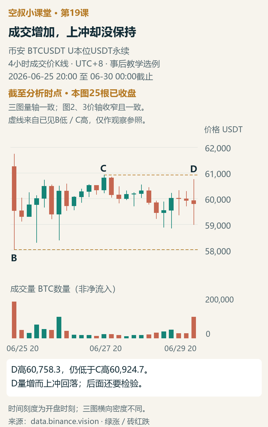
Figure 2 zooms in on the local area since B. You can see up to 00:00 on June 30. The price axis is narrower than Figure 1—when comparing across charts, please compare using values.
D is the candle opening at 20:00 on June 29. During the session it spikes above the highs of the two candles immediately preceding, but it finally closes below its own opening price; its highest price also doesn’t exceed C. Volume rises from about 216,000 in the previous candle to 974,000 BTC.
The key point of this candle is: trading volume increases clearly, yet the results of the push up weren’t held into the close. Placed in the context of A and B’s sell-offs (push downs) and C’s rebound that then gets stymied, D indicates that the rebound is still constrained by supply—so the low-level distribution explanation gains another supporting basis.
But even the lowest point of D was pulled back, which shows there is still resistance below. Next, what to look at is: after this failed push up, can the sellers continue to drive the price lower, or will the buyers reclaim the higher ground again?
First remember two existing reference points: C’s high at 60,924.7 and B’s low at 58,030. If later closes break above C’s high and keep holding, and the pullback is still controlled, then the interpretation of “the sustained rebound is under pressure” should weaken. On the downside, you watch whether the area around B’s low can hold. These are the coordinates for testing the explanation in this example—not an entry price or a unified stop-loss level.
E: volume increases—this time it brings downward progress
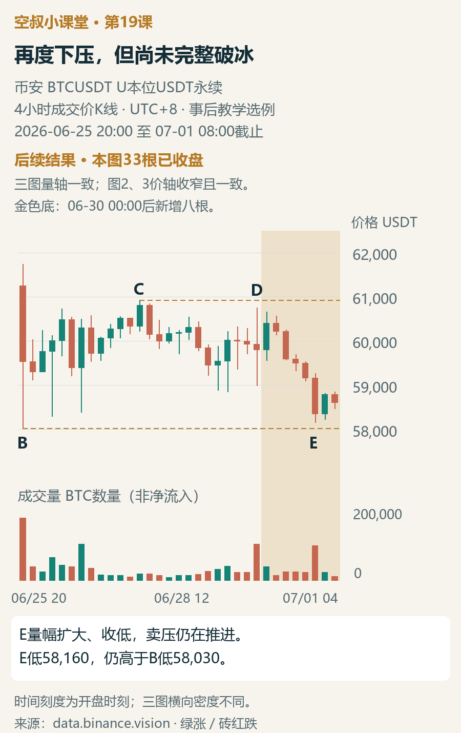
Now reveal the aftermath separately, up to 08:00 on July 1. The golden bottom adds eight more candles: immediately after D, the price first rebounds, reclaiming roughly 60,400, and then only afterward does it close lower in a continuous streak. This rebound still fails to break above C’s high.
E is the candle at 20:00 on June 30. Volume rises from about 216,000 in the previous candle to 925,000 BTC; the range from highest to lowest expands, and the close falls to 58,356.2. After that, although there is a small rebound, the price still stays in a lower area.
By comparing D and E, you can clearly see how trading volume needs to be read together with price. D is a push up with expanding volume, but it fails to hold the high; E is a push down with expanding volume, and it achieves an even lower close. The former shows the rebound is blocked; the latter adds evidence that selling pressure continues to advance. Sideways at the bottom hasn’t made the original downward pressure disappear on its own.
This result supports “selling pressure continues and the risk of low-level distribution increases.” There’s another boundary too: E’s lowest point is 58,160, still higher than B’s low of 58,030—so it hasn’t broken that prior low yet.
In the book’s example, the subsequent price breaks below the original support, which is called “breaking the ice.” Then the rebound returns to the vicinity of the old support to test whether it can be reclaimed—this is “testing the ice line.” After that, the price continues to move downward. In this example, even B’s low hasn’t been broken, so it can only be used to observe selling pressure during lower-range consolidation; it cannot be treated as a complete replay of that entire process.
My learning summary
The focus of this lesson can be grouped into three things: whether the recent push down drove the price lower, whether the range rebound can be maintained, and whether there is any new progress of pushing down after the rebound is blocked. Only by connecting these can there be reason to increase vigilance about low-level distribution.
In the book, in a scenario where they assume a bottom was bought and then this set of weak evidence appears, the author uses strong wording of “must exit.” It targets the risk of already-held longs, not an instruction to liquidate every time the market goes sideways. When an existing position has reached the predetermined risk-exit condition, there’s no need to wait for the distribution to be finally confirmed. Exiting longs also doesn’t automatically mean shorting.
Leave room for a small exercise
In Figure 2, D, and in Figure 3, E, trading volume is clearly higher than in the previous candle. Why does D mainly indicate that the push up meets obstruction, while E indicates that the push down achieves progress? Please explain using one price action each. Then, combining B’s low point, indicate where the conclusion of this BTC case should be stopped.
Feel free to write your basis in the comments—don’t just answer “up” or “down.” The reference analysis will be added later in this article’s comments section.
On the road of trading, Uncle Kong will grow with you together.#空叔小课堂 #威科夫供需量价